ABSTRACT
COX, DAVID N. Finding Patterns in DNA Sequences through Visualization with Symbolic Scatter Plots. (Under the direction of Dr. Alan L. Tharp).
Visualization is frequently mentioned as a technique for analyzing large amounts of data. It has been widely anticipated for many years that visualization would become a major tool for the analysis of rapidly growing genomic databases. However, beyond the dot plot which was introduced in 1981 there have been few successful attempts at visualizing this data.
Finding Patterns in DNA Sequences through Visualization with Symbolic Scatter Plots
by David N Cox
A dissertation submitted to the Graduate Faculty of North Carolina State University
in partial fulfillment of the requirements for the degree of
Doctor of Philosophy Computer Science
Raleigh, North Carolina 2010
APPROVED BY:
_______________________________ ______________________________
Dr. Alan L. Tharp Dr. Donald L. Bitzer
Committee Chair
________________________________ ______________________________
DEDICATION
BIOGRAPHY
David Cox is a native of Pennsylvania. He attended the Pennsylvania State University where he received a B.S. in Biochemistry and the Rochester Institute of Technology where he received a M.S. in Computer Science.
David worked first as a biochemistry laboratory technician and then as a programmer/analyst at the University of Rochester. He also worked for several years as a software engineer developing software for a line of blood analyzers at the Eastman Kodak Company and as a software engineer developing middleware at Xerox Corp. David currently works as a Principle Scientist in the U.S. Corporate Research Center for ABB Corporation.
ACKNOWLEDGEMENTS
To Professor Alan Tharp, words cannot express my gratitude nearly enough. Time flies and I have lost count of all the times we have met and exchanged email. Not only have you offered your guidance, you have been patient and kind and are a true friend. As I go forward from here, you will always be in my thoughts. In whatever I do in the future, I hope I can do it with the same grace and dignity that I have found in you. I came to learn how to conduct research and I have found so much more.
Thank you to Dr. Steffen Heber and Dr. Christopher Healey. Both taught me – one in computational methods in molecular biology and one in computer graphics. I am grateful for our conversations and discussions. Your ideas, suggestions, and encouragement were invaluable to me. To Professor Donald Bitzer, we ran into each other often. You always had warm words of advice and encouragement. Thank you.
To my Dad, Charles Cox, you instilled in me a tremendous respect for education. From the days of my first chemistry set when we had to throw open the windows and doors in the dead of winter after we concocted too much sulfur dioxide until today, you always made learning and life fun. Thank you, Dad, for helping me make it this far.
To my Mom, Barbara Cox, who is not with me today, I love you, Mom and wish so much that you could be here. You always encouraged me to do my best.
TABLE OF CONTENTS
LIST OF TABLES ... viii
LIST OF FIGURES ... ix
1 Introduction ... 1
1.1 Thesis Organization ... 5
2 Background ... 7
2.1 Pattern Discovery ... 8
2.2 Gestalt Laws ... 9
2.2.1 Proximity ... 10
2.2.2 Similarity ... 10
2.2.3 Connectedness ... 11
2.2.4 Continuity, Symmetry, Closure, and Relative Size ... 11
2.2.5 Figure and Ground ... 12
2.3 Pre-attentive Processing ... 14
2.4 The Central Dogma of Molecular Biology ... 18
2.5 DNA Sequence Analysis ... 23
2.6 Visualization Techniques: A Review ... 26
3 Inspiration from the Sieve of Eratosthenes ... 30
3.1 The Method... 32
3.2 Results ... 35
3.3 Discussion... 40
4 Symbolic Scatter Plots ... 42
5 Sequence Analysis with Symbolic Scatter Plots ... 51
5.1 Introduction ... 51
5.2 Results ... 58
5.2.1 Repeats Analysis ... 58
5.2.2 Identifying Complex Patterns ... 68
5.2.3 Comparing Sequences with Symbolic Scatter Plots ... 70
5.3 Discussion... 75
6 Visualizing the Huntingtin Gene ... 76
6.1 Introduction ... 76
6.3 Discussion... 82
7 Exploiting Visual Cues ... 83
7.1 Introduction ... 83
7.2 Proximity ... 83
7.2.1 Manipulating Horizontal Proximity ... 84
7.2.2 Manipulating Vertical Proximity ... 86
7.2.3 Discussion ... 92
7.3 Animation ... 93
7.3.1 Method ... 94
7.3.2 Results ... 95
7.3.3 Discussion ... 100
7.4 Color ... 101
7.4.1 Feature Highlighting ... 101
7.4.2 Visualizing Additional Dimensions of Information ... 103
7.4.3 Discussion ... 106
7.5 Summary ... 106
8 Conclusion ... 108
9 Future Research ... 116
LIST OF TABLES
LIST OF FIGURES
Figure 2.1 Examples illustrating how repetition influences our notion what is or
isn't a pattern. . ... 8 Figure 2.2 Illustration of a pattern with minimal repetition. ... 9 Figure 2.3 Effect of proximity on object grouping. On the left the dots are
closer vertically than horizontally and on the right the reverse is true.
. ... 10 Figure 2.4 Effect of similarity on grouping. On the left objects are grouped by
shape while on the right they are grouped by color. . ... 11 Figure 2.5 We tend to group objects that are somehow connected. Here objects
are connected with horizontal and vertical lines. ... 11 Figure 2.6 Examples of continuity, symmetry, closure, and relative size. ... 12 Figure 2.7 A classic example of figure and ground. Is this a vase or two faces ... 13 Figure 2.8 Color is pre-attentively processed and allows us to locate objects
quickly. ... 14 Figure 2.10 Examples of visual cues that are pre-attentively processed. ... 15 Figure 2.11 The central dogma of molecular biology. ... 20 Figure 2.12 Examples of DNA visualization. Top row: dot plots, chaos game
representation, DNA walk, color coding; middle row: color merging,
Figure 3.1 A visual representation of the sieve of Eratosthenes beginning with the number 1. Remarkably, the diagonals are constructed in exactly the same manner as the rows. Dots appear in every column for the diagonal with slope 1. They appear in every other column for the diagonal with slope 2. They appear in every third column for the
diagonal of slope 3. And, so on. ... 35
Figure 3.2 Further along in the matrix diagonals merge to reveal left facing parabolas. ... 36
Figure 3.3 Diagonals radiate from the first row of every column. Some are more visible than others. Those most visible correspond to numbers with the most divisors. The pattern of dots in each diagonal is identical. Only the spacing increases as the diagonals approach the horizontal... 37
Figure 3.4 The matrix as it appears from column 0. ... 38
Figure 3.5 Representing a portion of the matrix as 1's and 0's. ... 38
Figure 3.6 Illustration of how the remainders are duplicated in each column. Again, the spacing increases as each diagonal approaches the horizontal... 39
Figure 4.1 Examples of symbolic scatter plots. ... 43
Figure 4.2 Effect of plotting one point per 3-mer. ... 45
Figure 4.3 An example of repeated 3-mers in a symbolic scatter plot. ... 45
Figure 4.4 An illustration of how one region of a symbolic scatter plot is visually different from its surroundings. ... 47
Figure 4.5 What makes a portion of a DNA sequence interesting? Here repeats of AAA's are arranged symmetrically around a central set of repeats. Is this a coincidence or is there some biological relevance? ... 47
Figure 4.6 Small patterns such as these repeats would normally go unnoticed. However, their relatively large numbers make them visually conspicuous. ... 48
Figure 4.8 The human visual system groups objects at different levels. Here a series of several small groups of repeats are grouped to form a single whole. Such larger groupings are not easily identified
algorithmically. ... 49
Figure 4.9 Here three very different groups of patterns are perceived by their close proximity to form a single objet. ... 49
Figure 4.10 An example of many small features that are visually conspicuous. Visual cues such as proximity and symmetry make them stand out. ... 50
Figure 5.1 Matching regions from the yeast chromosome. ... 55
Figure 5.2 How Tandem Repeats Finder uses hashing to find tandem repeats. ... 59
Figure 5.3 How hashing is used to create a symbolic scatter plot. ... 61
Figure 5.4 An analysis of chromosomal contig, NT_008183.18 using Tandem Repeats Finder. ... 61
Figure 5.5 A symbolic scatter plot visualizing the same region as Figure 5.4. ... 62
Figure 5.6 Results of Tandem Repeats Finder for another portion of chromosomal contig, NT_008183.18. Contrast this result with the symbolic scatter plot in the next figure. ... 63
Figure 5.7 This symbolic scatter plot illustrates that Tandem Repeats Finder failed to find all of the repetitive 3-mers in this portion of the sequence. TRF reported only the highlighted region and missed the repeats to the left. ... 63
Figure 5.8 Tandem Repeats Finder identifies several often overlapping regions of repeats. ... 64
Figure 5.9 As illustrated in Figure 5.8, the repeats in this symbolic scatter plot are reported as several overlapping regions. Visually, the region appears as a single object. ... 65
Figure 5.10 At the bottom of this plot are several repeats corresponding to STOP codons. These repeats were not reported by Tandem Repeats Finder but are evident visually. ... 65
Figure 5.12 In this figure are additional examples of short repeats not reported by
Tandem Repeats Finder. Are they biologically significant? ... 66 Figure 5.13 A zoo of visual patterns. Statistically we would expect to find many
short repeats. However, both the number of repeats and the regularity of the spacing between them are visual cues that allow
some patterns to stand out from others. ... 67 Figure 5.14 Different visual patterns correspond to different information content.
Here a symbolic scatter plot is compared to an entropy profile for the
same sequence. ... 68 Figure 5.15 A complex pattern of irregularly spaced repeating 3-mers. Tandem
Repeats Finder failed to report these repeats even though they are
fairly evident to the eye. ... 69 Figure 5.16 Examples of visibly complex patterns consisting of repeating 3-mers.
No repeats were found by Tandem Repeats Finder. ... 70 Figure 5.17 Different alignments produced by different alignment algorithms. ... 71 Figure 5.18 Comparison of alignments using symbolic scatter plots. ... 72 Figure 5.19 Visual patterns can be used as markers to assist in the alignment of
sequences. Here the small patterns on the right suggest a possible alignment. A closer examination does show that the right half of the sequences do align well. However, the sequences do not align at the
left as indicated by the circled patterns. ... 73 Figure 5.20 Here the bottom sequence was scrolled until a pattern matching the
top left pattern was found. Notice the differences, however, on the
right. ... 73 Figure 6.1 The CAG repeats are visible as three horizontal lines of dots in the
center of this scatter plot for the human huntingtin gene. ... 78 Figure 6.2 A symbolic scatter plot for the first 500 3-mers of the chimpanzee
huntingtin gene. Although shorter, the CAG repeats are also evident
at the left of this plot. ... 78 Figure 6.3 Remarkably, the chimpanzee huntingtin gene shows a second group
of CAG repeats that visually is very similar to the first. Comparison
Figure 6.4 A comparison of the four sequences found in the chimpanzee trace archive. Each is different from the rest suggesting the possibility that the chimpanzee huntingtin gene might really contain two sets of
CAG repeats in contrast to the human gene which contains only one. ... 81
Figure 7.1 Manipulating visual cues can render patterns more visible. Here proximity is manipulated by bringing the points closer together horizontally. This “squishing” of the points transforms an apparent random display of points into a highly ordered array ordered array of 3-mers. ... 85
Figure 7.2 Example of a frequency profile often used for finding motifs. ... 87
Figure 7.3 Manipulation of vertical proximity can reveal specific sequences including those that do not match exactly. ... 88
Figure 7.4 Manipulation of vertical proximity reveals specific sequences. ... 89
Figure 7.5 An example of an approximate match revealed by changing the vertical proximity of 3-mers. ... 90
Figure 7.6 Co-location of a feature near another feature can raise suspicion that the feature has some biological function. ... 91
Figure 7.7 Typical textual representation of a sequence alignment ... 95
Figure 7.8 An alignment of overlapping 3-mers. ... 95
Figure 7.9 Correspondence between an alignment and a symbolic scatter plot ... 96
Figure 7.11 Subtle differences between the chimpanzee (left) and human (right)
huntingtin genes are much more noticeable with animation. ... 97 Figure 7.12 Color is useful for highlighting specific features. Here, blue lines are
used to highlight TCT's to reveal an interesting pattern of pairs of
3-mers. ... 99 Figure 7.13 Algorithms that report tandem repeats often present alternatives with
very similar scores. Is this repeat of length 68 and a score of 994 better or worse than one of length 205 and score 957? Visualization
provides additional information to help answer such questions. ... 102 Figure 7.14 Algorithms that report tandem repeats often present alternatives with
very similar scores. Is this repeat of length 68 and a score of 994 better or worse than one of length 205 and score 957? Visualization
provides additional information to help answer such questions. ... 102 Figure 7.15 Example of color to emphasize the entropy of a DNA sequence
while retaining the distribution of 3-mers. Red indicates low entropy
while green represents high entropy. ... 104 Figure 7.16 Regions of high and low entropy are not always obvious. Here is
another example where color helps make these differences more
1
Introduction
Deciphering DNA is an important and open research goal. Now that we have the sequences for whole genomes, the goal is to understand what the sequences represent. This goal exists partly to satisfy human curiosity – most people want to understand the nature of life. But this goal also exists for practical reasons. Many if not all diseases are genetically based. These include cancer, heart disease, and diseases that we know have specific genetic causes such as Downs syndrome and Huntington’s disease. Developing treatments and cures will require understanding a disease at the genetic level. Understanding how different people respond to medications will require understanding these differences at the genetic level. Developing accurate diagnostic tests also requires understanding diseases at the genetic level.
Deciphering DNA sequences requires understanding how DNA is transcribed and then translated into proteins. It requires understanding how some proteins bind to DNA to enhance or inhibit transcription as part of a molecular feedback loop. It requires understanding how DNA folds into various structures which in turn enhance or inhibit transcription. Lastly, it requires understanding how DNA is chemically modified by processes such as methylation to turn transcription and translation on or off.
repetitive patterns. Aside from comparing sequences and searching for patterns, statistics is employed to analyze how genes are expressed in different cell types and how organisms are related to each other genetically.
A major motivation for using statistical approaches and algorithms that automatically find similarities between sequences is the vast amount of data that must be analyzed. It is well known that the amount of genomic data has been growing exponentially and that humans can process only very small amounts of it manually in a short period of time (Tao, Liu, Friedman, & Lussier, 2004). Computers can analyze vast amounts of data quickly and perform statistical analyses and string comparisons efficiently and accurately.
It has been recognized for some time that data visualization is an effective strategy for analyzing large amounts of data. Healey (Healey, Effective visualization of large multidimensional datasets, 1996) wrote, “...the desire for computer-based data visualization arose from the need to analyze larger and more complex datasets. Scientific visualization has grown rapidly in recent years as a direct result of the overwhelming amount of data being generated. New visualization techniques need to be developed that address this ‘fire hose of information’ if users hope to analyze even a small portion of their data repositories.”
plots were introduced to compare two sequences (Maizel & Lenk, 1981). Nevertheless, for many years there have been few other developments in visualizing DNA and genomic data.
At the IEEE Visualization conference in 2001 several researchers participated in a panel discussion entitled, “Visualization for Bio- and Chem-Informatics: are you being served?” The panel discussion was introduced with a simple but challenging question: “To meet the computing challenges (of analyzing biological data), visualization plays a key role. Or does it?” Panelist Georges Grinstein stated, “In the past, I have argued that visualization must be used at every stage of the knowledge discovery process. I now argue that visualization today is not just one of the main keys to knowledge discovery but that it is still the most underutilized component of that discovery process and that so much more can be done to support that process.” The panelists expressed frustrations that visualization hasn’t taken a larger role particularly in the area of bioinformatics.
will be accomplished with visualization without mention of a single previous accomplishment.
At the Workshop on Ultrascale Visualization in November 2008, the primary visualization technique noted for comparing DNA sequences was still the dot plot (Samatova, Breimyer, Hendrix, Schmidt, & Rhyne, 2008). Compared to statistical methods, visualization remains a distant second when analyzing DNA whether for comparing sequences or finding patterns.
exploit its power and develop visualization techniques that 1) rival their statistical cousins and 2) open the door of data analysis to non-specialists.
1.1
Thesis Organization
Chapter two provides background pattern discovery, pattern perception, and how humans process visual information. It reviews the “central dogma of molecular biology” and traditional methods of sequence analysis. Chapter two concludes with a review of techniques developed by other researchers for visualizing DNA.
Chapter three introduces a technique for visualizing the sieve of Eratosthenes. This chapter is included because this technique was the inspiration for symbolic scatter plots. Furthermore, the technique was a significant result in its own right by providing a novel visualization of a two thousand year old mathematical approach for finding prime numbers.
Chapter four describes symbolic scatter plots and how to produce them. Various aspects of the plots are described. How patterns are perceived in the scatter plots is discussed in terms of Gestalt principles and visual processing.
Chapter five explores visualizing copies of DNA in larger sequences. The copies can be either exact or inexact. Results are compared to those generated by the predominant statistical technique, Tandem Repeats Finder.
Chapter six presents an application of using symbolic scatter plots – visualization of the huntingtin gene which is responsible for Huntington’s disease in humans.
2
Background
This research crosses several boundaries including computer science, biology, perception, pattern discovery, and information visualization. This chapter provides background on these areas. Sections 2.1, 2.2, and 2.3 discuss pattern discovery, Gestalt laws of pattern perception, and pre-attentive visual processing. The section on pattern discovery defines what is meant by a pattern. The section on Gestalt laws explains how we segment images into discernable objects or groups of objects. The section on pre-attentive processing explains why certain features grab our attention. The material in these sections helps to explain why we see patterns in graphical representations of DNA. It also suggests how we can change our graphical representations to improve our ability to see patterns in DNA.
Following these sections is a discussion about the “central dogma of molecular biology,” a term introduced by Francis Crick in 1958 and formally stated in an article in the journal Nature (Crick, 1970). The role of DNA sequence analysis is described and traditional algorithms for analyzing DNA are explained.
2.1
Pattern Discovery
Hardy once wrote, “A mathematician, like a painter or poet, is a maker of patterns” (Hardy, 1940). In his book, Mathematics as a Science of Patterns, Resnick states, “…in mathematics the primary subject-matter is not the individual mathematical objects but rather the structures in which they are arranged” (Resnick, 1997). Patterns are important but what exactly are they?
The first set of results returned by Google when searching for the word pattern is a set of images. The first few of these are shown here:
Figure 2.1: Examples illustrating how repetition influences our notion what is or isn't a pattern. (Google image results of patterns, 2009).
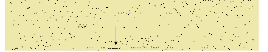
Patterns, however, involve more than repetition. In his book, “Information Visualization: Perception for Design,” Colin Ware refers to a pattern as something that can be visualized as a coherent whole (Ware, 2004). There are two images in Figure 2.2. Both contain about two thousand randomly placed points. However, certain points on the right were painted white to render them invisible. The repetition in these images kept to a minimum. Even so, the image on the right contains what most people would perceive to be a singular white circle.
Figure 2.2: Illustration of a pattern with minimal repetition.
Ware asks, “What does it take for us to see a group? How can 2D space be divided into perceptually distinct regions? Under what conditions are two patterns recognized as similar? What constitutes a visual connection between objects?” To answer these questions, Ware refers to the Gestalt laws of pattern perception (indeed, the German word gestalt means “pattern”).
2.2
Gestalt Laws
nearly a hundred years ago, the Gestalt laws of pattern perception remain valid today. The laws describe several visual cues that we use to organize what we see. These visual cues are proximity, similarity, connectedness, continuity, symmetry, closure, relative size, and figure and ground.
2.2.1 Proximity
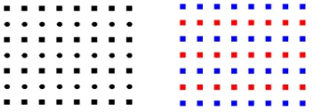
Our visual system forms groups for objects that are near each other. This happens automatically during an early stage of visual processing. In the following two images, the distances between the dots differ slightly. In the image on the left, the rows are closer together than the columns causing most people to see the dots organized into columns. In the right image, the columns are closer together than the rows causing most people to see the dots organized into rows.
Figure 2.3: Effect of proximity on object grouping. On the left the dots are closer vertically than horizontally and on the right the reverse is true. (Ware, 2004).
2.2.2 Similarity
to be grouped together. The objects
color is varied. Again, the shapes are organized into rows based
Figure
On the left objects are grouped by shape while on the right they are grouped by color (Ware, 2004)
2.2.3 Connectedness
According to Ware, connectedness was introduced by Palmer and Rock as a fundamental Gestalt organizing principle.
groups.
Figure
connected. Here objects are connected with horizontal and vertical lines
2.2.4 Continuity, Symmetry,
In Figure 2.6 people tend to see
four individual lines that meet at one point. This illustrates the principle of where we construct objects out of visual cues that are smooth and continuous.
to be grouped together. The objects in the right of Figure 2.4 have the same shape but the color is varied. Again, the shapes are organized into rows based on their similar colors.
Figure 2.4: Effect of similarity on grouping. On the left objects are grouped by shape while on the right they are grouped by color. (Ware, 2004).
According to Ware, connectedness was introduced by Palmer and Rock as a fundamental Gestalt organizing principle. Here the objects connected by a line tend to form
Figure 2.5: We tend to group objects that are somehow connected. Here objects are connected with horizontal and vertical lines. (Ware, 2004)
, Symmetry, Closure, and Relative Size
people tend to see the left most figure as two crossed lines rather than four individual lines that meet at one point. This illustrates the principle of
ere we construct objects out of visual cues that are smooth and continuous.
have the same shape but the on their similar colors.
According to Ware, connectedness was introduced by Palmer and Rock as a Here the objects connected by a line tend to form
two crossed lines rather than four individual lines that meet at one point. This illustrates the principle of continuity
We tend to perceive two symmetrical objects as a single object. The two wavy lines immediately to the right of the cross tend to appear as two distinct lines. However, if one of the lines is flipped, then the resulting symmetry suggests that the lines belong together as a single object.
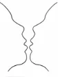
Closed contours tend to be seen as a single object. We also tend to see contours as
closed even though they have gaps. The blue circle in Figure 2.6 is perceived to be whole and partially hidden by the green rectangle rather than as three quarters of a pie. Relatively
smaller objects tend to be perceived as objects in preference over larger objects. At the far right of Figure 2.6 most people see blue objects over a red background rather than red objects on a blue background.
Figure 2.6: Examples of continuity, symmetry, closure, and relative size. (Ware, 2004)
2.2.5 Figure and Ground
2.3
Pre-attentive Processing
The Gestalt Laws help to explain how we perceive patterns. Pre-attentive processing helps to explain why some patterns “pop out” and are distinguishable from other patterns (Healey, Perception in Visualization, 2009). Pre-attentive processing occurs early in visual perception and determines what visual features grab our attention.
An example is color. The red circle below is immediately noticed by our visual system. Another example is a counting exercise. On the right of Figure 2.8 are several rows of numbers. Some of the 3’s are colored red. When given the task of counting the 3’s, subjects were able to count the red threes in constant time regardless of the number of other distracting numbers. When the 3’s were the same color as the distracters, the time to count them increased linearly as the number of distracters increased.
21820184029140923472 14987293479827349287 34982734927814721472 93847297349273492714 92714258621974374100 83423384710984098215 87235978927498721498 79871492378927159827
34927149
Figure 2.8: Color is pre-attentively processed and allows us to locate objects quickly. (Healey, Perception in Visualization, 2009) (Ware, 2004)
Examples cited by Healey are presented in
Intersection Density Curvature
Intensity Lighting Color
Figure 9: Visual cues that are processed pre-attentively. (Healey, Perception in Visualization, 2009)
Additional examples cited by Ware (Ware, 2004) are presented in Figure 2.10 and Table 2.1
Orientation Shape Size
Table 2.1: Visual cues that are pre-processed by the human visual system (Ware, 2004).
• Form
o Line orientation o Line length o Line width o Line collinearity o Size
o Curvature o Spatial grouping o Blur
o Added marks o Numerosity • Color o Hue o Intensity • Motion o Flicker
o Direction of motion
• Spatial Position
o 2D position o Stereoscopic depth
o Convex/concave shape from shading
Pre-attentive processing is also fast and accurate. Pre-attentive tasks such as searching for particular features happen in 200 ms or less and this time is constant regardless of the number of elements displayed (Healey, Perceptual techniques for scientific visualization, 1999). A typical computer display contains about one million pixels. When properly displayed for pre-attentive processing, a single computer monitor could easily represent 100,000 nucleotides of a DNA sequence while using only ten percent of the available display area.
2.4
The Central Dogma of Molecular Biology
What is life? What distinguishes a living thing from a non-living thing? After many years of observation and experimentation we have reached several conclusions. Living things consist of microscopic cells. Certain species such as bacteria consist of single cells while others such as humans consist of billions of cells. Cells differ from each other and this is particularly evident in multi-cellular organisms. Blood cells differ from nerve cells which differ from muscle cells which differ from skin cells.
Cells divide to produce more cells. Humans arise from many cell divisions beginning with a single cell – the fertilized egg. When the egg divides it produces identical copies of itself. Yet, with time those copies change allowing the cells to differentiate into many different cell types. We now know that each new cell receives an exact copy of its parent’s DNA. We also know that DNA controls the production of proteins and it is these proteins that give each cell its particular characteristics.
DNA serves as a template for creating proteins. First, small sections of DNA are copied to produce another molecule called RNA. RNA consists of the same nucleotides as DNA except that uracil (U) is used in place of thymine (T). Typically, a few hundred to several thousand DNA nucleotides are transcribed to produce a single RNA molecule. An A in DNA will result in a U in RNA. C will be transcribed to G, G to C, and T to A.
Once created, the RNA molecule serves as a template to produce a protein – another polymer consisting of a chain or sequence of amino acids. In this case triplets of nucleotides in RNA are translated into amino acids. With four nucleotides, there are 64 possible triplets. However, there are only 20 amino acids. Consequently, there is some redundancy where more than one triplet will be translated to the same amino acid.
Figure 2.11: The central dogma of molecular biology. (Crick, 1970)
The solid arrows refer to the most common transfers while the dotted arrows refer to specialized transfers. This figure is referred to as the central dogma of molecular biology
and was published in Crick’s paper of the same name, “Central Dogma of Molecular Biology” (Crick, 1970).
The interplay between DNA, RNA, and protein can be viewed as an exchange of information. Thus, the central dogma can be viewed as a flow of information with messages being encoded as DNA, RNA, or protein. The way that RNA is created from DNA or the way that protein is created from RNA can be viewed as a complex communication system. Understanding the details of this system is one of the main goals of molecular biologists.
exons are spliced together to form a final RNA molecule that is then translated into protein. Different exons can be spliced together to form different proteins.
Another complexity is that some proteins bind to DNA affecting how DNA is subsequently transcribed into RNA. These proteins can either inhibit or enhance DNA transcription. Through this complex feedback loop certain proteins can affect the creation of other proteins.
We know that DNA twists and folds and that the final shape of DNA can also affect transcription. Folding allows certain regions of DNA to be exposed to the machinery that transcribes DNA to RNA. Folding also hides certain regions of DNA from this machinery preventing transcription. Folding seems to depend on the sequence of nucleotides with different sequences resulting in different shapes. However, the binding of proteins such as histones also plays a role because they can hide or expose portions of DNA.
2.5
DNA Sequence Analysis
Now that we know the sequences of nucleotides in the human chromosomes as well as the sequences of nucleotides for the chromosomes of other species, we can begin to analyze the data. The goal of DNA sequence analysis is to help unravel the details of the central dogma of molecular biology – to determine exactly how information flows between DNA, RNA, and proteins. There are several ways to do this analysis and what follows is a review of several common approaches. This brief review is based on material in the texts by (Mount, 2004), (Pevsner, 2003), (Durbin, Eddy, Krogh, & Mitchison, 1998) and (Jones & Pevzner, 2004).
Perhaps the most obvious way to analyze DNA is to compare sequences to find similarities and differences. These similarities and differences help us to infer evolutionary relationships between species. They also help us to develop rules to locate genes, exons, and introns. We can compare sequences two at a time or we can compare several at a time. Comparing sequences involves creating a pairwise sequence alignment or a multiple sequence alignment depending on the number of sequences involved.
space in the first row is called an insertion while a column containing a space in the second row is called a deletion. Generally speaking, an optimal alignment maximizes the number of matches while minimizing the number of mismatches, insertions, and deletions. Multiple sequence alignments extend this concept to a matrix with multiple rows for multiple sequences.
Similar sequences are believed to share an evolutionary relationship. Over many generations DNA sequences will have diverged due to nucleotide insertions, deletions, and substitutions. These changes affect the flow of information between DNA, RNA, and protein resulting in both subtle and not so subtle changes to cells, tissues, and organs.
Finding both closely related (well aligned) and distantly related (poorly aligned) sequences is important because it is thought that related (and, therefore, well aligned) sequences perform common functions. Knowing how a sequence behaves in one species can provide clues about how a related sequence will behave in another species. The ability to make these comparisons is particularly helpful for studies related to humans. When it is unethical or impractical to perform experiments on human subjects, we can gain insights from animal studies and can extrapolate those insights when human DNA is found to align well with that of another species.
success to distinguish between protein coding and non-protein coding regions. In other cases we can develop more complex statistical models such as hidden Markov models to capture dependencies between regions of DNA. For example, such models attempt to distinguish between exons and introns or attempt to identify promoter regions where proteins bind to enhance or inhibit transcription.
Another method for analyzing DNA looks for either underrepresented or overrepresented strings of nucleotides in a larger DNA sequence or across several sequences. Searching for these strings is complicated because they might not be exactly the same due to mutations. Nevertheless, the idea is that such strings represent biologically important sequences – possibly regulatory motifs that serve as protein binding sites to either enhance or inhibit transcription.
Many genetic diseases are associated with abnormally repetitive sequences. For example, Huntington’s disease is associated with an excessive number of CAG’s in the huntingtin gene. Methods that look for repetitive sequences in DNA represent yet another way to analyze DNA.
2.6
Visualization Techniques: A Review
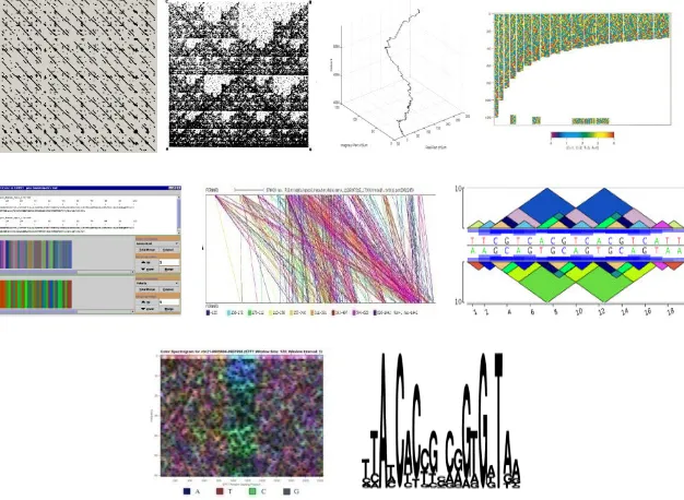
There have been few attempts to visualize patterns in DNA over the past 30 years. These approaches include dot plots, chaos game representations, DNA walks, color coding, color merging, repeat graphs, pygrams, spectral analysis, and sequence logos. Examples are presented in Figure 2.12.
Figure 2.12: Examples of DNA visualization. Top row: dot plots, chaos game representation, DNA walk, color coding; middle row: color merging, repeat graph, pygram; bottom row: spectrogram, sequence logos. (Maizel & Lenk, 1981) (Jeffrey, 1990) (Yoshida, Obata, & Oosawa, 2000) (Berger, Mitra, Carli, & Neri, 2004) (Alston, Johnson, & Robinson, 2003) (Durand, Mahe, Valin, & Nicolas, 2006) (Dimitrova, Cheung, & Zhang, 2006) (Schneider & Stephens, 1990)
dot plot a sequence may be compared to another sequence or to itself. Because dot plots frequently fill with a great number of points, filtering techniques and heuristics are employed to reduce the number of points to reveal diagonals that indicate regions in common in the two sequences. A limitation of dot plots is that they require the two sequences to have regions in common. If the sequences lack commonality, then the plot consists of points where matches occur at random thus providing no result.
Chaos game representations (Jeffrey, 1990) are also scatter plots. Fractals emerge from an iterative process of placing points in the plot. Construction begins by randomly placing an initial point at the center of a small set of vertices. Subsequent points are plotted by randomly choosing one of the vertices and plotting a point half way between the vertex and the previously plotted point. Using this process and an initial set of three vertices produces a Siepinski triangle. The technique is applied to a DNA sequence by using the nucleotides in the sequence to choose the next vertex. The resulting scatter plot serves as a unique signature for the sequence. As with a dot plot, chaos game representations quickly fill with points that must be filtered to reduce the noise in the image. This is particularly true with large sequences. Chaos game representations have the added problem that it isn’t clear how features in the plots correspond to features in the sequences that are of interest to biologists.
x 6 cols, etc. through 28 rows x 21 cols. Each point corresponds to a nucleotide in the sequence. For example the point at row 5, column 5 corresponds to the 25th nucleotide. Each point is colored in one of four colors. Examining the plots for diagonals reveals the presence of repeating nucleotides. However, the plots are filled with points and these patterns are hard to discern from the background.
Color merging (Alston, Johnson, & Robinson, 2003) represents nucleotides as colored vertical bars. Color merging allows one to zoom in or out of a sequence. When zoomed in, each nucleotide is rendered in its respective color. When zoomed out, colors are merged according to a formula. The technique has been tested to visually differentiate regions of hydrophobicity (i.e. attraction or repulsion to water). It isn’t clear how color merging would be used for general pattern finding.
Repeat graphs and pygrams (Durand, Mahe, Valin, & Nicolas, 2006) visualize the structure of repeats. Repeat graphs rely on numerous colored lines connecting the repeats between two sequences. Pygrams rely on colored triangles superimposed on a sequence where the base of a triangle spans a repeat. Multiple triangles of the same area and color reflect the same repeats in the sequence. Each is used after another technique performs repeats analysis. Neither is used alone and consequently each has the same limitations as the algorithm that was used to find the repeats.
biological interest. The spectrogram alone, however, cannot reveal which characters are repeating nor is it clear how the patterns in a spectrogram map to specific patterns in a sequence.
Sequence logos (Schneider & Stephens, 1990) are constructed from consensus sequences. Different sized characters represent the nucleotides with large characters reflecting strong consensus and small characters reflecting weak consensus. Interesting biological patterns are revealed only if the multiple sequences being compared have regions in common.
Of these techniques dot plots and sequence logos have had the greatest acceptance by far. Dot plots are specifically useful for comparing two sequences whereas sequence logos are used extensively with multiple sequence alignments and the frequency profiles that are calculated from them. Both are fairly easy to understand and interpret which likely contributes to their popularity.
3
Inspiration from the Sieve of Eratosthenes
The material in this chapter appeared as a featured communication of Notices of the
American Mathematical Society in May, 2008. (Cox, Visualizing the sieve of Eratosthenes, 2008)
The integers are the ultimate sequential data. Prior to working with DNA sequences, a technique to visualize the relationship of the integers to their divisors was created. The result was a scatter plot that is a graphical variation of the sieve of Eratosthenes – a technique developed 2,000 years ago for finding prime numbers. This novel visualization of the sieve of Eratosthenes directly led to the visualization of DNA sequences with symbolic scatter plots. This chapter presents result.
presented. Despite the simplicity of this method, when enough dots are generated, the resulting image turns out to be stunning. This article demonstrates well that computerized visualization can shed new light on old subjects—even those more than 2,000 years old.
According to (Gullberg, 1997) Eratosthenes lived from 276 to 194 BC. Only fragments of Eratosthenes’s original documents have survived. However, a description of his sieve method for finding prime numbers was described in “Introduction to Arithmetic” by Nicomedes written sometime prior to 210 BC(Cojocaru & Murty, 2005).
To use the method, imagine a written sequence of numbers from 2 to n. Starting at 2 cross off every other number in the sequence except for 2 itself. When done, repeat for 3 (which will be the next remaining number in the sequence) by crossing off every third number. When done, the next number remaining in the sequence will be 5. Repeat the process for every fifth number in the sequence. Continue with this process until you reach the end of the sequence. At the end of the process the numbers remaining in the sequence will be the primes. Here is an example.
Start with a sequence of integers:
2 3 4 5 6 7 8 9 10 11 12 13 14 15 16 17 18 19 20 21 22 23 24 25 26 27 28 29 30 Keep 2 but eliminate every second number beyond 2:
2 3 4 5 6 7 8 9 10 11 12 13 14 15 16 17 18 19 20 21 22 23 24 25 26 27 28 29 30 Keep 2 and 3 but eliminate every third number beyond 3:
2 3 4 5 6 7 8 9 10 11 12 13 14 15 16 17 18 19 20 21 22 23 24 25 26 27 28 29 30 At completing the sieve of Eratosthenes the following numbers remain:
2 3 5 7 11 13 17 19 23 29
These prime numbers have a few interesting properties. They are not divisible by any other numbers except 1 and themselves. All other numbers ultimately are divisible by some subset of the primes. Because of these fundamental properties both the prime numbers and the sieve of Eratosthenes have been studied intensely for 2,000 years. One would think that everything there is to know about the method has long since been discovered. Indeed, there are advanced sieve methods and optimization methods. However, these are significant variations of the original method and do not provide any additional characterization of the original method itself. After 2,000 years what more could be said?
This chapter explores the use of computerized visualization to further characterize the sieve of Eratosthenes. After all, Eratosthenes didn’t have a computer and computer graphics and visualization have only been widely available for the past 20 or 30 of those 2,000 years. With a simple extension of the sieve we arrive at novel result. In the next chapter this result is extended to DNA sequences.
3.1
The Method
column contains a dot. This would correspond to crossing off every number in Eratosthenes original sequence. In the original method this is not done. However, in two dimensions it proves useful.
In the second row of the matrix, every other column contains a dot starting with the second column. This corresponds to crossing off every other number in the original sequence. In the third row, every third column contains a dot starting with the third column. Again, this corresponds to crossing off every third number in the original sequence. In general, in the nth row, every nth column contains a dot starting with the nth column.
Aside from extending the one dimensional sequence of length n to a two dimensional matrix of size n x n, the process of crossing off numbers (using dots) remains faithful to the original method with two differences. In the first row every number is marked with a dot. In the remaining rows every nth number is marked with a dot including n itself. Consequently, even though 2 is not crossed off in Erathosthenes’s original sequence, it is marked with a dot in row 2. The same holds for rows 3, 5, 7, etc. The implication of this is that a prime number corresponds to a column containing two dots – one in the first row (division by 1) and one in the nthrow (division by the number itself).
3.2
Results
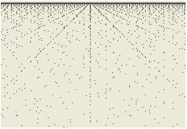
Figure 3.1 shows several hundred columns and rows beginning with column 1 on the left. The most striking feature is the set of diagonals. Close inspection of these diagonals reveals a pattern. The main diagonal has a slope of 1 and consists of contiguous dots. The adjacent diagonal has a slope of 2 and has a dot in every other column. The third diagonal has a slope of 3 and has a dot in every third column. And so on. Remarkably, these diagonals are constructed in exactly the same manner as the rows from which the image was constructed.
Figure 3.1: A visual representation of the sieve of Eratosthenes beginning with the number 1. Remarkably, the diagonals are constructed in exactly the same manner as the rows. Dots appear in every column for the diagonal with slope 1. They appear in every other column for the diagonal with slope 2. They appear in every third column for the diagonal of slope 3. And, so on.
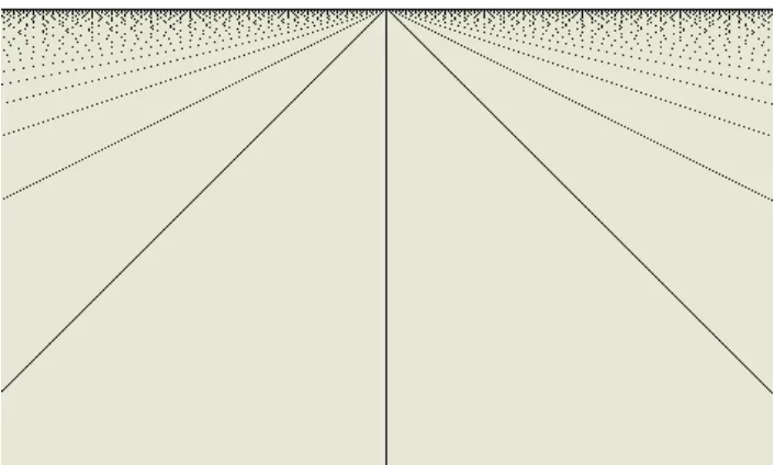
appear parabolic-like structures (these structures have, in fact, been proven to be parabolas and it has been proven that they are all oriented in the same direction).
Figure 3.2: Further along in the matrix diagonals merge to reveal left facing parabolas.
Some of the diagonals radiating out from the first row will be very prominent. An example is 327600 as shown in Figure 3.3. This prominence is related to the number of dots in the central column. The more dots plotted, the more prominent the diagonals. This is easy to understand by considering that a dot represents that column c is evenly divisible by row r. Consider two rows, r1 and r2, that both evenly divide column c. If c is divisible
by r1, then so is c + r1. Similarly, c + r2 is divisible by r2. Consequently a dot will be
plotted at (r1, c+r1) and another dot will be plotted at (r2, c+r2). These points lie on a line
with a slope of 1. The same reasoning can be extended to a dot at (r1, c+2r1) and another at
Figure 3.3: Diagonals radiate from the first row of every column. Some are more visible than others. Those most visible correspond to numbers with the most divisors. The pattern of dots in each diagonal is identical. Only the spacing increases as the diagonals approach the horizontal.
Figure 3.4: The matrix as it appears from column 0.
Another remarkable feature of Figure 3.4 is that the diagonals all seem to converge to a point. In fact, the convergence is real and the point is (0, 0).
Any binary image is easily represented numerically using 1’s and 0’s. Consequently, Figure 1 can be represented as in Figure 3.5.
1 1 1 1 1 1 1 1 1 1 1 0 1 0 1 0 1 0 1 0 1 0 0 0 1 0 0 1 0 0 1 0 0 0 0 0 1 0 0 0 1 0 0 0 0 0 0 0 1 0 0 0 0 1 0 0 0 0 0 0 1 0 0 0 0 0 0 0 0 0 0 0 1 0 0 0 0 0 0 0 0 0 0 0 1 0 0 0 0 0 0 0 0 0 0 0 1 0 0 0 0 0 0 0 0 0 0 0 1 0 0 0 0 0 0 0 0 0 0 0 1
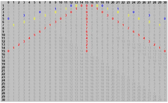
Carrying this idea further, these numbers can be replaced by remainders. In other words, each cell will contain the value c mod r where c and r are the column and row respectively. Doing so gives the result in Figure 3.6.
0 1 2 3 4 5 6 7 8 9 10 11 12 13 14 15 16 17 18 19 20 21 22 23 24 25 26 27 28 29 30
1 0 0 0 0 0 0 0 0 0 0 0 0 0 0 0 0 0 0 0 0 0 0 0 0 0 0 0 0 0 0 0
2 0 1 0 1 0 1 0 1 0 1 0 1 0 1 0 1 0 1 0 1 0 1 0 1 0 1 0 1 0 1 0
3 0 1 2 0 1 2 0 1 2 0 1 2 0 1 2 0 1 2 0 1 2 0 1 2 0 1 2 0 1 2 0
4 0 1 2 3 0 1 2 3 0 1 2 3 0 1 2 3 0 1 2 3 0 1 2 3 0 1 2 3 0 1 2
5 0 1 2 3 4 0 1 2 3 4 0 1 2 3 4 0 1 2 3 4 0 1 2 3 4 0 1 2 3 4 0
6 0 1 2 3 4 5 0 1 2 3 4 5 0 1 2 3 4 5 0 1 2 3 4 5 0 1 2 3 4 5 0
7 0 1 2 3 4 5 6 0 1 2 3 4 5 6 0 1 2 3 4 5 6 0 1 2 3 4 5 6 0 1 2
8 0 1 2 3 4 5 6 7 0 1 2 3 4 5 6 7 0 1 2 3 4 5 6 7 0 1 2 3 4 5 6
9 0 1 2 3 4 5 6 7 8 0 1 2 3 4 5 6 7 8 0 1 2 3 4 5 6 7 8 0 1 2 3
10 0 1 2 3 4 5 6 7 8 9 0 1 2 3 4 5 6 7 8 9 0 1 2 3 4 5 6 7 8 9 0
11 0 1 2 3 4 5 6 7 8 9 10 0 1 2 3 4 5 6 7 8 9 10 0 1 2 3 4 5 6 7 8
12 0 1 2 3 4 5 6 7 8 9 10 11 0 1 2 3 4 5 6 7 8 9 10 11 0 1 2 3 4 5 6
13 0 1 2 3 4 5 6 7 8 9 10 11 12 0 1 2 3 4 5 6 7 8 9 10 11 12 0 1 2 3 4
14 0 1 2 3 4 5 6 7 8 9 10 11 12 13 0 1 2 3 4 5 6 7 8 9 10 11 12 13 0 1 2
15 0 1 2 3 4 5 6 7 8 9 10 11 12 13 14 0 1 2 3 4 5 6 7 8 9 10 11 12 13 14 0
16 0 1 2 3 4 5 6 7 8 9 10 11 12 13 14 15 0 1 2 3 4 5 6 7 8 9 10 11 12 13 14
17 0 1 2 3 4 5 6 7 8 9 10 11 12 13 14 15 16 0 1 2 3 4 5 6 7 8 9 10 11 12 13
18 0 1 2 3 4 5 6 7 8 9 10 11 12 13 14 15 16 17 0 1 2 3 4 5 6 7 8 9 10 11 12
19 0 1 2 3 4 5 6 7 8 9 10 11 12 13 14 15 16 17 18 0 1 2 3 4 5 6 7 8 9 10 11
20 0 1 2 3 4 5 6 7 8 9 10 11 12 13 14 15 16 17 18 19 0 1 2 3 4 5 6 7 8 9 10
21 0 1 2 3 4 5 6 7 8 9 10 11 12 13 14 15 16 17 18 19 20 0 1 2 3 4 5 6 7 8 9
22 0 1 2 3 4 5 6 7 8 9 10 11 12 13 14 15 16 17 18 19 20 21 0 1 2 3 4 5 6 7 8
23 0 1 2 3 4 5 6 7 8 9 10 11 12 13 14 15 16 17 18 19 20 21 22 0 1 2 3 4 5 6 7
24 0 1 2 3 4 5 6 7 8 9 10 11 12 13 14 15 16 17 18 19 20 21 22 23 0 1 2 3 4 5 6
25 0 1 2 3 4 5 6 7 8 9 10 11 12 13 14 15 16 17 18 19 20 21 22 23 24 0 1 2 3 4 5
26 0 1 2 3 4 5 6 7 8 9 10 11 12 13 14 15 16 17 18 19 20 21 22 23 24 25 0 1 2 3 4
27 0 1 2 3 4 5 6 7 8 9 10 11 12 13 14 15 16 17 18 19 20 21 22 23 24 25 26 0 1 2 3
28 0 1 2 3 4 5 6 7 8 9 10 11 12 13 14 15 16 17 18 19 20 21 22 23 24 25 26 27 0 1 2
29 0 1 2 3 4 5 6 7 8 9 10 11 12 13 14 15 16 17 18 19 20 21 22 23 24 25 26 27 28 0 1
30 0 1 2 3 4 5 6 7 8 9 10 11 12 13 14 15 16 17 18 19 20 21 22 23 24 25 26 27 28 29 0
Figure 3.6: Illustration of how the remainders are duplicated in each column. Again, the spacing increases as each diagonal approaches the horizontal.
3.3
Discussion
This simple method for visualizing the sieve of Eratosthenes has resulted in surprisingly complex patterns. The set of dots in each column represents a set of divisors for that column. Extending out from each column is a set of diagonals with slopes of 1, 2, 3, etc. containing sets of dots that map 1-to-1 to the divisors in the corresponding column. This is true for every column.
Every column except for column 0 has a finite set of dots and every integer has a finite set of divisors while 0 is divisible by everything. Hence, column 0 contains an infinite set of dots.
The original sieve is used to find prime numbers. In this method, the prime numbers are represented in the image as columns containing exactly two dots. Column c corresponds to a prime number if it contains a dot in row 1 and row c and nowhere else.
Alternatively, these images can be represented numerically using a matrix whose cells are filled with 1’s and 0’s. However, it is not necessary to limit the numerical representation to 1’s and 0’s. The cells of the matrix can also be filled with remainders found by dividing each column by each row. Doing so reveals copies of each number’s divisors along diagonals extending out from the first row. These diagonals have slopes of 1, 2, 3, etc.
with those of other numbers, they do not interfere with another number’s divisors. Interestingly, the spacing of the divisors along these diagonals mirrors the spacing of dots used to create the initial images.
Additionally, there are other parabolic patterns that emerge in these images. These patterns have been shown to be true parabolas and that they are all oriented in one direction. Perhaps the most interesting result is that the process of building the image had nothing to do with diagonals, parabolas, or other features. These features emerged from the plotting of points in each row following the method of Eratosthenes’ sieve. We can explain why we see these particular features using a number of Gestalt laws. Perhaps the most relevant are the laws of symmetry and closure. Closure, in particular, comes into play as we perceive complete lines and curves from the collections of points.
These images illustrate the wonderful nature of the integers. Moreover, these images illustrate that even with a method more than 2,000 years old, a surprising new way of viewing the results can be found through the use of computerized visualization.
4
Symbolic Scatter Plots
Chapter 3 introduced a technique for visualizing patterns in a sequence of numbers. This chapter introduces a modification of this technique to visualize patterns in DNA. DNA is a large polymer constructed as a sequence of small molecules called nucleotides. There are four possible nucleotides: adenine, cytosine, guanine, and thymine. Typically, these are represented with the letters A, C, G, and T. A typical DNA sequence consists of thousands of nucleotides. A sequence beginning with AGGATC... and continuing with many additional nucleotides would be one example.
The strategy for visualizing a DNA sequence begins by converting the DNA from a sequence of characters to a sequence of numbers. Once converted, the strategy is as in chapter 3. Divide each number by a set of integers to calculate a set of remainders. If a remainder is 0, then plot a point. Otherwise, don’t.
A simple way to convert a DNA sequence to a sequence of integers is to represent each nucleotide as a number from 1 to 4. As an example, AGGATC would be converted into 133142. Each number in the sequence would be tested for divisibility by the numbers 1 to 4. If a number in the sequence is divisible by one of these divisors, then a point is plotted at the corresponding row and column.
strings called k-mers. Each k-mer contains exactly k characters. Because there are only four possible characters (A, C, G, and T) to choose from, the number of possible k-mers is 4k. Thus, there are 16 2-mers, 64 3-mers, 256 4-mers, and so on. By plotting points that correspond to k-mers rather than nucleotides, plots can be created with a larger number of rows.
Using 3-mers as an example, each overlapping 3-mer of a DNA sequence is converted to an integer ranging from 1 to 64. Zero is not used because it is divisible by everything. A plot is produced where each column corresponds to a position in the sequence. Each row corresponds to a divisor ranging from 1 to 64. If the 3-mer is divisible by a divisor, then a point is plotted in the row corresponding to the divisor and the column corresponding to the position of the 3-mer in the sequence. Two examples are shown in Figure 4.1 illustrating patterns formed from points distributed over 64 rows.
These images along with many others not shown here demonstrate that non-random patterns can be produced from DNA sequences using this technique. The images are intriguing. However, the technique has a shortcoming that could conceivably produce patterns that do not really exist. Different 3-mers will be divisible by different numbers of divisors. For example, assume that the 3-mer TCA maps to 12. In turn, 12 is divisible by 1, 2, 3, 4, and 6 leading to five points in every column that corresponds to TCA. In contrast if TTT maps to 1, then it is only divisible by 1 leading to a single point in its column. This difference would bias the observer towards certain 3-mers over others potentially leading the observer to find patterns correlated to the number of divisors rather than to the distribution of nucleotides in the DNA. To eliminate this bias, the technique was modified to plot one and only one point per column. Specifically, a point is plotted in the row corresponding to the integral value of a 3-mer. In the above example, TCA maps to 12. Thus a single point is plotted in row 12. Similarly, a single point is plotted in row 1 for TTT.
for AAA a single point is plotted in row 63. An example of such an image is shown in Figure 4.2. It was observed from this and other images that modifying the technique to eliminate any bias in the plots did not eliminate the patterns.
Figure 4.2: Effect of plotting one point per 3-mer.
Is there any relevance to the y-value? The y-values allow the points to be distributed vertically to produce patterns that draw the observer’s attention. Otherwise, they have no particular meaning. For 3-mers there are 64 y-values. The 3-mers could be mapped to these y-values in 64! ways. Different mappings will change the proximity of points to each other. As we have seen, proximity does affect perception. It will be shown later how different mappings can be exploited to help reveal different patterns. It will also be shown how different visual cues such as color can be added to the plots to enhance their usability. For now, several examples of the patterns revealed by these symbolic scatter plots are presented. All of these were created using DNA sequences from the human Y-chromosome.
Figure 4.3: An example of repeated 3-mers in a symbolic scatter plot.
The repeats in the middle correspond to the sequence
AAATAAAATAAAATAAAATAAAATAAAATAAAATAAAATAAAATAAAATAAAA.
While those on the left correspond to
GGAAAGAAAAGGAAAGCAAGGGAAGGGAAA
and those on the right correspond to
GGAAAGGAAAAGGAAAGGAGGGGATGAAGAAATCAAATAAT.
Putting them all together gives:
GGAAAGAAAAGGAAAGCAAGGGAAGGGAAAAAATAAAATAAAATAAAATAAAATAAAATAAA ATAAAATAAAATAAAATAAAATAAAATAAAGGAAAGGAAAAGGAAAGGAGGGGATGAAGAAA TCAAATAAT
While it is possible to see repetitions in the sequence from the text alone, it is much more of a challenge to see how the ends of the sequence differ from the middle and how much they resemble each other. In contrast it is much easier to distinguish these three regions in the symbolic scatter plot.
Figure 4.4: An illustration of how one region of a symbolic scatter plot is visually different from its surroundings.
The next image shows a structure highlighted in orange that appears frequently in DNA sequences. It corresponds to the sequence ATATATATATATAT. The arrows point to repeats of A’s. These repeats of A’s would normally go unnoticed even by programs that search for repeats because they are so short. However, the fact that they appear to be symmetrically arranged about the ATAT repeat makes them more interesting and easily noticeable.
Figure 4.5: What makes a portion of a DNA sequence interesting? Here repeats of AAA's are arranged symmetrically around a central set of repeats. Is this a coincidence or is there some biological relevance?
Figure 4.6: Small patterns such as these repeats would normally go unnoticed. However, their relatively large numbers make them visually conspicuous.
This next image shows a region that contains a moderate number of repeats interspersed with 3-mers that do not repeat or repeat in an irregular fashion. The highlighted region appears noticeably different from the surrounding regions.
Figure 4.7: An example of a slightly repetitive region that is distinct from its surroundings.
Figure 4.8: The human visual system groups objects at different levels. Here a series of several small groups of repeats are grouped to form a single whole. Such larger groupings are not easily identified algorithmically.
Our ability to group similar objects is also apparent in the following image. We can easily distinguish three different groupings while at the same time perceiving them as forming a single larger object based on their proximity to each other.
Figure 4.9: Here three very different groups of patterns are perceived by their close proximity to form a single objet.
Figure 4.10 contains two small clusters of dots arranged symmetrically about a center region. To the right are several small repeats that would normally go unnoticed. Further to the left is a regular little feature that also would normally go unnoticed. As for the region in the middle, can you tell that it consists of two regions arranged symmetrically about a center by glancing at the following text?
Figure 4.10: An example of many small features that are visually conspicuous. Visual cues such as proximity and symmetry make them stand out.
Patterns such as these occur throughout the DNA sequences that have been examined. The human Y-chromosome alone contains thousands of them. Some correspond to well know patterns of repetitive nucleotides. An example is the repetition of the nucleotide pair, AT, which is known as a “TATA” box. Most, however, correspond to patterns of nucleotides whose functions are unknown.
5
Sequence Analysis with Symbolic Scatter Plots
The material in this chapter is based on the paper, “An Analysis of DNA Sequences
Using Symbolic Scatter Plots” (Cox & Dagnino, An analysis of DNA sequences using symbolic scatter plots, 2009) presented at the 2009 International Conference on Bioinformatics & Computational Biology.
5.1
Introduction
Chapter 4 introduced the technique for creating symbolic scatter plots and presented several examples of patterns visible in the plots. This chapter considers the effectiveness of using symbolic scatter plots for sequence analysis. The types of tasks considered are 1) identifying tandem repeats, 2) identifying complex patterns, and 3) comparing sequences.
have nothing in common, then comparing them will find no significant patterns (Benson, 1999)(Schneider & Stephens, 1990).
Other methods look for regions called motifs that are statistically over-represented either within a single sequence or across several sequences. Examples of software of this type include MEME (Bailey, Williams, Misleh, & Li, 2006) and CONSENSUS (Stormo & Hartzell, 1989). A limitation of this approach is that if a pattern is not overrepresented in a sequence, then no motifs will be found (Frith, Fu, Chen, Hansen, & Weng, 2004)(Keich & Pevzner, 2002).
Some methods look for repetitive patterns. A popular (and possibly the most popular) tool for finding repetitive patterns in DNA sequences is Tandem Repeats Finder created by Gary Benson (Benson, 1999). A tandem repeat is a pattern that exists as many copies occupying consecutive locations within a sequence. These copies are sometimes exact but most often are inexact – that is the “copies” differ from each other through insertions, deletions, or substitutions of nucleotides. Tools such Tandem Repeats Finder identify the repetitive pattern, determine all the places where it is located, determine its periodicity, and characterize it statistically (e.g. to determine if the pattern could have arisen by chance).