Comparison of Supervised and Unsupervised Learning for Detecting
Anomalies in Network Traffic
Robert McAndrew Colorado State University
Stephen Hayne Colorado State University [email protected]
Haonan Wang Colorado State University [email protected]
Abstract
Adversaries are always probing for vulnerable spots on the Internet so they can attack their target. By examining traffic at the firewall, we can look for anomalies that may represent these probes. To help select the right techniques we conduct comparisons of supervised and unsupervised machine learning on network flows to find sets of outliers flagged as potential threats. We apply Functional PCA and K-Means together versus Multilayer Perceptron on a real-world dataset of traffic prior to an NTP DDoS attack in January 2014; scanning activity was heightened during this pre-attack period. We partition data to evaluate detection powers of each technique and show that FPCA+Kmeans outperforms MLP. We also present a new variation of the circle plot for visualization of resulting outliers which we suggest excels at displaying multidimensional attributes of an individual IP’s behavior over time. In small multiples, circle plots show a gestalt overview of traffic.
1.
Introduction
With the abundance of network security “events”, it is becoming more and more important to be able to gain insight into network traffic. Our adversaries want not only to steal data for use or sale, but also to disrupt the operations of their victims and impact their reputation. A significant challenge for the security community is to develop network intrusion detection systems that can automatically detect abnormal network access patterns. One of the most common forms of network intrusion is the “scanning” of networks (for a survey, see [1, 2, 3]). Prior to attacking, our adversaries scan to map the configuration of the network, identify the active hosts, the services running on those hosts, and whether these services are currently vulnerable. Scanning can be conducted by any number of tools (many of which are bundled into the Kali suite, for example); we do not attempt to distinguish which tool might have been used, only the fact that scanning may be occurring. Scanning
is often a prelude to a damaging attack [4].
Several approaches to find scanners use heuristic-based methods [2, 5], Machine Learning [6], and Statistical-based filtering [7]. Each of these methods have demonstrated deficiencies as shown by [8], who presented a blended approach of Functional Principal Component Analysis (FPCA) and K-means clustering. In this paper we expand this blended approach by comparing it to a supervised machine learning method to detect scanners. We use data from actual NTP traffic flows during the months prior to a reflective DDoS attack [5] - note we are not analyzing the attack. We also contribute a new technique for visualization of scanners, in a way that allows discovery and understanding of differences between flows for individual IPs.
2.
Related Work
Anomaly detection in networks is a frequently studied topic with a wide variety of applications (for review see [9, 10]). While there are general methodologies, accounting for knowledge of the type of anomaly sought can improve our potential for identification. Here, we focus on scanning as the network anomaly, and use their known and expected attributes to guide our approach.
Current techniques to detect scanners fall into one of two groups: (1) signature-based, which employs knowledge of previous anomalies to classify new observations, while (2) profile-based constructs data-driven, representative “usual” behaviors and searches for deviations from this to identify anomalies. An established signature-based approach is used by [2], which looks at the success of a remote host’s attempts at connecting to a local host. If the ratio of unsuccessful connection attempts to the successful exceeds two, the remote host is flagged as a scanner. A similar rule was employed by [5]. We refer to this as the “static fanout ratio”; [8] has demonstrated that this rule performs poorly if the data does not meet the exact threshold, e.g., many stealthy scanners are
Proceedings of the 52nd Hawaii International Conference on System Sciences | 2019
missed. Further, signature-based techniques cannot detect new scanning techniques, simply because they cannot recognize those which do not match their lists of signatures [11]. Profile-based approaches can be split into supervised or unsupervised and both have been applied to cyber-security anomaly detection [12]. Supervised approaches require labeled data, which is very problematic (similar to signature-based), in that behaviors not previously seen cannot be detected [ibid.]. Unsupervised methods prescribe their own labels based on the model. Clustering is a common method, but when applied to both attack and non-attack traffic, many false positives are co-mingled within the “malicious” cluster(s) ([13, 14, 15, 16, 17]). Combinations of clustering and other learning techniques have been suggested, and a few show promise ([8, 16, 11]). In this paper, we will compare the blended approach of [8] with a supervised technique based on the static-fanout ratio, in order to demonstrate the benefits of an unsupervised approach over a supervised approach trained with an accepted labeling mechanism.
To mitigate the inherent difficulty in detecting, filtering, classifying, and believing the patterns found within big data, Kryzwinski et al. [18], created the “circle plot”, which can (i) adapt to the data’s density and dynamic range, (ii) retain the data’s complexity and detail, and (iii) scale without sacrificing clarity and specificity. Circle plots have deeply impacted the fields of comparative and cancer genomics; referenced in over 3000 papers in top outlets such as Nature and PLoS One, and applied to other domains, e.g., car purchase or dating trends, and chemical reactivity [ibid.]. We suggest that circle plots can change the way scanner data is regarded and explored, much the same way that treemaps changed the understanding of the distribution of disk usage on a file system [19]. The circle plot has a high data-to-ink ratio, favorable scaling characteristics [20] and when organized into “small multiples”, allows for sophisticated quantitative reasoning by “visually enforcing comparisons of changes highlighting the differences among objects” [21].
3.
System Design and Dataset Description
Figure 1 shows the design of a Department of Homeland Security funded project called “NetBrane”
[22], where leading edge technologies are combined to build a shield while leaving data and sensitive services on the premises. The key novelty of the project lies in the confluence of: (a) SDN enabled small distributed footprint with 100G capture/filter capability for neutralizing DDoS (left side of figure), (b) elastic data analytics using near real-time flows and cloud capabilities (inside the red box), (c)
Figure 1. System architecture diagram
situational awareness, in terms of the global Internet information, and (d) proactive reconnaissance, by intelligent synthesis of information from multiple sources. In this paper, we report the results of comparing anomaly detection analytics on pre-attack network flows. At our large Mountain West University, we have installed optical taps to capture network flows at line rate (10gbps or more), and push those flows into hadoop (HDFS). We read these flows in small time intervals and analyze them applying both multi-core (parallel R packages) and multi-node (Spark and scala) platforms.
We will focus on an approximately one-month period (late October to early December, 2013) that led to a reflective DDoS on the NTP-port and service in January 2014. The data is a collection of time series of bi-directional packet flows to and from our university. For each source IP (SIP) and destination IP (DIP) pair, we have two series of non-negative counts, aggregated hourly: packets sent from SIP to DIP, and packets sent from DIP to SIP. A distinct data point is a SIP-DIP pair, along with both time series. The full dataset covers 772 hours (32 days) with 9248 distinct SIP-DIP pairs (1602 SIPs contacting 4795 DIPs) sending a total of about 3 million packets. As this is a real-world dataset, we do not have “ground truth” knowledge of which SIPs are true scanners, but as the time period is just prior to an attack, it is highly likely to include scanning activity.
Our methodological evaluations require both a training and testing dataset. We construct these by splitting our full dataset in half by time. That is, the first 386 hours form the training data and the second 386 form the testing data. In the training, this captures 3602 distinct SIP-DIP pairs (990 SIPs, 2189 DIPs) sending a total of 1.6 million packets. In the testing data, 6401 distinct SIP-DIP pairs (1028 SIPs, 3652 DIPs) send a total of about 1.4 million packets. Even though these are split evenly by time, they have slightly different packet counts due to variability in the traffic flows. Note that some IP addresses (both SIPs and DIPs) appear in both the training and testing datasets. This is acceptable; an IP address can be active on the network at many different
times. We find that both the training and testing sets are representative of usual traffic.
4.
Methodology
The analyses and comparisons of this paper are carried out in two phases: the ‘training’ and the ‘testing’. Training phase:We view determining scanner behavior as a classification problem - each SIP is to be labeled as, most generally, a scanner or non-scanner. This is carried out with two approaches: one supervised and one unsupervised. For the unsupervised technique, we use a two-step procedure based on FPCA and K-Means clustering [8]. The inclusion of FPCA as a first step before clustering is intended to remove the K-means concerns shown in [13]. The supervised technique we employ is the well-known Multilayer Perceptron (MLP), a non-linear version of a neural net that relies on backpropagation [23]. As labeled data is needed for MLP, we create labels for both the training and testing sets in two ways: a binary classification and clustering classification. The first uses the static fanout ratio of [5], thus labeling each SIP as a “scanner” or “non-scanner” (binary classification). In the clustering case, SIPs in the testing dataset are labeled as “non-outlier”, “low cluster outlier”, “mid cluster outlier”, and “high cluster outlier” according to FPCA+Kmeans. For both, MLP is trained on the labeled training data set. As FPCA+Kmeans is unsupervised, training is not needed in any scenario. Testing phase: We investigate the results of three different analyses: FPCA+Kmeans on the testing data, FPCA+Kmeans compared to MLP on the testing data with binary classifications, and FPCA+Kmeans compared to MLP on the testing data with cluster classifications (four labels). The first demonstrates use of the FPCA+Kmeans technique for scanner/outlier detection. The comparison in the case of binary labels demonstrates the differences between the supervised and unsupervised approaches when “ground truth” is approximated using an independent rule. The comparison in the cluster case illustrates the difference between the unsupervised approach and the supervised, but trained on an improved labeling mechanism [8].
4.1.
FPCA + K-means
The procedure begins with application of FPCA in order to first classify “outliers” in the data. We construct an n ×T matrix whose (i, t) entry is the count of distinct DIPs contacted by theith SIP during the tth hour. FPCA models this as a mean series plus a linear combination of eigenfunctions, which are orthogonal curves representing the descending dimensions of variance in the data; that is, the first eigenfunction can be thought of as the direction of highest variability, eigenfunction two the second most
variable, and so on. We employ the Principal Analysis by Conditional Expectation (PACE) algorithm of [24]. In order to select the number of eigenfunctions in our model, we apply the Akaike information criterion (AIC) and the Bayesian information criterion (BIC) [25]. For the data presented here, these agree on parameter selection; but we acknowledge this may not always be the case. Context-specific factors should be taken into account when deciding which criterion is more appropriate [26].
To classify SIPs, we calculate each observed series’ FPCA scores, which are projections of the data onto the eigenfunctions. Each SIP has one score for every eigenfunction, and that SIP is flagged as an “outlier” if at least one of its scores exceeds a three standard deviation threshold from the mean (well-known due to its standard application based on Chebyshev’s inequality [27]). For example, from the n scores on the first eigenfunction, we can calculate the bounds x¯±3s;x¯
is the mean score andsis the standard deviation. Any SIP whose first eigenfunction score lies beyond these bounds is flagged as an outlier. We use the term “outlier” because we do not think all SIPs flagged by FPCA are scanners - these are SIPs that contacted the network in an unusual way, which can clearly include activity other than scanning. Because of this, we carry out the second step of clustering these abnormal SIPs based on their rate of successful connections, where a “success” is characterized as the DIPs sending at least one packet back to the SIP. With this, we can investigate the cluster that exhibits behavior expected of a scanner, as our abnormal SIPs are now separated by their connectivity with the network.
In order to perform this clustering, we employ the K-means algorithm of [28]. The number of clusters in the application of K-means is chosen with the “elbow method”, which seeks the cluster amount such that adding one additional cluster would not have a significant impact on the fraction of variance explained (FVE) in the entire dataset [29]. K-means is run multiple times using randomly generated centers in order to assess sensitivity with respect to their centers, and we find that our data does not exhibit sensitivity to center selection. For our analysis, the elbow method selects three clusters, and we label the clusters based on relative order of their centers: “low”, “mid”, and “high”.
4.2.
Circle Plots
Given a set of classified SIPs, we desire a way to view the different clusters and behaviors within them. For most effective results, the graphical representation must: (1) display functional/temporal characteristics of the data, (2) demonstrate behavior of the SIP with
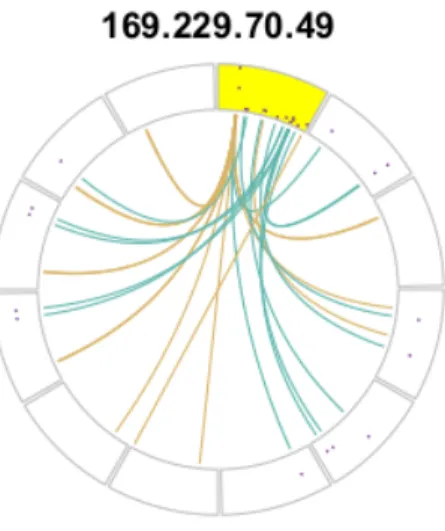
Figure 2. Circle plot’s outer track
respect to the whole network, and (3) demonstrate behavior of the SIP with respect to the individual DIPs it contacts. With such a plot, one should be able to identify and understand the results of any anomaly detection technique. We have chosen to use the “circle plot” [18], but do not merely adapt an existing circle plot technique. Rather, we take the individual aspects and features of examples discussed in the literature and adapt them to construct a new representation specific to network traffic. Each circle plot depicted herein represents a single SIP’s activity (indicated by the title of the plot) over a fixed length of time, and consists of two components, called the “outer track” and the “inner ribbons”. The outer track (Figure 2) consists of multiple segments. The segment just clockwise from the vertical radial of the circle formed by this outer track is always highlighted yellow to indicate that it corresponds to the SIP. The remaining segments going clockwise represent unique DIPs contacted by that source. Inside each of these segments, we plot the time series of non-zero packet flows with time increasing clockwise in each. The yellow-highlighted segment displays the series of packets sent by the SIP, while all other segments display the series of packets sent back to the SIP by the individual DIPs. The length of time represented in these segments is specified by the time-series of observations (i.e., hours) in the dataset. Note that each segment displays the same length of time, and that this is not related to the size of the individual segments - the annular width of each is determined by how many must be drawn, and thus how many DIPs were contacted by the SIP. In cases where a large number of DIPs are contacted (more than 80), the outer track can become densely packed with segments making each very narrow,
Figure 3. A complete circle plot
and thus the series may not be visible (see top plots of figure 4).
Ribbons are drawn in the interior of the circle (Figure 3), and connect the SIP segment to the distinct DIPs in order to represent an attempted connection. Ribbons originate in the SIP segment at the time the packets were sent, and terminate at the segment representing the DIP by which they were received. A teal ribbon denotes that the DIP sent packets back to the SIP, while an amber ribbon denotes that it did not.
A circle plot allows for visualization of a SIP’s activity in a window of time, specifically the frequency and severity of contacts made. Many segments in the outer track indicates a large number of DIPs contacted. The points within segments visualize the relative volume of packets sent and received by the SIP. The location and amount of ribbons show when and how often these contacts were made. The color of the ribbons gives an immediate notion of the proportion of successful contacts. To illustrate these benefits, consider the circle plot in Figure 3, where SIP 169.229.70.49 (last octet anonymized) contacted 11 unique DIPs (11 non-highlighted segments around the circle), sporadically (some gaps between points in the highlighted SIP segment) and with intermittent success (both teal and amber ribbons). The SIP sent relatively more packets in the beginning of the period than the end, as points in the SIP segment closer to the vertical radial are closer to the outer edge than those at the other end of the SIP segment.
Comparing behaviors between SIPs can be done by organizing circle plots for many SIPs in a grid. As shown in Figure 4, we propose it is easy to get a gestalt of the types of outliers, which can give insight and build
confidence in any subsequent clustering that might be performed. Note that the grids we present here are sorted by the number of DIP segments.
While the description above is tailored towards the goal of scanner detection, our variant of circle plots are extremely flexible in terms of what they can display. If packet counts are not as interesting a feature in some analyses, the series plotted in the outer track could show byte counts instead. Or, one could construct these plots from the opposite perspective, focusing on one DIP and displaying how it was contacted by different SIPs. Note that the format of a circle plot can be changed; in particular, more tracks can be added to display additional features, should they be relevant. Krzywinski et al. [18] demonstrate the many forms circle plots use for visualizing different aspects of genomics research; a path that we hope circle plots will follow in the field of network traffic classification.
Construction of circle plots was completed with the most current version of R (v. 3.5.0) using the ‘circlize’ package [30]. The computational cost of a single circle plot is small; many of the examples displayed here were completed in less than two seconds using a basic CPU. The circle plots which take the longest are those representing a SIP that contacts a large number of DIPs, due to the number of ribbons that must be drawn, e.g., the top-left circle plot of Figure 4 which took about five seconds. In practice, we create the SIPs’ circle plots using multiple cores (parallel computing in R, assigning a core to each plot) and then arrange the resulting individual plots into grids (small multiples), significantly reducing wait time for a user.
5.
Results and Comparisons
We first apply the unsupervised approach of FPCA+Kmeans to the full dataset, to act as an example of the method and how circle plots are used to better understand results and guide further analyses. We will discuss SIPs and their circle plots using the terms “blatant scanner”, “listkeeper”, “stealthy scanner”, and “active peer”. These names are given based on the type of behavior the SIP displays, and facilitate discussion of results. We are not stating that all scanner/outlier behaviors fall into one of these categories, rather that these are behaviors apparent in this dataset. Next, we compare the unsupervised approach to the supervised Multilayer Perceptron (MLP) in two ways: binary classification and clustering classification. In the binary case, the SIPs in the testing dataset are labeled as “scanner” and “non-scanner” according to the static fanout ratio. We show FPCA+Kmeans outperforms MLP on data with independently created labels. The clustering classification case labels the SIPs in the
testing dataset as “non-outlier”, “low cluster outlier”, “mid cluster outlier”, and “high cluster outlier” based on FPCA+Kmeans. We show that FPCA+Kmeans still outperforms MLP trained with labels from a more accurate mechanism.
Note we are not classifying SIPs with our terms for scanner behaviors, but rather the cluster to which they belong. The “blatant scanner”, “listkeeper”, “stealthy scanner”, and “active peer” terms are used in the clustering classification comparison to facilitate discussion of results from each method, but these are independent of FPCA+Kmeans and MLP classification.
5.1.
FPCA+Kmeans on Full Data
When applying our two-step procedure to the entire dataset, 89 out of the 1602 distinct SIPs are flagged as outliers. When applying K-means, we observe three clusters. Recall that outlier clustering is based on proportion of successful contacts, so cluster centers are values between 0 and 1. In particular, we observe low (Figure 4), mid (Figure 5), and high (Figure 6) clusters, with centers .209, .664, and .993, respectively. The circle plots clearly display similarities within each cluster; notice how the plots represent distinct types of behaviors due to the density and coloring of the ribbons. This permits us to understand multiple SIPs’ behaviors without inspecting the original data for each individually. In addition, it allows for strange activity to be pinpointed quickly. For example, in the low cluster (Figure 4), there are a handful of SIPs that contact many DIPs but have very little success. These are the first four of the figure, with these features being indicated by the nearly solid amber center of the circle plot. We refer to these as “blatant scanners”, because they act as we expect of scanners but are relatively easy to detect with a heuristic. Following these are outliers still contacting many destinations, albeit more successfully. In the lower half of Figure 4, these plots represent SIPs that only contact a small amount of DIPs, indicated by the fewer segments on the outer track. Also note that these SIPs reach out to DIPs at only one point in the time series, shown by the ribbons originating at the same place in the yellow segment. We suggest this behavior is very much like a “stealthy scanner” [3].
Examining the mid cluster in Figure 5, we see a different behavior: SIPs that contact a few DIPs quite consistently, frequently, and with varying success. We refer to these as “listkeepers”, because they behave similarly to scanners but it is as if they are updating information on previously detected vulnerabilities.
The high cluster in Figure 6 shows the most similarity among circle plots. These SIPs are those that were flagged as outliers but had a high rate of
134.147.203.7 106.37.190.206 38.229.1.61 58.17.52.247 17.171.4.165 17.151.16.2
17.171.4.149 17.151.16.3 17.151.16.27 17.151.16.1 17.171.4.166 17.171.4.167
17.151.16.0 17.171.4.147 17.171.4.148 17.171.4.150 17.151.16.5 17.171.4.90
17.151.16.4 17.151.16.6 17.171.4.92 17.151.16.7 17.171.4.117 17.171.4.93
17.151.16.56 17.171.4.91 17.171.4.116 17.151.16.22 17.171.4.94
Figure 4. Full dataset - low cluster
17.151.16.33 17.151.16.24 17.171.4.146 91.189.94.84 169.229.70.173 66.187.233.33 173.255.193.57 128.113.28.77 204.2.134.151 204.109.63.20 169.229.70.126 208.87.104.143 204.2.134.150 169.229.70.197 91.189.89.19 204.235.61.67 76.17.222.143 173.230.158.74 198.58.100.23 209.114.111.135 174.36.71.10 96.44.142.8 149.20.68.120 50.23.135.74 199.7.177.124 67.18.187.246 142.54.181.92 72.8.140.108 72.8.140.119 198.199.111.44 17.171.4.118
Figure 5. Full dataset - mid cluster
129.6.15.26 17.151.16.20 129.19.63.23 24.8.181.75 128.210.205.204 67.41.223.85
129.19.6.194 192.11.69.85 129.19.1.12 165.127.125.148 74.7.177.209 184.159.52.73
50.198.214.18 192.11.130.49 129.19.6.178 50.198.214.21 129.7.48.200 76.76.71.53
50.134.249.69 129.19.63.127 84.50.17.110 75.71.192.164 129.19.1.74 70.56.53.118
24.54.161.188 129.19.63.92 216.17.139.120 50.134.253.111 67.40.137.217
Figure 6. Full dataset - high cluster
successful contacts. As previously stated, we do not believe that all SIPs flagged as outliers are scanners, and the step of clustering provides better separation among the set. In fact, a majority of SIPs in the high cluster are engaging in potentially trusted NTP behavior: one SIP contacting one DIP in a uniform way and always receiving a response. As such, we refer to these as the “active peers”, which we believe have a lower priority to be investigated as scanners than the other clusters, but can be looked at in greater detail to determine if they are trusted. For high resolution plots of exemplars for these four labels, see “Supporting File 1”.
It is apparent that some types of circle plots appear in more than one cluster. For example, there are SIPs that contact three or four DIPs with one burst of packets in each cluster (bottom right of Figure 7, bottom left of Figure 5, top left of Figure 6). This behavior could certainly be thought of as indicating a scanner and should not be ignored because it appears in the high cluster. With so few DIPs contacted, the proportion of success for these SIPs can vary drastically. Thus, seeing these plots across clusters indicates that this behavior appeared with a varying degree of success, and perhaps that these in the high cluster should be studied more closely.
5.2.
Comparison to Multilayer Perceptron
Multilayer perceptron (MLP) is a supervised technique that requires a training dataset with labeled responses (i.e., labeled SIPs) and corresponding covariates on which to learn. When labeling the training set, the covariates used are features of the data which the mechanism that generated the labels relies on. For the static fanout ratio (binary) scenario, this is the count of instances in which the SIP exceeds the static threshold. In the FPCA+Kmeans (clustering) scenario, the covariates are the number of DIPs contacted by the SIP and the proportion of success.After MLP is trained and applied to the testing dataset, the output is a numerical value for each SIP in the test set. In the binary classification case, these values exist between 0 and 1, with 0 indicating “non-scanner” and 1 indicating “scanner”. In the clustering classification case, these values exist between 0 and 3, with 0 representing “non-outliers”, 1 indicating “low cluster”, 2 the “mid cluster”, and 3 the “high cluster”. The output values may not necessarily be integers, so rounding rules are implemented to assign fractional values to a label. For example, if MLP produces a value of 1.75 for a SIP, it is classified as part of the mid cluster.
The first case we consider uses results of the static fanout ratio as an approximation of “ground truth”. This
134.147.203.7 106.37.190.206 38.229.1.61 17.171.4.146 17.171.4.165 17.171.4.149 17.151.16.2 17.151.16.33 17.151.16.3 17.171.4.166 17.171.4.148 17.151.16.24 17.151.16.27 17.171.4.147 17.151.16.0 17.171.4.167 17.171.4.150 17.151.16.1 174.36.87.204 188.93.60.124 195.211.240.248 80.93.56.46 17.151.16.5 17.151.16.176 17.171.4.73 176.57.216.124 176.57.216.24 17.151.16.4 17.151.16.6 17.171.4.75 17.171.4.102 17.171.4.96 17.151.16.161 17.171.4.90 17.171.4.92 17.151.16.162 17.151.16.179 17.171.4.103 17.151.16.163 89.184.81.166 17.151.16.7 17.171.4.117 17.171.4.93 17.171.4.99 17.151.16.56 17.171.4.91 17.171.4.116 17.171.4.74 17.151.16.160 17.171.4.97 208.43.63.123 144.76.219.120 46.4.116.147 17.151.16.22 128.113.28.77 17.171.4.94
Figure 7. FPCA+Kmeans testing data low cluster
identifies 19 SIPs in the training data and 57 SIPs in the testing data as scanners. Note that this case involves no clustering, and remaining SIPs in each dataset are labeled as “non-scanners”. To compare results, we only apply the first step of FPCA which gives a binary classification. As FPCA is unsupervised, we can apply it directly to the testing set without training. Applying the trained binary MLP to the testing set, none of the SIP
169.229.70.197 173.230.158.74 91.189.94.84 208.87.104.143 149.20.68.120 169.229.70.173 142.54.181.92 173.230.149.147 138.236.128.49 198.58.100.23 50.23.135.74 204.2.134.151 204.235.61.67 199.7.177.124 174.36.71.10 216.66.0.198 94.79.10.218 198.55.111.45 198.98.51.20 204.2.134.150 66.187.233.33 209.114.111.135 67.18.187.246 18.85.44.31 198.199.111.44 204.109.63.20 76.17.222.143 96.44.142.8 199.30.140.195 66.228.59.9 64.246.132.191 209.118.204.227 15.185.186.118 66.175.209.79 69.65.40.184 17.171.4.118 129.6.15.26 205.233.73.126 65.49.70.124 91.189.89.19 108.61.73.71 68.11.14.92
Figure 9. FPCA+Kmeans testing data mid cluster
173.230.149.147 138.236.128.49 198.58.100.23 199.7.177.124
174.36.71.10 209.114.111.135 64.246.132.191 76.17.222.143
4.53.160.112 50.97.210.25 75.166.130.12 24.9.83.170
75.71.187.4
Figure 8. MLP testing data low cluster
addresses in the ground truth are flagged as scanners; in fact, the supervised technique detects no scanners at all, demonstrating that MLP does not learn well from the static fanout ratio (a fixed rule). When FPCA is applied to the testing data, 174 SIPs are flagged as outliers. 56 of these are scanners according to the static fanout ratio, so FPCA captures 98.25% of the “ground truth” (it misses one). While FPCA also identifies many SIPs that are not scanners, we believe these are more favorable results than those of MLP (supervised), which states there are no anomalies in the data. Recall that an important part of our methodology is that not all outliers found by FPCA are scanners, which still holds here.
In the clustering classification case, we classify all SIPs in the training data as “non-outlier”, “low cluster outlier”, “mid cluster outlier”, or “high cluster outlier” with FPCA+Kmeans (93 outliers are collected in the training dataset), and then use these labels to train MLP. The trained model will then be used to classify the testing data into the four groups, and results are compared to those of FPCA+Kmeans applied to the testing dataset. The addresses flagged by FPCA in this comparison form the same collection of 174 SIPs from the binary case, but now clustered with K-means.
While we have satisfied the need for labeled data, this does not include “ground truth”. In place of this, we investigate the clusters of SIPs from both approaches through circle plots. Figures 7 and 8 show the low clusters from the FPCA+Kmeans and MLP techniques, respectively. MLP detects a non-zero amount of SIPs (unlike in the binary classification case when learning
from the static fanout ratio). While MLP has found behavior similar to what we expect of scanners, it appears to have clustered them inappropriately.
The mid (Figures 9 & 10) and high (Figures 11 & 12) cluster comparisons show the same phenomenon, with certain behaviors appearing in the ‘incorrect’ cluster. For example, in the mid cluster of MLP in Figure 10, the last three circle plots display behaviors we suggest should place them in the high cluster, as their contacts are always successful. The disparities between the two high clusters are by far the greatest, as easily seen in Figures 11 and 12. The high cluster for MLP seems to have all three of our outlier types, with a few blatant scanners and listkeepers at the top and the active peers at the bottom.
To further compare the techniques, we look at the SIP addresses flagged by one method but not the other. We carry this out on the overall level; that is, we look at the differences between sets of outliers not clustered. This is due to the improper clustering discussed, which results in many of the SIPs common to both methods appearing in different clusters, e.g., the three “blatant scanners” in Figure 7 are the same SIPs as in Figure 12. Viewing these circle plots will allow us to investigate if one method detected behaviors the other did not.
FPCA flags 174 SIPs in the testing data as outliers, 72 of which are not identified by MLP. Circle plots for these are shown in Figure 13. On the other hand, MLP flags 103 SIPs, of which only one is not in the set detected by FPCA (Figure 14). This lone SIP exhibits behavior that we previously thought of as being an “active user”. Note that similar behavior is flagged by FPCA as well (last row of Figure 13). This
204.235.61.67 204.2.134.150 66.187.233.33
67.18.187.246 174.16.125.31 71.218.170.52
174.29.204.145
Figure 10. MLP testing data mid cluster
138.236.128.123 198.55.111.13 4.53.160.112 17.151.16.20 15.126.193.74 50.97.210.25 50.28.8.168 129.19.63.23 24.8.181.75 67.41.223.85 129.19.6.194 129.19.1.12 165.127.125.148 74.7.177.209 184.159.52.73 50.198.214.18 192.11.130.49 129.19.6.178 50.198.214.21 129.7.48.200 76.76.71.53 50.134.249.69 129.19.63.127 84.50.17.110 75.71.192.164 128.210.205.204 129.19.1.74 24.54.161.188 129.19.63.92 216.17.139.120 50.134.253.111 67.40.137.217 71.208.22.131 76.120.33.12 71.208.17.35 75.166.200.239 192.11.69.85 24.9.91.86 24.9.52.98 24.8.176.64 97.122.172.130 67.190.26.234 158.142.32.237 75.70.65.145 71.218.180.9 24.9.125.11 75.71.83.6 66.79.136.205 67.217.8.6 71.196.161.134 98.245.152.211 67.217.8.205 50.134.248.23 75.166.130.12 98.245.153.151 174.51.240.8 75.166.141.222 173.73.86.15 208.73.249.106 75.71.82.54 50.134.252.15 98.245.169.71 71.211.175.76 174.16.125.31 70.183.101.21 75.71.187.4 24.9.81.155 71.218.170.52 98.245.98.31 50.28.8.22 71.218.182.182 71.211.156.1 88.196.186.189 67.176.39.245 174.29.72.48 174.29.204.145
Figure 11. FPCA+Kmeans testing data high cluster
134.147.203.7 106.37.190.206 38.229.1.61 17.171.4.146 17.171.4.165 17.171.4.149 17.151.16.2 17.151.16.33 17.151.16.3 17.171.4.166 17.171.4.148 17.151.16.24 17.151.16.27 17.171.4.147 17.151.16.0 17.171.4.167 17.171.4.150 17.151.16.1 169.229.70.197 173.230.158.74 91.189.94.84 208.87.104.143 149.20.68.120 169.229.70.173 142.54.181.92 50.23.135.74 204.2.134.151 138.236.128.123 129.6.15.26 129.19.63.23 24.8.181.75 68.11.14.92 67.41.223.85 129.19.6.194 67.217.8.6 192.11.69.85 129.19.1.12 165.127.125.148 74.7.177.209 50.134.248.23 184.159.52.73 50.198.214.18 192.11.130.49 129.19.6.178 50.198.214.21 129.7.48.200 76.76.71.53 50.134.249.69 129.19.63.127 84.50.17.110 75.71.192.164 128.210.205.204 129.19.1.74 24.54.161.188 129.19.63.92 216.17.139.120 50.134.252.15 50.134.253.111 71.196.161.134 75.70.65.145 67.40.137.217 98.245.153.151 71.218.180.9 24.9.125.11 24.9.91.86 208.73.249.106 75.71.82.54 98.245.152.211 97.122.172.130 75.71.83.6 174.51.240.8 70.183.101.21 24.9.52.98 24.9.81.155 24.8.176.64 67.190.26.234 67.217.8.205 158.142.32.237 174.29.72.48 71.208.22.131 76.120.33.12 71.208.17.35 75.166.200.239
Figure 12. MLP testing data high cluster
shows that our method may not be missing any unusual activity that MLP can detect. Other circle plots of Figure 13 represent the “stealthy scanner” and “listkeeper” behavior. We would certainly want to find this activity while searching for scanners and MLP does not detect them.
6.
Discussion
The cases and comparisons here demonstrate the superiority of FPCA+Kmeans over a commonly used supervised machine learning technique, even when MLP is trained with the superior method. We have shown how circle plots can be used to visualize results of anomaly
174.36.87.204 188.93.60.124 195.211.240.248 80.93.56.46 17.151.16.5 17.151.16.176 17.171.4.73 176.57.216.124 176.57.216.24 17.151.16.4 17.151.16.6 17.171.4.75 17.171.4.102 17.171.4.96 17.151.16.161 216.66.0.198 94.79.10.218 198.55.111.45 198.98.51.20 17.171.4.90 17.171.4.92 17.151.16.162 17.151.16.179 17.171.4.103 17.151.16.163 198.55.111.13 89.184.81.166 17.151.16.7 17.171.4.117 17.171.4.93 17.171.4.99 18.85.44.31 198.199.111.44 204.109.63.20 96.44.142.8 17.151.16.56 17.171.4.91 17.171.4.116 17.171.4.74 17.151.16.160 17.171.4.97 208.43.63.123 199.30.140.195 66.228.59.9 144.76.219.120 209.118.204.227 15.185.186.118 66.175.209.79 46.4.116.147 69.65.40.184 17.151.16.22 17.171.4.118 205.233.73.126 65.49.70.124 128.113.28.77 91.189.89.19 17.171.4.94 17.151.16.20 15.126.193.74 50.28.8.168 108.61.73.71 66.79.136.205 75.166.141.222 173.73.86.15 98.245.169.71 71.211.175.76 98.245.98.31 50.28.8.22 71.218.182.182 71.211.156.1 88.196.186.189 67.176.39.245
Figure 13. IPs detected by FPCA but not MLP
detection methods, and facilitate their understanding. In the second case of labeling (which used results of FPCA+Kmeans on the training dataset), we found that MLP was able to learn what was “unusual” in the data to some extent, but it could not stratify these outliers in a meaningful way. Certainly, SIPs could be clustered with a different mechanism after being detected by MLP, but this increases computation time and reduces MLP back to a binary classification; these are unnecessary in the face of our method, which accomplishes the detection and clustering as is. Further, the greater number of SIPs detected by FPCA provides a better net for which to catch malicious behavior, both known and new. For example, if another bot engages in scanning behavior, it will merely be added to the existing cluster and no new investigation need occur. However, if a 0-day attack is launched, it may be put in an existing cluster or a new one, and the circle plot is likely to stand out.
The need for labeled data in order to run a supervised approach is a hurdle that is difficult to overcome. In the case of network security, ground truth labels seem to be impossible to get and may not even exist, i.e., new 0-day attacks. Any approximation of the true labels that is used must be chosen with care, as our binary classification comparison showed that MLP could not learn well from a simple heuristic. In fact, while training a model on an approximation of ground truth allows for the production of results, these should not hold much weight in practice because it has been shown that training on misclassified data can have detrimental effects [31].
Another benefit of our unsupervised approach is that
24.9.83.170
Figure 14. IPs detected by MLP but not FPCA
it is dynamic; it searches for data that is “unusual” with respect to the entire set, so when an adversary introduces a new type of anomaly or scanning behavior, the unsupervised approach has the potential to discover it. A supervised approach will likely never identify this new data because it is searching for features learned from old behavior, and must re-train to face new types. Unsupervised techniques (FPCA+Kmeans) do not face this issue and learn solely from the data, making them better candidates for the task of anomaly detection in network traffic.
7.
Conclusions
We have demonstrated that an unsupervised technique such as FPCA+Kmeans significantly outperforms the supervised approach of MLP when applied to a real-world network traffic dataset for the task of anomaly classification. Cyber-security needs mechanisms that can adapt dynamically and learn from any incoming data. FPCA+Kmeans appears to be a very promising approach toward this end. We suggest that small multiples of circle plots lend themselves well to the visual detection of smaller groupings within a cluster, thereby allowing an operator to decide which SIPs should be further investigated. For future work, we intend to explore clustering the results of K-means according to a different characteristic, in order to further separate the behaviors in each.
Acknowledgments
This material is based on research sponsored by the Department of Homeland Security (DHS) Science and Technology Directorate, Homeland Security Advanced Research Projects Agency (HSARPA), Cyber Security Division (DHS S&T/HSARPA CSD) BAA HSHQDC-14-R-B0005, and the Government of United Kingdom of
Great Britain and Northern Ireland via contract number D15PC00205. The views and conclusions contained herein are those of the authors and should not be interpreted as necessarily representing the official policies or endorsements, either expressed or implied, of the Department of Homeland Security, the U.S. Government, or the Government of United Kingdom of Great Britain and Northern Ireland.
The research of Haonan Wang was partially supported by NSF grants DMS-1521746 and DMS-1737795.
References
[1] M. De Vivo, E. Carrasco, G. Isern, and G. O. de Vivo, “A review of port scanning techniques,” ACM SIGCOMM Comp. Comm. Review, vol. 29, no. 2, pp. 41–48, 1999. [2] M. Allman, V. Paxson, and J. Terrell, “A brief history of
scanning,” inProceedings of the 7th ACM SIGCOMM Conf. on Internet Measurement, IMC ’07, (New York, NY, USA), pp. 77–82, ACM, 2007.
[3] E. Bou-Harb, M. Debbabi, and C. Assi, “Cyber scanning: a comprehensive survey,” IEEE Comm. Surveys & Tutorials, vol. 16, no. 3, pp. 1496–1519, 2014.
[4] M. Network, “Merit,” 2016. https://www.merit.edu/. [5] J. Czyz, M. Kallitsis, M. Gharaibeh, C. Papadopoulos,
M. Bailey, and M. Karir, “Taming the 800 pound gorilla: The rise and decline of ntp ddos attacks,” inProceedings of the 2014 Internet Measurement Conf., IMC ’14, (New York, NY, USA), pp. 435–448, ACM, 2014.
[6] G. Fernandes, L. F. Carvalho, J. J. Rodrigues, and M. L. Proenc¸a, “Network anomaly detection using ip flows with principal component analysis and ant colony optimization,”Journal of Network and Computer Applications, vol. 64, pp. 1–11, 2016.
[7] M. Zareapoor, P. Shamsolmoali, and M. A. Alam, “Advance ddos detection and mitigation technique for securing cloud,”Intnl. Jrnl. of Computational Science and Engineering, vol. 16, no. 3, pp. 303–310, 2018. [8] R. McAndrew, M. Gharaibeh, H. Wang, S. Hayne,
and C. Papadopoulos, “A functional approach to scanner detection,” inProceedings of the Asian Internet Engineering Conference, pp. 38–45, ACM, 2017. [9] M. Ahmed, A. N. Mahmood, and J. Hu, “A survey of
network anomaly detection techniques,”Jrnl. of Network and Computer Applications, vol. 60, pp. 19–31, 2016. [10] D. Kwon, H. Kim, J. Kim, S. C. Suh, I. Kim, and K. J.
Kim, “A survey of deep learning-based network anomaly detection,”Cluster Computing, pp. 1–13, 2017. [11] P. Casas, J. Mazel, and P. Owezarski, “Unsupervised
network intrusion detection systems: Detecting the unknown without knowledge,” Computer Communications, vol. 35, no. 7, pp. 772–783, 2012. [12] A. L. Buczak and E. Guven, “A survey of data
mining and machine learning methods for cyber security intrusion detection,”IEEE Communications Surveys & Tutorials, vol. 18, no. 2, pp. 1153–1176, 2016.
[13] B. Hammi, M. C. Rahal, and R. Khatoun, “Clustering methods comparison: Application to source based detection of botclouds,” in Security of Smart Cities, Industrial Control System and Communications, 2016 Intntl. Conf. on, pp. 1–7, IEEE, 2016.
[14] M. F. Lima, L. D. Sampaio, B. B. Zarpelao, J. J. Rodrigues, T. Abrao, and M. L. Proenc¸a Jr, “Networking anomaly detection using dsns and particle swarm optimization with re-clustering,” in Global Telecommunications Conference (GLOBECOM 2010), 2010 IEEE, pp. 1–6, IEEE, 2010.
[15] G. Gu, R. Perdisci, J. Zhang, and W. Lee, “Botminer: Clustering analysis of network traffic for protocol-and structure-independent botnet detection,” 2008.
[16] Y. Yasami and S. P. Mozaffari, “A novel unsupervised classification approach for network anomaly detection by k-means clustering and id3 decision tree learning methods,”The Journal of Supercomputing, vol. 53, no. 1, pp. 231–245, 2010.
[17] M. Panda and M. R. Patra, “A novel classification via clustering method for anomaly based network intrusion detection system,” International Journal of Recent Trends in Engineering, vol. 2, no. 1, p. 1, 2009. [18] M. Krzywinski, J. Schein, I. Birol, J. Connors,
R. Gascoyne, D. Horsman, S. J. Jones, and M. A. Marra, “Circos: an information aesthetic for comparative genomics,” Genome research, vol. 19, no. 9, pp. 1639–1645, 2009.
[19] B. Johnson and B. Shneiderman, “Tree-maps: A space-filling approach to the visualization of hierarchical information structures,” in Proc. of the 2nd conf. on Visualization, pp. 284–291, IEEE Computer Society Press, 1991.
[20] E. Tufte and P. Graves-Morris, “The visual display of quantitative information.; 1983,” 2014.
[21] E. R. Tufte, Envisioning information. Graphics Press, 1990.
[22] “Netbrane, funded project, department of homeland security award d15pc00205,” 2015-2019.
[23] B. Lang, “Monotonic multi-layer perceptron networks as universal approximators,” inIntnl. Conf. on Artificial Neural Networks, pp. 31–37, Springer, 2005.
[24] F. Yao, H.-G. M¨uller, and J.-L. Wang, “Functional data analysis for sparse longitudinal data,”Jrnl. of the American Statistical Association, vol. 100, no. 470, pp. 577–590, 2005.
[25] S. I. Vrieze, “Model selection and psychological theory: a discussion of the differences between the aic and the bic.,”Psych. methods, vol. 17, no. 2, p. 228, 2012. [26] Y. Li, N. Wang, and R. J. Carroll, “Selecting the number
of principal components in functional data,” Jrnl. of the American Statistical Association, vol. 108, no. 504, pp. 1284–1294, 2013.
[27] S. Seo, A review and comparison of methods for detecting outliers in univariate data sets. PhD thesis, University of Pittsburgh, 2006.
[28] J. A. Hartigan and M. A. Wong, “Algorithm as 136: A k-means clustering algorithm,” Jrnl. of the Royal Statistical Society, C, vol. 28, no. 1, pp. 100–108, 1979. [29] D. J. Ketchen and C. L. Shook, “The application of
cluster analysis in strategic management research: an analysis and critique,” Strategic management journal, vol. 17, no. 6, pp. 441–458, 1996.
[30] Z. Gu, “Circlize: Circular layout in r,”Comprehensive R Archive Network (CRAN), 2013.
[31] M. Soysal and E. G. Schmidt, “Machine learning algorithms for accurate flow-based network traffic classification: Evaluation and comparison,”Performance Evaluation, vol. 67, no. 6, pp. 451–467, 2010.