This paper describes the design, development and testing of a web application called ConnectCollege. This application can help college students who are interested in the same place at the same time to know each other and increase their possibility to hang out together, which solves a common issue that it is sometimes hard for students to find company to study or entertain together. Generally speaking, ConnectCollege supports searching places, viewing place details, finding people also interested in the place, chatting and making appointments. User requirement analysis and usability study of this application were performed with UNC students.
Headings:
Social Network Application Web Design
CONNECTCOLLEGE: BUILD A WEB APPLICATION PROMPTING INSTANT SOCIAL NETWORKING BASED ON PLACES FOR COLLEGE STUDENTS
by Yaxue Guo
A Master’s paper submitted to the faculty of the School of Information and Library Science of the University of North Carolina at Chapel Hill
in partial fulfillment of the requirements for the degree of Master of Science in
Information Science.
Chapel Hill, North Carolina April 2019
Approved by
Table of Contents
1. Introduction
22. User Requirements Analysis
43. Application Design and Development
73.1 Application Function Design 7
3.1.1. Technology Stack 7
3.1.2. E-R Diagram 9
3.1.3. UML Use Case Diagram 11
3.1.4. UML Activity Diagram 13
3.2 User Interface Design 14
4. Evaluation
194.1 Evaluation Methods 19
4.1.1. Function: Black Box and White Box Testing 19
4.1.2. User Interface: Heuristic Evaluation 20
4.1.3. Usability Testing Design 22
4.2 Usability Evaluation Results 24
5. Conclusion
336. References
357. Appendix
387.1 User Requirement Survey 38
7.2 Usability Study 39
7.2.1. Post-task Questionnaire 39
7.2.2. Post-study System Usability Scale Survey 40
7.2.3. Post-study Interview 40
7.2.4. Post-task Questionnaire Response 40
7.2.5. Post-test System Usability Scale Survey Response 47
1. Introduction
According to the 2018 Pew Research Center surveys of social media use, 88% of 18- to 29-year-olds indicates that they use any form of social media; and different social media platforms show varied growth [1]. At the same time, friend making applications are more and more popular like Meetup, Nextdoor, Bumble, Tinder, Peanut, Meet My Dog, etc.
Thus, the need of college students to social network and make friends is obvious and strong. College students are the most energetic group of people that believe in the
principle of studying hard and playing harder. The proposed application, ConnectCollege, is targeted to help college students who are interested in the same place at the same time to know each other and increase their possibility to hang out together, which will help them in the following ways:
- Solve the real-world problem that sometimes when a college student really wants to study or entertain with someone and has decided a place, but cannot find a friend to go with since friends are busy with their own business;
- Relax from the heavy study burden. It is worth celebration and relaxing after an assignment or exam, when your friends still have due and cannot make it to your celebration, use ConnectCollege to find someone also wanting to celebrate;
- Broaden the friend circle by meeting other students in person. Many people using a social network application have a part of “friends” from the friend list that they never
meet or chat. However, with ConnectCollege, students can meet with potential friends in real-person besides online chat. Also, by using this application and making friends with other students in your school, you can get more information or even
opportunities around the campus.
A demo application of ConnectCollege has been developed in this master project which supports searching places, viewing place details, finding people also interested in the place, chatting with them and making appointments to hang out together. User
requirements survey was distributed to UNC students before design and development process; functionality test and usability evaluation were performed after the development to provide insights into how to extend and improve the application in the future.
This master paper documented the process of the project in the following aspects: user requirement analysis, system design and development, evaluation and conclusion. As for the scope of this master project, only a demo web application was developed and tested due to time and programming skill set limitations. Upgraded version of the web
2. User Requirements Analysis
A 7-question survey was distributed to 8 UNC students to gather user requirements for ConnectCollege demo application. The survey can be found in Appendix 7.1. As the result, 100% of the participants responded that they may choose to use ConnectCollege after being introduced with the intention and idea behind ConnectCollege, which proved that this would be a marketable product and cater to students’ practical need.
For the situation that one wants to hang out with friends for entertainment or study while no one is available so he or she has to give up the plan, 2 participants said it happened every day, 2 said this happened several times a week, and 4 said it happened several times a month. This result proved the significance and value of ConnectCollege again. Since the situation is a common issue for college students, an application like
ConnectCollege can help them to find company in such situation and boost new friendship.
The target user group is supposed to be college students who are already familiar to local places, so it is assumed that they don’t expect ConnectCollege to provide rich reviews like Yelp does. However, only 3 participants agreed with this. While other 5 still hoped ConnectCollege can provide complete review functions. The result makes sense since
even though students are familiar with local places, they may still want to know latest reviews and information about the place to decide whether to go or not. It would be better if these information are accessible within one ConnectCollege portal so that they don’t need open Yelp or Google Map to find review information.
As for the application type, 4 participants said they preferred making ConnectCollege as a mobile application, and other 4 participants said they preferred both mobile application and web application. Given that my current programming skill set is limited to develop web applications, the ConnectCollege demo application only supports web view currently. In the future, mobile version can be developed to fulfill users’ requirement.
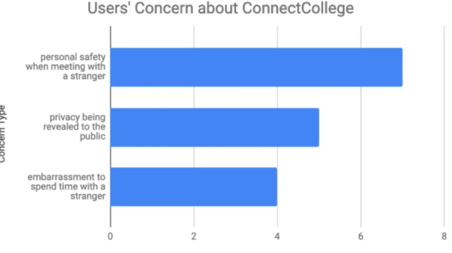
Participants expressed different types of concerns for using ConnectCollege as shown in Figure 1. 7 participants said they concerned about personal safety when meeting with a stranger; 5 were concerned about privacy being revealed to the public; and 4 expressed concern about embarrassment to spend time with a stranger.
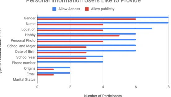
When it speaks to personal information users would like ConnectCollege to access, users chose name, phone number, personal photo, school year, school and major, gender, date of birth, hobby, origins, email and location, which contains sensitive private information. But for information users would like to show to public through ConnectCollege,
participants are more cautious and only chose partial information. The detailed participants’ response is shown as Figure 2 below.
Figure 2. Personal Information Users Like to Provide
In a nutshell, the results of user requirement survey indicates that college students are willing to choose ConnectCollege to solve the problem that it is sometimes hard to seek company for entertainment or study. Also, this user requirement analysis can facilitate the application design including adding place reviews, how to design database for user
information, and aspects to take into consideration for protecting users’ privacy and safety. Last but not least, the result guides future development of ConnectCollege that mobile version should be designed and developed.
3. Application Design and Development
This section introduces the design and development process of proposed ConnectCollege application. In consideration of time and human effort limitation of a master project, the scope of this project is only restricted to design, develop and test a demo version of the proposed application. The demo version is reproducible and extensible by adding
functions, improving user interface and adding mobile version in the future. The Code is in github repository: https://github.com/yaxue1123/connect-college. And the link for live version demo application is also available in this repository.
3.1 Application Function Design
3.1.1. Technology Stack
The demo application was mainly developed using a localhost server then deployed to the web server at last. Visual Studio Code 1.31.0 was used as the code editor. Github was used as the code version control tool. Detailed technology stack is shown in table 1 below.
Environment XAMPP
Backend PHP, MySQL, Ajax, Google Places API, CppComet API Table 1. Technology Stack
XAMPP is a free and open-source cross-platform web server solution stack package developed by Apache Friends[2], consisting of the Apache HTTP Server, MariaDB database, and interpreters for scripts written in PHP and Perl programming languages [3][4]. By developing on the localhost instead of a web host, the development of
ConnectCollege was faster, safer and the half done work won’t be exposed to the outside world.
Ajax is a web technology that used in the client side for asynchronously sending and retrieving data from the server based on XMLHttpRequest so that current display and behavior of current page won’t be interfered [5]. During the development of
ConnectCollege demo application, Ajax was applied in functions like showing other interested people, and displaying user profile. However, due to the Cross-Origin
Resource Sharing (CORS) [6] limitation of Google Places API, Ajax cannot be used with this API together. Instead, variables were passed between different pages via parameters in URL to get returned information about places using HTTP request with Google Places API.
Instant chat function of ConnectCollege demo application is powered by CppComet API, whose server is written in C ++ and data stored in MySQL database. Figure 3 shows the scheme and logic behind this API. The use of existing API for chat function is temporary for the demo version to complete a whole workflow for ConnectCollege but cannot
provide robust and perfect functions. Self-developed chat function may be involved in the future upgraded version.
Figure 3. Scheme of Chat based on CppComet API [7]
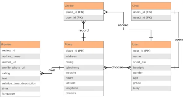
3.1.2. E-R Diagram
Figure 4. E-R Diagram of Connect College Demo App
Entity Relationship Explanation
Place and user Many-to-many A place can show multiple interested users and a user can be interested in different places at the same time.
Place and review
One-to-many A place has many reviews but a review can only belong to a single place.
Place and online One-to-many One place can have many online records triggered by multiple users, but one online record can only track one place by place id.
time, and a chat session is limited to current two users in this chat.
User and online One-to-many A user can be interested in multiple places at the same time thus have multiple online records.
Table 2. Entity Relationship Explanation
3.1.3. UML Use Case Diagram
This use case diagram shown in Figure 5 is to demonstrate the way a user might interact with ConnectCollege demo application, and Table 3 explained the use case in detail. It shows the following aspects from a high-level overview but doesn’t model every detail of users’ interaction steps [9]:
- Scenarios of how the demo app interacts with potential users and other APIs; - Goals this demo app helps users achieve;
Figure 5. Use Case Diagram of ConnectCollege Demo App
Use case Description Participants
Sign up Users should sign up before using the app. User
Log in Users can use the username and password set in the signup process to log into the web application.
User
View places Users can view places nearby after login, and search other places by keywords, sort results by review numbers or rating, or filter results by distance. A preview of place information will be showed on the result page and all data
User and Google Places API
are provided by Google places API.
View place details User can view a place’s detail including place name, address, telephone, website, rating, open hours, and reviews retrieved from Google Places API.
User and Google Places API
Chat User can see other users who are interested in the same place from the place detail page and chat with one of them to discuss whether to hang out together. The instant messaging chat function is powered by CppComet API.
User and CppComet API
Table 3. Use Case Explanation
3.1.4. UML Activity Diagram
The Figure 6 is an activity diagram is a flowchart that shows activities performed by ConnectCollege demo application. This diagram works as an addition to the use case diagram described in section 3.1.3 by showing processes and behaviors performed by the application and user to stakeholders from both business and development side. The activity diagram can [10]:
- Demonstrate the steps of UML use case shows and clarify complicated use cases; - Show the business process or workflow between users and the application;
Figure 6. Activity Diagram of ConnectCollege Demo App
3.2 User Interface Design
This section focuses on presenting the user interface of ConnectCollege demo
application. Based on the application function design in section 3.1, the user interface design followed the workflow and fulfilled primary proposed functions including login, view profile, view/ search/ filter/ sort places, be interested in a place, check other people
also interested, chat and make appointments. The overall user interface followed flat-design rules, adopting simple but clear layout, color code and font stack. Latest CSS Grid layout and Flexbox layout were put into use so that the application was responsive and could fit into different window size of browsers [11][12]. However, this demo version is limited to web use only and temporarily cannot support mobile view that the layout and content may get messy if opened in the browser of a mobile phone. Also, the signup function is temporarily not available due to that the purpose of the demo app emphasizes on showing and testing the idea and workflow, instead of implementing a complete application.
Figure 7 shows the login interface that is similar to most other websites’ login style. Adobe Illustrator was used to design the app icon, which utilized the two common start characters of “connect” and “college”, added star shapes and applied orange color to convey the message of easiness and vitality.
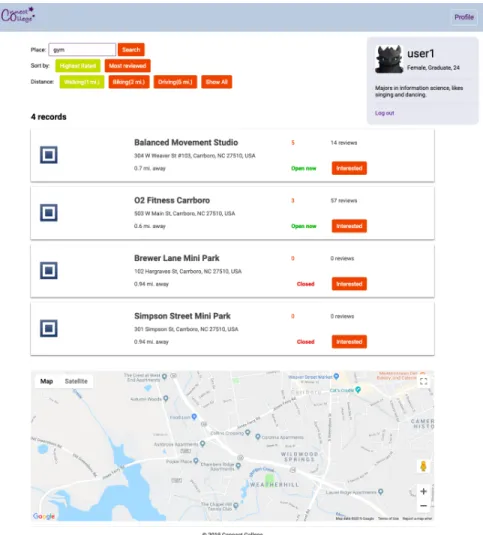
All users need login first before touching the next steps. When users click login button, an alert message will pop up asking “will you allow to access your location”. Users can continue after clicking on “yes”. Then a surrounding place list will show up based on the user’s current location as Figure 8 shows.
- Each place’s information is placed within a card including place name, address, rating, review numbers, open status, and distance from current user location. - Users have multiple control ways to manipulate the place list. A search box is
provided for users to input a keyword which can be a specific place’s name or a category to search related nearby places. Users can sort search results by rating or review numbers, and they can also filter search results by distance. The sort and filter buttons can change color under selection status to reduce the memory load of users so that they can easily see what criteria they have chosen. Button names are designed to close to real-world natural languages like interpreting distance numbers to transportation methods, which improves usability and readability. - Users can check the profile by clicking “profile” button on right top corner, which
also follows the convention of most other websites so that users can easily locate where to find the profile information. The profile element is fixed relative to the browser window so users can always see full information as they scroll up or down.
- A Google map is provided that is centered based on user’s current location. Users can look at this map to get a rough idea where they are and where the places are.
Figure 8. Place List Page Interface
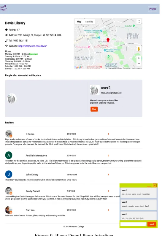
When users have explored nearby places and been interested in a place, they click on the button called “interested” and jump to another detail page of this selected place as Figure 9 shows.
- More place detail information are shown on this page including specific open hours, location mark on map and reviews.
- By clicking the chat button, a chat box will appear on the right bottom corner, and for the other user in this dialogue there will be a chat box popping up too. Users in chat can exchange information and make appointment to hang out together.
Figure 9. Place Detail Page Interface
4. Evaluation
This section focuses on the evaluation methods and results for ConnectCollege demo application. Evaluation methods part is divided into functional testing including black box and white box testing, user interface testing based on heuristic evaluation and
usability testing with participants. Evaluation results are mainly analysis of collected data via usability testing.
4.1 Evaluation Methods
4.1.1. Function: Black Box and White Box Testing
4.1.2. User Interface: Heuristic Evaluation
Besides functional testing, I also have applied Jakob Nielsen’s general principles [15] for User Interface Design on the demo application ConnectCollege, which are broad rules but not specific usability guidelines.
Visibility of Application Status
The demo application keeps users informed about what is going on, such as by asking users’ authorization to get their locations, showing error messages when wrong usernames and passwords are entered, and warning when conflicts happen during a request to chat. All these feedback is within reasonable time.
Match Between Application and the Real World
In the demo application, words, phrases and concepts familiar to the real world instead of system-oriented terms are widely used. For example, I choose “interested” as the button name for each place on the place list page instead of “select” to convey the message that users should choose what they are interested in. On the place detail page, there is a section called “people also interested in this place” using plain natural word to inform users what is going on. Also, the layout design follows real-world conventions that makes information appear in a reasonable and logical order. For example, user’s profile is put on the right top corner and chat box is fixed on the right bottom corner, which follows conventions and won’t confuse users with finding and adapting new positions for these widgets.
Consistency and Standards
By using the demo application ConnectCollege, users will not wonder whether different words, situations or actions mean the same thing since the design of names for User Interface elements is consistent.
Recognition Rather Than Recall
The demo application ConnectCollege minimizes users’ memory load by making actions, options and objects visible. Users can clearly see their history operations which result in the current status so that they can make corresponding adjustments then. For example, when a user uses filter and sort functions on the place list page, selected choices will turn to a different color to remind this user what he or she has operated, which doesn’t require the user to memorize previous actions and options.
Flexibility and Efficiency of Use
Even though the complete workflow for the demo application ConnectCollege includes searching a place, viewing details, chatting with new friends and making appointments, users can still tailor frequent actions based on their realtime needs. For example, a user may only want this application to check a place’s open hour, it is still flexible and efficient to use and return desirable results.
The user interface design of demo application follows the rule of minimalist and aesthetic which abandons irrelevant and unnecessary information, complicated and heavy style since every extra information may distract users’ attention from useful information. There is consistent and harmonious color code for all pages and extra colors to distinguish important information, such as green for “open now” and red for “closed”. The overall design is flat design that uses minimum stylistic elements to give the illusion of three dimensions and focuses on a minimalist use of simple elements, typography and flat colors.
4.1.3. Usability Testing Design
Previous study has proven that elaborate usability testing is a waste of resource and with five participants the first study can find 85% usability issues you want to fix and
redesign. After the redesign, you can test again [16]. I used snowball sampling method and recruited 8 students from UNC as the participant pool, which covers multiple-discipline user groups. Within this sample, 2 are undergraduate students, 5 are graduate students and 1 is doctor student.
Two participants were involved in per test session simultaneously. I was the only moderator. I gave them consent form to read and sign first, then introduced the
application and the usability study. Paper-based questionnaires were distributed to both participants.
There were three tasks in total, focusing on the key functions and workflow of the
guidance, and after each task, a post-task survey was provided to collect users’ feedback about the difficulty level about each task and what they liked and didn’t like of the user interface design and function design given the current task.
After three tasks, participants were asked to fill out a standard System Usability Scale (SUS) questionnaire containing ten questions, then answer four open-end questions regarding the whole application.
Post-task questionnaire, post-test system usability scale survey and post-test questionnaire can be found in Appendix 7.2.1, 7.2.2 and 7.2.3.
Test Environment and Equipment
The test takes place in a reserved study room in the Davis Library on UNC campus. I am the primary investigator as well as the only moderator and observer. Two participants and I sit by the same table with two computers set to the start point for the first task; pens, paper-based consent forms, post-task questionnaires and post-test questionnaires are provided.
Tasks
appointments. I collected data from participants’ feedback by each post-task questionnaire.
Three tasks included:
A. Log in to your account with provided username and password, check your profile.
B. View default place results on the homepage. Search for “movie”, sort results by rating and filter by distance within “1 mile”, click “interested” button on the first item.
C. Explore the detail page. Wait till another user appears, try to check this user’s information and chat with him/ her. Make an appointment about the time you are going to meet at this place.
4.2 Usability Evaluation Results
In Appendix 7.2.4, detailed user responses for each question from 8 participants are recorded. I extracted main ideas of all participants’ comments for each task categorized into two aspects: user interface and function. Although functional testing as well as heuristic evaluation about user interface had been performed before the usability testing with real participants involved, this usability testing revealed multiple usability issues.
Post-task survey results
Figure 10 shows the perceived difficulty level of three tasks by eight participants with average score of 4.625, 5 and 4 respectively, where the second task is perceived as the
easiest while the third task as the hardest. Raw data can be found in Appendix 7.2.4. Correspondingly, this result indicates that the chat function may have usability issues that make users hard to operate, and the search/ filter and sort place functions are easy to perform.
Figure 10. Number of Participants’ Perceived Difficulty Level
Besides choices of difficulty level, different participant provided different perspectives during the survey by open-ended questions, among which some were positive comments while others pointed out existing flaws of ConnectCollege demo application. A summary of participants’ feedback on three tasks are shown in the Table 4 below. Response for different tasks also had ideas in common.
Positive Negative Positive Negative Task A - flat design;
- simple style; - color code; - good color option to emphasize information; - clean layout.
- no background picture, only pure color;
- not enough item on navigation bar; - no real preview photo for places/ place icons are ambiguous; - rating numbers is not labeled with explanation.
- place preview information with card style is complete and clear;
- distance filter function by walking/ biking/ … is easy to interpret; - filter by
distance
function and sort by rating/ review number.
- login is slow; - not enough information for user profile; - no more sorting ways; - no auto suggestion; - result can only be based on current location; - each place card is not clickable.
Task B - sort/ filter buttons change color after selection; - clean layout.
- button names are confusing, e.g. “highest rated”; - no label for rating, or maybe use five stars; - label name “place” before search box is confusing; - button name “interested” is confusing.
- simple step; - sort and filter operation will not refresh the whole page.
- no option to choose distance scale;
- sort only includes high to low;
- no pins on map to show result places;
- no previous search result after clicking go-back. - no photo gallery for place; Task C - chat box is
simple and clear;
- position of the chat box
widget.
- no real pictures of current place; - cannot tell who is sender or receiver except using name; - messages don’t scroll up
automatically; - no full screen chat box option; - provide a button
- quick chat response; - supports multi-language chat; - well-structured information; - can see someone else is on the same page.
- only profile photo for other interested users; - reviews cannot be sorted by date or rating;
- no timestamp for each message; - cannot add friends; - cannot keep
for appointment; chat history; - doesn’t support multi-user chat; - cannot send emoji or stickers. Table 4. Summary of Participants’ Feedback on Three Tasks
As for the user interface, participants liked the flat design, simple layout, color code and position of widgets; they didn’t like some button and label names, no real place picture, rating label missing, and rough chat box design.
As for the function aspect, participants liked sort/ filter/ search functions in place list page, ajax effect without refreshing whole page, and view/ chat with other interested people in place detail page; but they didn’t like rough user profile, limited sort methods, fixed distance filter choice, no auto suggestion for search, no marks on the map, and rough chat functions that didn’t support group chat, chat history view, timestamp, sending stickers, etc.
These opinions and suggestions provide insightful and helpful guidance for how ConnectCollege web application can improve its user interface and functionality in the future.
Post-test survey results
In the end of the study, I applied the System Usability Scale (SUS) to evaluate
the usability, originally created by John brooke [17]. Based on the feedback of 8 participants, ConnectCollege gets an average score of 85.9, and the detailed scores and interpreting rules are included in Appendix 7.2.5.
There are multiple ways to interpret the SUS score. Generally speaking, a SUS score above 68 would be considered to be above average [18]. Besides the SUS score itself, methods including grades, adjectives, acceptability and NPS categories are associated with raw SUS scores as shown in Figure 11 [19]. Thus, the average SUS score of 85.9 of the demo application ConnectCollege indicates that the perceived usability of the entire application is acceptable and excellent.
Figure 11. Grades, adjectives, acceptability and NPS categories linked with SUS score
Post-test interview results
There are four questions included in the post-test interview asking participants about their overall satisfaction level and suggestions to improve the demo application
ConnectCollege. Detailed responses for all 8 participants can be found in Appendix 7.2.6.
What was easy to use or understand about ConnectCollege?
- Users found the purpose of this web application is easy to understand as everyone ever had experience of wanting to hangout at a place but no friend was available. - Users liked the simple user interface design which follows convention. For
example, there were participant saying “the UI layout is similar to most current websites so users can understand functions fast”, “uses real-world language which is easy to understand”, and “overall, this application is simple to use with user-friendly interface and languages”.
- Users could easily master the whole workflow of this application since participants commented that it was easy to use for searching, filtering, sorting places, viewing user profiles and chatting.
What was difficult to use or understand about ConnectCollege?
- From user interface aspect, users felt there is no navigation bar and no
introductory page for the application. Since the current version is only a demo application emphasizing on introducing the basic workflow and main idea, I didn’t build complete website structure and organize all necessary pages. Also, users thought some label names might be confusing like “place” before search bar, “show all” for distance filter and the button name “interested”. Since I designed, developed and tested the application based on my own idea and
- From function aspect, users found many ways to improve current functionality. For example, between the transition of place list page and place detail page, last search operation and search criteria is not stored. For the chat function, current basic version doesn’t support showing user status, storing chat history, sending stickers, group chat, etc. Users hoped the functions for chat could be more robust and abundant.
If you had creative and functional control over the application design of
ConnectCollege, what three things you would change?
- Users preferred more pictures and information in the place detail page like released movies and available food. This requirement is reasonable while in fact, there is technical limitation as I used Google Places API instead of customized backend database to retrieve and display information, the data I can get is limited to what API provides so far.
- Users wanted more control over the sort and filter functions. Besides default sort by “highest rated” (high to low) and “review numbers” (more to less), they wanted low to high and less to more too since in this way they could exclude places they would definitely not go, and they hoped there was another option to sort by expensive level. For the filter function, they liked customizing distance scope more freely. All these suggestions are quite easy to implement.
- Users also offered great ideas about new possible functions ConnectCollege could implement in the future including “add friend”, “match score between a user and others based on their profile similarity”, “group chat”, and “build browser
extension instead of an individual web application”. Each of these proposed functions requires large amount of extra development work so I will put them as future work if I keep improving and completing ConnectCollege application.
What general comments/ questions do you have about the ConnectCollege?
- Several users expressed that as an original demo application, ConnectCollege is a good idea, but still need further polishment including fixing existing inappropriate designs and adding new necessary functions.
- Users had concern about sharing private information like location, photo and name with other strangers. Since the goal of using this application is to hangout with someone possibly stranger at a public place, the exposure of personal
information is unavoidable but the safety issue is shrunk down as there are usually many people at public places. But further safety related functions can be
implemented in the future go-live version such as real-name authentication and emergency contact.
score” can solve this problem by showing user-selected limited number of other users also interested in the same place in the order of their match score.
5. Conclusion
This master project achieved its proposed goal of designing and developing a web application promoting instant social networking based on places for college students. It also analyzed real target user’s requirements prior development and performed usability study based on the demo version after development. Several usability issues regarding user interface and function design were found through the usability evaluation, which can facilitate next-round design and development of future application versions.
The overall main limitations for the development of ConnectCollege demo application are the time and workload limitation regarding a master project’s scope as well as my personal skill set limitation, so only a demo web application was designed and developed instead of both web and mobile version applications with complete user interface and function design.
API for place data and CppComet API for chat function also limit the application. Google Places API only offer limited information such as 20 place search results per query, 5 reviews per place at maximum and only icon without real pictures. CppComet API is not stable neither secure for production environment; meanwhile, the functions of chat box are pretty rough and basic so far. Besides current functions, usability evaluation results have suggested multiple new possible functions like providing match score between users based on similarity of profile, supporting group chat and adding friend, etc.
In the future, I would prefer gathering a group of people whose skill sets cover user experience, web and mobile application design and development, project management, and application promotion to work together. New design can be based on current demo version and the first-round usability evaluation results and try to break through the limitation mentioned above as much as possible. First of all, both mobile and web versions will be designed and developed to cater to users’ practical use. Secondly, more in-depth user requirement analysis regarding user interface and function design will be performed. Thirdly, more complete functions will be developed and tested so that they are robust and easy to use. Last but not least, more rounds of usability evaluation will be performed in the agile development process.
6. References
1. Smith, A., & Anderson, M. (2018). Social media use in 2018: A majority of Americans use Facebook and YouTube, but young adults are especially heavy users of Snapchat and Instagram. Pew Research Center.
2. "Apachefriends.org Traffic, Demographics and Competitors - Alexa". www.alexa.com. Retrieved April 17, 2019, from
https://www.alexa.com/siteinfo/apachefriends.org.
3. "New XAMPP with MariaDB". apachefriends.org. 19 October 2015. Retrieved April 17, 2019, from
https://www.apachefriends.org/blog/new_xampp_20151019.html.
4. "An easy to install Apache distribution containing MySQL, PHP, and Perl". SourceForge. Retrieved April 17, 2019, from
https://sourceforge.net/projects/xampp/.
5. "Ajax - Web developer guides". developer.mozilla.org. Retrieved April 17, 2019, from https://developer.mozilla.org/en-US/docs/Web/Guide/AJAX.
6. "Same-origin policy". developer.mozilla.org. Retrieved April 17, 2019, from
https://developer.mozilla.org/en-US/docs/Web/Security/Same-origin_policy#Cross-origin_network_access.
8. "What is an Entity Relationship Diagram". www.lucidchart.com. Retrieved April 17, 2019, from https://www.lucidchart.com/pages/er-diagrams.
9. "UML Use Case Diagram Tutorial". www.lucidchart.com. Retrieved April 17, 2019, from https://www.lucidchart.com/pages/uml-use-case-diagram.
10."UML Activity Diagram Tutorial". www.lucidchart.com. Retrieved April 17, 2019, from https://www.lucidchart.com/pages/uml-activity-diagram.
11."A Complete Guide to Flexbox". css-tricks.com. Retrieved April 17, 2019, from https://css-tricks.com/snippets/css/a-guide-to-flexbox/.
12."A Complete Guide to Grid". css-tricks.com. Retrieved April 17, 2019, from https://css-tricks.com/snippets/css/complete-guide-grid/.
13.Jerry Gao; H.-S. J. Tsao; Ye Wu (2003). Testing and Quality Assurance for Component-based Software. Artech House. pp. 170–. ISBN 978-1-58053-735-3. 14.Williams, Laurie. "White-Box Testing" (PDF): 60–61, 69. Retrieved 13 February
2013.
15.Nielsen, J. (1995). 10 usability heuristics for user interface design. Nielsen Norman Group, 1(1).
16."Why you only need to test with 5 users". www.nngroup.com. Retrieved April 17, 2019, from https://www.nngroup.com/articles/why-you-only-need-to-test-with-5-users/.
17.Brooke, J. (1996). "SUS: a "quick and dirty" usability scale". In P. W. Jordan, B. Thomas, B. A. Weerdmeester, & A. L. McClelland. Usability Evaluation in Industry. London: Taylor and Francis.
18."Measuring Usability with the System Usability Scale". measuringu.com. Retrieved April 17, 2019, from https://measuringu.com/sus/.
7. Appendix
7.1 User Requirement Survey
1. How often do you encounter with the situation that you want to hang out with friends for entertainment or study while no one is available so you have to give up the plan?
〇 Never 〇 Several times a month 〇 Several times a week 〇 Everyday
2. Do you think you may choose to use ConnectCollege? If not, why?
〇 Yes 〇 No ________________________________________________ 3. If you are familiar with local places enough and have decided a place to go, do you expect ConnectCollege to provide rich reviews like Yelp does?
〇 Yes 〇 No ________________________________________________ 4. Which Application type would you prefer for App ConnectCollege?
〇 Mobile Application (need download on your phone from the App Store).
〇 Web Application (use through browsers on computer or on phone).
〇 Both Mobile and Web Application are needed.
5. What kind of concerns you may have for this App ConnectCollege?
囗 Privacy being revealed to the public.
囗 Personal safety when meeting with a stranger.
囗 Embarrassment to spend time with a stranger.
囗 Other: __________________________________
6. Circle all types of information that you will allow ConnectCollege to access. 7. Circle all types of information that you would like to show to public.
Name Phone
Number School Year Gender Date of Birth Hobby Origins Email Marital
Status
School and Major
Personal Photo
Location
7.2 Usability Study
7.2.1. Post-task Questionnaire
1. I thought this task was:
囗 Very difficult 囗 Somewhat difficult 囗 Moderate 囗 Somewhat easy 囗 Very easy
2. What you like and don’t like about the user interface/ What do you think can improve this user interface?
7.2.2. Post-study System Usability Scale Survey
1. I think I would like to use this application frequently. 2. I found the application unnecessarily complex. 3. I thought the application was easy to use.
4. I think that I would need the support of a technical person to be able to use this application.
5. I found the various functions in this application were well integrated. 6. I thought there was too much inconsistency in this application.
7. I would imagine that most people would learn to use this application very quickly. 8. I found the application very cumbersome to use.
9. I felt very confident using the application.
10. I needed to learn a lot of things before I could get going with this application.
7.2.3. Post-study Interview
1.What was easy to use or understand about ConnectCollege? 2.What was difficult to use or understand about ConnectCollege?
3.If you had creative and functional control over the application design of ConnectCollege, what three things you would change?
4.What general comments/ questions do you have about the ConnectCollege?
7.2.4. Post-task Questionnaire Response
Difficulty level
Participant # Task 1 Task 2 Task 3
1 4 5 4
2 3 5 5
3 5 5 4
4 5 5 1
5 5 5 5
6 5 5 5
7 5 5 4
8 5 5 4
avg 4.625 5 4
Table 5. Perceived Difficulty Level on Scale of 1-5 (very difficult - very easy)
Comments
Task A
Participant User Interface Function
Positive Negative Positive Negative
1 NA NA - place info
preview is easy to read.
- login is slow; - no real picture of each location. 2 - color code;
- size of text.
- add background picture instead of pure color; - add more items on navigation bar. - distance function by divided into walking/ biking/ …; - sort function to facilitate better choice of higher rank or more review.
- no more ranking ways like by distance or expensive level; - no auto
suggestion function as user inputs.
3 NA - could be a
“more info” button for additional profile
NA - not enough
information. 4 - flat design,
simple style; - button colors in unselected and selected mode are striking.
- profile button color is too similar with the entire head bar. (but it’s ok since it obeys the convention that user profile is at the right top corner).
- display of a lists of places can show key information of each place clearly.
- no edit function for users to edit their profiles.
5 - overall design; - uses color easy to find
information.
NA - profile
information fixed on the page and after scrolling down, it is still there.
- I didn’t notice the allow-location-option and got stuck on the login page.
6 - color theme;
- clear layout; - real photos of each place, current icons of each place is unclear, I am not pretty sure about the meaning behind the icon.
- ranking feature;
- information is complete and helpful if I want to find a place to hang out.
- the name “show all” option is confusing (show all options or show all places); - button name “interested” is confusing;
- locations should be marked in the map.
7 - simple and easy style.
- icon of each place is ambiguous, using preview photo would be better;
- rating number is not labeled with
explanation; - more relaxing font-type.
- sort and filter by distance.
- the result is location-based only, personally I prefer viewing the list based on personal profile and preference.
8 - color theme;
size;
- “open now” in green and “closed” in red, which makes sense.
within a card. clickable (make the name or the whole card is clickable); - no effect of each card when users hover on. Table 6. Post-task Comments for Task A
Task B
Participant User Interface Function
Positive Negative Positive Negative
1 NA - the star icon on
each review user’s profile photo is confusing.
NA - no name but
only profile photo for “people also interested in the same place”; - no photo gallery of the place.
2 NA - more color and
picture.
- step is simple to get this page.
NA
3 NA - button names
are confusing, e.g. by “highest rated”, I cannot tell it’s high to low or vice versa. - no title for rating, just number “4.5”.
NA - add option for
user to choose distance scale; - add sort function of both high to low and low to high; - no pins on the map to mark locations; 4 - sort and filter
function buttons will change color after selection, can remind users about history operations.
NA - information of
the place is sufficient and clear on this detail page
5 - button color is highlighted when selected.
- The name before search input box of “place” is confusing, may indicate users to input a specific place name directly, actually a category/ keyword also works.
- sort/ filter content will not refresh the whole page.
- when I clicked the result and wanted to go back to previous search results, it goes back to default results. - cannot see more details on this page before making decision of whether “interested”. 6 - info page has
clean layout and helpful
information.
NA - the function to
show other people also interested in this place is great.
- no more pictures of the place.
7 - sort/ distance easy to see.
- When I click back button, it doesn’t save my previous
searching result; - don’t know what will happen if I click the button “interested”; 8 - design of
filters and sort buttons; - whole page layout.
NA NA - Rating can be
represented by 5 stars instead of just a number; - Google Map can show the place by a red pin with its name; - provide some inside and outside pictures about the place;
- reviews can be sorted by date or rating.
Table 7. Post-task Comments for Task B
Task C
Participant User Interface Function
Positive Negative Positive Negative
1 - chat box is clear and the color code looks great.
NA NA - cannot see
unread messages for each
interested user.
2 NA NA - chat response
is rapid.
- easy to see the other user’s information.
- no timestamp for each message.
3 NA - the displayed
reviews are limited to 5 and different to review numbers of last place list page.
- where to start a chat is not obvious enough;
NA - no timestamp
for chat messages; - no way to add friends;
- chat history is lost after closing the chat window.
4 NA - fixed chat
window size, cannot adjust. - supports multiple language chat. - messages cannot scroll up automatically; - cannot tell who is who if two users with same name (can add small arrows to facilitate this); - don’t know whether it
time for one user. 5 - organization of
widgets; - color.
- chat message cannot tell who is sender/ receiver purely by style (only by name), which can be modified (like floating to different directions).
NA - doesn’t have an
option to close the other user’s profile
information in the “people also interested in this place”.
6 - chat box interface is simple to use; - location of the chat window is well-designed that won’t cover too much information; - minimized chat box is cute.
NA - #people also
interested in this place# the panel stands out and is very creative to allow people who are
interested in the same place talking to each other.
- #people also interested in this place# the information of the user profile is
well-structured and it satisfied my curiosity about a stranger.
- #chat window# want more built-in function like sending emoji and stickers.
7 - chat box interface, but still need improvement.
- add username to the chat window like Facebook does.
- if someone else is on the same page, I can see him/ her.
- no keyboard shortcut for sending messages;
- no “full screen” function for chat box;
- provide separate button for
instead of talking manually.
8 - color; - design;
- different color for dialog from me and the other person will be better.
NA - cannot keep
history search result by click back button; - user chat history cannot be stored. Table 8. Post-task Comments for Task C
7.2.5. Post-test System Usability Scale Survey Response
Participant 1 2 3 4 5 6 7 8 9 10 Score
1 4 1 4 1 4 1 5 2 3 1 85
2 5 1 5 1 5 1 5 1 5 1 100
3 2 2 4 3 4 5 4 3 4 1 60
4 3 1 4 2 3 2 5 2 5 1 80
5 5 1 5 1 5 1 5 1 5 1 100
6 4 1 5 1 5 1 5 1 5 1 97.5
7 2 1 5 1 4 3 4 2 5 1 80
8 4 1 5 2 4 2 5 2 5 2 85
AVG 85.9 Table 9. SUS score from 8 participants
Calculation rules:
1. Convert the scale into number for 10 questions (strongly disagree: 1 points, disagree: 2 points, neutral: 3 points, agree: 4 points, strongly agree: 5 points); 2. For each odd numbered questions, subtract 1 from each;
3. For each even numbered questions, subtract each score’s value from 5; 4. Add all calculated values up and multiply it by 2.5 to get the final SUS score.
7.2.6. Post-test Interview Response
1 - search and filter functions. - how to filter reviews. 2 - chat and viewing user’s
information functions are really easy to use and understand.
- cannot see other users’ status in chat.
3 - profile is easy to access; - search function is easy to use.
- no navigation bar;
- no “about” page to introduce the system.
4 - UI layout is similar to most current websites so uses can understand functions fast.
- hard to find the chat box.
5 - uses real-world language which is easy to understand;
- design is simple and easy to use.
- some label names are confusing like “place” before search bar and “show all” for distance filter.
6 - overall, the application is simple to use with user-friendly interface and languages.
- button name “interested” is confusing, I am not sure whether it means “mark the place” or “check into it”.
7 - the purpose is easy to understand;
- search/ sort/ filter functions.
- chat function still need
improvements to be more robust.
8 - I like the idea of this app. - when users go back to the list from the detail page, their previous query and selection can be remembered. Participant Three functions to improve General comments
1 - add more pictures;
- more information about the place (e.g. released movies, available food, etc.)
- let the user choose distance they prefer and offer direction.
- users may have concerns about sharing private information like location, photo and name with other strangers;
- there could be too many users interested in the same place at the same time.
2 - add a match score function between me and another user by comparing our profile
information;
- add background images and pictures;
- enable sticker function for chat.
- how to protect users’ privacy; - how to contact another user besides the chat box within application, like exchanging user contact information safely.
3 - instead of an individual application, I would prefer to make this app as an extension to my browser.
- great idea, but still need further polishment and improvements.
4 - add items on navigation bar; - more user-customized filter/ sorting;
- add route function on map.
- not sure whether this app is applicable for other regions besides Chapel Hill area.
5 - make each place preview card clickable;
- keep last search results when user goes back.
- I like the idea of ConnectCollege and it will be a great application after fixing bugs and completing
functions. 6 - adjust the banner’s height, which
covers some main page content; - mark places with pin on the map;
- Seems that this app cannot support group chat.
7 - improve user interface;
- add “connect friends” function. - You need polish functionalities in the app. 8 - make place name clickable on
place list page;
- make chat window store history messages;
- add sort function to reviews.
- for an original demo of a web application, I feel ConnectCollege is really impressive. I will definitely use this app if the complete version is released in the future.
![Figure 3. Scheme of Chat based on CppComet API [7]](https://thumb-us.123doks.com/thumbv2/123dok_us/8329568.2209219/11.918.241.709.201.726/figure-scheme-chat-based-cppcomet-api.webp)