Ovis: A Framework for Visual Analysis
of Ocean Forecast Ensembles
Thomas H€
ollt,
Member, IEEE, Ahmed Magdy, Peng Zhan, Guoning Chen,
Member, IEEE,
Ganesh Gopalakrishnan, Ibrahim Hoteit, Charles D. Hansen,
Fellow, IEEE, and
Markus Hadwiger,
Member, IEEE
Abstract—We present a novel integrated visualization system that enables interactive visual analysis of ensemble simulations of the sea surface height that is used in ocean forecasting. The position of eddies can be derived directly from the sea surface height and our visualization approach enables their interactive exploration and analysis.The behavior of eddies is important in different application settings of which we present two in this paper. First, we show an application for interactive planning of placement as well as operation of off-shore structures using real-world ensemble simulation data of the Gulf of Mexico. Off-shore structures, such as those used for oil exploration, are vulnerable to hazards caused by eddies, and the oil and gas industry relies on ocean forecasts for efficient operations. We enable analysis of the spatial domain, as well as the temporal evolution, for planning the placement and operation of structures.Eddies are also important for marine life. They transport water over large distances and with it also heat and other physical properties as well as biological organisms. In the second application we present the usefulness of our tool, which could be used for planning the paths of autonomous underwater vehicles, so called gliders, for marine scientists to study simulation data of the largely unexplored Red Sea.
Index Terms—Ensemble visualization, ocean visualization, ocean forecast, risk estimation
Ç
1
I
NTRODUCTIONO
CEANforecasts are widely used for decision making in a large range of areas. The oil and gas industry relies on forecasts to safely operate off-shore structures for oil exploration. Strong currents, such as eddies, could severely affect the operations of these platforms. Marine scientists acquire data using autonomous underwater gliders whose paths can be optimized when currents are known beforehand.Nowadays, these forecasts do not come as single simu-lation results, but as ensembles of simusimu-lations, mapping uncertainty in the starting conditions, as well as the simu-lation models themselves, to variation in the ensemble. Developing efficient tools to visualize and clearly dissem-inate such forecast outputs and results is becoming a very important part of the forecasting process. Such tools have
to be conceived in a way that allows users to easily extract and clearly identify the necessary information from large ensembles and the associated statistics repre-senting the forecast and its uncertainties.
In earlier work [14] we present the first integrated system for the visual exploration and analysis of these kinds of fore-casts. Our system handles time-series of multivalued ensembles of sea surface height data, represented by 2D heightfields. A set of statistical properties is derived from the ensemble and can be explored in multiple linked views, while the complete ensemble is always available for detailed inspection on demand. Our system enables domain experts to efficiently analyze ocean forecasts, including their corresponding uncertainties. In this work we extend our framework by a more advanced technique for eddy classifi-cation, which is used in a second application scenario, also presented in this paper. We present the application of our framework in two settings. First for planning the placement and operations of off-shore structures, such as oil platforms in the Gulf of Mexico, and second, new to this work, to aid planning the paths of underwater gliders in the Red Sea. 1.1 Ocean Forecast Simulation
The development of a reliable ocean forecasting system requires models capable of simulating ocean circulation and an efficient assimilation scheme that, given enough observa-tions, provides accurate initial conditions for forecasting. High-resolution 3D general circulation ocean models are necessary to reproduce complex mesoscale dynamics like in the Gulf of Mexico [3]. However, such models cannot pro-vide accurate forecasts of mesoscale variability, such as eddy shedding events, without data assimilation. A general circulation ocean model is subject to several sources of
T. H€ollt and M. Hadwiger are with the Geometric Modeling and Sci-entific Visualization Center, King Abdullah University of Science and Technology, Thuwal, Saudi Arabia.
E-mail: {thomas.hollt, markus.hadwiger}@kaust.edu.sa.
A. Magdy is with Wireless Stars, Cairo, Egypt. E-mail: [email protected].
P. Zhan and I. Hoteit are with the Earth Science and Engineering Depart-ment, King Abdullah University of Science and Technology, Thuwal, Saudi Arabia. E-mail: {peng.zhan, ibrahim.hoteit}@kaust.edu.sa.
G. Chen is with the Department of Computer Science, University of Houston, TX. E-mail: [email protected].
G. Gopalakrishnan is with the Scripps Institution of Oceanography, University of California, San Diego, CA. E-mail: [email protected].
C.D. Hansen is with the SCI Institute and School of Computing, Univer-sity of Utah, Salt Lake City, UT 84112. E-mail: [email protected]. Manuscript received 31 May 2013; revised 3 Feb. 2014; accepted 5 Feb. 2014. Date of publication 23 Feb. 2014; date of current version 27 June 2014. Recommended for acceptance by S. Carpendale, W. Chen, and S. Hong. For information on obtaining reprints of this article, please send e-mail to: [email protected], and reference the Digital Object Identifier below.
Digital Object Identifier no. 10.1109/TVCG.2014.2307892
1077-2626ß2014 IEEE. Personal use is permitted, but republication/redistribution requires IEEE permission. See http://www.ieee.org/publications_standards/publications/rights/index.html for more information.
uncertainties, not only from the poorly known inputs such as the initial state, and atmospheric and lateral boundary conditions, but also from the use of approximate parameter-ization schemes of sub-grid physics and ocean mixing dynamics. Data assimilation methods address this issue by constraining model outputs with incoming data.
The important role of uncertainties is now increasingly recognized in the ocean prediction community for proper decision making and risk management.
New assimilation methods based on Bayesian filtering theory have been recently developed by the ocean and atmospheric communities for efficient propagation and quantification of uncertainties [7], [15], [16], [17], [18], [33]. These methods, known as ensemble Kalman filter methods, follow a Monte Carlo approach to represent the uncertainties on a state estimate by an ensemble of model states. These are then integrated forward in time with the general circulation ocean model to quantify uncertainties in the forecast. The estimated forecast uncertainties are then combined with the observation uncertainties to assimilate the new incoming data using a Kalman filter correction step [7], before a new forecast cycle begins. Developing and implementing efficient ensemble Kalman filters with state-of-the-art ocean and atmospheric models is a very active area of research.
With the fast-growing high performance computing resources, the implementation of ensemble Kalman filters with large ensemble members is now practically feasible using highly sophisticated general circulation ocean models. When a filter’s ensemble is available, it is cus-tomary to calculate various statistical measures of the ensemble spread as indicators of the uncertainties and of their evolution in space and time, which are then used in decision making.
Hoteit et al. [15] developed an ensemble forecasting sys-tem for the Gulf of Mexico circulation based on the Massa-chusetts Institute of Technology General Circulation Model (MITgcm) [25], and the Data Assimilation Research Testbed (DART) [18]. This system is capable of assimilating various sets of satellite and in-situ ocean observations. A similar system covering the Red Sea was developed very recently. We use these systems as real-world scenarios that illustrate the new capabilities for analysis and exploration provided by our visualization approach. Fig. 1 gives an overview of the areas covered by the forecasting systems.
1.2 Visualization Contributions
We present a GPU-based interactive visualization system for the exploration and analysis of ensemble heightfield data, with a focus on the specific requirements of ocean forecasts. Based on an efficient GPU pipeline, we perform on-the-fly statistical analysis of the ensemble data, allowing interactive parameter space exploration. Usually these kinds of data are visualized by means of parameterization, e.g., fitting a Gaussian curve and storing onlysandm. This requires a priori knowledge of the data, i.e., the distribution of ensemble members must correspond to a normal or at least unimodal distribution. One key difference of our approach is that we do not assume any such properties. The whole data set, or at least the distribution by means of a his-togram, is available throughout the pipeline. This allows us to carry out visualization and computation such as iso-contour extraction on the original data.
Based on our framework we present a novel workflow for planning the placement and operation of off-shore structures such as oil rigs as well as for planning the paths of autonomous sea vehicles, such as gliders used for data acquisition in marine research. While we focus on the visualization and analysis of ocean forecast data, the presented framework could also be used for the exploration of heightfield ensembles from other fluid earth systems, such as weather forecasting or climate sim-ulation, but also completely unrelated fields, such as for exploration of ensemble segmentation data [13].
2
R
ELATEDW
ORKUncertainty and ensemble visualization are widely recog-nized as important topics in the field of visualization, which has resulted in a large body of related work in recent years. In the following overview, we restrict ourselves to key pub-lications in uncertainty and ensemble visualization, as well as selected publications from other areas related to the tech-niques presented in this paper.
Uncertainty Visualization.A good introduction to uncer-tainty visualization is provided by Pang et al. [30], who present a detailed classification of uncertainty, as well as numerous visualization techniques. Johnson and Sander-son [19] give a good overview of uncertainty visualization techniques for 2D and 3D scientific visualization, includ-ing uncertainty in surfaces. For a definition of the basic
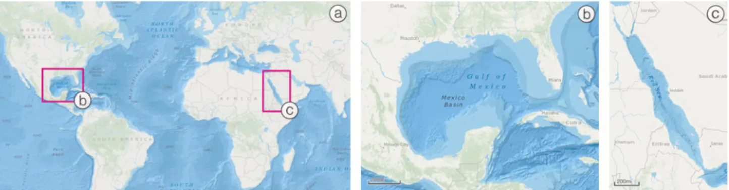
Fig. 1.Maps of the Areas of Interest.The Gulf of Mexico area is shown in (b). The simulation area for the Red Sea data set extends beyond the area illustrated in (c). However, for the use case that we present in Section 5.2, only the area shown in (c) is of interest. Map data courtesy of GEBCO, IHO-IOC GEBCO, NGS, DeLorme.
concepts of uncertainty and another overview of visuali-zation techniques we refer to Griethe and Schumann [9]. Riveiro [40] provides an evaluation of different uncer-tainty visualization techniques for information fusion. Rhodes et al. [39] present the use of color and texture to visualize uncertainty of iso-surfaces. Brown [1] employs animation for the same task. Grigoryan and Rheingans [10] present a combination of surface and point-based ren-dering to visualize uncertainty in tumor growth. Uncer-tainty information is provided by rendering point clouds in areas of large uncertainty, as opposed to crisp surfaces in more certain areas.
In recent work P€othkow et al. [35], [36] as well as Pfaffel-moser et al. [31] present techniques to extract and visualize uncertainty in probabilistic iso-surfaces. Pfaffelmoser and Westermann [32] describe a technique for the visualization of correlation structures in uncertain 2D scalar fields. They use spatial clustering based on the degree of dependency of a random variable and its neighborhood.
Saad et al. [41] present a system which models and visu-alizes uncertainty in segmentation data based on a priori shape and appearance knowledge.
Ensemble Visualization.Pang, Kao and colleagues present early work on visualization of ensemble data [20], [21], [23], [24]. While the authors do not use the term ensemble, these works deal with the visualization of what they call spatial distribution data, which they define as a collection ofn val-ues for a single variable inmdimensions. These are essen-tially ensemble data. The authors adapt standard visualization techniques to visualize these data gathered from various sensors, e.g., satellite imaging or multi-return Lidar. Frameworks for visualization of ensemble data gained from weather simulations include Ensemble-Vis by Potter et al. [38] and Noodles by Sanyal et al. [44]. These papers describe fully featured applications focused on the specific needs for analyzing weather simulation data. They implement multiple linked views to visualize a complete set of multidimensional, multivariate and multivalued ensem-bles. While these frameworks provide tools for visualizing complete simulation ensembles including multiple dimen-sions, to solve the problem presented in this work we focus on heightfield ensemble data.
Matkovic et al. [26] present a framework for visual anal-ysis of families of surfaces by projecting the surface data into lower-dimensional spaces. Piringer et al. [34] describe a system for comparative analysis of 2D function ensem-bles used in the development process of powertrain sys-tems. Their design focuses on comparison of 2D functions at multiple levels of detail. Healey and Snoeyink [11] pres-ent a similar approach for visualizing error in terrain representation. There, the error, which can be introduced by sensors, data processing or data representation, is mod-eled as the difference between the active model and a given ground truth.
Several published extensions of box plots have inspired our time-series view. Hintze and Nelson [12] introduce vio-lin plots to give an indication of the distribution using the sides of the box. Esty and Banfield [6] combine box and per-centile plots to add the complete distribution to the plot while keeping the simplicity of box plots. Potter et al. [37] combine quartile, moment and density plots, based on the
histogram, to create summary plots. The density of curves in 1D function plots can be visualized effectively using ker-nel density estimation [22]. Our histogram view that shows the distribution of surfaces embedded in 3D passing through each ðx; yÞ position is similar in spirit to such approaches, but for primitives of one dimension higher.
3
S
YSTEMD
ESIGNThis section describes our system for the visual analysis of multivalued sea surface height data gathered from ocean forecasts. The foundation for the visual exploration of the data comprises an extensive analysis of the data, which is described in Section 3.1. We compute a set of standard statistics to indicate variation at each grid point over the ensemble. For both of the applications that we present in Section 5, position and movement of eddies is of particular interest. The position of these eddies can directly be derived from the sea surface height. In addi-tion to the statical analysis we compute the eddy centers for all ensemble members as well as the probability of belonging to an eddy for each grid point.
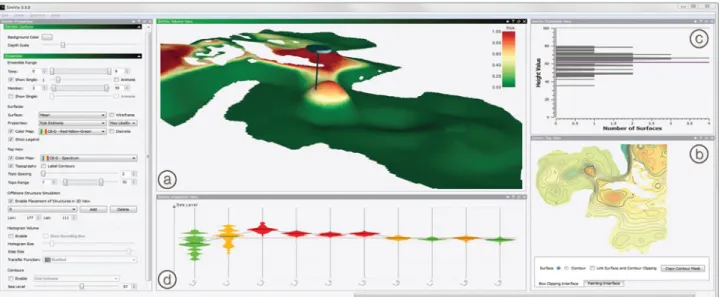
For efficient exploration of the data we provide multiple linked views (Section 3.2) as shown in Fig. 2. Two spatial views, in 3D (Fig. 2a) and 2D (Fig. 2b) provide an overview of the spatial relationships. The 2D view is also used for defining the area of interest as well as defining potential platform positions and glider paths. For a more detailed inspection we provide a histogram view (Fig. 2c) for a single position in time and space as well as a time-series view (Fig. 2d) which provides detailed information for a user-defined set of positions in time and space.
The analysis of the data is completely visualization-driven. Statistical properties are computed on the fly only when needed and for any user-defined subset of the ensem-ble, to allow inspection of the parameter space of the simu-lation. Using a completely GPU-based computation and visualization pipeline as presented in Section 4 allows updates of these data at interactive rates.
3.1 Analysis
Statistical Analysis. The goal of the statistical analysis is to provide information on the distribution of the members within the ensemble. Therefore, for each grid point, we compute a histogram of the sea surface height at this posi-tion over all ensemble members. Based on the histograms we compute a kernel density estimation to approximate the continuous probability density function (pdf). For visualiza-tion we assemble the 1D pdfs in a 3D volume by placing each pdf at the appropriate position in the grid.
For each grid point a number of statistical properties including range, mean, median, maximum mode, standard deviation, variance, skewness and kurtosis are computed, based on the 1D histograms. Similar to the probability den-sity functions these values are then assembled in the origi-nal grid to form 2D scalar fields, which are divided into two groups of different semantics. While mean, median and maximum mode are treated as additional, synthetic surfa-ces, the other properties are added as meta information, for example to color-code the surfaces.
Eddy Tracking.A very simple approach to automatically identifying eddies based on the sea surface height only is to look at the absolute height values. Clockwise rotating eddies will push the water up while counterclockwise rota-tion will lead to a drop in sea surface height. Based on a threshold, each grid point can be classified as belonging to an eddy or not. In our application this threshold is user-defined and can be modified at any time. The classification as well as the resulting risk estimate (see below) for the complete ensemble will be updated accordingly on the fly.
Chaigneau et al. [2] present a more advanced technique for automatic eddy identification. Their method is based on actual flows on the sea surface. Chaigneau et al. use satellite measurements of the sea surface height as input for their method. In absence of a measured velocity field they derive the geostrophic velocity field [8] ðUðk; x; y; tÞ; Vðk; x; y; tÞÞ from the gradients of the sea surface heightHðk; x; y; tÞas:
U¼ fg@@Hy ; (1)
V ¼ fg@H
@x; (2)
with g the gravitational acceleration and f the Coriolis parameter, k the ensemble member, x and y the spatial dimensions andtthe temporal dimension. While Chaigneau et al. are constrained by the fact that they only use the mea-sured sea surface height as input, any velocity field repre-senting the surface flow, such as results from the simulation, can be used as input. When using the geostrophic velocity field, the extracted streamlines match to iso-contours ofH.
With given sea surface height and velocity fields the method consists of four steps:
1. Using a moving window approach, local extrema in Hare tagged as potential eddy centers.
2. Streamlines on the velocity field, around each poten-tial eddy center, are computed. Closed streamlines,
i.e., taking a full 360 degree turn, within a limited area and with limited wiggling, indicate the charac-teristic circular eddy currents. For this we employ the winding angle algorithm as presented by Sadar-joen et al. [42], [43].
3. Extrema for which no closed streamline can be found, such as extrema close to the boundary of the data set, are dropped from the list of potential eddy centers. The remaining candidates will be considered eddy centers.
4. Closed streamlines for each eddy center are clus-tered. The outermost streamline for each eddy center identifies the boundary of the eddy.
Flood-filling the outermost streamlines classifies each grid point inside as corresponding to an eddy.
Risk Estimate. Both eddy tracking methods introduced above result in a binary mapMðk; x; y; tÞfor each member kof the ensemble that is true ifMðk; x; y; tÞis classified as an eddy and false otherwise. Assuming that all realiza-tions for one sample in time (assimilation cycle) t are equally probable, we define the eddy probabilityPeðx; y; tÞ or risk for each position in space and time as the fraction of the members in the ensemble where the bit is set in these maps for this position:
Peðx; y; tÞ ¼n1X n k¼1 1; ifMðk; x; y; tÞis true, 0; else; (3)
where n is the total number of realizations for a single assimilation cycle.
This is especially important for the oil rig-operation application we present in Section 5.1. The strong currents of eddies pose large risks to deep sea oil exploration. Hence we also call this property risk estimate. In addition to the uncertainty information that can be gathered for each tion, the risk estimate map also provides an idea of the posi-tional uncertainty. This can clearly be seen in Fig. 3. Eddies that are at similar positions and of similar size over all
Fig. 2.System Overview.Our system for exploration of ocean forecast ensembles consists of four main views. The simulated ocean surface, or a derived version like the mean surface for a single point in time, can be shown in 3D or 2D (a) and (b) . The histogram view (c) shows the complete dis-tribution of the ensemble at a selected position, while the time-series view (d) shows the disdis-tribution and the resulting operational risk at a selected position for multiple samples along time.
members at a single point in time have sharp boundaries (a), while eddies with a lot of variation will show up in the visualization with fuzzy boundaries (b).
3.2 Visual Forecast Exploration
Our system targets the interpretation of forecasts for ent applications. Since the different applications have differ-ent requiremdiffer-ents, we provide a set of four main views, which are used in different combinations depending on the application scenario. Fig. 2 shows our application with the main views plus a unified settings panel. The views are two spatial views showing the surface data themselves, one in 3D (a), the other one in 2D (b), a linked histogram view (c) as well as a time-series view (d) .
2D View.The simple 2D view shown in Fig. 2b is a com-mon tool for visualizing heightfield data and familiar to domain scientists.
The main function of the view is to provide a first over-view of the data. Therefore it provides two ways to visualize 2D scalar fields. The scalar field can be visualized directly by pseudo coloring the scalar values, or indirectly by extracting iso-contours from the scalar field which can then be rendered as curves in this view. Typically the topogra-phy of the mean sea surface height for a single point in time is rendered by extracting iso-contours for several interesting height values. Uncertainty information can be provided for example by rendering the variance scalar field in the back-ground. In general the view is completely user configurable. Any of the scalar fields, including any of the original height-fields from the ensemble, can be rendered directly or by means of iso-contouring.
In addition to presenting information to the user, the 2D view is also used for interaction. We provide a simple painting interface in this view to allow the definition of an area of interest. The user can select rectangles or directly paint interesting regions on the map, allowing arbitrary free-form selections, which will then be highlighted in both the 2D and 3D views. Furthermore the view enables the creation and editing of points and paths of interest. This allows probing positions, which could be potential positions for placing an off-shore struc-ture (see Section 5.1) or defining and adjusting the path for a glider (Section 5.2).
3D View. The 3D view (Fig. 2a) provides the same fea-tures for visualization as the 2D view plus several
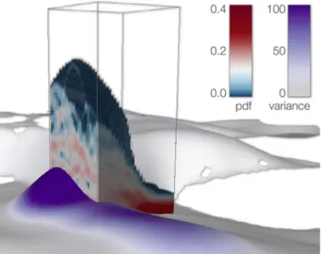
additional tools for a more detailed spatial and temporal inspection. Typically, in the 3D view the height values of the displayed surface are mapped to the third dimension, freeing pseudo-coloring and iso-contours for additional information. An additional benefit of the 3D view is that it is possible to use volume rendering for showing details of the distribution of the ensemble. Similar to approaches pre-sented by Pothkow et al. [35], [36], as well as Pfaffelmoser€ et al. [31], we depict the actual distribution of the ensemble as a volume around the surface. Instead of using a paramet-ric representation of the data based on mean and variance, we allow rendering the full probability density function, of the distribution, as presented in Section 3.1, to allow detailed inspection of the actual data. However, since at this point the user usually has picked a set of points of interest, to avoid unnecessary occlusion, we do not render the com-plete volume, but a small subset of adjustable size, which essentially works like a volumetric cursor (see Fig. 4). The user can simply probe the data by hovering with the mouse over a position of interest, and the probability density vol-ume is then rendered around the picked position.
Histogram View.Another way to inspect the distribution in detail is the histogram view shown in Fig. 2c. This view shows the histogram of all height values of the ensemble as well as the probability density function for a selected ðx; yÞ-position. To provide spatial context the histogram is positioned according to the actual height values and the bin corresponding to the surface that is currently shown in the 3D view is highlighted. The histogram is laid out with the sea surface height on they-axis and the number of surfaces on the x-axis. This layout deviates from the conventional layout for a histogram where usually the bins are mapped to the horizontal axis, but in our case the sea surface height intuitively maps to the vertical axis. Similar to the volumet-ric representation in the 3D view, the position is defined by picking directly in any of the spatial views. When the user moves the mouse over the surface, the histogram view is updated on the fly to show the histogram at the current mouse position.
Fig. 3.Spatial Uncertaintycan be seen using the risk estimate. The two figures show the risk for the same region but different assimilation cycles. In (a) the eddy can be classified with little uncertainty, indicated by the sharp features. In (b) the fuzzy boundary indicates larger spatial uncertainty.
Fig. 4.3D Probability Density Functionat a user-selected position. The surface is color-mapped with the variance. The large spread in areas of high variance is clearly visible in the volume rendering.
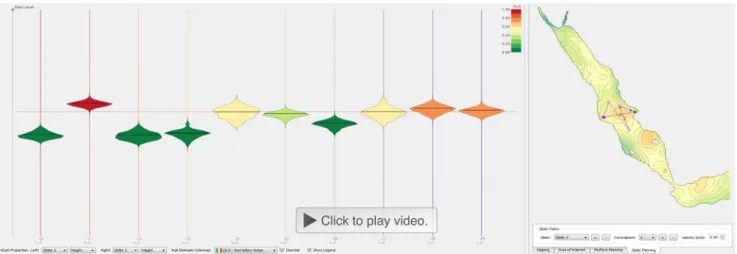
Time-Series View.The time-series view (Fig. 2d) provides detailed information on single positions over time, by means of a glyph, specifically designed to convey the most important information for the applications presented in Sec-tion 5. The glyphs are posiSec-tioned side by side, along thex -axis of the view. In general, each of these glyphs can show data from any desired point in time and space. We will show in Section 5 how this can be used to provide different semantics for this view depending on the application. For planning the operations of an oil platform at a fixed position the x,y coordinate is fixed, while each glyph presents the information for a sample along the timeline. For planning the glider paths the path is sampled along the time-series, providing distinctivex,y-coordinates for each point in time.
Fig. 5 shows a detailed description of the glyph, which is inspired by the violin plots, introduced by Hintze and Nelson [12]. While the shape of the violin plot is symmetric, the left and the right side of our glyph can be defined by two different properties. In the example in Fig. 5, the left side shows the pdf for the distance to the closest eddy center from the position of the glyph, while the right side shows the pdf of the sea surface height as described in Section 3.1. For the different applications the glyph can be configured by the user, for example for comparing two positions for placement the pdfs of the two positions can be used on the
two sides of the glyph. However, the most important appli-cation is displaying sea surface height distributions. There-fore we decided to use the same vertical layout as described above for the histogram view. The glyph is positioned on they-axis according to the actual height values, making the position not only comparable to other glyphs at different positions in the view, but also to the user-defined threshold for the simple, absolute height-based eddy classification, indicated by the horizontal red line. The mean values of both properties are indicated by a black bar on their respec-tive sides of the glyph. Additionally, the glyphs are pseudo-colored according to one of the two versions of the risk esti-mates described in Section 3.1. Information on the uncer-tainty of the data can immediately be retrieved from the shape of the glyph: A large spread or variation in the sur-face positions over the ensemble, indicating larger uncer-tainty, results in a large glyph, while little uncertainty results in less variation and more compact glyphs.
4
GPU-B
ASEDP
IPELINETo allow interactive updates of the statistics, we have imple-mented a completely GPU-based analysis and visualization pipeline presented in Section 4.1. A detailed performance analysis is presented in Section 4.2.
4.1 Implementation
Our GPU-based analysis and visualization pipeline is illus-trated in Fig. 6. In the remainder of this section, numbers in brackets refer to this figure. The pipeline is divided into two main parts: The statistical analysis and iso-surface extrac-tion is carried out using CUDA, while the visualizaextrac-tion is based on OpenGL and GLSL shaders. All data are shared between the two parts of the pipeline, so that after the initial upload of the ensemble onto the GPU no expensive bus transfer is necessary. Since usually only a small part of the ensemble is required by the visualization, a streaming approach would be possible for data sets that are larger than GPU memory, but we currently assume that the data set fits into GPU memory.
Input.The input (1) to our system is a set of heightfields. These can be part of a simulation ensemble, e.g., from ocean or weather forecasts, a time-series of some sort, or the
Fig. 5. TheTime-Series View Glyphin detail. Here the left side of the glyph shows the pdf of the distance to the closest eddy center for all members of the ensemble, while the right side shows the pdf of the sea surface height. The mean values are indicated by a bar at the appropri-ate position. Colorcoding is used to color the glyph according to the risk at the selected position. The sides of the glyph can be configured by the user, for example to show the sea surface height at two different posi-tions, one on each side of the glyph.
Fig. 6.Pipeline Overview.The pipeline is divided into two major blocks: The statistical analysis part at the top, and the rendering part shown at the bottom. Both parts are entirely GPU-based, and all data (middle row) are shared by both parts in GPU memory.
results of a parameterized segmentation [13]. Even though we focus on heightfields in this work, the concepts can also be applied to surfaces inndimensions as long as the corre-spondences between all surfaces in the data set are known for every nD-datapoint. In our framework, we assume the 2D spatial ðx; yÞ-coordinate to be the correspondence between the surfaces.
Data Representation. Before computation of statistics or visualization, the ensemble is converted into a 3D texture (2) and loaded onto the GPU. Every heightfield of the ensemble will be represented by one slice in this texture. Additionally, space for the mean, median and maximum mode heightfield will also be reserved in this texture. The surfaces are indexed using the original parametrization. If there is only a single parameter, for example the temporal samples in a time series, the surface ID corresponds to the texture index. For higher-dimensional parameter spaces, e.g., ensemble ID plus time, the linear texture index is com-puted from the original parameters. This allows the user to define subranges for each parameter separately, for example to examine the complete ensemble at a single point in time.
Statistical Analysis.The first step in the statistical analysis is the creation of the 3D histogram (3). Changes in the param-eter range trigger an update of the 3D histogram and subse-quently of the representative surface and property texture. Since each ensemble member provides exactly one entry to the histogram perðx; yÞ-position, rather than using a thread for each member, we use one thread per ðx; yÞ-position. Each thread then loops over all selected surfaces and inserts the corresponding height values into the histogram. This way, write conflicts can be avoided and no critical sections or atomic operations are needed. The kernels for the derived properties are set up in a similar fashion. The desired statisti-cal property is computed by one thread perðx; yÞ-position. The main difference to the histogram computation is that this results in a single scalar per thread, all of which are then assembled into a 2D texture. While mean, median and maxi-mum mode (4) are attached to the 3D heightfield texture to be used as representative surfaces, the other properties (5) are copied into a 2D texture available to the visualization pipeline for texturing the surface. Exploiting the parallelism of the GPU and eliminating costly bus transfers between CPU and GPU allows interactive modification of the parameter range even for ensembles containing several hundred surfaces. Section 4.2 provides a detailed perfor-mance analysis.
Iso Contouring.We have implemented marching squares using CUDA, based on the marching cubes example from the CUDA SDK [28]. We keep the initial geometric represen-tation of the contours, for example for use in the 2D view, but for overlaying the contours onto the 3D surfaces we ren-der the contours into an offscreen buffer (6), which is then used for texturing.
Rendering. The rendering pipeline takes advantage of the fact that all ensemble data are already stored in GPU memory, which facilitates efficient surface rendering. Instead of creating new surface geometry every time a different surface of the ensemble is rendered, a single generic vertex buffer of fixed size is created. This buffer covers the entire ðx; yÞ-domain, but does not contain any height information. The z-value of each vertex is set later
in the vertex shader. Before transforming the vertex coor-dinates into view space, the object spaceðx; yÞ-coordinates of the vertex in combination with the ID of the active sur-face are used to look up thez-value of the current vertex in the ensemble texture. At this point, the desired surface geometry is available. In order to be able to visualize the results of the statistical analysis, the object space coordi-nates are attached to each vertex as texture coordicoordi-nates (x andyare sufficient). In the fragment shader, this informa-tion can then be used to look up the active statistical property in the 2D texture. This texture contains the raw information from the statistical analysis, which is then converted to the fragment color by a look up in a 1D color map. We provide a selection of several continuous, diverging cool-to-warm color maps, as presented by Moreland [27], but also allow the creation of custom color maps. These color maps minimally interfere with shad-ing, which is very important in this case, as shading is an important feature to judge the shape of a surface. During testing we realized that using the continuous version made it very hard to relate an actual value to a color in the rendering so we decided to optionally provide a dis-crete version with ten steps. After the surface geometry has been rendered, a surrounding volume, for example the 3D probability density function, can be rendered as well. This is done in a second rendering pass in order to guarantee correct visibility [45].
Interaction.With the described pipeline in place, a num-ber of features can be implemented very easily and effi-ciently. If desired, the user can choose to render any surface from the ensemble. This requires no data transfer to or from the GPU, except for the ID of the surface in the ensemble to render. In addition, it is possible to automatically animate all surfaces in a predefined range. In the presented applica-tion this can be useful in two ways; As shown by Brown [1] animation is a powerful tool for visualizing uncertainty. The user can choose to animate through all members of a single sample of the time series to get an impression of the surface distribution. Second animating the mean surfaces over the time domain can show the behavior of the eddies.
The described visualization techniques can give a very good impression of the quantitative variation in the data. Detailed information on the surface distribution can be gained by animating through or manually selecting individ-ual surfaces from the ensemble. However, it is hard to get a good impression of the complete distribution this way. We therefore provide the possibility to render a cutout of adjustable size of the pdf of the complete distribution as a volume on top of the surface geometry (Fig. 4) or show his-togram and pdf for a selected position in a separate view (Fig. 2c). The position to investigate can be picked directly in the 3D view. All information that is required for picking is already available in our rendering pipeline: We use the same vertex shader as described before for rendering the surface into an off-screen buffer of the same size as the frame buffer. Instead of using the object space coordinates to look up the scalar values in the fragment shader, we use the coordinates directly as the vertex color. This way, we can look up the current mouse position directly in the downloaded off-screen buffer. With the ðx; yÞ-components of the resulting volume position, we can then directly look
up the histogram and probability density distribution for this position. To facilitate easy comparison, we color the bin corresponding to the current representative surface differ-ently than the remaining bins.
4.2 Performance
The performance of the statistical analysis is crucial for interactive exploration of the parameter space. We have used the data set of the Gulf of Mexico, described in Section 5 for a performance analysis. The data set consists of a total of 500 surfaces spread over ten sampled time steps. Since usually one time step is investigated at a time, we compare performance for a single forecast time step, consisting of50 surfaces, as well as the complete data set. Table 1 shows the resulting computation times.
The computations were performed using an NVIDIA GeForce GTX 580 with1:5GB of graphics memory. The tim-ings were averaged over1;000kernel executions. As all data stays on the GPU, no bus transfer has to be considered. For comparison, we also show computation times of a single time step on the CPU. The computations were carried out on a workstation with two six-core Xeons (12physical cores plus hyper threading) clocked at 3:33 GHz and 48 GB of main memory. The CPU computations were parallelized using OpenMP, utilizing24threads.
In general, it can be seen in Table 1 that using the GPU even for 500surfaces, the slowest update including skewness and all dependencies plus the probability den-sity function (which needs to be computed for the histo-gram and time-series views) still allows for interactive update rates. Compared to the CPU version, we achieved a speedup of roughly 5 for all tasks when considering the dependencies.
The histogram, range, mean, variance, kurtosis and the risk estimate are calculated directly from the ensemble and as such the complexity relies solely on the number of surfa-ces and valid data points per surface. We would expect the
computation time for these values to scale linearly with the number of surfaces/valid data points, which seems to be in line with the measured numbers. For larger data sets, how-ever, it would make sense to compute range, mean, vari-ance, kurtosis and the risk estimate using the histogram. This would result in constant time, only depending on the size of the histogram. For the data sets here, however, the histogram computation is the limiting factor. The probabil-ity densprobabil-ity function, median and mode are looked up using the histogram, and therefore there is no difference between the small and the large data set. Standard deviation and skewness are implemented as simple combinations of other surface properties, and thus computation times are also independent of the number of surfaces. With the dependen-cies precomputed, the computation of both properties is trivial, which results in very short computation times.
5
A
PPLICATIONS
CENARIOSThis section presents two novel visual workflows for plan-ning the placement as well as the operations of off-shore structures (Section 5.1), and for planning underwater glider paths for efficient data acquisition (Section 5.2), respec-tively. We have designed our framework with these real-world scenarios in mind. During this process, we have worked closely with our domain expert partners, who are also co-authors of this paper, to specifically address their needs. Although we have not yet performed a formal evalu-ation, we can say that the domain experts are very satisfied with the capabilities provided by our framework, and that they are eager to integrate it with their daily workflow. The close integration of views and tools specifically designed for the tasks at hand, as well as the GPU-based computation and visualization pipeline, considerably speed up the visual analysis process. Our collaborators think that this is a big step forward over the usual approach of combining the actual computation with plotting the results in MATLAB. The biggest advantage of our framework over this more TABLE 1
Computation Times for All Properties
All times are given in milliseconds. The first column shows ID and name of the property. The columns titledw/oandw depshow the computation time
limited approach is provided by the time-series view in our framework. Even though this is a kind of visualization that our partners have not used in their standard workflow until now, they were immediately comfortable with using it in our framework. They thought that the time-series view helps tremendously when judging the forecast for a prede-fined position over several time samples.
5.1 Off-Shore Oil Operations in the Gulf of Mexico Oil exploration in the deep Gulf of Mexico is vulnerable to hazards due to strong currents at the fronts of highly non-linear warm-core eddies [51]. The dynamics in the Gulf of Mexico are dominated by the powerful northward Yucatan Current flowing into a semi-enclosed basin. This current forms a loop that exits through the Florida Straits and merges with the Gulf Stream. At irregular intervals, the loop current sheds large eddies that propagate westward across the Gulf of Mexico. This eddy shedding involves a rapid growth of non-linear instabilities [4], and the occa-sional eddy detachment and reattachment make it very dif-ficult to clearly define, identify, monitor, and forecast an eddy shedding event [3], [15].
The predictability of these eddy shedding events poses a major challenge for the oil and gas industry operating in the Gulf. The presence of these strong currents potentially causes serious problems and safety concerns for the rig operators. Millions of dollars are lost every year due to dril-ling downtime caused by these powerful currents. As oil production moves further into deeper waters, the costs related to strong current hazards are increasing accordingly, and accurate 3D forecasts of currents are needed. These can help rig operators to avoid some of these losses through better planning.
We illustrate two different scenarios, planning the place-ment and planning operations of an off-shore platform, with a real-world forecast data set of the Gulf of Mexico. The data set covers the Gulf of Mexico basin between 8:5 degree N and31degree N, and72:5degree W and98degree W on a 1=101=10 grid (225255 samples of varying metrical distance, between9:5and11km, due to the spheri-cal grid) with 40 vertical layers. Forecasting experiments were performed over a six-month period in 1999 between May and October during which a strong loop current event occurred (Eddy “Juggernaut”) [29]. The assimilation cycle was two weeks, resulting in ten temporal samples, each con-sisting of50ensemble members.
Planning Phase.While the accessibility of an existing res-ervoir is the key factor when planning an oil platform, ocean forecasts can provide valuable additional information. Mod-ern drilling techniques to some extent allow flexible paths and thus considerable flexibility for the actual placement of a platform. However, the complexity of the path has impli-cations on the cost of drilling. On the other hand, slight changes of the position might move a platform from an area that is strongly affected by eddy shedding, which leads to long downtimes, to a less affected area, overall resulting in more efficient operations.
Planning the placement of an off-shore structure requires a complete overview of the ensemble in the spa-tial domain, but also of all available time steps. Fig. 7
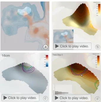
outlines all necessary steps. First, the user defines the area of interest (defined by factors not available in the ocean forecast, like reservoir reachability) in the 2D view (Fig. 7a) for example by painting directly on the map. In Fig. 7b, the sea level of the mean surface for a single sam-ple in time is mapped to the third dimension. The stan-dard deviation is used for pseudo-coloring in the 3D view. By animating over all assimilation cycles, the user can now get an overview of the mean sea level at the selected area of interest, as well as the corresponding uncertainties. Besides the 3D view, animation can also be used in the 2D view, showing the sea level using iso-contours and pseudo-coloring (inset). While the animation is very effec-tive to give a first impression of the changing sea level, it is challenging to derive qualitative results. Therefore, in the next step, the user can look at iso-contours from the mean surfaces, or risk estimates of multiple assimilation cycles in a single view. The contour for a single selected sea level and maximum allowed risk is extracted for all cycles and rendered on the mean surface. The selected sea level, as well as the maximum risk, can be changed on the fly (compare the animation in Fig. 7c). Starting with a low sea level and zero risk, the user can gradually approach a suitable compromise of available positions, critical sea sur-face height and risk, to narrow down the area of interest to a few points. Once a compromise is found, the ensemble distribution can be probed interactively at the interesting positions, to verify the results using the histogram view (Fig. 7d). At this point, the area for placement is narrowed down significantly. Positions for potential placement can now be defined and edited on the map in the 2D view or by entering coordinates directly. The operational phase for these samples can then be simulated identically to the actual operational analysis (see below).
Fig. 7.Spatial Explorationfor placement planning consists of four main steps: Definition of the area of interest based for example on reservoir reachability (a), general overview (b), time-series analysis (c) and detailed analysis for verification (d). Please use Adobe Reader9to enable animations.
Operational Phase.Most of the ensemble analysis for plan-ning operations and unavoidable downtimes is carried out in the time-series view shown in Fig. 2d. For a detailed expla-nation of the glyph used in the view, see Section 3.2. For plan-ning the operations, the view shows the complete available time-series at a single user-defined spatial position, corre-sponding to an actual, or potential oil rig. The most impor-tant information here is the risk estimate described in Section 3.1. Each glyph is color coded according to the risk at the corresponding point in time. We provide a set of stan-dard color maps for coloring the glyphs. The color map is also freely customizable, most importantly to adapt to the acceptable risk. A good color map should highlight three cases based on the risk estimate: Points in time which are safe for operation with a high certainty, time steps where the rig needs to be shut down with large certainty, and finally uncertain times. We found the green to yellow to red diverg-ing color map, as used in Fig. 2d to be a good fit, with the green and red mapping to the percentages which indicate safe operations and a high risk, respectively, and the yellow to percentages indicating the need for additional inspection.
The actual operation planning is a recurring process with only a few future assimilation cycles available at a time. Assuming a color map as described, after loading the data the user can immediately identify safe and unsafe points in time from the color of the corresponding glyphs. Only uncertain points in time need further investigation. The main factor to consider for these cases is the spread or uncertainty of the distribution. A compact glyph corre-sponds to a distribution with little uncertainty. Here, the risk estimate can immediately be used for making a decision to shut down the rig. A large glyph in general indicates large uncertainty. Here, the user must carefully weigh sev-eral properties: Are ensemble members in the critical range close to the critical sea level or far above, is the distribution skewed to either side, etc. This information can be derived from the glyph or the user can inspect the raw results from the statistical analysis to make a final decision.
Fig. 8 shows a comparison for two positions that are in close proximity, selected for potential placement at the boundary of the eddy shedding area. The spatial distance is less than30km (compare the positional markers in the insets of Fig. 8). While the position mapped to the left
side of the glyphs would allow minimal downtimes (only two of the samples of the time-series exhibit any risk, which is also very low) the position mapped to the right side of the glyphs exhibits a very different result. For this position, six out of the ten samples show a sea surface height that will certainly be above the critical level. In addition even the first two samples, which overall are less risky, expose a large amount of uncertainty. Using this comparison one can immediately see that the position mapped to the left side of the glyphs will allow much more efficient operations.
5.2 Planning Glider Paths in the Red Sea
The Red Sea has recently attracted attention from several scientific communities, for its unique physical and biologi-cal variability. It is characterized by high temperature and salinity due to its location, surrounded by hot deserts, resulting in high evaporation and negligible precipitation, as well as its isolation from the worlds oceans. Besides the negligible Suez Canal in the north, the only connection to other large bodies of water is through the strait of Bab el Mandeb, a narrow and shallow channel.
The Red Sea is bordered by high mountain ranges that constrain the winds to be closely aligned along the axis of the basin except at a few locations where gaps in the mountains exist. The horizontal circulation in the Red Sea consists of multiple eddies, driven by these strong winds. These eddies strongly influence the exchange of biological organisms and also transport heat and other physical properties. Nowa-days, so-called gliders, autonomous underwater vehicles (see Fig. 9), are used to record the physical, chemical and bio-logical properties of the eddies, such as temperature, salinity or chlorophyll content.
We illustrate the use of our system for the scenario of planning glider paths using an ensemble simulation data set for the Red Sea. The data set covers the Red Sea and extends towards the east through the Gulf of Aden to the Arabian Sea and the Persian Gulf. The exact covered area extends from9degree N to30degree N, and32degree E to77degree E on a1=101=10(corresponding to9:6to
11 km) grid with 50 vertical layers. The months of Janu-ary to March 2004 were simulated and the assimilation cycle was three days, resulting in a data set of 30 sampled time steps, with of 50 members, each consisting of
450210samples.
Underwater gliders [5], [46], [49] are autonomous sea vehicles consuming very little energy. They move without a propeller, only by means of changing their volume, for example by de- or inflating an external oil bladder, and shifting of weight. Recently Smith et al. [48] proposed
Fig. 8. Time-Series Comparison for two positions (indicated by the markers in the insets) that are in close proximity. The upper left position is mapped to the left side of the glyphs, the lower right position to the right side. The left side of the glyphs shows a position which exhibits very little risk only for the first and last sample of the time-series. Moving the position slightly results in several time steps which would definitely require a shutdown of operations (right side of the glyphs).
Fig. 9.Slocum Glideras used by the University of Southern California (courtesy of Smith et al. [47]).
improving glider operations by the use of an ocean model and Kalman filtering. The reasons to use ocean forecasts when planning the paths of a glider are diverse. Naturally, the positions of moving eddies are important when one wants to sample data inside these eddies. In addition to this, the energy consumption of the gliders can be judged more precisely when currents along the path are known. Strong currents can also be used as an accelerator, to mini-mize energy consumption or move the gliders to a desired position more quickly.
In our system, planning the path of a glider is similar to planning the position of an off-shore structure, as described in Section 5.1. First, the user gathers an overview of the eddy positions and their movements over time, using any of the spatial views. Again, the exploration starts with the definition of an area of interest. After that, the user would look at the eddy probability map (or risk estimate), as well as the eddy centers in the 2D and 3D spatial views. In com-bination with the visualization of the eddy centers, animat-ing over the eddy probability maps of the different samples of the time-series one can easily identify moving and more stationary eddies and plan the path accordingly. The path itself is then defined by placing waypoints in the 2D view. By assigning a velocity to the glider, the positions along the resulting path, corresponding to the available samples of the time-series of the forecast, can be computed. Waypoints can be edited, simply by dragging them within the 2D view. The available positions will automatically be recom-puted on the fly. The positions along the path, for which forecast data is available are highlighted in the spatial views, with extra emphasis on the point in time which is currently active in the view. All available positions can be shown in the time-series view. When planning a path, the view behaves differently compared to planning a single fixed position, as described above. While thex-axis still cor-responds to the time, each glyph does not only reflect a point in time, but is also created from the data at the grid point along the path computed for this point in time. Fig. 10 shows typical adjustments to a path. The user drags one of the waypoints, resulting in variations of the length of the adjacent path segments and thus updates of the positions of
the available samples of the time-series along the path. The time-series view updates immediately, showing the detailed information for each of the positions along the path over time.
6
C
ONCLUSIONIn this work we have presented an interactive, integrated system for the visualization, exploration and analysis of heightfield ensemble data. The core of our framework, which consists of statistical analysis and rendering, is imple-mented in an efficient GPU-based pipeline. We have illus-trated the utility of our framework for two real-world applications based on ocean forecasting. We developed the system in close collaboration with domain expert partners, who now use it on a regular basis. For the future we would like to conduct a formal user study.
In the current state our framework requires the whole data set to be available in GPU-memory at any point in the pipeline. Even though GPU-memory is getting larger and larger, this is an obvious problem when scaling to very large data. However, the statistics can all be computed based on the histogram. For the future we plan to implement a streaming approach for computing the histogram, i.e., load-ing the data into GPU memory in slabs and computload-ing the histogram slab by slab. Since the histogram is of constant size, this would eliminate the problem of computing statis-tics for very large data.
We would also like to explore the possibilities to deploy our framework in a broader set of application scenarios, dif-ferent from ocean forecasting. While visualization of weather and climate forecasts are obvious targets, completely differ-ent areas like analysis of time series of geospatial measure-ments [50] might also profit from this kind of analysis. In previous work [13] we present the application of our frame-work for interpretation of seismic tomography data.
A
CKNOWLEDGMENTSThe authors wish to thank Burt Jones for his input on glider operations and the anonymous reviewers for their construc-tive criticism.
Fig. 10.Detailed Glider Path Analysis.The video shows the editing of the path of a glider. When a control point is moved (2D view, right) the sample positions for the time series along the resulting path are recomputed, triggering updates in the time-series view (left) for detailed analysis.Please use Adobe Reader9 to enable the video.
R
EFERENCES[1] R.A. Brown, “Animated Visual Vibrations as an Uncertainty Visu-alisation Technique,”Proc. Int’l Conf. Computer Graphics and Inter-active Techniques in Australasia and South East Asia, pp. 84-89, 2004. [2] A. Chaigneau, A. Gizolme, and C. Grados, “Mesoscale Eddies off
Peru in Altimeter Records: Identification Algorithms and Eddy Spatio-Temporal Patterns,” Progress in Oceanography, vol. 79, no. 2-4, pp. 106-119, 2008.
[3] E.P. Chassignet, H.E. Hurlburt, O.M. Smedstad, C.N. Barron, D.S. Ko, R.C. Rhodes, J.F. Shriver, A.J. Wallcraft, and R.A. Arnone, “Assessment of Data Assimilative Ocean Models in the Gulf of Mexico Using Ocean Color,” Circulation in the Gulf of Mexico: Observations and Models, vol. 161, pp. 87-100, 2005.
[4] L.M. Cherubin, W. Sturges, and E. Chassignet, “Deep Flow Vari-ability in the Vicinity of the Yucatan Straits from a High Resolu-tion Micom SimulaResolu-tion,”J. Geophysical Research, vol. 110, pp. 20-72, 2005.
[5] C. Eriksen, T. Osse, R. Light, T. Wen, T. Lehman, P. Sabin, J. Ballard, and A. Chiodi, “Seaglider: A Long-Range Autono-mous Underwater Vehicle for Oceanographic Research,”IEEE J. Oceanic Eng., vol. 26, no. 4, pp. 424-436, Oct. 2001.
[6] W.W. Esty and J.D. Banfield, “The Box-Percentile Plot,”J. Statisti-cal Software, vol. 8, no. 17, pp. 1-14, 2003.
[7] G. Evensen, Data Assimilation: The Ensemble Kalman Filter. Springer, 2006.
[8] A.E. Gill, Atmosphere-Ocean Dynamics. Academic Press, 1982. [9] H. Griethe and H. Schumann, “The Visualization of Uncertain
Data: Methods and Problems,” Proc. Int’l Conf. Simulation and Visualization (SimVis ’06), 2006.
[10] G. Grigoryan and P. Rheingans, “Point-Based Probabilistic Surfa-ces to Show Surface Uncertainty,”IEEE Trans. Visualization and Computer Graphics, vol. 10, no. 5, pp. 564-573, Sept. 2004.
[11] C.G. Healey and J. Snoeyink, “Vistre: A Visualization Tool to Eval-uate Errors in Terrain Representation,”Proc. Third Int’l Symp. 3D Data Processing, Visualization, and Transmission, pp. 1056-1063, 2006. [12] J.L. Hintze and R.D. Nelson, “Violin Plots: A Box Plot-Density Trace Synergism,”The Am. Statistician, vol. 52, no. 2, pp. 181-184, 1998.
[13] T. H€ollt, G. Chen, C.D. Hansen, and M. Hadwiger, “Extraction and Visual Analysis of Seismic Horizon Ensembles,”Proc. Euro-graphics 2013 Short Papers, pp. 69-72, 2013.
[14] T. H€ollt, A. Magdy, G. Chen, G. Gopalakrishnan, I. Hoteit, C.D. Hansen, and M. Hadwiger, “Visual Analysis of Uncertainties in Ocean Forecasts for Planning and Operation of Off-Shore Structures,”Proc. IEEE Pacific Visualization Symp, pp. 59-66, 2013. [15] I. Hoteit, T. Hoar, G. Gopalakrishnan, J. Anderson, N. Collins, B.
Cornuelle, A. Kohl, and P. Heimbach, “A MITgcm/DART Ensem-ble Analysis and Prediction System with Application to the Gulf of Mexico,”Dynamics of Atmospheres and Oceans, vol. 63, pp. 1-23, 2013.
[16] I. Hoteit, X. Luo, and D.-T. Pham, “Particle Kalman Filtering: A Nonlinear Bayesian Framework for Ensemble Kalman Filters,”
Monthly Weather Rev., vol. 140, pp. 528-542, 2013.
[17] I. Hoteit, D.-T. Pham, and J. Blum, “A Simplified Reduced Order Kalman Filtering and Application to Altimetric Data Assimilation in Tropical Pacific,”J. Marine Systems, vol. 36, pp. 101-127, 2002. [18] J.A. Jeffrey, T. Hoar, K. Raeder, H. Liu, N. Collins, R. Torn, and A.
Avellano, “The Data Assimilation Research Testbed: A Commu-nity Facility,”Bull. Am. Meteorological Soc., vol. 90, pp. 1283-1296, 2009.
[19] C.R. Johnson and A.R. Sanderson, “A Next Step: Visualizing Errors and Uncertainty,”IEEE Computer Graphics and Applications, vol. 23, no. 5, pp. 6-10, Sept./Oct. 2003.
[20] D. Kao, J. Dungan, and A. Pang, “Visualizing 2D Probability Dis-tributions from EOS Satellite Image-Derived Data Sets: A Case Study,”Proc. IEEE Visualization Conf, pp. 457-560, 2001.
[21] D. Kao, M. Kramer, A. Love, J. Dungan, and A. Pang, “Visualizing Distributions from Multi-Return Lidar Data to Understand Forest Structure,”The Cartographic J., vol. 42, no. 1, pp. 35-47, 2005. [22] O.D. Lampe and H. Hauser, “Curve Density Estimates,”Computer
Graphics Forum, vol. 30, no. 3, pp. 633-642, 2011.
[23] A. Love, A. Pang, and D. Kao, “Visualizing Spatial Multivalue Data,” IEEE Computer Graphics and Applications, vol. 25, no. 3, pp. 69-79, May/June 2005.
[24] A. Luo, D. Kao, and A. Pang, “Visualizing Spatial Distribution Data Sets,”Proc. Symp. Data Visualisation, pp. 29-38, 2003.
[25] J. Marshall, A. Adcroft, C. Hill, L. Perelman, and C. Heisey, “A Finite-Volume, Incompressible Navier Stokes Model for Studies of the Ocean on Parallel Computers,” J. Geophysical Research, vol. 102, pp. 5735-5766, 1997.
[26] K. Matkovic, D. Gracanin, B. Klarin, and H. Hauser, “Interactive Visual Analysis of Complex Scientific Data as Families of Data Surfaces,”IEEE Trans. Visualization and Computer Graphics, vol. 15, no. 6, pp. 1351-1358, Nov./Dec. 2009.
[27] K. Moreland, “Diverging Color Maps for Scientific Visualization,”
Proc. Fifth Int’l Symp. Visual Computing, pp. 92-103, 2009.
[28] NVIDIA Corporation, “Marching Cubes Isosurfaces,” http:// docs.nvidia.com/cuda/cuda-samples/index.html#graphics, May 2013.
[29] L. Oey, T. Ezer, and H. Lee, “Loop Current, Rings and Related Cir-culation in the Gulf of Mexico: A Review of Numerical Models and Future Challenges,” Geophysical Monograph-Am. Geophysical Union, vol. 161, p. 31, 2005.
[30] A.T. Pang, C.M. Wittenbrink, and S.K. Lodha, “Approaches to Uncertainty Visualization,”The Visual Computer, vol. 13, pp. 370-390, 1997.
[31] T. Pfaffelmoser, M. Reitinger, and R. Westermann, “Visualizing the Positional and Geometrical Variability of Isosurfaces in Uncer-tain Scalar fields,”Computer Graphics Forum, vol. 30, no. 3, pp. 951-960, 2011.
[32] T. Pfaffelmoser and R. Westermann, “Visualization of Global Cor-relation Structures in Uncertain 2D Scalar Fields,” Computer Graphics Forum, vol. 31, no. 3, pp. 1025-1034, 2012.
[33] D.T. Pham, “Stochastic Methods for Sequential Data Assimilation in Strongly Nonlinear Systems,”Monthly Weather Rev., vol. 129, pp. 1194-1207, 2001.
[34] H. Piringer, S. Pajer, W. Berger, and H. Teichmann, “Comparative Visual Analysis of 2D Function Ensembles,”Computer Graphics Forum, vol. 31, no. 3, pp. 1195-1204, 2012.
[35] K. P€othkow and H.-C. Hege, “Positional Uncertainty of Isocon-tours: Condition Analysis and Probabilistic Measures,” IEEE Trans. Visualization and Computer Graphics, vol. 17, no. 10, pp. 1393-1406, Oct. 2011.
[36] K. P€othkow, B. Weber, and H.-C. Hege, “Probabilistic March-ing Cubes,” Computer Graphics Forum, vol. 30, no. 3, pp. 931-940, 2011.
[37] K. Potter, J. Kniss, R. Riesenfeld, and C.R. Johnson, “Visualizing Summary Statistics and Uncertainty,” Computer Graphics Forum, vol. 29, no. 3, pp. 823-832, 2010.
[38] K. Potter, A. Wilson, P.-T. Bremer, D. Williams, C. Doutriaux, V. Pascucci, and C.R. Johnson, “Ensemble-Vis: A Framework for the Statistical Visualization of Ensemble Data,”Proc. IEEE Workshop Knowledge Discovery from Climate Data: Prediction, Extremes and Impacts, pp. 233-240, 2009.
[39] P.J. Rhodes, R.S. Laramee, R.D. Bergeron, and T.M. Sparr, “Uncertainty Visualization Methods in Isosurface Rendering,”
Proc. EUROGRAPHICS 2003 Short Papers, pp. 83-88, 2003. [40] M. Riveiro, “Evaluation of Uncertainty Visualization Techniques
for Information Fusion,”Proc. 10th Int’l Conf. Information Fusion, pp. 1-8, 2007.
[41] A. Saad, G. Hamarneh, and T. M€oller, “Exploration and Visualiza-tion of SegmentaVisualiza-tion Uncertainty Using Shape and Appearance Prior Information,” IEEE Trans. Visualization and Computer Graphics, vol. 16, no. 6, pp. 1366-1375, Nov. 2010.
[42] I. Sadarjoen, F. Post, B. Ma, D. Banks, and H.-G. Pagendarm, “Selective Visualization of Vortices in Hydrodynamic Flows,”
Proc. IEEE Visualization Conf, pp. 419-422, 1998.
[43] I.A. Sadarjoen and F.H. Post, “Detection, Quantification, and Tracking of Vortices Using Streamline Geometry,”Computers & Graphics, vol. 24, no. 3, pp. 333-341, 2000.
[44] J. Sanyal, S. Zhang, J. Dyer, A. Mercer, P. Amburn, and R.J. Moorhead, “Noodles: A Tool For Visualization of Numerical Weather Model Ensemble Uncertainty,” IEEE Trans. Visualiza-tion and Computer Graphics, vol. 16, no. 6, pp. 1421-1430, Nov./ Dec. 2010.
[45] H. Scharsach, M. Hadwiger, A. Neubauer, and K. Buhler,€ “Perspective Isosurface and Direct Volume Rendering for Virtual Endoscopy Applications,” Proc. Eighth Joint Eurographics/IEEE VGTC Conf. Visualization (Eurovis ’06), pp. 315-322, 2006.
[46] O. Schofield, J. Kohut, D. Aragon, L. Creed, J. Graver, C. Haldeman, J. Kerfoot, H. Roarty, C. Jones, D. Webb, and S. Glenn, “Slocum Gliders: Robust and Ready: Research Articles,” J. Field Robotics, vol. 24, no. 6, pp. 473-485, 2007.
[47] R.N. Smith, J. Kelly, Y. Chao, B.H. Jones, and G.S. Sukhatme, “Towards the Improvement of Autonomous Glider Navigational Accuracy through the Use of Regional Ocean Models,”Proc. 29th ASME Int’l Conf. Ocean, Offshore and Arctic Eng, pp. 1-10, 2010. [48] R.N. Smith, J. Kelly, and G.S. Sukhatme, “Towards Improving
Mission Execution for Autonomous Gliders with an Ocean Model and Kalman Filter,”Proc. IEEE Int’l Conf. Robotics and Automation, pp. 4870-4877, 2012.
[49] H. Stommel, “The Slocum Mission,”Oceanography, vol. 2, no. 1, pp. 22-25, 1989.
[50] S. Thakur, L. Tateosian, H. Mitasova, E. Hardin, and M. Overton, “Summary Visualizations for Coastal Spatial-Temporal Dynami-cs,” Int’l J. Uncertainty Quantification, vol. 3, no. 3, pp. 241-253, 2013.
[51] F.M. Vukovich, “An Updated Evaluation of the Loop Current’s Eddy-Shedding Frequency,” J. Geophysical Research, vol. 100, pp. 8655-8659, 1995.
Thomas H€olltreceived the Diploma (MSc) from the University of Koblenz-Landau, Germany, in 2008, and the PhD degree in computer science from the King Abdullah University of Science and Technology, Saudi Arabia, in 2013. He is a postdoctoral fellow at the King Abdullah Univer-sity of Science and Technology. His research interests include scientific visualization, computer graphics, and GPGPU. He is a member of the ACM and IEEE.
Ahmed Magdyreceived the bachelor’s degree in computer science and engineering from German University, Cairo, Egypt, in 2011 and the mas-ter’s in computer science from the King Abdullah University of Science and Technology, Saudi Arabia, in 2012. He is a software engineer at Wireless Stars. His research interests include scientific visualization, artificial intelligence, and machine learning.
Peng Zhan received the master’s degree in physical oceanography from the Ocean Univer-sity of China, and the master’s degree in earth science and engineering from the King Abdullah University of Science and Technology. He is cur-rently working toward the PhD degree at the King Abdullah University of Science and Technology. His research interests include physical oceanog-raphy, ocean modeling, and assimilation.
Guoning Chenreceived the PhD degree in com-puter science from Oregon State University in 2009. He was a post-doctoral research associate at Scientific Computing and Imaging (SCI) Institute at the University of Utah. He is an assis-tant professor at the Department of Computer Science, University of Houston. His research interests include scientific visualization, computa-tional topology, geometric modeling, and com-puter graphics. He is a member of the ACM and the IEEE.
Ganesh Gopalakrishnan received the PhD degree in ocean engineering from the Stevens Institute of Technology in 2009. He is an assis-tant project scientist at the Scripps Institution of Oceanography, University of California San Diego. His research interests include variational and sequential data assimilation, hindcasting, forecasting, and predictability of the ocean state.
Ibrahim Hoteit received the PhD degree in applied mathematics from the University Joseph Fourier, France, in 2002. He is an assistant pro-fessor with a joint appointment in Earth Sciences and Engineering, and Computer, Electric, and Mathematical Sciences and Engineering at the King Abdullah University of Science and Technol-ogy. His research interests include data assimila-tion, ocean modeling, and Bayesian estimation. He has authored more than 50 journal papers. Charles D. (Chuck) Hansenreceived the PhD degree in computer science from the University of Utah in 1987. He is a professor of computer science and an associate director of the Scientific Computing and Imaging Institute at the University of Utah. He has published more than 150 peer reviewed journal and conference papers. He was awarded the IEEE Technical Committee on Visu-alization and Graphics ”Technical Achievement Award” in 2005. He is a fellow of the IEEE. Markus Hadwigerreceived the PhD degree in computer science from the Vienna University of Technology in 2004. He was a senior researcher at the VRVis Research Center in Vienna. He is an assistant professor in computer science at the King Abdullah University of Science and Technol-ogy, Saudi Arabia. He is a co-author of the book Real-Time Volume Graphics. His research inter-ests include petascale visual computing and visu-alization, and GPU algorithms. He is a member of the IEEE.
" For more information on this or any other computing topic, please visit our Digital Library atwww.computer.org/publications/dlib.