10-17-2012
Methods for Evaluating Prediction Performance of
Biomarkers and Tests
Margaret Pepe
University of Washington, Fred Hutch Cancer Research Center, [email protected]
Holly Janes
Fred Hutchinson Cancer Research Center, [email protected]
Suggested Citation
Pepe, Margaret and Janes, Holly, "Methods for Evaluating Prediction Performance of Biomarkers and Tests" (October 2012).UW Biostatistics Working Paper Series.Working Paper 384.
of Biomarkers and Tests
Margaret Pepe and Holly Janes1 Introduction
1.1 Background
Predicting an individual’s risk of a bad outcome is a key component of medical
deci-sion making. For example, the Framingham Risk Calculator (www.framinghamheartstudy.org) provides 10 year risks of cardiovascular event outcomes such as coronary heart
dis-ease and myocardial infarction events as functions of risk factors [5]. Risk factors for hard coronary heart disease (HCHD), defined as myocardial infarction or coro-nary death, include age, smoking status, treatment for hypertension and levels of total cholesterol, high density lipoproteins and systolic blood pressure. If the 10-year risk exceeds 20%, longterm treatment with cholesterol lowering drug therapy is recommended. Another risk calculator routinely used in clinical practice is the Breast Cancer Risk Assessment Tool (BCRAT)[30]. The predicted outcome may be a future event such as a cardiovascular event for the Framingham Risk Calcu-lator or breast cancer diagnosis for BCRAT. However, a current condition can also constitute the predicted outcome. For example, presence of acute kidney injury is the outcome predicted in Parikh et al. [15] and presence of critical illness requiring hospitalization is the outcome predicted by Seymour et al. [25]. New molecular bi-ology techniques for measuring biomarkers and new imaging technologies portend the availability of excellent predictors of risk in the future. Moreover, easy dissemi-nation of risk calculators over the internet will increase the impact of risk prediction models on clinical practice.
Margaret Pepe
Fred Hutchinson Cancer Research Center and University of Washington, Seattle, Washington, USA e-mail: [email protected]
Holly Janes
In this chapter we discuss methods for evaluating risk prediction models. Since the goal is to use risk calculators in medical decision making, our perspective is that the crucial evaluations are about determining whether or not good decisions can be made with use of the risk prediction model. For much of the chapter we define a good decision rule as one that recommends treatment for people who would get the bad outcome in the absence of treatment (calledcases here) and does not recom-mend treatment for those who would not have a bad outcome (calledcontrolshere). The rationale is that the cases could possibly benefit from treatment while the con-trols would not benefit but would be subjected to toxicities, expenses and other costs associated with treatment. Therefore, we consider that a prediction model is good if it leads to a large proportion of cases being classified into a treatment category and a large proportion of controls into a no-treatment category. However, prediction models are not just classifiers. A prediction model is an algorithm that people use to calculate their risk and as such it has real meaning and interpretation for individ-uals. This must be accounted for in evaluating a prediction model and sets it apart from evaluations of other classifiers such as diagnostic tests where a numerical score itself may not have meaning.
1.2 Notation and Assumptions
We writeDfor the outcome of interest and assume that it is binaryD=1 for a case andD=0 for a control. If the outcome is an event occurring within a specific time period, for example a cardiovascular event within 10 years, the cases may be called
eventsand the controls may be callednonevents. The prevalence or event rate in the
population is denoted byρ:
ρ=P(D=1).
The predictors are denoted byX andY, both of which may be multidimensional. In Section 2, we consider a single risk model and useXfor the predictors in the model. In Section 3, we consider two nested risk models, one with the baseline predictors denoted byX and one expanded model that includes the predictorsY in addition to
X.
To focus the presentation we assume that in the absence of predictor informa-tion subjects do not receive treatment. The purpose of the risk model is to identify subjects for treatment. One may be interested in the opposite scenario in some set-tings. That is, standard of practice may be to receive treatment and the purpose of the model is to identify subjects at low risk who may forego treatment. This setting can be dealt with using methods analogous to those we describe here and is men-tioned later, but for the most part, and to keep the discussion focused, we consider the default no-treatment scenario.
We assume that data are available for a cohort ofNindependent untreated sub-jects. We write the data as{(Di,Yi,Xi); i=1, . . .,N}. Most of this chapter concerns conceptual formulations of measures to quantify and compare the prediction
perfor-mance of risk models. As such, sampling variability and statistical inference is not a major focus, at least in sections 2 and 3. In other words we assumeNis very large.
1.3 Illustrative Data
For illustrative purposes we use a simulated data set. The simulated data is available on the DABS website (http://labs.fhcrc.org/pepe/dabs/index.html) and was previ-ously used in a publication [18]. It reflects the prevalence and risk ranges that have been reported for cohort studies of cardiovascular disease. The data are comprised of 10,000 observations of which 1017 are case subjects and 8983 are control subjects. PredictorsX andY are one-dimensional and continuous. In practice the predictors
Xand/orYmay be scores derived from multiple risk factors or biomedical measure-ments. In Section 2 we focus on the predictorXonly, while in Section 3 we consider
X andY together as predictors. Table 1 shows fitted logistic regression models for these data.
Table 1 Estimated coefficients for baseline and enhanced risk models.
Baseline Model Enhanced Model Factor Coefficient SE Coefficient SE Intercept -3.67 0.07 -4.23 0.09 X 1.72 0.05 1.77 0.05
Y 1.01 0.05
1.4 Chapter Outline
In section 2 we discuss the concept of risk and validity of a risk model. The perfor-mance of a risk model is discussed in Section 3. A plethora of perforperfor-mance measures are used to assess prediction performance and we describe the main ones. Insights and relationships amongst the measures are provided. In section 4 we consider the comparison of two risk prediction models focusing especially on the comparison of two nested models. This is a somewhat controversial area of statistical methodology where public debate and discourse is needed. We hope that this chapter will add constructively to the discourse.
2 Validity of the Risk Calculator
2.1 What is risk
(
X
)
?
The function risk(x) =P(D=1|X=x)is thefrequencyof events among subjects with predictor valuesX=x. It is important to remember that statistical analysis de-livers information about population level entities, such as averages and frequencies and distributions. We emphasize this point because the term ‘individual level risk’ is often used in this era of ‘personalized medicine’. But the risk value calculated from the risk calculator for subject jwith predictorsXj, risk(Xj), is not the probability of a random event for that subject. Rather it is the frequency of events in the group of subjects with the same predictors as him.
To make the distinction concrete, suppose that risk(Xj) =0.20 and consider the (large) group of subjects with predictorsXj. The following scenarios are all consis-tent with risk(Xj) =0.20: (i) 20% of the subjects are destined to have the event with probability 1 while 80% are destined not to have the event; (ii) for each subject i
there is a stochastic mechanism giving rise to an eventD=1 with individual level probabilityπi=0.20; (iii) 10% of subjects are destined to have the event (πi=1.00 for them), 50% are destined not to have the event (πi=0.00 for them) and for 40% of subjects the outcome is stochastic withπi=0.25. Gail and Pfeiffer [6] discuss the distinction between the unobservable individual level probabilities denoted by
πiand risk(x) =P(D=1|X=x). They note the equality: risk(x) =E{πi|Xi=x}. A simulated example that illustrates the distinction can be found in Pepe [18].
Unless repeated observations of the outcome were available for an individual, one cannot make inference about individual level risks. In this sense, the individual level risks, i.e. theπi’s, are not observable. It is not clear that they are even well defined when a subject can only experience one event. We regard the concept of individual level riskπas a useless distraction. Individualized risk will not be discussed further in this chapter.
Risk is a function of the predictors modeled. It is important to remember that an individual with two sets of predictorsXiandYi can have at least three risk values, risk(Xi) =P(D=1|X=Xi), risk(Yi) =P(D=1|Y =Yi)and risk(Xi,Yi) =P(D= 1|X=Xi,Y=Yi). Each is his ‘true risk’. Each is a frequency of events but calculated amongst different groups of subjects: those withX=Xi, those withY=Yiand those withX=XiandY =Yi, respectively.
2.2 The Meaning of Calibration
The traditional definition of calibration is that a well calibrated risk calculator risk∗(·), is one for which the frequency of events among subjects with X=xis equal to risk∗(x) :P(D=1|X=x) =risk∗(x). WhenXis multidimensional it can be difficult to assess calibration defined in this strong sense. A weaker definition of
cal-ibration is typically used in practice: the criterion is thatP(D=1|risk∗(X) =r)≈r
for allr. In words, if the frequency of events isramong subjects whose calculated risks are equal tor, then the model risk∗( )is considered well calibrated in the weak sense. This level of validity seems like a minimal requirement to justify use of the risk model in practice.
We note that strong calibration implies weak calibration because under strong calibration, where P(D=1|X=x) =risk∗(x) we haveP(D=1|risk∗(X) =r) =
E{P(D=1|X=x)|risk∗(X) =r}=E{risk∗(X)|risk∗(X) =r}=r. However, weak calibration does not imply strong calibration and must not be interpreted as such.
Calibration is an attribute that may not transport from one population to another. For example, if there are predictors (known or unknown) that are not included in the model and that have different distributions in two populations, the true risk models in the two populations will likely be different,P(D=1|X,population A)6=P(D=
1|X,population B). Strong calibration may not transport for this reason. However, if all relevant predictors are included in the model, strong calibration will not be affected by a change in the distribution of predictors. On the other hand, a model that is weakly calibrated but not strongly calibrated may not transport its weak cali-bration to other populations where distributions of modeled covariates differ.
2.3 Assessing Calibration
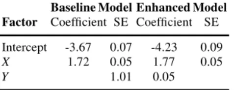
To evaluate calibration one compares the observed event rates within subgroups of subjects defined by the modeled predictors to the average modeled risk values among those subjects. The subgroups are usually selected as having modeled risk values in a narrow range. A visual aid to this comparison is the predictiveness curve
event rate (0.1017) 0.0 0.2 0.4 0.6 0.8 1.0 Risk 0 20 40 60 80 100 Risk percentile
[20]. The plot orders subjects from lowest to highest modeled risk, plotting the risk versus the corresponding percentile. The x-axis, allows one to identify subgroups similar in regards to modeled risk. For example, groups may be defined by decile of modeled risk. The observed event rate in each subgroup is superimposed on the plot as shown in Figure 1. If the circles follow the predictiveness curve, we conclude that modeled risks are close to observed risks and the model is well calibrated (in the weak sense) in the dataset. The predictiveness curve in Figure 1 shows that the fitted model is extremely well calibrated. An alternative but related visual display
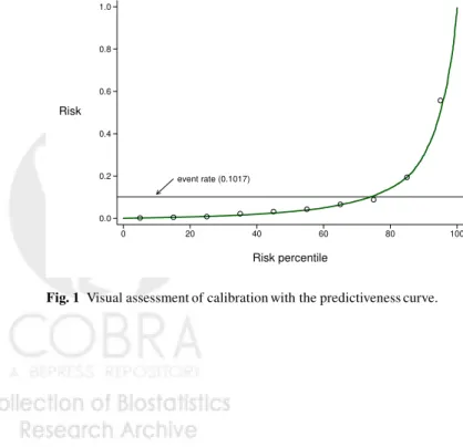
Fig. 2 Calibration with the calibration plot.
is the calibration plot (Figure 2) [25]. This also uses intervals of modeled risk (e.g. deciles) but plots observed event rates versus average modeled risk producing points that should lie along the 45◦ line if the model is well calibrated. A disadvantage of the calibration plot versus the predictiveness curve is that points can be more clumped. Moreover the variability in modeled risk within an interval risk category is not evident from the calibration plot. If substantial variation exists in a category one might choose to use smaller subdivisions of that category in comparing observed event rates with modeled rates.
The Hosmer-Lemeshow test is often reported as a test for calibration [14]. It also uses subsets defined by modeled risk, typically deciles, and calculates
H≡ 10
∑
k=1 Nk (0k−rˆk(X))2 ˆ rk(X)(1−rˆk(X))whereNk=the number of subjects in thekthcategory, 0k=the observed event rate and ˆrk(X)is the average estimated modeled risk. Under the null hypothesis of good model calibration, the statisticHhas a chi-squared distribution. The statistic
corre-sponds closely with the predictiveness and calibration plots in that it compares 0k and ˆrk. However, the statistic has been criticized for many reasons including that it is highly dependent on sample size (almost certainly significant ifNis large enough and non-significant ifNis small enough). In of itself, it does not convey the extent to which the model is well calibrated to the data. But it can serve as a descriptive adjunct to the visual display of calibration manifested in the predictiveness or cali-bration plots. Although deciles of risk are typically used for the predictiveness plot, calibration plot and Hosmer-Lemeshow statistic, as mentioned above there is no reason that other subgroupings couldn’t be used.
2.4 Achieving a Well Calibrated Model
This chapter does not cover procedures to fit regression models. We refer to text-books that cover the topic in depth [8, 26]. When only a few predictors are included, the task of fitting a model that is well calibrated to the data and not over-fit is rel-atively straightforward. Although sampling variability in the fitted model remains, assuming good study design practices have been followed and in the absence of ad-ditional data, one will propose the fitted model for use in practice. The next task will be to evaluate its performance for prediction.
Sometimes an externally fitted model will be proposed for validation on a new dataset. If the model is not found to be well calibrated on the new dataset, it must be regarded as not having been validated. Nevertheless, some investigators proceed to evaluate its classification performance. In our opinion this is inappropriate. Individ-uals will want to use the prediction model not just as an aid in classification but to calculate their risk as a function of predictors. A poorly calibrated model is known to be invalid for this purpose and should be abandoned.
A better strategy perhaps is to derive a revised risk prediction model with the new dataset. This may be done by using the original modeled risk value as a sole predictor and fitting a model with that single predictor to the data. This is called
recalibration. Because only one predictor is involved it should be easy to arrive at
a revised model that is well calibrated to the new dataset and therefore worthy of evaluation for its predictive performance.
Another strategy is to begin anew and fit a model with each predictor in the original model included as a candidate predictor for the new model. If many pre-dictors are involved, issues pertaining to overfitting arise and one will need to use techniques such as ‘shrinkage’ in order to arrive at a believable model. Fruitfully applying such techniques requires considerable skill and experience. An advantage of starting over with the new dataset is that a combination of predictors that is closer to optimal for application in the target population may be arrived at. Recalibrating an existing model is easer and subject to less sampling variability, but one maintains the same predictor combination of the original model that may be suboptimal if it was derived from a population that is not the one of interest.
Why might an externally derived model fail to be well calibrated? Certainly if it was derived in a different population with different predictor effects (or distribu-tions, see 2.2) it may not be valid for use in the target population. Another common cause is overfitting the model in the original population.
For the remainder of this chapter we assume that a model that is well calibrated is to be evaluated for its performance.
3 Measuring Prediction Performance of a Single Model
3.1 Context
The focus of this section is on describing conceptual approaches to evaluating a risk prediction model. We suppose that we have an extremely large population and the true risk function, risk(X) =P(D=1|X), is available. How do we measure the performance of this risk function for use in the population?
It is important to remember that the purpose of calculating risk(X) is to af-fect medical decisions. Recall that we assume that in the absence of knowledge of risk(X)no treatment will be offered, but that if risk(X)is found to be large enough, treatment will be offered. Implicitly we assume that treatment must have associated with it some costs, e.g. toxicity, monetary costs, inconvenience. Otherwise all sub-jects, regardless of their risk value, could be treated even if the benefit was minimal.
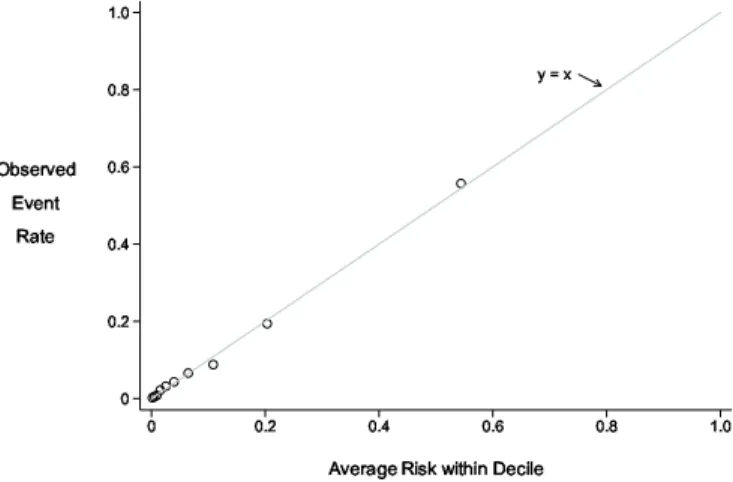
3.2 Case and Control Risk Distributions
All metrics to gauge the performance of a risk model are derived from the distribu-tion of risk(X)in cases and in controls. Having a visual display of the distributions is often helpful. Although probability density functions (Figure 3) give a sense for the separation between case and control distributions, cumulative distributions, or
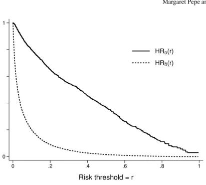
1−cd f sdenoted by HRD and HRD¯ in Figure 4 are more useful because they
ex-plicitly show the proportions of cases and controls above any threshold value used to define ‘high risk.’ Since decisions to opt for treatment will be based on ‘high risk’ designation, it is of interest and can be seen directly from the cdfs how many cases and controls are recommended for treatment using the risk model.
Gail and Pfeiffer [6] make the point that the cumulative distribution function(cdf) of risk in the population as a whole, cases and controls together, is sufficient to calculate performance measures. This is true because the case distribution and the control distribution can both be calculated from the overall population distribution of risk. Using f(risk(X) =r)to denote probability density for risk(X)atr, this follows because
threshold = t risk
cases controls
Fig. 3 Case and Control risk distributions on the logit scale.
f(risk(X) =r|D=1) =P(D=1|risk(X) =r) P(D=1) f(risk(X) =r) =r f(risk(X) =r) P(D=1) f(risk(X) =r|D=0) =(1−r)f(risk(X) =r) P(D=0)
The overall cdf of risk(X)in the population as a whole is shown by the
predictive-ness curvethat displays quantiles of risk in the population (Figure 5) but we find the
case and control specific cdfs to be a more informative display.
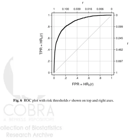
Thereceiver operating characteristic(ROC) curve, that plots HRD(r) =P(risk(X)>
r|D=1)versus HRD¯(r)≡P(risk(X)>r|D=0)(Figure 6) is another popular
vi-sual display to assess performance. When the case and control distributions are well separated, the ROC curve
ROC(f) =HRD(HR−D¯1(f))
lies close to the upper left hand corner of the [0,1]×[0,1]quadrant. Huang and Pepe [10]show that the ROC curve and prevalence, ρ =P[D=1], together can be used to calculate the predictiveness curve. And, since the predictiveness curve can be used to calculate the case and control distributions of risk it follows that
(ROC(f),f∈(0,1);ρ)contain all the information available in the case and control distributions of risk(X). However, the risk thresholdsrcorresponding to the points on the ROC curve,(HRD¯(r),HRD(r)), are not visible from the ROC curve detracting from its interpretation. When plotting a single ROC curve it is possible to add the risk thresholds to the axes (Figure 6). However, with two or more ROC curves this is not possible. Since ROC curves do not align models according to the same risk
_ 0 1 0 .2 .4 .6 .8 1 Risk threshold = r HRD(r) HRD(r)
Fig. 4 Case and control distributions of risk shown with 1−cd ffunctions, HRC(t) =P(risk(X)>
t|D=1)and HRN(t) =P(risk(X)>t|D=0)
thresholds and do not display risk thresholds they are less useful for evaluating prediction models than they are for evaluating diagnostic tests whose numeric scales are often irrelevant in data displays.
3.3 Risk thresholds
How should one choose the risk threshold for designating a patient as at sufficiently high risk to warrant treatment? Intuitively the costs and benefits associated with treatment dictate the choice. If the treatment is very costly in terms of toxicities, monetary expense or inconvenience, a high threshold may be warranted. If the treat-ment is very likely to be effective at preventing a bad outcome, this might lower the threshold for treatment. In the extreme, an ineffective or prohibitively costly treat-ment dictates use of a risk threshold close to 1 corresponding to few people being treated. At the other extreme, a highly effective inexpensive treatment with few tox-icities dictates that many people should be treated, i.e., use of a low risk threshold.
An explicit relationship is given in the next result between the risk threshold for treatment,rH, and the net costs and benefits of treatment. Write thenet benefit of
treatmentto a subject who would have an event in the absence of treatment asB. For
event rate (0.1017) 0.0 0.2 0.4 0.6 0.8 1.0 Risk 0 20 40 60 80 100 Risk percentile
Fig. 5 The predictiveness curve that shows the quantiles of risk(X)in the population. The predic-tion curve for the ideal model where all cases have risk=1 and all controls have risk=0, is shown as a dashed step function.
_ 1 0.697 0.462 0.245 0.099 0 r 0 .2 .4 .6 .8 1 TPR = HR D (r) 1 0.100 0.039 0.016 0.006 0 r 0 .2 .4 .6 .8 1 FPR = HRD(r)
{value of an event}and the net benefit is the benefit less the costs associated with treatment for a subject who would otherwise have an event. Note that these costs must be put on the same scale as the benefit, i.e.{value of an event}in our example. A subject who would not have an event in the absence of treatment suffers only costs and no benefit from being treated. We use Cost to denote the corresponding cost for such a subject.
Result 1
The risk threshold for treatment that should be employed to ensure subjects with risk values risk(X)benefit on average is
rH=Cost/(Cost+B).
The threshold does not depend on the model or on the predictors in the model.
Proof. The expected net benefit for subjects with risk(X) =ris
B P(D=1|risk(X) =r)−CostP(D=0|risk(X) =r) =B r−Cost(1−r)
which is positive if
r
1−r>
Cost
B
In other words, to ensure a positive average benefit for subjects with risk valuesr
they should opt for treatment ifr/(1−r)>Cost/Band should not opt for treatment ifr/(1−r)<Cost/B. That is the treatment risk threshold is Cost/(Cost+B). ut
The result agrees with the intuition that high costs and/or low benefits should be correspond to high values of the risk threshold for opting for treatment.
ExampleSuppose treatment reduces the risk of breast cancer within 5 years by 50% but it can cause other bad outcomes such as other cancers, cardiovas-cular events and hip fractures that are considered equally bad. Assume other bad outcomes, O, occur with a frequency ofxin the absence of treatment but with a frequency ofzin the presence of treatment regardless of whether
D=1 or 0. Let D(0),D(1),O(0),O(1)denote the potential outcomes with and without treatment. A subject who would not develop breast cancer absent treatment suffers the increased risk of other bad events; his/her net cost of treatment is
P(D=1 orO=1|T =1,D(0) =0)−P(D=1 orO=1|T =0,D(0) =0)
=P(O=1|T=1,D(0) =0)−P(O=1|T =0,D(0) =0) =P(O=1|T=1)−P(O=1|T=0) =z−x.
The net benefit of treating a subject who would get breast cancer absent treat-ment is the reduction in his/her event probability,
P(D=1 orO=1|T =0,D(0) =1)−P(D=1 orO=1|T =1,D(0) =1) =1−[P(D=1|T=0,D(0) =1) +P(D=0 andO=1|T=1,D(0) =1)] =1−[0.5+ (1−0.5)P(O=1|T =1)] =0.5+0.5z
The treatment risk threshold is thereforez−x+z−x0.5(1+z).
In practice it is often difficult to specify costs and benefits associated with treat-ment. It can be especially difficult to specify them on a common scale when they are qualitatively different entities. On the other hand a treatment threshold for risk is often easier to specify. For example, the ATP guidelines recommend that sub-jects with risks above 20% consider longterm treatment with cholesterol lowering therapy to reduce risk of cardiovascular events. Individuals make decisions such as whether or not to have genetic testing of their fetus based on their risk of having a child with genetic abnormalities. Their chosen risk threshold is often derived intu-itively from their knowledge of the qualitative costs and benefits of amniocentesis. We similarly make decisions about procuring insurance using our tolerance for risk. Result 1 tells us the explicit relationship between the risk threshold and the per-ceived cost-benefit ratio. For example, by choosing a risk threshold equal to 20% for cholesterol lowering therapy, we are implicitly stating that the net benefit of therapy for a would-be case is 4 times the net cost of therapy for a would-be control because rH
1−rH =.2/(1−.2) =1/4.
3.4 Summary Statistics When a Risk Threshold is Available
In this section we consider settings where a risk threshold,rH, exists that defines high risk status with possible recommendation for treatments or, perhaps, for entry into a clinical trial. The context then is essentially reduced to a binary classification rule, high risk or not high risk, and measures commonly used to summarize perfor-mance of binary classifiers are appropriate. We already defined the proportions of cases and controls classified as high risk as
HRD(rH) =P(risk(X)>rH|D=1) HRD¯(rH) =P(risk(X)>rH|D=0).
A perfect model classifies all cases and no controls as high risk, HRD(rH) =1 and HRD¯(rH) =0. A good model classifies a large proportion of cases as high risk and a low proportion of controls as high risk. Terms commonly used for HRD(rH) are true positive rate and sensitivity while false positive rate and 1-specificity are terms used for HRD¯(rH).
The HRD(rH)is a good attribute of a prediction model while HRD¯(rH)is a neg-ative attribute. The expected population net benefit of using the model with risk thresholdrH, NB(rH), combines the two into an overall population measure that balances the positive and negative attributes:
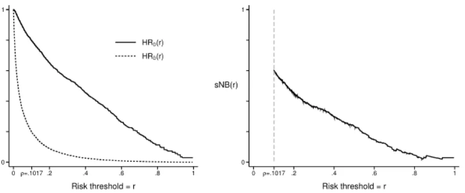
NB(rH) =P(risk(X)>rH){BP(D=1|risk(X)>rH)−CostP(D=0|risk(X)>rH)} =B P(risk(X)>rH|D=1)P(D=1)−CostP(risk(X)>rH|D=0)P(D=0) =BHRD(rH)ρ−CostHRD¯(rH)(1−ρ). _ 0 1 0ρ=.1017 .2 .4 .6 .8 1 Risk threshold = r HRD(r) HRD(r) 0 1 sNB(r) 0 ρ=.1017 .2 .4 .6 .8 1 Risk threshold = r
Fig. 7 Proprtions of cases and controls above risk thresholdrand corresponding standardized net benefit.
Observe that NB(rH)is an expectation over the entire population and assumes treat-ment is offered if risk(X)>rH. In contrast the expected net benefit in the proof of result 1 concerns only subjects with risk(X) =rand considers their net benefit if they receive treatment.
Recall that Result 1 tells us that use of the risk thresholdrH implies Cost/B=
rH/(1−rH). Substituting into the above gives us an expression for expected net benefit that depends only on model performance parameters (HRD(rH),HRD¯(rH)) and the constants(ρ,rH).
NB(rH) ={ρHRD(rH)−
rH 1−rH
(1−ρ)HRD¯(rH)}B
Vickers and Elkin [27] propose measuring net benefit in units that assignBa value 1. In those units NB(rH) =ρHRD(rH)−1−rrHH(1−ρ)HRD¯(rH)
A standardized version of NB(rH)is found by dividing NB(rH)by the maximum possible value that can be achieved, namelyρB, corresponding to a perfect model with HRD(rH) =1 and HRD¯(rH) =0. Baker et al. used the term ‘relative utility’ but we prefer the more descriptive term standardized net benefit’ and use notation that corresponds:
sNB(rH) =NB(rH)/max(NB(rH)) =NB(rH)/ρB =HRD(rH)− rH (1−rH) (1−ρ) ρ HRD¯(rH).
An advantage of standardizing net benefit is that it no longer depends on the measurement unitB, an entity that is sometimes difficult to digest.sNB(rH)is a unitless numerical summary in the range (0,1).
Another interpretation for sNB(rH) is that it discounts the true positive rate HRD(rH)using the scaled false positive rate HRD¯(t)to yield a discounted true
pos-itive rate. The FPR is scaled so that the units are on the same scale as the TPR.
sNB(rH)can therefore be interpreted as the true positive rate of a prediction model that has no false positives but equal benefit.
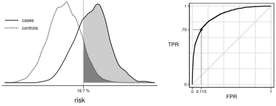
16.7 % risk cases controls 0 .70 1 TPR 0 0.115 1 FPR Fig. 8 ROC−1(0.7)−0.115
In our opinion a reasonably complete reporting of a prediction model’s perfor-mance is given by HRD(rH), HRD¯(rH)andsNB(rH). One also needs to keep in mind the prevalence,ρ, and the risk threshold,rH, in order to interpretsNB(rH)and its components(HRD(rH), HRD¯(rH)).
Example
Figure 7 shows HRD(rH), HRD¯(rH)and their weighted averagesNB(rH)for var-ious choices of risk threshold,rH. For example, atrH=0.2 we have that 65.2% of cases and 8.9% of controls are classified as high risk. This corresponds to a ben-efit that is 45.6% of the maximum possible benben-efit, where the maximum possible benefit would be achieved by classifying all 10.17% cases and no controls as high risk. Alternatively we can consider that the observed true positive rate of 65.2% is discounted to 45.6% by the 8.9% of controls that are designated as high risk.
The plot in Figure 7 allows one to view performance achieved with different choices of risk threshold. Observe that the net benefit curve is plotted only forrH>
ρ. This is because the assumed default action is tonottreat subjects. In the absence of predictors, all subjects are assigned risk valuesρ. Therefore a risk value ofρmust correspond to the ‘no treatment’ rule. To be consistent and rational we still assign
no treatment if risk(X)<ρwhen predictors are available. Therefore risk thresholds for treatment belowρ are not relevant. If one were to instead assign treatment as the default decision and use the model for decisions to forego treatment, then the expected net benefit and its standardized version would be calculated differently:
sNB(rL) = (1−HRD¯(rL))−(1−ρρ)(1−rrLL)(1−HRD(rL)), where rL is the low risk threshold below which subjects wouldnotreceive treatment. Moreover this version ofsNB(rL)would only be calculated forrL<ρ. See Baker [1] for details.
In many circumstances a fixed risk threshold for assigning treatment does not exist. It can be useful to consider a variety of thresholds. Consider that a predic-tion model is often developed to determine eligibility criteria for a clinical trial of a new treatment. For example, new treatments for acute kidney injury are under development and prediction models are sought to identify high risk subjects for up-coming clinical trials. Potentially toxic or expensive treatments will require higher risk thresholds than less toxic, inexpensive treatments. Having displays that show performance across a range of risk thresholds will allow researchers to entertain use of risk prediction models for designing trials of different types of treatment.
Another important reason to display performance as a function of risk threshold is that it allows individuals with different tolerances to assess the value of ascer-taining predictor information for them. If the distribution of risk thresholds among individuals in the population were known, those could be overlaid on the plots. One could summarize the information by integrating over the distribution of risk thresh-olds: HRD¯ =E(HRD¯(rH)) =the overall proportions of controls that do not receive treatment; HRD=E(HRD(rH)) =the overall proportion of cases who receive treat-ment; andE(NB(rH)) =expected net benefit.
Although we emphasize HRD(rH), HRD¯(rH)andsNB(rH)as the key measures of prediction performance for settings where a risk threshold reduces the model to a binary decision rule, we acknowledge that other measures of performance for binary classifiers could also be reported. Classic measures include: the misclassification rate, (1−HRD(rH))ρ+HRD¯(rH)(1−ρ); Youden’s index, HRD(rH)−HRD¯(rH); and the Brier score,E(D−risk(X))2. These measures, likesNB(r
H), are functions of HRD(rH)and HRD¯(rH)but seem to lack its compelling interpretation and prac-tical relevance. Therefore we do not endorse them for evaluating risk prediction models.
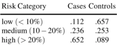
3.5 Multiple Risk Categories
For prevention of cardiovascular events two possible treatment strategies are rec-ommended. Longterm treatment with cholesterol lowering drugs is recommended for high risk subjects while an inexpensive, non-toxic intervention, namely healthy lifestyle changes, is recommended for subjects at moderately elevated risk. Three risk categories are therefore of interest in this clinical setting: low risk(risk≤5%), moderate risk (5−20%)and high risk (≥20%). The parameters HRD and HRD¯
pro-portions of cases in each category and the propro-portions of controls in each category. These fractions can be read off of the distribution function displays in Figure 7. Values are shown in Table 2.
Table 2 Proportions of subjects in each of 3 risk categories. Risk refers to 10-year probability of a cardiovascular event.
Risk Category Cases Controls low(<10%) .112 .657 medium(10−20%) .236 .253 high(>20%) .652 .089
The standardized net benefit function can also be generalized to accommodate more than two categories of risk, but it requires specifying some relative costs and benefits explicitly in addition to the cost-benefit ratios that are implied by the risk threshold values that define the risk categories.
As an example, suppose there are 3 categories of risk with treatment recommen-dations being none for the low risk category(risk≤rlow), intermediate treatment for the medium risk category(rlow≤risk<rhigh)and intense treatment for the high
risk category (risk>rhigh). Suppose that in the absence of a predictive model all subjects are recommended for intermediate treatment. We use the following nota-tion for costs and benefits:Bhigh= net benefit of intense treatment to a subject who
would be a case;Chigh= net cost of intense treatment to a would-be control;Blow= net
benefit of no treatment to a would be control andClow= net cost of no treatment to a would-be case. All of these quantities are relative to the intermediate treatment and as always, cases (controls) are those who would (would not) get the bad outcome in the absence of treatment. The expected net benefit in the population associated with use of the risk model is:
ρ{−ClowLRD+BhighHRD}+ (1−ρ){BlowLRD¯−ChighHRD¯}
where LR and HR are probabilities of being in the low and high risk categories and the subscriptsDand ¯Dindicate cases and controls as usual. LetrLandrH denote the risk thresholds that separate low from medium risk and medium from high risk, respectively. The arguments of Result 1 implies that(rL/1−rL) =Blow/Clow and (rH/1−rH) =Chigh/Bhigh. Let λ =Bhigh/Clow be the ratio of the net benefit of
intense treatment to the net cost of no treatment for a subject that would be a case. The population net benefit of using the model with these risk categories can then be written as Bhigh ρ{−1 λLRD+HRD}+ (1−ρ){ rL (1−rL)λ LRD¯− rH 1−rH HRD¯ . This can be standardized by the maximum possible benefit that is achieved with a perfect prediction model,Bhigh{ρ+ (1−ρ)(1−rrL
benefit function sNB(rM,rH) = ρ{HRD−LRD/λ}+ (1−ρ){(1−rrL L)λLRD¯− rH (1−rH)HRD¯} ρ+ (1−ρ) rL (1−rL)λ
This expression is a function of the risk thresholds, prevalence and case and con-trol risk distributions and it requires specifying another parameter, namelyλ. If we assume the net benefit of cholesterol lowering treatment relative to healthy lifestyle is 10 times as large as the net cost of no treatment relative to healthy lifestyle in-tervention to a would-be case, then the standardized net benefit associated with the fitted model risk(X)is
0.1017{0.652−0.112/10} −0.8983{0.05 0.95 0.657 10 − 0.20 0.80×0.089} 0.1017+0.8983× 0.05 0.95×10 =77.1%
This example demonstrates that calculation of net benefit associated with a risk model becomes quite complicated with 3 treatment categories compared with the calculation when only two treatment categories exist.
3.6 Implicit Use of Risk thresholds
In some circumstances a risk threshold for treatment that maximizes expected ben-efit cannot be adopted. Policy makers may require that alternative criteria are met. For example, Pfeiffer and Gail [23] consider using a risk threshold that determines a proportionvof the population is recommended for treatment: Allocation of financial resources might determine such a policy. The risk threshold is written as
rH(v) : v=P(risk(X)>rH(v)).
Having fixedv, they propose the proportion of cases that meet the treatment thresh-old as a measure of model performance:
PCF(v) =P(risk(X)>rH(v)|D=1),
with larger values indicating better performance. Observe that in our previous nota-tion we can write
PCF(v) =HRD(rH(v)).
Another policy based criterion might require that a fixed proportion of the cases are recommended for treatment. In this case the treatment threshold is
and the prediction model performance measure proposed by Pfeiffer and Gail is the corresponding proportion of the population needed to follow, i.e., testing positive,
PNF(w) =P(risk(X)>rH(w)). Smaller values ofPNF(w)are more desirable.
These measures are closely related to the ROC curve that plots the true pos-itive rate ROC(f) = P(risk(X)>rH|D=1) versus the false positive rate f =
P(risk(X)>rH|D=0)for all possible thresholdsrH∈(0,1). In fact a little algebra shows that
PNF(w) =ρw+ (1−ρ)ROC−1(w)
and
PCF(v) =ROC(f(v))
wheref(v)is found by solvingv=ρROC(f) + (1−ρ)f.
One can also directly use ROC curve points to characterize performance and it follows from arguments above that this approach is essentially equivalent to Pfeiffer and Gail’s approach. In ROC analysis one fixes the proportion of cases deemed at high risk, derives the corresponding thresholdrH(w)defined above, and evaluates the corresponding proportion of controls classified as high risk,
ROC−1(w) =P(risk(X)>rH(w)|D=0).
Alternatively, one can fix the proportion of controls classified as high risk at f, derive the corresponding threshold
rH(f) : f=P(risk(X)>rH(f)|D=0)
and use as the performance measure the corresponding proportion of cases classified as high risk
ROC(f) =P(risk(X)>rH(f)|D=1).
Example
Using our dataset, suppose we require thatw=70% of cases go forward for treatment. We calculate that the corresponding risk threshold will berH(w) =0.167 and that 11.5% of controls will exceed this threshold with use of the model. See Figure 8. Since the prevalence is 10.17%, the overall proportion of the population that will undergo treatment is 17.5%. Using our notation:
w=70%, rH(w) =0.167, ROC−1(w) =.115, PNF(w) =.175
3.7 Measures Independent of Risk Thresholds
When a risk threshold for decision making is not forthcoming, a descriptive sum-mary of the risk distributions in cases and controls may be of interest. In particular,
one can describe the separation between the case and control distributions of risk. For example, we could report: the average risk in cases, 0.391 in our example; the average risk in controls, 0.069 in our example, and the difference that we write as MRD, themean risk difference:
MRD=E(risk(X)|D=1)−E(risk(X)|D=0)
which is 0.322 in our example.
The MRD statistic is also called Yates’ slope. It is closely related to the integrated discrimination improvement (IDI) statistic proposed by Pencina et al. [16] for com-paring nested risk prediction models. Specifically, if we consider the baseline model as the null model without predictors, so all subjects have estimated risk equal toρ, then the IDI for comparing the model, risk(X), with the null model is the MRD. It has also been shown [19] that the MRD can be interpreted as the proportion of explained variation or coefficient of determination,R2=var{E(D|X)}/var(D).
Another way to summarize the distance between the case and control risk distri-butions is with theabove average risk difference, AARD:
AARD≡P(risk(X)>ρ|D=1)−P(risk(X)>ρ|D=0).
Noting that the average risk in the population isρ, this measure compares the pro-portion of cases with risks exceedingρ, HRD(ρ) =0.797 in our example, with the corresponding proportion of controls, HRD¯(ρ) =0.198, in our example, and
calcu-lates the difference, AARD=0.797−0.198=0.599.
The AARD has several additional noteworthy interpretations. First, Youden’s in-dex for a dichotomous diagnostic test is defined as the true positive rate minus the false positive rate. We see that AARD is Youden’s index for the rule that classi-fies subjects as positive when risk(X)>ρ. Second, we see that AARD=sNB(ρ), the standardized net benefit defined earlier, for the decision rule that usesρ as the high risk threshold. Third, the AARD is closely related to the net reclassification index (NRI) that will be defined in Section 4.3.2. The NRI is currently a very pop-ular measure for comparing nested models. It can be shown that for comparing the model with predictorsX,risk(X), to the null model that assigns all subjects a risk ofρ, AARD=NRI(>0)and AARD=NRI(ρ)where NRI(>0)is known as the continuous NRI and NRI(ρ)is the categorical NRI with two risk categories defined by the risk thresholdρ.
Interestingly, it can be shown that the difference, HRD(r)−HRD¯(r), is
maxi-mized at r=ρ (see proof of Theorem A.1 [22]). Therefore, the AARD can also be interpreted as a Kolmogorov-Smirnov distance between the case and control risk distributions. Finally, Huang and Pepe [10] and Gu and Pepe [7] showed that the standardized total gain statistic proposed by Bura and Gastwirth [2] as a measure of predictive capacity of a model risk(X),sT G=R|risk(X)−ρ|dF(X)/2ρ(1−ρ)is equal to the AARD.
Another nonparametric measure of distance between the case and control risk distributions is the area under the ROC curve (AUC):
AUC=P(risk(Xi)≥risk(Xj)|Di=1,Dj=0)
whereXiandXjare predictors for randomly drawn independent subjects from the case and control distributions, respectively. This is also known as the Mann-Whitney U-statistic and is calculated as AUC=0.884 for our data. The AUC has a long his-tory of use in evaluating diagnostic tests and other classifiers including risk models. It is still the most popular metric in use. However, its use in evaluating risk models has been criticized [3, 21]. One of the criticisms leveled against the AUC is that the measure has no practical relevance. Certainly this is true. If subjects were pre-sented in case-control pairs to the physician for deciphering which one is the case, the measureP(risk(Xi)>risk(Xj)|Di=1,Dj=0)would be of interest. But this is not the usual clinical task. Another criticism of the AUC is that the measure may be dominated by differences in risk distributions that are clinically irrelevant. In partic-ular in a low prevalence or incidence setting, the AUC is dominated by the low end of the risk range where most of the population’s risks lie. Yet small differences in the distributions over that range are of no clinical relevance. Consequently the AUC may not be sensitive to differences in risk distributions over more clinically relevant ranges.
These two criticisms, practical irrelevance and insensitivity to clinically impor-tant differences in distributions, however, apply not only to the AUC, but also apply to other measures of distance between case and control risk distributions such as the MRD and AARD. We see no particular advantage to MRD or AARD or the related reclassification measures (IDI and NRI) that will be described later. We caution against using any of these measures as a sole focus for evaluating and comparing models. Rather they may be more suitable to assessing if a model is at one extreme or the other in terms of prediction performance. As such, their use may be justified in algorithms to sift through many models in order to select some that have predictive performance worthy of more thorough evaluation, i.e., discovery research.
3.8 Recommendations
For evaluating a single risk prediction model we have the following recommenda-tions:
(i) Assess the model for its calibration in the population of interest and if necessary recalibrate the model.
(ii) Plot the case and control risk distributions, possibly providing a summary index of distance between the distributions as a descriptive adjunct.
(iii) In collaboration with clinical and health policy colleagues, elicit a risk threshold or several thresholds that could be used for making treatment decisions. Evaluate the model in terms of corresponding case and control classification rates and in terms of net benefit of using the model.
4 Comparing Two Risk Models
In this section we consider the comparison of two risk models for their prediction performance. In a nutshell we recommend that (i) each model be evaluated for its calibration; (ii) plots of risk distributions and net benefit be prepared for each model; (iii) having chosen a clinically relevant risk threshold for treatment (or several) com-pare the corresponding case and control categorized risk distributions for the two models and (iv) compare the corresponding net benefits associated with the two models. An illustrative example is provided in Section 4.1. This approach applies when the two models are nested (where one model has predictorsX and the other has additional predictorsY) and when the models are not nested. Several methods have been proposed in recent years for the specific problem of comparing nested models, notably risk reclassification methods. We describe those risk reclassifica-tion methods in secreclassifica-tion 4.3. Finally, we provide a result concerning the equivalence of null hypotheses about improvement in prediction performance gained by adding
Y to a set of baseline predictorsXand the classic null hypothesis aboutY as a risk factor after controlling forX.
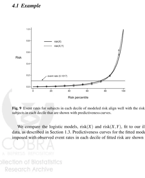
4.1 Example
event rate (0.1017) 0.0 0.2 0.4 0.6 0.8 1.0 Risk 0 20 40 60 80 100 Risk percentile risk(X) risk(X,Y)Fig. 9 Event rates for subjects in each decile of modeled risk align well with the risk values for subjects in each decile that are shown with predictiveness curves.
We compare the logistic models, risk(X) and risk(X,Y), fit to our illustrative data, as described in Section 1.3. Predictiveness curves for the fitted models super-imposed with observed event rates in each decile of fitted risk are shown in Figure
_ _ 0 1 0ρ=.1017 .2 .4 .6 .8 1 Risk threshold = r HRD(r) XY HRD(r) XY HRD(r) X HRD(r) X 0 1 sNB(r) 0 ρ=.1017 .2 .4 .6 .8 1 Risk threshold = r XY X model
Fig. 10 Plots showing high risk classification for cases(D)and controls(D¯)under the baseline model (X) and the expanded model(X,Y). A comparison of standardized net benefit is also shown.
9. Both models are well calibrated. The risk distributions in cases and controls are shown in the left panel of Figure 10 using 1−cumulative distribution functions. That is, for each risk threshold rwe show the proportions of cases and controls above that threshold. We see that at all thresholds more cases and fewer controls have risks above the threshold when using the model risk(X,Y)than with model risk(X). Consequently the case and control risk distributions are more separated by the model risk(X,Y)than by the model risk(X). The measures of separation, AUC, MRD, and AARD, are presented in Table 2, and confirm that greater separation is achieved with the model includingY as a predictor.
Table 3
risk(X)risk(X,Y)Difference AUC 0.884 0.920 0.036 MRD 0.322 0.416 0.094† AARD 0.599 0.673 0.074 HRD(0.20) 0.652 0.735 0.084 HRD¯(0.20) 0.089 0.084−0.005 sNB(0.20) 0.455 0.550 0.095 PNF 0.174 0.134−0.040
†difference in MRDs is called the IDI [16]
The right hand side of Figure 10 shows that, regardless of which risk threshold is employed for recommending treatment, the expected benefit is larger whenY is included in the risk model. This is not surprising since the change in the net benefit is a weighted sum of the increase in the value HRD(r)plus the decrease in the value of HRD¯(r), both of which are positive.
sNB(X,Y)(r)−sNBX(r) ={HR(DX,Y)(r)−HRXD(r)}+ (1−ρ) ρ r (1−r){HR X ¯ D(r)−HR (X,Y) ¯ D (r)} Suppose that subjects with risks above 20% are recommended for treatment be-cause the net benefit of treatment to a (would-be) case is considered 4 times the net cost of treatment to a (would be) control. The model that includesY recommends 8.4% more cases and .5% fewer controls for treatment. Relative to a perfect predic-tion model, the model withXonly achieves 45.5% of maximum benefit while that includingY as well asXachieves 55.0% of maximum benefit. That is, the standard-ized net benefit or discounted true positive rate is improved by 9.5%.
We also consider performance when certain criteria are set by policy mak-ers. Suppose that a treatment risk threshold will be employed that will guarantee
w=70% of cases are treated. Using the model withX only will require treating PNF(w) =17.4% of the population (and correspondingly ROC−1(w) =0.114 of controls) since the largest risk threshold exceeded by 70% of cases isrHX(w) =0.167. On the other hand, a higher risk threshold r(HX,Y)(w) =0.231, can be employed with the model risk(X,Y)as the case risk distribution is higher. Consequently only PNF(w) =13.4% of the population (and only ROC−1(w) =0.07 of controls) will be treated if risk(X,Y)is used for assigning treatment.
In this example, better performance is achieved by includingY in the risk model regardless of how performance is measured.
4.2 Risk Reclassification within Subpopulations Defined by
risk
(
X
)
In addition to determining whether or not use of the model risk(X,Y)is better than use of risk(X)in the population as a whole, one might ask if the additional informa-tion provided by knowledge ofY is useful in subsets of the population. Specifically, one might consider subsets of the population determined to be at low (or high or intermediate) risk according to risk(X) and evaluate use of the enhanced model risk(X,Y)in that subpopulation. This is one motivation for constructing the risk reclassification table illustrated in Table 4.
Table 4 shows risk reclassification tables for cases in the ‘Events’ panel of the table and for controls in the ‘Nonevents’ panel of the table. In cardiovascular dis-ease the tables are often constructed using 3 categories corresponding to the 3 treat-ment recommendations. Here we focus on the most important reclassifications to or from the high risk category that associated with cholesterol lowering treatment, and ignore reclassification between the medium and low risk categories that are less consequential. Table 5 summarizes the performance of the enhanced model risk(X,Y) within each of the subpopulations determined to be at low (<5%), medium(5−20%)and high(>20%)risk according to the baseline model, risk(X). In the low risk population, where the event rateρ=1.89%, only 3.5% of those cases are reclassified byY to the high risk category and almost no controls 0.4% are reclassified. The maximum possible benefit is to reclassify all cases (18.9 per 1000
Table 4 Event and Nonevent Risk Reclassification Tables Events risk(X,Y) r(X) <5% 5−20% ≥20% Total ≤5% 72 38 4 114 (11.2%) 5−20% 21 105 114 240 (23.6%) ≥20% 0 33 630 663 (65.2%) Total 93 176 748 1017 (9.1%) (17.3%) (73.5%) Nonevents risk(X,Y) r(X) <5% 5−20%≥20% Total ≤5% 5486 399 21 5906 (65.8%) 5−20% 1015 990 272 2277 (25.3%) ≥20% 40 296 464 800 (8.9%) Total 6541 1685 757 8983 (72.8%) (18.8%) (8.4%)
Table 5 Performance ofr(X,Y)within strata defined byr(X) ρ(X) cases controls % of max benefit Population Event Rate HRD(0.20)HRD¯(0.20) sNB(0.20)
low riskr(X) 1.89% 0.035 0.004 −1.7% med riskr(X) 9.54% 0.475 0.119 19.3% high riskr(X) 45.32% 0.950 0.580 25.4%
subjects) and no controls but the model reclassifies only 3.5% of the cases (0.66 cases per 1000 subjects). Consequently, the standardized net benefit of using the model is negligible. (The negative value,−1.7%, must be due to sampling variability as the net benefit cannot be negative if the model is correct.) It appears that use ofY
in the low risk population is not beneficial.
In the medium risk population, 47.5% of the cases are favorably reclassified to the high risk group while only 11.9% of the controls are. The maximum possible benefit is that achieved if all 95.4/1000 cases were moved to the high risk category without moving any of the 904.6/1000 of the controls. With use ofY it appears that
sNB(0.2) =19.3% of this maximum possible benefit is achieved. In other words the benefit reached by measuringY in the medium risk population is the same as that achieved by a model that moved about 19/1000 cases to treatment with statins without moving any controls into that high risk category.
In the high risk group, benefit can be obtained by moving controls down to a lower risk category but at the possible cost of moving cases down. The reclassifica-tion tables show however that with use ofY only 5% of the cases are moved down while 42% of controls move down. The maximum benefit in a population of 1000
subjects would be that achieved by moving none of the 453 cases but all of the 547 controls down. With use ofY, we are able to move 230 controls off treatment at the expense of moving 23 cases off treatment. Is this a net benefit? Arguments similar to those in Section 3.4 can be used to show the standardized net benefit of a rule that denies treatment when the risk<rHin a population with prevalenceρ is
sNB(rH) ={1−HRD¯} − ρ 1−ρ 1−rH rH { 1−HRD(rH)}.
We calculate thatsNB(rH) =25.4% of maximum benefit is achieved with use of
Y in the population deemed at high risk according to risk(X). This is equivalent to moving.254×547=140 controls down without moving any cases in a set of 1000 subjects. This benefit seems substantial.
We find risk reclassification tables useful for evaluating an expanded model risk(X,Y)within subpopulations defined by risk levels calculated according to the baseline model risk(X), as illustrated above. One might also choose to plot risk distributions and calculate other statistics for evaluating a risk model within each subpopulation using techniques described in Section 3. However, analyses of risk reclassification tables have been proposed for purposes beyond evaluation use of risk(X,Y)within subpopulations defined by risk(X). In particular, analyses that pur-port to compare the two models in the entire population have been proposed. In the next section we describe the two main approaches that have been proposed and point out some fundamental weaknesses in them.
4.3 Risk Reclassification to Compare Two Models
4.3.1 The Cook and Ridker Analysis Method
Cook and Ridker [4] combine the event and nonevent reclassification tables in a single table with the elements shown in Table 6.
Table 6 Risk reclassification tables showing numbers of subjects and event rates (%) in each cell. risk(X,Y) r(X) ≤5% 5−20%>20% Total ≤5% 5558 437 25 6020 1.30 8.71 16.00 1.89 5−20% 1036 1095 386 2517 2.03 9.59 29.53 9.54 >20% 40 329 1094 1463 0.00 10.03 57.59 45.32 Total 6634 1861 1505 10,000 1.40 9.46 49.70 10.17
They calculate the following entities that are explained below: (i) the overall reclassification rate=RC
(ii) the percent correctly reclassified=RC-correct
(iii) the baseline model reclassification calibration statistic: RCCXand its p-value (iv) the expanded model reclassification calibration statistic: RCC(X,Y)and its p-value
The RC is the proportion of subjects in the off-diagonal cells of the table, 22.5% in our example. This is simply a descriptive statistic that is not used to compare models although a small value indicates that treatment recommendations will be changed for few subjects by includingYas a risk predictor in addition toX.
The RC-correct is defined to be the proportion of subjects in off-diagonal cells where the observed event rate is within the risk(X,Y)category label and not within the risk(X)category label. In our data RC-correct=100%. If the RC-correct value is large, this is taken as evidence that prediction performance with the model that includesY is better than prediction performance with the reduced model risk(X). However, it has been shown that by definition, when models are well calibrated in the standard sense, RC-correct≈100% in large samples. This follows because for observations in an off-diagonal cell where risk(X)∈Aand risk(X,Y)∈Bthe expected event rate
P(D=1|risk(X)∈A,risk(X,Y)∈B) =E(D=1|risk(X)∈A,risk(X,Y)∈B)
=E(E(D=1|X,Y)|risk(X)∈A,risk(X,Y)∈B) =E(risk(X,Y)|risk(X)∈A,risk(X,Y)∈B).
This average risk is in the interval Bbecause for all subjects in the off-diagonal cell, risk(X,Y)∈B. Moreover, the average risk is not in the intervalA because, being an off-diagonal cell, the intervalAlies outside of intervalB. It follows that for each off-diagonal cell, in large samples the event rate is in the interval defined by the enhanced model. That is, we expect that RC-correct=100%. Any deviation from 100% that occurs must be due to sampling variability. There is no point in calculating a statistic that is≈100% by definition and it cannot be used to compare the performances of the two models.
The reclassification calibration statistics are: RCCX=
K
∑
k=1
(pbk−ave(risk(X))k)2
ave(risk(X))k(1−ave(risk(X))k)/nk and RCC(X,Y)= K
∑
k=1 (bpk−ave(risk(X,Y))k)2ave(risk(X,Y))k(1−ave(risk(X))k)/nk)
where the summation is over the K interior cells of the table with sample sizes
nk≥20,ave(risk( ))k is the average of modeled risks for subjects in cellkand
b
calibration statistics to chi-squared distributions withK−2 degrees of freedom for calculating p-values.
The arguments above show that in large samples the observed event rates in off-diagonal cells converge toave(risk(X,Y))kbut not toave(risk(X))k. Therefore the implicit null hypothesis for the statistic RCC(X,Y)is satisfied. That is, the enhanced model will not be rejected at a rate above the nominal significance level in large samples. On the other hand the implicit null hypothesis for the baseline model will be rejected in large samples assuming thatY is a risk factor that moves even a small proportion of subjects to off-diagonal cells. In other words, if there are sub-jects in off-diagonal cells, there is no point in performing the RCC(X,Y)statistical test since the result is predetermined in large samples. If there are no subjects in off-diagonal cells the setting is degenerate and there is obviously no point in per-forming the test either. We implemented the RCC tests on our illustrative data and in agreement with our arguments above, the baseline model was rejected, p< .001, while the enhanced model was not,p=0.29.
In conclusion, we regard the risk-reclassification table proposed by Cook and Ridker [4] as an interesting descriptive device. However, the analysis strategy based on the table is not useful for comparing risk models.
4.3.2 The Net Reclassification Index
Pencina et al. [16, 17] introduced the Net Reclassification Index (NRI) as a mea-sure to compare the prediction performance of nested risk models. The statistic is calculated as the sum of two components, the NRI-event and NRI-nonevent. When risk categories exist, the data are summarized in reclassification tables of the form shown in Table 4 and the corresponding NRI statistics are
cat-NRI-event=P[riskc(X,Y)>riskc(X)|D=1]−P[riskc(X,Y)<riskc(X)|D=1] cat-NRI-nonevent=P[riskc(X,Y)<riskc(X)|D=0]−P[riskc(X,Y)>riskc(X)|D=0]
cat-NRI=cat-NRI-event+cat-NRI-nonevent
where riskc(X,Y)is the risk category in which the subject’s value for risk(X,Y) falls and riskc(X)is that in which his value of risk(X) falls. In words, cat-NRI-event is the proportion of cases above the diagonal of the cat-NRI-event reclassification table minus the proportion below the diagonal. The counterpart, cat-NRI-nonevent is the proportion of controls below the diagonal minus the proportion of controls above the diagonal. Their sum, cat-NRI, takes values between 0 and 2. For our data with 3 risk-categories, cat-NRI-event=0.100, cat-NRI-nonevent=0.073 and cat-NRI=0.174.
The cat-NRI provides a descriptive summary of the reclassification tables. How-ever, it does not seem particularly well suited to the purpose of comparing the pre-diction performance of the models risk(X) and risk(X,Y). In general it does not represent a comparison of the performance of the model risk(X,Y)with the perfor-mance of the model risk(X). To see this, consider that the performance of the model risk(X)must be derived from the case and control distributions of risk(X). These
distributions are contained in thevertical marginsof the event and nonevent reclas-sification tables, respectively. Similarly the performance of the model risk(X,Y)
must be derived from thehorizontal marginsof the reclassification tables. However, the cat-NRI statistic is a function that depends on the interior cells of the tables, not just their margins. This is illustrated in Table 7 that shows an example where the margins of the reclassification tables are equal but cat-NRI>0.
Table 7 Example where cat-NRI>0 but there is no performance improvement. Events r(X,Y)
low med high low 10 10 0 20 r(X)med 5 20 10 35 high 5 5 35 45 20 35 45 100
Non-Events r(X,Y)
low med high low 500 100 0 600
med 100 200 0 300 high 0 0 100 100 600 300 100 900
That is, in Table 7, prediction performance for the model risk(X,Y)is the same as that for the model risk(X)since the vertical and horizontal margins are equal. How-ever, the cat-NRI statistic= (20−15)/100=0.05>0, indicating that performance has improved.
Although the cat-NRI statistic was originally proposed for use with 3 or more risk categories, it is interesting to consider it in the simpler and more common setting where only two risk categories exist that are separated at a treatment risk threshold
rH. Using the notation in Table 8, it is easy to see that with two categories cat-NRI-event=b−c=b+d−(c+d) =HRD(X,Y)(rH)−HRXD(rH) cat-NRI-nonevent=f−g=f+h−(g+h) =HRXD¯(rH)−HR (X,Y) ¯ D (rH) cat-NRI={HRD(X,Y)(rH)−HRXD(rH)} − {HRD(¯X,Y)(rH)−HR X ¯ D(rH)}. That is, cat-NRI-event is the increase in the proportion of cases classified as high risk and cat-NRI-nonevent is the decrease in the proportion of controls classified as high risk. The simple summation that is cat-NRI however, does not weight the relative contributions appropriately unlessrH=ρ. To see this, recall that the change in the standardized net benefit does weight the contributions appropriately and is written as sNB(X,Y)(rH)−sNBX(rH) ={HR(DX,Y)(rH)−HRXD(rH)}− 1−ρ ρ rH (1−rH) {HR(D¯X,Y)(rH)−HRXD¯(rH)}. Only whenrH=ρ does cat-NRI correspond to the appropriately weighted
combi-nation, the change insNB(rH). Interestingly a weighted version of the two-category NRI statistic has recently been proposed to correspond with the form of change in
sNB(rH), by weighting cat-NRI-nonevent by (1−ρρ)(1−rrHH) [17]. However, weighted versions of the cat-NRI statistic have not been proposed to correspond with change in standardized net benefit when more than two categories are involved.
Table 8 Example where cat-NRI>0 but there is no performance improvement. Events r(X,Y) low high low a b high c d Non-Events r(X,Y) low high low e f high g h
A continuous version of the NRI statistic has been proposed for use when no clinically relevant risk categories exist:
cont-NRI-event=P(risk(X,Y)>risk(X)|D=1)−P(risk(X,Y)<risk(X)|D=1) =2P(risk(X,Y)>risk(X)|D=1)−1
cont-NRI-nonevent=P(risk(X,Y)<risk(X)|D=0)−P(risk(X,Y)>risk(X)|D=0) =1−2P(risk(X,Y)>risk(X)|D=0)
cont-NRI=2{P(risk(X,Y)>risk(X)|D=1)−P(risk(X,Y)>risk(X)|D=0)}. The statistic cont-NRI is also denoted byNRI(>0). Again, since it is not a func-tion of the marginal case and control risk distribufunc-tions, cont-NRI does not seem well suited to quantifying the improvement in prediction performance of the model risk(X,Y)versus that of the model risk(X). It is not composed as a difference be-tween an index of the performance of risk(X,Y)and an index of the performance of risk(X). But it is an interesting easily understood descriptive statistic about the joint distributions of (risk(X),risk(X,Y)) based on the comparison of risk(X,Y)
and risk(X)within individuals. In our data we calculate that for 69.4% of cases their calculated risk increased with addition ofY and for 29.5% of controls their risks increased with addition ofY. Consequently cont-NRI-event=0.388, cont-NRI-nonevent=0.411 and cont-NRI=0.799.
4.4 Hypothesis Testing for Nested Models
When evaluating if a model that includes markerY in addition toXimproves perfor-mance over the baseline model that includesXonly, it is common practice to do sev-eral hypothesis tests. One will typically test the hypothesisH01: risk(X,Y) =risk(X), using, for example, likelihood techniques based on regression models. IfH01is re-jected, one may test if the prediction performance of risk(X,Y)is equal to that of risk(X)using one or more statistics, such as the difference in the AUCs or the IDI statistic, which is the difference in MRDs, amongst others. The following result indicates that the null hypotheses concerning many measures of performance im-provement are identical toH01: risk(X,Y) =risk(X).
The practical implication of this result is that ifH01is rejected, one can conclude that the other hypotheses listed in Result 2 are also rejected. Testing any one of
hy-pothesesH02−H06is equivalent to testingH01. We recommend using well standard methods from regression modeling to test the hypothesis formulated asH01. Corre-sponding statistical techniques are well developed and they are often efficient. In contrast techniques based on estimates of the performance measures inH02−H06are likely to be less efficient and have in some cases been shown to have bizarre dis-tributions under the null hypothesis of no change in performance [13]. This is an active area of research.
Result 2
The following conditions are equivalent
H01 : risk(X,Y) =risk(X) H02 : ROC(X,Y)(f) =ROCX(f) ∀ f H03 : AUC(X,Y)=AUCX H04 : MRD(X,Y)=MRDX H05 : AARD(X,Y)=AARDX H06 : NRI(>0) =0
For a proof of Result 2 and additional related results see Pepe [22].
5 Concluding Remarks
We now recap some of the main points made in this chapter. First, a necessary condition for a useful risk prediction model is that it be well-calibrated. Whereas the scale of a marker used for classifying individuals according to disease status is not in and of itself of interest, risks calculated using a prediction model are used to advise a patient and to make medical decisions. The scale of the risk model predictions is therefore a fundamental aspect of the model’s utility. Good calibration is essential.
The distributions of risk predicted by the model, for cases and for controls, are the building blocks for evaluating model performance. Summary measures are func-tions of these distribufunc-tions. A variety of summary measures have been described here which rely on specification of a high risk threshold (or multiple risk thresh-olds) for classifying subjects. Our preferred measures are the proportions of cases and controls classified as high risk (or classified into each risk category) and the standardized net benefit of using the model. Performance measures that do not rely on risk thresholds can be useful for screening many models in order to select a subset for further evaluation.
The choice of the risk threshold(s) should be based on an assessment of costs and benefits associated with a high risk (or each risk category) designation. These costs and benefits are also used in calculating the scaled net benefit of the model.
When comparing models, our recommendation is to compare measures of marginal performance. This is in contrast to basing comparisons on statistics that summarize the cross-classification of the two models. The cross-classification is useful for de-scriptive analysis but cannot be used as the basis for forming conclusions regarding the relative performance of the two models.
When testing the incremental value of a new marker added to a risk model, stan-dard likelihood methods should be used. Tests based on contrasts of performance measures between the baseline and expanded risk models are testing the same null hypothesis. These tests have, in some cases, been shown to poorly control the type-I error rate and to be less powerful [13, 28, 22].
This chapter has focused on conceptual approaches to evaluation assuming a very large sample size. In practice, where sample sizes are finite, all measures of model performance should be accompanied by confidence intervals to characterize the level of uncertainty. This practice is much more informative than reporting p-values based on hypothesis tests; moreover in some instances as mentioned above, tests based on model performance measures have poor properties. Bootstrapping is a simple and flexible technique that can be used to construct confidence intervals. The bootstrapping should reflect the actual data analysis that was performed; if the risk model was fit using the data (versus using a separate dataset), the model should be re-fit and performance estimated in each bootstrap sample. Bootstrapping is flexible in that unique attributes of the original study design can be accommodated, such as repeated measures or case-control sampling.
When a risk model is fit and evaluated using the same data, the apparent per-formance will tend to be over-optimistic. This is particularly true if an intensive model-selection procedure was employed. Standard approaches to dealing with this problem include separating the data into “training” and “test” portions, and more efficient methods such as cross-validation [8, 9]. The disadvantage of the latter ap-proach is the requirement for a prespecified and automated model selection proce-dure. If either approach is used, it should be reflected in the bootstrapping described above. Specifically, in each bootstrap sample the complete model selection proce-dure should be performed.
In many contexts there are covariates that need to be taken into account when pre-dicting risk and evaluating risk model performance. We distinguish between covari-ates (Z) that predict risk of bad outcome, eg age, and covariates that modify the per-formance of a risk calculator (risk(X)), e.g., the laboratory in which the biomarker
X is assayed. Of course some coviarates, such as disease comorbidities, may have both types of effects. For covariates that predict risk only, the approach is to simply include these as predictors in the risk model, ie to modelP(D=1|X,Z) =risk(X,Z). To do this, the covariates Zare treated as additional markers and the methods de-scribed in this chapter apply directly. On the other hand, covariates that modify the distribution ofrisk(X)will have an impact on the performance of the model. Evalu-ating how the performance ofrisk(X)varies withZwill generally require modeling
X as a function ofZ and we refer the reader to Huang [11] for details. Covariates that both predict risk and modify performance can be accommodated using the same