Strathprints Institutional Repository
Bill, Emma M. and Baker, Graham and Ferguson, Neil S. and Drinkwater,
David and Mutrie, Nanette (2015) Representing active travel : a formative
evaluation of a computer animation visualisation model showing a new
walking and cycling route in Glasgow. Environment and Planning B:
Planning and Design, 42 (3). pp. 450-467. ISSN 0265-8135 ,
http://dx.doi.org/10.1068/b130155p
This version is available at http://strathprints.strath.ac.uk/48879/
Strathprints is designed to allow users to access the research output of the University of Strathclyde. Unless otherwise explicitly stated on the manuscript, Copyright © and Moral Rights for the papers on this site are retained by the individual authors and/or other copyright owners. Please check the manuscript for details of any other licences that may have been applied. You may not engage in further distribution of the material for any profitmaking activities or any commercial gain. You may freely distribute both the url (http://strathprints.strath.ac.uk/) and the content of this paper for research or private study, educational, or not-for-profit purposes without prior permission or charge.
Any correspondence concerning this service should be sent to Strathprints administrator:
Representing active travel: A formative evaluation of a computer visualisation tool demonstrating a new walking and cycling route
Emma M Billa, Graham Bakerb, Neil S Fergusonc, David Drinkwaterd, Nanette Mutriee
a
Department of Civil and Environmental Engineering, University of Strathclyde, Colville Building,
North Portland Street, Glasgow, G1 1XM United Kingdom [email protected] Tel:
07712449823; 0141 548 4773.
b
Institute for Sport, Physical Education and Health Sciences, University of Edinburgh, St Leonard’s Land, Holyrood Road, St Leonard's Land, Holyrood Road, Edinburgh, EH8 8AQ United Kingdom
c
Department of Civil and Environmental Engineering, University of Strathclyde, John Anderson Building, Glasgow, G4 0NG United Kingdom [email protected]
d
School of Computing Sciences, University of East Anglia, Norwich Research Park, Norwich NR4
7TJ United Kingdom [email protected]
e
Institute for Sport, Physical Education and Health Sciences, University of Edinburgh, Moray House School of Education, St Leonard's Land, Holyrood Road, Edinburgh, EH8 8AQ United Kingdom
Abstract
Transport and public health researchers have a shared interest in the promotion of active travel. Walking and cycling are activities that may help achieve health benefits, while also contributing to wider sustainability goals, such as a reduction in carbon emissions from transport, and improvements in air pollution and congestion. A variety of interventions have been used to promote travel behaviour change, for example, infrastructure change and personalised travel planning. Some researchers have directed their interest towards the potential of technology and visual representation to motivate and engage individuals to become more sustainable. Computer visualisation tools may be an instrument to prompt behaviour change, leading to a shift towards more active modes of travel.
Visualisation technology has been used for multiple purposes including raising awareness of global environmental problems, scenario modelling and the representation of walking and cycling futures. Recently, the availability of large data sets has led to the visualisation of system usage data from cycle hire schemes. Elsewhere, various representations of personal journey data have been evaluated in terms of their capabilities to change behaviour.Currently it is thought that the technical possibilities of visualisations exceed the knowledge of their correct application. Therefore, methods and guidelines for producing and applying visualisations are required. To our knowledge, there has been no evaluation of use of a visualisation that shows infrastructure change to promote active travel.
Participants were asked to watch a computer visualisation of a new walking and cycling route in Glasgow. This animated visualisation included an existing segregated cycling facility and pedestrian and cyclist bridge. Eleven semi-structured interviews and two focus groups considered the potential utility of visualisation in promoting a new walking and cycling facility and identified any limitations of this approach and potential improvements.
The results suggested that visualisation technology has the potential to stimulate debate on in-journey accounts of active travel and the embodied experience of cycling. The built environment and psychosocial factors that culminate in road user conflicts were discussed. The perception of
non-motorised modes of transport as risky was not overlooked by participants, who shared their knowledge of cycling road safety and ‘correct’ walking and cycling behaviours. Participants responded positively to the appearance of protection from traffic by the new routes. However, many criticised the limited coverage of the visualisation and low traffic volumes.
The decision to cycle is often made in the context of real-life constraints that were not fully replicated in this visualisation. Further development of visualisation technology may be needed before it can be used successfully for active travel interventions.
1. Introduction
National Institute for Health and Care Excellence (NICE) guidance recognised that increasing how much someone walks or cycles can provide simultaneous health and transport benefits (National Institute for Health and Care Excellence, 2012). Achieving the recommended levels of physical activity (PA) of 150 minutes every week (Department of Health, 2011) through walking or cycling can help reduce the risk of chronic disease (obesity, coronary heart disease, stroke, type 2 diabetes, depression and some cancers). Current estimations suggest that congestion, physical inactivity, road traffic accidents, carbon emissions, air quality and noise, collectively, cost society around £49 billion a year (Department of Transport, 2011). Reductions in transport-related carbon emissions, reduced congestion, improved air and noise quality can follow reductions in trips by car (Maibach et al., 2009). It is claimed that walking and cycling encourage myriad economic and social connections for very modest environmental costs (Shaw and Docherty, 2008). Empirical evidence suggests that more pedestrians and cyclists result in a safer environment, since this increases driver awareness of vulnerable road users (Jacobsen, 2003; Robinson, 2005).
Cycling in the UK is substantially less common than in other European countries, although levels of walking are more similar (Pooley et al., 2013). In Great Britain, only 2% of all trips were made by bicycle in 2012 (Department of Transport, 2012). In comparison, Pucher and Buehler (2010) reported that 9% of all trips are by bicycle in Sweden and Finland, 10% in Germany, 18% in Denmark, and 26% in the Netherlands. Active travel, cycling in particular, is widely perceived in the UK as being a dangerous or risky activity (National Institute for Health and Care Excellence, 2012; Pucher and Buehler, 2008). It is often considered to be an abnormal form of everyday transport (Pooley et al., 2013). Consequently, only a minority of dedicated individuals have successfully negotiated a hostile urban environment to incorporate active travel into their everyday routines.
Attempts to increase walking and cycling include what are termed hard and soft measures. Hard measures refer to infrastructure and traffic management changes, such as separated cycle paths and reduced speed zones. Soft measures range from the provision of information on the health benefits of walking and cycling to more personalised travel plans (e.g. Sustrans TravelSmart programme). The smartphone, for example, is emerging as a potential implementation tool as it is increasingly used for reading, sharing and engaging with the environment (Dickinson et al., 2012). Travel/journey planning are amongst the top five most popular paid for apps, and maps/navigation amongst the top five free apps (Ofcom, 2011). Technology, such as computer visualisation tools, offers novel ways of communicating improvements to the built environment to facilitate active travel.
Visualisations have been used in a number of fields for a range of different intentions. In response to global environmental problems such as climate change, visualisation is said to bring the remote impacts and implications closer to the individual, leading to collective behaviour change (Nicholson-Cole, 2005; Sheppard, 2012). Computer animation visualisations have been used in scenario modelling and the representation of walking and cycling futures (Tight et al., 2011). The aims of these applications are the integration of science and intuition, public engagement, personal salience, the presentation of choices for the future, and user flexibility (Sheppard, 2005). Whilst some authors have speculated that visualisations may be used in a more persuasive mode to motivate people to do
something about the impact represented (Orland, 1992), the lack of studies carried out on the behavioural impacts has been highlighted (Sheppard, 2005).
More recently, the availability of large data sets has led to the visualisation of system usage data from cycle hire schemes. Researchers specialising in data mining or information visualisation have used these data to identify patterns of usage across cities over time. Using data from the London Cycle Hire Scheme, Beecham and Wood (2013) supported existing research on male and female cycling behaviours (Garrard et al., 2008). For example, they confirmed that women were more likely than men to avoid multi-lane roads and busy junctions. Visualised findings show that women’s journeys were concentrated within London’s parks and took place during the weekend, more often than men’s journeys. Others have compared the unique geographies of contrasting bicycle sharing systems that also have implications for operators and policymakers, including, the location of new docking stations and cycle infrastructure (O’Brien et al., 2014).
Researchers have explored the visualisation of personal journey data, obtained from in-car tracking devices (Elton et al., 2012). The authors considered six different design dimensions (data, temporal, spatial, less centric data) to visualise personal car journey data. Findings suggest that the latter less data centric visualisation incentivised participants to change their behaviour as enabled them to visualize the health benefits of not driving, rather than the overall journey data (distance, time, location). Users were persuaded to change their behaviour through tailored messages that were relevant at the individual level. Previously, Froehlich et al. (2009) highlighted the importance of [re]framing messages to the complex perceptions and motivations that surround transport choices.
Rapidly developing computer technology has produced increasingly sophisticated visualisations. Currently it is thought that the technical possibilities of visualisations exceed the knowledge of their correct application (Hayek, 2011). Therefore, methods and guidelines for producing and applying visualisations are required. Evaluating computer animation visualisations presents an ethical dilemma in how accurate the computer representation should be. In the context of urban geographical visualisations, Cartwright et al. (2005) discusses how user perceptions can be influenced depending on what is or is not included in a virtual scene, yet ethnographic research has drawn attention to the multisensory experience of travel (van Duppen and Spierings, 2013). This may refer to co-existing factors, such as, traffic proximity and volume, sounds and smells.
The aim of this study was to determine if visualisation might be useful for promoting walking and cycling. The study sought to investigate the potential utility of computer visualisation tools in promoting a new walking and cycling facility, to identify any limitations of this approach and to consider potential improvements for future visualisation tools.
2. The development of Computer Animation Visualisation for a new walking and cycling route
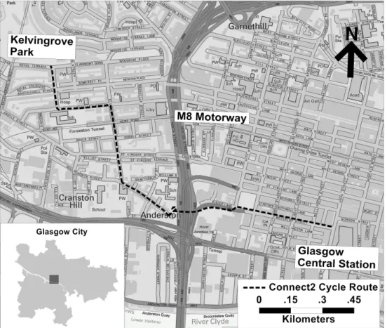
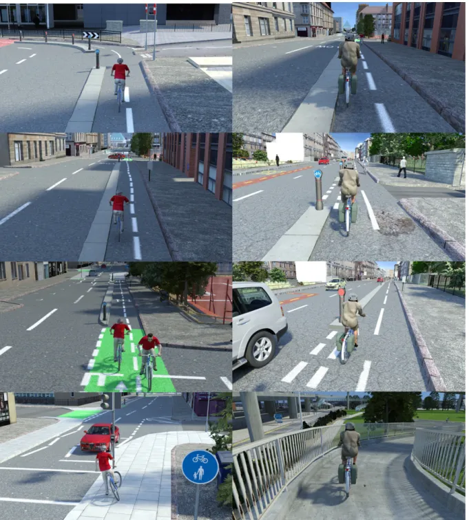
A 3D computer-aided design (CAD) visualisation was developed as part of the iConnect research project which aims to measure and evaluate the changes in travel, PA and carbon emissions related to Sustrans' Connect2. Connect2 is a UK-wide project that aims to transform local travel in 79 communities by creating new crossings and bridges to overcome barriers to walking and cycling. The iConnect study is an independent evaluation of the impact of these infrastructure changes focussing on five location specific developments for detailed case study (www.iconnect.ac.uk). Full reporting of the iConnect study methodology can be found elsewhere (Ogilvie et al., 2012). Figure 1 shows the location of the Connect2 cycle route Glasgow (Scotland, UK). The Glasgow case study involves the development of a self-help intervention designed to increase levels of walking and cycling to work in order to examine whether the effects of the infrastructure change can be enhanced by additional promotional materials. Part of these materials is a five minute visualisation demonstrating the Glasgow Connect2 route; a new segregated cycling facility and pedestrian and cyclist bridge (referred to hereafter as “the visualisation tool”). Figure 2 shows eight images of the visualisation tool taken from selected points along the route. Data obtained from Glasgow City Council shows that the route is
utilised primarily Monday to Friday at peak travel times corresponding to “office” hours. The same data shows an increase in usage over a three year period (2011 – 2013), with levels rising notably after the pedestrian and cyclist bridge (M8 bridge) was opened in 2013.
[Insert Figure 1 here: Connect2 cycle route © Crown Copyright/database right 2014. An Ordnance Survey/EDINA supplied service.]
[Insert Figure 2 here: Images of the visualisation tool showing Connect2 cycle route.]
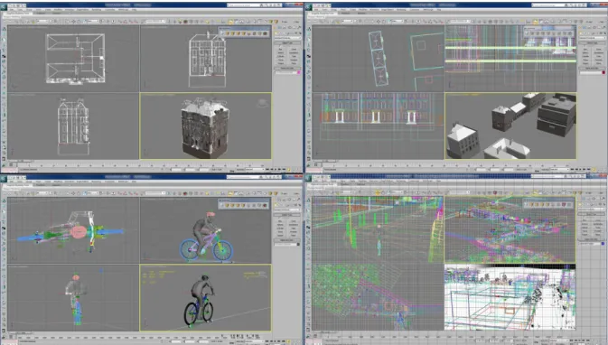
The visualisation tool was generated from 3D computer models with standard commercial animation software, Autodesk 3ds Max, combined with in-house software created at the School of Computing Sciences, University of East Anglia. This software enables the rapid creation of large scale urban environments by combining LIDAR data and OS data. In 3ds Max, the models were animated where appropriate, and suitable lighting applied so that sequences of images could be generated (Figure 3). These sequences were edited with video editing software (Adobe Premiere Pro and Adobe After Effects) which also enabled the addition of text. The interface, allowing selection and control of the animations and the incorporation of an animated map, was created with Adobe Flash Professional (Figure 4). The images were initially generated in two larger formats (1024 by 768 pixel format and HD) with each single frame of output typically taking between 60 and 300 seconds to generate and resulting in an image 700kb in size. The full animation totalling 5Gb worth of images was reduced to approximately 60Mb by editing and image compression techniques. The whole interface along with the animations is approximately 200Mb in size.
[Insert Figure 3 here: Screenshots of the creation of the visualisation tool using Studio 3D Max software application to create individual models (top left), to combine models (top right), to create a cyclist model and animate it (bottom left) and to combine all the elements (bottom right).]
[Insert Figure 4 here: Images of the visualisation tool showing Connect2 cycle route with street information and link to map interface.]
In an overview of visualisation tools and methods in participatory planning and design, Al-Kodmany (2001) identified four computer based visualisation tools: GIS mapping, three-dimensional modelling, virtual reality, and urban simulation. The visualisation in this study is an example of three-dimensional modelling, and it is believed to be the most natural way to communicate information on the proposed changes to the built environment (Levy, 1995). Increased interactivity and additional orientation demands are common features of three-dimensional visualisations (Keller et al., 2006). However, the nature of the visualisation tool here does not enable users to view the animated environment from multiple angles (e.g. by rotating the visualisation).
2.1 Approach and Methods
To test the visualisation tool, two workplaces were selected from which to recruit potential participants. For consistency purposes, employers were situated to the east of the pedestrian and cyclist bridge, and were selected based on their location within 1.5km road network distance from the infrastructure change.
Table 1: Participant characteristics
Pa Age M/Fb Access
to a bike Travel to work
Distance to work (miles) Interview or Focus Group 1 25 – 34 F No Train 12 Interview
2 45 – 59 M Yes Bus 3.9 Interview
3 45 – 59 M No Bus 7 Interview
5 25 – 34 M Yes Car, van, taxi
or motorcycle 40 Interview
6 45 – 59 M No Walk 2 Interview
7 35 – 44 M Yes Train 8 Interview
8 45 – 59 M Yes Train 3.5 Interview
9c 45 – 59 M Yes Car, van, taxi
or motorcycle+ 7 Interview
10 35 – 44 M No Train 9 Interview
11 25 – 34 M No Bus – Walk 2.2 Interview
12 25 – 34 F No Train 13.5 Focus
Group 1
13 16 – 24 F No Car, van, taxi
or motorcycle 16
Focus Group 1
14 25 – 34 F No Walk – Train 5.5 Focus
Group 1 15 35 – 44 F No Train 16 Focus Group 2 16 35 – 44 F No Train 12 Focus Group 2 17 45 – 59 M No Train 18 Focus Group 2
18 45 – 59 M No Car, van, taxi
or motorcycle 10
Focus Group 2
19 35 – 44 F No Car, van, taxi
or motorcycle 3 Focus Group 2 a P = participant b
M = male gender; F = female gender
c
Prior to November 2011 P9 had cycled to work.
Ethical approval was obtained from the University of Strathclyde’s Ethics Committee. Contacts at selected workplaces publicised and helped with the recruitment of participants. Participating workplaces differed in their function (i.e. office based vs. retail security) and allowed comparison of employee occupations. All participants were briefed on study requirements before agreeing to take part. A thirty-two item survey was constructed to obtain participant demographics and information about the journey to and from work. Given the lack of studies that have considered the usefulness of computer visualisation to prompt active travel, it was necessary to obtain as wide a spectrum of opinions as possible. Hence, participant recruitment did not exclude those who describe themselves as a ‘walker’ or ‘cyclist’. It was important to understand reactions to the visualisation of those who already walk and cycle (Table 1). Employees representing one organisation were responsible for city-wide transportation issues, thus critiques on the technical aspects of the visualisation were not unusual. In a second organisation, purposive sampling considered the different views of sedentary employees and those who stand throughout the working day. The former employees who sit were further up the hierarchy in the workplace and, generally, had more autonomy than employees who stand.
Conducting both interviews and focus groups allowed a more thorough evaluation of the extent to which the research findings can be trusted and inferences made from them (Teddlie and Tashakkori, 2003). This approach of combining two separate qualitative methods was important to ‘flesh out’ aspects identified by the interviews, and offset the shortcomings of each method (Barbour, 1998). During the focus groups an assistant moderator recorded information on seating plans, dominant and less dominant speakers. To minimise the effect of dominant group members, a written exercise
offered an opportunity for participants to expand on individual contributions, and to check the validity of verbal responses (Barbour, 2007).
Participants (n=19) were encouraged to consider using the visualisation in their everyday lives, rather than positioning themselves as ‘expert’, and provide a critical commentary on the tool. Participants were asked to watch the visualisation of the new walking and cycling route in Glasgow. Repetition of the visualisation allowed for real-time comments on specific parts of the route. Participants were asked for their opinions on the visualisation: a) at first glance; b) based on previous uses (outlined in section 1); for personal use; and c) for use by specific individuals or groups. To validate responses participants were asked to comment on the potential uses for visualisation within their own communities – “Would you recommend this tool to family/friends/colleagues for the purpose(s) previously stated?” For example, perceived use of visualisation might reflect the type of infrastructure represented, given that different types of infrastructure lend themselves to different types of interaction. Therefore, participants were asked about their views on the different types of infrastructure shown in the visualisation (i.e. extended/shared use pavements, segregated cycle paths, the pedestrian and cyclist bridge). Participants were asked to consider visualisation improvements based on their previous comments. To address the potential of the visualisation as a behaviour change tool several discussion items were framed on specific techniques commonly used in behaviour change interventions (Abraham and Michie, 2008). Participants were asked whether the visualisation helped them recognise barriers to active travel (i.e. prompt barrier identification), and, how well did the visualisation replicate walking and cycling behaviour (i.e. model ordemonstrate behaviour). They were asked to consider the extent to which visualisation communicated information on the consequences of physical inactivity and benefits of active travel (i.e. behaviour-health link), the availability and quality of cycle facilities, routes and safety guidance (i.e. general information).
3. Analysis
A grounded theory approach was employed which aimed to build theory from a combination of inductive and deductive techniques. Flexibility inherent in exploratory research allows a broad research question to become progressively narrower as the research progresses (Adams and Schvaneveldt, 1991). By systematically gathering and analysing the data, theory was generated on the role(s) of computer visualisations in the field of active travel.
Eleven individual transcripts and two transcripts of the focus groups were combined with, field notes, and written text from participants. The data were imported, stored, and managed in NVivo Qualitative Data Analysis software (QSR International Pty Ltd, 2010). Data were assessed by thematic analysis to identify themes which reflected the data as closely as possible. Braun and Clarke (2006) support the use of thematic analysis for ‘identifying, analyzing and reporting patterns within data’. This technique is one of the most frequently used methods of qualitative analysis (Howitt and Cramer, 2007). Coding involved applying brief descriptions to small chunks of data. Quotes corresponding to each code were exported from NVivo into standard word documents. For validation, a second researcher cross-examined transcripts and results were consistent.
4. Results and Discussion
Thematic analysis revealed three higher-order themes. These were 1) Potential uses of visualisation; 2) Visualisation limitations; 3) Visualisation improvements. The first theme brings together potential visualisation functions. The second theme identifies the ways in which cycling infrastructure and the practice of cycling is perceived by study participants. The third theme includes the factors likely to motivate participants to engage in active travel, based on improvements to the existing version. Presented here are the higher-order themes grouping substantial sets of codes (i.e. lower-order themes) (Table 2).
Higher-order themes Lower-order themes
Active travel to school Safety improvements
Potential uses of visualisation
Using cycling facilities Road user conflicts User-environment interactions
Visualisation Limitations
Visualisation alternatives and competitors Communication of regulation
Level of interactivity
Visualisation Improvements
Design (colour, text, coverage, length)
4.1 Potential uses of visualisation
Active travel to school
Participants acknowledged the importance of education to improve confidence to cycle. Many agreed that the visualisation could be used to educate certain groups. Schools were seen as an appropriate institution to target parents and other key decision-makers influencing active travel to school (teachers, other family or household members).
“Something like that would be handy for your kids at school who are all getting taught how to cycle bikes, but before they actually get out onto roads it’s getting them used to road layout, signs, traffic, signals. It’s getting your primary school kids into the mentality of what dangers are out there, how to use cycle lanes, obstacles, it could be bins, pedestrians, so it’s getting your primary school kids at that age ready to understand what it’s like to cycle round the roads” (Focus group 2, P2).
“You may well take it to a parent-teacher evening [or] school function of some sort” (P2).
Safety improvements
Computer visualisations have the potential to incorporate several techniques listed in a taxonomy of behaviour change techniques (Abraham and Michie, 2008). This visualisation successfully created awareness of a new segregated cycle facility and to-be-completed shared use pedestrian and cyclist bridge in Glasgow. However, the existing version does not include information on the health benefits of active travel. Rather than focusing on the risks associated with sedentary lifestyles (National Institute for Health and Care Excellence, 2012), this visualisation provides information on hard measures to separate cyclists from traffic. This visualisation goes beyond functioning as a general information tool and provides an opportunity for participants to verbalise the barriers to cycling beyond the provision of infrastructure at selected points. Still, the appearance of protection is perceived to be important in encouraging a wider uptake of cycling, and is especially important for certain groups – children and novice cyclists.
“The segregated facility bit is at a really good point in that route because it’s where there’s quite fast-moving vehicles, there’s quite a tight turn. It’s where cyclists could be quite
vulnerable…even as a walker I felt quite vulnerable at that point, so it’s good to show that there’s protection at certain points” (P1).
Participant comments revealed the difficulties encountered when catering to a group with conflicting infrastructure preferences, reinforcing the use of visualisation by child, novice, or less confident cyclists.
“I’m quite a confident cyclist so I would be on the road rather than the segregated path” (P4). Visual communication of segregated infrastructure designed to separate cyclists’ from traffic might be most useful for those who perceive the dominance of other road users (drivers) to be the main barrier to cycling. People who express concerns of mixing with traffic were reported to include less experienced, occasional, or novice cyclists, and parents escorting children. Research has suggested that most non-cyclists and recreational cyclists will only consider cycling regularly if they are segregated from traffic (Pooley et al., 2011). This visualisation tool emphasises the nature and extent of a segregated cycling facility, so that those who cite dedicated cycling space as a necessary prerequisite to cycle are able to make a more informed decision as to whether the infrastructure is sufficient to meet their travel needs and preferences.
“It’s good to know that their route isn’t being broken, it’s good to know that they’ve got that full flow” (P1).
Using cycling facilities
Visualisation, to stimulate discussion about the aforementioned issues, rather than to promote the use of the specific infrastructure being visualised, mirrors visualisation applications in planning, to enhance public participation in community design (Al-Kodmany, 2001; Hayek, 2011). Alone, the visualisation was not seen as a tool to promote concrete shifts towards more active modes of travel. This study, however, supports the use of visualisation as a ‘talking point’, and to bring to the fore, contradictory findings about the value of cycle facilities in reducing perceived risk of cycling (Møller and Hels, 2008; Parkin and Meyers, 2010; Parkin et al., 2007; Walker, 2007).
“This kind of segregation you’ve got there, you’ve got a separate bit of road that’s fine. I really don’t like these bits where you get cycle tracks painted on footpaths because cyclists are bullies quite frankly and they’ll come skirting down there and expect everyone to get out of the road”, (P6).
“When you go down them [shared footways] people are oblivious to pedestrians”, (P1).
4.2 Visualisation Limitations
Road-user conflicts
How we experience travel can have a substantial impact on overall well-being and quality of life. This is difficult to measure, particularly given that travel utility varies from person-to-person. Commuter cycling is an everyday practice in which experience is mediated through the senses (van Duppen and Spierings, 2013). Participants reported a lack of connection between real life sensory experiences and the visualised environment. Traffic volumes, crime, anti-social behaviour, the weather, local smells and sounds, physical exertion, collectively impact the journey experience. Participants discussed some of these dynamic events that feature in everyday travel beyond computer animation, focusing on the wider perceptions of car-dominated cities. Participants’ reaction to the visualisation was to emphasise the difficulties of engaging in a minority practice, reflective of the lack of provision and perceived abnormality of walking and cycling for transport (Pooley et al., 2013). Some participants justified their current behaviour of choosing not to cycle by emphasising the perception of cycling as a
dangerous activity. Others discussed perceptions in light of their experiences of travelling by bike. These comments show that participants were not able to overcome the disadvantages associated with how cycling is perceived simply by viewing the visualisation.
“See I wouldn’t [cycle to work]. I’ve got this fear thing of roads, cycling on the roads, it’s a personal fear, it’s, growing traffic” (Focus group 2, P2).
“…a nasty person that likes to stretch wires across railings, so you have one of them then you’re off [your bike]” (P9).
Employees from both organisations attributed a lack of walking and cycling to a combination of physical and social factors not fully replicated in this visualisation. Focus group discussions in the second organisation emphasised a set of social issues impinging on personal security when travelling on foot, or by bicycle. This could be linked to the nature of the organisation and respective employee roles. Focus groups were conducted with private sector retail security and management, where dealings with the general public featured in their everyday work routines. Nature of occupation, therefore, may impact perceptions of safety and risk of non-motorised modes.
“That does not reflect what would happen walking in Glasgow city centre. It’s a horrible place to walk” (Focus group 2, P5).
“Beggars, drunks, you name it, especially when the weather’s good” (Focus group 2, P4).
User-environment interactions
Participants’ interpretation of the environment, the cycling experience, behaviour and interactions, did not resonate well with that represented in the visualisation tool. Example quotes illustrate the expectations of cyclists’, and relay the perception of cycling at particular points along this route.
“I think [the visualisation] is quite optimistic in the behaviour [of cyclists]. Here we got this guy he’s checking over his shoulder, he’s coming up to junctions, he’s looking left, he’s looking right…”
“…Here he’s obviously climbing a gradient. It makes it look like it’s much easier than what that gradient actually is. I mean the bike would be swaying all over the place there”, (P1). “It’s optimistic. When [the cyclist] comes up here the traffic light goes immediately [green] for him, he doesn’t stop, he just goes on across. You know that wouldn’t happen. It would happen maybe 5% of the time. I mean probably half the time you’d be waiting for 20-30 seconds, other times we would have to wait for about 50-60 seconds. So if he actually had to stop for a minute or two while the cars flowed and then they stopped, I think that would be a more realistic representation” (P3).
Visualisation alternatives and competitors
This visualisation tool was compared with more readily available technologies that may facilitate the transition towards active modes (e.g. online journey planning tools and mobile phone applications). Google Street View was used by some to familiarise themselves with routes, junctions and potential conflict points, before undertaking a journey. However, the usefulness of available tools at improving levels of walking and cycling has not been evaluated (British Medical Association, 2012).
“[It’s similar] the way you would use Google Street View and Google Maps to familiarise yourself with something before you go somewhere” (P4).
Although the visualisation displays information beyond changes to the physical environment (journey time, street information), the health benefits of active travel are not included. For example, visualisations that show the number of calories burnt through walking and cycling could persuade individuals to walk or cycle (Elton et al., 2012). Existing technologies, such as walkit.com, include this information in their journey planning tool.
Alone, visualisation might not be sufficiently powerful to bring about concrete shifts in walking and cycling behaviour. Moreover, given the lack of continuity of the segregated facility other potential users might remain unconvinced in their individual ability to negotiate routes that go beyond the segregated facility.
“I think you would actually have to have a bigger network made for it really to be valid” (P7). “…that’s one of the things in terms of introducing people to cycling is, look you’re off the road, but by the way, there are still vehicles around here, you do still need to keep your wits about you” (P2).
This study suggests that there may be potential benefits in dynamic representation of active travel behaviours, most notably, for educational purposes. This visualisation tool was not successful at demonstrating user interactions on the different types of infrastructure represented (i.e. extended/shared use pavements, the segregated cycle paths and pedestrian and cyclist bridge).
“This [visualisation] would demonstrate routes that are available, but it doesn’t demonstrate how the guy should react should he encounter somebody within his area” (P10).
4.3 Visualisation Improvements
Communication of regulation
Participants’ revealed the potential implications of being able to visualise travel, such as, to stimulate discussion on the widespread misinterpretations of road safety regulation and perceived risk when cycling. A common issue reported by those watching the visualisation was the communication of cycling conduct and what the cyclist should (or should not) be wearing, to minimise the individual risks associated with cycling. In the UK, helmet use is largely down to personal choice. Only organisational policies (e.g. Cycling Scotland) in the delivery of cycle training schemes require participants to wear a helmet. It was found that this visualisation might provoke existing misunderstandings of the law regarding cycling safety. Some consider helmets and other specialized equipment to be a deterrent to active travel, reinforcing perceptions that cycling is dangerous. At the same time, presenting the animated cyclist without the ‘recommended’ safety equipment might be unethical. This is perceived to be a problem when delivering the visualisation to children.
“I think the fact that all the cyclists in this have helmets on will skew people into thinking that helmets are a legal requirement” (P1).
“If you go taking that into a primary school then you would have thought the cyclist should be wearing a helmet” (P2).
“Well I was thinking a helmet is an essential requirement, is it not?...”.
“…If he’s in dedicated areas or segregated areas, is there a need to provide it [reflective gear]? There shouldn’t be that conflict there’s a hard sort of kerb between other road users and [the cyclist]” (P10).
“If you are going on the road with other vehicles I think then you need to wear a helmet” (P11).
Level of interactivity
The visualisation is not an interactive tool and does not warrant viewers to react to everyday situations that may require them to diverge.
“[The visualisation] isn’t showing any pedestrians at all really, and pedestrians they’re going to be walking in front of the bikes, a couple of buggies and that’s your bike lane gone, so there’s issues like that that could affect your decision” (Focus group 2, P3).
“Put in normal day to day traffic, the normal issues, bins for bin day… the dogs at your ankles” (Focus group 2, P2).
“Cyclists [have to] try and dodge [potholes] and sometimes that can bring them more central onto the road” (Focus group 2, P4).
Design
Participants noted that other information about the environment could be made explicit in the visualisation, such as the availability and quality of cycle parking. Workplace facility improvements can be expected to provide a useful addition to the benefits of improved on-road facilities in any attempts at persuading more commuters to cycle to work (Wardman et al., 2007).
“It would obviously be beneficial to provide people with information as to where they can store their bikes if they choose to cycle to work” (Focus group 1, P1).
Research has shown that visualisation of the health benefits of cycling may incentivize individuals to walk or cycle. Focus group participants discussed the relevancy of non-journey specific information, including the financial costs of running a car, compared with a bicycle.
“if you were able to find out like how much it costs an average citizen every single year to run a car, how much it costs an average citizen every single year to buy a bike, doesn’t cost that much obviously” (Focus group 1, P2).
The results suggested that visualisation has the potential to stimulate debate on in-journey accounts of active travel and the embodied experience of cycling. For example, perception of risks and perceived social norms (Pooley et al., 2013), related to walking and cycling, exist beyond this visualisation and serve to constrain active travel as a common everyday practice. Despite the policy emphasis towards the health benefits of active travel, the decision to cycle is often made in the context of real-life constraints not fully replicated in this version. These include person-level factors (e.g. socio-demographics, level of experience of cycling and perception of risk), route factors (e.g. traffic, topography, availability and quality of cycling infrastructure), and external factors (e.g. the weather). Participants discussed the issue of potential accidents (i.e. near misses) with traffic, some of which could be fatal. This research highlights the need to communicate cycling regulation to all transport users – including drivers, cyclists’ and potential cyclists’ – and to address the limitations of our own understandings of the ‘correct’ ways to cycle.
The study results presented in this paper are reflective of participant responses skewed towards the focus of this visualisation, namely, the cyclist. Compared to cycling, walking requires little skill, equipment or facility. Walking is generally perceived as a low impact activity with minimal risk for injury, and is useful for personal transport. Walking, therefore, might be a better for target computer visualisations to promote active travel. Such intervention materials tailored towards pedestrian behaviours may be a subject of further research.
5. Conclusions
We have reported the first study to evaluate the use of visualisation technology in promotion of active travel. In this study, a computer animation visualisation model was shown to stimulate discussion on how participants’ view the environment for active travel. It is acknowledged that the small sample size (n=19) is a potential limitation. However, as this is the first study to consider the usefulness of a computer visualisation to promote active travel, a formative evaluation is a necessary starting point. A further study limitation concerns the context in which the computer visualisation is applied. Glasgow city centre is relatively hilly in comparison other parts of the UK. In cities where there are fewer physical barriers to active travel, the reaction to a computer visualisation to encourage walking and cycling may differ.
In this study participants’ revealed the perceived utility of the visualisation and potential improvements to it that could motivate individuals to walk or cycle. Visualisation may be a novel way to communicate infrastructure changes that improve the safety of pedestrians and cyclists, and, promote new walking and cycling routes. The study has outlined the use of visualisation in an educational context and for young people. Schools that wish to promote road safety and active travel to parents and children could benefit from visualisation interventions. Policy-makers can use visualisation to communicate safety improvements to those likely to consider cycling on segregated cycle paths or shared use facilities.
The visualisation was criticised by some participants for being “pro-cyclist” and for misrepresenting the physical (effort) and cognitive (stress) demands of negotiating the roads represented in this area of Glasgow. Visualisations must appear more realistic to viewers in order to be used successfully for active travel interventions and further development to this end may be required. Indeed, the great advantage of using computer generated 3D visualisations is their flexibility and adaptability, once the models have been created.
To demonstrate interactions between transport modes and the cyclist reacting to obstacles, several versions of the relevant sections of animations would have to be created, and included as options. Although there may be some loss of the high definition, it is feasible to include those features in a ‘real time interactive’ version, similar to a computer game. In a new version of the visualisation some other aspects – calories burnt, probable health benefits of cycling such a distance – could be incorporated interactively into the interface, either by data, charts or graphs. These ‘3D scientific visualisation’, depicting data in a 3D format, would feature alongside the 3D ‘Virtual Reality’ visualisation.
The implications of this study for the design of future visualisation tools include what can be presented in order to prompt individuals to walk and cycle. Future visualisation tools should ensure that they are accurate in their replication of the urban environment and modelling of human behaviours. They should focus on the visual representation of additional and non-journey specific information, including the health benefits of not driving and the financial cost of running a car, compared with a bicycle. Future studies could empirically examine through intervention research whether visualisation technology actually leads to behaviour change.
Acknowledgements
The authors led the study on behalf of the iConnect consortium (www.iconnect.ac.uk: Fiona Bull, Christian Brand, Ashley Cooper, Andy Day, Nanette Mutrie, David Ogilvie, Jane Powell, John Preston and Harry Rutter) funded by the Engineering and Physical Sciences Research Council. The authors would like to thank those from the iConnect consortium who provided valuable comments on an earlier version of this manuscript. We would also like to thank Dr Robert Laycock at the School of Computing Sciences, University of East Anglia for his contribution to the creation of the “visualisation tool”, and Glasgow City Council for providing data on the Connect2 cycle route.
References
Abraham C, Michie S, 2008, "A taxonomy of behavior change techniques used in interventions"
Health psychology27 379
Adams G R, Schvaneveldt J D, 1991 Understanding Research Methods (Longman, New York)
Al-Kodmany K, 2001, "Visualization tools and methods for participatory planning and design"
Journal of Urban Technology8 1-37
Barbour R, 2007, "Doing Focus Groups (Book 4 of The SAGE Qualitative Research Kit)", (London: Sage)
Barbour R S, 1998, "Mixing qualitative methods: quality assurance or qualitative quagmire?"
Qualitative Health Research8 352-361
Beecham R, Wood J, 2013, "Exploring gendered cycling behaviours within a large-scale behavioural data-set" Transportation Planning and Technology 1-15
Braun V, Clarke V, 2006, "Using thematic analysis in psychology" Qualitative research in
psychology3 77-101
British Medical Association, 2012, "Healthy transport = Healthy lives.", (British Medical Association.)
Cartwright W, Pettit C, Nelson A, Berry M, 2005, "Community collaborative decision-making tools: determining the extent of ‘geographical dirtiness’ for effective displays", in Proceedings of the 21st
International Cartographic Conference, A Coruna, Spain.
Department of Health P A, Health Improvement and Protection, 2011, "Start Active, Stay Active A report on physical activity for health from the four home countries’ Chief Medical Officers", (London)
Department of Transport, 2011, "Creating Growth, Cutting Carbon Making Sustainable Local Transport Happen", (Department for Transport, London)
Department of Transport, 2012, "National Travel Survey statistics", (Department of Transport, London)
Dickinson J E, Ghali K, Cherrett T, Speed C, Davies N, Norgate S, 2012, "Tourism and the smartphone app: capabilities, emerging practice and scope in the travel domain" Current Issues in
Tourism 1-18
Elton E, Ross T, Mitchell V A, 2012, "Co-design of personal travel visualisations. Deliverable 41.3.", (Loughborough University.)
Froehlich J, Dillahunt T, Klasnja P, Mankoff J, Consolvo S, Harrison B, Landay J A, 2009, "UbiGreen: investigating a mobile tool for tracking and supporting green transportation habits", in
Proceedings of the SIGCHI Conference on Human Factors in Computing Systems, ACM pp
1043-1052
Garrard J, Rose G, Lo S K, 2008, "Promoting transportation cycling for women: the role of bicycle infrastructure" Preventive medicine46 55-59
Hayek U W, 2011, "Which is the appropriate 3D visualization type for participatory landscape planning workshops? A portfolio of their effectiveness" Environment and Planning B: Planning and
Design38 921-939
Howitt D, Cramer D, 2007 Introduction to research methods in psychology (Prentice Hall)
Jacobsen P L, 2003, "Safety in numbers: more walkers and bicyclists, safer walking and bicycling"
Injury prevention9 205-209
Keller T, Gerjets P, Scheiter K, Garsoffky B, 2006, "Information visualizations for knowledge acquisition: The impact of dimensionality and color coding" Computers in Human Behavior22 43-65 Levy R M, 1995, "Visualization of urban alternatives" Environment and Planning B22 343-343 Maibach E, Steg L, Anable J, 2009, "Promoting physical activity and reducing climate change: Opportunities to replace short car trips with active transportation" Preventive medicine49 326-327 Møller M, Hels T, 2008, "Cyclists’ perception of risk in roundabouts" Accident Analysis & Prevention
40 1055-1062
National Institute for Health and Care Excellence, 2012, "Walking and cycling: local measures to promote walking and cycling as forms of travel or recreation", (National Institute for Health and Care Excellence, Manchester)
Nicholson-Cole S A, 2005, "Representing climate change futures: a critique on the use of images for visual communication" Computers, Environment and Urban Systems29 255-273
O’Brien O, Cheshire J, Batty M, 2014, "Mining Bicycle Sharing Systems for Insights into Sustainable Transport Systems. " Journal of Transport Geography34 262-273
Ofcom, 2011, "Communications Market Report: UK",
Ogilvie D, Bull F, Cooper A, Rutter H, Adams E, Brand C, Ghali K, Jones T, Mutrie N, Powell J, 2012, "Evaluating the travel, physical activity and carbon impacts of a ‘natural experiment’in the provision of new walking and cycling infrastructure: methods for the core module of the iConnect study" BMJ open2
Orland B, 1992, "Evaluating regional changes on the basis of local expectations: a visualization dilemma" Landscape and Urban Planning21 257-259
Parkin J, Meyers C, 2010, "The effect of cycle lanes on the proximity between motor traffic and cycle traffic" Accident Analysis & Prevention42 159-165
Parkin J, Wardman M, Page M, 2007, "Models of perceived cycling risk and route acceptability"
Accident Analysis & Prevention39 364-371
Pooley C, Tight M, Jones T, Horton D, Scheldeman G, Jopson A, Mullen C, Chisholm A, Strano E, Constantine S, 2011, "Understanding walking and cycling: summary of key findings and
recommendations", (Lancaster University, Lancaster Environment Centre)
Pooley C G, Horton D, Scheldeman G, Mullen C, Jones T, Tight M, Jopson A, Chisholm A, 2013, "Policies for promoting walking and cycling in England: A view from the street" Transport Policy27
66-72
Pucher J, Buehler R, 2008, "Making cycling irresistible: Lessons from the Netherlands, Denmark and Germany" Transport Reviews28 495-528
Pucher J, Buehler R, 2010, "Walking and cycling for healthy cities" Built Environment36 391-414 QSR International Pty Ltd, 2010, "NVivo qualitative data analysis software. Version 9.",
Robinson D L, 2005, "Safety in numbers in Australia: more walkers and bicyclists, safer walking and bicycling" Health promotion journal of Australia16 47-51
Shaw J, Docherty I, 2008 Traffic Jam Ten years of 'sustainable' transport in the UK (The Policy Press, Bristol)
Sheppard S, 2012 Visualizing climate change: a guide to visual communication of climate change and
developing local solutions (Routledge)
Sheppard S R J, 2005, "Landscape visualisation and climate change: the potential for influencing perceptions and behaviour" Environmental Science & Policy8 637-654
Teddlie C, Tashakkori A, 2003, "Major issues and controveries inthe use of mixed methods in the social and behvioral sciences" Handbook of mixed methods in social & behavioral research 3-50 Tight M, Timms P, Banister D, Bowmaker J, Copas J, Day A, Drinkwater D, Givoni M, Gühnemann A, Lawler M, 2011, "Visions for a walking and cycling focussed urban transport system" Journal of
Transport Geography19 1580-1589
van Duppen J, Spierings B, 2013, "Retracing trajectories: the embodied experience of cycling, urban sensescapes and the commute between ‘neighbourhood’and ‘city’in Utrecht, NL" Journal of
Transport Geography
Walker I, 2007, "Drivers overtaking bicyclists: Objective data on the effects of riding position, helmet use, vehicle type and apparent gender" Accident Analysis & Prevention39 417-425
Wardman M, Tight M, Page M, 2007, "Factors influencing the propensity to cycle to work"
Figure 1 Connect2 cycle route © Crown Copyright/database right 2014. An Ordnance Survey/EDINA supplied service.
Figure 3 Screenshots of the creation of the visualisation tool using Studio 3D Max software application to create individual models (top left), to combine models (top right), to create a cyclist model and animate it (bottom left) and to combine all the elements (bottom right).]
Figure 4 Images of the visualisation tool showing Connect2 cycle route with street information and link to map interface