Analysis to Stock Portfolio Management
Libin Yang
Department of Economics and Finance
University of Canterbury
A thesis submitted in partial fulfilment of the requirement for the Degree of
Master of Commerce in Finance
Table of contents vii
List of figures ix
List of tables xi
1 Introduction 1
2 Principal component analysis: a brief review 5
3 Literature Review 9
3.1 Market connectedness and systemic risk . . . 9
3.2 How many stocks make a diversified portfolio? . . . 12
3.3 PCA in portfolio construction . . . 13
3.4 Research questions . . . 16
4 Data and Methods 17 4.1 Data and Descriptive Statistics . . . 17
4.2 Methods . . . 19
5 How many components should be retained? 23 6 Identifying near-linear relationships between stocks 37
7.1 Constructing principal portfolios . . . 46 7.2 Allocation strategies comparison . . . 57
8 A study of principal component one 63
8.1 Systemic risk VS. ASX200 index value and return . . . 65 8.2 Systemic risk VS. Diversification . . . 68
9 A study of principal component two 73 10 How many stocks are needed to diversify a portfolio? 85
10.1 Stock selection using 156-stocks data set . . . 86 10.2 Stock selection using full data set . . . 98
11 Conclusions and Further Research 103
11.1 Conclusions . . . 103 11.2 Further research . . . 104
References 107
Appendix A Data: detailed description 113 Appendix B Standard deviations of the 156 stocks with complete data 117 Appendix C Time evolution of diversification ratio 125 Appendix D Time evolution of coefficients in principal components: a brief
dis-cussion 127
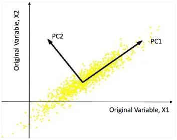
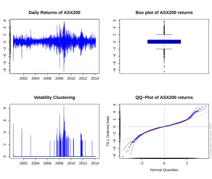
2.1 Geometric interpretation of principal component analysis. . . 7 4.1 Stylized facts for ASX200. . . 18 4.2 Bi-plots of relative weights of each stock in components 1 to 12 arising from
a PCA on a covariance matrix from the whole study period, April 2000 to February 2014, using the ICB industry classification . . . 22 5.1 Plots of percentage cumulative variance explained by principal components
against component number for the full study period, pre- and post-crisis. . . 27 5.2 Scree graph and Log-eigenvalue diagram for the correlation matrix of 156
stocks using complete study periods, pre- and post-crisis study periods. . . 31 5.3 Bi-plots of relative weights of each stock in components 1 to 12 arising from
a PCA on a correlation matrix from the whole study period, April 2000 to February 2014, using the ICB industry classification. . . 32 6.1 Bi-plots of relative weights of each stock in components 151 to 156 arising
from a PCA on a correlation matrix from the whole study period, April 2000 to February 2014, using the ICB industry classification . . . 41 6.2 Time series plots of near linear correlated stocks identified in principal
com-ponents 151 and 152. . . 42 6.3 Time series plots of near linear correlated stocks identified in principal
7.2 Density of losses with VaR and ES. . . 56 7.3 1/N and ERC allocation strategies of the 156 stocks and 10 principal portfolios. 60 8.1 Variance explained by principal component one and the ASX200 index price
and return. . . 67 8.2 Variance explained by principal component one and the diversification ratio. 71 8.3 KMO measure of sampling adequacy for 156 stocks and the variance
ex-plained by principal component one. . . 72 9.1 Time evolution of stocks coefficients in principal component two. . . 79 9.2 Bi-plots of relative weights of each stock in principal component one and
two for the study period of 22/09/05 to 19/09/07 and 23/09/05 to 20/09/07, with respect to Industry Classification Benchmark. . . 80 9.3 Time evolution of coefficients of GPT in principal component two. . . 81 9.4 Time evolution of the square of the coefficients in principal component two. 82 9.5 12-month out of sample of tests of portfolios constructed based on
coeffi-cient changes in principal component two. . . 83 10.1 Comparison of 15 stocks selected by PCA and 15 randomly selected stocks. 91 10.2 Comparison of 32 stocks selected by PCA and 32 randomly selected stocks. 92 10.3 Comparison of 72 stocks selected by PCA and 72 randomly selected stocks. 93 10.4 The efficient frontier of 156 stocks and mean and standard deviation of three
different sized equally weighted portfolios. . . 94 10.5 The number of stocks selected by PCA over time. . . 97 10.6 In sample and out of sample test of portfolios of selected stocks against the
ASX200 index value. . . 102 C.1 Variance explained by principal component one with diversification ratio on
156 stocks portfolio ( for GMV portfolio, MD portfolio, and ERC portfolio). 125 D.1 Time evolution of the coefficients and square of coefficients respectively in
5.1 Eigenvalues and variance explained by PC1 to PC10. . . 35 6.1 Price correlation coefficients of the four big banks. . . 38 6.2 Eigenvalues and variances explained by the last six principal components. . 39 7.1 Price correlations of each PP to the 1/N and ASX200 index. . . 54 7.2 Daily return correlations of each PP to the 1/N and ASX200 index. . . 54 7.3 The performance statistics for ASX200 index, 1/N (equally investment in
156 stocks), ERC (equal risk contribution in 10 PPs), PPEqual (equally in-vestment in each 10 PPs), PPERC (a portfolio budgeting equal risk to each 10 PPs) andPPn(principal component mimicking portfolio) . . . 61
10.1 The 15 stocks industry information. . . 95 10.2 The 32 stocks industry information. . . 96 10.3 The number of stocks in the selection pool in each two year sub period. . . 99 10.4 Measure of Sampling Adequacy for each sub-period. . . 101 10.5 The number of stocks selected for each year. . . 101 B.1 Standard deviations of the 156 stocks with complete data . . . 117 E.1 A list of the 156 stocks with complete data and thier respective industries. . 139 F.1 A list of the 156 stocks with complete data and their respective industries,
Introduction
Markowitz (1952)’s mean-variance theory is the foundation of modern portfolio theory. He introduced the first thorough proof in favor of diversifying a portfolio among a range assets instead of holding a single security alone. Investors had been aware of the benefits of di-versification even before the Markowitz (1952)’s mean-variance theory. Lowenfeld (1909) discussed the benefits of diversification and sometimes is considered the first rigorous aca-demic discussion of diversification.
the intention of diversification. Allen (2010) argued that the mean-variance approach failed to diversify a portfolio in the 2008 financial crisis.
There is an increasing need from both academic researchers and market practitioners for ways of eligibly building more diversified portfolios. The new paradigm of portfolio allo-cation is the risk-based alloallo-cation strategy, which constructs a portfolio based solely on the variance-covariance of assets. Examples of risk-based allocation strategies are minimum variance (Behr et al., 2008; Clarke et al., 2006; Haugen and Baker, 1991), most diversified portfolio (Choueifaty and Coignard, 2008), risk parity (also known as the equal risk con-tribution) (Maillard et al., 2010; Qian, 2006) and diversified risk parity (Kind, 2013; Lohre et al., 2012, 2014)1.
Two salient features of security investment are the uncertainty of security returns and the correlations between security returns. The correlations between securities, particularly low or negative correlations, make diversification possible but it is also the reason the analysis of security investment is complicated. If there are only a few securities involved, for example five stocks, then it is easy and intuitive to simply look at the five variances and 10 correla-tions or covariances. However, if the number of securities is large, for example 200, it will not be very helpful to simply look at the 200 variance and 19900 correlations or covariances. Principal component analysis (hereafter, PCA) is a statistical method of dimension reduc-tion. It provides us with an alternative approach that is able to reduce the complexity - look for a few derived principal components that are designed to be uncorrelated while preserv-ing most of the variation given by those variances and correlations or covariances (Jolliffe, 1986). Although it has been widely used in many areas, until recently the studies applying PCA to the finance sector were scarce, especially in the context of portfolio management.
Our research focuses on the potential use of PCA in portfolio management. For sim-plicity, we study a portfolio only with stocks. There are two ways of applying PCA in constructing portfolios. The PCA can reduce the complexity of a stock portfolio by trans-forming the stocks into a new set of uncorrelated principal components that represent
uncor-1The diversified risk parity is an allocation strategy based on principal component analysis. It relates to our
related risk sources. Then, instead of constructing portfolio based on the underlying stocks, one can treat the principal components as individual investment assets and simply choose from them. Hence, the analysis required for portfolio selection is therefore simplified.
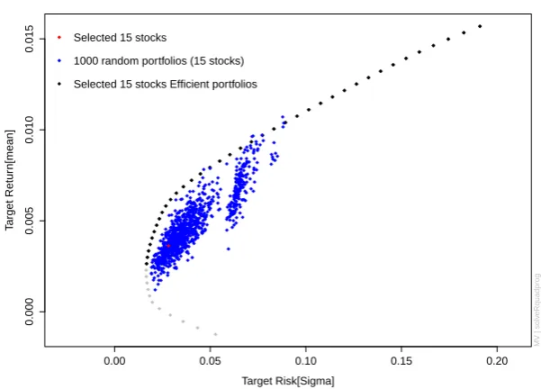
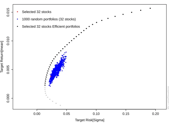
The other approach is using a selected subset of stocks to replace the original full data set. This relates to an old question that has been researched for decades - how many stocks are needed to diversify a portfolio? The traditional capital-asset pricing model (CAPM) required the purchase of a market portfolio that contains all risky assets, but essentially the market portfolio can be achieved with a much smaller portfolio. PCA allows us to identify the stocks that can be used as a representative of the whole data set and therefore find the number of stocks that is sufficient to diversify a portfolio.
Beside the use of PCA in portfolio construction, the most important application of PCA in portfolio management is to measure market concentration and the potential for diversi-fication. While there are literatures which applied PCA to research market connectedness and argued that the diversification effects declined when the market was more concentrated, to the best of our knowledge no papers actually compare the degree of diversification to the market connectedness. Moreover, to the best of our knowledge, no papers pointed out that it is crucial to use the correlation matrix rather than the covariance matrix as input to a PCA when studying market connectedness. We research the problems associated with the use of covariance matrix and emphasize the importance of using the correlation matrix in the study.
In many applications of PCA in finance, the high numbered principal components that explained little variance were normally discarded. No useful role was assigned to those principal components. But we found those components are effective in identifying near linearly correlated stocks.
Principal component analysis: a brief
review
Principal Component Analysis (PCA) is a statistical method of dimension reduction that is used to reduce the complexity of a data set while minimizing information loss. It transforms a data set in which there are a large number of interrelated variables into a new set of uncorrelated variables, the principal components, and which are ordered sequentially with the first component explaining as much of the variation as it can. Each principal component is a linear combination of the original variables in which the coefficients indicate the relative importance of the variable in the component.
Consider an unrealistic, but simple, case of only two variables and the data are plotted in two dimensions. In Figure 2.1, we display the geometrical interpretation of the two variable principal component analysis. The x1 andx2 represent the original variables and axes. ThePC1andPC2are the transformed variables and axes. The direction of the principal axes indicates the principal components. The first principal component looks for a linear combinationα1′xthat explains the most variation, which is
α1′x=α11x1+α12x2 (2.1)
variables,α1i is the coefficient of stockiin component one. Next, the principal component
two looks for a linear combination α2′x that explains as much of the remaining variation
conditional on it being orthogonal to principal component one. In a two variable case, this is the remaining variation, which is
α2′x=α21x1+α22x2 (2.2)
Clearly, in Figure 2.1 there is more variation in the direction of principal component one than either of the original variables, and leaves very little variation in the direction of principal component two.
Literature Review
PCA is one of the best-known techniques in multivariate analysis. Its range of applications has expanded with the advent of computers and it has been used in a wide variety of areas for the last 50 years (Jolliffe, 1986). The ability of PCA to decompose interrelated variables into uncorrelated components makes it attractive to use in analyzing the complex structure of financial markets. It has been applied to produce market indices (Feeney and Hester, 1967) and to identify common factors in bond returns (Driesson et al., 2003; Pérignon et al., 2007). In more recent years, a growing literature applied PCA to the study of market cross-correlation and systemic risk measurement (Billioand et al., 2012; Kritzman et al., 2011; Zheng et al., 2012). Most works have only discussed the theoretical framework of applying PCA in portfolio management, few have actually looked into its performance. Our research focuses on the practical application of PCA to portfolio management. To the best of our knowledge, no similar work has been done based on the Australian market.
3.1
Market connectedness and systemic risk
fact different concepts. Systemic risk indicates the ratio of systematic risk to idiosyncratic risk. An increase in the systemic risk suggests the proportion of systematic risk in the total risk increases. This means the amount of idiosyncratic risk, which is the diversifiable risk, decreases. Conversely, an increase in systematic risk does not necessarily indicate a decrease in diversifiable risk. Consider when the amount systematic risk increases and the idiosyncratic risk also increases while the ratio between them stays the same. So the systemic risk was unchanged. The amount of diversifiable risk in this case increases rather than decreases.
After the financial crisis in 2008, literature relating to systemic risk is substantial. There have been three groups of empirical studies on systemic risk. One of them focused on conta-gion, spillover effects and joint crashes in financial markets (Adrian, 2007; Billioand et al., 2012; Kritzman et al., 2011; Wang et al., 2011). Those studies were based on the analysis of interconnectedness among market security returns and our analysis on systemic risk follows in their steps. The other two groups of empirical studies on systemic risk include research on the auto-correlation in the number of bank defaults, bank returns, and fund withdrawals (Brandt and Hartmann, 2000; Kenett et al., 2012; Lehar, 2005) and research on bank capital ratios and bank liabilities (Aguirre and Saidi, 2004; Bahansali et al., 2008; Brana and Lahet, 2009) respectively. When the market becomes more connected, the systemic risk is higher in the sense that the negative shocks propagate more quickly and broadly. For this reason, monitoring the time evolution of correlation is critical. Moreover, low correlation between assets is what makes diversification possible, gaining insight into co-movement of securities is important in portfolio management.
Other research has shown that the security correlations change in different time periods. Butler and Joaquin (2001) and Campbell et al. (2002) reported that the market correlation increased in bear markets. Ferreira and Gama (2004), Hong et al. (2007), and Cappiello et al. (2006) reached the same conclusions for global industry returns, individual stock returns and international bond returns.
study the evolution of correlation in a diverse range of asset classes: 25 developed market equity indices, three emerging market indices, four corporate bond indices, 20 government bond indices, 15 currencies, nine metals, four fuel commodities, and 18 other commodities. They asserted that increases in the variance explained by the first component implied that there was more common variation in financial market. Moreover, they emphasized that the variance explained by the first component might be the result of increases in the correlations among a few assets or a market-wide correlation. The first case will have less impact on the diversification because one can simply move investments to less correlated assets. In contrast, it becomes much more difficult to reduce risk by diversifying across different assets if it is a market-wide correlation increase. They reported that the variance explained by the first principal component sharply increased when Lehman Brother filed for bankruptcy and Merrill Lynch agreed to be taken over by the Bank of America on 15 Sep 2008 was the case of a market-wide correlation increase.
Kritzman et al. (2011) introduced a measure of systemic risk called the absorption ratio. It is the fraction of variance absorbed by a finite number of principal components. They re-ported that most global financial crises were coincident with positive shifts of the absorption ratio. These crises include the Asian Financial Crisis in 1997, Russian default and LTCM collapse in 1998, Housing bubble in mid-2006, and Lehman Brothers default in 2008. An-other interesting finding in this paper is, in most cases, stock prices changed significantly when the absorption ratio reached its highest or lowest level.
others choose the size of moving window randomly, Zheng et al. (2012) pointed out that the size can impact the result. We believe that what Zheng et al. (2012) suggested is just a matter of sampling adequacy. One should not apply PCA to a data set that does not have enough data points.
3.2
How many stocks make a diversified portfolio?
Markowitz (1952)’s argued that instead of looking at single security alone, one should be concerned with portfolios as a whole. The reason for this is that including securities that have low correlations or even negative correlations could eliminate some risk. The existence of many kinds of index funds provide means for investors to hold a diversified portfolio, but is it necessary to include all constituents within a index fund to obtain the same diversifica-tion as the index itself? Convendiversifica-tional wisdom has it that the benefits of diversificadiversifica-tion are virtually exhausted when a portfolio contains a high enough number of stocks. However, how many stocks are enough remains an open question.
Evans and Archer (1968) reported that approximately 10 randomly chosen stocks would be adequate to diversify a portfolio. They observed that the benefit of diversification de-creased as the number of stocks inde-creased. Their conclusion has been cited in many text-books (Francis, 1986; Gup, 1983; Reilly, 1985; Stevenson and Jennings, 1984). Newbould and Poon (1993, 1996) followed Evans and Archer (1968)’s approach of comparing increas-ing size portfolio variance and claimed that just 8 to 20 stocks was enough to fully obtain the benefit of diversification. However, Statman (1987) compared the cost and benefit of diversification and reported that the number of randomly chosen stocks that make a well diversified portfolio was at least 30 using the data available in mid-1980s. Statman (2004) used the same approach and more available data, he then concluded that the break even point, where the marginal benefit was equal to the marginal cost, exceeded 300 stocks.
were required. According to Domian et al. (2007), shortfall risk reduction continues as the number of randomly chosen stocks was increased, even above 100 stocks.
The above researchers were using the number of stocks in a portfolio as a measure of diversification. However, this was problematic. If, in an ideal world, all stocks had same mean, variance and covariance, the number of stocks in a portfolio would be the key vari-able for estimating the reduction in variance (Frahm and Wiechers, 2011). In reality, such assumptions do not hold. Intuitively, randomly choosing stocks to add to a portfolio, even when they reach the number required, may not result in the promised diversification if the randomly chosen stocks were more highly correlated than expected. The use of PCA deals with the problem associated with randomly choosing stocks. In Chapter 10 we propose a stock selection method that picks stocks based on their correlation structure. The selected stocks are used to describe the original data set and represent the risk sources inherent in the data set. Rudin and Morgan (2006) applied PCA to measure diversification quantitatively and tested equal-weighted portfolios of stocks in the S&P100 index and reported that a pool of 40 randomly selected stocks is approximately as diversified as only 20 truly independent components. PCA provides us with a way to identify uncorrelated risk sources in the market and pick stocks from those different risk sources, the resulting portfolio size is more mean-ingful from the point of view of diversification. In addition, as we discussed in Section 3.1, the market connectedness does not stay constant over time. Markets become more tightly coupled in volatile periods and even a portfolio with same stocks would be less diversified (Billioand et al., 2012; Fenn et al., 2011; Kritzman et al., 2011; Zheng et al., 2012). Camp-bell et al. (2001) did point out the number of stocks needed to achieve a certain level of diversification was not the same in the 1963-85 period and the 1986-97 period.
3.3
PCA in portfolio construction
that if short sales were allowed, any asset set could be transformed into a set of uncorre-lated “principal portfolios”. After transforming to a principal portfolio environment, they constructed an efficient frontier based on principal portfolios. Based on the theoretical in-terpretation of such a transformation, they stated “return-volatility structure of the efficient frontier is more simply related to the principal portfolio environment than the original asset set”.
Partovi and Caputo (2004)’s theoretical framework of constructing principal portfolios has inspired many academic researchers as well as market practitioners in portfolio manage-ment. Especially after the global financial crisis in 2008, reducing risk became the priority. Meucci (2009) followed the idea of Partovi and Caputo (2004) by transforming a data set in which there were a large number of interrelated assets into a new set of principal port-folios representing uncorrelated risk sources inherent in the original assets. He reported a so-called diversification distribution, a tool to analyze the structure of a portfolio’s concen-tration profile. The diversification distribution is expressed as the ratio of each principal portfolio’s variance to its total variance. In the principal portfolio environment, all the prin-cipal portfolios are uncorrelated and therefore the variances are additive. The total variance is simply the sum of the variances of all principal portfolios. The ratio of individual princi-pal portfolio variance to the total variance is then in the range of 0 to 1 and sum to 1. These properties are similar to a probability, a non-negative value and always sum to 1. The maxi-mum diversification is achieved where the diversification distribution is close to uniform. In other words, a well-diversified portfolio is the one in which the risk drivers are invested into equally. Meucci (2009) also introduced a diversification index that represented the effective number of uncorrelated bets in a portfolio. The idea is that if the number of uncorrelated bets were small, the risks were rather concentrated in few sources and less diversified.
• 1/N
• Minimum variance • Risk parity
Lohre et al. (2012) and Lohre et al. (2014) reported that the diversified risk parity provided better risk-adjusted performance and was the most diversified among the investigated alter-natives.
The central idea of risk parity, also known as the equal risk contribution strategy, is achieving an equal risk contribution of each asset in the portfolio. Qian (2011) claimed that risk parity allocation results in better diversification and brings higher returns. He also emphasized that if one believed in the benefit of diversification then one should believe in risk parity. Other researchers such as Qian (2006) and Maillard et al. (2010) also advocate a risk parity strategy.
One similarity of the risk parity and diversified risk parity allocation strategy is they both construct portfolios by allocating risks. But the difference is while the risk parity allocates a risk budget based on underlying assets, the diversified risk parity allocates risk based on uncorrelated principal portfolios. The risk parity allocation strategy can have rather con-centrated risk if most assets have high correlations with each other. The diversification of a risk parity strategy is sensitive to the correlation between the assets included. Consider an extreme case with all stocks perfectly positive correlated, then allocating equal risk bud-get to all stocks is actually the same as holding one stock. The diversified risk parity, on other hand, does not have such a problem since it is allocating its risk budget based on un-correlated risk sources. Though in the case of perfect correlations all variation would be explained by the first principal component.
Kind (2013) compared risk parity and diversified risk parity with the 1/N on eight generic futures contracts that covered four asset classes. The back test1 was based on monthly US-Dollar returns over the period February 1990 to January 2013. They stated that no strategy was able to outperform the simple equal weight allocation strategy. DeMiguel
et al. (2009) and Lee (2011) also reported the simple 1/N strategies dominated the other allocation strategies available for portfolio selection.
When a data set is transformed into a new set of uncorrelated principal portfolios, all the allocation strategies that can be applied to the underlying assets can also be applied to the principal portfolios. The risk parity and diversified risk parity are good examples of same allocation strategy based on original underlying assets and the transformed principal port-folios respectively. Lohre et al. (2012) and Lohre et al. (2014) reported that the diversified risk parity, which is based on the transformed principal portfolios, was a better strategy than the risk parity that was based on the untransformed data set. We include only two allocation strategies in our research. We applied these two strategies to both the original underlying stocks and the transformed principal portfolios. One of the allocation strategies is the equal risk contribution. When it is applied to the stocks, it is known as the risk parity and when it is applied to the transformed principal portfolios, it is known as the diversified risk parity. The other strategy we study is the 1/N, the simplest strategy and one advocated by many papers (DeMiguel et al., 2009; Kind, 2013; Lee, 2011).
3.4
Research questions
The major research questions of this thesis are:
1. How has the systemic risk of Australian market changed over time?
2. Can principal component analysis be used as leading indicator of financial crisis? 3. How many stocks are needed to diversify a portfolio? Which stocks are they?
4. Can an asset allocation strategy based on PCA provide better performance and diver-sification?
5. Can the change in the coefficients signal a portfolio manger to trade?
Data and Methods
4.1
Data and Descriptive Statistics
Fig. 4.1 Stylized facts for ASX200.
2002 2004 2006 2008 2010 2012 2014
−8 −6 −4 −2 0 2 4 6
Daily Returns of ASX200
−8 −6 −4 −2 0 2 4 6
Box plot of ASX200 returns
Volatility Clustering
2002 2004 2006 2008 2010 2012 2014
0
2
4
6
8
−2 0 2
−8 −6 −4 −2 0 2 4 6
QQ−Plot of ASX200 returns
Normal Quantiles
TS.1 Ordered Data
Confidence Inter
v
als: 95%
We further calculated the skewness and kurtosis of the ASX200 daily returns. There were -0.383 and 5.657 respectively, clearly indicating a heavy tail.
There was a high frequency of stocks that were added to or deleted from the index from time to time, so we identified all stocks which had been in the ASX200 for the whole study period. After adjusting for mergers, acquisitions, and name changes we obtained a final data set of 524 unique stocks. We obtained daily closing prices and dividends for each stock from the SIRCA database1. All the prices and dividends were adjusted to be based on the AUD. For a more detailed description of data, see Appendix A. The PCA was performed on the correlation matrix of the return series and in which we assumed the dividends were reinvested into stocks which issued them when calculating the return. The
return was calculated in the following steps:
1. We created a new column in the spreadsheet named Dividend Factor. Then we started with a factor of 1 and every time a dividend was paid we multiplied the Dividend Factor,
Daily Dividend Factori(t) =
1 if no dividend 1+Di(t)
Pi(t) if dividend
Cumulative Dividend Factori(t) = t
∏
j=1
(Daily Dividend Factori(t)) (4.1)
whereDi(t)is the dividend for stockiin timet,Pi(t)is price for stockiat timet and
tis in units of one trading day.
2. We adjusted the price series with the dividend factor, the adjusted price was calculated by
PNEWi(t) =Pi(t)×Cumulative Dividend Factori(t). (4.2)
3. The return series for a given stockiis
Ri(t) =
PNEWi(t+1)−PNEWi(t)
PNEWi(t)
. (4.3)
4.2
Methods
For most parts of our research, a rolling window approach was applied. We extracted a set of stocks that had complete return information for the whole study period, and there were 156 such stocks. The remaining 368 stocks were either listed after April 2000 or delisted before February 2014.
to those of the partial correlations. If the investigated stocks share more common variation, the KMO will be close to 1. On the other hand, a KMO near 0 indicates the PCA will not extract much useful information.
We calculated the KMO statistic in rolling windows of different size for the 156 stocks that have complete data. A window size one year (252 trading days) had KMO statistics in the range from 0.36 to 0.90 for the whole study period and a quarter of them had KMO values below 0.5, which is the smallest KMO value that is considered acceptable to do a PCA. On the other hand, a window of two year (504 trading days) had better KMO statistics, with a lowest of 0.62 and highest of 0.95 during the whole study period. So we decided to apply PCA in rolling window approach with window size two years.
The KMO statistic can also be used to assess the potential for diversification. The KMO statistic measures the degree of common variation among stocks. One can expect less di-versification opportunities when stocks have more common variation, which means a high KMO test statistic. We will extend this discussion in Chapter 8, when we examine the market connectedness and systemic risk.
PCA can be applied to either a correlation matrix or a covariance matrix but there are some problems associated with using a covariance matrix. If there are large differences be-tween the variances of variables, then using a covariance matrix will result in low numbered principal components being dominated by variables that have a large variance. This will impede getting useful information for diversification from a PCA in some cases (Jolliffe, 1986).
deviation of 39.79% while the second largest was 7.83%. In principal component two, all stocks had small negative coefficients and most of them were in the range of 0 to 0.15. We found this interesting because the coefficient structure was similar to the principal compo-nent one arising from a correlation matrix (see Figure 5.3), which has been understood as the market component with roughly equal contribution from all stocks (Fenn et al., 2011; Kim and Jeong, 2005; Zheng et al., 2012). However, it is normally the first principal com-ponent, which explains the most variation, which is understood as the market component. When using a covariance matrix, the first principal component was dominated by a single large variance stock and so was not necessarily the market component. In Chapter 8, we use the variance explained by principal component one as a measure of systemic risk. Using a covariance matrix to do a PCA will be misleading. Furthermore, principal components three and four picked up the second and third riskiest stocks, ALZ and RSG. Principal component five was dominated by the stock with the fourth largest standard deviation, NRT. Obviously, the principal components were dominated by stocks ordered by standard deviation. Using a covariance matrix in a PCA may only picks stocks with large variances and does not illus-trate the correlation structure within the stocks, as it did with the ASX200. In Figure 5.3, we produced the same bi-plots of the coefficients in principal components 1 to 12 arising from a PCA on a correlation matrix using the same data set and study period2. Figure 5.3 shows there are structures in the coefficients that were not seen in the bi-plots using a covariance matrix. This clearly demonstrates the point that using a covariance matrix may not result in obtaining useful information for diversification from the principal components. So we decided to use the correlation matrix to do the PCA in our research.
2The discussions of the bi-plots for principal components 1 to 12 arising from a PCA on a correlation
How many components should be
retained?
A data set which contains p variables can be transformed into a new set of p principal components using PCA, in which each principal component is a linear combination of all the original variables. The original large number of variables can be replaced by a much smaller set of principal components that explain most of the variation if the KMO statistic is large1. When we apply PCA to a set of stocks, the principal components can be interpreted as uncorrelated risk sources inherent in the original data set. For instance, a portfolio of 156 stocks contains 156 uncorrelated risk sources. The eigenvalues of principal components typically decrease quickly and the higher numbered principal components have relatively small eigenvalues. This suggests the relevance of principal components quickly drops off. In theory, one can construct portfolios based on the principal components to get an exposure to all the risk sources. But it seems unreasonable to allocate any risk budget to the higher principal components that are not major risk sources.
Kim and Jeong (2005) decomposed the correlation matrix into three parts based on the Spectral Decomposition Theorem2. The Spectral Decomposition Theorem is about decom-posing a correlation or covariance matrix into the principal components and their
eigenval-1Larger number of KMO statistic indicates there is more common variation in the data set. This means
more variation will be explained by the first few principal components.
ues. One can reconstruct an approximation of the matrix using the principal components that have been obtained by the decomposition. Including more principal components will always result in better approximation of the matrix. In the case of including all the principal components, one will get back the matrix started with. Kim and Jeong (2005) decomposed the correlation matrix and posited that the principal components are organized by the market part with the largest eigenvalue, the group part of intermediate discrete eigenvalues, and the random part of small bulk eigenvalues. They argued that this refers to the three kinds of fluctuation in the stock price. We followed Kim and Jeong (2005) and break the principal components into three parts that correspond to the three kinds of fluctuation of stock price changes:
1. The first principal component with the largest eigenvalue represents a market wide effect that influences all stocks.
2. A number of principal components following the market component represent syn-chronized fluctuations that only happens to a group of stocks.
3. The remaining principal components indicate randomness in the fluctuations.
In this chapter, we aim to determine the threshold for cutting off the random part of stock price fluctuation and preserve the major risk sources in the data set. Note that Kim and Jeong (2005) considered the random part of principal components as the “random noise" which contained no useful information. But we found that the last few principal compo-nents successfully identify stocks with near linear relationships and which have important financial implications in portfolio management (see Chapter 6).
coefficients in each principal component to determine the threshold for cutting off rather irrelevant principal components3.
1. The most obvious rule in determining the number of components to retain is decid-ing the cumulative variance desired. PCA was designed so that the variances of the principal components are in descending order with the first principal component ex-plaining the most variance. In the case of a correlation matrix, the percentage variance explained by the firstmcomponents was calculated by
Variancek=
100
p
m
∑
k=1
lk (5.1)
wherelkis the eigenvalue of principal componentk, pis the total number of variables. The number of components to retain is then the smallest number, m, which exceeds the desired percentage variance explained. Normally the cut-off is in the range of 70% to 90%. But in our case, to preserve 70% of the variation of the original data set, 82 principal components were required when the total study period was used (see Figure 5.1a). The correlations among the 156 stocks were rather moderate during the last 14 years. If the stocks were highly correlated, we would expect that the first few components would absorb most of the variation and leave less variation in the higher numbered components. This means the slope of the cumulative variance explained plot will be steep in the beginning and flatten off towards the end. However, as we can see in Figure 5.1a, the variation of stocks were spread over the components with the first 50 components explained about half of variation and the following 50 compo-nents explained approximately 30% of the variation. This leaves about 20% variance explained by the last 56 components. We also separated the study periods into two sub periods: pre- and post- 2008 financial crisis. The results in Figure 5.1b and Fig-ure 5.1c showed that before the crisis, 82 components were needed to explain 70% variance while after the crisis it only required 69 components to explain the same vari-ance. This suggests that there was more common variation in the stock market after
3The irrelevant components refer to the random noise in the stock price fluctuations. We note that we do
the crisis. When the market was more concentrated, there would be less diversifica-tion benefits to exploit. A portfolio that contains the same stocks was less diversified after the crisis compared to before the crisis (see Chapter 8). To summarize, using the cumulative variance to decide the number of components to retain, we would have to choose at least 82 components.
2. The second rule we used is Kaiser’s rule (Kaiser, 1960), retaining principal compo-nents that have an eigenvalue greater than 1. The idea behind this rule is that if all the stocks were uncorrelated, then the principal components are the same as the original stocks and all have unit variance in the case of a correlation matrix. So any princi-pal components with eigenvalue less than 1 contains less information than one of the original variables and so is not worth retaining. Based on Kaiser’s rule, we needed to retain 49 components for the total period, 57 components pre-crisis and 45 compo-nents post-crisis. Jolliffe (1986) advised a more conservative cut-off eigenvalue, 0.7, because it would be unwise to delete the components that have eigenvalue close to 1. However, this significantly increased the number of components retained. In this sample, the number of components we needed to be retained increased from 49 to 109, 57 to 107 and 45 to 87 for the three periods respectively. One important thing about Kaiser’s rule and the first rule we discussed above is that, when there are a large number of stocks in the sample and the correlations between them are relatively small, a PCA on a correlation matrix will result in most principal components have eigenvalues close to 1 and be retained based on these two rules.
Fig. 5.1 Plots of percentage cumulative variance explained by principal components against component number for total study periods and pre- and post-crisis. The data set used was the 156 stocks which have complete price and dividend information for the complete study period.
(a) Total study period from 04/04/2000 to 17/02/2014.
(b) Before 2008 financial crisis, from 04/04/2000 to 19/09/2007.
looking at a plot of eigenvalues or log-eigenvalues against component numbers and deciding at which component the linear decay begins. However, despite the subjec-tivity, deciding the number of principal components based on the scree graph and log-eigenvalue diagram are used extensively in practice. In Figure 5.2, we present both the scree graph and the LEV diagram for the total study period, the time before and after the crisis. Figure 5.2a, Figure 5.2c and Figure 5.2e show, based on the scree graphs, approximately five components will need to be retained in all three study pe-riods. The LEV diagram, on the other hand, suggests more components are needed to be retained. In Figure 5.2b, the line joining the plotted points became less steep from principal component six. But a linear decay is actually staring from principal component 11. The LEV diagram of pre-crisis period suggests the similar number of principal components to retain, five principal components or a more conservative 10 principal components (see Figure 5.2d). The post-crisis period in Figure 5.2f shows that the slope of the line joining the plotted points stays steep until principal compo-nent eight. One can decide conservatively by choosing the point beyond which the scree graph or LEV diagram becomes, approximately, a straight-line. A decision to include a few more components will result in little difference. So based on the scree graphs and LEV diagrams, we will need to retain as many as 11 components.
The three rules above suggested significantly different numbers of components to retain and there is no way that we can tell which one is more accurate. However, if an analysis requires us to preserve as much as possible of the variation, then either deciding based on the cumulative variance or Kaiser’s rule is more appropriate. The objective of our analysis is to study the structure of the stock market and preserving more variance is not the priority. We will only retain the components that identify structure within the stock market. In other words, we filter out the random part of principal components and keep the market and group components4. In order to do this, we further investigated the contribution of each stock in the principal components for the full periods. We used bi-plots to present the relative
4Note that we are excluding the random part of principal components in this chapter, and further investigate
weights of each stock in the components with respect to ICB industry classification, see Figure 5.3. Each pair of coefficients is connected to the origin by a colored line where the colors correspond to the stocks’ ICB industry classification.
Based on the bi-plots, we can visualize the coefficient structure in the principal com-ponents easily. Principal component one has relatively homogenous negative coefficients across all 155 stocks. Note that the principal component one is normally understood as the market component with roughly equal contribution of the underlying stocks and all the co-efficients should be positive (Fenn et al., 2011; Kim and Jeong, 2005; Zheng et al., 2012). This is different from our result. Although our results show approximately equal impor-tance of each stock in the principal component one, the sign of the coefficients is opposite. Jolliffe (1986) stated that in circumstances where the first principal component has all its coefficients of the same sign and all the variables are thought of equal importance, it is a measure of size. This is a reasonable interpretation for all negative coefficients but we still cannot explain why our finding is contrary to the positive coefficients that are reported in many other papers. We also discuss the problem of all negative coefficients in Chapter 7 when we constructing portfolios based on each principal component.
of coefficient but opposite sign. Likewise, principal component nine is dominated by these two stocks. Unsurprisingly, SDL became negative and SDG became positive.
Principal component 10 onwards, bi-plots showed a “star-like” graph, the distinction is less clear-cut and structure was hardly seen. Thus, retaining 82 components as the first rule suggested or about 49 components based on Kaiser’s rule will be too conservative. The scree graph and LEV diagrams indicated a more reasonable number of components to retain in our case. Combining the investigation of stock coefficients in principal components with the scree graph and LEV diagram in Figure 5.2, 10 principal components were retained. This means there were 10 major risk sources in the Australian stock market. In Chapter 7, we will construct portfolios based on each of the retained principal components. So each portfolio represents a risk source that is uncorrelated to the others. One can diversify a portfolio by holding all the ten “principal component mimicking portfolios”, in which one gains exposure to all the major risk sources in the stock market (for more discussion see Chapter 7).
Fig. 5.2 Scree graph and Log-eigenvalue diagram using complete study periods, pre- and post-crisis study periods arising from PCA on a correlation matrix of 156 stocks (only the first 30 principal components are presented).
(a) Scree graph for correlation matrix of 156
stocks, for the complete study period from
04/04/2000 to 17/02/2014.
(b) Log-eigenvalue (or LEV) diagram for correla-tion matrix of 156 stocks, for the complete study period from 04/04/2000 to 17/02/2014.
(c) Scree graph for correlation matrix of 156 stocks, pre-crisis.
(d) Log-eigenvalue (or LEV) diagram for correla-tion matrix of 156 stocks, pre-crisis.
(e) Scree graph for correlation matrix of 156 stocks, post-crisis.
Table 5.1 Eigenvalues and variance explained by PC1 to PC10 using the full study periods, pre- and post-crisis study periods arising from a PCA on a correlation matrix of 156 stocks.
Total periods Pre-Crisis Post-Crisis
Cumulative Cumulative Cumulative
No. Eigenvalue Variance(%) Eigenvalue Variance(%) Eigenvalue Variance(%)
1 19.56 12.54 13.63 8.73 27.48 17.61
2 3.17 14.57 3.11 10.73 4.48 20.49
3 2.01 15.86 2.49 12.33 2.37 22.01
4 1.91 17.09 2.07 13.65 2.07 23.34
5 1.78 18.22 1.77 14.79 1.98 24.61
6 1.56 19.23 1.70 15.89 1.91 25.83
7 1.52 20.20 1.61 16.93 1.78 26.97
8 1.46 21.14 1.58 17.94 1.57 27.98
9 1.37 22.02 1.52 18.92 1.51 28.95
Identifying near-linear relationships
between stocks
In the last chapter, the potential use of bi-plots in visualizing the coefficients within the prin-cipal components was briefly discussed. We have used the bi-plots to identify the boundary where the coefficients in the principal components become star like, that is, there is no clear grouping of stocks. In this chapter, we present the bi-plots of the last six principal compo-nents which successfully pick up stocks with near linear relationships. Notably, if a set of variables has substantial correlations among them, the low variance principal components will ensure any near linear relationship is detected (Jolliffe, 1986).
In Figure 6.1, principal components 151 and 152 pick up six stocks. The first pair Mirvac Group (MGR) and Stockland (SGP) are two large diversified property groups in Australia. Their price correlation coefficient in the last 14 years was 0.71 (see Figure 6.2a). In the beginning of 2000, they had roughly the same stock price1 level and have diverged since then. However, despite the price level being different, they have moved closely together in the study period. Especially in the first ten years, the prices moved up and down together.
The second pair of stocks are Santos Limited (STO) and Woodside Petroleum Limited (WPL), which are in the Oil & Gas industry. Both companies explore for and produce oil and gas from onshore and offshore wells. They had a even higher correlation coefficient,
Table 6.1 Price correlation coefficients of the four big banks.
ANZ WBC CBA NAB
ANZ 1 0.97 0.96 0.85 WBC 0.97 1 0.98 0.76 CBA 0.96 0.98 1 0.73 NAB 0.85 0.76 0.73 1
0.95 (see Figure 6.2b). We observed the stock prices of STO and WPL were both relatively stable in the first five years and they became volatile about the same time.
The last pair of stocks are not in the same industry but had a high correlation coefficient, 0.91 (Figure 6.2c). These two stocks are BHP Billiton Ltd (BHP) in Basic Materials and CFS Retail Property Trust Group (CFX) in the Financial industry. While the correlation coefficient of the two stocks was 0.91, they tended to move in the opposite direction after the 2008 financial crisis. Figure 6.2b shows in some points of time (e.g. 7 Feb 2012), BHP reached its peak and CFX in its bottom or the other way around.
The last four components all picked up the four big banks in Australia, ANZ, WBC, CBA and NAB. Table 6.1 shows the price correlations between the four big banks. Ex-cept for NAB, the other three banks had price correlations higher than 0.95. NAB had the strongest price correlation with ANZ and the price correlations with the other two banks were also high (all above 0.7). These relationships are easily visualized in Figure 6.3a. To help visualizing the price co-movement of the four big banks, we use a different scaling for CBA. Its price changed from $20 in the beginning of our study period to approximately $150 at the end of study period while the other three banks had price levels that ranged from $10 to $70. Obviously, NAB was least correlated with others among the four banks. But after the 2008 financial crisis, all four banks converged to move very similarly
Table 6.2 Eigenvalues and variances explained by the last six principal components.
Eigenvalue Variance explained(%) PC151 0.40 0.25%
PC152 0.38 0.24%
PC153 0.32 0.21%
PC154 0.30 0.19%
PC155 0.29 0.18%
PC156 0.24 0.16%
However, during the 2008 financial crisis, RIO also declined more than BHP. At the end of our study period, the price of RIO was about 1.5 times of BHP, which is almost the same as it was at the beginning of our study period.
The low variance principal components effectively detected stocks with high correla-tions. The coefficients of stocks in the principal components in theory can be an approxi-mation for connectedness between stocks. Recall that each principal component is a linear combination of all the variables (see Chapter 2). The eigenvalues of the last few principal components were small. In some applications the eigenvalues are very close to zero. In our case the eigenvalues were clearly different from zero, nevertheless, they still picked up near linear relationships between some stocks (see Table 6.2). The eigenvalue of each principal component is a linear function of all variables (Jolliffe, 1986), which can be rewritten as
αk′x=αk1x1+αk2x2+
p
∑
i=3
αkixi (6.1)
whereαk′xis the eigenvalue of componentk,αkiis the coefficient of stockiin componentk.
Assume the eigenvalue of principal componentkis small and very close to zero, ifx1andx2
are the two highly correlated variables being detected in componentk, and with much larger coefficients while the rest of the variables have near zero coefficients, the function above is then
0≈αk1x1+αk2x2+0. (6.2)
As a consequence, the closerαk1andαk2are in magnitude, the more correlated of thex1and
In Figure 6.1, we have seen symmetrical lines in the bi-plots, which suggested a similar magnitudes of coefficient levels with opposite signs and therefore high correlations.
Notably, the highly correlated stocks tend to have similar coefficients in the first few components. We noticed that the four big banks showed up together in the same position in the bi-plot of components one and two, components five and six, and components seven and eight (see Figure 5.3). In the bi-plot of components one and two, other pairs of high correlated stocks also coexist: RIO and BHP, WPL and STO, SGP and MGR.
Fig. 6.2 Time series plots of near linear correlated stocks identified in principal components 151 and 152.
(a) Time series plot of two stocks in Financial in-dustry: SGP and MGR. The correlation coeffi-cient is 0.71.
(b) Time series plot of two stocks in Oil & Gas in-dustry: STO and WPL. The correlation coefficient is 0.95.
Fig. 6.3 Time series plots of near linear correlated stocks identified in principal components 153 to 156.
(a) Time series plot of the four big banks in Aus-tralia.
Principal Portfolios
Recall that a principal component analysis can be used to extract uncorrelated synthetic portfolios which represent uncorrelated risk sources in the stock market (Partovi and Ca-puto, 2004). In Chapter 5, we filtered out the random part of the stock risks and retained the first 10 principal components that represent the market risk and each risk group. The original set of 156 stocks was transformed to a principal system which included 156 uncor-related principal components in which the first 10 principal components identified the major risk drivers of stock returns. Essentially, the portfolios constructed based on the principal components were treated as individual investment assets with no correlations. We followed Partovi and Caputo (2004) and called the portfolios constructed based on principal compo-nents the “principal portfolios” (PPs).
The purpose of doing this is straightforward. A single risk exposure becomes feasible. Investors can choose to hold any principal portfolio to get exposure to a single risk source that is uncorrelated with the other risks in the market. The performances of principal port-folios also provide means of monitoring single risk exposures. The investment universe is simplified in the sense that the choices are among assets with uncorrelated risks. One can decide whether to include an asset solely based on its variance and return without concern about its co-movements with the others in the portfolio.
as input, we are using the returns of PPs. Meucci (2009) stated that maximum diversifica-tion is achieved when a portfolio has equal exposure to all uncorrelated risk sources. This concept coincides with allocating equal risk budgets to all PPs. Conversely, holding a single risk portfolio is considered under-diversified. So in theory, in order to achieve maximum diversification, we should include all 156 PPs. However, it is unreasonable to allocate equal risk budget to both major risk sources and the random part of the stock price fluctuations. So of all the PPs, we refer to the 10 PPs that represent the major risk sources. The alloca-tion strategy - that of budgeting equal risk on investment assets - is known as the equal risk contribution (ERC).
Moreover, we also applied the naive allocation strategy, which is equal investment in 10 PPs. The difference between these two strategies is the naive allocation strategy budgets equal dollar investment on the PPs while the ERC budgets equal risk. In this chapter, we begin with the investigation of the individual PPs. We will discuss the construction of the PPs and the performance of each PP relative to the ASX200 index over time. We next test the naive and ERC allocation strategies on PPs then compare them to portfolios constructed of the same allocation strategies based on the stocks.
7.1
Constructing principal portfolios
The PPs were constructed in the following steps:
1. Apply a PCA and get the coefficients of the principal components.
be invested in an average risk free rate1(Australian Negotiable Certificates of Deposit-90 days) over the last 14 years. Because we were using daily returns, the annual risk free rate was converted into a daily rate.
3. The PPs returns are then the sum of the weighted returns of each stock plus the product of risk free rate and the ratio of the short position.
The back-testing of the PPs was carried out on a rolling window basis for the whole sample period. The PP returns were calculated with respect to a window size of two years (504 observations) using the procedure described above and the portfolio weights were re-balanced daily. So daily returns from 3 April 2002 to 17 February 2014 were computed for each principal component one to ten.
It is worth noting that PP1 is constructed slightly differently than the others. We have mentioned in Chapter 5 that the sign of the coefficients in principal component one in our result was opposite to the findings that were reported in many other papers (Fenn et al., 2011; Kim and Jeong, 2005; Zheng et al., 2012). Principal component one is understood to be the market component that has approximately equal contribution of all stocks, but sampling variability ensures that they are never exactly the same (Jolliffe, 1986). Normally the sign of all coefficients in principal component one would be positive. However, our results show principal component one contains all negative coefficients, except for MGL which has nearly half of the zero return observations. We suspected that MGL is different from the others due to its large number of zero returns. We decided to manually change the coefficient sign of MGL to be the same as others. Because its coefficient in principal component one is small and near zero, we believe changing its sign to negative will not affect the performance of the PP1. The negative coefficients suggest that the market component is shorting all the stocks. This is inconsistent with principal component one as a “market component”. When a negative shock affects all stocks and they all have negative returns, PP1 will perform better than the market. PCA by design is such that the direction of the principal components has no effect on their variances (the eigenvalues). As a consequence,
1The average 90 days NCDs from April 2000 to February 2014 is 4.97% annually, and the daily rate is
we decided to change the all the coefficients to be positive, which is equivalent to rotating the principal component one by 180 degrees. After changing the sign of the coefficients, the PP1 returns were calculated using the same procedure as the other PPs.
Figure 7.1 presents the trajectory of PPs against ASX200 index value and their relative performance. All the portfolios are assumed to have an initial wealth position equal to $1 million. The relative performances are shown in the right panel of Figure 7.1, which are the differences between the principal portfolio value and index value over the index value:
PPn(t)−ASX200(t)
ASX200(t) (7.1)
where PPn(t) is the principal portfolio n value at time t, ASX200(t) is the index value at
timet andt is in units of one trading day.
price correlation of 0.99 with 1/N portfolio (see Table 7.1). They have the roughly the same portfolio value trajectory over the full study period (for 1/N portfolio, see Figure 7.3a). PP1 represents a market wide effect, and it is not necessarily the most risky portfolio of all PPs, but it is certainly the one which has the most systematic risk. This means the 1/N portfo-lio is the easiest way to get a portfoportfo-lio that has market risk rather than idiosyncratic risks. We note that PP1 was the only portfolio that had high daily return correlations with the 1/N portfolio and ASX200 index while all other nine PPs were near zero (see Table 7.2). This again reaffirmed its role as a market component. PP2 had the highest price correla-tion with the ASX200. It also highly correlated with the 1/N portfolio over the full study period. Although the price correlations between PP2 to the ASX200 and 1/N were high, their daily return correlations were about zero (see Table 7.2). PP2 followed the ASX200 index in the long term, but its daily movement was uncorrelated with the index. This was also the case for PP7. While its price correlation with the index was 0.75, their daily return correlation was only 0.01. Moreover, Figure 7.1 also shows PP1 and PP2 were the only portfolios among all PPs which consistently outperformed the ASX200 over the full study period. The outperformance of PP1 increased gradually until 2008 and decreased slightly during the 2008 financial crisis. When the market started to recover from 2009, the out-performance of PP1 rose suddenly and the cumulative percentage outout-performance was over 100%. Conversely, the percentage outperformance of PP2 was more volatile than PP1 over the study period. It increased in the first two years and dropped to zero around 2005. This decrease of the outperformance was due to a relatively slow increase in the portfolio value in PP2 from 2004 to 2005. We note that when the outperformance of PP1 dropped slightly in 2008, the outperformance of PP2 increased dramatically to the highest point in the full study period. One explanation for this is PP2 was more sensitive to the positive news during the 2008 financial crisis. When the market recovered only a little, PP2 reacted in a dramatic way. The percentage outperformance of PP2 also increased after the 2008 financial crisis and declined from 2012.
price correlations with ASX200 index. Figure 7.1 shows that all four PPs were not affected by the 2008 financial crisis, their portfolio values were all increasing in the falling market period. Our investigations into the relative performance of PP3 and ASX200 index showed there were two periods of sharp increase in the cumulative percentage outperformance. One was around the end of the 2008 financial crisis, when the ASX200 continued decreasing, PP3 increased significantly and reached its first peak at the end of 2009. The other one was at the end of our study period, while the index value was relatively stable and increased a little at the end of the period, PP3 jumped from roughly $2 million to about $4 million. PP8 increased in the first four years. The two years before the 2008 financial crisis, the portfolio value stopped increasing and the value stayed in the range between $1.2 million and $1.4 million. When the market started falling, PP8 continued to increase and reached its peak at the end of 2011. We note that PP8 was affected by the meltdown which happen in August 2011, the contagion of European sovereign debt crisis, American credit down grade and fears about the global economy. PP9 increased all the way from 2002 to 2014 and the portfolio value tripled. PP10 moved similarly to PP3 except its increase was more gradually than PP3 in the last two years.
Fig. 7.1 Plots of principal portfolios 1 to 10 with the ASX200 index. The data set used is the 156 stocks for the whole study period. The backtesting of each PP is constructed on a rolling window of two years and rebalanced daily. All plots start from April 2002 and end February 2014. The right panel shows the relative performance of PPs and the index and is
Table 7.1 Price correlations of each PP to the 1/N and ASX200 index.
1/N ASX200 PP1 0.99 0.78
PP2 0.91 0.80
PP3 0.75 0.18
PP4 -0.34 0.31
PP5 0.84 0.53
PP6 0.21 0.40
PP7 0.93 0.75
PP8 0.85 0.30
PP9 0.92 0.44
PP10 0.81 0.19
Table 7.2 Daily return correlations of each PP to the 1/N and ASX200 index.
1/N ASX200
PP1 0.96 0.94 PP2 0.00 -0.03 PP3 0.13 0.16 PP4 0.07 0.05 PP5 0.01 -0.01 PP6 -0.03 -0.02 PP7 0.01 0.01 PP8 0.02 0.00 PP9 0.01 0.01 PP10 -0.02 -0.01
While the plot of the PPs helps us to understand the behavior of the single risk sources we further investigated the performance statistics of individual PPs. We calculated the mean return, three measures of risk and the Sharpe Ratio2for all three risk measures. In Chapter 5, we tested the properties of the ASX200 index daily returns and found that the returns were skewed to the left and heavy tailed. Therefore, a risk measure that is based on the assumption of normality could be misleading. Pfaff (2013) pointed out that time series data of returns, particularly daily return series, are in general not independent and identically distributed (i.i.d.). For this reason, using the standard deviation will be inappropriate in assessing the
2Sharpe ratio examines the performance of an investment by adjusting the risk. It is a ratio measuring the
risks. But we still report the standard deviation of each portfolio to enable comparisons. We used value at risk (VaR) (RiskMetrics Group, 1994) and expected shortfall (ES) (Artzner, 1999; Artzner et al., 1997) at the 95% confidence level as the measurement of portfolio risks. A definition of VaR is it is the smallest loss, in absolute value, such that
P(L>VaR)≤1−α (7.2)
where α is the confidence level and L is the loss, measured as a positive number (Jorion,
2007). For example, if the one day VaR is 1%3at a confidence level of 95%, this suggests there is a 5% chance the loss will be greater than 1% in a day. ES is a complementary risk measurement to VaR that provides hindsight about the average size of loss when VaR has been violated for a given level of confidence (Pfaff, 2013). To help understand the concepts of VaR and ES we discussed above, we include an example of density of losses with VaR and ES as well as the expected loss in Figure 7.2.
The loss distribution is critical in computing VaR and ES. Recall that the daily return series are generally skewed and fat-tailed, and then risk measures that derived from the normal distribution assumption will underestimate the riskiness. So we used the modified VaR (mVaR) (Zangari, 1996) mES (Boudt et al., 2008), which directly deals with the non-normal returns.
In Table 7.3, the riskiness of PPs based on mVaR is in following order: PP2, PP1, PP4, PP3, PP9, PP8, PP5, PP10, PP7, PP6. Conversely, the riskiness of PPs based on mES is in following order: PP1, PP4, PP2, PP3, PP9, PP8, PP6, PP10, PP7, PP5. One should notice that riskiness of PPs is not in descending component order. This is because the eigenvalue of principal components does not necessary represent the riskiness of the portfolio constructed if the PCA was done on the correlation matrix. If we were based on a covariance matrix, then it would yield monotonically decreasing riskiness. There are some similarities of the riskiness order based on two risk measures. PP1, PP2 and PP4 were the three most risky portfolios among all 10 PPs. The order of PP3, PP9, PP8, PP10 and PP7 were the same
on both risk measures. However, while the mVaR suggests PP2 was the most risky PP at 95% level, mES indicates PP1 was the most risky PP. The mVaR was 1.801% and 1.700% for PP2 and PP1 respectively. This means the chance for PP2 to have a loss over 1.700% (mVaR of PP1) was higher than 5%, the chance for PP1. Although PP2 has higher mVaR than PP1, it had lower mES, which suggests if the 5% chance happened and the portfolio loss extended beyond the mVaR, PP2 will have a smaller loss than PP1. Moreover, the PP6 and PP5 were the least risky PP based on mVaR and mES respectively.
We next compared the PPs with the 1/N and ASX200 index. Even though the PP1 had high price and return correlations with the 1/N, it was more risky than the 1/N portfolio on all risk measures. The mean return was also lower than the 1/N portfolio. On the other hand, PP1 was approximately as risky as the ASX200 index on all risk measures. Notably that PP1 was the only one which had a higher risk than the ASX200 index. All PPs were more risky than the 1/N portfolio measured by mES except for PP5. If based on mVaR, there were still half of the PPs more risky than the 1/N.