DOI: http://dx.doi.org/10.26483/ijarcs.v8i7.4298
Volume 8, No. 7, July – August 2017
International Journal of Advanced Research in Computer Science
RESEARCH PAPER
Available Online at www.ijarcs.info
ISSN No. 0976-5697
HOW TO VISUALIZE YOUR BUSINESS INTELLIGENCE REPORT – A
RESEARCH BASED STUDY
Sourabh Bhatt Analytics, Liquid Hub
Gurugram (Haryana)
Vishal Sharma Analytics, Liquid Hub
Gurugram (Haryana)
Shilpi Aggarwal Analytics, Liquid Hub Gurugram (Haryana)
Abstract:Business Intelligence, Data Warehousing, Dashboards, Reports, Graphs, KPI etc. are frequently used words but only a few people really know the meaning and implementation of this. The goal of Business Intelligence is to enable management to make more intelligent decisions based on knowledge extracted from data. Does this mean that having data is always good, that having more data and extracting more Knowledge from it is better, and that knowledgecan be derived only from data? In this paper, author presents an overview of the common technologies used in BI Reporting side and the best practices around creation and consumption of dashboards. This paper is written from a developers’ view keeping the day to day practices/ thumb rules used in corporate world and will be very helpful for folks with beginners to intermediate level of experience/exposure to BI Reporting. The content of this paper is purely experience based and enhances the concept that an “Intelligent decision making can only be done through an apt visualization”.
Keywords:Business Intelligence; Dashboard;Themes; Data Modeling;Schema;
I. INTRODUCTION
Business intelligence is a technology driven process which combines broad set of data analysis applications that collects data from internal and external sources, prepare and run queries against the data, create reports and dashboards for insightful decision makings – from operational to strategic [1].
Business intelligence (BI) reporting tools are mainly used for and divided broadly into two major categories.
1. Guided reporting and analysis – This focus majorly on traditional BI reporting services which has been used by industry since long. They are highly power packages, well-established and scalable to handle large data files and serve the best out of it. Ex. Reports, Dashboards, Spreadsheet integration, BI search.
2. Self-service BI – This majorly focus on those areas which requires performing ad hoc analysis of data. This enables business users to add complex calculated metrics, schedule refreshing of newly added data and helps to perform deep dive analysis. Ex. OLAP, Data discovery, Ad-hoc analysis [2].
II. TOPBIREPORTINGTOOLS[3]
According to Gartner Magic Quadrant for Business Intelligence 2017 the top 3 Leaders are Tableau, Power BI and Qlik respectively.
1. Tableau is leading the market since long. This tool can help to create beautifully visual appealing charts, reports and dashboards with the connection to any
data sources. Tableau gives instantaneous look to the dashboard within fraction of seconds by drag and drop interface.
2. Power BI is a cloud based data analysis and reporting tool which is new in the market but its components such as Power query,Power pivot and power view are in market since so long. This tool is introduced by Microsoft which is growing very rapidly with new and unique features. Cost efficiency and flexibility of adding custom visuals increases the demand of this tool.
3. Qlik is the most flexible BI tool for turning data into knowledge irrespective of complexities of the data. Qlik is an In-memory tool with associative modeling which correlates data into meaningful insights. Two Qlik products majorly used are Qlikview and QlikSense.
III. WHICHBITOOLTOUSE?
Every BI tool has its own unique features and capabilities but when you look closer you will find that basic intent and structure of all BI tools are same.
When considering the right tool for anyorganization, it is essential to takethe decision based on the complexities of the dataand the user experience required.
Qlikview is highly adaptable BI tool and provides wide-ranging deep-dive analytics. For extensive data transformation and analysis even with un-structured data, Qlikview may well be a solid investment [4].
© 2015-19, IJARCS All Rights Reserved 98
performs very well with extensive R, big data integrations and connection with cloud [4].
If visualizations are the focus and you require simple and beautiful interface with structured/semi-structured data, Tableau is sofar,the best preferable choice. This is the reason it is ranked as #1 visualization tool [4].
IV. BEST PRACTICESINBIREPORTINGTOOLS
If the BI solution does notimprove performance, increase cost-effectiveness, or add value in some way then it is not a useful business solution. So, while designing any BI solution it is important to follow some best practices.
The design and functionality of any BI tool will determine the amount ofbenefit that the users receive.
BI functionality and design best practices can be incorporated in the following two aspects.
•Aesthetics •Data Modeling
A. Aesthetics
Aesthetics playsa key role in any BI application.
Front end visualization is the first visual experience that anybody sees which gives direct impact on the end users. Having ‘good looking’ dashboards and charts will make presentations look enhanced, better perception of value delivered; improve the user experience and more questions answered. The opposite means a less focused outcome [5]. Characteristics ofgood aesthetics-
•Use of right color schema: Colors on dashboard
are not only for good visual impact but for right communication with the user. Selection of colors for the dashboard needs proper understanding of human perception and the information that needs to be presented [6], [7].
Figure 1: Meaning in Colors
(Courtesy- www.cpoc.org/assets/Data/guide_to_dashboard_design1.pdf)
There are three types of color schemes to consider while designing any application:
• Sequential - Ordering values from low to high.
• Divergent - when the values are ordered and there is a critical mid-point (e.g. average).
• Categorical - when data falls into distinct groups and requires contrast between adjacent colors [7].
Colors in dashboard should not be used to make it look pretty but also to communicate informationeffectively. So, soft colors should be used more often. Color schema should be consistent across the application i.e. mixing of distinct colors should be avoided. Encodequantitative data correctly with right selection of colors.
•Organizing the dashboard:Formatting involves
everything that affects the visual appearance of a dashboard.
1. Layout – All the objects should be symmetrically aligned to each other. Several scientific studies prove that symmetry is more eye-catching. If the layouts of visualization objects are symmetrical they will be more appealing, and users are more likely to engage with the content.
Following points should be kept in mind for symmetrical layout of the dashboard.
• Objects should be designed by turning on grid view mode. This helps objects to align properly without overlapping.
• X-axis and Y-axis of the objects next to each other should be exactly same.
• Try to leave consistent space between objects and to the edge of the screen, this avoids user claustrophobia and delineates objects nicely
• Objects of same type should be placed at the same location on every sheet of the dashboard.
• All the space given on the page needs to be utilized appropriately; it should not look too clustered and on the same side there should not be empty spaces between the objects or in the corners of the page. Also, horizontal and vertical scrollbars on the page should be avoided [7].
2. Typography – This mainly includes choosing the right font type to pick the right point size which communicates effectively and is good visual appealing. It’s a personal choice to use the font type and size but on the sans-serif side, somecommon professional fonts are Arial, Calibri, Helvetica, Times New Roman and Tahoma [7].
Most of text on thepage falls into four categories:
• Headers include titles, name of the organization and some major sections of the work which needs to be highlighted. Font size of the headers should be larger.
• Body contains the description or detailed explanation about the work done. The text should be clean, and correctly readable and font size should be smaller than the headers.
• Error messages describe additional things the reader should be aware of. These should fade into the background unless you call attention to them.
• Emphasis text is to be used where you want to grab reader’s attention. Text should be under italics and placed with asterisk symbol Ex. Footnote.
3. Fundamentals of objects design – Placing the objects and its properties on the right place where it’s more visual appealing is the best practice that everyone should follow. Information that has been displayed should be less but accurate. Charts objects should be uncluttered, crisp and consistent which makes clean and readable dashboards [7], [8].
• Reduce chart junk by removing elements which makes chart clumsy and disordered. Look for opportunities to create "white space" on the page (empty spaces).
• Gridlines in the chart should be minimized and background color should be such that there is contrast between your data and background. Use horizontal or slant labels. Legends should be either placed on top or to the right of the chart.
• It’s always good practice to use donut chart rather than pie chart.
• Be careful with 3-D design and shadow effects. This can make reader confusing and misinterpret the information.
• Always label your x and y axis and sort them as per the requirements.
• Left align all the alphabetic characters, right align all the numeric characters and center align the entire column and row headings in the table chart.
• Mouse hover or help text should always be enabled in any chart which explains everything when mouse pointer has been hovered [8].
A complete dashboard contains lots of other functionalities than simple charts. It should be more interactive to the user and give meaningful insights. Common other functionality that a dashboard has is Filters, search object, drill down functionality, export to pdf/excel and navigation buttons.
4. Structure of the dashboard – You should not show all the information collaborated at one place, the structure of your dashboard should be in a flow describing a story about the data which should be key metrics i.e. KPI’s on top followed by context around the metrics and detail description with charts and functionalities on the bottom of the page. What about filters? All the filters should be assembled at one place.They should be ideally placed at the right or left side of the dashboard, however this is not a mandatory rule, depending upon the scenario they can be placed on top as well.
If you are working for a client project then always display organization logo and name on the dashboard. Also if you have several sheets in your dashboard, give header names to the sheet with the business prospective. Ex. Sales hierarchy, Executive dashboard.
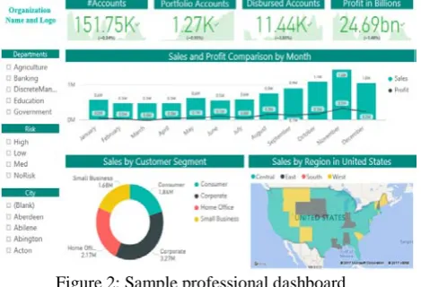
[image:3.595.308.543.59.219.2]By adhering all the best practices, this is how a professional dashboard will look like.
Figure 2: Sample professional dashboard
• Choosing the right chart type: We often ask,
“what is the right chart for my data?” As such there is no secretdecoder ring to point at data and see what kind of chart suits best but every chart has its own specialty that fits best as per the requirements.
There are two major types of data categorical or dimensions (fields that cannot be aggregated ex. Region) and quantitative or measures (numeric fields that can be aggregated or used for mathematical operations). Each chart suits the best with a unique combination of dimension and measures [7].
Common forms for data analysis in BI tools are as follows:
Comparison of data – Many times you need to show comparison between different items. So, to show highs and lows of data the best chart to use is bar or column chart. It’s the most commonly used chart in BI dashboard which can be made with 1 or 2 dimensions (stacked bar chart) and N number of measures. Example - Who is the best sales representative in the organization?
Guidelinesfor designing Bar/Column charts:
• Use consistent colors throughout the chart, colors that gives meaning to the data and reflect the changes in color over time.
• Use horizontal or slantlabels to better readability and start the y-axis from 0.
• It’s always a good practice to arrange the data in ascending or descending order until and unless it’s not a time-based data [9], [10].
Transition of data – If you want to see how the data is performing at a specific time or trend over months and days, line or area chart will be extremely useful in these scenarios. Line chart should be used when you have a continuous data set. Dual axis chart is used to plot the data using two y-axes and a shared x-axis. Two or three types of data sets are required, one will be continuous set of data and another must be grouped by category. Example – how the sales representatives are performing day by day?
Guidelinesfor designing Line/Dual axis charts:
• Use solid lines only.
• More than three or four lines should not be plotted for visual interruption.
• Use different graphing and coloring styles to demonstrate the different data sets [9], [10].
© 2015-19, IJARCS All Rights Reserved 100
A pie chart shows a fixed number in percentage and how categories represent part of a whole - the composition. Sum of all the segments in pie chart needs to be 100%.
A scatter chart shows the relationship with different variables to understand the distribution of data across each other.
Guidelines for designing Pie/Scatter charts:
• Use up to certain number to categories in the pie chart, if you have more than 6 values, sum up smaller ones as others.
• Make sure that the slices add up to 100% and sort them as per the size
• In scatter chart, include more variablesto incorporate more data [9], [10].
Guidelinesfor designing waterfall/funnel charts:
• Use contrasting colors for highlighting difference in datasets.
• As the size of funnel decreases, use colors from darkest to lightest.
• Size of the funnel reflects the amount of data, so scale the size of each sections of the funnel accordingly [9], [10].
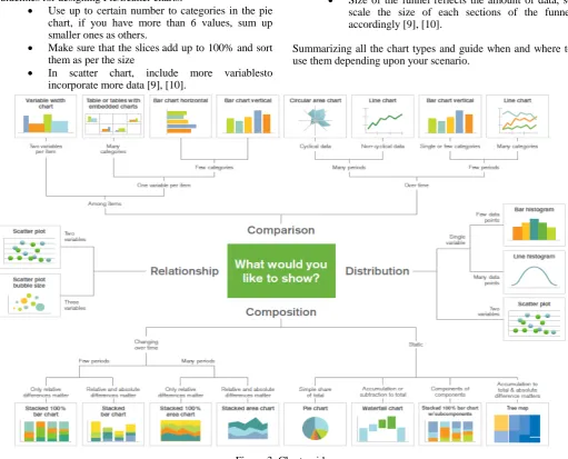
[image:4.595.43.555.119.532.2]Summarizing all the chart types and guide when and where to use them depending upon your scenario.
Figure 3: Chart guide
(Courtesy -www.qlik.com/~/media/Files/blog/Choosing-A-GoodChart-Dissected-FINAL.ashx)
5. Visibility guidelines –
The question is: do you always need to design the dashboard from scratch for one project?
These standard methods can be used to avoid such problem which is time consuming and improves quality.
o Tool specific template – A sample template can
be designed at starting of any project so that users aren’t required to design all the charts again. Sample charts and different type of common objects can be placed with standardized formatting so that user just need to copy and use the desired object into their dashboard.
o Themes – Themes are XML encoded files which
are used to replicate the dashboard with a single click as per the requirements.
Theme contains separate sections for each type of objects, document and sheet. For each separate object, the object-specific properties are stored, as well as caption and border properties and print
settings. Themes can be either applied to objects separately or at the document and sheet level. Every tool has distinct types of features regarding theme. Power BI has recently developedreport theme gallery where all types of themes structures are placed (high contrast, light contrast, spring, forest, color specific etc.) and users can simply download the file and load their data accordingly. Whereas in Qlikview, you have flexibility of making your own themesand apply them to the whole document, sheets or objects individually. Let’s say as per the requirementsyou need to change look and feel of the dashboard, in such case you can’t keep on changing colors, fonts and background again and again. So,use of theme is the smarter way to save time and add various functionalities much easily.[11], [12].
Figure 4: Dashboard before applying theme
Figure 5: Dashboard after applying theme
o Configuration file – Config file is used to control
variables that to be used in the dashboard. All the variables are initiallydefined in the config file and that file is loaded into the dashboard.
You often need to change the values of the variable again and again, so variables can be dynamically controlled by config file
The main advantage of loading variables in config file over defining in the dashboard is of tool performance, loading the config file increases performance and reduces the load on the tool; therefore, it’s always a good practice to load all the variables in the configuration file.
o UI checklist – You often needs to validate and
check whether all the requirements are completed or not. UI checklist enables to validate adherence with the prescribed guidelines to make sure that everything is completed as per the requirements.
B. Data Modelling
So far you have seen the best practices in terms of UI i.e. front end, but back end is the most important aspects which is known as data modeling in BI terminology.
The data model consists of the data structure (including tables, relationships, rows and columns of the table), the actual content of the data (dimension/measure, date and time, primary and foreign keys) and the metadata [13]. With an optimized data model, you can achieve the following functionality that improves the performance, speedand usability of the solution.
o Adaptability - schemas that undergo
enhancement of the tool.
o Portability - schemas that can be hosted on
different systems.
o Efficient Storage- optimized schema disk
footprint.
o HighPerformance- optimized schemas that
improve performance of the tool [14]. How can an optimized data model be created?
By incorporating these following points, you can create a fully optimized data model.
• Data granularity - Data tables should be created to
the lowest level of granularity i.e. fields should be segregated into the lowest granular level and into their respective tables.
Ex: If there is HR data, all data fields related to employees should be under one fields, same for the managers, team leads etc.
You should not club two different granularities together; this will result into incorrect errors [15].
• Identify Dimensions and fact tables –
You cannot always load flat files and use the data for developing dashboards. Every data contains Dimensions (Country, Region etc.) and Measures (Sales, Profit etc.). So, it’s always a good practice to segregate the data into dimension tables as per the granularity and fact table containing all the measures. Fact and dimension tables are co-related to each other.A dimension table has a primary key column that uniquely identifies each dimension field. The dimension table is associated with a fact table using the primary key. Fact table data can be sliced and diced by various combinations of attributes. If you have more than two facts tables in your data model then do not connect them directly, an alternative is to concatenate the two fact tables into a single fact table or use a link table to join them [17].
Consider a scenario where you have sales data with a single flat file. You should firstly divide the data into dimensions and measures. Suppose the fields names are Products, Region, State, City, Customer name, Customer address, Customer ID, Product ID, Order ID, Sales amount, Unit price, Profit and Discount. Fields that cannot be aggregated will come under dimension i.e. Products, Region, state, city, Customer name and Customer address.
The granularity of all these fields is not same.
You should use only one dimension that contains all the customer level data (customer name and customer address), one dimension that contains all the location level data (region, state, and city) and one for product. Likewise, there will be one fact table with the field’s Sales amount, Unit price, Profit and Discount. Primary keys will be used to join dimension tables to fact tables as per the level of granularity.
Ex. Customer ID will be used to join customer table to fact table and the same for product/order id.
o Avoid including non-additive facts, which cannot be used in metric computations.
o Instead of using unit prices as a field, store the extended price (units * unit price) and put thisinto a metric and use as a field.
© 2015-19, IJARCS All Rights Reserved 102
be placed in separate fact tables because the order must be placed before and shipment has done later [17].
• Primary keys and Foreign keys – To make data
more sensible there should be primary and foreign keys, in every data there will be primary keys through which all the fields will be co-related. (Customer ID, transaction ID, roll number etc.)
o Two compulsory conditions that any primary key should have are that all the fields should be unique and should not be null.
o A foreign key is nothing but a set of columns in a table that refers to the primary key in some other table.
o Date-time (except a GUID or Hash) isbasically bad primary keys and should be avoided [18].
Table 1: Comparison between primary keys and foreign keys [18]
Item Primary
Key
Foreign Key
Consist of One or More Columns
Yes Yes
Duplicate values allowed
No Yes
Null values allowed No Yes Uniquely identify
rows in a table
Yes Maybe
Number allowed per table
One One or more
Index Automatic Index
No automatic index created
• Cardinality – Cardinality (degree of relationship) in
the data model is the way to classify the relationships between two tables. Tables can be related to one another in many forms.
Majorly there are three degrees of cardinality
o One-to-One (1:1) - one-to-one relationship occurs when just one record in the first table corresponds to one record in the related table. For example, one person ‘A’ has a bike which is only related to that person.
Therefore, there is a one-to-one relationship between both the tables.
o One-to-Many (1:N) - one-to-many relationship occurs when exactly one record in the first table is associated with many records in the related table.
In the same example above if that person ‘A’ is having many bikes which belong to only that person then there is a one-to-many relationship between both the tables.
o Many-to-Many (M:N) - Many-to-many relationships occur when each record in a table is linked to many records in another table or vice-versa.
Considering the same example if many persons have many bikes then there is many-to-many relationships [19].
• Circular References – Circular references generally
occurs where a table A has a relationship with table B, table B has a relationship with table C, and table C has a relationship with table A which should be avoided.
Circular references should always be resolved it can create lot of data errors, inconsistency in values and performance degradation.
When you get a circular reference ask yourself if you could cut one of the join else you have toopt for concatenation or a link table to remove the circular reference. In every tool, there is separate method to break/avoid circular references.
Link tables allow you to join two or more fact tables against without circular references [20].
• Master Calendar – It’s always a best practice to
create a separate master calendar dimension table because if the data is missing for a certain period, we can create them in master calendar. So, we would be able to see the data as blank values for that period. Also using a master calendar avoids multiplication of the same data in the fact tables and we can use the same calendar for different facts in the data model rather than introducing same date-time fields in every fact tables. Year, month, quarter and day can also be extracted from the date field and used for further analysis of data [21].
Schema – It is a collection of all the database objects grouped
into dimensions and facts tables.
Majorly two types of schemas are used.
1. Star schema – In this schema, a single or more than one fact tables is in the middle connected with surrounding dimension tables. The formation of this schema looks like a star. Primary keys in the dimension tables are associated with foreign keys in fact tables [22].
2. Snowflake schema – When you extend the star schema and take it to the broader level by breaking one dimension (table) into smaller tables it will be called as snowflake schema. In this schema, each dimension table is normalized into multiple tables and represents a hierarchy of dimension tables [23]. Selecting the right schema depends on your level of data and requirements but always consider the performance of your dashboard on high priority, Star schema will be the best option for fast flexible applications.
[image:6.595.340.534.580.743.2]Here is the comparison of all the three options with respect to response time, RAM consumption, script run time, flexibility and complexity of the model.
Figure 6: Comparison between schemas
V. CONCLUSION
In this paper, we have addressed all the best practices required for any BI tool, which can help a developer create a good dashboard. These best practices will help you to create dashboards/reports with less errors and better visual impact. Following these practices, dashboards can be created at par with professional level. But these are just guidelines and not hard and fast rules. It depends upon the scenario, requirement and technology specifications. Also, as every technology is evolving and incorporating more features day by day, some of these guidelines may change and become obsolete but the basic principles will always remain same.
VI. REFERENCES
[1] http://searchdatamanagement.techtarget.com/definition/bu siness-intelligence
[2] http://searchbusinessanalytics.techtarget.com/feature/Und erstanding-BI-analytics-tools-and-their-benefits
[3] http://www.jenunderwood.com/2017/02/22/2017-gartner-bi-magic-quadrant-results/
[4] https://selecthub.com/business-intelligence/tableau-vs-qlikview-vs-microsoft-power-bi/
[5] https://community.qlik.com/servlet/JiveServlet/download/ 340693-61219/3.Good_chart_aesthetics.pdf
[6] https://www.linkedin.com/pulse/when-seeing-everything-dashboard-simultaneously-important-sarkar
[8] http://www.relevance.ro/wp-content/uploads/WP-Good-Practices-User-Experience-Qlik-Sense-EN.pdf
[10] https://blog.hubspot.com/marketing/data-visualization-choosing-chart#sm.0000y10c3jxfjdxw1060pdupgmesm
[11] https://www.urbanpro.com/qlikview/qlikview-themes
[12] http://community.powerbi.com/t5/Themes-Gallery/bd-p/ThemesGallery
[13] https://en.wikipedia.org/wiki/Data_modeling
[14] https://www.talend.com/blog/2017/05/05/data-model-design-best-practices-part-1/
[15] http://www.1keydata.com/datawarehousing/fact-table-granularity.html
[16] http://searchdatamanagement.techtarget.com/definition/di mension-table
[18] https://www.essentialsql.com/what-is-the-difference-between-a-primary-key-and-a-foreign-key/
[19]
https://www.sqa.org.uk/e-learning/SoftDevRDS02CD/page_44.htm
[20] https://www.tutorialspoint.com/qlikview/qlikview_circula r_reference.htm
[21] https://community.qlik.com/docs/DOC-8642
[22] http://www.1keydata.com/datawarehousing/star-schema.html