Master thesis
Activity types in a neural
mass model
Jurgen Hebbink
September 19, 2014
Exam committee:
Prof. Dr. S.A. van Gils (UT) Dr. H.G.E. Meijer (UT)
Contents
1 Introduction 4
2 Neural mass models 6
2.1 General principle of a neural mass . . . 6
2.2 Lopes da Silva’s thalamus model . . . 8
2.3 Models for cortical columns . . . 9
2.3.1 Jansen & Rit model . . . 9
2.3.2 Variations on the Jansen & Rit model . . . 10
3 Wendlingmodel 14 3.1 Model formulation . . . 14
3.2 Activity types . . . 16
3.2.1 Activity types found by Wendling et al. . . 17
3.2.2 Other activity types . . . 18
3.2.3 Variation of synaptic gains . . . 23
3.3 Bifurcation analysis inB. . . 24
3.3.1 Continuation inB forG= 25 . . . 24
3.3.2 Continuation inB forG= 50 . . . 28
3.4 Boundaries between equilibrium activity types . . . 30
3.5 Activity map for theB-G-plane . . . 34
3.6 Continuation of codim 1 bifurcations . . . 36
4 Conclusion & discussion 39 A Continuation of non-bifurcations 41 A.1 Continuation of eigenvalues . . . 41
A.1.1 Continuation of a real eigenvalue . . . 41
A.1.2 Continuation of a complex conjugated pair of eigenvalues . . . 43
A.2 Limit point at certain value of system variables . . . 43
A.3 Continuation of possible boundaries of activity types . . . 44
A.3.1 Transition of leading eigenvalue . . . 44
A.3.2 Continuation of eigenvalues with a fixed imaginary part . . . 45
B Simulation source code 46
Chapter 1
Introduction
Understanding neuronal activity in the human brain is a complex and difficult but necessary task in order to treat diseases like epilepsy. Due to the complexity there are multiple fields of science involved. One, at first glance surprising, way to study brain activity is by using mathematical models.
Mathematical models for brain activity are a useful tool because one can study brain activity without bothering about effects from outside. Experiments that one can do in a mathematical model are ideal in comparison to real experiments which are always performed under non-ideal conditions. Further one can change parameters in mathematical models easy, something that is difficult or even impossible in real experiments. A drawback of mathematical models is that they are always a simplification of the reality. However, a good mathematical model may give insight in the underlying processes that generates brain activity.
There are lots of different mathematical models for brain activity. All these models have their specific strength and weakness. Some of these models are made to model activity of single neurons. Often multiple of these single neuron models can be coupled in order to simulate a large network of neurons. However, one needs lots of coupled neurons to model bigger brain structures. For example a single cortical column counts in the order of 104-108 neurons [7].
Performing simulations of such large networks of coupled neurons is only feasible on su-percomputers and even then it takes long. Another disadvantage of such big models is that they count a huge number of parameters. It’s therefore difficult to analyze the influence of the parameters.
Other classes of mathematical models describe neuronal activity on a macroscopic level. These macroscopic models are less detailed then microscopic models and often describe average activity of a large group of neurons. This is not a big problem since most experimental data is the result of measurements of large groups of neurons. This is for example the case with EEG measurements.
An advantage of macroscopic models is that they need less computation time compared to microscopic ones. Simulations of macroscopic models can be done on a consumer PC. Further they have significantly less parameters and are therefore easier to analyze. Hence, studying macroscopic models may give more insight in brain activity.
In this report we will study a class of macroscopic models that is called Neural Mass Models (NMMs). The basis of NMMs is formed in the seventies by Lopes da Silva et al. [20, 21] and by Freeman et al. [9]. In this report we will study a model by Wendling et al. [28] that models the behaviour of a cortical column. A feature of this model for a cortical column is that it models two different inhibitory processes, a fast and slow one. Most neural mass models for cortical columns model only the slow inhibitory process.
model. This will result in a map that reveals regions where specific activity types are seen. This report is built up in the following way. In the next chapter we start to explain the basic principle of a neural mass models. After this we give a literature overview of some neural mass models for cortical columns. In the chapter that follows we investigate the Wendling model in more detail. First we will formulate a system of differential equations that governs this model. Then we show the different activity types that can be produced by the Wendling model. This is followed by bifurcation analysis of the model in one parameter. The bifurcations we find give a part of the boundaries between the activity types. After this we will search how the other boundaries can be found. It results in an activity map and a bifurcation diagram for a large parameter region. Finally we will discuss our results in the chapter ’Conclusion & Discussion’.
Chapter 2
Neural mass models
In this chapter we will discuss neural mass models in more detail. The basic units of neural mass models are neural masses. A neural mass models the average behaviour of a large group of neurons. Neural masses are coupled together to model larger structures of neurons like cortical columns. Some neural mass models consist of multiple cortical columns that are coupled together. In this chapter we describe first the general principle of neural mass models and explain how a single neural mass is modeled. Then we discuss one of the first neural mass model namely that of Lopes da Silva et al. [20]. We finish to comment on some literature on neural mass models for cortical columns.
2.1
General principle of a neural mass
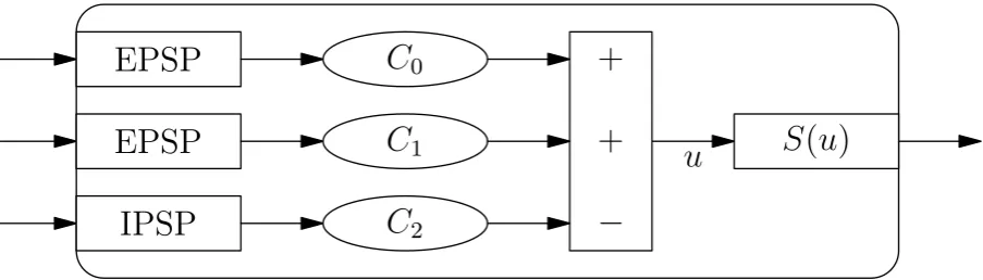
In this section is described how a single neural mass or neural population is modeled. Each neural mass has average membrane potential,u. This average membrane potential can be viewed as the state variable of the neural mass. This average membrane potential is the result of the different inputs that this neural mass receives.
In neural mass models these inputs represents average pulse densities. These inputs can come from other neural masses in the model or from external inputs. A neural mass it self can also give an output. This output is also an average pulse density.
Average membrane potential and average pulse densities are the two main quantities in neural mass models. These two quantities are converted via two transformations: Post Synaptic Potential (PSP) and a potential-to-rate function. Each input to a neural mass is converted from an average pulse density to a potential via a PSP transform. Each of these potentials is multiplied by some constant, modeling the average number of synapses to this population. Then the average membrane potential of a population,u, is formed by summing up all potentials from excitatory inputs and subtract all inhibitory ones. The potential-to-rate function converts the average membrane potential of a neural mass into the average pulse density that this population puts out. A schematic overview of a neuronal population is displayed in figure 2.1.
The PSP transformation is a linear transformation and is modeled using a second order differential equation. This second order differential equation is usually characterized in terms of it’s impulse response. Originally Lopes da Silva et al. [20] approximated the impulse response of a real PSP by the following impulse response:
h(t) =Q e−q1t−e−q2t.
Here Q(in mV) andq1< q2 (both in Hz) are parameters.
Van Rotterdam et al. [27] simplified this approximation by a version that has two parameters, Qand q. This impulse response is given by:
h(t) =
(
Qqte−qt t≥0
−
IPSP
C
2+
EPSP
C
1+
EPSP
C
0 [image:7.595.87.539.55.184.2]u
S
(
u
)
Figure 2.1: A schematic overview of a neural mass. Different inputs are converted to potentials using PSP transforms. These potentials are multiplied by a constant modeling the average number of synapses from this input to the population. Summing up all excitatory and subtracting all inhibitory potentials yields the average membrane potential u. Then a sigmoid transform is applied to u in order to get the average pulse rate that this population puts out.
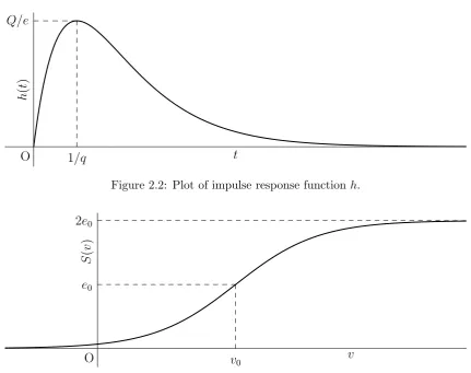
This PSP transformation is used in nearly all later NMMs, for example [10, 17, 28]. In figure 2.2 an example of the impulse response h is plotted. It can be seen that the PSP transform has a peak. The time of this peak can be adjusted by the parameter q, since it lays at t = 1/q. The other parameterQ is used to tune the height of this peak that is given by Q/e.
The integral of the impulse functionhin equation (2.1) isQ/qand depends on bothQandq. From a mathematical point of view one may prefer to tune this with a single variable Qb=Q/q.
In that case the impulse response becomes.
h(t) =
( b
Qte−qt t≥0 0 t <0,
However in this case the maximum height of the peak in the impulse response is Q/b (qe) and
this depends on two variables. This could be a reason that van Rotterdam et al. [27] used the impulse response of equation (2.1). Equation (2.1) has become the standard from then on. Also we will use the impulse response described by equation (2.1).
The impulse response in equation (2.1) corresponds to a linear transformation that is given by the following system of two ODE’s:
dx
dt =y, (2.2a)
dy
dt =Qqz−2qy−q
2x. (2.2b)
Here z(t) is the input to the PSP transform andx(t) the output of the PSP transform.
The potential-to-rate function converts the average membrane potential of a population, u, into an average pulse density. This average pulse density is the output of the neural mass. The potential-to-rate function is a non-linear function. It’s usually taken to be a non-decreasing function that converges to zero as u→ −∞ and is bounded from above. A common choice is a sigmoid function:
S(u) = 2e0
1 +er(v0−u), (2.3)
but also other functions are used for example in [18]. In equation (2.3) parameter e0 is half of
the maximal firing rate of the population, v0 the average membrane potential for which half of
the population fires andr a parameter for the steepness of the sigmoid. Most timese0 = 2.5Hz,
v0 = 6mV andr = 0.56mV−1 are used. A graph of S(u) for these values is plotted in figure 2.3.
h
(
t
)
t 1/q
Q/e
[image:8.595.68.500.46.387.2]O
Figure 2.2: Plot of impulse response functionh.
S
(
v
)
v
v0
e0
2e0
O
Figure 2.3: Plot of the sigmoid function. It can be seen that forv=v0 the sigmoid function has
a value of e0 and 2e0 is an asymptote.
models multiple neural masses are coupled to model bigger structures. In the next section we discuss the neural mass model by Lopes da Silva et al. [20] that models the thalamus. Later we will discuss different models for cortical columns.
2.2
Lopes da Silva’s thalamus model
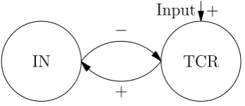
In 1974 Lopes da Silva et al. [20] published an article where models for the α-rhythm in the thalamus are investigated. In this article a neural network model is reduced to a NMM. First they consider a neural network model that consists of two classes of neurons namely thalamo-cortical relay cells (TCR) and interneurons (IN). Their neural network consists of 144 TCR neurons and 36 IN. With computer simulations is showed that this model is able to produce an α-rhythm.
In order to understand the influence of parameters they reduce this model to a neural mass model. Their neural mass model consists of two neural masses, one models the TCR, the other the IN. The TCR receive external excitatory input and inhibitory input from IN. The IN receive only excitatory input from the TCR. In figure 2.4 a schematic overview of this model is given.
TCR Input +
IN
−
[image:9.595.225.399.57.132.2]+
Figure 2.4: Schematic overview of Lopes da Silva’s NMM for the thalamus. Arrows marked with + are excitatory connections, with − are inhibitory.
2.3
Models for cortical columns
In this section different neural mass models for cortical columns are discussed. Like the neural mass model by Lopes da Silva et al. [20] for the thalamus these models couple multiple neural masses together. The models for cortical columns that we discuss are based on the model by Jansen & Rit [17]. Therefore we will start with a description of this model.
2.3.1 Jansen & Rit model
In 1993 Jansen et al. [18] devolped a model for a cortical column that consist of three neural masses: pyramidal neurons, local excitatory and local inhibitory neurons. It was based on the model for the thalamus by Lopes da Silva et al. [20] and uses the PSP transformation as proposed by van Rotterdam et al. [27].
Two year later, in 1995, Jansen and Rit [17] used a slightly different version of this model that is the basis for most cortical NMMs. A schematic representation of this model is showed in figure 2.5. In the Jansen & Rit model pyramidal and local excitatory neurons give excitatory input to other populations where local inhibitory neurons give inhibitory input. Local excitatory and inhibitory neurons both receive input from the pyramidal cells with connectivity strengthC1
respectively C3. Pyramidal neurons receive input from both excitatory and inhibitory neurons
with connectivity constantsC2 respectivelyC4.
In the Jansen & Rit model pyramidal cells are the only population that receive external excitatory input. This in contrast to the model by Jansen et al. [18]. Here also the local excitatory cells receive input from outside.
The external input to a cortical column can consist of output from pyramidal cells of other cortical columns and background activity. The model output that is studied is potential of pyramidal cells, since this is supposed to approximate EEG signals, as pyramidal neurons have by far the biggest influence on EEG signals.
Pyramidal cells Input +
Excitatory cells +,C1
+,C3
Inhibitory cells
−, C4
+,C2
Figure 2.5: Schematic representation of the Jansen & Rit model for a cortical column. Arrows marked with + are excitatory connections, with−are inhibitory. The constantsCk,k= 1,2,3,4
regulate the strength of the connections.
Jansen and Rit [17] related the connectivity constants in the cortical column by using liter-ature on anatomical data of animals. In this way they found the following relation:
[image:9.595.174.452.573.641.2]with C a parameter. This parameter C is set to 135 in a large part of their work. Further the standard parameters for the sigmoid function are used: e0 = 2.5Hz, r = 0.56mV−1 and
v0 = 6mV. As external input Jansen and Rit use noise that varies between 120 to 320Hz
Jansen and Rit [17] vary some parameters. They found out that their model was capable to produce activity types. These are displayed in figure 2.6. The upper left plot of this figure is what they called hyperactive noise. The potential of the pyramidal cells is high for this activity type. If the inhibition is increased the model produces a noisy α-rhythm and later on a normal α-rhythm. Then slow periodic activity with high amplitudes is seen. If the inhibition is higher the system produces hypo-active noise. The potential of the pyramidal cells is low in this case.
Wendling et al. [30] used the Jansen-Rit model with Gaussian white noise input with mean 90Hz. They claim to use a standard deviation of 30Hz, but probably this is much lower (see chapter 3.1). They observed that forA= 3.25mV the system oscillates in α-rhythm, when Ais increased the model started to create sporadic spikes that become more frequent, till the system was only produce spikes.
Grimbert and Faugeras [12] investigated the influence of the stationary inputI on the Jansen & Rit model using bifurcation analysis. They used the same parameter values as used by Jansen and Rit. In figure 2.7 the resulting bifurcation diagram is displayed. In this diagram the blue lines represent equilibria and the green lines the maxima and minima of periodic solutions. Solid lines indicate stable solutions and dashed lines unstable.
Grimbert and Faugeras found that the Jansen & Rit model has a large bistable region. For 0< I <89 the system has 2 stable equilibria. AtI ≈89 one of these stable equilibria undergoes a Hopf bifurcation. This produces the stable limit cycle that is responsible for the α-rhythm. Between I ≈ 89 and I ≈ 114 the system has a stable equilibrium and the stable limit cycle producing the α-rhythm. At I ≈ 114 a saddle-node on an invariant curve bifurcation (SNIC) takes place. This bifurcation produces a limit cycle with low frequency (<5Hz) and the stable equilibrium disappears. The new created limit cycle generates Spike-Wave-Discharge (SWD) activity. Till I ≈ 137 the α-rhythm limit cycle and the SWD limit cycle are the two stable solutions of the system. At I ≈ 137 the SWD limit cycle disappears because at this point it undergoes a Limit Point of Cycle (LPC) bifurcation with an unstable limit cycle. From this point till I ≈ 315 the α-rhythm is the only stable solution of the system. At I ≈315 again a Hopf bifurcation takes place. Theα-rhythm limit cycle disappears and for larger values ofI the system has a stable equilibrium.
Grimbert and Faugeras [12] also consider briefly changes of other parameters. They concluded that varying parameters by more then 5% leads to drastic changes in the bifurcation diagram for I. Lower values ofA,B and C or higher values of aand bmake that the system no longer has stable limit cyles. Higher values ofA,B andC or lower values ofaandbgive a new bifurcation diagram. The system is monostable for nearly all values ofIand has a broader region (compared to the standard values) of SWD activity.
2.3.2 Variations on the Jansen & Rit model
In the literature there are a lot of variations on the Jansen & Rit model. In this section we consider some of these variations.
0 0.5 1 1.5 2 10.5 11 11.5 12 12.5 t(s) up y (m V) Hyperactive noise
0 0.5 1 1.5 2
7.5 8 8.5 9 9.5 10 10.5 t (s) up y (m V)
Noisyα-rhythm
0 0.5 1 1.5 2
4 5 6 7 8 9 10 11 t(s) up y (m V) α-rhythm
0 0.5 1 1.5 2
−4 −2 0 2 4 6 8 10 t (s) up y (m V)
Slow periodic activity
0 0.5 1 1.5 2
[image:11.595.88.536.76.678.2]0.5 1 1.5 2 2.5 3 t (s) up y (m V) Hypo-active noise
−50 0 50 100 150 200 250 300 350 −2
0 2 4 6 8 10 12
LPC SNIC
LP
H H
H
I(Hz) up
y
(m
[image:12.595.66.512.58.251.2]V)
Figure 2.7: Bifurcation diagram ofupy as function ofI for the Jansen & Rit’s model as obtained
by Grimbert and Faugeras [12].
inhibitory population is very high: q = 500Hz, so the time constant 1/q is very small. This is needed to produce the fast activity.
More information about the Wendling model can be found in chapter 3. Here we describe the result found by Wendling et al. [28] and other. Further we will give an overview of the different activity types that this model can produce.
A mix of the Jansen & Rit model and the Wendling model is considered by Goodfellow et al. [10]. A schematic overview of this model is given in figure 2.8. Goodfellow’s model has, like the Jansen & Rit model, three populations. However they modeled a fast and slow inhibitory connection from the inhibitory cells to the pyramidal cells instead of only one inhibitory con-nection. Their target is to model the inhibitory process, that according to them has a highly variable time course, in a better way. The fast inhibitory PSP taken by Goodfellow et al. [10] uses q= 200Hz and is a lot smaller then in the Wendling model.
Goodfellow et al. [10] developed this model to generate SWD activity in a broad region. The model is also capable to produce oscillations with a frequency slightly lower then 15Hz. These oscillations are comparable with theα-rhythm in the Jansen & Rit model. Goodfellow et al. [10] call this background activity. Further this model is also able to generate poly SWD (multiple spikes followed by a slow wave) and other complex behaviour.
Pyramidal cells
Input, +
Excitatory cells +
+ Inhibitory
cells
−s
−f
+
Figure 2.8: Schematic representation of Goodfellow’s model [10] of a cortical column.
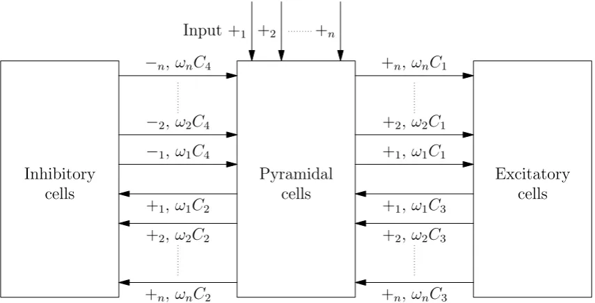
The model proposed by Goodfellow et al. [10] can be seen as a specific case of a class of models considered by David and Friston [5]. David and Friston generalized the Jansen & Rit model as displayed in figure 2.9. Each input to a population is split in nparts. All those parts a processed by their own PSP transformation that have their own parameters. In the figure we have +1, +2,. . . , +nfor the excitatory PSP transforms and−1,−2,. . . ,−nfor the inhibitory PSP
[image:12.595.142.428.558.643.2]k. It holds that:
∀k∈{1,...,n}ωk ≥0 and
n X k=1
ωk= 1.
So the constants C1,C2,C3 andC4 determine the total strength of the connections.
Pyramidal cells Input +1 +2 +n
Excitatory cells +1, ω1C1
+2, ω2C1
+n, ωnC1
+1, ω1C3
+2, ω2C3
+n, ωnC3
Inhibitory cells
−1, ω1C4
−2, ω2C4
−n, ωnC4
+1, ω1C2
+2, ω2C2
[image:13.595.98.526.130.348.2]+n, ωnC2
Figure 2.9: Schematic representation of David and Fristons generalization of the Jansen & Rit model.
David & Friston [5] investigate their model for n = 2. They took slow PSP transforms for +1 and −1 and fast PSP transforms for +2 and −2. The other parameters were chosen in such
way that if ω1 = 1 or ω2 = 1 the systems oscillates in a frequency corresponding to the first
resp. second PSP transform under stationary input. If they set (ω1, ω2) = (ω,1−ω) and took
0< ω <1 the system was not oscillating with stationary input. However if a white noise input was applied then the started noisy oscillations. The frequency spectrum in those cases didn’t have two separated peaks at the frequencies seen in caseω= 0 orω= 1 but it had a single peak at some intermediate value, depending on ω.
Chapter 3
Wendlingmodel
In the previous chapter we reviewed different neural mass models for cortical columns. In this chapter we investigate one of them, the model by Wendling et al. [28], in more detail. First a set of differential equations is derived that governs this model. Then is described what types of activity this model can produce and what their characteristics are. The next step is to investigate the influence of inhibition on the activity types. The target is to find boundaries between the different activity types. First this is done by bifurcation analysis. It turns out that not all the activity types can be separated in this way. Therefore we present a method to find the other boundaries. This leads to a map were different regions of activity are identified. Finally bifurcation analysis in a very broad parameter region is done in order to see what other type of behavior this model can produce and from which bifurcations they emerge.
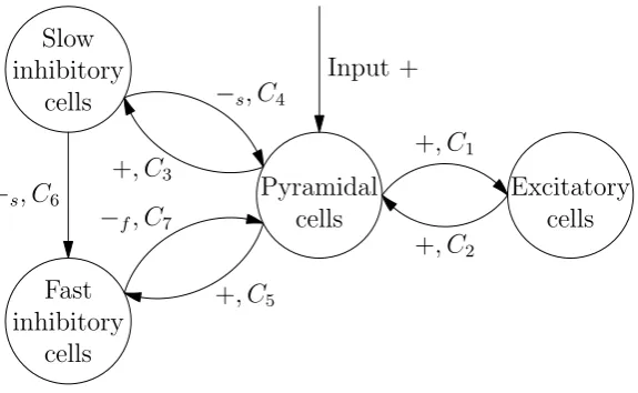
3.1
Model formulation
The model proposed by Wendling et al. [28] consist of 4 neural masses: pyramidal cells, excitatory interneurons, slow and fast inhibitory interneurons. In figure 3.1 a schematic overview is given. The pyramidal cells give excitatory input to all other populations. They receive excitatory input from the excitatory cells and from outside. Further they receive slow inhibitory input from the slow inhibitory cells and fast inhibitory input from the fast inhibitory cells. The slow inhibitory cells give also a slow inhibitory input to the fast inhibitory cells.
The signs +, −s and−f along the connectivity arrows in figure 3.1 indicate what parameters
for the PSP transform are used. The + stands for the excitatory PSP transform. The parameters
Pyramidal cells
Input +
Excitatory cells +, C1
+, C2
Slow inhibitory
cells
+, C3
−s, C4
Fast inhibitory
cells
+, C5
−f, C7
[image:14.595.140.428.548.725.2]−s, C6
Q and q in equation (2.2) for the excitatory PSP are taken to be Q= A and q =a. The sign −s represent the slow inhibitory process. It’s PSP transform has parametersQ=B and q =b.
Finally, the−f stands for the fast PSP transform, that has parameters Q=G andq =g.
The parameters Ck, k = 1, . . . ,7 are connectivity constants. It’s useful to express these
connectivity constants as fraction of a connectivity constantC. We haveCk=αkC,k= 1, . . . ,7,
where αk,k= 1, . . . ,7 are parameters that indicate the weight of the connection. The standard
values for these parameters that are used by Wendling et al. [28] are found in table 3.1. These standard values are the same as those used by Jansen and Rit except for those that are not part of the Jansen & Rit model.
The Wendling model can be described by a set of eight differential equations using the differential equations in equation (2.2) that describe the PSP transformation. This leads to the following set of differential equations:
˙
x0=y0, (3.1a)
˙
y0=AaS(upy)−2ay0−a2x0, (3.1b)
˙
x1=y1, (3.1c)
˙ y1=Aa
I C2
+S(uex)
−2ay1−a2x1, (3.1d)
˙
x2=y2, (3.1e)
˙
y2=BbS(uis)−2by2−b2x2, (3.1f)
˙
x3=y3, (3.1g)
˙
y3=GgS(uif)−2gy3−g2x3, (3.1h)
where
upy =C2x1−C4x2−C7x3, uex=C1x0, uis=C3x0, uif =C5x0−C6x2 (3.2)
are the potentials of the pyramidal cells, excitatory cells, slow inhibitory cells and fast inhibitory cells. The parameter I stands for the external input to the cortical column.
The first two differential equations represent the excitatory input from the pyramidal cells to the other three populations. Because these three populations process the input from the pyramidal cells with the same PSP transformation this is possible.
The excitatory input to the pyramidal cells consist of excitatory input from the excitatory cells and input from outside the cortical column. These two inputs undergo the same PSP transformation. After the PSP transformation the potential contribution of the input from the excitatory cells needs to be multiplied by C2 to account for the number of synapses. For the
external input there is no multiplication constant needed, since such a constant can be absorbed in the input. After this those two are, together with the potential contribution from the two inhibitory inputs, added to form the potential of the pyramidal cells.
Because of the linearity of the PSP transformation we can change the order of addition and PSP transformation and the order of multiplication and PSP transform. This leads to the following process. First multiply the input from the excitatory cells with C2. Then add the
result to the external input and apply the PSP transformation. The advantage of this is that we need to apply the PSP transformation once instead of twice. Therefore we need two differential equations instead of four to describe the excitatory inputs to the pyramidal cells.
We change this a bit further. We want to apply the multiplication withC2 of the excitatory
input after the PSP transformation. However, if we do this, we also multiply the potential contribution of the external input with C2. To solve this we divide the external input by C2
before the addition. This givesI/C2 term in equation (3.1d). The reason for multiplication after
formula in equation (3.2). Here all the x’s are multiplied with someCk which gives a consistent
formula.
The fifth and sixth equation model the slow inhibitory input from the slow inhibitory cells to the pyramidal cells and to the fast inhibitory cells. Finally the last two equations model the fast inhibitory input to the pyramidal cells coming from the fast inhibitory cells.
Note that in most articles where the Wendling model is used [2, 26, 28, 31] the model is described by a set of ten ODE’s. In these systems of ODE’s the slow inhibitory input to the pyramidal cells and to the fast inhibitory cells is modeled by two sets of two ODE’s instead of one set of two ODE’s.
As mentioned before, the parameter I represents the external input to the cortical column. Usually this input consist of a constant part and a stochastic part. In this chapter we set the constant part to 90Hz. The stochastic part is modeled as Gaussian white noise. This turns system (3.1) into a system of stochastic differential equations (SDE’s).
To solve SDE’s numerically one can’t use methods for ordinary differential equations but adapted methods are needed. For example the Euler-Maruyama method or the Milstein method. Both are based on the plain forward Euler method. The Milstein method includes extra terms in comparison to the Euler-Maruyama method. It therefore has a higher order of strong conver-gence. However for the system of differential equations in (3.1) those two methods are the same, because the coefficient in front of the noise term doesn’t depend on the state variables.
In the articles by Wendling et al. [28, 31] the standard deviation for the white noise is set to σW = 30. However, after trying to reproduce their results this seems way to big. In an
other article by Wendling et al. [29] a link to the source code that can be used to simulate the Wendling model is given. It turns out that they used a plain forward Euler method to simulate the differential equations. Therefore the actually used standard deviation is:
σ=p∆tWσW =
1 √
51230≈1.33,
where ∆tW is the size of the time step that Wendling at al. [28, 31] used. The typical value was
1/512s (sampling frequency of 512Hz).
Here we will useσ= 2. This is slightly bigger then the standard deviation used by Wendling et al. [28] but still acceptable for the system. In the next section we will see what types of activity can be generated by the Wendling model.
3.2
Activity types
In their article Wendling et al. [28] distinguished six different types of activity in their system. These six types of activity where found by stochastic simulations of their model for parameters (A, B, G) ∈ [0,7]×[0,50]×[0,30]. They separate these activities based on spectral properties and compared this with activity seen in depth-EEG signals.
In this section we first reproduce and describe these six activity types. After this it is showed that this model is capable to produce also other activity types. Part of these are found by Blenkinsop et al. [2]. We find two new types of activity. One of these is in the region explored by Wendling et al. [28].
For the simulation of the activity types we made an implementation for the system of differ-ential equations in (3.1). This implementation uses the Euler-Maruyama method to numerically solve the differential equations and is written in Matlab. The source code can be found in appendix B at page 46.
Parameter Description Standard value
A Average excitatory synaptic gain 3.25mV
B Average slow inhibitory synaptic gain 22mV
G Average fast inhibitory synaptic gain 10mV
a Reciprocal of excitatory time constant 100Hz
b Reciprocal of slow inhibitory time constant 50Hz
g Reciprocal of fast inhibitory time constant 500Hz
C General connectivity constant 135
α1 Connectivity: pyramidal to excitatory cells 1
α2 Connectivity: excitatory to pyramidal cells 0.8
α3 Connectivity: pyramidal to slow inhibitory cells 0.25
α4 Connectivity: slow inhibitory to pyramidal cells 0.25
α5 Connectivity: pyramidal to fast inhibitory cells 0.3
α6 Connectivity: slow to fast inhibitory cells 0.1
α7 Connectivity: fast inhibitory to pyramidal cells 0.8
v0 Sigmoid function: potential at half of max firing rate 6mV
e0 Sigmoid function: half of max firing rate 2.5Hz
[image:17.595.105.518.57.305.2]r Sigmoid function: steepness parameter 0.56mV−1
Table 3.1: Parameters and their default values as used in the Wendling model.
In order to get smoother frequency spectra we simulated (n+ 1)10s of model data. We neglected the first 10s of the output, in order to remove the effect of initial conditions. The other part is divided in n parts of 10s. For each part we computed the frequency spectrum after subtracting the mean. Then we averaged the results. The number of averaged parts, n, depends on the type of activity.
3.2.1 Activity types found by Wendling et al.
We now reproduce the activity types found by Wendling et al. [28] and try to give a clear description. We set A= 5 and variedB and G. The other parameters are set at their standard values as displayed in table 3.1. In figure 3.2 examples of the first four types of activity are given and in figure 3.3 the other two types of activity are given.
The activity that is called type 1 activity by Wendling et al. [28] is shown in the upper left plot of figure 3.2. This plot is made for (B, G) = (50,15) and for the frequency plot n= 500 is used. The activity can be described as a noisy perturbation around an equilibrium, because in absence of noise the system goes to an equilibrium. The frequency plot has a maximum around 5Hz. The power of this maximum is low because the activity is noise-driven. According to [28] this represents normal background activity.
Wendling et al. [28] don’t mention that this activity type can be divided in two sub activity types depending on the mean value ofupy. We call type 1 activity type 1a ifupyis low (say<2)
and type 1b if upy is high (say > 10). There is no type 1 activity seen for mid values of upy.
In case of type 1a activity the system is nearly inactive, all populations have a relatively low potential and therefore the pulse rate they send to each other is low. In case we have type 1b activity the system is almost saturated, most populations have a relatively high potential and therefore the pulse rate they send is high. There spectral properties of these subtypes are nearly equal.
frequency plot shows a peak around 3Hz which is caused by the SWDs. Around 5Hz the decay of this peak show some irregularity. This is the effect of the period with normal activity.
The activity called type 3 consist of sustained SWDs. These SWDs are not very sensible for noise. This is because they are not generated by noisy perturbations around an equilibrium but by a limit cycle with large amplitude. This can also be seen in the frequency plot that shows a sharp peak with a high power around 4.5Hz. Other peaks are seen at multiples 2, 3 and 4 of this frequency. These higher harmonics arise because the limit cycle isn’t a sinus-like oscillation. The frequency of the SWDs changes on parameter variation, the maximum frequency of the SWDs is roughly 5Hz. The example showed in figure 3.2 uses (B, G) = (25,15). For the frequency plot only 10 averages were needed.
Activity type 4 distinguished by Wendling et al. [28] is what they call slow rhythmic activity. As can be seen in figure 3.2, which uses (B, G) = (10,15), this activity shows some very noisy oscillations with highly varying amplitude. This is because the oscillations are noise-driven, in absence of noise the system goes to a stable equilibrium. The frequency of the oscillations changes a bit on parameter variation but lays around 10Hz as can be seen in the frequency plot that needed 200 averages.
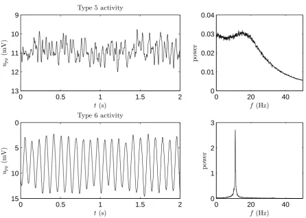
An example of activity type 5 is given in the upper plot of figure 3.3. For this example we used (B, G) = (5,25) andn= 500. This activity is called low-voltage rapid activity by Wendling et al. [28]. As one can see in the plot, this type of activity features relatively irregular fluctuations with low amplitude, compared to the other activity types. The fact that the fluctuations have a low amplitude comes from the fact that this activity type is caused by stochastic fluctuations around an equilibrium state. This can also be seen in the frequency plot, because the maximum power that is observed is very low. A more interesting thing that can be seen in the frequency spectrum is that it has two local maxima. The first one appears at a very low frequency and is the result of noise. The second one is in the range 13-25Hz. Between those two maxima the power is relatively high, this makes that there is a broad frequency region with approximately the same power. In this activity type the influence of frequencies around 20Hz is relatively large, this is probably the reason why it’s called rapid activity by Wendling et al. [28]. However, as we will see later, this model is also capable to produce activities with higher frequencies.
The last activity type distinguished by Wendling et al. [28] is activity type 6. In figure 3.3 an example of this activity type is displayed using (B, G) = (15,0) and only 10 averages for the frequency plot. Wendling et al. [28] call this slow quasi-sinusoidal activity. This activity consist of oscillations that have a high amplitude that is varying a bit. These small variations are effects of noise. In absence of noise this activity converges to a stable limit cycle and therefore produces oscillations that all have the same amplitude. The frequency of these oscillations is around 11Hz as the peak in the frequency plot indicates.
There are some relations between these activity types. Sometimes this makes it difficult to classify the right activity type. Type 4 and type 6 both show oscillations with a frequency around 10Hz. The criteria we will use is that type 4 activity is generated by random perturbations around an equilibrium state while type 6 is generated by a limit cycle. Further type 2 can be seen as a mixture of type 1 and type 3. It’s difficult to formulate a clear boundary between those types. It depends on what you will call a ’sporadic spike’ and is influenced by the standard deviation of the noise. In one of the next sections bifurcation analysis is done and based on this this we try to define the boundary between these types. However, first it is shown that also other types of activity can be found in the Wendling model.
3.2.2 Other activity types
0 0.5 1 1.5 2 −3 −2 −1 0 1 t (s) up y (m V)
Type 1 activity
0 20 40
0 0.02 0.04 0.06 0.08 f (Hz) p ow er
0 0.5 1 1.5 2
−20 −10 0 10 20 t (s) up y (m V)
Type 2 activity
0 20 40
0 0.2 0.4 0.6 0.8 f (Hz) p ow er
0 0.5 1 1.5 2
−10 −5 0 5 10 15 t (s) up y (m V)
Type 3 activity
0 20 40
0 1 2 3 4 5 f (Hz) p ow er
0 0.5 1 1.5 2
7 8 9 10 11 t (s) up y (m V)
Type 4 activity
0 20 40
[image:19.595.83.532.67.707.2]0 0.02 0.04 0.06 0.08 0.1 f (Hz) p ow er
0 0.5 1 1.5 2 9
10
11
12
13
t(s) up
y
(m
V)
Type 5 activity
0 20 40
0 0.01 0.02 0.03 0.04
f (Hz)
p
ow
er
0 0.5 1 1.5 2
0
5
10
15
t(s)
up
y
(m
V)
Type 6 activity
0 20 40
0 1 2 3
f (Hz)
p
ow
[image:20.595.62.509.220.538.2]er
0 0.5 1 1.5 2 −20
−10
0
10
20
t (s) up
y
(m
V)
pSWD 2 spikes
0 20 40
0 2 4 6
f (Hz)
p
ow
er
0 0.5 1 1.5 2
−10
0
10
20
t (s) up
y
(m
V)
pSWD 3 spikes
0 20 40
0 1 2 3 4
f (Hz)
p
ow
[image:21.595.87.535.61.371.2]er
Figure 3.4: Two examples of pSWD activityies found by Blenkinsop et al. [2]. Top: 2 spikes, bottom: 3 spikes. Left: typical time series. Right: frequency plot.
followed by a wave. For this plot we used A = 7, B = 30 and G = 50. The other one has 3 spikes followed by a wave. For the example plot in figure 3.4 we used A = 7, B = 25 and G= 150. Both frequency plots are obtained withn= 10 and look like the frequency plot of the plain SWD case. Like the SWD activity also the pSWD activity is generated by a limit cycle. Besides the pSWD activity type Blenkinsop et al. [2] note that system is able to very complex types of activity in certain parameter ranges. According to them a lot of these activity types resemble wave forms that are seen in EEGs.
Neither considered in by Wendling et al. [28] nor by Blenkinsop et al. [2] are oscillations with a frequency of around 30-35Hz. These oscillations come in two different types of activity. The activity that we will call type 7 is displayed in the upper plot of figure 3.5. This activity can be compared to activity type 4. It are noisy oscillation that vary a lot in amplitude and have a frequency that is around 30Hz. The oscillations are noise-driven, because in absence of noise this system converges to an equilibrium. This activity type exists in a small part of the parameter region that is exploit by [28]. It uses a high value of G and a low value ofB. For the plots in figure 3.5 A= 5, B= 0 and G= 30 is used. For the frequency plot 200 averages were needed.
0 0.5 1 1.5 2 7
7.5
8
8.5
9
9.5
t(s) up
y
(m
V)
Type 7 activity
0 20 40
0 0.01 0.02 0.03 0.04 0.05
f (Hz)
p
ow
er
0 0.5 1 1.5 2
0
5
10
15
t(s)
up
y
(m
V)
Type 8 activity
0 20 40
0 0.5 1 1.5 2 2.5
f (Hz)
p
ow
[image:22.595.62.509.228.539.2]er
Figure 3.6: Activity maps, made by Wendling et al. [28], of the B-G-plane forA= 3.5 (left) and A = 5 (right). Type 1: blue, type 2: cyan, type 3: green, type 4: yellow, type 5: red and type 6: white. Images taken from [28].
3.2.3 Variation of synaptic gains
Based on their classification of activity types Wendling et al. [28] explored the activity types seen in theB-G-plane for various values ofAby doing simulations for different parameter values. In this procedure parameter A was varied between 3 and 7 with stepsize 0.5. They varied B and G with a resolution of 1mV between 0 and 50 resp. 0 and 30. For every simulation they determined the activity type by looking at the frequency spectrum. In this way they obtained a colour map as displayed figure 3.6.
The colour maps in figure 3.6 are for the casesA= 3.5 andA= 5 those two are representative for the other maps. In both cases there are two regions of type 1 activity (blue). It turns out that the type 1 region at the lower left corner is type 1b and the region at the right is is type 1a. The caseA= 3.5 is representative for the activity maps forA≤4. In these maps there is no or a small region of type 2 activity (sporadic spikes, cyan) and type 3 activity (sustained SWD’s, green). According to Wendling et al. [28] is the transition, that is seen if the border from the type 1b region (blue) to the type 4 region (yellow) is crossed, typically seen during ictal periods in brain regions that don’t belong to the epileptic zone. A further property of the activity maps for lowA is that it contains a small type 5 activity region. In caseA= 3 this activity type isn’t even visible.
The case A = 5 is representative for the activity maps seen for A > 4. It contains all the activity types that Wendling et al. [28] distinguished. The region with type 3 activity grows to the right (higher values of B) ifAgets bigger. This causes also that the region of type 2 activity shifts to the right ifAis increased, but the area of this region stays approximately equal. Further it can be seen that the type 5 region (rapid activity) grows.
Because Wendling et al. [28] did distinguish only six types of activity their maps don’t contain activity type 7 that is visible in a small part of the region they explored. The example in figure 3.5 is also made for parameters that in this region. Type 7 is seen in the upper left corner of the red regions found by Wendling.
There are further differences between the activity maps of Wendling and the activity types we observe with our model. This is probably because the definition of the activity types we use here, is different from that used by Wendling et al. [28]. As far as it is clear from [28] they use only spectral properties. Our formulation of the activity types uses also the behavior under stationary input I.
0 10 20 30 40 50 60 70 −15
−10
−5
0
5
10
15
B (mV)
up
y
(m
V)
H
LP LP
IP
[image:24.595.61.509.57.251.2]Hom
Figure 3.7: Bifurcation diagram ofuP Y for continuation inB. Here we fixedG= 25 andI = 90.
Blue lines indicate equilibria. Green lines indicate the minima and maxima of the limit cycle. The cyan lines indicate the local minima and maxima of the limit cycle that arises through the existence of spikes. Solid lines stand for stable solutions and dashed lines for unstable ones.
3.3
Bifurcation analysis in
B
In this section bifurcation analysis on the Wendling model is performed. With the results we get more insight in the behaviour of the Wendling model under stationary input. It is also useful for finding the boundaries of the activity types for the model with white noise input. Bifurcation analysis on the Wendling model is done before by [2, 26]. In [26] the focus is on continuation ofI andC. Like [2] we will do continuation inB andG. We will find some new curves and give some new interpretations. Our focus will be at separating the different types of activity including the new types 7 and 8.
The bifurcation analysis is done using Matcont [8]. This is a package for numerical contin-uation in Matlab. During the bifurcation analysis A is fixed at A = 5 because for this value most types of activity can be seen. Further, it’s assumed that the inputI is constant with value I = 90, the mean value that is used if white noise is added.
In this section we will do bifurcation analysis inB whileGis fixed atG= 25 orG= 50. This gives a part of the boundaries between the activities. It turns out that the others boundaries are no bifurcations. In the next section we present a new way to determine them.
3.3.1 Continuation in B for G= 25
Based on the activity map made by Wendling et al. [28] forA= 5 (see figure 3.6) we decided to do bifurcation analysis inB withGfixed atG= 25. This is done because this bifurcation curve will cross regions of different activity types.
In figure 3.7 we see what happens to uP Y ifB is varied. Equilibria are indicated in blue. A
solid line means that the equilibrium is stable and a dashed line means that the equilibrium is unstable. We see that for low values of B we have a stable equilibrium. At B ≈13.08 a Hopf bifurcation takes place and the equilibrium gets two unstable eigenvalues. ForB≈64.42 a limit point bifurcation takes place. At this point the curve turns ’backwards’. From there on the equilibrium has one unstable eigenvalue up to the second limit point that is found atB≈37.66. From here on the equilibrium point is stable again.
0 0.02 0.04 0.06 0.08 4 6 8 10 12 t (s) up y (m V)
0 0.05 0.1
2 4 6 8 10 12 t(s) up y (m V)
0 0.05 0.1 0.15
2 4 6 8 10 12 t (s) up y (m V)
0 0.1 0.2
2 4 6 8 10 12 t (s) up y (m V)
0 0.1 0.2
0 5 10 t(s) up y (m V)
0 0.5 1 1.5
[image:25.595.83.539.54.397.2]−5 0 5 10 t (s) up y (m V)
Figure 3.8: Plot of limit cycles, upy against time, for different values ofB. Top row: B = 16.0, B = 19.5 and B = 20.4. Bottom row: B = 20.8, B = 25.0 and B = 37.7. ParametersA and G are fixed at A= 5 and G= 25.
of the Hopf point is negative a stable limit cycle will appear in the direction of the unstable equilibrium branch. In the bifurcation plot 3.7 the minima and maxima in uP Y of this limit
cycle are indicated by the green curves. The magenta curves show local minima and maxima of the limit cycle.
Right after the Hopf bifurcation the time profile of the limit cycle has the shape of a sinus-like oscillation as can be seen in the upper left plot of figure 3.8. Therefore the limit cycle has a single minimum and maximum. The period of this oscillation is around 80 to 100ms which means that the frequency is between 10 to 12Hz. This can also be seen in figure 3.9, where the frequency of the limit cycle is plotted against B.
In the bifurcation plot (figure 3.7) it can be seen that atB ≈19.54 a special point is marked with IP. At this point the limit cycle has an inflection point in uP Y as can be seen in the time
profile of the limit cycle in the upper center plot of figure 3.8. This limit cycle has a point where the first and second derivative of upy in time are zero, which means that the limit cycle has an
inflection point. One can also observe in figure 3.9 that the frequency of the limit cycle goes down around the inflection point to approximately 5Hz.
An inflection point that appears in a limit cycle is not a bifurcation. At a bifurcation point the phase portrait of the dynamical system changes topologically [19]. This is not the case at an inflection point. A consequence of this is that the stability of the limit cycle isn’t changed, the limit cycle remains stable after the bifurcation point.
the limit cycle. For values ofB beyond the inflection point the limit cycle has two local minima and maxima instead of a single minimum and maximum. Hence, the geometry of the limit cycle has changed.
Due to this new minimum and maximum a spike is born. A spike is sharp positive deflection with a duration of 20-80ms [25]. In the upper right plot of figure 3.8 we see that there exist a sharp positive deflection between the global minimum and the local minimum (keep in mind that the y-axis is reversed as is usual for EEG signals). After this positive deflection upy goes
down till the local minimum is reached. After this the limit cycle continues his slow wave. In the bifurcation diagram 3.7 we indicated the maximum of the spike (local maximum) by a cyan line. Also the local minimum that exist due to the spike is indicated by a cyan line.
The non-global minimum decreases as B increases and at a given point it is as low as the global minimum. The limit cycle has two global minima as is displayed in the lower left plot of figure 3.8. After this point the non-global minimum switches to the other hole of the limit cycle. This gives the corner in the cyan line in the bifurcation diagram (figure 3.7).
If B goes up further the frequency of the limit cycle goes down to zero (see figure 3.9) or equivalently the period goes up to infinity. This is because the limit cycle approaches a homoclinic bifurcation. At this point the limit cycle becomes a homoclinic orbit and disappears for larger values of B. This homoclinic bifurcation takes place directly after the second limit point bifurcation of the equilibrium. ForG= 25 these bifurcations don’t fall exactly together so there is a region where both the limit cycle and an equilibrium point are stable. This region is very small, the difference inB value is less then 0.01. Therefore this region is not physiologically relevant. Later we shall see that there are larger values ofGwhere the limit point and homoclinic bifurcation fall together and we have a so called Saddle-Node on an Invariant Curve (SNIC) bifurcation.
If we inspect the bifurcation diagram in figure 3.7 again we see that we now have described all bifurcations and curves. Therefore we will now give an interpretation of these results and compare them to the activity map of Wendling et al. [28] in figure 3.6. For low values of B the bifurcation diagram shows that the system has a stable equilibrium. This agrees with the fact that in Wendlings map activity type 4 and 5 are seen. Both these activity types arise from a stable equilibrium. The boundary between those two regions is not a bifurcation.
The Hopf point we found is the transition from a stable equilibrium to a stable limit cycle. In the definition we have given only type 3 (SWDs) and type 6 (α-rhythm oscillations) arise from a stable limit cycle. From the investigation of the limit cycle it turns out that right after the Hopf point type 6 is present and later on type 3 is seen. They are separated by the inflection point we found.
However if we compare this with Wendling’s activity map (figure 3.6) we don’t see activity type 6 for G= 25 but a direct transition from type 4 to type 3. This can be explained by the fact that type 4 and type 6 are closely related to each other. Type 4 consist of noise-driven oscillation with a frequency that is near to that of the limit cycle that causes type 6 activity. It’s plausible that Wendling et al. [28] classified this as type 4 activity. Unfortunately, they don’t give an explicit definition of their activity types, so we can’t check this.
Further we found a homoclinic bifurcation of the limit cycle and a limit point bifurcation of the equilibrium that where close together. This can be seen as the transition between type 3 and an equilibrium activity type. Comparing with figure 3.6, which shows Wendling’s activity map, it turns out that this must be the transition to type 1 activity. More precise it follows from the bifurcation diagram that the equilibrium value ofupy is low, so it is type 1a activity.
15 20 25 30 35 2
4 6 8 10 12
B (mV)
fLC
(Hz
[image:27.595.324.528.56.246.2])
Figure 3.9: Plot of frequency of the limit cycle as function of B.
0 10 20 30 40
80 85 90 95 100
NCH
B (mV)
I
(Hz
[image:27.595.93.304.57.252.2])
Figure 3.10: Bifurcation diagram in B and I. Blue: limit point, red: Hopf, orange: inflec-tion point. Horizontal lines indicate I = 84, I = 90 and I = 96. Vertical lines indicate the boundaries for which the blue line lays between I = 84 and I = 96.
input with mean µ= 90. It therefore interesting to see what happens to the bifurcation points ifI is varied, but still assumed to be constant.
In figure 3.10 the continuation of the Hopf point, inflection point and limit point inB and I is shown. One can see that the B value for which the Hopf bifurcation takes place almost stays constant if I varies. The same holds for the inflection point. This in contrast to the B value of the limit point. This is more sensitive to changes in I. The homoclinic bifurcation changes in the same way as the limit point bifurcation. Those two points stay close together. At I ≈87.2 Matcont detects a Non-Central Homoclinic bifurcation, indicated with NCH in figure 3.10. At this point the homoclinic curve gets ’glued’ to the limit point curve and they continue as a Saddle-Node on an Invariant Curve (SNIC) for lower values of I.
The curves in figure 3.10 divide the B-I-plane in a number of regions. In the region left of the Hopf curve (red line) the system has a stable equilibrium. Between the Hopf line and inflection point line (orange) the system has a stable limit cycle that looks like an α-rhythm oscillation. Between the inflection point line and the limit point line (blue) the system has the SWD limit cycle. Finally, right of the limit point line (and also right of the homoclinic curve that lies approximately on the limit point curve) the system has a stable equilibrium again.
It’s known that about 99% of the Gaussian distribution lies betweenµ−3σ and µ+ 3σ. In figure 3.10 these lines are indicated as horizontal black dash-dotted lines while the horizontal black dashed line indicates the mean value, I = 90. The two vertical black lines indicate the values B ≈ 35.65 and B ≈ 39.74. Between these values of B the limit point curve lays inside the zone I =µ±3σ. In this zone the system can jump from the SWD activity to equilibrium activity by varying I betweenµ±3σ. Hence in this region we can expect to see sporadic spike activity (type 2) if the system is perturbed with white noise.
One has to note that the bifurcation curves in figure 3.10 are valid for stationary values of I and don’t tell exactly what happens if I varies as white noise. However it will give some indication where we can expect that due to the noise the system switches between SWD activity and fluctuation around a stable equilibrium. We therefore take the limit points for I =µ±3σ as boundaries between type 1 and type 2 resp. type 2 and type 3 activity.
the activity types. The only boundary that isn’t found is the boundary between type 5 and type 4. This is because both activity arise from noise-driven perturbation around an equilibrium and the transition between those two is no bifurcation.
This holds for all boundaries between activity types that are noise-driven perturbations around an equilibrium (i.e. boundaries between type 1a, 4 and 5). If one wants to find boundaries between these types one need to find another method. This will be done in a later section.
First is looked at the bifurcation diagram for B with G fixed at G = 50, because it turns out that for this value of G the model has an interesting bifurcation diagram. The bifurcation diagrams forBwithGfixed at a value lower then 25 are qualitatively the same as the bifurcation diagram in figure 3.7 and are therefore less interesting.
3.3.2 Continuation in B for G= 50
In this subsection bifurcation analysis inB is done whileGis fixed atG= 50. In figure 3.11 the result of the bifurcation analysis is shown. The blue line in this figure indicate the value ofupy
at an equilibrium point. A solid line indicates a stable solution and a dashed line an unstable one.
In contrast to the caseG= 25 there is no stable equilibrium for low values ofB. AtB ≈4.13 the equilibrium undergoes a Hopf bifurcation and becomes stable. The rest of the bifurcation diagram for the equilibrium point is qualitatively the same as in the caseG= 25. The equilibrium has another Hopf bifurcation atB ≈14.19 and becomes unstable. AtB ≈64.31 the equilibrium has a limit point. The equilibrium curve turns ’backward’. At B ≈ 34.81 the equilibrium undergoes a SNIC bifurcation. The equilibrium becomes stable again and this remains the case for higher values ofB.
From the Hopf point at B ≈ 4.13 a stable limit cycle bifurcates in the direction of the unstable equilibrium. The minima and maxima of this limit cycle are shown by the green lines in figure 3.11. This limit cycle has the shape of a sinus-like oscillation and has a frequency of approximately 35Hz.
From the other Hopf point atB ≈14.19 also a stable limit cycle bifurcates. Like in the case G = 25 this limit cycle shows first a sinus-like oscillation with a frequency in the α-band. A difference with the caseG= 25 is that this limit cycle undergoes a period doubling bifurcation at G≈21.53. Here the limit cycle becomes unstable (see lower plot of figure 3.11). This unstable limit cycle has two inflection points, the first at B ≈22.4 and the second at B ≈ 23.72. After the second inflection point the limit cycle has 3 local minima and maxima. This limit cycle has a wave shape that can be seen as pSWD activity, it has two spikes followed by a wave.
The second inflection point is quickly followed by a period doubling at B ≈23.75. After this point the limit cycle becomes stable for a short time, because at B ≈23.8 the limit cycle has a limit point of cycle bifurcation. The curve of limit cycles turns ’backwards’. At B ≈23.52 a second limit point of cycles is detected. The limit cycle becomes stable and the limit cycle curve turns ’forward’ again. The stable limit cycle has another inflection point atB ≈27.29. At this inflection point one local minimum and maximum disappears. After this inflection point the limit cycle has a SWD shape. This SWD limit cycle disappears at the SNIC point atB≈34.81. From the period doubling points it’s possible to continue a stable limit cycle with double period (not shown in figure 3.11). This limit cycle has a period doubling bifurcation quickly after it’s birth and it becomes unstable. It’s possible to continue an other limit cycle with double period (w.r.t the double period limit cycle) from this point. To continue this limit cycle numerically one need to increase the accuracy of the continuation. This is possible but the region in which this limit cycle exists is very small and not relevant to know for the activity types in the noisy system.
0 10 20 30 40 50 60 70 −10
−5
0
5
10
15
B (mV)
up
y
(m
V)
SNIC
LP H
H
IP
21.5 22 22.5 23 23.5 24
0
2
4
6
8
10
12
B (mV)
up
y
(m
V)
PD IP IP
[image:29.595.89.537.156.551.2]PD LPC LPC
Figure 3.11: Upper plot shows a bifurcation diagram ofuP Y for continuation inB whileG= 50.
can be seen as a boundary for type 8 activity. Since from this Hopf point a limit cycle with frequency in theγ-band bifurcates.
Further we found two period doubling points and two limit points. In the small region enclosed by these points the system has a chaotic behavior. Between the two limit points the system is bistable, while between the period doubling points there exist cycles with larger periods. One can expect that if noise is applied for parameters between the period doubling and limit points, the system shows complex wave forms.
Important is that the limit cycle has two inflection points in the period doubling and limit point region. Therefore the system generates pSWD activity with two spikes, as seen in the upper plot of figure 3.4, for values of B beyond the period doubling and limit point region. A third inflection point forms the boundary of this pSWD activity. After this point the system shows SWD activity.
In this section we have found a boundary for type 8 activity. However, as we observed also in the previous subsection not all bounds between activity types are bifurcations. We still want to find bounds for activity types that are generated by noisy perturbations about an equilibrium. This is done in the next section.
3.4
Boundaries between equilibrium activity types
In this section we will try to find criteria that can be used to separate activities that come from noise-driven perturbations around a stable equilibrium. As it turned out from the previous section these boundaries aren’t given by bifurcations. There are no abrupt changes in stability that give a very sharp and clear bound. This also turns out from time simulations. If one makes time simulation for close parameter values one see a graduate change in activity rather than an abrupt change.
In order to find bounds for the equilibrium activity types we simulated some time series and frequency plots forG= 13,G= 18, G= 23 andG= 28 while we fixedB = 3. In the color map of Wendling 3.6 it can be seen that the lineB= 3 passes through different regions of equilibrium activity types. The activity types for G= 13, G= 23 and G= 28 are relatively easy to classify with the description we gave before. They are classified as type 1a, type 5 and type 7 activity.
The case G= 18 is more difficult to classify. At first glance it’s frequency plot doesn’t show many similarities with that of the types we distinguished. The power of higher frequencies is not very high. Therefore this isn’t type 5 or type 7 activity. For type 1b activity the power of the frequencies around 10Hz is too large. Then type 4 activity remains. The frequency plot doesn’t have a clear peak around 10Hz. However, the frequencies around 10Hz do have a significant influence in the power spectrum. Therefore we will classify this as type 4 activity.
With these results in mind we try to find bounds for the equilibrium activity types. In the literature Blenkinsop et al. [2] suggested to look at the leading eigenvalue (eigenvalue with the smallest real part in absolute sense). The idea behind this is that the leading eigenvalues determines the behaviour of the dynamical system for the largest part. They state that activity type 5 comes from a leading eigenvalue that is real while type 4 activity comes from a complex leading eigenvalue. At the boundary between type 4 and 5 the system then has either a double real eigenvalue that is leading or a complex conjugated pair of eigenvalues and a real eigenvalue that are both leading. They don’t mention a way to find the boundary between type 4 and type 1a.
0 0.5 1 1.5 2 13.5 14 14.5 15 15.5 16 t (s)
upy
(m
V)
G= 13
0 20 40
0 0.02 0.04 0.06 f (Hz) p ow er
0 0.5 1 1.5 2
11 11.5 12 12.5 13 13.5 t (s)
upy
(m
V)
G= 18
0 20 40
0 0.01 0.02 0.03 0.04 0.05 f (Hz) p ow er
0 0.5 1 1.5 2
9 9.5 10 10.5 11 11.5 t (s)
upy
(m
V)
G= 23
0 20 40
0 0.01 0.02 0.03 0.04 f (Hz) p ow er
0 0.5 1 1.5 2
8 8.5 9 9.5 10 10.5 t (s)
upy
(m
V)
G= 28
0 20 40
[image:31.595.82.535.70.710.2]0 0.01 0.02 0.03 0.04 f (Hz) p ow er
0 2 4 6 8 10 0 5 10 15 20 25 30 B1 B2 B3 B (mV) G (m V)
Figure 3.13: B-G-plot of boundaries proposed by Blenkinsop et al. [2] for activity type 5. Green line: double real leading eigenvalue. Blue line: leading real eigenvalue and leading complex eigenvalue pair. Red stars: parameter values used for plots in figure 3.12.
0 2 4 6 8 10
0 5 10 15 20 25 30 1b 4 5 7 B (mV) G (m V)
Figure 3.14: B-Gplot of boundaries for the ac-tivity types proposed in this report. The curves show lines where the imaginary part of a certain complex eigenvalue pair is constant. Upper line correspond to imaginary part of 25·2π, middle line 13·2π and lower line 7·2π.
last region ’B3’ isn’t mentioned but from our simulation we see that here type 7 activity is seen. Let us now compare our classification of activity types we found for the plots in figure 3.12 with the region they are in according to Blenkinsop et al. [2]. In figure 3.13 the parameter values of the plots in figure 3.12 are indicated by red stars. It can be seen that the point (B, G) = (3,13) lays in region ’B1’ as it should be. Also the plot for (B, G) = (3,23) (type 5) lays in the correct region, namely ’B2’. However the other points (B, G) = (3,18) (type 4) and (B, G) = (3,28) (type 7) should lay in regions ’B1’ resp. ’B3’ but this is not the case. One may attribute this to effects of the stochastic input but this differences are quite big.
We want to find better bounds then those proposed by Blenkinsop et al. [2] for activity type 5. Further we want also to find bounds for the other equilibrium activity types. In order to do this it may be a good idea to look at the eigenvalues of the equilibrium since the eigenvalues give information about the behavior close to the equilibrium.
Because our formulation of the Wendling model in equation (3.1) has 8th ODE’s we have 8 eigenvalues. These eigenvalues can only be computed numerically. It turns out that 4 of the eigenvalues don’t vary much ifB and G are changed. Two of them form a complex conjugated pair of eigenvalues with a real part around −500. The other two are real eigenvalues and vary around −100.
The other four eigenvalues change a lot more if B and G are varied and have nearly every where a larger real part then the first four. Two of these eigenvalues are always a complex conjugated pair, the other two could be both real or a complex conjugated pair. In figure 3.15 the real and complex part of these four eigenvalues are shown if Gis varied andB = 3.
It can be seen that for low values of Gthe four eigenvalues are all complex. The pair with the larges real part splits around G ≈ 14 in two real eigenvalues. At this point the transition from a leading complex pair of eigenvalues to a leading real eigenvalue takes place. This can also be seen in figure 3.13 as the intersection between the lineB = 3 and the green line. After this transition one eigenvalue increases and the other decreases.
[image:32.595.67.280.56.250.2]0 10 20 30 −100
−80 −60 −40 −20 0
G(mV)
R
e(
λ
)
0 10 20 30
0 5 10 15 20 25 30
G(mV)
Im
(
λ
)
/
(2
π
[image:33.595.101.527.57.253.2])
Figure 3.15: Plots of 4 eigenvalues with larges real part if G is varied and B = 3. Left: real part. Right: imaginary part divided by 2π.
then smallest real eigenvalue. For G = 30 the real part is close to the largest real eigenvalue. Not shown in the plot is that for larger values of Gthis pair of complex conjugated eigenvalues becomes the leading eigenvalue pair and ifGis increased further this pair of eigenvalues becomes unstable and generates a Hopf bifurcation. This Hopf bifurcation is responsible for the birth of the limit cycle that generates type 8 activity.
In the right plot of figure 3.15 the complex part of the eigenvalues divided by 2π is plotted. The division by 2π is done because then complex part of the eigenvalues matches with the frequency that it can generate. One can see that the frequency, of the eigenvalues that form a complex pair all the time, increases from nearly 0 to nearly 30 ifG increases. The frequency of the other complex pair stays low as long as it exists.
Let’s try to see how the influence from the eigenvalues is visible in the time series and frequency plots in figure 3.12. The frequency plots for G= 23 and G= 28 have a peak in the power spectrum at a frequency that is very close to the imaginary part of the eigenvalue pair that is complex all the time divided by 2π. The difference can be explained by stochastic effects of the input that causes the frequency spectrum to be noisy.
For the other two cases displayed in figure 3.12 (forG= 13 andG= 18) this correspondence is less clear. The frequency plot of these cases doesn’t have a clear peak in the frequency spectrum. This can be explained by the fact that the real part of the complex conjugated eigenvalue pair is small here compared to the real part of the leading eigenvalue. Therefor this eigenvalue has less influence on the system then in the cases G= 23 and G= 28. However it has a small influence. In case G= 18 the frequency spot has a relative large range of frequencies where the power is close to the maximum power. This can be a consequence of the eigenvalue with large complex part that would correspond to a frequency of around 12Hz in this case.
With a bit of fantasy the same argument hold for the case G = 13. There the frequency induced by this complex conjugated eigenvalue pair is around 5Hz. Another interesting thing in case G= 13 is that also the leading eigenvalue is complex as can be seen in figure 3.15. It’s complex part is very small and corresponds to a frequency of 0.7Hz. This peak is close to 0 and is difficult to see in the plot.
![Figure 2.6: Time series for different activity types seen by Jansen and Rit [17] in their model.Top: hyperactive noise and noisy α-rhythm.Middle: α-rhythm and slow periodic activity.Bottom:hypo-active noise](https://thumb-us.123doks.com/thumbv2/123dok_us/9865731.487749/11.595.88.536.76.678/figure-dierent-activity-jansen-hyperactive-middle-periodic-activity.webp)
![Figure 2.8: Schematic representation of Goodfellow’s model [10] of a cortical column.](https://thumb-us.123doks.com/thumbv2/123dok_us/9865731.487749/12.595.66.512.58.251/figure-schematic-representation-goodfellow-s-model-cortical-column.webp)