Department of Computer Science Information Technology and Education
The VisuLab
®: an Instrument for Interactive, Comparative
Visualization
Hans Hinterberger
Technical Report Nr. 682
2
Contents
Abstract ... 3
1 Data visualization to serve as digital laboratory ... 3
1.1 E-Science meets E-Learning ... 3
1.2 Data visualization as novel instructional medium ... 4
1.3 Harnessing the combined power of conceptually different graphic displays ... 4
2 Four conceptually different graphical methods ... 6
2.1 Scatterplot matrices ... 6
2.2 Parallel coordinates ... 7
2.3 Permutation matrix ... 9
2.4 Andrews' curves ... 11
3 Interactivity: combining direct manipulation with linking ... 12
3.1 Querying ... 13
3.2 Linking, selection and brushing ... 14
3.3 Varying plot characteristics ... 15
4 Applied interactive comparative visualization ... 19
4.1 File manipulations ... 19
4.2 Olympics data collection ... 19
4.3 Currency data collection ... 22
4.4 Future directions ... 24
References ... 25
Acknowledgements ... 25
VisuLab® and E.Tutorial® are registered trademarks of ETH Zurich.
3
The VisuLab
®: an Instrument for Interactive, Comparative Visualization
Hans Hinterberger
Information Technology and EducationETH Zurich
Abstract
Teaching experiences made at ETH Zurich support the idea that multivariate data visualization – a powerful tool for Exploratory Data Analysis – can be used as a medium to teach many information processing competencies. Particularly interactive comparative visualization, an approach that allows the graphical manipulation of data in several different displays simultaneously, can engage students in interesting problems to actively manipulate data. With this approach the data displays are operationally interconnected so that modifying one graphic can affect the appearance of the same data in other visualizations. The goal is to exploit unique graphical displays for more effective data explorations and to investigate the usefulness of each visualization method for a given data collection. We have developed a program that supports interactive comparative data visualization based on the scatterplot matrix, parallel coordinates, the permutation matrix and Andrews' curves. The software is used as a teaching instrument in the form of a digital data and information laboratory to help the natural science students at ETH understand and effectively deal with the complexities of multivariate data.
Keywords: Interactive visualization, multivariate visualization, comparative visualization, exploratory data analysis, key competencies, scatterplot matrix, parallel coordinates, permutation matrix, Andrews' curves.
1 Data visualization to serve as digital laboratory
1.1 E-Science meets E-Learning
Sophisticated methods for simulation and complex data visualizations have made the computer an invaluable electronic tool for the sciences. Developments in both areas are driven by activities at many research universities who not only advance the state of the art of scientific methods but also integrate them into their teaching. This gives birth to a powerful combination of E-Science with E-Learning and opens the way to provide future generations of scientists and engineers with the competencies needed for a successful professional career as defined by the Organization for Economic Co-operation and Development ([OECD 05]) and the US National Research Council ([NRC 10]). A wider scope and different ideas as to how research can positively influence teaching are discussed in [Aerni 10].
Still, the question of how to let students apply modern scientific methods remains a challenging issue. One seemingly natural and promising approach is to provide learners with a "digital laboratory" to give them the opportunity for active experimentation. This report describes such a laboratory in the form of software for multivariate data visualization – a powerful tool for exploratory data analysis (EDA, as introduced by [Tukey 77]). It illustrates how this idea can lead to an attractive medium to teach students at the post-secondary level how to use data management in decision making processes for example.
Current pedagogical advice given to teachers recommends that they rely on active, problem based, individualized learning (PBL) as instructional method. PBL is a student-centered instructional strategy in which students collaboratively solve problems and reflect on their experiences. Its main characteristic is that learning is driven by challenging, open-ended, real-life problems. In a PBL environment teachers take on the role as "facilitators" for learning, leaving much room for individualized learning where content, instructional materials, instructional media and place of learning are based upon the abilities and interests of each individual learner. There is strong evidence that active PBL is also superior to ex-cathedra teaching when it comes to imparting competencies that last beyond graduation [Koh 08].
4
1.2 Data visualization as novel instructional medium
A consequence of active PBL is the need for a teaching medium that engages students in the action. Much in the sense of the old Chinese proverb: "I hear and I forget, I see and I remember, I do and I understand", skills are learned by working with learning materials not by reading about them. So we need a computer supported laboratory where students can become involved with data and information. Aspiring chemists and biologists are also equipped with more than just textbooks; they are given the chance to lay their hands on interesting and possibly dangerous substances to hone their skills. Our students need an "information workplace" and by this we do not mean a room full of computers but a lab inside these computers, a lab where they can experiment with visualizations of multivariate data. But how could such a lab look like? We considered three options:
Microsoft Office graphics
Statistics packages
Scientific visualization software
We decided against all three because each one of them suffers from one or more of the following shortcomings: low dimensionality, no direct manipulation, no linking of graphical displays, no interesting mix of graphical methods, requires expert knowledge. Therefore we decided to develop our own teaching medium in the form of visualization software whose key-feature is that students are able to interactively work with four conceptually different dynamic, multivariate graphical methods.
The reason for choosing different graphical methods is the observation that people have learned to tackle complex challenges by combining different methods available in the relevant field (e.g. not a single pill but a cocktail of drugs to combat cancer or AIDS). In this way a method that works a little bit, can be combined with another that works a little bit and another that works a little bit. As long as all three work in different ways and have different side effects, the combination can turn out to be spectacular.
Interactivity is crucial because it has been shown that active graphical representations can improve cross-content transfer in text processing. In [Stern 03] the use of linear graphs as reasoning tool that can be transferred from one economic content area to another has been investigated.
The next section describes the features and functionality of a program which follows this philosophy. It can equally well be used for exploratory data analysis and serve as part of a laboratory with which to interactively experiment with complex real life data and information. In other words, a teaching medium to get students involved.
1.3 Harnessing the combined power of conceptually different graphic displays
Visual explorations into the data's structures can be particularly effective when several unique views on the data can easily be compared. Ideally, these visualizations are linked, so that any interactive modifications in one display immediately become effective also in all the others. Viewing data in such operationally combined graphic displays is what we call interactive comparative visualization. First steps in this direction are described in [Schmid 99].
Each of the graphical methods we chose had to be based on a different technique to convert quantitative data into displays. Each display on the other hand had to use a different graphical element to draw or plot the data. The combinations of these requirements which would guarantee conceptually different visualizations, each having different "side effects" are shown in Table 1.1.
Table 1.1 Four graphical methods that are based on conceptually different visual representations of multivariate data.
Graphical method Conversion technique Graphical elements
Scatterplot matrix [Chambers 83] Projection RN R2 Point Parallel Coordinates [Inselberg 85] Mapping RN R2 Line Andrews' Curves [Andrews 72] Mapping Xk
k
f
Curve5
In addition to the requirements shown in Table 1.1 we stipulated that it must be possible to display the four different graphics simultaneously for two reasons.1.) Visual data exploration. If the graphical representation of the data is modified in one display, one must be able to observe the effects this causes in all other displays.
2.) Evaluating graphical methods. Even though a great number of visualization methods for multivariate data are routinely being used, little is known about the relative merits of each when applied to a given data collection. But to appraise the usefulness of particular graphical methods in a given situation and to compare them, it must be possible to see all different visualizations simultaneously without having to switch between them.
The VisuLab
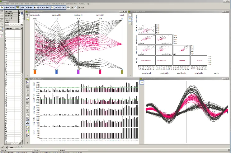
®There were no programs on the market in 1989 that would support our idea of interactive comparative visualization by fulfilling our requirements as outlined in this section and the next. We therefore started to develop our own visualization software to facilitate EDA and, by extension, to serve as a teaching instrument. The program – called VisuLab® – was developed in the course of several student projects and is now available as an Add-In for Microsoft Excel; it can thus be applied with any quantitative data stored in a spreadsheet. VisuLab® does not provide any statistical operations; its only aim is to interactively support several multivariate data displays as shown in Fig. 1.1, all linked with each other. During the past twelve years we have used interactive comparative visualization successfully to teach over 500 natural science students each year the concepts of multivariate data visualizations as part of a compulsory introduction to computer science. Interestingly, it turned out to be the part of the course that fascinates the students the most, letting them appreciate the complexities of today’s data while they learn how to deal with it.
Figure 1.1 A VisuLab® display showing Edgar Anderson's iris data. Clockwise from the top left: parallel coordinates, a scatter plot matrix, Andrews' curves and a permutation matrix.
6
The effectiveness of interactive comparative visualization depends to a large degree on the expressive power and distinctiveness of the graphical methods used. If we are observing time series data with line diagrams for example, we might miss in these data interrelations that are not temporal in character; or, if a display does not allow a reordering of the data we might not see how they could be categorized. The power of interactive comparative visualization therefore lies in an effective combination of graphical methods that allow the unexpected to appear. This is more likely to happen if the displays' designs are conceptually really different. Figure 1.1 illustrates such a combination of displays. It must be mentioned that VisuLab® serves not only as an instrument for exploratory data analysis and as a medium to teach 21st century competencies, but also as a tool to investigate the four graphical methods it provides: how and why do they work, what are their "side effects"? And possibly many more interesting questions.
Of course VisuLab® is not the only software for multivariate data visualization. In [Unwin 06], the reader will find an up-to-date overview of the many statistics programs that support interactive data visualizations. To the best knowledge of the author, however, only the program described in this report specializes in interactive comparative visualization, to be used as an Add-In with MS Excel. In [Siirtola 03] an experiment to combine parallel coordinates with the permutation matrix is described.
Why the VisuLab
®works
Graphic displays are suited for exploration if they can provide the graphics to visualize one of the following three characteristic properties of quantitative data:
Interrelations such as linear or non-linear correlations or clusters
Topological structures as expressed by the 'geometry' of the data
Patterns, particularly those that allow the establishment of categories
The four graphical methods of VisuLab® can deliver the pictures needed to visualize these properties as follows:
Scatterplot matrices to reveal interrelations
Parallel coordinates to give insight into the data's geometry
Andrews' curves to generate patterns by transforming the data
Permutation matrix to manipulate the data until patterns emerge
In Section 2 each of the visualization methods shown in Fig. 1.1 is described in more detail. Section 3 discusses the different graphical operations that provide interactivity. A simple example of the program's application is the topic of Section 4 and future directions are suggested in Section 3.4. Readers interested in data visualization in general are referred to [Tufte 84], [Nielson 97] and [Ware 04].
2 Four conceptually different graphical methods
2.1 Scatterplot matrices
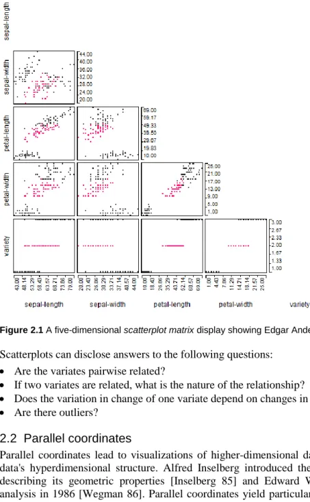
The scatterplot, still the classic display used to investigate relationships between two variates X1 and X2, is readily adapted to visualize multivariate data, X1, X2, .. , Xm by arranging all pair wise combined variates in a matrix. The intersection of the ith row with the jth column holds the plot of Xi versus Xj. Some prefer to omit the plots either above or below the diagonal to avoid duplications and reduce the display to m(m-1)/2 plots. The fields along the diagonal, where a variate is plotted against itself, are often used to display either the corresponding variates' name or their kernel density or both.
For three variates, X1, X2, X3 two interesting variants of the scatterplot are sometimes used. They are the symbolic scatterplot which uses a different plot-symbol in X1 versus X2, depending on the value of X3 and the casement display, which lists several scatterplots for X1 versus X2 where each plot shows only the values of X1 and X2 that go with a particular value of X3 [Chambers 83]. Sometimes curves are fitted to the data points in a scatterplot to highlight dependencies between the two plotted variates.
For the purposes of interactive comparative visualization we use the lower arrays of a simple scatterplot matrix, without symbols and without fitted curves (Fig. 2.1).
7
Figure 2.1 A five-dimensional scatterplot matrix display showing Edgar Anderson's iris data.Scatterplots can disclose answers to the following questions:
Are the variates pairwise related?
If two variates are related, what is the nature of the relationship?
Does the variation in change of one variate depend on changes in the other?
Are there outliers?
2.2 Parallel coordinates
Parallel coordinates lead to visualizations of higher-dimensional data in a plane that can give a sense of the data's hyperdimensional structure. Alfred Inselberg introduced the method in 1985 to a wider audience by describing its geometric properties [Inselberg 85] and Edward Wegman illustrated its application to data analysis in 1986 [Wegman 86]. Parallel coordinates yield particularly useful visualizations to analyze variates pair wise because they also show how these pairs fit into the higher-dimensional geometric structure. This is accomplished by a mapping Rn R2 that produces planar diagrams on the basis of a simple system of coordinate axes arranged in parallel, equidistant (one unit apart) and perpendicular to the horizontal axis of the diagram.
A point C with Cartesian coordinates (c1, c2, c3, c4, c5), for example, corresponds to a polyline in parallel coordinates as shown in Fig. 2.2. Generalization to n dimensions is straightforward.
Figure 2.2 Parallel axes for R5. X1 X2 X3 X4 X5 c5 c4 c3 c2 c1
8
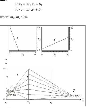
To illustrate how a multidimensional object is represented in parallel coordinates, consider two projections of a simple, three-dimensional diagonal (Fig. 2.3, top). Its projections on the X1, X2 and the X2, X3 planes are the lines
l1: x2 = m1 x1 + b1 l2: x3 = m2 x2 + b2 where m1, m2 < ∞.
Figure 2.3 Top: Two projections of a three-dimensional diagonal drawn in Cartesian planes. Bottom: the same line plotted in parallel coordinates. The points sampled on the Cartesian lines at the top intersect at the points (7, 10) and (56, 4) respectively in the parallel coordinate display.
In Fig. 2.3 the continuous straight lines l1and l2 are sampled and the values plotted on corresponding axes of a three-dimensional parallel coordinate system (Fig. 2.3, bottom). The two illustrations show that a collection of points, P, sampled from a straight line in Cartesian coordinates corresponds to a set of lines P in parallel coordinates that intersect at a point
,
: m b m d 1 , 1 for m 1.For example, given the straight line l1: -3 x1 - x2 + 40 = 0, in Fig. 2.3, and d = 28, we get m = -3 and b = 40. In parallelcoordinates the sampled points therefore intersect at
1 3 40 , 3 1 28 = (7, 10)
The point of intersection for line l2 : x1 /2 - x3 + 2 = 0, is (56, 4), with the first coordinate measured from the Y-axis lying on X2.
If the parallel axis for X1 were duplicated on the right of parallel axis X3 , a third point, 3, representing the projection l3 in the X1, X3 Cartesianplane would be generated.
The location of the point at which the lines of two adjacent parallel axes intersect shows an important property of the data. If two variates, such as X1, and X2 of Fig. 2.3 for example, are inversely proportional to each other, the intersection point lies in between the two parallel axes. In Fig. 2.3, top right, where X3 is directly proportional to X2, the intersection point is located outside the two parallel axes.
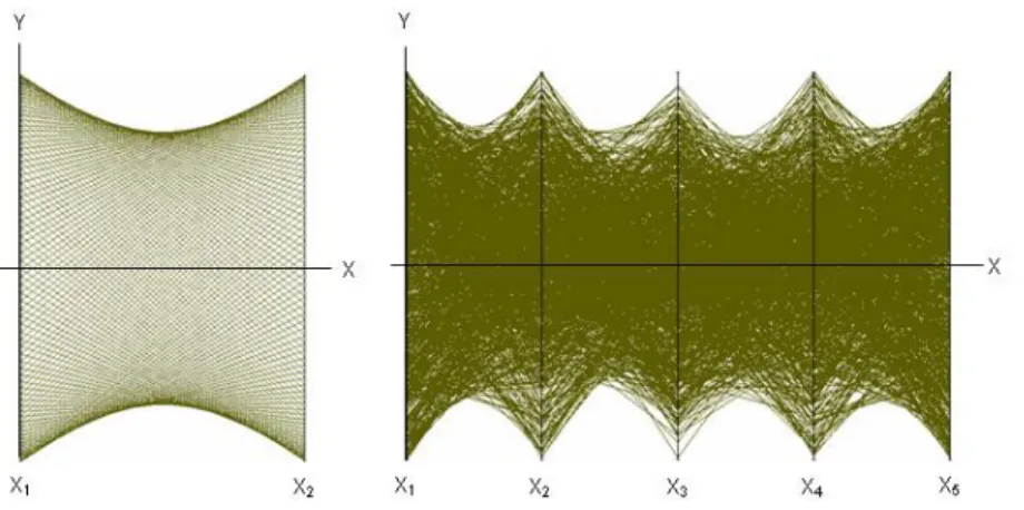
A non-linear relationship between two variates leads to dualities with curves. In particular, a Cartesian ellipse is represented by hyperbolas in parallel coordinates (Fig. 2.4, left). Knowing this, we can recognize for example a five-dimensional hyper sphere, impossible to draw in the Cartesian plane, in the eight hyperbolas at the right of Fig 2.4. One disadvantage, inherent in parallel coordinate displays, is that due to the density of lines in the
9
display, information can get lost. In Fig. 2.4, for example, it is not possible to detect that all points shown lie on the surface of the sphere. Additional visual aids would be necessary to cut through this thicket of lines.Figure 2.4 Left: 150 points, evenly distributed on a circle in the Cartesian plane. Right: 1000 Points sampled randomly from the surface of a five-dimensional hyper sphere, centered at the origin and drawn in parallel coordinates.
Even though in Fig. 1.1 the parallel coordinates and the scatterplot matrix visualize the same data, they provide entirely different impressions of the data’s structure. The structural differences of the two display methods also come to bear when we introduce graphical operations to manipulate the displayed data.
Many other surprising dualities between Cartesian objects and parallel coordinates can be found; to discover them, the reader is referred to [Inselberg 85] and [Inselberg 09].
Parallel coordinates can disclose answers to the following questions:
What variates are dominant for a given observation?
Which observations are most similar, i.e., are there clusters of observations?
Are there outliers?
2.3 Permutation matrix
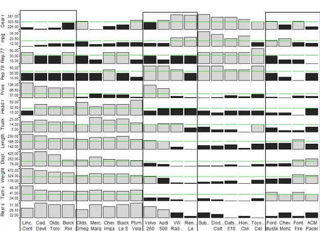
We now look at the problem of using graphical methods to classify data. Consider the 1979 statistics of automobile models that John Chambers and co-authors used in [Chambers 83] to illustrate various methods to plot multivariate data and try to visualize the data such that different categories (e.g. luxury, full size, intermediate, compact, and sports cars) become apparent. The automobile statistic includes 12 variates such as price, mileage, headroom, weight, repair record, displacement etc. for 74 different automobiles from ACM Concord to Volvo 260. For practical reasons we shall use from this data collection only a representative sample of 22 cars to illustrate the method we use.
A common variate, used to categorize cars is price and a common graphic to visualize price is the column graph. The prices of the 22 automobiles are shown in Fig. 2.5 with a column graph slightly enhanced for graphical effects. Since there is no natural order for car models the bars can be sequenced by name (top of Fig. 2.5) or more meaningfully by value (bottom of Fig. 2.5). The column graph ordered by value produces a more revealing graphic where the luxury cars clearly stand out; but to distinguish between the other categories is still close to impossible.
Since there is also no natural order for the variates describing the cars, we can stack the corresponding column graphs on top of each other in any sequence we like to produce a matrix of bars, hence the name permutation matrix. If we follow the restriction that the variates of all column graphs are aligned top to bottom then we can not only detect characteristic changes along the columns in this matrix but also see regional patterns in the entire matrix. Because changing the sequence of bars in one column graph will also change the sequence in all others, a different pattern is likely to emerge whenever one column graph is permuted. If the permutation of the columns and the rows of this matrix are done with the goal to place similar columns and rows next to each other, patterns in the data, if there are any, are bound to appear.
10
Figure 2.5 The top column graph depicts the automobile prices ordered alphabetically by car name. Bars for prices below the average of all cars shown (dashed line) are dark, those above average are light. The column graph shows the same data ordered by price instead of by name.
After scaling the variates of the automobile data so that the bars for each variate are of comparable size, one can permute the corresponding matrix until the pattern shown in Fig. 2.6 appears. In this image one can readily detect 8 distinct regions which we combine into 5 groups of adjacent columns as shown in Fig. 2.7 because our task is to categorize based on the variates shown as columns.
Figure 2.6 A pattern created by permuting the matrix constructed with column graphs from the automobile data.
Figure 2.7 Five categories of automobile models found with the permutation matrix.
11
A permutation matrix can be modified many ways to suit particular visual requirements. To simplify its geometry, for example, one could replace the individual bars with rectangles of equal size and code a variate's value with the corresponding rectangle's color. Or, the width of a column could be made to vary in relation to a certain quantity, so that the areas of the bars become meaningful. For a detailed account of the permutation matrix and its application the reader is referred to [Bertin 81].Permutation matrices can disclose answers to the following questions:
Are there patterns in the data?
Can the data be separated into groups?
If two variates are related, what is the nature of the relationship?
Does the variation in change of one variate depend on changes in the other?
Are there outliers?
2.4 Andrews' curves
An alternative to the methods based on projections described in the previous Sections is to transform the data in a way that will make its properties visible. Such a transformation must maintain most of the inherent properties of the data. Andrews' curves [Andrews 72] allow that kind of transformation.
In order to make structures in higher-dimensional data visible, D.F. Andrews suggested that each value of a data point x = {x1, x2, .. , x3} defines the coefficient of a finite Fourier series
...
)
2
cos(
)
2
sin(
)
cos(
)
sin(
2
/
)
(
t
x
1
x
2t
x
3t
x
4t
x
5t
f
xwhich is then plotted for the interval -π < t < π. In this way, each data point may be viewed as a sinusoidal curve between -π and π.
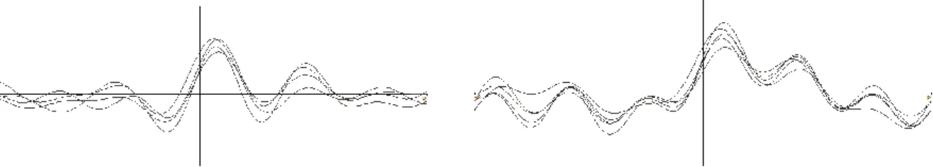
The Andrews curves plot for the four-dimensional iris data is shown in the bottom right display of Fig. 1.1. There it can be seen that one type of iris is clearly distinct whereas the other two are nearly impossible to differentiate without additional graphical help.
In his original paper, Andrews noted that this type of curve has several useful properties, such as: mean preservation, distance preservation, proportional one-dimensional projections, preservation of linear relationships, variance preservation. For details the reader is referred to [Andrews 72].
In the plots low frequencies are more readily recognized than high frequencies because their influence on the form of the curve is stronger. For this reason it might be useful to associate the most important variates with the low frequencies, that is with x1 or x2. This property makes Andrews' curves strongly dependent on the order in which the variables are assigned to the Fourier series (Fig. 2.8). Different permutations can produce curves with completely different shapes. This is a useful property that Andrews's curves share with parallel coordinates to help us find the most revealing visualization.
Figure 2.8 Andrews' curves of the automobile data. Left: the data ordered as shown on the left in Fig. 2.6, right: the same data ordered as shown on the right in Fig. 2.6.
Andrews' curves are particularly suited for comparisons of small data collections with high dimensionality. In Fig. 2.9 we see that the shapes of the sports cars curves (left) are quite distinct from the shape of the curves of the compact cars (right), but that only the former can be further separated into two subgroups. Comparing the plot representing the compact cars with the comparable plot of all cars lets us conclude that the compacts form a coherent cluster in this twelve-dimensional space.
12
Andrews' curves can disclose answers to the following questions:
Is there a high variability in the data?
Can the data be separated into groups?
Are there outliers?
Which variates characterize the data collection best?
They are an ideal visualization method to classify objects described by higher-dimensional data.
Sports cars Compact cars
Figure 2.9 Two subsets of curves from curves shown on the right in Fig. 2.8. Looking at an individual curve, a sports car cannot be mistaken as a compact car.
Windows for comparison
Each one of the four display methods described in this section has its own merits and just being able to simultaneously compare the different visualizations of the same data collection can provide insights that individual displays in isolation could not reveal. The distinctiveness of the four visualizations makes them particularly interesting to use in combination.
The VisuLab® supports comparisons by placing each display in a separate window. How these displays can be manipulated individually is discussed in Section 3.3. The contents of a window can be copied to the clipboard for further processing
For exploration we want to go one step further and exploit the fact that the graphics of each display technique are predisposed to certain interactions, for example selection through brushing with scatterplots, sorting of data items with permutation matrices. Such a methodological individuality provides a high flexibility which can be a blessing for the experienced data manager but could be a curse for the inexperienced who does not know on what basis to choose a method.
The VisuLab® can help evaluate interactive visualization methods by simultaneously showing in each display the effects that result from different graphic manipulations. This feature is based on MS Windows' Multiple Document Interface (MDI) and object oriented programming techniques of Delphi 6 that allow the VisuLab® to communicate with MS Excel via COM-objects (Component Object Model). The program updates all graphics immediately in response to changes in the Excel spreadsheet and to interactive manipulations on a graphic in the active window.
3 Interactivity: combining direct manipulation with linking
Many authors have argued that it is hard to pin down what interactivity, when applied to data visualizations, actually means. Given these uncertainties, we organize our discussion around the following three broad categories of interaction:
Querying
Selection and linking
Varying plot characteristics
This list is adopted from [Unwin 2006], where the author argues that, quote 'Querying is a natural first activity to find out more about the display that you have in front of you. Next, you select cases of interest and link to other displays to gain further information. At this stage, it's helpful to vary the form and format of displays to put the information provided in the best possible light'.
13
Please note that we use the term 'interactivity' only in connection with graphic operations, not operations related to data management. With the term 'selection', for example we mean choosing a graphic element and not the operator of a relational algebra.3.1 Querying
A visualization is queried when an observer wants to see in detail the information that a particular graphical element represents. For VisuLab®, querying is a feature of low priority as it really is not an important conceptual aspect of comparative visualization. Nevertheless, queries are possible but precise information must be retrieved from the underlying spreadsheet.
Scatterplot matrices
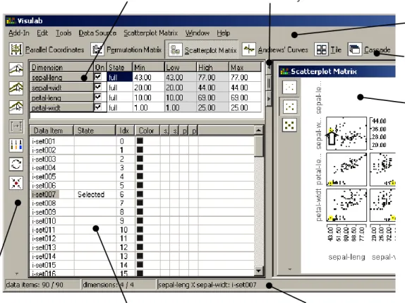
If the mouse cursor (), active in the scatterplot matrix of the iris data in the display area of Fig. 3.1, touches a data point we immediately see in the status line which data item that point corresponds to. In this example it is data item 'i-set007' (iris setosa). Since the data item name is imported from the spreadsheet we can readily find the precise details there. In the status line we also see that all 90 data items are displayed in graphics that show all 4 attributes.
If we click on the data point, it will be highlighted in the display and the corresponding data item is marked as selected in the data point editor's column 'State'. With highlighted data points a query can also answer the question as to where in the data space a data item is located. Range queries are specified by stretching a selection rectangle over the area of the display that is of interest or by holding the Ctrl-key pressed while clicking at successive data points.
In the attribute editor (Fig. 3.1) we see the names of the data attributes, together with their lower and upper bounds (Min, Max), as well as the scale range of the corresponding axes in the graphic displays. The lower and upper bounds of these scales (Low, High), which can be interactively changed, initially correspond to the attribute bounds. The window with both editors can be called up on demand or made to disappear with the visibility control buttons. Most users reduce the editor window to the size shown in Fig. 1.1.
Figure 3.1 The main elements of VisuLab®'s user interface.
Visibility controls for the editor
Menu bar
Display tool bar
Status line Attributeeditor
Operation tool bar Data point editor
14
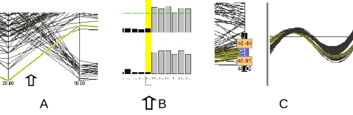
Parallel coordinates
To query parallel coordinates one simply points to a segment of a polyline (Fig. 3.2, A). The rest of the procedure is the same as with queries in the scatterplot. For range queries one draws a line across a bundle of line segments or holds the Ctrl-key pressed while clicking at one line segment after another.
Permutation matrix
In the permutation matrix one can recall data item names by moving the mouse cursor over any graphic element that represents a data value or over the name of the data item at the margin of the matrix. A data item is highlighted when the data items name is clicked (Fig. 3.2, B). For range queries the Ctrl-key is held pressed or a selection rectangle is stretched over the region of interest.
Andrews' curves
Andrews' curves cannot be queried directly. It is possible, however, to query them indirectly via a linked graphic. This is shown at the left of Fig. 3.2, C, where a slider has been moved up one of the parallel coordinate axis until the curves one wants to query are highlighted in the linked Andrews' curves. This is a practical benefit of linked displays, the topic of the next Section.
Figure 3.2 Querying data points with parallel coordinates, the permutation matrix and Andrews' curves.
3.2 Linking, selection and brushing
Linking
In VisuLab®, linking is complete: all four data displays are linked with each other and with the cells of the spreadsheet whose data are visualized. Whenever a data value is changed with Excel, the corresponding graphic element in any one of the four displays can be updated interactively with the 'refresh' command in the menu 'Data Source'. And, whatever graphic operation is applied to one of the displays will also be applied to all other displays, as long as it makes sense. Reordering data points, for example, makes sense in a permutation matrix but not in a scatterplot.
Selection
Data displays in the VisuLab® are manipulated by first selecting one or more elements and then acting on them with an operation provided as part of the particular display. There are three ways to select graphic elements: 1) Point selection
clicking on the data item's name shown in the attribute editor or in the permutation matrix
clicking on a data point in a scatterplot or on a line segment in parallel coordinate display 2) Range selection
repeating a point selection with the Ctrl-key held pressed
clicking an attribute name in all displays where they are shown
drawing a selection line across a bundle of line segments in parallel coordinates
moving a slider up and down a parallel coordinate axis, adjusting its width if necessary and select the highlighted polylines with the command 'Select data item under slider' (Fig. 3.5) while the slider is active
stretching a selection rectangle across a region of data points in scatterplots
stretching a selection rectangle across a sequence of data item names in a permutation matrix
15
Brushing
Range selection is a particularly useful operation with multivariate data as one often wants to observe whether or not a certain pattern in one part of the data space repeats itself in other parts. Range selection has a long tradition with scatterplot matrices; in [Chambers 83] it was introduced under the name 'brushing'. Brushing is a particularly apt description of the operation when the selection frame can be moved dynamically over the graphic's display area. This is not possible in VisuLab®, but it can be approximated with incremental movements by repeatedly redrawing the selection frame a little off the current position. Brushing in the dynamic sense is impressive with parallel coordinates because the dynamics involves the entire data space in a comparatively small display area as patterns of line segments that change at the move of a slider. Thanks to linked displays we can dynamically brush a scatterplot matrix along one of its dimensions by dragging the slider along its corresponding axis in parallel coordinates.
After graphic elements in a display have been selected they can be operated on as described in the next section.
3.3 Varying plot characteristics
The VisuLab®'s displays can be altered in many ways by using either the attribute editor, the data point editor, the display tool buttons, the command menus or through direct manipulation by 'grabbing' graphic elements and using context menus displayed by pressing the right mouse button.
Layout of the display area
The appearance of the display area can be controlled with several commands to improve viewing comfort. First, each visualization method has a button in the display tool bar with which it can be made visible or invisible in the display area. Second, the visible displays can be arranged as follows:
a) At random with arbitrarily sized windows; clicking a window activates it and places it on top of all other windows
b) Tiled to completely fill the display area without overlaps c) Cascaded with the active window placed on top
Figure 3.3 shows that for each of these operations a command in the menu 'Window' exists. In this menu we also find a command to render the entire VisuLab® window transparent so that two graphs can be compared easily by placing a transparent graph on top of a graph in another instance of VisuLab®. For one and the same data collection several instances of the VisuLab® can be called up, but each of them can display a certain graphic only once.
Figure 3.3 The command menu to organize the display area of the VisuLab®. A tick mark indicates the active display.
Focusing and zooming
The data space visible in the graphic displays can be modified in two ways:
1) Reducing the number of attributes in each graphic. This will make it easier to focus on parts of a display to sharpen the view on particular aspects of the data. Reductions are done by removing the tick mark in the 'On'-box of the attribute editor (Fig. 3.1) or by selecting the appropriate dimension in one of the displays and choose the command 'Hide dimension(s)' in the menu 'Edit' (Fig. 3.7).
2) Zooming in on a particular region of a graphic. To get a better impression of certain details one can adjust the bounds of the scales so that the same display area covers a smaller region of the corresponding attribute domain. This is done by adjusting the values in the fields 'Low' and 'High' in the attribute editor (Fig. 3.1).
16
Selecting 'Fit scales to visible data' in the menu 'Data source' (Fig. 3.5) will result in an automatic adjustment of the scale bounds after data points have been hidden or unhidden at either end of the scales (Fig. 3.4).
Figure 3.4 The command menu to organize the displayed data's attributes. The tick mark indicates that each scale will be adjusted to the range of the data displayed.
In Fig.1.1, we see a parallel coordinate display with different scales where every attribute domain has an entire scale of its own. The scale for the attribute 'sepal length' for example covers the range 43.00 to 79.00 whereas the scale for 'sepal width' starts at 20.00 and ends at 44.00. In a sense this 'normalizes' the scales graphically. It is the default mode for all displays of the VisuLab®. Sometimes, for one reason or another, we might want common scaling, i.e. all scales should cover the same range, as is done with certain line-diagrams in Excel. With the command 'Common Scale' one can force the displays into this mode. How this affects a graphic is shown at the right side of Figs. 3.5 and 3.6. In the example of Fig. 3.5 a view on proportional relationships is gained at the cost of detail in the individual dimensions.
Figure 3.5 Left: the command menu for the parallel coordinate display; right: the iris data collection of Fig. 2.1 displayed with common scales (using the command 'Common Scale') and with one dimension removed for better focus.
Figure 3.6 Left: the command menu for the Andrews' Curves display; right: the automobile data collection of Fig. 2.8 (left) displayed with common scales (using the command 'Common Scale'). Here, interesting detail is lost but nothing is gained.
No obvious benefit results in Fig. 3.6, when compared with Fig. 2.7. The difference between 'normalized' scales and common scales is particularly striking with Andrews' curves, whenever there are large differences in the range of the attribute domains displayed in the graphic. A big range will 'squash' the contribution to the curves of the smaller ranges and make possibly interesting and valuable detail disappear.
Varying the appearance of data points
There are several operations to modify the representation of data in a graphic that allow us to 'freeze' certain observations or enhance the visibility of structures in the data. The least intrusive is to mark all selected data points with color to make them stand out from the rest. The coloring might become more effective if the size of
17
the dots in a scatterplot is increased or decreased. This command can be found in the menu 'Scatterplot' (Fig. 3.7).We might wish to work only with a certain subset of the data or hide some of the data points from view in order to bring more visibility into cluttered areas of a graphic. The commands that will carry out these operations on previously selected graphic elements can be found in the menu 'Edit' (Fig. 3.7) or in the context menu that appears when pressing the right mouse button while the mouse cursor lies over the selected data points.
Figure 3.7 The menu with commands to manipulate the visibility of data points.
With the other commands of the menu 'Edit' one can make all data points that are hidden visible again (unhide); simultaneously select all data items of a plot or only those that are visible, and also hide or unhide entire dimensions of a graphic.
The menu for the permutation matrix in Fig. 3.8 shows that this visualization method offers the greatest variability in the use of graphic elements. It can represent the data values either as column graphs (see Section 2.3), as bar graphs or with tiles of different shades of gray or different colors. For the example in Section 2.3 the columns were filled either black or white, depending on whether their value is below or above the average of the row. With VisuLab® one can choose between an individual scale for each attribute (matrix row) or a common scale and also whether the average is calculated individually for each attribute or for all attributes taken together.
With the command 'Rotate View' a permutation matrix can be transposed which is useful when it has more rows than columns. The column graphs can be drawn such that the assignment of display space is proportional to the largest column value of each graph or that the display area is divided equally among the rows (selecting 'Constant dimension height/width' in the menu of Fig. 3.8).
Figure 3.8 The menu with commands to manipulate the appearance of a permutation matrix (left). The permutation matrix of Fig. 2.6 drawn with shaded tiles instead of column graphs.
Changing the sequence of attributes and of data points
The scatterplot matrix and the parallel coordinate displays are graphics for continuous data that have inherently ordered attribute domains. Therefore, it does not make much sense to reorder the data points. But it does make sense to change the order in which the dimensions appear in a display because this determines which attributes lie close together and can thus be better compared with each other. In both the scatterplot matrix and the parallel coordinate displays one can change the dimensions' order through direct manipulation by 'grabbing' one of them by its name, dragging it over the item with which it should change position and releasing it.
Because Andrews' curves take on a different shape with each new sequence of dimensions, it can be quite informative to play around with several different permutations of dimensions. This would have to be done
18
indirectly in another display.
As its name suggests, the permutation matrix was born out of the desire to have a graphical method that can provide the greatest flexibility to manipulate data. It does so by allowing a viewer to choose the order in which both the attributes and the data items are arranged in a display. This is possible because the permutation matrix organizes its graphical elements not based on continuous but on categorical scales so that it does not matter in which order the attributes and the data items are sequenced. We are free to place them in such a way that the resulting graphic yields the most information.
The permutation matrix provides not only the largest number of operations, it is also the only method that includes complex operations such as sorting and automatic permutations to speed up the search for patterns in the data (see Fig. 3.9). The sequence of attributes and of data points in a permutation matrix can be changed by dragging and dropping, much like the direct manipulation provided for the dimensions of the scatterplot matrix and the parallel coordinate displays. Because high data densities often make it impossible to read the name of a selected data item in the permutation matrix, the name appears also in the status line.
There are automatic operations with which the sequences of attributes or data items are rearranged so that: 1) the values of the selected data item are sorted in increasing or decreasing order
2) the values of the selected attribute are sorted in increasing or decreasing order 3) attributes which are similar to a selected attribute or attributes are grouped together 4) data items which are similar to a selected data item or items are grouped together 5) contiguous regions are formed based on the similarity of the data values
For the automatic permutations mentioned under point 5) above, it is possible to choose between different measures that are used to establish if two rows or two columns of the permutation matrix are similar. Automatic permutations are typically carried out repeatedly until an instructive pattern has emerged or until the search algorithm can no longer deliver new results. The result that an automatic permutation delivers can often be improved by modifying the graphic manually. The patterns shown in Figs. 2.6 and 2.7 have been found with automatic permutations.
Figure 3.9 The command menu to rearrange the sequence of attributes and of data points in the permutation matrix (left). The permutation matrix of Fig. 3.8, after selecting the data item located in the leftmost column and grouping similar data items next to it using the command 'Group similar data items' (right).
There are two ways in which the characteristics of Andrews' curves can be modified directly. They are: a) switching between individual and common scales and b) the way how hidden dimensions are treated when calculating the plot of the curve. By default, the hidden dimensions are omitted from the formula. As an option, the terms that correspond to the hidden dimensions can be left in the formula and its value set to zero by unticking 'Omit Hidden Dimensions' in the command menu 'Andrews Curves' as shown in Fig. 3.5.
As further option to change the characteristics of a display is to transpose the data table; that is, to let the names of the data items become attributes and treat the attributes as data items (Fig. 3.4). This of course is impractical with large data collections but it can suggest a different way to look at the data when the distinction between attribute and data item is not so clear.
The menu 'Data Source' shown in Fig. 3.4 lists also the command to 'reset' the VisuLab® to the initial settings and start with the data analysis anew.
19
Table 3.1 summarizes the operations for each display method.Table 3.1 The operations that can be applied to data items and to dimensions in each of the four display methods. X = operation is supported directly, (X) = operation is supported indirectly, − = operation is not supported.
4 Applied interactive comparative visualization
This section illustrates possible scenarios of working with VisuLab® using two different data collections. At the end we discuss possible extensions to the program.
4.1 File manipulations
When displaying a particular data collection the first time with VisuLab® one typically starts with Excel. Subsequently one can get around Excel by saving the VisuLab® data as an XML-file which can later be loaded after starting the program in its standalone version rather than the Excel Add-in. Fig. 4.1 shows where these commands can be found. It also shows that a graphic display of VisuLab® can be saved to the clipboard or be directly sent to a printer.
Figure 4.1 The command menu to manipulate VisuLab® displays and data.
4.2 Olympics data collection
As a first example to illustrate a possible scenario we use the Olympics data collection from [Simonoff 03] (Part of it is shown in Fig. 4.2).
Figure 4.2 The distribution of medals after the 1996 and 2000 Olympic Games including the number of participating athletes, the population and the gross domestic product (GDP) of each of 66 countries.
The parallel coordinate display of Fig. 4.3, showing all attributes and all data items (the different countries) gives us a first impression of the entire data collection and shows that taking the logarithm of certain variates substantially improves the visibility of detail in some attribute domains. To underline this effect the slider of the
Operation Scatterplot Matrix Parallel Coordinates Andrews' Curves Permutation Matrix
Marking X X (X) X Hiding dimensions X X (X) X Hiding data items X X (X) X Moving dimensions X X (X) X Moving data items X Change an axis' domain X X
20
2000 silver medal winners scale has been placed to cover the range from 5 to 10. In Fig. 4.3 we also see that for many scales in the upper half of the range only about 10% of the countries appear (medals). If we eliminate those from the graphic while at the same time zooming into the attribute domains where the logarithm has not been taken, we should see the data's structure in more detail.
This can be done with little effort by selecting the top five data items and hide them. In a next step we hide the scales for 'Population', 'GDP' and 'Athletes' since their log-equivalent provide better visual detail. We also hide 'Log1996', keeping 'Total1996' instead for better comparison with 'Total2000'. After the hiding of unwanted information we open the attribute editor and adjust the scale boundaries of the attributes 'Gold2000', 'Silver2000', 'Bronze2000', 'Total2000', and 'Total1996' in order to get a better resolution of these scales.
Figure 4.4 shows at the left the entries in the attribute editor and at the right the corresponding parallel coordinate display that gives us a much better starting point to analyze the data. Note that the data themselves have not been touched; all changes were made using the visualization software and can readily be undone again.
Figure 4.3 A parallel coordinate display of the entire Olympics data collection where each line represents one country. The second slider from the left has been placed to select those countries that won between 5 and 10 silver medals during the Olympic Games in Sydney.
Figure 4.4 Zooming into the data collection by adjusting the scale boundaries with the attribute editor of the VisuLab® (left). The resulting parallel coordinate display, where five countries have been hidden as seen in the attribute editor, provides much visibility into details of the data than the display of Fig. 4.3.
21
Using the slider of the 'LogGDP' axis we can now brush the scatterplot matrix to find out how well the countries with the largest GDP did in terms of medals (see Fig. 4.5) by analyzing the data items marked in the adjacent scatterplot matrix.Someone interested in how the number of athletes sent by each country correlates with all other variates might want to use the permutation matrix. Figure 4.6 shows the display based on the original, except that the dimension 'Logathletes' has been hidden because we want the bar charts to be shaded based on the average value of the actual number of athletes sent and not the average of the logarithm of that number which would result in a slightly different pattern for that dimension.
Figure 4.5 The sliders on the scales of the parallel coordinate display (left) can be used to 'brush' the scatterplot matrix (right).
Figure 4.6 Ordering the columns of a permutation matrix based on the values of the dimension 'Athletes' yields an interesting pattern. The graphic builds on the original data (no scale ranges modified, no data or dimension hidden, except the dimension 'LogAthletes').
22
4.3 Currency data collection
In this example we look at a data collection from the financial market for the years from 1986 to 1993 (courtesy Alfred Inselberg). In Fig. 4.7 the details of these data are shown. Again we start with two displays showing the entire data collection before deciding on what part of the data collection to operate (see Fig. 4.8).
The way the slider has been placed in the parallel coordinates we can see in the three leftmost scales at what points in time short term money was cheap and in the scatterplot matrix how these low interest rates related to the other variates.
Figure 4.7 The first ten data items of the currency data collection (courtesy Alfred Inselberg). For about 31/2 years, starting at the beginning of 1986, the following values are shown for each week of the year: the exchange rates in US$ for the British pound, the German mark, the Japanese yen, short term (3 months) and long term (30 years) interest rates, the price of gold in US$ and the Standard and Poor's 500 index.
Figure 4.8 The currency data collection visualized with the scatterplot matrix and with parallel coordinates. Using the slider of the parallel coordinate display to brush the data the smallest values of the short term interest rates have been selected.
The careful reader might also notice the strong correlation between the German mark and the British pound at the very top of their respective scales. Let us investigate this further. To this end we need to pick those horizontal parallel lines that connect the two currencies. This can be done better if we hide all other dimensions and only display the upper third of the scale values for the pound and the mark as shown in Fig. 4.9. Now it is easy to select the desired data lines and after having done it we pick the marked data items and bring them into context to the other data by unhiding those scales that we think might lead to interesting insights. We decided to
23
choose year and month to find out when something happened (if something happened) and the price of gold, to see if that might have anything to with synchronizing the exchange rates of the German mark and the British pound. We leave any conclusions as to what might have been going on between June and September 1992 to the reader.We also note in Fig. 4.10 that two lines between the pound and the mark with a negative slope have been picked (this is not so easily visible in Fig. 4.9). The rest of the parallel coordinates and also the scatterplot matrix indicate that these data items do not belong to the phenomenon we just observed. A corresponding Andrews' curves display confirms this as shown in Fig. 4.11.
Figure 4.9 To make it easier to operate on the lines connecting the pound with the mark we zoom in on the top third of the two scales by changing the 'Low'-value of the two scales in the attribute editor (left). The other scales remain hidden for better focusing (right).
Figure 4.10 After interesting data items have been selected, they are brought into context of the other variates by unhiding the scales for 'Month', 'Year' and 'Gold'.
24
Figure 4.11 Outliers become readily visible in the Andrews' curves.
This has only been a brief sketch of how the VisuLab® can be used. Readers are encouraged to explore their own data collections after downloading the program from http://people.inf.ethz.ch/hinterbe/. On the website http://www.cta.ethz.ch/index_EN you will find an electronic tutorial (E.Tutorial®) that will help you learn how to use the VisuLab®.
4.4 Future directions
The VisuLab® is under continuous development and one could ask for more features in many ways:
additional display methods, particularly graphics that are tailored for large data collections
more powerful querying features
direct manipulation for zooming
provide a measure to express similarity or dissimilarity of (collections of) data items
implement new algorithms for automatic permutations
comfortable brushing for scatterplot matrices
Data management
We will also in the future refrain from including statistical features in VisuLab®. Instead we plan to investigate techniques that allow to linking of multivariate data visualizations with multidimensional data management. Such an extension would have to support retrieval operations whose parameters can be selected in a graphic display.
Clustering
At the time of this writing we have started to implement clustering algorithms which will color the different groupings found in all displays. The goal is to let analysts first select the number of clusters to be identified, followed by the selection of one of these four grouping methods:
Nearest neighbor hierarchical clustering
Furthest neighbor hierarchical clustering
average neighbor hierarchical clustering
K-means clustering
For each of these grouping methods one can specify whether they should be based on Euclidean distance or Manhattan distance.
25
References
[Aerni 10] P. Aereni & F. Oser, Eds.: Forschung verändert Schule. Seismo Verlag, Zürich, 2010. [Andrews 72] D. F. Andrews: 'Plots of High-Dimensional Data'. Biometrics, March 1972, pp. 125-136. [Bertin 81] J. Bertin: Graphics and Graphic Information Processing. de Gruyter, Berlin, 1981.
[Chambers 83] J. Chambers, W. Cleveland, B. Kleiner, P. Tukey: Graphical Methods for Data Analysis. Wadsworth, Belmont, California, 1983.
[Inselberg 85] A. Inselberg: 'The plane with parallel coordinates'. Special Issue on Computational Geometry. The Visual Computer 1, pp. 69-97, 1985.
[Inselberg 09] A. Inselberg: Parallel Coordinates – Visual Multidimensional Geometry and Its Application. Springer Science+Business Media, 2009.
[Koh 08] G.C. Koh, H.E. Khoo, M.L. Wong, D. Koh D: 'The effects of problem-based learning during medical school on physician competency: a systematic review'. CMAJ 178 (1): 34–41, 2008.
[Nielson 97] G.M. Nielson, H. Hagen, H. Müller: Scientific Visualization – Overviews, Methodologies, Techniques. IEEE Computer Society, Los Alamos, Cal., 1997.
[NRC 10] National Research Council: Exploring the Intersection of Science Education and 21st Century Skills: A Workshop Summary. Margaret Hilton, Rapporteur. Board on Science Education, Center for Education, Division of Behavioral and Social Sciences and Education. Washington, DC: The National Academies Press, 2010.
[OECD 05] Organization for Economic Co-operation and Development: Definition and selection of key competencies: Executive summary. Paris, 2005.
[Schmid 99] C. Schmid: Active Comparative Visualization: A Novel Way of Exploring Multivariate Data. Diss. ETH No. 13116, 1999.
[Simonoff 03] J.S. Simonoff: Analyzing Categorical Data. Springer-Verlag, New York, 2003
[Siirtola 03] H. Siirtola, 'Combining Parallel Coordinates with the Reorderable Matrix'. Proceedings of the Intl. Conference on Coordinated & Multiple Views in Exploratory Visualization, IEEE Computer Society, 2003. [Stern 03] E. Stern, C. Aprea, H.G. Ebner: 'Improving cross-content transfer in text processing by means of active graphical representation'. Learning and Instruction 13, pp 191-203, 2003.
[Tufte 84] E.R. Tufte: The Visual Display of Quantitative Information. Graphics Press, Box 430, Cheshire, Conn., 1984.
[Tukey 77] J.W. Tukey: Exploratory Data Analysis. Addison-Wesley, Reading, Mass., 1977.
[Unwin 06] A. Unwin, M. Theus, H. Hofmann: Graphics of Large Datasets. Springer Series 'Statistics and Computing', 2006, pp 73-101.
[Ware 04] C. Ware: Information Visualization (2nd edition.). Morgan Kaufmann Publishers, 2004.
[Wegman 86] E.J. Wegman: Hyperdimensional Data Analysis Using Parallel Coordinates. Report No. 1, Center for Computational Statistics and Probability, George Mason University, Fairfax, VA, 198.
Acknowledgements
The author is thankful to Barbara Scheuner and Lukas Fässler for helpful comments and grateful to the following students who contributed to the VisuLab®, either through programming or projects that used the software. The most recent contributors are listed first.
Barbara Scheuner, Michael Bürgi, Claudia Schmid, Kathrin Meier, Markus Meier, Markus Grob, Beat Grichting, Dieter Richter, Gianmario Garatti, Matthias Müller, Christoph Baumann, Masoud Ghazvini, Maurizio Codoni.