This is a repository copy of Beyond authenticity: A visual-material analysis of locality in the global redesign of Starbucks stores.
White Rose Research Online URL for this paper: http://eprints.whiterose.ac.uk/87634/
Version: Accepted Version
Article:
Aiello, G and Dickinson, G (2014) Beyond authenticity: A visual-material analysis of locality in the global redesign of Starbucks stores. Visual Communication, 13 (3). 303 - 321. ISSN 1470-3572
https://doi.org/10.1177/1470357214530054
[email protected] https://eprints.whiterose.ac.uk/ Reuse
Unless indicated otherwise, fulltext items are protected by copyright with all rights reserved. The copyright exception in section 29 of the Copyright, Designs and Patents Act 1988 allows the making of a single copy solely for the purpose of non-commercial research or private study within the limits of fair dealing. The publisher or other rights-holder may allow further reproduction and re-use of this version - refer to the White Rose Research Online record for this item. Where records identify the publisher as the copyright holder, users can verify any specific terms of use on the publisher’s website.
Takedown
If you consider content in White Rose Research Online to be in breach of UK law, please notify us by
Beyond authenticity:
A visual-material analysis of locality in the global redesign of Starbucks stores
Giorgia Aiello and Greg Dickinson
Abstract
In this article we examine the global store design strategy launched by Starbucks in 2009
in the wake of the economic crisis, increasing brand dilution, and growing competition. We offer
a visual-material analysis of the corporation’s efforts to create a global aesthetic grounded in
locality, with an in-depth focus on meaning potentials of materiality and community found
across the four store redesigns that were unveiled in Seattle, the coffee company’s hometown,
and which functioned as prototypes for store design across the United States, Europe, and Asia. We then critically engage Starbucks’ rhetoric/discourse of locality in relation to the more widespread notion of authenticity. We argue that while authenticity is rooted in textual and
symbolic arrangements, locality operates in the realm of emplaced and embodied claims of
difference. Shifting from authenticity to locality in design and branding practices alters critical
engagements and everyday relationships with global consumer capitalism, insofar as this may be
increasingly entrenched with vernacular expressions of cosmopolitanism.
Keywords
Sustainability. Green. Organic. Recycled. Repurposed. Local. Community. And, of course, coffee. These became the creative watchwords for Starbucks’ new store designs. (Schultz with Gordon, 2011, p. 271)
Introduction: Onward and back to where it all started
In 2009 architect and real estate developer Arthur Rubinfeld was hired back by the
Starbucks Coffee Company as president of global development. In Onward, the pathos-infused
book telling the story of Howard Schultz’s decision to return as the CEO of Starbucks in the
wake of the company’s growing financial problems, Schultz himself states that Rubinfeld was
given the demanding task to fix “two significant problems: Starbucks’ bloated real estate portfolio and stale store designs” (Schultz with Gordon, 2011, p. 270). According to Schultz, Starbucks had lost its soul and needed to return to its roots. For this to happen, not only did the coffee company’s core values and their related “creative watchwords” need to be redefined, but its “innovative, brand-defining aesthetic” (p. 270) ought to be resurrected.
Rubinfeld had initially been hired by Starbucks as executive vice president for store
development in 1992, just before the coffee company went public. During the decade of his
initial employment (he left in 2001), the number of Starbucks stores grew from around 100 to
nearly 5,000, and expanded from North America to over 20 other countries. To help fuel this
growth, Rubinfeld had devised a ‘Kit of Parts’ store design model, which included a
customizable if limited range of colours, furniture, light fixtures, murals and artwork. This kit
enabled designers to create stores that were aesthetically consistent but also responsive to
different locales, creating seemingly distinctive looks in the quirky spaces of the characteristic or
historic buildings of the downtown and central areas that Starbucks privileged in the heyday of
its spread across North American and European cities.
In a 2008 interview with the New York Times, Rubinfeld defended Starbucks’ coffee
quality, environmental stewardship and labour relations. Nevertheless, he acknowledged that “in
its relentless expansion to around 17,000 stores, Starbucks overlooked the costs to its reputation
of generic, cookie-cutter designs and of placing stores in dreary suburban strip malls” (Stone,
2008). In the 2000s, the Starbucks brand was weakened by the rapid growth of its chain stores,
the progressive diversification and standardization of its products, and the debut of other global
McCafés).1 For this reason, the corporation has increasingly been preoccupied with ensuring that
the Starbucks brand is unique, expresses a recognizable identity, and remains highly competitive
in terms of global presence and sales.
Responding to these priorities, Starbucks placed the design of its stores at the forefront of
its new strategy. Rubinfeld’s new approach focused on the introduction of palettes balancing a
globally consistent Starbucks aesthetic with details pointing to the specificity of the locales and
communities in which stores are placed. In a preview of his new role that was featured in the
online architecture magazine Dwell, Rubinfeld explained: “When we’re opening new stores,
these elements will be interpreted by in-house designers around the globe and infused into local store designs connecting with the neighborhood” (Walker, 2009).
In this article we examine Starbucks’ new strategic approach to store design, with a focus on the dialectic between homogenization and heterogenization inherent in the corporation’s
efforts to create a global aesthetic that relies on local substance. We offer a visual-material analysis of the four store redesigns launched in the coffee company’s hometown of Seattle between March and November 2009, which functioned as prototypes for similar redesigns in
other parts of the United States, Europe, and Asia. In this analysis, we will gain an in-depth
understanding of how an emblematic contemporary corporation such as Starbucks actively
deploys a visual-material rhetoric/discourse of locality within the globality of its brand to
communicate distinctiveness in the global marketplace.
Researching Starbucks stores
Our investigative approach is aimed at tracing and evaluating the ‘rhetorics’ and ‘discourses’ at work in globalizing (con)texts of everyday life such as Starbucks stores. We explore claims made by store designs in relation to the bodies and subjectivities of patrons. How
do the symbolic and material features of these stores interpellate and compel, but also limit and constrain specific actions and identities? Concurrently, we ask: What are the major ‘ways of knowing’ and therefore also communicating locality in these store designs? In asking these questions, we examine the ideological implications of the resources that are deployed to signify
and produce an experience of locality.
1 In the wake of its increasing brand dilution, the economic crisis, and growing competition from McDonald’s and
Our analysis is grounded in field photographs and direct observations that we collected
across physical sites, intersected with our reading of media interviews, press releases and news
articles. We focus specifically on the visual-material resources deployed across Starbucks stores
to communicate locality. Although store design involves a variety of sensorial stimuli, including
smell and sound, our focus is justified by the significance of the visual (and broadly multimodal)
in relation to the material composition of redesigned stores. As an operation aimed at renewing Starbucks’ overall ‘image’, Rubinfeld’s store design strategy was developed with an eye towards the global circulation of images portraying the ‘local’ stores for publication in social media as
well as generalist and specialist media, including design and architecture magazines. This push
to visually publicize the new stores was also reflected in the fact that, whereas taking pictures
inside Starbucks stores is typically forbidden, we were allowed and even encouraged to liberally
photograph the interiors of the four Seattle stores.2
Using this analysis, we critically engage this rhetoric/discourse of locality in relation to
the more widespread notion of authenticity. Shifting from authenticity to locality in design and
branding practices alters critical engagements and everyday relationships with global
capitalism’s assertions of difference. In particular, we argue that while authenticity is rooted in textual and symbolic arrangements, locality operates in the realm of emplaced and embodied
claims of difference.
From customizable to stealth: Store design and the Starbucks brand
With nearly 20,000 stores in 63 countries, nowadays Starbucks can hardly be equated
with a local coffeehouse. When bohemian entrepreneurs Gordon Bowker, Jerry Baldwin and Zev
Siegl opened the first Starbucks store in the Pike Place Market in 1971, they did not imagine that
their business –which was so emblematic of Seattle’s ‘post-hippie’ economy (Simon, 2009) –
would become a world-wide presence and the leading corporate retailer of coffee beverages. By
1987, Howard Schultz had acquired Starbucks and he began its relentless transformation into a
global corporation, opening the first stores outside Seattle in Chicago and Vancouver (Canada).
Through the 1990s and well into the 2000s, Starbucks kept opening new stores across the
world, and increasingly in locations such as drive-thrus and malls. Again and again, Starbucks
2
stores combined visual references to nature (for example, through colour palettes ranging from
browns to greens) with allusions to Italian and European coffee culture. Materially, these stores’
surfaces, edges and fixtures were smooth or soft, spotless or uncluttered, and often rounded or
transparent. Across sensorial stimuli, Starbucks stores evoked cleanliness, which in turn
“represents an important emotional marker of sameness” (Simon, 2009 p. 67). At the same time, and within a clear framework of comfort and familiarity, the Starbucks ‘experience’ was
customizable in relation to ambience, service and products alike.
Eventually, this ‘mass customization’ approach became equated with McDonaldization
and mass-produced, mediocre goods, which led to the ‘dilution’ of Starbucks’ brand identity
(Simon, 2009). In 2009, with Rubinfield charged again with store design, Starbucks announced its new global store design strategy, aimed at “setting the stage for a reinvigorated customer experience” (Starbucks reinvents, 2009).Starbucks’ fresh strategy linked its newly established aim to “source materials and employ craftsmen on a localized basis” (Starbucks reinvents, 2009) with environmental and lifestyle principles.3This new design strategy expressed Starbucks’
social responsibility initiative, Shared Planet, organized around areas of activity like ethical
sourcing, community involvement, and environmental stewardship.
As a highlight of its new strategy, Starbucks announced the opening of three stores which
were planned according to the new design principles. These included a newly opened store in the
Paris Disney Village, and two stores in Seattleone in the University Village shopping centre
near the University of Washington, and one across the street from the downtown Pike Place
Market, which also hosts the first iconic Starbucks store now visited by hordes of tourists every
year. The Disneyland Paris store opened in June 2009 within an architectural complex designed
by Frank Gehry in 1992. The store is an example of one of the four store design styles–‘Regional Modern’, ‘Heritage’, ‘Artisan’ and, more recently, ‘Concept’–developed by Starbucks for its global store design strategy. As a store in the ‘Artisan’ style, the Paris Disney venue “looks back
towards the 1930s-era of European clean, modernist design” (Disney Village, n.d.). Despite their
aesthetic differences, all four styles were conceptualized to “source materials and employ
3
The strategy outlined material principles such as a “[f]ocus on reused and recycled elements” and “[e]xposure of structural integrity and authentic roots”. In relation to more broadly experiential design principles, the new strategy
included aims such as the “[e]levation of coffee and removal of unnecessary distractions”, “storytelling and customer engagement through all five senses”, “[f]lexibility to meet the needs of many customer types – individual
craftsmen on a local basis and incorporate reused and recycled elements where possible” (Store
design, n.d.).4
The 1st Avenue and Pike Street store (1st and Pike from now on) in Seattle was the first
store to be designed in the ‘Heritage’ style and opened in March 2009. Located just steps away
from the first Starbucks store in the Pike Place Market, it “evokes the warm heritage of that first
store through its hardwoods, furniture and lighting” (1st and Pike, n.d.). 1st and Pike was branded
with a muted and airbrushed version of the original logo, which had first been reintroduced in 2006 to celebrate Starbucks’ 35th
anniversary. Hence, in the Seattle heritage store the distinctive
green colour that has long defined the Starbucks brand was replaced by chocolate brown. This
store has “a more rustic look than most Starbucks stores” (Allison, 2009), including a coffee bar
covered in scrap leather obtained from shoe and automobile factories, a long community table
salvaged from a local restaurant, cabinets made with wood repurposed from fallen trees in the
Seattle area, and exposed columns, floor and ceiling details preserved from the original building. This was also Starbucks’ first store to achieve LEED certification, consisting of an independent third-party verification of ‘green’ building and design practices.
In June 2009, Starbucks unveiled yet another newly redesigned store, this time in
Seattle’s University Village (U-Village from now on), an upscale outdoor shopping mall near the University of Washington campus. As a LEED-certified store designed in the ‘Artisan’ style,
U-Village features recycled and reclaimed materials including slate for menu boards sourced from Seattle’s Garfield High School, wood salvaged “from Eastern Washington hop-vine poles” and “from a fallen ash tree in Seattle’s Wallingford neighborhood”, leather for the bar counter obtained as “scrap from shoe and automobile factories”, and burlap coffee bags repurposed “from our local roasting plant” (University Village, n.d.).
In July and November 2009, Starbucks opened two additional redesigned stores in
Seattle’s Capitol Hill neighbourhood. Although these stores were planned and opened around the same time as the corporation announced its global store design strategy, the Capitol Hill stores
were not included in any official announcement or press release. These Starbucks stores went
even further than the Paris or the other Seattle stores in their ‘revamp’. Both stores were named
after their respective locations, namely “15thAve Coffee and Tea” (15th Ave E from now on) and
4
For example, the Paris Disney Village store features wood cladding made with “reclaimed Champagne racks from
France”, café chairs “found locally in France”, wood from “retired barrels reclaimed from the French wine
“Roy Street Coffee and Tea” (Roy Street from now on). The stores’ logos were grainy, stenciled street signs reporting the name of each café. Except for the “Inspired by Starbucks” byline placed
underneath each store’s name (as found, for example, on the main entrance door and on branded
paper cups), these outlets hid their relationship with Starbucks. In short, the Capitol Hill locales
were unbranded or, as critics in the press stated, ‘stealth’ Starbucks stores. Indeed,Starbucks’
Director of Global Concept Design Liz Muller stated that the Capitol Hill stores were designed to “become a true reflection of the neighborhood” (Fawkes, 2009). Both stores fully expressed the new store design strategy’s‘Concept’ style, which emphasizes locally reclaimed, salvaged or ‘vintage’ furnishings and the original work of local artists, architects and craftsmen.5
Overall, the four Seattle stores described here functioned as ‘labs’ for the corporation to experiment with various ways to integrate different designs into an overarching strategy for the
restyling and refurbishment of thousands of Starbucks stores across the world. Starbucks’
previous approach to store design grounded its corporate aesthetic in the communication of
authenticity, which entailed claims of truth, originality and closeness to cultural and natural
sources that were key to the Starbucks brand. These claims were largely enacted through the
representational means of linguistic and visual communication. Dickinson (2002) explained that
this rhetoric of authenticity relied heavily on a “bodily involvement” (p. 11) with predominantly
symbolic connections to the ‘naturalness’ and origins of coffee, the company’s roots in Seattle,
and cultural references to Europe and Art Nouveau. Through a combination of colours, shapes
and arrangements, but also smells and sounds, Starbucks stores were designed to offer trustworthy points of attachment to ‘authentic’ practices, locales and histories that were otherwise removed from patrons’ everyday lives.
Starbucks’ new store designs mark a shift from symbolic inducements to authenticity toward an aesthetic and experience of locality. The major organizing principles of locality are a
firm grounding in the material and social ‘fabric’ of a given store’s urban context. In the next
section, we will show how the redesigned stores both visualize and materialize an ethos of
locality by deploying major meaning potentials of materiality and community, while also
highlighting meaning potentials such as hereness, heritage, and local practices of elsewhere.
5
Although Roy Street has remained unbranded to this day, by the beginning of 201 15th
Ave E had been
‘rebranded’, with the Starbucks logo fully visible in outdoor and indoor signage. This said, both Capitol Hill stores
Communicating locality: Materiality and community as visual-material claims of difference
As we stepped into each of the four redesigned Seattle stores, the first most noticeable
departure from Starbucks’ original aesthetic was a novel emphasis on the store’s ‘materiality’.
The four Seattle locales were filled with knotty and discoloured wood paneling, live-edge granite
countertops, organically shaped wooden tables, scratched slate boards, cracked leather armchairs,
clotty concrete ceilings, unpolished metal fixtures, stools and sinks, and rustic canvas ropes and
wall tapestry. Unlike the smooth, soft and ordered aesthetic that characterized trademark
Starbucks stores, the new stores were purposefully grainy, rough and uneven. As a first
overarching way of signifying locality, a meaning potential of materiality was achieved through
a multimodal combination of cues pointing to the texture and provenance of the woods, slates,
metals, leathers and textiles that ‘made’ the store’s surfaces and furnishings.
Djonov and Van Leeuwen (2011) argue that texture is a “synaesthetic semiotic resource”
(p. 560), as it can be achieved “across different media and can have tactile as well as visual and aural manifestations” (p. 541). Regardless of its mode, and whether or not one can truly ‘touch’ it, texture summons us to identify with the experiential rather than merely symbolic implications
of its manifestations. Starbucks’ previous attempts to mobilize texture as a semiotic resource in its store designs were bound to the creation of an “illusion of tangibility” which was mainly “brought about visually, by shifts in [...] colour and by patterns of lines and shapes” (Djonov and Van Leeuwen, 2011, p. 541).
Starbucks’ most recent store design strategy emphasizes the actual presence of ‘matter’ and the ability to experience and in fact linger on its texture(s), both visually and haptically. For
example, at Roy Street, we could distinctly ‘feel’ the multiple scratches on the cold slate table at
which we sat. At the same time, our gaze could not but linger on the reclaimed wood cladding
across the room, which covered an entire wall, as its visible texture compelled us to carefully
scan the relief obtained from its slightly irregular panels and examine their weathered, patchy
and discoloured finish (Figure 1). The dominant colour palette, which combined the natural
browns of wood and greys of metal with textiles in warm hues, added to the material ‘weight’ of
the store. Likewise, lower lighting enhanced our perception of texture, through a combination of
dramatic angles and deep shadows. Not surprisingly, Rubinfeld redesigned in-store lighting to
resemble the 1970s mercantile lamps of the original Pike Place Market store. He also made plans
This experience of materiality was re-enacted across the four Seattle stores. 1st and Pike
featured live-edge counters on the sugar and milk stations, and U-Village had external signage
with the Starbucks logo printed on a visibly grooved surface that noticeably looked like wood. In
both cases, the textural quality of the materials used was evidently exaggerated. For instance, it
was obvious that the jagged edges of countertops at 1st and Pike had been carved into the granite in a repetitive pattern, leading to a ‘faux-fray’ effect. In other stores similar visual-material resources were closer to organic matter, as in the case of countertops and table edges that followed the ‘natural’ curves and grooves of the wood of which they were made. Overall, then, the heterogeneity and irregularity of the visual-material texture of redesigned stores contributes
to the creation of an ‘ambience’ that anchors patrons in the materiality of each store while also
[image:10.612.75.397.326.568.2]highlighting the unpredictability and uniqueness of each locale.
Figure 1 – Materiality and texture: Indoor wood cladding in Roy Street
This experience of materiality is also linked to meaning potentials regarding the (local) provenance of the materials used for each store’s design. On one hand, this is because texture itself typically foregrounds provenance as a key to its interpretation. As we apprehend texture,
(Djonov and Van Leeuwen, 2011). On the other hand, across stores there were overt references
to the origin and following recontextualization of some of the raw materials and furnishings used
for interior design. For example, both U-Village and 1st and Pike boasted a number of round metal plaques placed on columns, counters and tables alike, which explained the ‘reuse’ of materials and furnishings under the shared heading “Starbucks™ Shared Planet: You and Starbucks. It’s bigger than coffee”.
In foregrounding Starbucks’ ‘green’ approach to interior design, most of these
explanations made explicit references to the local and emplaced provenance of repurposed items.
One plaque read: “This table has had many lives. Before arriving here, it graced a local
restaurant and before that, a Seattle-area home. Where will it live next?” (emphasis added;
Figure 2). Other plaques named Kent, Washington, the local wine industry, Eastern Washington,
and the building itself as the origins of the store’s materials, which included repurposed burlap
coffee bags, wine barrels and hop-vine poles as well as well as reclaimed columns, floors and
[image:11.612.77.427.385.655.2]ceilings.
This metadiscourse of locality in relation to the provenance of both materials and
furnishings is echoed by some of the nonlinguistic cues found in the two ‘stealth’ stores, which
integrate direct stylistic references to the local character of their surrounding neighbourhood. Roy Street is located across the street from Harvard Exit Theatre, one of Seattle’s most beloved historic cinemas, and has a 1930s theatrical and cinematic theme running throughout the store’s
multiple rooms and corners, with features like old film reels attached to walls and heavy crimson
velvet curtains used as space dividers. 15th Ave E’s façade was designed to resemble surrounding
storefronts—to the extent that Linda Derschang, the owner of the neighbouring restaurant Smith, became extremely concerned with the formerly unbranded Starbucks store’s ‘theft’ of the
signature look she designed for her own small, Seattle-based chain of cafés and restaurants. Clearly, the four redesigned stores’ meaning potentials of materiality are not only achieved through an emphasis on the textures and general provenance of their décor, but also on an
emplaced connectivity with the local urban context.
Combined with meaning potentials of materiality, redesigned Starbucks stores also mobilize meaning potentials of ‘community’. An evident innovation in the new store design strategy was the introduction of communal tables able to seat five to ten customers. In his ‘Kit of Parts’ model, Rubinfeld had privileged small round tables, as these were able to accommodate and facilitate the quick turnover of single patrons. This was also a design strategy to make
customers feel less alone, since there can be no ‘empty’ seats at a round table. In other words, Starbucks’ trademark approach to store design aimed to create an illusion of community (and therefore of an authentic ‘third place’) in the absence of actual physical proximity or concrete acts of sharing.
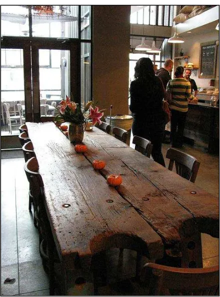
Contrary to this previous strategy, each of the four redesigned Starbucks stores in Seattle has at least one or two ‘community’ tables, often located near the centre of the space or even outside in a covered area by the main entrance and against the backdrop of the store’s front
façade. 15th Ave E features an outdoor six-seat table in the front patio and an indoor ten-seat
table made from irregularly shaped wood planks salvaged from an old Seattle-area boat (Figure
3). The store’s mix-and-match aesthetic adds to the space’s ‘grassroots’ feel, with its assorted
local artwork, plants in terracotta pots, reclaimed furniture (old wood theatre seats) and
Figure 3 – Meaning potentials of community: Communal table in 15th Ave E
In addition to communal tables as materializations of meaning-potentials of community,
we observed explicit gestures to neighbourhood residents in the guise of community boards and
handwritten messages, especially in the two ‘stealth’ stores. Scattered across Roy Street and 15th
Ave E there were several small free-standing, frail wire picture frames that had a ‘homemade’ or ‘DIY’ aesthetic and contained messages written on plain pieces of paper by hand, with a black marker and in neat cursive. Messages like “Please let us know if you would like to reserve this
room!” and “The table, stage and patio are for the community. Let us know if you’d like to reserve them” informed customers that the coffeehouse’s space is available for group meetings and performances. Other messages explained that the café will share coffee grounds for
gardening, that the space provides puzzles and games, and that in-house coffee cuppings are
scheduled on a daily basis. All of these messages urge and even incite store patrons to interact
with the baristas and each other to build and maintain community. In addition, many of these
messages were physically located on or around the stores’ communal tables, or in high-traffic
areas, for example on or near milk and sugar stations. The combination of these messages’
between the material resources offered by redesigned stores and the surrounding social context grounded in the ‘local community’.
In keeping with this direct approach to addressing customers as community members and
framing Starbucks itself as a major local resource and community hub, both Roy Street and
U-Village prominently feature community boards made of recycled slate or plastic, and made for
customers to affix their own leaflets and business cards—a practice common in nearby
independent coffeehouses, but one that was not allowed or was heavily regulated in ‘regular’
Starbucks stores. Moreover, in Roy Street, black slate community boards are used to
communicate with store patrons about in-store events featuring local artists and opportunities to showcase one’s work. Messages like “Get involved! Send your demo, sample reel or letter of interest”and “Roy Street Coffee and Tea has Community Connections [in larger font and underlined] featuring Local [in larger font and underlined] Musicians, Photographers, Artists,
Filmakers [sic.], Poets, Actors, Authors and Playwrights” handwritten with chalk and followed by contact information such as the coffee shop’s website or manager’s email address.
Across the four Seattle locales, then, community is placed at the center of the store and
the store asserts its centrality within the larger urban communities in which they are built. As
spaces of locality, the redesigned stores strive to foreground and create community within
themselves while also directly inviting patrons to bring the surrounding community into the
coffeehouse space, whether by using it for group meetings, attending scheduled events, or
showcasing their own creative practice.
While meaning potentials of materiality and community are dominant and in fact made
explicit through a host of visual-material, linguistic, and quite often metadiscursive means, the four Seattle stores also mobilize meaning potentials such as ‘hereness’, ‘heritage’ and ‘local practices of elsewhere’. These additional meaning potentials contribute to further amplifying claims regarding Starbucks’ grounding in the local material and social context, as they extend
such claims both in time and space. Across stores, there are several visual-material references to
the ‘hereness’ of Starbucks as a material and social space. First, there is a stated emphasis on
using ceramic cups and mugs, rather than to-go paper cups. While 15th Ave E showcases rows of
white ceramic crockery on open shelving located next to the coffee counter, both U-Village and
1st and Pike display (handwritten) messages encouraging customers to use ceramic rather than
paper cups. In 1st and Pike, the bussing station where ceramic cups are collected after use is
Further, 1st and Pike’s positioning in relation to the Pike Place Market is such that the market’s iconic red neon sign is perpetually reflected in the glass storefront, thus offering a visual-material juxtaposition and a constant reminder of the store’s emplacement within the city
of Seattle and centrality within one of the city’s most visible landmarks. A similar statement is
made at 15th Ave E, though with different means. At the time of our research, this store had an
outdoor, freestanding blackboard sign for passers-by to see and read as they walked along the
sidewalk. The sign exhorted potential customers to “discover” food and drink offerings from local companies such as Beecher’s Cheese, Essential Baking Co., Pyramid Breweries, Goose Ridge Vineyards, and Wallace Brook Cellars, while inviting them to “also try” a more properly cosmopolitan selection of edibles such as “World’s Best” Spanish sardines and Norwegian
smoked salmon. In addition to being handwritten with chalk, the sign featured a pictorial
representation of the Space Needle, another major Seattle landmark, standing on a bed of autumn
leaves and against the backdrop of a stylized sun surrounded by clouds.
In a similar fashion, Roy Street has a menu that favours locally sourced foods and
beverages within a worldly selection of Mediterranean and American breakfast and lunch dishes.
Of the eleven wines listed in the menu, five are from Washington state, two from Oregon and
two from California, while only two of the wines come from abroad, namely France and
Argentina. These menus are prominently displayed on the counter by the cash register and at
eyelevel, summoning customers to scan their content and promptly recognize the local food
brands that are highlighted in bold. The menus’ simple courier font is reminiscent of typewriting and the store’s general theme of local creativity. It is through such multimodal references to ‘hereness’ that Starbucks extends its ‘locality’ in space, from given locales (each store’s space) to the broader contexts of the specific cities (in this case, Seattle) and regions (the Pacific
Northwest and the US West Coast) that host its coffehouses.
While drawing attention to their spatial ‘hereness’, redesigned stores also extend Starbucks’ claims of locality in time, and more precisely into the past. Across stores there are frequent references to ‘heritage’, both in relation to Starbucks itself and more broadly to the practice of coffee making and consumption. Although 1st and Pike is the only store that was
properly designed in the heritage style, U-Village displays a large cutout of the heritage siren
logo above the main entrance. In the absence of corporate branding, Roy Street displays black
and white photographic close-ups of coffee being poured from old-fashioned metal pots into
spoon. And as we mentioned earlier, the ceiling lighting fixtures in all redesigned stores are
modeled after the original store’s mercantile lamps.
Finally, Starbucks stores cannot but also mobilize references to the ‘global’ nature of
their main commodity: coffee. In doing so, redesigned stores frame the far-flung origins of
coffee together with the routes it traverses to get to Starbucks as ‘local practices of elsewhere’.
Most notably, 1st and Pike features an artistic diagram etched by hand into the community table that describes the lifecycle of coffee beans. In explaining the different ‘hands’ through which the coffee has been to get to its final destination, the diagram emphasizes the emplaced and
embodied dimensions of the 22-day, 5000-mile journey taken by coffee beans “to get to your local store”. Each stage of this journey is described through sentences like “12 pairs of hands have taken care of this coffee so far”, “on a family farmthat supports 28 people”, “[i]t was picked by hand”, “and milled at a community mill”, “where it was roasted by a partner with 18 years of experience”, and “[n]ow it is up to the barista who brews the coffee for you to enjoy”. In U-Village, Roy Street and 15th Ave E, gestures towards such embodied and emplaced
local practices of elsewhere are somewhat subdued, even though each coffee variety is
painstakingly displayed and labeled with its specific country of origin (for example, Guatemala,
Kenya, and Ethiopia). Both U-Village and 15th Ave E display mural-sized, documentary-style
photographs portraying individuals in the act of tending to coffee beans or pouring brewed coffee. These photographs are shot from above and we see these subjects’ arms and hands against highly contextualized backdrops, but we never see their faces. This portrayal contributes to indexing subjects as racially ‘other’, while also drawing our attention to their coffee-related practices in local contexts that are visibly remote.
Beyond authenticity: Locality as emplaced and embodied cosmopolitanism?
Late modern spaces and cultural practices often attempt to locate subjects in time and
place and do so, many argue, through appeals to authenticity. Many have written and continue to
write about authenticity. From photography and television to branding and advertising, there is
no doubt that authenticity is a fundamental form of currency in contemporary media and
promotional culture. Here we cannot do justice to the vast literature on authenticity, but we build
aspect of modality, authenticity pertains to “the semiotic resources we use for expressing ‘as how true’ or ‘as how real’ a given representation is to be taken” (Van Leeuwen, 2001, p. 396). In other words, authenticity is a judgment of validity based on (often enhanced or fabricated)
multimodal cues.
It is in this sense that authenticity ought to be seen as a rhetorical accomplishment rather than “an objective feature of talk, or of any other form of sociocultural production” (Van
Leeuwen, 2001, p. 396). In this regard, Blommaert and Varis (2011) explain that the perception
of authenticity is obtained by “administering the right amount of specific semiotic features” (p.
8). At the core of authenticity, they argue, are judgments pertaining to the ‘enoughness’ of such
features, insofar as a recognizable or emblematic identity is achieved by dosing a limited set of
small details. For example, the authenticity of an Irish pub can be achieved through the right
amount and combination of linguistic, typographic, chromatic, and aural cues. Details of this
kind are sometimes only noticeable to those who are ‘in the know’. Hence, authenticity is an
outcome of identity work that varies according to the targeted audience(s).
In the case of Starbucks, standard stores are designed to feature seemingly unique
characteristics, such as a specific combination of colours, murals and architectural features.
Along the same lines, service practices are ‘tailored’ to individual customers, who are called by
their first names and whose beverages can be assembled according to their preferences, though
within a set repertoire of available choices. Meanwhile, systematic references to the cultural and natural ‘origins’of Starbucks’ coffee are deployed through visual, linguistic, aural and even olfactory means. However, these implied connections are far removed from the stores’ locales in
their own right, and actual textures are largely characterized by homogeneity and regularity, and
therefore also a certain degree of sameness across stores. As such, this aesthetic of authenticity
relies heavily on symbolic markers of difference while also remaining firmly grounded in an
ethos of predictability.
In our descriptive and interpretive analysis, we have highlighted that the redesigned
stores communicate a rhetoric/discourse of locality largely through visual-material meaning
potentials of materiality and community. These two major meaning potentials are enhanced and
even extended in space and time through additional references to hereness, heritage and the local
practices of elsewhere. The redesigned stores compel patrons to actively experience their
material substance through visual and tactile textures, which are “very perceptible” (Stewart and
within the same store. This wealth of visual-material resources pointing to stores’ materiality is
further highlighted by the active deployment of metadiscourse regarding the repurposed, local
provenance of raw materials and furnishings. In addition, customers are heavily interpellated as
community members, again, through a combination of visual-material resources and linguistic
metadiscourse.
Overall, redesigned stores slow us down and invite us to gaze, touch, recognize and
linger, rather than simply move through. They also exhort us to place our bodies next to the
bodies of others and to bring our embodied selves and networks into their space, so we can
dwell, connect and even perform our creative skills in it. In doing this, these stores also constrain
our subjectivities in particular ways, which are shaped by the very ideological aims and
assumptions underlying Starbucks’ vision/version of locality. Clearly, the emplaced and embodied nature of Starbucks’ aesthetic of locality is, at the very least, racialized and classed. Both materiality and community are communicated as unproblematically fluid and open though
firmly emplaced in specific streets, neighbourhoods and cities, and embodied in the physical and
lifestyle identities of customers. Furthermore, rising consumer values like “environmental friendliness” and local “character”, together with the ability to compete “with the nation’s independent coffee shops” (Guzman, 2009) are vital to this strategy.
More than an account of some of the strategies of global corporations like Starbucks, this
analysis offers critical instruments to engage both the abstractness and concreteness of
globalization, and allows us to investigate the material and symbolic processes by which locality
becomes ingrained in strategic corporate aesthetics while remaining, to use an iconic definition
by Appadurai (1996), “a complex phenomenological quality, constituted by a series of links
between the sense of social immediacy, the technologies of interactivity, and the relativity of contexts” (p. 178). Contrary to authenticity, locality relies on excess, rather than enoughness. A full range of symbolic and material inducements remind us that within these stores our
encounters with difference are both emplaced and embodied, rather than omnitopic and virtual.
These encounters with difference cannot be simply ascribed to the top-down diversity and ‘worldliness’ that is typical of neoliberal or branded cosmopolitanism (Georgiou, 2013;
Bookman, 2013). Instead, this highly orchestrated strategy adopts a ‘street-level’ approach to
grounding spaces of globalist consumption into forms of spatiality and connectivity that are
typical of vernacular cosmopolitanism, insofar as they are “much messier and less harmonious”
(pp. 145-146). It is also in this sense that locality cannot be defined under the notion of modality,
but needs to be considered as a particular aspect of reality itself. As Appadurai (1996) states, “locality is always emergent from the practices of local subjects in specific neighborhoods” (p. 199). In these stores, it is not rudimentary sketches of the local that are ‘plugged’ into an
overarching global format, as it often happens in glocalization. Instead, a certain vision/version
of the actually rather than virtually local is both materially and socially woven into the making of specific places where globalist consumption quite literally ‘takes place’.
Tellingly, as it proceeded to cut thousands of jobs and close hundreds of underperforming
stores, Starbucks focused on crafting spaces of locality, rather than authenticity. Ultimately, authenticity may be considered as a “space of representation” (Zukin, 2008). In this regard, we agree with Zukin (2008) when she argues that “[t]he more connected we are to its social life, especially if we grew up there, the less likely we are to call a neighborhood authentic” (p. 728).
In other words, “[w]e can only see spaces as authentic from outside them” (p. 728).
In suturing each redesigned store into the concrete material and social environment that
hosts it (Stewart and Dickinson, 2008), Starbucks moves into a burgeoning territory in matters of
global capitalism, where we are invited and even forced to ‘see’ spaces of global consumption
from within rather than from without. In short, while authenticity is represented, locality is
practiced. Naturally, this is only an analytical distinction, and there are evident overlaps and
contradictions. Nonetheless, this analysis contributes to highlighting the progressive
entrenchment of global consumer capitalism with vernacular, rather than simply neoliberal or
branded processes of cosmopolitanization. As a form of emplaced and embodied
cosmopolitanism, Starbucks’ strategy of locality may contribute to further solidifying a
capitalism that makes us, quite aptly, feel close to and even become part of its matter.
References
1st and Pike (n.d.). Retrieved February 21, 2014 from:
http://www.starbucks.co.uk/coffeehouse/store-design/1st-and-pike
Allison, M. (June 25, 2009). Starbucks unveils eco-friendly, neighborhood-tailored store designs. The Seattle Times. Retrieved August 2, 2013 from
Appadurai, A. (1996). Modernity At Large: Cultural Dimensions of Globalization. Minneapolis, MN: University of Minnesota Press.
Blommaert, J.M.E., & Varis, P.K. (2011). Enough is enough: The heuristics of authenticity in superdiversity. Tilburg Papers in Culture Studies, 2 Tilburg: Babylon.
http://www.tilburguniversity.edu/upload/684c1837-b1c4-413c-9b73-b5b2b1113c1a_tpcs%20paper2.pdf
Bookman, S. (2013). Branded cosmopolitanism: ‘Global’ coffee brands and the co-creation of ‘cosmopolitan cool’. Cultural Sociology, 7(1), 56-72.
Dickinson, G. (2002). Joe’s rhetoric: finding authenticity at Starbucks. Rhetoric Society Quarterly, 32(4), 5-27.
Disney Village (n.d.). Retrieved February 21, 2014 from:
http://www.starbucks.co.uk/coffeehouse/store-design/disney-village
Djonov, E. and Van Leeuwen, T. (2011). The semiotics of texture: From tactile to visual. Visual Communication, 10(4), 541-564.
Fawkes, P. (2009, July 30). Interview with Starbucks designer Liz Muller, creator of 15th Ave E. PSFK.com. Retrieved December 15, 2013 from:
http://www.psfk.com/2009/07/interview-with-starbucks-designer-liz-muller-creator-of-15th-avenue-e.html
Georgiou, M. (2013). Media and the City: Cosmopolitanism and Difference. Cambridge: Polity.
Guzman, M. (June 25, 2009). Will a Starbucks makeover win you over? Seattlepi.com Retrieved August 2 2013 from: http://blog.seattlepi.com/thebigblog/2009/06/25/will-a-starbucks-makeover-win-you-over/
MacCannell, D. (1976). The Tourist: A New Theory Of The Leisure Class. New York: Schocken.
Schultz, H. (2011). Onward: How Starbucks Fought For Its Life Without Losing Its Soul (with
Joanne Gordon). Wiley.
Simon, B. (2009). Everything but the Coffee: Learning about America from Starbucks. Berkeley and Los Angeles: University of California Press.
Stewart, J., & Dickinson, G. (2008). Enunciating locality in the postmodern suburb: FlatIron
Crossing and the Colorado lifestyle. Western Journal of Communication, 72(3), 280-307.
Starbucks reinvents the store experience to speak to the heart and soul of local communities.
(2009, June 25). Starbucks Newsroom [press release]. Retrieved February 21, 2014 from:
Stone, B. (October 29, 2008). Original team tries to revive Starbucks. The New York Times. Retrieved February 21, 2014 from:
http://www.nytimes.com/2008/10/30/business/30starbucks.html?pagewanted=all&_r=0
Store design (n.d.). Retrieved February 21, 2014 from: http://www.starbucks.ca/coffeehouse/store-design
University Village (n.d.). Retrieved February 21, 2014 from:
http://www.starbucks.co.uk/coffeehouse/store-design/university-village
Van Leeuwen, T. (2001). What is authenticity? Discourse Studies, 3, 392-397.
Walker, A. (June 24, 2009). Preview: Arthur Rubinfeld. Dwell.com. Retrieved August 4, 2013 from: http://www.dwell.com/dwell-design/article/preview-arthur-rubinfeld
Zukin, S. (2008). Consuming authenticity. Cultural Studies, 22(5), 724-748.
Authors’
bios
Giorgia Aiello is a Lecturer in International Communication in the School of Media and
Communication at the University of Leeds. Her research focuses on the nexus of globalization,
social and cultural difference, and both visual and urban communication. She has written about branding, photography and the urban built environment, on institutions like the EU and Magnum Photos, and corporations such as Starbucks and Getty Images. Her work has been published in
several edited collections and in academic journals like Visual Communication, Social Semiotics,
Language and Intercultural Communication, Western Journal of Communication, Journal of Tourism and Cultural Change, First Monday, and Studi Culturali. She is the recipient of a four-year Marie Curie grant awarded by the European Commission for the research project
‘Globalization, Visual Communication, Difference’.
Greg Dickinson is Professor of Communication Studies at Colorado State University. His scholarship focuses on the ways buildings and human landscapes engage viewers on questions of beliefs, values, and action and it often explores the intersections of rhetoric, memory, and place. His monograph Suburban Dreams: Imagining and Building the Good Life will be published in 2015 by the University of Alabama Press. He has published his scholarship in academic journals including Communication and Critical/Cultural Studies, Critical Studies in Media
Communication, Cultural StudiesCritical Methodologies, Quarterly Journal of Speech, Rhetoric Society Quarterly, Southern Journal of Communication, and Western Journal of