10. Introduction to the Swing Classes
The Java Foundation Classes (JFC or “Swing”) are a complete set of light-weight user interface components that enhance, extend and to a large degree replace the AWT components such as buttons, panels, listboxes and
checkboxes. In addition to the buttons, lists, tables and trees in the JFC, you will also find a pluggable look-and-feel that allows the components to take on the appearance of several popular windowing systems, as well as its own look and feel. The JFC actually uses a few common design patterns, and we will be using the JFC for most of the examples in this book. Thus, in this appendix, we review how to use the JFC and point out a number of the patterns it encompasses. If you haven’t used these powerful classes yet, here is a simple introduction. If you have, read through this chapter to see the number of patterns you can discover in them.
We should note at the outset, that this package was called “Swing” during development and it was intended that it be referred to as “JFC” upon release. However, the nickname has stuck, and this has led to the Java programmer’s explanation: “it’s spelled JFC, but it’s pronounced Swing.”
Installing and Using the JFC
All programs which are to make use of the JFC, must import
import javax.swing.*;
and may require one or more of the following depending on the components you use.
import javax.swing.event.*; import javax.swing.border.*; import javax.swing.text.*;
Ideas Behind Swing
The Swing components are referred to as “lightweight” components, because they don’t rely on native user-interface components. They are, in fact, 100% pure Java. Thus, a Swing JButton does not rely on a Windows button or a Motif button or a Macintosh button to implement its
previous heavier-weight AWT classes. In addition, there are many more Swing user-interface components than there were AWT components. Swing gives us image buttons, hover buttons, tooltips, tables, trees, splitter panels, customizable dialog boxes and quite a few other components.
Since Swing components create their look and feel completely within the Swing class hierarchy, you can have a pluggable look and feel to emulate Windows, Motif, Macintosh or the native Swing (metal) look.
Many Swing components make use of an architecture derived from the model-view-controller design pattern. The idea of this MVC patternl, is to keep the data in a model class, display the data in a view class and vary the data and view using a controller class. We’ll see in later chapters that this is exactly how the JList and JTable handle their data.
When to Use Swing Classes
You should use the Swing GUI classes whenever you want to have a professional looking user interface. The classes provide beveled borders, buttons and menus with images, tooltips, and more sophisticated lists, trees and tables. You should only avoid Swing classes in applets when some of your users may be using back-level browsers and don’t want to load the Java plug-in.
The Swing Class Hierarchy
All Swing components inherit from the JComponent class. While JComponent is much like the AWT’s Component in its position in the hierarchy, JComponent provides the pluggable look and feel. It also provides
• Keystroke handling that works with nested components.
• A border property that defines both the border and the component’s insets.
• Tooltips that pop up when the mouse hovers over the component.
• Automatic scrolling of any component when placed in a scroller container.
class. You also should avoid mixing AWT and Swing components in the same program, since they do not interact well.
Writing a Simple JFC Program
Getting started using the Swing classes is pretty simple. Application windows inherit from JFrame and applets inherit from JApplet. The only difference between Frame and JFrame is that you cannot add components or set the layout directly for JFrame. Instead, you must use the
getContentPane method to obtain the container where you can add components and vary the layout.
getContentPane().setLayout(new BorderLayout()); JButton b = new JButton (“Hi”);
getContentPane().add(b); //add button to layout
This is sometimes a bit tedious to type each time, so we recommend creating a JPanel, adding it to the content pane and then adding all the components to that panel.
JPanel jp = getContentPane(); JButton b = new JButton(“Hi”); jp.add(b);
JPanels are containers much like the AWT Panel object, except that they are automatically double buffered and repaint more quickly and smoothly.
Setting the Look and Feel
If you do not select a look and feel, Swing programs will start up in their own native look and feel (called Metal) rather than the Windows, Motif or Mac look. You must specifically set the look and feel in each program, using a simple method like the following:
private void setLF() {
// Force SwingApp to come up in the System L&F String laf =
UIManager.getSystemLookAndFeelClassName(); try {
UIManager.setLookAndFeel(laf);
} catch (UnsupportedLookAndFeelException exc) { System.err.println("UnsupportedLookAndFeel: " + laf);
System.err.println("Error " + laf + ": " + exc); }
}
Setting the Window Close Box
Like the Frame component, the system exit procedure is not called automatically when a user clicks on the close box. In order to enable that behavior, you must add a WindowListener to the frame and catch the WindowClosing event. This can be done most effectively by subclassing the WindowAdapter class:
private void setCloseClick() {
//create window listener to respond to window close click
addWindowListener(new WindowAdapter() {
public void windowClosing(WindowEvent e) { System.exit(0);
} });
}
Making a JxFrame Class
Since we must always set the look and feel and must always create a WindowAdapter to close the JFrame, we have created a JxFrame class which contains those two functions, and which calls them as part of initialization:
public class JxFrame extends Jframe { public JxFrame(String title) { super(title);
setCloseClick(); setLF();
} }
The setLF and setCloseClick methods are included as well. It is this JxFrame class that we use in virtually all of our examples in this book, to avoid continually retyping the same code.
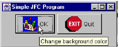
A Simple Two Button Program
Figure 10-1– A simple two button Swing program.
One button switches the color of the background and the other causes the program to exit. We start by initializing our GUI and catching both button clicks in an actionPerformed method:
public class SimpleJFC extends JxFrame implements ActionListener {
private JButton OK, Quit; private Color color; private JPanel jp; public SimpleJFC() {
super("Simple JFC Program"); color = Color.yellow;
setGUI(); }
//--- private void setGUI() {
jp = new JPanel();
getContentPane().add(jp);
//create and add buttons OK = new JButton("OK"); Quit = new JButton("Quit"); OK.addActionListener(this); Quit.addActionListener(this); jp.add(OK);
jp.add(Quit);
setSize(new Dimension(250,100)); setVisible(true);
}
//--- public void actionPerformed(ActionEvent e) { Object obj = e.getSource();
The only remaining part is the code that switches the background colors. This is, of course, extremely simple as well:
private void switchColors() { if (color == Color.green) color = Color.yellow; else
color = Color.green; jp.setBackground(color); repaint();
}
That’s all there is to writing a basic JFC applic ation. JFC applets are identical except for the applet’s init routine replacing the constructor. Now let’s look at some of the power of the more common JFC components.
JButtons
The JButton has several constructors to specify text, an icon or both:
JButton(String text); JButton(Icon icon);
JButton(String text, Icon icon);
You can also set two other images to go with the button
setSelectedIcon(Icon icon); //shown when clicked setRolloverIcon(Icon icon); //shown when mouse over
Finally, like all other JComponents, you can use setTooltiptext to set the text of a ToolTip to be displayed when the mouse hovers over the button. The code for implementing these small improvements is simply
OK = new JButton("OK",new ImageIcon("color.gif")); OK.setRolloverIcon(new ImageIcon("overColor.gif")); OK.setToolTipText("Change background color");
Quit = new JButton("Quit", new ImageIcon("exit.gif")); Quit.setToolTipText("Exit from program");
Figure 10-2–Two picture buttons with the hover tooltip showing.
RadioButtons and Toolbars
Swing provides separate implementations of both the JRadioButton and the JCheckBox. A checkbox has two states and within a group of checkboxes, any number can be selected or deselected. Radio buttons should be grouped into a ButtonGroup object so that only one radio button of a group can be selected at a time.
Radio Buttons
Both radio buttons and check boxes can be instantiated with an image as well as a title and both can have rollover icons. The JCheckBox component is derived from the simpler JToggleButton object. JToggleButton is a button that can be switched between two states by clicking, but which stays in that new state (up or down) like a 2-state check box does. Further the
JToggleButton can take on the exclusive aspects of a radio button by adding it to a ButtonGroup.
//create radio buttons in right panel JRadioButton Rep, Dem, Flat;
right.add(Rep = new JRadioButton("Republicrat")); right.add(Dem = new JRadioButton("Demmican")); right.add(Flat = new JRadioButton("Flat Earth")); ButtonGroup bgroup = new ButtonGroup();
bgroup.add(Rep); //add to button group bgroup.add(Dem);
bgroup.add(Flat);
only-one-on protocol. This is a clear example of the Mediator pattern we’ll be discussing in the chapters ahead.
The JToolBar
JToolBar is a container bar for tool buttons of the type you see in many programs. Normally, the JDK documentation recommends that you add the JToolBar as the only component on one side of a BorderLayout typically the North side), and that you not add components to the other 3 sides. The buttons you add to the toolbar are just small JButtons with picture icons and without text. The JToolBar class has two important methods: add and addSeparator.
JToolBar toolbar = new JtoolBar(); JBUtton Open = new JButton(“open.gif”); toolbar.add(Open);
toolbar.addSeparator();
By default, JButton has a rectangular shape. To make the usual square-looking buttons, you need to use square icons and set the insets of the button to zero. On most toolbars, the icons are 25 x 25 pixels. We thus develop the simple ToolButton class below, which handles both the insets and the size:
public class ToolButton extends JButton { public ToolButton(Icon img) {
super(img);
setMargin(new Insets(0,0,0,0)); setSize(25,25);
} }
The JToolBar also has the characteristic that you can detach it from its anchored position along the top side of the program and attach it to another side, or leave it floating. This allows some user customization of the running program, but is otherwise not terribly useful. It also is not particularly well implemented and can be confusing to the user. Thus, we recommend that you use the setFloatable(false) method to turn this feature off.
JToggleButton
actions the user might select. By themselves, toggle buttons behave lick check boxes, so you can press as many as you want, and you can “uncheck” or raise toggle buttons by using the setSelected(false) method.
You can also add toggle buttons to a ButtonGroup so that they behave like radio buttons: only one at a time can be pressed down. However, once a ButtonGroup object is mediating them, you can’t raise the buttons using the setSelected method. If you want to be able to raise them, but still only allow one at a time to be pressed, you need to write your own Medator class to replace the ButtonGroup object.
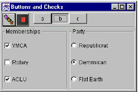
Sample Code
[image:9.540.72.298.258.409.2]The simple program display in Figure 10-3 illustrates checkboxes, radio buttons, toolbar buttons and toggle buttons:
Figure 10-3 – A simple display of checkboxes, radio buttons,
toolbar buttons and toggle buttons.
Note the “b” JToggleButton stays depressed until another button is selected, as toggle buttons are supposed to do. While the user can select any number of organizations in which he holds memberships using the JCheckboxes, he can only select one political party from the JRadioButtons.
Borders in Swing
BevelBorder(n) Simple 2-line bevel, can be LOWERED or RAISED CompoundBorder
(inner, outer)
Allows you to add 2 borders EmptyBorder(top,
left, bottom, right)
Blank border width specified on each side.
EtchedBorder Creates etched norder. LineBorder(width,
color)
Creates simple line border,
MatteBorder Creates a matte border of a solid color or a tiled icon. SoftBeveledBorder Creates beveled border with rounded corners. TitledBorder Creates a border containing a title. Use this to
surround and label a JPanel.
[image:10.540.66.422.67.278.2]These borders are simple to use, in conjunction with the setBorder method of each JComponent. The illustration in Figure 10-4 shows a normal JButton with a 2-pixel solid line border, combined with a 4-pixel EmptyBorder and an EtchedBorder.
Figure 10-4 – Dbutton has a 2-pixel solid line border and Quit has
a 4 pixel EmptyBorder and an etched border.
This was created with the following simple code:
JPanel jp = new JPanel(); getContentPane().add(jp);
LineBorder lb = new LineBorder(Color.black, 2); Dbutton.setBorder(new CompoundBorder(lb, ep)); jp.add(Quit = new JButton("Quit"));
EtchedBorder eb = new EtchedBorder(); Quit.addActionListener(this);
Quit.setBorder(eb);
One drawback of these Border objects is that they replace the default Insets values that determine the spacing around the component. Note that we had to add a 4-pixel EmptyBorder to the Dbutton to make it similar in size to the CButton. We did not do this for the Quit button, and it is therefore
substantially smaller than the others.
You can also affect the border around a JButton, rather like a CoolButton, using the setBorderPainted(b) method. If b is false, the border is not drawn. You then would turn it back on and repaint when the button receives a mouseOver event.
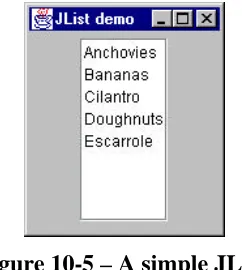
The JList Class
The JList class is a more powerful replacement for the simple List class that is provided with the AWT. A JList can be instantiated using a Vector or array to represent its contents. The JList does not itself support scrolling and thus must be added to a JScrollPane to allow scrolling to take place.
In the simplest program you can write using a JList, you 1. add a JScrollPane to the Frame, and then 2. create a Vector of data
3. create a JList using that Vector
4. add the JList to the JScrollPane’s viewport This is shown below
JPanel jp = new JPanel(); //panel in Frame getContentP ane().add(jp);
//create scroll pane
JScrollPane sp = new JScrollPane();
dlist.addElement("Bananas"); dlist.addElement("Cilantro"); dlist.addElement("Doughnuts"); dlist.addElement("Escarrole");
JList list= new JList(dlist); //create list with data sp.getViewport().add(list); //add list to scrollpane
[image:12.540.178.299.168.303.2]This produces the display shown in Figure 10-5.
Figure 10-5 – A simple JList.
You could just as easily use an array instead of a Vector and have the same result.
The JList is considerably more flexible than the AWT List class, but we will defer its sophisticated features to the advanced Swing chapter, where we will see that the JList, the JTable, and the JTree all support the Model-View-Controller pattern or Observer pattern, where the data are completely separate from the interface class.
Summary
11. Writing a Simple Visual Application
in Java
Windows in Java
When you write visual applications in Java, you are writing programs that use and manipulate windows. All Java windows inherit from the Container class, but the inheritance tree beyond that has two branches. For
applications, the hierarchy starts with the Window class, which is an
undecorated square on the screen. The Frame class, derived from Window is the one we usually see on the scree. It contains a title bar and may contain a menu.
Applets are also a kind of window derived from Panel. Panels are designed to be regions inside another container where you draw or arrange components in a particular way, and Applets are a kind of panel with specific methods that the web browser can call to initialize and start them running. The inheritance tree for Applets and Frames is show in Figure 8-1.
Fig 8-1: The Inheritance Tree of Applets and Frames
Since both Applets and Frames are kinds of containers, it is not surprising that we add the visual controls that we wish to use into these containers. It is important to recognize that create instances of these graphical objects is only part of our job. We also have to tell the window that it it going to contain them, so it can display them by calling their paint methods. How and where it will display the controls is really dependent on the window’s layout manager, and we will consider several ways of laying out a window in this chapter.
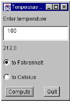
Building a Temperature Conversion Applet
program will consist of a text field, two labels, two radio buttons and a Compute button.
We are going to write this conversion program as an application. In this example, we are going to create a class called Tempcalc in a file called tempcalc.java. We will compile this into an applet called tempcalc.class which we will run from a HTML file called tempcalc.html. The structure of the applet consists of
1.
The public class initializer routine where we initialize variables.2.
Layout of controls on the screen3.
Routines to process button click events and compute the result.Laying out Controls on the Screen
Java layout managers are objects that arrange the positions of the controls dynamically so that they never overlap, based on rules embedded in the various layout manager classes. Further, layout manager-driven
applications are independent of screen resolution and computer platform. They allow the layout to expand and stretch dynamically as a window is resized.
In this chapter we are first going to write the program while ignoring the details of layout managers and then we will revisit it using layout mangers in the following chapter.
Option button “Fahrenheit” 125, 100 100 x 15
Applet Methods
The init() Method
After the applet is loaded and its constructor called, the browser calls its init method. This is the time at which connection is first made to the runtime environment and the earliest that making references to the layout of graphical objects is meaningful. So, for applets, rather than doing our initialization inside the constructor, we do it inside the init method.
The start() and stop() Methods
What happens if we display an applet on a web page and then scroll down or switch pages so it is no longer showing? Does it continue to run? Can it be restarted?
The web browser calls the init() method only once. Then it calls the applet’s start() method. The applet runs until that part of the web page is obscured either by scrolling away from it or by moving to another page. Then the browser calls the applet’s stop() method. If you scroll or switch back to the applet again, the browser again calls the start() method.
While you may not need to override these methods and write any actual code for many applets, they can be useful when you write animation
programs.
Laying Out Our Applet
The private variables in our tempcalc applet consist of the graphical controls on the screen and the checkbox group object.
private CheckboxGroup Temper; //group radio buttons private Label label1;
Creating Objects
Let’s consider that Font statement above for a minute.
setFont(new Font("SavSerif", Font.PLAIN, 12));
What do we mean by this? Well, if you look at the constructor for the Font class you will find that it is
public Font(String name, int style, int size);
Then, if you look for the method setFont under Applet, you won’t find it. If you start going down the inheritance tree, you will pass through Panel and Container before you find the method in the base Component class:
public void setFont(Font f);
So in order to set the font to the new style or size, we have to create a Font object. We could do this by
Font newfont = Font(“Helvetica”, Font.PLAIN,12); setFont(newfont);
or we could do it by creating a new font object right in the setFont method call:
setFont(new Font("Helvetica", Font.PLAIN, 12));
which is what we have done here.
Initializing the Controls
Then we begin initializing the controls. For each control, we create an instance of it using the new operator. Note that while we declared a variable label1 of type Label above, we didn’t create an object to put in that
So in the case of the label1 object, we create a label using the label constructor which specifies the text of the label. Then we use the applet’s add method to add each control to the applet container.
label1 = new Label("Enter temperature:"); add(label1);
We do pretty much the same thing for each of the other controls. However, the Option (radio) buttons are a little difference since they are a special kind of Checkbox. First we need to create a CheckboxGroup object and then refer to it in the constructor of each of the option buttons that you want to have work together as a unit:
Temper = new CheckboxGroup();
Fahr = new Checkbox("to Fahrenheit",Temper, false); add(Fahr);
Celsius = new Checkbox("to Celsius",Temper, false); add(Celsius);
Adding the Buttons and an ActionListener
Now that we have initialized the controls and started the applet, we need to take action when the Compute or Quit buttons are clicked.
compute=new Button("Compute"); add(compute);
compute.addActionListen er(this); quit = new Button("Quit"); add(quit);
quit.addActionListener(this);
We declare the outside Applet to implement the ActionListener interface
public class tempcalc extends Applet
implements ActionListener {
and include an actionPerfomed method to intercept the button presses:
public void actionPerformed(ActionEvent evt) { Object obj = evt.getSource ();
if (obj == compute) {
clickedCompute(); //compute temperature }
else
System.exit(0); //exit from application }
}
Note that the Quit button calls the System.exit(0) method. This method only applies to stand-alone applications, and has no effect in applets. This program is designed to work in both modes, however.
The clickedCompute Method
Now to the crux of the program. We need to read the value in the TextField box TempEntry and then see whether the Fahr button is selected and perform one calculation or the other. We will need two local variables:
float temp, newtemp;
Then we convert the text in the text box into a float as follows. First we convert the string into a Float object:
Float flt = new Float(TempEntry.getText());
Then we obtain the float numerical value from the Float object using that class’s floatValue() method.
temp = flt.floatValue();
Or we can do the whole thing in one single statement:
temp = new Float(TempEntry.getText()).floatValue();
So our entire click method is as follows:
public void clickedCompute() { float temp, newtemp;
temp = new Float(TempEntry.getText()).floatValue(); if (Fahr.getState())
newtemp = 9 * temp / 5 + 32; else
newtemp = 5 * (temp - 32) / 9;
The computed result is converted to a String and shown in the result label text field. The running program for computing and displaying temperatures is illustrated in Figure 8-4.
Figure 8-4: The tempcalc program running in the appletviewer.
The listing is given below:
import java.awt.*; import java.awt.event.*; import java.applet.*;
public class tempcalc extends Applet implements ActionListener {
private CheckboxGroup grpTemper; //group radio buttons
private TextField tempEntry; //edit box private Checkbox fahr; //radio button private Checkbox celsius; //radio button private Label result; //result shown here private Button compute; //compute when clicked private Button quit; //exit when clicked //--- public void init() {
//initialize applet
setLayout(new GridLayout(6,1)); setBackground(Color.lightGray);
label1 = new Label("Enter temperature:"); add(label1);
tempEntry=new TextField(7); add(tempEntry);
result=new Label(" "); add(result);
grpTemper = new CheckboxGroup();
fahr = new Checkbox("to Fahrenheit",grpTemper, false); add(fahr);
celsius = new Checkbox("to Celsius",grpTemper, false); add(celsius);
Panel p = new Panel(); add(p);
p.setLayout(new GridLayout(1,2)); compute=new Button("Compute"); Panel lp = new Panel();
p.add(lp);
lp.add(compute);
compute.addActionListener(this); Panel rp = new Panel();
p.add(rp);
quit = new Button("Quit"); rp.add(quit);
quit.addActionListener(this); super.init();
}
//--- public void actionPerformed(ActionEvent evt) { Object obj = evt.getSource ();
clickedCompute(); //compute temperature }
else
if (obj == quit) {
System.exit(0); //exit from application }
}
//--- public void clickedCompute() {
float temp, newtemp;
temp = new Float(tempEntry.getText()).floatValue(); if (fahr.getState())
newtemp = 9 * temp / 5 + 32; else
newtemp = 5 * (temp - 32) / 9;
result.setText(new String().valueOf(newtemp)); }
Applets vs. Applications
An Applet is always a visual program. It lives inside a web page and come into existence when the web browser calls its init and start methods.
By contrast, applications do not need to have visual components. If you want to display something in a window, you must provide an initialized window. The basic displayable unit is the Window, but the Frame class, which extends Window, provides borders and a title bar. It is usually the Frame which we will use to put up windows in applications.
If we add a main routine to the tempcalc class we can create a program which will run either as an application or as an applet. We need only create a frame, which is just another kind of container, add the tempcalc class to it, resize it and display it.
public static void main(String arg[]) { //create the frame
Frame fr = new Frame("Temperature calculation"); fr.setLayout(new BorderLayout());
//create the applet
Applet app = new tempcalc();
fr.add("Center",app); //add into the fr ame fr.setSize(364, 225); //define its size
fr.pack(); //arrange applet inside frame }
[image:23.540.179.299.175.348.2]If we compile and run the tempcalc class with this main method included, it will run as a stand-alone window. This main method is included in the tempcalc.java program in the \chapter8 directory of your example disk. The tempcalc program running as an application is shown in Figure 8-5.
Figure 8-5: The same tempcalc program running as an
application.
Stopping Your Application from the System Close Button
If you tried to close the application we show above by clicking in the upper right corner system close button, it will not close. This is because, by default, the windowClosing event is not handled by the Frame object. If you do no specifically include a Quit button as we did in the above example, you must implement the WindowListener interface in your application and close the window in response to the windowClosing event.To implement this interface, you must have instances of all 7 window events, even though all but one are empty methods:
public void windowIconified(WindowEvent e){} public void windowDeiconified(WindowEvent e){} public void windowOpened(WindowEvent e){} public void windowClosing(WindowEvent e){ System.exit(0);
}
This is the approach used in the example TempApp.java which runs only as an application. In this case, the main method becomes simply
public static void main(String arg[]) { //create the frame
new TempApp("Temperature calculation"); }
Making an Application/Applet Exit
We have to admit that having a program that will run both as an applet and as an application is more aconjuring trick than a really useful approach, it does illustrate some interesting problems.
There is no way to have an Applet implement the WindowListener interface and have it exit from the Close box when run as an application, because the applet does not receive that message. Conversely, there is no direct way to have a Frame cla ss implement the WindowListener. However, it is perfectly possible for a subclass of Frame to implement that interface and exit
properly. Thus, if we create an XFrame class we have the ability to have a closable window frame.
public class XFrame extends Frame implements WindowListener { // a subclass of Frame that exits on the close box
public XFrame(String title) {
super(title); // put the title in the title bar addWindowListener(this); //listen for close setLayout(new BorderLayout());
}
//WindowListener interface classes
public void windowActivated(WindowEvent e){} public void windowClosed(WindowEvent e){} public void windowDeactivated(WindowEvent e){} public void windowIconified(WindowEvent e){} public void windowDeiconified(WindowEvent e){} public void windowOpened(WindowEvent e){} public void windowClosing(WindowEvent e){ System.exit(0);
Then we modify the main method of the applet class to create this new type of frame rather than an ordinary Frame.
public static void main(String arg[]) { //create the frame
XFrame fr = new XFrame("Temperature calculation");
//create the applet
Applet app = new XTempCalc();
fr.add("Center",app); //add into the frame fr.setSize(364, 225); //define its size
fr.show(); //show the frame app.init(); //lay out the applet app.start(); //start it
fr.pack(); //arrange applet inside frame }
}
This modified version of the program is called XTempCalc.java on your example disk. We’ll be using this XFrame class throughout the rest of our examples using the AWT, and an analogouse JxFrame class for our Swing examples.
Subclassing the Button Control
One of the great strengths of Java is that as an object-oriented language, you can extend nearly any class to add function to it. We just saw a useful reason to extend the Frame class. Now let’s consider the Button class.
It would be convenient if we could have each button control know what operation it is to perform and then go ahead and do it. Each button could be its own actionListener, or we could vector all actions through the same interface.
Our final drawback to this approach is that we have to create a separate subclass for each separate button on the form. Here, since there are only two, this is not particularly difficult. A good way to do this is to start with an abstract button class which contains a general Execute method, and then subclass that to create the actual buttons.
//an abstract button class that executes the command public abstract class ComdButton extends Button { public ComdButton(String label) {
//pass the label to the base Button class super(label);
}
abstract public void Execute(); }
Note that the Execute method is abstract. This just measn that we haven’t filled it in yet, and that we have to make sure that each derived class contains an implementation of that method.
For the Quit button we simply create a class that exits:
public QuitButton(String caption) { super(caption);
}
public void Execute() { System.exit(0); }
}
However, for the Compute button, we have to access the fields of the form, do the computation and put the result back in the result label. We could put all this in the button class, but since we already have a computeClick method in our main program class, we can just call it. In order to call it, we have to give the button an instance of the applet class to use in the call. Our QuitButton class thus has an Execute method and a set method to pass in an instance of the applet class:
public class ComputeButton extends ComdButton { private subButton sbt = null;
public ComputeButton(String caption) { super(caption);
}
public void setApp(subButton app) { sbt = app;
}
//if the applet instance is set, //call its compute method
public void Execute() { if(sbt !=null) {
sbt.clickedCompute(); }
} }
The complete program is called subButton and is in the \chapter8 directory of your example disk.
Summary
Now that we have built some real visual applications in Java we have all the fundamentals in hand. We’ve learned about applets and applications, and we’ve seen how to derive new classes from the Frame and from the Button class and have begun to write some significant Java code.
12. Layout Managers
While you can position controls in a Java window can be done using
absolute pixel positioning, it is more common to use a layout manager class. While many programmers may be used to visual GUI builders that generate absolute pixel positioning, Java started in the Unix world where specifying a program to do your layout is more common.
Before Java came along, the most popular high level language for creating GUI applications was TCL/TK, a language system developed almost entirely by John Osterhout. Since he had to deal with any number of different Unix platforms as well as screens varying from 640 x 480 to thousands of pixels across, he developed the concept of a layout manager, which would allow you to tell it something about the relative positions of the controls and let the layout manager figure out how to achieve it.
The great advantage of layout managers is that they are both screen size and operating system independent. Further, if you resize a window controlled by a layout manager, the components will move apart in a sensible fashion. The great disadvantage is that layout managers take a good deal of programming by the user to achieve this screen independence.
Java Layout Managers
There are 5 layout manager objects provided with Java:
• FlowLayout -controls flow from left to right and onto new lines as needed.
• BorderLayout - controls can be added to North, South, East and West. The remainder goes into the Center.
• CardLayout - provided to allow you to display one of several card areas a time, like Hypercard or a tabbed container does.
• GridBagLayout - a complex layout where each object can take up several rows or columns.
For the most part, you can lay out simple screens using the Flow, Grid and Border layouts. The others are for more involved cases.
In Java applications, a Frame is the top level window which you display on the screen. It has a title bar and may have a menu. Layouts apply to the Frame where you add controls in either an applet or an application.
A Panel is a logical, but unmarked region of a screen where you can group controls. You can add one or more Panels within the frame area each of which can then have its own layout. The default layout manager for a Frame is BorderLayout and the default for a Panel is FlowLayout. Rather than trying to remember this, we will always set the layout we need.
For simple programs, you can do a fairly good job using the
GridLayout to divide your window into regions and then inserting panels in the grid cells, each having a FlowLayout so that the components within a cell are spaced apart and do not touch. You can use the BorderLayout if you want some component to be along one of the edges of the window.
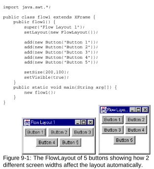
The Flow Layout
A flow layout allows you to add components to a panel in a simple, left-to-right fashion using the following constructors:
public FlowLayout();
When one row is full, the next component starts a new row. When you set a FlowLayout you have the option of specifying the alignment and gap between components. However, the default alignment is CENTER, and the default gap is a reasonable looking 10-20 pixels.
public FlowLayout(int align); public final static int CENTER; public final static int LEFT; public final static int RIGHT;
The FlowLayout is primarily for laying out rows of buttons, although of course you can use it for check or text boxes or any other kind of component you wish. The following code produces the layout show in Figure 9-1.
import java.awt.*;
public class flow1 extends XFrame { public flow1() {
super("Flow Layout 1"); setLayout(new FlowLayout()); add(new Button("Button 1")); add(new Button("Button 2")); add(new Button("Button 3")); add(new Button("Button 4")); add(new Button("Button 5")); setSize(200,100);
setVisible(true); }
public static void main(String arg[]) { new flow1();
[image:30.540.65.378.112.455.2]} }
Figure 9-1: The FlowLayout of 5 buttons showing how 2
different screen widths affect the layout automatically.
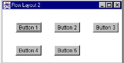
If you want the components to be aligned along the left edge, use the third version of the constructor as shown below:
public class flow2 extends XFrame { public flow2() {
super("Flow Layout 2");
setLayout(new FlowLayout(FlowLayout.LEFT,30, 30)); add(new Button("Button 1"));
add(new Button("Button 4")); add(new Button("Button 5")); setSize(200,100);
setVisible(true); }
[image:31.540.70.284.181.290.2]This program is flow2.java on your example disk. It is illustrated in Figure 9-2.
Figure 9-2: The FlowLayout using left alignment and a 30-pixel
horizontal and vertical gap.
Flow layouts can also produce fairly reasonable looking mixed control layouts. Each row must be the same height all the way across, but different rows may have different heights to accomodate different kinds of
components. For example, the following code leads to the layout shown in Figure 9-3.
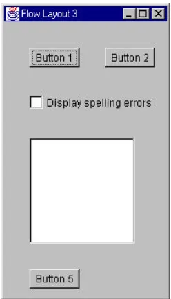
public class flow3 extends XFrame { public flow3() {
super("Flow Layout 3");
setBackground(Color.lightGray);
setLayout(new FlowLayout(FlowLayout.LEFT,30, 30)); add(new Button("Button 1"));
add(new Button("Button 2"));
add(new Checkbox("Display spelling errors")); add(new List(8, false));
add(new Button("Button 5")); setSize(200,350);
setVisible(true); }
public static void main(String arg[]) { new flow3();
}
Figure 9-3: A FlowLayout of a mixed group of components.
The Grid Layout
The GridLayout manager organizes the container into equal sized cells in a specified number of rows and columns. The constructors are:
public GridLayout(int rows, int cols);
public GridLayout(int rows, int cols, int hgap, int vgap);
So for example, if we want to lay out five controls in two columns you could use the Grid Layout:
public class grid1 extends XFrame { public grid1() {
super("Grid Layout 1");
setBounds(100,100,200,100); setVisible(true);
}
public static void main(String arg[]) { new grid1();
} }
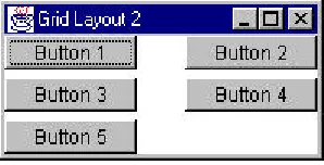
This program, grid1.java, produces the display shown in Figure 9-4. It is clearly not particularly elegant looking to have the buttons touching each other without any space between them. However, by simply changing the GridLayout constructor to
setLayout(new GridLayout(3, 3, 30, 5));
[image:33.540.166.317.294.368.2]we can have the somewhat more pleasant spacing shown in Figure 9-5.
Figure 9-4: The GridLayout using a grid of 3 x 3 with 5 buttons.
No spacing between buttons was specified.
[image:33.540.166.315.421.497.2]The BorderLayout Manager
The BorderLayout allows you to divide the screen into 5 regions named “North,” “South,” “East,” “West,” and “Center.”
North
West Center East
South
Normally, you use the top and bottom border areas as narrow strips to hold buttons or toolbars, and the side borders for such things as scrollbars. As with the other managers, it has two constructors:
public BorderLayout();
public BorderLayout(int hgap, int vgap);
When you add a component to a border layout, you specify the edge name as part of the add method:
add(“North”, Button1);
Each component is given the amount of space it naturally requires: there is no requirement that the layout manager distribute the space equally. For example, the following program produces the layout shown in Figure 9-6:
public class border1 extends XFrame { public border1() {
super("Border Layout 1");
setLayout(new BorderLayout(5, 5)); add("West", new Button("Button 1")); add("North", new Button("Button 2")); add("East", new Button("Btn 3")); add("South", new Button("Button 4")); add("Center",new Button("Button 5")); setBounds(100,100,300,200);
setVisible(true); }
public static void main(String arg[]) { new border1();
The program is called border1.java in \chapter9 of your example disk.
Figure 9-6: A frame using the BorderLayout manager. Note that
the right and left edges are unequal in width.
Since we named the West button as “Button 1,” but the East button as “Btn 3,” the left and right panels are not of the same width. Programmers generally use the BorderLayout manager to set aside part of the window at one side or another, and then put a panel containing another type of layout manager in the remaining space.
For example, we could divide the screen in half, putting a list box in one part and a series of buttons in the other. Since the center always takes up “what’s left,” we will put the list box in the center and the buttons on the right side. We will add the list box to the Center part of the border layout and then create a panel to add to the East side of the border layout. The program for laying out the controls in two columns is shown below:
public class border2 extends XFrame { public border2() {
super("Border Layout 2");
setLayout(new BorderLayout(15, 1)); setBackground(Color.lightGray ); //create right panel
Panel rpanel = new Panel(); add("East", rpanel); //put List in center
add("Center", new List(10, false)); //put rest in right panel
rpanel.add(new Button("Diving")); rpanel.add(new Button("Beach Soccer")); setBounds(100,100,300,200);
setVisible(true); }
and Figure 9-7 shows the window it generates. This program is called
[image:36.540.71.297.180.330.2]border2.java in \chapter9 on your example disk.
Figure 9-7: Using a BorderLayout to divide the screen in half.
The “East” side is further divided using a 3 x 1 GridLayout.
Padding a Layout Using Panels
One problem with the layout as shown, is that the buttons are too fat and take up to much of the right hand screen area. It would be better if there were more space above the top button and below the bottom button, but that the top-center-bottom button spacing was about the same as it is now.
The easiest way to accomplish this is to make the GridLayout 1 x 5 instead of 1 x 3. But how will we will adjust the middle three cells? Simple. We’ll simply insert a Panel component in the top and bottom cells:
super("Border Layout 3");
setBackground(Color.lightGray ); setLayout(new BorderLayout(15, 1)); Panel rpanel = new Panel();
add("East", rpanel);
add("Center", new List(10, false));
rpanel.setLayout(new GridLayout(5, 1, 30, 5)); rpanel.add(new Panel());
rpanel.add(new Button("Swimming")); rpanel.add(new Button("Diving")); rpanel.add(new Button("Beach Soccer")); rpanel.add(new Panel());
setBounds(100,100,300,200); setVisible(true);
}
[image:37.540.129.353.281.431.2]This layout is shown in Figure 9-8 and the program is called border3.java on your example disk.
Figure 9-8: A BorderLayout divided with a 1 x 5 GridLayout on
the right side. Top and bottom grid cells contain an empty
Panel.
Laying Out the Temperature Conversion Program
To lay out the controls for this program, we’ll need to put the controls into 6 rows and one column:
1. A label “Enter Temperature” and an entry field.. 2. A label where the result is to be displayed. 3. The “to Fahrenheit” option button.
4. The “to Celsius” option button.
5. A Compute and Quit button on a single line together.
We create the layout by the following steps.
1.
Create a 6 x 1 grid.
2.
Add a label.
3.
Add a TextField.
4.
Add the Results label .
5.
Add the “to Fahrenheit” radio button to it.
6.
Add the “to Celsius” radio button to it.
7.
Add a panel to the sixth line and add the two pushbuttons to that.
The code for accomplishing this is shown below.
public class tempcalc extends Applet implements ActionListener {
//--- public void init() {
//initialize applet
setLayout(new GridLayout(6,1)); setBackground(Color.lightGray);
label1 = new Label("Enter temperature:"); add(label1);
tempEntry=new TextField(7); add(tempEntry);
result=new Label(" "); add(result);
//put radio buttons in group
grpTemper = new CheckboxGroup(); fahr = new Checkbox("to Fahrenheit",
grpTemper, false); add(fahr);
celsius = new Checkbox("to Celsius", grpTemper, false); add(celsius);
//two buttons in panel with grid layout Panel p = new Panel();
add(p);
p.setLayout(new GridLayout(1,2)); compute=new Button("Compute"); Panel lp = new Panel();
p.add(lp);
lp.add(compute);
compute.addActionListener(this); Panel rp = new Panel();
p.add(rp);
quit = new Button("Quit"); rp.add(quit);
quit.addActionListener(this); super.init();
}
Figure 9-9: The TempCalc program designed using the
GridLayout manager.
This window is adequate but not all that appealing. You can improve it somewhat by putting every component inside a Panel inside each line of the grid. This gives each grid line its own flow layout, and the labels, buttons and entry field do not try to fill the entire grid line.
Since every add method will have a new Panel associated with it, you can just extend the Frame’s add method to always create a panel first:
public Component add(Component comp) { Panel p = new Panel();
p.add(comp); super.add(p); return comp; }
The CardLayout Manager
The card layout manager is designed to allow you to create a number of components, usually panels containing controls, but show only one of these components at a time. It can provide a basis for designing a tabbed dialog or a Hypercard-like program. It is now pretty much obsolete as more
sophisticated controls provided by the Swing classes supercede it.
The GridBagLayout Manager
Of the layout managers provided with Java, the GridBagLayout manager is the most complex as well as the most versatile. The underlying assumption of this layout manager is that you can have controls that span more than one row or column.
public void GridBagLayout(); public void GridBagConstraints();
a reference to the control, you only need one instance of the GridBagConstraints class as well.
The GridBagConstraints class has a number of publicly accessible variables that tell the GridBagLayout class how to position that component. You can change these fields before adding each new component to the layout.
Gridx x grid position of the component. Gridy y grid position of the component.
Gridwidth the number of x cells the component spans. Gridheight the number of y cells the component spans.
Fill which dimensions should grow if the space is larger
than the component: NONE, BOTH, HORIZONTAL or VERTICAL.
Ipadx extra space in pixels added to the width of the
component.
Ipady extra space in pixels added to the height of the
component.
Insets margins to appear around component: part of inset
class.
Anchor how the component should be aligned within the
grid cells: CENTER, EAST, NORTH,
SOUTH,WEST, NORTHEAST, NORTHWEST, SOUTHEAST, SOUTHWEST
weightx how much weight a given cell should be given
relative to others if window is wider than needed. Default is 0.
weighty how much weight a given cell should be given
Default is 0.
To position a component using the GridBagLayout, we have to create an instance of both the GridBagLayout and GridBagConstraints, add the component and then set the constraints for that component:
gbl = new GridBagLayout(); //create layout mgr gbc = new GridBagConstraints(); //and constraints setLayout(gbl); //set layout
Button b1 = new Button("One"); //create button
gbc.gridx = 4; //fourth row gbc.gridy = 0; //first column gbc.gridwidth = 2; //two cells wide gbc.gridheight =1; //one cell high
add(b1); //add button into layout gbl.setConstraints(b1, gbc); //set constraints for b1
Since most controls will have just their positions set as they are added, we can put most of the above into a private method which operates on gbl and gbc.
private void add_component(Component c, int x, int y, int w, int h)
{
gbc.gridx = x; //set x and y positions gbc.gridy = y;
gbc.gridwidth = w; //and sizes gbc.gridheight =h;
add(c); //add component gbl.setConstraints(c, gbc); //set constraints }
A Simple GridBagLayout Example
Now lets write a simple program using a list box and three buttons. The list box will occupy 3 horizontal cells and 4 vertical ones. The push buttons will be one cell each: two in row 0 and one in row 3. The complete program for laying out these buttons is:
private GridBagLayout gbl; private GridBagConstraints gbc; private List lb;
public gblay(String caption) { super(caption);
setBackground(Color.lightGray ); gbl = new GridBagLayout(); gbc = new GridBagConstraints(); setLayout(gbl);
lb = new List(5,false);
add_component(lb, 0, 0, 3, 4); Button b1 = new Button("One"); b1.addActionListener (this); add_component(b1, 4, 0, 2, 1); Button b2 = new Button("Two"); b2.addActionListener (this); add_component(b2, 6, 0, 2, 1); Button b3 = new Button("Three"); b3.addActionListener (this); add_component(b3, 5, 3, 2, 1); setBounds(20, 20, 250, 150); setVisible(true);
}
//---
private void add_component(Component c, int x, int y, int w, int h) {
gbc.gridx = x; gbc.gridy = y; gbc.gridwidth = w; gbc.gridheight =h; add(c);
gbl.setConstraints(c, gbc); }
//--- public void actionPerformed(ActionEvent evt) { Button but = (Button)evt.getSource (); lb.add(but.getLabel());
}
//--- public static void main(String arg[]) { new gblay("Simple GridBagLayout"); }
The resulting layout is illustrated in Figure 9-12. The program is called gblay.java on your example disk.
Figure 9-12: Simple GridBagLayout of list box and three
buttons.
Improving on Our Simple GridBagLayout
If you stretch the window in the above gblay.java program, the buttons and list box will stay the same size and stay clustered in the center of the window. Further, the buttons seem a bit crowded. Let’s see what we can do to unclutter the layout slightly.
First, we can make the buttons a bit bigger on either side of their captions by making ipadx and ipady larger than their default, 0.
gbc.ipadx = 5; //make buttons wider gbc.ipady = 3; //make buttons higher
Then we can add a little more space between the buttons by adding a few pixels to the insets class. This class has four direction names and we add 4 pixels to each:
gbc.insets.left = 4; gbc.insets.right = 4; gbc.insets.bottom = 4; gbc.insets.top = 4;
Button b2 = new Button(" Two ");
gbc.weightx = 1; //this column gets more space add_component(b2, 6, 0, 2, 1);
The complete program gblay2.java is on your example disk. It contains only the changes we have just discussed. Figure 9-13 shows the window
[image:46.540.146.334.211.325.2]displayed by this program at is normal width and Figure 9-14 shows the same window stretched horizontally. As you can see, buttons 1 and 3 stay near the list box, but button 2 moves outward as the window is expanded.
Figure 9-13: GridBayLayout gblay2.java, showing the effects of
increasing ipadx and ipady and adding values for insets.
[image:46.540.111.369.377.489.2]A GridBagLayout for the TempCalc Program
[image:47.540.66.411.165.369.2]When we looked at the layout of the TempCalc program in Figure 9-9 that we constructed using flow and grid layouts, it look adequate but not that professional. Let’s see how we can do using the GridBagLayout manager to arrange the controls. We’ll arrange them using the grid layout illustrated in Figure 9-15.
(blank) (blank) (blank) (blank)
Enter temperature: TempEntry TextField Result label
O - To Fahrenheit O - to Celsius
(blank) (blank) (blank) (blank)
Compute Quit
Figure 9-15: Layout of cells to be used for the final layout of the
TempCalc program.
The complete program is show below and is named gbTemp.java on your example disk. The window it displays is shown in Figure 9-16.
public class gbTemp extends XFrame implements ActionListener { private GridBagLayout gbl; //layout mgr
private GridBagConstraints gbc; //and constraints private Label label1; //label
private TextField tempEntry; //entry field private Label result; //result lable private CheckboxGroup cbg;
private Checkbox fahr; //radio buttons private Checkbox celsius;
private Button compute; //compute button private Button quit; //quit button public gbTemp(String caption) {
gbl = new GridBagLayout(); gbc = new GridBagConstraints(); setLayout(gbl);
gbc.ipadx = 5; //make buttons wider gbc.ipady = 5; //make buttons higher label1 = new Label("Enter temperature:"); add_component(label1,0,1,2,1);
tempEntry = new TextField(5); add_component(tempEntry,2,1,1,1); result = new Label(" result "); add_component(result,1,2,2,1); cbg = new CheckboxGroup();
//left align check boxes in cell 1 gbc.anchor = GridBagConstraints.WEST;
fahr = new Checkbox("to Fahrenheit", cbg, true); add_component(fahr,1,3,2,1);
celsius = new Checkbox("to Celsius", cbg, false); add_component(celsius,1,4,2,1);
//return to center alignment
gbc.anchor = GridBagConstraints.CENTER;
add_component(new Label(""),1,5,1,1); //leave space compute = new Button("Compute");
compute.addActionListener (this); add_component(compute, 0,6,1,1); quit = new Button(" Quit "); add_component(quit, 2,6,1,1); quit.addActionListener (this); setBounds(20, 20, 250, 300); setVisible(true);
}
//---
private void add_component(Component c, int x, int y, int w, int h) { gbc.gridx = x;
gbc.gridy = y; gbc.gridwidth = w; gbc.gridheight =h; add(c);
gbl.setConstraints(c, gbc); }
//---
int weighty) { gbc.weightx = weightx;
gbc.weighty = weighty; gbl.setConstraints(c, gbc); }
//--- public void actionPerformed(ActionEvent evt) { Object obj = evt.getSource();
if (obj == compute) { clickedCompute(); }
if (obj == quit) { System.exit(0); }
}
//--- private void clickedCompute() {
float temp, newtemp;
temp = new Float(tempEntry.getText()).floatValue(); if (fahr.getState())
newtemp = 9 * temp / 5 + 32; else
newtemp = 5 * (temp - 32) / 9; result.setText(" " +
new String().valueOf(newtemp)+" "); }
//--- public static void main(String arg[]) { new gbTemp("GridBag Temperature"); }
Figure 9-16: The TempCalc program as laid out using the
GridBagLayout manager.
Summary
13. Writing a Program With Two
Windows
We often need to write programs that contain a number of windows which need to communicate data entered between them. You can do this in Java, but in an even more rigorously object-oriented fashion than in other languages.
A Temperature Plotting Program
In Chapter 8, we wrote a simple program for converting temperatures between Fahrenheit and Celsius, but with no memory of past data points. In this chapter, we’ll write a program which keeps an array of data points and then allows you to display a plot of them on the screen.
While an array would be a likely candidate to store a list of data points, one drawback is that we won’t know ahead of time how many data points the user might enter. Rather than reserving some large, unnecessary amount of memory, we have a somewhat simpler way of doing the same thing, using the Vector class. An instance of a Vector class can hold any number of objects (although not primitive data types) and expands as needed. While there is no requirement that the objects all be of the same type, if you intermingle objects it is up to you to make sure you obtain objects of the correct type, or a run-time error will occur. The major Vector methods are
Vector v = new Vector(); //pick default size Vector v = new Vector(n); //estimate size v.addElement(obj); //any object type
obj = v.elementAt(i); //return an element v.removeElement(i); //remove an element
v.insertElementAt(obj,i) //insert element n = v.size(); //return number in use
Since Vectors always return objects of type Object, you must cast them to the correct type of object on return:
In this plotting program, we will accumulate the data to be plotted in a Vector and then pass a reference to the entire vector to the plotting window when we want to plot it. Our main entry screen is shown in Figure 11-1. The complete program is on your example disk as TempPlot.java in the
[image:52.540.145.334.147.260.2]\chapter11 directory.
Figure 11-1: The TempPlot entry screen.
The program screen is laid out using the Border and Grid layout managers as follows:
public class TempPlot extends XFrame implements ActionListener {
private Vector plotPoints; //data stored here private TextField numEdit;
private Label label1; private Label counter; private Button btStore; private Button btPlot;
//--- public TempPlot(String caption) {
super(caption);
setBackground(Color.lightGray );
//layout using border layout for top line //and Grid Layout for panel inserted in center setLayout(new BorderLayout());
label1 = new Label("Enter temperature"); add("North", label1);
Panel p0 = new Panel(); //put panel in center add("Center", p0);
//create 2 x 2 Grid with 20 pixel gaps
//entry field
numEdit = new TextField(13); numEdit.addActionListener (this); Panel tp = new Panel();
p0.add(tp);
tp.add(numEdit); //counter label
counter = new Label("0 points "); //label in p0.add(counter);
//panel for push buttons Panel bp = new Panel(); add("South", bp); //store push button
btStore = new Button("Store"); btStore.addActionListener (this); bp.add(btStore); //plot push button
btPlot = new Button("Plot"); btPlot.addActionListener (this); bp.add(btPlot); //create vector for data
plotPoints = new Vector(); setSize(250,150);
setVisible(true);
//request focus does not work before setVisible numEdit.requestFocus(); //set focus
}
Note that if we want to set the focus to the text entry field numEdit using the requestFocus method, we must do this after the window’s setVisible method has been executed.
We can enter any number of data points by typing them in and clicking on the Store button. Each time we store data, we clear the text box and place the cursor back there for the next data point.
public void clickedStore() { //create Float object from fp data
Float temp = new Float(numEdit.getText()); plotPoints.addElement(temp);
//change label to show new number of points counter.setText(new
numEdit.setText(""); //clear entry field numEdit.requestFocus(); //reset focus here }
It would be convenient to be able to enter data using the Enter key rather than having to click on the Store button each time. In Visual Basic, we would have done this by making the Store button the Default button. In Java, we can do something analogous, because pressing the Enter key generates an actionPerformed event. Then we need only test for where it came from and call the clickedStore procedure:
public void actionPerformed(ActionEvent evt) { Object obj = evt.getSource();
if (obj == btPlot)
clickedPlot(); //plot button starts plot else
clickedStore(); //store button adds poi nt }
Then when we have accumulated enough data points, we click on the Plot button and it creates an instance of the Plotit class.
public void clickedPlot() {
//create instance of plot form Plotit pl = new Plotit(plotPoints); //and display it
pl.setVisible(true); }
[image:54.540.70.359.394.546.2]The Plotit display is shown in Figure 11-2.
The Plotit Display
This window contains a Close button, four label fields and a Panel control that we have subclassed to plot x-y data. When we create an instance of the Plotit class we pass it a reference to the vector of x,y points. Then, when we define the size of the panel using the reshape method, the plotPanel extends this method to calculate the x- and y-scaling factors. Once the class has determined the maximum and minimum y-values as part of this scaling process, we can use its public Ymax and Ymin methods to obtain the values we will put in the ymin and ymax axis labels. We can determine the x axis labels from the number of points in the vector. The Plotit class constructor is shown below:
The PlotPanel class does most of the work in this display. It receives a copy of the vector of plot points in its constructor.
public class PlotPanel extends Panel {
//this panel class plots an array within its boundaries //and draws an outline in black
private Vector plotpnts;
private float xmin, xmax, ymin, ymax; private int pwidth, pheight;
private int pleft, ptop; private float xscale, yscale;
//--- public PlotPanel (Vector pl) {
plotpnts = pl; //save vector inside object }
}
During its setBounds method, it calculates the scale for the plot based on the size of the window. The method calculates the maximum and minimum y values and from the number of y-pixels computes the y scale. Since (0,0) is in the upper left hand corner in Java graphics, the yscale is computed as a negative, and during plotting this value is added to the height to determine the absolute y-pixel position.
//--- public void setBounds(int xpos, int ypos,
int width, int height) { Dimension sz;
setBackground(Color.white ); xmin = 1;
