City, University of London Institutional Repository
Citation
: Slingsby, A., Lowe, R., Dykes, J., Stephenson, D., Wood, J. and Jupp, T. (2009).
A pilot study for the collaborative development of new ways of visualising seasonal climate forecasts. Paper presented at the GIS Research UK, 17th Annual Conference, 1 - 3 Apr 2009, University of Durham, Durham, UK.This is the unspecified version of the paper.
This version of the publication may differ from the final published
version.
Permanent repository link:
http://openaccess.city.ac.uk/402/Link to published version
:
Copyright and reuse:
City Research Online aims to make research
outputs of City, University of London available to a wider audience.
Copyright and Moral Rights remain with the author(s) and/or copyright
holders. URLs from City Research Online may be freely distributed and
linked to.
City Research Online: http://openaccess.city.ac.uk/ [email protected]
Slingsby, A., Lowe, R., Dykes, J., Stephenson,D, Wood, J. and Jupp, T. 2009.A Pilot Study for the Collaborative Development of New Ways of Visualising Seasonal Climate Forecasts. In Proceedings of GISRUK09 (1-3 April 2009), Durham, UK. (http://www.gicentre.org/papers/gisruk09/climate.pdf)
A Pilot Study for the Collaborative Development of New Ways of
Visualising Seasonal Climate Forecasts
Aidan Slingsby
1, Rachel Lowe
2, Jason Dykes
1, David Stephenson
2, Jo Wood
1,
Tim Jupp
21giCentre, Department of Information Science, School of Informatics, City University London,
Northampton Square, London, EC1V 0HB Tel. +44 (0)20 7040 8800 Fax +44 (0)20 7040 8845
{a.slingsby | jad7 | jwo}@soi.city.ac.uk http://www.gicentre.org/
2Exeter Climate Systems, School of Engineering, Computing and Mathematics, Harrison Building,
University of Exeter, North Park Road, Exeter, EX4 4QF Tel. +44 (0)1392 264067 Fax. +44 (0)1392 264067
{rl263 | D.B.Stephenson | T.E.Jupp}@exeter.ac.uk http://www.secam.ex.ac.uk/xcs/
KEYWORDS: visualisation, climate, prototyping, collaboration, uncertainty.
1. Introduction
Seasonal climate forecasts are used by climate scientists, government departments, utility agencies, health agencies and in agriculture. Uncertainties in environmental data and in numerical prediction models make such forecasts inherently probabilistic. Good decisions require that this uncertainty in predictions be communicated to users. Some established methods have limitations, prompting this collaborative work between data visualizers and climate scientists facilitated by the Willis Research Network1.
We report on the methods developed and prototyped and summarise the informal feedback generated. This informal process is insufficient for forming wider conclusions, but we reflect upon this exploratory work to help inform a planned formal study of collaboration between visualisation and domain-specific experts to develop new and effective modes of visual exploratory data analysis in the domain.
2. Data
Precipitation forecast and observation data expressed as precipitation anomalies (deviation from the 25-year mean) for Dec-Jan-Feb periods over 25 years (1981-2005) were provided by ECMWF2 via
the EUROBRISA3 project. Forecasts from ensemble models (multiple model runs with slightly
differing initial conditions), were provided as (a) mean forecast anomalies and (b) probabilistic forecasts expressed in terms of lower (p1), middle (p2) and upper (p3) terciles (33rd and 66th
percentiles) corresponding to below normal, normal and above normal precipitation, respectively.
1 http://www.willisresearchnetwork.com/
2 European Centre for Medium-Range Weather Forecasts (http://www.ecmwf.int/)
Slingsby, A., Lowe, R., Dykes, J., Stephenson,D, Wood, J. and Jupp, T. 2009.A Pilot Study for the Collaborative Development of New Ways of Visualising Seasonal Climate Forecasts. In Proceedings of GISRUK09 (1-3 April 2009), Durham, UK. (http://www.gicentre.org/papers/gisruk09/climate.pdf)
3. Graphical techniques in use and their limitations
Graphical representations of seasonal forecasts are widely used by scientists and agencies. However, the inherent uncertainty that results from modelling dynamic natural systems and therefore the confidence one can place in these forecasts is not always shown effectively by existing approaches (see examples on Met Office, ECMWF, IRI and EUROBRISA websites4).
The tercile-based data summarise variation between ensemble members by allocating them into ‘drier than normal’, ‘normal’ and ‘wetter than normal’ tercile bins. These are expressed as probabilities; e.g. if 10% of the ensemble members predict ‘drier than normal’ conditions, 20% lie predict ‘normal’ and 70% predict ‘wetter then normal’, then pwetter=0.1, pnormal=0.2, and pdrier=0.7. We express these as the
lower (p1), middle (p2) and upper (p3) terciles respectively.
Most current approaches either show the probability for only one tercile or they further bin p1, p2 and p3 into nominal categories that may be rather arbitrarily defined, may not cover all scenarios and often
use inconsistent colour schemes.
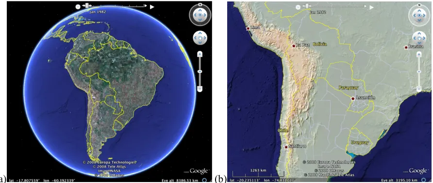
[image:3.595.78.524.284.473.2](a) (b)
Figure 1.
Background datasets in Google Earth.
4. Prototyping ideas and feedback
We addressed some of these limitations through novel, interactive and animated ‘data prototypes’ that support the rapid development of visual ideas. Technologies5 that enable ‘patchwork prototyping’
(Floyd et al, 2007) were employed including: SVG (Figures 2b and 4), KML (Google Earth), Processing (Figure 5) and R (Figure 2c). Google Earth provides built-in aerial imagery and background datasets (Figure 1), which many end-users liked and it was relatively easy to incorporate other datasets such as the elevation model in Figure 1b. The other technologies used are more general-purpose and offer more control over appearance and interaction. Researchers at Exeter University and EUROBRISA project members in Brazil provided informal feedback and suggestions. These users ranged from scientists to decision-makers based in Brazil. For this preliminary study, we did not gather specific requirements from our diverse set of users. Instead, we developed and prototyped ideas for addressing some of the limitations of existing technique identified by the climate scientists and invited informal feedback. This helped us to assess the feasibility carrying out our
4 http://www.metoffice.gov.uk/, http://www.ecmwf.int/, http://portal.iri. columbia.edu/ and
http://www6.cptec.inpe.br/eurobrisa/
5 http://www.w3.org/Graphics/SVG/, http://code.google.com/apis/kml/documentation/, http://processing.org/
Slingsby, A., Lowe, R., Dykes, J., Stephenson,D, Wood, J. and Jupp, T. 2009.A Pilot Study for the Collaborative Development of New Ways of Visualising Seasonal Climate Forecasts. In Proceedings of GISRUK09 (1-3 April 2009), Durham, UK. (http://www.gicentre.org/papers/gisruk09/climate.pdf)
formal study that will deal with specific user requirements from specific user groups of climate scientists at the UK MET office.
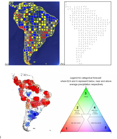
(a) (b)
[image:4.595.109.490.130.580.2](c)
Figure 2.
Tercile-based probabilistic precipitation forecasts.
(a)
Circles coloured by
dominant tercile and sized by the sum of the deviations between tercile probabilities;
(b)
Glyphs where arm lengths correspond to p
1, p
2and p
3(left, bottom and right arms,
respectively).
(c
) The probabilistic forecast (left) is coloured according to the combination of
the 3 tercile probabilities given within the colour space shown in the ternary phase diagram
(right). Hue varies by angle from the centre and saturation varies by distance from the centre.
Colour shows whether drier (p1; red), normal (p2; green) or wetter than normal (p3; blue)
conditions are most likely. Corners denote a probability of 1 for each tercile (high saturation,
high probability of rainfall in dominant tercile category) and the centre denotes equal
probability for all terciles (low saturation, forecast no better than issuing climatology).
Colour is a necessary characteristic of this figure – obtain a colour PDF of this abstract
Slingsby, A., Lowe, R., Dykes, J., Stephenson,D, Wood, J. and Jupp, T. 2009.A Pilot Study for the Collaborative Development of New Ways of Visualising Seasonal Climate Forecasts. In Proceedings of GISRUK09 (1-3 April 2009), Durham, UK. (http://www.gicentre.org/papers/gisruk09/climate.pdf)
4.1. Tercile-based probabilistic forecasts
To explore the design space with users we quickly generated initial ideas and prototypes that map different aspects of the data sets using various techniques. In Figure 2 information about all three tercile probabilities is visually encoded at each location concurrently for a single time period. In Figure 2a circles are sized according to the sum of the deviations between the p-values; thus the smallest circles occur where p1=p2=p3=0.33, where the ensemble forecast tells us little beyond the
known climatology. The largest circles occur where p1=1, p2=1 or p3=1, with hue encoding the
dominant tercile. User groups in Brazil found these maps easy to interpret. In Figure 2b, glyphs are used where the p1 (left arm), p2 (vertical) and p3 (right) values are encoded through length, with
Y-shaped glyphs denoting equal (1/3) probability for all terciles. In Figure 2c colour is derived from plotting the forecast on a ternary phase diagram. Circles are largest for forecasts at the corners and smallest in the centre of the diagram. Initial reactions of users to the latter two design ideas were less positive as they were less immediately interpretable. Sensible concerns were also raised about interpretation of colour by users with colour-impaired vision.
4.2. Comparison of observed and mean forecast precipitation anomalies
[image:5.595.155.443.363.567.2]Figure 3 compares observed with mean forecast precipitation anomalies. Although there is general agreement between whether observed and modelled precipitation anomalies are positive or negative, observed anomalies were more extreme in magnitude and exhibit stronger spatial patterns.
Figure 3.
Observed (left) and mean forecast (right) precipitation anomalies (red circles are
negative anomalies, blue are positive – size of circle indicates magnitude of anomaly).
4.3. Time series
Slingsby, A., Lowe, R., Dykes, J., Stephenson,D, Wood, J. and Jupp, T. 2009.A Pilot Study for the Collaborative Development of New Ways of Visualising Seasonal Climate Forecasts. In Proceedings of GISRUK09 (1-3 April 2009), Durham, UK. (http://www.gicentre.org/papers/gisruk09/climate.pdf)
Figure 4.
Glyphs showing p1, p2 and p3 values for different seasons.
The use of animation in this way is a common but ineffective technique for trend discovery (Robertson et al., 2008) and interactive techniques may be more appropriate. We rapidly prototyped some ideas in Processing which allows interactive and quite sophisticated prototypes to be created, such as shown in Figure 5 which allows temporal data to be explored spatially and vice versa.
Figure 5.
Interactive map that shows the exploration by
grid square
(time-series on the left)
or by
season
(map). It also allows seasons to be selected for inclusion in an animation.
4.4. Brier Skill Score
[image:6.595.88.513.364.517.2]Slingsby, A., Lowe, R., Dykes, J., Stephenson,D, Wood, J. and Jupp, T. 2009.A Pilot Study for the Collaborative Development of New Ways of Visualising Seasonal Climate Forecasts. In Proceedings of GISRUK09 (1-3 April 2009), Durham, UK. (http://www.gicentre.org/papers/gisruk09/climate.pdf)
[image:7.595.118.478.72.246.2]
Figure 6.
Transparency used to indicate the skill (quality) of the forecast using the Brier Skill
Score (BSS). High transparency indicates lower skill.
5. Conclusions and outlook
This pilot demonstrates that cross-disciplinary collaborative work in visualisation is fruitful even where established techniques already exist. All parties involved were exposed to new perspectives and this promoted creative thinking, excitement about the possibilities demonstrated and valuable contributions.
More formal methods are required however. User-centred task-based aims are likely to be core to this activity with long-term workplace-based evaluation. Users initially responded negatively to some of the more complex representations even though they were more information rich. Given time to use them for the tasks for which they were designed may elicit a different response – the Information Visualization community is learning to expect the effective use of sophisticated tools to require training (Shneiderman and Plaisant, 2006). The rapid implementation of ideas as working prototypes facilitated informed feedback and kept all parties engaged. ‘Patchwork’ data prototypes (Floyd et al., 2007) were successful in our pilot and SVG, KML, Processing and R are suitable technologies that allow ideas to be implemented and discussed quickly.
Our formal study design is based onthese conclusions and other methods reported in the literature. Creativity is an important part of the design process and was central to our collaboration. Promoting creativity early the design process leads to better solutions (Jones and Maiden, 2005). Our ongoing design incorporates creativity-promoting activities through the RESCUE methodology, a formal task and workplace-based long-term evaluation (Shneiderman and Plaisant, 2006) and patchwork prototyping (Floyd et al., 2007). This study will be carried out for specific requirements of specific user groups from the UK MET Office.
References
Floyd, I.R., Jones, M.C., Rathi, D. and Twidale, M.B. 2007. “Web Mash-ups and Patchwork Prototyping: User-driven technological innovation with Web 2.0 and Open Source Software”. In System Sciences, 2007. HICSS 2007. 40th Annual Hawaii International Conference on. p86.
Heer, J. and Robertson, G. 2007. “Animated Transitions in Statistical Data Graphics” IEEE Transactions on Visualization and Computer Graphics 13 (6), pp 1240-1247.
Slingsby, A., Lowe, R., Dykes, J., Stephenson,D, Wood, J. and Jupp, T. 2009.A Pilot Study for the Collaborative Development of New Ways of Visualising Seasonal Climate Forecasts. In Proceedings of GISRUK09 (1-3 April 2009), Durham, UK. (http://www.gicentre.org/papers/gisruk09/climate.pdf)
Robertson, G., Fernandez, R., Fisher D., Lee, B. and Stasko, J. 2008. “Effectiveness of Animation in Trend Visualization”. IEEE Transactions on Visualization and Computer Graphics 14 (6), pp1240-1247.
Shneiderman, B. and Plaisant, C., 2006. “Strategies for evaluating information visualization tools: multi-dimensional in-depth long-term case studies”. In Proceedings of the 2006 AVI workshop on Beyond time and errors: novel evaluation methods for information visualization. Venice, Italy: ACM, pp. 1-7.
MacEachren, A.M. 1992. “Visualising uncertain information”. Cartographic perspectives 13, pp10-19.
Acknowledgements
The authors are grateful to the Willis Research Network and the EUROBRISA network project (F/00 144/AT; kindly funded by the Leverhulme Trust) for funding this work. The dynamical ensemble forecast data were kindly provided by ECMWF as part of the EUROSIP project. The digital elevation model is sourced from USGS and the Google Earth screenshots contain background data from NASA and Europa Technologies (used with permission).
The use of colour was an important part of this study; you can download a colour version of this document from http://www.gicentre.org/papers/gisruk09/climate.pdf
Biographies