Rochester Institute of Technology
RIT Scholar Works
Theses
Thesis/Dissertation Collections
5-1-1999
The Design and implementation of a virtual type
specimen
Keli McCreadie
Follow this and additional works at:
http://scholarworks.rit.edu/theses
This Thesis is brought to you for free and open access by the Thesis/Dissertation Collections at RIT Scholar Works. It has been accepted for inclusion
in Theses by an authorized administrator of RIT Scholar Works. For more information, please contact
Recommended Citation
School of Printing Management and Sciences
Rochester Institute of Technology
Rochester, New York
Certificate of Approval
Master's Thesis
This is to certify that
Keli M. McCreadie
With a major in Graphic Arts Publishing has been approved by
the thesis committee as satisfactory for the thesis
requirement for the Master of Science
degree at the convocation
of May 1999
Thesis committee:
Archie Provan
Thesis Advisor
Marie Freckleton
The Design
and
Implementation
of
a
Virtual Type
Specimen
by
Keli
M.
McCreadie
e>
A
thesis project
submittedin fulfillment of
the
requirementsfor
the
degree of
Master
of Science in
the
School
of
Printing
andManagement
Sciences
in
the
College
of
Imaging
Arts
andSciences of
Rochester Institute
of
Technology
May
1999
Dedication
M
To my
family
andloved
ones whohave
supported methrough
my
educational andprofessional
journey.
Your
encouragementand supportAcknowledgements
M
A
specialthanks to
Archie
Provan,
for
helping
mekeep
it
allin
perspective.Due
to
his
guidance,I
wasableto
further
my love
for
typewhileteaching
myself and othersnewideas
aboutthefuture
oftypeandhow it
is
andwillbe
affectedby
technology.
Due
to
Archie's unfailing
support,
I
pushed myselfto
persevere.His
enthusiasm,
excitement and andfresh ideas
helped
mefocus
onproducing
thebest
possiblepiece.I
would alsolike
to thankMarie Freckleton
for her
guidance andideas in
thedevelopment
ofthis thesisproject.
Her
patience and advice combined withher
compassionfor
thestudenthelped
metocreatethisvirtualtypespecimen.
Also,
I
extendmy
thanks toall oftheprofessionalsthatparticipatedin
thesurveys.The
timethey
took tofill
out surveys and make commentswascriticalin
thedevelopment
ofthis thesis.I
alsothankmy junior
graphic
design
students whogavevaluablefeedback
and commentsontheinteractive
piece.Table
of
Contents
Abstract
vChapter I: Introduction
1
Background & Significance
3
Reasons
for
Interest
7
Endnotes
9
Chapter II: Theoretical Basis
ofStudy
10
The Computer
andType Specimen Books
10
Type Specimen Programs
11
The Type Book
11
Linotype
Font Explorer
14
Adobe
Type Manager
(ATM)
Deluxe
4.0
14
Graphic Design
andtheNeed
for
aComprehensive Type Specimen
15
End Notes
19
Chapter III:
Review
oftheLiterature
20
End
Notes
29
Chapter IV: Statement
oftheProblem
30
Chapter V:
Methodology
32
Initial
samplepages33
Second
samplepages36
Questionnaire
37
Results
39
Final
samplepages45
Interactive
sample pages49
Chapter VI: Results
52
Chapter
VII:
Summary
& Conclusions
54
Bibliography
55
Appendix
58
Full
sizeinitial
samplepages59-61
Full
size secondsamplepagesfor
evaluation62-64
Full
sizefinal
sample pages afterevaluation65-67
Abstract
Typesetting
andtypography
have become
misunderstoodterms, if
notobsolete,
due
to the
proliferation of computers.Since every
computeruserhas
access
to
a myriad oftypefaces
andthe
ability
to
modify
type through software,
the true
qualities ofmany
typefaces
have become
unrecognizable.Therefore,
it
is incumbent
upon peopleto
seek outthe
information necessary
to
be
competent
in
the
area ofdesign
andtypography.
A
well-designedtype
specimen
is
the
first
placeto
startfor
a userto
referencetypographic
terminology
and rules.Technical
characteristicsoftypefaces
such astracking,
font
metrics,
leading
and unique recognizable characters could proveto
be
aninvaluable
tool
for many
people,
notjust
designers. In
additionto
atype
specimen
being
a subtletutorial, it
should alsobe
educational.Computer
technology
has
openedthe
door for
many
people andhas increased
their
exposureto typefaces
andtypography.
On
the
otherhand,
it
has
alsoled
many
to
believe
that
by
typing
onthe computer,
they
aresetting
type
correctly.There
aremany
rules and guidelinesthat
shouldbe followed
to
insure
the
correctusage of
type, both aesthetically
andtypographically.
And
everyone-designers,
printers, typesetters
andthe
generalpublic,
needto
learn
andpractice
these
rules andterminology
to
upholdthe
standards oftypography
that
have
evolved overthe
centuries.Type
specimenbooks have been
usedfor
centuries,
anddue
to the
influx
ofdesigners
wereinitially
reluctantto
use a specimen onthe
computer.It did
notseem as
'pure'
as a
type
specimenbook.
The
computer would add glitzandglimmer while
sacrificing quality
andquantity
ofinformation. But
as more andmore specimens
became
availableonthe computer,
it became
obviousthat
huge
amountsofinformation
couldbe included
andcontinually
updated,
whereas
it
wouldbe far
too
muchto
include
in
abook. A
well-designed
user-friendly
specimen couldbe
aninvaluable
tool
to
adesigner.
Many
specimens,
while
being
aesthetically
pleasing,
were not useful as areferencetool
oreducational aid.
While
everyonehas
their
own reasonsfor wanting
specificattributesin
aspecimen, these
needs allbegin
to
intermix
andoverlap,
thusly
forming
acomplex entity.
Designers,
printers andtypesetters
may
allhave different
needs,
but
they
allhave
onething
in
common: everyone wants a useable andhelpful
type
specimenbook.
An
interactive
type
specimenis
anecessary
andvaluabletool
for any
professionalin
the
graphicindustry.
The
ease ofuse, the
ability
to
keep
it
updated,
andthe
cohesiveformat
make aninteractive
specimen useful
to
alllevels
oftype
users.Since
printed materialis
outdated assoon as
it
is
completed,
aninteractive
piecehas
the
flexibility
to
be continually
updated
-keeping
the
users up-to-date onthe
trends,
newsandinformation
Chapter
T
Introduction
Design
ofatype
specimenis "one
ofthe
moststimulating
of alltypographicalprojects.
It is
atask
which provides unparalleledfreedom
to
subjugatecopy
andevery
other normal obligationto the
single objective ofpresenting
atypeface
in
its
mostfavourable
context."
l
This
statementfully
embraces allthat
atype
specimenhas
represented andwillcome
to
exemplify in
the
rapidly
changing
industry
ofgraphic arts.Type
andtypography
is
the
basis,
the
foundation,
of successfuldesign.
Typography
canplay
anumberof roles-it
can
be
usedto
evoke amood,
to
createavisual, to
catch someone's attention or
just
to
communicatea message.Typography
canbe
so subtleit
becomes
almost subliminal.It
may
just
skillfully
enterinto
oursenses,
as we areunawareofits
presenceorits influence. Or it
canbe
sopowerful,
soforceful,
that
it
screamsits
messageinto
ourconsciousness.A
controversialargument
that
is
being
fought constantly in
the
design
worldis
the
battle between
legibility
andaesthetic quality.When
does
onestop
and onestart?
In
the
strivefor
aesthetics, the
creation ofillegible
designs,
whileinteresting
to
look
at,
arecausing
many
to
giveup
onthe
idea
ofactually
reading
the
message.It
has
become
"trendy"
to
break
the
rules ofdesign.
In
breaking
these rules,
designers
arealsobreaking
the
rules oftypography.
But,
many designers
claimthat their
studies ofthe
history
ofdesign
and ofthe
lives
are what
have
allowedthem to
break
these
rules.They
emphasize againandagain
that
they
learned
whatthe
rules werefirst
andthen
usedthat
knowledge
to
break
the
rules.The
standardsthat
werededicated
to type
setting
andtypography
needto
be
taught to
and absorbedby
the
newgenerations ofdesigners
andprinters.These
rules need
to
be learned before
they
canbe
practiced,
andespecially
before
they
can
be
broken. But
the
digital
revolutionhas
brought
anewperspectiveto the
world of
type.
It
has
become
too
easy for
anyoneto
sitdown
and chooseafont
that
is readily
available ontheir
computer.But
most ofthose
working
in
the
graphics arts
field,
such asdesigners
andprinters,
have
not cast asidethe
standardsset
regarding
type
andtypesetting.
Type
founders'specimenbooks
from
the turn
ofthe
century
setthe
criteriafor
design
and productioninternationally.2
People
experienced and educatedin
typography
realizethat
there
is
much moreto type than
just
typing
ona computerkeyboard.
But
asmore
young
computer-literate graphic artists enterthe
workplace,
many
ofthe
proper
typesetting
rules areforgotten,
orwereneverlearned.
A
type
specimenis
oftenthe
only
exposuremany young designers have
to type
andtypography.
Many
type
books designed in
recentyears areinadequate
to
fulfill
the
needs ofmostgraphic
artists,
newto the
industry
orexperiencedveterans.Due
to the
fact
that
graphicdesigners
makeup
the
majority
ofthe target
marketfor
type
specimens,
many
type
companiestry
to
maketheir
specimenbooks
andusing
atype
specimen
book
to
assist onein choosing
atypeface
andusing it
correctly
becomes
lost
in
all ofthe
advertising
hype.
Many
designers,
in
this
fast-paced
world oftechnology
do
nothave
the
time
ordesire
to
usetype
specimen
books.
Since many
type
specimenbooks
and software aregearedtoward those
individuals
who arefamiliar
withtype
-they
may only
showthe
alphabetin
upper and
lower
case,
possibly
withfigures.
What
they
do
not showis any
information
that
someone unfamiliarwithtype
andtypographic
terminology
could
learn
from.
Gustov Jaegar
understoodthis
concept whenhe
stated,
"It is
a mistake
to
believe
that
a conclusivejudgment
of atypeface
canbe
passed onthe
basis
of analphabeticaldisplay."
3
Background & Significance
Now
that
somany
people owncomputers,
and notjust
designers
and graphicartists,
they
need a resourceto
help
educatethem
abouttypography,
the
terminology
and whatit
allmeans.The
Fontshop
Type Specimen Book
is
auseful resource
to
designers
orthose
whohave
a comprehensiveunderstanding
oftypography.4
Created
in
1991
by
British
graphic andtype
designer
Neville
Brody,
this
book is
notonly
aresource,
but
also an example ofdesign
in itself.
Over
5,000
faces
are arrangedalphabetically in
athree-ring
binder,
divided
by
tabbed pages,
eachdesigned
by
adifferent
designer. The
full
alphabet
is
shownThere is
also ashort
history
aboutthe
designer
ofthe
typeface, along
withthe
year
it
wasintroduced. This
book
is
a perfect example of abook
that
is
informative
andvisually appealing
to
designers,
but
it may
be
abit
overwhelming
and even alittle
intimidating
to
someone withnothing
morethan
abasic
understanding
oftypography.
Emigre
is
also anothertype
company
that
is extremely
popularwithdesigners,
for
both
their type
andtype
specimens.Emigre's philosophy
states,
"New
technology
wasthe
genesisfor
the
letter
designs,
ratherthan
impetus
for
change."
The
main goal oftheir
specimenbooks is
to
showthe typeface
in
avariety
of sizes and uses-notto
help
users achieve abetter
understanding
oftypography.
They
geartheir
specimenbooks
to the
computeruser,
but
they
do
not
take
into
accountthat
while mostdesigners
and printersare also computerusers,
they
alsoappreciatetype
andadditionalinformation
that
may
help
them
in
their
design. Some
oftheir type specimens,
which are notbooks
atall,
but
are
posters,
aredesigned merely for
the
sakeofattracting
attention,
notfor
showing
the
forms
ofthe
letters.
The
needsof graphicdesigners
arerarely
metin existing
books
orin
software.In
the
concept stage ofany
design,
many
designers,
myselfincluded,
still referto type
specimensto
locate
the
appropriatefont for
a project.This
has become
increasingly
difficult
due
to type
specimensthat
showthe
alphabet at a smallpoint
size,
ordo
notshowthe
complete alphabet.When
designing
a piecethat
or
learning
the
date
it
was released couldbe
helpful in
adesigners decision
to
use
that
particularface.
In
addition,
many
designers
are often askedto
match atypeface
on a piecethat
waspreviously
done.
This too, is
especially
difficult if
there
is
not acomplete alphabet andthere
areonly
afew letters
to
compare.There
are elementsthat
canbe
included
on aspecimenpagethat
wouldmakeit
easierfor
the
userto
recognize and/oridentify
a specifictypeface.
One
suchelementwould
be
displaying
key
characters,
such ascapital "T"or
"P"
or
lower
case
"g"
for
ease ofrecognition.These
couldbe displayed
on atype
specimenpage
to
assistdesigners in
the
comparison oftypefaces
and aidin
the
recognitionofcharacteristics unique
to
a specificfont.
Key
characterscan alsoincrease
aperson's awarenessof aparticulartypeface,
andthis
feature may be
remembered
long
afterthe
viewerhas looked
atthe
specimen.The
"appreciation"oftype
has
awhole newmeaning in
ourtechnologically
advanced civilization.
The
quality
ofthe
type
specimenhas
suffereddue
to the
vast quantities of
typefaces
available.Since
the
early
1900's,
many have believed
the
quality
ofthe type
specimenbook
has been
gradually
declining.5
But due
to the
high
standards ofprinting
that
areexpected,
along
withthe
equally high
standards
that
peoplein
the
graphicartsindustry
have
toward
typography,
quality
type
specimenbooks
shouldbe
ofinterest
to
everyone involved.6This
also applies
to
aspecimendesigned for
the
computer.If
anything,
a specimenFurthermore,
specimens
of some ofthe
more recent companiesdo
notput outbooks
at all.They
send out ahuge
poster
withmany
oftheir
fonts
featured.
These
posters
usually
consist
ofthe
complete
alphabet of eachface
andperhapsan
accompanying block
oftext.
On
the
back
ofthe
posteris
often a piecedesigned
using
some ofthe
featured
typefaces.
While
these
posters aresometimes
aesthetically
pleasing,
they
fail
to
give muchinformation
aboutthe
typeface
itself,
andlittle
or noinformation regarding
the
designer,
kerning,
tracking,
or characters perpica, to
name afew.
On
the
otherhand,
these
specimen pages are always
visually
interesting
andthey
dare
the
viewerto
openthe
folded
pages.This
exact problemhas
plagued specimenbook
designers
since
the
first book
wasdesigned. Is it
possibleto
combineaesthetics,
bibliographical
information,
andthe
ability
to
appealto
a commercialmarket?7
These
questionshave been
askedfor decades.
As
statedin
the
Monotype
Newsletter
in
1952,". . . numbers of
type
founders'
specimen
books
aredwindling
. . .there shouldbe
a changein
the
marketing
need andthe
conditions."8
These
statements can still
be
asked andappliedto the type
specimens of
today.
The
marketis
definitely
availablefor
aninteractive
type
specimen;
onethat
educates as well asinforms. This
computer-based
specimenwould
be
createdin Director
and wouldbe
cross-platform.The
user wouldhave basic
typographic
knowledge.
By
clicking
on"hot
spots", the
viewer canchoose
to
viewdifferent
aspects ofthe type
specimen.As previously
mentioned,
this
form
of a specimenbook
wouldb
every
user-friendly.
This
educational
tool
Reasons
for Interest
The
wants and needs ofthe
largest
market share of users areoverlooked whenit
comesto type
specimenbooks.
Through
research andinterviews
withtypographers,
designers,
andstudents, the
realizationwas madethat
mostpeople were
intrigued
withthe
idea
of acomprehensivetype
specimen.It
seems
that
many
peoplehave begun
to take type
for
granted;
it has become
too
easy for designers
to
settle on afont because it is
ontheir
computer.There
is
agenuine need
for
atype
specimento
offermorethan
just
an alphabet.Designers
wantto
be
ableto
look
and seehow
leading,
tracking,
andfont
metrics
look in
aparticulartypeface,
as comparedto
another.Key
charactersare
extremely
important,
asthey
help
people recognize certaincharacteristicsthat
may be
uniqueto
a certaintypeface.
They
arestarting
to
appreciate whattype
andtypography
represented centuriesago,
whentype
wasmadeand setby
hand.
Designers
are oftenin
the
positionofcoming
up
with conceptsfor
anew
design
project.The first
thing
he
or she willlook
atis
atype
specimenandchoosea
few different
typefaces.
In
mostcases, the type
chosen will setthe tone
for
the
entire piece.Type
playsanimportant
rolein
the
conceptualend ofadesign,
along
withthe
equally
important
roletype
holds in
regardto
communicating
amessageto the
viewer.In
additionto
using
atype
specimenbook
to
help
in
the
decision
ofchoosing
atypeface
that
may
have
the
rightlook,
adesigner
will also usethe
specimento
comparethe
different
x-heightshave
avery
limited
numberoffonts,
orthey
jump
onthe
trendy
typographic
bandwagon.
They
do
not spendtime
researching
type
to
choose anappropriatetypeface.
They
tend to
usebasic
fonts,
such asTimes
andHelvetica. Due
to the
fact
that
they
have
alimited
knowledge
aboutdesign
andtypographic
history,
they
willplay it
safe or goto the
other extreme andexperiment- sometimeswith
disastrous
results.Students
neednotonly
an aidto
assistthem
in
type
selection,
but
they
need an educationaltool
to
help
them
learn
more aboutChapter
T
End Notes
1.
British Printer
(April
1959
vol.72
),
79
2.
Ibid
3.
Berthold Types Booklet
4.
Berlin,
Fontshop
International
1991
5.
Alexander S. Lawson
Printing
Impressions
(
"The
Hobby
ofCollecting
Type
Specimen
Books"March
1972),
137-138
6.
British Printer (April
1959
vol.72
),
77
7.
Printing
andGraphic Arts Stinehour Press Vol.
1 Number 2
8.
Beatrice
Ward Monotype Newsletter "Problems
ofthe
Printers'
Type
Book"Chapter
1
Theoretical Basis
of
Study
The Computer
andType Specimen Books
Words
arejoined
to
form
verbal sentences andtypographic
lines.The
configurationand placement of
lines
oftype
are significant structuralconcerns.
In its
mostbasic
form,
aline
oftype
consists of a single point sizeand a single weight extended
horizontally
over a specificline
width.'Basic
ideas
andphilosophies which were at onetime taught
such asthis one,
regarding type, its
use andfunction,
arequickly
becoming
obsolete.While
the
concept
is
stillthe same,
many
who practicethis
are not aware ofthe
foundation
upon whichtheir
use oftype
stands.The
computerhas
played amajor role
in
the
graphic arts profession andthe
effects ofit
arebecoming
evident
in
oursociety
aswell asthe
industry.
As
aresult, type
specimens areconsidered
to
be
adying
resourceby
many in
the
graphic artsindustry. Since
awide
variety
of professions arenowusing
the
computer on aday-to-day
basis,
atype
specimencouldbe
gearedtoward
that
market.The
emergence ofthe
computer
has
allowedmany
peopleto
disregard
the
training
andknowledge
they
have
oftypography.
This
machinehas
greatly
affectedthe
profession ofgraphic
design. A
generaldecline
in
the
useoftype,
the
terminology,
the
knowledge
andthe
overallexpectationsthat
many
have
in
regardsto the
outcome of a
finished
piece areglaringly
apparent.Due
to the
embracing
ofone of
the
more essentialtools
ofthe
graphic
arts profession.Many
graphicdesigners do
nothave
the time to
keep
checking
abook.
The
use ofthe
computer
has
caused a generallaziness
in
regardto the
use oftype.
"A
love
ofletters
is
the
beginning
oftypographic
know
how. Whereas
type
may be only
apart of
the
designer's
task, it
mustbe handled
withthe
sametaste
andcreativity
as other
design
elements."2This
basic
philosophy
does
not seem as valid asit
may
have
at onetime.
Type
Specimen Programs
The Type Book
Programs
are now availablefor
the
computerthat
create sampletype
specimenpages.
One
suchprogram,
"The
TypeBook"
creates a page
for
eachfont
on acomputer,
resulting in
the
creationof a completereference manual.The
introduction
to
"The
TypeBook"states,
The TypeBook is
aMac utility
whichaidsin
the
creation and maintenance ofa
typeface
referencebook. This
type
ofreferenceis extremely
popularin
the
Graphics
andTypesetting
industries. It
helps
people(both
clients andemployees)
selecttypefaces
by demonstrating
the
various artistic attributesofeach
face
ona printedpage.3By
stating
that this
helps "both
clients andemployees", this
programis
MinIon-Regular
.ABCDEFGHIJKlilXOPQRSTL^^sTCYZabcdefi^i^Jrimopir^
,
ABCDEFGHIJKLMNO
PQRSTUVWXYZabcde
fghijklmnopqrstuvwxyz
0123456789!?,"<t$&%{}
OieTyptBoo*.
program and select
typefaces.
One
ofthe
majorfocal
points ofthis
programis
that normally, the
computer user wouldhave
to
createhis
orher
own pageswith a
desktop
program
andthen
changethe
font
with each page.This
program,
"eliminates
the
needfor
operatorinvolvement
in creating
each page.
Selection
ofthe
desired
typefaces
and
issue
ofthe
is
allthat
is
required."4
While
this program,
like many
others similar
to
it,
does
offer ease ofuse,
it
does
not offerany
otherinformation
exceptsome
very basic features. It displays
the
fig2-1
alphabet
up
to
18
points, then
jumps
to
48.
The
alphabetis
cropped asit
reaches
the
end ofthe
page(fig.
2-1).
Thus,
asthe
point size getslarger,
the
last
quarter
to
last half
ofthe
alphabetis
not shown.Only
three
paragraphs areshown with
leading. It
does
feature
characters perpica,
but in
terms
offont
metrics, the
"The
TypeBook"
only
offersthe
cap height. The
x-height,
or ascenderanddescender
heights
are notmentioned.The
useralsohas
the
optionofprinting
out apage of complete characters and a page of
the
characterset
(fig.
2-2).
This
page enablesthe
user
to
see whichkey
stokehe
or she needsto
The
user can also print out a page of acomplete
charactershowing,
which canbe
confusing
(fig
2-3).
This
does
showthe
complete character
listing,
but
the
userhas
to
consult
the
page ofthe
key
characterfirst,
to
find
out whereto
find
a specific character onthe
keyboard.
The
large letter format
with nospacing
makesthis
pagevery difficult
to
readand
interpret.
Mlnlon-Regular
!"#$%&'()*+,-./0123456
789:;<=>?@ABCDEFG
HIJKLMNOPQRSTUV
WXYZ[\]
aJabcdefghijk
lmnopqrstuvwxyzf
I
}
~AACENOUaaaaaa^eeeeiiii
n66666uuuut<t'j6
'-?^0oo<>u:3in
7iJaoQs0(5i->V/~A.
. .AAOCE-oe
"'"VOy&taofi
flM%oAEAEEini60#
ouOOm
fig
2-3
LineShowings
ABCDEFGHl|KLMNOPQRSTUVWXYZ!8t?$c% abcdefghijklmnopqrsluvwxyz0123456789
A
line showing is
also an optionthe
user canchoose
to
view.This
alsodoes
notgive muchinformation
(fig
2-4).
There
is
noaccompanying
explanation ofthe
purposeofthis
page.While
this
program andits
capabilities
may
assistthe
computeruser on alimited
level,
it does
not offerany
specificorin-depth information
aboutthat
particulartypeface.
This
type
of programis really
gearedtoward
novicecomputerand
type
users.Someone
withabasic understanding
oftype
willquickly be
disappointed.
astes**
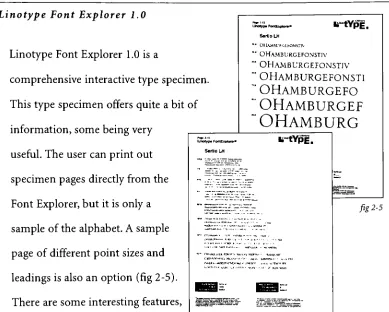
[image:21.573.85.476.87.541.2]Linotype Font Explorer
1.0
Linotype Font Explorer
1
.0is
acomprehensive
interactive
type
specimenThis
type
specimen offers quite abit
ofinformation,
somebeing
very
useful.
The
user can print outspecimen pages
directly
from
the
Font
Explorer,
but
it is only
asample of
the
alphabet.A
sample page ofdifferent
point sizes andleadings is
also anoption(fig
2-5).
There
are someinteresting
features,
such as a
timeline
andmoodindicator
ofthe
type
Unotrp. Ff*x{*onf
iilYp
m SertJoLU ""OllAMJU'PGLhONSTIV " OHamburgefonstiv "'OHamburgefonstiv
nem "OHAMBURGEFON5T1
"OHAMBURGEFO
of "'OHamburgef
"OHamburg
Unotyp*FomExptom* *
PE
SertloLH " k"~-~-:'=-^-."fig
2-5
-~|~~-~:zzj~...
r.","fi"';
:z:'.^.:~'.T"^;.:.z
'"E^?9'^E:E
"'5E3
a:
IslfllliliyfSr
513h1SS
"Adobe
Type
Manager
(ATM)
Deluxe
4.0
Another
example of anelectronictype
specimen
is
the
Adobe
Type
Manager
(ATM
Deluxe)
4.0
(fig
2-6). Specimen
pages canbe
printed
from
directly
withinthis
program as well.These
pages are more comprehensivethan those
out ofthe
Font
Explorer,
but
still notcomplete.A
complete alphabetis
shown,
abcdefghljklmnopqrstuvwxyz
ABCDEFGHIJKLMNOPQRSTUV
1234567890
$%&(.,;:"""!?)
Whtfe tre basicshapes ofletters haven'tchanged muchin
nundredsofyears,there hove been Thousandsofvariations onthe ThemeTherearespecialtypes tor Telephone books. rewspdpe-sand magazines, andfor Theexclusiveuseot
corporations.Some typefaces havealelsurotylookabout them whleconforming to everyday Typographic
>jitkoocraanlrwig everytow ckj a-o-ed for one etc*iiB JusTkeepexamining every low bidquotedfarznce:chtng
Justkeepexamining everylowbidquotedt
,
Just
keep
examining every low bid
Just
keep
examining
every to
Just
keep
examining
Just
keep
exami
Just
keep
exa
[image:22.573.95.484.95.407.2]but
there
is
no mention ofany
other aspects ofthe
type,
such asleading,
recognition
characters,
tracking,
etc.Graphic Design
and
the
Need
for
a
Comprehensive Type Specimen
The
designer
ortypographer
mustdetermine
whenthe
overall effectis
balanced
andfully
integrated. All
design
considerations-typeface
selection,
alignments,
andspacing
-should
display
connectionsthat
are apparentanddistinct.5
Decisions
such asthese
along
with all ofthe
questionsthat
may
arise whiletrying
to
spectype
could allbe
addressedby
asuccessfully
designed
type
specimen.
Many
designers,
along
with professionalsin
the
graphicartsfield,
rely
onthe
computerto
do
all ofthis
for
them.
The
"user-friendliness"that
comeswith
the
computerhas
madedesign
anddesktop
publishing
availableto
everyone,
regardlessoftheir
training.
The
publicis
now saturatedwithpoorly
designed
andtrendy
piecesthat
seemto
be setting
the
standardfor design
andproduction.
Around
the
turn
ofthe century,
typefounders'
specimen
books
used
to
setthe
criteriafor design
andproduction on aninternational
level.6
Type
specimens shouldbe
ofinterest
to
all ofthose
concerned withthe
high
standards of
typography
andprinting.7This
is
not
the
case anymore.Since
most
type
specimenbooks
nowadaysconsistofonly
asmallline
oftype,
sometimes
only
a partialalphabet,
they
are not considered a valuable resourcemood of sorrow or
pain?"
or
"I have limited
spacein
this
layout,
sohow does
the
x-height ofthis typeface
compareto that
are notaddressed.Most
designers
willjust
glancedown
afont list for
their
computer and settle on one.Terms
that
arethe
basis
oftype
andits
usage,
arerarely
used,
if
they
were evenlearned,
by
many
designers
or computer users.If
the
useris
evenfamiliar
withthe term
"em
space",
they
very
oftendo
notknow
that
it
originatedin
the
days
of metal
type,
andit
refersto the
piece of metalthat
is
a square ofthe
pointsize
being
used.Smaller
pieces ofmetal,
whichwouldbe
subdivisions ofthe
"em"
wereused
in
between
words.Many
peopledo
notknow
that the term
"leading"
originated
from
the
metalstrips,
orleads,
that
wereusedbetween
lines
of metal type.8A
type
specimen couldbe
avaluabletool
for speccing
type,
along
withbeing
an educationalpiecefor
users oftype.
Not
only
couldthese
usersbe
exposedto
different
typefaces
andstyles,
they
couldbe
educatedin
the
proper useoftype
andthe
terminology,
if
they
so choose.Since
almostalldesigners
nowdo
their
owntypesetting
onacomputer, the
care and precisiona
trained typesetter
usedin
the
pasthas
become virtually
obsolete.
In
the
early
1900's,
typography
was consideredto
be
one ofthe
moreimportant
andpromising
parts ofthe
graphic artsindustry. The
superb useandconstruction of
type
was adirect
correlationto the
creation of ahigher
standardofprinting.9
Stated
by
Alex White
in
his
book,
How
to
Spec
Type,
"Whenever
you work withbefore
you runheadlong
into
specifying
type."10A
type
specimenshouldbe
aninvaluable
tool to anyone,
ofany
profession, that
usestype.
This
specimenshould not
only
show what a particulartypeface
looks
like,
it
shouldeducatethe
viewer abouttype
in
general."The
basic fundamentals
oforganizing
type
to
mosteffectively
communicateideas
. . .While
printing,
both
editorial(book)
and commercial(ads),
is
the
prime endresultofthis
knowledge."11In
their
defense,
not allblame
canbe
placed onthe
designers. In many
cases,
when
purchasing
type
for
the
computerfrom any
numberoftype
companies,
asamplespecimenpage
pertaining
to that
particularfont,
muchless
an entirespecimen
book
featuring
all ofthe
fonts
soldby
that company,
is
notincluded
with
the
diskette
that
containsthat
font.
And
mosttype
companies assumethat
the
purchaser ofthe
font is
adesigner,
or someonethat
willbe
doing
sometype
ofdesign
withtheir
font. Not
only
wouldthis
be
a chancefor
the type
company
to advertise,
but it
wouldbe
aprimeopportunity
to
begin
to
educatethe
generalpublic,
along
withdesigners,
abouttype
andthe
correct andincorrect
waysto
useit.
One
ofthe
most overlookedproblems withmosttype
specimenbooks
is
that
they
are not gearedtoward
different
professionsanddifferent levels
ofknowledge in
the type
user.Some
specimensaredefinitely
gearedtoward
graphic
designers.
They
may
feature
the
typeface
in
aneye-catching
design.
While
the
designer may
appreciatethe
design,
this type
of specimen pageis
notaddressing
the
characters perpica,
recognizablecharacteristics,
orafeature
that
would allow a comparison of x-heights
between
different
typefaces.
There
is
very rarely any information included
at all.An interactive
type
specimencannot
only
serve afunction,
displaying
atypeface,
but it
can appealto the
computer user
due
to
its
friendly
interface
and ease ofuse.A
comprehensivetype
specimen wouldhave
great appealto the
"average"
userof
type.
At
aglance,
he
or she can seethe
basic
characteristicson acertaintypeface.
But
upon
deeper
exploration,
he
or she canlearn
more about moredetailed
Chapter TT
End
Notes
1
Rob
Carter,
Ben
Day,
Philip
Meggs,
Typographic Design: Form
andFunction
(New York: Van Reinhold
Company, Inc.,
1985),
46
2
Bill
Grey,
Tips
onType
(New York: Van Reinhold
Company, Inc., 1983),
5
3
lim
Lewis,
The
TypeBook,
aPower Tool
from
Jim Lewis
(Golden State Graphics: Santa
Ana)
4
Ibid.
5
lames
Craig,
Designing
withType
(New
York:
Watson-Guptill
Publications,
1980),
26
6
British Printer
(April
1959,
vol.72),
77
7
Ibid.
8
lames
Craig,
Designing
withType (New York: Watson-Guptill
Publications, 1980),
26
9
George
French,
The
Printing
Art (March
1903)
10
Alex
White,
How
to
Spec
Type (New York: Watson-Guptill
Publications, 1987),
8
Chapter
TTT
Review
of
the
Literature
Throughout
the
yearsbetween
1920
to
1940,
there
was atremendous
risein
the
production
oftype
specimen
books
which canbe
directly
correlatedto the
increase in
the
printing
industry.1
Also,
designers began
to
demand
more andmore specimen
books
to
meettheir
evergrowing
needs.Eventually,
type
specimen
books became
morethan
just
an alphabet or afew
words onapage.They
became
adesign
untothemselves
as well asbeing
atool to the
user.Type
specimenbooks
have certainly
come along
way
from
the
first
book
produced
by
a printerin
1567.
This
wasanindexsive
specimenby
Christopher
Plantin
in
Antwerp.2It
is
possibleto
seethe
influence Plantin's
book
had,
andcontinues
to
have,
on successivetype
specimenbooks. Although Plantin's book
only
showed onesize, the
completefont
was present.In
addition,
afew
letters
were shown of
italic,
smallcaps,
lower
case anditalic
numeralsin
eachrepresented size.
Plantin
alsohad
showings ofborders,
ornaments,
andrules.He
alsobelieved
that
a proper printer'stype
specimenbook
shouldbe
abound
volume,
notloose leaf
pages.3Plantin
knew
what
the
needs ofthose
using
the
book
were.But he
alsohad
a vision of whatthe
needs wouldbecome.
To
continue, the
specimenbook
createdby
Theodore DeVinne
took the
book
by
Plantin
onestep further. DeVinne's book
showednumbers,
accentedletters,
andmathematical symbols.
Also,
signs ofthe zodiac,
peculiar sorts andthe
foundry
wherethe type
was cast setthis
book
apartfrom
many
others.4In
In
1923,
American Type Founders
produced
the
mostwidely
used andrespected
type
specimen
book
ofits
time.5This
book
was
the
mostcomprehensive
book
ofits
time
-it
had
anything
adesigner
or printer could want or need.Beginning
with anindex in
the
front
ofthe
book,
many
pages of popularfaces
were shown.The
copyrightdate
andthe
manufacturer were alsodisplayed.
A
complete set ofcharacters
was shownalong
with sentences andwords
in
sizesranging
from
24
pointsto
72
pointsin
basic
increments:
24, 26,
48, 60,
and72.
Only
oneface
is
displayed
perpage,
making it
easierfor
recognition and study.Furthermore,
there
is
also an areadesignated
to
the
showing
ofdesign.6
While
this
book is extremely
thorough
and containslarge
amounts ofinformation,
in
someinstances
there
is
so much contentit
tends to
become confusing
and overwhelming.For
example, the
name ofthe typeface
is
displayed in
that
respectiveface. In
terms
of some script ordecorative
faces,
legibility
becomes
a problem.In
1941,
the
American
Type Founders
released a supplementto
The
Book
of
American
Types.
This
supplementis
enclosedin
a pocketinside
the
front
cover.This
is
avery
efficient methodof storage andit
also makesit
easierto
replaceolder versions withnew updates.
Also,
this
supplement showsthe
influence
ofthe
design
styles ofthe
period.Some
headline
are vertical onthe
page.A
"torn
visually
stimulating
andinteresting. Type
specimens
werebeginning
to
be
seenas not
only
anecessity,
but
also as a creative outletto
showthe
beauty
ofthe
type
andthe
myriad of uses a particularface
canbe
applied.This
supplement,
which stressesthe
beauty
ofthe
specimenbook is
reminiscent of
"The
Rugged
Roycroft"
produced
by
the
American Type
Foundry
of
Boston
in
1902.
This book
showsthat
atype
specimenbook
can alsobe
abeautiful
work ofart;
it becomes
more of anexquisitely done book
than
atype
specimen.
A
beautifully
embossed coversetsthe
moodfor
the
viewer.The
reader
is
greeted withinitial
capsbeginning
the text
whichtells the
story
ofRoycroft
andhis
type.
Accompanying
this text
is
woodcut and pen andink
illustrations. There
are also sampleads and acalendarin
"The Rugged Roycroft".
This is
awonderful exampleof awell executedbook,
but in
terms
of atype
specimen,
it
does
notcontain much usefulinformation. Designers
wouldenjoy
looking
atit for
the
design
aspects,
but
they
would not consultthis
book
to
obtain
technical
information
to
assistthem
in
speccing
type.
In
1952,
Typographica
developed
ahierarchy
to
be
appliedto type
specimenbooks. This
hierarchy
is in
orderofimportance
to
obtainthe
mostsuccessfultype
specimenbook. First in
the
hierarchical
list
is
ashowing
ofthe
capitalletters,
from A
to
Z,
withthe
alternative sortsets afterthe
alphabet.The
capitalletters
arethen
followed
by
the
ampersandandlogotype
capitals,
JE
andGE.
Alternative
capitals,
otherlogotype
capitals arenext,
followed
by
the
lowercase
and oe.
Then
the
alternativelowercase
sorts
are portrayed.Logotype letters
arenext,
followed
by
ligatures.
Small
capitals,
A
through
Z
are nextin
order ofimportance,
followed
by
both
old style and modern numbers.Lastly,
punctuation
is
presented.This
hierarchical
system,
whilebeing
thorough
andincluding
most aspects of aninformative
type
specimendoes
not usethe
mostefficient method of organization
in
displaying
the
orderandcontent ofthe
major points
that
shouldbe
usedin
atype
specimen.In
addition,
all ofthe
lines
in
the
display
are shown withoutthe
amount ofleading
indicated. These
lines
oftext
are notletter
spaced andthere
is
no explanationasto the
purposeof
this.
Also,
the
practical use ofthis
hierarchical
methodis
not aidedby
the
introduction
ofcolor.7On
the
otherhand,
this
specimendoes have many
redeeming features. The
wholealphabetis
shown,
notjust
a phrase or word.An
extremely important
factor
ofthis
book is
that
it
must meetthe
needs anduses of all of
the
peopleimplementing
it:
publishers,
adagencies,
typographers,
and
designers.8
Also,
two
basic ideals
that
werethe
foundation for
this
specimenwere
that
it
mustbe easy
to
handle
andbe economically
produced.8In
1924,
Daniel
Berkeley
Updike
statein
his book "In
the
Day's
Work"that
blank books in
which proofs were pasted were a usefulway
ofdisplaying
type
samples,
but
aloose leaf folder
was an evenbetter
solutionto the
problem ofupdating
the
specimenbook. The loose leaf
method permittedthe
addition ofnew pages
in
the
propersequence.9This idea
of aloose leaf binder became
very
successful
in
displaying
type.
Each
folio
told the
weight andtype
of stockthe
sample was printed
on,
along
withthe
size ofthe
mould usedfor
the
making
of
the
paper usedin
the
book.
Each
folio
was an advertisementfor
a particulartypeface.
These
pages,
at7
inches
by
9
inches
folded
outto
9
inches
by
14
inches.10
Many
specimens usedthe
fold
out conceptto
show additionalinformation.
Herman Zapf
usedit
to
showhis
'Marconi'
typeface.
It
was also seenin
Divertissments
Typographiques,
althoughthe
fold
out was not used onevery
page.11
In
the
Columbia
type specimen,
fold
out pageswere usedto
showtext
at
different
point sizes andleading. Figures
andfractions
were alsodisplayed.
This
type
specimen also showedligatures
with small and swash capitals.An
informative
aspectthat
appliesto
both designers
and printersis
whitetext
reversedout of
black,
to
showboth
legibility
andink
fill in. The fold
outconcept allowed
type
houses
to
show greater amounts ofinfo in
amanageablesize
book.
A
main point stressedin Typographical
hierarchy
wasthe
showing
ofthe
complete alphabet.
This important factor began
to
be
recognizedby
others
who were
designing
andusing
the type
specimenbooks. "The
showing
ofcomplete characterssets
for
eachfamily
and oneline
showing
of eachindividual font is certainly
astep in
the
rightdirection."12
Most
type
specimen
books began
to
showthe
full
alphabet.This became
imperative
for font
The Alphatype
Typemasters'Book ofFaces. This
book,
using up
to
five
pages perfamily,
shows
the
larger
point sizesfrom
24
to
48
onthe
back
ofthe
first
page.The
full
alphabetis
shownin
both
roman anditalic.
Letterspacing
andkerning
are also
depicted
onthe
back
ofthe
page.Showing
the
full
alphabetin
both
roman and
italic is
detrimental
to
designers
and printers alike.It
is
a greataid,
helping
to
compareline length
and character width ofthe
romananditalic
faces.
Eventually,
very few
type
specimenbooks
were shown withonly
partialalphabets.
In
asimilarmanner, the
majority
oftype
specimenbooks
alsodepicted
ablock
oftext,
or atleast
afew
sentencesto
showleading,
kerning
and
the
general color of a paragraph oftext.
Daniel
Berkeley
Updike
wrotein
In
the
Day's
Work,
"The
same passage(either in Latin
orEnglish)
may be
usedthroughout
the
volumeto
showtypes
for book
pagesandthe
comparativeamountof matter whichcan
be
setin
various sizes of type."Thus,
a successfulspecimen
book
cannot surviveonshowing only
an alphabet.While
it
has
apurposeof
identifying
type, it
shouldserve as atool to
help
adesigner
orprinter see
how
text
willlook
when setin
aparagraph or on abook's
page.One
may
also seehow
different leadings look
whenpaired with various point sizes.In
Updike's
book,
he discusses
the
properway
ofshowing
paragraphs;
he
suggests
four
paragraphswithvarying leading. Since
this
wouldtake
up
quite abit
ofspace,
his idea
wasto
possibly
spreadthis
outoverfacing
pages.As
for
larger
sizes,
such asinscriptional
faces,
a separate page wouldbe
included.
13To
appealto
graphicdesigners,
the
Berthold
types
booklets featured different
designers'
sample words and phrases.
By
using
the
sametext
for
these
words andphrases,
users
found
comparison offonts
mucheasier.By
showing
ablock
oftext,
a viewercould seehow
much space wouldbe
required
for
a particular point size of aselectedfont. This became
awonderfultool to
designers
andtypesetters,
who wereconstantly
having
to
deal
withcopyfitting.
Displaying
characters per pica seemedto
be
rarein
type
specimenbooks. If it
wasshown,
it
was oftenin
a chartonthe
back
cover or onthe
back
of
the
font
listing
page.As printing became
moreadvanced,
type
specimenbooks began
to
adaptto
ever
changing
needs.Color
wasintroduced
to
show notonly
the
typefaces,
but
the
quality
andcraftsmanship
ofthe
metaltype.
Some
foundries,
such asL'Astree,
produced aposter.In
the
book
featuring
the
typeface
Kabel,
the
actualconstructionof
the
letter
was shown.The Berthold
types
Booklet
containedfull
display
pagesthat
were similarto
posters.It
alsohad double
page spreadsof
illustrations
and photosincorporated
together
withtype.
It
wasthese
smaller
booklets
that
featured
afew
faces,
or maybe evenjust
onefamily,
that
weregeared
towards
designers
and printers.It
was commonto
see suggestionsofpossible uses of
the
featured
typefaces.
An
example wasin
the
booklet
for
"Medieval:
An Interface
Face."In
this
booklet,
suggestions weregivenfor
the
face
to
be
usedfor letterheads
andbusiness
correspondence.Furthermore,
in
addition
to there
being
tips
onhow
to
usespecificfaces,
the
"Bifur
Alphabet"featured
sample advertisementsutilizing
the typeface
being
featured. This
would
help
showdesigners
proper and accepted use of certainfonts. Most
designers had
a want and"need
to
seethe
face in
useto
determine
the
quality
of
the
typeface."14By
seeing
aface
in
an actualdesign,
adesigner
cangrasp
anidea
of whatthe
face looks like
printed,
orthe
mood orfeeling
it
portrays.Moving
into
the
computerage,
software andprogramshave been developed
to
show
typefaces
andtheir
uses.The
mostcomprehensive exampleis
Linotype's
Font
Explorer 1.0.
This
is
avery
complextype
specimen.There
aremany
different
modulesthat the
usercan choosefrom. The
programoffers'basic'
usage or
'advanced',
sothe
user can choosethe
level he
or she wantsto
useit.
The initial
page showsthe
complete alphabet andthe
designer's
nameandthe
year
the typeface
was created.In
the
'basic'
usage,
the
classifications are shown.It
does
notlist
a complete classificationlist,
withonly
serif,
sansserif,
scriptand
decorative
available.A
second moduleis
the
variations.Here
are suchconcepts as:
expert,
black
letters, handtooled,
titlings,
oldstylefigures,
ornamental,
smallcaps.This
area seemsdisjointed.
Many
ofthese
choicescould
be
combinedwith others.The
third
module representedsymbols.Under
this
heading,
the
user could chooseborders, dingbats,
games,
ornaments,
andphonetic.
Again,
someofthese
seemedto
gobetter
combined with others.The
user couldalso choose
language. An
interesting
concept wasthe
user couldchoose
the
applicationfor
the
type,
such asbooks,
papers, cards,
letters,
andwas
intriguing,
it
wasconfusing
once selections weremade.If
the
user chosethe
'Advanced'modules,
he
or she could searchfor
typefaces
according
to
mood.
This
too
wasinteresting,
but
it
was more of anopinion,
not a provenmethod.
Serif
scale and calculations were also modules.The
user could scaleeither
the
serif orthe
completefont
andthe
program would choose atypeface
that
was similarto
whatthe
useris
looking
for. The
programwill also offersuggestions
based
on atimeline
that the
user canturn
aknob
to
aparticularyear and a
typeface
willbe
chosen.A
great conceptthat
Font
Explorer
does
offer
is making
afile
ofa specimen page.But
it
was adisappointment
when
the
page appearedshowing
only
afew letters.
Lacking
in
this
programwas a
designer
biography
andany
othertypographic
information,
such asChapter
TTT
End Notes
1.
(Type
specimenBibliography,
Kalamazoo
1972
Signature
(US)
5
1948)
2.
Ibid.
3.
Daniel
Berkeley
Updike,
In
the
Day's Work
(Section
onPrinter's Specimen
Books)
(Cambridge,
Harvard
University
Press
1924)
4.
Alexander
S. Lawson
Printing
Impressions
(
"The
Hobby
ofCollecting
Type Specimen
Books"March
1972),
137-138
5.
Book ofAmerican
Types,
American
Founders
1934,
Jersey
City, NJ
American
Type Founders Co.
6.
Typographica
6
(1952),
13
7.
Typographica
6
(1952),
12
8.
Ibid.
9.
Daniel
Berkeley
Updike,
In
the
Day's Work (Section
onPrinter's Specimen
Books)
(Cambridge,
Harvard
University
Press
1924)
10. Sphinx-Continental
Typefounders
Association.
Inc.,
(New
York)
11. Divertissements Typographiques
(Paris,
1928
)
12.
Serif,
The Magazine of Type &
Typography,
"Briefly
Noted"(Number
3,
Fall
1995)
11
13.
Daniel
Berkeley
Updike,
In
the
Day's Work
(Section
onPrinter's Specimen
Books)
(Cambridge,
Harvard
University
Press
1924)
7
Chapter
TV
Statement
of
the
Problem
Design
of atype
specimenis "one
ofthe
moststimulating
of alltypographical
projects.It is
atask
which provides unparalleledfreedom
to
subjugatecopy
andevery
other normal obligationto the
singleobjective of
presenting
atypeface
in its
mostfavorable
context."'
Designing
atype
specimenis
astimulating,
yetchallenging
project.Working
with a
typeface to
showits
beauty
andform is very different
than
choosing
atypeface to
usein
the
design
of a particular project.Be it
abook
or on adisk,
the task
ofdesigning
asuccessful specimenis
onein
the
same.A
type
specimenshould appeal
to the
user.It
should giveinformation
and educate.Since
the
"Virtual Type
Specimen"is
aimed at graphicdesigners,
this
specimen mustbe
visually
appealing,
as well aseducational.Due
to the
growing popularity
ofthe
computerin
the
graphics artsindustry,
the
use oftype
is
suffering.Designers
stillneedto
usetype
specimens.A
type
specimenneeds
to
have features
that
are notreadily
availableto
designers.
And
most
working
professionalsdo
nothave
time to
searchfor information
whenthey
caneasily
choose atypeface
that
is readily
available onthe
computer.Basic
features like
leading,
metrics andtracking
aretreated
by
designers
in
ahaphazard
manner-making it
fit
ormaking it
workthe
easiest andfastest
way
possible.
With
the
newmillenniumquickly
approaching,
aninteractive
type
interactive
piecehas
the
flexibility
to
be
continually
updatedwith newinformation
and newtypefaces.
A
type
specimen mustbe
easy
to use,
convenient andeasy
to
update.Type is
being
generated at anastounding
rate.Somehow,
designers
mustbe kept
abreast of new
developments. Designers
need education onthe
uses oftype
and
typography.
Some designers
arecompromising
their
designs
due
to
alack
Chapter
V
Methodology
In
the
course ofpreparation
requiredfor
designing
the
mosteffectivetype
specimen
book,
comprehensive
research of specimenbooks,
past and presentwas
done.
A study
ofthe pages,
both
aesthetically
and