Library Data Visualisation Transformations: global patterns for research evaluation metrics in China
Cocoa Wu, Aaron Kennedy,Lulu Qiu and Neil Smyth University of Nottingham Ningbo China,
199 Taiking East Road, University Park, Ningbo 315100, Zhejiang, China.
Cocoa Wu: [email protected]
ABSTRACT
The new information environment in higher education libraries is shaped by an ever changing scholarly communication infrastructure and evolving cycles of research production, communication and evaluation. New services have emerged for research data analytics, based around strategic research intelligence. This paper focuses on library data visualisation transformations for research evaluation metrics in physical library spaces using physical hardware technologies and software, notably, in this study, CiteSpace and Google Fusion Table.
This paper focuses on research evaluation metrics and the evolution of a data analytics service in China. Data-driven research intelligence is an emerging need for universities, including reporting to funding organisations. Deeper understandings of collaborative authorship and citation clusters can provide a comparative edge for strategy development. Leading universities need research data to analyse the performance at multiple levels.
This paper focuses on data visualisation in the physical library using wall and table technologies. It showcases how library atrium spaces are transformed through the data visualisation of bibliometric data, where the data can be presented in ways that are beautiful, boring and functional. The paper will demonstrate how library spaces create opportunities for interaction, where researchers can experience data or interact and manipulate data to create new meaning, narratives and stories. The paper presentation will include video examples of data visualisation and the visualisation of data in physical library spaces, projecting a future for data visualisation in new library buildings on university campuses.
Keywords: Data Visualisation; Citation Analysis; Strategic Intelligence; Research Evaluation Metrics Data; Physical Library Spaces.
Library Data Visualisation Transformations: global patterns for research evaluation metrics in China
1. Introduction
The evolving information environment in higher education is shaped by changing scholarly communication infrastructure and evolving cycles of research production, communication and evaluation. New library services have emerged for research data analytics, based around strategic research intelligence, developing on the traditional library roles in communicating information. This paper focuses on library data visualisation transformations of research evaluation metrics in library spaces using physical hardware, in wall and table technologies, and software, notably, in this study, CiteSpace (http://cluster.cis.drexel.edu/~cchen/citespace/) and Google Fusion Tables (https://support.google.com/fusiontables) 1 to enable cartographic research data visualisations.
Traditional university library spaces have been dominated by the communication of knowledge in books, journals and other similar physical formats. Libraries are making repositories of research publications and research data available online and increasingly open access. Data visualisations can feature included in these physical and digital formats. But how can the data itself be communicated in new ways in physical library buildings? Can data be presented as beautiful or artistic and still convey information, a narrative or a story with meaning? How can researchers interact with data from different research projects to gain new interdisciplinary insights?
The challenge is to understand the global networked world of research. The Royal Society produced data visualisations of global collaborations, identifying how research is driven by researchers “seeking to work with the best of their peers and to gain access to complementary resources, equipment and knowledge” (Royal Society, 2011). Many studies have visualised global co-authored networks in maps (Börner & Polley, 2014) or shown connections in the networked world (Slaughter, 2017). Libraries are presenting data visualisations which show correlation and summaries. The challenge is interpretation, knowledge, causation (Pearl & Mackenzie, 2018). Raw data such as lists of bibliometric information for publications would be difficult to communicate in one time. The process of data communication involves taking this raw information and abstracting parts of interest into visualisations that provide cues to the audience in how to interpret the information (Yau, 2013).
The need for the library to communicate data visualisations to different audiences is becoming more important (Zoss, 2016). The traditional library is a neutral place. To clearly communicate data, however, requires exploring the data and highlighting the areas of greatest interest for discussion. This iterative process involves judgements about what is important because the presentation of data cannot include every aspect of information and stories need to be drawn out of the data in order to inspire public conversation, moreover stories tailored for a particular audience (Knaflic, 2015).
Complex network data visualisations can help people to understand connected systems and require new basic literacies in networks and network data visualisation (Archambault, Helouvry, Strohl, & Williams, 2015; Zoss, Maltese, Uzzo, & Börner, 2018). Web of Science data, the primary source for this paper, has been used produce visualisations of global research collaborations, including international co-affiliated networks (Börner, Pentchev, Hutchinson, Pringle, Rollins, Yadu N. Babuji et al., 2017).
This paper focuses on using Citespace. It is a free Java application for visualising and analysing trends and patterns in scientific literature, which has been available since 2003 (Chen, 2018a). There is a practical guide (Chen, 2018b). CiteSpace has developed for domain visualisation (Chen, 2004), patterns in scientific literature (Chen, 2006) and co-citation analysis (Chen, Ibekwe-SanJuan, & Hou, 2010). There have been many published studies using CiteSpace, including key recent examples: a systematic review of scientific mapping literature (Chen, 2017); bibliometric analysis of organisational cultures (Cui, Liu, & Mou, 2018); and, the trajectory of knowledge (Zhang, 2018). There are many examples of visualisation used in library science literature related to bibliometric data, from webometrics as an emerging trend (Thelwall, 2008), to co-word analysis (Liu, Hu, & Wang, 2012) and more recent studies with key-word co-occurrence (Cheng, Huang, Yu, & Wu, 2018), geographic visualisation of research collaborations (Hu, Huang, & Wang, 2018) and highly cited papers (Zhang, Wan, Wang, Zhang, & Wu, 2018). This paper is about the practical use of CiteSpace in a university library and information service. We have been used several key practical texts about CiteSpace (李 杰 & 陈超美, 2017), R (李杰, 2018a) and scientometrics (李杰, 2018b).
The other key software tool used in this study is Google Fusion Tables. Google announced plans to retire Fusion Tables (The Google Fusion Tables Team, 2018). Fusion Tables had been available for nine years, but it was an experimental Google Labs product. In our study it has been a tool for visualising data on maps, with some of the examples included below. Google has now developed alternative products for data visualisation.
2. CiteSpace Method
2.1 Web of Science
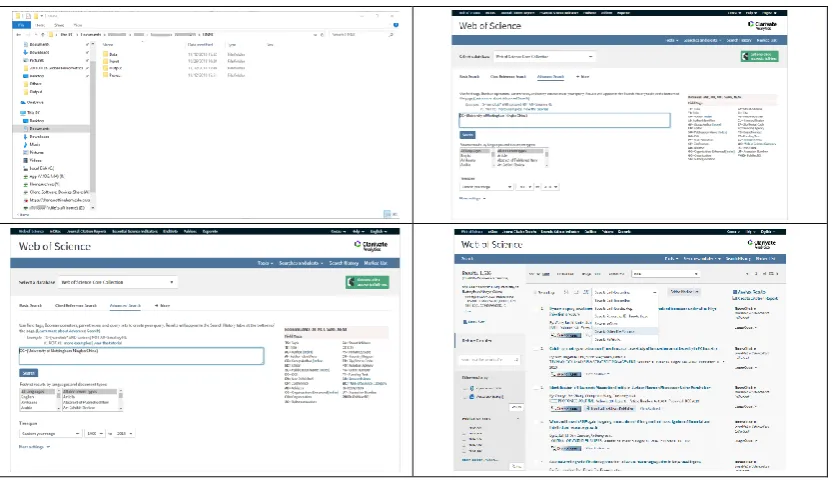
[image:4.595.91.508.231.471.2]The primary source of data for CiteSpace visualisations has been Web of Science. CiteSpace, however, can use data from a variety of sources, including PubMed, arXiv to generate geographic map visualisations with Google Earth. In Web of Science a simple search produces results and data then able to be downloaded.
Figure 1 Web of Science data and CiteSpace
Figure 2 CiteSpace Projects
A new project is created in CiteSpace using the downloaded data (Figure 2). The plain text file is then downloaded. For our institutional data four downloads were needed for all the data. A new project is created with a title and this is combined with the data file through the Data Directory.
Through a few final steps a visualisation can be generated (Figure 3). Time Slicing allows a date range to be selected. There are further options through Node Types, such as author, for visualisations of the outputs and collaborations of an organisations’ authors, or country, for the collaborations of countries. Once these settings are finished, a click will generate the visualisation map. Further edits can be made to colour, label and size in the control panel.
[image:5.595.92.507.467.724.2]Figure 2 CiteSpace Projects
A new project is created in CiteSpace using the downloaded data (Figure 2). The plain text file is then downloaded. For our institutional data four downloads were needed for all the data. A new project is created with a title and this is combined with the data file through the Data Directory.
[image:6.595.92.508.112.362.2]Through a few final steps a visualisation can be generated (Figure 3). Time Slicing allows a date range to be selected. There are further options through Node Types, such as author, for visualisations of the outputs and collaborations of an organisations’ authors, or country, for the collaborations of countries. Once these settings are finished, a click will generate the visualisation map. Further edits can be made to colour, label and size in the control panel.
Figure 3 Time Slicing
2.2 Scopus
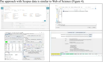
The approach with Scopus data is similar to Web of Science (Figure 4).
Figure 4 Scopus and CiteSpace
A search on Scopus for affiliation retrieves the data. Through the export document settings all the information is selected. The Scopus data is downloaded into the input folder and opened. In the CiteSpace Data Processing Utilities, the named Scopus file is selected. The Scopus RIS file is converted into a Web of Science format for data visualisation.
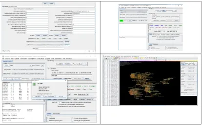
2.3 Dimensions
Dimensions data can also be used in a similar way to Web of Science. The data is downloaded and can be imported into CiteSpace (Figure 5).
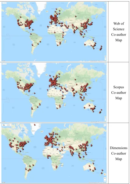
[image:6.595.88.510.597.741.2]3. Library Research Data Visualisations
The data sources for the library research data visualisations are Web of Science,
Web of Science Co-author
Map
Scopus Co-author
Map
Dimensions Co-author
[image:7.595.91.518.140.741.2]Map
3. Library Research Data Visualisations
The data sources for the library research data visualisations are Web of Science,
Web of Science Co-author
Map
Scopus Co-author
Map
Dimensions Co-author
Map
Figure 6 Co-author Maps (Map data ©2018 Google)
Scopus and Dimensions, which were collated on 30 October 2018, 5 November 2018 and 29 November 2018 respectively. The three visualisations above are Co-Author Maps, created using Google Fusion Tables. A co-author is anybody who has collaborated in a publication. The visualisations show the global nature of research collaborations with authors affiliated to an institution (Figure 6). The three visualisations show similar distributions patterns, mainly across Europe, North America and East Asia. The Co-Author Maps are available online: Web of Science (Wu, 2018a); Scopus (Wu, 2018b); Dimensions (Wu, 2018c).
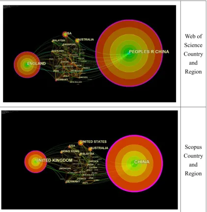
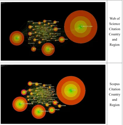
Web of Science Country
and Region
Scopus Country
[image:8.595.93.515.233.665.2]and Region
Figure 7 Country and Region Analysis
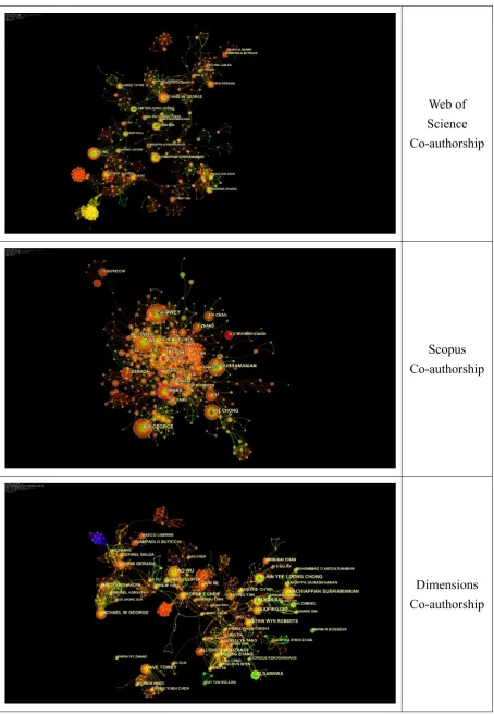
Web of Science Co-authorship
Scopus Co-authorship
[image:9.595.91.546.85.742.2]Dimensions Co-authorship
Web of Science Co-authorship
Scopus Co-authorship
Dimensions Co-authorship
Figure 8 Co-author Analysis Visualisation
the United States of America and Australia. Web of Science and Scopus data produce similar patterns. Dimensions data could not be extracted in CiteSpace for this study.
In the Co-Author Analysis Visualisation (Figure 8) every node represents one author, with links to all the co-authors in each research output. Web of Science, Scopus and Dimensions data identify similar patterns.
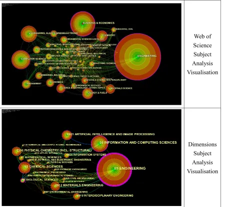
Web of Science Subject Analysis Visualisation
[image:10.595.92.545.198.613.2]Dimensions Subject Analysis Visualisation
Figure 9 Subject Analysis Visualisation
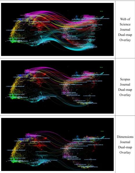
Web of Science Journal Dual-map
Overlay
Scopus Journal Dual-map
Overlay
Dimensions Journal Dual-map
[image:11.595.92.558.70.667.2]Overlay
Figure 10 Journal Dual-map Overlay Analysis
Web of Science Journal Dual-map
Overlay
Scopus Journal Dual-map
Overlay
Dimensions Journal Dual-map
Overlay
Figure 10 Journal Dual-map Overlay Analysis
In the Journal Dual-map Overlay Analysis (Figure 10) the links show the citation relationships between institution affiliated articles and cited references. Web of Science has the most graph lines in our set of visualisations in this study. The main trends across
each data sources is the same, highlighting a concentration of research on key areas: Physics, Materials, Chemistry; Veterinary, Animal, Science; Psychology, Education, Health; Economics, Economic, Political; and, Molecular, Biology, Genetics. In each visualisation, however, the details are different. Dimensions data, for instance, shows articles from the “Molecular, Biology, Immunology” category being cited in “Molecular, Biology, Genetics”.
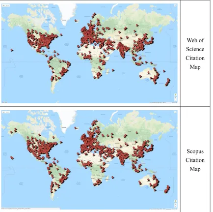
Web of Science Citation Map
Scopus Citation
[image:12.595.93.528.198.629.2]Map
Figure 11 Citation Maps (Map data ©2018 Google)
use Google Fusion Tables. The main benefit of this visualisation is the comparison with co-authors. It helps to show that the citing authors are in different locations, indicating possible new opportunities for future collaboration.
Web of Science Citation Country
and Region
Scopus Citation Country
[image:13.595.93.516.144.575.2]and Region
Figure 13 Citation Country and Region Analysis
use Google Fusion Tables. The main benefit of this visualisation is the comparison with co-authors. It helps to show that the citing authors are in different locations, indicating possible new opportunities for future collaboration.
Web of Science Citation Country
and Region
Scopus Citation Country
[image:14.595.89.537.141.577.2]and Region
Figure 13 Citation Country and Region Analysis
The Citation Country and Region Analysis (Figure 13) develops the focus on the concentrations of citing authors and the institutions where citing authors are located. In this example the locations of co-authors and citing authors match, across China and the United Kingdom. But there the circular concentrations of citing articles are better visualised. Web of Science and Scopus data show similar country patterns. Scopus uses “USA” and “United States.” China is defined in different ways in Web of Science, Scopus and Dimensions. The People’s Republic of China includes Taiwan, Macao and Hong Kong. In Web of Science, for example, the Country and Region field includes
options for “Peoples R China”, “Taiwan”, “Hong Kong” and “Macao”. The Scopus and Dimensions field for “Country/territory” contains China, Taiwan, Hong Kong and Macao options.
Web of Science Citation Institution
Analysis Visualisation
Scopus Citation Institution
Analysis Visualisation
Figure 14 Citation Institution Analysis
Web of Science Citation Analysis Visualisation
[image:15.595.91.543.72.504.2]Scopus Citation Analysis Visualisation
Figure 15 Citation Analysis Visualisation
Web of Science Citation Analysis Visualisation
Scopus Citation Analysis Visualisation
Figure 15 Citation Analysis Visualisation
The Citation Analysis Visualisation above are based on Web of Science and Scopus data (Figure 15). Each node represents one author. The detail is hidden in a Word based presentation. This is one reason why we need to explore data in new library spaces with emerging technologies for large scale visualisation.
4. Discussion
4.1. Services
A key development in the Research Analytics Service was the introduction of data visualisation. This enabled us to visualise co-authorship and citation patterns to develop new understandings within the University. The visualisations helped to facilitate discussion, with new ways to highlight bibliometric information leading to new questions and narratives. Working with our community we are better able to provide analysis for faculty or researchers requests with information about academic subjects, individual researchers, and institutional information for future collaboration.
There are emerging new opportunities for the library to embrace data scholarship. This develops our digital learning environment using data, starting with bibliometric data, methods of inquiry, shaped through immediate business requirements and assets, including publications, technologies and stored data. An important emerging part of our approach is making data visualisations available online and referencing them in this conference paper. It is about developing data scholarship as a more specific area of digital scholarship and digital humanities.
It is about librarians learning more about the methods of inquiry and the processes of research, so this can be linked to emerging technologies in new library spaces. Data will be stored in institutional and external repositories. Scholarly communication will continue to happen through physical books and journals, as well as the online versions. The communication of data in libraries is the emerging area and this will be linked to visualisation in spaces using sustainable technology.
4.2 Spaces
Building new libraries provides an opportunity to consider opportunities and risks. The library atrium spaces provide an opportunity for experimentation. It is already a space for events, art exhibition and even student painting on pillars. It has become a space for data visualisation on table and wall technologies, with distinctive new approaches.
interactive, with visitors to the library clicking on a bubble of the author institutional location, prompting links to bibliometric data.
The wall technology allows a video showing data visualisation to be displayed with a story summary. The content on the screens is a narrative summarising research data. It was built around data visualisations using Google Earth, CiteSpace and bibliometric data from Web of Science, Scopus and Dimensions. It was edited using Adobe Premier.
4.3 Positioning
In research, the challenge is to further develop content with cultural, historical, and sociological areas. Our programme will be organised into four areas of data visualisation: research; teaching and learning; commercial and business; and, beautiful data for art. This might include, for example, projects on the city, the influence of the province in the tea trails and marine, oceanographic and sea trade representations.
The library cannot be neutral. The library is contesting territory in strategy, assessment, and planning. There are challenges beyond summarising data. There is a need to be brave in embracing new technologies.
5. Conclusion
Libraries are transforming spaces for interaction through the innovative use of data visualisation. In this study we have focused on the visualisation of bibliometric data from Web of Science, Scopus and Dimensions using CiteSpace and Google Fusion Tables. The visualisations have been communicated in library spaces, using table and wall technologies. The new challenge is for librarians to communicate pictures through storytelling. Librarians need to be smarter and braver to influence strategies for improving publication performance.
6. Acknowledgements
We are grateful for permission from Chaomei Chen to use CiteSpace in this conference paper.
We are grateful to Web of Science, Scopus, Dimensions who give permission for the use of data and the related visualisations.
REFERENCES
Archambault, S. G., Helouvry, J., Strohl, B., & Williams, G. 2015. Data visualization as a communication tool. Library Hi Tech News, 32(2): 1-9.
Börner, K. & Polley, D. E. 2014. Visual insights: a practical guide to making sense of data. Cambridge, Massachussetts: The MIT Press.
Börner, K., Pentchev, V., Hutchinson, M., Pringle, J., Rollins, J., Yadu N. Babuji, Y. N., & Duede, E. 2017. Web of Science™ as a Research Dataset. Paper presented at the 16th International Conference on Scientometrics and Informetrics, Wuhan, China.
Chen, C. 2004. Searching for intellectual turning points: Progressive knowledge domain visualization. Proceedings of the National Academy of Sciences of the United States of America, 101: 5303-5310.
Chen, C. 2006. CiteSpace II: Detecting and visualizing emerging trends and transient patterns in scientific literature. Journal of the American Society for Information Science and Technology, 57(3): 359-377.
Chen, C., Ibekwe-SanJuan, F., & Hou, J. 2010. The Structure and Dynamics of Co-Citation Clusters: A Multiple-Perspective Co-Co-Citation Analysis. Journal of the American Society for Information Science and Technology, 61(7).
Chen, C. 2017. Science Mapping: A Systematic Review of the Literature. Journal of Data and Information Science, 2(2): 1-40.
Chen, C. 2018a. CiteSpace. Available: http://cluster.cis.drexel.edu/~cchen/citespace/ (Accessed 4 December 2018).
Chen, C.; How to Use CiteSpace. Available: http://leanpub.com/howtousecitespace (Accessed 3 December 2018.
Cheng, F.-F., Huang, Y.-W., Yu, H.-C., & Wu, C.-S. 2018. Mapping knowledge structure by keyword co-occurrence and social network analysis. Library Hi Tech, 36(4): 636-650.
Cui, Y., Liu, Y., & Mou, J. 2018. Bibliometric analysis of organisational culture using CiteSpace. South African Journal of Economic and Management Sciences, 21(1).
Hu, J., Huang, R., & Wang, Y. 2018. Geographical visualization of research collaborations of library science in China. The Electronic Library, 36(3): 414-429.
Liu, G.-Y., Hu, J.-M., & Wang, H.-L. 2012. A co-word analysis of digital library field in China. Scientometrics, 91(1): 203-217.
Pearl, J. & Mackenzie, D. 2018. The book of why: the new science of cause and effect. New York: Basic Books.
Royal Society; Knowledge, networks and nations: Global scientific collaboration in the 21st century. Available:
https://royalsociety.org/~/media/Royal_Society_Content/policy/publications/2 011/4294976134.pdf (Accessed 3 December 2018).
Slaughter, A.-M. 2017. The chessboard and the web: strategies of connection in a networked world. New Haven: Yale University Press.
The Google Fusion Tables Team. 2018. Notice: Google Fusion Tables Turndown. Mountain View, California: Google.
Thelwall, M. 2008. Bibliometrics to webometrics. Journal of Information Science, 34(4): 605-621.
Wu, C. 2018. Web of Science Co-author Map. Available:
https://www.google.com/fusiontables/DataSource?docid=1kvS0pPnyefwpN_k zeIy-aZXEwY-ArlFGqM8FnDqr (Accessed 4 December 2018).
Wu, C. 2018. Scopus Co-author Map. Available:
https://www.google.com/fusiontables/DataSource?docid=15GHda6vEqumCsu coyJdpOWBvQ2-od-bzCYZAPMeC (Accessed 4 December 2018).
Wu, C. 2018. Dimensions Co-author Map. Available:
https://www.google.com/fusiontables/DataSource?docid=1J4RxFThUoMbkdF Tb20NCFsR7h64TYNowCPG8zS1r (Accessed 3 December 2018.
Wu, C. 2018. Web of Science Citation Map. Available:
https://www.google.com/fusiontables/DataSource?docid=1hir1mKONAXWL 6TgXfBRDB26qLk3qMYNBVtwAdUGU; 4 December 2018.
Wu, C. 2018. Scopus Citation Map. Available:
https://www.google.com/fusiontables/DataSource?docid=1MtfPnNwa5wpRa1 -Po1jJ_hRIfAG267nTWpp3Fycq (3 December 2018).
Yau, N. 2013. Data points: visualization that means something. Indianapolis: John Wiley & Sons, Inc.
Zhang, N., Wan, S., Wang, P., Zhang, P., & Wu, Q. 2018. A bibliometric analysis of highly cited papers in the field of Economics and Business based on the Essential Science Indicators database. Scientometrics, 116(2): 1039-1053. Zhang, Z. 2018. Visualization analysis of the development trajectory of knowledge
sharing in virtual communities based on CiteSpace. Multimedia Tools and Applications: 1-15.
Zoss, A., Maltese, A., Uzzo, S., & Börner, K. 2018. Network Visualization Literacy: Novel Approaches to Measurement and Instruction, Network Science in Education. Cham: Springer.
Zoss, A., M. 2016. Designing Public Visualizations of Library Data. In L. Magnuson (Ed.), Data visualization: a guide to visual storytelling for libraries. Lanham: Lanham : Rowman & Littlefield.
李杰 & 陈超美. 2017. CiteSpace::科技文本挖掘及可视化(第二版). 北京: 首
都经济贸易大学出版社.