Rochester Institute of Technology
RIT Scholar Works
Theses Thesis/Dissertation Collections
5-2015
Motion Sequence Teaser for a Trilogy by Satyajit
Ray
Ashoomi Dholakia
Follow this and additional works at:http://scholarworks.rit.edu/theses
This Thesis is brought to you for free and open access by the Thesis/Dissertation Collections at RIT Scholar Works. It has been accepted for inclusion in Theses by an authorized administrator of RIT Scholar Works. For more information, please [email protected].
Recommended Citation
Ashoomi Dholakia
Master of Fine Arts in Visual Communication Design
School of Design
College of Imaging Arts and Sciences Rochester Institute of Technology May, 2015
This Thesis been made possible due to the continual support and encouragement of family and friends. I am very grateful to each and every person especially my husband Ashwin Inamdar without his support this thesis would not have been possible.
Special thanks to the dedicated faculty at the Rochester Institute of Technology, especially my advisors Daniel DeLuna, Chris Jackson and Shaun Foster who provided invaluable guidance, support and motivation.
Daniel DeLuna
Chief Advisor, Professor Visual Communication Design
Chris Jackson
Associate Advisor, Professor Visual Communication Design
Shaun Foster
Advisor Assistant, Professor Visual Communication Design
Table of Contents
1
Title
2
Acknowledgements
5
Abstract
6
Introduction
9
Review of Literature
13
Process & Ideation
15
Pre-production
Story boarding Style frames
20
Production
Modeling
Texturing and UVing Animation and rigging Lighting and rendering
25
Post-production
Challenges
32
Summary
34
Conclusion
35
Appendix: Proposal
Art is omnipresent, and the exclusivity in any form of art comes from our surrounding and the environment that we surround ourselves with. This thesis attempts to
investigate the characteristic work of an Indian director, Satyajit Ray (1921-1992) from a modern point of view and bring back his work that has been forgotten with time. Satyajit Ray introduced the Neorealism movement 1 to Indian cinema, and came to be known for his artistic style which offered a certain sense of universality to the expression depicted. The honest portrayals in his work resonated with the international audience for the first time in the history of Indian cinema.
Neorealism is a documentary style of shooting movies where they mostly used
non-professional actors and filmed at real locations, in real environments. The point was that of capturing life in its purest forms which mostly addressed the rural and the poor class in the society.
My thesis engages in studying the significance of Ray’s work in today’s world, and briefly discusses ways to incorporate the same kind of work with today’s technology and audience. I have studied one of his masterpiece’s called “The Apu Trilogy” which is a fusion of sadness, humour and poetry with exceptionally little resort to the spoken words. It’s an attempt to establish a connection between his films with the contemporary American culture, hence navigating across culture boundaries. Attention to detail, minute observation, and appreciation of issues in a mundane human life were characteristic features of Ray’s work. These are some points that I am trying to focus on through an audio-video presentation. This thesis will attempt to reintroduce Ray’s virtues into a rather modern setting of today’s time.
Keywords: satyajit, ray, neorealism, documentary, culture, indian cinema, poetry,
modern, audio, video, honest, international, history, human, contemporary.
1. Iannone, Pasquale. 2014. BFI Film Forever. June 13. Accessed April 05, 2015. http://www.bfi.org.uk/
“Not have seen the cinema of Ray would mean existing in the world without the sun or the moon.”– Akira Kurosawa.
Satyajit Ray has worked on 36 films, several shorts and many stories as an artist and film maker. From the start of his filmography, Ray has always had a unique and exclusive way of introducing the character in his movies. His focus has always been on realism, giving a different dimension to the characters through his backgrounds and other elements. He was known to use a simple plot which was adorned by plenty of space and time around it, hence facilitating the viewer with enough opportunity to observe the characters’ relationship with each other as well as the environment. Authentic music was a very important part of his stories as well.
This project was selected as I deeply feel that our society can benefit from Ray’s virtues, for several reasons:
1. Today’s commercial cinema has the biggest platform to reach out to the masses. However, it reflects more on the glamorous side of human beings. And although it is far away from the accurate depiction of the state of the society, it builds TRPs. Ray, on the other hand, liked to focus on the more ‘everyday’ aspects of human desire and emotions which are very well showcased through his artistic lens.
2. People have known India as the land of producing Bollywood movies which misrepresents the country, and which, in my opinion, needs to be corrected by reinforcing works of directors like Satyajit Ray, Shyam Benegal, Rajat Kapoor etc.
3. I came across Satyajit Ray’s work for the first time in an art festival in Mumbai through his film Charulata - The Lonely Wife, which showcased how a life of an average wife is, in an Indian traditional household. It was topics like these that he picked which gave an ordinary life an extraordinary perspective.
This realist movement that Ray set in India from 1950s to 1980s helped Indian cinema receive international recognition. Incidentally, this was also a time of revolutions in
European cinema: Italian Neorealism, French Nouvelle Vague, the Free Cinema of Britain and the post-war films from northern, central and Eastern Europe 2. This movement gave people a new direction to think and act upon in life.
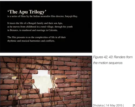
To introduce today’s generation of film makers and audience alike to this realistic work, a motion sequence is made that encapsulates Satyajit Ray’s film named The Apu Trilogy. It was a series of three films which is focused on a boy named Apu and his life, transitioning through his birth, childhood and adulthood. The films represented three significantly different stages in Apu’s life, emphasizing on his struggles, family and relationships. The trilogy consisted of the following films:
1. Pather Panchali (Song of the Little Road, 1955) 2. Aparajito (The Unvanquished, 1956)
3. Apur Sansar (The World of Apu, 1959)
The characters in these films are scripted to be tightly knit with each other, so that every little change impact their relationships considerably. This dynamic among the characters is a bonding factor for the three films. In my motion sequence I have tried to cover this spatial aspect of his films through different sets of visuals. The sequence is divided into 6 scenes that take us through the journey of Apu’s life.
I have also always liked working with materials and environment modeling in Maya, and this was a perfect chance for exploring that as a challenge. Satyajit Ray, being a
Introduction - continuation
calligrapher, gave me an opportunity of giving this piece an organic feel by including words and tying this piece with a story that would take the viewer through the spaces that signify Apu’s life. The visual treatment is inspired by the works of the artists like Kyle Cooper, Saul Bass, Karin Fong and Michael Riley. Through learning about all these different artists, I have learned that getting through to the audience in AV pieces with shorter durations is a challenge, and can be overcome through consistently powerful and apt imagery. This is what I have tried to establish with my motion sequence piece in this project.
Introduction - continuation
The path I started exploring after my proposal was that of creating a title sequence for all the films of The Apu Trilogy. I started collecting references for each film and started storyboarding them. But while doing so, I realized that the title sequence approach was not helping me achieve my goal of getting Ray’s work to the international platform. It merely allowed me to set a stage for this series. However, in order to go beyond this step, I realized I needed to reintroduce Ray’s work by interpreting and capitalizing on his styles, as well as merging some of his styles with those of other artists (such as Kyle Cooper). I revisited the base concept and comprehended that I need a more holistic approach to this problem.
Through a brainstorming session with my professors and peers, and some more
research, I decided on attempting a visually powerful piece that gave an experience and the tone that Ray’s movies had, that would help me establish what I was looking for. Such a visualization, or simply an AV piece, could be shown in film festivals, museums and art shows where people could understand, imagine, research, and reminisce this director better. The goal was to create an interest in the subject which would inspire my audiences to take an initiative and investigate for his work.
This project now had multiple goals which I was trying to accomplish;
1. Research on Satyajit Ray - what was he like, his childhood, education, hobbies and how did he begin his career?
2. Create a seamless, pleasant, 3D experience through animation, visual, sound, color and type.
3. Explore tools that would help me make all of this successful.
Review of Literature
Here are the list of few resources that I explored post proposal:
ONLINE ARTICLES
Pather Panchali: A Living Resonance – an interview by Indian diplomacy on YouTube
https://www.youtube.com/watch?v=arzpoAOFlfQ&feature=related
In this video we have interviews from legendary directors like James Ivory, Richard Attenborough and Derek Malcom talking about the details of the Apu trilogy and what went into making the films so extraordinary. It talks about the struggles faced, the humanistic explanation of the world and his commitment to art.
Viewpoints on Satyajit Ray: Shyam Benegal, Richard Attenborough, Martin Scorsese – An interview by Social ontology on YouTube
https://www.youtube.com/watch?v=XNBRLrJnEb0
Distinguished filmmakers discuss the contribution that Satyajit Ray made to the society of cinema and art.
Winds from the East by Nitesh Roy - Wednesday, December 17, 2008
http://windsfromtheeast.blogspot.com/2008/12/satyajit-rays-aparajito.html
This source is an excellent analysis of the movie Aparajito and talks about how Ray went about this movie. His relationship with the camera, the subject and the surrounding. It has also pointed out some interesting connection on how Ray admired John Ford’s work and how he has incorporated some of his elements in this movie.
The Apu Trilogy – by Satti Khanna on Film Reference
montage to create the tension, vastness in the space and matter in any piece he selects for his films. Sound becomes an important element of montage to convey different feelings and emotions. So editing was an important part of this particular film.
Lives Less Forgotten – Posted on February 18, 2013
http://rajsaday.com/?p=2349
This article gives an insight of Ray’s crafting skills and exposure to his international experiences working with directors like John Huston and Akira Kurosava. It talks about his diversity as a person and a director.
BOOKS
The Cinema of Satyajit Ray, Between Tradition and Modernity by Darius Cooper. Published by Cambridge University Press 2000
This books talks about Satyajit Ray’s ideologies as an acclaimed artist. It speaks about the challenges Ray had creating movies being a Bengali director, and most of all makes an attempt to study the cinema Ray created from an aesthetic and social perspective.
Satyajit Ray The inner Eye, a biography of a master film maker by Andrew Robinson, published in 1989 by André Deutsch Limited.
“The eye, which is said to be the window of the soul, is the primary means by which the brain may most fully and magnificently contemplate the infinite works of nature…”
– Leonardo da Vinci
This books is a perfect example of Ray’s own interpretation of how he made it big for himself, his struggles and his path to success.
MOVIE TITLES AND MOTION SEQUENCES
Fin produced by Superfad productions and directed by David Viau.
I really liked how this piece is so poetic and takes you through the journey of fantasy. The colors, type and animation also make the transitioning really smooth and story-like.
The Painted Veil – by John Curran 2006
This title sequence is a great example of how the sequence transforms from realistic to stylized so smoothly, taking the viewer into the movie without realizing the medium.
The New World – by Terrence Malick 2005
This title sequence is a collection of illustrations which are set in different layers and well-animated with simple transitions that made me understand the importance of simplicity and navigating through a two minute long piece.
Process & Ideation
The process of thesis was a great learning experience as there were a lot of things I was doing in here for the first time. After my approval of the proposal I started reviewing a lot of references to see how I can start story boarding this concept. I reviewed the films multiple times and made the list of scenes I wanted to highlight for setting the expectation of the films to my audience. Since my target audience was both male and female who were mainly young aspiring film makers and art appreciators, I had to make sure that my piece had an appeal that would match them equally.
One of my big challenges was to capture the neorealism essence to my film as the director’s approach towards the concept, was a very interesting. He tried working with non-professional actors, using modest resources, and shooting on actual locations as he went through the process of making the three movies. I have attempted to capture a similar element of rawness to my piece as that was a key feature of Ray’s film too. Through my piece I have tried to take the viewer through the philosophy of the movies
have symbolical represented a moving train that takes us through different phases of his relationships, as it was the main mode of transport in the three films of connecting Apu to his family back and forth from village to the city. But towards the end Apu
understands the meaning of life when he has his own family and a symbolism expressed by the blooming of a lotus which shows his maturity towards people and life around him.
Another big challenge was that the films were in black and white and I wanted to add color, the reason being it would draw the attention from modern audiences.
For all the rawness of life and emotion on the screen, these are works as sophisticated in technique and sensibility as the Indian civilization that produced their maker.
A black and white rendition of the AV piece did not seem as effective, since it would be repeating what was already present in the movies. I started collecting reference and making mood boards, and initiated the process of peer review through showcase and Q&A. The responses I got were not very far away from the direction I was heading in. People wanted to see a style in my sequence that echoed what the original movies were like. Also, Satyajit Ray was also known for his humanistic approach to the movies. So extremely stylizing the AV piece would not compliment his method. I chose to use 3D since I was most comfortable in this arena. I wanted to add color just enough to reverberate the real natural scheme as his films were very simple, so the viewers could concentrate on all the elements in the movies. I have divided my process into three stages: Pre-production, production and post-production.
Process & Ideation
— Pre-productionPre-production
Ray had a unique way of directing his scenes and his editing style gave an interesting twist to the simplicity of his films. All the three films of The Apu Trilogy are the
progression of events which are derived from the narrative and the character. It’s a story of a boy and his transitions and experience throughout his life time.
Process & Ideation
— StoryboardFigures 1, 2, 3: Storyboard sketches
Storyboarding
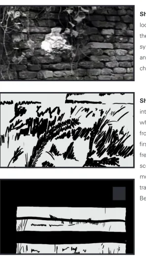
Shot 1 - The film starts off by looking at the distant train through the hole in the brick wall, which symbolically represents the new and open world through the character’s (Apu) point of view.
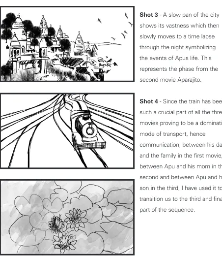
Shot 2 - The camera ventures
Shot 3 - A slow pan of the city shows its vastness which then slowly moves to a time lapse through the night symbolizing the events of Apus life. This represents the phase from the second movie Aparajito.
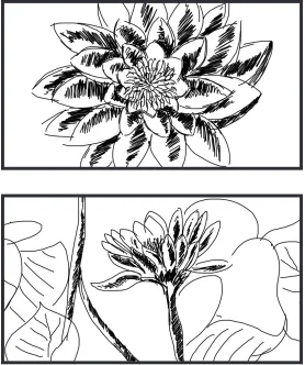
Shot 4 - Since the train has been
such a crucial part of all the three movies proving to be a dominating mode of transport, hence
communication, between his dad and the family in the first movie, between Apu and his mom in the second and between Apu and his son in the third, I have used it to transition us to the third and final part of the sequence.
[image:18.612.73.525.126.646.2]Process & Ideation
— StoryboardProcess & Ideation
— Story BoardShot 5 - The lotus blossoming
[image:19.612.71.349.138.470.2]represents maturing of Apu from his adolescence to manhood, that is symbolized by the lotuses in the pond where Apu comes to an agreement with the society and accepts life for what it is, which is a part of the third movies.
Process & Ideation
— Style FramesStyle Frames
[image:20.612.70.533.223.552.2]I wanted to stay close to the realistic look and feel of the movies as they were simple and black and white in color. Hence one of my objective was to experiment with color and add effects that would give a fantasy feel to the piece creating a poetic experience.
Process & Ideation
— ProductionProduction
For the production of the motion sequence, Autodesk Maya 2015, Adobe After Effects CC, Adobe Premiere Pro CC and Adobe Photoshop CC were used primarily. These were operated on both Windows 7 and OS X.
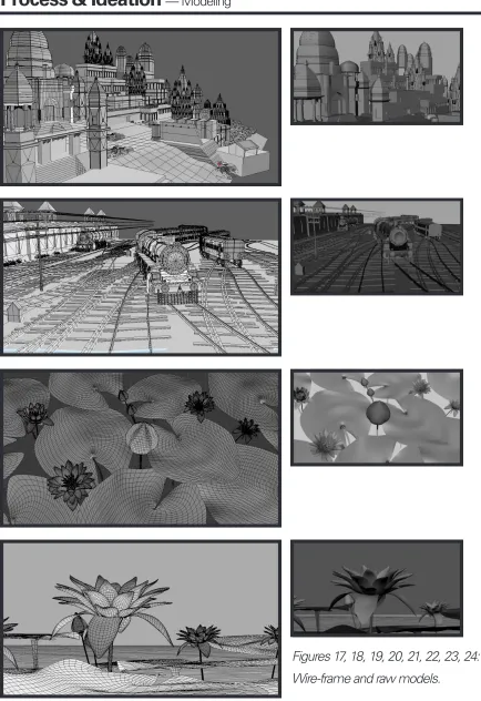
Modeling
[image:21.612.71.492.378.677.2]Most objects in the scene are modeled in quads. Although, some of them will show triangles, since they were made using simulation techniques such as nCloth. Symmetrical objects were created using image planes in the front and the side view, and then using the box modeling technique. However, for the temple scene, a camera based modeling technique was used to create an illusion of depth. All the modeling was done in Maya.
Process & Ideation
— ModelingTexturing and UVing
Although not all the objects were UV unwrapped, some of the ones that show closely to the camera were intricately unwrapped. Examples of such objects are buildings closer to the camera in the temple scene, lotuses, ground planes, the brick wall in the first scene etc. Photoshop was used to create PSDs as initial textures which were then converted into PNGs for the final renders.
[image:23.612.73.542.268.720.2]Process & Ideation
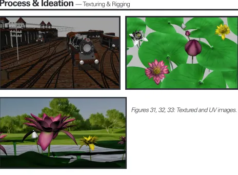
— TexturingAnimation and rigging
Animation of all the shots was done in 24 fps. The scenes were relatively slow in pace, which was in accordance with Ray’s work. Rigs were created with a global Scale attribute which allowed the rigs to merge in well with the scenes created.
Process & Ideation
— Texturing & Rigging [image:24.612.74.538.95.436.2]Figures 31, 32, 33: Textured and UV images.
Lighting and rendering
The physical sun and sky system was used for the most part, since it allows an outdoor setup of lights with ease. In most cases this was edited before use. Individual scenes were divided into render layers. Sequences of TIFFs for various render layers were rendered from the Maya file.
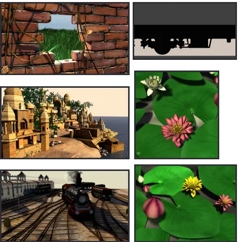
[image:25.612.72.546.232.709.2]Post-production
After the scenes were made in Maya tiff sequences were published and taken into after effects where all the compositing was done. Since most of the scenes were rendered in layers compositing was an important part of my motion sequence. Vignette was added to the piece to give a complete look and tie all the scenes together and give a real camera effect. The files from after effects were carried over to Adobe Premiere Pro where the sound was edited, converted to the wave format and carried over to after effects. I then added noise and camera shake to replicate the effect of the actual films since they were shot in 1950s. The type was added to tie all the visuals, where I used a calligraphic font to give an organic feeling to the sequence. The animation of the type was very simple and subtle just enough to give a basic context to the viewer and the rest of the experience is carried over by the visuals.
[image:26.612.74.540.385.756.2]Process & Ideation
— Post productionProcess & Ideation
— Post productionProcess & Ideation
— Post productionThe execution of this project was challenging in several ways, starting from interpreting colors for a series of black and white films to compositing in After Effects to look as naturalistic and real as the actual film.
Due to the limitation of technology & resources in the 50s the films were not shot in color, but the director started using color in his later movies. Hence to understand how the director used color, I had to watch different pieces of Ray’s work to understand his approach towards color and style. As the director was a neorealistic director his idea of color & lighting was to keep it as natural and subdued as possible. That was a good start for my project, I collected reference of the elements that I used in my motion sequence like the brick wall, field, the Benaras city, the train, the lotus and the pond. Since all these objects were so definite in my project, I had to make them as real as possible. To capture this realistic effect I had to UV map all the objects very well in Maya and not just assign them plain materials. I then took all the maps in Photoshop and painted them with real references. For the brick wall I got the reference of rusted brick and painted to make it look old and tethered. The field scene was completely colored and rendered in Maya paint effects. The train took the longest of all the models, as it was the steam locomotive engine which was an old model that ran in 1950s & 60s. I had to visit museum to get the exact reference of the engines and how it would function so it could look as real as in the film. The city scape was also very challenging as the city was very different from what it is now. Photography was not very popular in those days in India, hence getting the right references of the painting on the wall the flooring was mostly left to my imagination, and referencing from what is left of it now.
The other challenge was to make sequence look less digital and more live footage, as this piece had to be close to what Ray’s movies were like. To overcome this part I had
Process & Ideation
— Challengesactual movies. I created the vignette in after effects, reduced the opacity and added wiggle script to give a natural feel to it. I than added noise to give a film grain quality effect which makes it again more life like and connectable to the audience to what the movies are like.
Another challenge was to give this animation a poetic feel and connect to Ray’s
interpretation of life. Hence to achieve this, I decided to add fog which would connect all the scenes together and compile them to one holistic motion piece. I was not a Maya software expert and to save me more time in learning particles and rendering in Maya, I decided to create this in After Effects. This worked really well for me and it exactly helped to illustrate the effect I was going for. The symbolic explanation to fog was, it gives us an idea as to how the rural life in India is, it is very dusty and smoggy. It also creates an element of mystery to Apus life, like there is always a factor of big unknown as how things will end up in his life. And the haziness helped to create that interest in the piece.
Simulation & Rendering Challenges
Listed below is a list of challenges that were faced which were mostly overcome through learning via tutorials or through peers.
Problem: For any outdoor scene it is very important to have an ambient animation. This
Process & Ideation
— Challengesmental ray. Rendering these with a file setup with physical sun, which works with nothing but mental ray, was quite a challenge.
Solution: Since paint effect can only be rendered in Maya software, I separated all
the layers and rendered them separately as render layers. I also rendered an RGB layer which was used for masking of the beauty layers. These layers were put together using compositing technique in After Effects. A similar solution was used to sort out the swaying of the trees in the scene with the temple.
Problem: In the scene with the lotus pond, the ripples in the lake had to be simulated
without using fluids. This was important since the camera was pretty close to the water.
Solution: Non-linear deformer called as Sine was used on a simple plane with a higher
sub-divisional count. This created the water illusion in the scene, and allowed for the bumps and the reflections as intended.
Problem: Creating smoke for the train was quite a task. Learning using particles,
tweaking a system for it and then rendering it was quite time consuming. An alternate system had to be put in place.
Solution: Paint effect smoke was used in the first scene and composited with the train
animation. This, however, couldn’t work for the shot with the train passing closer to the camera (scene 4). So for that scene, a particle emitter was created and particles coming out of it were rendered out as sprites.
Problem: For the temple scene, a simple physical sun and sky setup in its default could
not be used to create night scene in the temple. Not only was this needed to be done, it had to be keyable so I could translate the scene from dawn to dusk.
Process & Ideation
— ChallengesProblem: Creating a fog was of utmost importance. It created a sense of haziness and
speculation, and added to the ambient animation. Once again, I wanted to keep away from using Maya particles since they take a while to render out.
Solution: For most of the scenes, an After Effects comp was created which was simply
overlaid on top. For scene 4, however, since the train was travelling towards the camera, the depth of it didn’t allow for a flat After Effects comp to work well. So solve this, I rendered out a depth pass in Maya and then used it as a mask in After Effects to set opacity to give a feeling of fog.
Problem: The train had to be rigged to follow a path. Also, the rocking of the
compartments, which depended on the point on the tracks that they were on, had to be simulated.
Solution: Motion paths were used to make the train follow a certain path. The UV
value was Set-Driven-Keyed to an attribute to make animation easier. The rocking of the train was also Set-Driven-Keyed to the motion path. Referencing was used to avoid repetition of work.
Problem: The lotus had to be rigged to ensure an organic flow in the blooming of it.
Solution: A mixture of blend shapes, joints and Set-Driven-Keys were used to rig the
Summary
The motion piece was presented to an audience, and their reactions, suggestions and ideas were noted. The following is a gist of the data collected.
Subtitles: The motion piece, originally, had subtitles that ran alongside the visuals. This seems to have paced up the film, and distracted the audience from the aesthetic itself. Some chose to simply ignore the text in order to look at the visuals. In order to facilitate a more relaxed viewing of the piece, the subtitles were removed and replaced by an introductory blurb which precedes the visuals. Another possible solution for this would have been to include a narration instead of text. However, this could have led to a conflict with the background score, which was meant to be a vital part of the piece.
Visual design: The visuals were found to have a stylization which was somewhere
between a naturalistic and an illustrative style. This might have been because of the initial influences that the project started with - works of the likes of Karin Fong and Kyle Cooper, which incorporated more design. However, the basic premise of the teaser was still addressing a neorealistic piece, the characteristics of which was more ‘natural’. The conclusion reached was that a stronger understanding and experience of the software would have helped achieve a happier medium between the two styles. That remains to be worked on.
Connection: The visual piece was designed to be more interpretational and open. Any
direct links to the trilogy were avoided to make the experience of watching the film more ‘divergent’. However, from the conversations with the audience, it seemed like a direct
connection of the piece with ‘The Apu Trilogy’ could have served the purpose more. The issue was addressed and solved by incorporating details about the director and the
Summary
Showcase: The attempt is to showcase the piece at exhibitions, museums, art shows
Conclusion
This thesis attempts to use 3D as a medium to create an AV motion sequence in 3D introducing the movie, The Apu Trilogy, hence opening a window into other works by Satyajit Ray’s. Recreating the feel of this movie using modern technology has helped readdress the content of the movies to a modern audience. This process has involved studying the director’s characteristic work, and carefully multiplexing it with newer stylizations of artists such as Kyle Cooper, Martin Scorsese, Karin Fong, Saul Bass etc. The piece, hence generated, can be used in exhibitions, museums, film festivals to promote the genre of Neorealism, but catered towards a modern audience through use of color, contemporary editing, type animation etc.
The genre of movies that Ray made has never felt so important. We live in a world where technology has taken over our lives. As important as all of our devices are, it is also very important that we do not lose our human side of feeling and empathizing the life around us. Watching movies made by Ray, Vittorio De Sica and such directors reinforces the focus on a simple social order of survival in rural, everyday life, and is put across through an artistic lens.
Thesis Proposal for the Master of Fine Arts Degree
Designing a motion title sequence for a trilogy made in 1950s by Satyajit Ray (an independent film maker). by Ashoomi Dholakia
Abstract:
The best titles create an expectation and that makes you think ‘Wow, this is going to be a great movie - Kyle Cooper
The main-title sequence or the opening credits of a movie can be considered the most important piece of a film. Other than trailers and marketing elements, they are the first images the audience see. These sequences, outline the filmmaker’s intentions and set up the expectations of those watching.
In this thesis I have chose to design title sequence for trilogy directed in 1950s by an
independent film director Satyajit Ray. I chose this topic as in those times the title sequences were not very effective and attractive enough to provoke the audience to go watch the movie. And in todays world we know how important is it to have a good packaging for any product for it to sell as WHAT WE SEE, SELLS. Because of lack of technology lack of awareness among larger set of audience was not possible, because of which these legendary pieces have got lost over a period of time.
This gives me gives me a chance to repackage the movies in a new manner and to make it more accessible for a wider set of audience. With the help of motion graphics I am trying to solve a design problem, in which I shall use my 2D and 3D skills and create a 3 to 4 minute motion piece to promote these movies. The movies are directed by the director named Satyajit Ray who is known for his realism, naturalism and a poetic symbolic approach to his movies.
Thesis Proposal for the Master of Fine Arts Degree
Designing a motion title sequence for a trilogy made in 1950s by Satyajit Ray (an independent film maker). by Ashoomi Dholakia
Problem Statement
My subject is to design title sequence for a trilogy directed in 1950s by an independent film director Satyajit Ray father of Indian Parallel cinema. He has collectively created a body of work known of its technical brilliance as well as artistic simplicity and thematic grandeur. The formative period for Parallel Cinema was 1940s and 1950s, the movement was
influenced by Italian and French cinema, particularly by Italian neorealism as well as French poetic realism. Ray was a legendary director and had a poetic flair to his movies which distinguished them from other directors. He had very strong way of presenting his thoughts and ideas in his movies through symbolism. Ray was a very outstanding director and it is very important for people from all over the world to know about his talents and his great piece of work.
I selected to do title sequence on Ray’s directed movie in 1950s where the opening credits of the movie were too simple with just text and music. He made his films in Bengali, (a language spoken in the eastern state of India) so would not create a universal interest. So to get people involve and make them aware about his movies it is important to introduce them in the manner that it can attract the audience to it. Creating title sequence which would be understood by all kind of audiences will give the audience a small preview about the film, and help them keeping interested in the movie.
One way to hold people back is to show a short summary in the start of the movie so they can have whats is the movie all about. Today we know that when we design a title sequence for a movie it is not just for its own sake, it does a very important job of creating a visual style of the movie and revealing the story that entices the viewer to watch more. The importance of title sequence to a movie is as much as a head to the body.
Through this thesis I am trying to revive great movies lost with time and with the help of motion graphics, give them new opening credits, for a wider set of audience and for them to understand and be a part of the movie.
My problem statement would be whether designing title sequence for old movies would help them get better recognition in todays world and if computer graphics as a medium will do true justice from real time camera to digital simulation?
Thesis Proposal for the Master of Fine Arts Degree
Designing a motion title sequence for a trilogy made in 1950s by Satyajit Ray (an independent film maker). by Ashoomi Dholakia
Background information:
This research explores designing a film title sequence for the movies directed by film maker Satyajit Ray in 1950s. Satyajit Ray, an Indian filmmaker and is known for his humanistic approach to cinema. He made his films in Bengali, a language spoken in the eastern state of India - West Bengal. And yet, his films are of universal interest. His films are about things that make up the human race - relationships, emotions, struggle, conflicts, joys and sorrows.
Satyajit ray has directed 37 films in his career and his style and visual imagery has always inspired me in the manner of composition and layout. The composition of each frame seems like a painting to me as each frames looks crafted and made for the subject, be it a smallest object to the entire city. Since his old master pieces have lost recognition and I feel his work should get more awareness so everybody can see the real art. The reason I decided to design motion sequence for the trilogy he directed. It is called the
The Apu Trilogy - a three-part tale of a boy’s life from birth through manhood. • Pather Panchali (Song of the little road, 1955)
• Aparajito (The Unvanquished, 1956) and • Apur Sansar (The World of Apu, 1959).
The main objective to do thesis on his extraordinary work as it has not only greatly influenced so many filmmakers, but has profoundly affected their humanitarian attitude. As humans we always want to tell a story, simple or complicated, it doesn’t matter. Whether it be a main title or a journey through an immersive architectural environment, complete with audio, video, giant puppets and acrobats - the story needs to be compelling and relevant. So the way Ray does his films and gives them a human touch to them, and has a very symbolic way to approach the subject be it any feeling, from joy to sorrow to tragedy, and even life an death.
Thesis Proposal for the Master of Fine Arts Degree
Designing a motion title sequence for a trilogy made in 1950s by Satyajit Ray (an independent film maker). by Ashoomi Dholakia
Survey of Literature
Online Documentation
Satyajit Ray
Satyajit Ray (2 May 1921–23 April 1992) was an Indian Bengali filmmaker. He is regarded as one of the greatest auteurs of 20th century cinema.[1] Ray was born in the city of Calcutta (now Kolkata) into a Bengali family prominent in the world of arts and letters. Starting his career as a commercial artist, Ray was drawn into independent filmmaking after meeting French filmmaker Jean Renoir and viewing the Italian neorealist film Bicycle Thieves during a visit to London.
Ray directed thirty-seven films, including feature films, documentaries and shorts. He was also a fiction writer, publisher, illustrator, graphic designer and film critic.
Karin Fong interview
Director and designer Karin Fong is one of the founding members of Imaginary Forces. She has worked on numerous Main Title projects since she started working for IF. We caught up with her backstage after the Flux/Watch the Titles event in L.A. to discuss title sequences. Fong talks about her recent main title and the making of “machine vision” for Terminator Salvation, her animated title sequence for The Pink Panther 2, and we asked her about her favorite title sequences. (5’30”)
To embed this interview: vimeo.com/5974987
URL: http://www.watchthetitles.com/articles/00145-Karin_Fong_interview
Paul Rand Film by Imaginary Forces
For his posthumous induction into The One Club’s Hall of Fame for 2007, Imaginary Forces created a short film, combining original animation with a videotaped interview of Rand himself, that encapsulated his unique and timeless contribution to the design community. URL: http://www.imaginaryforces.com/featured/3/415
Taking Chance - designer: Michael Riley
The credits are set in a basic sans-serif font which makes nice contrasts to the
(post-processed) live action footage of writing. Black ink gets absorbed into the thirsty, white paper - a clear reference to the diaries kept by the main character of the film. The handwriting also
Thesis Proposal for the Master of Fine Arts Degree
Designing a motion title sequence for a trilogy made in 1950s by Satyajit Ray (an independent film maker). by Ashoomi Dholakia
account of a US Lieutenant who, at his own request, accompanied the remains of a young Marine who got killed in Iraq back home to his family in Wyoming. The main titles are subtle and poetic – an approach that seems appropriate for a movie that deals with a subject that affects average Americans all across the US on a daily basis.
URL: http://www.watchthetitles.com/articles/00125-Taking_Chance
Forget the Film, Watch the Titles
was one of the first online resource dedicated to film title design.
You know what they say about first impressions... That’s why both Hollywood and
independent studios spend valuable time and resources to create the most appropriate main title sequences for their movies.
Title sequences can be engaging or wildly entertaining, funny, exhilarating, or simply drop dead beautiful. They can be oozing with visual poetry and sophisticated imagery while others hit you hard with their bold and audacious stylistic gestures. And let’s face it. Despite what some studios seem to believe, everybody loves a good title sequence, whether it’s at the start or at the end of the movie.
URL: http://www.watchthetitles.com/search
Saul Bass
was an American graphic designer and Academy Award-winning filmmaker, but he
is best known for his design on animated motion picture title sequences.
Bass became notorious in the industry after creating the title sequence for Otto Preminger’s The Man with the Golden Arm (1955). The subject of the film was a jazz musician’s struggle
to overcome his heroin addiction, a taboo subject in the mid-’50s. Bass decided to create a controversial title sequence to match the film’s controversial subject. He chose the arm as the central image, as the arm is a strong image relating to drug addiction. The titles featured an animated, black paper cut-out arm of a heroin addict. As he expected, it caused quite a sensation.
Thesis Proposal for the Master of Fine Arts Degree
Designing a motion title sequence for a trilogy made in 1950s by Satyajit Ray (an independent film maker). by Ashoomi Dholakia
Kyle Cooper interview pt. 1/2
In part one of our interview with the acclaimed title designer, art director and filmmaker Kyle Cooper, recorded at the Prologue studios in Venice Beach, California. (6’51” mins.)
In Part 2, Cooper discusses “integrated typography” and three classic main titles that made a big impression on him: The Dead Zone by Wayne Fitzgerald, To Kill A Mockingbird by Stephen Frankfurt and Walk On The Wild Side by Saul Bass.
Kyle Cooper has been credited as the man who single-handedly revitalized the main title sequence as an art form. His groundbreaking title sequence for Se7en (1995) changed the way we look and think about title design today and is arguably the most imitated main title ever made. The Se7en title sequence was hailed by New York Times Magazine as “One of the most important design innovations of the 1990s”.
Cooper founded two internationally recognized film design companies, Imaginary Forces and Prologue Films, both of which are based in Los Angeles and both are influential in their field. His body of work includes over 100 film title sequences. Among the most memorable ones are Mimic, Dawn of the Dead, Donnie Brasco and all three of the Spider-Man movies. http://watchthetitles.com/articles/00170-Kyle_Cooper_interview_pt_1_2
In part two, the acclaimed title designer/(art) director provides us with great insights on the use of typography in film. Cooper discusses the three classic main titles that made a big impression on him: The Dead Zone by Wayne Fitzgerald, To Kill A Mockingbird by Stephen Frankfurt and Walk On The Wild Side by Saul Bass.
Cooper, who feels more comfortable designing story-based main titles, talks about his opening en end credits for Dawn of the Dead. Arguably one of his greatest main titles, next to Se7en.
Kyle Cooper has been credited as the man who single-handedly revitalized the main title sequence as an art form. His groundbreaking title sequence for Se7en (1995) changed the way we look and think about title design today and is arguably the most imitated main title ever made. The Se7en title sequence was hailed by New York Times Magazine as “One of the most important design innovations of the 1990s”.
Thesis Proposal for the Master of Fine Arts Degree
Designing a motion title sequence for a trilogy made in 1950s by Satyajit Ray (an independent film maker). by Ashoomi Dholakia
Kyle Cooper
http://watchthetitles.com/designers/Kyle_Cooper
Thesis Proposal for the Master of Fine Arts Degree
Designing a motion title sequence for a trilogy made in 1950s by Satyajit Ray (an independent film maker). by Ashoomi Dholakia
Books
Ray, Satyajit. Our films, their films.
1st U.S. ed. New York, Hyperion Books, 1994 / Bombay, Orient Longman, 1976. A collection of articles written by Ray. Discusses Indian, European, Asian, Russian and Hollywood cinema; aspects of his craft; his encounters with Renoir and Kurosawa; New wave and old masters & Silent films.
The Cinema of Satyajit Ray : Between Tradition and Modernity
Cooper, Darius.
Although Ray had western education he was very influenced by the Indian culture and various art forms. and he also mentions that the fusion between east to west should be considered.
Satyajit Ray : A Study of his Films
Nyce, Ben
Satyajit Ray : The Inner Eye
Robinson, Andrew
Individual films in detail , bio, career chronology, development as a filmmaker, Ray style & Craft. Comprehensive and in depth.
Portrait of a director: Satyajit Ray
Seton, Marie.
Individual films in detail , bio, career chronology, development as a filmmaker, Ray style & Craft. Comprehensive and in depth.
Pause :59 Minutes of Motion Graphics
by Julie Hirschfeld (Author), Stefanie Barth (Author), Peter Hall Peter Hall (Author)
Thesis Proposal for the Master of Fine Arts Degree
Designing a motion title sequence for a trilogy made in 1950s by Satyajit Ray (an independent film maker). by Ashoomi Dholakia
while the paranoia of corporate sponsors is humorously brought to the fore over the editing ability of the pause button and the removal of unwanted ads.
Kyle Cooper
Andrea Codrington (Author)
In this book, Codrington reveals Cooper’s oeuvre, influences, and education. His religious background may come as a surprise, considering the gore and horror he injected into Se7en’s opening credits. You may also question Paul Rand’s supposed influence. Coming out of such a rigorous typographic upbringing as his, it’s hard to notice Cooper’s attention to details under the quick cuts and typographic distress in title sequences like The Island of Dr. Moreau, Flubber, or Se7en. Freezing the motion in the printed pages of the book, we get a glimpse of action before it happens. Moving images become mere images. Being his most renowned sequence, Se7en appears frozen as storyboards. This was disappointing, but revealed the creative process.
Speak up
URL: http://www.underconsideration.com/speakup/archives/001826.html
Articles
The Dark Genius of Kyle Cooper
By Jon M. GibsonPage
Cooper, 41, specializes in crafting title sequences - the short introductions and closings to films, video games, and television shows that list the names of the cast and crew involved in the production. In this boutique industry, Cooper is king. He has designed the lead-ins to 150 features - including Donnie Brasco, the 1996 remake of The Island of Dr. Moreau, Mission: Impossible, Spider-Man, Sphere, Spawn, Twister, and Flubber. The movies themselves may not be cinematic classics, but Cooper’s credits - which operate as mini films in their own right - consistently stun and entertain audiences.
URL: http://www.wired.com/wired/archive/12.06/cooper.html
The Film Titling Industry Silent Films....Saul Bass•. Kyle Cooper and beyond.
Richard Matarazzo IMA 505 Prof. Aievoli
Thesis Proposal for the Master of Fine Arts Degree
Designing a motion title sequence for a trilogy made in 1950s by Satyajit Ray (an independent film maker). by Ashoomi Dholakia
printed material that were photographed and later incorporated into the movie. These cards also included the dialogue and set the time, place and action for the scenes. As the movie industry evolved, so did the titles. After the implementation of sound, titles began to function as a transition: taking on the responsibility of displaying the movie’s title, the name of the director and establishing the hierarchy of actors. In the 1950s, titles began to move beyond realistic communication and evolved into complete narratives÷establishing the mood and visual character of the film.
URL: http://myweb.cwpost.liu.edu/paievoli/finals/505Sp_03/Prj2/MataP2.htm
Whatever the genre – or budget- each element of Kyle Cooper’s film titles is a
painstaking executed piece design
David Peters
Kyle Cooper was the wunderkind of contemporary film title designers, often described as the new Saul Bass and acclaimed for a body of work that included The Island to Dr Moreau, Donnie Brasco, and the legendarily caustic psycho-opener for Seven
URL: http://www.eyemagazine.co.uk.feature.php?id-152&fid=660
MTV has championed animators from every corner, but now the stakes have
changed by Liz Farrelly
Producing station indents, programme tittles and promos and PSAs (public service
announcements), Ayre layered images and fast-moving informational graphics, exaggerating grain, pixel, raster pattern and random glitches, even subverting the test-card.
URL: http ://www.eyemagazine.co.uk/feature.php?i-169&fid=758
Gut instinct and self-scrutiny [EXTRACT]
Monographics Chip Kidd By Veronique Vienne Kyle Cooper By Andrea Codrington Laurence King Monographics, series editor Rick Poynor
Reviewed by Christopher Wilson
Thesis Proposal for the Master of Fine Arts Degree
Designing a motion title sequence for a trilogy made in 1950s by Satyajit Ray (an independent film maker). by Ashoomi Dholakia
Approach / Project Description
Ray directed 37 movies in his whole career and I selected trilogy which was directed in 1950. They are about a three-part tale of a boy’s life from birth through manhood.
All his movies were naturally shot with camera and the backdrop was nature with no special effects. My challenge would be using motion graphics as a tool I have to capture the same kind of environment from nature and make it match to is movies. I opted for this style so I could create my own visual representation getting influenced from his natural cinema look. And using motion graphics it would give new and fresh dimension to his films, suiting the taste of the audience today.
Thesis Proposal for the Master of Fine Arts Degree
Designing a motion title sequence for a trilogy made in 1950s by Satyajit Ray (an independent film maker). by Ashoomi Dholakia
My Process
Design: Promotional video Duration: 1 to 1.5 minute
Theme: The main theme of the video would be that all the shots and the scenes and the story line would be symbolic, representing what is there in the movie. It would be crafted as a film by itself and would have a poetic feel to it. Since the movie is very organic and has a very natural approach to it the style of my graphics would also be organic with the help of 2D and 3D graphics. I would even have more of calligraphic strokes one 3d modelled object hard surface or organic shape common in all three to connect one sequence to the other.
Typography: The typography would be handmade and if needed i would use my own style of fonts which would add a personal touch to it. It will be more of calligraphy and brush feel for it to be organic and crisp.
Style: First approach could be very 3D and dynamic in its way of animation.
Second will be very type and 2D graphic inspired, type will play a very important role and will create the mood of that time and atmosphere. Type will rather play as image and no as type. Third there will be amalgamation of first and second style
By taking three different approach I will at least give myself a new ventures to explore. My best try would be how with all the three different approach I will still give a contemporary look to the titles, and make it as subtle and match the movies from 1950s.
Color: Mostly my sequences would have a two color look to it. The colors would reflect more of earthy palate and would be more natural than being too colorful. This is because the tone of the movie is black and white and to match the tone and the mood I have selected a subtle look to the sequence.
Sound: Would be a sound track used from the movie and my try would be to match the pace of my graphics to the tone of the sound. As the movies are real cinema they are not fast pace and quick the metamorphoses is clear at very stage and the growth is evident in the movie
Thesis Proposal for the Master of Fine Arts Degree
Designing a motion title sequence for a trilogy made in 1950s by Satyajit Ray (an independent film maker). by Ashoomi Dholakia
Sketches / Examples –
Original title sequence
Thesis Proposal for the Master of Fine Arts Degree
Designing a motion title sequence for a trilogy made in 1950s by Satyajit Ray (an independent film maker). by Ashoomi Dholakia
Sequence 1 could be portray a similar
style, where it will be 3d modeling
would be dominated.
Approach 1
Thesis Proposal for the Master of Fine Arts Degree
Designing a motion title sequence for a trilogy made in 1950s by Satyajit Ray (an independent film maker). by Ashoomi Dholakia
All my sequences would have a very
organic feel to it.
Thesis Proposal for the Master of Fine Arts Degree
Designing a motion title sequence for a trilogy made in 1950s by Satyajit Ray (an independent film maker). by Ashoomi Dholakia
Approach 2
In this approach
Thesis Proposal for the Master of Fine Arts Degree
Designing a motion title sequence for a trilogy made in 1950s by Satyajit Ray (an independent film maker). by Ashoomi Dholakia
Thesis Proposal for the Master of Fine Arts Degree
Designing a motion title sequence for a trilogy made in 1950s by Satyajit Ray (an independent film maker). by Ashoomi Dholakia
Implications of the Research:
Satyajit Ray was one of the greatest auteurs of 20th century cinema. I chose to do title sequence for his trilogy which was directed in 1950. They are about a three-part tale of a boy’s life from birth through manhood.
Since the movies were shot in 1950s, they were naturally shot with camera and the
backdrop was nature with no special effects. My challenge would be using motion graphics as a tool I have to capture the same kind of environment from nature and make it match to his movies. I opted for this style so I could create my own visual representation getting influenced from his natural cinema look. And using motion graphics it would give new and fresh dimension to his films, suiting the taste of the audience today.
Thesis Proposal for the Master of Fine Arts Degree
Designing a motion title sequence for a trilogy made in 1950s by Satyajit Ray (an independent film maker). by Ashoomi Dholakia
Thesis Show -
For the final thesis show I plan to project my motion sequence on a projector. I will play each sequence with their individual movie and play 10 minutes of each film for the viewers to understand the relationship between the title and the movie.
Marketing
Plan-I would like to submit this work to Motionographer, Siggraph, ADAA Motion Graphics Category Cut & Paste global tour, Communication Arts Design Competition, AIGA design competition.
Target Audience
Male/Female- Both Age- Adults
Motivational Level- People who are cinema lovers and has a taste for films from different genres.
Experience with Thesis Subject Matter: People have made title sequence in the past but have not seen anybody in the 21st century designing something for 1950s, which will clearly be a challenge for me.
Software and Hardware Requirements
Compatible with both PC and Mac .Thesis Proposal for the Master of Fine Arts Degree
Designing a motion title sequence for a trilogy made in 1950s by Satyajit Ray (an independent film maker). by Ashoomi Dholakia
T
hesis Time line
D
es
ig
nin
g a m
otio n t itle s eque nc e f
or a t
rilo gy m ad e i n 1 95 0s b y S aty ajit R ay ( an i nd ep en de nt fi lm m ak er) by Ashoomi Dholakia i MONTHS October November December January February March April May Milestones
End of Fall Quarter
End of W
inter Quarter
Literature Review
W
rite
Abstract Chart Flow
Research Content Thesis W eb site Document Project Final Proposal Committee Meeting Finalize Committee Mid Quarter Committee Meeting Committee Meeting Committee Meeting Committee Meeting
Develop Content Outline
Create Storyboards Sketches
Animatic
Sample Animation
End of Spring Quarter
Finish Final Project
___ Proposal accepted
___ Sketches
___ W
eb site started
___ 1st committee meeting
___ Content finalized
___ Storyboards done
___ 2nd committee
meeting
___ Animatic
done
___ 3rd committee meeting
___ Pass thesis defense
___
Sample Animation
___ 4th committee meeting
___ Complete final project
___
Thesis report online
___
Last committee meeting
___ Thesis
show
Thesis Proposal for the Master of Fine Arts Degree
Designing a motion title sequence for a trilogy made in 1950s by Satyajit Ray (an independent film maker). by Ashoomi Dholakia
T
hesis Time line
D
es
ig
nin
g a m
otio n t itle s eque nc e f
or a t
rilo gy m ad e i n 1 95 0s b y S aty ajit R ay ( an i nd ep en de nt fi lm m ak er) . by Ashoomi Dholakia i MONTHS June July August September October November DA TES Milestones
Thesis Show - November, 2009
End of Fall Quarter
End of Summer Quarter
Thesis Report Finish Final Project Research Content
Final Proposal Committee Meeting Committee Meeting Committee Meeting Committee Meeting Committee Meeting Committee Meeting Publish Report
___ Proposal accepted
___ Sketches
___ W
eb site started
___ 1st committee meeting
___ Content finalized
___ Storyboards done
___ 2nd committee
meeting
___ Animatic
done
___ 3rd committee meeting
___ Pass thesis defense
___
Sample Animation
___ 4th committee meeting
___ Complete final project
___
Thesis report online
___
Last committee meeting
___ Thesis
show
___ Graduation
Defense
Bibliography
“International Dictionary of Films and Filmmakers - 2,” Fourth Edition, https://archive. org/stream/International_Dictionary_of_Film_and_Filmmakers_Volume_2_Directors/ International_Dictionary_of_Film_and_Filmmakers_Volume_2_Directors_djvu.txt
“The Film Sufi, August 24 2013 (04:09:00 pm) commented on Satyajit Ray “Pather Panchali” - Satyajit Ray (1955)
http://www.filmsufi.com/2013/08/pather-panchali-satyajit-ray-1955.html
Derek Malcolm, on Thursday 2 May 2002, (06.19 EDT) wrote, “The universe in his back yard,” http://www.theguardian.com/culture/2002/may/02/artsfeatures1
Nitesh Rohit, on Wednesday, December 17, 2008, (7.14pm) wrote “Satyajit Ray’s: Aparijito,” http://windsfromtheeast.blogspot.com/2008/12/satyajit-rays-aparajito. html
Aditya Chakrabortty, Monday 22 July 2013, (15.00 EDT), wrote “Satyajit Ray’s artifice and honesty set him apart from other film directors,” http://www.theguardian.com commentisfree/2013/jul/22/satyajit-ray-artifice-honesty-film
Isabel Stevens, Tuesday 13 August 2013, (10.35 EDT) researched “Satyajit Ray’s film posters – in pictures,” http://www.theguardian.com/film/satyajitray
Satyajit Ray. org, http://www.satyajitray.org/films/pather.htm
Pasquale Iannone, Updated: 13 June 2014, wrote “The roots of neorealism,” http:// www.bfi.org.uk/news-opinion/sight-sound-magazine/features/deep-focus/roots-neorealism
Indian Cinema: Spiritual Lessons In The Early Films Of Satyajit Ray last modified in 2005, http://www.cinemaseekers.com/ray/
Roger Ebert, on March 4, 2001, “The Apu Trilogy,” http://www.rogerebert.com/ reviews/great-movie-the-apu-trilogy-1959
Bibliography
Indian Diplomacy, on 7 Aug 2012, “Pather Panchali: A Living Resonance” https:// www.youtube.com/watch?v=arzpoAOFlfQ
In Praise of Satyajit Ray by Smithsonian Education, https://www.youtube.com/watch?v= vXZUYLXM4D8&noredirect=1
Viewpoints on Satyajit Ray: Shyam Benegal, Richard Attenborough, Martin Scorsese , on 26 July 2012, https://www.youtube.com/watch?v=XNBRLrJnEb0
Darius Cooper. The Cinema of Satyajit Ray, Between Tradition and Modernity (Cambridge University Press 2000)
Tom Pendergast & Sara Pendergast, International Dictionary of Films and Filmmakers- 1 FILMS (Copyright © 2000 St. James Press)
Andrew Robinson, Satyajit Ray The Inner Eye - The Biography Of A Master Film-Maker, (I.B. Tauris & Co Ltd, 2004)
Edited by Sandip Ray, Satyajit Ray On Cinema, (Columbia University Press New York, 2011)
12.
13.
14.
15.
16.
17.