City, University of London Institutional Repository
Citation
:
Perin, C., Boy, J. and Vernier, F. (2016). Using Gap Charts to Visualize the
Temporal Evolution of Ranks and Scores. IEEE Computer Graphics and Applications, 36(5),
pp. 38-49. doi: 10.1109/MCG.2016.100
This is the accepted version of the paper.
This version of the publication may differ from the final published
version.
Permanent repository link:
http://openaccess.city.ac.uk/16707/
Link to published version
:
http://dx.doi.org/10.1109/MCG.2016.100
Copyright and reuse:
City Research Online aims to make research
outputs of City, University of London available to a wider audience.
Copyright and Moral Rights remain with the author(s) and/or copyright
holders. URLs from City Research Online may be freely distributed and
linked to.
Using Gap Charts to Visualize the Temporal Evolution of Ranks and
Scores
Rank3(or
dinal
)
Value
3(quantitative
)
Rank3and3Gap3of3Va
lue
(a)3Rank3Chart (b)3Score3Chart (c)3GapChart
t t t
Semantically3meaningful gap3magnitude landmarks
Magnitude difference
33Tied3entries are3adjacent Magnitude
difference
33tied3entries overlap Entry Logo Semantically3meaningful
score3landmarks
[image:2.612.50.561.189.308.2]No3visual3 identification of3tied3 entries
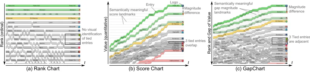
Figure 1: The teams participating in a soccer championship visualized using (a) a Rank Chart, (b) a Score Chart, and (c) a Gap Chart.
Charles Perin, University of [email protected]
Jeremy Boy, United [email protected]
Fr´ed´eric Vernier, University [email protected]
Abstract
1. Introduction
In this article, we are interested in visualizing the evolution of rankings over time, with a particular focus on sports data. Most athletic competitions rely on the ranking of individuals, teams, or countries to determine outcome. These rankings are usually based on performance metrics like scores, and can evolve over time. Here, we chose to focus primarily on soccer competitions, orchampionships, as they provide a realistic mainstream appli-cation case for rank-based visualizations—soccer team rankings are regularly published in newspapers or on the web, and broad-casted on television.
During a championship, team rankings are updated after each match-day, ortime-step; each team’s rank depends on ascore, which reflects its total number of wins, draws, and losses. If two teams have the same score at a given time-step, their rank is determined by their goal difference, i. e., the difference between goals scored and conceded. Every championship further uses a specific ranking formula to ensure that every rank is occupied by one (and only one) team (e. g., points, then goal difference, then number of goals scored, then game result between the two tied teams, then random). As a result, the ranking is tie-free: while scores may be identical, ranks are always unique.
The most common representation for championship rankings in mass media is a table. Tables can show teams ordered by rank and display scores in cells [1]. However, they cannot convey the magnitude of score differences, or the temporal evolution of both ranks and scores [1, 2]. They also need to be updated or re-created after each time-step.
A simple alternative is to use line charts. Here, we make a distinction between Rank Charts (RC), which use theyaxis to encode ranks from top to bottom on an ordinal scale, similarly to tables; and Score Charts (SC), which use theyaxis to encode scores that increase from bottom to top. Generally speaking, RC have the advantage of being overlap-free (Figure 1(a)): teams, orentries, are visually distinct at each time-step—although they may intersect between time-steps as rankings change. This makes ranks easy to distinguish. However, RC do not convey the magnitude of scores, nor do they showties(equal scores). This can be problematic when trying to predict future rankings, and ultimately a championship’s outcome. Conversely, SC con-vey the magnitude of scores. This can help make predictions. However, SC are not overlap-free when scores are tied, which makes it impossible to determine unique ranks (Figure 1(b)).
To address these respective limitations, we introduce Gap Charts (GC), a novel class of line charts which use theyaxis to encode both ranks from top to bottom, and scores from bottom to top. The main originality of GC is that they use the gaps between lines, i. e. the white space, to encode score magnitude. This makes GC overlap-free (Figure 1(c)), as tied scores are simply shown by adjacent entries, i. e., lines that are not separated by a gap at a given time-step.
We evaluate the effectiveness of GC for performing rank-, score-, and rank-and-score related tasks, by comparison with
RC and SC. We chose to focus primarily on static renderings of GC, i. e., without possible additional interactive features, as static charts are most common in mass-media publications on soccer championships (and on athletic competitions in general). Our results show that GC are most effective for rank-and-score related tasks, and that they are a good tradeoff between RC and SC for rank-alone and score-alone related tasks.
Finally, we extend our initial design of GC by exploring possible interactive techniques that can alleviate our class of line charts for tasks for which they are least effective. We also assess the scalability of GC by applying them to a range of other datasets. In summary, our main contributions are:
1. a formal distinction between RC and SC, two existing classes of line charts;
2. the design and implementation of GC, a novel class of line charts;
3. a comparative evaluation of GC, RC, and SC using real data from the French soccerLigue 1; and
4. the extension and generalization of GC using other/larger datasets.
2. Background
Sports enthusiasts are generally accustomed to seeing sports rankings in tables. Several studies have shown that tables are ef-fective for simple tasks like value retrieval (see [2] for a review). However, other previous work has shown that people interested in soccer championships usually seek to perform complex syn-optic tasks like analyzing trends and comparing patterns over time [1]; and line charts have been found more efficient than tables for performing such tasks [1, 2].
2.1. Formalizing the distinction between Rank
Charts and Score Charts
Slope graphs are a particular type of line chart that“compare changes over time for a list of nouns located on an ordinal or interval scale”(Figure 2(a)) [3]. They map the values ofn en-tries onmaxes (ortime-steps—m=4 in Figure 2(a)), and draw a connection between each entry’s values. Values are displayed inboxes, i. e., horizontal white spaces or segments, at each time-step. Connections show magnitudes of score differences. As entries are plotted on an ordinal scale, values encoded along the
yaxis can be either ranks or scores1 2 3 4 5. We define Rank
Charts (RC) as a class of slope graphs that uses theyaxis to encode ranks, and Score Charts (SC) as a class of slope graphs that uses theyaxis to encode scores.
1http://www.citylab.
com/design/2014/06/a-brilliantly- restored-19th-century-visualization-of-us-city-population-shifts/373386/
2http://junkcharts.typepad.com/junk
charts/2010/12/be-guided-by-the-questions.html
3http://charliepark.org/slopegraphs/
4http://charliepark.org/a-slopegraph-update/ 5http://www.edwardtufte.
(b)
(a)
Figure 2: (a) Tufte’s Slope Graph [3] (used with permission, cropped) and (b) Brinton’s Rank Chart [4] (cropped).
RC (Figure 1(a)) show each of thenentries at a unique rank at every time-stepm. The main advantages of RC are: 1) they are overlap-free—assuming two entries cannot have the same rank; and 2) they scale well, both fornandm. Figure 2(b) shows an early use of RC from the beginning of the 19th century [4]. RC are also extensively used on the web6, and come with many variations. While RC clearly show changes in rank, they do not show the magnitudes of score differences, nor do they show tied entries—an important feature according to [5]. That said, some designs have attempted to address the latter limitation by grouping entries at a same rank on the ordinal axis7. However, this breaks the expected bijection mapping of entries to ranks.
SC (Figure 1(b)) show the scores for each of thenentries at every time-stepm. The main advantage of SC is that ranks can be inferred from scores, as long as these are distinct (no ties). If they are not, entries overlap, and ranks are impossible to determine. SC also waste a great amount of white-space— particularly in the top-left corner when all scores are low, if scores start from 0 and increase monotonously—, and suffer from scaling: the highern, the more overlap.
Overall, we consider RC useful for showing ranks, and SC useful for showing scores and the magnitude of their differences.
2.2. Other Ways of Visualizing Rankings
RankExplorer [6], which uses stacked area charts, and LineUp [5], which enables interactive analysis of multidi-mensional ranked entries, were developed to visualize time-dependent rankings. Although they are powerful tools for per-forming advanced queries, their visual and interaction complex-ity is high, and we believe untrained people may find it difficult to interpret and interact with them. Sports enthusiasts cannot be expected to be visualization experts [7]; they may lack [1] visualization literacy [8] and interaction propensity [9]. Hence we focus primarily on static representations in this article.
Another recent work [10] has explored the combination of tables and line charts for manipulating ranking tables. However, as for the aforementioned tools, the benefits of this technique lie in relatively complex interaction.
6http://www.javiertordable.
com/interesting-visualizations-changes-over-time/
7https://www.census.gov/dataviz/visualizations/023/
3. GapChart
We introduce Gap Charts (GC) as a novel class of slope graphs which combines the advantages of both RC and SC. GC simul-taneously show the temporal evolution of both ranksandscores, as they are derived from a specific state in the continuous tran-sition between an ‘ordinal rank’yaxis (RC) and a ‘continuous score’yaxis (SC). Entries are represented bylines, composed ofboxesandlinks. Boxes show the value (rank and/or score) of the entry at a given time-step, and links connect consecutive boxes.Labelsdesignate entries’ names.
By exploring the continuum between RC and SC, and by tuning each component, we identified the following defining characteristics for GC:
C1 the yaxis encodes both ranks and score, and the score magnitudes are shown in the gaps between lines;
C2 tied entries are made visually distinct by keeping equal scores at a given time-step adjacent, i. e., with no gap be-tween lines, which keeps the chart overlap-free;
C3 the result is less compact than RC, but more than SC.
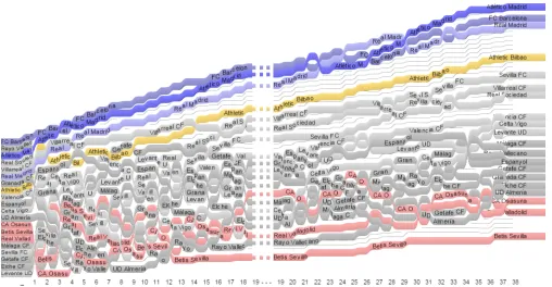
[image:4.612.62.562.69.180.2]Figure 3: The SpanishLiga2013–2014, visualized using GC.
3.1. Layout Algorithm
We created a simple algorithm for describing RC, SC, and GC in a unified way. Our generic layout function takes a factor
F∈[0,1] as a parameter to compute the vertical position of boxes over time.Fexpresses the continuum between RC and SC:F=0 creates a RC, andF=1 creates a SC. Given:
H the height of the canvas
E the set of entries
T the set of time-steps RANK(en,tm) the rank ofenattm
SCORE(en,tm) the score ofenattm
m =Min(SCORE(Ei,Tj)) i∈ |E|,t∈ |T|
M =Max(SCORE(Ei,Tj)) i∈ |E|,t∈ |T|
h the height of entries
The vertical positionyof an entryEn,n∈ |E|at each time-step
tm,m∈ |T|is computed as follows:
yR=HRANK|E(|e,t)
yS=H(1−|E1|h)(1−
SCORE(e,t)−m
M−m )
y= (1−F)yR+FyS
For a soccer championship, m=0 and M is the score of the team ranked 1st at the last time-step. yRis theyposition
according to ranks; yS is the yposition according to scores.
SettingF=0 impliesy=yRand produces RC; settingF=1
impliesy=yS and produces SC; and settingF =1−1n and
h=nH|E| ensuresC1,C2, andC3and produces GC.
3.2. Rendering Rationale
RC, SC and GC share several adjustable rendering parameters. These are: boxwidthandheight, linkcurvature(from a straight line to a “S” shape), linkheight at extremitiesandat inflection point(from very thin to same as box height),shading, andlabels positioning. Each parameter is described in Figure 4.
According to Tufte, data graphics should maximize their data-ink ratio [3]. This suggests that any class of slope graph should avoid large link heights and colors—asa priorithese do not
label
label...
box width
box width
bh=box
height bh
bh link width
=lw
lw box width
1rst bezier control point
2nd bezier control point
link height
bh
Figure 4: Main rendering parameters.
encode information. Figure 2(a) respects this principle: links are rendered as straight lines (no curvature) with a continuously thin height at extremities and inflection point. There is no shading, and the labels (numeric values) are shown in every box.
Our choice of rendering for GC (see Figure 3) clearly violates the data-ink ratio principle. However, it is based on a number of application-domain-driven rationales, as well as on a short qualitative evaluation, which we describe below.
An important specificity of soccer championship rankings is that scores never decrease—they only increase at a steady, pre-defined pace. Teams gain 3 points for winning a match, 1 for drawing, and 0 for losing. As such, focusing on a unique team’s score variations, i. e., on the slope of connections, is of little interest. However, being able to follow the evolution of a team as it changes ranks is crucial. This is why we display entries as continuous lines, where links and boxes smoothly alternate.
In addition, we follow standard color-coding for soccer cham-pionships: we use blue for the three top-ranked teams at the end of the championship—as they qualify for the European Cham-pion’s League—, yellow for the fourth team—as it qualifies for theEuropa League—, and red for the three bottom-ranking teams—as they are demoted to the minor league.
To further tune the different rendering parameters described in Figure 4, we asked six volunteers to order 3 classes of charts (RC, SC, and GC)∗5 rendering parameters=15 series of three parameter variations according to aesthetic preference and legi-bility. We wanted to ensure that the charts would be appealing to unfamiliar viewers (e. g., sports enthusiasts). Preference orders were given on 1–3 Likert-like scales, with the possibility of giving equal preferences. Variations were:
• link shape: straight line, weak curvature, strong curvature;
• link height at extremities: very thin, medium, same height as boxes;
• link height at inflection point: very thin, medium, continu-ous (i. e. same height as boxes);
• shading:none, low, strong; and
[image:5.612.319.562.71.188.2]For legibility, we instructed participants to focus on how easy/difficult each rendering variation made it to identify:
• a lumped group of teams;
• the gap between two or more teams;
• the evolution of a team’s rank over time; and
• the stability of a team’s score over time8.
We first inspected the legibility scores. We then confronted the most legible variations with their aesthetic preference scores. Because both orders were similar for all three classes, i. e., for RC, SC, and GC, we decided to keep one rendering configu-ration: weak curvature, stroke widths at extremities the same size as the boxes, medium stroke widths at link inflection points, low level of shading, and full name labels where boxes are wide enough. Generally speaking, we found that thick lines were preferred over thin ones. Thus, we stress that although the data-ink ratio principle suggests the use of thin lines, thick lines and repeated labels were perceived as more effective.
Some of these design takeaways may seem counter-intuitive. In particular, existing charts usually emphasize the use of thin lines. However, thick lines and repeated labels make it easier to follow entries over time, especially when the number of entries is high. In addition, for GC, line thickness has to be a ratio of the chart height to ensure that entries with tied scores are adjacent— one of the main features of GC. While the line thickness / chart height could be reduced, it would be at the cost of legibility. Finally, comparing ranks is the main focus of our paper, and existing representations of ranked entries often use similarly thick lines9 10.
4. Evaluation
We evaluated the effectiveness of GC for performing rank-, score-, and rank-and-score related tasks, by comparing them with RC and SC. We used real soccer data form 33 seasons of the FrenchLigue 1, a national championship in which 20 teams (entries) confront each other twice, over a period of 38 match-days (time-steps).
Comparing GC with RC and SC may not seem ideal, since RC are specifically designed to show only ranks, SC to show only scores, and GC to show both. However, the lack of ex-isting alternative designs to GC for showing both ranks and scores simultaneously prevents us from establishing a proper baseline condition. By default, it is impossible to perform score-related tasks using RC, and it can be very difficult to perform rank-related tasks using SC. To alleviate these limitations, we designed a set of ‘hover’ inspectors. While our main focus is on static representations—which cannot include such ‘lightweight’ interactions—we wanted to make sure score-related tasks would
8These features are individually inspired by the tasks we later used in our
evaluation of GC, described in Section 4.
9http://www.javiertordable.
com/interesting-visualizations-changes-over-time/
10http://in.somniac.me/2010/01/fortune-500-visualization/
be possible to perform with RC, and that rank-related tasks could be performed without too much effort with SC.
We then selected four tasks based on different visual proper-ties of each class of charts, which we found to be frequent and/or important in related work. We also made sure these would be meaningful for sports rankings. Tasks were:
T1 determine the longest period during which teamsTiandTj
have the same score;
T2 determine when the score difference between the teams rankedriandri+1was the highest;
T3 determine how many changes occur at rankri; and
T4 determine the longest period during which the score of teamTistays the same.
Based on Andrienko et al.’s task taxonomy for time-dependent data [11], Perin et al. [1] have found that comparing teams (T1, T2) and detecting trends (T3, T4) are important tasks in the analysis of a soccer championship. Similarly, Gratzl et al. [5] have found that comparing entries’ scores and slopes over time (T1, T2, T4), as well as retrieving specific ranks and tied ranks (T3) are frequent tasks related to ranked entries.
4.1. Inspector Designs
As previously discussed, both RC and SC have several limita-tions. Score-related tasks are impossible to perform with RC, as scores are not indicated. Likewise, rank-related tasks are diffi-cult to perform with SC, as entries with identical scores overlap. Thus, although our primary goal is to assess the efficiency of each technique for static representations, we designed a set of inspectors to enhance RC and SC for our experiment. The ratio-nale was that: 1) the experiment would be extremely frustrating for participants if one third of the tasks were impossible to per-form; and 2) GC would be optimal for static representations if the technique outperformed the enhanced/interactive versions of RC and SC. By adding inspectors to each class, we expected to maximize accuracy at the expense of increasing the amount of time spent to perform tasks.
Figure 5: The different inspectors. For RC (left), both the tooltip inspector and the scores inspector. For SC (center), both the tooltip inspector and the ranks inspector. For all, the tooltip inspector.
4.2. Hypotheses
For each taskTi, we formulated two hypothesesHia/b. Here,
we refer to each task in the form of a question (which we asked participants), and propose the following coding for hypotheses:
A>B means that we hypothesize participants will be more accurate usingAthanB, and will respond more quickly using
A than B if the accuracy rate is similar. All tasks involved analyzing one season of the championship, i. e., 20 entries over 38 time-steps. T1 and T2 required focusing both on ranks and scores; T3 only on ranks; and T4 only on scores.
T1 What is the longest period during which teams Ti and Tj
had the same score? H1a GC>RC
H1b GC>SC
Rationale: using GC, T1 simply consists in finding the longest segment during which the two entries have no gap between them (adjacent entries); using RC, T1 requires the scores inspector, as RC do not convey scores; and using SC, T1 requires the tooltip inspector, as entries with the same score overlap.
T2 When is the score difference between the team ranked riand
ri+1the highest? H2a GC>RC
H2b GC=SC
Rationale: using GC, T2 simply consists in finding the biggest gap between the two entries; using RC, T2 requires using the scores inspector; and using SC, T2 should require the same strategy as using GC.
T3 How many changes occurred at rank ri?
H3a GC<RC
H3b GC>SC
Rationale: using GC, T3 consists in following the line ending at the given rank (starting from the end), and counting and
moving up one line every time there is a crossing; using RC, T3 simply consists in horizontally following the rank, and counting the number of times it is crossed; and using SC, T3 requires the ranks inspector.
T4 What is the longest period during which the score of team Tistayed the same?
H4a GC>RC
H4b GC<SC
Rationale: using GC, T4 requires the tooltip inspector, as en-tries with invariant scores may change ranks; using RC, T4 requires the scores inspector; and using SC, T4 simply consists in finding the entry’s longest horizontal segment.
4.3. Procedure
We recruited 12 unpaid participants (1 female), aged 19–39 (mean=28), who were not involved in the pre-study. All were students or university staff, and had at least some basic knowl-edge of soccer championships and of line charts. The experi-ment was conducted on a desktop computer equipped with a mouse, a keyboard, and a 30” LCD display with a resolution of 2560x1600 pixels—charts were 1272 pixels wide and 750 pixels high. Participants first filled out a short background survey, and answered general questions about soccer. They were given the correct answer for each question, to ensure full comprehension of the ranking process (e. g., number of teams in the champi-onship, number of points gained for winning, drawing, or losing a match, etc.). They were then given a sheet of instructions.
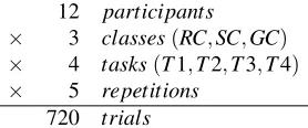
The experiment was blocked by class of charts (RC, SC, GC). Each block consisted of four trials—one for each task (T1, T2, T3, T4)—repeated five times. Blocks and trials were counterbalanced. Dependent variables wereaccuracy(number of correct answers) andefficiency(time spent answering). The full factorial design was as follows:
12 participants
× 3 classes(RC,SC,GC) × 4 tasks(T1,T2,T3,T4) × 5 repetitions
720 trials
[image:7.612.367.506.502.560.2]GC RC SC GC RC SC GC RC SC GC RC SC T1 T2 T3 T4
0 % 25 % 50 % 75 % 100 %
Mean accuracy for Class x Task (ratio)
GC − RC GC − SC SC − RC
GC − RC GC − SC SC − RC
GC − SC RC − GC RC − SC
GC − RC SC − GC SC − RC
−25 % 0 % 50 % 100 %
Mean correctness Pairwise Comparisons (% differences)
T1 T2 T3 T4 GC RC SC GC RC SC GC RC SC GC RC SC T1 T2 T3 T4
0 10 20 30
Mean time for Class x Task (seconds)
RC / GC RC / SC SC / GC
RC / GC SC / GC SC / RC
GC / RC GC / SC RC / SC
GC / SC RC / GC RC / SC
1.0 2.0
Mean time Pairwise Comparisons (ratios)
[image:8.612.52.553.70.272.2]T1 T2 T3 T4 (a) (b)
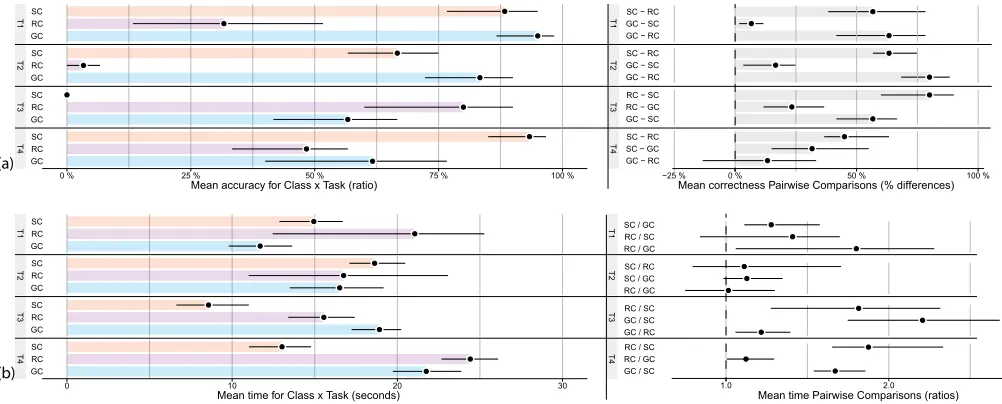
Figure 6: Mean (a)accuracy, (b)efficiency, and mean (a)accuracydifference, (b) meanefficiencydifference as a function of visualization technique and task. Error bars are 95% bootstrapped confidence intervals.
1–5 Likert scales the difficulty of the task, their confidence in their responses, and the suitability of the class of charts for the task. Overall the experiment lasted approximately 45 minutes.
4.4. Results
In order to assess the accuracy and time of performing tasks with the three classes of charts, we base our analyses on es-timation, i.e., effect sizes with bootstrapped [12] confidence intervals [13] (see Figure 6). Using effect sizes with confidence intervals is recommended by the APA [14], and for reporting statistical results in HCI [15] over the traditional null hypothesis significance testing.
We first compared accuracy rates between classes of charts. If we found no clear difference, we removed timed out and skipped trials and inspected efficiency. Note that in the experiment de-sign, we had highlighted entries that participants were required to focus on in T1 and T4 to avoid measuring any extra time spent finding those entries.
For T1, there is strong evidence that GC are roughly twice as accurate as RC (H1a); and while there is little evidence that GC are more accurate that SC, there is evidence that they are more efficient (H1b), i. e., the task was completed on average 1.2 times faster using GC.
For T2, there is strong evidence that GC are roughly 75% more accurate than RC (H2a); and there is evidence that GC are more accurate than SC (H2b), although the effect size is less important.
For T3, there is evidence that GC are less accurate and effi-cient than RC (H3a); but there is strong evidence that GC are more accurate than SC (H3b).
Finally for T4, there is no evidence that GC are more accurate than RC, and only little evidence that they are more efficient (H4a); and there is strong evidence that GC are less accurate
and efficient than SC (H4b).
Figure 7 shows the questionnaire results formatted using Berti-fier [16]. These are consistent with the accuracy and efficiency analyses. GC were considered well-suited for T1 and T2, which were easy to perform. Responses were more mitigated for T3 and T4, although there is no strong trend against GC. RC were considered ill-suited T1 and T2, well-suited for T3, and re-sponses were mitigated for T4. SC received enthusiastic feed-back for T1 and T4, more mitigated responses for T2, and were considered ill-suited for T3.
4.5. Discussion
H1ais clearly supported by our results. WhileH1bis also supported, we had expected to see a bigger difference between GC and SC. We attribute the little evidence of a difference in accuracy to the fact that we had initially highlighted entries for comparison. In a less artificial setting with no highlights, SC would suffer from visual clutter, and the potentially overlapping entries of interest would be harder to find and follow. This would not be the case with GC, as they are overlap-free.
H2ais also clearly supported by our results. H2bhowever is not, as we had expected results to be similar for GC and SC. We attribute the evidence that GC are more accurate than SC to the fact that GC showscore magnitude landmarks(the lightgray horizontal lines in Figure 1(c)). These convey the relative score differences between consecutively ranked entries. In contrast, SC showabsolute landmarks(the lightgray horizontal lines in Figure 1(b)). These only convey the absolute scores of entries, and not the differences between them.
VT T QUESTION P4P3 P6P0 P9 P10P1 P8P11P5P7 P2
AGE
GENRE
KNOWLEDGE ABOUT SOCCER
DIFFICULTY
T1 CONFIDENCE
VISUALIZATION WELL SUITED DIFFICULTY
T2 CONFIDENCE
GC VISUALIZATION WELL SUITEDDIFFICULTY
T3 CONFIDENCE
VISUALIZATION WELL SUITED DIFFICULTY
T4 CONFIDENCE
VISUALIZATION WELL SUITED DIFFICULTY
T1 CONFIDENCE
VISUALIZATION WELL SUITED DIFFICULTY
T2 CONFIDENCE
RC VISUALIZATION WELL SUITEDDIFFICULTY
T3 CONFIDENCE
VISUALIZATION WELL SUITED DIFFICULTY
T4 CONFIDENCE
VISUALIZATION WELL SUITED DIFFICULTY
T1 CONFIDENCE
VISUALIZATION WELL SUITED
DIFFICULTY
T2 CONFIDENCE
VISUALIZATION WELL SUITED DIFFICULTY
T3 CONFIDENCE
VISUALIZATION WELL SUITED DIFFICULTY
T4 CONFIDENCE
SC VISUALIZATION WELL SUITED
M: F:
40
20 30
PARTICIPANTS DEMOGRAPHICS AND QUESTIONNAIRE ANSWERS
[image:9.612.61.290.68.437.2]1 2 3 4 5
Figure 7: Answers on 1–5 likert scales are mapped on a dual-color scale, 3 being the neutral value. Difficulty scores are inverted to be congruent with other questions, as indicate the black squares. Knowledge about soccer is the average score of 7 questions.
straight horizontal line along the provided rank, and counting the number of times it was crossed. Vertical positions are not as stable in GC, as they also continuously increase to show scores. This is even more true for SC, which is whyH3bis so clearly supported by our results.
H4ais only partially supported, and the effect is small. We attribute the lack of evidence of a difference in accuracy be-tween GC and RC to the efficacy of the scores inspector. It enabled score extraction in RC, which would otherwise have been impossible—unlike in GC.H4bhowever is clearly sup-ported. We expected SC to outperform GC because using the former class, T4 simply consisted in finding the longest hor-izontal segment for the provided entry. The task was not as straightforward using GC, as entries with invariant scores may change vertical position according to changes in rank. For ex-ample, a soccer team A that has a stable score over a certain
period may be challenged by another team B that obtains the same score after winning a match. If team B’s goal difference is higher than team A’s, then team A will be reclassified at a rank below team B. Visually, this would result in a break in the horizontal line representing the team, even though the team’s score remains unchanged.
Overall, our results show that RC are best suited for rank-related tasks, SC for score-rank-related tasks, and GC for rank-and-score related tasks. This makes sense, as each class of charts is designed to facilitate its respective type of tasks. However, we have found that GC are a good tradeoff for performing all types of tasks—especially if interaction is disabled. Although scores cannot be precisely determined using static GC, we argue that score-values are generally not a first class characteristic of sports rankings—ranks come first, gaps between consecutive entries come second, and scores come last (usually to discriminate ties). Finally, it is interesting to point out that while the scores inspector worked very well for T4 using RC, the ranks inspector was ineffective for T3 using SC (see Figure 6).
Based on our results, we have established the following list of recommendations:
• GC should be used for rank-and-score related tasks. RC should not.
• RC are most effective for rank-related tasks, but GC provide a good alternative. SC should not be used.
• SC are most effective for score-related tasks, but GC pro-vide an alternative. RC may be used if a scores inspector is implemented.
On a higher level, we recommend using GC over the other classes for static representations, as GC are more generic. How-ever, interactively transitioning between RC, GC, and SC using our layout algorithm should prove optimal in situations where interaction is possible.
5. Extensions and Future Work
Participants in our experiment—especially the soccer enthusiasts—suggested developing a way to visualize cham-pionships with a focus on a particular team. To address this, we extended our initial design of GC to include an advancedentry focusinteraction (Figure 8).
We also used GC to visualize a range of other datasets, includ-ing data from other sports, academia, economics, and politics. All examples are available at http://newcol.free.fr/. This variety allowed us to assess the scalability of static ren-derings of GC, as well as the importance of finding ways to visualize missing data.
5.1. Entry Focus Interaction
For interactive versions of GC, double clicking on an entry
Figure 8: Illustration of the entry focus interaction. The entry is set as the visualization’s baseline, and the causes of change are shown.
line showingeis thus represented as it would be in a slope graph, with the vertical position of boxes showinge’s score at each time-step. This facilitates tasks like T4, as they can be performed like using SC. All other entries are laid out according to the baseline, and the vertical distance betweeneand any other team encodes the score difference between them.
As several participants in our experiment later asked to visu-alize the causes of change, we also added visual cues (green and red vertical bars) for each game played bye. Each bar linkse
with its opponent at the corresponding time-step. Green bars en-code wins, gray bars draws, and red bars losses. Figure 8 shows this information. We see thatewon most of its games against teams ranked lower, and lost to most teams ranked higher.ealso had difficulties winning several games in a row.
5.2. Generalization and Scalability
As GC are a generic class of slope graphs, we were able to apply them to various other time-dependent ranking datasets. Here, we discuss the generalization and scalability of static renderings of GC through two examples.
Figure 9 shows the evolution of 198 cyclists’ (entries) rank-ings after each of the 21 stages (time-steps) of theTour de France. The magnitude landmarks (thin gray lines) represent 1 minute gaps between cyclists. Colors encode cyclists’ nationality, and stage miniatures provide context at the top. The chart clearly shows that many changes occurred in the rankings during the second stage of the race, which means this stage was key. After that, rankings remained stable for three stages, before changing dramatically once again.Tour de Franceenthusiasts will also see that ‘flat terrain stages’ generally do not impact rankings or gap magnitudes, whereas ‘mountain stages’ strongly impact both.
Figure 10 shows the evolution of the top 100 universities’ (entries) rankings over 10 years (time-steps), according to the ARWU Shanghai University Ranking. Colors encode world regions (North America in purple, Europe in orange, Asia in green, and unclassified in dark gray). The most immediate observation is that the entry ranked first (Harvard University) is far above all others. Below that, several universities struggle
Figure 9:Le Tour de France at a Glance[17].
for the top-5 ranks, while competition is fierce at the bottom of the ranking. Nearly half the top-100 universities are North American; only five European and two Asian universities are among the first third. It is also interesting to point out that rankings varied a lot between 2003 and 2005. This was simply due to modifications of the ranking formula.
[image:10.612.51.301.77.185.2]miss-Figure 10: The Shanghai University Ranking.
ing data, including changing the color (as we have done here), using dashed-lines, or applying sketchy renderings. However, we stress more work is needed to determine best practices.
Overall, these two examples show that although individual entries may be hard to discern and follow when their number increases, interesting and important trends can still be detected. Ultimately, the most limiting factor in the scaling of static GC is the size of the screen or or of the paper on which they are displayed/printed.
6. Conclusions
In this article, we have proposed a formal distinction between Rank Charts (RC) and Score Charts (SC), two previously ex-isting classes of slopegraphs for visualizing time-dependent rankings. Rank Charts are effective for visualizing ranks, and Score Charts for visualizing scores. However, both techniques are limited when it comes to visualizing the other dimension.
We have introduced Gap Charts (GC) as a novel class of slopegraphs to address these limitations. GC show both ranks
and scores, ensure no overlap at each time-step, and make it possible to identify tied entries.
We have evaluated the effectiveness of GC for performing rank-, score-, and rank-and-score related tasks. Our results show that GC are most effective for latter type of tasks, and that they are a good tradeoff between RC and SC for performing rank-alone and score-alone related tasks.
Using GC to visualize a wide range of different datasets has raised a set of new challenges and opportunities. Considering interaction, we have explored the possibility of focusing on a particular entry. This should alleviate GC for score-related tasks, which by default are most difficult.
Overall, we believe this work provides evidence that semi space-filling visualizations have unique properties, which raises the question as to whether they can be applied to other families of data graphics.
References
[1] Charles Perin, Romain Vuillemot, and Jean-Daniel Fekete. A table!: Improving temporal navigation in soccer ranking tables. InProceedings of the 32Nd Annual ACM Confer-ence on Human Factors in Computing Systems, CHI ’14, pages 887–896, New York, NY, USA, 2014. ACM. [2] Sirkka L. Jarvenpaa and Gary W. Dickson. Graphics and
managerial decision making: Research-based guidelines.
Commun. ACM, 31(6):764–774, 1988.
[3] Edward R. Tufte.The Visual Display of Quantitative Infor-mation. Graphics Press, Cheshire, CT, USA, 1983, 2001. ISBN 0-9613921-0-X.
[4] William C. Brinton.Graphic Methods for Presenting Facts. Industrial management Library. Engineering Magazine Company, 1914.
[5] S. Gratzl, A. Lex, N. Gehlenborg, H. Pfister, and M. Streit. Lineup: Visual analysis of multi-attribute rankings.IEEE Transactions on Visualization and Computer Graphics, 19 (12):2277–2286, Dec 2013.
[6] Conglei Shi, Weiwei Cui, Shixia Liu, Panpan Xu, Wei Chen, and Huamin Qu. Rankexplorer: Visualization of ranking changes in large time series data. IEEE Trans-actions on Visualization and Computer Graphics, 18(12): 2669–2678, December 2012.
[7] Charles Perin, Romain Vuillemot, and Jean-Daniel Fekete. Soccerstories: A kick-off for visual soccer analysis.IEEE Transactions on Visualization and Computer Graphics, 19 (12):2506–2515, December 2013.
[8] J. Boy, R. A. Rensink, E. Bertini, and J. D. Fekete. A principled way of assessing visualization literacy. IEEE Transactions on Visualization and Computer Graphics, 20 (12):1963–1972, Dec 2014.
[image:11.612.51.301.71.435.2]information visualization. IEEE Transactions on Visual-ization and Computer Graphics, 22(1):639–648, Jan 2016. [10] Romain Vuillemot and Charles Perin. Investigating the direct manipulation of ranking tables for time navigation. InProceedings of the 33rd Annual ACM Conference on Human Factors in Computing Systems, CHI ’15, pages 2703–2706, New York, NY, USA, 2015. ACM.
[11] Natalia Andrienko and Gennady Andrienko.Exploratory Analysis of Spatial and Temporal Data: A Systematic Ap-proach. Springer-Verlag New York, Inc., 2005.
[12] K. N. Kirby and D. Gerlanc. BootES: An r package for bootstrap confidence intervals on effect sizes. Behavior research methods, 45(4):905–927, 2013.
[13] Geoff Cumming and Sue Finch. Inference by eye: Confi-dence intervals and how to read pictures of data.American Psychologist, 60(2):170, 2005.
[14] American Psychological Association. The Publication manual of the American psychological association. Wash-ington, DC, 6th edition, 2013.
[15] Pierre Dragicevic. Fair statistical communication in hci. InModern Statistical Methods for HCI, pages 291–330. Springer, 2016.
[16] C. Perin, P. Dragicevic, and J. D. Fekete. Revisiting bertin matrices: New interactions for crafting tabular visualiza-tions.IEEE Transactions on Visualization and Computer Graphics, 20(12):2082–2091, Dec 2014.
[17] Charles Perin, Jeremy Boy, and Fr´ed´eric Vernier. Le tour de france at a glance. InIEEE VGTC/VPG International Data Visualization Contest, 2014. http://vgtc.org/
![Figure 2: (a) Tufte’s Slope Graph [3] (used with permission, cropped) and (b) Brinton’s Rank Chart [4] (cropped).](https://thumb-us.123doks.com/thumbv2/123dok_us/1456129.98311/4.612.62.562.69.180/figure-tufte-slope-graph-permission-cropped-brinton-cropped.webp)

![Figure 9: Le Tour de France at a Glance [17].](https://thumb-us.123doks.com/thumbv2/123dok_us/1456129.98311/10.612.313.563.75.539/figure-tour-france-at-glance.webp)