City, University of London Institutional Repository
Citation
:
Endert, A., Ribarsky, W., Turkay, C., Wong, B.L.W., Nabney, I.T., Diaz-Blanco, I.
& Rossi, F. (2017). The State of the Art in Integrating Machine Learning into Visual Analytics.
Computer Graphics Forum, 36(8), pp. 458-486. doi: 10.1111/cgf.13092
This is the accepted version of the paper.
This version of the publication may differ from the final published
version.
Permanent repository link:
http://openaccess.city.ac.uk/16739/
Link to published version
:
http://dx.doi.org/10.1111/cgf.13092
Copyright and reuse:
City Research Online aims to make research
outputs of City, University of London available to a wider audience.
Copyright and Moral Rights remain with the author(s) and/or copyright
holders. URLs from City Research Online may be freely distributed and
linked to.
The State of the Art in
Integrating Machine Learning into Visual Analytics
Alex Endert, William Ribarsky, Cagatay Turkay, William Wong, Ian Nabney, Ignacio Díaz Blanco, Fabrice Rossi
Abstract
Visual analytics systems combine machine learning or other analytic techniques with interactive data visualization to promote sensemaking and analytical reasoning. It is through such techniques that people can make sense of large, complex data. While progress has been made, the tactful combination of machine learning and data visualization is still under-explored. This state-of-the-art report presents a summary of the progress that has been made by highlighting and synthesizing select research advances. Further, it presents opportunities and challenges to enhance the synergy between machine learning and visual analytics for impactful future research directions.
Categories and Subject Descriptors(according to ACM CCS): Human-centered computing - Visualization, Visual analytics
1 Introduction
We are in a data-driven era. Increasingly more domains generate and consume data. People have the potential to understand phe-nomena in more depth using new data analysis techniques. Addi-tionally, new phenomena can be uncovered in domains where data is becoming available. Thus, making sense of data is becoming in-creasingly important, and this is driving the need for systems that enable people to analyze and understand data.
However, this opportunity to discover also presents challenges. Reasoning about data is becoming more complicated and difficult as data scales and complexities increase. People require powerful tools to draw valid conclusions from data, while maintaining trust-worthy and interpretable results.
We claim that visual analytics (VA) and machine learning (ML) have complementing strengths and weaknesses to address these challenges. Visual analytics (VA) is a multi-disciplinary domain that combines data visualization with machine learning (ML) and other automated techniques to create systems that help people make sense of data [TC05, KSF∗08, Kei02, KMSZ06]. Over the years, much work has been done to establish the foundations of this area, create research advances in select topics, and form a community of researchers to continue to evolve the state of the art.
Currently, VA techniques exist that make use of select ML mod-els or algorithms. However, there are additional techniques that can apply to the broader visual data analysis process. Doing so reveals opportunities for how to couple user tasks and activities with such models. Similarly, opportunities exist to advance ML models based on the cognitive tasks invoked by interactive VA techniques.
This state-of-the-art report briefly summarizes the advances made at the intersection of ML and VA. It describes the extent
to which machine learning methods are utilized in visual analyt-ics to date. Further, it illuminates the opportunities within both dis-ciplines that can drive important research directions in the future. Much of the content and inspiration for this paper originated dur-ing a Dagstuhl Seminar titled, “Bridgdur-ing Machine Learndur-ing with Information Visualization (15101)” [KMRV15].
1.1 Report organization
This report is organized as follows. Section 2 of the report dis-cusses three categories of models: human reasoning, visual analyt-ics and information visualization, and machine learning. The mod-els describing the cognitive activity of sensemaking and analytical reasoning characterize the processes that humans engage in cogni-tively to gain understanding of data. The models and frameworks for visual analytics depict systematic descriptions of how compu-tation and analytics can be incorporated in the systematic construc-tion and design of visual analytic applicaconstruc-tions. Finally, the machine learning community has several models that illustrate how models are trained, used, and interactively steered.
Section 3 categorizes the integration of machine learning tech-niques into visual analytic systems. Section 4 discusses how such systems have been used in specific domains to solve real-world challenges. Section 5 discusses a research direction for integrat-ing steerable dimension reduction techniques into visual analytics. Finally, Section 6 discusses open challenges and opportunities for ML and VA. While the current work shows how some progress has been made in bringing these two communities closer together, there are several open challenges.
2 Models and Frameworks
Figure 1: The “sensemaking loop” (from [PC05]) illustrating the cognitive stages people go through to gain insight from data.
three categories of models and frameworks below. First, we dis-cuss existing models meant to describe the cognitive stages peo-ple progress through while analyzing data. These models show the complex processes people go through to gain insight from data, which developed systems must support. Second, we discuss exist-ing models and frameworks that describe interaction and informa-tion design of visual analytic applicainforma-tions. These models illustrate how data transformation and analytic computation are involved in generating the visual representations of data in tools. User interac-tion is critical in tuning and steering the parameters of these mod-els. Finally, we show select ML frameworks that emphasize the importance of training data and ground truth for generating accu-rate and effective computational models. In addition, we describe the main techniques developed in the ML field to integrate user feedback in the training process.
2.1 Models of Sensemaking and Knowledge Discovery One should emphasize that a primary purpose of data ana-lytics is for people to understand, and gain insights into, their data [CMS99, Chr06]. Thus, it is important to understand the cog-nitive processes of people as they reason about data. It is from such an understanding that “human-in-the-loop” application designs are realized. Prior work exists that provides models and design guide-lines for visual analytics.
Sense-making is the process of “structuring the unknown” by organising data into a framework that enables us “to comprehend, understand, explain, attribute, extrapolate, and predict” [Anc12]. It is this activity of structuring–the finding and assembly of data into meaningful explanatory sequences [LI57]–that enables us to turn ever more complex observations of the world into findings we can understand “explicitly in words and that serves as a springboard into action” [WSO05]. By attempting to articulate the unknown, we are driven more by “plausibility rather than accuracy” [Wei95] as we create plausible explanations that can be used to evolve and test our understanding of the situation or the data. Decision makers are often faced with inaccurate representations of the world [EPT∗05] and have to fill-in the gaps with strategies such as “story-telling” to create stories that explain the situation.
One of the earliest models to describe the iterative process of
data analysis as “sensemaking” [RSPC93] is presented in Figure 1 and illustrates the well-known (and probably the most frequently cited) Pirolli and Card sensemaking model [PC05]. Proposed in the context of intelligence analysis, it is useful for showing how infor-mation is handled through the process of searching and retrieving relevant information, organizing, indexing and storing the informa-tion for later use, structuring the informainforma-tion to create a schema or a way to explain what has been observed, the formulation and testing of hypotheses, which then leads to the determination of a conclu-sion, and a sharing of that conclusion. This notional model depicts the cognitive stages of people as they use visual analytic tools to gain understanding of their data.
From Pirolli and Card’s perspective, sensemaking can be cate-gorized into two primary phases: foraging and synthesis. Foraging refers to the stages of the process where models filter and users gather collections of interesting or relevant information. This phase emphasizes the computational ability of models, as the datasets are typically much larger than what a user can handle. Then, using that foraged information, users advance through the synthesis stages of the process, where they construct and test hypotheses about how the foraged information may relate to the larger plot. In contrast to foraging, synthesis is more “cognitively intensive”, as much of the insights stem from the user’s intuition and domain expertise. Most existing visualization tools focus on either foraging or synthesis, separating these two phases.
As with all models of cognitive processes, there have been crit-icisms. For instance, while there are feedback loops and repeat loops, and cycles within cycles, it still is somewhat a linear model. It describes the data transaction and information handling and transformation processes, “... rather than how analysts work and how they transition” [KS11]. Human analysts carry out their work within this framework, but their thinking and reasoning processes are much less linear and structured. For example, although recog-nised as a part of the sense-making loop, there is little explanation about the thinking and reasoning strategies that are invoked to for-mulate hypotheses. This is a critical aspect of the sense-making process: how are explanations of the situation or data formed in the mind of the human in order that the explanation can be used to test one’s understanding of the data or situation? Later in this section, we report on work that is attempting to unravel this aspect of how analysts think.
Figure 2: The Data-Frame Model of Sense-making [KMH06b].
demand for more information, and building her frame. However, when evidence is discovered through exploration that contradicts or refutes the existence of such a mental frame, the frame can either be augmented or a new one created. This is the important process that leads her to question her earlier conclusions or assumptions made to arrive at these conclusions. Additionally new frames can also be created to reframe the problem. In situations where data is missing or ambiguous or unknown, reframing enables her to artic-ulate the problem in different ways that may allow her to change her information search strategy and perhaps even her goals. One of the key benefits of the Data-Frame Model is that it points to the importance of designing visual analytics in a way that encourages analysts to question their data and their understanding, and to fa-cilitate visualizations and transformations that enable reframing of their understanding of the situation.
Recently a set of knowledge generation and synthesis models have been proposed that comprehensively attack a central issue of visual analytics: developing a human-computer system that enables analytic reasoning to produce actionable knowledge. The first of these models was proposed by Sacha et. al. [SSS∗14] and is shown in Figure 3. One sees looping structures and components familiar from Pirolli and Card’s sensemaking model, as depicted in Figure 1 above. However, the computer and human regions of the model, and their relationship with each other, are now explicitly expressed, and the paper shows a clear relationship, via interaction, between the human and both the visualization and the model. The paper also describes detailed steps for the data-visualization and data-model pipelines (the latter in terms of KDD processes that couple, for ex-ample, to machine learning algorithms). Whereas the sensemaking model was conceptual, this model is concrete and shows, better than other models, where to put computing and (via interactive in-terfaces) human-in-the-loop steps in order to build an actual sys-tem.
The Sacha et al. model has recently been generalized to pro-duce a more complete knowledge generation and synthesis (KGS) model [RF16]. The KGS model explicityly accounts for both Prior Knowledge (placed between Data, Visualization, and Model in Fig-ure 3) and User Knowledge (placed between Action and Finding). Prior Knowledge is quite important for any exploration involving experts or based on expertise; experts will want to know immedi-ately the relationship of new knowledge to existing domain
knowl-Figure 3: Human-Computer knowledge generation model of Sacha et al. [SSS∗14].
edge. User knowledge is built up during complex reasoning, where it can then be the basis for generating additional knowledge or can be synthesized with Prior Knowledge to produce more general truths. The KGS model posits an iterative process that addresses high level reasoning, such as inductive, deductive, and abductive reasoning, in the knowledge generation and exploration loops. It is based on a framework by Gahegan et al. [GWHR01] that was developed for GIScience but is generalizable.
These models provide a roadmap for visualization and analytics processes, and for the role of human-computer interaction. In par-ticular, they illuminate the relationships among machine learning, visualization, and analytics reasoning processes including explo-ration and knowledge geneexplo-ration. For example, Klein’s data frame model, discussed above, would fit in this structure, providing a fo-cus for ML components while the models in Figure 3 would show how to connect the data frame model with interactive visualization and hypothesis-building. There are no VA systems that embody all the components of the Sacha and KGS models, but there are some (e.g., VAiRoma [CDW∗16]) that include parts of the model. Typically in these systems, ML is a static pre-processing step ap-plied to the data at the beginning. For example, in VAiRoma time-dependent, hierarchical topic modeling is applied to large text col-lections [CDW∗16]. However, the KGS model shows how interac-tive ML can be placed in the human-computer process and how it relates to interactive visualization and reasoning. There is fur-ther discussion of interactivity in VAML systems below. The dis-cussion in Sacha et al. [SSS∗14] implies two main roles for ML; one is to transform unstructured or semi-structured data into a form more meaningful for human exploration and insight discovery. The other is to use unsupervised or semi-supervised ML to guide the analysis itself by suggesting the best visualizations, sequences of steps in the exploration, verification, or knowledge generation pro-cesses, guarding against cognitive bias, etc. In addition, since the KGS model was derived with reference to cognitive science princi-ples [GRF09], there is a possibility for merging ML with cognitive models to produce even more powerful human-machine models. To illustrate, one could explore Fu and Pirolli’s SNIF-ACT cognitive architecture model [FP07], which connects human exploration and information foraging in a sensemaking context. This could be mar-ried with ML approaches to refine and focus the parameters of the ML approach for particular exploration strategies.
2.2 Models of Interactivity in Visual Analytics
[image:4.595.316.552.86.154.2]visualiza-Figure 4: The information visualization pipeline [Hee06] depict-ing the data transformation and visual mappdepict-ing process for con-structing visualizations.
tions adhering to this pipeline exhibit two primary components of the visual interface: the visualization showing the information, and a graphical user interface (GUI) consisting of graphical controls or widgets. The graphical controls in the GUI (e.g., sliders, knobs, etc.) allow users to directly manipulate the parameters they control. For example, “direct manipulation” [Shn83] user interfaces for in-formation visualizations enable users to directly augment the val-ues of data and visualization parameters to see the corresponding change in the visualization (e.g., using a slider to set the range of home prices and observing the filtering of results in a map showing homes for sale). This model is a successful user interaction frame-work for information visualizations.
Visual analytic systems have adopted this method for user inter-action, but with the distinct difference of including analytic models or algorithms, as discussed earlier in this section. For example, in addition to filtering the data by selecting ranges for home prices, users could be given graphical controls over model parameters such as weighting the mixture of eigenvectors of a principal component analysis (PCA) dimension reduction (DR) model to produce two-dimensional views showing pairwise similarity of homes across all of the available dimensions. To users who lack expertise in such models, this may pose fundamental usability challenges.
In contrast, prior work has proposed frameworks to perform model steering via machine learning techniques applied to the user interactions performed during visual data analysis, called semantic interaction [EFN12b]. Semantic interaction is an approach to user interaction for visual data exploration in which analytical reasoning of the user is inferred and in turn used to steer the underlying mod-els implicitly (illustrated in Figure 5). The goal of this approach to user interaction is to enable co-reasoning between the human and the analytic model (or models) used to create the visualization (coupling cognition and computation) without requiring the user to directly control the models.
The approach of semantic interaction is to overload the visual metaphor through which the insights are obtained (i.e., the visual-ization of information created by computational models) and the interaction metaphor through which hypotheses and assertions are communicated (i.e., interaction occurs within the visual metaphor). Semantic interaction enables users to directly manipulate data within visualizations, from which tacit knowledge of the user is captured, and the underlying analytic models are steered. The an-alytic models can be incrementally adapted based on the user’s sensemaking process and domain expertise explicated via the user interactions with the system (as described in the models of Section 2.1).
Figure 5: The semantic interaction pipeline [EFN12b] showing how the user interactions in a spatial visualization can be incorpo-rated into the computation of a visual analytic system.
The semantic interaction pipeline (shown in Figure 5) takes an approach of directly binding model steering techniques to the in-teractive affordances created by the visualization. For example, a distance function used to determine the relative similarity between two data points (often visually depicted using distance in a spatial layout), can serve as the interactive affordance to allow users to ex-plore that relationship. Therefore, the user interaction is directly in the visual metaphor, creating a bi-directional medium between the user and the analytic models [LHM∗11].
2.3 Machine Learning Models and Frameworks
There is not as much work in machine learning models and frameworks. Most of the proposals correspond to some form of
de factoindustrial standards, such as the SEMMA (Sample, Ex-plore, Modify, Model, and Assess) methodology advertised by SAS Institute Inc. Among those, a vendor neutral framework, CRISP-DM [She00], is somewhat comparable to knowledge discovery and visual analytics frameworks. There are six phases in the framework: business (or problem) understanding; data understanding (devel-oped through exploration of the data and discussion with data own-ers); data preparation (including feature extraction, noise removal, and transformation); modeling; evaluation (testing the quality of the model, and particularly its generalization performance); de-ployment (embedding the model in practice). In some versions of this framework, there is an additional link from deployment back to business understanding - this represents the fact that the underlying data generator may change over time. The model needs continu-ous evaluation in deployment and when performance degrades, the process starts again. Perhaps more importantly, all the steps of the framework are embedded in a general loop comparable to the ones observed in other frameworks. This emphasize the feedback from the latter stage of the process (evaluation in numerous machine learning applications) to the early stages (e.g. data preparation in CRISP-DM).
As pointed out in e.g. [ACKK14], the traditional implementation of the machine learning workflow leads to long development cycles where end users (who are also domain experts) are asked to give feedback on the modeling results. This feedback is used by machine learning experts to tune the whole processing chain, especially at the data preparation stage. Ideally, this feedback should take the form of specific and formal user inputs, for example positive and negative feedback on exemplars (such as “those two objects should not belong to the same cluster” or “this object is misclassified”).
[image:5.595.64.281.84.151.2]training examples, and is thus able to more closely approximate the phenomena or concept being classified in the data.
To further establish an ML framework, we note the following. Machine learning tasks are traditionally divided into two broad categories, supervised tasks and unsupervised tasks. In supervised learning, the goal is to construct a model that maps an input to an output, using a set of examples of this mapping, the training set. The quality of the model is evaluated via a fixed loss criterion. Up till recently, it has generally been considered that human input is not needed in the model construction phase. On the contrary, it could lead to undetected overfitting. Indeed the expected quality of the model on future data (its so-called generalization ability) is gen-erally estimated via an independent set of examples, the test set. Allowing the user (or a program) to tune the model using this set will generally reduce the generalization ability of the model and prevent any sound evaluation of this ability (unless yet another set of examples is available).
Supervision via examples can be seen as a direct form of user control over the training process. Allowing the user to modify the training set interactively provides an indirect way of integrating user inputs into the model construction phase. In addition, oppor-tunities for user feedback and control are available before and af-ter this modeling step (e.g., using the CRISP-DM phases). For in-stance, user feedback can be utilized at the feature selection, error preferences, and other steps. Leveraging those opportunities (cluding training set modification) has been the main focus of in-teractive machine learning approaches. For instance, tools such as the Crayons system from [FOJ03] allow the user to add new train-ing data by specifytrain-ing in a visual way positive and negative exam-ples. This specific type of user feedback in the form of labelling new examples is exactly the focus of theactive learning frame-work [Set09] in machine learning. This learning paradigm is a vari-ation over supervised learning in which ML algorithms are able to determine interesting inputs for which they do not know the de-sired outputs (in the training set), in such a way that given those outputs the predictive performances of the model would greatly improve. Interestingly active learning is not the paradigm used in e.g. [FOJ03]. It seems indeed that in real world applications, ac-tive learning algorithms tend to ask too many questions and pos-sibly to similar ones, as reported in e.g., [GB11]. More generally, the need for specific and formal user inputs can create usability issues with regards to people and their tasks, as pointed out in e.g., [ACKK14, EHR∗14]. That is, the actions taken by the user to train the systems are often not the actions native to the exploratory data analysis described in the previously mentioned frameworks. This is starting to become more commonly used in the ML commu-nity, as exemplified by [BH12]. In this paper the authors consider additional questions a system can ask a user, beyond just labelling. They focus in particular onclass conditional queries– the system shows the user unlabeled examples and asks him or her to select one that belongs to a given class (if one exists).
In unsupervised learning, the data has no input/output structure and the general goal is to summarize the data in some way. For in-stance, as discussed further below, dimension reduction techniques build low dimensional approximations of the data from their high dimensional initial representation; clustering groups data into
sim-Figure 6: A model for interactive machine [FOJ03] learning de-picting user feedback for model training.
ilar objects; etc. Unsupervised learning is generally considered ill posed in the ML field in the following sense: most of the tasks of unsupervised learning (clustering, dimensionality reduction, etc.) have only an informal description to which numerous formal mod-els can be related. Those modmod-els are very difficult to compare on a theoretical point of view as well as on a practical one. In unsu-pervised learning, the need for user input, steering and control is therefore broadly accepted and techniques to include user feedback into e.g., clustering have been studied for some time. Variations over unsupervised methods that take explicitly into account some form of additional information are generally called semi-supervised methods. The supervision is frequently provided by external data in an automated way, but those methods can lead to principled ways of integrating user feedback.
It should be noted however that most of the methodological development in machine learning that can be used to integrate user feedback, from active learning to triplet based constraints [vdMW12], are seldom evaluated in the context of visualization systems. In general, the feedback process is either simulated or ob-tained via off line and slow process (e.g. Amazon’s Mechanical Turk for triplet in [WKKB15]). Thus while specific frameworks that enable user feedback have been defined by the ML commu-nity, the practical relevance of the recent ones in the context of interactive visualization remains untested.
2.4 Comparison to another classification framework
A recent paper by Sacha et al. [SZS∗16] overlaps with this STAR Report. It focuses on the specific area of dimensionality reduction and how these techniques integrate with interactive visualization in visual analytics systems. The paper builds around a systematic analysis of visualization literature, which reveals seven common interaction scenarios. The evaluation leads to the identification of future research opportunities.
The current paper provides a significantly broader survey of ma-chine learning methods coupled with interaction, while Sacha et al. [SZS∗16] probe deeper in one important area. In addition to di-mension reduction, the current paper deals with ML methods for clustering, classification, and regression. There is some overlap in the literature covered in the two papers. However, the literature reviewed in the current paper cites ML methods that are already coupled with interactive visualization systems plus those that are not yet (but it would be beneficial if they were); Sacha et al. deal mostly with ML methods that are already coupled with interactive visualizations.
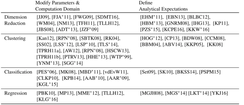
[image:6.595.355.510.85.175.2]analysis in DR strengthening the wider analysis in the current paper, and vice versa. The human-in-the-loop process model in [SZS∗16] has similarities with the use of the human-machine interaction loop in the current paper; they also share a common ori-gin. The classifications used in Sacha et al’s structured analysis are different than those in the current paper’s taxonomy, although one could be mapped into the other, with modifications. However, there are also multiple similarities; in particular, classification according to “modify parameters and computation domain” and “define an-alytical expectations” in Sections 3.2 and 3.3 of the current paper map to various interaction scenarios in Sacha et al. [SZS∗16]. For example, the first classification maps to data manipulation, DR pa-rameter tuning, and DR type selection scenarios in Sacha et al’s model. The second classification, in permitting the user to tell the system (based on results it gives) expectations that are consistent with domain knowledge, maps to feature selection and emphasis and defining constraints scenarios. The current paper then goes be-yond DR, including for each classification a discussion of clus-tering, classification, and regression methods. This broadens and strengthens the discussion from Sacha et al. [SZS∗16].
3 Categorization of Machine Learning Techniques Currently used in Visual Analytics
The visual analytic community has developed systems that lever-age specific machine learning techniques. In this section, we give an overview of the existing ways that machine learning has been integrated into VA applications from two transversal perspectives: thetypes of ML algorithmsand the so-calledinteraction intent. We pay special attention to the “interaction intent” as described below, because this focuses on human-in-the-loop aspects that are central to VA systems. There are also other papers where the main role of visualization is on communicating the results of computations to improve comprehension [TJHH14] that are not directly covered in this section. Some of the most significant of these papers, referring to VA systems, are described in Section 4.
Along the first perspective, we consider the differenttypes of ML algorithmsthat have been considered within visual analytics liter-ature. Although one might think of several other possible ways to categorize the algorithms [Alp14, FHT01], here we adopt a high-level task-oriented taxonomy and categorize the algorithms under the following headings:dimension reduction, clustering, classifi-cation,regression/correlation analysis. We observe that ML algo-rithms to tackle these tasks are frequently adopted in visual analyt-ics applications since these analytical tasks often require the joint capabilities of computation and user expertise. To briefly summa-rize: i)dimension reductionmethods help analysts to distill the in-formation in high-dimensional data so that conventional visualiza-tion methods can be employed and important features are identified ii)clusteringmethods help to identify groups of similar instances which can be done both in a supervised or unsupervised manner iii)classificationmethods are often supervised and help to build models to associate labels to data instances, and finally iv) regres-sion/correlationanalysis methods help to investigate relations be-tween features in the data and to understand/generate causal links to explain phenomena.
Along the second perspective, we focus on the user side of the process. We name this aspect asinteraction intentand categorize
the actions taken by users within visual analysis in terms of the methods through which the analyst tries to improve the ML result.
This perspective of our taxonomy resonates with the “user in-tent” categories suggested by Yi et al. [YaKSJ07] for low-level in-teractions within InfoVis applications. Our focus, however, is tar-geted on higher-level analytical intents within the narrower scope of visual analytics applications that involve ML methods. With this motivation in mind, we suggest two broad categories for “intents”:
modify parameters and computation domainanddefine analytical expectations. Table 1 shows the organization of literature along the dimensions of algorithm type vs the two categories of user intent. Here we survey the existing literature within the scope of this char-acterization.
3.1 Review Methodology
The literature summarized and categorized in this section are taken from impactful ML and visualization conferences and jour-nals. They were chosen and categorized based on discussions the authors had at the Dagstuhl Seminar titled, “Bridging Machine Learning with Information Visualization (15101)” [KMRV15], and later refined through a more extensive literature review.
Within this report, we review existing literature on the integra-tion of machine learning and visualisaintegra-tion from three different per-spectives – models and frameworks, techniques, and application areas. When identifying the relevant works in these domains, we follow a structured methodology and identified the different scopes of investigation for these three different perspectives. One impor-tant note to make is, due to our focus on the integration of the two fields, we scanned resources from both the visualisation and ma-chine learning domain.
Within the domain of visualisation, we initiated our survey start-ing with publications from the followstart-ing resources:
Journals: IEEE Transactions on Visualization and Computer
Graphics, Computer Graphics Forum, IEEE Computer Graphics and Applications, Information Visualization
Conferences:IEEE Visual Analytics Science and Technology (par-tially published as a special issue of IEEE TVCG), IEEE Sympo-sium on Information Visualization (InfoVis) (published as a special issue of IEEE TVCG since 2006), IEEE Pacific Visualization Sym-posium (PacificVis), EuroVis workshop on Visual Analytics (Eu-roVA)
Within the domain of machine learning, we initiated our survey starting with publications from the following resources:
Journals:Journal of Machine Learning Research, Neurocomput-ing, IEEE Transactions on Knowledge and Data Engineering
Conferences: International Conference on Machine Learning
(ICML), ACM SIGKDD International Conference on Knowledge Discovery and Data Mining, European Symposium on Artificial Neural Networks, Computational Intelligence and Machine Learn-ing (ESANN)
Modify Parameters & Computation Domain
Define
Analytical Expectations
Dimension Reduction
[JJ09], [FJA∗11], [FWG09], [SDMT16], [WM04], [NM13], [TFH11], [TLLH12], [JBS08], [ADT∗13], [JZF∗09]
[EHM∗11], [EBN13], [BLBC12], [HBM∗13], [GNRM08], [IHG13], [KP11], [PZS∗15], [KCPE16], [KKW∗16]
Clustering [Kan12], [RPN∗08], [SBTK08], [RK04], [SS02], [LSS∗12], [LSP∗10], [TLS∗14], [TPRH11a], [AW12], [RPN∗08], [HSCW13], [TPRH11b], [PTRV13], [HHE∗13], [WTP∗99], [YNM∗13], [SGG∗14]
[HOG∗12], [CP13], [BDW08], [CCM08], [BBM04], [ABV14], [KKP05], [KK08]
Classification [PES∗06], [MK08], [MBD∗11], [vdEvW11], [CLKP10], [KPB14], [AAB∗10], [AAR∗09], [KGL∗15]
[Set09], [SK10], [BKSS14], [PSPM15]
Regression [PBK10], [MP13], [MME∗12], [TLLH12], [KLG∗16]
[image:8.595.91.520.82.267.2][MGJH08], [MGS∗14] [LKT∗14] [YKJ16]
Table 1:In Section 3, we review the existing literature in visual analytics following a 2D categorization that organizes the literature along two perspectives: Algorithm Type (rows) and Interaction Intent (columns).
3.2 Modify parameters and computation domain
Here we list techniques where interaction has been instrumental in modifying the parameters of an algorithm, defining the measures used in the computations, or even changing the algorithm used. An-other common form of interaction here is to enable users to modify the computational domain to which the algorithm is applied. Such operations are often facilitated through interactive visual represen-tations of data points and data variables where analysts can select subsets of data and run the algorithms on these selections within the visual analysis cycle to observe the changes in the results and to refine the models iteratively. The types of techniques described in this section can be considered as following a “direct manipula-tion” [Shn83] approach where the analysts explicitly interact with the algorithm before or during the computation and observe how results change through visualization.
Dimension Reduction One class of algorithms that is widely in-corporated in such explicit modification strategy is dimension re-duction. Since high-dimensional spaces are often cognitively chal-lenging to comprehend, combinations of visualization and dimen-sion reduction methods have demonstrated several benefits. Johans-son and JohansJohans-son [JJ09] enable the user to interactively reduce the dimensionality of a data set with the help of quality metrics. The visually guided variable ordering and filtering reduces the com-plexity of the data and provides the user a comprehensive control over the whole process. The authors later use this methodology in the analysis of high-dimensional data sets involving microbial pop-ulations [FJA∗11]. An earlier work that merges visualization and machine learning approaches is by Fuchs et al. [FWG09]. The au-thors utilize machine learning techniques within the visual analy-sis process to interactively narrow down the search space and as-sist the user in identifying plausible hypotheses. In a recent paper, Stahnke et al. [SDMT16] devised a probing technique using inter-active methods through which analysts can modify the parameters of a multi-dimensional scaling projection. The visualization plays a key role here to display the different dimension contributions to the
projections and to communicate the underlying relations that make up the clusters displayed on top of the projection results.
In MDSteer [WM04], an embedding is guided by user interac-tion leading to an adapted multidimensional scaling of multivariate data sets. Such a mechanism enables the analyst to steer the com-putational resources accordingly to areas where more precision is needed. This technique is an early and good example of how a deep involvement of the user within the computational process has the potential to lead to more precise results. Nam and Mueller [NM13] provide the user with an interface where a high-dimensional jection method can be steered according to user input. They pro-vide “key” computational results to guide the user to other rele-vant results through visual guidance and interaction. Turkay et al. introduce the dual-analysis approach [TFH11] to support analysis processes where computational methods such as dimension reduc-tion [TLLH12] are used. The authors incorporate several statistical measures to inform analysts on the relevance and importance of variables. They provide several perspectives on the characteristics of the dimensions that can be interactively recomputed so that ana-lysts are able to make multi-criteria decisions whilst using compu-tational methods. Jänicke et al. [JBS08] utilize a two-dimensional projection method where the analysis is performed on a projected 2D space called the attribute cloud. The resulting point cloud is then used as the medium for interaction where the user is able to brush and link the selections to other views of the data. In these last group of examples, the capability to run the algorithms on user-defined subsets of the data through visually represented rich information is the key mechanism to facilitate better-informed, more reliable data analysis processes.
“on-demand”. gCluto [RK04] is an interactive clustering and visualiza-tion system where the authors incorporate a wide range of tering algorithms. This is an early example where multiple clus-tering algorithms can be run on-the-fly with varying parameters and results can be visually inspected. InHierarchical Clustering Explorer[SS02], Seo and Shneiderman describe the use of an in-teractive dendogram coupled with a colored heatmap to represent clustering information within a coordinated multiple view system.
Other examples include work accomplished using the Caleydo software for pathway analysis and associated experimental data by Lex et al. [LSS∗12, LSP∗10]. In their techniques, the authors en-able analysts to investigate multiple runs of clustering algorithms and utilize linked, integrated visualizations to support the interpre-tation and validation of clusters. Along the same lines, Turkay et al. present an interactive system that addresses both the generation and evaluation stages within the clustering process and provides inter-active control to users to refine grouping criteria through investiga-tions of measures of clustering quality [TPRH11a]. In a follow-up work [TLS∗14], within the domain of clustering high-dimensional data sets, integrated statistical computations are shown to be use-ful to characterize the complex groupings that analysts encounter in such data sets. Figure 7 demonstrates how the authors incorpo-rated statistical analysis results to indicate important features for data groups. In this work, the most discriminative features (indi-cated with red dots as opposed to blue ones that are less important) for the clustering result of a high-dimensional data set are repre-sented as integrated linked views. The user is able to select these features in one clustering result (e.g., within the clustering result in the right-most column in Figure 7) and observe whether the same features are represented in others, e.g., in the left-most column.
Schreck et al. [SBTK08] propose a framework to interactively monitor and control Kohonen maps to cluster trajectory data. The authors state the importance of integrating the expert within the clustering process for achieving good results. Kandogan [Kan12] discusses how clusters can be found and annotated through an image-based technique. His technique involves the use of “just-in-time” clustering and annotation, and the principal role for visual-isation and interaction is to aid the interpretation of the structures observed, and provide a deeper insight into why and how particular structures are formed.
An important role for visualization is to get the user engaged in
progressiveanditerativegeneration of clusters [RPN∗08]. In such approaches, the user is presented with content that is built step-by-step and gains additional insight in each iteration to decide whether to continue, alter, or terminate the current calculations. Such levels of interactivity, of course, require the solutions to be responsive and capable of returning results within acceptable delays. Ahmed and Weaver [AW12] address this problem through forward-caching ex-pected interaction possibilities and providing users with clustering results without breaking the responsive analytical flow.
Visual analytics applications that involve clustering algorithms within the analysis of complex dynamic networks have also been developed [HSCW13]. The use of visualisation is in particular crit-ical with such dynamic relational data sets due to the limitations in interpreting the algorithmic results; well-designed combinations of visual summaries can assist analysts in this respect. In the
do-main of molecular dynamics simulation, there are some examples of tight integrations of interactive visualizations, clustering algo-rithms, and statistics to support the validity of the resulting struc-tures [TPRH11b], [PTRV13].
Classification Being a relevant and widely utilized technique, classification algorithms have also found their place within visual analytics applications. Common roles for interactive visualization are filtering the feature space, iteratively observing and fixing prob-lems, and when the classification tasks involve multiple mediums such as space, time and abstract features, providing multiple per-spectives to the algorithmic results.
A conceptual framework on how classification tasks can be supported by interactive visualizations is presented by May and Kohlhammer [MK08]. Their approach improved the classification of data using decision trees in an interactive manner. They proposed the use of a technique called KVMaps to inform users on classifica-tion quality thus enabling the iterative refinement of the results. The authors later proposed a technique called SmartStripes [MBD∗11] where they investigated the relations between different subsets of features and entities. Interactive visual representations have been used to help create and understand the underlying structures within decision trees [vdEvW11]. The authors not only presented the over-all structure of decision trees, but also provided intuitive visual representations of attribute importance within the different levels of the tree. Such interactive visualizations are critical in unraveling the computed information hidden within the layers and can be quite instrumental in increasing the trust in such computational models. Similar insights can be gained on other models (additive ones, e.g. naive Bayes, in [PES∗06] and more general ones in [SK10]) by ex-plainingindividual classification. In these papers, the authors dis-play the contribution of features to the classification made by the model and enable what-if scenarios, such “how would the classifi-cation change if this particular feature was set to another value?”
In iVisClassifier by Choo et al. [CLKP10], the authors improve classification performance through interactive visualizations. Their technique supports a user-driven classification process by reduc-ing the search space, e.g., through recomputreduc-ing Latent Dirichlet Allocation (LDA) [BNJ03] with a user-selected subset of data de-fined through filtering in additional coordinated views. Klemm et al. [KGL∗15] investigate the use of interactive visualisation to com-pare multiple decision trees in investigating relations within non-image and non-image based features for a medical application. They visualise the quality aspects of classifiers to infer observations on the predictive power of the features.
Figure 7: Visualization of clustering results, together with associ-ated on-the-fly computations to identify discriminating features of groups, are used here to aid analysts in interpreting the clusters and refining them further [TLS∗14].
are also used as elements for visual selections and enable analysts to interactively apply modelling on subsets of features.
Classification of spatio-temporal patterns is one of the complex tasks that requires the involvement of user input and efficient algo-rithms due to the complex nature of structures found in such data sets. Andrienko et al. [AAB∗10] investigate how self organizing maps (SOMs) are integrated into the visual analysis process. They integrate a SOM matrix where the user can interactively modify the parameters and observe the changes in the results in various visual representations, e.g., where space is represented in time, and the time is represented in space. Again involving spatio-temporal data, an interactive process where a clustering algorithm assists users to pick relevant subsets in building classifiers has shown to be effec-tive in categorizing large collections of trajectories [AAR∗09].
Regression Identifying the multivariate relations within data vari-ables, in particular when their numbers are high, is one of the critical tasks in most data analysis routines. In order to evaluate to what degree observed relations can be attributed to underly-ing phenomena and to build causal interpretations, visual analytics approaches have shown good potential. Visualization has shown to be effective in validating predictive models through interactive means [PBK10]. The authors visually relate several n-dimensional functions to known models through integrated visualizations within a model building process. They observed that such a visualization-powered approach not only speeds up model building but also in-creases the trust and confidence in the results. Mühlbacher and Piringer [MP13] discuss how the process of building regression models can benefit from integrating domain knowledge. Berger et al. [BPFG11] introduce an interactive approach that enables the investigation of the parameter space with respect to multiple tar-get values. Malik et al. [MME∗12] describe a framework for in-teractive auto-correlation. This is an example where the
correla-Figure 8: Visual summaries to indicate the relevance of fea-tures over cross-validation runs support analysts in making in-formed decisions whilst selecting features for a classification model [KPB14].
tion analysis is tightly coupled with the interactive elements in the visualization solution. Correlation analysis has been integrated as an internal mechanism to investigate how well lower-dimensional projections relate to the data that they represent [TLLH12]. The use of relational representations here supports analysts to evaluate how local projection models behave in preserving the correlative structures in the data. In a recent paper, Klemm et al. [KLG∗16] demonstrates the use of visualisation to show all combinations of several independent features with a specific target feature. The au-thors demonstrate how the use of template regression models, inter-actively modifiable formulas and according visual representations help experts to derive plausible statistical explanations for different target diseases in epidemiological studies.
3.3 Define analytical expectations
Unlike the papers in the previous category where the user explic-itly modifies the parameters and the settings of an algorithm, the works we review under this section follow a different strategy and involve users in communicatingexpected results to the computa-tional method. In these types of interactive methods, the user often observes the output of an algorithm and tell the machine which as-pect of the output is inconsistent with the existing knowledge, i.e., correcting the algorithm. Furthermore, analysts can also commu-nicate examples of relevant, domain-knowledge informed relations to be preserved in the final result. Since this is a relatively recent approach to facilitate the interaction between the user and the al-gorithms, the number of works in this category is not as high as the previous section. In the following, we review such works again under a categorization of different ML algorithm types involved. Notice that integrating user knowledge in this way in unsupervised learning contexts falls into the general semi-supervised framework, which is a principled way in ML for making unsupervised problems less ill-posed.
[image:10.595.312.552.80.218.2]observa-tion level interacobserva-tions to assist computaobserva-tional analysis tools to de-liver more interpretable/reliable results. The authors describe such operations as enabling the direct manipulationfor visual analyt-ics [EBN13]. In this line of work, the underlying idea is to pro-vide mechanisms to users to reflect their knowledge about the data through interactions that directly modify computational results. One typical interaction is throughmovingobservations in a pro-jection such that the modified version is more similar to the expec-tationof the analyst [EHM∗11, BLBC12]. This line of research has been expanded to focus on the interpretability of linear [KCPE16] and non-linear DR models [KKW∗16]. Hu et al. [HBM∗13] com-plemented such visualization level interaction methods with further interaction mechanisms. The authors aim to understand users’ in-teraction intent better and give them mechanisms to also highlight preferences onunmovedpoints.
In their Model-Driven Visual Analytics system, Garg et al. [GNRM08] suggest the use of a "pattern painting" mechanism that enables analysts to paint interesting structures in the visualiza-tion which are then turned into logical rules that can be fed into a projection algorithm to build an effective model.
An interesting supervised point of view has been proposed in [IHG13] on the dimension reduction steering. The main idea is to introduce an information theoretic criterion that evaluates the un-certainty in the representation, considering that the original high dimensional points are noisy. Given this criterion, the authors ap-ply an active learning approach to select points that are maximally informative: if the user can move one of those points to its desired position, the uncertainty of the representation will be maximally reduced (compared to the reduction expected with other points). The experimental evaluation shows that the optimal points tend to be more uniformly distributed over the projected data set than with other selection methods, possibly reducing some of the drawbacks of active learning summarized in e.g. [ACKK14].
Clustering There are a number of works where user knowledge is incorporated to feed a clustering algorithm with expected results. Hossain et al. makes use of a scattergather technique to iteratively break up or merge clusters to generate groupings that meet ana-lysts’ expectations [HOG∗12]. (See Figure 9.) In their technique, the expert iteratively introduces constraints on a number of required relations and the algorithms take these constraints into considera-tion to generate more effective groupings. The users state whether clusters in the current segmentation should be broken up further or brought back together. Upon inspection of a clustering result, the user interactively constructs a scatter gather constraint matrix which represents a preferred clustering setting from her perspec-tive. The algorithm then considers this input along with the clus-tering result to come up with an “optimized” result. In a number of papers, the user has been involved even further to modify clustering results. In order to support a topic modeling task through clustering, Choo et al. [CP13] enable users to interactively work on topic clus-ters through operations such as splitting, merging and also refining clusters by pointing to example instances or keywords.
More generally, clustering is one of the first tasks of machine learning to include ways to take into account expert knowledge, originally in the form of contiguity constraints (see [Mur85] for an early survey): the expert specifies a prior neighborhood
struc-Figure 9: ScatterGather [HOG∗12] is a technique to interactively gather feedback from analysts in response to algorithmic output and refine user-generated constraints to improve the clustering.
ture on data points (for instance related to geographical proximity) and the clusters are supposed to respect this structure (according to some notion of agreement). While the original methodology falls typically into the offline slow steering category, it has been ex-tended to more general and possibly online steering based on two main paradigms for constraints clustering [BDW08]: the pairwise paradigm (withmust-link/cannot-link constraints) and the triplet paradigm (with constraints of the formx must be closer to y than to z).
An early example of the pairwise paradigm is provided by [CCM08]. The authors describe a document clustering method that takes into account feedback of the form: this document should not belong to this cluster, this document should be in this cluster, those two documents should be (or should not be) in the same cluster (this mixes pointwise constraints, with pairwise ones). Active learning has been integrated into this paradigm in [BBM04]. A variation over the pairwise approach which consists in issuing merge and/or split requests at the cluster level has been proposed and studied in [ABV14].
[image:11.595.325.540.87.278.2]Constraints based on triplet are more recent and were proposed in the context of clustering by [KKP05, KK08]. The main advan-tage of specifying triplet based constraints over pairwise ones is that they allow relative qualitative feedback rather than binary ones. They are also known to be more stable than pairwise comparisons [KG90].
In their visual classification methodology, Paiva et al. [PSPM15] demonstrates that effective classification models can be built when users’ interactive input, for instance, to select wrongly labeled in-stances, can be employed to update the classification model. Along the similar lines, Behrisch et al. [BKSS14] demonstrate how users’ feedback on the relevance of features in classification tasks can be incorporated into decision making processes. They model their pro-cess in an iterative dialogue between the user and the algorithm and name these stages asrelevance feedbackandmodel learning. This work serves as a good example of how user feedback might lead to better performing, fit-for-purpose classification models.
Regression Although examples in this category are limited in numbers, defining the “expected” has shown great potential to sup-port interactive visual steering within the context of ensemble sim-ulation analysis [MGJH08, MGS∗14]. In their steerable computa-tional simulation approach, Matkovic et al. [MGJH08] demonstrate how a domain expert (an engineer) can interactively define and re-fine desired simulation outputs while designing an injection sys-tem. Their three-level steering process enables the expert to de-fine desired output values through selections in multiple views of simulation outputs. The expert then moves on to visually explore the control variables of the simulation and assess whether they are feasible and refine/re-run the simulation models accordingly. The authors went on to incorporate a regression model within this pro-cess to further optimise the simulation results based on users’ in-teractive inputs [MGS∗14]. With this addition to the workflow, the experts again indicate desired output characteristics visually and a regression model followed by an optimization supports the process to quickly converge to effective simulation parameters. The critical role that the users play in these examples is to express their expert knowledge to identify and communicate suitable solutions to the algorithmic processes which in turn try and optimize for those.
4 Application Domains
The integration of ML techniques into VA systems has been ex-emplified in different domains, described below. Each of these do-mains present unique and important challenges, thus different com-binations of interactive visualizations and ML techniques are used. Some of these techniques are related to, but go beyond the classifi-cations in Section 3. For instance, dimension reduction, clustering, etc. since they must be closely embedded in the VA system and can be attached to higher level meanings. However, most are rele-vant to the Define Analytical Expectations category in Table 1. The examples given in this section generally make use of one or more technique categories in Section 3, depending on the particular do-main for which the applications are designed for.
4.1 Text Analytics and Topic Modeling
Text corpora are frequently analyzed using visual analytic sys-tems. Text is a data format that lends itself nicely to specific com-putational processes, as well as human reasoning. Various text an-alytics methods have seen a lot of use in visual anan-alytics sys-tems over the past 6-7 years. A main reason is that these methods have proved useful in organizing large, unstructured text collections around meaningful topics or concepts. The text collections consid-ered have been diverse including research publications, Wikipedia entries, streaming social media such as Twitter, Facebook entries, patents, technical reports, and other types.
Visual analytic tools have been used to support information for-aging by representing high-dimensional information, such as text, in an easily comprehensible two-dimensional view. In such views, the primary representation is one where information that is rel-atively closer to other information is more similar (a visualiza-tion method borrowed from cartography [Sku02]). These applica-tions allow users to find relevant information and gain new insights into topics or trends within the data. An early example of com-bining machine learning with visual analytics for analyzing text is a system calledIN-SPIRE[WTP∗99]. One of the views of the system, theGalaxy Viewshown in Figure 10, displays documents clustered by similarity. Using dimension reduction techniques, this view encodes relative similarity as distance (documents near each other are more similar). The high-dimensional representation of the text documents is created by keyword extraction from each docu-ment (defining a dimension), and weightings on the keywords de-termined computationally using popular methods such as TF-IDF, etc. [RECC10].
Visual analytic tools have also been used to support synthe-sis by enabling users to externalize their insights during an in-vestigation. In a spatial workspace where users can manually ma-nipulate the location of information, users build spatial structures to capture their synthesis of the information over time - a pro-cess referred to as “incremental formalism” [SM99, SHA∗01]. An-drews et al. found that intelligence analysts can make use of such spatial structures as a means to externalize insights dur-ing sensemakdur-ing, manually placdur-ing relevant documents in clus-ters on a large, high-resolution display [AEN10]. Additionally, they found that the large display workspace promoted a more spatially-oriented analysis. Tools, such as I2 Analyst’s Notebook [i2], Jig-saw’s “Tablet view” [SGL08], nSpace2 [EKHW08, WSP∗06], An-alyst’s Workspace [AN12], and others have also found it helpful to provide users with a workspace where spatial representations of information can be manually organized.
More recently, researchers have developed techniques such as Latent Semantic Analysis (LSA) for extracting and representing the contextual meaning of words [LD97]. LSA produces a concept space that could then be used for document classification and clus-tering. Also, probabilistic topic models have emerged as a power-ful technique for finding semantically meaningpower-ful topics in an un-structured text collection [BL09]. Researchers from the knowledge discovery and visualization communities have developed tools and techniques to support visualization and exploration of large text corpora based on both LSA (e.g., [DWS∗12, CDS09]) and topic models (e.g., [IYU08, LZP∗09, WLS∗10, OST∗10]).
Figure 10: IN-SPIRE [WTP∗99], a VA system for text corpora. IN-SPIRE combines computational metrics with interactive visualizations.
community provide ways to refine and improve topic models by integrating user feedback, e.g. moving words from one topic to an-other [HBGSS14].
There have been extensions of LDA-based techniques and other text analytics by investigating texts in the combination <topic, time, location, people>. This permits the analysis of the ebb and flow of topics in time and according to location [DWCR11, DWS∗12, LYK∗12]. Time-sensitivity is revealed not only in top-ics but in keyword distributions [DWS∗12]. Lately there has been work to add people and demographic analysis as well [DCE∗15]. Combining topic, time, and location analysis leads to identifica-tion of events, defined as “meaningful occurrences in space and time” [KBK11, DWS∗12, CDW∗16, LYK∗12]. Here the topic anal-ysis can greatly help in pinpointing the meaning. In addition, com-bining topic modeling with named entity extraction methods, such as lingpipe [20008], can greatly enhance the time, location, and even people structure since these quantities can be automatically extracted from the text content [MJR∗11, CDW∗16].
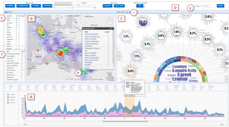
At this point, it is worthwhile to describe a visual analytics sys-tem that combines all these characteristics. VAiRoma [CDW∗16] (shown in Figure 11) creates a narrative that tells the whole 3,000 year history of Rome, the Empire, and the state of Italy derived from a collection of 189,000 Wikipedia articles. The articles are selected from the nearly 5M English language article collection in Wikipedia using a short list of keyword, but otherwise the initial topic modeling and named entity extraction are done automatically. The interface for VAiRoma is displayed in Figure 11. The individ-ual topics are depicted as color-coded streams in the timeline view (A). The circular topic view in (C) provides a compact way of de-picting topics, the weights of their contributions for a given time range, and topic keywords. The navigable map view in (B) provides immediate updates of geographic distribution of articles (based on locating the geographic entities in the text) in terms of hotspots for a selected time range and topic. The window (f) lists article titles
for selected geographic view, time range, and topic. In Figure 11, one can clearly see event peaks for selected topics having to do with Roman government and military battles in the period from 500 BC to 500 AD. The interlinked windows in the interface plus key top-ics and event peaks permit a user to quickly peruse the main events in ancient Roman history, including the rise of Christianity and the Catholic church, trade with India and the Far East, and other events that one might not find in looking narrowly at, say, just the history of the Roman Empire. In this case, the user can focus from thou-sands of articles to a few hundred articles overall, which she can then quickly peruse. See the VAiRoma article for more details.
VAiRoma shows the power of the overall model depicted in Fig-ure 3. Though it is not complete w.r.t. this model (no current VA system is), it provides an integrated approach to data handling, interactive visualization, ML (in this case topic modeling) com-bined with other techniques, and exploration and knowledge build-ing techniques. It shows the power of an integrated approach. The approach is general and is now being applied to large, heteroge-neous collections of climate change documents. In addition, full text journal article collections are being analyzed using extensions of the topic modeling and entity extraction methods. This shows that once <topic, time, location, people> features and event signa-tures can be extracted, analyses based on these analytics products can integrate a wide range of heterogeneous collections.
4.2 Multimedia Visual Analytics
Figure 11: Overview of VAiRoma Interface. The interface has three main views: Timeline view (A), Geographic view (B) and Topic view (C). A user-generated annotation is shown in the Timeline view.
MultiFacetis another example of visually analyzing multimedia data [HHE∗13]. MultiFacet presents facets of each data type to users as interactive filters. Thus, the process of interactively select-ing attributes of different data types helps create groups of concep-tually interesting and related information.
As image and video data is often combined with text data (or textual metadata attached to the images or videos), fusing the fea-ture space between these datatypes is an open challenge. Auto-mated approaches are error-prone, and often require user interven-tion and guidance when semantic concepts and relainterven-tionship need to maintained across data types [CBN∗12]. Similarly, an example of a much more specific application is given in [BM13] where the authors present a steering mechanism for source separation in a sin-gle monophonic recording. The user can annotate a standard time-frequency display to roughly define the different sources. Errors made by the algorithm can be annotated to improve further the sep-aration.
4.3 Streaming Data: Finance, Cyber Security, Social Media Streaming data is a growing area of interest for visual analyt-ics. Data are no longer isolated and static, but instead are part of a sensor-laden ecosystem that senses and stores data at increasing frequencies. Thus, visual analytic systems that integrate machine learning models have great potential. Examples of domains that generate streaming data include the financial industry, cyber secu-rity, social media, and others.
In finance, for example, FinVis is a visual analytics system that helps people view and plan their personal finance portfo-lio [RSE09]. The system incorporates uncertainty and risk models to compute metrics about a person’s portfolio, and uses interactive visualizations to show these results to users. Similarly, Ziegler et al. presented a visual analytic system to help model a user’s indi-vidual preferences for short, medium, and long-term stock perfor-mance [ZNK08] and later extended their approach to real-time
mar-ket data [ZJGK10]. Figure 12 is an example of how visualisations can provide an in-depth understanding of the groupings (cluster-ings) of financial time series. Here, financial market data for assets in 3 countries and 28 market sectors from 2006 and 2009 are de-picted. The red bars indicate the crash of the stock market in 2008 and the visualisation enables the user to identify the overall changes but also notice subtle variations such as the lack of a response in some countries for particular sectors.
Cyber security is a domain fraught with fast data streams and alerts. Examples of machine learning techniques often incorpo-rated into systems that support this domain include sequence and pattern-based modeling, rule-based alerting, and others [BEK14]. People in charge of the safety and reliability of large networks an-alyze large amounts of streaming data and alerts throughout their day, thus the temporal component of making a decision from the analysis is emphasized. For example, Fisher et al. presentedEvent Browser, a visual analytic system for analyzing and monitoring net-work events [FMK12]. Their net-work emphasizes how different tasks of the analyst have to happen at different time scales. That is, some tasks are “real-time”, while others can be taken “offline” and per-formed for a longer duration of time. The persistent updating of new data into the offline tasks presents challenges.
Social media data can also be analyzed using visual analytic sys-tems. For example,Storylines[ZC07] and EventRiver[LYK∗12] are two examples of how visual analytic applications can help peo-ple understand the evolution of events, topics, and themes from news sources and social media feeds. In these systems, similar ma-chine learning techniques are used as for text. However, the tem-porality of the data is more directly emphasized and taken into ac-count.
![Figure 1: The “sensemaking loop” (from [PC05]) illustrating thecognitive stages people go through to gain insight from data.](https://thumb-us.123doks.com/thumbv2/123dok_us/1407138.93642/3.595.55.291.79.243/figure-sensemaking-loop-illustrating-thecognitive-stages-people-insight.webp)
![Figure 3:Human-Computer knowledge generation model ofSacha et al. [SSS∗14].](https://thumb-us.123doks.com/thumbv2/123dok_us/1407138.93642/4.595.67.274.83.228/figure-human-computer-knowledge-generation-model-ofsacha-sss.webp)
![Figure 4: The information visualization pipeline [Hee06] depict-ing the data transformation and visual mapping process for con-structing visualizations.](https://thumb-us.123doks.com/thumbv2/123dok_us/1407138.93642/5.595.64.281.84.151/figure-information-visualization-pipeline-transformation-mapping-structing-visualizations.webp)
![Figure 6: A model for interactive machine [FOJ03] learning de-picting user feedback for model training.](https://thumb-us.123doks.com/thumbv2/123dok_us/1407138.93642/6.595.355.510.85.175/figure-model-interactive-machine-learning-picting-feedback-training.webp)
![Figure 8:Visual summaries to indicate the relevance of fea-tures over cross-validation runs support analysts in making in-formed decisions whilst selecting features for a classificationmodel [KPB14].](https://thumb-us.123doks.com/thumbv2/123dok_us/1407138.93642/10.595.73.268.80.289/summaries-indicate-relevance-validation-analysts-decisions-selecting-classicationmodel.webp)
![Figure 9: ScatterGather [HOG∗12] is a technique to interactivelygather feedback from analysts in response to algorithmic outputand refine user-generated constraints to improve the clustering.](https://thumb-us.123doks.com/thumbv2/123dok_us/1407138.93642/11.595.325.540.87.278/scattergather-technique-interactivelygather-algorithmic-outputand-generated-constraints-clustering.webp)
![Figure 10: IN-SPIRE [WTP∗99], a VA system for text corpora. IN-SPIRE combines computational metrics with interactive visualizations.](https://thumb-us.123doks.com/thumbv2/123dok_us/1407138.93642/13.595.103.502.79.299/figure-spire-corpora-combines-computational-metrics-interactive-visualizations.webp)
![Figure 12: Aggregated visual representations and clustering havebeen used in supporting the real-time analysis of temporal sector-based market data [ZJGK10].](https://thumb-us.123doks.com/thumbv2/123dok_us/1407138.93642/15.595.53.292.82.197/figure-aggregated-representations-clustering-havebeen-supporting-analysis-temporal.webp)
