INFORMATION VISUALISATION GUIDELINES
Lonsdale and Lonsdale | 2019
Research funded by the Office of the Chief Scientific Advisor | Gov UK
02
inform
Conducted by
Dr Maria Lonsdale | University of Leeds | UK Dr David Lonsdale | University of Hull | UK
Sponsored by
The Office of the Chief Scientific Advisor | Gov UK
Research Period
2018
Research Publication
2019
01
Introduction p.03
Table of contents
02
Underlying theories p.06
03
Infographics p.15
04
Data visualisation p.40
05
Image credits p.91
06
01
Guidelines that bring research and practice together and that take visual perception and cognition into account, are both necessary or useful when visualising information. Moreover, guidelines are open to interpretation and can be adjusted to the specific information context being dealt with. As argued by Berinato (2016) guidelines are for responding to context, not for setting it.
Literature was reviewed to: 1) identify principles for the effective use of infographics and data visualisation; 2) identify obstacles to effective communication; 3) ascertain and examine case studies where information communication was significant to the outcome; 4) develop rationales for good practice.
“Five databases were used: Science Direct, EBSCO, Google Scholar, Sage Journals, Taylor and Francis Online; and three design journals: Information Design Journal, Visible Language, Infodesign. The selection of the databases and journals was based on their relevancy for research focusing on information visualization. The search used specific keywords such as: ‘infographics’, ‘data visualization’, ‘information visualization’ ‘graphic risk information’, and only focused on articles that were written in English and Portuguese... The articles gathered went through two stages of examination and filtering process. In the first stage, the articles were checked and filtered based on the titles and abstracts, and then organized in individual folders according to sub-areas. In the second stage, the selected articles were reviewed in their entirety through detailed reading and highlighting of relevant information (as well as making notes). Approximately 230 papers were reviewed in stage 2. Due to the little research available in the area of information design and visualization, approximately 40 books were reviewed, which mainly offered practice-based tacit knowledge and recommendations.” (Lonsdale and Lonsdale, 2019, p. 14).
The 486 information visualisation guidelines that emerged from this research are presented in a clear and efficient way, by dividing them into:
• Guidelines from research – This includes academic papers involving
experimental testing, academic papers with a more theoretical focus, academic papers reviewing and discussing existing research, etc. When not presenting an experimental study, to be considered research, such academic papers also need to have a good set of academic references to support their analysis and discussion
• Additional practice-based guidelines – Several books, online articles, blogs, etc.
were reviewed that give recommendations based on experience from practice. If any further recommendations, in addition to the ones given by research, are given, then these will be listed here, as a way to complement research.
• Findings from research – Relevant findings generated by the experimental
studies reviewed are given here to reinforce and validate the guidelines, as well as to make them more user-centred.
• Rationale – At the end of each design feature, a rationale is given to explain
further the meaning of certain guidelines and the need to follow them.
There are several terms used to define the visualisation of information and data. From infographics to information visualisation, from data visualisation to knowledge visualisation, from charts to graphs, etc. The review and set of guidelines here presented focus only on:
• Underlying descriptive theories – Include cognition (thinking) and visual
perception (seeing) to explain how we see and process information before actually giving recommendations on how to visualise information.
• Infographics – Is a branch of the field of Information Design and in this review
represents the visualisation of information combining graphics, text, colour and layout.
• Data visualisation – Is, in turn, a branch of infographics and in this review
includes charts used to represent data in a visualised and objective form. This review is limited to the charts that are most established in practice and are the most researched, therefore proving a solid list of guidelines: bar charts (including stacked and divided bar charts), line charts, pie charts (including donut charts), and unit charts. A single section also reviews ‘other charts’ to include a few other charts that, although to a much lesser extent, have been subject to some research. Tables are also addressed because, although not a visualised form per se, they are still important when communicating data, and they form part of many infographics. Newer and unusual chart types were not included at this stage of the research.
Important note: Guidelines are listed in the form of bullet points and small chunks
02
2.1.1 Memory
There are three types of memory that process visual information in our brain: 1) iconic memory; 2) working memory; and 3) long-term memory.
Information usually remains in the iconic memory for less than a second before being forwarded to the working memory. Thus, at this first stage of memory, information is processed extremely quickly, and is nothing more than an automatic and unconscious perceptual processing – pre-attentive visual processing. Here, several features are detected such as: colour (hue and intensity); form (length, width, orientation, shape, size); and location of elements in a 2D space, making these the elements that stand out when we first look at information. Consequently, if something important needs to stand out in an infographic or chart, the information should be encoded using a pre-attentive attribute that has good contrast with the surrounding information. The same is true if a particular set of elements needs to be seen as a group, where a pre-attentive attribute can be assigned to such elements.
Information is then moved to the working memory, which is temporary and has limited storage capacity. At this second stage of memory, what our brains recognise as useful will be combined into meaningful chunks of information. According to the chunking principle, the cognitive load can be reduced if visualisations are presented in chunks. However, only three or four chunks of information can be stored at one time in our working memory. Nonetheless, these can contain a good amount of information. Therefore, for new information to be included into our working memory, something that is already there will be either forgotten or forwarded into our long-term memory. For example, in a learning context, when this working memory capacity is exceeded, learning is affected and cognitive processing becomes ineffective. In terms of data visualisation, if a legend for a chart contains a colour or symbol for 10 different sets of data, users will be forced to go back and forth between the chart and the legend because their working memory cannot take in more than three or four chunks of information. In terms of size, as long as a large amount of information is chunked coherently and consistently, the user will be able to hold more information in their working memory. An example of that is the fact that charts are able to communicate a large amount of information because it is perceived all at once and as a meaningful pattern, although it actually consists of hundreds and thousands of values. However, tables are only used to look information up; it would be impossible to take a series of numbers and chunk them together meaningfully to store in our working memory.
When we finally decide to store information for later use, we send chunks of
information into our long-term memory. Long-term memory is extremely important to visual perception because it is where our ability to recognise visuals is held. In conclusion, in terms of visualising information, iconic memory and working memory is where we want to make sure that our information is perceived and processed adequately.
2.1.2 Cognitive elements
Both functional and cognitive elements need to be considered when developing effective visualisations that integrate different components of intelligence
information. The goal when using visualised information is to reduce the cognitive load of information, i.e. the mental effort that the user has to make when processing the information. This is to allow users to easily interpret and assess large amounts of information and data with ease, and as quickly as possible. Infographics are particularly relevant in this context because the use of graphics together with text reduces the cognitive load. Moreover, an effective infographic allows users to spend more time focusing on the content, instead of trying to decode the way information is displayed.
The following guidelines should be taken into consideration in infographic design in terms of visual perception and reduction of cognitive load:
• Information chunking – Elements should be grouped together in a meaningful
way. Users will treat meaningful units as one chunk of information (as opposed to separate bits of information), which will help them process and remember the information better.
• Reminders – Visual cues should be used to remind users about the information
they are seeing when they need to make sense of more than one piece of information at the same time. For example, when users have to remember the type of data they are seeing while also finding patterns, labels and other supporting text elements can be used.
• Familiar elements – The way information is visualised should build on the
knowledge that the user might have regarding symbols, colours, etc. If a symbol is likely to be unfamiliar, then a label can be added.
• A limit of choices – The number of choices given to the user should be limited.
Although it might seem thoughtful to give various choices, the user will simply struggle to make a decision when faced with too many options.
• A limit of visuals – Although visualisation makes information more accessible
and quicker to interpret, the number of graphic elements in each single section should be limited to avoid the user having to make an effort to determine which elements are relevant. Any unnecessary elements that are not important for the processing and understanding of the information should be removed (e.g. logos, decorative elements, junk such as unnecessary grid lines).
• Order – Information should be ordered so that the most relevant information
comes first, as this will affect how users perceive the subsequent information.
• Hierarchy – A hierarchy should be presented in the order consumers are likely
to use it (or that we would like them to use it). Information will be more readily processed if it is presented hierarchically in the order consumers are likely to use it. For example, what are the resources available, how should they be allocated, what are the benefits of allocating the resources, what are the risks of allocating the resources and how can they be avoided, and what should be done if the resources are not allocated properly?
• Consistency – Constant and common information across various infographics
• Emphasis – Emphasis can be used to facilitate finding information, such as using
different colours or sizes of typeface. This is particularly important for iconic memory, i.e. to grab the user’s attention at a glance.
In summary, a well-designed infographic: 1) should engage and promote high-level cognitive functioning, i.e. to gain insight, reasoning, and understanding; 2) should attract the users to relevant information and minimise the possibility of users ignoring important information; 3) should promote chunking that provides strong retrieval cues that will then be passed onto long-term memory and support reasoning, thinking, and decision making.
Chunking should be achieved by using Gestalt principles of visual perception, as they promote grouping, as explained in the next section. Knowing how we perceive and interpret visual stimuli is equally important as understanding how we process and memorise information.
Gestalt research was conducted to find out how we perceive pattern, form and
organisation to make sense of what we see. In general, Gestalt principles show that we group graphical elements in particular ways to interpret them and build relationships between the various elements. These principles are essential to inform infographic design and enhance comprehension of information.
2.2.1 Principle of simplicity
We better perceive and interpret abstract and complex information when it is in the simplest form possible. For example, in Figure 1, the chart on the left requires less effort, and therefore is easier to interpret than the chart on the right, because our brains favour things that are clear, simple and ordered.
2.2.2 Principle of proximity
We perceive elements that are close together as belonging to a group. The manipulation of white space is a powerful tool when it comes to organising
information and directing the viewers to particular information. For example, in bar charts, bars that are clustered will be seen as a group (Fig. 2).
[image:11.595.99.500.382.484.2] [image:11.595.101.498.664.784.2]2.2 Gestalt Principles of visual perception (seeing)
Figure 1 | Principle of simplicity
2.2.3 Principle of similarity
We perceive elements that have the same typeface or are similar in size, shape, colour (both hue and intensity) or orientation, as being part of the same group. This principle works very effectively as long as the differences are only a few and clearly distinct from one another. For example, in a bar chart, if the bars are the same colour it will indicate to user that the bar values should be compared (Fig. 3, left). If different colours are used, it will impose extra cognitive load and may indicate that each bar belongs to a unique attribute, and therefore do not need to be compared (Fig. 3, right).
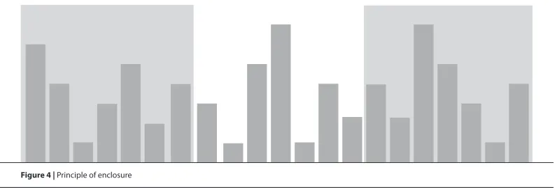
2.2.4 Principle of enclosure
We perceive elements as belonging to the same group when they are enclosed in a way that it seems to create a boundary around them (e.g. border, common field of colour or shade) (Fig. 4). Enclosure is the strongest approach of visual perception to group elements.
2.2.5 Principle of closure
[image:12.595.99.497.256.358.2] [image:12.595.100.498.536.671.2]We perceive open structures as closed, complete and regular if there is a way that allows us to reasonably interpret them as so. For example, in a chart we do not need
Figure 3 | Principle of similarity
complete borders to define a space. This is particularly relevant for the x- and y-axes, where it is actually preferable to define the area of the chart by using one single thin line (y-axis line on the left and x-axis line at the bottom), rather than with heavy lines around the entire area that will only create a boxed chart (Fig. 5)
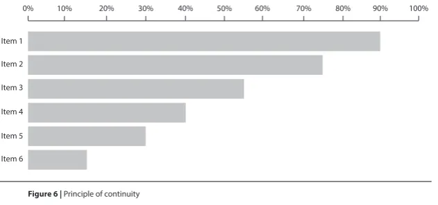
2.2.6 Principle of continuity
We perceive elements as part of a whole if they are aligned or seem to form a
continuation of one another. For example, in a horizontal chart, aligning all the bars to the left, even without a line to indicate the y-axis, makes it obvious that they share the same baseline and are part of the same chart (Fig. 6).
2.2.7 Principle of connection
We perceive elements that are connected (e.g. by a line or point liner) as belonging to the same group. Connection is a stronger tactic than proximity or similarity (colour,
Item 1
Item 2
Item 3
Item 4
Item 5
Item 6
[image:13.595.102.498.188.322.2] [image:13.595.104.420.507.655.2]0% 10% 20% 30% 40% 50% 60% 70% 80% 90% 100%
size and shape). For example, using a line to connect points in a chart is an effective approach. It is very difficult for our eyes to connect points without lines (Fig. 7).
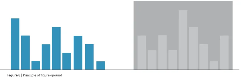
2.2.8 Principle of figure-ground
[image:14.595.105.499.170.311.2] [image:14.595.101.499.634.763.2]We perceive elements as either figure (the element in focus) or ground (the background on which the element rests). When dealing with information, and particularly in situations of time pressure where scanning might be used, it is crucial to be able to determine at a glance what is important (figure) and what is secondary (ground). Therefore, good contrast between the foreground and background should be ensured so that charts are more legible. In Figure 8, the chart on the right has additional cognitive load due to the lower contrast between the bars and background. This means that users will take longer to determine which elements are figures, i.e. that communicate data and need immediate attention; and which elements are ground, i.e. not as important and can be left to be interpreted later.
Figure 7 | Principle of connection
2.2.9 Principle of focal point
Our attention will be grabbed by a point of interest, emphasis or difference. Therefore, distinct elements will be perceived as creating a focal point, and distinct features such as colour, size, and shape, can be used to highlight and create focal points. For example, in a bar chart, if only one bar is presented with a different shade or colour, the user’s attention will be automatically directed to that bar first (Figure 9). This is a good technique to use when an important data value needs to be highlighted among the rest (e.g. a significant finding).
2.2.10 Principle common fate
Lines that move in the same direction are perceived as belonging to the same group, i.e. they have a common fate. For example, in a line chart, lines trending in the same direction will be easily interpreted as belonging to the same or common data set (Fig. 10). Therefore, lines moving in opposite directions should only be used if the intention is to show exactly that, i.e. opposite trend.
[image:15.595.102.496.255.381.2] [image:15.595.104.496.560.733.2]Guidelines: Moore and Fitz, 1993; Lipton, 2007; Mol, 2011; Few, 2012; Ali and Peebles, 2013; Brower, 2014; Knaflic, 2005; Korpela, 2016b.
03
3.1 General
p.173.2 Text | Typography
p.213.3 Colour
p.273.4 Graphics | Visual elements
p.323.5 Layout and structure
p.36Infographics is the contraction of ‘information graphics’ and are used to communicate specific information to specific users. They are visual representations of information, data and knowledge and are designed with the goal of communicating intense and complex information in a clearer and more accessible manner than text, as well as creating attention and interest. The use of words, numbers, icons, colours, and graphics lend infographics the role of telling the story behind the information and data in a more focused, organised, intuitive and engaging way (Mol, 2011; Krum, 2013; Lyra et al., 2016).
All in all, effective infographics capture complex ideas, behaviours, or knowledge in an easily digestible visual format; deliver maximum information in a minimum amount of time and space; and combine visuals and words to increase consumer comprehension and retention (Niebaum et al., 2015). Moreover, an effective infographic is a self-contained and stand-alone document that does not require users to resort to external sources (Zhang, 2017).
03
Guidelines
1. Infographics should have a clear focus and purpose.
2. Infographics should communicate complex information quickly and clearly. 3. Infographics should communicate accurate, complete, and relevant content. 4. Infographics should be efficient, simple (but not simplistic) and concise (without
leaving important information out).
5. Infographics should be included into one, maximum two, pages. 6. The reader should not be misled by the way information is visualised.
7. Design principles should be applied to infographics for successful communication of information.
8. Simple and plain infographics should be used when quick comprehension and decision-making are at stake.
9. For attention seeking, infographics can communicate simple messages with the help of visual elements, such as the use of bright colours and relevant images. 10. For wider appeal, embellished infographics can be used.
11. Infographics, however, should not be purely ornamental, but a way to enhance the comprehension of information.
12. The target audience should always be taken into account.
13. Considerable time should be spent on the design and evaluation of infographics to ensure that the message is communicated effectively and accurately.
Additional practice-based guidelines
14. The key message should be communicated in less than five seconds, and should be the first information users understand and remember after reading the infographic.
15. Visualisation should minimise text density as much as possible, otherwise infographics with too much text and numbers might look complicated and intimidating and might be skipped altogether.
16. When there is a lot of information to share, the infographic should be broken into several parts.
17. For clear and unbiased infographics (as is the case for academic and scientific infographics), the order of priority should be as follows: 1) Comprehension – the infographic should effectively provide knowledge that enables a clear understanding of the information; 2) Retention – the infographic should impart memorable knowledge.” 3) Appeal – the infographic should engage a voluntary audience.
18. The user should be guided on how to interact with the information displayed in the infographic by making salient what is important, by eliminating distractions, and by creating a visual hierarchy of information through the use of text to label and explain.
19. All elements present in an infographic should convey the message, not describe the structure.
20. Ambiguity should be mitigated by ensuring that every element in the infographic has a specific purpose, which will not be misunderstood by the user.
21. Any conclusion that needs to be made can be stated in words, because not all users looking at the same infographic will draw the same conclusion.
Research Findings
• Infographics were found to facilitate a quick grasp of information, i.e. obtain useful information in little time and with little effort in situations of time pressure.
• Infographics were considered highly informative, practical, useful and valuable in decision-making and business operations. For example, historical data to help with decision-making, reports to help with strategy, and tips for better performance.
• The combination of text and graphics in a meaningful and calculated way (as is the case of infographics) was found to be very effective in a variety of learning, instructional, and persuasive tasks.
• Infographics within news stories were found to achieve longer viewing times than other images.
• Users were found to be more attracted by good visuals and small chunks of information, than by the one- or two-page in-depth stories.
• Infographics were considered by users to play a paramount role in technical documentation.
• Infographics were found to be intrinsically memorable, with consistency across various groups of people.
• The same information presented in different formats was found to result in different decisions.
Rationale
Presenting information with infographics can enhance understanding and learning, and influence decision-making, i.e. how quickly users can interpret information, but also how the information is interpreted and acted upon. It is therefore imperative to ensure that infographics are focused, accurate, accessible and clear.
Although appeal is important for attention grabbing, the main goal of an
infographic should always be to communicate the information in order to facilitate comprehension and retention. The visual appeal of an infographic alone will not make up for poor design and content.
The way most users interact with infographics is by skimming, hence the need for the key message to be clear and straightforward. Moreover, keeping an infographic to one page ensures that all the elements contribute to the communication of the message at the same time, and that the infographic is easier to scan and then skim.
Therefore, taking into account the target audience and conducting frequent
evaluations with users, are extremely important for the development of an infographic and its iterative and redesign process.
Guidelines: Mol, 2011; Lankow et al., 2012; Borkin et al., 2013; Krum, 2013; Knaflic, 2015; Mollerup, 2015; Stones and Gent, 2015; Berinato, 2016; Dikson, 2016; Dunlapa and Lowenthalb, 2016; Hassan, 2016; Yildirimi, 2017.
Research findings: Kendler, 2005.; Bettman, 1979; Payne, 1982; Winett et al., 1984; Bettman et al., 1986; Zacks et al., 2001; Holmqvist & Wartenberg, 2005; Mol, 2011; Bursi-Amba et al., 2016; Lyra et al., 2016; Zhang, 2017.
Figure 11. Government spending by department, 2010-11 (first) | Figure 12. Under surveillance – Satellites (second)
Guidelines
1. Text in infographics should be transparent (i.e. not call attention to itself), easy to read and self-explanatory.
2. Typography should be chosen appropriately for their function, i.e. to convey the infographic message effectively and to fit with the purpose of the text and the infographic.
3. The number of typefaces should be limited to two (maximum three); otherwise they will only serve to distract the reader.
4. Type size, interlinear space and line length should be coordinated and chosen together.
5. Bold should be used over italic to emphasise text. Italic should be reserved for situations when a foreign word is used, or for short titles.
6. Because bold has different weights available (bold, semi- or demi-bold, black or ultra black), sufficient contrast should be used, because a slight difference in weight will be ineffective and will look like a print error.
7. All-capitals should be avoided whenever rapid reading is required.
8. Titles should be one of the most dominant elements in an infographic, and should quickly present the purpose of the content and the focus of message. When using a multiple display infographic (communicating various facts), the title should contain the topic of the infographic. When using a single display infographic, the title should communicate the main message (e.g. what was found).
9. The contrast between the title, headings and narrative text should be clear in terms of size differences and the features of the typeface (e.g. bold for the title and heading if the narrative text is regular).
10. When using white type on black, the amount of text should be small, and a sans serif type should be used in a slightly bigger size to avoid loss of legibility. 11. Text and its background must have good contrast to be legible.
12. Unsuitable backgrounds such as multi-coloured or gradient backgrounds should be avoided for text.
13. Black ink on dark red or purple paper should be avoided.
14. Large amounts of text should be left aligned rather than centralised. Centralised justification should be restricted to very small amounts of text or ttles/headings. 15. Orientating text should be included to help users understand the relevance of the
infographic.
16. When infographics are embedded within other pages, other images will compete for attention. Therefore, the key message should be in large text to stand out.
Additional practice-based guidelines
17. Text in infographics should be kept short, simple, and powerful. 18. The typefaces selected should match the theme of the infographic
19. Typefaces with unusual features, typefaces that distract from the text content, and typefaces that have not been tested objectively, should be avoided
20. Bold can be used to emphasise one piece of information over another, and as a technique to thicken the characters when these are to be printed or seen on a dark and/or coloured background.
21. Both lowercase and uppercase letters should be used, where uppercase/capitals are used as initial letter of sentences, short titles and headings, and nouns.
22. Interletter space should not be too wide or too narrow, as this disrupts the normal reading flow.
23. Wide interword space and fully justified text should be avoided as they lead to “rivers” (vertical white spaces that look like rivers running down the page) that disrupt reading, as well as affecting the page texture.
24. Text should be set without rivers and without excessive hyphenation, which can be achieved by avoiding short line lengths and/or aligning text to the left. 25. For print material read at ordinary distances of approximately 300-350mm from
the eyes (e.g. a book), arrangements between 9- and 12-point size, with a line length of 60 to 70 characters per line, and additional interlinear space of one to four points, should be used
26. For italic, body text and sans-serif type, an additional interlinear space of at least one point should be given in comparison to serif types.
27. Longer paragraphs should be denoted with a moderate indentation of one to four ems, or separated by one line space. Short paragraphs, however, should not be separated by one line space.
28. Generous margins around the infographic should be used for functional reasons, such as making notes, holding the page without covering any information, punch or clip copies for filing without damaging the text. In digital formats, margins allow the eyes to rest.
29. When normal paragraph headings are set heavier than the body type, they do not need to be in a larger size but just have blank line between them and the text. 30. The first line of the title and heading should be either longer or shorter than the
second one, and no word breaks should be used.
31. When sans serif type is used for the main text, then only sans serif type should be used for titles and headings, either in the same weight or bolder.
32. Titles can be left aligned or centred, while headings should be aligned left. 33. A font palette should be created to establish what typefaces work together
and what sizes, weights, and typefaces will be used throughout different parts of the infographic.
34. Having a font palette does not mean using several different typefaces. No more than two (maximum three), typeface families should be used. Instead, different weights and colours for different sections can be used, but should be kept consistent.
35. A font palette can be divided to reflect the structure of the infographic and include the following elements: main title, section title, headers, descriptors, body text.
36. If more than one typeface is used, there should be as maximum differentiation between them as possible (e.g. a serif and a sans serif type will have more contrast and will be better distinguished, than two serif typefaces).
38. Each level of the hierarchy should be emphasised by one or more cues, such as spatial cues (e.g. indent, interlinear space, placement) or graphic cues (e.g. size, weight, style, colour).
39. Labels and captions should be designed to be clear.
Research Findings
• User focus was found to be greater for larger text summaries than for the graphic content or for small columns of text.
• Standard typefaces that are used in everyday reading situations have been found to be equally legible.
• No significant differences were found in speed of reading and comprehension between serif and sans serif type.
• No particular preference was found for either serif or sans serif type. • Italic text was found to retard reading.
• Text in lowercase was found to be read quicker than all-capitals, and was also preferred.
• Black print on a white background was found to be much more legible than white print on a black background.
• Moderate text arrangements were found to be read faster than text in relatively long or short lines, smaller type sizes and with little or no interlinear space. • Very short and very long lines, small type, and little interlinear space were disliked
by users.
• Type sizes of 9-, 10-, 11-, and 12-pt with an interlinear space of one to four points were found to be the most legible (for print material read at ordinary distances of approximately 300-350mm from the eyes).
• Relative differences in sizes were found to be the best way to distinguish the hierarchy of headings.
• Centred headings were judged as most important, then left aligned headings, and embedded headings as least important.
Rationale
Infographics are used to communicate large amounts of information, and typography is inevitably one of the most important design tools to help towards that end.
However, it is the combination and manipulation of various typographic features as a group that makes the text legible and perceived as easier to read. Each typographic feature should be selected in relation to the others.
A few other relevant features that should be considered and understood in the context of infographic design, in order to facilitate efficient access of information, include the fact that: a) lowercase text takes less space on the page than all-capitals (about 35 per cent less, for text of the same body size), resulting in economy of space, which is crucial in infographics to reduce the amount of visual information on the page; b) very wide space between words creates vertical white spaces, called “rivers “ (very apparent in newspapers due to short line length and fully justified text), which not only disrupt reading but also destroy the normal page texture; c) very narrow space between letters and words makes them join too close together leading to arduous reading, especially when the information has to be accessed in a quick glance; d) when text is set with very long line lengths it makes it more difficult for the eyes to make an accurate return sweep (i.e. a long movement to the left from the end of a given line to the beginning of the next line), which increases the number of return sweeps and eye fixations before the user finally finds the right text line to read next; e) too much interlinear (when text lines are too separated) will increase the time taken to get to the next line of text, i.e. it is more difficult for the eyes to make an accurate return sweep to the beginning of each new line of text.
Lastly, choosing typefaces and using them randomly in infographic design is bad practice. Contrastingly, creating a font palette can be fundamental to ensure a consistent design and improve the overall look of the infographic.
Guidelines: Simon, 1945; Tinker, 1963; Zachrisson, 1965; Poulton, 1967; Tschichold, 1967; Spencer, 1969; Becker et al, 1970; Hartley and Burnhill, 1977; Reynolds, 1978; Rehe; 1979; McLean, 1980; Glynn et al, 1985; Black, 1990; Bringhurst, 1992; Luna, 1992; Gilreath, 1993; Hartley, 1994 and 2004; Simmonds and Reynolds, 1994; Schriver; 1997; Wijnholds, 1997; Lipton, 2007; O’Grady and O’Grady, 2008; Lupton, 2010; Lankow, et al., 2012; Cousins, 2013; Davis and Quinn 2013; Coates and Ellison, 2014; Davidson 2014; Lamb and Johnson 2014; Lonsdale, 2014b; Strizver, 2014; Arslan and Toy, 2015; Stones and Gent, 2015; Dikson, 2016; Dunlapa and Lowenthalb, 2016; Mighty, 2017; Murray et al., 2017; Yildirimi, 2017; Carter et al, 2018.
Research findings: Pyke, 1926; Tinker and Paterson, 1928, 1931 and 1942; Paterson and Tinker, 1932 and 1940; Luckiesh and Moss, 1938; Simon, 1945; Tinker, 1955; Tinker, 1963; Poulton, 1965 and 1967; Moriarty and Scheiner, 1984; Williams and Spyridakis, 1992; Schriver, 1997; Lonsdale et al., 2006; Lonsdale 2007, 2014a, 2014b, 2016; Stones and Gent, 2015.
Rationale: Simon, 1945; Tinker 1963; Tschichold, 1967; Hartley and Burnhill, 1977; Rehe, 1979; Black, 1990; Bringhurst, 1992; Luna, 1992; Simmonds and Reynolds, 1994; Schriver, 1997; Wijnholds, 1997; Lonsdale et al., 2006; Lonsdale 2007, 2014a, 2014b, 2016; Arslan and Toy, 2015; Stones and Gent, 2015; Mighty, 2017; Carter et al., 2018.
Figure 13. Deportation from the US (first) | Figure 14. How terrorism in the West compares to terrorism everywhere else – Washington post (second)
In Figure 13 the amount of colour distracts from the rest of the information. In terms of text, where it is placed on the colour background it is very dificult to read: small and light type, and when placed around the chart it is squeesed between lines as well as on an angle. All these features make accessing the information very difficult. In Figure 14, however, not just there is a good contrast between text and background, as there is a clear typographic hierarchy, where more important pieces on information are emphasised. Moreover, text has a clear supporting role to the complex bar chart that, without a well designed text, would be very difficult to interpret. It is a well balanced infographic overall.
06/03/2018, 07+44 How terrorism in the West compares to terrorism everywhere else - Washington Post
Page 2 of 13 https://www.washingtonpost.com/graphics/world/the-scale-of-terrorist-attacks-around-the-world/
Daily terrorist attacks with at least five non-militant deaths since Jan. 1, 2015
120 non-militant deaths
Nov. 15 ISIS attacks
on Paris Bastille Dayattack in
Nice, France
100
EUROPE AND
THE AMERICAS 80 Pulse nightclub shooting in Orlando Attacks in Brussels 60 Charlie Hebdo
attack Deaths in
46 attacks 40
Dallas police shooting 20
0 21 15 5 14 0 6 49
139 91 11 5 14 12 129 35 10 12
JAN. FEB. MARCH APRIL MAY JUNE JULY AUG. SEPT. OCT. NOV DEC. JAN. FEB. MARCH APRIL MAY JUNE
1,468 2,068 2,013 1,483 1,287 1,251 1,571 1,749
1,709 1,397 1,724 1,869 1,189 1,570 907 1,220 1,220 1,673
100 120 140 160 180 200 Russian Airliner brought down by explosive device over the Sinai peninsula
Suspected Murle tribesmen attack in Ethiopia 220 240
THE REST OF THE WORLD 260
ISIS suicide bombing in Baghdad, July, 3, 2016
280
Deaths in 2,063 attacks in the Middle East, Africa and Asia
300 320 340
ISIS attack on Kobane
June 25, 2015. 350
In total, 396 people died due to terrorism on this day.
Guidelines
1. Colour selection should not be subjective or based on personal preferences, but informed and deliberate to fulfil the specific needs and purposes of the infographic.
2. No more than four colours should be used in a single design, as using too many and incompatible colours overwhelms the user.
3. The same attention should be paid to both text and its background colour. If colour is used for the background, then contrasting colours should be used and dark elements should be set on a light background, and vice versa.
4. Colour can be used to focus user attention, clarify the meaning of the content, and ensure all the text is clear, readable and accessed quickly.
5. Colour can be used to help organise chunks of information and group pieces of relevant data together.
6. Colour can be used to emphasise words, make headings stand out, signal relationships within a document, show hierarchal levels, and provide structure and organisation in a document. All these will help the user to skim and navigate the information with ease. However, too much colour emphasises nothing. 7. Colour gradient effects should be avoided, as this makes the infographic busier. 8. Colour coding can be used to show levels of severity.
9. Colour can subtly affect mood and opinion. Therefore, it should be used
harmoniously to support effective communication and make users comfortable with the colours used.
10. The meaning of colours in different cultures, regions and contexts must be taken into account to ensure the colours used do not offend or send the wrong messages to the target audience, and ultimately have negative consequences on a cross-cultural scale.
Additional practice-based guidelines
11. Colour should be used effectively to show differences in the information
displayed, and therefore help the user to scan the information quickly, while still being able to isolate relevant chunks of information.
12. A three-color palette should be used for infographics. It should include the background colour, which should be the lightest colour of the three. 13. Three, maximum five colours, should also be the number for labelling and
categorisation in a colour coding system, and they should be of equal strength and contrast.
14. Bright, highly saturated (primary) colours should be avoided, because they are visually too obtrusive and can create legibility problems.
15. Simultaneous contrast colour-pairings that create visual vibration when used together should be avoided.
16. Coloured text or symbols should not be placed on a coloured background. Either the text or the background should be black or white.
17. Only white, yellow, or a light cyan should be used for text on a black background (yellow should never be used for text or symbols on a white background). Other pastel colours, such as light green, may also be legible.
18. If text is coloured, then it should be bold.
19. Clear contrasts should be used, where a 70% contrast between an object and its background is advised.
20. To quickly check the contrast between values, the design should be printed in grey scale or the monitor should be turned to grey scale. If this shows that the different visual elements blend together, then the colours should be adjusted to create good contrast.
21. For colour to be memorable, only colours that the user is able to name should be used. Therefore, the basic six-colour palette should be considered.
22. Coloured text, coloured borders, coloured backgrounds, or coloured patterns should not be used solely for decoration.
23. Conventions and metaphors can be used to facilitate faster access to the information. For example, red for hot and blue for cold.
Research Findings
• Poor use of colour in infographics was found to compromise legibility.
• For search and identification tasks, colour coding was found to work better than variation in shape and size.
• Inconsistent application of colour schemes was identified as being a major design issue in infographics.
• The visual appeal of some infographics was found to be liked by users because of their simple and elegant colour combinations (e.g. blue, red and grey).
• Infographics with multiple bright colours and shades were considered busy and confusing.
• The use of colour in infographics was found to enhance memorability and influence users’ retention.
• Colour infographics were found to be more effective than black and white infographics.
Rationale
Poor use of colour distracts users’ perception, decreases their performance, increases difficulty when making sense of the information, and ultimately will send the wrong message to the user. Despite these potential risks of colour misuse, colour is a very powerful visual element that can greatly enhance communication of information. Therefore, to minimise potential risks, it is important to understand how colour can affect how information is processed, as well as how to make deliberate choices.
(important for reasoning and the guidance of decision-making and behaviour) and remains more significantly in the long-term memory. To nurture these cognitive abilities and assist the user to understand how colour is structured in an infographic, the relationship of hue, value and saturation needs to be considered and controlled.
It is also important to understand that we do not perceive colour in an absolute sense, but in relation to other colours. The same exact colour will be perceived differently, depending on the colours surrounding it. Although our eyes see colour in an absolute way, our brain, on the other hand, adjusts the colour according to its context.
In information design, the chaotic use of colour is particularly common in
infographics. To avoid this, colour must be used with a function in mind. Colour can be used to label (colour as noun), to measure (colour as quantity), to represent or imitate reality (colour as representation), or to decorate (colour as beauty).
Furthermore, a harmonious and well thought through relationship between colour and text can significantly influence a document’s effectiveness. When first looking at a document, users can easily distinguish levels of importance and decide what to read and look at first. Colour can help create a clear hierarchy in an infographic by enhancing the organisation of the information, distinguishing hierarchal levels in texts, and providing signal cues. Signal cues, if carefully considered, can also focus attention, group elements together, create specific points of information, and help users understand the relationships in an infographic.
For example, colour-coding enhances the users’ capacity to distinguish between colours and associate each colour with a meaning. However, the eye only recognises a limited number of colours accurately and with confidence. More than three colours are difficult to recall. The less distinction between different colours, the more likely it is that the user will get confused, and will fail to distinguish the relative importance of specific colours. Therefore, if too many colours are used in a colour coding system, if contrast is not strong enough, or if the user does not know or understand the meaning to be associated with each colour represented in the system, colour will impair information extraction.
Using colour for decorative purposes can be considered colour misuse, as it adds complexity and may visually conflict or be confused with colours used with a function.
Guidelines: Travis, 1991; White, 1991; Keys 1993; Yantis & Gibson, 1994; Vanka and Klein 1995; Madden et al. 2000; Lipton, 2007; Kimball and Hawkins 2008; O’Grady and O’Grady, 2008; Stone, et al., 2008; Mackiewicz 2009; Baer, 2010; Balliette, 2011; Arnkil, 2013; Davis and Quinn, 2013; Coates and Ellison, 2014; Davidson 2014; Lamb and Johnson 2014; Arslan and Toy, 2015; Mollerup, 2015; Stones and Gent, 2015; Berinato, 2016; Dikson, 2016; Conley, 2017; Menezes and Pereira, 2017; Murray et al., 2017; Yildirimi, 2017.
Research findings: Christ, 1975; Hoadley, 1995; Dae-Young, 2010; Borkin et al., 2013; Stones and Gent, 2015; Bursi-Amba et al., 2016; Menezes and Pereira, 2017; Zhang, 2017.
Figure 15a. All the National Food Days (first) | Figure 15b. Nobel Prize Nominees (second) | Figure 16. A show of force – North Korea’s military parades (last)
Guidelines
1. Visual elements should be consistent with the function, content and key message of the infographic, and determined early on in the design process.
2. All visual elements should be used effectively and arranged adequately within the infographic’s structure.
3. All visual elements in an infographic should contribute to the communication of the message. If only decorative and unrelated to the subject matter, they should be removed as they can interfere with the function and clarity of the infographic. 4. Lines and arrows can be applied to guide users through the information.
5. Shapes that are simple and colourful can be used to emphasise information, and even make the data more personalised.
6. Pictograms can be used effectively for general representations of populations, and are easy to source.
7. Illustrations that resemble cartoon figures should be used carefully in more serious contexts such as health and security.
8. Pictures can be used to reflect the subject matter of the infographic. However, they should not distract, but rather assist the infographic in its purpose.
Additional practice-based guidelines
9. Visual elements of an Infographic should be able to tell the visualised story with little requirement for additional text explanations
10. Line, rules, bullet points and other graphic elements should have a function, such as to give direction and punctuation, not just to attract the eye.
11. To ensure that icons in an infographic are useful, a label or text should be used. 12. Icons in infographics, and the way they are paired with the text, should always add
to the content, not distract users.
13. When pairing icons and typefaces, the typefaces should match the icons, and the style of both elements should have contrast and be consistent throughout (for example, for a bold icon a light typeface and vice versa).
14. To make icons clear, a background shape should be used (e.g. within a circle). 15. Size and colour choices should make icons noticeable and clear, not distracting. 16. Illustration should only be used to increase the quality of the infographics, not to
distract.
17. Unique colours, pointers, labels and markers, can be used to draw the user’s attention to important information.
18. To emphasise the main idea in the infographic, secondary elements should be de-emphasised by grouping them together, making them grey, etc.
Research Findings
• As a visual medium of communication, infographics were expected to contain more illustrations and images that can help the user understand a concept. • Users were found to enjoy the visual and graphical nature of infographics. • When viewing text-heavy infographics, user tendency was to glance at the texts,
leaving them with the impression that they gain less insight with text-heavy infographics.
• Users were found to be aware that infographics cannot be completely without text. But they still preferred infographics to convey information without much help from words.
• A preference was found for restroom icons over other icon types.
• Users agreed that a higher quantity of graphics than text can make infographics easier to view on smartphone screens.
• The use of photography was seen as stronger than drawing, when the aim is to reflect reality closely.
• Pictures and graphs were considered more striking than text, and more capable of grabbing the immediate attention of the users.
• Long-term memory was found to increase when drawn pictures were used within and around the data, compared with using very plain graphs.
• Drawn illustration was preferred for positive statistics (e.g. about the benefits of exercise), but not for more serious statistics and risk information (e.g. the link between the negative risks of inactivity and smoking).
Rationale
Graphics-dense and text-light infographics seem to be most successful, but if
decorative visual elements that distract the user are included, then they are perceived as less effective.
A coherent and well-structured layout is very important in guiding viewers from one section of the infographic to the other related section based on the flow of information and the underlying story. To that end, lines and arrows, for example, can be used to indicate a clear start and ensure that users process the information in the intended order, and that no information will be missed.
In terms of context, icons carry a more formal and objective tone than illustrations because they are usually made of simple shapes with minimum detail. However, understanding them might not be straightforward, and using a supporting label is what clarifies the context. Background shapes also help to make the icon clearer and more accessible, as they give a sense of order and organisation, and our eyes are also drawn to those shapes almost instantly.
Illustration, on the other hand, can work well in narrative infographics (e.g. editorial infographics) by helping to tell the story. However, they can be distracting in
Guidelines: Levin, 1981; Tufte 2006; Baer, 2010; Lankow et al., 2012; Davis and Quinn 2013; Davidson 2014; Lamb and Johnson 2014; Arslan and Toy, 2015; Stones and Gent, 2015; Berinato, 2016; Dunlapa and Lowenthalb, 2016; McCredy, 2016; Mighty, 2017; Moojin et al., 2017; Murray et al., 2017; Yildirimi, 2017.
Research findings: Larkin and Simon, 1987; Bateman et al. 2010; Zikmund-Fisher et al, 2014; Stones and Gent, 2015; Majooni et al., 2017; Zhang, 2017.
Rationale: Levin, 1981; Tufte 2006; Gillian and Sorensen, 2009; Lankow et al., 2012; Stones and Gent, 2015; Dunlapa and Lowenthalb, 2016; McCredy, 2016; Murray, et al., 2017; Majooni et al., 2017.
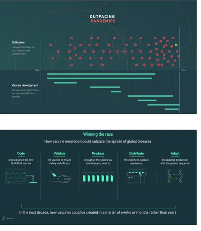
Figure 17. An actor’s life (first) | Figure 18a and 18b. Outpacing pandemics (second and last)
Guidelines
1. Our natural eye movements when looking at information, i.e. left-right and top-down, should be considered when designing the layout of infographics. A layout in zig-zag form should be favoured to increase comprehension.
2. The layout should also show a well-planned and clear hierarchical structure to help viewers locate the information.
3. Typefaces, shapes, colours, alignment and the space between elements should be consistent throughout the infographic layout.
4. Data visualisations, images and words should be balanced in an infographic layout. Text should be limited to titles, short annotations and bullet points, etc. 5. Text and relating images should be placed closely together in terms of perceptual
proximity (and with the help of visual guides if appropriate) to direct the eye from the text to the images and back, and facilitate integration of information.
6. Good infographics should include an introduction, the key message and a conclusion.
Additional practice-based guidelines
7. Organising the information should be the first task when creating an infographic. 8. To organise information successfully, the following should be done: a) read
carefully the information to be designed; b) identify the order the information needs to be presented; c) establish what the users need to see in terms of priority; d) decide how the different levels of information are going to be distinguished; e) consider elements such as typeface with a variety of weights, colour, scale, white space and other graphic elements that can successfully guide the user around the information.
9. After understanding and organising the information, the next step should be to create a grid to organise the content on the page and ensure visual clarity of the message through: a) organisation – a framework for text and visuals; b) movement – links between information sets and ability to move the eye through the content; c) grouping – connecting groups of content through proximity and alignment. 10. When developing a grid, the following should be decided: a) which pieces of
information should be grouped together; b) what should be the size and format of the infographic; c) how text and graphics should work together; d) should captions be used; e) how should white space be used effectively to emphasise the information; f) how should consistency be kept; etc.
11. A graphic and information hierarchy should also be very clear in every infographic, and even more so when the information is complex.
12. Hierarchies should be assessed throughout the various stages of design development to avoid altering the order of information randomly and consequently affecting its meaning.
13. White space should be used generously, and in harmony with the grid to give users a “visual” break and help them focus on the relevant information.
14. To make sure elements are aligned adequately, the following should be checked: a) are headings aligned in the same vertical axis (left, right, centre)?; b) do
headings, main text and sections have the same amount of space between them?; c) do lines start and end in the same proximity to the elements they are placed next to?
15. Elements should be aligned along as few horizontal and vertical lines as possible. 16. Weight and scale of the typographic elements, as well colour and type style, can
be manipulated to signal the relevance and priority of certain information.
Research Findings
• Eyes were found to be clearly guided by a grid format, making fairly predictable eye movements from left-right and top-down.
• A predictable orientation of the chunks of information in a zig-zag model was found to help users follow the story of an Infographic more steadily and with less distraction.
• Eye-tracking data showed quantitative evidence that comprehension is high from a zig zag form of layout, and with a low imposed cognitive load.
• Coherence when designing a set of infographics can save users time, because users do not have to mentally adjust to a different style every time they see a new infographic.
• Eye-tracking shows that scanning paths are much more unpredictable and varied with infographic designs that do not use a clear grid.
Rationale
An easy-to-navigate layout should be used in infographics to clearly show where to begin looking at the information, and where to end. For example, taking account of our natural left-right/up-down eye movement when placing dominant visual elements in the layout of the infographic, can improve comprehension and speed of finding information. A clear hierarchy, with clearly connected elements, further helps the user navigate through complex information in a logical and accessible way, and consequently reduces information overload. Grouping by similarity, which strengthens the link between the various design elements, also reduces complexity of the infographic and increases the speed of finding information. Alignment is equally important as it ensures that all the pictures and text elements line up with each other along a series of invisible lines, making the information easy to follow.
Furthermore, a well-structured infographic delivers more than accessible information. It delivers harmonious, balanced and aesthetically pleasing information.
Guidelines: Wickens and Carswell, 1995; Lipton, 2007; O’Grady and O’Grady, 2008; Holsanova, 2009; Baer, 2010; Davis and Quinn 2013; Coates and Ellison, 2014; Davidson 2014; Lamb and Johnson 2014; Arslan and Toy, 2015; Stones and Gent, 2015; Berinato, 2016; Dikson, 2016; Mighty, 2017; Majooni et al, 2017; Murray, et al., 2017; Yildirimi, 2017; Zhang, 2017.
Research findings: Stones and Gent, 2015; Majooni et al, 2017; Zhang, 2017.
Rationale: Lidwell, et al., 2003; Lipton, 2007; O’Grady and O’Grady, 2008; Baer, 2010; Moere and Purchase, 2011; Arslan and Toy, 2015; Stones and Gent, 2015; Majooni et al, 2017; Menezes and Pereira, 2017; Zhang, 2017.
Figure 19. The net of terror (first) | Figure 20. Under surveillance – Facial recognition (second)
04
4.1 General
p.424.2 Text | Typography
p.464.3 Colour
p.514.4 Graphics | Visual elements
p.554.5 Chart junk
p.594.6 Tables
p.634.7 Charts in general
p.664.8 Bar charts
p.714.9 Line charts
p.774.10 Pie charts
p.804.11 Unit charts
p.844.12 Other charts
p.87Data visualisations are not infographics, but are featured within infographics (Krum, 2014). Data visualisation is the visualisation of numeric values with charts, tables and graphics by transforming raw and intense data into visual presentations. Most of all, it includes clear information based on measurable statistical data (Dur, 2014).
Data visualisation and infographics, however, exist on a continuum (Cairo, 2013). Of the elements used in infographics, data visualisation is among the strongest one, if not the strongest. First, because it summarises hundreds and thousands of numbers into a digested visual form, but also because it has direct effect on the credibility and persuasiveness of infographics (Tanyoung and DiSalvo, 2010).
04
Guidelines
1. Data visualisation should be kept simple and display information in an accessible and readily understandable way.
2. Data visualisation should be used for comparison, not for individual amounts. 3. A suitable chart format and design, one that requires as little perceptual and
cognitive processing as possible, should be selected for the specific context and data that needs to be communicated.
4. Multiple data visualisation formats should be considered, to suit the type of data to be communicated and the target audience in question.
5. The content of a chart should be organised by: a) analysing the data thoroughly; b) classifying it in order of relevance; c) associating it according to its meaning. 6. Visual attributes should be used in data visualisation to help: a) group information
into meaningful sections; b) prioritise information in order of importance; c) sequence the information according to the order in which it should be read. 7. Data quality and simplicity should be ensured by: a) keeping symbols, colours,
text and metrics consistent; b) carefully selecting a few visual cues to help clarify the meaning of the data; c) creating clear captions, titles, and annotations on how to interpret the visualisation (in particular when less familiar formats are used); d) ordering the information by rank and relevance; e) clarifying uncertainty (e.g. clearly labelling associations, comparisons, etc.); f) avoiding using shadows and truncated scales; g) using the same scale for comparison.
8. Chartjunk and cluttering should be minimised by avoiding: distracting patterns, overbearing colours, shading, 3D, unnecessary grids, etc.
9. A simple and straightforward design with a richness of data should be used instead by: reducing the need for inferences, making clear and explicit comparisons, providing optional additional detail.
10. Information density can be accepted in certain instances, as long as the information can be visually extracted from the chart.
11. Data-ink ratio should be optimised by reserving the use of visuals (data ink) to communicate important data, and not for presenting redundant information. 12. Extra visuals (extra ink) can be used at times to facilitate cognitive processing and
help the user to perform a task with ease.
13. Data should have a narrative quality, i.e. a story to tell about the data to provide a context and give more meaning to the data.
14. To communicate complex data effectively and in a more intuitive way, a balance between functionality and aesthetics should be established.
15. Words, numbers, and drawings should be combined to make complex data more accessible and support the reader in interpreting the data accurately.
16. The focus of the whole visualisation should be on two or three key messages, which are then depicted using different visual aids.
17. Data transparency and integrity is imperative – displaying the data accurately and in context, avoiding distortion and bias.
18. The limitations, quality and relevance of the information should be acknowledged. When needed and appropriate, communicating a restricted part of a whole picture should be an option.
19. Data should be visualised in a manner that facilitates analysis.
20. The needs and expectations of the audience should be considered at all times. 21. Data visualisations should be validated by feedback from the target audience and
by conducting usability studies that include cognitive process tracing (e.g. eye tracking, verbal protocols, etc.).
22. The target audience should be involved in the design, evaluation, and dissemination of data visualisations.
Additional practice-based guidelines
23. Visualisation of information should start with a clear understanding of the message that needs to be communicated.
24. Data visualisation should not be used if a simple sentence is sufficient to
communicate the information clearly, or when only a number or two need to be communicated (a chart for such little data will only take space).
25. When considering aesthetics in data visualisation, things to take into account are: a) be smart with colour – colour should always be used with an intention and used sparingly to highlight relevant parts; b) pay attention to alignment – elements should be organised in clean vertical and horizontal lines to achieve a sense of unity and cohesion; c) maximise the use of white space – margins should be preserved by not including unnecessary elements simply because there is space. 26. Four elements should be included in all charts: title (about 12% of the
visualisation); subtitle (8%); visual field (75%); source line (5%).
27. Within the visual field, axes, labels, and sometimes captions and legends can be included.
Research Findings
• Charts designed according to principles of perceptual and cognitive processes of chart reading, were found to improve performance
• Statistical charts were found to encourage viewing in comparison to articles and numerical tables.
• A preference was also found for charts that visualise statistical information. • An even stronger preference was found for charts that allow direct visual
comparisons of statistical data and reaching a conclusion quickly.
• A preference was found for simple visual displays that allow access to more data.
Rationale
strategy that should be used to make complex data more accessible. Moreover, infographics present a story about the data, and because storytelling engages the user with the data, this will result in the user spending more time interpreting the data and, consequently, better data processing and understanding.
Above all, data needs to be communicated accurately. This can be further supported through an effective encoding of the data within an accurate organisation of the information on the page. This guides the user about where to focus and in which order to read the flow of information. Designs that are more aesthetic, are also perceived as easier to use, are better accepted, and foster problem solving. However, the correct balance between form and function needs to be ensured for effective communication of data. The use of colour, arrangement of elements on the page, and manipulation of white space, for example, should all be invisible components in a visual display. If these elements are noticed, the design is poor and will only create visual discomfort, and may even be seen as disrespectful to the data, as well as to the user accessing the data.
Guidelines: Gillan and Neary, 1992; Gillan and Lewis, 1994, Gillan and Richman, 1994; Gillan and Callahan, 2000; Gillan, 1995, 2000; Lipkus and Hollands, 1999; Shah and Hoeffner, 2002; Few, 2004a, 2004c, 2012; Hesse and Shneiderman, 2007; Friedman, 2008; Gillian and Sorensen, 2009; Hildon et al., 2011; Mol, 2011; Spiegelhalter et al., 2011; Dur, 2012; Trevena et al., 2012; Woller-Carter et al., 2012; Gelman and Unwin, 2013; Krum, 2013; Knaflic, 2015; Berinato, 2016; Okan et al., 2016; Asada et al., 2017; Garcia-Retamero and Cokely, 2017.
Research findings: Gillan and Callahan, 2000; Gillian and Sorensen, 2009; Le et al., 2013; Zhang, 2017.
Figure 21. State by state migration (first) | Figure 22. Who was working (second)
Guidelines
1. Typographic design principles should be applied to any visualisation that includes text.
2. No more than two typefaces should be used in the same visual display. 3. Type sizes should be appropriate for the size of the chart and the chart area. 4. Sans serif type should be used for digital content and at smaller sizes.
5. Both serif and sans serif typefaces can be used in combination to create a visual hierarchy and still maintain legibility. For example, using a sans serif typeface for headings and a serif typeface for paragraph text creates contrast and helps the user navigate the data and identify which text should receive attention first. 6. Type weight (e.g. bold) and size can also be used to create contrast and hierarchy. 7. Consistent use of type should be used throughout the data visualisation(s) to
convey a cohesive story.
8. Left-justified alignment should be used for bigger chunks of text, as the vertical edge on the left facilitates readability.
9. Left-alignment should also be used consistently to reduce visual clutter.
10. Important numerical and textual information should be added to the visualisation to increase accuracy.
11. Titles/headings should be clear and informative.
12. All supporting text (labels, legends, etc.) should be positioned to help the user interpret the chart, not to distract or confuse.
13. Labels should be used to provide detailed information on the data, and excluded if redundant or if making the chart look cluttered.
14. Labels should be used with segmented data, with a wide range of data, and with data areas (especially when volume is used to represent size).
15. Labels should not be used when the task is only to understand general trends (rather than specific data points), or to compare one data element to another (unless the data points are close to one another).
16. Horizontal labels extending beyond the chart should be avoided. 17. Legends should be written to make the chart self-explanatory.
18. Legends should be placed around the chart, or built into the chart, rather than perceived as separated from the chart.
19. Legends of similar charts should emphasise their different features.
20. Legends should have the same order as the corresponding content elements on the chart.
21. Borders around legends should be used only when necessary.
22. Self-explanatory symbols could be used in certain contexts instead of a legend, but all abbreviations and symbols should be clearly defined.
23. Captions should be used to highlight important aspects of charts, but they are often too general and do not capture a chart’s intended message. Therefore, verbs and adjectives in a caption could be used to suggest the general category of the chart’s message (e.g. the word ‘declining’ can suggest a falling or a change-trend).


![Design2Inform: Information visualisation overview [Report 01]](data:image/gif;base64,R0lGODlhAQABAIAAAP///wAAACH5BAEAAAAALAAAAAABAAEAAAICRAEAOw==)