2. Patterns and tests
In this chapter, I will present two key strategies in the quantitative analysis of linguistic data. We will come back to these in several different contexts in later chapters, so this is supposed to provide a foundation for those later discussions of how to apply hypothesis testing and
regression analysis to data.
2.1 Sampling
But first I would like to say something about sampling. In the “Fundamentals” chapter, I made the distinction between a population parameter (Greek letter symbols like µ, σ, σ2) and sample statistics (Roman letter symbols like
€
x , s, s2). These differ like this: If we take the average
height of everyone in the room, then the mean value that we come up with is the population parameter µ, of the population “everyone in the room”. But if we would like to think that this group of people is representative of a larger group like “everyone at this university” or
“everyone in this town”, then our measured mean value is a sample statistic
€
x that may or may
not be a good estimate of the larger population mean.
In the normal course of events as we study language, we rely on samples to represent larger populations. It isn’t practical to directly measure a population parameter. Imagine trying to find the grammaticality of a sentence from everyone who speaks a language! So we take a small, and we hope, representative sample from the population of ultimate interest.
So, what makes a good sample? To be an adequate representation of a population, the sample should be (1) large enough, and (2) random. Small samples are too sensitive to the effects of the occasional “odd” value, and nonrandom samples are likely to have some bias (called sampling bias) in them.
To be random it must be the case that every member of the population under study has an equal chance of being included in the sample. Here are two ways in which our linguistic samples are usually nonrandom.
1) We limit participation in our research to only certain people. e.g. a consultant must be bilingual in a language that the linguist knows, college students are convenient for our listening
experiments, we design questionnaires and thereby require our participants to be literate.
judgments of sentences in a particular order on a questionnaire.
Obviously, it is pretty easy to violate the maxims of good sampling, but what should you do if your sample isn’t representative of the population that you would most like to study? One option is to try harder to find a way to get a more random, representative sample. For instance you might collect some data from monolingual speakers and compare this with your data drawn from bilingual speakers. Or you might try conducting a telephone survey, using the listing of people in the phone book as your “population”. And to address the context issue, you might try asking people meaningful questions in a natural context, so that they don’t know that you are observing their speech. Or you might simply reverse the order of your list of sentences on the questionnaire.
In sum, there is a tradeoff between the feasibility of research and the adequacy of the sample. We have to balance huge studies that address tiny questions against small studies that cover a wider range of interesting issues. A useful strategy for the discipline is probably to encourage a certain amount “calibration” research that answers limited questions with better sampling.
2.2 Data
Some of this discussion may reveal that I have a particular attitude about what linguistic data is, and I think this attitude is not all that unusual but worth stating explicitly. The data in linguistics are any observations about language. So, I could observe people as they speak or as they listen to language, and call this a type of linguistic data. Additionally, a count of forms used in a text, whether it be modern newspaper corpora or ancient carvings, is data. I guess you could say that these are observations of people in the act of writing language and we could also observe people in the act of reading language as well. Finally, I think that when you ask a person directly about language, their answers are linguistic data. This includes native speaker judgments, perceptual judgments about sounds, and language consultant’s answers to questions like “what is your word for finger?”
Let’s consider an observation and some of its variables.
The observation is this: A native speaker of American English judges the grammaticality of the sentence “Josie didn’t owe nobody nothing.” to be a 3 on a 7-point scale.
There are a large number of variables associated with this observation. For example, there are some static properties of the person who provided the judgment - gender, age, dialect,
orderings of the sentences that we want to test, but we should pay attention to the possibility that order matters. Additionally, the person’s prior experience in judging sentences probably matters. I’ve heard syntacticians talk about how their judgments seem to evolve over time and sometimes reflect theoretical commitments.
The task given to the participant also may influence the type of answer we get. For example, we may find that a fine-grained judgment task provides greater separation of close cases, or we may find that variance goes up with a fine-grained judgment task because the participant tends to focus on the task instead of on the sentences being presented.
We may also try to influence the participant’s performance by instructing them to pay particular attention to some aspect of the stimuli or approach the task in a particular way. I’ve done this to no effect (Johnson, Flemming & Wright, 1993) and to startling effect (Johnson, Strand &
D’Imperio, 1999). The participants in JFW gave the same answers regardless (so it seemed) of the instructions that we gave them. But the “instruction set manipulation” in JSD changed listener’s expectations of the talker and thus changed their performance in a listening experiment. My main point here is that how we interact with participants may influence their performance in a data collection situation.
An additional, very important task variable is the list of materials. The context in which a judgment occurs influences it greatly. So if the test sentence appeared in a list that has lots of “informal” sentences of the sort that language mavens would cringe at, it might get a higher rating than if it appeared in a list of “correct” sentences.
The observation “3 on a 7-point scale” might have been different if we had changed any one of these variables. This large collection of potentially important variables is typical when we study complex human behavior, especially learned behavior like language. There are too many possible experiments. So the question we have to address is: which variables are you interested in
studying? Which would you like to ignore? You have to ignore variables that probably could affect the results, and one of the most important elements of research is learning how to ignore variables.
This is a question of research methods which lies beyond the scope of this chapter. However, I do want to emphasize that (1) our ability to generalize our findings depends on having a
representative sample of data - good statistical analysis can’t overcome sampling inadequacy - and (2) the observations that we are exploring in linguistics are complex with many potentially important variables. The balancing act that we attempt in research is to stay aware of the complexity, but not let it keep us from seeing the big picture.
Now, keeping in mind the complexities in collecting representative samples of linguistic data and the complexities of the data themselves, we come to the first of the two main points of this chapter - hypothesis testing.
We often want to ask questions about mean values. Is this average Voice Onset Time different from that one? Do these two constructions receive different average ratings? Does one variant occur more often than another? These all boil down to the question is
€
x (the mean of the data xi)
different from
€
y (the mean of the data yi)?
The smarty-pants answer is that you just look at the numbers, and they either are different or they aren’t. The sample mean simply is what it is. So
€
x is either the same number as
€
y or it
isn’t. So what we are really interested in is the population parameter estimated by
€
x and
€
y -
call them µx and µy. Given that we know the sample mean values
€
x and
€
y , can we say with
some degree of confidence that µx is different from µy? Since the sample mean is just an estimate of the population parameter, if we could measure the error of the sample mean then we could put a confidence value on how well it estimates µ.
2.3.1 The Central Limit Theorem.
A key way to approach this is to consider the sampling distribution of
€
x . Suppose we took 100
samples from a particular population. What will the distribution of the means of our 100 samples look like?
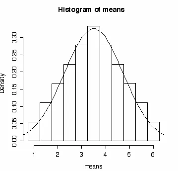
Consider sampling from a uniform distribution of the values 1... 6, i.e. roll a dice. If we take samples of two (roll the dice once, write down the number shown, roll it again, and write down that number), we have 62 possible results, as shown in Table 2.1.
€
x 4 4.5 5 5.5 6
6,6 6,5 6,4 6,3 6,2 6,1 6 5,6 5,5 5,4 5,3 5,2 5,1 5 4,6 4,5 4,4 4,3 4,2 4,1 4 3,6 3,5 3,4 3,3 3,2 3,1 3 2,6 2,5 2,4 2,3 2,2 2,1 2 1,6 1,5 1,4 1,3 1,2 1,1 1 6 5 4 3 2 1
Notice that the average of the two rolls is the same for cells in the diagonals. For example, the only way to average 6 is to roll 6 in both trials, but there are two ways to average 5.5 - roll a 6 and then a 5 or a 5 and then a 6. As you can see from Table 2.1, there are six ways to get an average of 3.5 on two rolls of the dice. Just to drive the point home, excuse the excess of this, the average of the following six two dice trials is 3.5 - (6,1), (5,2), (4,3), (3,4), (2,5), and (1,6). So, if we roll two dice, the probability of having an average number of dots equal to 3.5 is 6 times out of 36 trials (6 of the 36 cells in table 2.1).
Figure 2.1. The frequency distribution of the mean for the samples illustrated in Table 2.1.
---R-note. Here’s how I made Figure 2.1. First I entered a vector “means” that lists the mean value of each cell in Table 2.1. Then I entered a vector “b” to mark the edges of the bars that I want in the histogram. Then I plotted the histogram and best fitting normal curve.
means = c(1, 1.5,1.5, 2,2,2, 2.5,2.5,2.5,2.5, 3,3,3,3,3,
3.5,3.5,3.5,3.5,3.5,3.5, 4,4,4,4,4, 4.5,4.5,4.5,4.5, 5,5,5, 5.5,5.5, 6)
b = c(0.75,1.25,1.75,2.25,2.75,3.25,3.75,4.25,4.75,5.25,5.75,6.25) hist(means,breaks=b,freq=F)
plot(function(x)dnorm(x,mean=mean(means), sd=sd(means)),0.5,6.5, add=T)
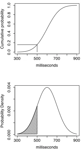
---Before we continue with this discussion of the central limit theorem we need step aside slightly to address one question that arises when you look at Figure 2.1. To the discriminating observer, the vertical axis doesn’t seem right. The probability of averaging 3.5 dots on two rolls of the dice is 6/36 = 0.1666. So, why does the vertical axis in Figure 2.1 go up to 0.3? What does it mean to be labelled “density” and how is probability density different from probability?
Consider the probability of getting exactly some particular value on a continuous measurement scale. For example, if we measure the amount of time it takes someone to respond to a sound, we typically measure to some chosen degree of accuracy - typically the nearest millisecond.
However, in theory we could have produced an arbitrarily precise measurement to the
nanosecond and beyond. So, on a continuous measurement scale that permits arbitrarily precise values, the probability of finding exactly one particular value, say exactly 500 milliseconds, is actually zero because we can always specify some greater degree of precision that will keep our observation from being exactly 500 milliseconds - 500.00000001 ms. So on a continuous dimension, we can’t give a probability for a specific value of the measurement variable. Instead we can only state the probability of a region under the cumulative distribution curve. For instance, we can’t say what the probability of a measurement of 500 is, but we can say for example that about 16% of the cumulative distribution in figure 2.2 falls to the left of 500 milliseconds - that given a population like this one (mean = 600, standard deviation = 100) we expect 16% of the values in a representative sample to be lower than 500.
The probability density curve in the bottom panel of figure 2.2 shows this same point, but in terms of the area under the curve instead of the value of the function at a particular point. In the probability density function, the area under the curve from 0 to 500 ms is 16% of the total area under the curve, so the value of the cumulative density function at 500 ms is 0.16. This
increases from 0 to 1, while the probability density function (pdf) takes the familiar bell-shaped curve.
The probability density that we see in Figures 2.1 and 2.2 indicates the amount of change in (the derivative of) the cumulative probability function. If f(x) is the probability density function, and F(x) is the cumulative probability function then the relationship is:
€
d
dxF(x) = f(x), The density function from the cumulative probability function
The upshot is that we can’t expect the density function to have the values on the y-axis that we would expect for a cumulative frequency curve, and what we get by going to the trouble of defining a probability density function in this way is a method for calculating probability for areas under the normal probability density function.
Let’s return now to the main point of Figure 2.1. We have an equal probability in any particular trial of rolling any one of the numbers on the dice - a uniform distribution - but the frequency distribution of the sample mean, even of a small sample size of only 2 rolls, follows the normal distribution. This is only approximately true with an n of 2. As we take samples of larger and larger n the distribution of the means of those samples becomes more and more perfectly normal. In looking at this example of two rolls of the dice, I was struck by how normal the distribution of means is for such small samples. This property of average values - that they tend to fall in a normal distribution as n increases - is called the central limit theorem. The practical consequence of the central limit theorem is that we can use the normal distribution (or, as we will see, a close approximation) to make probability statements about the mean - like we did with Z-scores - even though the population distribution is not normal.
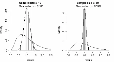
Let’s consider another example - this time of a skewed distribution. To produce the left side of Figure 2.3, I started with a skewed population distribution as shown in the figure and took 1000 random samples from the distribution with a sample size of 10 data points per sample. I
calculated the mean of each of the 1000 samples so that now I have a set of 1000 means. These are plotted in a histogram and theoretical curve of the histogram that indicate that the frequency distribution of the mean is a normal distribution. Also, a Q-Q plot (not shown) of these has a correlation of 0.997 between the normal distribution and the sampling distribution of the mean.
was when we took samples of size 10 from this skewed distribution.
Figure 2.3. The sampling distribution of the mean taken from 1000 samples that were drawn from a skewed population distribution when the sample size was only 10 observations, and when the sample size was 50 observations.
Notice in Figure 2.3 that I report the “standard error” of the 1000 means in each panel. By standard error I mean simply the standard deviation of the sample of 1000 means. As is apparent from the pictures, the standard deviation of the means is smaller when we take samples of 50 than when we take samples of 10 from the skewed distribution. This is a general feature. We are able to get a more accurate estimate of the population mean with a larger sample. You can see that this is so if we were to limit our samples to only one observation each. In such a case, the standard error of the mean would be the same as the standard deviation of the population being sampled. With larger samples the effects of observations from the tails of the distribution are dampened by the more frequently occurring observations from the middle of the distribution.
10 were much more spread out than were the means drawn from samples of size 50. Next we’ll look at another factor that determines how accurately we can measure the population mean from samples drawn from that population.
---R-note. To explore the central limit theorem I wrote a function in R called central.limit().
Then to produce the graphs shown in Figure 2.3 all I had to do was type:
source("central.limit")
par(mfrow=c(1,2)) # to have one row with two graphs central.limit(10) # to make the first graph
central.limit(50) # to make the second graph
I also made it so we can look at a Q-Q plot of the distribution of the means by changing the function call slightly.
central.limit(10,qq=TRUE)
I put a little effort into this central.limit() function so that I could change the shape of the population distribution, change the sample size, and the number of samples drawn, and to add some information to the output. Here’s the definition of central.limit() that I stored in a text file called “central.limit” and that is read into R with the source() command above.
#--- central.limit ---#
#The input parameters are: # n - size of each sample
# m - number of samples of size n to select # qq - TRUE means show the Q-Q plots
# df1, df2 - the df of the F() distribution from which samples are drawn # xlow, xhigh - x-axis limits for plots
central.limit = function(n=15,m=1000,qq=FALSE,df1=6,df2=200,xlow=0,xhigh=2.5) {
means = vector() # I hereby declare that "means" is a vector
for (i in 1:m) { # get m samples from a skewed distribution
data= rf(n,df1,df2) # the F() distribution is nice and skewed means[i] = mean(data) # means is our array of means
}
qqline(means)
caption = paste("n =",n,", Correlation = ",signif(cor(means,x),3)) mtext(caption)
} else { # the default behavior
title = paste("Sample size = ",n)
hist(means, xlim = c(xlow,xhigh),main=title,freq=F)
plot(function(x)dnorm(x,mean=mean(means), sd=sd(means)), xlow, xhigh, add=T)
plot(function(x)df(x,df1,df2),xlow,xhigh,add=T)
caption = paste("Standard error = ",signif(sd(means),3)) mtext(caption)
} }
This looks pretty complicated, I know, but I really think it is worth knowing how to put together an R function because (1) being able to write functions is one of the strengths of R, and (2) having a function that does exactly what you want done is extremely valuable. I do a number of new things in this function, but I also do a number of things that we saw in the first chapter. For example, we saw earlier how to sample randomly from the F distribution using the rf()
command, and we saw how to plot a histogram together with a normal distribution curve. We also saw earlier how to draw Q-Q plots. So really, this function just puts together a number of things that we already know how to do.
There are only three new R capabilities that I used in writing the central.limit() function:
function(). The first is that central.limit() shows how to create a new command in R using the function() command. For example, this line:
>square = function(x) {return(x*x)}
creates, or defines, a function called square() that returns the square (x times x) of the input value. So now if you enter:
>square(1532)
R will return with the number “2347024”. Note that in my definition of “central.limit()” I gave each input parameter a default value. This way the user doesn’t have to enter values for these parameters, but can instead pick and choose which variable names to set manually. Because I set default values for the input variables in the central limit function, central.limit(df1=3) is a legal command that works so that the default values are used for each input parameter except
into R and make them available for use.
for (i...). The central.limit() function shows how to use a “for loop” to do something over and over. I wanted to draw lots (m) of random samples from the skewed F distribution, store all of the means of these samples and then make a histogram of the means. So, I used a “for loop” to execute two commands over and over:
data= rf(n,df1,df2) means[i] = mean(data)
The first one draws a new random sample of n data points from the F distribution, and the second one calculates the mean of this sample and stores it in the ith location in the “means” vector. By putting these two commands inside the following lines we indicate that we want the variable i to start with a value of 1 and we want to repeat the commands bracketed by {...} counting up from i=1 until i=m. This gives us a vector of m mean values stored in means[1]... means[m].
for (i in 1:m) {
# my repeated stuff here }
if (). Finally, central.limit() shows how to use an “if statement” to choose to do one set of commands or another. I wanted to have the option to look at a histogram and report the standard deviation, or to look at a Q-Q plot and report the correlation with the normal
distribution. So, I had central.limit() choose one of these two options depending on whether the input parameter “qq” is TRUE or FALSE.
if (qq) {
# do this if “qq” is TRUE } else {
# do this if “qq” is not TRUE }
---I made a new version of central.limit() that I decided to call central.limit.norm()
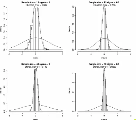
the right had a σ of 0.6. The top panels had a sample size (n) of 15, while for the bottom panels n=50.
We saw in figure 2.3 that our estimate of µ was more accurate (the standard deviation of
€
x was
smaller) when the sample size increased. What we see in figure 2.4 is that the error of our estimates of µ are also smaller when the standard deviation of the population (σ) is smaller. In fact, figure 2.4 makes it clear that the standard error of the mean depends on both sample size and σ. So, we saw earlier in figure 2.3 that the distribution of sample means
€
x is more tightly
focused around the true population mean µ when the sample n is larger. What we see in figure 2.4 is that the distribution of sample means is also more tightly focused around the true mean when the population distribution is smaller.
Check this out. Let’s abbreviate the standard error of the mean SE - this is the standard deviation of
€
x values that we calculate from successive samples from a population and it indicates how
accurately we can estimate the population mean µ from a random sample of data drawn from that population. It turns out (as you might expect from the relationships apparent in Figure 2.4) that you can measure the standard error of the mean from a single sample - it isn’t necessary to take thousands of samples and measure SE directly from the distribution of means. It is a good thing. Can you imagine having to perform every experiment 1000 times so you can measure SE
directly? The relationship between SE and σ (or our sample estimate of σ, s) is:
€
SE =sx = σ
n Standard error of the mean: population
€
SE =sx = sx
Figure 2.4. The sampling distribution of the mean of a normal distribution is a function of sample size and the population standard deviation (σ). Right panels: the population distribution has a σ of 1. Left panels: σ is 0.6. Top panels: Sample size (n) was 15. Bottom panels: n is 50.
You can test this out on the values shown in Figure 2.4:
€
σ n =
1
15 = 0.258
€
σ n =
0.6
€
σ n =
1
50 = 0.141
€
σ n =
0.6
50 = 0.0849
The calculated values are almost exactly the same as the measured values of the standard deviation of the set of 5000 means.
2.3.2 Score keeping.
Here’s what we’ve got so far about how to test hypotheses regarding means.
1) You can make probability statements about variables in normal distributions. 2) You can estimate the parameters of empirical distributions as the least squares
estimates of
€
x and s.
3) Means themselves, of samples drawn from a population, fall in a normal distribution. 4) You can estimate the standard error (SE) of the normal distribution of
€
x values from a
single sample.
What this means for us is that we can make probability statements about means.
2.3.3 H0: µ = 100
Recall that when we wanted to make probability statements about observations using the normal distribution, we converted our observation scores into z scores (the number of standard
deviations different from the mean) using the z score formula.
So, now to test a hypothesis about the population mean (µ) on the basis of our sample mean and the standard error of the mean we will use a very similar approach.
€
z= xi-x
s z-score
€
t = x -µ
sx t value
However, we usually (almost always) don’t know the population standard deviation. Instead we estimate it with the sample standard deviation, and the uncertainty introduced by using s instead of σ means that we are off a bit and can’t use the normal distribution to compare x to µ. Instead,
distribution that takes into account how certain we can be about our estimate of σ. Just as we saw that a larger sample size gives us a more stable estimate of the population mean, so we get a better estimate of the population standard deviation with larger sample sizes. So the larger the sample size, the closer the t distribution is to normal. I show this in Figure 2.5 for the normal distribution and t distributions for three different sample sizes.
Figure 2.5. The normal distribution (solid line) and t-distributions for samples of size n=21 (dash), n=7 (dot) and n=3 (dot,dash).
So we are using a slightly different distribution to talk about mean values, but the procedure is practically the same as if we were using the normal distribution. Nice that you don’t have to learn something totally new.
make a probability statement about a t value you refer to the t distribution. It may seem odd to talk about comparing the sample mean to the population mean because we we can easily calculate the sample mean but the population mean is not a value that we can know. However, if you think of this as a way to test a hypothesis, then we have something. For instance, with the Cherokee voice onset time data, where we observed that
€
x = 84.7 and s = 36.1 for the stops
produced in 2001, we can now ask whether the population mean µ is different from 100. Let’s just plug the numbers into the formula.
€
t= x −µ
sx =
84.7−100 36.1 26 =
−15.3
7.08 =−2.168
So we can use the formula for t to find that the t value in this test is -2.168. But what does that mean? We were testing the hypothesis that the average VOT value of 84.7 ms is not different from 100 ms. This can be written as H0: µ = 100. Meaning that the null hypothesis (the “no difference” hypothesis H0) is that the population mean is 100. Recall that the statistic t is analogous to z - it measures how different the sample mean
€
x is from the hypothesized
population mean µ, as measured in units of the standard error of the mean. As we saw in chapter 1, observations that are more than 1.96 standard deviations away from the mean in a normal distribution are pretty unlikely - only 5% of the area under the normal curve. So this t value of -2.168 (a little more than 2 standard errors less than the hypothesized mean) might be a pretty unlikely one to find if the population mean is actually 100 ms.
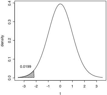
How unlikely? Well, the probability density function of t with 25 degrees of freedom (since we had 26 observations in the VOT data set) shows that only 2% of all t values in this distribution are less than -2.16 (Figure 2.6). Recall that we are evaluating the null hypothesis that µ = 100. Therefore, this probability value says that if we assume that µ = 100 it is pretty unlikely (2 times in 100) that we would draw a sample that has an
€
x of 84.7. The more likely conclusion
Figure 2.6. The probability density function of t with 25 degrees of freedom. The area of the shaded region at t < -2.168 indicates that only a little over 2% of the area under this curve has a t value less than -2.168.
---R-note. I wrote a script to produce t probability density functions with shaded tails such as the one in Figure 2.6. The function is called “shade.tails” (check for it in the “Data sets and scripts” part of the course web page), and to produce figure 2.6, I entered the t value we calculated above, the degrees of freedom for the t distribution and indicated that we want the probability of a lower t value. The key functions in shade.tails are pt(), the probability of getting a smaller or larger t value, and dt() the density functon of t. For example, the probability of finding a smaller t value, given 25 degrees of freedom is calculated by the pt() function.
> pt(-2.168,25)
[1] 0.01994047
This hypothesis test, using the mean, standard deviation, and hypothesized population mean (µ) to calculate a t value, and then look up the probability of the t value is a very common statistical test. Therefore, there is a procedure in R that does it for us.
> vot01 = c(84, 82, 72,193, 129, 77, 72, 81, 45, 74, 102, 77, 187, 79, 86, 59, 74, 63, 75, 70, 106, 54, 49, 56, 58, 97)
> vot71 =c(67, 127, 79, 150, 53, 65, 75, 109, 109, 126, 129, 119, 104, 153, 124, 107, 181, 166)
> t.test(vot01,mu=100,alternative="less")
One Sample t-test
data: vot01
t = -2.1683, df = 25, p-value = 0.01993
alternative hypothesis: true mean is less than 100 95 percent confidence interval:
-Inf 96.74298 sample estimates: mean of x
84.65385
In this call to t.test(), I entered the name of the vector that contains my data, the
hypothesized population mean for these data, and that I want to know how likely it is to have a lower t value.
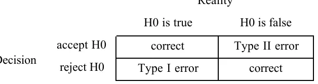
---2.3.4 Type I and Type II error
We seek to test the hypothesis that the true Cherokee VOT in 2001 (µ ) is 100ms by taking a sample from a larger population of possible measurements. If the sample mean (
€
x ) is different
enough from 100ms then we reject this hypothesis otherwise we accept it.
hypotheses).
H0: µ = 100 Reject H1: µ < 100 Accept
We have to admit, though, that 2 times out of 100 this decision would be wrong. It may be unlikely, but it is still possible that H0 is correct -- the population mean really could be 100 ms even though our sample mean is a good deal less than 100 ms. This error probability (0.02) is called the probability of making a type I error. A type I error is that we incorrectly reject the null hypothesis - we claim that the population mean is less than 100, when actually we just were unlucky and happened to draw one of the 2 out of 100 samples for which the sample mean was equal to or less than 84.7.
No matter what the sample mean is, you can’t reject the null hypothesis with certainty because the normal distribution extends from negative infinity to positive infinity. So, even with a
population mean of 100 ms. we could have a really unlucky sample that has a mean of only 5 ms. This probably wouldn’t happen, but it might. So we have to go with our best guess.
[image:21.612.160.474.592.675.2]In practice, “going with your best guess” means choosing a type I error probability that you are willing to tolerate. Most often we are willing to accept a 1 in 20 chance that we just got an unlucky sample that leads us to make a type I error. This means that if the probability of the t value that we calculate to test the hypothesis is less than 0.05, we are willing to reject H0 (µ = 100) and conclude that the sample mean comes from a population that has a mean that is less than 100 (µ < 100). This criterion probability value (p<0.05) is called the “alpha” α level of the test. The α level is the acceptable type I error rate for our hypothesis test.
Table 2.2. The decision to accept or reject the null hypothesis may be wrong in two ways. An incorrect rejection, a type I error, is when we claim that the means are different but in reality they aren’t, and an incorrect acceptance, a type II error, is when we claim that the means are not different but in reality they are.
Decision
Reality
correct correct Type II error Type I error
reject H0 accept H0
Where there is a type I error, there must be a type II error also (see table 2.2). A type II error occurs when we incorrectly accept the null hypothesis. Suppose that we test the hypothesis that the average VOT for Cherokee (or at least this speaker) is 100 ms, but the actual true mean VOT is 95 ms. If our sample mean is 95 ms and the standard deviation is again about 35 ms we are surely going to conclude that the null hypothesis (H0: µ = 100) is probably true. At least our data is not inconsistent with the hypothesis because 24% of the time (p=0.24) we can get a t value that is equal to or less than -0.706.
€
t= x −µ
sx =
95−100 36.1 26 =
−5
7.08=−0.706 testing for a small difference
Nonetheless, by accepting the null hypothesis we have made a type II error. Just as we can choose a criterion α level for the acceptable type I error rate, we can also require that our
statistics avoid type II errors. The probability of making a type II error is called β, and the value we are usually interested in is 1-β, the power of our statistical test. As my example illustrates, to avoid type II errors you need to have statistical tests that are sensitive enough to catch small differences between the sample mean and the population mean - to detect that 95 really is
different from 100. With only 26 observations (n=26) and a standard deviation of 36.1, if we set the power of our test to 0.8 (that is accept type II errors 20% of the time with β = 0.2) the difference between the hypothesized mean and the true population mean would have to be 18 ms before we could detect the difference. To detect a smaller difference like 5 ms we would have to increase the power of our hypothesis test.
You’ll notice that in the calculation of t there are two parameters other than the sample mean and the population mean that affect the t value. These are the standard deviation of the sample (s) and the size of the sample (n). To increase the power of the t test we need to either reduce the standard deviation or increase the number of observations. Sometimes you can reduce the standard deviation by controlling some uncontrolled sources of variance. For example, in this VOT data I pooled observations from both /t/ and /k/. These probably do have overall different average VOT, so by pooling them I have inflated the standard deviation. If we had a sample of all /k/ VOTs the standard deviation might be lower and thus the power of the t test greater.
Generally, though, the best way to increase the power of your test is to get more data. In this case, if we set the probability of a type I error at 0.05, the probability of a type II error at 0.2, and we want to be able to detect that 95 ms is different from the hypothesized 100 ms, then we need to have an n of 324 observations (see the R note for the magic).
---R note. The ---R function power.t.test() provides a way to estimate how many
magnitude with α and β error probabilities controlled. In the call below, I specified that I want to detect a difference of 5 ms (delta=5), that I expect that the standard deviation of my
observations will be 36.1 (sd=36.1), and that we are testing whether the sample mean is less than the hypothesized mean, not just different one way or the other (alternative =
"one.sided"). With α = 0.05 (sig.level=0.05) and β = 0.2 (power=0.8), this function reports that we need 324 (n = 323.6439) observations to detect the 5 ms difference.
power.t.test(power=0.8,sig.level=0.05,delta=5,sd=36.1, type="one.sample",alternative="one.sided")
One-sample t test power calculation
n = 323.6439 delta = 5 sd = 36.1
sig.level = 0.05 power = 0.8
alternative = one.sided
---Of course, collecting more data is time consuming, so it is wise to ask, as Ilse Lehiste once asked me, “sure it is significant, but is it important?” It may be that a 5 ms. difference is too small to be of much practical or theoretical importance, so taking the trouble to collect enough data so that we can detect such a small difference is really just a waste of time.
2.4 Correlation.
So far we have been concerned in this chapter with the statistical background assumptions that make it possible to test hypotheses about the population mean. This is the “tests” portion of this chapter on “Patterns and tests”. You can be sure that we will be coming back to this topic in several practical applications in chapters to follow. However, because this chapter is aiming to establish some of the basic building blocks that we will return to over and over in the subsequent chapters, I would like to suspend the “tests” discussion at this point and turn to the “patterns” portion of the chapter. The aim here is to explain some of the key concepts that underlie studies of relationships among variables - in particular to review the conceptual and mathematical
underpinnings of correlation and regression.
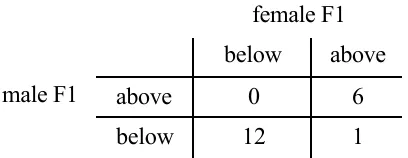
vowels /i/, /e/, /a/, /o/, and /u/ in four different languages (see the data file “F1_data.txt”). Women tend to have shorter vocal tracts than men and thus to have higher resonance frequencies. This is the case in our data set, where the average F1 of the women is 534.6 Hz and the average F1 for men is 440.9. We can construct a contingency table by counting how many of the observations in this data set fall above or below the mean on each of the two variables being compared. For example, we have the five vowels in Sele measured on two variables - male F1and female F1 - and we are interested in studying the relationship or correlation between male and female F1 frequency. The contingency table in 2.3 then shows the number of times that we have a vowel that has female F1 above the average female F1 value while for the same vowel in the same language we have male F1 above the male F1 average - this “both above” condition happens six times in this small data set. Most of the other vowels (twelve) have both male and female F1 falling below their respective means, and in only one vowel was there a discrepancy, where the female F1 was above the female mean while the male F1 was below the male F1.
Table 2.3 A 2 X 2 contingency table showing the number of F1 values above or below the average F1 for men and women in the small “F1_data.txt” data set.
female F1
1 12
below
above below
6 0
above male F1
So, table 2.3 shows how the F1 values fall in a two by two (2 X 2) contingency table. This table shows that for a particular vowel in a particular language (say /i/ in Sele), if the male F1 falls below the average male F1, then the female F1 for that vowel will probably also fall below the average F1 for female speakers. In only one case does this relationship not hold.
I guess it is important to keep in mind that Table 2.3 didn’t have to come out this way. For instance, if F1 was not acoustically related to vowel quality, then pairing observations of male and female talkers according to which vowel they were producing would not have resulted in matched patterns of F1 variation.
Contingency tables are a useful way to see the relationship, or lack of one, between two
same amount above average or if sometimes the amount above average for males is much more than it is for females. It would be much better to explore the relationship of these two variables without throwing out this information.
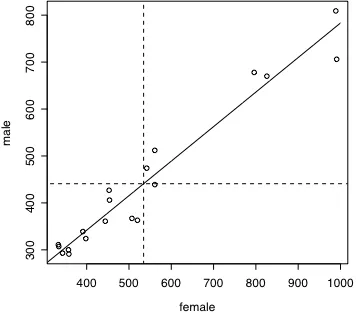
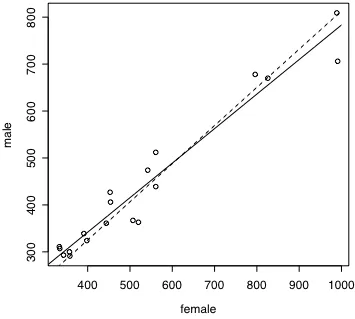
Figure 2.7. Nineteen pairs of male and female F1 values drawn from four different languages and 4 or 5 vowels in each language. The grid lines mark the average female (vertical line) and male (horizontal line) F1 values. The diagonal line is the best fitting straight line (the linear regression) that relates female F1 to male F1.
not. In fact, it looks as if we divide the lower left and the upper right quadrants into quadrants again we would still have the relationship, higher male F1 is associated with higher female F1. We need a measure of association that will give us a consistent indication of how closely related two variables are.
---R note. For the example in Table 2.3 and Figure 2.7, I used data that are stored in a data file that I called “F1_data.txt”. This is laid out like a spread sheet, but it is important to keep in mind that it is a text file. So, if you are preparing data for import into R you should be sure to save your data file as a “.txt” file (actually R doesn’t care about the file name extension, but some programs do). The first three lines of my data file look like this:
female male vowel language
391 339 i W.Apache
561 512 e W.Apache
...
The first row contains the names of the variables, and the following rows each contain one pair of observations. For example, the first row indicates that the vowel [i] in Western Apache has an F1 value of 391 Hz for women and 339 Hz for men. I used the read.delim() function to read my data from the file into an R data.frame object.
f1data = read.delim("F1_data.txt")
This object f1data is composed of four vectors, one for each column in the data file. So, if I would like to see the vector of female F1 measurements I can type the name of the vector - in this case it is the name of the data frame, followed by a dollar sign and then the name of the vector.
> f1data$female
[1] 391 561 826 453 358 454 991 561 398 334 444 796 542 333 [15] 343 520 989 507 357
The command summary() is a useful one for verifying that your data file has been read correctly.
> summary(f1data)
3rd Qu.:561.0 3rd Qu.:493.0 u:3 Max. :991.0 Max. :809.0
It is a bit of a pain to keep typing f1data$female to refer to a vector, so the attach()
command is useful because once a data frame has been attached you don’t have to mention the data frame name.
attach(f1data)
Now, having read in the data, here are the commands I used to produce Figure 2.7 (I’ll discuss the diagonal line later).
plot(female,male)
lines(x=c(mean(female),mean(female)),y=c(200,900),lty=2) lines(x=c(200,1100),y=c(mean(male),mean(male)),lty=2)
Finally, as you might expect, R has built in functions to calcluate the covariance and correlation between two variables.
> cov(female,male) [1] 33161.79
> cor(female,male) [1] 0.9738566
---2.4.1 Covariance and correlation.
The key insight in developing a measure of association between two variables is to measure deviation from the mean (
€
xi−x ). As we saw in Figure 2.7, the association of male F1 and female
F1 can be captured by noticing that when female F1 (let’s name this variable x) was higher than the female mean, male F1 (y) was also higher than the male mean. That is, if
€
xi−x is positive
then
€
yi−y is also positive. What is more, the association is strongest when the magnitudes of
these deviations are matched - when xi is quite a bit larger than the x mean and yi is also quite a bit larger than the y mean. We can get an overall sense of how strong the association of two variables is by multiplying the deviations of x and y and summing these products for all of the
observations.
(xi−x )(yi−y )
i=0
n
∑
sum of product of deviationsproduct will be greater than if yi is only a little larger than the mean. Notice also that if xi is quite a bit less than the mean and yi is also quite a bit less than the mean the product will again be a large positive value.
The product of the deviations will be larger as we have a larger and larger data set, so we need to normalize this value to the size of the data set by taking the average of the paired deviations. This average product of the deviations is called the covariance of X and Y.
€
(xi−x )(yi−y ) i=0
n
∑
n Covariance of X and Y
Of course, the size of a deviation from the mean can be standardized so that we can compare deviations from different data sets on the same measurement scale. We saw that deviation can be expressed in units of standard deviation with the z-score normalization. This is commonly done when we measure association too.
€
xi−x sx
yis−y
y i=0 n
∑
n =(zx)(zy)
i=0
n
∑
n =rxy Correlation of X and Y
The main result here is that the correlation coefficient rxy is simply a scaled version of the sum of the product of the deviations using the idea that this value will be highest when x and y deviate from their means in comparable magnitude. Correlation is identical to covariance, except that correlation is scaled by the standard deviations. So covariance can have any value, and correlation ranges from 1 to -1 (perfect positive correlation is 1 and perfect negative correlation is -1).
2.4.2 The regression line.
Notice in Figure 2.7 that I put a diagonal line through the data points that shows generally the relationship between female and male F1. This line was not drawn by hand, but was calculated to be the best fitting straight line that could possibly be drawn. Well, let’s qualify that by saying that it is the best fitting least-squares estimate line. Here the squared deviations that we are trying to minimize as we find the best line are the differences between the predicted values of yi, which we will write as yi hat (
€
ˆ
y i), and the actual values. So the least squares estimate will
minimize
∑
(yi−y ˆ i)2. The difference between the predicted value and the actual value for anyHere’s how to find the best fitting line. If we have a perfect correlation between x and y then the deviations zx and zy are equal to each other for every observation. So we have:
€
yi−y sy =
xi−x
sx deviations are equivalent if rxy = 1
So, if we solve for yi to get the formula for the predicted
€
ˆ
y i if the correlation is perfect, then we
have:
€
ˆ y i =sy
sx(xi−x )+y predicting yi from xi when rxy = 1
Because we want our best prediction even when the correlation isn’t perfect and the best prediction of zy is rxy times zx, then our best prediction of yi is:
€
ˆ
y i =rxy sy
sx(xi−x )+y predicting yi from xi when rxy≠ 1
Now to put this into the form of an equation for a straight line (
€
ˆ
y i =A+Bxi) we let the slope of
the line
€
B=rsx
sy and the intercept of the line
€
A=y −Bx .
---R note. Let’s return to the male versus female vowel F1 data and see if we can find the slope and intercept of the best fitting line that relates these two variables. Note that we are justified in fitting a line to these data because when we look at the graph, the relationship looks linear.
Using the correlation function cor() and the standard deviation function sd(), we can calculate the slope of the regression line.
cor(male,female) [1] 0.9738566 sd(male) [1] 160.3828 sd(female) [1] 212.3172
B = cor(male,female)*(sd(male)/sd(female)) A = mean(male) - B*mean(female)
A
B
[1] 0.7356441
Now we have values for A and B, so that we can predict the male F1 value from the female F1:
male F1 = 0.736 * female F1 + 47.6
Consider, for example, what male F1 value we expect if the female F1 is 700 Hz. The line we have in Figure 2.7 leads us to expect a male F1 that is a little higher than 550 Hz. We get a more exact answer by applying the linear regression coefficients.
> B*700 + A [1] 562.547
---2.4.3. Amount of variance accounted for.
So now we have a method to measure the association between two continuous variables giving us the Pearson’s product moment correlation (rxy), and a way to use that measure to determine the slope and intercept of the best fitting line that relates x and y (assuming that a linear relationship is correct).
So what I’d like to present in this section is a way to use the correlation coefficient to measure the percent of variance in y that we can correctly predict as a linear function of x. Then we will see how to put all of this stuff together in R, which naturally has a function that does it all for you.
So, we have a statistic rxy that ranges from -1 to 1 that indicates the degree of association between two variables. And we have a linear function
€
ˆ
y i =A+Bxi that uses rxy to predict y from x. What
we want now is a measure of how much of the variability of y is accurately predicted by this linear function. This will be the “amount of variance accounted for” by our linear model.
Is it a model or just a line? What’s in a name? If it seems reasonable to think that x might cause y we can think of the linear function as a model of the causal relationship and call it a “regression model”. If a causal relationship doesn’t seem reasonable then we’ll speak of the correlation of two variables.
to this conclusion.
€
r2 =rxyrxy r-squared, the amount of variance accounted for
The variance of y is
€
sy2. We are trying to measure how much of this variance can be accounted for
by the line
€
ˆ
y i =A+Bxi. The amount of variance that is predicted by this “linear regression
function” is
€
sy ˆ 2. Which means that the unpredicted variance is the variance of the deviation
between the actual yi values and the predicted values
€
ˆ
y i. Call this unpredicted, or residual,
variance
€
sy2- ˆ y . Because we used the optimal rule (the least squares criterion) to relate x and y,
€
sy ˆ 2
and
€
sy2- ˆ y are not correlated with each other, therefore
€
sy2=sy ˆ 2+sy2- ˆ y .
In words that is: The total variance of y is composed of the part that can be predicted if we know x and the part that is independent of x.
If we consider this same relationship in terms of z scores instead of in terms of the raw data (
€
sz2y =sz
ˆ y
2
+szy−z
ˆ y
2 ) we can equivalently talk about it in terms of proportion of variance because the
variance
€
sz2 of the normal distribution is equal to one. Then instead of dividing the total amount of
variance into a part that can be predicted by the line and a part that remains unpredicted we can divide it into a proportion can be predicted and a remainder.
In terms of z scores the line equation y = A+Bx is
€
ˆ
z y =rzx and from the definition of variance,
then,
€
sz ˆ 2y =
(rzx)2
∑
n =r
2
∑
(zx2)n =r
2 proportion of variance accounted for is r2
€
I guess, in decifering this it helps to know that
€
zx2
∑
=n because the standard deviation of z is 1.The key point here is that r2 is equivilent to
€
sz
2ˆ y , the proportion of total variance of y that can be predicted by the line.
values. What I’d like to do here is to introduce the function lm(). This function calculates a linear model in which we try to predict one variable from another variable (or several).
In this example, I ask to see a summary of the linear model in which we try to predict male F1 from female F1. You can read “male~female” as “male as a function of female”.
> summary(lm(male~female))
Call:
lm(formula = male ~ female)
Residuals:
Min 1Q Median 3Q Max -70.619 -18.170 3.767 26.053 51.707
Coefficients:
Estimate Std. Error t value Pr(>|t|) (Intercept) 47.59615 23.85501 1.995 0.0623 . female 0.73564 0.04162 17.676 2.23e-12 ***
---Signif. codes: 0 `***' 0.001 `**' 0.01 `*' 0.05 `.' 0.1 ` ' 1
Residual standard error: 37.49 on 17 degrees of freedom Multiple R-Squared: 0.9484, Adjusted R-squared: 0.9454 F-statistic: 312.4 on 1 and 17 DF, p-value: 2.230e-12
Notice that this summary statement gives us a report on several aspects of the linear regression fit. The first section of the report is on the residuals (
€
yi−y ˆ i) that shows their range, median, and
quartiles. The second section reports the coefficients. Notice that lm() calculates the same A and B coefficients that we calcuated in explicit formulas above. But now we also have a t test for both the intercept and the slope.
Finally lm() reports the r2 value and again tests whether this amount of variance accounted for
is greater than zero - using an F test. The line F1male = 47.596 + 0.7356*F1female accounts for
almost 95% of the variance in the male F1 values.
The t tests for A and B (the regression coefficients) above indicate that the slope (labeled
female) is definitely different from zero but that the intercept may not be reliably different from zero. This means that we might simplify the predictive formula by rerunning lm()
multiplying each paired female F1 value by 0.813. That is, the regression formula was F1male =
[image:33.612.120.475.198.517.2]0.813*F1female. The two regression analyses (with and without the intercept coefficient) are shown in figure 2.8.
Figure 2.8. Regression lines at y=47.5 + 0.736x (solid line) and y=0.81x (dashed line).
---Exercises
1. Given a skewed distribution (Figure 2.2) what distribution of the mean do you expect for samples of size n=1?
0.997 0.993 0.991 0.988 0.981 0.965 8 6 4 3 2 1 correlation n
What do these values indicate about the distribution of the mean? Where was the biggest change in the correlation?
3. We test the hypothesis that the mean of our data set (
€
x = 113.5, s = 35.9, n = 18) is no
different from 100, and find that the t is 1.59, and the probability of finding a higher t is 0.065. Show how to get this t value and this probability from the t distribution. What do you conclude from this t test?
4. Calculate the covariance and correlation of the following data set by hand (well, use a calculator!). Plot the data and notice that the relationship is such that as Y gets bigger X gets smaller. How do your covariance and correlation values reflect this “down going” trend in the data?
X Y
90 - 7 82 -0.5 47 8 18 32 12 22 51 17 46 13 2 31 48 11 72 4 18 29 13 32
5. Source() the following function and explore the χ2 distribution. It is said that the expression
€
(n-1)s2/σ2 is distributed in a family of distributions (one slightly different distribution for each value of n) that is analogous to the t distribution. Try this function out with different values of n, and different population standard deviations. Describe what this function does in a flow chart or a paragraph - whatever makes most sense to you. What is the effect of choosing samples of different size (n = 4 ... 50)?
#--- chisqu ---#
# n - size of each sample
# m - number of samples of size n to select
# mu, sigma - the mean and sd the normal distribution from which samples are drawn
chisq = function(n=15,m=5000,mu=0,sigma=1) {
sigsq=(sigma*sigma) xlow = 0
xhigh = 2*n
vars = vector() # I hereby declare that "vars" is a vector
for (i in 1:m) { # get m samples
data= rnorm(n,mu,sigma) # sample the normal dist vars[i] = var(data) # vars is our array of variances }
title = paste("Sample size = ",n, "df = ",n-1)
hist((n-1)*vars/sigsq, xlim=(xlow,xhigh),main=title,freq=F) plot(function(x)dchisq(x,df=(n-1)),xlow,xhigh,add=T)
}
6. Is the population mean (µ) of the 1971 Cherokee Voice Onset Time data (chapter 1, Fundamentals, Table 1) 100 ms? How sure are you?
7. You want to be able to detect a reaction time difference as small as 20 ms between two
conditions in a psycholinguistic experiment. You want your t test to have a criterion type I error rate of 0.05 and you want the type II error rate to be 0.2. The standard deviation in such