Data Representation and Basis Selection to Understand Variation of
Function Valued Traits
Travis L. Gaydos
A dissertation submitted to the faculty of the University of North Carolina at Chapel Hill in partial fulfillment of the requirements for the degree of Doctor of Philosophy in the Department of Statistics and Operations Research.
Chapel Hill 2008
Approved by
Advisor: Dr. J. S. Marron
Reader: Dr. J. G. Kingsolver
Reader: Dr. D. G. Kelly
Reader: Dr. Haipeng Shen
ABSTRACT
TRAVIS L. GAYDOS: Data Representation and Basis Selection to Understand Variation of Function Valued Traits
(Under the direction of J. S. Marron )
Many fields, including evolutionary biology, collect data in which a curve corresponds
to each individual. Therefore a curve is the statistical atom of analysis, which is an area
in statistics known as Functional Data Analysis (FDA). A common goal in FDA is to
understand the variation of curves. Often Principal Components Analysis (PCA) is a
useful tool to do this. But PCA will often yield undesirable results if the amount of
variation explained by directions is not significantly different.
Directions of low variation do not often explain significantly differing amounts of
variation. Therefore in subspaces of low variation it is difficult to separate biological
signal from noise using variation measures. In this dissertation a way to separate
bio-logical signal from noise by quantifying the simplicity structure of curves in a subspace
of low variation is shown. Also asymptotic properties of subspaces of low variation and
subspaces of biological signal are developed.
The results of PCA are highly dependent on the representation of the data as well. In
this dissertation a representation of data curves similar to shape statistics is produced by
exploiting the developmental stages of insects. This representation allows for variation,
that is usually most efficiently modeled using non-linear methods when using typical
FDA grid based representations of the data, to be modeled using linear PCA.
Also in the dissertation is a method to simultaneously visualize multiple t-tests to
CONTENTS
List of Figures vi
List of Tables viii
1 Introduction 1
1.1 Introduction to Point Cloud and Object Space Using A Toy Example . . 2
2 Estimation of G and E 12 2.1 Simulated Toy Data Set . . . 13
2.2 Fixed Effects ANOVA on the Toy Data Set . . . 16
2.2.1 Estimation of Phenotypic Variance . . . 16
2.2.2 Estimation of Genetic Variance . . . 19
2.2.3 Estimation of Environmental Variance . . . 22
2.3 Random Effects ANOVA on the Toy Data Set . . . 25
2.3.1 Estimation of Genetic Variance . . . 25
3 Finding Genetic Constraints: A Simple Curve Basis Of A Nearly Null Space 28 3.1 Introduction to the Simple Curve Basis of the Nearly Null Space . . . 29
3.2 Measure of Simplicity . . . 32
3.3 Method To Derive Simple Curve Basis . . . 35
3.3.2 Mathematical Derivation of FPN . . . 38
3.4 Simple Curve Basis for Unevenly Spaced Environment Levels . . . 40
3.5 Variance-Simplicity View of a Direction . . . 42
3.6 Example: Caterpillar Growth Rate . . . 43
3.6.1 Simple Curve Basis of R6 . . . . 44
3.6.2 PC basis . . . 46
3.6.3 Simple Curve Basis of the Nearly Null Space . . . 47
4 Principal Components For Developmental Stage Data 53 4.1 Introduction to Developmental Stage Landmark Data . . . 54
4.2 PCA for Developmental Stage Landmark Data . . . 56
4.3 Representation for a Differing Number of Developmental Stages . . . 69
4.4 Results for the Manduca sexta Data Set . . . 74
4.4.1 Original Raw Data Scale Landmark PCA . . . 75
4.4.2 Landmark PCA on the Correlation Matrix . . . 78
4.4.3 Landmark PCA on Trace Standardized Data . . . 80
5 Hypothesis Test for Line Segment Slopes and Visualization 83 5.1 Introduction to the Data Set and Hypothesis Test for Slope Equality . . 84
5.2 Visualization of Results Of Multiple Slope Comparisons . . . 87
5.3 Temperature Adjustment . . . 93
5.4 Multiple Slope Comparisons for Multiple Temperature Data . . . 98
5.5 Multiple Segment Length Comparisons . . . 101
6 Mathematical Background 103 6.1 Geometric Introduction to Canonical Angles . . . 103
6.2 Canonical Angles and Relation to CCA . . . 111
6.2.1 CCA Calculations in Terms of Canonical Angles . . . 111
6.3 Gap Metric . . . 124
6.4 Euclidean Sine metric . . . 127
7 Mathematical Statistic Investigation 131 7.1 Study of Nearly Null Space Asymptotic Properties . . . 132
7.1.1 Definition of Nearly Null Space . . . 132
7.1.2 Estimated Nearly Null Space Dimension Convergence . . . 134
7.1.3 Convergence In Probability of the Nearly Null Space . . . 144
7.2 Asymptotic Properties of the Interesting Genetic Constraint Space . . . . 150
7.2.1 Definition of the Interesting Genetic Constraint Space . . . 150
7.2.2 Estimated Genetic Constraint Space Space Dimension Convergence 154 7.2.3 Convergence of the Estimated Interesting Genetic Constraint Space 159 7.3 Hypothesis Test for a Given Subspace contained in S . . . 162
A Algebraic Justification 166 A.1 Algebraic Justification of Ff ull . . . 166
A.2 Algebraic Justification of F . . . 166
LIST OF FIGURES
1.1 Point Cloud and Object Space View of Toy Example . . . 3
1.2 PC 1 of Toy Example . . . 6
1.3 PC 2 of Toy Example . . . 7
1.4 Smooth Curve Direction 1 for Toy Example . . . 9
1.5 Smooth Curve Direction 2 for Toy Example . . . 10
2.1 Toy data Set for Estimating Genetic and Environmental variation . . . . 13
2.2 True Genetic Curves of Toy Data Set . . . 14
2.3 True Environmental Curves of Toy Data Set . . . 15
2.4 Center Curves of Toy Data Set . . . 17
2.5 Side by Side PCA of ˜P and P . . . 18
2.6 Estimated Group Mean Curves of Toy Data Set . . . 21
2.7 Side by Side PCA of ˜G and G . . . 22
2.8 Estimated Individual Curves of Toy Data Set . . . 23
2.9 Side by Side PCA of ˜E and E . . . 24
2.10 Side by Side PCA of ˆG and G . . . 26
3.1 Measure of Simplicity in Object Space . . . 33
3.2 Uneven Environment Levels Toy Example . . . 41
3.3 Simple curve basis for full space . . . 44
3.4 PCA basis . . . 46
3.5 Simple curve basis when null space is 2-d . . . 48
3.6 Simple curve basis when null space is 1-d . . . 50
4.1 Manduca sextas’ Growth Trajectories . . . 54
4.2 Toy Data For Grid and Landmark Representation . . . 58
4.3 PCA of Grid Based Representation . . . 60
4.4 PCA scores scatterplot . . . 63
4.5 Parallel Coordinates View of Landmark Representation . . . 65
4.6 Landmark PCA on toy data set . . . 68
4.7 Biological Correspondence of Landmarks . . . 72
4.8 Added pseudo-landmarks for All Curves . . . 73
4.9 PCA on Original Scale . . . 76
4.10 PCA on Correlation Matrix . . . 79
4.11 PCA of Trace Standardized Data . . . 81
5.1 Manduca sextas’ Growth Trajectories up to Peak . . . 84
5.2 Manduca sextas’ Growth Trajectories Highlighted Line Segments . . . 86
5.3 Visualization of Multiple T-test Comparisons . . . 87
5.4 Highlighted Visualization of Multiple T-test Comparisons . . . 90
5.5 Manduca sextas’ Growth Trajectories for 20 and 25 . . . 94
5.6 Manduca sextas’ Growth Trajectories combined data . . . 95
5.7 Visualization of Multiple T-test Comparisons Combined Cyan Curves . . 97
5.8 Visualization of Multiple T-test Comparisons Combined Data . . . 99
6.1 Geometry of Canonical Angles Between 1-d Subspaces . . . 105
6.2 Geometry of Canonical Angles Between 2-d Subspaces . . . 108
6.3 Geometry of Canonical Angles Between a 1-d Subspace and a 2-d subspace 110 6.4 Toy Data for CCA as CA . . . 112
6.5 Dual Space Representation . . . 118
6.6 AXY in Primal Space of X and Y . . . 120
CHAPTER 1
Introduction
Evolutionary biologists study changes in populations from one generation to the next.
A common way to study populations is throughphenotypes of individuals. A phenotype
is an observable characteristic of an individual, see Lynch and Walsh (1998) for a more
detailed discussion of quantitative genetics. Examples of a phenotype are growth rate of
a caterpillar or height of a plant. A common practice is to view the phenotypic value of
an individual over several environment levels. These environment levels could be different
temperatures or densities of plants.
Those traits with continuous phenotypic values with respect to the different
environ-ment levels, are called function valued traits (FVT), see Kingsolver et al. (2001) for an
introduction to function valued traits. Examples of FVT include Pieris rapae
caterpil-lars growth rate as a function of temperature, see Kingsolveret al.(2004), and mass as a
function of age for Manduca sexta hornworms, see Gilbert et al. (2000), Nijhout (1994),
Riddiford et al. (2003). The phenotypic values with respect to different environment
levels can now be thought of as functions, i.e. curves.
Statistical analysis on curves is an area in statistics known as Functional Data Analysis
(FDA). FDA is based on the curve being the statistical atom of analysis, i.e. each
individual is associated with a curve. In the the area of FDA, statistical analyses have
results based on the curves of the individuals. For this case each individual is associated
more detailed discussion of FDA, see Ramsay and Silverman (2005).
A common approach to Functional Data Analysis is to discretize the curves.
Statisti-cal analysis can be performed on vectors that contain the discretized values, see Ramsay
and Silverman (2002). The discretization, i.e. representation, of the curves can
deter-mine which statistical method is most efficient at answering a biological question, see
Sections 4.1 and 4.2. If the curve is discretized into d values, then the statistical
analy-sis is performed on points in the Euclidean space Rd. Although the analysis is done in
Rd, i.e. the point cloud space, the results are often more easily interpretable if they are
shown as curves, i.e. in the object space. A toy example in 2-d space may help in the
understanding of the point cloud and object space.
1.1
Introduction to Point Cloud and Object Space
Using A Toy Example
A toy example is provided to show a representation of the curves, as well as
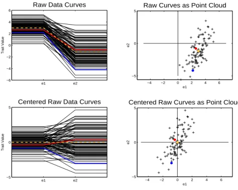
demon-strating the important concepts of the object space and point cloud space. The left hand
side of Figure 1.1 shows the data in the object space. The curves, fi(E)i= 1,2, ..., n, are FVT, but each curve can be summarized by two numbers because of the curves’ special
simple structure.
Each curve has the same value for each environment level until it reaches the
environ-ment level denotede1. Then the FVT changes linearly until the environment level named
e2 is reached. Once environment level e2 is reached each curve has the same attribute value for the remaining environment levels. All of the curves follow the pattern of only
e1 e2 −6
−4 −2 0 2 4 6
Raw Data Curves
Trait Value
−4 −2 0 2 4 6
−5 0 5
Raw Curves as Point Cloud
e1
e2
e1 e2
−5 0 5
Centered Raw Data Curves
Trait Value
−4 −2 0 2 4 6
−5 0 5
Centered Raw Curves as Point Cloud
e1
e2
Figure 1.1: Object view is on the left while point cloud view is on the right. Each curve can be represented by a point in the point cloud space and each point can be represented as a curve in the object space.
to ai from the first environmental point to e1, then the curve is plotted as a piecewise linear line with trait values from ai tobi in the region frome1 toe2, and finally the curve is plotted as having trait value bi from e2 to the last environmental point. Since e1 and
e2 are common across curves, it follows that to compare curves, fi(E) i = 1, ..., n, only the pairs {(ai, bi), ...,(an, bn)} need to be analyzed.
Now that the curves have been discretized and summarized by two trait values, each
curve can be represented as a point in R2. The curves represented in
R2, i.e. the point
cloud space, are shown on the right hand side of Figure 1.1. To show exactly how a curve
view, as well. This point has a value of 2 along the horizontal axis, i.e. e1, and a value of -4 along the vertical axis, i.e. e2. Each curve can be represented in the point cloud view in this same manner.
Also in the point cloud view is a yellow point. This yellow point is the arithmetic
mean of the horizontal axis and vertical axis, i.e. (a,b) = (1nP
iai,n1
P
ibi). The yellow dot is the arithmetic mean of the points in R2. But this point can also be shown as a corresponding curve in the object space. The yellow curve is this corresponding mean
curve. Although this curve did not exist in the original data set, it can still be viewed in
the object space by the correspondence between the point cloud view and the object space.
So not only can any curve be represented by a point, but any point can be represented
by a curve. Usually calculations are best understood in the point cloud space, however
deeper understanding of the results can be gained by viewing the corresponding curves
in the object space.
The lower portion of the figure shows the data in the object space and point cloud
space with the mean removed. The yellow dot is now at (0,0) and the yellow curve is
now a straight line at trait value zero. The curves and points now represent how the
data differs from the mean. After removing the mean it is natural to focus the analysis
on variation. Variation can be summarized by a covariance matrix. The total variation
of all of the data is known in evolutionary biology as the phenotypic variance. A useful
decomposition of the variance, in terms of evolutionary biology, is into genetic variance
and environmental variance, see Chapters 2 and 3. This is a useful decomposition because
the genetic variation determines the evolutionary response, an important evolutionary
biological concept. Evolutionary response, ∆Z, is the change in mean phenotype from
one generation to the next.
A good way to understand variation is to find an orthonormal basis in the point cloud
space. This is the same as finding a set of orthogonal linear directions which can represent
thought of as a line that passes through the origin. Two directions that are orthogonal
will be at right angles with respect to each other, i.e. the Euclidean inner product is 0.
Once this orthonormal basis is defined, the data can be projected onto the directions of
this basis to see how much variation each direction explains. These projections can also
be viewed in the object space to understand the variation in that direction.
One such othonormal basis is the identity matrix of size d. In our toy example a
2×2 identity matrix is an orthonormal basis for the data. That would correspond to
the horizontal and vertical axis passing through the origin. In Figure 1.1 these are the
horizontal and vertical black lines in the point cloud view. The projections onto these
directions would simply be the actual trait values at the corresponding environment
levels. The identity matrix is one orthonormal basis used to understand variation of the
data, but there are infinitely many orthonormal bases that could be used to understand
the data. The orthonormal basis used to understand variation is often selected such that
it optimizes some criterion.
One useful basis is that found by Principal Component Analysis (PCA). This basis is
such that the first direction is the one that explains the most variation. The next direction
is orthogonal to the first and explains the next most amount of variation, etc. The PCA
basis is such that it explains the most variation in the least number of directions, and
hence has been invaluable in many fields, including signal compression. See Section 4.1 as
well as Anderson (1984), Muirhead (1982), and Ramsay and Silverman (2005) for more
details about PCA.
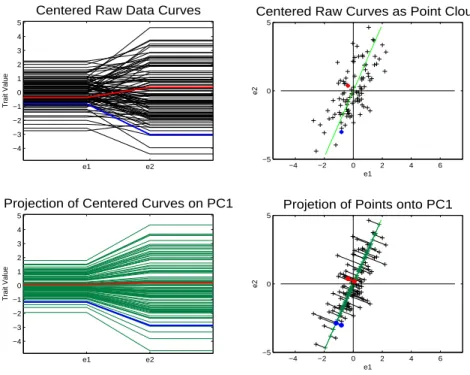
The results of a PCA performed on the 2-d toy data set is shown in Figures 1.2 and
1.3. First the focus is on Figure 1.2, which displays the first direction of the PCA basis.
The upper left panel of Figure 1.2 shows the centered data curves in the object space,
the same as in the lower left panel of Figure 1.1. The panel in the upper right corner
is the point cloud view of the centered data. This panel is the same as the panel in the
e1 e2 −4 −3 −2 −1 0 1 2 3 4 5
Centered Raw Data Curves
Trait Value
−4 −2 0 2 4 6
−5 0 5
Centered Raw Curves as Point Cloud
e1 e2 e1 e2 −4 −3 −2 −1 0 1 2 3 4 5
Projection of Centered Curves on PC1
Trait Value
−4 −2 0 2 4 6
−5 0 5
Projetion of Points onto PC1
e1
e2
Figure 1.2: Object view is on the left while point cloud view is on the right. Green line in point cloud space is the PC 1 direction. Lower right shows projected data onto the PC 1 direction. Projected points are along a line and quite spread out. Projected curves, in lower left panel, are multiples of each other and represent, the data quite well.
This green line is the first PC direction. This line is equivalent in the point cloud view
to the direction where the points are most spread out, which can be seen in the figure.
The lower right panel shows the projection of the points onto the PC 1 direction. The
projection of a point onto a direction corresponds to finding the point along the line
that is closest to the original data point. This is equivalent in the 2-d case to drawing a
perpendicular line from the data point to the PC 1 direction. Each of the curves has a
projection point associated with it. Although these are not points from the original data
set they can still be visualized in the object space. In the lower left hand corner are the
projected curves associated with the PC 1 direction. The projected points fall along a
line in the point cloud space, which corresponds to the lines being multiples of each other
Notice that the curves in the lower left hand corner look similar to the curves in the
upper left corner. Also notice that the perpendicular lines that connect the projected data
points to the actual data points are small. These perpendicular lines are the residuals,
i.e. each data point minus its corresponding projected point.
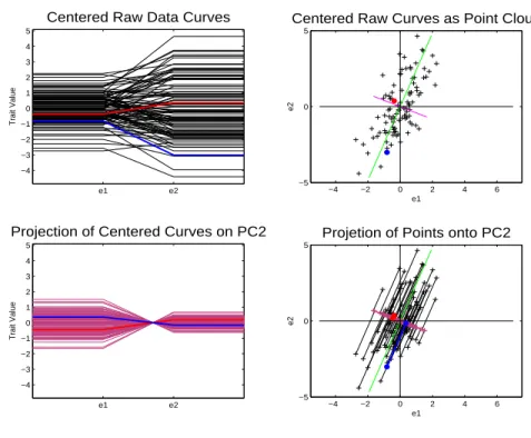
Figure 1.3 shows the PC 2 direction. Again the upper left panel shows the centered
data curves. The red line in the upper right panel is the PC 2 direction. This direction
is at a right angle to the PC 1 direction. The PC 2 direction is thus orthogonal, which
implies that it explains a different mode of variation. In the lower right corner is the
projection of the data points onto the PC 2 direction. The projected points are much
e1 e2 −4 −3 −2 −1 0 1 2 3 4 5
Centered Raw Data Curves
Trait Value
−4 −2 0 2 4 6
−5 0 5
Centered Raw Curves as Point Cloud
e1 e2 e1 e2 −4 −3 −2 −1 0 1 2 3 4 5
Projection of Centered Curves on PC2
Trait Value
−4 −2 0 2 4 6
−5 0 5
Projetion of Points onto PC2
e1
e2
Figure 1.3: Object view is on the left while point cloud view is on the right. Red line in point cloud space is the PC 2 direction. Lower right shows projected data onto the PC 2 direction. Projected points are along a line and not spread out. Project curves, in lower left panel, are multiples of each other and do poor job of representing the data.
closer together for this direction. That means that this direction explains less variation
curves associated with the PC 2 direction. The curves do a worse job representing the
actual data curves than PC 1, i.e. the curves look less similar to the curves in the upper
left. The residuals are also larger for the PC 2 direction showing again that the PC 2
direction does a worse job of representing the data in only one dimension than does the
PC 1 direction. Since this is only 2 dimensional data the PC 1 direction and the PC 2
direction explain all of the variation of the data points.
Also, because PC 1 and 2 are orthogonal and explain all of the variation, if the
projections of PC1 and 2 are added together they will yield the actual data points. This
can be seen in the point cloud view in that the residuals for PC 1 are the same as the
projected points for PC 2. Also this can be seen in the object space, by the fact that if
the curves are added together they will yield the actual data curves.
The principal component basis provides directions with an evolutionary biological
interpretation. This interpretation is that the first PC direction calculated from genetic
variation is the direction that produces the most evolutionary response when selected
upon. Selecting upon a direction means to choose individuals with high absolute
pro-jection scores in that direction. Then each following principal component direction can
be thought of as producing less and less evolutionary response when selecting in that
direction. The lower principal components will eventually produce so little evolutionary
response when selected upon, that they can be considered genetic constraints. For a
more detailed discussion of genetic constraints see Section 3.1.
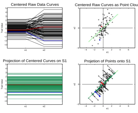
Other criteria, besides variation of the data can be used to construct an orthonormal
basis. For example, the selection process of the basis can ignore the variation of the data
completely and try to find directions which yield the smoothest possible projected curves
in the object space. One measure of smoothness can be defined in terms of minimizing
squared differences of adjacent points along the curves, standardized to have length 1. I.e.
one seeks the curve that has trait values changing the least between adjacent environment
e1 e2 −4 −3 −2 −1 0 1 2 3 4 5
Centered Raw Data Curves
Trait Value
−4 −2 0 2 4 6
−5 0 5
Centered Raw Curves as Point Cloud
e1 e2 e1 e2 −4 −3 −2 −1 0 1 2 3 4 5
Projection of Centered Curves on S1
Trait Value
−4 −2 0 2 4 6
−5 0 5
Projetion of Points onto S1
e1
e2
Figure 1.4: Object view is on the left while point cloud view is on the right. Green line in point cloud space is Smooth basis direction 1. Lower right shows proejcted data onto smooth direction 1. Projected points are along a line. Project curves, in lower left panel, are multiples of each other and never cross zero.
Figure 1.4 shows the first direction of the smooth basis, i.e. the direction that produces
the smoothest projected curves. The line in the upper right panel is smooth direction 1.
The lower right panel shows the projection of the data onto smooth direction 1 and the
lower left panel shows the projected curves. Each projected curve has the same trait value
for e1 and e2. Therefore the trait values of these curves have changed the least amount as possible between environment levels e1 and e2. Notice that the direction explains less variation than PC 1 and has larger residuals. This can be seen in the object space
in that the curves do a worse job of representing the actual data curves. But smooth
direction 1 explains more variation than PC 2, i.e. the projected curves do a better job
of representing the actual data curves.
to smooth direction 1. The lower right panel shows the projection of the data points
onto smooth direction 2. Notice that this direction explains less variation than the PC
e1 e2 −4 −3 −2 −1 0 1 2 3 4 5
Centered Raw Data Curves
Trait Value
−4 −2 0 2 4 6
−5 0 5
Centered Raw Curves as Point Cloud
e1 e2 e1 e2 −4 −3 −2 −1 0 1 2 3 4 5
Projection of Centered Curves on S2
Trait Value
−4 −2 0 2 4 6
−5 0 5
Projetion of Points onto S2
e1
e2
Figure 1.5: Object view is on the left while point cloud view is on the right. Red line in point cloud space is smooth basis direction 2. Lower right shows projected data onto smooth direction 2. Projected points are along a line. Project curves, in lower left panel, are multiples of each other and cross zero once. These are the least smooth curves.
1 direction, but more than the PC 2 direction. The residuals are also larger than PC
1 but smaller than the PC 2. This direction’s projected curves are shown in the lower
left panel. Each of these projected curves has fi(e1) = −fi(e2), i.e. the curves have trait values changing the most between e1 and e2.
These are only two choices for orthonormal bases used to understand the variation
of the data. One could always look at a compromise between smoothness and amount
of variation explained, see Section 3.1. Also one could find a basis that optimizes a
completely different criterion.
from environmental variation. If it is possible to separate these different types of variation
into orthogonal subspaces, then each subspace can have a basis which maximizes different
criteria. Then the bases of these two subspaces can be viewed together to understand
the variation as a whole. This separation of genetic and environmental variation is not
always possible. So a simpler goal is to find a basis that explains the genetic variation
only. Then define the directions orthogonal to this basis as genetic constraints, and find
a basis to understand this genetic constraint space.
In chapter 2 of this dissertation will be a more detailed discussion of the estimation
of genetic and environmental variation. Chapter 3 covers genetic constraints and the
selection of a basis to view genetic variation. The basis chosen to view genetic variation
will be a compromise between the PCA basis and the basis which is chosen based on
smoothness of curves. Chapter 4 discusses curve representation in the context of principal
components. An analysis of the slope structure of the data set introduced in Chapter
4 is presented in Chapter 5. Chapter 6 builds some background mathematical material
used in Chapter 7. Some asymptotic properties of methods introduced in Chapter 3 are
CHAPTER 2
Estimation of
G
and
E
An important aspect of evolutionary biology is to model genetic and environmental
variation. Generally individuals in an evolutionary biological study are grouped by
ge-netic similarity. Gege-netic variation is then the variation between these groups while the
environmental variation is the variation of individuals within these groups. A
straightfor-ward potential approach to estimating genetic variation is to use the sample covariance
matrix based on sample group mean curves. This approach is heavily dependent on
the fact that the true mean of the individual curves in each group is 0. Often these
groups have a small number of individuals in each group, so the sample mean of the
individual curves is not 0. This leads to environmental variation being misclassified as
genetic variation. The procedure of estimating genetic variation via group means can be
viewed as fixed effects Analysis of Variance (ANOVA). Random effects ANOVA shrinks
the misclassification of environmental variation compared to fixed effects ANOVA.
Ran-dom effects ANOVA does this by accounting for the inaccuracy of sample mean estimates
to true means, due to the small number of individuals in each group. For a more detail
discussion of the definition and differences between fixed and random effects ANOVA,
see Searle et al. (1992).
In this chapter a toy example will be used to explore the difference between fixed
effects ANOVA and random effects ANOVA. In Section 2.1 is a description of the
set are shown where the misclassification is evident. The results of the Random effects
ANOVA, which lessen this misclassification, are shown in Section 2.3.
2.1
Simulated Toy Data Set
A simulated toy data set is presented in this section, which is used to display the
differences between the fixed and random effects ANOVA methods. The random effects
ANOVA lessens the misclassification of environmental variation as genetic variation.
The toy data set is simulated to have 2500 curves of 11 dimensions, see Figure 2.1.
Each curve is the sum of a random group, i.e. genetic, curve and a random individual,
i.e. environmental, curve. Each group and individual curve has a normally distributed
random error, i.e. noise curve, added to them. Our data consists of 500 groups with
5 individuals in each group. In Figure 2.1 the first 100 curves are shown. Only these
1 2 3 4 5 6 7 8 9 10 11
−1.5 −1 −0.5 0 0.5 1 1.5
Raw Data (Toy Example)
100 curves are shown to avoid over-plotting. In future plots of the toy data set only 100
curves will be included for the same reason.
Each member of the same group has the same group curve, i.e. genetic curve. The
group curves are generated as the sum of normally distributed multiples of flat lines and
parabolic curves, see Figure 2.2. Thus each curve is a random parabola with a random
vertical shift. The curves appear in tight groups of 5 of the same color. This is because
1 2 3 4 5 6 7 8 9 10 11
−1 −0.5 0 0.5 1
True Genetic Curves
Figure 2.2: The group curves of the first 100 individuals, as shown in Figure 2.1 using the same colors. Notice that the curves are in groups of five which correspond to the five individuals in each group. The curves are random parabolas with a random vertical shift.
each group has 5 individuals and each individual from the same group has the same
genetic curve, except for some small normally distributed random noise.
Each individual has its own distinct individual curve, i.e. members of the same group
have differing individual curves but the same group curves. The individual curves are
1 2 3 4 5 6 7 8 9 10 11 −1
−0.5 0 0.5 1
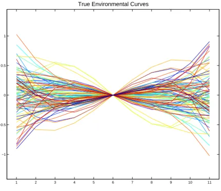
True Environmental Curves
Figure 2.3: The individual curves of the first 100 individuals, as shown in Figure 2.1 using the same colors. Notice that the curves are made up of a random combination of linear and cubic terms. The curves are no longer in tight groups of 5 of the same color.
environmental curves are not in tight groups of 5 because each individual has its own
distinct individual curve.
These components have been carefully chosen to be orthogonal, and all explain
dif-fering amounts of the total variation.
The phenotypic variation is reflected by all of these curves. The linear component
explains 36.8% of the phenotypic variation. While the cubic component explains 13.2%
of the phenotypic variation. The flat line component explains 36.8% of the phenotypic
variation and the parabolic component explains 13.2% of the variation.
The genetic variation is reflected by only the group curves, i.e. flat line and parabolic
modes of variation. The genetic variation is 50% (36.8% + 13.2%) of the total phenotypic
mode explains 26.5% of the genetic variation.
The environmental variation is reflected by only the individual curves, i.e. the linear
and cubic modes of variation. The environmental variation is 50% (36.8% + 13.2%) of
the total phenotypic variation. The linear mode accounts for 73.5% of the environmental
variation and the cubic mode accounts for 26.5% of the environmental variation.
The raw data curves, which are a mixture of genetic and environmental curves, are
the only curves which will be explicitly viewed. We want to find a procedure which will
partition the phenotypic variance into the genetic variance and environmental variance,
i.e we hope to recover the curves from Figure 2.2 and Figure 2.3.
2.2
Fixed Effects ANOVA on the Toy Data Set
2.2.1
Estimation of Phenotypic Variance
This section focuses on how to use fixed effects ANOVA to estimate the phenotypic
variation from the observed curves. TheP matrix is a summary of phenotypic variation,
so the above goal is the same as estimating the P matrix. The first step in estimating
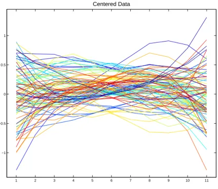
the P matrix, in the case of the fixed effects approach, is to subtract the mean for all
11 dimensions of the curves, see Figure 2.4. The centered curves are arranged into an 11
by 2500 matrix, Xc = (X−X). Outer product multiplication, XcXcT, is performed on the centered curve matrix and each entry of the matrix produced is divided by (n−1).
These operations produce an 11×11 empirical covariance matrix,
˜
P = (X−X)(X−X)
T
n−1
which is the estimated P matrix.
Now that P has been estimated by ˜P, the next question is how accurate the estimate
is. A good way to visualize the variation summarized by matrices is through PCA. To
1 2 3 4 5 6 7 8 9 10 11 −1
−0.5 0 0.5 1
Centered Data
Figure 2.4: The first 100 centered data curves with the mean for each point on the x-axis subtracted. Individuals in the same group have the same color curve. One color corresponds to more than one group.
In Figure 2.5 the first column shows the first six PC directions of ˜P, viewed as the
corresponding unit length curves in the object space. The second column shows the first
six principal component directions of the theoreticalP matrix for this simulation if there
were no errors, viewed as the corresponding unit length curves in the object space. The
thick blue line and number at the top of each panel represents the percentage of variation
of the matrix explained by each curve, i.e. each direction. The number in parentheses
represents the sum of squares of the data that the direction explains. The similarity of
the two columns indicates the accuracy of ˜P as an estimate of P.
The first panel of the first column is the PC 1 direction of ˜P, which explains 38.6% of
the variation. The PC 1 direction is a linear curve, which corresponds to an environmental
which explains 34.8% of the variation. This is a flat line which corresponds to a genetic
mode of variation. The line is not exactly flat because there is some mixing with the
2 4 6 8 10
−0.5 0
0.5 38.611%(0.3732) Calculated Principal Component 1
2 4 6 8 10
−0.5 0
0.5 36.8%(0.3714) Theoretical Principal Component 1
2 4 6 8 10
−0.5 0
0.5 34.8326%(0.33668) Calculated Principal Component 2
2 4 6 8 10
−0.5 0
0.5 36.8%(0.33744) Theoretical Principal Component 2
2 4 6 8 10
−0.5 0
0.5 14.1409%(0.13668) Calculated Principal Component 3
2 4 6 8 10
−0.5 0
0.5 13.2%(0.13728) Theoretical Principal Component 3
2 4 6 8 10
−0.5 0
0.5 12.1283%(0.11723) Calculated Principal Component 4
2 4 6 8 10
−0.5 0
0.5 13.2%(0.11765) Theoretical Principal Component 4
2 4 6 8 10
−0.5 0
0.5 0.045167%(0.00043657) Calculated Principal Component 5
2 4 6 8 10
−0.5 0 0.5 0%(0)
Theoretical Principal Component 5
2 4 6 8 10
−0.5 0
0.5 0.04498%(0.00043476) Calculated Principal Component 6
2 4 6 8 10
−0.5 0 0.5 0%(0)
Theoretical Principal Component 6
Figure 2.5: Left hand side panels are empirical principal components of P˜. Right hand side panels are theoretical principal components of P. Bars and numbers at top of panels represent
amount of variation of P matrix explained. The columns are similar indicating P˜ is a good
estimate of P.
linear mode of variation, due to the fact that they explain a similar amount of phenotypic
variation. This is a weakness of PCA. If the amount of variation explained by modes of
variation is similar, then the PCA results in a linear mixing of these modes of variation.
The third panel is a cubic curve which is an environmental mode of variation while the
It can be seen from this figure that P is a mixture of genetic modes of variation,
summarized by the matrixG, and environmental modes of variation, summarized by the
matrix E. Recall that the first and third principal component directions explain
varia-tion summarized by E, i.e environmental variation, and the second and fourth principal
component directions explain variation summarized by G, i.e. genetic variation. For
both columns the shape of the curves and amount of variation explained are similar.
The first column appears to differ from the second column in the last two panels.
For the theoretical case, i.e. column 2, the curves are flat lines at zero. This is because
the P matrix is of rank 4, so the first 4 PC directions explain all of the variation of P.
For the empirical case, i.e. column 1, the last two panels are random error directions.
Notice that the amount of variation explained by these directions is nearly zero. Similarly
the principal component directions 7-11 are just directions of random error and explain
nearly zero variation. These directions are not included in the figure. Because the left
hand column is for the theoretic non-error case, the columns are similar except for the
error components.
This figure indicates that the estimate of the P matrix is quite good. This can be
seen from the fact that the two columns are so similar. The P matrix was estimated
the same way for both fixed and random effects ANOVA, so the principal component
decomposition looks the same for both methods. Therefore this figure will only appear
in this section of the chapter.
2.2.2
Estimation of Genetic Variance
The estimation of genetic variation using fixed effects ANOVA is presented in this
section. Also the results of using this approach to estimate the genetic variation of the
toy data set will be shown. Similar to the phenotypic variation case, there is a matrix G
which summarizes the genetic variation. Our goal is to estimate this G matrix accurately.
as estimates of the true genetic curves. Often these estimates are not accurate, due to
the small number of individuals in each group. The empirical covariance matrix, ˜G,
summarizing the variation of these curves is the fixed effects ANOVA estimate of G. If
Xg is an 11×ng matrix of the sample group means andng, i.e. 500 for this toy example, is the number of groups then
˜
G= (Xg −X)(Xg−X)
T
ng−1
is the fixed effects ANOVA estimate of G.
The sample group mean curves for the toy example are shown in Figure 2.6. The
sample group mean curves should look like the true genetic curves, shown in Figure 2.2,
since they are estimates of the true genetic curves. But the sample group mean curves
also include some linear and cubic modes of variation, i.e. environmental modes, along
with vertically shifted parabolas, i.e. genetic modes. Also they do not appear to be in
groups of 5, because each group member is estimated to have the same group mean curve.
Therefore the curves are overlayed directly on top of each other. The sample group mean
curves are not accurate estimates of the true genetic curves, which leads to an inaccurate
estimate of G.
To view the inaccuracy of ˜G as an estimate of G, side by side PCAs are shown in
Figure 2.7. The first column of Figure 2.7 shows the first four PC directions of ˜G, viewed
as the corresponding unit length curves in the object space. The second column shows
the PC directions of the theoretical G matrix, viewed as the corresponding unit length
curves in the object space.
Fixed effects ANOVA does not do a good job of estimating G, which can be seen by
Column 1 and Column 2 being different. For this method the linear curve, appearing in
row 3 of column 1, and cubic curve, appearing in row 4 of column 1, are showing up as
1 2 3 4 5 6 7 8 9 10 11 −1
−0.5 0 0.5 1
Family Mean Curves
Figure 2.6: The first 100 group mean curves. Notice that the cubic and linear part can still be seen, which leads to incorrect estimates of G. These curves do not look like the group curves from Figure 2.2
These two modes of variation explain about 18% of the genetic variation, when they
should theoretically explain almost 0% of the variation. Indicated by the fact that PC
directions 3 and 4 are flat lines of height 0 in column 2 since all the variation is explained
by the first two principal components in the non-error theoretical case. Fixed effects
ANOVA produces estimates of G with more variation than just genetic variation. This
over estimation of genetic variation causes the percentage of variation of the flat line and
parabolic modes of variation to be less than in the theoretic case.
Again for this figure the last several PC directions are not pictured since they are
ran-dom error directions that explain nearly zero amount of the variation, and are therefore
2 4 6 8 10 −0.5
0
0.5 60.3771%’(0.33841) Calculated Principal Component 1
2 4 6 8 10
−0.5 0
0.5 73.6%(0.33744)
Thoerectical Principal Component 1
2 4 6 8 10
−0.5 0
0.5 21.074%’(0.11812) Calculated Principal Component 2
2 4 6 8 10
−0.5 0
0.5 26.4%(0.11765) Thoerectical Principal Component 2
2 4 6 8 10
−0.5 0
0.5 13.6277%’(0.076382) Calculated Principal Component 3
2 4 6 8 10
−0.5 0 0.5 0%(0)
Thoerectical Principal Component 3
2 4 6 8 10
−0.5 0
0.5 4.6245%’(0.02592) Calculated Principal Component 4
2 4 6 8 10
−0.5 0 0.5 0%(0)
Thoerectical Principal Component 4
Figure 2.7: Left hand side panels are empirical principal components of G˜. Right hand side panels are theoretical principal components of G. Bars and numbers at top of panels represent amount of variation of G matrix explained. Notice that environmental modes(linear and cubic)of variation are being classified as genetic variation.
2.2.3
Estimation of Environmental Variance
This section describes the estimation of environmental variation using fixed effects
ANOVA. This is done by finding an estimate of the E matrix. The fixed effects ANOVA
estimate of E involves the same sample group means, calculated in the case of ˜G. In
this case the sample group means are subtracted from the original curves, which yield
used to form an empirical environmental covariance matrix,
˜
E = (X−Xg)(X−Xg)
T
ng(ne−1)
which is an estimate ofE. Where all of the notation is the same as used in earlier sections
and ne is the number of individuals in each group, i.e. 5 for this toy example.
For the toy data set these estimated environmental curves are shown in Figure 2.8.
The estimated environmental curves are similar to the true environmental curves, shown
in Figure 2.3. The estimated curves reflect the linear and cubic components but none of
1 2 3 4 5 6 7 8 9 10 11
−1 −0.5 0 0.5 1
Curves minus Family Mean
Figure 2.8: The curves are the centered data with the group means subtracted out, the first 100 are shown. Notice that this figure is similar to the individual curves in Figure 2.3 so the curves will produce a good estimate of E.
the flat line or parabolic components. Their accuracy yields a good estimate of E.
The accuracy of ˜E as an estimate ofE is shown through side by side PCAs. In Figure
unit length curves in the object space. While the panels of the second column are the
PC directions of the theoreticalE, viewed as the corresponding unit length curves in the
object space. In this figure the first and second columns look similar, which indicates ˜E
is a good estimate. The first and second rows of column 1 are linear and cubic modes of
2 4 6 8 10
−0.5 0
0.5 72.4609%(0.36888)
Calculated Principal Component 1
2 4 6 8 10
−0.5 0
0.5 73.6%(0.3714)
Thoeretical Principal Component 1
2 4 6 8 10
−0.5 0
0.5 27.19%(0.13842) Calculated Principal Component 2
2 4 6 8 10
−0.5 0
0.5 26.4%(0.13728) Thoeretical Principal Component 2
2 4 6 8 10
−0.5 0
0.5 0.042636%(0.00021705) Calculated Principal Component 3
2 4 6 8 10
−0.5 0 0.5 0%(0)
Thoeretical Principal Component 3
2 4 6 8 10
−0.5 0
0.5 0.042476%(0.00021623) Calculated Principal Component 4
2 4 6 8 10
−0.5 0 0.5 0%(0)
Thoeretical Principal Component 4
Figure 2.9: Left hand side panels are empirical principal components of E estimated by group means. Right hand side panels are theoretical principal components of E. Bars and numbers at top of panels represent amount of variation of E matrix explained
variation, which are the same modes of variation as the theoretical environmental modes.
The third and fourth principal component directions do look different. This is just due
to random error since the theoretical E is of rank two, i.e. has only two directions that
directions of random error and explain nearly no amount of the environmental variation.
2.3
Random Effects ANOVA on the Toy Data Set
Section 2.2 showed the fixed effects ANOVA method, while the details of the random
effects ANOVA are given in this section. Only the estimation of G is discussed. The
estimation ofP and E is not covered, since both the P and E matrices are estimated in
the same way as the fixed effects approach.
2.3.1
Estimation of Genetic Variance
In Section 2.2, it is shown that fixed effects ANOVA yields an estimate of the genetic
covariance matrix that actually has environmental variation as well as genetic variation,
see Figure 2.7. Random effects ANOVA is a method that finds an estimate of G, ˆG,
which lessens the amount of environmental variation that is summarized by ˜G, the fixed
effects estimate of G. The case where all groups have the same number of individuals
is described in this section to help in the understanding of how random effects ANOVA
lessens the misclassification.
As can be seen from Figure 2.9, ˜E provides a good estimate ofE. The matrix ˜E is an
unbiased estimator ofE, which provides theoretical evidence to accompany the empirical
evidence. So random effect ANOVA tries to remove the environmental variation from ˜G
by subtractingcne* ˜E, wherecne is a constant that depends on the number of individuals
in each group.
The exact method of random effects ANOVA, when all groups have the same number
of individuals, is to let
ˆ
G= ˜G−( 1
ne ) ˜E
be the estimate of G. This is because (n1
e) ˜E is the expected amount of environmental
variation that is misclassified as genetic variation based on expected values of the
effects estimate converges to the fixed effects estimate. So the random effects estimate is
correcting for the bias of the sample group means due to a small sample size, and as the
sample size becomes larger less of a correction is needed.
The accuracy of ˆGas an estimate ofGis shown through side by side PCAs in Figure
2.10. Shown in the first column of Figure 2.10 are the PC directions of ˆG, viewed as
2 4 6 8 10
−0.5 0
0.5 73.8166%’(0.33824)
Calculated Principal Component 1
2 4 6 8 10
−0.5 0
0.5 73.6%(0.33744)
Thoerectical Principal Component 1
2 4 6 8 10
−0.5 0
0.5 25.6364%’(0.11747) Calculated Principal Component 2
2 4 6 8 10
−0.5 0
0.5 26.4%(0.11765) Thoerectical Principal Component 2
2 4 6 8 10
−0.5 0
0.5 0.66251%’(0.0030357) Calculated Principal Component 3
2 4 6 8 10
−0.5 0 0.5 0%(0)
Thoerectical Principal Component 3
2 4 6 8 10
−0.5 0
0.5 −0.4127%’(−0.0018911) Calculated Principal Component 4
2 4 6 8 10
−0.5 0 0.5 0%(0)
Thoerectical Principal Component 4
Figure 2.10: Left hand side panels are empirical principal components of G estimated by random ANOVA. Right hand side panels are theoretical principal components of G. Bars and numbers at top of panels represent amount of variation of G matrix explained
the corresponding unit length curves in the object space. In the second column is the
PC directions of the theoreticalG, viewed as the corresponding unit length curves in the
Random effects ANOVA provides a much better estimate of G then fixed effects
ANOVA, which can be seen by the fact that although there still seems to be some
misclassification of environmental variation as genetic it is to a much lesser degree. Notice
that the curves in rows 3 and 4 of column 1 are linear and cubic but the percentage of
variation explained is less than 1%. But one problem that does arise from random effects
ANOVA is that it can produce a covariance matrix that is not positive definite, even
though covariance matrices should always be positive definite. This can be seen by
the fact that the fourth direction is supposedly explaining a negative portion of genetic
variation.
For the case when groups do not all have the same number of individuals the random
effects estimates can found by Restricted Maximum Likelihood estimation (REML), see
Searle et al. (1992). The REML method gets its name because it restricts the
maxi-mization to the part of the likelihood which is invariant to the mean parameters of the
model. For the case when all groups have the same number of individuals the REML
estimates are exactly the same as the random effects estimates described in this section.
The REML estimates are unbiased but again can produce estimates that are not positive
definite. Also the asymptotic distributions of the estimators can be difficult to calculate.
A software package known as DFREML, see Meyer (1988), Meyer (1989), and Meyer
(1998), has been used to successfully find REML estimates for many biological studies.
Also random effects estimates can be found by maximum likelihood (ML). For the case
of the groups all having the same number of individuals the ML estimates are not always
equal to the estimate described above. Also the estimates are not always unbiased, i.e.
environmental variation can be misclassified. But the ML estimates are always positive
CHAPTER 3
Finding Genetic Constraints: A Simple Curve Basis
Of A Nearly Null Space
This chapter discusses a method to find genetic constraints of biological interest. This
is done by not only measuring the amount of variation that a direction explains, but also
measuring the simplicity of the corresponding curves in the object space. A genetic
constraint of biological interest is a direction with low variation that is also associated
with simple curves, i.e. a high simplicity score.
An introduction to the nearly null space and a basis based on simplicity of directions
is provided in Section 3.1. The next section, Section 3.2, details how we will measure the
simplicity of the curves associated with a direction, i.e calculate the direction’s simplicity
score. A way to derive the simple curve basis, mentioned in Section 3.1, using an
eigende-compostion of a simplicity matrix is described in Section 3.3. Section 3.4 details how to
modify this method when environment levels are not evenly spaced. How to use the idea
of simplicity and amount of variation to determine if a basis yields genetic constraints of
biological interest is described in Section 3.5. A way to visualize the simplicity score and
3.1
Introduction to the Simple Curve Basis of the
Nearly Null Space
Variation of an observed characteristic of an individual is referred to as Phenotypic
variation. The Phenotypic variation is modeled as lying in a vector subspace SP ⊆ Rd.
The variation inSP is summarized by a covariance matrixP. Useful insight about pheno-typic variation comes from viewing it as a mixture of genetic variation and environmental
variation. The genetic variation is modeled as lying in a subspace SG ⊆ SP. The vari-ance inSG is summarized by a covariance matrixG. Directions ofSP which explain little genetic variation, will also produce little genetic response when selected upon. These
directions are considered to be genetic constraints.
A straight forward way to define genetic constraints is via the subspace, SN ⊆ SP, orthogonal toSG. This orthogonal subspace SN is defined to be thenearly null space. All genetic variation lies inSG, so any direction in SN explains no genetic variation because
SN is orthogonal to SG. Therefore any direction in SN is a genetic constraint.
The estimate of a basis of SG is calculated from the estimated genetic covariance matrix ˆG, see Chapter 2 for details on estimating the genetic covariance matrix. Then
the subspace ˆSG generated by this basis is the estimate of SG. Once SG is estimated, a nearly null space estimate, ˆSN, can be found.
The basis of ˆSG should be as small as possible, i.e. having the least number of directions to explain genetic variation, in order to produce a rich orthogonal subspace of
genetic constraints. A natural way to find the least number of directions that generates
ˆ
SG is to perform Principal Component Analysis(PCA) on ˆG, as follows.
The numerical calculations that drive PCA of the genetic space ˆSG is the eigende-composition of ˆG. The eigenvector corresponding to the the largest eigenvalue of ˆGis the
first PC direction. The eigenvector corresponding to the second largest eigenvalue is the
second PC direction explains the most genetic variation not explained by the first PC
direction, in the sense that the directions are orthogonal. The eigenvectors are ordered in
this manner to define the remaining PC directions. All eigenvectors being orthogonal is
a property of the eigendecomposition, so all of the directions will explain different modes
of genetic variation.
If PCA is performed on ˆG then the first PC direction is viewed as the direction of
greatest evolutionary response, i.e. least evolutionary resistance. As the PC directions
explain less of the genetic variation they are viewed to have more evolutionary resistance
until they can be considered genetic constraints. There are several ways to define the
boundary between response and constraint. One way is to consider the set of lower
PC directions, whose combined percentage of genetic variation explained is less than
constraint threshold cprop, to be the basis for ˆSN.
The initial basis of the nearly null space, i.e. the lower PC directions, often provide
directions that are hard to interpret. This is because the biological signal is weak, i.e.
ex-plains little variation, so the lower PCs are a mixture of the biological signal and random
noise. As suggested by Nancy Heckman and Mark Kirkpatrick, deeper understanding of
the nearly null space can be gained through another basis comprised of directions that
are more interpretable.
Smooth orthogonal directions, i.e. simple curves, are often easily interpretable. A
rotation of the initial basis to another orthonormal basis, that tries to find the simplest
curves, yields an appealing opportunity to find insightful genetic constraints. Where the
simplicity of a curve is measured by the squared vertical difference of given adjacent
points along a curve in the object space. The number of simple orthogonal curves will
be equal to the number of PC directions in the nearly null space, i.e. the dimensions
are equal. This simple curve basis of the nearly null space is more interpretable but
still explains the same amount of variation as the initial basis. Any single direction will
well.
This measure of simplicity provides a way to find a basis of interpretable biological
directions. Viewing the measure of simplicity of directions of a basis has statistical
advantages as well.
One such statistical advantage is when we would like to partition the nearly null
space into a subspace of biological interest, i.e. interesting genetic constraint space, and
one of random noise. The interesting genetic constraint space is generated by particular
directions of the nearly null space.
The directions of the nearly null space can be distinguished from directions not in
the nearly null space based on their percentage of variation explained. This is because
the gap between the other directions percentages of variation explained and the nearly
null space directions percentage of variation explained is larger than the random error.
But for directions within the nearly null space the gap between percentage of variation
explained is not larger than random error. Therefore it is almost impossible to
differ-entiate between directions which generate the interesting genetic constraint space and
random error directions based on amount of genetic variation. But by viewing the
direc-tions measure of simplicity there is a large enough gap to distinguish between direcdirec-tions
within the nearly null space.
Because of this statistical advantage the directions of the simple curve basis of the
nearly null space are more stable, from sample to sample, than that of the PCA basis of
the nearly null space. One way to generate the interesting genetic constraint space is by
choosing directions of an estimated basis. So if the estimated basis is more stable from
sample to sample then the estimation of the subspace is also more stable.
Further intuition into the stability of the basis, is gained by thinking of estimating
the same subspace for multiple samples. If the same subspace is estimated for multiple
samples, the PCA basis can be different for each sample, even if the directions all
estimated for each sample, this does not imply that the subspace has the same estimated
covariance structure for each sample, i.e estimated covariance matrix. Since the
direc-tions are explaining very similar amounts of theoretical variation, due to random error
it is quite easy to have a random reordering of the directions.
But if the same subspace is estimated for multiple samples then the simple curve basis
is always the same, given the directions have different simplicity scores. Because if the
same subspace is estimated for each sample, then the simplicity structure is always the
same, see Section 3.3.1. The simplicity structure is the same because a direction always
has the same simplicity score.
3.2
Measure of Simplicity
Once the nearly null space is estimated, we would like to separate it into a subspace
of biological interest and a subspace of random noise. This is accomplished by finding
the simple curve basis of the nearly null space. Those directions of the simple curve basis
which are considered to be simple enough will generate theinteresting genetic constraint
space. Therefore a method to calculate the simple curve basis is needed. But before
describing this method, see Section 3.3, the measure of simplicity needs to be better
understood, as well as characterized in vector and matrix notation.
The measure of simplicity that is being used is the sum of the differences squared of
trait values of adjacent environmental levels along a unit length curve. This is analogous
to minimizingR f02in the continuous case. An example of how to calculate this simplicity measure for a given direction will aid in the understanding of this measure. Assume that
all environment levels are equally spaced, i.e (e1−e2) = (e2−e3) = . . .= (ed−1−ed) where
e1. . . ed are the ordered environment levels. Letβ be thed×1 vector which contains the
discretized values of a unit length curve, i.e. kβk = 1.
One particular unit length curve of a direction, β, is represented in the object space
e1 e2 e3 e4 e5 −0.6
−0.4 −0.2 0 0.2 0.4 0.6
β = Chosen Direction
Figure 3.1: The unit length curve of a chosen direction (β), black line, is shown in the figure. The lengths of the cyan, green, yellow, and magenta line segments are the absolute difference between trait values of adjacent environmental levels. The sum of the squared lengths of these lines is our measure of simplicity.
differences of trait values between adjacent environment levels. For this particular β,
the absolute difference between the trait values at the first and second environment level
is the length of the cyan line. The absolute difference between the second environment
level and third environment level trait values is the length of the green line, etc. So
our simplicity measure is the sum of the squared lengths of the cyan, green, yellow, and
magenta line segments. This is the interpretation of the simplicity measure in terms of
the object space. But we would like a way to calculate this simplicity measure in the
point cloud space, i.e. by vector and matrix multiplication.
The differences between the trait values of adjacent environment levels is calculated
Where D is the d×d−1 matrix D=
−1 0 0 · · · 0
1 −1 0 · · · 0
0 1 . .. ...
0 · · · 0 −1 0
0 · · · 0 1 −1
0 · · · 0 0 1
.
But for thesimplicity measure, the squares of these differences are considered. Therefore
the simplicity measure, mβ, is
mβ = (βTD)(βTD)T.
This simplicity measure has a low score for the simplest directions. However for
interpre-tation purposes, we would like to have a simplicity score which is high for the simplest
directions. To achieve this the simplicity measure mβ is subtracted from a constant. In this case the constant is 4, since mβ is always less than 4, see Schatzman (2002). Therefore the simplicity score being used is
sβ = 4−(βTD)(βTD)T. (3.1)
Now that the simplicity score is defined, the directions of the nearly null space can be
ordered by their simplicity score. This allows for the simple curve basis to be found. An
algorithm for finding the simple curve basis by an eigendecompostion of an appropriate
3.3
Method To Derive Simple Curve Basis
3.3.1
Methods Relation to PCA
Some intuition into the method to derive the simple curve basis is gained by studying
its relationship to PCA. PCA orders orthogonal directions by the amount of variation
ex-plained. The directions are found by performing an eigendecompostion of the covariance
matrix, ˆΣPN. The matrix ˆΣPN summarizes the covariance structure of the subspace. For
the simple curve basis analysis we are ordering orthogonal directions by their simplicity
scores. The directions are found by performing an eigendecompostion on the simplicity
matrix, ˆFPN. The matrix ˆFPN summarizes the simplicity structure of the subspace.
Before describing the methods to finding the PCA basis and simple curve basis of a
subspace, we first have to define the covariance matrix and simplicity matrix of the full
space because the methods are highly dependent upon these. The covariance matrix of
the full space is the empirical covariance matrix of the data
ˆ
Σ = 1
n−1(X−X)(X−X),
where X is a d×n data matrix and X is a d×n matrix with each column being the
mean of the rows of X.
The simplicity matrix of the full space is
ˆ
Ff ull = 4Id−DDT,
where D is the difference matrix introduced in Section 3.2 and Id is the identity matrix of size d× d. Some intuition for why Ff ull has this from is gained by extending the definition of the simplicity score for multiple directions of a basis.
is a basis of the full space. This leaves the simplicity measure for multiple directions of
the full space as DDT. But for interpretability purposes we would like simple directions to be associated with high simplicity score. The analogous calculation of subtractingmβ from 4 is to subtractDDT from 4I
d. Therefore these steps produce the simplicity matrix ˆ
Ff ull which is analogous to the simplicity score for multiple directions.
In order to find the PCA basis of the full space an eigendecompostion of ˆΣ is
per-formed. In order to find the simple curve basis of the full space an eigendecompostion
of ˆFf ull is performed. But we would also like to find the PCA basis and simple curve basis of a subspace as well. The PCA basis and simple curve basis are found by an
eigendecompostion of
ˆ
ΣPN = ˆPNΣ ˆˆPN
and
ˆ
FPN = ˆPNF
f ullPˆ N
respectively.
Insight into the form of ˆΣPN is gained by thinking of PCA of projected data. Let
PN be the projection matrix of the nearly null space. The centered data, i.e. X −X, projected onto the nearly null space is then PN(X−X). PCA of the nearly null space is then PCA using this projected data. The covariance matrix of the projected data is
ΣPN =
1
n−1PN(X−X)[PN(X−X)]
T =P
NΣˆPN,
which is the covariance matrix of the full space pre and post multiplied by the projection
matrix of the nearly null space. Since the nearly null space is not usually known the PCA
basis of the estimated nearly null space is found. To do thisPN is replaced by the projec-tion matrix of the estimated nearly null space. This implies that an eigendecomposiprojec-tion
of
ˆ
yields the PCA basis of the estimated nearly null space. The PCA basis of the estimated
nearly null space is the eigendirections of ˆΣPN which correspond to the dN smallest
eigenvalues, wheredN is the dimension of ˆPN.
To find the simple curve basis an eigendecompostion of
FPN =PNF
f ull
PN,
which is the simplicity matrix of the full space pre and post multiplied by the projection
matrix of the nearly null space. To find the simple curve basis of the estimated nearly
null space the eigendecompostion of
ˆ
FPN = ˆPNF
f ullPˆ N
is performed. The simple curve basis of the estimated nearly null space is the
eigendirec-tions of ˆFPN which correspond to the dN largest eigenvalues, wheredN is the dimension
of ˆPN. For a more mathematical derivation of FPN see Section 3.3.2.
A further investigation of ˆΣPˆN and ˆF shows an interesting property of the simplicity matrix for different samples. If the same nearly null space is estimated for multiple
samples, then ˆPN is the same for each of the samples. This implies that ˆF is the exact same for those samples, since Ff ull is the same for every sample. Ff ull is the same for every sample because the projection matrix of the full space is always Id. Thus the simple curve basis is the same. But for PCA, the matrix ˆΣPˆN is not necessarily the same, because ˆΣ could be different for each sample. Thus the PCA basis of the nearly null
space could be different for each sample, even though the estimated nearly null space is
3.3.2
Mathematical Derivation of
F
PNHow to derive the simple curve basis of the nearly null space is defined in Section 3.3
using its relation to PCA for an intuitive understanding of the procedure. This Section
provides a more mathematical derivation of the method.
To derive the simplicity matrix a calculation similar to Equation 3.1 is performed.
Ideally we would wish to replaceβby the basis matrix B. But more careful consideration
must be taken when subtracting the simplicity score from 4. Before the simplicity matrix
is defined another characterization of sβ is needed. In order for the characterization to be given, first note that
sβ = 4−(βTD)(βTD)T = 4−βTDDTβ.
Next we would like to replaceDDT by another matrix which will produce the simplicity score, with out having to subtract from 4. This is done by using the characterization
sβ = 4−βTDDTβ =βT(4Id−DDT)β,
where Id is the identity matrix of size d×d.
Based on this characterization of sβ, the simplicity matrix can be defined by simply replacing β by the basis matrix B. Therefore the simplicity matrix is
FB=BT(4Id−DDT)B,
whereB = [b1, b2, . . . , bdN] is any d×dN basis matrix. Notice that along the diagonal are
the simplicity scores of each direction of the basis. Also notice that this matrix isdN×dN. Therefore an eigendecompostion of this matrix leads to eigenvectors of size dN ×1. The eigenvector which corresponds to the largest eigenvalue, is the linear combination of the