31 July 2017
Version of attached le:
Published Version
Peer-review status of attached le:
Peer-reviewed
Citation for published item:
Sutherland, S. and Ridgway, J. (2017) 'Interactive visualisations and statistical literacy.', Statistics education research journal., 16 (1). pp. 26-30.
Further information on publisher's website: https://iase-web.org/documents/SERJ/SERJ16(1)Sutherland.pdf
Publisher's copyright statement:
c
International Association for Statistical Education (IASE/ISI)
Additional information:
Use policy
The full-text may be used and/or reproduced, and given to third parties in any format or medium, without prior permission or charge, for personal research or study, educational, or not-for-prot purposes provided that:
• a full bibliographic reference is made to the original source
• alinkis made to the metadata record in DRO
• the full-text is not changed in any way
The full-text must not be sold in any format or medium without the formal permission of the copyright holders. Please consult thefull DRO policyfor further details.
Durham University Library, Stockton Road, Durham DH1 3LY, United Kingdom Tel : +44 (0)191 334 3042 | Fax : +44 (0)191 334 2971
INTERACTIVE VISUALISATIONS AND
STATISTICAL LITERACY
SINCLAIR SUTHERLAND Durham University [email protected] JIM RIDGWAY Durham University [email protected] ABSTRACTStatistical literacy involves engagement with the data one encounters. New forms of data and new ways to engage with data – notably via interactive data visualisations – are emerging. Some of the skills required to work effectively with these new visualisation tools are described. We argue that interactive data visualisations will have as profound an effect on statistical literacy as the introduction of statistics packages had on statistics in social science in the 1960s. Current conceptualisations of statistical literacy are too passive, lacking the exploration part in data analysis. Statistical literacy should be conceived of as empowerment to engage effectively with evidence, and educators should seek to move students along a pathway from using interactive data visualisations to building them and interpreting what they see.
Keywords:Statistical literacy; Interactive data visualisation; Constituency Explorer; Empowerment
1
1. BACKGROUND
A brief introduction is needed: Sinclair Sutherland directs the NOMIS project in the UK, which provides labour market statistics on behalf of the Office for National Statistics. This involves managing large volumes of data, and making it accessible to audiences with different levels of technical and statistical sophistication. NOMIS offers a telephone help line, so we are sympathetic to the range of technical and statistical barriers to understanding information.
2. STATISTICAL LITERACY AND INTERACTIVE DATA VISUALISATION Wallman (1993) defined statistical literacy as “the ability to understand and critically evaluate statistical results that permeate our daily lives – coupled with the ability to appreciate the contribution that statistical thinking can make in public and private, professional and personal decisions.” For Wallman, the heartland of statistical literacy is understanding and better decision making. So which statistical results permeate our daily lives? There have been some dramatic changes over the last two decades; new sorts of data (big data, video, graphics, text) are gathered and analysed, and new forms of presenting statistical information have been developed. We now live in an era of open
Statistics Education Research Journal, 16(1), 26-30, http://iase-web.org/Publications.php?p=SERJ © International Association for Statistical Education (IASE/ISI), May, 2017 – Invited essay
data – data producers such as national statistical offices, Eurostat, OECD (Organisation for Economic Co-operation and Development), and the United Nations set out to make their data accessible to a general public.
2.1. DISPOSITIONS AND SKILLS FOR THE NEW CHALLENGES
A key development has been the emergence of sophisticated ways to communicate visually, apparent in both video and print media. The emergence of interactive data visualisation (IDV) has the potential to cause a revolution by democratising statistics; explorations that would once have required considerable technical skills can now be performed easily by statistically naïve users. This is analogous to the introduction of statistics packages such as BMDP, SAS and SPSS in the 1960s, and offers similar opportunities (namely insights into data structures with little effort involved in data manipulation), and similar risks (namely explorations conducted without understanding, which lead to misinterpretation and bad decisions). We now need to attend not just to ‘statistical results that permeate our daily lives’ but to the whole process of drawing evidence-based conclusions.
Perhaps the most important demands on users of IDV relate to dispositions. Gal (2005) proposed two distinct dimensions of probability literacy: one relating to knowledge elements (e.g., big ideas such as variation and randomness, and knowing how to work out probabilities); the other relating to dispositions (e.g., a willingness to be critical and to ask questions, and having positive feelings about being able to understand situations with probabilistic elements). These dispositions are central to the new visual approach – without a disposition to have confidence in one’s own ability to make sense of the complexities presented, and the willingness and ability to ask questions and seek answers within the IDV, the approach collapses to the static visualisation of its first appearance. We take these dispositional elements to be fundamental and move on to explore technical and conceptual elements of literacy associated with IDV.
First note the work of Tufte (1997, 2001), Wainer (2000) and others, analysing misleading graphics presented in print media, and offering heuristics to enable users to avoid being misled either wittingly or unwittingly by visualisations. Users of IDV need to be aware of all these heuristics. However, proper interpretation requires statistical competencies that go beyond those required to interpret printed visualisations. As an illustration, consider the literacies needed to work effectively with a single IDV.
2.2. THE CASE OF THE CONSTITUENCY EXPLORER
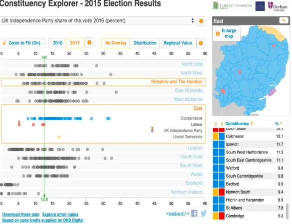
The Constituency Explorer (n.d.) is shown in Figure 1. It was developed as a joint venture between Durham University and the House of Commons Library (the Library). The Library is the first port of call for politicians in the UK who want data on any topic, for any purpose of governance – designing or critiquing policy, writing speeches, and the like. The Library produces a variety of resources that are used widely by politicians and their researchers and also by journalists and academics. The Constituency Explorer (CE) was designed in preparation for the 2015 general election, and was subsequently updated with election results in such a way that users can compare voting patterns in 2015 and 2010. It was updated again in 2017 in preparation for the 2017 UK general election. In the UK, members of parliament are elected from geographical areas called constituencies (650 in all). The CE was designed to provide information about every constituency on a wide range of variables (such as demography, voting patterns, economic status, and
health) in a way that is easily accessible; in all, more than 150 variables can be explored; it uses data from ONS (the UK Office of National Statistics) and elsewhere.
There are some literacy skills shared with a paper approach. These include: first and foremost, the need to understand and critique the measures being used, and the provenance of the data. Unlike paper-based resources, IDV usually make it easy to access metadata – this is encouraged in this display by providing direct access to metadata from the information button by the side of the pull-down menu box. Paper and interactive visualisations call on a collection of mathematical and statistical ideas such as the notion and measure of central tendency and spread, and scale reading; understanding the CE display requires an understanding of box plots (although an explanation is provided here when the help icon is used).
Figure 1: Screenshot on the 2015 election results from the Constituency Explorer
2.3. EFFECTIVE USE OF INTERACTIVE DATA VISUALISATIONS – NEW SKILLS AND OLD TRAPS
To use the IDV effectively, users must call on literacies specific to current conventions. Most notably: knowing how to select different variables to explore; knowing that help is likely to be provided on-screen; knowing how to search for information by locating areas on a map, or by name, or by clicking on a data point; knowing about common facilities to sort data (here, sorting by constituency, or party, or value on the variable (low to high or high to low), along with secondary sorting (e.g., to sort constituencies by value on a variable within political party – ‘of the Conservative
party seats, which had the smallest majority in the election?’); understanding ‘zoom to fit’; navigation skills – anticipating that there will be multiple routes through the data (e.g., users can change the variable being displayed by clicking on a variable name in a summary page that gives information about each constituency); anticipating that it will be possible to expand or shrink some features of the display such as the size of the map (in order to explore spatial patterns in voting); and anticipating that it will be possible to undo actions to reset the display to an earlier state.
A further example of the importance of user disposition is that users need to be able to explore the potential benefits of novel features of the display. Here, the display allows users to identify constituencies of interest via a ‘pin’ (see Figure 1). When a new variable is chosen, the location of every constituency will (almost certainly) change; the pins make it easy to find the location of the constituencies of interest on the selected new variable, and compare relative values across different variables (here, the pinned constituencies show the percentage of votes for a right wing party in Cambridge and Clacton).
Visualisation can present data in misleading ways and the interactive approach offers even more opportunities for misrepresentations and misinterpretations. An important element of statistical literacy in the context of IDV is its sensitivity to errors that can be induced by different features of the display. One mistake in data visualisation is to represent scalar quantities as areas or volumes (see Tufte, 2001); for example, oil imports may be represented via a graphic where the value of the import is represented by the height of an oil drum. There is an analogous perceptual distortion in the CE that users should be aware of; the maps show the colour of the political party that represents each constituency. However, constituencies are roughly the same in terms of the size of their electorate, and populations are denser in cities than in rural areas. Further, city areas are more likely to be represented by left-wing parties, and rural areas are more likely to be represented by right-wing parties. The result is that the coloured map of a region appears to show a predominance of right-wing parties, overall.
Two further examples can be described, which were ‘designed out’ of the CE at an early stage (see Sutherland, Hedger, Ireland, & Ridgway,2015). The first relates to scale reading. Users can choose to rescale the display; however, whenever a new variable is chosen which involves rates or proportions, the display reverts to a scale of 0-100 (for raw numbers, the axis always shows a zero point). Paying attention to scales, including locating zero, is an element of statistical literacy within IDV which is shared with all visual displays. A second example relates to confidence intervals and possible sample bias. Every element of every variable displayed in the CE is based on either a census value from 2011 or on a large representative sample. Elements are represented by filled circles of uniform size rather than points. This was based on an active decision to avoid presenting potentially unreliable data; attention to sampling variability is a key element of statistical literacy which is sometimes overlooked in commentaries on data visualisations such as time series of employment rates or productivity.
3. THE FUTURE OF STATISTICAL LITERACY WITHIN THE REVOLUTION OF VISUALISATION
So IDV require knowledge of current web conventions, an awareness of possible misleading features of displays induced by visual illusions, and a willingness to learn about new features.
New sources and kinds of data, and the design of new data visualisations mean that statistical literacy is a moving target. Wallman’s definition is too passive – verbs such as
‘understand’, ‘appreciate’ and ‘evaluate’ do not reflect active engagement. IDV require a redefinition of statistical literacy that reflects the idea of active exploration. This scope for active exploration is, itself, increasing. Users can engage at a variety of levels, starting with explorations where IDV and data are already bundled, as in the case of the CE, Gapminder, visualisations from the OECD and elsewhere.
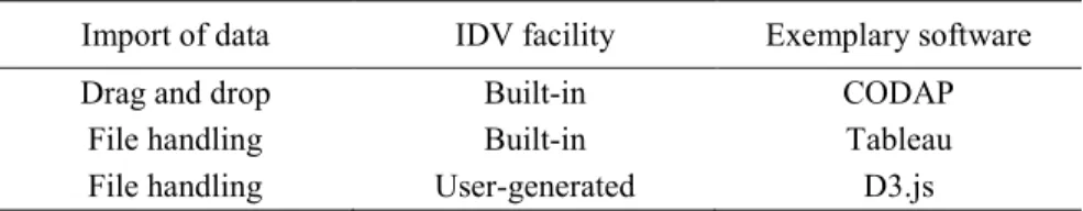
A wide range of tools are available to support the development of IDV (see Table 1).
Table 1. IDV tools and their functionalities
Import of data IDV facility Exemplary software
Drag and drop Built-in CODAP
File handling Built-in Tableau
File handling User-generated D3.js
These tools bring the potential impact of IDV on statistical literacy closer to the impact of statistical packages in the 1960s on social science. Future conceptions of statistical literacy will emphasise active exploration, and decision making. We should look for ways to encourage citizens to go beyond others’ choices of data and data interface; users should learn to access relevant data and embed it in a suitable interface (and perhaps customise such interfaces), and conduct their own explorations.
REFERENCES
Constituency Explorer (n.d.). Reliable evidence for politicians and journalists – data for everyone. Durham: Durham University.
[Online: www.constituencyexplorer.org.uk/]
Gal, I. (2005). Towards “probability literacy” for all citizens: Building blocks and instructional dilemmas. In G. A. Jones (Ed.), Exploring probability in school: Challenges for teaching and learning (pp. 39–63). New York: Kluwer Academic Publishers.
Sutherland, S., Hedger, S., Ireland, M., & Ridgway, J. (2015). Designing interactive displays to promote effective use of evidence. In: M. A. Sorto (Ed.), Proceedings of the IASE Satellite Conference on Advances in Statistics Education: Developments, Experiences and Assessments. The Hague, The Netherlands: ISI
[Online: iase-web.org/Conference_Proceedings.php?p=Advances_in_Stats_Education_2015] Tufte, E. R. (1997). Visual explanations: Images and quantities, evidence and narrative.
Cheshire, CT: Graphics Press.
Tufte, E. R. (2001). The visual display of quantitative information (2nd Ed.). Cheshire, CT: Graphics Press.
Wainer, H. (2000). Visual revelations: Graphical tales of fate and deception from Napoleon Bonaparte to Ross Perot. Mahwah, NJ: Erlbaum.
Wallman, K. K. (1993). Enhancing statistical literacy: Enriching our society. Journal of the American Statistical Association, 88(421), 1–8.
SINCLAIR SUTHERLAND Nomis, Department of Geography, Durham University Lower Mountjoy Centre, South Road, Durham DH1 3LE UK