Dell™ One Identity Manager 7.0
Web Designer Reference Guide
©2015 Dell Inc. ALL RIGHTS RESERVED.
This guide contains proprietary information protected by copyright. The software described in this guide is furnished under a software license or nondisclosure agreement. This software may be used or copied only in accordance with the terms of the applicable agreement. No part of this guide may be reproduced or transmitted in any form or by any means, electronic or mechanical, including photocopying and recording for any purpose other than the purchaser’s personal use without the written permission of Dell Software Inc.
The information in this document is provided in connection with Dell Software products. No license, express or implied, by estoppel or otherwise, to any intellectual property right is granted by this document or in connection with the sale of Dell Software products. EXCEPT AS SET FORTH IN DELL SOFTWARE’S TERMS AND CONDITIONS AS SPECIFIED IN THE LICENSE AGREEMENT FOR THIS PRODUCT, DELL SOFTWARE ASSUMES NO LIABILITY WHATSOEVER AND DISCLAIMS ANY EXPRESS, IMPLIED OR STATUTORY WARRANTY RELATING TO ITS PRODUCTS INCLUDING, BUT NOT LIMITED TO, THE IMPLIED WARRANTY OF MERCHANTABILITY, FITNESS FOR A PARTICULAR PURPOSE, OR NON-INFRINGEMENT. IN NO EVENT SHALL DELL BE LIABLE FOR ANY DIRECT, INDIRECT, CONSEQUENTIAL, PUNITIVE, SPECIAL OR INCIDENTAL DAMAGES (INCLUDING, WITHOUT LIMITATION, DAMAGES FOR LOSS OF PROFITS, BUSINESS INTERRUPTION OR LOSS OF INFORMATION) ARISING OUT OF THE USE OR INABILITY TO USE THIS DOCUMENT, EVEN IF DELL SOFTWARE HAS BEEN ADVISED OF THE POSSIBILITY OF SUCH DAMAGES. Dell Software makes no representations or warranties with respect to the accuracy or completeness of the contents of this document and reserves the right to make changes to specifications and product descriptions at any time without notice. Dell Software does not make any commitment to update the information contained in this document.
If you have any questions regarding your potential use of this material, contact: Dell Software Inc.
Attn: LEGAL Dept 5 Polaris Way Aliso Viejo, CA 92656
Refer to our web site (www.software.dell.com) for regional and international office information. Patents
This product is protected by U.S. Patent # 8,639,827 and # 8,601,539. Additional patents pending. Trademarks
Dell™, the Dell logo, and Dell™ One Identity Manager, Dell™ Dell™ Active Roles, Dell™ One Identity Password Manager, and Dell™ One Identity Cloud Access Manager are trademarks of Dell Inc. and/or its affiliates.
Microsoft, Outlook, Active Directory, SharePoint, SQL Server, Forefront, Internet Explorer, Visual Studio, Windows Server, Windows PowerShell, Windows Vista and Windows are either registered trademarks or trademarks of Microsoft Corporation in the United States and/or other countries. SAP, SAP R/3, SAP NetWeaver Application Server, and BAPI are trademarks or registered trademarks of SAP AG (or an SAP affiliate company) in Germany and other countries. IBM, Lotus Notes and LotusScript are registered trademarks of International Business Machines Corporation. Linux is the registered trademark of Linus Torvalds in the U.S. and other countries. Oracle and Java are registered trademarks of Oracle and/or its affiliates. UNIX is a registered trademark of The Open Group. Mono, and SUSE are registered trademarks of Novell, Inc. Apache and Apache HTTP Server are trademarks of The Apache Software Foundation. Firefox is a registered trademark of the Mozilla Foundation. Safari is a registered trademark of Apple Inc. Chrome and Google are trademarks or registered trademarks of Google Inc., used with permission.
Other trademarks and trade names may be used in this document to refer to either the entities claiming the marks and names or their products. Dell disclaims any proprietary interest in the marks and names of others.
Legend
CAUTION:A CAUTION icon indicates potential damage to hardware or loss of data if instructions are not followed.
WARNING:A WARNING icon indicates a potential for property damage, personal injury, or death.
IMPORTANT NOTE,NOTE,TIP,MOBILE, orVIDEO:An information icon indicates supporting information.
One Identity Manager Web Designer Reference Guide Updated - July 2015
Contents
The Web Designer Editor 7
Before Starting 7
Web Designer Structures and Functions 7
Introduction 8
Installing or Selecting a Web Application 8
Start Page 10
Title Bar 11
Status Bar 11
Menu Bar 12
Toolbar 14
Navigation View 17
Definition Tree View 19
The Web Designer Object Model 19
Web Application 20
Web Project 20
Modules 21
Start Module 21
Session module 21
Menu Structure 21
Structure of Breadcrumb Navigation 22
Current User 22
Components 22
Form Types 22
Local Components 23
Controls 23
Functions 23
Layout Objects 23
Multilingual Captions 36
Object Properties 39
Change Labels for Web Projects 40
Web Project Configuration Options 42
Project Configuration - Web project 42
Parameter Type "Boolean Value" 44
Parameter Type "SQL filter condition" 44
Parameter Type "Selection from value list" 45
Parameter Type "Free text" 46
Parameter Type "Property list" 46
Parameter Type "Image" 47
Parameter Type "Configuration Object" 48
Parameter Type "Color value" 49
Parameter Type "Color dictionary" 49
Project Configuration - Customization 50
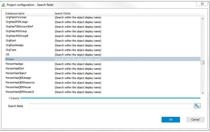
Project Configuration - Search Fields 51
Column-Dependent References 52
Using a Column-Dependent Reference 53
Defining a new Column-Dependent Reference 53
Dynamic References 54
Customizing the Web Portal 57
Creating a New Project 57
Creating a New Module 60
Adding New Components 65
Customizing Object Definitions 67
Creating Object Copies with the Wizard 68
Extensions 69
How Extensions Work 69
Creating New HyperViews 72
Adding New Nodes 73
Create Data Display 74
Displaying Single Objects 75
Grid Display for Collection Data 76
Generating Mapping Definitions 81
Embedding Reports 81
Linking to a Page 84
Basics of Web Designer Programming 85
Node Types 85
Loading Collections 85
Querying Data from a Collection 86
Filtering Data from a Collection 87
Functions 88
Collections 89
Database Objects as Collection 89
Working with a Database based Collection 90
Loading Database Object through Relations 91
Loading Database Objects from Multiple Tables 92
Using the Database Query Wizard 92
Loading a Historical Object State 94
Loading a Change History 94
View Definitions 95
Collections as Data Sources for Controls 95
Collection Events 95
Assigning Collections to Components 96
Declaring Configuration Keys in Modules and Components 97
Declaring Context Parameters 98
Executing Microsoft® .NET Framework Code 99
Runtime API 99
Integrating Code in Object Definitions 100
Integrating C# code into a WebSQL Expression 100
Access to Environmental Data 101
Referencing Controls 101
Referencing Collections 102
Customizing Documentation 102
Compiling and Debugging 104
Compiling a Web Application 104
Compiling with the Database Compiler 104
Tasks 105
Working with a Web Application 107
Querying a Web Application 107
Editing Captions 111
Adding Functions 112
Pasting in Texts or Captions 113
Pasting in Grids 114
Presets for Grouping Grids 115
Visualizing Exceptions in the Web Portal 115
Replacing Images from Resource Files 116
About Dell Software 119
Contacting Dell Software 119
The Web Designer Editor
The Web Designer is a development environment for One Identity Manager web applications. The resulting web application is based on the ASP.NET. However, the Web Designer uses a simplified development model with whose help you can develop a robust web application without any prior knowledge in Microsoft® .NET Framework.
Before Starting
The development module use by the Web Designer forms the basis of the web project. A web project represents the later web application and is made up of reusable modules and components amongst others. The installation already contains numerous default modules and components as well as a default web project that uses them. You can configure and extend the default web project to create your own web application. You can also add a new web project where you can reuse default modules and components.
The Web Designer development environment contains an editor with which you can program your web application.
In addition, the Web Designer has a compiler to compile your web project. This is a prerequisite so that the web project can run as a web application. You can debug a running web project with help of the integrated
debugger in the Web Designer.
Detailed information about this topic The Web Designer Object Model
Customizing the Web Portal
Web Designer Structures and Functions Compiling and Debugging
Web Designer Structures and Functions
In this section, we will discuss the Web Designer's interface and its functions. Each element and its functions are described in detail in the following chapters.
Introduction
To start the Web Designer
1. Start WebDesigner.exein you directory. 2. Select the connection of your choice.
Click OR
-Add new connection to create a new connection.
3. Select the authentication module for database connection from the menuLogin as.... 4. Enter your full user name in User.
5. Enter your personal password in Password. 6. Click Log in.
Installing or Selecting a Web Application
NOTE:Certain specific Web Designer functions, such as the preview or debugging, can only work if a web project is installed. An important prerequisite for ensuring that the web application will work, is a functioning WCF connection.
To set up a web application 1. Open the Web Designer.
2. Select a database connection in the menu. OR
-Set up a new connection.
3. Select an authentication method from the menu if required. 4. Enter a user and password, if required.
5. Click Log in.
The Web Designer start page is opened. Select one of the following options:
l Install a new web application l Select a web application To install a new web application
1. Select Web applications | Install new web applicationson the left of the start page. This displays the windowUser account controlwith the question whether you want to install
WebDesignerInstaller.exe. 2. Click Yesto install the file.
This opens the One Identity ManagerWeb Installer window. 3. Select a database connection.
4. ClickNext.
5. Select an install destination by entering an application name in the text box. 6. ClickNext.
The installation is executed. 7. ClickNext.
8. Select the application you entered inChange in. 9. ClickNext.
10. Click Finishafter successful installation to close the wizard.
NOTE:After you have created a new web application, important settings must be made in the database. You can configure the settings in the Web Designer. The exact procedure is explained inTo edit web application settings. You can also configure the setting in the Web Designer Configuration Editor. For more information about about these settings, see the Dell One Identity Manager Installation Guide. To select a web application
1. Select Web applications | Select web application. This displays a list of existing web applications. 2. Select the web application of your choice from the list.
The selected web application is loaded and display underManage your web portal environmenton the start page.
To edit web application settings
NOTE:A web application must be selected.
1. Click Edit web application settings.
This opens the dialog boxEdit web application settings.
NOTE:The text boxURLshows you the address where the web application can be found. This value cannot be edited and serves as a key for the matching set in the database.
2. Select inWeb projectthe web project to be shown in your web application.
WARNING:The project you selected in "Web project" must be stored in the database. Otherwise, you cannot select it. Ensure that you have saved the web project.
The selected web shown in the menu.
3. Select the module the web application user will use for authentication in future in Authentication module.
5. Click theDebuggingcheck box if you want to enable debugging. You can use debugging.
NOTE:Before you compile the web project for release, it is recommended you test your web project with these settings.
NOTE:If you use OAuth-Authentication, you can enter the this ID in the text box provided. This automatically identifies the web application.
Start Page
You can control the Web Designer graphical user interface with a mouse and key combinations. A minimum screen resolution of 1280 x 1024 pixels is recommended with at least 16 bit color in order to optimize the user interface graphics. A display size of at least 9.7 inches is recommended for mobile displays, for example, when using a tablet.
NOTE:You can customize the Web Designer's default layout, as in the other Manager tools, by moving, closing or hiding to suit your requirements. You can set the hide mode with theAuto Hidebutton. After you have logged in, you are presented with an empty start page. This contains a title bar, status bar, menu bar, toolbar and various working areas.
NOTE:In the middle area of the start page, you can see various information about the status and functionality of the currently selected web project and for other web projects. For more information, seeWeb Projecton page20. Also about the current state of the preview in the form of a prompt. The following list of working areas contains references to the corresponding sections in the guide with detailed information:
1. Web application
l Install new web applications l Select web application For more information, see:
l Installing or Selecting a Web Application .
2. Configuration l Web project l Customizations l Search fields
l Column-dependent references l Object reference
For more information, see:
l Web Project Configuration Options 3. Edit
l Add new l Edit texts
For more information, see:
l Customizing the Web Portal Figure 1: The Web Designer Start Page
To reopen a closed start page
l Select Start pagein theViewmenu.
TheStart pagetab is displayed as an empty page with the usual selection options and settings.
<server>\<database (description)> and the connected user or system user.
When Web Designer launches a database activity (such as loading or saving a database object) the status icon is activated in the left corner of the status bar. A gray icon means “no activity”.
Menu Bar
You can use the menus in the menu bar to call up submenus and quickly reach many of the Web Designer's functions and execute them. The menus are described in more detail in the following table. Excluding theEdit menu. This menu is explained in detail inEditingon page25.
Figure 2: Menu Bar
Menu Item Description
Settings... Use theSettings...item to open theGlobal Settingsdialog box. Here you can change Web Designer settings or reset your setting to the default set. Click Applyto save the changes.
Exit Use this menu item to close the Web Designer. Table 1: Menu Items in the "Connection" Menu
Menu Item Description
Windows... Use this item to open theWindows...dialog box. This provides you with an overview of windows open in the Web Designer.
To get an overview of open tabs
1. Select Windowfrom theViewmenu in the menu bar. This opens the dialog boxWindows...with a list of open tabs. 2. Mark the tab in the list you want to edit and clickActivate.
This selects the tab on the start page. OR
-3. Mark the tab in the list you want to save and clickSave. This saves the marked tab.
OR
-4. Mark the tab in the list you want to close and clickClose tab(s).
TIP:You can use multi-select by selecting items in the list whilst holding the CTRL key.
5. ClickOKto close the dialog box. Restore default layout Use this item to restore the default layout. Table 2: Menu Items in the "View" Menu
Menu Item Description Restore default layout (size
inclusive)
This item has the same function as theRestore default layoutitem described above. The size of the window is also adjusted.
Restore saved layout Use this item to restore the layout that you have previously modified and saved.
Save layout Use this item to save the Web Designer layout after you have modified it. home page If you have closed the start page once, you can open it again by using this
item. For more information, seeStart Pageon page10.
Object state Use this item to open theObject stateview. This view is displayed on a tab in the same area as the preview. The database objects are listed with
information about their database state and local state. You can mark database objects in this view and refresh them. Or mark all modified files to be refreshed. You can update the database object list with another button. Node editor Use this item to open theNode editorview. This is open by default and is
displayed in the lower area of the Web Designer.
Tasks You can view entries such as error messages and warning inTasks, which is in the lower area of the Web Designer. For more details about messages, click on the entry, You can use this menu item to reopen the view. This view is also open by default.
Command list The viewCommand list, is also open in the lower area of the Web Designer. Here you can undo actions not yet saved in the web project or redo them. Open this view with this menu item.
Bookmarks Use theBookmarksmenu item to open the view of the same name. This is displayed in the lower area of the Web Designer. All bookmarks are listed in this view and you can edit them. The following actions are available:
l Delete all bookmarks l Edit description
l Delete current bookmark l Group by module/component
l Show bookmarks for current web project only
Navigation Use theNavigationmenu item to open the navigation view. You can also reach the navigation view through theNavigationcategory on the left sidebar of the program. You will probably use open the navigation view from the menu, left sidebar is not visible. This can happen, if you have previously closed the navigation view. For more information, seeNavigation Viewon page
17.
Menu Item Description
Properties ThePropertiesview is displayed in the lower area of the Web Designer. The view is open by default. You can use this menu item to reopen the view. For more information, seePropertieson page35.
query This view is display in the same way as the previous view in the lower area of the Web Designer. The view is open by default. You can use the menu item Queryto reopen the view. For more information, seeQuerying a Web Applicationon page107.
Call stack You can use the menu itemCall stackto open theCall stackview. The view is not open by default. This view is also opened in the lower area of the Web Designer.
Compiling Use the menu itemCompilationto open theCompilationview. This view is opened in the lower area of the Web Designer. You can view the compilation log here. The view is open by default.
Compiled objects This view is also opened in the bottom area of the Web Designer. Use the menu itemCompiled objectsto open the view. All compiled objects are listed in with more details.
Menu Item Description
Info Use this item to open a dialog box with several tags, which contains detailed information about the Web Designer, like version number, third party contributions, installed modules and such like.
Table 4: Menu Items in the "Help" Menu
Toolbar
The Web Designer has a toolbar. This toolbar cannot be configured. Figure 3: Toolbar
Icon Description Change
Label:
You can select a change label in the menu. Changes in the Identity Manager database are stored under the change labels that are selected here.
Change label administration
This function opens the standard dialog for inserting, editing, or deleting change labels. For more information about working with target system types, see "Setting Up Target System Types" in the configuration.
Icon Description
Uses the current change label as default and selects it automatically later.
This function sets the currently selected change label as a default label that will be selected automatically when Web Designer is restarted. The selection is client-specific and has no impact on other Identity Manager database users.
Applies a change label to the entire web project.
Use this button to open a dialog box for assigning a special change label to all referenced object of a web project. Some web projects can be moved completely and independently of previously selected assignments.
Configure project
Use this button, you can configure your web project. This function is also available in the definition tree view and on the start page. However, you must have previously selected a database object, like, a component or a module. The difference being that, if you configure your project here, you can make global changes affecting the entire web project.
The following options are available: l Web project
l Customizations l Search fields
l Column-dependent references l Object reference
For more information, seeWeb Project Configuration Optionson page42. Captions
Use this button to open theMultilingual Captionsdialog box. You can add, delete and edit captions here.
Icon Description Control text
Use this button to open theControl texts...dialog box. You can add and save or delete custom text for controls in the Web Designer for all languages stored in theLanguagemenu.
To add custom text for a control
1. Click theControl texts...button in the Web Designer toolbar. Opens theControl textdialog box.
2. Select the key for the control in theKeycolumn enter part or all of the key name inEnter search text.
The control text translation is displayed underText:in theEditarea, if it exists. 3. Select the language you want use for the translation from theLanguagemenu. 4. Enter your text in Customized text:.
Once you have entered the text, theSavebutton is enabled. To enter text for the key in other languages, select the previous step.
5. ClickOK.
NOTE:You delete customized text in the same way as you added it. After selecting the key you want, clickDelete custom value.
Editing Hyperviews
Use this button to edit theHyperView Wizarddialog box. You can also create HyperViews or import existing ones. For more information,, seeCreating New HyperViewson page72.
Suppress background actions
Use this button to start and stop actions running in background. These actions are defined through nodes of typeTimer. This results in the web application executing these actions are regular intervals. The behavior may be disturbing when debugging.
Save
This button is enabled if you have modified a database object. Use this button to save changes to the current database object. If you want to save changes to other database objects, you must select the corresponding tab in the definition tree view and press the button again.
Save all
Use this button to save changes to all database object at the same time. One node back/forward
Use this button to navigate back or forwards in the history of the selected object. This displays the selected object in the definition tree view.
If an object or node was delete, the next existing object is shown. If an object is selected in the history which no longer exists, the previous object is shown.
The number of objects displayed in the history can be specified in the settings in the menu bar underConnection | Global settings. You can delete the history usingDelete historyin the context menu.
Navigation View
The navigation view is on the left edge of the default view and is divided into the follow categories, after which database objects are named:
l Modules l Components l Web projects l Project files l Form types l Layout definitions l Test scripts
NOTE:The navigation view is hidden at all times, if you are not using it. This feature is designed to provide ease of use.
To show and hide the navigation view.
1. Click or mouse over theNavigationcontrol in the left sidebar. OR
-2. Select in the Navigationfrom theViewmenu in the menu bar.
NOTE:UseAuto Hidein the navigation toolbar to fix the navigation view.
NOTE:If theNavigationcontrol is not visible on the sidebar as described, you can only make it visible from theViewmenu. Alternatively, you can selectRestore default layoutorRestore saved layoutinstead ofNavigation.
This opens the navigation view.
3. Click or mouse over outside the navigation view to close it again. Now, only theNavigationcontrol is visible in the program's sidebar.
Select the database objects you want to edit with the Web Designer in navigation view. The various categories have different functions, which you see depending on what you selected.
Database objects are displayed in a tree view in theModulescategory. There are two root nodes in this view. Defined database objects are grouped under each root node. These objects cannot be edited in a One Identity Manager custom installation. You have the option to copy these objects and extensions. Each second root node has the prefixcustom. All custom objects are grouped under this. This root node is displayed in the navigation view through the root node containing database objects, which belong to the default installation of the Web Designer.
Extensions are displayed as subnodes for the module or component for which they were created. You will also see these subnodes under groups, search results and recent files. For more information, see
Extensionson page69.
Figure 4: Navigation View Toolbar
Icon Description
To execute a function
1. Mark either a module, component, project file, form type, layout definition or test script in the category you want.
NOTE:You cannot add a web project through this context sensitive submenu. You can also add new modules using the corresponding wizards.
Other functions includingAdd ..are available in the context sensitive submenu depending on your choice.
2. Click the arrow next toAdd ...
3. Select the function you want from the submenu.
You can execute the following functions in theProject filescategory. l Add project files
l Import files l Export files l Add help archive
To delete a database object
1. Select the database object of your choice in the navigation view.
2. Click Delete
This deletes the selected object after confirming the security prompt from the database.
NOTE:TheDeletebutton is only enabled of you have selected a database object.
NOTE:The delete process cannot be undone.
To load new database objects
l Click the database objects in the appropriate category to refresh the database.
Icon Description
To view database object properties
l Mark the database object in the navigation view and click Properties.
This display the database object properties. To search in the navigation view
1. Select in the category in which you want to search for the object in the navigation view. This displays the selected category in the navigation view.
2. Enter the search term in the box and click RETURN. The search results are listed under the text box.
Definition Tree View
Each web project has a dedicated node hierarchy. This hierarchy or tree is edited and its nodes configured using the Web Designer GUI. Web projects, modules and components obtain a minimum number of node in the object definition when added. All other nodes are inserted through the context menu.
While a specific web application is in use, the user is always located at a defined position in the definition tree view.
The definition tree view provides the user with the following views or dialog boxes, which can be opened using the buttons in the view's menu bar.
l Object definition: This view is mainly used to view existing database object nodes. This view is preset when you switch to the definition tree view. If the database object comes from the Web Designer default installation, the view is calledObject definition (read-only). For more information, see
Customizing Object Definitionson page67.
l Configuration: For more information, seeWeb Project Configuration Optionson page42. l Generated Code: For more information, seeViewing Generated Codeon page32. l Settings...: For more information, seeProject Configuration - Web projecton page42.
l Show item help: Use this button to open the help for the selected node. You will find more information in the dialog box.
l Search and replace: For more information, seeSearch and Replace in the Web Designeron page24. l Copy object: For more information, seeCustomizing Object Definitionson page67.
For more information, see the Dell One Identity Manager Web Designer Object Model Documentation.
Web Application
A web application is a published and live website on a web server, which interacts with the Manager database. This functions, such as editing or saving employees or request data are available. Each web application has a dedicated intranet or internet address.
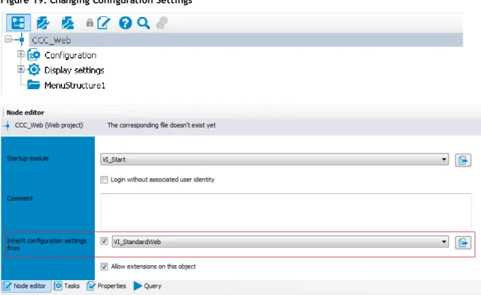
Web Project
You can define several web projects in the database and one resulting web application. The web projectsVI_ StandardWebandVI_RegistrationWebare already in the database and are part of the business workflow. Normally, only one web project is in the web application. A special case represent represents the link between the web projectsVI_StandardWebandVI_RegistrationWebnamed above.VI_
RegistrationWebbecomes a subproject ofVI_StandardWeband is published separately. Modules with and without parameters are linked in the web project.
To assign a web project to a web application that is on the web server, use the web application configuration file (see Web Portal Installation Guide).
There is a series of specific data to maintain in the definition tree view for each web project (for more information, seeDefinition Tree Viewon page19).
NOTE:New web projects cannot be added using the navigation menu bar. Such projects are created through theCreate new projectwizard. For more information, seeCreating a New Projecton page57. To select a web project
l Double-click the web project of your choice inWeb Projects in the navigation view. The selected database object is displayed as a tab in the definition tree view.
Subprojects
You can also select another web project as additional web project. You can update or compile this project on the start page in the same way as the web projectVI_StandardWeb.
To select an additional web project
NOTE:Your web project must already be selected and open in the definition tree window.
1. Open the nodeDisplay settingsin theObject definitionview. This displays subnodes.
2. Mark the subnodeSubprojects1and selectWeb projectfrom the context menu.
This jumps to theConfigurationview in the definition tree view and marks the nodeWeb project. 3. Select the subproject you want in Identifier*in theNode editor.
Modules
A module can be accessed as a logical closed unit within a web project. A module, therefore, can only contain one website with a short welcome text (as in the start page) but can also map a comprehensive workflow, which stretches over several web pages (such as, requesting products).
Modules contain at least one form or main page respectively. They can contain components, which are required for defining nodes visible in the browser. This allow the contents of a form to be rendered in a start up module or on the browser's start page if the user see the start page. The size of the module or number of modules is not limited.
The optionAllow direct navigation to this module with an URL parameterallows you to navigate directly to a specific module. For example, with help of defined passing parameters, you can navigate directly to the overview page of a particular database object or a approve a request. Quick navigation can, for example, be used for opening a link in an email.
NOTE:A good and structured mapping of a web application's target functionality in modules, makes any eventual debugging and later implementation of other function more easy.
Start Module
The start module for a web project is a special module. It can configured and is calledVI_Start. It specifies which main content page is displayed first. Each module can have a start module, assuming the check box Allow quick navigation to this module with a URL parameteris set. You cannot pass any parameters.
Session module
The session module is a special module. Exactly one session module is used in each web project. It can be used by several web projects.
The lifetime of a module is a deciding factor. As long as the session is valid on the web server, you can always access the session module data.
This module contains data about the current user and other session related data.
A session module is initially loaded at the start of a session and retains its data during the entire lifetime of the session. A session module must contain information about the current user. To do this, a session module must contain:
l Collections with the nameUser l UserRuntimeModule
l UserMenu
Structure of Breadcrumb Navigation
The collectionUseNavigationcontains information about the user's navigation breadcrumb trail. Each entry corresponds to a generated form object. The following collection properties are available:
l UID_RuntimeForm:
Use this property to enter the primary key. l UID_RuntimeContext:
References the entry in the collection <UserRuntimeModule> containing the associated module entry. l UID_RuntimeFormPrevious:
References the entry in the collection <UserNavigation> corresponding to the previous form. This information is used for building up the breadcrumb trail.
l Title:
Provides the form title. l CanReturnToThis:
Provides the Boolean value specifying whether this form can be opened or not. l SkipInNavigation:
Boolean value specifying whether the breadcrumb trail should be skipped. l Number: Specifies the sequential number of this form in the breadcrumb trail. l FormID: The property specifies the form identifier.
Current User
The collectionUsercontains the database of typePersonthat corresponds to the current user.
Components
A component is a part of a module, which has been separated out. The module references these component using cross-references. It can be use by several modules and components and rendered multiple times in a browser, simultaneously. Instances arise from components that are used more than once. To differentiate various instances from each one another, each instance is given an automatically generated suffix at runtime. All nodes of this instance have the same suffix.
Apart from that, components are part of the definition tree and keep it free from redundancies. This property reduces the effort of programming and ensure a uniform appearance as well as homogeneous functionality of the web application. Another feature is the different component type. The position of the component in the definition tree determines, which component type can be referenced.
Form Types
A form type specifies the structure of HTML pages, which are rendered in the browser. You define the
available form parts and their positions in the HTML tree.Form typesare found in the navigation view and form definitions as DialogAEDS objects in the database.
The default version supplies four different VI_Objects as templates. To edit a form type, you must make a copy of the object. For more information, seeCreating Object Copies with the Wizardon page68. Each form type is made up of the form partsTitleandMainand other output nodes. Use the context menu to add custom parts
of form and nodes in the definition tree edit window. You can edit the added elements in theNode editor. You can also add talking selectors. Form types are often differentiated by mobile and desktop view.
Local Components
A local component is a node in the XML tree of a module and a component. It provides a better overview for programming and can be referenced in other modules and components.
Controls
The same applies to a control as to a local component. They are defined within a module and are only found there.
Hence, a reference to a control can only be set in the module in which the control was defined. A benefit of controls is simple referencing.
Functions
A function provides a better overview and is suited to checked readability. That ensures increased quality. Function are available in the respective module or component.
NOTE:Function defined in a session module are an exception. These functions can be implemented everywhere.
Layout Objects
Layout objects are layout definitions and describe the appearance of display nodes (nodes of typeView) which are rendered in the browser. There is at least one layout variation defined for each display node where possible. Layouts with the endingdefaultare used by the associated node type without having to be entered on individual nodes.
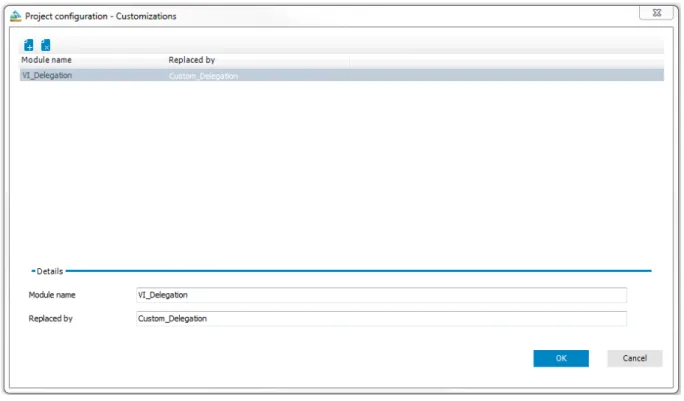
Each object in the layout definition list corresponds to a CSS class and is linked ot a node type. This layout definition is therefore available for each node of a particular node type. You can set up more new layout definitions in this list. A wizard is available to you to customize a default layout definition. For more information, seeProject Configuration - Customizationon page50.
For a better overview, layout definitions are divided into type and group in the navigation view.
Search and Replace in the Web Designer
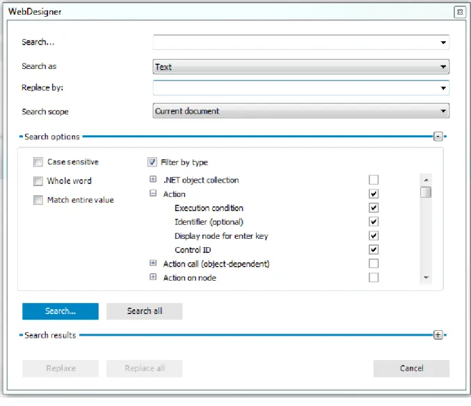
To run a search
1. Select the menu itemEdit | Search in the menu bar.
NOTE:You will also find the search in the definition tree view.
This opens a dialog box with search options. 2. Enter a search term in Search.
3. Select the item of choice in the menu Search asto refine the search. 4. Enter the item of choice in Replace by.
5. Select the item of choice in the menu,Search scope. You will find the following items: a. Current document
b. Current document and its extensions c. Current web project
d. Below the selected object e. All Web Designer objects
6. Enable your preferred criteria underSearch optionsas required: -Case sensitive
-Whole word -Match entire word.
7. Enable the check box Filter by type under Search options, if required, and select your preferred options.
TIP: Select node types, to filter the search by the selected node types.
8. Click SearchorSearch all. The search results are displayed. 9. Double-click a result in the result list.
This marks and displays the corresponding nodes in the definition tree view. OR
-Mark the result in the result list you want to replace. 10. Click ReplaceorReplace all.
Figure 5: Dialog box "Replace"
Editing
Menu Item function
Refresh preview Use this menu item up update the preview
Publish Opens a submenu with other options. The following options are available: Table 7: Functions of the "Edit" Menu
Menu Item function
Configure project Opens a submenu with other configuration functions. The following options are available: l Web project
l Customizations l Search fields
l Column-dependent references l Object reference
Copy objects Opens theCopy objectsdialog box. The wizard creates the copies. For more information, see the chapterCreating Object Copies with the Wizardon page68.
Create new module
Opens theCreate new module dialog box. The wizard creates the new module. For more information, seeCreating a New Moduleon page60.
Create new project
The wizard create a new project. For more information, seeCreating a New Projecton page57.
search Opens a search dialog box with different search options to set. For more information, see
Search and Replace in the Web Designeron page24.
Search next Continues searching with the search parameters given in the dialog box. The search continues without reopening the dialog box. UseF3to continue searching.
Captions Opens theCreate new module dialog box. You can insert, delete and edit captions here. For more information, seeMultilingual Captionson page36.
Control text Opens theControl textdialog box. Here you can edit existing keys by adding your own text to describe the key. You can also add new key in any language. There is a menu available to select another language.
Import object Use this function to import module and components into the Web Designer. to using the standard Windows file import dialog. The function recognizes alone whether complete modules or components are being dealt with and imports them as such. In all other cases the selected file is loaded as a project file.
Related applications
Opens theRelated applicationsdialog box. This function can insert, delete and edit external applications, which are shown Web Portal of the in the menu bar under
Applications. For any application you have to define a clear name, the display name, the description, the basis URL, the parent application (for a direct entry in subforms of one main application) and a picture (optional).
Check model integrity
This function check references, function calls and other details of the current web project. Any errors found do not result in compiler errors but should be corrected for the sake of the web applications‘s stability.
Check accessibility
This function checks the web project to ensure rules meet current standards for web application accessibility. A rule violation example is, when no alternative text is given for missing visuals.
If there is inconsistency with this function, a detailed warning is shown. Violations of accessibility rules do not engender compilation errors.
Context Menu Functions
To call up the context menu, right-click any node. The content of the menus depends heavily on the type of the node clicked ("context sensitive"). The top section of the context menu contains the node types and all
available wizards that can be inserted into the currently selected node type. The following wizards are available:
l Insert bundling node
Eases the task of structuring nodes hierarchically later on. Acontainernode is generated above the currently selected node and the currently marked node is pasted into the new container.
l Create data display
This wizard creates forms, form elements, or grid views from available data. You will find this wizard on a node of type container, for example. For more information, seeCreate Data Displayon page74. l Embed Report
Generates views from previously generated reports that are stored in the database. This wizard is available on action nodes For more information, seeEmbedding Reportson page81.
If a defined number of node types is exceeded, the nodes will be re-bundled beforehand. Some node types do not allow pasting of additional node types. In such cases, the context menu begins with theCutfunction. All other functions are either available or grayed out, depending on the type of node and its position in the definition tree view.
function Description
Cut This function is available insofar as the node in question was not added automatically to the definition tree. All nodes that are subordinate to the selected node are likewise cut. Copy This function is always available. All subordinated nodes are likewise copied.
Paste This function is available if the clipboard contains a node that is also in the list of nodes that can be inserted in the currently selected node.
Delete This function is available insofar as the node in question was not added automatically to the definition tree. All nodes that are subordinate to the selected node are likewise deleted. You can multi-select nodes with the CTRL key to apply the function just once to all selected nodes. Set
breakpoint
This function is available for controls and action nodes. Use this function in debugger mode to halt rendering at the selected points. You can multi-select nodes with the CTRL key to apply the function just once to all selected nodes.
Set bookmark
This function opens a dialog box, in which to add a description of the bookmark. The object is then labeled with a bookmark in the definition tree view. For more information, see the chapter
Bookmarkson page33.
Export This function opens theSave asdialog box. In this process, the xml definition of the selected node and all of its subordinate nodes are saved along with the file.
Import This function opens theFile selectiondialog box. where a previously exported definition tree structure can be selected. If the structure that is to be imported is compatible with the selected node, the structure will be inserted below the selected node.
function Description Search
object references
Search all references, which reference the current object. If the search is successful, the object references are displayed with position, module and object type.
search This function opens a dialog in which various search parameters can be entered (CTRL + F). For more information, seeSearch and Replace in the Web Designeron page24.
Search next
This function continues the current search using the current search parameters and in so doing marks the next relevant node. The search can also be carried out without opening theSearch dialog box.
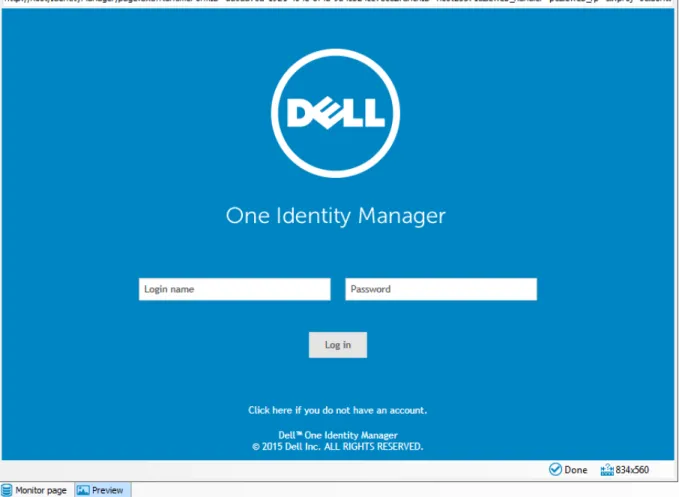
Working with the Preview
The preview window shows how a specific web application will look and respond in the browser. This means that the preview window can be used to test out the entire functionality of all buttons, links and so on. The displayed view is rendered using Internet Explorer, which is installed in the current client.
NOTE:Other browsers or other versions of the same browser may generate views that differ from the preview. Therefore, it is advisable to perform an extensive layout test of the web application with the previously predefined browser versions.
Figure 6: Preview in the Web Designer
The preview function also writes data to the database or deletes database objects if this function is activated by the user. Hence caution should be exercised when testing this function.
The preview window integrates a toolbar of its own, most of whose functions are used to manage debugging mode. These icons are listed in a separate table in this chapter. When the debugger is activated, program functions are realized step by step rather than dynamically, thus enabling you to see which program step is actually being realized and the results yielded by the step. In addition, with the debugger activated, you can navigate at will to the query or data schema window.
The toolbar is explained in the following tables.
Icon Function
Updating the preview. The Web Portal start page is displayed on update. This button has varying displays. The following visuals are possible:
l If the button is displayed in combination with the start icon, modifications made to the web project in the definition tree view have not been compiled. After you click the button, the modifications are compiled and displayed in the preview .
l The button is combined with a question mark if it is unsure whether modifications have been made to the web project.
You can use the arrow next to this button to select other menu items. The following menu items are available:
l Create new predefined connections: You can add any amount of login data for different users. Predefined login data is listed under this menu item. If you are one of the users in this list, you can login simple by mouse click. You save yourself the work of entering your login name and password on the start page of the preview window. Predefined connections are deleted the moment you close the Web Designer.
l Copy to clipboard: If you select this menu item, you copy the link to your web project start page that you see in the preview.
l The browsers you use on your computer are automatically inserted into the menu as extra menu items. The preview is displayed with the browser you choose.
Suppress action
Use this button to prevent executing actions in the preview. This can be helpful if you want to view a certain node in the definition tree view in more detail. To display a node in the definition tree view, selectShow definition objectin thePropertieswindow. This highlights the select node in the Propertieswindow in blue.
One node back / One node forward
Use theForwardandBackbuttons to navigate backward or forward through the sequence of objects selected in the Web Portal. However, a historical view is not shown here.
Enable debugger
This field allows you to toggle the debugger on and off. If the button is blue highlighted, the debugger is enabled. All actions are executed in succession (for example one node at a time) when the debugger is deactivated.
If the debugger status is deactivated inPausedstate, click theResume executionbutton to resume debugging.
Single step
The Single step button is only activated when the debugger is activated. If single step mode is set (you can see this if it is highlighted in blue), execution of the action is suspended at each step in the definition tree view. If single step mode is deactivated, the action continues on to the next break point (break points are inserted in the definition tree at action nodes above the context menu).
Icon Function
Resume execution
This button is activated with the debugger deactivated insofar as any program steps remain to be carried out, for example no user entries are anticipated. Clicking this button launches realization of the next program step.
Icon Function
One node back / One node forward
Use theForwardandBackbuttons to navigate backward or forward through the sequence of objects selected in the Web Portal. However, a historical view is not shown here.
Demo mode
The preview window switches to full screen mode. All other Web Designer windows are covered. The resolution defined for the preview window is disregarded here. This button is only active with the window in a docked state.
View HTML source
The button is enabled after compiling has successfully completed. It opens a popup window containing the html source code generated by Web Designer. You can debug directly in the source code.
Window size: 1024 x 768
Window size
This option is only available when the window is not docked. You can open the list with the arrow and select a value from the listed monitor resolutions. After selecting a resolution, the preview is automatically set to this size. This makes it possible to estimate whether the web application required scrollbars. The available space in the web browser to be used also plays a significant role as well as the number of item shown in the menu bar.
Use this button to swap from the mobile view to the desktop view. Use this button to swap from the desktop to the mobile view.
Language: TheLanguageoption allows you to set the language for the preview. You can choose from the language in which you have logged in to the Web Designer or other One Identity Manager tools. For more information about login languages, see the configuration.
Icon Function
Address bar In the address bar, you can see the web application URL as in a browser. You can enter additional URL parameters either here or in the browser in which you opened the web application. Example of parameters:
l d1im_layout: The values "tablet" and "desktop" are options for this parameter. l d1im_culture: The values "de-DE" and "en-US" are options for this parameter. To enter a parameter with a value
1. Click in the address bar next to the URL in the preview window. 2. Enter the following data, for example:
&d1im_layout=tablet
3. PressReturn.
You preview changes to mobile view.
NOTE:In addition to manual entry of URL parameters, you can also use the buttons for desktop and mobile view as well as theLanguagemenu to change the view or language, as described above.
In addition to a toolbar, the preview window also has a foot bar. The following functions are available to you.
Icon Function Status
Donehere means that compilation and rendering of the current project state have been completed and that entries can be made in the relevant pages.
769x485
Pixel lines
The pixel line count indicates the dimensions of the window area that are available for the display of rendered html code. This information obviates the need for scroll bars during programming in cases where the amount of available browser space is known. This is affected by the screen resolution and the number of menu bars displayed in the browser.
Use this button to swap from the preview to the monitor page. Use this button to swap from the monitor page to the preview. Table 11: Functions in the Preview Window Status Bar
Viewing Generated Code
You can view and copy generated code with help ofGenerated code (readonly)from the database object's toolbar in the definition tree view. This function is particularly useful if you view C# code in detail and want to use parts of it or examine an error in more detail.
To copy generated code
1. Mark the position in the code in the definition tree view and selectCopyfrom the context menu. The code is copied into the clipboard.
2. Inset the copied code at another point.
NOTE:For more information about implementing C# code, see Microsoft® .NET FrameworkExecuting code.
For more information about examining errors in web projects, seeTaskson page105.
Bookmarks
You can set bookmarks for custom and defined object at any place in the definition tree view. To set a bookmark
1. Run the functionSet bookmarkfrom the context menu and enter a description for the bookmark. 2. ClickOKto confirm.
OR
-3. Use the key combinationCTRL + F2to open the dialog box for the bookmark description. The object is labeled with a bookmark.
To remove a bookmark
1. Delete the bookmark from the definition tree view context menu. OR
-2. Use the key combinationCTRL + F2. This removes the bookmark.
To manage bookmarks
1. Select bookmarks in the menu bar View.
TheBookmarktab is shown in the definition tree view in its own view. This lists bookmarked objects in chronological order.
2. Double-click an object in theBookmarkview.
NOTE:The marked object object is also shown in the definition tree view. Use the keyF2to jump between bookmarks.
Figure 7: Bookmarks
TheBookmarksview has its own toolbar. Figure 8: Bookmark Toolbar
Icon function
Delete all bookmarks: All bookmarks are deleted after the security prompt is confirmed. Edit description: This open a dialog box in which a description can be entered for the bookmark. The description can be extended, changed or delete. This function can also be called by right clicking on the selected object.
Delete current bookmarkThis delete the current bookmark after the security prompt is confirmed. All bookmarks of the marked modules or components are deleted when
modules/components are grouped together. This function can also be called by right clicking on the selected object.
Group by modules/components: Bookmarked objects are group by their respective affiliation under modules or components and are listed in alphabetical order.
Show bookmarks for current web project only.: This option only filters bookmarks which belong to the compiled web project. Hidden bookmarks are shown again by clicking on the button.
Table 12: Toolbar for "Bookmarks"
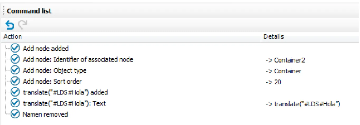
Command List
The command list shows all modification carried out on the current object in the definition tree view. A command list is kept for each object in the definition tree view. Use the button in the menu bar or the key combinationCTRL + ZandCTRL + Yto undo or redo the commands.
Implemented commands are flagged with the icon in the list. This icon is missing for commands that were undone.
Figure 9: Command List
The use of wizards allows for automatic implementation of numerous commands, which in the command list are displayed as composite commands and the individual commands are shown at a second level. However, these commands can only be undone through the composite command.
Icon function
UndoUndoes the last implemented command on the list. RedoRedoes the last implemented command on the list. Table 13: Functions in the Command List
Properties
Once you have successfully compiled a web project, you can call up all the important information in the Propertiesview. In this view, you can check the property values of controls during application runtime.
abfNOTE:A WCF connection must be created for this function.
ThePropertiesview is divided into two sections. On the left, the ASP.NET control hierarchy is displayed as it was on the web server when the web page was created. The associated database objects and IDs are also listed with the controls. On the right, the properties and property values for the controls are displayed.
To view properties of a node you can, for example, click on a point in the preview window to view it in more detail in thePropertiesview. The point is highlighted in thePropertiesview.
NOTE:This is only possible with display nodes, since only they are displayed in the preview window. Data and action node properties are only displayed in debug mode.
2. Click the marked object with the right mouse button inProperties.
The itemsShow definition objectandShow queryare shown in the context menu. 3. Click Show definition object.
The definition object is marked in the definition tree view.
Icon function
After pressing this button, the definition object's parent nodes are marked in thePropertiesview. Use this button to navigate down through the hierarchy node by node. On the right-hand side of the view in thePropertycolumn, the property associated with the node to be marked is highlighted in color.
You can close all nodes and sub-nodes in the view withCollapse all entries. Only the root node is visible.
UseExpand all nodesto expand all nodes and sub-nodes. This displays all levels in the hierarchy. Use this button to mark the definition object in the definition tree view and view more details. Table 14: Toolbar Functions in the "Properties" View
Figure 10: Properties
Multilingual Captions
You can open the dialog boxMultilingual CaptionsfromEdit | Captions in the menu bar.
NOTE:If you open the dialog boxMultilingual Captionswhen editing a node in the node editor, it contains an extra tabQuick editwith additional settings. For this, the selected or entered caption is assigned to the relevant node in the same work step.
MultiLanguage captions are standalone objects from the standpoint of the database, and are thus not saved in web project files. Instead, a reference to the object is created in the web project nodes. The dialog box Multilingual Captionsis responsible for creating and editing objects on the one hand and creating node references in the in the definition tree view in Web Designer, on the other.
The objects are edited on theCaptionstab. These objects have four main properties: l Language
Language indicates the language in which the text is written. l Key
l Text
Text is the text that is to be displayed in the designated language. l Customized text
Customized text is likewise text in the designated language, but overwrites a Dell defined text when displayed. thus allowing texts in Dell defined modules to be edited to the customer’s specifications without generating a customer-specific module.
NOTE:You can add one object for each language in a web application. All such objects must then have the same key (not to be confused with primary key). You can add captions in different languages in the dialog boxMultilingual Captions. The text boxLanguageis available for this. Specify the language culture as well. You can select, for example, English, English United Kingdom [enGB] or English -United States [en-US]. Your web browser settings are also important for the multilingual captions you use with the Web Designer. If the selected languages (e.g. de-AT) in your web browser settings do not exist as text in the Web Designer, the text is found in the nearest parent language set.
To edit existing captions, a search function with several options in implemented in the top part of the dialog box.
l Search key and value l Search for key only l Search for value only
l Search in all available languages
During text searches, both the Dell defined text and the customer-specific text are searched in all cases. The search results are shown in the results list, where they can be selected for editing by clicking them. Use the toolbar buttons to save and delete captions.
Figure 11: Toolbar "Multilingual Text"
Icon function Add
Adds a new caption. Delete
Deletes the active caption in the edit view after a confirming the prompt. Save
Saves a new or modified caption in the database.
3. Click the button next toText.
This opens theMultilingual Captionsdialog box. 4. Select Quick edit.
Quick edithas an SQL edit window. Here you can enter and edit the node caption.
The SQL window is empty if the node does not yet have any caption. If a caption already exists for this node, an SQL expression in the form"#LDS#<key>". In this case,Translatestands for calling the associated Web Designer SQL function, whilst#LDS#means that a caption follows the key (LDS -language dependent string).
TheTranslatefunction also allows for the use of parameters. The following figure shows an example of a caption with two parameters. In such a case, you do not need to enter the parameter reference (for example
{0}) in the key. It is sufficient to enter it in the text. It is always necessary to edit the function, for example enter the relevant parameters.
TheQuick edittab is available too, if no caption has been previously selected on theCaptiontab. In this case, the SQL field is empty. You can enter a statement manually. If you use a key without a caption in the database, the key name is displayed in the preview and in the web application.
Example:
translate#LDS#Hello World!becomesHello World!in the web if the key does not exist in the database. This function is particularly useful during the initial phases of a project, when captions are frequently modified. Until the customer initially accepts the text, only its key is kept updated. Once the text has been accepted, the captions and all necessary translations are implemented. A specific dialog has been
implemented that makes this task easier. There are instructions for this later in this chapter. Figure 12: Dialog "Multilingual Captions" and the "Quick Edit" Tab
To search for a caption
1. Open theMultilingual Captionsdialog box from the web project menu bar or from the node of choice in the definition tree window.
2. Limit your search with help from the radio buttonsSearch key and value,Search for key onlyand Search for value onlyor with by checkingSearch in all available languages.
3. Select inLanguagea language and culture to use for the search.
NOTE:In the Web Portal, captions and other values, such as, numbers or dates, are normally dependent on the language of the browser you use. When maintaining captions, you must specify a language which applies for all captions. You can learn how to find the right language from one of the languages given in your browser inLanguages for Displaying and Maintaining Datain the Dell One Identity Manager Configuration Guide.
4. Enter part or all of a caption in the search box and click the button to the right. All captions matching the search string are displayed.
NOTE:If one of the optionsSearch key and valueorSearch for key onlyis set, the keys shown in the result list are labeled with an asterisk.
Object Properties
TheObject propertiesdialog shows properties that are generated by Web Designer and the files that are saved as objects in theDialogAEDStable. Each module, component, project file and web project is represented as a separate file.
To open object properties
1. Select the object of choice in the navigation view. The selected object is marked in color.
2. Click Propertiesin the navigation toolbar.
This opens theObject propertiesdialog box. There are three tab available. You can edit the data on the tabsPropertiesandAccess permissionsif you have the right access permissions.
Figure 13: Information shown in the "Object Properties Window"
Change Labels for Web Projects
ClickApply a change label to whole web projectin the toolbar to open the dialog box. Use the function to book all database objects that make up a web project to one change label. This allows a web project to be transported to another database using the toolTransporterwithout problems. The function ensures that all necessary database objects are taken into account during transport.
To open the dialog box, "Edit change labels..."
1. Click Apply a change label to whole web project toolbar to open the dialog box in the toolbar. 2. Select, which groups of database objects should be linked to the change label:
a. Modules, components and configuration
The option links the database objects created by the Web Designer with the change label. b. Captions
The option links all captions required by the web project with the change label. For more information, seeMultilingual Captionson page36.
If any of the selected objects are already linked to one or more change labels, these assignments are not changed or deleted. In fact, another link is added.
3. ClickNext.
Another view appears in the dialog box. 4. Click the icon next toChange labels.
To create, edit or delete change labels 1. Open the dialog box as described above.
In the dialog box, you see selection options for a change label. 2. Click the magic wand.
TheChange labeldialog box is display with changes labels.
NOTE:If you have not selected and change labels, only theChanges labelsbutton is enabled.
3. Select the change label.
The buttonsOpen/close edit viewandCreate change labelandDelete change labelare set and can be clicked.
a. Click the buttonOpen/close edit viewto edit the selected change label.
This displays a table with more information about changes label in the dialog box which can be edited.
OR
-b. Click the buttonCreate change labelif you want to add new change label.
This displays a table with more information about changes label in the dialog box which can be edited.
l PopulateChange labels,Description,RemarkandStatus remark. l Select the change label fromParent change labelif necessary. l Select the option you want from theLockedlist.
l Select the label type from the list.
l Select the change label status from theStatuslist. l ClickOK.
l Click Save change label.
The new change label is displayed in the dialog box. OR
-c. Click Delete change label.
The messageDo you really want to delete the change label?appears.
l Confirm the prompt withYesif you are sure you want to delete the change label. The change label is deleted and not shown in the dialog box anymore.