Exploring Data Science
Selections by John Mount and Nina Zumel
Manning Author Picks
Copyright 2016 Manning Publications
www.manning.com. The publisher offers discounts on these books when ordered in quantity.
For more information, please contact
Special Sales Department Manning Publications Co. 20 Baldwin Road
PO Box 761
Shelter Island, NY 11964 Email: [email protected]
©2016 by Manning Publications Co. All rights reserved.
No part of this publication may be reproduced, stored in a retrieval system, or transmitted, in any form or by means electronic, mechanical, photocopying, or otherwise, without prior written permission of the publisher.
Many of the designations used by manufacturers and sellers to distinguish their products are claimed as trademarks. Where those designations appear in the book, and Manning
Publications was aware of a trademark claim, the designations have been printed in initial caps or all caps.
Recognizing the importance of preserving what has been written, it is Manning’s policy to have the books we publish printed on acid-free paper, and we exert our best efforts to that end. Recognizing also our responsibility to conserve the resources of our planet, Manning books are printed on paper that is at least 15 percent recycled and processed without the use of elemental chlorine.
Manning Publications Co. 20 Baldwin Road Technical PO Box 761
Shelter Island, NY 11964
Cover designer: Leslie Haimes
ISBN 9781617294181
iii
contents
Introduction ivE
XPLORING
DATA
1
Exploring data
Chapter 3 from
Practical Data Science with R
2
T
IME
SERIES
32
Time series
Chapter 15 from
R in Action, Second Edition
33
D
EEP
LEARNING
AND
NEURAL
NETWORKS
63
Deep learning and neural networks
Chapter 6 from
Algorithms of the Intelligent Web, Second Edition
64
T
EXT
MINING
AND
TEXT
ANALYTICS
95
Text mining and text analytics
Chapter 8 from
Introducing Data Scienc
e
96
M
ODELING
DEPENDENCIES
WITH
B
AYESIAN
AND
M
ARKOV
NETWORKS
132
Modeling dependencies with Bayesian and Markov networks
Chapter 5 from
Practical Probabilistic Programming
133
iv
Introduction
Data science is a broad field that touches on aspects of statistics, machine learning, and data engineering. What the tools, methods, and work look like depend a lot on your problem domain and point of view. Our book, Practical Data Science with R, intro-duces readers to basic predictive modeling in the R language. But it was never our intent to imply that data scientists can restrict themselves to one problem domain or one implementation language.
This is a great time to get into data science. The number of free tools and materials has exploded. Storing and managing large data sets is now markedly easier. However, this diversity can seem overwhelming and divisive. A traditional statistician may not consider text analytics to be data science, and similarly somebody using neural nets to analyze images may not appreciate classic statistical inference.
D
ata exploration and data cleaning are oft-neglected topics, yet they are also the most crucial—and most time-consuming—parts of the data science pro-cess. Without good data, you can’t develop effective models or glean important insights. R’s interactive environment and visualization capabilities make it partic-ularly well-suited for the task of understanding your data. The following chapter covers some common data issues and how to detect them via visualization and other exploration techniques in R. The chapter also provides an introduction to R’s ggplot2 visualization package, a flexible grammar for creating rich and infor-mative plots.2
by Nina Zumel and John Mount
Exploring data
In the last two chapters, you learned how to set the scoe and goal of a data science project, and how to load your data into R. In this chapter, we’ll start to get our hands into the data.
Suppose your goal is to build a model to predict which of your customers don’t have health insurance; perhaps you want to market inexpensive health insurance packages to them. You’ve collected a dataset of customers whose health insurance status you know. You’ve also identified some customer properties that you believe help predict the probability of insurance coverage: age, employment status, income, information about residence and vehicles, and so on. You’ve put all your data into a single data frame called custdata that you’ve input into R.1 Now you’re
ready to start building the model to identify the customers you’re interested in.
This chapter covers
Using summary statistics to explore data
Exploring data using visualization
Finding problems and issues during data exploration
3 Using summary statistics to spot problems
It’s tempting to dive right into the modeling step without looking very hard at the dataset first, especially when you have a lot of data. Resist the temptation. No dataset is perfect: you’ll be missing information about some of your customers, and you’ll have incorrect data about others. Some data fields will be dirty and inconsistent. If you don’t take the time to examine the data before you start to model, you may find your-self redoing your work repeatedly as you discover bad data fields or variables that need to be transformed before modeling. In the worst case, you’ll build a model that returns incorrect predictions—and you won’t be sure why. By addressing data issues early, you can save yourself some unnecessary work, and a lot of headaches!
You’d also like to get a sense of who your customers are: Are they young, mid-dle-aged, or seniors? How affluent are they? Where do they live? Knowing the answers to these questions can help you build a better model, because you’ll have a more specific idea of what information predicts the probability of insur-ance coverage more accurately.
In this chapter, we’ll demonstrate some ways to get to know your data, and discuss some of the potential issues that you’re looking for as you explore. Data exploration uses a combination of summary statistics—means and medians, variances, and counts— and visualization, or graphs of the data. You can spot some problems just by using sum-mary statistics; other problems are easier to find visually.
3.1
Using summary statistics to spot problems
In R, you’ll typically use the summary command to take your first look at the data.
> summary(custdata)
custid sex
Min. : 2068 F:440
1st Qu.: 345667 M:560 Median : 693403
Mean : 698500 3rd Qu.:1044606 Max. :1414286
Listing 3.1 The summary() command
Organizing data for analysis
is.employed income Mode :logical Min. : -8700
FALSE:73 1st Qu.: 14600
TRUE :599 Median : 35000
NA's :328 Mean : 53505
3rd Qu.: 67000 Max. :615000
marital.stat
Divorced/Separated:155
Married :516
Never Married :233
Widowed : 96
health.ins Mode :logical FALSE:159 TRUE :841 NA's :0 housing.type
Homeowner free and clear :157 Homeowner with mortgage/loan:412
Occupied with no rent : 11
Rented :364
NA's : 56
recent.move num.vehicles
Mode :logical Min. :0.000
FALSE:820 1st Qu.:1.000
TRUE :124 Median :2.000
NA's :56 Mean :1.916
3rd Qu.:2.000
Max. :6.000
NA's :56
age state.of.res
Min. : 0.0 California :100
1st Qu.: 38.0 New York : 71
Median : 50.0 Pennsylvania: 70
Mean : 51.7 Texas : 56
3rd Qu.: 64.0 Michigan : 52
Max. :146.7 Ohio : 51
(Other) :600
The summary command on a data frame reports a variety of summary statistics on the numerical columns of the data frame, and count statistics on any categorical columns (if the categorical columns have already been read in as factors2). You can also ask for
summary statistics on specific numerical columns by using the commands mean, variance, median, min, max, and quantile (which will return the quartiles of the data by default).
2 Categorical variables are of class factor in R. They can be represented as strings (class character), and some analytical functions will automatically convert string variables to factor variables. To get a summary of a variable, it needs to be a factor.
The variable is.employed is missing for about a third of the data. The variable income has negative values, which are potentially invalid.
About 84% of the customers have health insurance.
The variables housing.type, recent.move, and num.vehicles are each missing 56 values.
5 Using summary statistics to spot problems
As you see from listing 3.1, the summary of the data helps you quickly spot poten-tial problems, like missing data or unlikely values. You also get a rough idea of how categorical data is distributed. Let’s go into more detail about the typical problems that you can spot using the summary.
3.1.1 Typical problems revealed by data summaries
At this stage, you’re looking for several common issues: missing values, invalid values and outliers, and data ranges that are too wide or too narrow. Let’s address each of these issues in detail.
MISSINGVALUES
A few missing values may not really be a problem, but if a particular data field is largely unpopulated, it shouldn’t be used as an input without some repair (as we’ll dis-cuss in chapter 4, section 4.1.1). In R, for example, many modeling algorithms will, by default, quietly drop rows with missing values. As you see in listing 3.2, all the missing values in the is.employed variable could cause R to quietly ignore nearly a third of the data.
is.employed Mode :logical FALSE:73 TRUE :599 NA's :328
housing.type Homeowner free and clear :157 Homeowner with mortgage/loan:412
Occupied with no rent : 11
Rented :364
NA's : 56
recent.move num.vehicles
Mode :logical Min. :0.000
FALSE:820 1st Qu.:1.000
TRUE :124 Median :2.000
NA's :56 Mean :1.916
3rd Qu.:2.000
Max. :6.000
NA's :56
If a particular data field is largely unpopulated, it’s worth trying to determine why; sometimes the fact that a value is missing is informative in and of itself. For example, why is the is.employed variable missing so many values? There are many possible rea-sons, as we noted in listing 3.2.
Whatever the reason for missing data, you must decide on the most appropriate action. Do you include a variable with missing values in your model, or not? If you
Listing 3.2 Will the variable is.employed be useful for modeling?
The variable is.employed is missing for about a third of the data. Why? Is employment status unknown? Did the company start collecting employment data only recently? Does NA mean “not in the active workforce” (for example, students or stay-at-home parents)?
decide to include it, do you drop all the rows where this field is missing, or do you con-vert the missing values to 0 or to an additional category? We’ll discuss ways to treat missing data in chapter 4. In this example, you might decide to drop the data rows where you’re missing data about housing or vehicles, since there aren’t many of them. You probably don’t want to throw out the data where you’re missing employment information, but instead treat the NAs as a third employment category. You will likely encounter missing values when model scoring, so you should deal with them during model training.
INVALIDVALUESANDOUTLIERS
Even when a column or variable isn’t missing any values, you still want to check that the values that you do have make sense. Do you have any invalid values or outliers? Examples of invalid values include negative values in what should be a non-negative numeric data field (like age or income), or text where you expect numbers. Outliers are data points that fall well out of the range of where you expect the data to be. Can you spot the outliers and invalid values in listing 3.3?
> summary(custdata$income)
Min. 1st Qu. Median Mean 3rd Qu.
-8700 14600 35000 53500 67000
Max. 615000
> summary(custdata$age)
Min. 1st Qu. Median Mean 3rd Qu.
0.0 38.0 50.0 51.7 64.0
Max. 146.7
Often, invalid values are simply bad data input. Negative numbers in a field like age, however, could be a sentinel value to designate “unknown.” Outliers might also be data errors or sentinel values. Or they might be valid but unusual data points—people do occasionally live past 100.
As with missing values, you must decide the most appropriate action: drop the data field, drop the data points where this field is bad, or convert the bad data to a useful value. Even if you feel certain outliers are valid data, you might still want to omit them from model construction (and also collar allowed prediction range), since the usual achievable goal of modeling is to predict the typical case correctly.
DATARANGE
You also want to pay attention to how much the values in the data vary. If you believe that age or income helps to predict the probability of health insurance coverage, then
Listing 3.3 Examples of invalid values and outliers
Negative values for income could indicate bad data. They might also have a special meaning, like “amount of debt.”
Either way, you should check how prevalent the issue is, and decide what to do: Do you drop the data with negative income? Do you convert negative values to zero?
7 Using summary statistics to spot problems
you should make sure there is enough variation in the age and income of your cus-tomers for you to see the relationships. Let’s look at income again, in listing 3.4. Is the data range wide? Is it narrow?
> summary(custdata$income)
Min. 1st Qu. Median Mean 3rd Qu.
-8700 14600 35000 53500 67000
Max. 615000
Even ignoring negative income, the income variable in listing 3.4 ranges from zero to over half a million dollars. That’s pretty wide (though typical for income). Data that ranges over several orders of magnitude like this can be a problem for some modeling methods. We’ll talk about mitigating data range issues when we talk about logarithmic transformations in chapter 4.
Data can be too narrow, too. Suppose all your customers are between the ages of 50 and 55. It’s a good bet that age range wouldn’t be a very good predictor of the probability of health insurance coverage for that population, since it doesn’t vary much at all.
We’ll revisit data range in section 3.2, when we talk about examining data graphically. One factor that determines apparent data range is the unit of measurement. To take a nontechnical example, we measure the ages of babies and toddlers in weeks or in months, because developmental changes happen at that time scale for very young children. Suppose we measured babies’ ages in years. It might appear numerically that there isn’t much difference between a one-year-old and a two-year-old. In reality, there’s a dramatic difference, as any parent can tell you! Units can present potential issues in a dataset for another reason, as well.
UNITS
Does the income data in listing 3.5 represent hourly wages, or yearly wages in units of $1000? As a matter of fact, it’s the latter, but what if you thought it was the former? You might not notice the error during the modeling stage, but down the line someone will start inputting hourly wage data into the model and get back bad predictions in return.
Listing 3.4 Looking at the data range of a variable
Income ranges from zero to over half a million dollars; a very wide range.
How narrow is “too narrow” a data range?
> summary(Income)
Min. 1st Qu. Median Mean 3rd Qu. Max.
-8.7 14.6 35.0 53.5 67.0 615.0
Are time intervals measured in days, hours, minutes, or milliseconds? Are speeds in kilometers per second, miles per hour, or knots? Are monetary amounts in dollars, thousands of dollars, or 1/100 of a penny (a customary practice in finance, where cal-culations are often done in fixed-point arithmetic)? This is actually something that you’ll catch by checking data definitions in data dictionaries or documentation, rather than in the summary statistics; the difference between hourly wage data and annual salary in units of $1000 may not look that obvious at a casual glance. But it’s still something to keep in mind while looking over the value ranges of your variables, because often you can spot when measurements are in unexpected units. Automobile speeds in knots look a lot different than they do in miles per hour.
3.2
Spotting problems using graphics and visualization
As you’ve seen, you can spot plenty of problems just by looking over the data summa-ries. For other properties of the data, pictures are better than text.
We cannot expect a small number of numerical values [summary statistics] to consistently convey the wealth of information that exists in data. Numerical reduction methods do not retain the information in the data.
—William Cleveland
The Elements of Graphing Data
Figure 3.1 shows a plot of how customer ages are distributed. We’ll talk about what the y-axis of the graph means later; for right now, just know that the height of the graph corresponds to how many customers in the population are of that age. As you can see, information like the peak age of the distribution, the existence of subpopulations, and the presence of outliers is easier to absorb visually than it is to determine textually.
The use of graphics to examine data is called visualization. We try to follow William Cleveland’s principles for scientific visualization. Details of specific plots aside, the key points of Cleveland’s philosophy are these:
A graphic should display as much information as it can, with the lowest possible cognitive strain to the viewer.
Strive for clarity. Make the data stand out. Specific tips for increasing clarity include
–Avoid too many superimposed elements, such as too many curves in the same graphing space.
Listing 3.5 Checking units can prevent inaccurate results later
9 Spotting problems using graphics and visualization
–Find the right aspect ratio and scaling to properly bring out the details of the data.
–Avoid having the data all skewed to one side or the other of your graph.
Visualization is an iterative process. Its purpose is to answer questions about the data.
During the visualization stage, you graph the data, learn what you can, and then regraph the data to answer the questions that arise from your previous graphic. Differ-ent graphics are best suited for answering differDiffer-ent questions. We’ll look at some of them in this section.
In this book, we use ggplot2 to demonstrate the visualizations and graphics; of course, other R visualization packages can produce similar graphics.
0.000 0.005 0.010 0.015 0.020
0 50 100 150
age
density
Invalid values?
Min. 1st Qu. Median Mean 3rd Qu. Max. > summary(custdata$age)
0.0 38.0 50.0 51.7 64.0 146.7
Customer “subpopulation”: more customers over 75 than
you would expect. It’s easier to read the mean, median
and central 50% of the customer population off the summary.
It’s easier to get a sense of the customer age range from the graph. The peak of the customer
population is just under 50. That’s not obvious
from the summary.
Outliers
Figure 3.1 Some information is easier to read from a graph, and some from a summary.
A note on ggplot2
The theme of this section is how to use visualization to explore your data, not how to use ggplot2. We chose ggplot2 because it excels at combining multiple graphical elements together, but its syntax can take some getting used to. The key points to understand when looking at our code snippets are these:
In the next two sections, we’ll show how to use pictures and graphs to identify data characteristics and issues. In section 3.2.2, we’ll look at visualizations for two variables. But let’s start by looking at visualizations for single variables.
3.2.1 Visually checking distributions for a single variable
The visualizations in this section help you answer questions like these:
What is the peak value of the distribution?
How many peaks are there in the distribution (unimodality versus bimodality)?
How normal (or lognormal) is the data? We’ll discuss normal and lognormal distributions in appendix B.
How much does the data vary? Is it concentrated in a certain interval or in a cer-tain category?
One of the things that’s easier to grasp visually is the shape of the data distribution. Except for the blip to the right, the graph in figure 3.1 (which we’ve reproduced as the gray curve in figure 3.2) is almost shaped like the normal distribution (see appen-dix B). As that appenappen-dix explains, many summary statistics assume that the data is approximately normal in distribution (at least for continuous variables), so you want to verify whether this is the case.
You can also see that the gray curve in figure 3.2 has only one peak, or that it’s uni-modal. This is another property that you want to check in your data.
Why? Because (roughly speaking), a unimodal distribution corresponds to one population of subjects. For the gray curve in figure 3.2, the mean customer age is about 52, and 50% of the customers are between 38 and 64 (the first and third quartiles). So you can say that a “typical” customer is middle-aged and probably pos-sesses many of the demographic qualities of a middle-aged person—though of course you have to verify that with your actual customer information.
size of the points—are called aesthetics, and are declared by using the aes
function.
The ggplot() function declares the graph object. The arguments to ggplot()
can include the data frame of interest and the aesthetics. The ggplot()
function doesn’t of itself produce a visualization; visualizations are produced by layers.
11 Spotting problems using graphics and visualization
The black curve in figure 3.2 shows what can happen when you have two peaks, or a
bimodal distribution. (A distribution with more than two peaks is multimodal.) This set of customers has about the same mean age as the customers represented by the gray curve—but a 50-year-old is hardly a “typical” customer! This (admittedly exaggerated) example corresponds to two populations of customers: a fairly young population mostly in their 20s and 30s, and an older population mostly in their 70s. These two populations probably have very different behavior patterns, and if you want to model whether a customer probably has health insurance or not, it wouldn’t be a bad idea to model the two populations separately—especially if you’re using linear or logistic regression.
The histogram and the density plot are two visualizations that help you quickly examine the distribution of a numerical variable. Figures 3.1 and 3.2 are density plots. Whether you use histograms or density plots is largely a matter of taste. We tend to prefer density plots, but histograms are easier to explain to less quantitatively-minded audiences.
HISTOGRAMS
A basic histogram bins a variable into fixed-width buckets and returns the number of data points that falls into each bucket. For example, you could group your customers by age range, in intervals of five years: 20–25, 25–30, 30–35, and so on. Customers at a
0.00 0.01 0.02 0.03
0 25 50 75 100
age
density
Min. 1st Qu. Median Mean 3rd Qu. Max. > summary(custdata$age)
0.0 38.0 50.0 51.7 64.0 146.7
Min. 1st Qu. Median Mean 3rd Qu. Max.
> summary(Age)
–3.983 25.270 61.400 50.690 75.930 82.230
“Average” customer–but
not “typical” customer!
boundary age would go into the higher bucket: 25-year-olds go into the 25–30 bucket. For each bucket, you then count how many customers are in that bucket. The result-ing histogram is shown in figure 3.3.
You create the histogram in figure 3.3 in ggplot2 with the geom_histogram layer.
library(ggplot2)
ggplot(custdata) +
geom_histogram(aes(x=age),
binwidth=5, fill="gray")
The primary disadvantage of histograms is that you must decide ahead of time how wide the buckets are. If the buckets are too wide, you can lose information about the shape of the distribution. If the buckets are too narrow, the histogram can look too noisy to read easily. An alternative visualization is the density plot.
DENSITYPLOTS
You can think of a density plot as a “continuous histogram” of a variable, except the area under the density plot is equal to 1. A point on a density plot corresponds to the
Listing 3.6 Plotting a histogram
0 20 40 60 80 100
0
50
100
150
age
count
Invalid
values Outliers
Figure 3.3 A histogram tells you where your data is concentrated. It also visually highlights outliers and anomalies.
Load the ggplot2 library, if you haven’t already done so.
13 Spotting problems using graphics and visualization
fraction of data (or the percentage of data, divided by 100) that takes on a particular value. This fraction is usually very small. When you look at a density plot, you’re more interested in the overall shape of the curve than in the actual values on the y-axis. You’ve seen the density plot of age; figure 3.4 shows the density plot of income. You produce figure 3.4 with the geom_density layer, as shown in the following listing.
library(scales)
ggplot(custdata) + geom_density(aes(x=income)) + scale_x_continuous(labels=dollar)
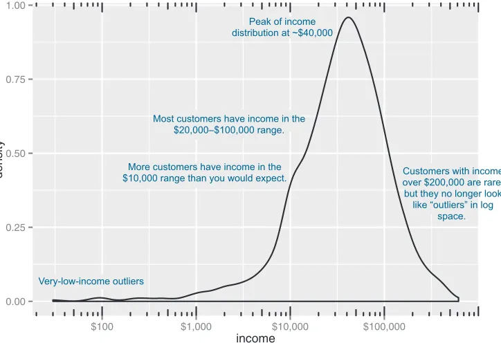
When the data range is very wide and the mass of the distribution is heavily concen-trated to one side, like the distribution in figure 3.4, it’s difficult to see the details of its shape. For instance, it’s hard to tell the exact value where the income distribution has its peak. If the data is non-negative, then one way to bring out more detail is to plot the distribution on a logarithmic scale, as shown in figure 3.5. This is equivalent to plotting the density plot of log10(income).
Listing 3.7 Producing a density plot
0e+00 5e 06 1e 05
$0 $200,000 $400,000 $600,000
income
density
Most of the distribution is concentrated at the low end: less than $100,000 a year.
It’s hard to get good resolution here.
Wide data range: several orders of
magnitude. Subpopulation
of wealthy customers in the $400,000
range.
Figure 3.4 Density plots show where data is concentrated. This plot also highlights a population of higher-income customers.
The scales package brings in the dollar scale notation.
In ggplot2, you can plot figure 3.5 with the geom_density and scale_x_log10 layers, such as in the next listing.
ggplot(custdata) + geom_density(aes(x=income)) +
scale_x_log10(breaks=c(100,1000,10000,100000), labels=dollar) + annotation_logticks(sides="bt")
When you issued the preceding command, you also got back a warning message:
Warning messages:
1: In scale$trans$trans(x) : NaNs produced
2: Removed 79 rows containing non-finite values (stat_density).
This tells you that ggplot2 ignored the zero- and negative-valued rows (since log(0) = Infinity), and that there were 79 such rows. Keep that in mind when evaluating the graph.
In log space, income is distributed as something that looks like a “normalish” distri-bution, as will be discussed in appendix B. It’s not exactly a normal distribution (in fact, it appears to be at least two normal distributions mixed together).
Listing 3.8 Creating a log-scaled density plot
0.00 0.25 0.50 0.75 1.00
$100 $1,000 $10,000 $100,000
income
density
Peak of income distribution at ~$40,000
Most customers have income in the $20,000–$100,000 range.
More customers have income in the $10,000 range than you would expect.
Very-low-income outliers
Customers with income over $200,000 are rare, but they no longer look
like “outliers” in log space.
Figure 3.5 The density plot of income on a log10 scale highlights details of the income distribution that are harder to see in a regular density plot.
Set the x-axis to be in log10 scale, with manually set tick points and labels as dollars.
15 Spotting problems using graphics and visualization
BARCHARTS
A bar chart is a histogram for discrete data: it records the frequency of every value of a categorical variable. Figure 3.6 shows the distribution of marital status in your cus-tomer dataset. If you believe that marital status helps predict the probability of health insurance coverage, then you want to check that you have enough customers with dif-ferent marital statuses to help you discover the relationship between being married (or not) and having health insurance.
When should you use a logarithmic scale?
You should use a logarithmic scale when percent change, or change in orders of mag-nitude, is more important than changes in absolute units. You should also use a log scale to better visualize data that is heavily skewed.
For example, in income data, a difference in income of five thousand dollars means something very different in a population where the incomes tend to fall in the tens of thousands of dollars than it does in populations where income falls in the hundreds of thousands or millions of dollars. In other words, what constitutes a “significant dif-ference” depends on the order of magnitude of the incomes you’re looking at. Simi-larly, in a population like that in figure 3.5, a few people with very high income will cause the majority of the data to be compressed into a relatively small area of the graph. For both those reasons, plotting the income distribution on a logarithmic scale is a good idea.
0 100 200 300 400 500
Divorced/Separated Married Never Married Widowed marital.stat
count
The ggplot2 command to produce figure 3.6 uses geom_bar:
ggplot(custdata) + geom_bar(aes(x=marital.stat), fill="gray")
This graph doesn’t really show any more information than summary(custdata$marital .stat) would show, although some people find the graph easier to absorb than the text. Bar charts are most useful when the number of possible values is fairly large, like state of residence. In this situation, we often find that a horizontal graph is more legible than a vertical graph.
The ggplot2 command to produce figure 3.7 is shown in the next listing.
ggplot(custdata) +
geom_bar(aes(x=state.of.res), fill="gray") + coord_flip() +
theme(axis.text.y=element_text(size=rel(0.8)))
Listing 3.9 Producing a horizontal bar chart
AlabamaAlaska Arizona Arkansas CaliforniaColorado ConnecticutDelaware Florida GeorgiaHawaii Idaho Illinois IndianaIowa Kansas Kentucky LouisianaMaine Maryland MassachusettsMichigan Minnesota MississippiMissouri Montana NebraskaNevada New HampshireNew Jersey New MexicoNew York North CarolinaNorth Dakota Ohio OklahomaOregon Pennsylvania Rhode Island South CarolinaSouth Dakota TennesseeTexas Utah VermontVirginia Washington West VirginiaWisconsin Wyoming
0 25 50 75 100
count
state
.of
.res
Figure 3.7 A horizontal bar chart can be easier to read when there are several categories with long names. Plot bar chart as before: state.of.res is on x axis, count is on y-axis. Flip the
x and y axes: state.of.res is now on
17 Spotting problems using graphics and visualization
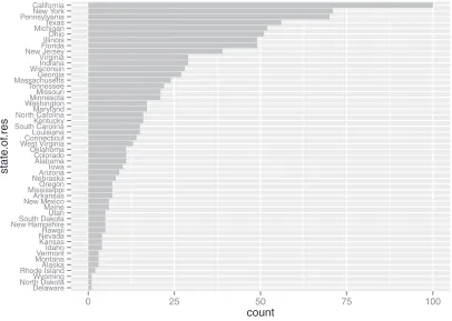
Cleveland3 recommends that the data in a bar chart (or in a dot plot, Cleveland’s
pre-ferred visualization in this instance) be sorted, to more efficiently extract insight from the data. This is shown in figure 3.8.
This visualization requires a bit more manipulation, at least in ggplot2, because by default, ggplot2 will plot the categories of a factor variable in alphabetical order. To change this, we have to manually specify the order of the categories—in the factor variable, not in ggplot2.
> statesums <- table(custdata$state.of.res)
> statef <- as.data.frame(statesums)
> colnames(statef)<-c("state.of.res", "count")
> summary(statef)
3 See William S. Cleveland, The Elements of Graphing Data, Hobart Press, 1994.
Listing 3.10 Producing a bar chart with sorted categories
Delaware North DakotaWyoming Rhode IslandAlaska MontanaVermont Idaho Kansas NevadaHawaii New HampshireSouth Dakota Utah Maine New MexicoArkansas MississippiOregon NebraskaArizona Iowa Alabama Colorado Oklahoma West VirginiaConnecticut Louisiana South CarolinaKentucky North CarolinaMaryland WashingtonMinnesota Missouri Tennessee MassachusettsGeorgia WisconsinIndiana Virginia New JerseyFlorida IllinoisOhio MichiganTexas PennsylvaniaNew York California
0 25 50 75 100
count
state
.of
.res
Figure 3.8 Sorting the bar chart by count makes it even easier to read.
The table() command aggregates the data by state of residence— exactly the information the bar chart plots. Convert the table
object to a data frame using as.data.frame(). The default column names are Var1 and Freq. Rename the
columns for readability.
state.of.res count
Alabama : 1 Min. : 1.00
Alaska : 1 1st Qu.: 5.00
Arizona : 1 Median : 12.00
Arkansas : 1 Mean : 20.00
California: 1 3rd Qu.: 26.25
Colorado : 1 Max. :100.00
(Other) :44
> statef <- transform(statef,
state.of.res=reorder(state.of.res, count))
> summary(statef)
state.of.res count
Delaware : 1 Min. : 1.00
North Dakota: 1 1st Qu.: 5.00
Wyoming : 1 Median : 12.00
Rhode Island: 1 Mean : 20.00
Alaska : 1 3rd Qu.: 26.25
Montana : 1 Max. :100.00
(Other) :44
> ggplot(statef)+ geom_bar(aes(x=state.of.res,y=count),
stat="identity",
fill="gray") +
coord_flip() +
theme(axis.text.y=element_text(size=rel(0.8)))
Before we move on to visualizations for two variables, in table 3.1 we’ll summarize the visualizations that we’ve discussed in this section.
3.2.2 Visually checking relationships between two variables
In addition to examining variables in isolation, you’ll often want to look at the relation-ship between two variables. For example, you might want to answer questions like these: Table 3.1 Visualizations for one variable
Graph type Uses
Histogram or density plot
Examines data range Checks number of modes
Checks if distribution is normal/lognormal Checks for anomalies and outliers
Bar chart Compares relative or absolute frequencies of the values of a categorical variable Use the reorder() function to set the state.of.res variable to be count ordered. Use the transform() function to apply the transformation to the state.of.res data frame. The state.of.res
variable is now count ordered.
Since the data is being passed to geom_bar pre-aggregated, specify both the x and y variables, and use stat="identity" to plot the data exactly as given.
19 Spotting problems using graphics and visualization
Is there a relationship between the two inputs age and income in my data?
What kind of relationship, and how strong?
Is there a relationship between the input marital status and the output health insurance? How strong?
You’ll precisely quantify these relationships during the modeling phase, but exploring them now gives you a feel for the data and helps you determine which variables are the best candidates to include in a model.
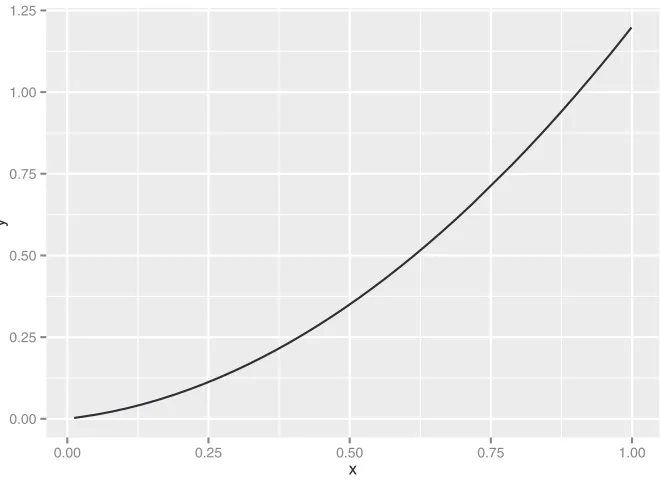
First, let’s consider the relationship between two continuous variables. The most obvious way (though not always the best) is the line plot.
LINEPLOTS
Line plots work best when the relationship between two variables is relatively clean: each
x value has a unique (or nearly unique) y value, as in figure 3.9. You plot figure 3.9 with geom_line.
x <- runif(100)
y <- x^2 + 0.2*x
ggplot(data.frame(x=x,y=y), aes(x=x,y=y)) + geom_line()
Listing 3.11 Producing a line plot
First, generate the data for this example. The x variable is uniformly randomly distributed between 0 and 1.
The y variable is a quadratic function of x.
0.00 0.25 0.50 0.75 1.00 1.25
0.00 0.25 0.50 0.75 1.00
x
y
Figure 3.9 Example of a line plot Plot
When the data is not so cleanly related, line plots aren’t as useful; you’ll want to use the scatter plot instead, as you’ll see in the next section.
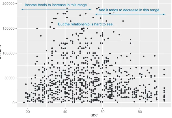
SCATTERPLOTSANDSMOOTHINGCURVES
You’d expect there to be a relationship between age and health insurance, and also a relationship between income and health insurance. But what is the relationship between age and income? If they track each other perfectly, then you might not want to use both variables in a model for health insurance. The appropriate summary statis-tic is the correlation, which we compute on a safe subset of our data.
custdata2 <- subset(custdata,
(custdata$age > 0 & custdata$age < 100 & custdata$income > 0))
cor(custdata2$age, custdata2$income)
[1] -0.02240845
The negative correlation is surprising, since you’d expect that income should increase as people get older. A visualization gives you more insight into what’s going on than a single number can. Let’s try a scatter plot first; you plot figure 3.10 with geom_point:
ggplot(custdata2, aes(x=age, y=income)) + geom_point() + ylim(0, 200000)
Listing 3.12 Examining the correlation between age and income
Only consider a subset of data with reasonable age and income values.
Get correlation of age and income. Resulting correlation.
0 50000 100000 150000 200000
20 40 60 80
age
income
And it tends to decrease in this range.
But the relationship is hard to see. Income tends to increase in this range.
21 Spotting problems using graphics and visualization
The relationship between age and income isn’t easy to see. You can try to make the rela-tionship clearer by also plotting a linear fit through the data, as shown in figure 3.11.
You plot figure 3.11 using the stat_smooth layer:4
ggplot(custdata2, aes(x=age, y=income)) + geom_point() + stat_smooth(method="lm") +
ylim(0, 200000)
In this case, the linear fit doesn’t really capture the shape of the data. You can better capture the shape by instead plotting a smoothing curve through the data, as shown in figure 3.12.
In R, smoothing curves are fit using the loess (or lowess) functions, which calcu-late smoothed local linear fits of the data. In ggplot2, you can plot a smoothing curve to the data by using geom_smooth:
ggplot(custdata2, aes(x=age, y=income)) + geom_point() + geom_smooth() +
ylim(0, 200000)
A scatter plot with a smoothing curve also makes a good visualization of the relationship between a continuous variable and a Boolean. Suppose you’re considering using age as an input to your health insurance model. You might want to plot health insurance
4 The stat layers in ggplot2 are the layers that perform transformations on the data. They’re usually called under the covers by the geom layers. Sometimes you have to call them directly, to access parameters that aren’t accessible from the geom layers. In this case, the default smoothing curve used geom_smooth, which is a loess curve, as you’ll see shortly. To plot a linear fit we must call stat_smooth directly.
0 50000 100000 150000 200000
20 40 60 80
age
income
0 50000 100000 150000 200000
20 40 60 80
age
income
The ribbon shows the standard error around the smoothed estimate.
It tends to be wider where data is sparse, narrower where data is dense. The smoothing curve makes it easier to see that
income increases up to about age 40, then tends to decrease after about age 55 or 60.
Figure 3.12 A scatter plot of income versus age, with a smoothing curve
0.0 0.3 0.6 0.9
20 40 60 80
age
as
.n
umer
ic(health.ins)
Here, the y-variable is Boolean (0/1); we’ve jittered it for legibility.
The smoothing curve shows the fraction of customers with health insurance, as a
function of age.
23 Spotting problems using graphics and visualization
coverage as a function of age, as shown in figure 3.13. This will show you that the prob-ability of having health insurance increases as customer age increases.
You plot figure 3.13 with the command shown in the next listing.
ggplot(custdata2, aes(x=age, y=as.numeric(health.ins))) + geom_point(position=position_jitter(w=0.05, h=0.05)) + geom_smooth()
In our health insurance examples, the dataset is small enough that the scatter plots that you’ve created are still legible. If the dataset were a hundred times bigger, there would be so many points that they would begin to plot on top of each other; the scat-ter plot would turn into an illegible smear. In high-volume situations like this, try an aggregated plot, like a hexbin plot.
HEXBINPLOTS
A hexbin plot is like a two-dimensional histogram. The data is divided into bins, and the number of data points in each bin is represented by color or shading. Let’s go back to the income versus age example. Figure 3.14 shows a hexbin plot of the data. Note how the smoothing curve traces out the shape formed by the densest region of data.
Listing 3.13 Plotting the distribution of health.ins as a function of age
The Boolean variable health.ins must be converted to a 0/1 variable using as.numeric.
Since y values can only be 0 or 1, add a small jitter to get a sense of data density. Add
smoothing curve.
0 50000 100000 150000 200000
25 50 75
age
income
4 8 12 16
count The hexbin plot gives a
sense of the shape of a dense data cloud.
The lighter the bin, the more customers in that bin.
To make a hexbin plot in R, you must have the hexbin package installed. We’ll discuss how to install R packages in appendix A. Once hexbin is installed and the library loaded, you create the plots using the geom_hex layer.
library(hexbin)
ggplot(custdata2, aes(x=age, y=income)) +
geom_hex(binwidth=c(5, 10000)) + geom_smooth(color="white", se=F) + ylim(0,200000)
In this section and the previous section, we’ve looked at plots where at least one of the variables is numerical. But in our health insurance example, the output is categorical, and so are many of the input variables. Next we’ll look at ways to visualize the relation-ship between two categorical variables.
BARCHARTSFORTWOCATEGORICALVARIABLES
Let’s examine the relationship between marital status and the probability of health insurance coverage. The most straightforward way to visualize this is with a stacked bar chart, as shown in figure 3.15.
Listing 3.14 Producing a hexbin plot
Load hexbin library. Create hexbin with age binned into 5-year increments, income in increments of $10,000. Add smoothing
curve in white; suppress standard error ribbon (se=F).
0 100 200 300 400 500
Divorced/Separated Married Never Married Widowed marital.stat
count
health.ins
FALSE
TRUE Most customers are married.
Never-married customers are most likely to be
uninsured.
Widowed customers are
rare, but very unlikely to be uninsured. The height of
each bar represents total customer
count.
The dark section represents
uninsured customers.
25 Spotting problems using graphics and visualization
Some people prefer the side-by-side bar chart, shown in figure 3.16, which makes it easier to compare the number of both insured and uninsured across categories.
The main shortcoming of both the stacked and side-by-side bar charts is that you can’t easily compare the ratios of insured to uninsured across categories, especially for rare categories like Widowed. You can use what ggplot2 calls a filled bar chart to plot a visualization of the ratios directly, as in figure 3.17.
The filled bar chart makes it obvious that divorced customers are slightly more likely to be uninsured than married ones. But you’ve lost the information that being widowed, though highly predictive of insurance coverage, is a rare category.
Which bar chart you use depends on what information is most important for you to convey. The ggplot2 commands for each of these plots are given next. Note the use of the fill aesthetic; this tells ggplot2 to color (fill) the bars according to the value of the variable health.ins. The position argument to geom_bar specifies the bar chart style.
ggplot(custdata) + geom_bar(aes(x=marital.stat, fill=health.ins))
ggplot(custdata) + geom_bar(aes(x=marital.stat, fill=health.ins),
position="dodge")
ggplot(custdata) + geom_bar(aes(x=marital.stat, fill=health.ins),
position="fill")
Listing 3.15 Specifying different styles of bar chart
0 100 200 300 400
Divorced/Separated Married Never Married Widowed marital.stat
count
health.ins
FALSE
TRUE The dark section
represents uninsured customers. The light bars
represent insured customers.
A side-by-side bar chart makes it harder to compare the absolute
number of customers in each category, but easier to compare
insured or uninsured across categories.
Figure 3.16 Health insurance versus marital status: side-by-side bar chart
Stacked bar chart, the default
Side-by-side bar chart
To get a simultaneous sense of both the population in each category and the ratio of insured to uninsured, you can add what’s called a rug to the filled bar chart. A rug is a series of ticks or points on the x-axis, one tick per datum. The rug is dense where you have a lot of data, and sparse where you have little data. This is shown in figure 3.18. You generate this graph by adding a geom_point layer to the graph.
ggplot(custdata, aes(x=marital.stat)) +
geom_bar(aes(fill=health.ins), position="fill") +
geom_point(aes(y=-0.05), size=0.75, alpha=0.3,
position=position_jitter(h=0.01))
In the preceding examples, one of the variables was binary; the same plots can be applied to two variables that each have several categories, but the results are harder to read. Suppose you’re interested in the distribution of marriage status across housing types. Some find the side-by-side bar chart easiest to read in this situation, but it’s not perfect, as you see in figure 3.19.
A graph like figure 3.19 gets cluttered if either of the variables has a large number of categories. A better alternative is to break the distributions into different graphs, one for each housing type. In ggplot2 this is called faceting the graph, and you use the facet_wrap layer. The result is in figure 3.20.
Listing 3.16 Plotting data with a rug
0.00 0.25 0.50 0.75 1.00
Divorced/Separated Married Never Married Widowed marital.stat
count
health.ins
FALSE
TRUE Rather than showing
counts, each bar represents the population
of the category normalized to one.
The dark section represents the
fraction of customers in the category who are uninsured.
Figure 3.17 Health insurance versus marital status: filled bar chart
Set the points just under the y-axis, three-quarters of default size, and make them slightly transparent with the alpha parameter.
27 Spotting problems using graphics and visualization
0.00 0.25 0.50 0.75 1.00
Divorced/Separated Married Never Married Widowed marital.stat
count
health.ins
FALSE
TRUE Married
people are
common. Widowed
ones are rare.
Figure 3.18 Health insurance versus marital status: filled bar chart with rug
0 100 200
Homeo
wner free and clear
Homeo wner with mor
tgage/loan
Occupied with no rent
Rented
housing.type
count
marital.stat
Divorced/Separated
Married
Never Married
Widowed “Occupied with no rent”
is a rare category. It’s hard to read
the distribution.
The code for figures 3.19 and 3.20 looks like the next listing.
ggplot(custdata2) +
geom_bar(aes(x=housing.type, fill=marital.stat ),
position="dodge") +
theme(axis.text.x = element_text(angle = 45, hjust = 1))
ggplot(custdata2) +
geom_bar(aes(x=marital.stat), position="dodge",
fill="darkgray") +
facet_wrap(~housing.type, scales="free_y") +
theme(axis.text.x = element_text(angle = 45, hjust = 1))
Listing 3.17 Plotting a bar chart with and without facets
Homeowner free and clear Homeowner with mortgage/loan
Occupied with no rent Rented
0 25 50 75 0 100 200 0 1 2 3 4 5 0 50 100 Div orced/Separ ated Marr ied
Never Marr ied Wido wed Div orced/Separ ated Marr ied
Never Marr ied
Wido wed
marital.stat
count
Note that every facet has a different scale on the y-axis.
Figure 3.20 Distribution of marital status by housing type: faceted side-by-side bar chart
Side-by-side bar chart.
Tilt the x-axis labels so they don’t overlap. You can also use coord_flip() to rotate the graph, as we saw previously. Some prefer coord_flip() because the theme() layer is complicated to use.
The faceted bar chart.
Facet the graph by housing.type. The scales="free_y" argument specifies that each facet has an independently scaled y-axis (the default is that all facets have the same scales on both axes). The argument free_x would free the x-axis scaling, and the argument free frees both axes.
29 Summary
Table 3.2 summarizes the visualizations for two variables that we’ve covered.
There are many other variations and visualizations you could use to explore the data; the preceding set covers some of the most useful and basic graphs. You should try dif-ferent kinds of graphs to get difdif-ferent insights from the data. It’s an interactive pro-cess. One graph will raise questions that you can try to answer by replotting the data again, with a different visualization.
Eventually, you’ll explore your data enough to get a sense of it and to spot most major problems and issues. In the next chapter, we’ll discuss some ways to address common problems that you may discover in the data.
3.3
Summary
At this point, you’ve gotten a feel for your data. You’ve explored it through summaries and visualizations; you now have a sense of the quality of your data, and of the rela-tionships among your variables. You’ve caught and are ready to correct several kinds of data issues—although you’ll likely run into more issues as you progress.
Maybe some of the things you’ve discovered have led you to reevaluate the ques-tion you’re trying to answer, or to modify your goals. Maybe you’ve decided that you Table 3.2 Visualizations for two variables
Graph type Uses
Line plot Shows the relationship between two continuous variables. Best when that relationship is functional, or nearly so.
Scatter plot Shows the relationship between two continuous variables. Best when the relationship is too loose or cloud-like to be easily seen on a line plot.
Smoothing curve Shows underlying “average” relationship, or trend, between two continuous variables. Can also be used to show the relationship between a continuous and a binary or Boolean variable: the fraction of true values of the discrete variable as a function of the continuous variable.
Hexbin plot Shows the relationship between two continuous variables when the data is very dense.
Stacked bar chart Shows the relationship between two categorical variables (var1 and var2). Highlights the frequencies of each value of var1.
Side-by-side bar chart Shows the relationship between two categorical variables (var1 and var2). Good for comparing the frequencies of each value of var2 across the values of var1. Works best when var2 is binary.
Filled bar chart Shows the relationship between two categorical variables (var1 and var2). Good for comparing the relative frequencies of each value of var2 within each value of var1. Works best when var2 is binary.
Bar chart with faceting Shows the relationship between two categorical variables (var1 and
need more or different types of data to achieve your goals. This is all good. The data science process is made of loops within loops. The data exploration and data cleaning stages are two of the more time-consuming-and also the most important-stages of the process. Without good data, you can't build good models. Time you spend here is time you don't waste elsewhere.
Key takeaways
Take the time to examine your data before diving into the modeling.
The summary command helps you spot issues with data range, units, data type, and missing or invalid values.
Visualization additionally gives you a sense of data distribution and relation-ships among variables.
Business analysts and developers are increasingly col-lecting, curating, analyzing, and reporting on crucial business data. The R language and its associated tools provide a straightforward way to tackle day-to-day data science tasks without a lot of academic theory or advanced mathematics.
Practical Data Science with R shows you how to apply the R programming language and useful statistical tech-niques to everyday business situations. Using examples from marketing, business intelligence, and decision sup-port, it shows you how to design experiments (such as A/B tests), build predictive models, and present results to audiences of all levels.
What’s inside
Data science for the business professional
Statistical analysis using the R language
Project lifecycle, from planning to delivery
Numerous instantly familiar use cases
Keys to effective data presentations
T
ime series are how you organize data when time is an important factor. Examples include forecasting stock prices, modeling the environment, and pre-dicting future product demand. In classic predictive modeling, learning a strong relation between presumed inputs and results, both sampled from the same time, is enough. By contrast, for time series you are asked to forecast one or more quantities for a series of times in the future, based only on measurements from the past. Time series models have a high risk of false fit, so using well-char-acterized techniques is important. The following chapter demonstrates the most common components of time series prediction using R: smoothing trends, esti-mating moving averages, identifying seasonal oscillations, and estiesti-mating autore-gressive relations.33
Chapter 15 from
R in Action, Second Edition
by Robert I. Kabacoff
Time series
How fast is global warming occurring, and what will the impact be in 10 years? With the exception of repeated measures ANOVA in section 9.6, each of the preceding chapters has focused on cross-sectional data. In a cross-sectional dataset, variables are measured at a single point in time. In contrast, longitudinal data involves measuring variables repeatedly over time. By following a phenomenon over time, it’s possible to learn a great deal about it.
In this chapter, we’ll examine observations that have been recorded at regularly spaced time intervals for a given span of time. We can arrange observations such as these into a time series of the form Y1, Y2, Y3, … , Yt, …, YT,where Yt represents the
value of Y at time t and T is the total number of observations in the series.
Consider two very different time series displayed in figure 15.1. The series on the left contains the quarterly earnings (dollars) per Johnson & Johnson share between 1960 and 1980. There are 84 observations: one for each quarter over 21
This chapter covers
Creating a time series
Decomposing a time series into components
Developing predictive models
years. The series on the right describes the monthly mean relative sunspot numbers from 1749 to 1983 recorded by the Swiss Federal Observatory and the Tokyo Astro-nomical Observatory. The sunspots time series is much longer, with 2,820 observa-tions—1 per month for 235 years.
Studies of time-series data involve two fundamental questions: what happened (description), and what will happen next (forecasting)? For the Johnson & Johnson data, you might ask
Is the price of Johnson & Johnson shares changing over time?
Are there quarterly effects, with share prices rising and falling in a regular fash-ion throughout the year?
Can you forecast what future share prices will be and, if so, to what degree of accuracy?
For the sunspot data, you might ask
What statistical models best describe sunspot activity?
Do some models fit the data better than others?
Are the number of sunspots at a given time predictable and, if so, to what degree?
The ability to accurately predict stock prices has relevance for my (hopefully) early retirement to a tropical island, whereas the ability to predict sunspot activity has rele-vance for my cell phone reception on said island.
Predicting future values of a time series, or forecasting, is a fundamental human activity, and studies of time series data have important real-world applications. Econo-mists use time-series data in an attempt to understand and predict what will happen in
Johnson & Johnson
Quarterly earnings per share (dollars)
1960 1970 1980
0
5
10
15
Sunspots
Time Time
Mean monthly frequency
1750 1850 1950
0
5
0
100
150
200
250
35
financial markets. City planners use time-series data to predict future transportation demands. Climate scientists use time-series data to study global climate change. Cor-porations use time series to predict product demand and future sales. Healthcare offi-cials use time-series data to study the spread of disease and to predict the number of future cases in a given region. Seismologists study times-series data in order to predict earthquakes. In each case, the study of historical time series is an indispensable part of the process. Because different approaches may work best with different types of time series, we’ll investigate many examples in this chapter.
There is a wide range of methods for describing time-series data and forecasting future values. If you work with time-series data, you’ll find that R has some of the most comprehensive analytic capabilities available anywhere. This chapter explores some of the most common descriptive and forecasting approaches and the R functions used to perform them. The functions are listed in table 15.1 in their order of appearance in the chapter.
Table 15.1 Functions for time-series analysis
Function Package Use
ts() stats Creates a time-series object.
plot() graphics Plots a time series.
start() stats Returns the starting time of a time series.
end() stats Returns the ending time of a time series.
frequency() stats Returns the period of a time series.
window() stats Subsets a time-series object.
ma() forecast Fits a simple moving-average model.
stl() stats Decomposes a time series into seasonal, trend, and irregular components using loess.
monthplot() stats Plots the seasonal components of a time series.
seasonplot() forecast Generates a season plot.
HoltWinters() stats Fits an exponential smoothing model.
forecast() forecast Forecasts future values of a time series.
accuracy() forecast Reports fit measures for a time-series model.
ets() forecast Fits an exponential smoothing model. Includes the ability to automate the selection of a model.
lag() stats Returns a lagged version of a time series.
Acf() forecast Estimates the autocorrelation function.
Pacf() forecast Estimates the partial autocorrelation function.
Table 15.2 lists the time-series data that you’ll analyze. They’re available with the base installation of R. The datasets vary greatly in their characteristics and the models that fit them best.
We’ll start with methods for creating and manipulating time series, describing and plotting them, and decomposing them into level, trend, seasonal, and irregular (error) components. Then we’ll turn to forecasting, starting with popular exponential modeling approaches that use weighted averages of time-series values to predict future values. Next we’ll consider a set of forecasting techniques called autoregressive integrated moving averages (ARIMA) models that use correlations among recent data points and among recent prediction errors to make future forecasts. Throughout, we’ll consider methods of evaluating the fit of models and the accuracy of their pre-dictions. The chapter ends with a description of resources available for learning more about these topics.
15.1
Creating a time-series object in R
In order to work with a time series in R, you have to place it into a time-series object—an R structure that contains the observations, the starting and ending time of the series, ndiffs() forecast Determines the level of differencing needed to remove trends in a
time series.
adf.test() tseries Computes an Augmented Dickey–Fuller test that a time series is stationary.
arima() stats Fits autoregressive integrated moving-average models.
Box.test() stats Computes a Ljung–Box test that the residuals of a time series are independent.
bds.test() tseries Computes the BDS test that a series consists of independent, identically distributed random variables.
auto.arima() forecast Automates the selection of an ARIMA model.
Table 15.2 Datasets used in this chapter
Time series Description
AirPassengers Monthly airline passenger numbers from 1949–1960
JohnsonJohnson Quarterly earnings per Johnson & Johnson share
nhtemp Average yearly temperatures in New Haven, Connecticut, from 1912–1971
Nile Flow of the river Nile
sunspots Monthly sunspot numbers from 1749–1983 Table 15.1 Functions for time-series analysis
37
Creating a time-series object in R
and information about its periodicity (for example, monthly, quarterly, or annual data). Once the data are in a time-series object, you can use numerous functions to manipulate, model, and plot the data.
A vector of numbers, or a column in a data frame, can be saved as a time-series object using the ts() function. The format is
myseries <- ts(data, start=, end=, frequency=)
where myseries is the time-series object, data is a numeric vector containing the observations, start specifies the series start time, end specifies the end time (optional), and frequency indicates the number of observations per unit time (for example, frequency=1 for annual data, frequency=12 for monthly data, and frequency=4 for quarterly data).
An example is given in the following listing. The data consist of monthly sales fig-ures for two years, starting in January 2003.
> sales <- c(18, 33, 41, 7, 34, 35, 24, 25, 24, 21, 25, 20, 22, 31, 40, 29, 25, 21, 22, 54, 31, 25, 26, 35)
> tsales <- ts(sales, start=c(2003, 1), frequency=12) > tsales
Jan Feb Mar Apr May Jun Jul Aug Sep Oct Nov Dec 2003 18 33 41 7 34 35 24 25 24 21 25 20 2004 22 31 40 29 25 21 22 54 31 25 26 35
> plot(tsales)
> start(tsales)
[1] 2003 1
> end(tsales)
[1] 2004 12
> frequency(tsales)
[1] 12
> tsales.subset <- window(tsales, start=c(2003, 5), end=c(2004, 6)) > tsales.subset
Jan Feb Mar Apr May Jun Jul Aug Sep Oct Nov Dec 2003 34 35 24 25 24 21 25 20 2004 22 31 40 29 25 21
In this listing, the ts() function is used to create the time-series object
b
. Once it’s created, you can print and plot it; the plot is given in figure 15.2. You can modify the plot using the techniques described in chapter 3. For example, plot(tsales, type="o", pch=19) would create a time-series plot with connected, solid-filled circles.Listing 15.1 Creating a time-series object
Creates a time-series object
b
Gets information about the object
c
Once you’ve created the time-series object, you can use functions like start(), end(), and frequency() to return its properties
c
. You can also use the window() function to create a new time series that’s a subset of the originald
.15.2
Smoothing and seasonal decomposition
Just as analysts explore a dataset with descriptive statistics and graphs before attempt-ing to model the data, describattempt-ing a time series numerically and visually should be the first step before attempting to build complex models. In this section, we’ll look at smoothing a time series to clarify its general trend, and decomposing a time series in order to observe any seasonal effects.
15.2.1 Smoothing with simple moving averages
The first step when investigating a time series is to plot it, as in listing 15.1. Consider the Nile time series. It records the annual flow of the river Nile at Ashwan from 1871– 1970. A plot of the series can be seen in the upper-left panel of figure 15.3. The time series appears to be decreasing, but there is a great deal of variation from year to year. Time series typically have a significant irregular or error component. In order to discern any patterns in the data, you’ll frequently want to plot a smoothed curve that damps down these fluctuations. One of the simplest methods of smoothing a time series is to use simple moving averages. For example, each data point can be replaced with the mean of that observation and one observation before and after it. This is called a centered moving average. A centered moving average is defined as
St = (Yt-q + … + Yt + … + Yt+q) / (2q + 1)
where St is the smoothed value at time t and k = 2q + 1 is the number of observations
that are averaged. The k value is usually chosen to be an odd number (3 in this example). By necessity, when using a centered moving average, you lose the (k – 1) / 2 observations at each end of the series.
Time
tsales
2003.0 2003.5 2004.0 2004.5
10
20
30
40
50
39
Smoothing and seasonal decomposition
Several functions in R can provide a simple moving average, including SMA() in the TTR package, rollmean() in the zoo package, and ma() in the forecast package. Here, you’ll use the ma() function to smooth the Nile time series that comes with the base R installation.
The code in the next listing plots the raw time series and smoothed versions using k equal to 3, 7, and 15. The plots are given in figure 15.3.
library(forecast)
opar <- par(no.readonly=TRUE) par(mfrow=c(2,2))
ylim <- c(min(Nile), max(Nile)) plot(Nile, main="Raw time series")
plot(ma(Nile, 3), main="Simple Moving Averages (k=3)", ylim=ylim) plot(ma(Nile, 7), main="Simple Moving Averages (k=7)", ylim=ylim) plot(ma(Nile, 15), main="Simple Moving Averages (k=15)", ylim=ylim) par(opar)
As k increases, the plot becomes increasingly smoothed. The challenge is to find the value of k that highlights the major patterns in the data, without under- or over-smoothing. This is more art than science, and you’ll probably want to try several val-ues of k before settling on one. From the plots in figure 15.3, there certainly appears to have been a drop in river flow between 1892 and 1900. Other changes are open to interpretation. For example, there may have been a small increasing trend between 1941 and 1961, but this could also have been a random variation.
For time-series data with a periodicity greater than one (that is, with a seasonal component), you’ll want to go beyond a description of the overall trend. Seasonal decomposition can be used to examine both seasonal and general trends.
Listing 15.2 Simple moving averages
Raw time series
Time
Nile
1880 1920 1960
600
1000
1400
Simple Moving Averages (k=3)
Time
ma(N
ile,
3)
1880 1920 1960
600
1000
1400
Simple Moving Averages (k=7)
Time m a (Nile , 7 )
1880 1920 1960
600
1000
1400
Simple Moving Averages (k=15)
Time m a (N ile , 1 5 )
1880 1920 1960
600
1000
1400