Visualizing Statistical Linked Knowledge for
Decision Support
Editor(s):Aba-Sah Dadzie, The Open University, UK; Emmanuel Pietriga, INRIA France & INRIA Chile
Solicited review(s):Luc Girardin, ETH Zurich, Switzerland; Bernhard Schandl, University of Vienna, Austria; Emmanuel Pietriga, INRIA France & INRIA Chile
Adrian M.P. Bra¸soveanu
a,c,∗, Marta Sabou
b, Arno Scharl
a,c, Alexander Hubmann-Haidvogel
a,c, and
Daniel Fischl
aaDepartment of New Media Technology, MODUL University Vienna, Am Kahlenberg 1, 1190 Vienna, Austria
E-mail: {adrian.brasoveanu, alexander.hubmann, daniel.fischl}@modul.ac.at
bChristian Doppler Laboratory for Software Engineering Integration for Flexible Automation Systems, Vienna
University of Technology, Favoritenstrasse 9-11, 1040 Vienna, Austria E-mail: [email protected]
cwebLyzard technology gmbh, Puechlgasse 2/44, 1190 Vienna, Austria
E-mail: [email protected]
Abstract.In a global and interconnected economy, decision makers often need to consider information from various domains. A tourism destination manager, for example, has to correlate tourist behavior with financial and environmental indicators to allocate funds for strategic long-term investments. Statistical data underpins a broad range of such cross-domain decision tasks. A variety of statistical datasets are available as Linked Open Data, often incorporated into visual analytics solutions to support decision making. What are the principles, architectures, workflows and implementation design patterns that should be followed for building such visual cross-domain decision support systems. This article introduces a methodology to integrate and visualize cross-domain statistical data sources by applying selected RDF Data Cube (QB) principles. A visual dashboard built according to this methodology is presented and evaluated in the context of two use cases in the tourism and telecommunications domains.
Keywords: Linked Data, Information Visualization, Decision Support Systems, RDF Data Cube, Data Analytics
1. Introduction
Decision Support Systems(DSS) are typically cus-tomized for specific decisions in a given domain. In a global economy, external events such as financial crises or climate change - through observable con-sequences like bankruptcies or hurricanes - can ren-der such domain-specific solutions obsolete. Building comprehensive monitoring systems into DSS tools is a potential solution, but one that can be prohibitively expensive and out-of-reach for smaller companies and research groups. One way to build DSS tools that
lever-*Corresponding author. E-mail: [email protected].
age such cross-domain information is to analyze ag-gregated representations of events in the form of sta-tistical data. Such an integration helps answer com-plex questions that require cross-domain data. Draw-ing on economic and sustainability indicators in con-junction with behavioral data from tourism research, for example, allows answering complex questions such as the following: Do financial crises affect tourist be-havior? Do temperature increases in continental Eu-rope change the annual distribution of arrivals? Can the failure of specific stocks - e.g., large tour operators or hotel stocks - predict a sector-wide crisis? Similar questions arise in other sectors as well. A telecommu-nications analysts, for example, might want to
gate longitudinal data to explain unusual peaks in the number of calls or text messages sent, or better under-stand how geopolitical trends (migration, aging popu-lation, etc.) influence call data patterns.
Statistical data sources from multiple domains are increasingly available as linked (open) data follow-ing the publication of the RDF Data Cube Vocabulary (QB).1 Visualization seems to be thede factomethod
for making sense of Linked Data (LD), and various ap-proaches have been developed for navigating the data deluge [11], but less effort was dedicated to integrat-ing visualizations into analytical platforms for answer-ing complex questions, similar to the ones we have dis-cussed earlier. Fox and Hendler [16] argue that inte-grationandreusabilityare the most important aspects on which visualization designers need to focus for suc-cessfully controlling the current data deluge through visualizations. The success of tools like LOD, QB or D3 [4] has greatly simplified data publishing and vi-sualization, but the problems described by Fox and Hendler still persist due to a combination of factors: i) the standards are often taken as guidelines and there is a lot of improvisation when publishing datasets; ii) integration of SLD is a complex field [56]; iii) projects are mostly focused on creating individual visualiza-tions (line charts, bar charts, etc) instead than frame-works for integrating multiple types of visualizations; iv) in the context of Big Data, scalability has to be taken into account when designing new systems right from the start.
This article describes the methodology that was used to remove some of these gaps and to integrate cross-domain statistical data sources into a visual dashboard that supports a multiple coordinated view approach. A first prototype considered specific project requirements in conjunction with recommendations from Dadzie and Rowe [11] and QB (concepts such asobservationsandslicing). We have then extracted a set of principles and workflows for integrating and vi-sualizing heterogeneous data sources that we later ap-plied to various use cases (e.g., tourism, telecommuni-cations, etc). We iteratively continued to improve and deploy new versions of this technology. The current article is focused on the first two generations.
We present use cases from the tourism and telecom-munications domains based on cross-domain datasets from multiple sources including Eurostat2 and the
1www.w3.org/tr/vocab-data-cube 2eurostat.linked-statistics.org
World Bank3, and discuss specific types of tasks that the visual dashboard helps address. The article’s main contributions include:
– a set of workflows and visualization principles usable for visualizing datasets in the RDF Data Cube vocabulary (Section 4);
– a collection of visualization scenarios that are useful for multiple use cases (Section 5);
– visual dashboards developed following these prin-ciples and scenarios (Section 6 and Section 8).
The remainder of this article is structured as follows: Section 2 offers an introduction to the QB vocabulary and formulates the problem statement; Section 3 de-scribes the current state of the art in statistical LD Vi-sualization; Section 4 describes the principles, archi-tecture and workflows we propose to visualize statisti-cal LD using different visual metaphors; Section 5 de-scribes use cases from the tourism and telecommunica-tion domains and how they guided the development of visual tools; Section 6 describes the design, implemen-tation, and usage of a tourism dashboard in line with the use case requirements, which is evaluated in Sec-tion 7. The telecommunicaSec-tions dashboard presented in Section 8 builds on recommendations derived from this evaluation. Section 9 summarizes the lessons we learned and outlines future research avenues.
2. Background and Problem Statement
2.1. Background - RDF Data Cube Vocabulary
The RDF Data Cube Vocabulary is a W3C Recom-mendation for publishing statistical data, supported by industry and academia as evidenced by the increasing number of datasets published using this vocabulary; e.g., the PlanetData datasets4 or the W3C use cases.5 A further advantage of QB is that it is based on a cube model that is compatible with theStatistical Data and Metadata Exchange(SDMX) standard and designed to be general so that it enables the publishing of different types of multidimensional datasets.
The basic building blocks of the cube model are measures, dimensions andattributes, collectively re-ferred to ascomponents, and have the following roles:
– Measure componentsdescribe the things or phe-nomena that are observed or measured (e.g., height, weight, arrivals, bed nights, capacity, number of mobile phone calls).
– Dimension componentsspecify the variables that are important when defining an individual obser-vation for a measurement (e.g., time and space). – Attributeshelp interpret the measured values by
specifying the units of measurement, but also ad-ditional metadata such as the status of the obser-vation (e.g., observed, estimated).
These basic building blocks are then combined into more complex structures such asslicesanddatasets:
– Observationsare the atomic data units that repre-sent a concrete measured value for a set of con-crete dimension values. Observations correspond to the values from statistical databases. Some-times observations can also contain multiple mea-surements related to the same dimensions. – Slices are groups of observations with several
dimensions fixed (e.g., the arrivals of German tourists in Budapest between 2007 and 2013 has only one variable dimension: time).
– Datasetsare collections of observations with the same dimensions and measures. Datasets that contain observations grouped into slices across dimensions constitute acube.
– AData Structure Document (DSDs) describes a dataset and contains all the required namespaces and components.
– Code listsordictionariesdescribe the list of en-tities that are repeated through all datasets of a publisher (e.g., countries, units of measurements). They can also be used to describe complex hier-archies (geopolitical, ISO classification, etc.), and are often described using the SKOS vocabulary.
2.2. Problem Statement
Global economies expose us to various instabili-ties of non-periodic flows similar to those described by Lorenz [34]. Most domains reflect aggregated pat-terns of human behavior (finance, telecommunica-tions, tourism, culture, etc.), where small changes of amplitudes can lead to instabilities. To design a DSS for such dynamic domains, one needs to understand financial and cultural profiles (migration patterns, fi-nancial needs, etc.). Such problems are easier to inves-tigate through the lens of statistics. In fact an imme-diate method to reduce the complexity derived from
such phenomena is to use large collections of statisti-cal data such as those provided by the World Bank or Eurostat, which are now increasingly available as LD. Such collections help understand macroscopic effects when investigating complex economic, environmental or social phenomena.
By splitting statistical data into cubes of up to three dimensions, the QB vocabulary offers a simple and flexible structure to represent such macroscopic ef-fects. Performing ontology alignment between any QB datasets is a problem that is usually complicated by a number of factors - lack of DSDs, failure of SPARQL endpoints, errors in the data or DSD, deviations be-tween QB guidelines and actual implementations, etc. Simply gathering a lot of data will not suffice to un-derstand macro trends, however, and visual methods can help reduce data complexities during the decision-making process. Building a visual DSS is the first step towards a full-fledged DSS system, but the output of the visualizations (e.g., correlations, patterns) does not necessarily need to be translated into new knowl-edge (e.g., by creating new annotations or datasets with these correlations). Even without automatic interpreta-tion of the results, this still complicates the problem, as most visualizations are built for simple use cases. What methodology needs to be followed to display multiple coordinated visualizations built from a single query? What are good methods to show both numeric results of analytic processes and the corresponding visualiza-tions in a unified view?
Building visualizations is a time-consuming pro-cess, and the desired ability to reuse them poses a num-ber of challenges. What are the best design patterns for implementing reusable visualizations? Do existing interaction patterns of existing visualizations need to be adapted for new datasets? These questions lead to the main research problem investigated in this article: What are the principles, architectures, workflows and implementation design patterns needed to build a vi-sual DSS that exploits cross-domain information?
3. Related Work
querying, aggregation, abstraction, etc) and scalabil-ity. Semantic Web (and Linked Data, by extension) and DSS can be viewed as application areas of Arti-ficial Intelligence (AI), and in many cases the result of research in such an applied field is a system. How-ever, effective AI systems need to use a variety of tech-nologies to deliver their best results. In Semantic Web, for example, there is an increased wave of hybridiza-tion with Natural Language Processing (NLP), Ma-chine Learning (ML), and Information Retrieval (IR), even the most popular systems such as Watson sub-scribing to this trend [27,53]. Another possibility is to use Human-Computer Interaction (HCI) techniques such as visualization to navigate the data flow. The re-mainder of this section is focused on the visualization of Linked Data as a major means of sense-making.
3.1. Linked Data Visualization
We can distinguish two large domains of LD visu-alization:ontology visualization (TBox visualizations) andinstance data visualizations (ABox visualizations). Systems that offer both are also possible. In both cases, the main goal of the visualizations is to help understand the relations between the various ontology classes or instances. We also discuss several Linked Data Visualization Models.
Ontology Visualization. The evolution of ontol-ogy visualization can be traced through several sur-veys about the early days of Semantic Web visualiza-tion [18,30]; the role of ontologies in building user interfaces [38] and OWL visualizations [14]. The pa-per by Dudas [14] also examines the types of tasks needed in an ontology visualization system, how these tasks are supported in the current systems, and show-cases an Ontology Visualization Recommender tool. RDF based languages that allow visualizing ontolo-gies and data are now being used to visualize on-tologies. RDFS/OWL Visualization Language (RVL) [39] was designed to create simple mappings between RDFS/OWL and D3.js [4] visualizations. It is a declar-ative language that allows creating visualizations from both the TBox and the ABox of a dataset. Another de-velopment is a visual language called VOWL2 [33] geared towards helping users visualize ontologies.
Instance Data Visualization. The early survey of LD visualization techniques from Dadzie and Rowe [11] predates the release of the RDF Data Cube Vo-cabulary. It contains the first coherent set of principles for visualizing LD, and divides existing visualization tools into two groups: text-based and LD browsers that
offer visualization options. A later survey of LD ex-ploration systems [35] starts with a list of search task characteristics and links them to features already im-plemented in LD browsers. The survey identifies three types of LD exploration systems: LD browsers; LD Recommenders; and LD-based exploratory search sys-tems. It offers a summary of best-practice systems in-cluding their IR and HCI features. Similar to the case of ontology visualization, there is the possibility to use declarative LD for creating LD instance data visualiza-tions with RVL [39].
Linked Data Visualization Models. A number of formal models describe LD visualization work-flows, some of them also being associated with pro-totype implementations. De Vocht’s [50] Visual Ex-ploration Workflow is an executable model for vi-sualizing graphs that contains four types of views (overview groups, narrowing views, coordinated views and broadening views). Brunetti’s [7] Linked Data Vi-sualization Model (LVDM) extends Chi’s data state reference model [10] and consists of a series of trans-formation stages built on top of RDF and non-RDF data: a) data transformation; b) visualization trans-formation; c)visual mapping transformation. Helmich [22] implements this model in Payola for visualizing the Czech LOD cloud. Ba-Lam Do’s Linked Widgets platform [13] is a pipeline for creating mashups.
An extensive treatment of the various reusable quan-titative visualizations can be found in [54]. The book presents a grammar of graphics that allows building any 2D scientific visualization from a set of simple primitives such as points, lines, scales or shapes. Re-cent visualization libraries built on top of D3 such as ggD36 or Vega7 are following this philosophy. The
next step in the evolution of LD visualization systems is to design pipelines and systems capable of exploit-ing the dataset structure and the underlinexploit-ing data struc-tures. The next section is focused only on those sys-tems able to visualize QB datasets.
3.2. Statistical Linked Data Visualization
In statistical LD visualization, instances will typi-cally belong to or be associated with QB datasets. If the SLDs have a more complex structure, the corre-sponding ontologies or DSDs might need to be visu-alized as well. There are three types ofStatistical LD Visualizations systems:
– tools and packages that offerbasic LD visualiza-tions(tables, charts, maps) of QB datasets, with or without aggregations;
– dashboardsor complex tools that integrate sev-eral visualizations typically using Multiple Coor-dinated Views (MCV);
– LD platformsthat might contain visualizations.
Basic Visualizations and Aggregations. The LOD2 project developed aStatistical Workbenchthat reflects various phases of the statistical LOD consumption cy-cle, e.g. triplification via CSV2DataCube, validation through the RDF Data Cube Validation tool and vi-sualization with CubeViz[15,44].CubeViz[44] is an RDF Data Cube Browser which can be used to query both resources and observations from QB datasets, and display the results in the form of several classic chart types. The OpenCube toolkit offers tools to manage the statistical LOD lifecycle [26] and includes com-ponents for Extract-Transform-Load (ETL) operations (Grafter framework), data conversion (TARQL adap-tation) and data publishing (D2RQ extensions). It also contains tools for consuming the data: the OpenCube Browser for table-based views, an R package for sta-tistical analysis, a widget for slicing data cubes, a cat-alog management component and a tool for interac-tive map-based visualizations.Vital [12] uses
visual-6benjh33.github.io/ggd3 7trifacta.github.io/vega
izations to help in the analysis and debuggging process for QB datasets publication. The automated Visualiza-tion Wizarddescribed in [36] offers support for vocab-ulary mappings, considers the possible combinations of dimensions and measures for RDF Data Cubes, and offers a choice between several visualization pack-ages (D3.js [4] and Google Charts). Another paper re-lated to the same project [24] presents theLinked Data Query Wizard which uses a table-based approach to selecting query results from QB datasets, and classic chart types or mind maps to visualize the results. Ba-Lam Do [13] developed a visualization pipeline fo-cused on creatingLinked Widgetslike lines, bars, pies, and especially maps, from QB datasets. He also iden-tified two main problems for statistical LD visualiza-tions: a) the challenge of analyzing and aligning multi-ple datasets due to the fact that most publishers use the QB vocabulary as a guideline rather than as a specifi-cation and almost always come up with some changes to it; b) the challenge of creating tools for consuming statistical LD.
Dashboards. There are several dashboards based on the RDF Data Cube format (QB) and its predecessor, the Statistical Data and Metadata eXchange (SDMX) format - the ISO standard for statistical data represen-tation currently used by large institution such as the United Nations, Eurostat, the International Monetary Fund, and the World Bank. The dashboards of Jern [25] and Hienert [23] used SDMX as they were built before 2012. One of the first QB dashboard examples by Sabol et al. [40] extends earlier work [36,24] and allows brushing over multiple coordinated visualiza-tions. Sabol’s paper analyzes two scenarios (search and analysis over LOD, analysis of scientific publications), describes the underlying workflow, and the resulting visualizations implemented in the extensions of the Vi-sualization Wizardtool. The framework presented in this article is based on a Multiple Coordinated View (MCV) architecture to synchronise multiple visualiza-tions [45].8This approach addresses several challenges
identified in the Semantic DSS study [2].
Even though not directly related to visualizations, the work of Kämpgen and Harth [28] focused on in-terrogating multiple QB datasets via the OLAP4LD framework, which can be used as a starting point for delivering data to complex dashboards.
Linked Data Platforms (LDPs).9The idea behind LDPs is the delivery of data in various formats using REST APIs (Application Programming Interfaces fol-lowing the Representational State Transfer standard). Some platforms also allow to build full-featured inter-faces that can contain maps or pictures, typically using templating solutions such as Velocity,10 Elda,11
Car-bon LDP,12 Apache Marmotta,13 Graphity,14, LDP4j
[19] and Virtuoso15are several exponents of this trend.
Many of the applications developed following LDP best practices16include maps or other types of
visual-izations. The main reason to include them as a sepa-rate type of visualization is the fact that many of these platforms are used to publish QB datasets.
In conclusion, many visualization workflows are geared towards creating simple charts, and little ef-fort (with the exception of MCV dashboards) is dedi-cated to complex analytic solutions. Without combin-ing datasets and synchronizcombin-ing multiple visualizations with the integrated repository, it will remain a chal-lenge to clearly present complex use cases like those described in Kämpgen and Harth’s work or at the be-ginning of this article. The next section presents a set of principles and a workflow to support the creation of complex visualisations from statistical linked data.
4. Visualizing Statistical Linked Data
Before describing the design of visualizations fol-lowing QB principles, this section outlines the work-flow of statistical LD visualizations, as well as the tasks and visual metaphors involved.
4.1. RDF Data Cube Visualization Principles
The principles outlined in this section do not funda-mentally change those presented by Dadzie and Rowe [11], but extend them in the context of visualizing statistical LD. The goal is to create a set of linked views for analyzing the relations between slices from multiple datasets in order to identify correlations and other patterns. The iterative process of defining these
9www.w3.org/tr/ldp 10velocity.apache.org
11www.github.com/epimorphics/elda 12www.carbonldp.com
13marmotta.apache.org 14www.github.com/graphity 15virtuoso.openlinksw.com
16dvcs.w3.org/hg/ldpwg/raw-file/default/ldp-bp/ldp-bp.html
principles started with the design guidelines for QB datasets, iteratively expanding and refining them dur-ing dashboard development. The followdur-ing list sum-marizes these principles for visualizing statistical LD.
– Linked Views for Statistical LD. Visualizations should reflect the linked nature of the data and support switching between visualizations when navigating the underlying datasets, or at the very least reflect changes across several visualizations on a single screen using multiple coordinated views technology. We refer to this principle as Linked Visualizations for Linked Data, and en-courage it regardless of the nature of the linked datasets to be visualized. Linked visualizations are an obvious choice for statistical LD as statisti-cians tend to use multiple graphics to understand statistical phenomena.
– Integrate Data Analysis and Visualizations. Since statistics GUIs like R also tend to integrate code, data and visualizations, we also recommend tointegrate the data analysis and the visualiza-tion taks. Code should not be integrated, except if the GUI is dedicated to programmers. Support-ing views that do not necessarily contain visual-izations while displaying slices of datasets is a good way to apply this principle - e.g., a list of top customers can be arranged after certain crite-ria or a table can be used to display the results of a statistical test.
spe-cific context (together with text or data, for ex-ample) also increases the value of the information presented to the user.
– Apply Flexible Mechanisms for Selecting Slices. Slices are collections of observations, in which at least one dimension remains fixed, approximat-ing the way humans tend to query datasets, for example:Identify all data about Austria’s GDP between 2008 and 2014(Austria represents the fixed dimension) orFind all observations related to bookings by German tourists in Prague be-tween 2008 and 2014(Germany and Prague are fixed dimensions). In the second example, it is difficult to predict if the user is actually inter-ested in data related to the German clients, or to data related to people who visited Prague, or both. Therefore the best way to present the results is to take into account both dimensions and pro-vide two separate views or a single view which is updated whenever the user wants to change the query. Implementing switching mechanisms for the fixed dimensions allows for flexibility in the choice of slices to be visualized.
– Highlight Particular Observations. The "High-light links" principle from Dadzie and Rowe’s work[11] needs to be extended to take into ac-count the structure of the datasets. When using multidimensional datasets (e.g., tourists visiting a particular destination) we also need to high-light specific (best, worst) observations, not just the links. To differentiate these top observations, they could be aggregated by location and color-coded by performance indicators. Charts could use heatmaps to emphasize importance, while in tables row/column coloring or fonts can achieve a similar effect.
– Normalize Indicator Values. If one wants to plot multiple indicators in order to observe correla-tions between them, it is not only useful, but rec-ommended to normalize their values so that they can all be displayed in the same plot. Normal-ization is often a part of visualNormal-ization processes, but in the case of statistical indicators it is al-most always needed. In fact without normaliza-tion SLD visualizanormaliza-tion would not be possible at all. Indicator selection is extremely important, as even though after normalization any indicator can be plotted against any indicator, perhaps it would be better to plot only things that mean something in a certain use case.
– Provide Highly Customizable Temporal Con-trols. The temporal dimension plays an important role in SLD, therefore temporal controls should provided but not at the expense of overcrowding the interface. While this might seem obvious, it is a principle that was overlooked when creating the initial SLD dashboard for the ETIHQ project (see Section 5.1), since time was being perceived im-portant just for slicing datasets. However, when one needs to understand data properly, time is es-sential, as things like seasonality, peaks or valleys can only be understood when using different time perspectives.
– Extract and Share. One of the main princi-ples behind LD is its accessibility in multi-ple machine-readable formats. A quick way to achieve this through visualizations is to export the data slices into various formats. Customizable image export functions should support the dis-semination of new research insights, for example, and reflect the last principle we propose, that of extracting and sharing visual knowledge.
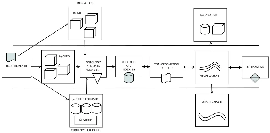
4.2. Architecture and Workflow
Many state-of-the-art applications emphasize au-tomation and reuse - creating, using and replacing vi-sualizations as part of an iterative process. Such a life-cycle can be expressed as a series of visualization pipelines [13,26], which requires developers to follow certain workflows. When visualizing statistical LD, such workflows will necessarily include both LD tasks (selection of indicators, ontology alignment, etc.) and visualization tasks (data wrangling, interaction, etc.).
Building on best-practice examples reported in the literature, we propose a workflow for creating visual-isations that follows the logical sequence of develop-ing statistical LD applications. We have closely fol-lowed these steps when implementing the dashboards described in Sections 6 and 8.
vi-(a) QB
(b) SDMX
Conversion (c) OTHER FORMATS
ONTOLOGY AND DATA ALIGNMENT
STORAGE AND INDEXING
TRANSFORMATION
(QUERIES) INTERACTION INDICATORS
GROUP BY PUBLISHER REQUIREMENTS
DATA EXPORT
CHART EXPORT VISUALIZATION
Fig. 1. Generic, reusable workflow for visualizing Statistical Linked Data (QB, SDMX and other formats)
sualizations appropriate to address the research questions. Scenarios are a good fit for describ-ing larger applications with multiple types of in-teraction, many data sources, and most likely significant customization efforts. User stories are a good fit for smaller applications and typ-ically describe only one feature. Ideally, sce-narios should be split into several user stories. During requirements collection special emphasis should be placed on how to link visualizations in the context of an application. Another important point is to understand what kind of workflow best describes a new use case, especially the changes in existing workflows required to add the new features requested by a project or client.
2. Discovery and Indicator Selection. If data sources were already identified in the require-ments phase, this step will require to select the needed indicators and convert them to a format that is easy to use for visualizations (e.g., a fla-vor of RDF or JSON). The discovery of the right indicators is not necessarily a straight-forward process, as one will have to not only identify the right indicator, but also the version that is best for the application (e.g., there can be hundreds of variants of GDP indicators published by large statistical data publishers). To get the right ver-sion of the indicator one will have to check for the name, granularity (yearly, monthly, daily), geolocation (it frequently happens that some
in-dicators are not available for all locations or that the label of the location is different from one dataset to another) or additional clues (Which GDP indicator is needed - GDP, GDP growth or GDP per capita?). In general this step almost al-ways requires either the use of LD and domain experts (a strategy we have deployed in the ini-tial phases of building the ETIHQ dashboard (see Section 5.1) when the experts provided a set of URIs to index), or the creation of an automated tool to discover and import the data (a strategy we have started to deploy later in the process, once we had a better understanding of the data). Grouping the indicators according to their prove-nance and category helped in the later stages of the process. In this stage lies the key to devel-oping multiple types of workflows based on the data provenance and format, as it can easily be seen in Figure 1. The current article is mostly fo-cused on the QB workflow. RDF workflows need an extra cubification step, while other formats such asComma-Separated Values(CSV) require both cubification and conversion steps. While we do not explicitly show additional cubifications in Figure 1, the next steps of the workflow assume the data is in a QB or QB inspired format (e.g., a JSON representation of QB datasets).
var-ious dimensions of the datasets under consider-ation need to be analyzed, aligned, augmented or aggregated in order to fit particular visual-ization scenarios. The ontology alignment phase only refers to the analysis and alignment of the data. There are a number of important steps that need to be taken into account when performing ontology alignment between QB datasets: fix-ing or avoidfix-ing broken or missfix-ing DSDs, fail-ure of SPARQL endpoints, broken dumps, miss-ing code lists. All these have to be included into alignment queries or scripts. The strategy we used in order to ease the ontology align-ment process was to examine sets of RDF dumps from large statistical data publishers (e.g., exam-ine several random World Bank or Eurostat QB datasets) and determine upfront if we needed ad-ditional data (e.g., code lists). By focusing on the publishers instead of particular datasets, we are able to easily ingest all the datasets from each publisher since they will all follow the same rules (e.g., the DSDs will follow the same format, the code lists will be similar, etc).
4. Indicator Storage and Retrieval. Storage ad-dresses the problem of failing SPARQL end-points, and coupled with effective indexing strate-gies in conjunction with established platforms such as Elasticsearch, Lucence or Sindice is es-sential when building IR applications. For pub-lishers with large number of datasets we index the RDF dumps. We prefer to index triples due to the advantages offered by modern search en-gines like Elasticsearch (speed, availability, sple document structure). Familiarity plays an im-portant role in this phase, as it is imim-portant to choose triple stores and search engines that are known by the development team.
5. Transformation.This is one of the most impor-tant steps of the workflow, as it allows to spec-ify data wranglers [29] (scripts that transform data into formats suited for particular visualiza-tions), queries or aggregations. Since the data items were already indexed using a search server there was no need for data wrangling scripts as the indexer already performs this mapping func-tion. However, in this step we wrote the queries and aggregations. We view the transformation step as a first part of Heer and Shneiderman’s data and view specification (filter, derive), even though derive tasks can also appear in subse-quent steps [21].
6. Visualization. Once the data is indexed, any query has to lead to at least one visualization. As opposed to approaches that focus on creat-ing a screat-ingle chart [40], the goal was to gener-ate a set of linked visualizations. This simplifies the process for first-time users, who do not need to choose a particular representation of the data representation, but can look at the data from dif-ferent perspectives. Since data has already been aligned in a previous step, all the visualizations got similar input regardless of provenance. Each visualization module contains all the functional-ity one would expect from a visualization gram-mar, therefore we view them as the second part of Heer and Shneiderman’s data and view specifica-tion (visualize, sort) [21] in our implementaspecifica-tion. While it might not seem important at this stage, the taxonomy used in the interfaces (e.g., entries in the menus) needs to be clear enough for the users so that they do not need to experiment too much, otherwise they might perceive the learning process of the tool as a complex task.
7. Interaction. An interaction layer (selections, zoom, pan, transitions, synchronization) is usu-ally built on top of the visualization layer. Some interactive features are already built into most of the visualizations (e.g., selections, tooltips), but the features found in this layer are those that are essential to the global look and feel of the inter-face. This level corresponds to Heer and Shnei-derman’s view manipulation [21].
8. Reuse and Sharing. These processes can oc-cur on multiple levels, from the indicators or indexes, to specific charts, APIs or entire plat-forms. Reuse should be an integral part of the design process, parts of it corresponding to pro-cess and provenance in Heer and Shneiderman’s taxonomy [21]. Users should be able to share both the visual results, as well as the underly-ing datasets.Chart Export(PNG, SVG) andData Export(CSV, XLS) create the possibility to eas-ily automate reporting (a feature that is essential for business analytics), while also offering users the opportunity to quickly share their findings.
The next section will introduce several use cases for statistical LD. It will outline the analysis of user re-quirements, show how to transform these requirements into visualization scenarios, and discuss how to imple-ment these scenarios using the previously imple-mentioned principles and steps.
5. Decision Support Use Cases
The main strength of LD technology lies in the sim-plified integration of various data sources either by aligning identical entities (e.g., statistical indicators, people, organizations, locations), or by explicitly stat-ing the relation between similar thstat-ings (e.g., one statis-tical indicator being narrower than another).
The following use cases present independent visual analytics platforms for different domains, which in-tegrate statistical linked data with real-time content streams from news and social media channels.
5.1. Tourism Domain
Tourism analytics is a complex field drawing on dif-ferent statistical data sources (Eurostat, World Bank, etc.) and a wide range of indicators incorporated from these sources (bed nights, arrivals, capacities, etc.). The ETIHQ project [42] investigated such sources and their value for visual tools and real-world deci-sion support scenarios. Typical users in such scenar-ios are tourism professional (e.g., DMO managers, travel consultants, researchers) interested in questions related to seasonality, country and city profiles dur-ing peak tourist season, points of interests, arrivals in tourism destinations, or number of occupied bed nights. Tourism professionals will be interested in nu-anced answers to such questions in order to better un-derstand why tourists choose a certain destination in a given time period.
Many existing tools do not support the creation of scenarios for visualizing linked models as part of a uni-fied view, or to easily reuse visualizations by changing their input data. Answering complex questions, how-ever, often requires combining heterogeneous indica-tors from multiple sources. One has to specify not only the possible combinations of dimensions and measures within a visualization, but also the temporal granular-ity of the datasets (e.g. monthly, weekly or daily data points), their provenance, or statistical tests that are needed to validate the underlying models. To combine this heterogeneous data into meaningful visualizations,
visual tools need to use MCV or similar design pat-terns to synchronize multiple visualizations [45].
To specify requirements in line with the scope of the ETIHQ project, we have initially conducted struc-tured interviews with colleagues from theTourism and Service ManagementandApplied Statistics and Eco-nomicsdepartments from MODUL University Vienna, and also conducted a practitioner’s survey [43]. The evaluation of the interface described in Section 7 took place after the project had ended - its results were in-strumental for designing the telecommunications dash-board prototype, as outlined in the next section.
5.2. Telecommunications Domain
The effective integration of structured and unstruc-tured data from multiple sources, both open and pro-prietary, is of particular importance in the telecom-munications industry. Pursuing such an integrated ap-proach, the ASAP Project (see Section 8) collects and annotates the public dialog about regional and national events in the form of Web documents and social me-dia content, and combines the resulting repository with Call Data Records(CDRs) related to voice, SMS and mobile traffic, aggregated and fully anonymized to pre-serve customer privacy in line with European privacy protection laws.17
A telecommunications analyst who wants to com-pare CDR data across cities, for example, can use the aggregated representations of online media media cov-erage from the observed regions, and correlate peaks in the number of calls with co-occurring events such as music concerts, sports events and political campaigns. Statistical indicators from the respective cities can help analysts understand related geopolitical trends such as migration, an aging population, or a decreasing Gross Domestic Product (GDP).
To cope with the requirements of such scenarios, a state-of-the-art visualization engine and dashboard needs to include not just a set of appropriate visual methods, but also components that support: (i) the par-allel processing of a wide variety of data types, in-cluding semantic data types like geographic location, sentiment, timestamp, etc; (ii) the remix of data from a wide variety of data sources regardless of domain, type (structured or unstructured), or provenance; (iii) and the possibility to extract aggregated statistics of the most important entities, and means to select, sort and summarize the data accordingly.
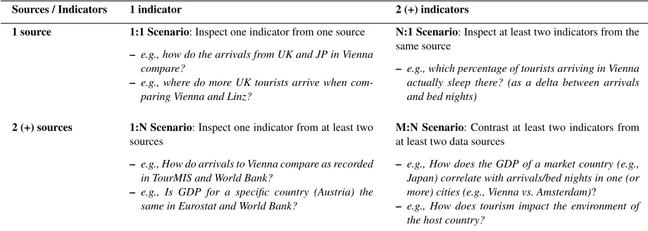
5.3. Classification of Decision Support Scenarios
To better structure use case descriptions, we have devised a theoretical framework (see Table 1) that takes into account the provenance of the indicators, and several possible scenario types (ST). These sce-nario types allow telling different stories, and mix the visualizations according to the hypothesis we want to check, but also with respect to data provenance.
The1:1 Scenario(one indicator, one source)is the most common case that inspects one indicator from a single source, e.g. showing the TourMIS18bed nights indicator over a period of time. Showing a single in-dicator hardly restricts the visualization design space, as arrivals from different markets for the same des-tinations, can be shown via a large number of visual metaphors (line charts, bar charts, pie charts, arc dia-grams, hive plots, etc). Different selections of the same indicator can be displayed on the same graph. By fix-ing destination, we can show values for different mar-kets (e.g., United Kingdom and Germany) and answer simple questions (What are the top markets for cer-tain cities?). By fixing market, we can show values for different destinations (UK arrivals to Vienna vs. Linz vs. Graz) with the goal of comparing destination performance. We can easily ask the same questions at country-level instead of city-level, by using the aggre-gation operators.
The N:1 Scenario (two or more indicators, same source)allows inspecting multiple indicators from the same source - e.g., by displaying bed nights and ar-rivals from the same market to a destination one could infer the percentage of the arriving tourists who slept in hotels. It is rarely used in practice, but it is useful when we need a list of all indicators related to a cer-tain topic from a single source (e.g., we want to know which type of arrival indicators appear in TourMIS -arrivals inside the city, -arrivals at city borders, -arrivals at hotels, etc) or when we need correlations between indicators from the same source.
The1:N Scenario(one indicator, multiple sources can send the wrong message to the user, but can be of interest for dataset publishers. Inspecting values of the same indicator (e.g., arrivals) from two (or more) data sources is the general use case for this scenario, (e.g., comparing arrival indicator values from TourMIS and the World Bank). It must be ensured that the indica-tor in the two data sources is measured in the same
18www.tourmis.info
way, i.e., it has same (or comparable) meaning and it has same (or comparable) semantics for its dimen-sions. This scenario could sometimes lead to problem-atic cases by suggesting to users that the indicator data from one source is incorrect. This might not even be true, as in some cases there could be differences be-tween the data collection methodologies.
The M:N Scenario (multiple indicators, multiple sources) covers the most interesting cases, often ad-dressing interdisciplinary questions such as: How are the arrivals from a certain market influenced by the GDP growth in a market country? DoCO2emissions
of a destination city affect its arrivals per capita? Vary-ing the settVary-ings of an indicator can reveal interestVary-ing correlations - e.g., comparing performance on city vs. country levels, or investigating seasonal variations.
From a tourism research perspective, cross-domain indicator comparisons are the most relevant cases. LD technologies support integrated visualizations that are difficult to obtain by means of traditional database sys-tems. When implementing such scenarios it is impor-tant that the two indicators are linked based on the value of one of their dimensions, that is the same or compatible (e.g., if one has cities and the other country data, city data from that country can be added up). Ad-ditionally, indicator value ranges should be the same, or compatible in the sense that higher granularity data can be obtained from lower granularity data by addi-tions (e.g., month vs. year, city vs. country).
6. Visual Analytics Dashboard
The visual dashboard19(Figure 2) is a visual seman-tic DSS that uses multi-domain knowledge in tourism. The dashboard combines information from TourMIS, World Bank and EuroStat. Its design is based on the scenarios discussed in Section 5. It currently al-lows decision makers to select and concurrently visu-alize tourism, economic and sustainability indicators, though the number of indicators can be extended to any number of domains of interest for which statistical LD exists. While TourMIS provides European tourism indicators, we select economics and sustainability in-dicators from the other two sources. Data from Tour-MIS/ETIHQ rarely overlaps with Eurostat or World Bank data, therefore scenarios that compare same in-dicator from multiple sources (1:N Scenarios) are not present in this dashboard.
Table 1
Overview and examples of decision support scenarios depending on the number of combined data sources and indicators
Sources / Indicators 1 indicator 2 (+) indicators
1 source 1:1 Scenario: Inspect one indicator from one source
– e.g., how do the arrivals from UK and JP in Vienna compare?
– e.g., where do more UK tourists arrive when com-paring Vienna and Linz?
N:1 Scenario: Inspect at least two indicators from the same source
– e.g., which percentage of tourists arriving in Vienna actually sleep there? (as a delta between arrivals and bed nights)
2 (+) sources 1:N Scenario: Inspect one indicator from at least two sources
– e.g., How do arrivals to Vienna compare as recorded in TourMIS and World Bank?
– e.g., Is GDP for a specific country (Austria) the same in Eurostat and World Bank?
M:N Scenario: Contrast at least two indicators from at least two data sources
– e.g., How does the GDP of a market country (e.g., Japan) correlate with arrivals/bed nights in one (or more) cities (e.g., Vienna vs. Amsterdam)?
– e.g., How does tourism impact the environment of the host country?
Our dashboard has two large components:
– An indexer package that represents the Linked Data components and produces an Elasticsearch index.
– A set ofreusable visualization components that are linked together to form a dashboard.
After discussing the design of the scenarios that were important for this dashboard, we will examine how each component implements the workflow from Section 4.2.
6.1. The Linked Data Layers
In order to implement the use cases described in Section 5, one needs access to several indicators from various data publishers. The tourism data we have used represents the dumps of an updated version of Tour-MISLOD [41] named ETIHQ which contains tourism data about arrivals, capacities, bed nights, points of interest and shopping items in QB format. For Eu-rostat and World Bank data we have used dumps of economics and sustainability indicators published in the 270 Linked Dataspaces repositories20. Some de-tails about the publishing process of these RDF dumps can be found in [8,9].
Currently several issues need to be solved by anyone trying to build large scale RDF or Linked Data visual-ization engines: (i) SPARQL repositories still have se-rious availability and scalability issues and in order to federate data one will have to replicate all the needed
20www.270a.info
datasets, vocabularies and Knowledge Bases locally; (ii) somewhat related to the previous issue, in order to be able to run queries against data from multiple sources one either has to perform data matching on the fly or convert those sources to a common format; (iii) the data matching is complicated by the fact that dataset designers do not strictly follow the rules from guidelines, therefore in the case of RDF Data Cubes, we frequently have missing code lists / dictionaries or DSDs, object properties that are labeled heteroge-neously [56]; (iv) visualizations are usually realised with JavaScript libraries like D3, which require JSON-based formats in order to quickly process and visual-ize any type of data. These issues suggested indexing the data rather than to provide the users with on-the-fly integration and visualization of LD sources, as all op-erations should take less than a second if they are to be integrated into the portal.
Fig. 2. The ETIHQ Dashboard showing bed nights occupied by German tourists in various European destinations (Budapest, Dublin, Venice), plotted against the GDP growth of Germany
used. While this perhaps makes sense for slices which can be created automatically later, behind the existence of an observation group there might be reasons that are not immediately obvious if not documented. For exam-ple, medical data from certain months or years can be published as an observation group because there was an epidemic in a set of countries. In such a scenario we face a loss of information if the observation group is missing.
While RDF Data Cubes do offer a simple way to merge lots of datasets together and create large data cubes with statistical indicators, this is true only if the data publishers follow the specifications point by point. The fact that some components such as code lists are optional and not necessarily well-understood leads to additional complexity. We have for example encountered several situations related to code lists: (i) they do not exist, which is not a problem since they are optional; (ii) they exist, work fine and respect the specifications; (iii) they exist, but they contain ambiguous names or URIs (which should not happen) -therefore requiring a pre-processing step since it
can-not be anticipated what they will contain. In fact, some small changes to the specification of the optional com-ponents of the RDF Data Cubes and a better valida-tion process for these components are needed before on-the-fly validation and visualization in a reasonable amount of time (sub second) can be achieved, espe-cially if a system needs to be able to integrate any kind of SLD source. We insist on the sub second loading times to avoid suboptimal user experiences.
Ontol-ogy and Data Alignment; Storage and Indexing). As long as the running time of SPARQL queries is several seconds, we will prefer the fastest method of indexing data and recomputing the queries each time instead of classic data cube methods like full or partial material-ization of cuboids (slices in the current QB terminol-ogy). In fact even though full or partial materialization of cuboids is certainly useful, it is not always needed. A common use case where it is not really needed is creating a new index on top of the current indexes. Creating derived indicators, a central problem in Sta-tistical Linked Data, requires complex computations, therefore in general it is better to use the full power of a programming language like Java and some of its DSLs instead of plain SPARQL. Since we do plan to include derived indicators in a future release, this was an additional reason to consider indexing.
After indexing the datasets, each observation corre-sponds to one document. The document structure for a QB observation only takes into account the essen-tial information that needs to exist in a dataset so that it can be visualized: the observation value, the unit of measure, the geographic location (if it exists), and so on. This allows indexing a huge number of datasets from many publishers therefore enabling the creation of scalable visualization solutions.
Since the URIs from Eurostat and World Bank pub-lished in the 270 Linked Data Space 21 are
well-designed, for thediscovery and selection of indicators all that is needed to find an indicator is to have an idea about the name or part of the name of the desired indi-cator. If the indicator name and URIs are known, then it is sufficient to directly provide the URIs for the new datasets. In the first phase, the indexer will harvest all triples from that location that match the selected crite-ria (for example, only the data for indicators that cor-respond to real geographic entities, and no entities that were invented for statistics (likeGermany+Franceor EU-Germany); or only data for the last 10 years).
A simple process of harvesting the triples that match certain criteria would have not offered enough in-formation for a visualization. Some additional tasks that are performed are usually those related to ontol-ogy alignment. One such example of alignment is the geospatial alignment performed by the indexer: Geon-ames [55] and DBpedia [32] URIs are used instead of the names of the actual locations, as the real names of the location might suffer from various issues such
21www.270a.info
as spelling mistakes, wrong encoding or even differ-ent name variants. Another example is the alignmdiffer-ent of various units of measurements which was done us-ing the DSDs (where they were available, else we took no units of measurements into consideration). We have not performed any alignment based on granularity of the temporal data (month, quarter, years), but instead used a convention: each observation corresponds to a data point in a graphic. The granularity information is added to each observation, and it can be used whenever it is needed (for complex aggregations at query time, for example).
Whenindexing the data, we kept all the informa-tion (including the links) from the actual RDF dumps so that any observation or slice can be recreated if needed. From the first set of indexed datasets we have extracted a QB-inspired JSON data format in order to ease the validation of further datasets. The required fields of this format are those expected to be found in any QB dataset (dataset, observation URI, observation value, date, etc.), while optional fields can accommo-date dataset-specific information such as geographic location or the unit of measurement
The added information such as granularity or added URI is only used for visualization purposes. It can be said that an indexer, in addition to the processing for the LD layers, also provides some of the functionality typically found on a transformation layer.
The first version of the indexer contained small functions that allowed indexing any type of dataset or code lists from a certain publisher (e.g., Eurostat, World Bank, TourMIS). This was possible due to the fact that each publisher follows the same style of dataset design for their datasets (e.g., if they do not use code lists, none of the datasets from that publisher will have references to code lists). Therefore by writ-ing several lines of code we were able to automatically index hundreds of datasets from a single publisher. While this worked well, we still needed new data for-mats from time to time (date or time forfor-mats that were not included in the initial list, for example), as almost each dataset producer only loosely followed the W3C Recommendation when designing RDF Data Cubes and introduced small variations. Due to this fact, a cus-tom API has been developed to provide third-party ac-cess (see Section 8).
6.2. Cross-Domain Visualization Layers
All the visualization layers are grouped in the actual dashboard product. The visualizations were designed taking into account the requirements presented in the previous sections (see Section 5).
Transformation.Thetransformationlayer contains the various queries and aggregations needed to feed the data into particular visualizations. There was no need for a data wrangling component as the data from the Elasticsearch index was already in the format needed by visualizations. As mentioned in the previous sec-tion, the indexer already performed some of the tasks usually found in this layer.
Thereusable visualizationsare written in JavaScript with jQuery and d3.js, following the conventions of the d3 reusable chart pattern22. All visualizations are pre-sented in a single-screen interface, synchronized using the multiple coordinated views design pattern.
The two layers that host the interface components are thevisualizationandinteractionlayers. In reality they often cannot be separated, as often certain types of interaction are easier to implement directly into a specific visualization, as opposed to external modules. It also helps to present the workflow that needs to be followed when constructing particular dashboard visu-alizations.
The current dashboard is targeting analysts and de-cision makers. This can be inferred directly from the use cases presented in the previous section. A Destina-tion Management Office (DMO) manager that wants to understand the influence of the financial crisis on the traveling behavior of German tourists, needs only to add some indicators to a chart, namely the variables he is interested in. Some of the functionalities of the dashboard were created with researchers in mind (e.g., data export).
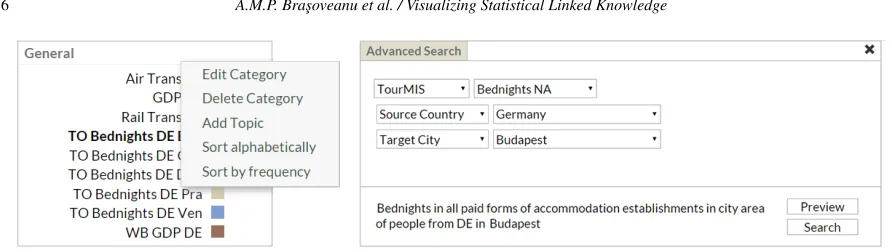
Adding and Visualizing Slices. The user can start exploring new questions by adding several slices. In order to add a slice one will have to choose a date interval (via the calendar button from Figure 2), then proceed to complete all the needed information about provenance and dimensions in the Advanced Search dialog and add it to the General menu.
A good method to start could beadding an indica-torfrom TourMIS that shows thedata slice represent-ing the number of beds reserved by German tourists in Budapest. The definition of an indicator in the visual
22bost.ocks.org/mike/chart
interface is a slice of data that covers the selected dates and in which the market and the destination are fixed. Pushing the gear icons button in theGeneralpane (Fig-ure 2) will uncover the menu where we will selectAdd topic. A topic corresponds to an indicator, that is a slice of the data in the respective interval (the time interval of interest must be selected in the upper-part of the in-terface) with market (source) and destination (target) as fixed dimensions. From the same menu we cansort the data from a chart alphabetically or by frequency.
It is recommended to create ameaningful naming conventionfor the topics / indicators, as shown in Fig-ure 2, because the display space for menus will al-ways be limited. Generally, we recommend that the names consist of the abbreviation of the indicator’s data source (TO stands for TourMIS, ES for Eurostat and WB for World Bank), the name of the indicator (i.e., Bednights) and the dimension values that are cho-sen (in the shown example, these would be DE for Ger-many and Bud for Budapest). So, for this example in-dicator we provide the TO Bednights DE Praname. While some users might not adopt this convention (in-deed some of the users who participated in the evalu-ation described in the next section have not), it is nev-ertheless good to provide guidelines about this naming convention in the tutorials or user manuals.
Once named, a new indicator (or topic) is added on the right-hand panel of the portal, under theGeneral heading. We then proceed to define the topic. By hov-ering over the new topic and clicking the gear icon on the right, the chart view in the top-middle pane of the interface will be replaced with a dialog field that al-lows defining the topic, as shown in Figure 3. It en-ables selecting the data source (currently, World Bank, Eurostat, TourMIS), indicators (the indicators from the menu), markets and destinations (both can be cities or countries). A description of the selected indicator ap-pears near theSavebutton. Once the relevant selections have been made,Savewill close the dialog box.
TheGeneralpane, theAdvanced Searchdialog, and the date selection mechanisms, allow the users to cre-ate most of the operations from thedata and view spec-ification layers suggested by Heer and Shneiderman [21]. TheGeneralpane allows to filterthe indicators andsortthem via the advanced search menu, and trig-gers the visualizations. By looking at the charts we can alsoderive new knowledge, this being the main pur-pose of designing a visual DSS.
Fig. 3. Advanced search dialog for creating slices, accessible via the topic’s gear icon
first time a topic’s data is visualized, the correspond-ing trend line is a dashed line. The current search can also be observed in theCurrent Searchbox, under the Generalmenu.
The newly added topic also triggers various changes in the rest of the interface. The data displayed in the tables (middle pane) changes. This pane will create as many sub-panes as the number of dimensions for the visualized indicators. For the presented example, the TourMIS Bednights indicator has two dimensions, namely source and target, so two panes will be cre-ated corresponding to these dimensions (see the ta-ble in Figure 2). TheTargetstable, keeps the source value fixed (Germany) and varies the values for the Target cities, thus displaying the number of German tourists going to all European destinations. The table can be sorted based on the value field, thus allowing to quickly identify the most/least popular destination for Germans - it appears for example that Venice is a very popular destination for German tourists. Similarly, the Source table keeps the target fixed to Budapest, for example, but varies the source markets, thus allowing detecting those tourist groups that go to Budapest the most/the least. World Bank and Eurostat indicators are from the economic and sustainability areas, and there-fore have a single dimension, that of the country/city of interest. In this case (as shown in the left side of Fig-ure 4) a single table, called Targets, is created. The Tar-gets table only contains data about the main markets for the indicator of interest.
A click on the pane name will trigger a change in the Geo Map (right pane of the interface), which dis-plays the tabular data visually. The data for a particu-lar market is summed up (from months to yearly data), and a visual representation of the connection between markets and destinations (arrows) is created (bigger ar-rows mean more tourists in the selected interval). The map from Figure 2, shows various destinations that were top choices for German tourists. For the
Euro-stat data (Air Transport indicator), the right side of Figure 4 (choropleth map), displays the markets using color coding (darker shades correspond to higher val-ues), and the tooltips contain totals and averages of the selected indicator for the currently hovered country.
Interaction.Since from the previous analysis Bu-dapest does not necessarily stand out as a popular tourist destination for Germans (which is normal given the fact that it is not compared with anything), new topics can be added that contain Bednights of German tourists to other locations (Dublin, Venice, etc). These new topics can be added through the topic definition interface as explained before.
The previous steps allow exploring the behavior of German tourists in terms of their visitor volume to Bu-dapest and also to other European cities. To understand whether this behavior correlates with the economic situation in Germany, we can continue by selecting an economic indicator as a new topic. A good eco-nomic indicator is GDP Growth from World Bank (dis-played as a brown line in the Figure 2). Figure 2 super-imposes German GDP (from World Bank) as well as Bednights occupied by German tourists in Dublin, Venice and Budapest, as these indicators have been se-lected for visualization in theGeneralpane (the color on the right side of a topic corresponds to the graph color on the chart - e.g., light blue for German Bed-nights to Budapest). The values displayed in the chart are normalized so that it is easy to compare them.
Fig. 4. Tabular and geographic map views of Eurostat data
drop from 2009. Adding more destinations (Copen-hagen, Dubrovnik, Venice) confirms our hypothesis of German tourist behavior being influenced by seasonal-ity, as opposed to GDP fluctuation.
These interconnected tables and charts correspond to Heer and Shneiderman’s view manipulation logic [21]. We canselectitems from the tables and trigger new searches using them as parameters, orselect var-ious observations from the line chart and display ad-ditional information in tooltips. The geographic map allows users to see summaries of the various destina-tions visited by tourists from a certain country. Users canorganizetheir workspace as they please, and are able tocoordinatethe views to explore the data in a meaningful way. Since everything happens on a single screen,navigationis reduced to several clicks in the various views.
Sharing. Pushing the Exportbutton, opens a side menu that allows selecting from two groups of op-tions: Chart Data (XLS or CSV formats) and Di-agrams (Line Chart, Geographic Map). They allow users tosharetheir work, createguidesfor their users or clients. The commercial implementation also allows torecordand analyze the Search History(instead of theCurrent Searchavailable in this version). These op-tions represent our version of Heer and Shneiderman’s [21]process and provenancefunctionality, and are one of the most popular features.
6.3. Scalability
It generally takes less than a minute to load two to five typical datasets via the API, and this results in an index with the size of around a hundred MB. An index
of 1000 random datasets with data from Eurostat and the World Bank has 27,2 GB and 242 million docu-ments (= data points). We do not index data about com-posite geographical entities, regardless of them being real (like European Union) or made up for that specific indicator (like DE+FR or EU-25 or Vienna+Salzburg), only data that contains real geographical coordinates or corresponds to actual geopolitical entities (coun-tries, regions, cities) or points of interests (e.g., histor-ical sites, parks, museums). Covering the full datasets would likely result in sizes that are up to 1.5 times bigger. Elasticsearch has no latency issues even when hosting indexes several times this size. The initial load of the portal takes about 1.5 to 5 seconds. Each subse-quent query and the visualization of results is typically performed in less than a second, regardless of the in-dex size. Future versions will also support the display of composite geographical entities.
visualiz-ing 10 such slices (the maximum number of slices that can be visualized with this tool). However, for sources with monthly or daily data, the more the time interval is increased, the chances to end up with a visualiza-tion where data is already aggregated (daily data dis-played as monthly totals, and monthly data disdis-played as yearly totals) also grow.
7. Dashboard Evaluation
The tourism dashboard prototype showcases cross-domain data analytics functions that are feasible over datasets integrated through Linked Data. An exploratory evaluation of this prototype has been conducted and reported in [43] with the focus of understanding the usefulness of the tool for tourism practitioners. In this section we provide a summary of that evaluation and refer the interested readers to details in [43].
7.1. Evaluation Design
Evaluation goalswere (a) identifying potential new functionalities that the tool could enable; (b) assess-ing the current usability of the prototype and deriv-ing ideas for future usability-level improvements; and (c) obtaining indicative performance values when us-ing this prototype as opposed to current practices for solving cross-domain data analytics.
Participants. Participants to the evaluation were selected from the two major stakeholder groups that could benefit from a cross-domain data analytics in-frastructure: researchers in the tourism domain as well as tourism practitioners, working primarily for Desti-nation Management Offices (DMO’s). The 16 partici-pants were divided randomly in two groups (Group_A and Group_B), both containing an equal number and mixture of researchers and practitioners, i.e., five prac-titioners and three researchers per group.
Evaluation Setup. Prior to the evaluation itself, each participant received a tutorial that explained the features of the tool, and included practical exercises to ensure a basic familiarity with the tool (e.g., how to create and define indicators, how to visualize and com-pare their values). Evaluations were performed at the desk of each participant and at a time that best fitted the participant’s schedule. This allowed to maintain a real-istic work environment and to avoid bias potentially in-troduced by requesting the use of a new work environ-ment, such as in lab-based evaluation settings. Addi-tionally, such a setup was the only option that allowed
involving DMO employees from across Europe (this design setup was suitable for an exploratory study, but future baseline comparisons will consider a more con-trolled lab-based setup). The evaluation included the four following activities:
– Activity 1. Participants performed three tasks us-ing the Dashboard and recorded the time taken to perform each task and the results they have reached. See Table 2 for an overview of the tasks as well as their assignment to the two groups. Group_A performed tasks T1-T3 with the Dash-board, while Group_B focused on tasks T4-T6. – Activity 2. To gather insights about potential new
uses of the tool, participants were asked to cre-ate and perform two tasks of their own using the Dashboard. They noted the tasks they preformed and the insights they gained.
– Activity 3. To collect information about how the evaluated tasks would be typically performed in state of the art settings, participants performed three tasks without using the Dashboard. Partici-pants were allowed to adopt their usual data col-lection and analytics approach. Participants noted their findings, the time taken to perform each task as well as the approach and tools they made use of. In this activity, the role of the groups was inverted, with Group_A performing tasks T4-T6 without the Dashboard, while Group_B focused on tasks T1-T3.
– Activity 4. To get an insight into the usability of the tool, participants answered the ten ques-tions that make up the System Usability Scale (SUS), the most used questionnaire for measuring perceptions of system usability [5]. Additionally, they provided feedback about the most and least useful features of the tool, as well as their recom-mendations for future extensions of the tool.