Combining automated analysis and visualization techniques
for effective exploration of high-dimensional data
Andrada Tatu∗ University of Konstanz Germany Georgia Albuquerque† TU Braunschweig Germany Martin Eisemann‡ TU Braunschweig Germany J ¨orn Schneidewind§ Telefonica o2 Business Intelligence Center Germany Holger Theisel¶ University of Magdeburg Germany Marcus Magnork TU Braunschweig Germany Daniel Keim∗∗ University of Konstanz Germany ABSTRACT
Visual exploration of multivariate data typically requires projection onto lower-dimensional representations. The number of possible representations grows rapidly with the number of dimensions, and manual exploration quickly becomes ineffective or even unfeasi-ble. This paper proposes automatic analysis methods to extract potentially relevant visual structures from a set of candidate visu-alizations. Based on features, the visualizations are ranked in ac-cordance with a specified user task. The user is provided with a manageable number of potentially useful candidate visualizations, which can be used as a starting point for interactive data analy-sis. This can effectively ease the task of finding truly useful visu-alizations and potentially speed up the data exploration task. In this paper, we present ranking measures for class-based as well as non class-based Scatterplots and Parallel Coordinates visualiza-tions. The proposed analysis methods are evaluated on different datasets.
Index Terms: H.3.3 [Information Storage and Retrieval]: In-formation Search and Retrieval I.3.3 [Computer Graphics]: Pic-ture/Image Generation;
1 INTRODUCTION
Due to the technological progress over the last decades, today’s sci-entific and commercial applications are capable of generating, stor-ing, and processing massive amounts of data. Making use of these archives of data provides new challenges to analysis techniques. It is more difficult to filter and extract relevant information from the masses of data since the complexity and volume has increased. Ef-fective visual exploration techniques are needed that incorporate automated analysis components to reduce complexity and to ef-fectively guide the user during the interactive exploration process. The visualization of large complex information spaces typically in-volves mapping high-dimensional data to lower-dimensional visual representations. The challenge for the analyst is to find an insight-ful mapping, while the dimensionality of the data, and consequently the number of possible mappings increases. For an effective visual exploration of large data sources, it is therefore essential to support the analyst with Visual Analytics tools that helps the user in finding relevant mappings through automated analysis. One important goal
∗e-mail: [email protected] †e-mail:[email protected] ‡e-mail:[email protected] §e-mail:[email protected] ¶e-mail:[email protected] ke-mail:[email protected] ∗∗e-mail:[email protected]
of Visual Analytics, which is the focus of this paper, is to generate representations that best show phenomena contained in the high-dimensional data like clusters and global or local correlations.
Numerous expressive and effective low-dimensional visualiza-tions for high-dimensional datasets have been proposed in the past, such as Scatterplots and Scatterplot matrices, Parallel Coordinates, Hyper-slices, dense pixel displays and geometrically transformed displays [12]. However, finding information-bearing and user-interpretable visual representations automatically remains a diffi-cult task since there could be a large number of possible represen-tations and it could be difficult to determine their relevance to the user. Instead, classical data exploration requires from the user to find interesting phenomena in the data interactively, starting from an initial visual representation. In large scale multivariate datasets, sole interactive exploration becomes ineffective or even unfeasible, since the number of possible representations grows rapidly with the number of dimensions. Methods are needed that help the user au-tomatically find effective and expressive visualizations.
In this paper we present an automated approach that supports the user in the exploration process. The basic idea is to either generate or use a given set of potentially insightful candidate visualizations from the data and to identify potentially relevant visual structures from this set of candidate visualizations. These structures are used to determine the relevance of each visualization to common prede-fined analysis tasks. The user may then use the visualization with the highest relevance as the starting point of the interactive analysis. We present relevance measures for typical analysis tasks based on Scatterplots and Parallel Coordinates. The experiments based on class-based and non class-based datasets show that our relevance measures effectively assist the user in finding insightful visualiza-tions and potentially speed up the exploration process.
2 RELATEDWORK
In the last years several approaches for selecting good views of high-dimensional projections and embeddings have been proposed. One of the first was theProjection Pursuit[6, 10]. Its main idea is to search for low-dimensional (one or two-dimensional) projections that expose interesting structures of the high-dimensional dataset, rejecting any irrelevant (noisy or information-poor) dimensions. To exhaustively analyze such a dataset using low-dimensional projec-tions, Asimov presented theGrand Tour[3] that supplies the user with a complete overview of the data by generating sequences of orthogonal two-dimensional projections. The problem with this approach is that an extensive exploration of a high-dimensional dataset is effortful and time consuming. A combination of both approaches, Projection Pursuit and the Grand Tour, is proposed in [4] as a visual exploration system. Since then, different Projection Pursuit indices have been proposed [5, 10], but none of these tech-niques consider possible class information of the data.
As an alternative to Projection Pursuit, theScagnosticsmethod [21] was proposed to analyze high-dimensional datasets. Wilkinson
presented more detailed graph-theoretic measures [23] for comput-ing the Scagnostics indices to detect anomalies in density, shape and trend. These indices could be also used as a ranking for Scatterplot visualizations depending on the analysis task.
We present an image-based measure for non-classified Scatter-plots in order to quantify the structures and correlations between the respective dimensions. Our measure can be used as an index in a Scagnostics matrix as an extension to evaluate such correlations.
Koren and Carmel propose a method of creating interesting pro-jections from high-dimensional datasets using linear transforma-tions [13]. Their method integrates the class decomposition of the data, resulting in projections with a clearer separation between the classes. Another interesting visualization method for multivariate datasets isParallel Coordinates. Parallel Coordinates was first in-troduced by Inselberg [11] and is used in several tools, e.g. Xmdv-Tool [22] and VIS-STAMP [7], for visualizing multivariate data. It is important for Parallel Coordinates to decide the order of the di-mensions that are to be presented to the user. Aiming at dimension reordering, Ankerst et al. [1] presented a method based on simi-larity clustering of dimensions, placing similar dimensions close to each other. Yang [24] developed a method to generate interesting projections also based on similarity between the dimensions. Simi-lar dimensions are clustered and used to create a lower-dimensional projection of the data.
The approach most similar to ours is probablyPixnostics, pro-posed by Schneidewindet al.[19]. They also use image-analysis techniques to rank the different lower-dimensional views of the dataset and present only the best to the user. The method provides to the user not only valuable lower-dimensional projections, but also optimized parameter settings for pixel-level visualizations. How-ever, while this approach concentrates on pixel-level visualizations as Jigsaw Maps and Pixel Bar Charts, we focus on Scatterplots and Parallel Coordinates.
Additional to the measure for classified and non-classified Scat-terplots, we also propose two measures for classified Scatterplots as an alternative to [13]. Our measures first select the best projections of the dataset and therefore have the advantage, over embeddings generated by linear combination of the the original variables, that the orthogonal projection axes can be more easily interpreted by the user. As an alternative to the methods for dimension reordering for Parallel Coordinates we propose a method based on the structure presented on the low-dimensional embeddings of the dataset. Three different kind of measures to rank these embeddings are presented in this paper for class and non-class based visualizations.
3 OVERVIEW ANDPROBLEMDESCRIPTION
Increasing dimensionality and growing volumes of data lead to the necessity of effective exploration techniques to present the hidden information and structures of high-dimensional datasets. For sup-porting visual exploration, the high-dimensional data is commonly mapped to low-dimensional views. Depending on the technique, exponentially many different low-dimensional views exist, which can’t be analyzed manually.
A commonly used visualization technique to deal with multivari-ate datasets is Scatterplots. This low-dimensional embedding of the high-dimensional data in a 2D view can be interpreted easily, espe-cially in the most common case of orthogonal linear projections. Since there aren22−n different plots for ann-dimensional dataset in a Scatterplot matrix, an automatic analysis technique to preselect the important dimensions is useful and necessary.
Another well known and widely used visualization method for multivariate datasets is Parallel Coordinates. One problem of this kind of visualization is the large number of possible arrangements of the dimension axes. For ann-dimensional dataset it has been shown, that n+12 permutations are needed to visualize all adjacen-cies, but there aren! possible arrangements. An automated analysis
of the visualizations can help in finding the best visualizations out of all possible arrangements. We attempt to analyze the pairwise combinations of dimensions which are later assembled to find the best visualizations, reducing the visual analysis ton2visualizations.
Data Image Analysis with ranking functions Set of Visualizations Ranked Visualizations Task
Figure 1: Working steps to get a ranked set of good visualizations of high-dimensional data.
Some applications involve classified data. We have to take this property into account when proposing our ranking functions. When dealing with unclassified data, we search for patterns or correlations between the data points. This might reveal important characteris-tics that can be of interest to the user. In order to see the structure of classified data, it is necessary for the visualizations to separate the clusters or at least to have a minimal overlap. The greater the number of classes, the more difficult the separation.
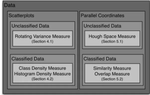
Data
Scatterplots Parallel Coordinates Unclassified Data
Classified Data Classified Data Unclassified Data
Rotating Variance Measure (Section 4.1)
Hough Space Measure (Section 5.1)
Class Density Measure Histogram Density Measure
(Section 4.2)
Similarity Measure Overlap Measure
(Section 5.2)
Figure 2: Overview and classification of our methods. We present measures for Scatterplots and Parallel Coordinates using classified and unclassified data.
In our paper we describe ranking functions that deal with visu-alizations of classified and unclassified data. An overview of our approach is presented in Figure 1. We start from a given multivari-ate dataset and cremultivari-ate the low-dimensional embeddings (tions). According to the given task, there are different visualiza-tion methods and different ranking funcvisualiza-tions, that can be applied to these visualizations. The functions can measure the quality of the views and provide a set of useful visualizations. An overview of these techniques is shown in Figure 2. For Scatterplots on un-classified data, we developed theRotating Variance Measurewhich highly ranksxy-plots with a high correlation between the two di-mensions. For classified data, we propose measures that consider the class information while computing the ranking value of the im-ages. For Scatterplots we developed two methods, aClass Density Measureand aHistogram Density Measure. Both have the goal to find the best Scatterplots showing the separating classes. For Par-allel Coordinates on unclassified data, we propose aHough Space Measurewhich searches for interesting patterns such as clustered lines in the views. For classified data, we propose two measures, one, theOverlap Measure, focusing on finding views with as little overlap as possible between the classes, so that the classes sepa-rate well. The other one,Similarity Measure, looks for correlations between the lines.
We chose correlation search in Scatterplots (Section 4.1) and cluster search (i.e. similar lines) in Parallel Coordinates (Section 5.1) as example analysis tasks for unclassified datasets. If class information is given, the tasks are to find views, where distinct clusters in the dataset are also well separated in the visualization (Section 4.2 ) or show a high level of inter- and intraclass similarity (Section 5.2).
4 QUALITYMEASURES FORSCATTERPLOTS
Our approaches aim at two main tasks of visual analytics of Scat-terplots: finding views which show a large extend of correlation and separating the data into well defined clusters. In Section 4.1 we propose analysis functions for task one, ranking functions for task two are then proposed in Section 4.2. In the case of unclassified, but well separable data, class labels can be automatically assigned using clustering algorithms [16, 17, 18].
4.1 Scatterplot Measures for unclassified data
4.1.1 Rotating Variance Measure
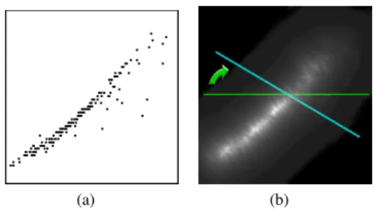
Good correlations are represented as long, skinny structures in the visualization. Due to outliers even almost perfect correlations can lead to skewed distributions in the plot and attention needs to be paid to this fact. TheRotating Variance Measure(RVM) is aimed at finding linear and nonlinear correlations between the pairwise dimensions of a given dataset.
First we transform the discrete Scatterplot visualization into a continuous density field. For each pixelpand its positionx= (x,y)
the distance to itsk-th nearest sample pointsNpin the visualization
is computed. To obtain an estimate of the local densityρat a pixel
p, we defineρ=1/r, whereris the radius of the enclosing sphere
of thek-nearest neighbors ofpgiven by
r=maxi∈Np||x−x
i||. (1)
Choosing the k-th neighbor instead of the nearest eliminates the influence of outliers.kis chosen to be between 2 andn−1, so that the minimum value ofris mapped to 1. We used 4 throughout the paper. Other density estimations could of course be used as well.
Visualizations containing good correlations should, in general, have corresponding density fields with a small band of larger val-ues, while views with less correlation have a density field consisting of many local maxima spread in the image. We can estimate this amount of spread for every pixel by computing the normalized mass distribution by takingssamples along different lineslθ centered at the corresponding pixel positionsxlθ and with length equal to the image width, see Figure 3. For these sampled lines we compute the weighted distribution for each pixel positionxi.
νθi = ∑sj=1p sj lθ||x i−xsj|| ∑sj=1p sj lθ (2) νi = min θ∈[0,2π]ν i θ (3) wherepsj
lθis thej-th sample along linelθ andx
sjis its correspond-ing position in the image. For pixels positioned at a maximum of a density image conveying a real correlation the distribution value will be very small, if the line is orthogonal to the local main di-rection of the correlation at the current position, in comparison to other positions in the image. Note that such a line can be found even in non-linear correlation. On the other hand, pixels in density images conveying no or few correlation will always have only large
νvalues.
For each column in the image we compute the minimum value and sum up the result. The final RVM value is therefore defined as:
RV M= 1
∑xminyν(x,y), (4)
(a) (b)
Figure 3: Scatterplot example and its respective density image. For each pixel we compute the mass distribution along different direc-tions and save the smallest value, here depicted by the blue line.
whereν(x,y)is the mass distribution value at pixel position(x,y).
4.2 Scatterplot Measures for classified data
Most of the known techniques calculate the quality of a projec-tion, without taking the class distribution into account. In classified data plots we can search for the class distribution in the projection, where good views should show good class separation, i.e. minimal overlap of classes.
In this section we propose two approaches to rank the scatter-plots of multivariate classified datasets, in order to determine the best views of the high-dimensional structures.
4.2.1 Class Density Measure
TheClass Density Measure(CDM) evaluates orthogonal projec-tions, i.e. Scatterplots, according to their separation properties. The goal is to identify those plots that show minimal overlap between the classes. Therefore, CDM computes a score for each candidate plot that reflects the separation properties of the classes. The can-didate plots are then ranked according to their score, so that the user can start investigating highly ranked plots in the exploration process.
In order to compute the overlap between the classes, a continu-ous representation for each class is necessary. In the case we are given only the visualization without the data, we assume that every color used in the visualization represents one class. We therefore first separate the classes into distinct images, so that each image contains only the information of one of the classes. For every class we estimate a continuous, smooth density function based on local neighborhoods. For each pixelp the distance to its k-th nearest neighborsNpof the same class is computed and the local density is
derived as described earlier in Section 4.1.
Having these continuous density functions available for each class we estimate the mutual overlap by computing the sum of the absolute difference between each pair and sum up the result:
CDM= M−1
∑
k=1 M∑
l=k+1 P∑
i=1 ||pik−pil|| , (5)withM being the number of density images, i.e. classes respec-tively,pi
k is the i-th pixel in thek-th density image andP is the
number of pixels. If the range of the pixel values is normalized to[0,1]the range for the CDM is between 0 andP. This value is large, if the densities at each pixel differ as much as possible, i.e. if one class has a high density value compared to all others. There-fore, the visualization with the fewest overlap of the classes will be given the highest value. Another property of this measure is not only in assessing well separated but also dense clusters, which eases the interpretability of the data in the visualization.
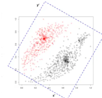
Figure 4: 2D view and rotated projection axes. The projection on the rotated plane has less overlap, and the structures of the data can be seen even in the projection. This is not possible for a projection on the original axes.
4.2.2 Histogram Density Measure
TheHistogram Density Measure(HDM) is a density measure for Scatterplots. It considers the class distribution of the data points using histograms. Since we are interested in plots that show good class separations, HDM looks for corresponding histograms that show significant separation properties. To determine the best low-dimensional embedding of the high-low-dimensional data using HDM, a two step computation is conducted.
First, we search in the 1D linear projections which dimension is separating the data. For this purpose, we calculate the projections and rank them by the entropy value of the 1D projections separated in small equidistant parts, called histogram bins. pcis the number
of points of classcin one bin. The entropy, average information content of that bin, is calculated as:
H(p) =−
∑
c pc ∑cpc log2 pc ∑cpc (6)H(p)is 0, if a bin has only points of one class, andlog2M, if it
con-tains equivalent points of allMclasses. This projection is ranked with the1D-HDM: HDM1D = 100− 1 Z
∑
x(∑
c pcH(p)) (7) = 100−1 Z∑
x∑
c pc(−∑
c pc ∑cpc log2 pc ∑cpc ). (8)where1Zis a normalization factor, to obtain ranking values between 0 and 100, having 100 as best value:
1
Z=
100
log2M∑x∑cpc
. (9)
In some datasets, paraxial projections are not able to show the struc-ture of high-dimensional data. In these cases, simple rotation of the projection axes can improve the quality of the measure. In Figure 4. we show an example, where a rotation is improving the projection quality. While the paraxial projection of these classes cannot show this structures on the axes, the rotated (dotted projection) axes have less overlay for a projection on thex0axes. Therefore we rotate the projection plane and compute the1D-HDMfor different anglesθ.
For each plot we choose the best 1D-HDM value. We experimen-tally foundθ=9mdegree, with (m∈[0,20)) to be working well
for all our datasets.
Second, a subset of the best ranked dimensions are chosen to be further investigated in higher dimensions. All the combinations of the selected dimensions enter a PCA computation. The first two components of the PCA are plotted to be ranked by the2D-HDM.
The2D-HDMis an extended version of the1D-HDM, for which a 2-dimensional histogram on the Scatterplot is computed. The quality is measured, exactly as for the1D-HDM, by summing up a weighted sum of the entropy of one bin. The measure is normalized between 0 and 100, having 100 for the best data points visualiza-tion, where each bin contains points of only one class. Also the bin neighborhood is taken into account, as for each binpcwe sum the
information of the bin itself and the direct neighborhood, labeled as
uc. Consequently the2D-HDMis:
HDM2D=100− 1 Z
∑
x,y∑
c uc(−∑
c uc ∑cuc log2 uc ∑cuc ) (10) with the adapted normalization factor1
Z =
100
log2M∑x,y(∑cuc)
. (11)
5 QUALITYMEASURES FORPARALLELCOORDINATES
When analyzing Parallel Coordinate plots, we focus on the detec-tion of plots that show good clustering properties in certain attribute ranges. There exist a number of analytical dimension ordering ap-proaches for Parallel Coordinates to generate dimension orderings that try to fulfill these tasks [1, 24]. However, they often do not gen-erate an optimal parallel plot for correlation and clustering proper-ties, because of local effects which are not taken into account by most analytical functions. We therefore present analysis functions that do not only take the properties of the data into account, but also the properties of the resulting plot.
5.1 Parallel Coordinate Measures for unclassified data
5.1.1 Hough Space Measure
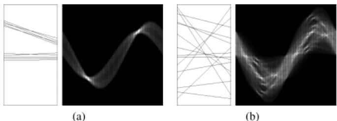
Our analysis is based on the assumption that interesting patterns are usually clustered lines with similar positions and directions. Our algorithm for detecting these clusters is based on the Hough trans-form [9].
Straight lines in the image space can be described asy=ax+ b.The main idea of the Hough transform is to define a straight line according to its parameters, i.e. the slopeaand the interceptionb. Due to a practical difficulty (the slope of vertical lines is infinite) the normal representation of a line is:
ρ=xcosθ+ysinθ (12)
Using this representation, for each non-background pixel in the vi-sualization, we have a distinct sinusoidal curve in theρ θ-plane, also called Hough or accumulator space. An intersection of these curves indicates that the corresponding pixels belong to the line de-fined by the parameters(ρi,θi)in the original space. Figure 5 shows two synthetic examples of Parallel Coordinates and their respective Hough spaces: Figure 5(a) presents two well defined line clusters and is more interesting for the cluster identification task than Fig-ure 5(b), where no line cluster can be identified. Note that the bright areas in theρ θ-plane represent the clusters of lines with similarρ
andθ.
To reduce the bias towards long lines, e.g. diagonal lines, we scale the pairwise visualization images to ann×nresolution, usu-ally 512×512. The accumulator space is quantized into aw×hcell grid, wherewandhcontrol the similarity sensibility of the lines. We use 50×50 grids in our examples. A lower value forwandh
reduces the sensibility of the algorithm because lines with a slightly differentρandθare mapped to the same accumulator cells.
Based on our definition, good visualizations must contain fewer well defined clusters, which are represented by accumulator cells with high values. To identify these cells, we compute the median valuemas an adaptive threshold that divides the accumulator func-tionh(x)into two identical parts:
(a) (b)
Figure 5: Synthetic examples of Parallel Coordinates and their re-spective Hough spaces: (a) presents two well defined line clusters and is more interesting for the cluster identification task than (b), where no line cluster can be identified. Note that the bright areas in theρ θ-plane represent the clusters of lines with similarρandθ.
∑h(x) 2 =
∑
g(x) , where (13) g(x) = x if x≤m; m else.Using the median value, only a few clusters are selected in an accu-mulator space with high contrast between the cells (See Fig 5(a)), while in a uniform accumulator space many clusters are selected (See Fig 5(b)). This adaptive threshold is not only necessary to se-lect possible line clusters in the accumulator space, but also to avoid the influence of outliers and occlusion between the lines. In the oc-clusion case, a point that belongs to two or more lines is computed just once in the accumulator space.
The final goodness value for a 2D visualization is due to the num-ber of accumulator cellsncellsthat have a higher value thanm
nor-malized by the total number of cells(wh˙)to the interval[0,1]:
si,j=1−
ncells
wh , (14)
wherei,jare the indices of the respective dimensions, and the com-puted measure si,j presents higher values for images containing
well defined line clusters (similar lines) and lower values for im-ages containing lines in many different directions and positions.
Having combined the pairwise visualizations, we can now com-pute the overall quality measure by summing up the respective pair-wise measurements. This overall quality measure of a parallel vi-sualization containingndimensions is:
HSM=
∑
ai∈I
sai,ai+1, (15)
whereIis a vector containing any possible combination of then
dimensions indices. In this way we can measure the quality of any given visualization, using Parallel Coordinates.
Exhaustively computing alln-dimensional combinations in or-der to choose the best/worst ones, requires a very long computation time and becomes unfeasible for a largen. In these cases, in or-der to search for the bestn-dimensional combinations in a feasible time, an algorithm to solve a Traveling Salesman Problem is used, e.g. the A*-Search algorithm [8] or others [2]. Instead of exhaus-tively combining all possible pairwise visualizations, these kind of algorithms would compose only the best overall visualization.
5.2 Parallel Coordinates Measures for classified data
While analyzing Parallel Coordinates visualizations with class information, we consider two main issues. First, in good Par-allel Coordinates visualizations, the lines that belong inside a determined class must be quite similar (inclination and position similarity). Second, visualizations where the classes can be
separately observed and that contain less overlapping are also considered to be good. We developed two measures for classified Parallel Coordinates that take these matters into account: the
Similarity Measurethat encourages inner class similarities, and the
Overlap Measurethat analyzes the overlap between classes. Both are based on the measure for unclassified data presented in section 5.1.
5.2.1 Similarity Measure
The similarity measure is a direct extension of the measure pre-sented in section 5.1. For visualizations containing class informa-tion, the different classes are usually represented by different col-ors. We separate the classes into distinct images, containing only the pixels in the respective class color, and compute a quality mea-sureskfor each class, using equation (14). Thereafter, an overall
quality valuesis computed as the sum of all class quality measures:
SM=
∑
k
sk. (16)
Using this measure, we encourage visualizations with strong inner class similarities and slightly penalize overlapped classes. Note that due to the classes overlap, some classes have many missing pixels, which results in a lowerskvalue compared to other visualizations
where less or no overlap between the classes exists.
5.2.2 Overlap Measure
In order to penalize overlap between classes, we analyze the differ-ence between the classes in the Hough space (see section 5.1). As in the similarity measure, we separate the classes to different images and compute the Hough transform over each image. Once we have a Hough spacehfor each class, we compute the quality measure as the sum of the absolute difference between the classes:
OM= M−1
∑
k=1 M∑
l=k+1 P∑
i=1 ||hik−hil|| (17)HereMis the number of Hough space images, i.e. classes respec-tively and P is the number of pixels. This value is high if the Hough spaces are disjoint, i.e. if there is no large overlap between the classes. Therefore, the visualization with the smallest overlap between the classes receives the highest values.
Another interesting use of this measure is to encourage or search for similarities between different classes. In this case, the overlap between the classes is desired, and the previously computed mea-sure can be inverted to compute suitable quality values:
OM INV=1/OM. (18)
6 APPLICATION ANDEVALUATION
We tested our measures on a variety of real datasets. We applied ourClass Density Measure (CDM), Histogram Density Measure (HDM), Similarity Measure (SM)andOverlap Measure (OM)on classified data, to find views on the data which try to either separate the data or show similarities between the classes. For unclassified data, we applied ourRotating Variance Measure (RVM)andHough Space Measure (HSM)in order to find linear or non-linear correla-tions and clusters in the datasets, respectively. Except for the HDM, we chose to present only relative measures, i.e. all calculated mea-sures are scaled so that the best visualization is assigned 100 and the worst 0. For the HDM, we chose to present the unchanged mea-sure values, as the HDM allows an easy direct interpretation, with a value of 100 being the best and 0 being the worst possible constel-lation. If not stated otherwise our examples are proof-of-concepts, and interpretations of some of the results should be provided by domain experts.
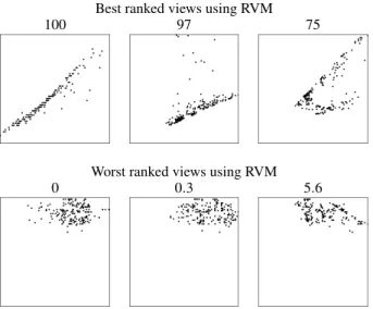
Best ranked views using RVM
100 97 75
Worst ranked views using RVM
0 0.3 5.6
Figure 6: Results for the Parkinson’s Disease dataset using our RVM measure (Section 4.1). While clumpy non-correlation bearing views are punished (bottom row), views containing more correlation are preferred (top row).
We used the following datasets:Parkinson’s Diseaseis a dataset composed of 195 voice measures from 31 people, 23 with Parkin-son’s disease [15, 14]. Each of the 12 dimensions is a particular voice measure.Olivesis a classified dataset with 572 olive oil sam-ples from nine different regions in Italy [25]. For each sample the normalized concentrations of eight fatty acids are given. The large number of classes (regions) poses a challenging task to the algo-rithms trying to find views in which all classes are well separated.
Carsis a previously unpublished dataset of used cars automatically collected from a national second hand car selling website. It con-tains 7404 cars listed with 24 different attributes, including price, power, fuel consumption, width, height and others. We chose to divide the dataset into two classes, benzine and diesel to find the similarities and differences between these. Wisconsin Diagnostic Breast Cancer(WDBC) dataset consists of 569 samples with 30 real-valued dimensions each [20]. The data is classified into ma-lign and benign cells. The task is to find the best separating di-mensions. Wineis a classified dataset with 178 instances and 13 attributes describing chemical properties of Italian wines derived from three different cultivars.
First we show our results for RVM on the Parkinson’s Dis-ease dataset [15, 14]. The three best and the three worst re-sults are shown in Figure 6. Interesting correlations have been found between the dimensions Dim 9(DFA) and Dim 12(PPE), Dim 2(MDVP:Fo(Hz)) and Dim 3(MDVP:Fhi(Hz)), as well as Dim 2(MDVP:Fo(Hz)) and Dim 4(MDVP:Flo(Hz)) (Fig. 6). On the other hand visualizations containing few or no correlation infor-mation at all received a low value.
In Figure 7 the results for theOlives dataset using our CDM measure are shown. Even though a view separating all different olive classes does not exist, the CDM reliably choses three views which separate the data well in the dimensions Dim 4(oleic) and Dim 5(linoleic), Dim 1(palmitic) and Dim 5(linoleic) as well as Dim 1(palmitic) and Dim 4(oleic).
We also applied our HDM technique to this dataset. First the 1D-HDMtries to identify the best separating dimensions, as presented in Section 4.2.2. The dimensions Dim 1(palmitic), Dim 2(palmi-toleic), Dim 4(oleic), Dim 5(linoleic) and Dim 8(eicosenoic) were ranked as the best separating dimensions. We computed all subsets of these dimensions and ranked their PCA views with the2D-HDM. In the best ranked views presented in Figure 8 the different classes
Best ranked views using CDM
100 97 84
Worst ranked views using CDM
0 15 24
Figure 7: Results for the olive dataset using our CDM measure (Sec-tion 4.2.1). The different colors depict the different classes (regions) of the dataset. While it is impossible for this dataset to find views completely separating all classes, our CDM measure still found views where most of the classes are mutually separated (top row). In the worst ranked views the classes clearly overlap with each other (bot-tom row).
Best ranked PCA-views using HDM
85.45 84.98 84.9
Figure 8: Results for the Olives dataset using our HDM measure (Section 4.2.2). The best ranked plot is the PCA of Dim(4,5,8) were the classes are good visible, the second best is the PCA of Dim(1,2,4) and the third is the PCA on all 8 dimensions. The differ-ences between the last two are small, because the variance in that additional dimensions for the 3rd relative to the 2nd is not big. The difference between these and the first is good visible.
are well separated. Compared to the upper row in Figure 7, the vi-sualization uses the screen space better, which is due to the PCA transformation.
To measure the value of our approaches for Parallel Coordinates we estimated the best and worst ranked visualizations of different datasets. The corresponding visualizations are shown in Figure 9, 10 and 11. For a better comparability the visualizations have been cropped after the display of the 4th dimension. We used a size of 50×50 for the Hough accumulator in all experiments. The algo-rithms are quite robust with respect to the size and using more cells generally only increases computation time but has little influence on the result. Figure 9 shows the ranked results for the Parkinsons Disease dataset using ourHough Space Measure.
The HSM algorithm prefers views with more similarity in the distance and inclination of the different lines, resulting in the promi-nent small band in the visualization of the Parkinsons Disease
dataset, which is similar to clusters in the projected views of these dimension, here between Dim 3(MDVP:Fhi(Hz)) and Dim 12(PPE) as well as Dim 6(HNR) and Dim 11(spread2).
we can see that there seem to be barely any good clusters in the dataset (see Figure 10). We verified these by exhaustively looking at all pairwise projections. However, the only dimension where the classes can be separated and at least some form of cluster can be re-liably found is (Dim 6(RPM)), in which cars using diesel generally have a lower value compared to benzine (Fig. 10 top row). Also the similarity of the majority in Dim 15(Height), Dim 18(Trunk) and Dim 3(Price) can be detected. Obviously cars using diesel are cheaper, this might be due to the age of the diesel cars, but age was unfortunately not included in the data base. On the other hand the worst ranked views using the HSM (Fig. 10, bottom row) are barely interpretable, at least we weren’t able to extract any useful information.
In Figure 11 the results for ourHough Overlap Measureapplied to the WDBCdataset are shown. This result is very promising. In the top row, showing the best plots, the malign and benign are pretty well separated. It seems that the dimensions Dim 22(ra-dius (worst)), Dim 9(concave points (mean)), Dim 24 (perimeter (worst)), Dim 29(concave points (mean)) and Dim 25(Area (worst)) separate the two classes pretty well. We showed these results to a medical scientist who confirmed our findings, that these measures are some of the most reliable to discern cancer cells, as cancer cells tend to either divide themselves more often, which results in larger nuclei due to the mitosis, or do not completely divide resulting in deformed, concave nuclei.
7 CONCLUSION
In this paper we presented several methods to aid and potentially speed up the visual exploration process for different visualization techniques. In particular, we automated the ranking of Scatterplot and Parallel Coordinates visualizations for classified and unclassi-fied data for the purpose of correlation and cluster separation. In the future aground truthcould be generated, by letting users choose the most relevant visualizations from a manageable test set and com-pare them to the automatically generated ranking in order to prove our methods. Some limitations are recognized as it is not always possible to find good separating views, due to a growing number of classes and due to some multivariate relations, which is a gen-eral problem and not related to our techniques. As future work, we plan to applyα-transparency and clutter reduction to overcome overplotting.
Furthermore, we will aim at finding measures for other, maybe more complex tasks, and we would like to generalize our techniques so that they can be applied and adapted to further visualization tech-niques.
ACKNOWLEDGEMENTS
The authors would like to acknowledge the contributions of the Institute for Information Systems at the Technische Universit¨at Braunschweig (Germany). This work was supported in part by a grant from the German Science Foundation (DFG) within the strate-gic research initiative on Scalable Visual Analytics.
REFERENCES
[1] M. Ankerst, S. Berchtold, and D. A. Keim. Similarity clustering of dimensions for an enhanced visualization of multidimensional data.
Information Visualization, IEEE Symposium on, 0, 1998.
[2] D. L. Applegate, R. E. Bixby, V. Chvatal, and W. J. Cook.The Trav-eling Salesman Problem: A Computational Study (Princeton Series in Applied Mathematics). Princeton University Press, January 2007. [3] D. Asimov. The grand tour: a tool for viewing multidimensional data.
Journal on Scientific and Statistical Computing, 6(1):128–143, 1985. [4] D. Cook, A. Buja, J. Cabreta, and C. Hurley. Grand tour and pro-jection pursuit.Journal of Computational and Statistical Computing, 4(3):155–172, 1995.
[5] M. A. Fisherkeller, J. H. Friedman, and J. W. Tukey.Prim-9: An in-teractive multi-dimensional data display and analysis system, volume In W. S. Sleveland, editor. Chapman and Hall, 1987.
[6] J. Friedman and J. Tukey. A projection pursuit algorithm for ex-ploratory data analysis. Computers, IEEE Transactions on, C-23(9):881–890, Sept. 1974.
[7] D. Guo, J. Chen, A. M. MacEachren, and K. Liao. A visualization system for space-time and multivariate patterns (vis-stamp). IEEE Transactions on Visualization and Computer Graphics, 12(6):1461– 1474, 2006.
[8] P. N. Hart, N. Nilsson, and B. Raphael. A formal basis for the heuristic determination of minimum cost paths. IEEE Trans, Sys. Sci. Cyber-netics, S.S.C.-4(2):100–107, 7 1968.
[9] P. V. C. Hough. Method and means for recognizing complex patterns.
US Patent, 3069654, December 1962.
[10] P. J. Huber. Projection pursuit. The Annals of Statistics, 13(2):435– 475, 1985.
[11] A. Inselberg. The plane with parallel coordinates. The Visual Com-puter, 1(4):69–91, December 1985.
[12] D. A. Keim, M. Ankerst, and M. Sips. Visual Data-Mining Tech-niques, pages 813–825. Kolam Publishing, 2004.
[13] Y. Koren and L. Carmel. Visualization of labeled data using lin-ear transformations. Information Visualization, IEEE Symposium on, 0:16, 2003.
[14] M. A. Little, P. E. McSharry, E. J. Hunter, and L. O. Ramig. Suitability of dysphonia measurements for telemonitoring of parkinson’s disease. InIEEE Transactions on Biomedical Engineering.
[15] M. A. Little, P. E. Mcsharry, S. J. Roberts, D. A. E. Costello, and I. M. Moroz. Exploiting nonlinear recurrence and fractal scaling properties for voice disorder detection.BioMedical Engineering OnLine, 6:23+, June 2007.
[16] S. Lloyd. Least squares quantization in pcm. IEEE Transactions on Information Theory, 28(2):129–137, 1982.
[17] J. B. Macqueen. Some methods for classification and analysis of mul-tivariate observations. InProcedings of the Fifth Berkeley Symposium on Math, Statistics, and Probability, volume 1, pages 281–297. Uni-versity of California Press, 1967.
[18] A. Y. Ng, M. I. Jordan, and Y. Weiss. On spectral clustering: Analy-sis and an algorithm. InAdvances in Neural Information Processing Systems 14, pages 849–856. MIT Press, 2001.
[19] J. Schneidewind, M. Sips, and D. Keim. Pixnostics: Towards measur-ing the value of visualization.Symposium On Visual Analytics Science And Technology, 0:199–206, 2006.
[20] W. Street, W. Wolberg, and O. Mangasarian. Nuclear feature extrac-tion for breast tumor diagnosis. IS&T / SPIE International Sympo-sium on Electronic Imaging: Science and Technology, 1905:861–870, 1993.
[21] J. Tukey and P. Tukey. Computing graphics and exploratory data anal-ysis: An introduction. InProceedings of the Sixth Annual Conference and Exposition: Computer Graphics 85. Nat. Computer Graphics As-soc., 1985.
[22] M. O. Ward. Xmdvtool: Integrating multiple methods for visualizing multivariate data. InProceedings of the IEEE Symposium on Informa-tion VisualizaInforma-tion, pages 326–333, 1994.
[23] L. Wilkinson, A. Anand, and R. Grossman. Graph-theoretic scagnos-tics. InProceedings of the IEEE Symposium on Information Visual-ization, pages 157–164, 2005.
[24] J. Yang, M. Ward, E. Rundensteiner, and S. Huang. Visual hierarchi-cal dimension reduction for exploration of high dimensional datasets, 2003.
[25] J. Zupan, M. Novic, X. Li, and J. Gasteiger. Classification of mul-ticomponent analytical data of olive oils using different neural net-works. InAnalytica Chimica Acta, volume 292, pages 219–234, 1994.
Best ranked views using HSM
100 97 97
Worst ranked views using HSM
0 0.7 1.1
Figure 9: Results for the non-classified version of theParkinsons Diseasedataset. Best and worst ranked visualizations using our HSM measure for non-classified data (ref. Section 5.1.1). (a) Top row: The three best ranked visualizations and their respective normalized measures. Well defined clusters in the dataset are favored. Bottom row: The three worst ranked visualizations. The large amount of spread exacerbates interpretation. Note that the user task related to this measure is not to find possible correlation between the dimensions but to detect good separated clusters.
Best ranked views using SM
100 98 98
Worst ranked views using SM
0 0.6 1.5
Figure 10: Results for theCarsdataset. Cars using benzine are shown in black, diesel in red. Best and worst ranked visualizations using our Hough similarity measure (Section 5.2.1) for Parallel Coordinates. (a) Top row: The three best ranked visualizations and their respective normalized measures. Bottom row: The three worst ranked visualizations.
Best ranked views using OM
100 99 99
Worst ranked views using OM
0 0.1 0.2
Figure 11: Results for theWDBCdataset. Malign nuclei are colored black while healthy nuclei are red. Best and worst ranked visualizations using our overlap measure (Section 5.2.1) for Parallel Coordinates. (a) Top row: The three best ranked visualizations. Despite good similarity, which are similar to clusters, visualizations are favored that minimize the overlap between the classes, so the difference between malign and benign cells becomes more clear. Bottom row: The three worst ranked visualizations. The overlap of the data complicates the analysis, the information is useless for the task of discriminating malign and benign cells.