95 Available online at www.ijiere.com
International Journal of Innovative and Emerging
Research in Engineering
e-ISSN: 2394 - 3343 p-ISSN: 2394 - 5494
Designing Pre-requisites, Essentials and Process of
Graphical User Interface
Mrs. Pratibha Adkar
MCA Department, P.E.S. Modern College Of Engineering, Pune, 411005
ABSTRACT
User Interface is an interface between the human and the computer. User interface is a general connection tool for getting the request of user and giving back the responses. GUI (Graphical User Interface) is a special type of user interface, which is a milestone in Human- Computer interaction and you can't find any application without it. Designing a suitable GUI is definitely an important part of designing any application. Hence, in order to design a captivating GUI, there are some pre-requisites, golden rules and principles which are needed to be followed. This paper emphasizes on Designing process of GUI
Keywords: User interface, Designing, GUI, Process, Pre-requisites
I. INTRODUCTION
When designing a Graphical User Interface, it is important that the needs, wants, and limitations of the end users are given extensive attention. In human-computer interaction, the user interface refers to the graphical, textual and auditory information presents to the user. The user employs several control sequences (such as keystrokes with the computer keyboard, movements of the computer mouse, or selections with the touch screen) to control there exist several types of user interfaces. Below explained are two of such user interfaces.
Standard User Interface (SUI): In this type, view and user friendliness of user interface is less important and the performance is the main measure. UIs from this type are suitable for applications which are designed for experts.
Graphical User Interface (GUI): This type is used for the general purpose heterogeneous audience applications. It is based on graphical features and computer vision.
Graphical User Interface provides the user graphical means to interact with the system. GUI can be combination of both hardware and software. Using GUI, user interprets the software. Typically, GUI is more resource consuming than that of SUI. With advancing technology, the programmers and designers create complex GUI designs that work with more efficiency, accuracy and speed.
The rest of the paper is organized as follows. In section II, III and IV design Pre-requisites &essentials, golden rules and designing principals are described. In section V a brief discussion of “Importance of good designing “, “How to design good GUI” and Designing Process of GUI are presented. Finally conclusion is presented in section VI.
II. GUI DESIGNING TIPS AND TECHNIQUES [1,5,9]
1. Consistency, consistency, consistency. [9]
The most important thing that you can possibly do is make sure that your user interface works consistently. Consistency allows users to transfer existing knowledge to new tasks, learn new things more quickly, and focus more on tasks because they need not spend time trying to remember the differences in interaction. By providing a sense of stability, consistency makes the interface familiar and predictable. Consistency is important through all aspects of the interface, including names of commands, visual presentation of information, and operational behavior. To design consistency into software, you must consider several aspects.
96 • Consistency within the operating environment. By maintaining a high level of consistency between the interaction and interface conventions provided by Windows, your software benefits from users' ability to apply interaction skills they have already learned. If you can click on items in one list and have something happen then you should be able to double-click on items in any other list and have the same sort of thing happen. Put your buttons in consistent places on all of your windows, use the same wording in labels and messages, and use a consistent color scheme throughout.
• Consistency with metaphors. If a particular behavior is more characteristic of a different object than its metaphor implies, the user may have difficulty learning to associate that behavior with an object. For example, an incinerator communicates a different model than a wastebasket for the recoverability of objects placed in it. Consistency in your user interface allows your users to build an accurate mental model of the way that it works, and accurate mental models lead to lower training and support costs.
2. Set standards and stick to them[9]
The only way that you’ll be able to ensure consistency within your application is to set design standards and then stick to them. The best approach is to adopt an industry standard and then fill any missing guidelines that are specific to your needs. Industry standards, such as the ones set by IBM (1993) and Microsoft (1995), will often define 95%-99% of what you need. By adopting industry standards you not only take advantage of the work of others you also increase the chance that your application will look and feel like other applications that your users purchase or have built. User interface design standards should be set during the Define Infrastructure Stage (Ambler, 1998b).
3. Explain the rules [9]
Your users need to know how to work with the application that you built for them. When an application works consistently it means you only have to explain the rules once. This is a lot easier than explaining in detail exactly how to use each and every feature in an application step by step.
4. Support both novices and experts[9]
Although a library-catalog metaphor might be appropriate for casual users of a library system, library patrons, it probably is not all that effective for expert users, librarians. Librarians are highly trained people who are able to use complex search systems to find information in a library, therefore you should consider building a set of search screens to support their unique needs.
5. Navigation between screens is important [9]
If it is difficult to get from one screen to another then your users will quickly become frustrated and give up. When the flow between screens matches the flow of the work that the user is trying to accomplish, then your application will make sense to your users. Because different users work in different ways, your system will need to be flexible enough to support their various approaches. Interface-flow diagrams can be used during the Model Stage to model the flow between screens.
6. Navigation within a screen is important[9]
In Western societies people read left to right and top to bottom. Because people are used to this should you design screens that are also organized left to right and top to bottom. You want to organize navigation between widgets on your screen in a manner that users will find familiar to them.
7. Word your messages and labels appropriately[9]
The text that you display on your screens is a primary source of information for your users. If your text is worded poorly then your interface will be perceived poorly by your users. Using full words and sentences, as opposed to abbreviations and codes makes your text easier to understand. Your messages should be worded positively, imply that the user is in control, and provide insight into how to use the application properly. For example, which message do you find more appealing “You have input the wrong information” or “An account number should be 8 digits in length.”? Furthermore, your messages should be worded consistently and displayed in a consistent place on the screen. Although the messages “The person’s first name must be input.” and “An account number should be input.” are separately worded well, together they are inconsistent. In light of the first message, a better wording of the second message would be “The account number must be input” to make the two messages consistent.
8. Understand your widgets[9]
You should use the right widget for the right task, helping to increase the consistency in your application and probably making it easier to build the application in the first place. The only way that you can learn how to use widgets properly is to read and understand the user interface standards and guidelines that your organization has adopted.
97 Unless you know that another application follows the user-interface standards and guidelines of your organization, you must not assume that the application is doing things right. Although it is always a good idea to look at the work of others to get ideas, until you know how to distinguish between good user-interface design and bad user-interface design you have to be careful. Too many developers make the mistake of imitating the user interface of another application that was poorly designed.
10. Use color appropriately[9]
Color should be used sparingly in your applications, and if you do use it you must also use a secondary indicator. The problem is that some of your users may be color blind – if you are using color to highlight something on a screen then you need to do something else to make it stand out if you want these people to notice it, such as display a symbol beside it. You also want to use colors in your application consistently so that you have a common look and feel throughout your application. Also, color generally does not port well between platform – what looks good on one system often looks poor on another system. We have all been to presentations where the presenter said “it looks good on my machine at home.”
11. Follow the contrast rule[9]
If you are going to use color in your application you need to ensure that your screens are still readable. The best way to do this is to follow the contrast rule: Use dark text on light backgrounds and light text on dark backgrounds. It is very easy to read blue text on a white background but very difficult to read blue text on a red background. The problem is that there is not enough contrast between blue and red to make it easy to read, whereas there is a lot of contrast between blue and white.
12. Use fonts appropriately[9]
Old English fonts might look good on the covers of William Shakespeare’s plays, but they are really hard to read on a screen. Use fonts that are easy to read, such as serif fonts like Times Roman. Furthermore, use your fonts consistently and sparingly. A screen using two or three fonts effectively looks a lot better than a screen that uses five or six. Never forget that you are using a different font every time you change the size, style (bold, italics, underlining, ...), typeface, or color.
13. Gray things out, do not remove them[9]
You often find that at certain times it is not applicable to give your users access to all the functionality of an application. You need to select an object before you can delete it, so to reinforce your mental model the application should do something with the Delete button and/or menu item. Should the button be removed or grayed out? Gray it out, never remove it. By graying things out when they shouldn’t be used people can start building an accurate mental model as to how your application works. If you simply remove a widget or menu item instead of graying it out then it is much more difficult for your users to build an accurate mental model because they only know what is currently available to them, and not what is not available. The old adage that out of sight is out of mind is directly applicable here.
14. Use non destructive default buttons.[9]
It is quite common to define a default button on every screen, the button that gets invoked if the user presses the Return/Enter key. The problem is that sometimes people will accidentally hit the Enter/Return key when they do not mean to, consequently invoking the default button. Your default button shouldn’t be something that is potentially destructive, such as delete or save (perhaps your user really did not want to save the object at that moment).
15. Alignment of fields.[9]
When a screen has more than one editing field you want to organize the fields in a way that is both visually appealing and efficient. Make the left-hand side of each edit field line up in a straight line, one over the other. The corresponding labels should be right justified and placed immediately beside the field. This is a clean and efficient way to organize the fields on a screen.
16. Justify data appropriately[9].
For columns of data it is common practice to right justify integers, decimal align floating point numbers, and left justify strings.
17. Do not create busy screens.[9]
Crowded screens are difficult to understand and hence are difficult to use. Overall density of the screen should not exceed 40%, whereas local density within groupings shouldn’t exceed 62%.
18. Group things on the screen effectively. [9]
Items that are logically connected should be grouped together on the screen to communicate that they are connected, whereas items that have nothing to do with each other should be separated. You can use whitespace between collections of items to group them and/or you can put boxes around them to accomplish the same thing.
98 When your user double-clicks on an object to display its edit/detail screen then his or her attention is on that spot. Therefore it makes sense to open the window in that spot, not somewhere else.
20. Pop-up menus should not be the only source of functionality.
Your users cannot learn how to use your application if you hide major functionality from them. One of the most frustrating practices of developers is to misuse pop-up, also called context-sensitive, menus. Typically there is a way to use the mouse on your computer to display a hidden pop-up menu that provides access to functionality that is specific to the area of the screen that you are currently working in.
21. Your design should be intuitive.
In other words, if your users don’t know how to use your software, they should be able to determine how to use it by making educated guesses. Even when the guesses are wrong, your system should provide reasonable results from which your users can readily understand and ideally learn.
22. Take an evolutionary approach
Techniques such as user interface prototyping and Agile Model Driven Development (AMDD) are critical to your success as a developer.
Techniques for Captivating the User's Attention[8]
Some techniques for getting user's attention are widely employed in user interfaces.
• Animation
Items blinking on the screen easily capture the user's attention. This technique can be disturbing and invasive. Animation is often used to express the GUI internal state, signaling work in progress or activity in general.
Figure 1. Screen with animation [8] Figure 2. Screen without animation[8] • Color
Like animation, this technique should be used wisely. Too many colors tend to produce confusing GUIs.
Figure 3.Too many colours on the screen [8] Figure 4. Wisely used colours on the screen[8]
• Sound
99 • Graphic Adornments (such as bold fonts, special graphics, and so forth)
When used wisely and coherently, these graphic conventions could be effective without being disruptive.
Figure 5.Graphical adornments are not wisely used [8] Figure 6. Wisely used graphical adornments[8]
A few words of caution are necessary. "There is a danger in creating cluttered displays by overusing these techniques. Some web designers use blinking advertisements or animated icons to attract attention, but users almost universally disapprove. Animation is appreciated primarily when it provides meaningful information. Audio tones like the clicks in keyboards or ringing sounds in telephones, can provide informative feedback about progress. Alarms for emergency conditions do alert users rapidly, but a mechanism to suppress alarms must be provided."
III. GOLDEN RULES OF GUI DESIGN[1,2,3,11]
To improve the usability of an application it is important to have a well designed interface. These Golden Rules of Interface Design are a guide to good interaction design.
1. Strive for consistency
Consistent sequences of actions should be required in similar situations; identical terminology should be used in prompts, menus, and help screens; and consistent commands should be employed throughout.
Figure 7.Inconsistent Navigation [8] Figure 8.Consistent Navigation[8]
2. Enable frequent users to use shortcuts.
As the frequency of use increases, so do the user's desires to reduce the number of interactions and to increase the pace of interaction. Abbreviations, function keys, hidden commands, and macro facilities are very helpful to an expert user.
3. Offer informative feedback.
For every operator action, there should be some system feedback. For frequent and minor actions, the response can be modest, while for infrequent and major actions, the response should be more substantial.
4. Design dialog to yield closure.
Sequences of actions should be organized into groups with a beginning, middle, and end. The informative feedback at the completion of a group of actions gives the operators the satisfaction of accomplishment, a sense of relief, the signal to drop contingency plans and options from their minds, and an indication that the way is clear to prepare for the next group of actions.
100 As much as possible, design the system so the user cannot make a serious error. If an error is made, the system should be able to detect the error and offer simple, comprehensible mechanisms for handling the error.
6. Permit easy reversal of actions.
This feature relieves anxiety, since the user knows that errors can be undone; it thus encourages exploration of unfamiliar options. The units of reversibility may be a single action, a data entry, or a complete group of actions.
7. Support internal locus of control.
Experienced operators strongly desire the sense that they are in charge of the system and that the system responds to their actions. Design the system to make users the initiators of actions rather than the responders.
8. Reduce short-term memory load.
The limitation of human information processing in short-term memory requires that displays be kept simple, multiple page displays be consolidated, window-motion frequency be reduced, and sufficient training time be allotted for codes, mnemonics, and sequences of actions.
IV. PRINCIPLES OF GUI DESIGN [4,9]
1. The structure principle. Your design should organize the user interface purposefully, in meaningful and useful ways based on clear, consistent models that are apparent and recognizable to users, putting related things together and separating unrelated things, differentiating dissimilar things and making similar things resemble one another. The structure principle is concerned with your overall user interface architecture.
2. The simplicity principle. Your design should make simple, common tasks simple to do, communicating clearly and simply in the user’s own language, and providing good shortcuts that are meaningfully related to longer procedures.
3. The visibility principle. Your design should keep all needed options and materials for a given task visible without distracting the user with extraneous or redundant information. Good designs don’t overwhelm users with too many alternatives or confuse them with unneeded information.
4. The feedback principle. Your design should keep users informed of actions or interpretations, changes of state or condition, and errors or exceptions that are relevant and of interest to the user through clear, concise, and unambiguous language familiar to users.
5. The tolerance principle. Your design should be flexible and tolerant, reducing the cost of mistakes and misuse by allowing undoing and redoing, while also preventing errors wherever possible by tolerating varied inputs and sequences and by interpreting all reasonable actions reasonable.
6. The reuse principle. Your design should reuse internal and external components and behaviors, maintaining consistency with purpose rather than merely arbitrary consistency, thus reducing the need for users to rethink and remember.
V. GUI DESIGN PROCESS[2,3,11]
Why GUI Design is Important?
Old programmer wisdom dictated that if it was difficult to write, then it should also be difficult to use. It was the fault of the user if they couldn’t figure out a program; it’s just a learning curve. Yet is it? The science of usability says no. We can design interfaces to be usable.
How to Design Good GUI?
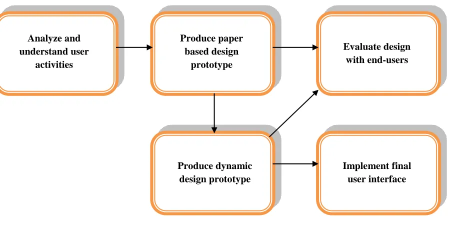
101 GUI Design Process
Figure 9.GUI Design Process
The first stage is to analyze and understand user activities. It is usually necessary to find out what is currently happening. Identification of needs is performed through observation and interviews. Design is a central stage, move from ‘What you want?’ to ‘How to do it?’. There are numerous tips, techniques guidelines and that can be used to help with this. The next stage is designing a paper based prototype. Humans are complex and we cannot expect to get designs right first time. We therefore need to evaluate a design from end users to see how well is it working and where there can be improvements. When we are happy with our design, we need to create it and deploy it. This will involve the production of a dynamic design prototype, evaluation with end users and lastly implementation of final GUI.
VI. CONCLUSIONS
In this paper, first, I have reviewed various types of interfaces. It is seen that how GUI designing tips, techniques, Golden rules and some principles can be used to provide a pathway for the GUI design Process. Lastly I have reviewed that designing GUI is not just about creating software but instead is about the whole interaction between people, software and their environment. The GUI design process starts with understanding the situation as it is and the requirement for change.
REFERENCES
[1] Reena Saini: ,‘Graphical User Interface Design Essentials & Process’, ‘International Journal of Advanced Research in Computer Science and Software Engineering’ 481-483
[2] Shneiderman, Designing the user interface, 3rd edition, Addision-wesley, 1998. [3] Alan Cooper, The essential of User Interface design (IDG Books worldwide, Inc.1995).
[4] P. Reeda,*, K. Holdawayb, S. Isenseec, E. Buied, J. Foxe, J. Williamsf A. Lundg :’ User interface guidelines and standards: progress,issues, and prospects’, ‘Interacting with Computers’ 12 (1999) 119–142
[5] Antcheva, R. Brun, F. Rademakers, CERN, Geneva, Switzerland:,’ Guidelines for Developing a Good GUI [6] The Windows Interface Guidelines — A Guide for Designing Software Microsoft Windows February 1995.
http://www.ics.uci.edu/~kobsa/courses/ICS104/course-notes/Microsoft_WindowsGuide...
[7] Masoud Nosrati * ,Ronak Karimi ,Mehdi Hariri:,’ Main Principles in GUI design for Data Systems’,’ World Applied Programming’, Vol (2), No (4), April 2012. 211-215.
[8] Regula Stopper,René Sieber,Samuel Wiesmann,Olaf Schnabel:,’Graphical User Interface - Layout and Design’ [9] Scott W. Ambler:,’User Interface Design: Tips and Techniques’,’ Cambridge University Press’.
http://www2.fiit.stuba.sk/~bielik/courses/psi-slov/material/ui-design.pdf
[10]D. Mayhew, ‘Principles and Guidelines in Software User Interface Design’, Prentice-Hall, Englewood Cliffs,NJ, 1992..
[11]C.M. Brown, Human-Computer Interface Design Guidelines, 1988. Analyze and
understand user activities
Produce paper based design
prototype
Evaluate design with end-users
Produce dynamic design prototype
![Figure 3.Too many colours on the screen [8] Figure 4. Wisely used colours on the screen[8]](https://thumb-us.123doks.com/thumbv2/123dok_us/8874117.1815821/4.612.90.521.532.650/figure-colours-screen-figure-wisely-used-colours-screen.webp)
![Figure 5.Graphical adornments are not wisely used [8] Figure 6. Wisely used graphical adornments[8]](https://thumb-us.123doks.com/thumbv2/123dok_us/8874117.1815821/5.612.114.498.398.517/figure-graphical-adornments-wisely-figure-wisely-graphical-adornments.webp)