Mapping the First World War Using
Interactive Streamgraphs
Alaa Abi-Haidar
1,2,*, Bin Yang
1, Jean-Gabriel Ganascia
1,21Laboratory of Computer Sciences, Pierre and Marie Curie University, France 2Labex OBVIL(Observatory Literary Life). Sorbonne University, France
Copyright©2016 by authors, all rights reserved. Authors agree that this article remains permanently open access under the terms of the Creative Commons Attribution License 4.0 International License
Abstract
In this paper, we use unsupervised namedentity recognition and streamgraphs in order to visualize massive amounts of unstructured textual stream data, namely, French newspapers (e.g. Le Figaro, La presse, L’humanité) from the first world war period. Such a visualization allows us to identify main characters, events and locations involved in or relevant to the first world war, according to the French press. Furthermore, our visualization technique can help visually identify correlations between major people (e.g. presidents, generals, public figures...), locations (e.g. countries, cities, towns...) and organizations and events (e.g. corporations, battles...) on multiple aligned streamgraphs. Our method can be applied to unstructured data streams of any domain or time period.
Keywords
Named Entity Recognition, InformationExtraction, Stream Graphs, Information Visualization, Stream Data, Stacked Graphs
1. Introduction
Huge amounts of printed manuscripts from old French news journals (from the 19th and 20th century) have been recently digitized and published by the National French Library, la Bibliotheque Nationale Francaise (BnF). However, the massive amounts of produced textual data are highly unstructured and hard to index, search, or visualize, needless to mention the digitization errors resulting from ill-preserved or damaged manuscripts and imperfect Optical Character Recognition (OCR) techniques.
Named Entity Recognition (NER) is a task of information extraction that aims to identify in-text references to concepts such as people, locations and organizations, mainly in unstructured natural-language text. NER is very useful for text indexing, text summarization, question answering and several other tasks that enhance the experience between humans and literature. Furthermore, advanced NER and disambiguation techniques are capable of dealing with noise
resulting from digitization errors.
The unsupervised use of dictionary-lookup is known to enhance NER, however dictionaries have limitations for being finite and ambiguous. On the other hand, supervised NER such as Stanford's NER Classifier that we tested here is known to perform very well but only with the availability of huge amounts of manually annotated training data that is very costly, time consuming and sometimes inaccurate due to inter-annotator inconsistencies.
state of art unsupervised and supervised NER classifiers, namely DBPedia Spotlight, BaLIE and Stanford NER classifier. We have shown that our method outperforms all unsupervised methods [9] and occasionally Stanford’s supervised method when little training data is available [8]. Details of the UNERD algorithm or performance go beyond the scope of this study.
Finally, we use streamgraphs [1] (or stacked graphs) to visualize the evolving trendline of key figures (people), locations and organizations related to the first world war that are extracted automatically using UNERD from the French newspaper “La Presse” between 1914 and 1919, thus totalling 1820 issues.
In the following sections, we focus on information visualization and the steamgraph method that we use to visualize the trends of main figures, battle locations and organizations involved in the first world war.
2. Information Visualization Overview
T The term Information Visualization or InfoVis is referenced in a variety of contexts of meaning; in Computer science, Card , Shneiderman, and Mackinlay define this term in a more narrow sense and referred to it as “the use of computer-supported, interactive, visual representations of
abstract non-physically based data to amplify cognition” [2] . Visualization is also an important technique for the analysis of knowledge derived from text mining. Thus many InfoVis techniques have been introduced to visualize documents and text streams in the domain of text mining [13]. However, what method is used depends on the question to answer and the data at hand [11]. According to Risch [5], text visualization is composed of three steps. First, the text is processed in a representation more suitable for sequent operations. Second, in order to render a certain view, a mapping onto a 2D or 3D space is performed. Third, user interaction is enabled. In fig. 1, we show examples of two traditional visualization techniques, namely, Data Mountain (document management visualization) and Topic Island (topic visualization). A Survey on text stream visualization techniques can be also found in [7].
[image:2.595.64.547.399.596.2]In 2008, Havre et al. introduced Themeriver [3]. In their visualization, a “river” flows from left to right through time with its width varying according to thematic strength of temporally associated documents. Colored “currents” (or streams) flowing within the river narrow or widen to indicate decreased or increased strength of individual topics or a groups of topics in the associated documents. The river is shown within the context of a timeline and a corresponding textual presentation of external events.
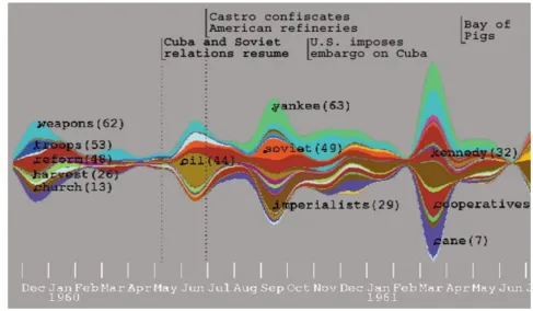
In 2008, Byron introduced Streamgraphs [1] to emphasize legibility of individual layers that are arranged distinctly in organic forms. Streamgraphs were applied to last.fm music data as part of an academic project called “Listening Histories”. The Streamgraph design attracted huge interest from both information visualization enthusiasts and music lovers. Streamgraph made it to the New York Times, with a visualization of movies according to box office receipts (see Fig. 2) and an online interactive visualization tool.
Figure 2. Detail of a roll-over label in a Streamgraph visualization of the box office receipts for movies between 1986 and 2008 posted in the New York Times.
Figure 3. ThemeRiver™ uses a river metaphor to represent theme changes over time.
Assume the time series as a set of n real-valued non-negative functions: 𝑓𝑓1, 𝑓𝑓2. . . 𝑓𝑓𝑛𝑛 such that the baseline
function is given by: 𝑔𝑔𝑖𝑖= 𝑔𝑔0+ ∑𝑖𝑖𝑗𝑗=1 𝑓𝑓𝑗𝑗
The silhouette is as close as possible to the x-axis and is defined by: 𝑠𝑠𝑠𝑠𝑠𝑠ℎ𝑜𝑜𝑜𝑜𝑜𝑜𝑜𝑜𝑜𝑜𝑜𝑜(𝑔𝑔0) = 𝑔𝑔02+ 𝑔𝑔𝑛𝑛2The deviation
measure at each value of x, is defined by: 𝑑𝑑𝑜𝑜𝑑𝑑𝑠𝑠𝑑𝑑𝑜𝑜𝑠𝑠𝑜𝑜𝑑𝑑(𝑔𝑔0) = ∑𝑛𝑛
𝑖𝑖=0 𝑔𝑔𝑖𝑖2
The sum of squares of the slopes at each value of x, is defined by: 𝑤𝑤𝑠𝑠𝑔𝑔𝑔𝑔𝑠𝑠𝑜𝑜(𝑔𝑔0) = ∑𝑛𝑛𝑖𝑖=0 𝑔𝑔′𝑖𝑖2
Minimizing the deviation and the sum of squares yields the steamgraph’s equation that is detailed in by Lee Byron [1].
[image:3.595.59.547.342.626.2]interactive visualization method that could reveal additional information (such as labels and frequencies) when the mouse is rolled over a “stream” which avoids cluttered information. Secondly, Streamgraph can display the importance of an entity based on the relative area of the stream which in our case represents the frequency of each entity in a period of time.
According to Silic’s three important factors of evaluating visualization techniques [12] our NEs Visualization technique using streamgraphs meets Generalizability, Precision and Realism. Our method can be applied to a more general corpus with other types of data sets, bringing the users precise and realistic visual representation of the data set.
Figure 4. Three streamgraphs identifying key figures (people) [blue], locations [pink] and organizations [green] of the first world war extracted automatically as ENAMEX named entities from the French newspaper “La Presse” between 1914 and 1919. The labels for each stream appear when the mouse is rolled over the stream.
3. Visualization Results
The three Streamgraphs in the fig. 4 were automatically generated from extracted ENAMEX named entities labeled as Person (blue), Location (pink) and Organization (green). This streamgraph visualization offers a much more intuitive overview of what happened, when and where during the first world war. Events can be easily correlated and their labels displayed by simply hovering over a stream with the mouse over a certain time period. A publicly accessible interactive demo is accessible at http://alahay.org/labs/ACASA/. For example, at the beginning of 1916, we notice an inflation of the trendline corresponding to “Poincare”1 (blue) which happens to inflate along with the inflation of “Verdun” (pink) which is the location of a famous battle and “rente” (green) which is a form of war tax. This observation does not necessary imply any causality, however, it helps identify major co-occurrences of figures, events and/or locations which facilitates the crunching and understanding of huge amounts of textual data.
1 President of France 1913-1920
[image:4.595.59.560.182.417.2]4. Conclusions
We have successfully used streamgraphs and unsupervised named entity recognition in order to compress and represent 5 years of daily press related to the first world war in an online interactive visualization tool. Our method can be extended to any domain or field of study over any period of time. In biology, for example, event mining and named entity recognition are very common for identifying protein and gene names, and interactions in between.
Acknowledgements
This work has been done within the LABEX OBVIL project, and received financial state aid managed by the Agence Nationale de la Recherche, as part of the programme "Investissements d'avenir" under the reference ANR-11-IDEX-0004-02. We thank the National French Library, BnF, for the provided data.
REFERENCES
[1] Byron, L. and Wattenberg, M. Stacked graphs &minus, geometry &, aesthetics. IEEE Trans. Vis. and Comp. Graphics, 14 (6): 1245-1252, 2008.
[2] Card, S.K., Mackinlay, J.D. and Shneiderman B., Readings in information visualization: using vision to think, chapter 1, pages 1–34. Morgan Kaufmann Publishers Inc., 25 January 1999.
[3] Havre, S., Hetzler, E., G., and Nowell, L., T., “Themeriver: Visualizing theme changes over time,” in INFOVIS, 2000, pp. 115–124.
[4] Miller, N. E., Wong, P.C., Brewster, M., and Foote, H., “TOPIC ISLANDS-a wavelet-based text visualization system,” in Proceedings of the 9th IEEE Conference on Visualization VIS 1998. IEEE, pp. 189–196, Oct.1998. [5] Risch, J, Kao, A, Poteet, S. and Wu, Y. “Text Visualization for
Visual Text Analytics,” Lecture Notes in Computer Science, vol. 4404, pp. 154–171, 2008.
[6] Robertson G., Czerwinski, M and Larson, K, “Data Mountain: Using Spatial Memory for Document Management,” Proceedings of UIST’98, ACM Press. 153-162. 1998. [7] Silic, A., Visualization of Text Streams: A Survey. Electrical
Engineering, 6277:31–43, 2010. doi:10.1007/978-3-642-153 90-7.http://www.springerlink.com/index/KN4TTH05608618 68.pdf
[8] Mosallem, Y. Abi-Haidar, A. and Ganascia J.G. "Unsupervised Named Entity Recognition and Disambiguation: An Application to Old French Journals", volume 8557 of the Lecture Notes in Computer Science series. In Proceedings of ICDM 2014.St. Petersburgh, Russia. [9] Abi-Haidar A., Wild, O., and Ganascia J.G. "A Simple yet
Efficient Method for Unsupervised Named Entity Recognition and Disambiguation", WIREs Data Mining and Knowledge Discovery (DMKD) (InWiley’s Press)
[10]C. Brando, F. Frontini, A. Abi Haidar and J.G. Ganascia. [2015] Reconnaissance d'entites nommees: adaptation au domaine de la litterature francaise du XIXe sicle. JLC 2015 Orleans, 2-4 Sept 2015.
[11].J.J.Van Wijk: Views on visualization. IEEE T. Vis. Comp. Graph. 12(4) (2006)
[12]A. Silic and B. D. Basic. Visualization of text streams: A survey. In R. Setchi, I. Jordanov, R. J. Howlett, and L. C. Jain, editors, KES (2), volume 6277 of Lecture Notes in Computer Science, pages 31–43. Springer, 2010.
![Figure 1. Left: Data Mountain with 100 web pages.[6] Right: Topic Island for the Buddhist article showing major themes [4]](https://thumb-us.123doks.com/thumbv2/123dok_us/8764944.895908/2.595.64.547.399.596/figure-mountain-right-topic-island-buddhist-article-showing.webp)
![Figure 4. Three streamgraphs identifying key figures (people) [blue], locations [pink] and organizations [green] of the first world war extracted automatically as ENAMEX named entities from the French newspaper “La Presse” between 1914 and 1919](https://thumb-us.123doks.com/thumbv2/123dok_us/8764944.895908/4.595.59.560.182.417/streamgraphs-identifying-locations-organizations-extracted-automatically-entities-newspaper.webp)
