Cory M Chapman. A Preliminary Usability Study of the Dryad Database of Biological Data. A Master’s Paper for the M.S. in I.S. degree. April, 2013. 36 pages. Advisor: Jane Greenberg
This paper reports on a usability test (n=10) that evaluated the web interface of the Dryad repository of biological data. Participants, mostly biologists, were asked to find
information about the database, find and download data, and upload data. These three workflows were tested with a card sorting procedure and a think-aloud protocol. The results suggest that biologists interact with online database systems much like non-biologists; color, placement, and size of buttons and text were important determiners of recognition and acknowledgement. However, while most web users prefer browsing to seek information on new websites, participants in this study preferred searching. Most participants did not arrive at the website at the homepage, and thus reported a lack of information about Dryad at their initial entry point. Recommendations for enhancing Dryad specifically and web database interfaces in general are included.
Headings:
Usability engineering (System design) Biological Science Disciplines
Database Management Systems Research
A PRELIMINARY USABILITY STUDY OF THE DRYAD DATABASE OF BIOLOGICAL DATA
by
Cory M Chapman
A Master’s paper submitted to the faculty of the School of Information and Library Science of the University of North Carolina at Chapel Hill
in partial fulfillment of the requirements for the degree of Master of Science in
Information Science.
Chapel Hill, North Carolina April 2013
Approved by
Table of Contents
INTRODUCTION --- 2
DRYAD --- 2
DRYAD USABILITY --- 2
INFLUENCE OF OTHER RESEARCH --- 3
WORKFLOWS --- 5
OVERVIEW --- 5
LEARN ABOUT DRYAD --- 5
FIND AND DOWNLOAD DATA --- 5
UPLOAD DATA --- 6
METHODOLOGY --- 7
OVERVIEW --- 7
PRE-TEST --- 8
LEARN ABOUT DRYAD --- 8
FIND AND DOWNLOAD DATA --- 9
UPLOAD DATA --- 10
POST-TEST --- 10
RESULTS AND DISCUSSION --- 11
LEARN ABOUT DRYAD --- 11
FIND AND DOWNLOAD DATA --- 13
UPLOAD DATA --- 14
GENERAL GUIDELINES FOR FUTURE STUDIES --- 15
RECOMMENDATIONS --- 15
CONCLUSION --- 21
APPENDIX --- 22
FIGURES --- 26
Introduction
This paper reports on a usability case study of the Dryad repository of biological data that was conducted in February 2012. It is important to note that the scope of the Dryad repository has grown to include data outside of the biological sciences since this research was conducted. Although the scope of Dryad has expanded, the results of this study still provide useful insight into the usability of biological science databases and may give insight into databases for the other disciplines that Dryad now encompasses.
Dryad
Dryad (datadryad.org) is a nonprofit organization and an international repository of data underlying publications in the biological sciences. At the time of this research, Dryad’s mission was to promote the availability of data underlying findings in the biological literature for research, preservation, and educational reuse. Dryad served as a repository for tables, spreadsheets, flat files, and all other kinds of published data that do not have another discipline-specific repository. Dryad was funded by the U.S. National Science Foundation, the U.S. Institute for Museum and Library Services, and the U.K. JISC.
Dryad Usability
technologies for information retrieval (Vision 2010). In line with those goals, Dryad commissioned the present study to be conducted. Prior to this study, usability was primarily considered during the initial design phase of Dryad’s creation, making this the beginnings of the first holistic redesign in the repository’s history.
Previously, personas were created to represent various stakeholders in the Dryad web interface: board members, managing editors, searchers, depositors, Dryad curators, and institutional repository administrators. Mockups for submission systems and information finding interfaces were created, tested against the personas, and reviewed. The current study aimed to add insights into scientists’ perceptions, understanding, and uses of the Dryad data repository. Specifically, this study looked at how data was submitted and retrieved from a web-based interface of the Dryad database. This study was the first step in a systematic attempt to reevaluate and redesign Dryad’s web interface. As of April 2013, the data download, upload, and information seeking workflows are being redesigned based on this and other research, and the curatorial interface is undergoing user experience enhancements as well.
Influence of Other Research
prefer to learn a system by using it rather than by being told how to use it
(Blandford et al. 2004), cognitive walkthroughs were chosen for Dryad’s own usability needs. Previous studies’ heuristic methods (Nielsen 1994; Norman 2002; Kuniavsky 2008) influenced the methodologies used in the present study, but were downplayed as too costly and time consuming for the scope of the research.
Workflows
Overview
This study aimed to understand user reactions to three specific tasks in regards to the Dryad web interface. These particular tasks were assumed to be the useful and relevant for data scientists who approach the Dryad web interface. Other tasks may be better suited for journal editors, Dryad curators, and other users who interact with the Dryad website, but those users are not the focus of this study.
Learn About Dryad
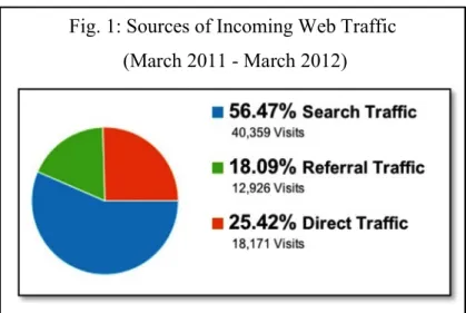
Users arrived at the Dryad web interface in many ways (Fig. 1). Depending on their familiarity with the service, users may have tried to find more information about Dryad such as its journal affiliations, tutorials on uploading data, funding sources, etc. To find more information, users could read the initial Dryad page at which they arrived, click to find more information on the page, and/or search elsewhere for information about Dryad.
Find and Download Data
associated metadata in order to determine whether the contents of a data package were relevant before downloading them.
Upload Data
Methodology
Overview
The procedures outlined below were designed to understand how users interacted with the existing Dryad web interface. A recruitment email was sent to the entire staff of the National Evolutionary Synthesis Center, and the first ten respondents were tested over a two-week period in February 2012. Ten respondents were determined to be an
appropriate number for the purposes of this study (Nielsen 2000). Nine of the ten subjects self-identified as “biologists”. Each test lasted between 50 and 90 minutes.
Subjects signed a waiver granting the researcher permission to use the subjects’ responses as part of this research. Subjects were then asked to take a brief pre-test to understand their pre-existing familiarity with the Dryad web interface and with biological data generally.
To test the three workflows listed in the previous section, users were told to perform four different tasks: (1) Sort cards representing sections of the “Information” portion of the Dryad website into meaningful groups. (2) Find information about Dryad itself. (3) Find a specific data package and download it. (4) Upload a provided data package.
Each test was conducted individually, and the subjects’ faces, voices, and computer screens were recorded during all parts of the test except the pre-test, the card-sorting exercise, and the post-test. Testing was performed in compliance with the University of North Carolina at Chapel Hill’s Institutional Review Board’s regulations.
Pre-test
A written test was administered before any other testing procedures. The pre-test was intended to determine, to some degree, the familiarity the subject had with Dryad’s web interface, other web-based biological databases, and the internet in general. The full text of the pre-test is included in the Appendix of this paper.
Learn About Dryad
The purpose of this test was to better understand where users expected certain pieces of information to be located within the “Information” portion of the website. Based on the results of this test, new information architectures can be designed to better accommodate subjects’ expectations. The test was in two parts:
Part 2: Subjects were asked to find specific items of information within the existing “Information” portion of the website. The specific items were not section titles, but were instead pieces of information within the body text of the pages. All of the asked-for items were phrased differently than the answers appeared on the website to promote concept recognition above word recognition.
Find and Download Data
The purpose of this test was to better understand how users attempted to find data through the Dryad interface. Based on the results of this test, possible data discovery mechanisms can be made more prominent and intuitive for future users.
For this test, subjects were given the following citation and asked to find the link that would allow them to download the associated data:
Blackman BK, Michaels SD, Rieseberg LH (2011) Connecting the sun to flowering in sunflower adaptation. Molecular Ecology 20(17): 3503-3512. doi:10.1111/j.1365-294X.2011.05166.x
Upload Data
The purpose of this test is to better understand users’ expectations and reactions to current data submission process. The current process is a paginated wizard-style
workflow that allows users to upload and describe multiple files per data packet. Subjects were given a citation, a DOI, list of authors, an abstract, keywords, two data files, and descriptions of those data files associated with the following paper:
Morran LT, Schmidt OG, Gelarden IA, Parrish II RC, Lively CM (2011) Running with the Red Queen: host-parasite coevolution selects for biparental sex. Science 333(6039): 216-218. doi:10.1126/science.1206360
Subjects were asked to describe and upload the data files into the Dryad repository using the existing wizard-style workflow.
Post-test
Each subject was asked to complete a post-test. This test served to give the subject a means by which to express their opinions of the overall experience on the website, and as a way to establish which parts of the website were best and worst. Finally, the subjects were asked if they had an questions regarding the test, its
Results and Discussion
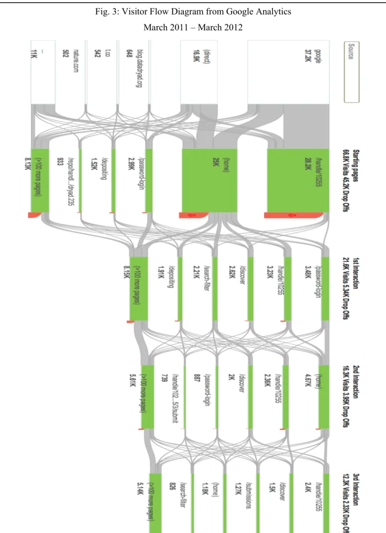
The trends and recurring themes regarding subjects’ interactions with each of the three workflows are described in this section. Due to the small sample size (n=10), no meaningful statistical analysis could be performed from the results gathered in this study. Rather, these results represent a preliminary case study and should be interpreted as such. Some of the data is cross-referenced with Google Analytics data that was collected for the datadryad.org domain between March 2011 and March 2012.
Learn About Dryad
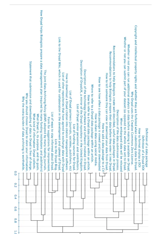
Part 1: The card sorting results yielded three rather distinct categories in a
complete-linkage dendrogram (Fig. 2). Though three main categories emerged among the subjects, no individual subject created fewer than five categories. These categories will be used to create the menu and nested information architecture used on a new web interface, so though there were three primary categories, the goal should be to have close to seven distinct categories to maximize visibility while minimizing confusion in regards to the main menu (Miller 1956). Seven is a reasonable number, as most subjects created six categories and the average number of categories was eight.
helpful to most users in practice, as the information in that category would likely be different for different users. This is reaffirmed by the fact that none of the cards were shared between both users’ “unknown” categories.
Part 2: Phrasing on the part of the researcher was the most important determinant in whether or not a subject found the information asked for by the researcher. This was expected because think-aloud protocols like the one implemented here are known to be fast and efficient, but somewhat prone to interviewer effects (Cooke 2010). Along with researcher phrasing, position, size, and color of the information on the screen were also important determinants in subjects’ recognition of information items. The expected outcome was that subjects would find larger, uniquely colored items easier, though this was rarely the case. This discrepancy may have been caused by the users associating the large, uniquely colored elements as ads, superfluous headings, or other information that is non-relevant to the task (Pagendarm and Schaumburg 2001). More information would be needed from both users and other stakeholders to ascertain exactly which items should be set apart and how to maximize user’s recognition. Until such a study can be conducted, the information that is most important and most often sought after should be put towards the top and left of the page (Nielsen 2006).
determine if “Depositing Data” is the best descriptor for the information that page
contains, and if the information on the page is useful for the in regard to the users’ goals.
Find and Download Data
Subjects were very proficient at finding and downloading data. 100% of the subjects successfully found and downloaded the data packet in two different ways. Most subjects used the search mechanism first and browsed upon the researcher’s prompting. This is surprising because most web users initially prefer browsing interfaces to searching interfaces (Hearst et al. 2002). However, subjects did not correctly interpret the search mechanism when multiple searches were performed in succession. Users expected each use of the search box to be independent of the previous search, but the search box, instead, evaluated only the subset of things that were returned from the first search, that is, it was a cascading search. The users’ performance was to be expected as most website searches default to being independent of any previous search query. On most websites, it it is possible to cascade search criteria, that is an option that must be selected by the user; it is not the default behavior.
Subjects disliked the prominence of the article citation information on the package pages. They agreed that the citation was important, but not as important as the links to download the data, which are at the bottom of the page. This finding was expected because this study primarily tested biologists and researchers. Had this study included journal editors and other Dryad partners, one could reasonably expect the prominence of the citation information to be viewed positively. A future study might incorporate a broader range of stakeholders to determine whether the prominence of the citation information is acceptable.
Upload Data
All subjects successfully uploaded a data package, though the quality of their metadata varied. Subjects were confused by a lack of instructions on each page, and their assumptions varied quite significantly about what to put into each field. Less than half of the subjects noticed the hover-over instructions for each metadata field. This was to be expected because relatively websites put examples and instructions in hover-over text. There was no indication to the users that hover-over information existed on the page, so they did not think to pause the mouse over each metadata field to find more information. Once subjects were informed about the hover-over instructions, they found them very useful. This indicates that information should be clearly visible beside each metadata field with no special user action needed to access it.
entered into the database. This confusion exemplifies the need for the system to
give consistent, timely feedback regarding the status and quality of the user’s entries. A dialog asking users to confirm or cancel their data entry would suffice.
General Guidelines for Future Studies
Though resources were limited for this study, future studies could reveal deeper insights into the users’ experiences. Future researchers could implement one or more of the following changes:
During the interview process, the researcher has the potential to bias the results quite significantly by what he/she says and does, or merely by some inherent attribute of the himself/herself such as gender (Flores-Macias and Lawson 2008), race (Hill 2002), or demeanor (Olson and Peytchev 2007). In an attempt to combat interviewer effects, a script is suggested to maintain a constant presentation to all subjects (Krug 2006). In this study, a script was overly formal and would likely have stifled both the researcher and the subject.
Recommendations
This is a list of generalized recommendations followed by specific examples of their use on the March 2012 Dryad web interface. These recommendations were derived from the users’ comments during the study and from common trends and motifs in web user experience design. The recommendations are intended for the Dryad development staff, but their usefulness and generalizability may be extended beyond that scope. Recommendations are in no particular order.
1. Make the default text larger or provide a ubiquitous “Increase text size” button on every page.
100% of the subjects reported that the text was too small. Some of them knew how to change the font size in their browser, but most did not. Consider providing a button that will allow them to change the font size. Multiple users reported knowing how to increase the font size and zoom level, so the website should render well with these nonstandard settings.
To most subjects, the “Contents” section under “Depositing Data” did not appear to be any different from the information below it. The “Contents” section should be larger, and possibly in a separate box. Consider using right-justified boxes for the most frequently accessed information on each page.
3. Use as few colors as necessary to clearly indicate different sections of the website. Colors should be easy to read, and they should follow existing web paradigms.
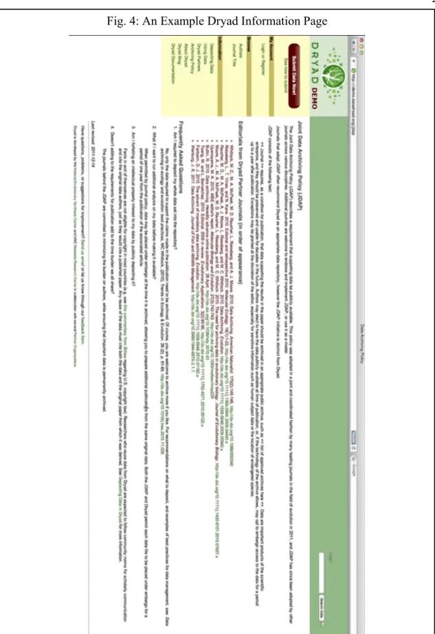
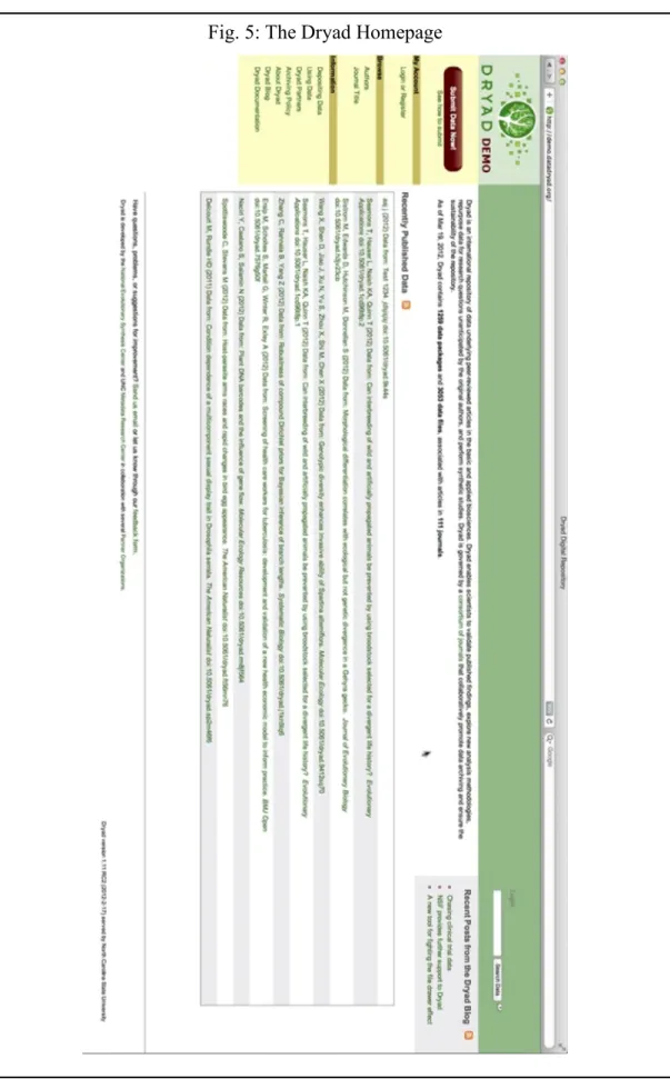
In the “Information” portion of the website (Fig. 4), links were in green, and other text was in red or black. The users were unable to determine that green text represented a link because they expected blue links like was the default for their browsers. Red text was difficult to read on a white background.
4. Vertical screen real estate is more precious than horizontal screen real estate.
Users complained about the “poor use of vertical space” because most users’ screens were in widescreen format. The large, green box at the top should be vertically smaller. (Fig. 5)
5. Any external link should be obviously marked as an external link.
6. All pages and workflows that contain a term that may be unfamiliar users should explicitly state the definition of that term.
“CC0” and “Creative Commons Zero waiver” were unfamiliar to half of the biologists tested. These and other less-familiar terms should be defined in every workflow where they occur. Alternately, consider using the more familiar Creative Commons logo alongside the original text.
7. A symbol/icon should not be used when a word would not harm the aesthetic.
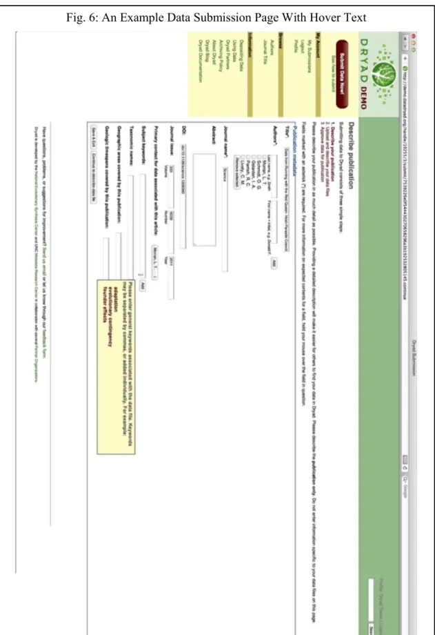
In the submission workflow, the asterisk as a symbol for “required” was either misunderstood or unnoticed by most users. (Fig. 6) Consider replacing it with the term “required”, thereby reducing the cognitive effort required by the user to understand the intent.
8. All buttons that perform the same action (e.g. link to XYZ page, or submit the entered data) should have the same label.
In the submission process (Fig. 6), the “Save & Exit” buttons should always use the same text on each page because they will all perform the same action. Their
different, but be side-by-side. Ideally, the button that progresses the user to the next step should be to the right, and it should be larger.
9. Any buttons that perform opposite tasks should be easily distinguishable by shape, size, location, and/or color, etc. Similarly, when presented with multiple options in a workflow, the most frequently selected choice should be first, largest, and/or
brightest, etc.
In the submission process (Fig. 6), the “Save & Exit” button and its companion at the bottom of each page should be different from each other. Save & Exit should be a link (not a button) to the right of its companion button.
10. Any guided, step-by-step process should ask for confirmation before exiting or completing the process. Likewise, any guided, step-by-step process should ask for re-confirmation before exiting the process or deleting one’s progress.
In the submission workflow, there was no straight-forward confirmation that the submission has succeeded. Sending the user to the list of his/her successful
11. Any input field should be clearly associated with its label and/or submission button by location, color, style, etc.
The “Login” and “Logout” buttons were too close to the search box (Fig. 5). Users expected to input their login info in that text box, and they were confused when the box was intended for searching. (Fig 6)
12. Always give examples for input fields. Make all examples easy to find. Users should always be able to see the example when they see the input field.
Conclusion
This usability test was conducted in February 2012 as a first step in understanding biologists’ preferences and interactions with the web interface of the Dryad repository of biological data. These interactions could be reduced to three distinct workflows: (1) Learn about Dryad (2) Find and download data (3) Upload data. With the results of a card sorting procedure, a dendrogram was created that will be useful in organizing information about Dryad itself in accordance with user expectations. When asked to find information about Dryad, biologists reacted to the interface similarly to non-biologists. The users preferred standard web practices like categorizing content into clearly defined groups marked by location and color over less-standard practices like green link highlighting. When asked to find and download data, however, the biologists differed from typical web users; the biologists initially preferred to search for most information rather than to browse. Data uploading was successful, but fraught with difficulties. Though information regarding what should go into each entry field was present, it was not acknowledged or recognized by most subjects, so they were uncertain about what to input into each field.
As of April 2013, Dryad’s web interface is undergoing a redesign and its scope has broadened to include most scientific and medical literature. The results and
Appendix
Pre-test
1. Have you ever used Dryad before?
Yes No
2. If so,
a. Have you searched Dryad for data?
Yes No
a.i. Did you find that process easy or difficult? Easy Difficult b. Have you submitted data to Dryad before?
Yes No
b.i. Did you find that process easy or difficult? Easy Difficult c. Have you searched for information about Dryad itself?
Yes No
c.i. Did you find that process easy or difficult? Easy Difficult
3. How often do you use the Internet? (ex. multiple times per day, daily, once a week, once a month, etc)
Post-test:
1. What did you find to be the most difficult, jarring, or unintuitive part of the tasks you performed for this test? Why?
2. Do you have any suggestions for improving the tasks you performed in the future?
3. Do you have any suggestions for improving the Dryad web interface in general?
Card Sorting Labels
• Why you should choose Dryad to store your information. • What kind of information Dryad collects.
• Recommendations to help Biologists create well-described, useful data packages in Dryad.
• Recommendations to help Biologists prepare their data before they enter it into Dryad.
• Description of the data submission process.
• How Dryad helps Biologists prepare a data management plan (required by many funding institutions and publishers)
• Why Dryad uses the Creative Commons Zero License. • Definition of a Dryad DOI
• How to format display a DOI
• How to refer to a Dryad data package within an article. • Where to refer to a Dryad data package within an article. • Definition of a data package
• How to see how often a data package is viewed and/or downloaded • How to add a data package to a CV.
• How to tell someone they can view or download your data from Dryad. • When embargoed data will be released
• How to share data using social media.
• How to download a Dryad citation into citation management software.
• Statement that submission and downloading of data in Dryad is free of charge. • List of Dryad partners (journals, societies, publishers, etc.)
• List of other repositories that have agreed to exchange data with Dryad
• Whether or not you can submit part of your dataset (as opposed to the whole data set) to Dryad.
• Copyright and intellectual property rights and whether they are forfeited when submitting data to Dryad.
• Why the extra burden of data archiving is worthwhile.
• The Joint Data Archiving Policy (JDAP) adopted by many leading journals. • What Dryad is, its purpose, and its goals.
• List of ways to stay informed about Dryad. • List of funding sources for Dryad.
• Description of DryadUK, a mirror of the Dryad repository in the United Kingdom. • List of Dryad senior personnel and contributors.
• Description of the technology (hardware and software) involved in Dryad. • Link to the Dryad Blog.
• Link to the Dryad Wiki, which is used for collaboration in the development and upkeep of Dryad.
Figures
Fig. 1: Sources of Incoming Web Traffic (March 2011 - March 2012)
Bibliography
Blandford, A, S Keith, I Connell, and H Edwards. 2004. “Analytical Usability Evaluation for Digital Libraries: a Case Study.” Ed. Hsinchun Chen, Howard D Wactlar, Ching-chih Chen, Ee-Peng Lim, and Michael G Christel. Proceedings of the 2004 Joint ACMIEEE Conference on Digital Libraries 2004 (January): 27.
http://discovery.ucl.ac.uk/16693/.
Bolchini, Davide, Anthony Finkelstein, Vito Perrone, and Sylvia Nagl. 2009. “Better Bioinformatics Through Usability Analysis.” Bioinformatics 25 (3): 406–412. http://discovery.ucl.ac.uk/153847/.
Cooke, L. 2010. Assessing Concurrent Think-Aloud Protocol as a Usability Test Method: A Technical Communication Approach. Ieee Transactions On Professional
Communication. Vol. 53. IEEE. doi:10.1109/TPC.2010.2052859. http://ieeexplore.ieee.org/xpls/abs_all.jsp?arnumber=5556472.
Flores-Macias, Francisco, and Chappell Lawson. 2008. “Effects of Interviewer Gender on Survey Responses: Findings from a Household Survey in Mexico.” International Journal of Public Opinion Research 20 (1): 100–110. doi:10.1093/ijpor/edn007. http://ijpor.oxfordjournals.org/cgi/doi/10.1093/ijpor/edn007.
Hearst, Marti, Ame Elliott, Jennifer English, Rashmi Sinha, Kirsten Swearingen, and Ka-Ping Yee. 2002. “Finding the Flow in Web Site Search.” Communications of the ACM 45 (9): 42–49. doi:10.1145/203241.203243.
Hill, Mark E. 2002. “Race of the Interviewer and Perception of Skin Color:
Evidence from the Multi-City Study of Urban Inequality.” American Sociological Review 67 (1): 99–108. doi:10.2307/3088935. http://www.jstor.org/stable/3088935.
Krug, Steve. 2006. Don’t Make Me Think!: A Common Sense Approach to Web Usability. Ed. Karen Whitehouse. Style DeKalb IL. Vol. 2nd. New Riders.
http://www.worldcat.org/title/dont-make-me-think-a-common-sense-approach-to-web-usability/oclc/61895021&referer=brief_results.
———. 2009. Rocket Surgery Made Easy: The Do-It-Yourself Guide to Finding and Fixing Usability Problems. The Doityourself Guide to Finding and Fixing Usability Problems Berkeley New Riders. New Riders.
http://www.amazon.de/dp/0321657292.
Kuniavsky, Mike. 2008. “User Experience Design for Ubiquitous Computing.” Society 15 (6): 20–22. doi:10.1145/1409040.1409045.
http://portal.acm.org/citation.cfm?doid=1409040.1409045.
Mckay, Dana. 2007. “A Brief Literature Review on the Usability of Institutional Repositories.” Information Resources, Swinburne University of Technology: 1–9. http://hdl.handle.net/1959.3/44102.
McKay, Dana. 2007. “Institutional Repositories and Their ‘Other’ Users: Usability Beyond Authors.” Ariadne (52): 1–9. http://www.ariadne.ac.uk/issue52/mckay/. Miller, George A. 1956. “The Magical Number Seven.” Ed. Sergio Della Sala. The
Psychological Review. Oxford University Press. http://www.musanim.com/miller1956/.
Nielsen, Jakob. 1994. “Enhancing the Explanatory Power of Usability Heuristics.” Ed. Beth Adelson, Susan T Dumais, and Judith S Olson. Conference Companion on Human Factors in Computing Systems CHI 94 94 (10): 210.
doi:10.1145/259963.260333.
———. 2000. “Why You Only Need to Test with 5 Users.” Jakob Nielsens Alertbox. Alertbox. http://www.useit.com/alertbox/20000319.html.
———. 2006. “F-Shaped Pattern For Reading Web Content.” Search. Nielsen Norman Group. http://www.useit.com/alertbox/reading_pattern.html.
———. 2012. “User Satisfaction Vs . Performance Metrics.” Jakob Nielsens Alertbox. http://www.useit.com/alertbox/satisfaction-vs-performance.html.
Norman, Donald A. 2002. The Design of Everyday Things. Basic Book Inc. Vol. 16. Doubleday. http://www.amazon.com/dp/0465067107.
Olson, K, and A Peytchev. 2007. “Effect of Interviewer Experience on Interview Pace and Interviewer Attitudes.” Public Opinion Quarterly 71 (2): 273–286.
doi:10.1093/poq/nfm007.
http://poq.oxfordjournals.org/cgi/doi/10.1093/poq/nfm007. Ottaviani, James. 2006. “Deep Blue/Dspace Usability Summary.”
doi:http://hdl.handle.net/2027.42/40249.
http://deepblue.lib.umich.edu/handle/2027.42/40249.
Pagendarm, M, and H Schaumburg. 2001. “Why Are Users Banner-Blind? The Impact of Navigation Style on the Perception of Web Banners.” Journal Of Digital
Information 2 (1): 13–14. http://journals.tdl.org/jodi/article/viewArticle/36/38.
Veretnik, Stella, J Lynn Fink, and Philip E Bourne. 2008. “Computational Biology Resources Lack Persistence and Usability.” Ed. Barbara Bryant. PLoS
Computational Biology 4 (7): 3. http://www.ncbi.nlm.nih.gov/pubmed/18636105.
Vision, Todd J. 2010. “Open Data and the Social Contract of Scientific Publishing.” BioScience 60 (5) (May 1): 330–331. doi:10.1525/bio.2010.60.5.2.