Software Structures
Vom Fachbereich Informatik der Technischen Universität Kaiserslautern
zur Erlangung des akademischen Grades Doktor der Ingenieurswissenschaften (Dr.-Ing.)
genehmigte Dissertation von
Taimur Kausar Khan
Datum der wissenschaftlichen Aussprache: 17. Juli 2015
Dekan: Prof. Dr. rer. nat. Klaus Schneider Promotionsausschuss-Vorsitzender: Prof. Dr.-Ing. Jens B. Schmitt Berischterstatter: Prof. Dr. Hans Hagen
Prof. Dr. Achim Ebert
Prof. Dr.-Ing. habil. Peter Liggesmeyer
T
AIMURK
HANI
NTERACTIVE
V
ISUAL
A
NALYSIS
O
F
S
OFTWARE
S
TRUCTURES
I
would never have been able to finish my dissertation without the guidance of my committee members, help from friends, and support from my family and wife. I would like to express my gratitude to all of them, realizing that those whom I owe the most I cannot thank enough, and that the things for which I am most grateful, I cannot put into words.I would like to express my deepest gratitude to my advisors, Prof. Dr.-Ing. Peter Liggesmeyer and Prof. Dr. Achim Ebert, for their excellent guidance, care, patience, and providing me with an excellent atmosphere for doing research. It would be hard to overstate how much I benefited from their deep insight, their invariably correct intuitions, and their unwavering support. I cannot thank them adequately for all the effort they have made to understand me and to bring out the best in me. I thank them for their valuable suggestions and comments on this manuscript.
I would like to give a heartfelt thanks to Prof. Dr. Hans Hagen for being a mentor to me for the past six years. I will always be indebted to him for the chance to be a part of the International Research Training Group 1131 (IRTG) and for inviting me to write a Doctoral thesis. He has given me guidance and advice on a personal and professional level that has been instrumental in my growth as a research student preparing to be a professional. He consistently makes himself available to his students, to listen and encourage them to pursue their desired interests. While I can never thank him enough, I want him to know that I am truly grateful for his leadership by
example as he continuously demonstrates excellent qualities as a researcher, teacher, friend, and above all, his role as a mentor. I hope I can one day make an impact to someone else the way he has done to me.
I would like to thank Prof. Dr. Frederic McKenzie for being the one to put me on the path towards academic enlightenment. I still remember the excitement of working on my Masters and turning in my first paper, this was my first introduction to research. I am also grateful to Dr. Henning Barthel who let me experience the research of software visualization in the field and face practical issues beyond textbooks. The four years of collaboration, guidance, and support helped me understand what my ideas really were.
I would like to thank all my colleagues at theComputer Graphics and HCI and Software Engineering: Dependability groups for the rewarding discussions and intellectual exchanges, especially Daniel Engel, Mathias Hummel, and Sebastian Petsch. Furthermore, I would also like to thank Mady Gruys, Inga Scheler, and Roger Daneker for always being there and assisting me in the day-to-day mundane duties.
Finally, I would like to thank my wife Heike and my son Noah. Heike was always there cheering me up and stood by me through the good times and bad. Her love, support, and constant patience have taught me so much about sacrifice, discipline and compromise. Noah was born before this dissertation was completed and spent many days without my presence. I am deeply sorry for the time we spent apart.
M
aintaining complex software systems tends to be a costly activity where software engineers spend a significant amount of time trying to understand the system’s structure and behavior. As early as the 1980s, operation and maintenance costs were already twice as expensive as the initial development costs incurred. Since then these costs have steadily increased. The focus of this thesis is to reduce these costs through novel interactive exploratory visualization concepts and to apply these modern techniques in the context of services offered by software quality analysis.Costs associated with the understanding of software are governed by specific features of the system in terms of different domains, in-cluding re-engineering, maintenance, and evolution. These features are reflected in software measurements or inner qualities such as
extensibility, reusability, modifiability, testability, compatability, or adatability. The presence or absence of these qualities determines how easily a software system can conform or be customized to meet new requirements. Consequently, the need arises to monitor and evaluate the qualitative state of a software system in terms of these qualities. Using metrics-based analysis, production costs and quality defects of the software can be recorded objectively and analyzed.
In practice, there exist a number of free and commercial tools that analyze the inner quality of a software system through the use of software metrics. However, most of these tools focus on software data mining and metrics (computational analysis) and only a few support visual analytical reasoning. Typically, computational analysis tools generate data and software visualization tools facilitate the
exploration and explanation of this data through static or interactive visual representations. Tools that combine these two approaches focus only on well-known metrics and lack the ability to examine user defined metrics. Further, they are often confined to simple visualization methods and metaphors, including charts, histograms, scatter plots, and node-link diagrams.
The goal of this thesis is to develop methodologies that combine computational analysis methods together with sophisticated visualiza-tion methods and metaphors through an interactive visual analysis approach. This approach promotes an iterative knowledge discovery process through multiple views of the data where analysts select fea-tures of interest in one of the views and inspect data items of the select subset in all of the views. On the one hand, we introduce a novel approach for the visual analysis of software measurement data that captures complete facts of the system, employs a flow-based visual paradigm for the specification of software measurement queries, and presents measurement results through integrated software visu-alizations. This approach facilitates the on-demand computation of desired features and supports interactive knowledge discovery – the analyst can gain more insight into the data through activities that involve: building a mental model of the system; exploring expected and unexpected features and relations; and generating, verifying, or rejecting hypothesis with visual tools. On the other hand, we have also extended existing tools with additional views of the data for the presentation and interactive exploration of system artifacts and their inter-relations.
Contributions of this thesis have been integrated into two different prototype tools. First evaluations of these tools show that they can indeed improve the understanding of large and complex software systems.
D
ie Pflege komplexer Software-Systeme ist eine zunehmend kost-spielige Tätigkeit, bei der Software-Ingenieure einen Großteil ihrer Zeit damit verbringen, Struktur und Verhalten der Systeme zu verstehen. Bereits in den 80er Jahren waren Betriebs- und Wartungskos-ten doppelt so teuer wie die anfänglichen EntwicklungskosWartungskos-ten größerer Softwaresysteme. Seither ist der Anteil dieser Kosten an den Gesamtkos-ten stetig gestiegen. Der Schwerpunkt dieser Arbeit ist es, diese KosGesamtkos-ten durch neuartige interaktive explorative Visualisierungskonzepte zu re-duzieren und diese modernen Techniken im Kontext der von Software-Qualitätsanalyse angebotenen Dienste zu integrieren.Kosten, die mit dem Verständnis der Software verbunden sind, un-terliegen bestimmten qualitativen Eigenschaften des Systems in Bezug auf verschiedene Aspekte des Gesamtlebenszyklusses, einschließlich des Re-Engineering, der Wartung, und Entwicklung. Diese Eigen-schaften werden bewertet durch Software-Metriken, die sogenannte innere Qualitäten (wie Erweiterbarkeit, Wiederverwendbarkeit, Än-derbarkeit, Testbarkeit, Kompatibilität oder Anpassbarkeit an unter-schiedliche Umgebungen) messen. Das Vorhandensein oder Fehlen dieser inneren Qualitäten bestimmt, wie leicht ein Softwaresystem neuen Anforderungen gerecht wird oder gemacht werden kann. Um Wartungs- und Betriebskosten zu reduzieren, ist es notwendig, die inneren Qualitäten eines Software-Systems zu gewährleisten. Folglich ergibt sich die Notwendigkeit zur Überwachung und Bewertung des qualitativen Zustand eines Softwaresystems. Mittels metriken-basierter Analyse können Produktionskosten und Qualitätsmängel der Software objektiv erfasst und analysiert werden.
Für der praktischen Einsatz existieren eine Reihe von kostenlosen und kommerziellen Tools, die die innere Qualität eines Softwaresystems durch den Einsatz von Software-Metriken analysieren. Diese konzen-trieren sich jedoch meist auf Software-Data-Mining und Metriken (Automatische Datenanalyse) und nur wenige bieten Unterstützung bei der visuellen Analyse. Typischerweise generieren automatische Da-tenanalysetools Daten und Software-Visualisierungstools ermöglichen die Untersuchung und Erklärung dieser Daten durch statische oder interaktive visuelle Darstellungen. Werkzeuge, die diese beiden An-sätze kombinieren, konzentrieren sich nur auf bekannte Metriken und unterstützen nicht die Untersuchung von benutzerdefinierten Metriken. Darüber hinaus sind diese oft auf da Einsatz einfach zu inte-grierender Visualisierungsmethoden und Metaphern wie beispielsweise Charts, Histogramme, Streudiagramme und Node-Link-Diagramme beschränkt.
Das Ziel dieser Arbeit ist es, Data Mining Methoden und Soft-waremetriken zusammen mit anspruchsvollen Visualisierungsmetho-den und -metaphern zu einem interaktiven visuellen Analyseansatz zu kombinieren. Dieser Ansatz fördert eine iterative Schaffung von Wis-sen durch mehrere Ansichten der Daten, in denen Analysten beispiel-sweise interessante Merkmale in einer der Ansichten auswählen und die Datenelemente der ausgewählten Untergruppe in anderen Ansichten weiter inspizieren können. Zunächst stellen wir einen neuen Ansatz für die visuelle Analyse von Software-Messdaten vor. Dieser umfasst eine integrierte Software-Visualisierung, die die vollständigen Fakten des Systems aufzeigt, sowie anhand eines Flussdiagrammes visuelle Spezifikationen von Datenbankabfragen der Software-Messdaten er-möglicht und die zugehörigen Messdaten präsentiert. Dieser Ansatz ermöglicht die Berechnung und Bewertung von Softwareeigenschaften somit gewinnt das Softwaresystem, unterstützt durch den Aufbau eines mentalen Modells, der Erkundung erwarteter und unerwarteter Eigenschaften und Beziehungen, sowie der Überprüfung von Hypothe-sen. Ein weiteres Ziel dieser Arbeit ist es, vorhandene Werkzeuge mit zusätzlichen Ansichten der Daten bezüglich der Darstellung und interaktiven Exploration von Systemartefakten zu ergänzen, sowie deren Wechselbeziehungen zu erweitern.
Beiträge dieser Arbeit wurden in zwei verschiedene prototypische Werkzeuge integriert. Erste Evaluierungen dieser Werkzeuge zeigen, dass deren Auswirkungen tatsächlich das Verständnis großer und komplexer Softwaresysteme verbessern können.
1 Introduction and Overview . . . 1
1.1 Analysis of Software Systems . . . 2
1.2 Visualization and Interactive Visual Analysis. . . 4
1.3 Contribution. . . 5
1.3.1 Visual Analysis of Software Measurement Data 6 1.3.2 Visual Analysis of Software Architecture Evolution . . . 7
1.3.3 Visual Analysis of Software Architecture Relations. . . 8
1.3.4 Visual Analysis in a Collaborative Environment 8 1.4 Organization of this Thesis . . . 9
2 Background and Related Work . . . 11
2.1 Visual Analytics. . . 12
2.1.1 Data Foraging Loop . . . 14
2.1.2 Sense-Making Loop. . . 16
2.1.3 Tools . . . 20
2.2 Interactive Software Visualization . . . 21
2.2.1 Visualizing Architectures. . . 22
2.2.2 Visualizing Architecture Evolution. . . 31
2.2.3 Tools . . . 39
2.3 Coordinated Multiple Views . . . 40
3 Visual Analysis of Software Measurement Data. . . . 45
3.1 Motivation . . . 46
3.2 Methodology. . . 49
3.2.1 Metrics from a Graph Database. . . 49
3.2.2 Using a Workflow-based Approach. . . 61
3.2.3 Live-data Prototype . . . 66
3.3 Experiment. . . 72
3.3.1 Research Purpose and Hypothesis . . . 72
3.3.2 Operationalization. . . 73 3.3.3 Field Test . . . 74 3.3.4 Preliminary Study. . . 75 3.4 Results. . . 77 3.4.1 Effectiveness Results. . . 78 3.4.2 Efficiency Results . . . 82
3.4.3 User Satisfaction Results . . . 84
3.4.4 Threats to Validity . . . 86
3.5 Concluding Remarks. . . 88
3.A Appendix . . . 90
3.A.1 Partial Listing of Implemented Fact-Extractors 90 3.A.2 User Satisfaction Questions. . . 92
3.A.3 Software Understanding Tasks . . . 93
4 Visual Analysis of Software Architecture Evolution 95 4.1 Motivation . . . 96
4.2 Methodology. . . 98
4.2.1 eCITY Schema. . . 98
4.2.2 SAVE Diagram View . . . 99
4.2.3 Timeline View . . . 101
4.2.4 City View . . . 102
4.3 Experiment. . . 106
4.3.1 Research Purpose and Hypotheses. . . 106
4.3.2 Operationalization. . . 107 4.3.3 Field Test . . . 108 4.3.4 Controlled Experiment. . . 108 4.4 Results. . . 110 4.4.1 Efficiency Results . . . 110 4.4.2 Effectiveness Results. . . 113 4.4.3 Acceptability Results . . . 115 4.4.4 Usability Results. . . 117 4.4.5 Threats to Validity . . . 119
4.5 Concluding Remarks. . . 120
4.A Appendix . . . 122
4.A.1 Acceptability Questions . . . 122
4.A.2 Usability Questions. . . 122
5 Visual Analysis of Software Architectural Relations 125 5.1 Motivation . . . 126
5.2 Methodology. . . 128
5.2.1 Overlaying Architectural Relationships. . . 129
5.2.2 Particle Animations to Depict Direction. . . 130
5.2.3 Animating Edge Changes. . . 131
5.3 Discussion. . . 132
5.4 Concluding Remarks. . . 133
6 Visual Analysis in a Collaborative Environment . . . 135
6.1 Motivation . . . 136
6.2 Related Work. . . 137
6.2.1 Distributed Rendering Software . . . 138
6.2.2 Distributed Device Data . . . 140
6.2.3 Distributed Applications . . . 141 6.3 Methodology. . . 141 6.3.1 Dispatcher. . . 143 6.3.2 NetMessage. . . 145 6.3.3 MessageHandler. . . 147 6.3.4 Virtual Input . . . 149
6.3.5 Basic Hardware Configuration . . . 151
6.4 Case Studies. . . 152
6.4.1 Safety and Security Analysis using CakES . . . . 152
6.4.2 Software Measurement Analysis using VIMETRIK . . . 160
6.5 Concluding Remarks. . . 163
7 Conclusion and Outlook . . . 167
7.1 Conclusion . . . 167
7.2 Future Work. . . 173
Appendix
A List of Acronyms . . . 209
B Declaration of Authorship . . . 211
C Curriculum Vitae. . . 213
2.1 The Visual Analytics sense-making process [1]. . . 13
2.2 Epinome: a VA Workbench for Epidemiology data [2] 17 2.3 Simple flow-based diagram. . . 19
2.4 Sample KNIME workflow and views13. . . 21
2.5 General and tool specific node-link diagram. . . 23
2.6 Rectangular and Circular TreeMaps using TreeViz14 . 24 2.7 Icicle [3], Sunburst, and Hyperbolic layouts using TreeViz14. . . . 25
2.8 Cluttered software architecture [4] . . . 27
2.9 Hierarchical Edge Bundles (HEBs)[5]. . . 28
2.10 Clustered graph layout [6] . . . 29
2.11 Metric View [7] and Areas of Interest visualizations [8] 30 2.12 Visual comparison of two source code versions. . . 32
2.13 Graph and City based layouts for software evolution . 33 2.14 The Evolution Matrix [9] and VERSO [10] tools. . . 35
2.15 Fine-grained and coarse CodeCity visualizations [11] . 37 2.16 Multivariate visualization using Kiviat diagrams [12]. 38 2.17 CMV using Soft-Vision [13] . . . 41
3.1 Graph model of top-level entitites . . . 53
3.2 Graph model of selected statements . . . 54
3.3 Graph model of expression and member access . . . 55
3.4 A simple workflow. . . 62
3.5 More complex workflows . . . 65
3.6 VIMETRIK prototype schema . . . 67
3.8 Standard views of measurement results. . . 70
3.9 Custom view of the measurement results . . . 71
3.10 Box-plots of Completion rates. . . 79
3.11 Box-plots of Accuracy rates. . . 81
3.12 Box-plots of Efficiency results . . . 82
3.13 Box-plots of User-Satisfaction results. . . 84
4.1 eCITY prototype schema . . . 99
4.2 SAVE Diagram View. . . 100
4.3 Timeline View . . . 101
4.4 CITY View. . . 103
4.5 Detailed eCITY View . . . 105
4.6 Box-plots of Efficiency results . . . 111
4.7 Box-plots of Effectiveness results . . . 113
4.8 Box-plots of Acceptability response . . . 116
4.9 Box-plots of Usability response. . . 118
5.1 Analyzing relations with eCITY+ . . . 127
5.2 Creating an architectural edge . . . 128
5.3 Varying edge bundling factor. . . 129
5.4 Animating particles along an edge . . . 131
5.5 Animating edge representations . . . 132
6.1 Logical structure of Dispatcher Framework. . . 143
6.2 Logical structure and behavior of Dispatcher. . . 144
6.3 Logical structure and behavior of MessageHandler . . . 148
6.4 TileRenderer and MessageHandler Extention-Point details . . . 149
6.5 Structure of an SDL_Event. . . 150
6.6 Case Study 1: eCITY Tiled-Wall configuration . . . 154
6.7 CakES: Menu and BE Views. . . 155
6.8 CakES: Model View . . . 156
6.9 CakES: Desktop Views. . . 158
6.10 CakES: Desktop and Tiled-Wall configurations . . . 159
6.11 Case Study 2: VIMETRIK Tiled-Wall configuration . 161 6.12 VIMETRIK: Menu and Hyperbolic Views . . . 162
3.1 Properties within Graph Model. . . 56
3.2 Participants Completion rate. . . 79
3.3 Participants Accuracy rate. . . 81
3.4 Participants Efficiency . . . 83
3.5 Participants User Satisfaction response. . . 85
3.A.1 Description of Software Fact-Extractors . . . 90
3.A.2 Software measurement experiment tasks . . . 93
4.1 Participants Efficiency . . . 111
4.2 Efficiency gain and effect size . . . 112
4.3 Participants Effectiveness. . . 114
4.4 Effectiveness gain and effect size. . . 115
4.5 Participants Acceptability response . . . 116
Introduction and Overview
“You need statistics to describe data, but then
visualization to see it in context ”
–Andy Kirk1
T
his thesis presents novel methods for the interactive visual analysis of software systems. In particular, we present various approaches suitable for the analysis of data from a wide range of problem domains, including re-engineering, software maintenance, and software evolution. Visual analysis can enhance the software analysts’ cognitive ability to comprehend analysis results and can enable the formation of valuable knowledge from raw data artifacts. It facilitates thesense-making pro-cess through the propro-cessing of visual information to detect interesting structures and relationships in the data such as patterns, trends, and anomalies. In this chapter, we first provide a brief description of the problem domain:the analysis of software systems. Next, we present a short introduction of the proposed methodologies: Visualization and Interactive Visual Analysis (IVA). Finally, we outline the main contributions of this work and provide an overview of the structure of this thesis.1
1.1 Analysis of Software Systems
Software systems nowadays are a integral part of our daily lives. They can be found all around us in conventional desktop and internet applications or in almost all technical devices, from mobile phones to traffic lights. In addition to becoming more pervasive, they have also become more complex, large, and sophisticated. Consequently, more resources are allocated to make sure that the software is correct, robust, reliable, and of high quality.
The field of software engineering aims to address these concerns through systematic and disciplined activities. The IEEE standard 601.12 defines software engineering as “the application of systematic, disciplined, quantifiable approaches to the development, operation, and maintenance of software”. Typically these approaches can be categorized into a hierarchy of activities, “ranging from requirements gathering, specification, and design to implementation, debugging, testing, and maintenance” [14]. Although these activities or more specifically software engineering sub-disciplines are quite varied, they all have one common goal; to better understand the macroscopic properties of software systems to make well-informed decisions about re-engineering, maintenance, software evolution, etc. [15].
This need to understand software systems from different perspec-tives coupled with the size and complexity of modern software systems makes it a towering task, so much so that professional software devel-opers spend more time analyzing code than developing it [16]. Further, this understanding is convoluted due to various ways of structuring source code [17,18] (i.e. as a file hierarchy, a network of components, a set of design patterns or aspects, etc.), the complexity of inter-hierarchy relations [19], and the complexity of software evolution [20]. In general, understanding software is hard because it is large, complex, abstract, and changing [21].
In practice, there are three main categories of analysis tools and techniques:static code analysis, that reviews “static” (non-executing) source code to highlight possible vulnerabilities [22] such as syntactic pattern matching, type systems, data-flow analysis, and abstract implementation;dynamic code analysis, that detects run-time errors such as memory leaks and null pointer errors [23]; andhybrid analysis, that integrates static and dynamic analysis approaches [24,25]. This
thesis mostly is concerned with static analysis, however, our approach can easily be extended to encompass the other two categories. The interested reader may refer to a report compiled by Larsen et al. [26] that lists the state of the art software analysis tools and techniques. Most software analysis tools follow a database approach due to the sheer size of software facts and the inherent structure of software. Much like a database, software contains a set of entities that range from components, files, classes, functions to code lines and expressions; and relationships, such as call, containment, and build dependencies [14]. Further, entities and relationships have various numerical, ordi-nal, or textual attributes, such as types of data access, quality and complexity metrics, and source code. In practice, analysis tools extract syntax, dependency, and execution facts from software [27–29] and refine these facts into measurements, such as code readability, cohe-sion, and coupling [28], or higher-level artifacts like design patterns [27] or code smells [29]. Finally, the raw data generated is typically understood through computational analysis methods such as data mining, exploration, and presentation [30,31].
While computational methods are essential, they are not always adequate. They typically require problems (queries) to be precisely defined from the beginning [32] and lack the means to exploratively analyze the underlying raw data. Further, the results of automated analysis of complex problems can be difficult to understand. It is not always intuitive to explore trends, patterns, relations, and depen-dencies in data through statistical aggregates. Usually, one requires knowledge of properties of interest and data patterns to compute useful statistical aggregates. Such knowledge is difficult to attain and using common statistical aggregates without it can lead to important data features remaining completely hidden [33]. Further, this can lead to situations where traditional data mining techniques may fail to find the most basic data features [34]. However, where applying computational methods alone fails,Visualization and IVAcan support the analysis and knowledge generation from complex software analysis data [35].
1.2 Visualization and Interactive Visual Analysis
The field of Visualization or more specifically Information Visual-ization has emerged from research in human-computer interaction, computer science, graphics, visual design, psychology, and business methods. It has been defined by Card et al. [36] as “the use of computer-supported, interactive, visual representations of data to am-plify cognition”. In recent times, it has been increasingly applied as a “critical component in scientific research, digital libraries, data mining, financial data analysis, market studies, manufacturing production control, and drug discovery” [37].
There are three major application goals or stages for visualization [38]. In the first stage,Visual Exploration, new and unknown data characteristics are visually investigated [39]. The analyst tries to dis-cover trends, patterns, clusters, outliers, and relationships in the data; and formulate hypotheses about the relationships and dependencies in the data [38]. In the second stage,Visual Analysis, a goal-oriented analysis process is used to confirm or reject a hypothesis [40]. Finally in the third stage,Presentation, knowledge gained in analysis is com-municated and disseminated to domain experts, decision makers, or the general public [40,41]. An important lesson that is learned from research but often forgotten is that visualization must be tailored with respect to different users and tasks [38,42].
There is even a large subarea of Information Visualization, called
Software Visualization, that is dedicated to support the understanding of software systems [43–45], the analysis and exploration of software systems and their anomalies [14,46–48], and their development and evolution [49–51]. Similar to the lesson learned from Information Visualization, the work of Telea et al. [45] indicates that software visualization need to focus more on tailored solutions.
On the other hand, IVA has evolved out of the fields of information and scientific visualization [52]. It is a multi-disciplinary approach that combines computational and interactive visual data analysis methods. Whereas computational methods require analysts to explic-itly formulate their questions [34], IVA promotes iterative knowledge discovery. It typically uses several distinct views to show different aspects of the data set [53,54]. These views can be commonly used representations (i.e., histograms, scatter plots, parallel coordinates, etc.) or even custom-built software visualizations. Regardless of the number or types of views, IVA systems have one common aspect;
they allow analysts to select features of interest in one of the views and highlight data items of the selected subset in all the views [32]. Thisbrushing and linking approach enables analysts to emphasize and correlate different perspectives on the features of interest.
In literature and practice, there are many data mining tools and techniques that are used in software engineering [27,30, 31]. Addi-tionally, the entire field of software visualization is dedicated to visual methods and tools for software understanding [43,44]. In contrast, there is very limited work that combines computational analysis meth-ods together with software visualization [14]. In this thesis, we look to bridge this gap through various IVA approaches.
1.3 Contribution
This thesis is concerned with the interactive visual analysis of the static aspects of software structures. The methodology presented in this thesis is suitable for the analysis of data from a wide range of domains, including software re-engineering, software maintenance, and software evolution. These principles have been successfully integrated into a framework that combines computational analysis and IVA approaches [55,56], frameworks that extend existing software analysis tools with IVA techniques [57–60], and a framework that applies IVA on a large High-Resolution (Hi-Res) display for collaborative software analysis tasks [61].
The main contributions of this thesis advance certain aspects in the visual analysis of software structures. We introduce a novel approach for the Visual Analysis of Software Measurement Data
that consists of a data model that captures complete facts of the source code, a flow-based paradigm for the visual specification of software metric queries, and integrated software visualizations. We introduce means of extending existing analysis tools for the Visual Analysis of Software Architecture Evolution and theVisual Analysis of Software Architectural Relations. A complementary contribution,
Visual Analysis in a Collaborative Environment, extends our ideas for collaborative software analysis tasks. A summary of these contributions is provided below with more details following in subsequent chapters.
1.3.1 Visual Analysis of Software Measurement Data
There is currently a large gap between software data mining and metrics tools (computational analysis) and software visualization. Typically the computational analysis part, consisting of software fact mining and metrics computation, and the visualization part, consisting of interactive software visualization, are separated in practice through different tools. Interesting data is extracted through computational methods using one tool and visualized through another. In contrast, we present a novel methodology of combining the two in a flow-based approach.
While most computational analysis tools employ relational databas-es, we advocate for a graph database approach. Due to the large amounts of analysis data generated by extracting source code facts, traditional approaches either support a limited number of well-known metrics or trade the amount of source code details stored for per-formance. Instead, graph databases provide a means to perform a complete analysis of large software system at interactive rates. In this regards, we present a data model that captures full details of the source code and is designed for optimized graph traversals for software analysis queries.
Further, current computational analysis tools are designed to either support only well-known metrics or are too complicated to use in generating custom software metrics. The analyst requires extensive knowledge of the underlying data schemata and the relevant querying language. In our work, we alleviate the analyst from this burden through an interactive visual workflow modeling approach where the focuses is on visual elements, their configurations, and inter-connectivity rather than the data ontology and querying language.
In order to test and validate our ideas in the wild, we have developed a prototype tool called Visual Specification of Metrics (VIMETRIK). Our initial studies show that users with diverse
back-grounds and no knowledge of the data ontology or the querying mechanisms could not only interactively generate software measure-ments. They could also visualize them in an integrated environment that combines computational analysis and software visualization.
1.3.2 Visual Analysis of Software Architecture Evolution
Analyzing the architecture of a software system plays an important role in the context of software maintenance and evolution. The struc-ture of a software system is analyzed to explain how a system has evolved to its present state and to predict its future development. In this regards, current tools are confined with easy to integrate visualization techniques such as node-link diagrams that lack the sophistication to handle informative large-scale software architecture evolution visualization. However, there a number of solutions pro-posed in the research of software visualization that have not made it to the mainstream. In our work, we have looked to bridge this gap by extending an existing software architecture analysis tool through an IVA means that incorporates state-of-the-art software visualization.
Our methodology consists of augmenting traditional views of the data with additional views and apply “brushing and linking” to facili-tate the analyst in making appropriate correlations and understanding the structural evolution of software structures. In our work, we de-veloped the Evolving CITY (eCITY) tool that extends a “software city layout” proposed by Steinbrückner et al. [51] that explicitly takes development history of software systems into account and makes it directly available in the layouts. We have adapted their approach to highlight software structural changes over time through an interactive view that uses animation. In this view of the data, the analyst inter-acts with a time slider and can see city suburbs growing and shrinking to quickly get an overview of when and where hierarchical structural changes took place.
In order to test and validate our ideas, we conducted an experiment to validate the efficiency and effectiveness of basic tasks involved in the understanding of software architecture evaluation with and without our evolving city metaphor. Further, we were also interested in the usefulness and acceptance of our IVA approach as compared to the traditional workflow of the analysts.
1.3.3 Visual Analysis of Software Architecture Relations
Current software analysis tools tend to incorporate visualizations that focus more on the architectural structure as compared to the inter-dependencies of these software structures. Most tools depict these inter-dependencies using still images and provide the user with no direct means of examining their evolution. Further, they typically connect elements with straight line segments that lead to cluttered diagrams that are difficult to understand.
In order to address these issues, we extended our eCITY tool to incorporate the architectural ties between architectural structures. To achieve this goal, we represent relationships between architectural structures as Hierarchical Edge Bundles (HEBs) [5] on top of our evolving software city metaphor and unravel the evolution of these relationships through the use of animation. Additionally, we propose interactive particle animations instead of curvature, arrows, or colors to depict the direction of these relations.
Overall, our approach has been well received by visualization, Hu-man Computer Interaction (HCI), and software engineering (software analysts) experts. In particular, the bundling of relations using the streets’ space was found to be “interesting” and “highly useful”, as it produces a compact visualization that minimizes clutter and contains more information. Additionally, we also present the insights gained in examining a real software system using our approach.
1.3.4 Visual Analysis in a Collaborative Environment
The comprehension of software is often a social activity involving per-sonnel across many disciplines (i.e., architects, developers, engineers, etc.). Therefore, we introduce a collaborative framework that extends the principle idea of IVA to a scalable large high-resolution Tiled-Wall display.
In particular, we present a lightweight dispatcher framework to facilitate input management, focus management, and the execution of several interrelated yet independent visualizations. The main idea of this approach is to “brush and link” different visualizations or perspec-tives of the data via messages that are passed through our framework. Two case studies demonstrate that the proposed approach is indeed applicable in the context of collaborative software understanding tasks.
1.4 Organization of this Thesis
The remaining parts of this thesis are organized as follows: Chapter
2 provides background and surveys the state of the art in related fields for analyzing and understanding software artifacts. Chapter 3
describes a graph-based data model capable of representing software analysis data sets effectively and efficiently. This chapter also intro-duces a workflow-based approach that combines the generation of software measurements and visualizations. Further, it provides details on how these ideas are integrated and evaluated using our VIMETRIK prototype tool. In Chapter 4, we introduce an IVA approach inte-grated into a conventional analysis tool to examine the evolution of software architecture. Further, implementation details of our eCITY tool are provided and experimental results are discussed. Chapter 5
addresses the visual analysis of software architecture relations. This chapter discusses the mapping of architectural ties on top of existing visualization, the use of particle animation to depict direction, and the use of animation to depict their evolution. Chapter6 applies our ideas in a collaborative environment. Finally, Chapter7 provides an outlook and closing remarks.
Background and Related Work
“All truths are easy to understand once they are
discovered; the point is to discover them”
–Galileo Galilei1
T
he work presented in this thesis leverages IVA to capture, process, and analyze information from various kinds of software artifacts. The basic idea of IVA is to generate knowledge from large and complex data sets through the combination of data analysis methods and interactive visualizations [62–64]. In the context of IVA, Coordinated Multiple Views (CMV) with linking and brushing play a pivotal role by enabling information drill-down processes [65]. Further, recent initiatives have focused on the synergy of visual and computational data analysis methods to form the field of Visual Analytics (VA). While IVA mainly focuses on the integration of data mining and data analysis into visualizations, VA aims to encompass other methods of analytical reasoning (i.e., machine learning, pattern extraction, cognitive and perceptual science, decision science, etc.).In this chapter we survey related work with respect to visual analytics of engineering data, software architecture visualization, and CMV. We admit that the list of related work we review is by no means extensive. There are several excellent books and surveys on: 1) combining visual data analysis with interactive visualizations by Simoff et al. [66], Oliveira and Levkowitz [67], Keim [62], and Keim
1Was an Italian physicist, mathematician, engineer, astronomer, and
et al [38], 2) a general overview of software visualization [43, 68], and 3) the state of the art of coordinated multiple views [54]. These materials contain more in-depth reviews of the respective fields. We try to extract and present only the most relevant aspects with respect to the contribution of this thesis. The interested reader is also referred to a book [40] by the European visual analytics consortium2 that
additionally discusses VA aspects such as data management, space and time analysis, cognition and perception considerations, and evaluation.
This Chapter is organized as follows. In Section2.1, we discuss important concepts such as the combination of computational analysis methods and interactive visualization. Then, in Section2.2, we present the state of the art of software architecture visualization. Next, in Section2.3we examine coordinated multiple views. Finally, closing remarks are presented in Section2.4.
2.1 Visual Analytics
VA amalgamates techniques from graphics, visualization, interaction, data analysis, and data mining to support reasoning and sense-making for complex problems solving in a variety of fields [1, 69]; i.e., en-gineering, finances, security, geosciences, etc. There are quite a few similarities between these fields and software understanding in terms of data (software data is multivariate, relational, large, and abstract), reasoning (making sense of data), and tools (combination of analysis and visualization).
In general, VA consists of a pipeline of activities (see Figure
2.1) that refine and enrich the underlying data with semantics in order to understand it better [1]. Initially, in thedata foraging loop, data is searched and filtered to extract elements of interest. This is predominantly a data mining step that consists of extracting all modules and module dependencies in a software code base. Next, in thesense-making loop, a hypothesis is formed, a data schema is structured to reflect the hypothesis, and the data is fit into it to validate or invalidate the hypothesis. This sense-making step can assist analysts in identifying a number of critical aspects; such as, modularity problems of a software system, non-compliance of coding standards, performance issues, etc.
2
Figure 2.1. The Visual Analytics sense-making process [1]
However, while applying the VA pipeline to software analysis, there exists a large gap between the foraging and sense-making parts. In terms of the former, there are several software fact mining and metrics computation tools. While in terms of sense-making, there are are several interactive software visualizations. However, in practice they are separated into different tools. In this thesis, we investigate combining the two via an IVA means. Additionally, there are even some on-going research efforts to bridge this gap [14,47].
In the forthcoming subsections, we examine related work with respect to the activities involved in the VA process – namely data foraging that consists of fact extraction and data mining as well as visual means of approaching sense-making. Since this is a fairly wide topic, we shall focus on introducing these topics and providing appropriate resources for more details. Additionally, we shall examine the applicability of VA to software analysis and present the most prevalent tools.
2.1.1 Data Foraging Loop
Generally, thedata foragingloop can be further subdivided into fact extraction and data mining. Fact extraction covers the gathering of information from source code, binaries, and Source Control Manage-ment (SCM) systems such as CVS, Subversion, or Git. There are a number of well-known static analyzers that may either trade fact completeness and accuracy for speed and simplicity or perform full syntactic and semantic analysis at higher cost. Some well-known static analyzers include ROSE [70], Columbus [71], Eclipse JDT3, and
Re-coder4. In our work, we wanted to develop on top of a well-known
IDE, therefore, we choose to perform a full syntactical and semantic analysis using the Eclipse JDT.
Once data is generated through the fact extraction process, data mining techniques are applied to extract modules and their inter-dependencies [31]. However, extracting facts of large software systems results in a huge quantity of data; making it difficult to simultaneously keep all the data in memory and to discover patterns and relationships. The most common solution in practice is to store data pertaining to software facts in a relational database [72] and to query the database for knowledge discovery.
While the relational database approach has worked in resolving memory issues, it is severely hindered in recent times due to the exponential growth of the volume of data generated by users, systems and sensors, and the constraints of scalability over several servers. Once the data is modeled in this traditional sense, it is normally queried via Structured Query Language (SQL) to generate software metrics or measurements; such as complexity measures (i.e., McCabe, Halstead, etc), cohesion and coupling metrics [30, 31], or even encompassing source code analysis rules [47].
In addition, relationship database systems can often experience “implementation caused” problems due to any combination of the following reasons: if the data contains many relationships and requires joins of large tables, schema evolution over time, semi structured data,
3
Eclipse Java Development Tools (JDT) (http://www.eclipse.org/jdt/
overview.php/)
4
and scalability5. Furthermore, a change in the schema of the data sources requires major restructuring of the global schema through operations that are costly, complicated, and may not be performed automatically.
Major internet companies, such as Google, Amazon, and Facebook, had similar challenges in dealing with vast quantities of data that conventional relationship databases could not handle, therefore, they have already turned to the Not Only SQL (NoSQL) movement [73]. Although the original intention of this paradigm shift was towards modern web-scale databases, its schema-free approach and its inde-pendence from SQL as its query language has made it a viable option for many non-web based applications.
Typically, NoSQL databases are classified according to different data models. They are normally classified into five categories: key-value data stores, column stores, document stores, object-oriented databases, and graph databases. The interested reader may refer to the paper of Nayak et al. [74] for a detailed description of NoSQL data models, the types of NoSQL data stores, and the characteristics and feature of each data store.
In our work, we choose a graph database due to the inherent graph like structure of object-oriented software. In the graph database paradigm, the underlying data model consists of nodes and edges, where nodes represent software modules and edges depict dependencies between the software modules. A key feature of graph databases that we look to exploit is that they focus on finding relationships within massive amounts of data at the fastest possible speed. These features make the graph database approach an ideal replacement for a relational database. In the past, this adaptation might have been constrained due to the unavailability of high-performance graph database implementations. However, several promising projects have been developed in recent years, such as: Neo4j6, AllegroGraph7, and HypergraphDB8. Further, we have also seen developers and researchers apply this approach in the context of software engineering [75,76].
5
Graph Databases, NOSQL and Neo4j (http://www.infoq.com/
articles/graph-nosql-neo4j/)
6
Neo4j - The World’s Leading Graph Database (http://neo4j.org/)
7AllegroGraph (http://franz.com/agraph/allegrograph/) 8
We decided to implement our graph database using Neo4j due to its performance, reliability, and scalability, as well as it being ranked the world’s leading graph database by database monitoring site DB-Engines9.
2.1.2 Sense-Making Loop
In the sense-making loop, data needs to be restructured according to a hypothesis in order to validate or invalidate it. This process typically consists of formulating hypotheses, executing queries, and examining results.
In traditional approaches, relational databases are queried with textual SQL type queries and results in the form of tabular data are scrutinized. However, analysts not only require knowledge of the query language but they also have to look into the data as well as its ontology. Typically, these textual queries present several issues for the database user, such as the necessity to identify the database classes, attributes, and relationship structure before writing a query, and issues relating to semantic and syntactical errors [77].
The work of Cammarano et al. [78] observes that most data analysis user interfaces take either one of two approaches. While one approach focuses on simplifying the query specification, the other examines the results through visualization metaphors and techniques. While specifying or presenting the results of queries visually has been beneficial in the context of exploratory search, it is the coupling of both these approaches that is of special interest [79]. In recent times, researchers have successfully applied a number of combined approaches to a wide variety of application domains, such as Network Security, Epidemiology, and Biomedicine [2,80–82]. Figure2.2is an example of this approach that targets the detection and response of an infectious disease outbreak.
The above examples highlight the need to simplify query specifica-tion and the importance of innovative ways of viewing the results so that effective decisions may be made on large multidimensional mea-surement data – an aspect not so dissimilar to what software analysis tools strive for. In our work, we aim to bridge this gap through a Visual Programming Language (VPL) means that combines query specification and interactive software visualizations to present results
9 DB-Engines Ranking of Graph DBMS (http://db-engines.com/en/
Figure 2.2.Epinome: a VA Workbench for Epidemiology data [2]
in a more meaningful manner. VPLs are languages that exploit visual representations in order to focus on the domain of interest instead of command languages, while interactive software visualizations encode software metrics in hierarchical representations of software systems.
Visual Query Specification
A number of techniques can be found as alternatives to command languages. A popular visualization for queries is the use of graph or network representations where nodes and edges represent components and their relationships. The Ecosystem Services Database [83] is a good illustration of this approach where users compare ecosystem service values across various geographic regions through the use of a graph-based visual query system.
Some researchers have focused on graphically representing the Boolean operations found in command languages. Representations of Venn diagrams [84] have been used to form graphical queries, where query terms are associated with a ring or circle and conjunction of terms are indicated using intersection of circles. Similarly, flow diagrams [85] have been used to depict conjunctions using sequential flows and dis-junction using parallel flows. Elmqvist el al. [86] present a visual canvas for constructing visual queries through the use of a graphical set representation that they refer to as DataRoses. Each DataRose comprises of a starplot of selected columns in a dataset that are displayed as a multivariate visualization that incorporates
dynamic query sliders into each axis. Tools such as InfoCrystal [87] and KMVQL [88] are similar in providing a means to find and select graphical representations of interest. The former employs iconographic representations while the latter makes use of Karnaugh maps.
Other interfaces found in literature are either based on the ubiqui-tous file-system browser interface [89] or focus on certain innuendos that assist the user in forming his query. Examples of the latter would be the work of Sinha and Karger [90] that assists the user through the use of navigation hints and the work of Trigoni [91] that lets the user improve a query over time by gradually revealing the underlying data.
Query Result Display
Traditional query interfaces display data items that meet query spec-ifications in the form of tabular results. While this is still a useful approach, it often makes it difficult for the user to make correlations in large datasets. In the recent past, researchers have sought to tackle this problem by empowering users with better visual feedbacks.
Researchers such as Lucas el al. [92] and Mathew Ward [93] have implemented a variety of standard statistical charts as well as infor-mation visualization graphing techniques to communicate the results to the user. Similarly, systems such as Visionary [94] offer a direct-manipulation interface for browsing the results. The survey paper of Oliveira et al. [95] provides a closer look at such database visualization techniques.
In the context of software analysis, interactive software visualiza-tions can be applied to present the extracted facts in a more meaningful manner than traditional methods. In Section2.2, we provide a detailed overview of the relevant software visualization tools and techniques.
Coupling Queries with Results
The well known metaphor of a pivot table in a spreadsheet is used in the Polaris system [96] to incorporate both a novel query interface mechanism as well as an integrated visualization that displays corre-lations in data with respect to any attribute in the dataset. Similarly, the research of Livnat el al. [82] focuses on visual correlations of heterogeneous data to facilitate situational awareness and decision making processes. His work with Draper [81] introduces an interactive
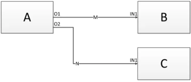
A
MB
C
N O1 O2 IN1 IN1Figure 2.3. Simple flow-based diagram
radial query language for simplifying the tasks of searching for data correlation. They place icons representing individual entities around the circumference of a ring and allow the user to interactively focus on certain relationships by dragging relationship icons into the ring’s interior.
In our work, we employ a diagram-based VPL that combines software related queries with query results. VPLs are languages that exploit visual representations in order to focus on the domain of inter-est instead of command languages. They facilitate users to program by manipulating or arranging graphical elements rather than writing textual source code. This gives users the ability to work with them at a higher abstraction level where they need no prior experience or knowledge to express their programming requirements. Thereby, providing end-users with a more intuitive way to create, modify, or extend parts of a software system.
Every VPL can be classified into one of three basic categories: icon-based, form-based, or diagram-based, depending on which type of visual expressions are used. In his thesis, Stehno [97] examines these categories in more detail. Our work is based on the concept ofboxes and arrows which belongs to the category of diagram-based visual programming. In this flow-based paradigm [98], nodes can be thought of as “black boxes” and arrows as “arcs” that send data tokens to other connected nodes. Figure 2.3shows the major entities of a flow-based diagram: A, B, and C are black boxes that process executing code components, and M and N are arcs that connect to their respective processes via the O1, O2, and two IN1 ports. Each node performs
a pre-described task as soon as it receives all the required tokens it needs for execution, while arcs carry numbers, arrays, or even pointers to objects as data tokens between a sending or receiving node. This principle is often referred to as the dataflow execution model.
2.1.3 Tools
Due to data being generated at an alarming rate, there is an increased interest and effort from both academia and industry towards VA solutions to assist in the sense-making of this data. On the one hand, there are a number of commercial vendors specialized in data discovery such asTableau10,Qlik11,TIBCO12, and theFraunhofer M-System
[99] as well as multinational corporations with Business Intelligence solutions such asIBM,Microsoft,Oracle, andSAP. While on the other, there are many open-source solutions that have come out of academia such as Gephi [100], GraphViz [101], Improvise [102], Protovis [103], R [104], and Infovis [105].
In general, research tools provide various state-of-the-art VA func-tionality that may include prototype techniques. However, the biggest challenge in using these open source toolkits is integrating them into an end-user application due to the lack of maintenance, development, and support. On the other hand, commercial tools are designed to be used as-is and are typically bundled with conservative visualization techniques.
For further details, the interested reader may refer to survey of Harger and Crossno [106] that compares existing open source VA solutions and the work of Zhang et al. [107] that examines current market trends. Additionally, relevant software visualization tools are listed in Section2.2.3and VPLs such as LabView, KNIME, OpenDX, Quartz Composer, and the Visualization Toolkit are covered in more detail in Stehno’s thesis [97].
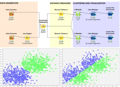
In our work, we extend KNIME [108] (see Figure2.4), a visual data exploration and data mining tool, that is built as an Eclipse plugin. Using a flow-based approach, we enable software analysts to perform complex queries by configuring nodes that represent sub-queries and connecting them visually in a workflow editor. As shown in Figure
2.4, the query results can be examined through traditional views.
10
Tableau Software (http://www.tableausoftware.com/)
11 Qlik (http://www.qlik.com/) 12
Figure 2.4. Sample KNIME workflow and views13
Additionally, the resulting dataflow networks can be analyzed through a custom NetworkViewer that embeds the results into interactive software visualizations. Thus, providing the analyst with a tool that can combine both computational analysis and software visualization.
2.2 Interactive Software Visualization
Software systems are an integral component of our everyday life, as we find them in tools and equipment all around us. It is imperative and at times critical to produce and maintain reliable systems, a well-designed and well-maintained architecture goes a long way in achieving this goal. However, due to the intangible and often complex nature of software architecture, this task can be quite complicated. The field of software visualization aims to ease this task by providing interactive tools and techniques to examine the hierarchy, relationship, evolution, and quality of architecture components.
13
Picture taken from KNIME Blog (http://www.knime.org/category/
blog/knime-blog-tech/). It shows a KNIME workflow with two scatter
In this section, we present a discourse on the state of the art of interactive software visualization tools and techniques. Further, we highlight the importance of developing solutions tailored to meet the needs and requirements of the stakeholders involved in the analysis process.
2.2.1 Visualizing Architectures
One of the core topics in the field of software visualization is a means to effectively visualize, navigate, and explore the software architecture of a system [44,109,110]. Generally, object-oriented software tends to be structured hierarchically - with packages containing sub-packages, which in turn contain classes that hold methods and attributes. It is this hierarchy and relationships between software components that is of interest when it comes to interactive software visualization [111].
In the context of visualizing software architectures, we explore representations of the global architecture of a system, such as tree, graph, and diagram model depictions. Further, we also investigate representations that highlight relationships between components as well as the importance of visualizing software metrics.
Architecture Representations
Tree structures are an ideal way of representing the hierarchical structure of software architecture. However, research in this area has shown the need to move forward from well-known techniques such as node-link layouts to more sophisticated ones to handle the larger hierarchies found in software systems nowadays [45]. Figure
2.5 shows both a generic node-link diagram as well as one found in a commercial tool. Inspection of these representations shows that they quickly become too large and utilize available screen space far too poorly for proper investigation. Further, the amount of textual information represented in the nodes as well as the way relationships are depicted should be revisited to avoid visual clutter and information overload [112].
In our research we have inspected several 2D visual representations [3] that may not be specific to just software visualization, but have been effectively applied to highlight the hierarchical structure of a software system [45, 113]. Here, it is important to note that a lot of these representations have been extended to 3D visualizations
(a) General node-link dia-gram
(b) As found in SAVE [4]
Figure 2.5. General and tool specific node-link diagram
[114–116]. While 3D approaches have been shown to display larger hierarchies and minimize clutter [117], they have also suffered from the well documented drawbacks of 3D visualizations, such as: object occlusion, cumbersome view adjustments, performance issues, as well as poor readability of 3D texts [118, 119]. Due to these drawbacks and the requirements of our stakeholders, we focus mostly on 2D representations.
TheTreemap visualization (see Figure2.6a), first introduced by Johnson and Schneiderman [120], is an effective means to visualize an entire software hierarchy. It is essentially a space-filling technique that displays hierarchical data as a set of nested rectangles. This is usually performed by a tiling algorithm that slices a box into smaller boxes for each level of the hierarchy, recursively, alternating between horizontal and vertical slices. “The resulting visualization displays all the elements of the hierarchy, while the paths to these elements are implicitly encoded by the Treemap nesting” [111]. In the context of interactive software visualization, Treemaps are used to represent methods as elementary boxes and classes as composed boxes. Several modifications of Treemaps appear in literature and in practice - some improve readability by enforcing an aspect ratio as close as possible to 1, while others have used irregular shapes such as Voronoi instead of rectangles to show more information [121]. Typically, designers are limited to the encoding of a single metric - the box color. While this provides a symbolic idea of how such a metric value is spread through the hierarchy, it is not simple to determine or represent metrics of enclosing entities [122].
(a) Rectangular TreeMap (b) Circular TreeMap Figure 2.6.Rectangular and Circular TreeMaps using TreeViz14
Treemaps provide an extremely compact layout, however, they are limited by mainly showing the leaves of the software structure. Similarly, thecircular Treemap visualization (see Figure 2.6b) and variations of it have been researched in order to have circles fill the available space more efficiently [123].
TheIcicle Plotprinciple of Figure2.7ais where a line represents a tree level and each line is split according to its number of children [3]. While Icicle Plots provide better understanding of structural relation-ships as packages can be used as root and classes and methods as tree elements, scalability and navigation may be an issue with hierarchies of large systems [122]. Typically, two metrics maybe encoded in the visual representations: node size and color.
An alternative space-filling technique to nested geometry is the use of a Sunburst visualization that focuses on adjacencies instead [124]. This technique was first proposed by Stasko and Zhang [125], where they utilized a circular or radial display to depict the hierarchy rather than a rectangular layout (see Figure2.7b). In a sunburst, the hierarchy is laid out radially with the root at the center and discs or portions of discs as deeper levels further away from this center [126]. In contrast to the Treemap techniques mentioned earlier and similar to the Icicle Plot, designers have the added flexibility to encode two distinct metrics: the angle swept out by an item and its color [122]. Studies have shown the performance of localization, comparison, and identification tasks in Treemap and Sunburst visualizations to be
14
1 100 2 80 3 20 4 60 5 20 6 40 7 20 8 20 9 20 Organization Chart 1 2 3 4 5 6 7 8 9 Icicle Plot
(a) Icicle Plot
(b) Sunburst TreeMap (c) Hyperbolic TreeMap Figure 2.7. Icicle [3], Sunburst, and Hyperbolic layouts using TreeViz14
comparable, however the Sunburst is found to be easier to learn and more pleasant [127]. While screen-space is better utilized as compared to node-link diagrams, scalability and navigation may still be an issue in larger systems.
Another approach is to make use of the hyperbolic space, which intrinsically provides more space than a layout that employs Euclidean coordinates. This well-established technique is more commonly re-ferred to as the hyperbolic tree layout(see Figure 2.7c) and was first introduced in the context of information visualization by Lamping et al. [128]. Essentially, it lays out the hierarchy in a uniform manner on a hyperbolic plane and maps this plane on a circular display region.
A key feature of this technique is referred to asfisheye distortion15, where components tend to diminish in size as they move outwards. This leads to a larger representation of the center or focused area while still displaying the overall structure of the tree. Hyperbolic trees provide an interactive overview of a hierarchy; they show both detail and context at once. Initially the root of the hierarchy is placed in the center, however, the display can be transformed to bring another node into focus through interaction. It would probably be best to encode metrics through the use of color alone, as varying the node size would adversely affect the layout algorithm. When the graph is deemed too large to be rendered effectively, nodes are pruned together and may be interactively expanded to reveal the subtree structure.
Visualizing Relationships
In contrast to visualizing the software hierarchy of a system, visualizing relationships of the software system is a more complex task. This is due to both the higher amount and the different types of relations that exist in a system, such as: inheritance, method calls, dynamic invocation, accesses, etc.
Generally,graphshave all the characteristics required to represent relationships of a software system. This is typically done by expressing software components as nodes and relationships between them as edges [129]. However, this often leads to the visualization of an extremely large graph due to the high inter-connectivity between the large amount of components found in software systems nowadays. Thus, the resulting visualization tends to be extremely confusing and cluttered - it becomes difficult to discern between nodes and edges due to the
cluttering, overlapping, and occlusion of edges (see Figure2.8). A well-known approach to remedy this clutter issue is to replace node-link diagrams with a square matrix that has matching row and column labels. The matrix then highlights the number of relations between row and column elements within each matrix entry, possibly through some visual representation [130]. This well-known technique is often referred to as theDependency Structure Matrix[131] in literature and provides a compact and uncomplicated representation of relations in a complex system. However, keeping a mental map of the system hierarchy can still be an issue in these visualizations.
15 A Brief Tour of Nonlinear Magnification (http://alan.keahey.org/
Figure 2.8.Cluttered software architecture [4]
The most accepted graph-based software visualization in the field of object-oriented software engineering are Unified Modeling Lan-guage (UML) class diagrams. This modeling language was created and developed by the Objected Management Group and has since become the industry standard for modeling software systems16. Its
main purpose is to portray inter-class relations, such as: composition, inheritance, generalizations, aggregations, and associations. However, due to the amount of textual information depicted by each component such as the listing of methods and variables, these graphs grow expo-nentially with each additional component or class notation and are highly prone to information overload. Some researchers have looked at reducing the visual complexity associated with such graphs by reduc-ing the number of overlappreduc-ing edges, the use of orthogonal layouts, the horizontal writing of the labels, and edge bundling [132–134]. While some success in reducing the complexity has been achieved, the draw-backs associated with node-link diagrams such as poor screen-space management and information overload still need to be tackled.
More recently, researchers have experimented with different layout and filter techniques in order to resolve the clutter issue. An example of this is the work of Pinzger et al. [135] that focuses on the creation of condensed and aesthetically pleasing graphs that show information relevant to solve a given program comprehension task. Their solution was to use nested graphs and a feature that allowed to add and filter appropriate nodes and edges. Other researchers such as Holten [5] have chosen to implement better space-filling techniques in combination with improved edge representations. Holten’s approach was to place software elements on concentric circles according to their depth in
16
(a)β= 0 (b)β= 0.75 Figure 2.9. Hierarchical Edge Bundles (HEBs)[5]
the hierarchical tree and then to display edges above the hierarchical visualization (see Figure2.9). Further, he extended the work of Fekete et al. [136] that used spline edges to replace explicit arrow directions, in order to reduce the visual clutter and edge congestion by allowing edges to bundle together according to a parameter (see Figures2.9a
and2.9b). Similarly, techniques displaying, clustering, and filtering edges on top of structural representations can be utilized in other visualizations (i.e., Treemaps, circular trees, etc.) to represent the hierarchical graph structure of a software system.
Another approach to resolve the issues of cluttered 2D graphs is the use of 3D visualizations [137], where the user can access a view without occlusions. However, 3D representations of large graphs have their own problems, such as: navigation can not only be difficult but also disorienting [138], object occlusion, performance issues, and text illegibility [118]. For the purpose of completion it would be prudent to mention some of the more prominent work in the area of 3D in-teractive software visualization. Some researchers in this field have experimented with real-world metaphors to take advantage of the intuitiveness of these representations [139]. For example, theCity or
Citiesmetaphors are often used to depict relationships through a visu-ally understandable metaphor [114,140], where cities (packages) are connected via streets (two-directional calls) and water (uni-directional calls). Similarly, researchers have realized the Solar System [141],
![Figure 2.1. The Visual Analytics sense-making process [1]](https://thumb-us.123doks.com/thumbv2/123dok_us/11060591.2992791/33.629.118.543.92.384/figure-the-visual-analytics-sense-making-process.webp)
![Figure 2.2. Epinome: a VA Workbench for Epidemiology data [2]](https://thumb-us.123doks.com/thumbv2/123dok_us/11060591.2992791/37.629.108.556.85.267/figure-epinome-a-va-workbench-for-epidemiology-data.webp)
![Figure 2.8. Cluttered software architecture [4]](https://thumb-us.123doks.com/thumbv2/123dok_us/11060591.2992791/47.629.105.553.83.236/figure-cluttered-software-architecture.webp)
![Figure 2.10. Clustered graph layout [6]](https://thumb-us.123doks.com/thumbv2/123dok_us/11060591.2992791/49.629.165.498.89.253/figure-clustered-graph-layout.webp)
![Figure 2.14. The Evolution Matrix [9] and VERSO [10] tools](https://thumb-us.123doks.com/thumbv2/123dok_us/11060591.2992791/55.629.112.558.100.447/figure-evolution-matrix-verso-tools.webp)
![Figure 2.16. Multivariate visualization using Kiviat diagrams [12]](https://thumb-us.123doks.com/thumbv2/123dok_us/11060591.2992791/58.629.89.516.90.535/figure-multivariate-visualization-using-kiviat-diagrams.webp)
