ABSTRACT
HUBER, DANIEL ERIC. Simple Motion in Glyph-Based Visualization. (Under the direc-tion of Dr. Christopher G. Healey).
Visualizations provide many advantages over textual displays as a means to analyze and
explore large sets of data. When analyzing data visually, users often want to perform two
tasks: identify elements with specific values, and discriminate between elements with different
values. Both of these tasks can be aided through the proper application of visual features in
visualizations. Our objective is to study how two properties of simple motion, direction of
motion and flicker, can be used to effectively aid the discrimination task in a visualization.
We present two user studies and an example of a practical application in the meteorological
domain. Our user studies consist of visual search experiments in which viewers are asked to
detect the presence or absence of a target group of elements within a background group as
quickly and as accurately as possible. Direction of motion is tested by varying the angular
difference between target and background motion and measuring mean viewer error rates and
response times. In our study, viewers needed an angular separation of at least 30◦ in order
to rapidly and accurately detect the presence of the target. Flicker is tested by varying the
difference in flicker rate between the target and background for both coherent and noncoherent
flicker. In our experiment, viewers were able to rapidly and accurately detect the presence of the
target when target and background elements flickered coherently, regardless of the difference in
rate of flicker. During the noncoherent flicker experiment, viewers were only able to accurately
detect the presence of the target when the target or background flickered rapidly and there was
by using the results from our user studies in our weather data visualization, groups of similar
BIOGRAPHY
Daniel Eric Huber was born on January 2, 1980 in Bristol, Pennsylvania to Walter and
Sharon Huber. In 2002, he received a Bachelor of Science degree in Computer Science with
a minor in Mathematics from Lafayette College, Easton, Pennsylvania. In the Fall of 2002,
he entered the graduate program in Computer Science at North Carolina State University. Dan
has accepted a job offer from Northrop Grumman Corporation where he will begin work after
ACKNOWLEDGMENTS
Several people helped me along the way in completing this thesis by giving thoughtful
suggestions and guidance. Most importantly, they gave me the support needed to reach the
finish line. My committee members, Dr. Christopher G. Healey, Dr. R. Michael Young, and
Dr. Harry Perros, proved to be outstanding, especially my advisor and committee chair, Dr.
Healey, who was a great source of knowledge about topics inside and out of this thesis.
Without the help of my peers I would have found the thesis-road bumpy and long. In the
lab, I thank Brent, Laura, Amit, Sarat, and Reshma for giving me pointers and helping me
with my presentation. It is much easier when there are people who have been there before and
gone through it all. I especially thank Brent who answered so many of my questions and was
a constant source of advice. Outside of the lab, my time at NC State would have been much
more boring without the friendships of Joe and Sean. Thanks guys for making my time at NC
State very enjoyable.
I also thank Kasia, whose love and affection I couldn’t do without. She also listened to my
presentation in those final hours and gave me much confidence.
Finally, I thank my parents and brothers who have given me support and encouragement
Contents
List of Figures vi
1 Introduction 1
2 Visualization 6
2.1 What Is Visualization . . . 6
2.2 Foundations of Visualization . . . 8
2.3 Benefits of Visualization . . . 9
2.4 Visualization Design . . . 11
2.5 Multi-Dimensional Visualization . . . 12
3 Motion 17 3.1 Visual Perception Overview . . . 17
3.2 Properties of Motion . . . 18
3.2.1 Direction of Motion . . . 19
3.2.2 Flicker . . . 22
3.3 Motion in Visualization . . . 23
4 Direction Experiment 27 4.1 Methods . . . 27
4.1.1 Design . . . 27
4.1.2 Procedure . . . 30
4.1.3 Viewers . . . 31
4.2 Results and Discussion . . . 32
5 Flicker Experiment 34 5.1 Methods . . . 34
5.1.1 Design . . . 34
5.1.2 Procedure . . . 35
5.1.3 Viewers . . . 37
5.2 Results and Discussion . . . 37
7 Conclusions and Future Work 46
List of Figures
2.1 Visualization of reconstructed CT slices . . . 11
2.2 Visualization of an oceanography data set . . . 15
3.1 Examples of Preattentive Processing . . . 26
4.1 Pexel movement within a cell . . . 28
4.2 Direction of motion experiment display . . . 29
4.3 Mean error rate versus angular difference . . . 32
4.4 Mean response time versus angular difference . . . 33
5.1 Mean error rate versus period difference . . . 39
5.2 Mean visibility change versus period difference . . . 40
Chapter 1
Introduction
Computers have long been used to process and store large amounts of complex information
as sets of numbers and strings. However, working with data in such a raw form is not always
the most productive approach to analyzing a problem. Even if it were possible to read through
the number of pages required to present data from a large data set, it is easy to miss potentially
interesting phenomena. This is because our visual system is not optimized to process large
amounts of text for trends or relationships between the different values. On the other hand, our
ability to process, recognize and remember relationships within images is much stronger. As
computers became cheaper, faster and capable of processing larger amounts of data, researchers
have started to take advantage of the strengths in our visual system by developing methods to
transform numerical and textual information into images displayed on a computer screen. This
process is known as visualization.
Expressing numerical data visually is not exclusive to the computer and in fact goes back
that depicted the path of trade winds and the locations of monsoons. Halley drew strokes
characterized by one end being noticeably thinner than the other. The strokes were drawn in
patterns, which resemble vector fields, to show the direction of the winds (the wind came from
the direction of the thin end on each stroke). Monsoons were represented by dense areas of
alternating strokes [Tuf83].
Over time, visualizations have aided people in analyzing as well as discovering new
pat-terns in complex information sets. Scientists in fields ranging from medicine to
meteorol-ogy to civil engineering have all benefited from being able to explore data visually while
performing tasks such as diagnosing patients or predicting future events [BA02, Tre99].
Re-searchers have found that visualization systems are also particularly useful for analyzing
ab-stract data, for example, the wealth of information stored in databases, or network traffic
pat-terns. [CAL+97, BP01].
There are two fundamental tasks users often want to perform when viewing data visually.
First, they may want to easily discriminate between the values of two pieces of data. Said
differently, a user will want to form mental groupings of similar pieces of data. Second, users
will want to easily identify the value of a single data point or the difference between values
of two or more data points. As it turns out, the discrimination task is often much easier than
the identification task. This is because being able to identify the value of two pieces of data
generally implies, as a necessary condition, the ability to discriminate between them.
With the goals of providing discriminability and identifiability, the designer of a
visualiza-tion system must carefully address the issue of how raw data is represented by visual elements.
to perform the two fundamental tasks.
Today’s computers can process and store enormous amounts of information. As a result,
useful data sets often have a large number of elements as well as a high dimensionality,
mean-ing each sample point encodes multiple attributes. Dealmean-ing with multi-dimensional data sets
can be especially challenging. It is often difficult to display all the attributes associated with
each element simultaneously. One approach for dealing with this situation uses simple visual
elements called glyphs. A glyph is the building block of the visualization. A glyph possesses
distinguishing visual characteristics such as shape, color, orientation and density. Each attribute
of the data set controls one characteristic, or visual feature, of a glyph.
In order to harness the power of our low-level vision system during visualization, study
in the field of cognitive psychology is required. In particular, results from visual perception
experiments can be directly applied to the task of choosing effective visual features for a
vi-sualization. Image properties such as color, orientation, density, size, shape and motion have
been determined to be processed by our vision system preattentively, meaning that we are able
to quickly discern certain aspects of these features without the need for focused attention. In
other words, the features often ‘pop out’ of the display, making them easily distinguishable.
Using visual features that are processed preattentively can lead to visualizations that
facili-tate rapid and accurate discrimination and identification of information. Previous research in
our lab has shown how color, texture and orientation can be used effectively in visualizations
[HE98, HE99, HE96, Hea96].
This thesis explores the use of motion in visualizations. We chose to use motion as a visual
have supported this claim by reporting on how humans perceive motion. Simple linear motion
has been found to be processed preattentively when elements are moving in sufficiently
differ-ent directions [DD92]. Additionally, motion has been shown to effectively aid the process of
grouping elements [Bra98]. These properties make motion an excellent candidate for use as a
visual feature in visualizations.
Unfortunately, few experiments have determined appropriate values of motion to use in
visualizations. We investigated how simple linear motion and flicker, or blinking, can be used
effectively. For each type of motion, we wanted to know the conditions that make the feature
‘pop out’. To do this, we set up two visual search experiments, one for linear motion and one
for flicker. In each setup, a sequence of search trials was presented to a viewer. Each trial
consisted of a group of similar elements and potentially a smaller target group of dissimilar
elements located within the larger group. Viewers were asked to determine as quickly and
as accurately as possible whether or not a target group appeared within the larger group. We
recorded accuracy and response time as a measure of viewer performance. After a short delay,
the next trial was presented. Results from our study show how simple linear motion and flicker
can be used in visualizations effectively.
Our first experiment explored how large an angular difference is needed to easily
discrimi-nate between two groups of elements moving linearly. In this case, the target elements differed
from the background elements only in their direction of motion.
Our second experiment attempted to answer two questions: how large an interval is needed
between the rate of flicker of two groups of elements in order to distinguish one from the other,
to easily recognize a difference between groups? In these cases, the target elements differed
from the background elements by rate of flicker, and possibly by the phase of their flicker
pattern.
Finally, we created visualizations of weather data using linear motion and flicker as visual
features. The application confirms that linear motion and flicker can be used to effectively
discriminate between groups of elements with different attributes in a practical application
domain.
The remaining chapters of this thesis are as follows. An overview of visualization is given
in chapter 2, and motion in chapter 3. A description and analysis of the linear motion
experi-ment is given in chapter 4 and of the flicker experiexperi-ment in chapter 5. A sample visualization
with motion is discussed in chapter 6. Concluding remarks and ideas for future work are then
Chapter 2
Visualization
2.1
What Is Visualization
In the simplest of terms, visualization is the process of transforming numerical and textual
information into images. The images express the values, structure and relationships in data sets
and allow exploration in a way that plain text cannot provide.
There are generally considered two categories of visualization, scientific and information.
The major difference between the two types is that scientific visualizations display data that
contain some inherent spatial property. Spatial locations for each data element must be
com-puted in an information visualization. This is often done by simply mapping data attributes to
each of the spatial axes (e.g., as is done for horizontal and vertical axes in a 2D graph). Both
types of visualizations share many properties and as a result, techniques used in a scientific
visualization can often be applied to an information visualization and vice versa.
com-posed ofnsample points, or elements,{e1. . . en}, into some visual representation,V.
M :D={e1. . . en} →V
There are thus three phases in the creation of a visualization. First, the type of data set
and elements to be analyzed must be chosen. Sources of data come from many different
disci-plines. This first phase drives the visualization because it strongly affects the decisions made
during the second and third phases of creating a visualization. The second phase chooses a
visual representation. Visual representations vary greatly from one application to the next.
Consequently, creating and improving visual representations are often the focus of research
in the visualization community. Common types of visual representations include scatterplots,
volume visualizations, tree structures and glyphs. Lastly, the mapping,M, from data elements to visual representation must be chosen. Some visualization architectures help users determine
an appropriate mapping. For example, one visualization system helps users choose an
effec-tiveM by posing a sequence of questions to the user. The responses to the questions guide a visualization assistant to select perceptually optimal methods for converting a data set into a
visualization [HSAE99].
Many data sets also have several dimensions, meaning each data element consists of two or
more attribute values. This complicates matters further. A multi-dimensional data set contains
a set of mattributes, A = {A1. . . Am}. Each dimension of the data set corresponds to some
of visual representation and the choice of mapping from data elements to visual representation.
These topics are addressed later in this chapter.
2.2
Foundations of Visualization
Visualization in scientific computing traces its roots back to a panel discussion in the 1980’s
where members expressed the need to apply graphics and image technologies to computational
science. They stated a goal for visualization to “provide new scientific insight through visual
methods.” This goal was based on the observation that scientific discovery is the process of
gaining insight through error. They concluded that “the most potential for visualization is
the insight gained and mistakes understood by spotting visual anomalies while computing”
[MDB87].
Today, several disciplines form the basis for developments in visualization. Within
com-puter science alone there are a number of subfields involved including comcom-puter graphics,
animation, computer vision, image processing and user interface design. Many of the
im-provements in the field have come about from other sciences as well. Medicine, meteorology,
and economics are just some of the industries that push visualization further with their need to
analyze large quantities of data.
Another critical area to the study of visualizations comes from cognitive psychology.
Re-searchers in this field study how the human visual system ‘sees’ visual properties in the world
around us. In the context of visualizations, cognitive psychologists are interested in how
visualiza-tions that express greater amounts of information more intuitively. Chapter three discusses the
topic of visual perception in more detail.
2.3
Benefits of Visualization
There are many reasons why one would want to examine data visually. A visual
represen-tation of data can provide a prompt qualitative overview without giving specific quantitative
details. Having a general visual overview contained within a single display allows a user to
make quick and accurate deductions because he or she is able to consume relevant high-level
information all at once. Oftentimes only a cursory glance is required to form important
con-clusions.
When further analysis of a large data set is required, a visualization can help identify areas
of interest for in-depth exploration. Dennis and Healey developed a navigation assistant that
clusters potentially important data into spatially-coherent regions and facilitates investigation
through an intelligent camera planner [DH02]. An effective user interface would also allow a
user to manually navigate and select areas of interest, which triggers the display of a higher
level of detail for the selected elements.
Visualizations are also a powerful means to enhance identification of structure, patterns,
trends and other relationships between elements of a data set. Such tasks may not be as
effort-lessly performed without a visual representation. In fact, large data sets can easily overwhelm
users, so much so that pertinent relationships are overlooked. Miller’s work from cognitive
of information can be processed without overload [Mil]. Researchers have addressed this issue
by creating methods to display as much information in as small a space as possible while still
maintaining comprehensibility of all data attributes.
Yet another advantage visualizations provide is the ability to explore and discover new
re-lationships within a data set. In 1854, an outbreak of cholera took the lives of several hundred
Londoners. The source of the infectious disease was unknown until Dr. John Snow drew a
map showing the locations of each death and the locations of eleven area water pumps. It
be-came obvious that a centrally located water pump was contaminated [Tuf83]. In more recent
times, visualization has provided a means to view and explore invisible natural phenomena.
The atomic nucleus is so small that current photographic technology cannot capture its
struc-ture. However, an abundance of precise data exists to describe the nucleus’ energy states. Cook
et al. developed an application to visualize and interact with several theoretical models of the
nucleus. The authors’ goal was to provide a means for physicists to explore the atomic nucleus
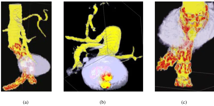
in ways that numerical data alone does not allow [CHY99]. Figure 2.1 shows a volume
visu-alization of reconstructed CT (computed tomography) slices of an abdominal aortic aneurysm
and the stents used to reinforce it.
Occasionally, the ability to manipulate data by hand visually is easier than making similar
modifications through a text based interface. Some visualization architectures account for this
by providing an interface to edit data. For example, Aiken et al. allow users to browse a
(a) (b) (c)
Figure 2.1: An abdominal aortic aneurysm visualized with different colourmaps and viewing directions: (a) an aneurysm visualized using a perceptual colourmap; (b) a cut through the volume created with Volren’s interactive clip planes, showing the cross-sectional area of the aneurysm and the two iliac arteries, and the location of tynes (metal hooks) in a stent used to reinforce the artery wall; (c) an orthogonal viewing direction, showing clearly the location of the tynes in the vertical iliac artery.
2.4
Visualization Design
There are a number of considerations that must be taken into account when designing a
vi-sualization architecture. To address these considerations, answering the question: what makes
an effective visualization, is a good place to start. In his book, Edward Tufte describes several
aspects of how to display quantitative information. Two techniques are directly relevant to our
discussion on visualization. First, a display should show data accurately, without distorting
meaning. Second, data should be displayed in a way that encourages comparisons between
different elements [Tuf83]. Adhering to these guidelines is critical to the fundamental tasks of
discriminability and identifiability.
should be strongly tied to specific application areas and implementation requirements. In his
case study on operational weather forecasting, Treinish points out that using generic
visualiza-tion techniques without regard for the users’ goals can prove to be counterproductive. Instead,
he suggests that a careful composition of visual elements to describe data such as
tempera-ture, wind speed, and precipitation will result in more effective visualizations [Tre99]. While
it is generally not cost effective to develop specific visualization applications for every
pos-sible type of data set, Treinish’s work suggests the importance of a user-guided method to
specify visualization parameters. Robertson and De Ferrari describe a visualization reference
model that lets users specify visual directives, such as, “show variable X using
representa-tion R,” and interpretarepresenta-tion aims, such as, “show local trends for variable Y and its correlarepresenta-tion
with variable Z” [RDF94]. Allowing the user to configure the visualization to suit his or her
needs can improve data exploration and knowledge discovery by making the
discriminabil-ity and identifiabildiscriminabil-ity tasks easier. In an effort to aid the user in configuring a visualization,
mixed-initiative algorithms have been used to guide the user through a series of questions
[KFL91, Koc94, HSAE99].
2.5
Multi-Dimensional Visualization
Recall that a multi-dimensional data set is one where each data element is comprised of
more than one attribute value. For example, in a weather data set, each sample point might
encode location, temperature, amount of precipitation, and wind speed. The techniques for
community. Some researchers focus on the development of novel visual representations to
represent such data, while others concentrate on improving how data is mapped to specific
visual representations. Both of these areas of research address the issue posed by Grinstein:
how can we improve the consumption of large quantities of data? [GLI98]
The difficulty in visualizing multi-dimensional data arises from the fact that most displays
are two-dimensional, for example, a computer screen or a sheet of paper. Therefore, methods
are needed to compress multi-dimensional data into some representation that can be displayed
in a two-dimensional space. In the case of computers, it is often sufficient to transform data into
three-dimensional space and then let traditional computer graphics techniques project the
rep-resentation onto a screen. Clearly, each dimension adds an additional challenge to identifying
attribute values of data elements and discriminating between them. Consequently, several types
of visual representations have been developed to cope with visualizing large, multi-dimensional
data sets.
Pixel based Visual Representations
One method for displaying large amounts of data in a small space is based on pixels as
the underlying representation. Pixels were chosen because they are the smallest elements that
can be displayed on a computer screen, and therefore, mapping one attribute value to one pixel
allows the largest amount of information to be viewed at once. Keim and Kriegel designed a
visualization system where each attribute value of a data element controls the color of a pixel.
The pixels are arranged in a spiral about some user defined reference point, where a pixel’s
reference point. Separate dimensions are either viewed in separate windows or by grouping the
pixels comprising one data element along the spiral [KK95].
Because the attributes of a sample point are either spread across multiple views or arbitrarily
arranged together, it can be difficult to ascertain the values of each attribute of a single data
point. It also makes comparing data elements difficult.
Glyph based Visual Representations
A category of multi-dimensional visualizations that can provide a better coupling of
at-tributes to sample points uses simple visual elements called glyphs to represent data elements.
Glyphs are composed of several different visual features and are thus able to encode several
dimensions of information in a single object. Glyphs come in many different varieties, some
of which are described here.
Star plots use a point to represent each data element and lines protruding from each point
to represent attribute values. The length of each line is determined by the value of the
corre-sponding attribute [Spe99].
A slightly more amusing type of glyph is called a Chernoff face. These visual elements
take advantage of a human’s ability to differentiate between other human faces. Each glyph is
a stylized drawing of a human face where values of attributes are encoded by the size, shape
and separation of different facial features [Che73].
Another glyph-based visualization that harnesses humans’ perceptual abilities uses texture
elements as the building blocks of a visualization. Healey and Enns describe a system where
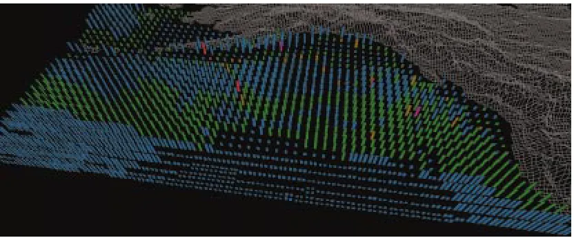
Figure 2.2: Visualization of the oceanography datasets, color used to represent plankton density (blue, green, brown, red, and purple represent lowest to highest densities), height used to represent current strength, texture density used to represent SST: February, 1956.
on a gridded surface with each cell containing one data element. Each pexel can be identified
by a combination of its visual features, e.g. color, luminance, orientation, height, density and
regularity. Each attribute of a data set controls one visual feature, for example, in a weather
data set, wind speed might be mapped to the height of a pexel [HE98, HE99, IFG+98, Hea96,
HE96].
Figure 2.2 shows a data frame from an oceanography dataset representing seasonal ocean
conditions for February, 1956. These datasets are analyzed in the context of simulations of
salmon migration patterns, which are used to try to identify where in the open ocean salmon
feed and grow during the year. Color shows the variation in plankton densities (blue, green,
brown, red, and purple for low to high densities). Height shows current strength (taller for
stronger). Density shows sea-surface temperature (denser for higher). This mapping allow the
oceanographers to track current strengths and SSTs. In February, most plankton densities are
a region of weak currents also sits off the south coast of Alaska. Most of the ocean is cold
(sparse pexels), although a region of higher temperatures can easily be seen as dense pexels in
the south.
A disadvantage of glyph-based visualizations is that there are normally fewer data elements
per display, although there is not necessarily less total data shown because each glyph can
encode multiple data values. Fortunately, the results of the pexel-based visualizations show
that taking advantage of the strengths of the low-level human vision system can help users
analyze large multi-dimensional displays quickly and correctly with little effort. Thus, we
need some way to map attributes of a data set to visual features based on visual perception, the
Chapter 3
Motion
3.1
Visual Perception Overview
In the context of statistical displays, Tufte describes graphical excellence as being the
com-munication of complex ideas in the least amount of space with precision, clarity, and efficiency
[Tuf83]. The application of theories in visual perception to visualization is one way to help
achieve graphical excellence.
Studies in visual perception attempt to determine how humans analyze images.
Contribu-tors from cognitive psychology, psychophysics, computer science and other fields continue to
provide a great deal of information on this topic. We are concerned with studies on the
percep-tual strengths and weaknesses of various visual features, in particular, simple motion. We want
to know how motion can be used to facilitate accurate and efficient detection and grouping of
visual elements, in a manner similar to previous research on the perceptual strengths of color
Perceptual efficiency is critical to an effective information display. By using visual features
that can be rapidly identified, users can process data quickly and easily. Typically, a visual
fea-ture is considered perceptually efficient if it can be detected in less than 200-250 milliseconds.
Determining the efficiency and accuracy of a particular perceptual task can be difficult. One
popular strategy uses visual search experiments. In a visual search experiment a viewer views
a sequence of images, and for each image the viewer is asked to determine if some identifying
characteristic is present or absent. For example, a viewer may be asked to determine if a red
circle is present in a field of red squares and blue circles. The response time and accuracy of
each response is recorded. These values can be analyzed to measure a viewer’s performance
during the search task. Details of our visual search experiments with linear motion and flicker
are given in the next two chapters.
The ability to mentally group elements by visual feature is an important task in
visualiza-tion. Treisman, Driver and Nakayama are among many who found that perceptual groups in
a single display can be searched independently [TG80, Tre82, DD92, NS86]. McLeod et al.
also showed that even if elements belonging to one perceptual group are scattered among other
elements, search can still be restricted to the perceptual group [MDC88]. These are some of
the strengths motion can offer as a visual feature.
3.2
Properties of Motion
Like color, texture and shape, motion is considered a fundamental sense. Consequently, the
can help encode depth and relative distances of objects. Perception of motion is also essential
in anticipating the time to collision of moving objects. Most important to this thesis, motion
cues can also aid in image segmentation, e.g. the detection and grouping tasks mentioned
previously [Nak85].
Computers can give the impression of continuous motion through a perceptual illusion
known as the phi phenomenon. Simulated motion occurs when a sequence of static images
containing an object displaced by small increments are displayed in rapid succession. The
brain fuses the images together and motion is perceived. The rate at which successive images
need to be presented in order to perceive motion is known as the critical flicker frequency.
The critical flicker frequency varies depending on color, brightness, and size of objects to be
displayed but is generally around 60 images per second.
Motion of an object can range from simple to complex. Some motion types are anchored
about a specific point. Example anchored motions include rotation, oscillation, flicker, and
deformation. Other motion types are not constrained in this way. These motions include simple
linear motion and motion of an object along a vector field. We chose to test simple linear
motion and flicker in our visualizations. As a result, we studied how direction of motion and
flicker can be used in a perceptually efficient manner.
3.2.1
Direction of Motion
Motion of an object as it changes position is characterized by two quantities, direction and
speed. Matthews and Qian report that the senses in the brain that detect differences in direction
the threshold for detecting small differences in direction may be different than the threshold
for detecting small differences in speed [MLGQ99]. Speed of an object, however, does
influ-ence the time it takes to detect a differinflu-ence in direction of moving stimuli. In visual search
experiments speed is often measured in degrees per second, which is the rate at which the
vi-sual angle between the center of focus and an object changes. De Bruyn and Orban reported
on the relation of direction discrimination to speed measured with random dot patterns. They
found that discrimination improved as speed increased to approximately 4 degrees per second.
That threshold remained constant up to a speed of approximately 128 degrees per second. For
speeds greater than 128 degrees per second, the ability to discriminate direction differences
deteriorated [DBO88].
Differences in the direction of motion of glyphs provide cues to help identify individual
elements that differ from the field. Nothdurft reported on the ability to discriminate direction
of an incoherently moving target dot in a field of coherently moving background dots. The
di-rection of each background dot was allowed to vary slightly from the didi-rection of its neighbors.
Nothdurft found that as the maximum allowable variation between background dots increased
(i.e. the background dots lost their coherent motion pattern), the difference in direction needed
to detect the target dot increased even more rapidly. When the maximum allowable variation
between background dots was 60 degrees, the target dot was effectively hidden amongst the
background and could no longer be accurately detected [Not93].
Perceptual grouping tasks are also aided through proper use of direction of motion. In
multi-dimensional visualizations, grouping tasks can be complicated by visual features used
help identify features that are perceptually efficient when used in conjunction. For example,
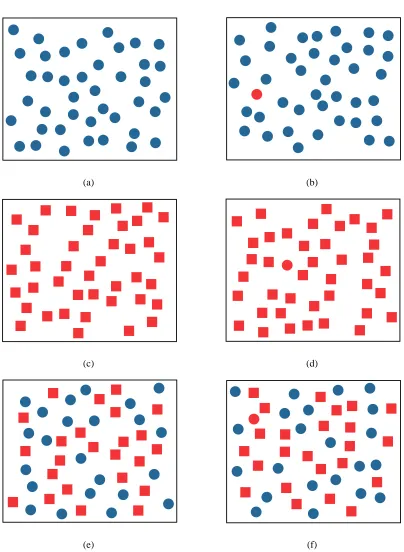
detecting a red circle in a group of blue circles or a group of red squares is easy. However,
detecting a red circle among a group of blue circles and red squares is more difficult. See
Figure 3.1 for such an example of conjunction search versus preattentive search. Nakayama
and Silverman showed that when sets of elements move coherently, e.g. in the same direction,
viewers can easily form mental groups from each set and can search the groups independently,
without interference between groups [NS86]. Driver et al. also showed that linear motion, in
the form of oscillation, can be used to separate elements into distinct visual groups. However,
they found that perceptually efficient motion is only produced when elements in each group
oscillate with the same phase. For example, finding a horizontally moving X among a field
of vertically moving X’s and horizontally moving O’s is easy when horizontal elements move
together and vertical elements move together. When elements within each group move out of
phase, it is much more difficult to find the horizontally moving X [DD92].
Average luminance levels also affect the ability to segregate texture by motion. Takeuchi et
al. found that the minimum amount of time to detect a difference in the direction of two moving
textures increases as luminance decreases [TYDV04]. Many perceptual tasks are easier when
the stimulus is presented near the focus of attention. However, Takeuchi et al. also found that
in low luminance conditions, detection of a difference in motion in the periphery is easier than
detection near the fovea, or center of attention [TYDV04].
Research suggests that detection of difference in motion between elements is influenced by
a perception of a global motion pattern in addition to perceived differences in local motion.
direction within each window. The windows separated groups so that perceived differences in
direction were not due to edges formed by local velocity differences. Viewers were asked to
identify the window containing dots moving in a direction incoherent from the pattern formed
by motion in the other windows. Bravo concluded that moving stimuli can be segregated at a
global level, without the need for perceived differences in direction of motion at the boundaries
[Bra98].
The performance of many perceptual tasks can be improved through repeated practice. Ball
and Sekuler reported on the ability to learn direction of motion discrimination. Viewers were
trained every day for approximately 30 minutes. Results showed that learning was specific
to an area within 45 degrees of the trained direction. Effects of training lasted at least 10
weeks [BS87]. Matthews et al. produced a follow-up report that showed training on direction
discrimination transferred to orientation discrimination. However, training on orientation did
not transfer to direction learning [MLGQ99].
3.2.2
Flicker
We are interested in the properties of perceivable intermittent stimulation produced by
flick-ering glyphs. The rate at which flicker occurs in order to perceive a distinct on-off pattern must
be below the critical flicker frequency (CFF). The CFF is influenced by many variables of
the stimulus as well as other human factors, such as age. The luminance value of a stimulus
strongly affects the minimum frequency at which image fusion occurs. Graham reports that
at high luminance levels, CFF is approximately 60 cycles per second (cps). However, under
effects of luminance on the CFF are different when the flickering stimulus is presented in the
periphery versus in the fovea. Under high luminance, the CFF is greater for stimulus in the
fovea than in the periphery. Conversely, with low luminance, the CFF is lower for stimulus in
the fovea than in the periphery [Bro65].
Discrimination of flicker rate is an important task if flicker is to be used in visualization.
Brown discusses several factors that influence our sensitivity to flicker rate discrimination.
Lu-minance affects rate discrimination, in addition to its impact on CFF. Specifically, as luLu-minance
increases, the perceived rate of flicker decreases [Bro65]. Brown also discusses the differential
frequency threshold,∆F/F, which is a measure of the smallest detectable change in flicker rate∆F for a given baseline rateF. Data was recorded for flicker rates between 8.4 cps and 51 cps. Over this range, ∆F/F was found to vary from 0.02 to 0.05, meaning that the rates of flicker must differ by about 2-5% in order to produce a distinguishable a difference. It was
shown that a flicker rate of 22.5 cps required the largest ∆F to produce a visible difference [Bro65]. Eccentricity, the angle between a viewer’s center of view and a stimulus, also affects
the differential frequency threshold. ∆F is generally higher for a stimulus presented in the periphery than in the fovea [Bro65].
3.3
Motion in Visualization
Motion has been used in visualizations for a variety of purposes. Wright discussed several
ways to use motion to enhance and improve visualizations of capital market data. Animation
motion can be effectively used to replay changes in data over time. Using motion for play back
purpose increased the amount of Federal bond market information displayed by two orders of
magnitude when compared to a traditional quote screen display. Wright also used motion of a
curve to communicate projected profits and losses [Wri95].
Motion can also be effective at attracting attention in a visualization. Bartram et al. used
simple motion of icons as an alert to users engaged in some visually demanding task. They
found that motion as a notification mechanism is better than a static change of color or shape,
especially when the notification icon appears in the user’s periphery. Less than 2% of alerts
cued by motion were missed versus 6% of alerts in the center of attention and 25% of alerts in
the periphery cued by color. The authors also compared the distraction level of motion cues.
They found anchored motions, e.g. flicker and rotation, to be less distracting than traveling
motions [BWC01b].
Bartram et al. also found that different motion patterns are effective at grouping dissimilar,
spatially dispersed glyphs. For example, glyphs with different colors and shapes that moved in
a coherent circular motion pattern were efficiently separated from glyphs that oscillated. They
also found that two groups of oscillating glyphs could be discriminated from one another most
easily if their directions were separated by at least 16 degrees if the two directions came from
two different quadrants (i.e. the two motions straddled either the x- or y-axis) [BWC01a].
Jesse and Strothotte use simple motion similar to Batram’s. They use three types of motion,
oscillation, rotation, and distortion, in their glyph-based visualizations to convey meaning to
the user. It was shown that moving a glyph, or small subset of glyphs, among a group of static
for spotting interesting data [JS01].
Motion is also effective at providing a general overview of trends in data. Kerlick used
motion associated with specific shapes of glyphs to communicate information to users. For
example, arrow and dart shaped glyphs moved along the path of a vector field to show the
gradients in the data, while a spherical glyph was deformed to an ellipsoid according to the
(a) (b)
(c) (d)
(e) (f)
Chapter 4
Direction Experiment
Our direction of motion experiment was similar to some of the visual search experiments
described in the preceding chapter. Viewers were asked to rapidly detect if a group of target
elements was moving in a direction different than the background elements. Elements differed
only by direction of motion. Based on the research reported in the previous chapter, we
hypoth-esized that direction of motion could be used in a visualization to help discriminate between
groups of elements with similar values.
4.1
Methods
4.1.1
Design
The stimuli were presented in a 20×20 grid of square cells inside a window with a black
background. Boundaries between cells were not visible. Each cell contained a single moving
1
3
4
5
6
2
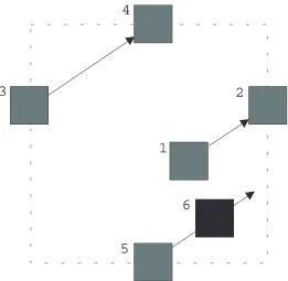
Figure 4.1: Example of pexel movement within a cell. The pexel moves in the direction of the arrows. Starting at (1), the pexel moves to (2), which is at the edge of a cell. The pexel then ‘jumps’ to (3), where it continues on to (4). (4) is also at the edge of the cell, so the pexel reappears at (5) and continues on to (6).
one-tenth of the area of a cell. The motion of a pexel was defined by its direction,d, and speed,
s. When a pexel reached the edge of a cell it wrapped back around to the other side of the cell. See Figure 4.1 for an example of this behavior.
Direction of motion was constrained between0◦ and90◦ counter-clockwise from
horizon-tal, i.e. pexels moved up, right, or up and to the right. The speeds of all pexels were identical
and constant throughout the experiment. The starting offsets within each cell of every pexel
were also identical.
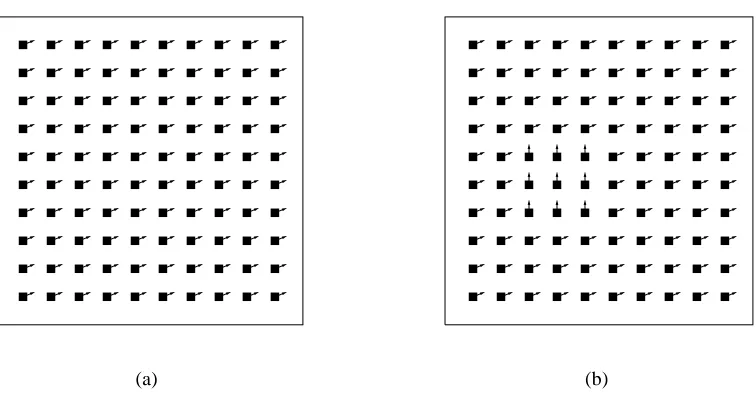
During some trials, a 3×3 target patch of pexels was present within the field of background
(a) (b)
Figure 4.2: An example of two experiment displays on a 10×10 grid. The vectors extending from each pexel indicate the direction of motion. (a) no target is present; (b) a target with lower left corner in the third column and fourth row is present.
the directiondB. When the target patch was present,dT anddB were never equal. Figure 4.2
shows example target-absent and target-present trials on a 10×10 grid of pexels.
Boundary Between Target and Background Pexels
When adjacent pexels had equal values ford ands, with the same relative starting offset, the impression of a continuous stream of pexels was created. All pexels reached the edge of
their cells and ‘jumped’ back to the other side simultaneously. The space left empty by one
pexel was filled by an adjacent pexel reappearing in its place. Thus, there was no evidence of a
boundary between pexels.
However, when a target patch was present, a discontinuity at the boundary between
Unfortunately, doing nothing produced a noticeable popping when pexels reached the edge of a
cell. Entire pexels were removed and redrawn at new locations when their centers passed over
cell boundaries. This caused the pexels within the target patch to appear to jump around
in-stead of flow continuously. With such a large distraction it was difficult to determine if viewers
would notice a difference in direction or the popping effect first.
A second solution was to gradually fade-out pexels as they approached the edge of a cell
and fade-in pexels as they moved away from an edge. Unfortunately, the changes in luminance
also created a distraction.
A third solution was to create a stencil around the target cells. A stencil can be thought of as
a sheet of paper with a hole cut out. When elements pass under the stencil, only those portions
that are underneath the hole are visible. Our stencil masks out background pexels extending
into the target area as well as target pexels extending into the background area. This created the
effect of pexels gradually disappearing from view. In order to make pexels gradually reappear
on the other side of their cells as they disappeared, multiple pexels had to be drawn in each cell
for some duration. By making pexels appear and disappear gradually, no jumping or change
of luminance distractions were noticeable. We used a stencil around the target cells in our
experiment.
4.1.2
Procedure
Viewers sat in front of an LCD screen at a comfortable viewing distance. Each viewer was
presented with 540 trials in random order. In half of the trials, the target patch was present.
the 270 trials with the target present, every combination of dT and dB, with dT 6= dB, was presented three times. The target patch was randomly located within the grid and at least one
row and one column away from the edge of the grid.
For each trial, a viewer was asked to identify whether or not he or she saw a target group
of pexels moving in a direction different than the background field of moving pexels. If the
viewer perceived a target patch he or she pressed a key to indicate ‘present’. If no target patch
was seen, the viewer pressed a different key to indicate ‘absent’. The viewer was asked to
respond as quickly and accurately as possible. Response time and correctness of each trial
were recorded. A one second delay occurred between the time a viewer indicated the presence
or absence of a target and the time the next trial began. During the delay, feedback was given
to the viewer in the form of a green plus sign for a correct response and a red minus sign for an
incorrect response. After every 135 trials the viewer was given an opportunity to take a break
for as long as needed.
Each viewer practiced on 36 trials immediately prior to completing the experiment. 18
practice trials contained a target; the other 18 did not. Among the practice trials with the target
present, each magnitude of difference in direction that would be present during the experiment
was presented twice.
4.1.3
Viewers
Ten viewers participated in the experiment. Some of the viewers were familiar with visual
search experiments, while others did not have any previous experience. All viewers had normal
0 5 10 15 20 25 30 35 40 45 50
10 20 30 40 50 60 70 80 90
Mean Error Rate, e (%)
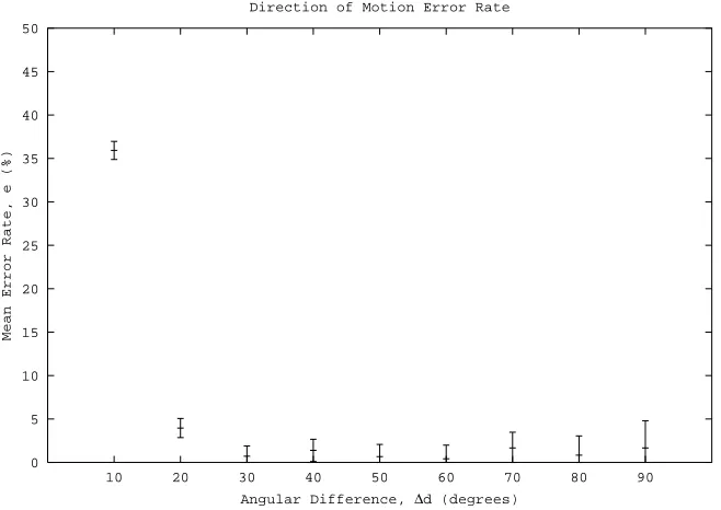
Angular Difference, ∆d (degrees) Direction of Motion Error Rate
Figure 4.3: Mean error rates, e, with error bars are plotted against angular difference, ∆d, for the direction experiment. Error bars represent±1standard error.
4.2
Results and Discussion
Performance was measured by mean viewer error rates, e, and response times, rt. Fig-ure 4.3 showse for each difference between dT anddB. At an angular difference ∆d = 10◦, viewers responded correctly on only64% of trials. An increase to∆d = 20◦ increased accu-racy to 96%. With ∆d ≥ 30◦ viewers responded correctly on more than98% of trials. An analysis of variance (ANOVA) on the data shows that the magnitude of∆dhad a significant impact on the accuracy at which viewers could rapidly discriminate between two groups of
elements moving in different directions (F = 108.8,p <0.0001).
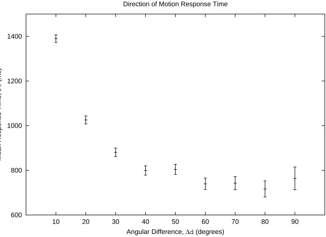
600 800 1000 1200 1400
10 20 30 40 50 60 70 80 90
Mean Response Time,
rt
(ms)
Angular Difference, ∆d (degrees) Direction of Motion Response Time
Figure 4.4: Mean response times,rt, with error bars are plotted against angular difference,∆d, for the direction experiment. Error bars represent±1standard error.
than 1 second. An ANOVA on the response time data shows that the magnitude of∆dwas a significant factor in the time it took viewers to respond during the discrimination task (F =
121.3,p <0.0001).
The results suggest that a target patch of moving pexels can be rapidly and accurately
detected within a field of moving pexels when ∆d ≥ 30◦. This confirms research presented earlier that linear motion can be used to segregate groups of elements effectively. We also found
that viewers did not increase in accuracy or achieve faster response times as they progressed
Chapter 5
Flicker Experiment
The design of our flicker experiment was similar to our direction of motion experiment.
Viewers were asked to rapidly detect the presence or absence of a group of target elements
flickering at a rate different than the background elements. In half of the experiment, elements
differed only by flicker frequency. In the other half, elements differed by flicker frequency and
phase. As with direction of motion, we hypothesized that flicker could be used in a
visualiza-tion to help discriminate between groups of elements with similar values.
5.1
Methods
5.1.1
Design
The stimuli were presented as a 20×20 grid of yellow square pexels. Each pexel flickered
During an ‘on’ stage the pexel was completely visible, and during an ‘off’ stage the pexel was
completely invisible. T is the absolute duration (in milliseconds) of one cycle (e.g.,T = 200 ms in the previous example).
The experiment was comprised of two sub-experiments, coherent flicker and noncoherent
flicker. In the coherent flicker sub-experiment, all background pexels flickered with an
iden-tical frequency and a zero phase (i.e. all pexels blinked on and off at the same time). During
the noncoherent flicker sub-experiment, all background pexels flickered with an identical
fre-quency but random phases (i.e. all pexels blinked at the same rate, but not necessarily on and
off together).
During some trials a 3×3 target patch of pexels was present. The target pexels flickered at
a frequencyfT whereas the background pexels flickered at a frequencyfB. It was always the case thatfT 6=fB. In the coherent sub-experiment, target pexels also had a zero phase. In the noncoherent sub-experiment, target pexels had random phases.
5.1.2
Procedure
Viewers sat in front of an LCD screen at a comfortable viewing distance. Half of the
viewers were presented with the coherent sub-experiment first, while the others were presented
with the noncoherent sub-experiment first. The procedures for both sub-experiments were the
same. During each sub-experiment, each viewer was presented with 192 trials in random order.
In half of the trials the target patch was present. The target was randomly located within the
grid and at least one row and one column away from the edge of the grid. The magnitude of
ms (8.33 Hz),∆T = 240ms (4.17 Hz),∆T = 360ms (2.78 Hz), or∆T = 480ms (2.08 Hz). Among the 96 trials with the target present, each ∆T was presented 24 times. The possible flicker rates of the target varied based on the ∆T being presented. With a target period TT measured in milliseconds, for∆T = 120 ms,TT ∈ {120,240,360,480}; for∆T = 240ms,
TT ∈ {240,360,480,600}; for∆T = 360ms,TT ∈ {360,480,600,720}; for∆T = 480ms,
TT ∈ {480,600,720,840}. The background pexels flickered with a period TB = TT ±∆T,
except whereTT = ∆T, in which caseTB =TT + ∆T.
For each trial, a viewer was asked to identify whether or not he or she saw a group of
pexels flickering at a rate different than the background pexels. The pexels continued to flicker
until the viewer pressed a key to indicate ‘present’ if the target was seen or another key to
indicate ‘absent’ if it was not. The viewer was asked to respond as quickly and as accurately
as possible. Responses times and accuracy were recorded for each trial. A one second delay
occurred between the time the viewer indicated the presence or absence of a target and the time
the next trial began. During the delay, feedback was given to the viewer in the form of a green
plus sign for a correct response and a red minus sign for an incorrect response. After every 48
trials the viewer was given an opportunity to take a break for as long as needed.
Immediately prior to completing each sub-experiment, the viewer practiced on 32 trials. 16
practice trials contained a target; the other 16 did not. Among the practice trials with the target
present, each magnitude of difference in flicker rate that would be used during the experiment
5.1.3
Viewers
Eight viewers participated in the experiment. All viewers participated previously in the
direction experiment described in the preceding chapter. All viewers had normal or
corrected-to-normal vision.
5.2
Results and Discussion
Viewer performance was measured by mean error rates, e, and mean number of visibility changes,vc, that occurred before a response was made. vctells us how many times the target or background switched on and off before the viewer responded. vcwas calculated using the faster flicker rate between target and background,Tbase =min(TT, TB). Given a response time
rtand a periodTbase, the number of visibility changesvcfor a single trial was:
vc=b2 rt Tbasec
An important point to note about vc is that it depends on the minimum of the target and background periods. Therefore, we plottedeandvcversus∆T for trials with the sameTbase.
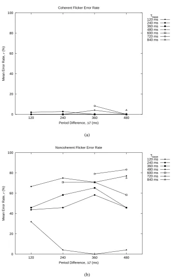
Figure 5.1 shows e for each combination of ∆T and Tbase for both the coherent (Fig-ure 5.1(a)) and noncoherent (Fig(Fig-ure 5.1(b)) sub-experiments. Clearly, viewers were more
accurate at detecting the presence of the target when all pexels flickered coherently.
responded incorrectly on more than 50% of trials for mostTbase. Only forTbase = 120ms did viewers respond correctly on more than half of trials for every∆T (i.e., for rapidly flickering backgrounds or targets). In this case, when∆T ≥240ms viewers responded with near perfect accuracy. ∆T only had a significant impact on e for Tbase = 120 ms (p < 0.0001). These results suggest that whenTbase = 120ms and pexels flickered noncoherently, viewers needed
∆T ≥240in order to accurately detect the presence of a target.
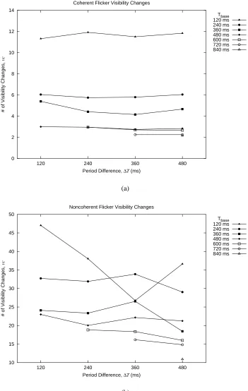
Figure 5.2 shows vc for each combination of ∆T and Tbase for both the coherent
(Fig-ure 5.2(a)) and noncoherent (Fig(Fig-ure 5.2(b)) sub-experiments. Again, viewers performed better
when pexels flickered coherently. During coherent flicker vc was in the range 10-12 when
Tbase = 120ms, and in the range 2-6 whenTbase ≥ 240ms. With noncoherent flicker,vcwas
in the range 25-48 whenTbase = 120ms, and in the range 10-35 whenTbase≥240ms.
Furthermore, when pexels flickered coherently,vcdid not vary significantly with different
∆T acrossTbase. ∆T only had a significant impact onvcforTbase = 360, but the absolute
dif-ference invcin this case was only 1.25. With noncoherent flicker,vcdid not vary significantly across∆T. However,vcdiffers over∆T for each Tbase by more than 5 forTbase ≤ 360. This suggests that viewers eventually ‘gave up’ and guessed whether the target was present or not.
The results of this experiment show that a target patch of flickering pexels can be detected
rapidly and accurately regardless of the difference in flicker rate if the target and background
pexels flicker coherently. No significant difference was found between viewers who
com-pleted the coherent experiment first versus viewers who comcom-pleted the noncoherent
sub-experiment first. Additionally, based on results from our direction sub-experiment, we assume that
0 20 40 60 80 100
120 240 360 480
Mean Error Rate,
e
(%)
Period Difference, ∆T (ms) Coherent Flicker Error Rate
Tbase 120 ms 240 ms 360 ms 480 ms 600 ms 720 ms 840 ms (a) 0 20 40 60 80 100
120 240 360 480
Mean Error Rate,
e
(%)
Period Difference, ∆T (ms) Noncoherent Flicker Error Rate
Tbase 120 ms 240 ms 360 ms 480 ms 600 ms 720 ms 840 ms (b)
0 2 4 6 8 10 12 14
120 240 360 480
# of Visibility Changes,
vc
Period Difference, ∆T (ms) Coherent Flicker Visibility Changes
Tbase 120 ms 240 ms 360 ms 480 ms 600 ms 720 ms 840 ms (a) 10 15 20 25 30 35 40 45 50
120 240 360 480
# of Visibility Changes,
vc
Period Difference, ∆T (ms) Noncoherent Flicker Visibility Changes
Tbase 120 ms 240 ms 360 ms 480 ms 600 ms 720 ms 840 ms (b)
Chapter 6
Weather Application
In this chapter we provide the details of a practical application in the meteorological
do-main using simple linear motion and flicker in a glyph-based visualization. We used a data set
recorded by the Intergovernmental Panel on Climate Change over the years 1961 to 1990. The
data set contained average monthly surface climate conditions, such as temperature,
precipita-tion, cloud cover, wind speed, and pressure, measured at 12◦ latitude and longitude increments
spanning the entire world.
One of the limiting factors that determines how many sample points can be visualized using
motion is processor speed. In order to achieve acceptable frame rates that give the appearance
of smooth motion, the display needs to be updated at least 15 times per second. With a large
data set, it may not be feasible to update the locations and visibility of all elements in that short
amount of time. In our application, we visualize the Eastern portion of the United States, as far
west as central Texas, which contains approximately 14,000 data points.
to segregate elements into groups. From this we decided to map various climate conditions to
linear motion in order to test its effectiveness in a practical visualization. Our visualization
used pexels (perceptual texture elements) to represent the values at each sample point of the
data set. Each pexel was in the form of a yellow square, and its position within the display
was given by the latitude and longitude of the corresponding sample point. The process of
mapping an attribute value to the value of a visual feature (e.g. direction of motion) is basically
a binning problem. We chose to use 7 bins so we needed 7 directions of motion (−90◦ to90◦
in30◦ increments). An attribute value was then mapped to a bin by comparing its value to the
minimum and maximum values of that attribute. Values in the first quantile were mapped to
−90◦, in the second quantile to−60◦, and so forth.
We first chose to map temperature to linear motion. We expected to see more or less
hori-zontal bands of elements because temperature changes almost uniformly from North to South.
Linear motion did in fact produce this phenomenon. We also mapped precipitation to linear
motion. From this mapping it was easy to see the higher spatial frequency that precipitation
data exhibits, especially during the month of May. We noticed the following effects of linear
motion in our visualization:
• Although it was easy to group similar elements that were near each other, it was
dif-ficult to determine if spatially dispersed clusters of elements were moving in the same
direction.
• Comparison between values of neighboring groups was easy. For example, it was easy
it was difficult to determine the magnitude of difference between groups.
• Linear motion was able to present an overall trend to the data. For instance, it was easy to
see that some months are hotter than others because the overall motion pattern of pexels
was upward versus downward.
• Unfortunately, it was difficult to identify pexels with a specific direction of motion,
es-pecially if they were amongst pexels with varying directions. This is because the motion
of a group of neighboring pexels can influence our perception of the direction of another
group of pexels. For example, a small patch of horizontally moving pexels within a larger
field of vertically moving pexels may appear to move diagonally.
Next, we tested the effects of flicker in our weather visualization. With flicker, we must
be concerned with the rate at which the display is updated because the maximum frequency of
flicker that can be produced is 12 of the display update frequency. For example, if the display is
updated 20 times per second (20 Hz), then the fastest produceable flicker rate is 10 Hz. In order
to avoid aliasing problems (the result of trying to use a frequency greater than the maximum
flicker frequency), we tied the values of flicker in our visualization to the display rate. Thus,
there would never be a case when a high attribute value appeared as a lower value, the result of
an aliasing problem. Given a display rater, the 7 possible flicker rates were, 2r, 4r, 8r, 16r,
32r,64r, and128r, with high attribute values mapped to a fast flicker rate.
One difference between our experimental flicker setup and our use of flicker in a practical
visualization is the appearance of a pexel during its ‘off’ stage. In our visual search
an actual visualization because pexels seem to appear out of nowhere. To remedy this, instead
of disappearing completely, we made pexels blend in with the background, but still be visible,
during an ‘off’ stage.
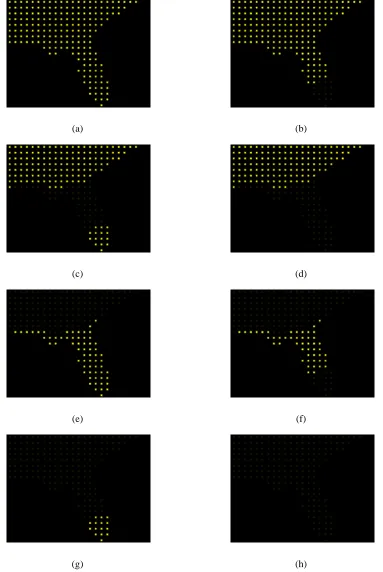
In testing flicker, we first mapped temperature to flicker. The same bands of elements
with similar temperatures that were seen with linear motion were also seen with flicker. See
Figure 6.1 for an example of this behavior. We also mapped precipitation to flicker and found
that flicker was good at grouping high spatial frequency data. We found that flicker had the
following effects in our visualization:
• The boundaries between groups of pexels were easily distinguishable.
• It was possible to group spatially dispersed clusters of pexels with the same flicker
fre-quency.
• Small clusters of outliers within a larger cluster of elements were quickly noticeable.
• Comparison of flicker rates between groups was easy, although it was difficult to
deter-mine by how much two groups differed.
• It was difficult to identify pexels with a specific attribute value. By using the display rate
as a base for flicker rate, it was impossible to determine, without a full range of flicker
values for comparison, why a pexel blinked at the rate it did. A slow flicker rate could
be caused by either a low attribute value or a slow display rate. Displaying a legend
(a) (b)
(c) (d)
(e) (f)
(g) (h)
Chapter 7
Conclusions and Future Work
Visualizations provide a means to analyze and explore large sets of data. Several techniques
exist to present data visually, including glyph-based visualizations where each glyph encodes
multiple attribute values of a single sample point. The effectiveness of a glyph’s visual features
such as color, form, texture, and density have been studied previously. We were interested in
how simple motion of glyphs could be used in visualizations. We conducted two user studies to
ascertain the properties of direction of simple linear motion and flicker relevant to visualization.
We then applied the knowledge gained from the results of these studies to a visualization of
weather data.
From our first experiment, we found that viewers were able to rapidly and accurately detect
a target group of elements within a background when the direction of the groups differed by
at least 30◦, regardless of the specific direction of any one group. This suggested that when
direction of motion is used as a visual feature, directions of groups with similar values should