RECEIVED5 May 2014 REVISED25 July 2014 ACCEPTED14 September 2014 PUBLISHED ONLINE FIRST21 October 2014
Innovative information visualization of
electronic health record data: a systematic
review
Vivian L West1, David Borland2, W Ed Hammond1
ABSTRACT
...
Objective
This study investigates the use of visualization techniques reported between 1996 and 2013 and evaluates
innovative approaches to information visualization of electronic health record (EHR) data for knowledge discovery.
Methods
An electronic literature search was conducted May–July 2013 using MEDLINE and Web of Knowledge,
supple-mented by citation searching, gray literature searching, and reference list reviews. General search terms were used to
assure a comprehensive document search.
Results
Beginning with 891 articles, the number of articles was reduced by eliminating 191 duplicates. A matrix was
developed for categorizing all abstracts and to assist with determining those to be excluded for review. Eighteen articles
were included in the final analysis.
Discussion
Several visualization techniques have been extensively researched. The most mature system is LifeLines
and its applications as LifeLines2, EventFlow, and LifeFlow. Initially, research focused on records from a single patient
and visualization of the complex data related to one patient. Since 2010, the techniques under investigation are for use
with large numbers of patient records and events. Most are linear and allow interaction through scaling and zooming to
resize. Color, density, and filter techniques are commonly used for visualization.
Conclusions
With the burgeoning increase in the amount of electronic healthcare data, the potential for knowledge
dis-covery is significant if data are managed in innovative and effective ways. We identify challenges discovered by previous
EHR visualization research, which will help researchers who seek to design and improve visualization techniques.
...
Key words
: Information visualization; Electronic Health Records; Systematic review; Health care data
BACKGROUND AND SIGNIFICANCE
In 2004 a presidential executive order, ‘Electronic Health Records (EHRs) for All Americans’, laid out tenets to improve the quality and efficiency of healthcare, with one goal being accessible EHRs for most Americans within 10 years.1,2 In September 2009, years of research and policy work culminated in the Health Information Technology for Economic and Clinical Health Act (HITECH Act) allocating $19.2 billion in incentives to increase the use of EHRs by hospitals and health delivery prac-tices. The latest report from the Centers for Medicare and Medicaid Services (CMS) found that approximately 80% of eli-gible hospitals and over 50% of elieli-gible professionals had received incentive payments from CMS for adopting EHRs.3
With the burgeoning amount of electronic data, the potential for knowledge discovery is significant if the large amounts of data are managed in innovative and effective ways. This review
investigates data visualization techniques reported in the healthcare literature between 1996 and 2013, aiming to evalu-ate innovation in approaches to information visualization of EHR data for knowledge discovery.
Historical background
The graphical visualization of data dates back to the later part of the 18th century when William Playfair is credited with the first use of line graphs, pie charts, and bar graphs. Playfair, an engineer and economist, considered charts and graphs the most effective way to communicate information about data.4 In 1786, he published The statistical breviary; shewing, on a principle entirely new, the resources of every state and kingdom in Europe; illustrated with stained copper plate charts, representing the physical powers of each distinct nation with ease and perspicuity, stating that by graphically
Correspondence to Dr Vivian L West, Duke Center for Health Informatics, Duke University, 2424 Erwin Road, Suite 9002, Room 9021, Durham, NC 27705, USA; [email protected]
VC The Author 2014. Published by Oxford University Press on behalf of the American Medical Informatics Association.
This is an Open Access article distributed under the terms of the Creative Commons Attribution Non-Commercial License (http://creativecommons.org/licenses/by-nc/ 4.0/), which permits non-commercial re-use, distribution, and reproduction in any medium, provided the original work is properly cited. For commercial re-use,
REVIEW
by guest on January 12, 2016
http://jamia.oxfordjournals.org/
representing data, the reader can best understand and retain the information.5
A widely recognized visualization is a two-dimensional graph using time, temperature, and geography showing Napoleon’s march on Russia in 1812. This linear graph, published by Charles Minard in 1861, shows the movement of Napoleon’s army across Russia to Moscow and back to Europe (figure 1).
The horizontal axis of the graph is marked with tempera-tures below freezing as they returned. The width of the line depicting the army is scaled, illustrating the decline in the number of men returning from war as the temperature decreased, which can be easily compared to the size of the army as they set out in 1812. Tufte and Graves-Morris point out that Minard’s innovative graph relies on six variables: size (of army), latitude and longitude (where the army was), direc-tion (that army was moving), locadirec-tion (at certain dates), and temperature (where the army was).6
One of the first effective means of using medical data to generate knowledge was developed in 1858 when Florence Nightingale used a polar-area diagram (also called a coxcomb chart) to demonstrate the relationship between sanitary condi-tions and soldiers’ deaths compared to death from battlefield wounds (figure 2).7,8
Since then, standardized charts and graphs have been used for specific types of healthcare data to quickly determine the need for appropriate interventions. For example, graphing vital signs data can quickly identify a rise or fall in physiological data, indicating the need for an intervention and demonstrating the effectiveness of the intervention; and Fishbone diagrams are commonly used graphic representations of laboratory results.
A plethora of scales, shapes, and colors have been used with both small and large datasets rendered as visual diagrams such as bar charts, line graphs, scatterplots, and pie charts to reveal patterns leading to knowledge discovery. Industries such as finance, accounting, and the petroleum industry routinely use information visualization, defined as ‘interactive, visual rep-resentations of abstract data to amplify cognition’,9using inno-vative approaches that account for both the volume and complexity of their data. In the healthcare field, however, appli-cations of advanced visualization techniques to large and com-plex EHR datasets are limited.
Data in healthcare
In 1994, Powsner and Tufte10proposed summarizing patient status with test results and treatment data plotted on a graph.
Figure 1: Translation: ‘Figurative chart of the successive losses in men by the French army in the Russian campaign 1812–1813. Drawn up by Mr. Minard, inspector-general of bridges and roads (retired). Paris, 20 November 1869. The number of men present is symbolized by the broadness of the colored zones at a rate of 1 mm for ten thousand men; fur-thermore, those numbers are written across the zones. The red [note: gray band here] signifies the men who entered Russia, the black those who got out of it. The data used to draw up this chart were found in the works of Messrs. Thiers, de Se´gur, de Fezensac, de Chambray and the unpublished journal of Jacob, pharmacist of the French army since 28 October. To better represent the diminution of the army, I’ve pretended that the army corps of Prince Jeroˆme and of Marshall Davousz which were detached at Minsk and Mobilow and rejoined the main force at Orscha and Witebsk, had always marched together with the army.’ Public domain (U.S.) image via Wikimedia Commons. Available at http:// commons.wikimedia.org/wiki/File:Minard.png. Accessed July 21, 2014.
REVIEW
by guest on January 12, 2016
http://jamia.oxfordjournals.org/
This was one of the earliest examples of using several diverse datasets in medical records to visualize information. Also in the 1990s, Plaisantet al11developed LifeLines as a means to visu-alize patient summaries using several different graphical attrib-utes, for example colors and lines depicting a patient’s discrete events. Furthermore, Shahar and Cheng12,13 developed Knowledge-based Navigation of Abstractions for Visualization and Explanation (KNAVE) as a means to explore time-oriented, semantically-related concepts.
Clinical records by nature contain longitudinal data of patient visits over time, with records of changing problems, medications, treatments, and responses related to evolving health status. Graphs are routinely used to illustrate data in a way that comparisons, trends, and associations can be easily understood. In healthcare studies, the use of graphs with time as the horizontal axis to display various types of data has been increasing, and several well established visualization tools have been developed using temporal data, with LifeLines/ LifeLines211,14–16and KNAVE/KNAVE-II/VISITORS17–20the most widely reported. When querying ‘longitudinal studies’ in
PubMed, 7071 publications were found in 1983, with the num-ber consistently rising through the following 30 years to 45 821 studies published in 2013.
Longitudinal data from EHRs displayed through innovative visualization techniques has tremendous potential for discover-ing useful information in the data. Until health record data became widely available electronically, however, there was lit-tle emphasis on using such large and complex datasets. We argue that EHR data is actually a new kind of data that requires new visualization techniques beyond graphs and charts to accommodate the size of the dataset and explore the contents of the data.
Exploring EHR data with visualization techniques other than tables, graphs, and charts is a nascent approach to under-standing the information in EHRs. A comprehensive monograph by Rind et al21 focuses on a survey of visualization systems and criteria typically used by designers of systems. A book by Combiet al,22and two book chapters23,24also describe several of the visualization systems reported in the literature. We report our results from a systematic review that describes how
Figure 2: Florence Nightingale’s coxcomb chart representing causes of death each month between April 1854 and March 1856 during the Crimean War. Thelarge outer gray bands represent deaths attributed to lack of sanitation in the wards, the lighter gray middle bands to death from wounds during the war, and the darkest inner bands to other causes. Public domain (U.S.) image via Wikimedia Commons. Available at http://commons.wikimedia.org/wiki/File:Nightingale-mortality.jpg. Accessed July 21, 2014.
REVIEW
by guest on January 12, 2016
http://jamia.oxfordjournals.org/
innovative visualizations are being used with large and complex EHR data as a means to present or ‘discover’ information with-out specific hypotheses.
Objectives
The aim of this review is to investigate the visualization techni-ques that have been used with EHR data and answer the fol-lowing questions:
• What is the prevalence of the use of information visualiza-tion with EHR data?
• Are techniques being used for knowledge discovery with an entire EHR dataset?
• What has been learned from research on visualization of EHR data?
METHODS
We conducted a systematic literature review following the Preferred Reporting Items for Systematic reviews and Meta-Analysis (PRISMA) statement.25 Our review was limited to articles published between 1996 and 2013. We began with 1996, the year one of the largest healthcare systems in the USA, the Veterans Health Administration, first mandated the use of EHRs.26The Health Insurance Privacy and Accountability Act (HIPAA) of 1996 was also enacted to provide security of individually identifiable health information, with a consensus that EHRs would be the most effective way to assure compli-ance with HIPAA. It is also the year when the first study using visualization with complex data (medical records histories and associated longitudinal data) was published by Plaisantet al.11 This time interval enables us to construct the historical timeline for the use of information visualization in healthcare, particu-larly as data have become more common electronically due to the legislative requirement for conversion to EHRs.
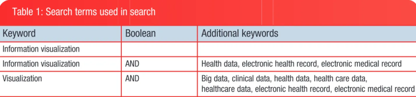
An electronic literature search was conducted in May–July 2013 using MEDLINE, the most frequently used reference data-base in healthcare, and Web of Knowledge. This was supple-mented using citation searching and gray literature searching. Reference lists from highly relevant articles were also reviewed to find additional articles. Broad keywords were used to assure a comprehensive document search (seetable 1).
Inclusion and exclusion criteria
Articles had to include the use of EHR data using innovative visu-alization techniques, or describe developing techniques that
would be applied to EHR data. We define EHR data as data in electronic clinical records that contain clinical information (eg, demographics, problems, treatments, procedures, medica-tions, labs, images, providers) collected over time that can be shared among all authorized care providers. We define innovative visualizations as visualizations other than standard graphs tradi-tionally used for displaying healthcare information (such as bar charts, pie charts, or line graphs) that use complex data, which we define as data with multiple types of variables and many data points, resulting in an exceptionally large amount of data, such as that in an entire EHR. We were interested in any innovative visualization technique for vast amounts of information that might be the foundation for an interactive system; therefore, although interaction is a key characteristic of information visualization, we included articles describing static visual representations of large amounts of EHR data in addition to interactive visualizations.
Articles were excluded if they related to animals or plants, were position papers describing the need for visualizing data or ideas for techniques in visualization, or did not describe spe-cific techniques used for the visualization or have figures show-ing the results from visualization. The literature is replete with articles on visualization in genetics, syndromic surveillance, and geospatial environmentally aware data, which we also did not include in our review because we were focused on clinical EHR data as defined above. There were many articles on the technical details related to visualization techniques, which did not fit our target for studies explaining how clinical data is used in visualization; these were also excluded.
Article selection and analysis
The authors, title, journal, year of publication, and abstract for each article were collected in an Excel spreadsheet. To identify key themes for matrix analysis, the first 50 abstracts and titles were reviewed; 11 themes were identified. These themes were then added to the spreadsheet to form a matrix for reviewing and categorizing all abstracts and to assist with determining which should be excluded.
After reviewing all abstracts and eliminating those catego-rized with exclusion criteria or lacking inclusion criteria, full articles of the remaining were read for eligibility. Our primary interest in conducting the study was to understand what inno-vative information visualization techniques in healthcare have been reported using EHR data since 1996. The review is not a meta-analysis and does not include a statistical analysis. The objective of the study was to investigate the prevalence of
Table 1: Search terms used in search
Keyword
Boolean
Additional keywords
Information visualization
Information visualization AND Health data, electronic health record, electronic medical record
Visualization AND Big data, clinical data, health data, health care data,
healthcare data, electronic health record, electronic medical record
REVIEW
by guest on January 12, 2016
http://jamia.oxfordjournals.org/
information visualization techniques used with EHR data, there-fore we did not conduct a risk of bias assessment.
RESULTS
A total of 847 references were retrieved from our initial search of electronic databases, specifically MEDLINE (PubMed and PMC) and Web of Knowledge. A search of the gray literature and hand-searching references from articles yielded an addi-tional 44 papers. All abstracts were reviewed, with duplicates removed (n¼191). We then excluded 666 articles because the visualizations discussed were diagnostic, did not relate to EHR data, focused on animals or plants, used genomics data, dis-cussed geospatial data or syndromic surveillance, were posi-tion papers suggesting the need for visualizaposi-tion or describing a potential visualization technique, or were primarily discus-sions of the technical details of visualization.
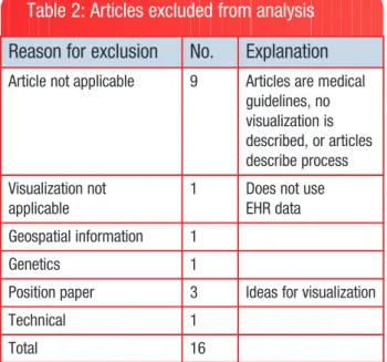
The full text of each of the remaining 34 articles was then read; 16 of these articles were excluded (table 2lists reasons for exclusion). Results of the screening process in the analysis are noted in the flow diagram infigure 3.
Eighteen articles were included in the qualitative synthesis. The online supplementary table S3 summarizes those included.11,14–20,27–36
The studies reviewed describe prototypes in various stages of development. Four of the articles describe LifeLines, the most advanced application, with its continued revisions and application in various populations. First described in 1996 by Plaisantet al,11LifeLines was developed as a prototype using data from the Maryland Department of Juvenile Justice to pro-vide a visual overview of one juvenile’s record on a single screen. LifeLines, using electronic health data, provides a time-line of a single patient’s temporal events; time is represented on the horizontal axis, and events (problems, allergies, diagno-ses, complaints, labs, imaging, medications, immunizations, communication) are listed vertically.
LifeLines evolved to LifeLines2 and the use of multiple patient records. LifeLines2 research found that users want to see both numerical and categorical data, and that the ability to drill down into details when looking at patient records is an important feature.16 Several other visualization techniques have been developed by this team using multiple records, for example LifeFlow,31developed for use with millions of patient records visualized on a single page that allows the user to see trends and evaluate quality of care. Using LifeFlow, new users can easily explore the data to understand patterns and trends at a high level.
Four articles17–20describe a second innovative visualization called VISITORS, or Visualization of Time-Oriented Records. VISITORS is based on earlier work of Shahar and colleagues, whose research conceptualized clinical data (eg, multiple measures of temperature over time) summarized into abstrac-tions (in this case, fever). This was KNAVE12; KNAVE-II is a later enhancement.18 Like LifeLines, VISITORS applies what researchers learned in earlier applications for a single record to develop an application that accommodates diverse temporal data from multiple records. Usability testing found the system feasible for exploring longitudinal data for quality or clinical results. The interface used with VISITORS was deemed to need simplification, in spite of the short time it took for users to learn how to use the system.
One article that we might have excluded used relatively simple linear graphs to illustrate the correlation of abstract con-cepts with laboratory values.29 The data used in the analysis are from the 3 million patient EHRs for New York Presbyterian Hospital, promising complexity in the data. Both factors, EHR data and complex data, are inclusion criteria; therefore, the study was included in the final analysis. Seven laboratory tests and sign-out notes used primarily by residents to assist over-night staff caring for inpatients were abstracted. From the sign-out notes, 30 clinical concepts were identified using pat-tern matching, and then correlated with normalized lab values graphed on a timeline. The research showed the value of using time in the correlation, and the value of using aggregated data from many records versus a single record. It also demonstrates how temporal patterns can be visually found in EHR data using pattern matching and temporal interpolation.
A different approach is proposed by Joshi and Szolovits34 using a radial starburst to show the complexity of data repre-sented over a 100-dimensional space. The complexity is reduced by using machine learning to group similar clusters of patients characterized by eight physiological foci to allow a user to look at one patient and evaluate the severity of that patient’s condition. This is an example of using a very large set of data, or the EHR ‘big data’ as a clinical decision making tool. Although it is a static representation, Joshi and Szolovits pro-vide a visual representation with an interesting presentation of complex data that has potential as a foundation for an interac-tive system with interactions such as filtering, selection, or brushing (highlighting a subset of data).
Gotzet al30developed Dynamic Icons, or DICON, as a visu-alization technique for exploring clusters of similar patients.
Table 2: Articles excluded from analysis
Reason for exclusion
No.
Explanation
Article not applicable 9 Articles are medicalguidelines, no visualization is described, or articles describe process Visualization not applicable
1 Does not use
EHR data Geospatial information 1
Genetics 1
Position paper 3 Ideas for visualization
Technical 1
Total 16
EHR, electronic health record.
REVIEW
by guest on January 12, 2016
http://jamia.oxfordjournals.org/
By applying algorithms to EHR data, they found clusters of patients similar to the target patient. The user can interactively explore the clusters represented as icons on a treemap. They found this visual representation, a unique approach to visual-ization of healthcare data, required time for users to under-stand. Once users understood the design concept, however, the interface provided functionality for rapidly analyzing the data using icons that could be easily controlled.
Gotz and Wongsuphasawat32,33 designed Outflow as a means to look at disease progression paths based on the assumption that the onset of a particular disease symptom applies perpetually, with common disease states among patients and transitions between the states. Outflow allows users to look at a visual display consisting of multiple events, their sequences, and outcomes to quickly analyze the event sequences in order and accurately identify factors most closely correlated with specific pathways.
Wanget alreport using LifeLines2 and sentinel event data for subject recruitment to clinical trials.19 They found using alignment, ranking, and filtering functions reduced user
interaction time when working with sentinel events. Its use for subject recruitment was found to be questionable, however. Data in medical records can be somewhat uncertain, making the timeline inaccurate. For example, a patient with a long-standing diagnosis of asthma who visits a care provider for shortness of breath may be coded as first being diagnosed with asthma on that visit, even though the diagnosis of asthma was made previously. If a clinical trial includes patients diag-nosed with asthma within a certain time range, the patient would be excluded in recruitment.
Fifteen studies address the use of temporal
data.11,14–20,27,29,31–35Most articles describe interactive visu-alizations. All but two articles focus on use of the visualizations for clinical decision support. The two visualizations not used for decision support suggest use for quality assurance and improvement.25,28
Most studies that included an evaluation of the visualization described the training of the user and training time. One study reported training time of 6 minutes for its visualization, which used radial displays with a body map in the center of the radius
Figure 3: Flow of information through the different phases of systematic review. Adapted from the Preferred Reporting Items for Systematic reviews and Meta-Analysis (PRISMA) group.25
REVIEW
by guest on January 12, 2016
http://jamia.oxfordjournals.org/
and the relevant physiological parameters highlighted on the body map.36This was the shortest training time reported; the longest was a half hour.30
Although several ways to visualize EHR data are described, it was difficult to discern if the data as described were actually real-time data, or retrospective data or databases with prede-termined datasets. Some of the articles describe systems for data visualization, for example, LifeLines2 and VISITORS. Others use visualization techniques such as sequential displays,31,36 treemaps,28,30 radial displays,34,36,38 or icicle trees.31
DISCUSSION
Although most studies recognize the importance of the growing amount of clinical data, we found few innovative EHR visualiza-tion techniques that lend themselves to the large amount of data available electronically. Prior to 2010, seven publications we reviewed employed different and innovative visualization techniques with healthcare data; three of those describe LifeLines and three describe KNAVE-II/VISITORS. With the HITECH Act in 2009, national interest in EHRs was high, with increasing interest in knowledge that might be discovered by using visualization techniques applied to EHR data. Three stud-ies on visualization of electronic health data were reported each year in 2010 and 2011, and four in 2012. Data from 2013 are not inclusive since our review was conducted in May–July 2013 (figure 4).
Several themes are common: the type of data accessible to the user, meaningfulness of visualizing large amounts of data, usability, and training time. Challenges from research to date can be broadly categorized into four areas identified by Keim et al37in other domains using very large, complex datasets: data (quality, size, diversity), users (needs, skills), design (intertwining both in a system that provides an easy way to visually explore and analyze results), and technology (tools, infrastructure).
Research on EHR visualization provides some important les-sons on challenges that need to be addressed:
• The amount of EHR data and its display is a challenge; the more data, the more difficult it is to see and identify mean-ingful patterns in visualizations. Using tools such as zoom, pan, and filter reduces some of the clutter, but the purpose of the visualization will affect the use of such tools. If researchers are to use entire datasets from EHRs to dis-cover information within the data, it will be necessary to develop better ways to manage the massive amounts of data.
• The size and complexity of EHR data is a challenge. Color, density, and filtering techniques are commonly used to dis-tinguish variables or temporal events. Although scaling and zooming have been used to resize data, none of the reported techniques in the studies we reviewed discuss applicability to an entire EHR dataset and the potential for knowledge discovery in this very large composite dataset. • The ability to use temporal data in visualizing aggregate
data from EHRs is important to users.
• Researchers need to be cognizant of the many variables that can lead to uncertain data in EHRs; uncertain data can distort temporal events.
• EHR data are complicated by missing values, inaccurate data entry, and mixed data types that must be considered in developing visualization techniques.
• Presenting a great deal of information in a single screen shot where the user can interactively explore the information is an important design feature.
• Users want to see both categorical and numerical data when interactively exploring the data, and they like to look at the detail in the record. This is challenging with visualiz-ing an extremely large amount of data in an EHR, but impor-tant for user satisfaction.
Figure 4: Number of publications included in review.
REVIEW
by guest on January 12, 2016
http://jamia.oxfordjournals.org/
• A normalization scheme is needed for aggregated numerical data.
• The time it takes to learn the system is an important consid-eration that is complicated by the complexity of the data using visualizations that are different from those most clini-cians and researchers are used to seeing, such as charts and graphs.
• Training time to understand and effectively use the visual-ization for its intended purpose should be considered when developing visualization techniques. Training is usually the user’s first introduction to visualization. The complexity of the visualization and ways to navigate the display will increase training time if it is not easy to explain or demon-strate the functionality of the visualization.
Aigneret alhave identified similar challenges working with temporal data, which is inherent in EHR data: the complexity, quality, diversity, and uncertainty of data; the interfaces and roles of the users; and evaluation of quality and effectiveness of the design.38 The interest and challenges in data analysis with ‘visual presentation and interaction technologies’ that can be used with very large and complex datasets is universal.39 The ability to explore and gain a deeper understanding of the value of ‘big data’ will encourage adoption of visualization tech-niques in healthcare. Research focused on these challenges is needed if we are to fully utilize EHR data for knowledge discovery.
Limitations
Although there are numerous articles published by Plaisant et aland Shahar and Klimov that are related to the techniques incorporated in their specific visualizations (LifeLines/ LifeLines2/LifeFlow/EventFlow and KNAVE/KNAVE-II/ VISITORS), our review was limited to those articles that were the primary publications describing the innovative visualization technique and its application to electronic health data. By restricting our review to a narrow segment of this literature, we may have inadvertently eliminated meaningful details from our review.
Our search terms were intentionally broad; we eliminated articles whose abstracts indicated the articles were more tech-nical in nature, and we eliminated articles whose focus was on geospatial representation. We may have obtained different results had more specific terms been used.
Finally, there are books and book chapters that deal with visualization of healthcare data. These types of publications are not included in our review, but may contain information rele-vant to this review.
CONCLUSIONS
This study was conducted to determine the prevalence of the use of information visualization for EHR data, what techniques have been used, and what research has taught us to date. Although there is increasing interest in visualization of elec-tronic healthcare data, few techniques have been found to effectively and efficiently display the large and complex data in EHRs.
The new buzzword in healthcare is ‘big data’, often used in conjunction with data analysis. Most studies have found that visualization of EHR data requires techniques that will handle not only ‘big data’, but the temporal complexity of constantly changing variables found within EHR data. Disciplines such as computer science, engineering, and genetics have developed visualizations to improve presentation, analysis, and under-standing of data. The healthcare provider community has not yet taken advantage of these methods or significantly explored the use of new visualization techniques to accelerate the use and understanding of EHR data. We have identified important findings reported in the literature that can help guide future research needed to explore, refine, and retest visualization techniques. Only then will stakeholders begin to take advant-age of the wealth of knowledge within EHR data.
ACKNOWLEDGEMENTS
The authors wish to acknowledge Rene’ Hart, Staff Assistant at the Duke Center for Health Informatics, for her help in organiz-ing the literature review.
CONTRIBUTORS
VLW conducted the literature search. All authors contributed to the analysis and text. VLW and DB provided the figures. All edited, reviewed, and approved the final version.
FUNDING
This work was supported by the US Army Medical Research and Materiel Command (USAMRMC) grant number W81XWH-13-1-0061.
COMPETING INTERESTS
None.PROVENANCE AND PEER REVIEW
Not commissioned; externally peer reviewed.SUPPLEMENTARY MATERIAL
Supplementary material is available online at http://jamia. oxfordjournals.org/.
REFERENCES
1. Bush GW; Office of the Press Secretary, the White House. Executive Order: Incentives for the Use of Health Information Technology and Establishing the Position of the National Health Information Technology Coordinator. Press release, April 27, 2004. http://www.whitehouse.gov/news/releases/2004/04/ print/20040427-4.html2004. Accessed July 23, 2013. 2. Bush GW. State of the Union Address, Promoting Innovation
and Competitiveness, President Bush’s Technology Agenda. 2004.
3. Data Show Electronic Health Records Empower Patients and Equip Doctors. Press release, July 17, 2013. http:// www.cms.gov/Newsroom/MediaReleaseDatabase/Press-Releases/2013-Press-Releases-Items/2013-07-17.html. Accessed July 23, 2013.
REVIEW
by guest on January 12, 2016 http://jamia.oxfordjournals.org/ Downloaded from4. Spence I. William Playfair and the psychology of graphs. American Statistical Association JSM Proceedings; 2006: 2426–2436.
5. Playfair W. The statistical breviary; shewing, on a principle entirely new, the resources of every state and kingdom in Europe; illustrated with stained copper plate charts, repre-senting the physical powers of each distinct nation with ease and perspicuity. To which is added, a similar exhibition of the ruling powers of Hindoostan. London: J Wallis, 1801. 6. Tufte ER, Graves-Morris PR.The visual display of
quantita-tive information.Vol 2. Cheshire, CT: Graphics Press, 1983. 7. Nightingale F. Notes on matters affecting the health,
effi-ciency, and hospital administration of the British Army. Founded chiefly on the experience of the late War. Presented by request to the secretary of state for War. Privately printed for Miss Nightingale, Harrison and Sons, 1858.
8. Lienharg J. The Engines of Our Ingenuity, Episode 1712: Nightingale’s Graph. Podcasts between 1988–2002. 1988–2002. http://www.uh.edu/engines/epi1712.htm. Accessed July 21, 2013.
9. Card SK, Mackinlay JD, Shneiderman B, eds. Readings in information visualization: using vision to think. Morgan Kaufmann, 1999.
10. Powsner S, Tufte E. Graphical summary of patient status. Lancet. 1994;344:386–389.
11. Plaisant C, Milash B, Rose A, et al. LifeLines: visualizing personal histories. SIGCHI Conference on Human Factors in Computing Systems Proceedings; 1996:221–227.
12. Shahar Y, Cheng C. Intelligent visualization and exploration of time-oriented clinical data. Systems Sciences, HICSS-32, 32nd Annual Hawaii International Conference Proceedings 1999 (Volume:Track4).
13. Shahar Y, Cheng C. Model-based visualization of temporal abstractions.Comput Intell. 2000;16:279–306.
14. Plaisant C, Mushlin R, Snyder A,et al. LifeLines: using visu-alization to enhance navigation and analysis of patient records. AMIA Symposium Proceedings; 1998:76–80. 15. Wang TD, Plaisant C, Quinn AJ,et al. Aligning temporal data
by sentinel events: discovering patterns in electronic health records. CHI ‘08 SIGCHI Conference on Human Factors in Computing Systems Proceedings 2008:457–466.
16. Wang TD, Wongsuphasawat K, Plaisant C,et al. Visual infor-mation seeking in multiple electronic health records: design recommendations and a process model. 1st ACM International Health Informatics Symposium Proceedings; 2010:46–55.
17. Klimov D, Shahar Y. A framework for intelligent visualization of multiple time-oriented medical records. AMIA Annu Symp Proc. 2005;2005:405–409.
18. Martins SB, Shahar Y, Goren-Bar D,et al. Evaluation of an architecture for intelligent query and exploration of time-ori-ented clinical data.Artif Intell Med. 2008;43:17–34. 19. Klimov D, Shahar Y, Taieb-Maimon M. Intelligent interactive
visual exploration of temporal associations among multiple time-oriented patient records. Methods Inf Med. 2009;48: 254–262.
20. Klimov D, Shahar Y, Taieb-Maimon M. Intelligent visualiza-tion and exploravisualiza-tion of time-oriented data of multiple patients.Artif Intell Med. 2010;49:11–31.
21. Rind A, Wang TD, Aigner W, et al. Interactive information visualization to explore and query electronic health records: a systematic review. Foundations Trends Hum-Comput Interact. 2013;5:207–298.
22. Combi C, Keravnou-Papailiou E, Shahar Y. Temporal infor-mation systems in medicine. Springer, 2010.
23. Aigner W, Kaiser K, Miksch S. Visualization techniques to support authoring, execution, and maintenance of clinical guidelines. Computer-based Medical Guidelines and Protocols: A Primer and Current Trends 2008;139:140–159. 24. Lesselroth BJ, Pieczkiewicz DS. Data visualization
strat-egies for the electronic health record. Nova Science Publishers, Inc., 2011.
25. Moher D, Liberati A, Tetzlaff J, et al.; PRISMA Group. Preferred reporting items for systematic reviews and meta-analyses: the PRISMA statement. PLoS Med. 2009;6: e1000097.
26. Anderson M. Lessons learned from the Veterans Health Administration. Healthc Pap, 5, 30–37. 2005. https:// www.thecsiac.com/sites/default/files/files/Clinger%20Co hen%20(1996).pdf. Accessed April 15, 2013.
27. Bashyam V, Hsu W, Watt E,et al. Problem-centric organiza-tion and visualizaorganiza-tion of patient imaging and clinical data. Radiographics. 2009;29:331–343.
28. Willison B. Advancing Meaningful Use: Simplifying Complex Clinical Metrics Through Visual Representation. Parsons Institute for Information Mapping (PIIM) Research 2010. 29. Hripcsak G, Albers DJ, Perotte A. Exploiting time in
elec-tronic health record correlations. J Am Med Inform Assoc. 2011;18(Suppl 1):i109–115.
30. Gotz D, Sun J, Cao N,et al. Visual cluster analysis in support of clinical decision intelligence. AMIA Annu Symp Proc. 2011;2011:481–490.
31. Wongsuphasawat K, Guerra Go´mez JA, Plaisant C, et al. LifeFlow: visualizing an overview of event sequences. SIGCHI Conference on Human Factors in Computing Systems Proceedings 2011:1747–1756.
32. Gotz D, Wongsuphasawat K. Interactive intervention analy-sis. AMIA Annual Symposium Proceedings; 2011:274. 33. Wongsuphasawat K, Gotz D. Exploring flow, factors, and
outcomes of temporal event sequences with the outflow visualization. IEEE Trans Vis Comput Graph. 2012;18: 2659–2668.
34. Joshi R, Szolovits P. Prognostic physiology: modeling patient severity in intensive care units using radial domain folding.AMIA Annu Symp Proc. 2012;2012:1276–1283. 35. Stubbs B, Kale DC, Das A. SimTwentyFive: an interactive
visualization system for data-driven decision support.AMIA Annu Symp Proc. 2012;2012:891–900.
36. Zhang Z, Wang B, Ahmed F, et al. The five W’s for information visualization with application to healthcare informatics. IEEE Trans Vis Comput Graph. 2013;19: 1895–1910.
REVIEW
by guest on January 12, 2016
http://jamia.oxfordjournals.org/
37. Keim DA, Kohlhammer J, Ellis G,et al., eds.Mastering the information age-solving problems with visual analytics. Florian Mansmann, 2010.
38. Aigner W, Federico P, Gschwandtner T, et al. Challenges of Time-oriented Data in Visual Analytics for Healthcare.
IEEE VisWeek Workshop on Visual Analytics in Healthcare; 2012.
39. Thomas JJ, Cook KA. A visual analytics agenda. IEEE Comput Graph Appl. 2006;26:10–13.
AUTHOR AFFILIATIONS
...
1Duke Center for Health Informatics, Duke University, Durham, North Carolina, USA
2
The University of North Carolina at Chapel Hill, Chapel Hill, North Carolina, USA
REVIEW
by guest on January 12, 2016
http://jamia.oxfordjournals.org/