Information and Knowledge Assisted Analysis and
Visualization of Large-Scale Data
Chaoli Wang
Kwan-Liu Ma
Department of Computer Science University of California, Davis
Davis, CA 95616 {wangcha, ma}@cs.ucdavis.edu
Abstract—The ever-increasing sizes of data produced from a variety of scientific studies post a formidable challenge for the subsequent data analysis and visualization tasks. While steady advances in graphics hardware enable faster rendering, achieving interactive visualization of large data must also rely on effective data filtering and organization. In many cases, the best interactivity can only be obtained by taking into account the intrinsic properties of the data and domain knowledge to better reduce and organize the data for visualization. As a result, in recent years, we have seen increasing research and development efforts into the area of Information and Knowledge assisted Visualization (IKV). In this paper, we survey research in IKV of scientific data and also identify a few directions for further work in this emerging area.
I. INTRODUCTION
Interactive visualization is key to insightful data exploration. In the past decade, we have witnessed great advancements of graphics hardware, which make real-time rendering a com-modity. Real-time rendering enables interactive visualization but the size of the viewable data is limited by the available computer memory space. An active area of research is thus the reduction, packing, and indexing of large data for more efficient and effective visualization. Most of the solutions introduced were based on conventional compression methods, multi-resolution techniques, and out-of-core algorithms. It is projected that by 2011, we will enter the era of petascale computing. The vast amounts of data routinely generated by petascale computing will overwhelm any of the existing data visualization hardware and software technologies, thus demanding novel thinking and new techniques for making sense of the data. This exponential growth of data will continue into exascale and greater. We are in need of scalable, cost-effective solutions for data analysis and visualization.
A viable solution to such extreme scale data problem builds on our ability to identify the most relevant information about the data and utilize this information in the process of visu-alization. This information may be explicit or implicit within the data. It may also be knowledge derived from data analysis. We believe that information and knowledge assisted visualiza-tion (IKV) holds the promise for extreme-scale visualizavisualiza-tion where more efficient and effective visual understanding can be achieved through the utilization of intrinsic information extracted from the data as well as domain knowledge about the modeled phenomena or processes. In this way, we are able
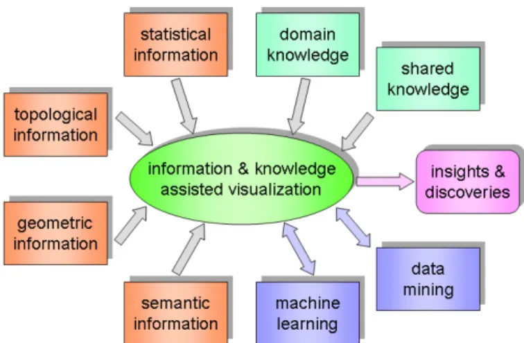
Fig. 1. Information and knowledge assisted visualization (IKV).
to preserve or reveal important aspects of the data while de-emphasizing or discarding non-important parts.
Most existing visualization techniques and systems were not designed to utilize the information and knowledge about the data or derived from the analysis and visualization process. As visual data analysis is inherently an iterative and explo-rative process, it is highly desirable to enable more effective visualization by utilizing information about the visualization process itself (e.g., visualization parameters chosen by users) and knowledge about the data to be visualized (e.g., feature description from specialists). Collecting and leveraging such information and knowledge becomes important, especially when the cost of visualization is high or when the work requires collaborative efforts. The combination of such infor-mation from different visualization processes can also infer new knowledge that can aid data visualization in an intelligent manner. In addition, information visualization techniques are increasingly used in scientific data analysis and visualization to especially display high-dimensional information and derived knowledge.
We begin to see a growing interest in IKV. As sketched in Figure 1, IKV takes essential information extracted from the data, such as statistical, geometric, topological, and semantic information, and/or knowledge, such as domain-specific or shared knowledge, about the data as input. The visualization process itself may also incorporate intelligent computational
algorithms such as data mining or machine learning. The output of visualization are in the form of image and video, which may lead to insights and discoveries.
The position paper [4], written by the organizers of IEEE Visualization Knowledge-Assisted Visualization Workshop, describes the definitions and relationships of data, information, and knowledge in visualization. Examples of information and knowledge assisted visualization are also provided. This paper reviews recent work in information and knowledge assisted analysis and visualization of large-scale data. To keep the dis-cussion focused, we specifically restrict ourselves to examples of work in scientific visualization. These IKV examples are chosen to match the diagram shown in Figure 1, rather than provide a comprehensive review for the field. At the end of this paper, we point out a few future research directions.
II. INFORMATION-ASSISTEDVISUALIZATION
Information-assisted visualization utilizes intrinsic infor-mation extracted from the data for meaningful visual data analysis, such as data classification, automatic viewpoint and camera path planning, feature detection, structure understand-ing, and semantic parameter specification etc. The types of information include statistical measures, geometric representa-tions of physical features, topological structures, and semantic relationships, etc.
A. Visualization Enabled by Statistical Information
Importance-Driven Focus of Attention. Viola et al. [17] presented a solution for automatic focusing on features within a volumetric data set. A focus is selected from a set of predefined features and the algorithm automatically determines the most expressive view on this feature. Characteristic view-points are estimated using the viewpoint mutual information (VMI) measure defined in terms of visibility between a set of viewpoints and the objects of a data set. A high value of the VMI means a high dependence between the viewpoint and the data object; while a low value of the VMI corresponds to a more independent view showing more objects in the data in a balanced way. Therefore, a best viewpoint is defined as the one that has minimum mutual information. Focus of attention from one object to another is achieved by smoothly changing viewpoint settings and visual parameters with emphasis placed on the newly-selected object of interest.
Texture-Based Tracking and Transfer Function.Caban et al. [2] proposed a texture-based feature tracking technique by analyzing local textural properties and finding correspondent properties in the time series. This approach is based on the observation that time-varying data present specific pattern and textural features which characterize local space-time regions. These patterns represent the actual dynamic data movement and thus make tracking possible. They used a combination of first-order, second-order, and run-length matrices to capture local data texture patterns. To enable feature tracking, they employed similarity measurements and a windowing technique to find the best texture match in subsequent time steps. Caban and Rheingans [3] further extended this texture-based
Fig. 2. Importance-driven visualization of the jet flame combustion data set [19]. Top to bottom: three clusters with high, medium, and low importance values respectively. Opacity is adjusted in the figure to hide the remaining clusters not selected.
approach for transfer function specification in which the color and opacity of voxels are based on local textural properties instead of intensity values. They showed that textual metrics can be more effective in differentiate similar structures due to the fact that the statistical textural pattern is attached to local properties rather than individual intensity values.
Importance-Driven Visualization. Wang et al. [19] pro-posed to study the important aspect of time-varying volume data using an information-theoretic approach. They evaluated the importance of data around a spatial local neighborhood (i.e., a data block) in the joint feature-temporal space. The feature space is a multidimensional space that consists of data value, local features such as gradient magnitude, and/or domain specific derivatives or quantities. Using the conditional entropy from information theory, they derived the importance measure by computing the amount of relative information a data block contains with respect to other blocks in the time series. An importance curve is derived for each data block which characterizes the local temporal behavior of the block. Clustering the importance curves of all the volume blocks effectively classifies the underlying data. For example, Figure 2 shows the three clusters of the jet flame combustion data set.
Such clustering results help scientists focus on, for example, the cluster of the highest importance values (i.e., with the most temporal changes) and examine its evolution over time. Based on different temporal trends exhibited by importance curves and their clustering results, they demonstrated several interesting and cost-effective ways to visualize and understand large time-varying volume data.
Local Statistical Complexity.J¨anicke et al. [8] introduced an information-theoretic approach to detect importance regions by extending the concept of local statistical complexity (LSC) from finite state cellula automata to discretized multifields. LSC focuses on the local temporal evolution of a field. The local past of a position in the field consists of all the points that might influence it. As effects propogate at finite speed, the past has the shape of a light-cone that is directed towards the past. Similarly, the future is given by a light-cone that is directed in the opposite direction. In their approach, past and future light-cones are defined for all grid points, which are used to estimate conditional distributions and calculate the LSC. It has been shown that this method can automatically detect structures in an unsteady multifield that deviate from the average behavior in the field.
B. Visualization Enabled by Geometric Information
Particle Destination and FTLE Maps. Snoi et al. [14] studied the effects of flow structures on particle transport and deposition in the small bronchial tubes. The main challenge associated with identifying the impact of flow features on particle deposition is that both local (Eulerian) and global (Lagrangian) effects must be considered. In response, they employed particle destination maps in conjunction with two-dimensional, finite-time Lyapunov exponent (FTLE) maps to correlate local information about the flow with global particle decomposition patterns. The particle destination maps indicate the zone of the computational domain in which a particle is deposited. The FTLE maps give a quantitative description of the coherence of particles passing through a certain region in the flow. Their visualizations demonstrate that the combination both maps, together with carefully-placed particle trajectories, provides an effective means to study particle/flow structure interactions and their effects on particle deposition.
C. Visualization Enabled by Topological Information
Topology Simplification. Gyulassy et al. [5] presented a topological approach for simplifying continuous functions de-fined on volumetric domains. They introduced two atomic op-erations that remove pairs of critical points of the function and design a combinatorial algorithm that simplifies the Morse-Smale complex by repeated application of these operations. The Morse-Smale complex is a topological data structure that provides a compact representation of gradient flow between critical points of a function. The Morse-Smale complex is used to guide data simplification through the utilization of a global view of the function and its spatial distribution for detecting, ordering, and removing features. It also allows
the simplification within a local neighborhood of the non-significant feature. Critical points paired by the Morse-Smale complex identify topological features and their importance. The simplification procedure leaves important critical points untouched, and is therefore useful for extracting desirable features.
Topological Landscapes. Weber et al. [21] proposed a visual terrain metaphor, called the topological landscape, to facilitate understanding of the topological structure of scien-tific scalar data. The common way of depicting topological information using a contour tree is not intuitive for the user to relate to the structure of a scalar field. To improve this situation, they utilized the topological information and additional metric information associated with its branches to create the topological landscape, which shares the same topology as the original data. Such a metaphor is very intuitive to understand since humans are naturally trained and very effective in understanding the structure of a terrain. Important information, such as function values of critical points, the persistence (function span) topological features, is preserved in this metaphor mapping. Complex topological information becomes easily accessible by displaying the topologically equivalent landscape together with the original data.
D. Visualization Enabled by Semantic Information
Semantic Transfer Functions and Layers. Transfer func-tion specificafunc-tion is a complex task which requires expert knowledge about the data as well as the underlying rendering technique. The increasing uses of multidimensional transfer function make the task more difficult and non-intuitive. Rezk-Salama et al. [12] presented a new way to facilitate the specification of transfer function for direct volume rendering by introducing an additional level of abstraction for parametric models of transfer functions. Based on principal component analysis and concepts from computer animation, they proposed a high-level user interface for transfer function design which can be intuitively used by non-expert users. It was demon-strated that such semantic models can be effectively used to hide the complexity of visual parameter assignment for a specific examination purpose. Rautek et al. [11] proposed a methodology for the specification of semantic layers which maps volumetric attributes to illustrative visual styles. They used fuzzy sets to represent volumetric attributes and visual styles and specified rules for mapping that are evaluated with fuzzy logic arithmetics. This handling allows the user to specify the fuzzy sets and the rules without knowing the under-lying rendering techniques. Such semantic-based approaches open up a new research direction on visualization enabled by semantic specification.
III. KNOWLEDGE-ASSISTEDVISUALIZATION
Knowledge-assisted visualization incorporates domain knowledge or derived knowledge for more efficient and effective data manipulation, management, and understanding. A key ingredient in knowledge-assisted visualization is that certain knowledge about the data or simulation is known a
Fig. 3. Application-driven compression of the V-flame combustion data set [20]. Left to right: rendering of original data, rendering of compressed data, image difference of the compressed and original data calculated in the CIELUV color space, and the color map. Note that regions farther away from the surface of interest show more quantization artifacts in rendering. Themixf racsurface with thechivariable are shown in the figure.
priori and can thus be leveraged, or about user intentions or preferences may be recorded and utilized to derive a more concise, well-informed visualization.
Analysis of the Mixing Flow.Understanding the turbulent mixing of fluids is one of the fundamental research challenges in the area of fluid dynamics. Laney et al. [10] presented a compressive study joint with domain scientists to understand the structure of the turbulent mixing layer in hydrodynamic instabilities. They extracted a hierarchical segmentation of the mixing envelope surface to identify bubbles (due to the heavy fluid) and spikes (due to the light fluid) which are critical for understanding the mixing process, and analyzed analogous segmentations of fields on the interface plane. Meaningful statistical information is computed to reveal the evolution of topological features and corroborate the observations made by scientists. Moreover, they also employed geometric tracking techniques to follow the evolution of single bubbles and highlight merge/split events leading to the formation of the large and complex structures. This approach is based on the rigorous mathematical foundations of Morse theory and can be applied to a more general class of applications.
LiveSync. Kohlmann et al. [9] presented LiveSync, a new concept to synchronize 2D slice views and volumetric views in medical data sets. Although direct volume rendering with high interactivity is available due to the advances of graphics hardware, this visualization method is seldom used in the clinical practice due to the complexity of adjusting the pa-rameters, such as viewpoint, zooming, transfer function, and clipping planes, to achieve meaningful results. As a result, most often only 2D slices of the data set are examined, which raises an issue of synchronizing 2D and 3D views. To achieve live synchronization, they used a minimal set of derived information without the need to segment data or precompute data-specific quantities. Taking into account knowledge about the procedure performed, a rough estimate of the preferred
viewing directions is made. They introduced deformed viewing spheres which encode the viewpoint quality (including picked point, slice view zoom, patient orientation, viewpoint history, local object shape and visibility) for the components. A combination of these deformed viewing spheres is used to estimate a good viewpoint. LiveSync provides the physicians with synchronized views which help them gain deeper insight into the medical data with minimal user interaction.
Application-Driven Compression. The common practice of compressing high-precision floating-point data solely based on values can only achieve limited saving. Further reduction is possible by utilizing the fact that usually only a smaller subset of the data is of interest in the analysis. Wang et al. [20] have experimented with this application-driven ap-proach to compressing large-scale time-varying volume data. By consulting the application scientists, a reference feature is identified for partitioning the data into space-time blocks, which are compressed with various precisions according to their association to the feature. For example, in the context of time-varying, multivariate volume data visualization, such knowledge could be the salient isosurface of interest for some variable and the visualization task could be observing spatio-temporal relationships among other variables in the neighbor-hood of that isosurface. The goal is to directly incorporate such knowledge and tasks into the whole data reduction, compression, and rendering process. This application-driven solution achieves high compression rates and interactive ren-dering while preserving fine details around regions of interest. An example with the V-flame combustion data set is shown in Figure 3. Such a knowledge-assisted approach points out a promising direction for coping with the large data problem facing computational scientists.
IV. INTELLIGENTVISUALIZATION
Intelligent visualization applies methods from artificial in-telligence (AI) such as machine learning and intelligent
al-Fig. 4. Intelligent feature tracking with the swirling flow data set [15]. Fist row: the results of tracking a feature over time based on a specific data range. Second row: the results of tracking the same feature with the adaptive transfer function. The feature is still tracked even the data range has changed.
gorithms from data mining to tackle difficult tasks that could not be easily solved by other approaches. Adaptive training or heuristic search is leveraged to generate desired results in an iterative manner. The derived knowledge can be accumu-lated and systematically shared and reused in the process of visualization.
Intelligent Feature Tracking. Conventional methods for feature extraction and tracking require either an analytical description of the feature of interest or tedious manual inter-vention throughout the feature extraction and tracking process. Tzeng and Ma [15] presented an intelligent feature extraction and tracking algorithm for visualizing large-scale 4D flow simulation data. They showed that it is possible for a visualiza-tion system to learn to extract and track features in complex 4D flow field according to their visual properties, location, shape, and size. Intelligent feature extraction and tracking is performed in the data space by utilizing machine learning techniques on high-dimensional data. In this case, the scientists do not need to specify explicitly the relationship between these different dimensions. The feature extraction function is revised through an iterative training process following the temporally changing properties of the tracked features. An example is shown in Figure 4. They also designed an intuitive user interface with multiple coordinated views to facilitate interactive, intelligent feature extraction and tracking. Using a painting metaphor, the scientist specifies a feature of interest by marking directly on the 2D or 3D images of the data through this interface. Such an intelligent system leads to a greatly simplified and intuitive visualization interface.
ViA. Healey et al. [6] proposed an AI-based visualization assistant named ViA which integrates perceptual guidelines
Fig. 5. LOD adjustment on the Richtmyer-Meshkov instability data set [18]. First row: the LOD selected based on the mean square error (MSE) and its corresponding LOD map. Second row: the LOD after adjustment and its corresponding LOD map. The number of blocks remains the same while more details of the data are revealed after the adjustment.
from human vision with heuristic AI search strategies and mixed-initiative interactions to collaborates with its users to identify perceptually-salient visualizations for large multidi-mensional data sets. The proposed system applies the knowl-edge of low-level human vision to evaluate the effectiveness of a visualization and to direct its search towards new visual-izations for possible improvements. ViA also allows the users to share their different strengths to improve the understanding of user preferences using a mixed-initiative strategy.
V. VISUALIZATIONINTERFACE
User interface plays an increasingly important role in nav-igation and exploration of large-scale data sets. Research has been conducted to utilize information extracted from scientific data for interface design, guiding the user through the immerse data and parameter spaces using information visualization techniques. In this scenario, multiple coordinated views are enabled with brushing and linking techniques to allow comprehensive data analysis through the diverse types of information. The key is to help the user mentally link pieces of information obtained through the process of visualization with a carefully-designed interface.
LOD Map. Wang and Shen [18] developed the LOD map, a visual interface for navigating multiresolution volume visualization. To quantify the level-of-detail (LOD) quality, they proposed to evaluate the distortion and contribution of multiresolution data blocks and utilized the concept of entropy from information theory. The LOD map is constructed by
Fig. 6. Using the tri-space interface to explore the hurricane data set for finding correlation between cloud, wind speed, vapor and pressure [1]. Left to right: the spatial view for time steps 2 and 29, the temporal view for the four variables, and the variable view for time step 29. Brushing and linking are used to coordinate multiple views for simultaneous exploration of data in all domains.
mapping the LOD quality (distortion and contribution of data blocks) to the 2D treemap (color, size, and opacity of rectangles) from information visualization. Through visually-striking features, the LOD map shows the tradeoff between computation cost and information gain, as well as the com-pleteness of visualization results. Figure 5 shows an example of LOD adjustment using the LOD map. The LOD map after adjustment gives a more balanced result in terms of the size and color of rectangles, which indicates a better LOD quality. In this manner, the user is informed not only what they have seen (i.e., visible data blocks), but also what they have not yet seen (i.e., occluded data blocks). This interface greatly facilitates LOD selection and comparison, resulting in an increase in effectiveness and productivity.
Tri-Space Interface.The dramatic grow of data in spatial, temporal, and variable dimensions demands new tools to en-able simultaneous data exploration with all these dimensions. Akiba and Ma [1] proposed a tri-space interface for analyzing and visualizing time-varying, multivariate volume data. As shown in Figure 6, their tri-space interface consists of three components. The spatial component allows the user to explore the data in spatial domain while rendering multiple variables into a single visualization in a user-controllable fashion. The temporal component displays time histograms of the data which helps the user identify time steps of interest and spec-ify time-varying features. The variable component displays correlations between variables using parallel coordinates and allows the user to verify correlations and identity unanticipated ones. Each of these three components is not only an interface but also the visualization itself, thus enabling efficient usage of the screen space. The three components are tightly linked
to facilitate tri-space data exploration, offering scientists new power to study their time-varying, multivariate volume data.
Multifield-Graphs. Sauber et al. [13] presented an ap-proach to visualize correlations in 3D multifield data using multifield-graphs. Correlations are calculated using two dif-ferent measures: gradient similarity measure (GSIM) and local correlation coefficient (LCC). In multifield-graphs, each node corresponds to a correlation field and each edge connects two fields where one field is the exact addition of another field with one new variable. The nodes are displayed as icons with correlation overview information graphically encoded. This interface provides an overview of the correlations and their strengths, thus are able to guide the selection of promising correlation fields for detailed examination. Multifield-graphs become very useful when a large number of variables are simultaneously considered in the analysis.
Attribute Cloud. J¨anicke et al. [7] proposed to use the
attribute cloudfor multivariate data visualization. The attribute cloud is a point cloud that results from transforming of the high-dimensional data in attribute space to 2D. The transfor-mation is based on ideas from multivariate statistics and man-ifold learning. They first computed a minimal spanning tree (MST) that represents the skeleton of the high-dimensional density and then used Fruchterman-Reingold algorithm for graph layout of the MST in 2D. In attribute cloud, points with similar multivariate attributes are located close to each other. Leveraging this visual representation, correlations and coherency in the high-dimensional multivariate attribute space can be explored by the user in the 2D space.
VI. FUTURERESEARCH
The samples of IKV research suggest many opportunities for further research. In the following, we outline some promi-nent directions.
Feature Extraction and Tracking.Most previous research in feature extraction and tracking took into account the statis-tical, geometric, or topological information in the data but did not incorporate domain knowledge. Many scientific simulation data are dynamic in nature and exhibit a diverse presence of spontaneous fluctuations distributed over a wide range of spatial and temporal scales. Research in this direction requires that visualization researchers and application scientists work closely to truly understand what are the features in the data. This is the important first step for feature extraction and tracking, but little attention has been paid. Domain knowl-edge can provide specific criteria and guidelines to describe, characterize, and quantify data features so that they can be effectively categorized, tracked, and visualized.
Detecting Causal Effects. Time-varying, multivariate data analysis and visualization remains one of the most challenging subjects in visualization research. Previous work on multi-variate data visualization placed a focus on correlation study. A more challenging issue in multivariate data analysis is the study of information flow to identify the casual effects between the input and the output, or relationships among different variables in the time series. Commonly-used tools for the estimation of dependencies are linear cross-correlation and mutual information. However, these measures share the property of being symmetric and therefore are not suitable for this porpose. New methods and techniques need to be sought for assessing causality within relationships.
Assess the Uncertainty. Dealing with and accounting for uncertainty is an important topic in scientific experiments. Uncertainty comes with various forms and has multiple facets throughout the simulation and data understanding pipeline. Thus, a comprehensive framework is necessary for tracing the sources of uncertainty and the following propagation throughout the entire simulation, analysis, and visualization process. Uncertainty representation and quantification, uncer-tainty propagation, and unceruncer-tainty visualization techniques need to be developed in order to provide scientists with credible and verifiable visualizations. Information as well as knowledge gathered from the process can be used to handle the uncertainty where the different sources of uncertainty are identified, quantified, represented, tracked, and visualized together with the underlying data.
VII. CONCLUDINGREMARKS
The primary goal of scientific data analysis and visualization is to support the generation of new knowledge [16]. Most visualization algorithms and techniques developed up to date, however, address knowledge implicitly rather than explicitly. That is, these techniques are not formally integrated with meth-ods and tools to enable knowledge discovery, representation, and sharing. The future of visualization lies in the development of information and knowledge driven solutions that utilize
previously acquired knowledge and related information to derive new knowledge so that it can be disseminated to science collaborators or even broader communities.
ACKNOWLEDGMENT
This work was supported in part by the U.S. National Sci-ence Foundation through grants CNS- 0716691, OCI-0325934, OCI-0749217, CNS-0551727, CCF-0811422, CCF-0808896, OCI-0749227 and OCI-049321, and the U.S. Department of Energy through the SciDAC program with Agreement No. DE-FC02-06ER25777 and DE-FG02-08ER54956.
REFERENCES
[1] H. Akiba and K.-L. Ma. A tri-space visualization interface for analyzing time-varying multivariate volume data. InProceedings of Eurograph-ics/IEEE VGTC Symposium on Visualization 2007, pages 115–122, 2007.
[2] J. J. Caban, A. Joshi, and P. Rheingans. Texture-based feature tracking for effective time-varying data visualization. IEEE Transactions on Visualization and Computer Graphics, 13(6):1472–1479, 2007. [3] J. J. Caban and P. Rheingans. Texture-based transfer functions for direct
volume rendering. IEEE Transactions on Visualization and Computer Graphics, 14(6):1364–1371, 2008.
[4] M. Chen, D. Ebert, H. Hagen, R. S. Laramee, R. van Liere, K.-L. Ma, W. Ribarsky, G. Scheuermann, and D. Silver. Data, information, and knowledge in visualization.IEEE Computer Graphics and Applications, 29(1):4–11, 2009.
[5] A. Gyulassy, V. Natarajan, V. Pascucci, P.-T. Bremer, and B. Hamann. Topology-based simplification for feature extraction from 3d scalar fields. InProceedings of IEEE Visualization 2005 Conference, pages 275–280, 2005.
[6] C. G. Healey, S. Kocherlakota, V. Rao, R. Mehta, and R. St. Amant. Vi-sual perception and mixed-initiative interaction for assisted viVi-sualization design. IEEE Transactions on Visualization and Computer Graphics, 14(2):396–411, 2008.
[7] H. J¨anicke, M. B¨ottinger, and G. Scheuermann. Brushing of attribute clouds for the visualization of multivariate data. IEEE Transactions on Visualization and Computer Graphics, 14(6):1459–1466, 2007. [8] H. J¨anicke, A. Wiebel, G. Scheuermann, and W. Kollmann. Multifield
visualization using local statistical complexity. IEEE Transactions on Visualization and Computer Graphics, 13(6):1384–1391, 2007. [9] P. Kohlmann, S. Bruckner, A. Kanitsar, and M. E. Gr¨oller. LiveSync:
Deformed viewing spheres for knowledge-based navigation. IEEE Transactions on Visualization and Computer Graphics, 13(6):1544– 1551, 2007.
[10] D. Laney, P.-T. Bremer, A. Mascarenhas, P. Miller, and V. Pascucci. Understanding the structure of the turbulent mixing layer in hydrody-namic instabilities. IEEE Transactions on Visualization and Computer Graphics, 12(5):1053–1060, 2006.
[11] P. Rautek, S. Bruckner, and M. E. Gr¨oller. Semantic layers for illustrative volume rendering. IEEE Transactions on Visualization and Computer Graphics, 13(6):1336–1343, 2007.
[12] C. Rezk-Salama, M. Keller, and P. Kohlmann. High-level user interface for transfer function design with semantics. IEEE Transactions on Visualization and Computer Graphics, 12(5):1021–1028, 2006. [13] N. Sauber, H. Theisel, and H.-P. Seidel. Multifield-graphs: An approach
to visualizing correlations in multifield scalar data. IEEE Transactions on Visualization and Computer Graphics, 12(5):917–924, 2006. [14] B. Soni, D. Thompson, and R. Machiraju. Visualizing particle/flow
structure interactions in the small bronchial tubes. IEEE Transactions on Visualization and Computer Graphics, 14(6):1412–1419, 2008. [15] F.-Y. Tzeng and K.-L. Ma. Intelligent feature extraction and tracking
for visualizing large-scale 4d flow simulations. In Proceedings of ACM/IEEE Supercomputing 2005 Conference, 2005.
[16] J. J. van Wijk. The value of visualization. InProceedings of IEEE Visualization 2005 Conference, pages 79–86, 2005.
[17] I. Viola, M. Feixas, M. Sbert, and M. E. Gr¨oller. Importance-driven focus of attention. IEEE Transactions on Visualization and Computer Graphics, 12(5):933–940, 2006.
[18] C. Wang and H.-W. Shen. LOD map - a visual interface for navigating multiresolution volume visualization. IEEE Transactions on Visualiza-tion and Computer Graphics, 12(5):1029–1036, 2006.
[19] C. Wang, H. Yu, and K.-L. Ma. Importance-driven time-varying data visualization. IEEE Transactions on Visualization and Computer Graphics, 14(6):1547–1554, 2008.
[20] C. Wang, H. Yu, and K.-L. Ma. Application-driven compression for visualizing large-scale time-varying volume data. IEEE Computer Graphics and Applications, To appear.
[21] G. H. Weber, P.-T. Bremer, and V. Pascucci. Topological landscapes: A terrain metaphor for scientific data.IEEE Transactions on Visualization and Computer Graphics, 13(6):1416–1423, 2007.
![Fig. 2. Importance-driven visualization of the jet flame combustion data set [19]. Top to bottom: three clusters with high, medium, and low importance values respectively](https://thumb-us.123doks.com/thumbv2/123dok_us/1423388.2690502/2.918.469.843.83.574/importance-driven-visualization-combustion-clusters-medium-importance-respectively.webp)
![Fig. 3. Application-driven compression of the V-flame combustion data set [20]. Left to right: rendering of original data, rendering of compressed data, image difference of the compressed and original data calculated in the CIELUV color space, and the colo](https://thumb-us.123doks.com/thumbv2/123dok_us/1423388.2690502/4.918.191.730.82.353/application-compression-combustion-rendering-compressed-difference-compressed-calculated.webp)
![Fig. 5. LOD adjustment on the Richtmyer-Meshkov instability data set [18].](https://thumb-us.123doks.com/thumbv2/123dok_us/1423388.2690502/5.918.78.445.80.408/fig-lod-adjustment-richtmyer-meshkov-instability-data-set.webp)
![Fig. 6. Using the tri-space interface to explore the hurricane data set for finding correlation between cloud, wind speed, vapor and pressure [1]](https://thumb-us.123doks.com/thumbv2/123dok_us/1423388.2690502/6.918.115.800.78.426/using-space-interface-explore-hurricane-finding-correlation-pressure.webp)
