iVoLVER: Interactive Visual Language for Visualization
Extraction and Reconstruction
Gonzalo Gabriel M´endez
University of St Andrews, UK
[email protected]
Miguel A. Nacenta
University of St Andrews, UK
[email protected]
Sebastien Vandenheste
University of St Andrews, UK
[email protected]
Rectangle
A B C 0.00 D
-2.00 2.00
400.00
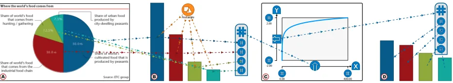
Figure 1. A) Data is extracted from a pie chart, B) converted into bars, and C) transformed into D) a log-scale bar-chart (see Motivating Scenario).
ABSTRACT
We present the design and implementation of iVoLVER, a tool that allows users to create visualizations without textual programming. iVoLVER is designed to enable flexible acqui-sition of many types of data (text, colors, shapes, quantities, dates) from multiple source types (bitmap charts, webpages, photographs, SVGs, CSV files) and, within the same canvas, supports transformation of that data through simple widgets to construct interactive animated visuals. Aside from the tool, which is web-based and designed for pen and touch, we con-tribute the design of the interactive visual language and wid-gets for extraction, transformation, and representation of data. We demonstrate the flexibility and expressive power of the tool through a set of scenarios, and discuss some of the chal-lenges encountered and how the tool fits within the current infovis tool landscape.
Author Keywords
Information visualization; visual information extraction; visual languages for visualization; visualization verification.
ACM Classification Keywords
H.5.2 Information interfaces and presentation: graphical user interfaces; D.1.7 Software: visual programming
INTRODUCTION
Information Visualization is often motivated as a way to leverage the innate human visual processing capacity for the analysis of data [51]. Creating visualizations can enhance the ability of users to explore, understand, and communi-cate data, as evidenced by the large number of projects and
Copyright Owner/Authors 2016. This is the author’s version of the work. It is posted here for your personal use. Not for redistribution. The definitive Version of Record was published in the Proceedings of the SIGCHI Conference on Human Factors in Computing Systems (CHI 2016), http://dx.doi.org/10.1145/2858036.2858435
effort invested in visualization programming languages and APIs (e.g., [5, 20, 35]), tools (e.g., MS Excel, Tableau, ManyEyes [50]), and research prototypes (e.g., [12, 46]).
However, many of the existing tools and systems assume that the data is available in a digital structured format, that the user can access the software when it is needed with the ap-propriate input and output devices (e.g., keyboard for textual programming), or that the user has programming and debug-ging expertise. These assumptions make it harder for non-programmers to take advantage of infovis in certain situations where textual programming is not possible or when the data is not in the right format.
We present iVoLVER (interactive Visual Language for
Visualization Extraction and Reconstruction), a prototype tool designed to address the issues mentioned above. The tool aims to enable users to capture data from a range of sources and use these data to build visualizations that fit the users’ own needs. For this purpose iVoLVER provides a novel set of data extraction functions and widgets that enable one to pull data from bitmaps (with computer vision), SVGs, pho-tographs, text and web pages. The data extracted can then be manipulated and combined through a touch-based web canvas that offers visually explicit representations of the data trans-formations.
This paper describes the following contributions:
• The design of a novel tool and visual language to create alternative visualizations from varied data source types.
• The design and implementation of a set of novel widgets that extract data from varied data sources.
• A discussion of scenarios that demonstrate how this ap-proach can be used in a range of situations.
[image:1.612.77.544.177.263.2]In the next sections, we first provide a motivating scenario for the use of our tool. This is followed by a review of relevant work. Then, we describe the design principles and process and show iVoLVER’s main interface. Several scenarios of use are then demonstrated. We finish with a discussion of the challenges, opportunities and lessons learnt for future tools in this area of the design space.
MOTIVATING SCENARIO
Jacey is a professor at the fictional University of Lannisport, working with her student, Manu, on a paper on world food production. When Manu brings her the latest version of their paper Prof. Jacey is dismayed at seeing a pie-chart (see Fig-ure 1.A), which she has learned is a poor way to represent data due to humans’ inability to judge angles [10, 19]. Instead of tearing the paper apart and sending Manu back to his desk to send her the data or re-do the image, she decides to take a more didactic approach. Prof. Jacey captures the image from the paper with her tablet’s camera and extracts each of the pie sector areas, plugging them into the length of bars (B). This only took a few seconds, but it is enough to convince Manu that the barchart would be a better representation. Manu then suggests that, as he has read recently in a statistical paper, per-haps a logarithmic transformation of the data would provide a better view. Prof. Jacey is skeptical, but indulges Manu’s suggestion and applies a logarithmic function (C), plugging the transformed results into bars again (D). Very quickly they both agree that the logarithm was not useful.
RELATED WORK
The most powerful and flexible way to create visualizations is by programming them using either general graphical API’s (such as OpenGL) or, more effectively, by using specialized visualization languages and APIs such as D3 [5], Process-ing [35], the Prefuse API [20] or APIs for deployment in spe-cific types of environments (e.g., ubicomp environments [1]). However, textual programming demands a specific kind of environment (appropriate text input, large screens) and re-quires a significant time and effort to learn, which is why a large literature of work in visual programming and visualiza-tion tools exist. In the subsecvisualiza-tions below we summarize the legacy of visual programing and visualization tools that form the conceptual base of our system.
Visual Programming Languages
The idea that visual representations or diagrams—rather than text or lists of instructions—can facilitate the understand-ing and creation of programs or make them accessible to non-programmers is several decades old. Many successful projects and products rely on visual elements to represent pro-gram structures. A notable example is Scratch [37] (inspired by previous work by Seymour Papert [33]), which provides visual support for teaching and learning programming. Sev-eral surveys of the genSev-eral area of visual programming lan-guages exist [4, 21, 32].
Dataflow systems are a subset of visual programming lan-guages where “boxes and arrows” represent data processes and flow respectively. A number of very successful tools are based on this approach such as LabView [47], MAX/MSP1,
1https://cycling74.com/products/max
and Simulink.2 This paradigm has also been used in
re-search as a way to facilitate investigation and creation of performance-sensitive data processing algorithms [39].
More specific to visualization, GADGET/IV [15] and VAN-ISH [25] provide boxes and arrows programming interfaces as a means to generate visualizations in a separate visual space. A more recent example is the visual IVO editor [31] which makes visualization programming of image-space vi-sualization operations for the GPU more accessible to non-programmers. iVoLVER takes a dataflow approach with an infinite canvas inspired by visual programming. However, it differs from most visual languages above in that the visual objects themselves are both controllers and representations of the data, with a focus on flexible input of data in multiple forms, and in that its web-based interface, which enables pen and touch, supports use with a wider set of devices.
Visualization Tools
There is a current boom of tools oriented to simplify the vi-sualization creation process and to make it accessible to non-programmers [16, 45]. It is in this category that we find the work that is most related to iVoLVER.
The most popular tools for creating visualizations and charts are commercial products such as MS Excel or visual analy-sis tools such as Tableau.3 Additionally, online systems such
as Many Eyes [50] and Gapminder4provide web-based ways to create visualizations, but also share the visualizations and data through the web and support collaboration and com-ments. These tools facilitate the creation of visualizations without code, but tend to be more rigid and less expressive than programming languages. This is mostly due to the use of specific templates, which limit the choice of possible vi-sualizations to a preloaded set and make the data representa-tions somewhat monolithic. Additionally, the large number of features results in overloaded traditional-style interfaces with large amounts of hidden data and processing steps that might not be obvious to the user.
This approach has been recognized as limiting by a recent wave of research that has produced tools to address this rigid-ity in different ways. For example, Javed and Elmqvist ad-dress the issue that current tools do not provide an adequate representation of the analysis process and built an infinite canvas with exploration plates which can be interconnected and annotated in a pen-based environment [24]. Some of the philosophy in this system can be traced to previous work in the DataMeadow system [12], which also uses an infi-nite canvas but for the analysis of large-scale multivariate data. Lyra [41], iVisDesigner [36], and Bret Victor’s Drawing Dynamic Visualizations tool (demonstrated in his presenta-tion [49]) all enable the construcpresenta-tion of flexible custom visu-alizations. iVoLVER shares multiple elements (e.g., infinite canvas, direct manipulation) with these tools because it also aims at flexibility, but it differs from these in: a) its focus on integrating the acquisition of many forms of information, b)
2http://www.mathworks.com/products/simulink/
index-b.html
its aim to preserve a visual record of the process as in [24], and c) its touch and pen-friendly interface.
SketchStory [26], SketchVis [7], and napkinVis [8], are a set of tools designed to support sketching of visualizations in a natural, casual and occasionally social way. As with iVoLVER, a flexible input and versatile visual interface are a main focus of these tools, more so than in Lyra and iVis-Designer. However, iVoLVER provides more computational support and operations (further flexibility), a wider variety of data sources, and a more widget-oriented approach that is not based on digital ink and does not rely on ink recognition.
Our explicit representation of data processing is inspired by Lark [46], a research prototype that provides an explicit vi-sual representation of the vivi-sualization pipeline as interface elements in a tree. This approach is also present in the earlier DataMeadow [12] and in ExPlates [24]. iVoLVER applies this approach but at a lower level of abstraction (data point and mark instead of data tables) and is more expressive.
Finally, the interface of iVoLVER inherits interaction styles from Pad++ [2] (zooming and panning [11]), and its main in-teraction paradigm (touch on small objects in a large canvas) relates to several other novel interfaces for music visualiza-tion, scatterplots and networks [29, 40, 43].
Data Extraction, Transformation, and Collection
Data might exist in forms that are not easily processed by ex-isting tools. Several research and production systems address this problem. ReVision [42] applies computer vision to rec-ognize the type of chart, extracts marks and encodings from raster images, and allows the viewer to remap the data to dif-ferent visual variables. ReVision builds upon existing work that uses computer vision approaches to extract data from ex-isting graphics, mostly for the purpose of making the quanti-tative information of existing documents available as search-able semantic data [22, 28]. Harper and Agrawala also pro-vide a toolset that enables remapping of visual variables in ex-isting D3 visualizations [18] to generate alternative graphics. Additionally tools such as Data Thief [48] and WebPlotDigi-tizer [38] enable the extraction of data from digital charts.
iVoLVER shares with these systems the goal of allowing the viewer to extract and, in some cases, modify and restyle visu-alizations; however, these systems are not generally designed to derive new data, to combine data from multiple visualiza-tions, or to process the data. Also, in our system the prob-lem of computer vision and data mark extraction is limited to simple data extraction algorithms by allowing the viewer to drive the process via simple gestures or interactions. In other words, it is the viewer who decides what is a mark or an encoding and how to extract the visual variables from an ex-isting graphic, which significantly simplifies its implementa-tion. In this sense our work is closer to the concept of Trans-mogrification [6], proposed by Brosz et al., where gestures on existing bitmap graphics let the viewer transform the ge-ometry of existing raster images such as a rose chart into a barchart. iVoLVER can perform many of these reconstruc-tions, but differs from Transmogrification in that, once the
data is extracted from the raster image, it allows calculations and mappings that are not strictly geometrical or pixel-based.
In terms of its ability to collect and combine data from dif-ferent sources and formats, iVoLVER relates to the Sand-box [52], where pieces of evidence are manipulated in the context of hypotheses analysis, and to the IdeaMˆach´e curation system [27], which is specifically oriented to support ideation processes, not quantitative data representation.
DESIGN GOALS AND PRINCIPLES
The previous section summarizes a long history of tools to create visualizations, some notable examples of tools to trans-form and adapt existing visualizations, and multiple examples of diagram-based visual languages as a paradigm to specify visualizations. iVoLVER aims to build upon this work but addresses a different set of goals. Specifically, we set out to support the following:
G1: visualization of data that is not necessarily in digital or structured formats,
G2: flexible exploration of alternative representations, and
G3: use by non-programmers.
Although simplicity of use and an easy to learn interface and language are generally desirable, these were not the main fo-cus of our design. We also did not fofo-cus on designing a tool that is readily usable by novices or without instruction (see also the Discussion section).
Naturally, the design space of such tools is large. We describe the initial positioning of iVoLVER’s design in terms of three dimensions: atomic-abstract, programmable-configurable, and integrated-specialized.
Atomic vs. abstract—Inspired by the vision ofconstructive
visualization [23] (based on constructivist theoretical
foun-dations [34, 33]), we aimed at providing concrete interactive visual representations of the smallest atomic elements of data and visualization. Our assumption was that a bottom-up ap-proach would fit well with foundational apap-proaches to visu-alization (Bertin [3] and Cleveland and McGill [9] decom-posed data representation into atomic building blocks such as marks and elementary graphic encodings), and support flexi-bility (G2). This distinguishes iVoLVER from other tools that hide operations and data under layers of abstraction through more complex widgets (e.g., Lark’s coordination points [46] or ExPlates [24]).
Programmable vs. configurable—To achieve flexibility (G2),
we also decided to avoid an approach based on templates (e.g., Gapminder [13], Many Eyes [50]), where textboxes, drop-down menus and other GUI elements determine how the visual representations behave (here we call theseconfigurable
templates). An alternative that avoids textual programming
(G3) is based on visual languages. The key is to allow any number of elements to be created and to enable their inputs and outputs to be connected in flexible ways. This approach has been successfully applied before to infovis [12, 25].
Integrated vs. specialized—We aimed at creating a general
as journalists verifying data from multiple sources or scien-tists creating alternative visualizations from published graphs (e.g., for discussion). Although it might be possible to take advantage of specialization for specific scenarios or build multiple tools that address specific needs (e.g., data extrac-tion separate from data manipulaextrac-tion and representaextrac-tion) we believe that there is benefit in supporting all these activities within the same tool. This enables workflows that quickly alternate between these activities.
Based on these goals and starting points, we chose to priori-tise the following principles when designing the tool. The iVoLVER UI and visual language should, when possible:
DP1–Provide access to data from multiple sources and in
multiple forms:flexibility and convenience in data input will
make the tool more useful when the data do not exist as a structured file format with variables and associated values, or are not explicitly available to the user (G1).
DP2–Enhance Atomicity:make the core conceptual elements
directly accessible to enable construction of complex and flexible representations (G2).
DP3–Visual explicitness:make the interface elements and the
process as explicit as possible (G3).
DP4–Avoid textual programming: avoid when possible the
more complex elements of textual coding (e.g., syntax) (G3).
DP5–Avoid menus and hidden operations: as in DP4,
non-transparent computation and hidden menus might constrain tool use (G3).
DP6–Enable interaction through different input modalities:
A PC with a mouse and a keyboard should not be the only gateway to visual data analysis (G1, G3).
DESIGN PROCESS
The design process was iterative and user-driven. We al-ternated design and implementation phases by the authors; demonstration and interview with an expert (a researcher in globalization and education who needed to make compelling demonstrations of her non-standard map-based data to politi-cians) and; a formal empirical test. Demonstrations and inter-view with the researcher took place twice, once at the begin-ning and once at the midpoint of the design process. These helped to determine and prioritize features to implement. We added several features as a consequence, including the ability to import structured files, locators, and the measurement of linear lengths from free-form marks. We run the empirical test before the final iteration, which resulted in changes of the organization and icons of the menus and the copying, align-ing, and link hiding features. We describe the formal test in the auxiliary materials.
THE IVOLVER VISUAL LANGUAGE
Here we describe the iVoLVER tool as well as the basic ele-ments of the visual language. References to the design prin-ciples (e.g., DP1) indicate the design motivation. See the ‘Components’ video included in the auxiliary materials for more detail.
Canvas and System-Wide Features
The main space of the application is a web-based infinite zoomable canvas or sandbox where all objects are dropped
and can be relocated at will by dragging (DP2, 3, 5, 6). Most widgets have two states: compressed and expanded.
Compressedis their natural state for display, whereas the
ex-pandedmode exposes their visual properties and allows
con-nection to other objects.
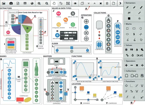
A top toolbar (Figure 3.A) enables essential operations (load, save, align, compress, hide, duplicate, and delete objects), and data importing functions: loading bitmap and vector graphics, structured data files; taking camera pictures; and opening web pages (DP1).
The right-side palette (Figure 3.B) is separated by categories and contains all the types of objects that can be composed in the canvas. The shape of the buttons encode whether these are draggable (circles) or involve switching to a mode (squares).
We designed the palette and toolbar to show all available functionality at a glance. Although these might appear com-plex (58 icons), and many icons need to be learned, they also make every operation and widget visually explicit (DP3). This design avoids the multi-step interactions required in menus (DP5—particularly important for touch interfaces), and the discoverability problems of gestures.
Extractors
These components extract data from different data sources (DP1) and make them available to other components in the canvas.
Color region extractors(Figure 3.D) can extract size, color
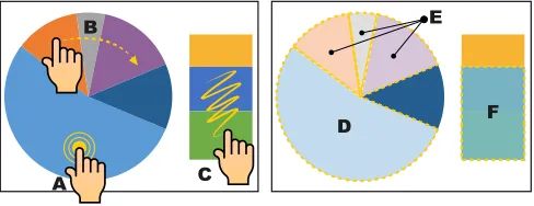
and shape from uniformly colored areas within raster images (e.g., a sector of a pie chart, the map area of a country). Dou-ble tapping on an area of a bitmap image uses a flood fill Computer Vision (CV) algorithm and creates an extractor ob-ject from where to drag the values (Figure 2.A). A similar pro-cess enables extraction from vector formats (without requir-ing CV). To facilitate extraction of multiple regions, a trace gesture creates multiple extractors for all objects in the trace (Figure 2.B). A squiggle over several areas with different col-ors creates a single extractor for all areas (Figure 2.C). If the source material is not good enough for CV (e.g., low-contrast photo), users can still trace areas with a pen or a finger over the picture or map and use their information in the same way.
Line samplersare created by tracing a freehand line on top
of an image. The sampler extracts colors of the image below (Figure 3.E) at adjustable intervals (Figure 3.F) and outputs them as color collection. Line samplers can also output the length of their trace. There is a straight line version as well.
Text recognizersappear as scalable and rotatable
rectangu-lar shapes that recognise textual information underneath the area that they cover (Figure 3.G). Expanding a text extrac-tor exposes the recognised text, which can be interpreted as a string, a number, or a date with a time stamp (Figure 3.H).
Structured data file extractorsare the canvas embodiment of
structured data files (in CSV or JSON format), which take the form of a named collection of collections (Figure 3.I).
Web page extractionenables web pages to be opened in a
A
D F
E B
[image:5.612.54.298.62.156.2]C
Figure 2. Gestures to create color region extractors. A double tap (A) extracts from an homogeneous region (D). A trace (B) creates separate extractors for each of the homogeneous regions underneath (E). A squig-gle (C) creates a sinsquig-gle extractor (F) from multiple regions.
from a web page (e.g., text, images, tables) into the canvas creates the corresponding object, interpreting it if necessary (e.g., as a date, time or number).
Values, Types and Data Flow
iVoLVER supports six different data types: numbers, strings, colors, date and time stamps, durations, and shapes, which are all represented as atomic objects in the canvas (DP2, DP3). Values appear as colored circles with a symbol inside; color and symbol identify the type of the value (Figure 3.J). They are sized slightly larger than a fingertip to enable touch ma-nipulation (DP6). Values can be dragged out of a value holder element (e.g., a property of an extractor) into a blank sec-tion of the canvas or from the palette. Expanding a number value (with a double click or double tap) enables direct edit-ing, scaling its output in orders of magnitude (for numbers), and assigning a unit label (Figure 3.K). Strings, colors, date and time stamps, and durations similarly support manual as-signment of the value.
Reading and writing operations to and from a specific iVoLVER value or a value holder element are displayed via visual connections. The connectors are dashed lines with di-rectional arrows that indicate flow direction (i.e., which value is the origin and which is the destination, reading and writing, etc.—see Figure 3.M, DP3, DP4). All links except the active one can be made invisible through a toolbar button. This is convenient when the canvas becomes cluttered.
To enable interactivity and as an alternative to having to edit a value manually to explore a particular range, iVoLVER has a slider (Figure 3.L) which outputs a value in real time de-pending on the interactive position of the handle. The range of values can be established interactively or from another ob-ject. Sliders also have a ‘play’ button that cycles through the range of values in a loop, producing animations.
Collections
Values can be grouped into collections. When compressed, collections appear as a toast shape with a symbol that rep-resent the type of objects held (Figure 3.N). Collections are always homogeneous. When expanded, each value in the col-lection can be accessed individually (Figure 3.O). Colcol-lections are created by dragging the collection icon from the palette, and are typeless until the first value is dragged into it. Col-lections are built by adding iVoLVER values one by one or
generated from other objects, including a sequence genera-tor that produces a collection of numbers between two values with a configurable step increment (Figure 3.P).
Operators
Values of most types can be combined through the four ba-sic arithmetic operations: addition, subtraction, multiplica-tion and division, which are represented as circles with the operator’s symbol in them (Figure 3.Q). Operators are sen-sitive to the type of value of its inputs and produce a cor-responding output; for example, subtraction of two numbers produces a number, but subtraction of two time stamps pro-duces a duration.
Marks
Visual marks in iVoLVER are represented through their own visual elements (DP2, DP3). There are seven types of marks: squares, rectangles, circles, ellipses, paths, filled marks, and SVGs (Figure 3.R). Marks are created from the palette ex-cept for paths and filled marks that can also be drawn on the canvas. SVG marks require the selection of an existing file.
The visual appearance of a mark is controlled by several prop-erties (visual variables) that can be interactively adjusted or receive input from other objects. All marks can take text (a la-bel), color, and a geometrical shape (which will convert them into a different kind of mark); most marks take some kind of geometrical dimension (width, height, radius, angle or a combination of these). Paths and filled paths also take lists of point coordinates to define their shape. Note that all these properties can be read or written; For example, one can give a mark the color from another mark, or read the collection of coordinates that makes up a path mark.
Relations: Functions and Mappers
A critical element of using data flexibly (G2) is the ability to transform it. iVoLVER provides two mechanisms to trans-form data: functions and mappers. These define a relation between a collection of inputs and a collection of outputs.
Functions correspond to the mathematical concept of real
number univariate functions: a mapping between subsets of the domain of real numbers where each value in the input is related to exactly one value of the output. The function wid-get is one of the most important widwid-gets in iVoLVER since it indirectly supports DP1 and provides a visually explicit rep-resentation of data transformation (DP3) without the need to code (DP4). There are three main ways to create a function: one can drag a predefined function from the palette (e.g., log-arithmic, square, sin), draw the desired shape directly on the canvas, or create a correspondence between x and y values from elsewhere in the system.
USER-TRACED FUNCTION OPERATORS
Q
EXTRACTORS
COLOR SAMPLER
COLOR-BASED STRUCTURED DATA
FILE EXTRACTOR Data.csv
Name
Age
Date of Birth
F
A
I G
E
M
VALUES & DATA TYPES
07/Sep/2015, 00:00:00 61.02 minutes
A String rgb(112, 112, 112)
Circle
EXPANDED NUMBER 100 centi meters
J
K D
C
Percent of
MAPPERS
EMPTY
COLORS TO NUMBERS MAPPING (EXPANDED) NUMBERS TO NUMBERS MAPPING
(COMPRESSED) T
SLIDER
L
0.00 360.00
FUNCTIONS
S
U W V
BUILT-IN SIN FUNCTION 0.00 85.00
0.00 100.00
(77.00, 53.00)
(291.67, -278.30)
0.00 -300.00 300.00
360.00
LOCATORS
COMPRESSED Y
200.00 EXPANDED X MARKS
Sales
COMPRESSED EXPANDED
Mark’s label Mark’s label
bottle.svg R
VISU
AL V
ARIABLES
H
TEXT RECOGNIZER
CONNEC-TION
COLLECTIONS
EXPANDED O
GENERATOR P
COMPRESSED EMPTY
N
B Group 2
Group 4 Group 1 Group 2
160.00
[image:6.612.57.561.61.427.2]Group 4 Group 1
Figure 3. iVoLVER components. See the iVoLVER Visual Language section for labeled descriptions.
transformation. The ports are connected through perpendicu-lar lines to a small yellow circle that moves along the function line. Each of the axes have two collection elements that pro-vide access to the coordinates that define the function.
Functions are used by connecting any numeric value from the canvas into the input port, which will result in the input port moving to the corresponding position in the X axis and the output port to the corresponding output position. Dragging from the output port will make the transformed value avail-able elsewhere in the canvas. Dragging the input port manu-ally will also produce the same effect interactively. Dragging a collection of numeric values into the input port will generate a collection of transformed values in the output.
Mappersallow the specification of relations between values
of different types (e.g., numbers, colors, and dates), as op-posed to functions which only work with numbers. They are a key element to support the use of data from different sources (G1, DP1) because data is often represented in different ways in the real world. For example, many topographic maps use color to represent height.
The mapper takes the shape of two vertical columns (collec-tions) of values where the left column represents the input domain, and the right one the output domain (Figure 3.T). An input port to the left of the input collection (Figure 3.U) can receive an input of the same type as the input domain, or simply be slided up and down. The output port to the right (Figure 3.V) will output a value within the output domain that corresponds to the vertical alignment of the specific input.
The vertical alignment of input and output elements deter-mines how the input and output domains are related. For example, if an input numeric value of 8 is aligned horizon-tally with a color value red, any inputs of value 8 fed to the mapper will be output as red colors. In between elements the mapper creates linear interpolations. Elements in the input and output domains can also be adjusted by dragging them (Figure 3.W). Finally, feeding a collection of values (rather than a single value) to the input port will result in a collection of outputs.
Locators
similar to functions (Figure 3.X). In its compressed form it is just a small circle (Figure 3.Y).
Dragging from the core circle of the locator to a mark gives control of the mark’s position to the locator. The mark’s X and Y position within the Cartesian space defined by the lo-cator provide a point of entry for values from other objects. The locator also provides an anchor to move multiple objects at the same time—once linked to a locator, they keep the spa-tial relationship to it.
Interactivity and Interaction
iVoLVER supports multi-touch, pen-based and mouse input, consistent with DP6. During the design we considered tak-ing advantage of the different input modalities by changtak-ing the input behavior depending on the type of input (e.g., en-abling the creation of connections by simultaneously touch-ing start and end ports), and even taktouch-ing advantage of pen and touch interactions (as in [14]). Although this could de-liver optimized interactions and a better use of the input band-width of specific devices, we decided against it to support the use the tool in a consistent fashion across a range of de-vices. We therefore designed interactions that are both consis-tent and feasible across the three input modalities (e.g., drag, tap/click) with occasional specific adaptations (e.g., buttons to zoom in and out when using pen or mouse input, enforcing a minimum size of objects for touch).
The web interface runs well on mobile devices such as iPads and large phones, also supporting DP6. The gesture design is consistent across widgets: double tap (or click) expands and contracts, drag moves an object or pans the canvas, dwell and drag pulls a data connection to another object. Multi-touch pinching and rotation (with two fingers) change the zoom level in the canvas or scale and translate when on top of im-ages.
The design of many widgets also introduces interactivity at all levels. For example, users can manipulate input ports in functions and mappers in real time, as if they were handles. Interactive sliders also enable interactive visualizations and animations.
IMPLEMENTATION
Since text recognition and computer vision are not yet well supported in browser-based frameworks, iVoLVER’s current implementation offloads these tasks to a server program spe-cialized in image processing routines. Thus, the system works under a client-server scheme. The client is implemented as a dynamic web page mostly written in JavaScript. The main area of the screen (i.e., the system’s sandbox) is implemented on top of a HTML5 canvas element, where most of the ren-dering process takes place. Fabric.js5 is used to handle the 2D graphical context of this element while seeking to ex-ploit the processing capabilities of the GPU at the client side. iVoLVER also takes advantage of regular DOM elements to implement objects such as the panels used to manually mod-ify values (e.g., to configure numbers’ magnitudes). The tooltipster6 jQuery plugin is used for this purpose. When
5http://www.fabricjs.com
6http://iamceege.github.io/tooltipster
running on multi-touch displays, the user input is handled through the Hammer.js7library in combination with the built-in touch capabilities of Fabric.js. Other libraries used built-in the client side of the system are: Simplify.js8 for polyline sim-plification support, the JSTS Topology Suite9 for the
appli-cation of spatial predicates and geomety processing, and the moment.js10library for date parsing and manipulation.
On the server side, a computer vision system written in Java executes several image processing routines as they are re-quested by the iVoLVER’s web client. Among other tasks, the server component is responsible for 1) computing color-based connected components in images through the applica-tion of a flood fill algorithm, 2) finding contours in binary and gray-scale images, 3) applying graphical morphological oper-ators (such as erosion and dilation), 4) performing per-pixel operations (e.g., to extract color samples), and 5) recogniz-ing text. These tasks are implemented with the OpenCV li-brary.11 The text detection and recognition routines are built upon the Tesseract4Java library.12 The communication
be-tween the client and the server is implemented through Java servlets.
Although eventually it will be possible to carry out the server-side operations in the browser, there are several advantages in offloading them to an internal or external component: a) computation is offloaded as well, which can benefit the use of the application in devices with low computational power such as phones and tablets; b) with the appropriate definition of a communication interface, offloading results in a separa-tion of concerns and improves maintainability; c) it can spur the usage of computer vision computations as a service from different provider frameworks or libraries, which could com-pete and therefore improve on the basic algorithms.
iVoLVER’s current implementation is only tested on Google Chrome, which is available for most major operating sys-tems. iVoLVER is accessible throughhttp://iVoLVER.cs. st-andrews.ac.uk.
SCENARIOS
We present four scenarios that show how iVoLVER could be used to support infovis in new situations. Live videos of the scenarios are available in the Video Figure.
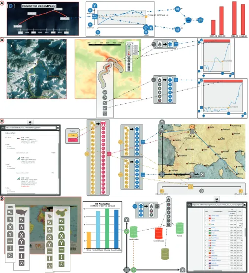
Verifying Infographics (and Correcting Them)
Figure 4.A illustrates how iVoLVER can be used to verify (and correct) mistakes (or manipulations) in existing info-graphics. We use the example of a TV line chart shown in the National Spanish Television in January 2015 [30]. The graphic showed a line representation of unemployment that is incongruous with the numbers displayed and with a non-zero baseline. This representation exaggerates and misrepresents unemployment decrease in the last two years, which led to many critics of the former government to claim bias through social networks.
7http://hammerjs.github.io
8http://mourner.github.io/simplify-js 9https://github.com/bjornharrtell/jsts 10http://momentjs.com
11http://opencv.org
0.00 6038.80 8619.10
55.00 (35.04, 6368.72)
B
C
D A
2007.00 2009.00 2012.00 2014.00
(2014.00, 3657543.18)
2014.00 2007.00
2129547.00 4848723.00
4447711.00
3657543.18
790167.82 790167.82
0.00 5415.11 8786.50
55.00 (26.31, 6606.40)
22/Sep/2015, 16:30:00 22/Sep/2015, 06:30:00
log.csv
Let’s play some music
China
Tweets Times
United States Saudi Arabia
Russia
ChinaUnited States Saudi Arabia 0
10
Russia 2
4 6 8
Oil Production
[image:8.612.58.564.61.616.2](millions of barrels per day)
Figure 4. Scenarios of use of iVoLVER. See Scenarios section for labelled descriptions.
With iVoLVER we trace the function over the displayed line and adjust the range to correspond to the numbers shown in the chart. A quick manipulation of the input of the function can help us see that the numbers provided are inconsistent with the shape of the chart (by hundreds of thousands of
This scenario shows how non-programmers trained in the use of iVoLVER (perhaps even when in front of the TV, with a tablet) could analyze graphics and generate alternative rep-resentations that are more understandable to them or less bi-ased. Simultaneously, journalists can use the same procedure to verify their sources and to double check that the graphics that they produce are correct and fair.
Climbing Everest
This scenario, depicted in Figure 4.B, involves the creation of route altitude profiles from raster image data. Two raster images are imported. One contains a depiction of the North Col-North Ridge and the South Col routes to reach the sum-mit of Mount Everest; the other is a topographic map of the area. We then use the freehand sampler tool to create two samplers that correspond to each of the routes. These traces can be created directly in the second figure, or created in the first figure and then moved onto the second (the second op-tion works in this case because both representaop-tions coincide spatially, but it might not be the case in other scenarios).
To create a mapping between color and altitudes we extract the colors and the altitude figures from the legend. This map-per can now translate any color or series of colors into a nu-merical altitude. We feed the altitudes from the route sam-plers into the mapper and use the output to display the as-cension as an interactive function. The width of the function widgets are adjusted to scale by extracting the route length from the trace. The result is a set of two comparable profiles.
This scenario exemplifies the creation of a sophisticated visu-alization optimized for a particular purpose, from data which is spatial and not trivial to extract. Besides the expressiveness of the visual language, this visualization also highlights the embedded interactivity: one can interactively query the pro-files, adjust routes or create new ones, adjust the sampling, and any of the extracted or manipulated data can be further fed into new processing or visuals.
Personal Visualization of a Trip
Camilla, which we assume has already learned the iVoLVER tool, just flew from Brest (France) to Perugia (Italy) to visit her family. She decides to visualize the trip in a fun way to her relatives. She uses any map of the area as a base and pulls the temporal data (flight departures and arrivals) straight from her webmail inside the tool (Figure 4.C). She does not need the system to have any geographical knowledge because she can easily select the trajectory. Mappers can transform dates into points of the map, interpolating the points in between. A date slider feeds the mappers to generate coordinates which, in turn, control the position of an SVG mark on the canvas through a locator. The resulting animation is proportional to the actual time scale of the trip. Finally, she can annotate the trip with her tweets because these are also time-indexed.
The scenario demonstrates pulling data from different sources to construct something new and fairly sophisticated in behav-ior without the need of any textual programming. The result is fun and animated. It is easy to imagine how this extends to more serious needs such as animal trajectory visualizations that help detect when two individuals are in close temporal and spatial proximity.
Oil Production and Consumption
This scenario displays the multiple flexible data importing mechanisms of iVoLVER and demonstrates how the different collected data can be combined to build a relatively standard chart of multivariate data (Figure 4.D).
We use oil production in the top four producing countries as example motivation. We first use the photograph feature of the tool to import a map that was on a poster. Color extrac-tors pull approximate country areas from the map (with squig-gles). Extractors on an SVG bring in the main production data and the labels. The consumption data comes from a table in the web. We use a locator to map the X coordinate to country area, the Y coordinate to oil production, and a number-to-color mapper translates oil consumption into number-to-color.
The scenario showcases how the tool can support a workflow where importing and capturing data can be better integrated and interleaved with the design of representations. Addition-ally, the resulting visualization is also a visual record of the representation choices and the data sources which can be use-ful in explaining the chart itself.
DISCUSSION
iVoLVER is a novel infovis creation system distinguished by the combination of three main features: it provides user-driven data extraction from non-structured data sources such as photographs, raster graphics, vector graphics, web pages and text; it does not require textual programming; and it en-ables analysis away from the mouse and keyboard through a touch, pen or mouse-based interface. These combined ele-ments aim to enable the use of infovis in an extended range of possible situations, a small sample of which is demonstrated through the scenarios from the previous section.
As a point exploration of a large design space, building iVoLVER has also made apparent the impact of our early de-sign choices. In the following subsections we identify the challenges that we found during the design process and re-flect on the advantages and disadvantages of our approach. It is important to note, however, that much of what is discussed below poses new questions rather than providing clear an-swers, and that these questions should be addressed through further analytical and empirical study.
Power and Simplicity
The radical atomic approach that we adopted (we repre-sent very low-level data such as single numeric values—the atoms—through separate interactive visual elements) aimed at producing a flexible interface where a few types of building blocks could be combined with each other in a multiplicity of ways. We believe that this indeed resulted in a powerful and flexible interface, especially when combined with the infinite canvas approach. However, the power-simplicity tradeoff is not really circumvented and complexity creeps up in several ways. For example, we found that the number of basic ele-ment types that we had to include in the design to make the system useful is not small.
emergent functionality and visualizations are possible, but the time and number of interactions required to put those together increases with their complexity and could threaten the util-ity of the tool in many situations that rely on quick, sketch-like creation of visualizations (e.g., the motivating scenario). Clutter can also result from this, which we addressed partially through functions that compress all objects and hide all links.
A related problem is caused by visualizations of larger datasets, which could be tedious to create. iVoLVER does not scale well with the size of the data because it does not easily allow abstraction (e.g., generalization of the operation on a concrete element to a group or to a group of groups), as enforced by our visual explicitness (DP3) and avoidance of hidden processes (DP5) principles. Complexity and scala-bility have been identified as fundamental challenges in other diagrammatic visual tools (e.g., by Javed and Elmqvist [24]). These challenges could be addressed in future designs by in-troducing abstraction in ways that do not obscure or hide the operations taking place.
Learnability
Although visual explicitness (DP3), avoiding hidden pro-cesses (DP5) and, more generally, avoiding abstraction might be ways to make interfaces easier to learn, iVoLVER is far from being suitable for novices and is definitely not walk-up-and-use. Maximizing learnability was not part of the original focus of iVoLVER’s design but it is an aspect of visual lan-guages worth discussing. The learnability challenges from iVoLVER stem, at least partially, from the complexities de-scribed in the previous subsection; namely, the multiple types of marks, data types, operations, functions and settings of the interface must all be learned, and this might result in a steep learning curve. It is also important to note that a visual syntax such iVoLVER’s is still a syntax. The semantic challenges of specification faced by textual programmers might be equiva-lent or even exacerbated by the visual nature of the language.
The question of what kind of approaches in the atomic-abstract and programmable-configurable continua work best for novices is important but outside of the scope of this paper.
Teaching and Collaborating
We have noticed that the current design has some possible advantages which we had not anticipated or aimed at. Specif-ically, the effort to atomize (DP2) and make everything visi-ble on the canvas (DP3) could prove useful for collaboration. Most actions in iVoLVER leave visual traces and the perma-nent feedthrough produced can help maintain other’s aware-ness [17] and facilitate communication [44]. For example, a circle connected with arrows in the canvas is harder to miss and easier to interpret than some actions in menus and dia-logues that disappear immediately (DP5). For the same rea-son, iVoLVER might be useful for teaching visualization and visual representation.
Integration and Interactivity
We realized early on that a tool that just enables extraction would be severely limited. We believe that the main value of iVoLVER comes from being able to extract data flexibly while being able to transform, combine, and represent this
data immediately and swap seamlessly between all these ac-tivities. All the activities take place through the same canvas, which reduces the need to compartmentalize the screen real estate or provide multiple screens or pages, although it might result in a significant amount of panning and zooming.
The integration of interactive control of data, representation and parameters within the canvas itself as interactive sliders, movable buttons and direct tracing of functions was motivated by DP5. The resulting interface is interesting in that the data and its manipulation are integrated within the same space and linked visually.
Limitations and Technical Constraints
iVoLVER does not provide universal coverage of all pos-sible infovis tasks or representations. Specifically, it does not provide features for set-level data interaction (e.g., se-lection, navigation, annotation) and is not as expressive as textual visualization programming languages or other recent tools such as Lyra [41]. For example, there is no simple way to produce force-directed layouts, trees, and two- and three-dimensional scalar fields. These could be implemented in the future through additional language elements. Extraction and text recognition features are also limited by the graphic anal-ysis algorithms. Users have no control of the parameters used in the image processing routines. This simplifies the extrac-tion process and avoids complex configuraextrac-tion, but might also impact user experience if unexpected results arise.
CONCLUSION
We introduce iVoLVER, a web-based visualization system that supports interactive construction of interactive visualiza-tions. iVoLVER makes the data processing steps—and the intermediate transformations performed on it—visually ex-plicit. This is achieved by the implementation of a visual lan-guage that provides graphical components aimed to support the extraction, manipulation and processing of both struc-tured and non-strucstruc-tured data. The combination of a flexible set of tools to extract data from many forms (raster images, pictures, SVG charts), a set of widgets to transform data, and a set of representation objects, aim to support visualization activity in a wider set of situations, such as when the data is not available in a convenient digital form or when the data comes from multiple sources. We illustrated the flexibility and expressiveness of the tool with a set of scenarios. Fi-nally, we provide a discussion that highlights the challenges and lessons learnt from our design choices.
ACKNOWLEDGMENTS
The authors wish to thank the reviewers and associate chairs for their advice. We are also indebted to Dr Laurence Lasselle who gave us access to her research and presentation prob-lems; to the Ecuadorian Government, who supports GGM through a SENESCYT scholarship; to Uta Hinrichs, Aaron Quigley and the SACHI group for feedback and help; and to Wacom, who supports the research through the donation of the Cintiq multi-touch displays in which our tool was devel-oped.
REFERENCES
Ubiquitous Analytics and Visualization Spaces.IEEE Transactions on Visualization and Computer Graphics
21, 2 (Feb. 2015), 215–228.DOI:
http://dx.doi.org/10.1109/TVCG.2014.2337337
2. Benjamin B. Bederson and James D. Hollan. 1994. Pad++: A Zooming Graphical Interface for Exploring Alternate Interface Physics. InProceedings of the 7th Annual ACM Symposium on User Interface Software
and Technology (UIST ’94). ACM, New York, NY, USA,
17–26.DOI:
http://dx.doi.org/10.1145/192426.192435
3. Jacques Bertin. 2011.Semiology of Graphics:
Diagrams, Networks, Maps. ESRI Press, Redlands,
Calif.
4. Marat Boshernitsan and Michael Sean Downes. 2004.
Visual programming languages: A survey. Technical
Report UCB/CSD-04-1368. University of California, Berkeley.
5. Michael Bostock, Vadim Ogievetsky, and Jeffrey Heer. 2011. D3; Data-Driven Documents.IEEE Transactions
on Visualization and Computer Graphics17, 12 (Dec.
2011), 2301–2309.DOI:
http://dx.doi.org/10.1109/TVCG.2011.185
6. John Brosz, Miguel A. Nacenta, Richard Pusch, Sheelagh Carpendale, and Christophe Hurter. 2013. Transmogrification: Casual Manipulation of
Visualizations. InProceedings of the 26th Annual ACM Symposium on User Interface Software and Technology
(UIST ’13). ACM, New York, NY, USA, 97–106.DOI:
http://dx.doi.org/10.1145/2501988.2502046
7. Jeffrey Browne, Bongshin Lee, Sheelagh Carpendale, Nathalie Riche, and Timothy Sherwood. 2011. Data Analysis on Interactive Whiteboards Through Sketch-based Interaction. InProceedings of the ACM International Conference on Interactive Tabletops and
Surfaces (ITS ’11). ACM, New York, NY, USA,
154–157.DOI:
http://dx.doi.org/10.1145/2076354.2076383
8. William O. Chao, Tamara Munzner, and Michiel van de Panne. 2010. Poster: Rapid pen-centric authoring of improvisational visualizations with napkinvis.Posters
Compendium InfoVis(2010).
9. William S Cleveland and Robert McGill. 1984. Graphical Perception: Theory, Experimentation, and Application to the Development of Graphical Methods.
J. Amer. Statist. Assoc.79, 387 (1984), 531–554.DOI:
http://dx.doi.org/10.2307/2288400
10. William S. Cleveland and Robert McGill. 1987. Graphical Perception: The Visual Decoding of
Quantitative Information on Graphical Displays of Data.
Journal of the Royal Statistical Society. Series A
(General)150, 3 (1987), 192–229.
http://www.jstor.org/stable/2981473
11. Andy Cockburn, Amy Karlson, and Benjamin B. Bederson. 2009. A Review of Overview+Detail,
Zooming, and Focus+Context Interfaces.Comput.
Surveys41, 1 (Jan. 2009), 2:1–2:31.DOI:
http://dx.doi.org/10.1145/1456650.1456652
12. Niklas Elmqvist, John Stasko, and Philippas Tsigas. 2008. DataMeadow: A Visual Canvas for Analysis of Large-scale Multivariate Data.Information Visualization
7, 1 (March 2008), 18–33.DOI:
http://dx.doi.org/10.1145/1391107.1391110
13. Gapminder Foundation. 2015. Gapminder, a fact-based worldview. (2015).http://www.gapminder.org
14. Mathias Frisch, Jens Heydekorn, and Raimund Dachselt. 2009. Investigating Multi-touch and Pen Gestures for Diagram Editing on Interactive Surfaces. InProceedings of the ACM International Conference on Interactive
Tabletops and Surfaces (ITS ’09). ACM, New York, NY,
USA, 149–156.DOI:
http://dx.doi.org/10.1145/1731903.1731933
15. Issei Fujishiro, Yoshihiko Ichikawa, Rika Furuhata, and Yuriko Takeshima. 2000. GADGET/IV: a taxonomic approach to semi-automatic design of information visualization applications using modular visualization environment. InIEEE Symposium on Information
Visualization, 2000. InfoVis 2000. 77–83.DOI:
http://dx.doi.org/10.1109/INFVIS.2000.885093
16. Lars Grammel, Chris Bennett, Melanie Tory, and Margaret-Anne Storey. 2013. A Survey of Visualization Construction User Interfaces. InEuroVis - Short Papers, Mario Hlawitschka and Tino Weinkauf (Eds.). The Eurographics Association.DOI:
http://dx.doi.org/10.2312/PE.EuroVisShort. EuroVisShort2013.019-023
17. Carl Gutwin and Saul Greenberg. 2004. The importance of awareness for team cognition in distributed
collaboration. InTeam cognition: Understanding the
factors that drive process and performance, E. Salas and
S. M. Fiore (Eds.). American Psychological Association, Washington, DC, US, 177–201.
http://hdl.handle.net/1880/45867
18. Jonathan Harper and Maneesh Agrawala. 2014. Deconstructing and Restyling D3 Visualizations. In
Proceedings of the 27th Annual ACM Symposium on
User Interface Software and Technology (UIST ’14).
ACM, New York, NY, USA, 253–262.DOI:
http://dx.doi.org/10.1145/2642918.2647411
19. Jeffrey Heer and Michael Bostock. 2010. Crowdsourcing Graphical Perception: Using Mechanical Turk to Assess Visualization Design. InProceedings of the SIGCHI Conference on Human Factors in Computing Systems
(CHI ’10). ACM, New York, NY, USA, 203–212.DOI:
http://dx.doi.org/10.1145/1753326.1753357
20. Jeffrey Heer, Stuart K. Card, and James A. Landay. 2005. Prefuse: A Toolkit for Interactive Information Visualization. InProceedings of the SIGCHI Conference
on Human Factors in Computing Systems (CHI ’05).
ACM, New York, NY, USA, 421–430.DOI:
21. Daniel D. Hils. 1992. Visual languages and computing survey: Data flow visual programming languages.
Journal of Visual Languages & Computing3, 1 (March
1992), 69–101.DOI:
http://dx.doi.org/10.1016/1045-926X(92)90034-J
22. Weihua Huang and Chew Lim Tan. 2007. A System for Understanding Imaged Infographics and Its
Applications. InProceedings of the 2007 ACM
Symposium on Document Engineering (DocEng ’07).
ACM, New York, NY, USA, 9–18.DOI:
http://dx.doi.org/10.1145/1284420.1284427
23. Samuel Huron, Sheelagh Carpendale, Alice Thudt, Anthony Tang, and Michael Mauerer. 2014.
Constructive Visualization. InProceedings of the 2014
Conference on Designing Interactive Systems (DIS ’14).
ACM, New York, NY, USA, 433–442.DOI:
http://dx.doi.org/10.1145/2598510.2598566
24. Waqas Javed and Niklas Elmqvist. 2013. ExPlates: Spatializing Interactive Analysis to Scaffold Visual Exploration.Computer Graphics Forum32, 3pt4 (2013), 441–450.DOI:
http://dx.doi.org/10.1111/cgf.12131
25. Rick Kazman and Jeromy Carri`ere. 1996. Rapid prototyping of information visualizations using
VANISH. InInformation Visualization ’96, Proceedings
IEEE Symposium on. 21–28, 118.DOI:
http://dx.doi.org/10.1109/INFVIS.1996.559212
26. Bongshin Lee, Rubaiat Habib Kazi, and Greg Smith. 2013. SketchStory: Telling More Engaging Stories with Data through Freeform Sketching.IEEE Transactions
on Visualization and Computer Graphics19, 12 (Dec.
2013), 2416–2425.DOI:
http://dx.doi.org/10.1109/TVCG.2013.191
27. Rhema Linder, Nic Lupfer, Andruid Kerne, Andrew M. Webb, Cameron Hill, Yin Qu, Kade Keith, Matthew Carrasco, and Elizabeth Kellogg. 2015. Beyond Slideware: How a Free-form Presentation Medium Stimulates Free-form Thinking in the Classroom. In
Proceedings of the 2015 ACM SIGCHI Conference on
Creativity and Cognition (C&C ’15). ACM, New York,
NY, USA, 285–294.DOI:
http://dx.doi.org/10.1145/2757226.2757251
28. Ruizhe Liu, Weihua Huang, and Chew Lim Tan. 2007. Extraction of Vectorized Graphical Information from Scientific Chart Images. InNinth International Conference on Document Analysis and Recognition,
2007. ICDAR 2007, Vol. 1. 521–525.DOI:
http://dx.doi.org/10.1109/ICDAR.2007.4378764
29. Sean Lynch, Miguel A. Nacenta, and Sheelagh Carpendale. 2011. ToCoPlay: Graphical Multi-touch Interaction for Composing and Playing Music. In
Human-Computer Interaction INTERACT 2011, Pedro
Campos, Nicholas Graham, Joaquim Jorge, Nuno Nunes, Philippe Palanque, and Marco Winckler (Eds.). Lecture Notes in Computer Science, Vol. 6948. Springer
Berlin Heidelberg, 306–322.DOI:
http://dx.doi.org/10.1007/978-3-642-23765-2_22
30. Redacci´on Madrid. 2015. Un nuevo gr´afico ‘manipulado’ sobre el paro se cuela en TVE.La
Vanguardia(Jan. 2015).http://www.lavanguardia.
com/television/programas/20150123/54424726878/ grafico-manipulacion-tve-paro.html
31. Bryan McDonnel and Niklas Elmqvist. 2009. Towards Utilizing GPUs in Information Visualization: A Model and Implementation of Image-Space Operations.IEEE Transactions on Visualization and Computer Graphics
15, 6 (Nov 2009), 1105–1112.DOI:
http://dx.doi.org/10.1109/TVCG.2009.191
32. Brad A. Myers. 1990. Taxonomies of visual programming and program visualization.Journal of
Visual Languages & Computing1, 1 (March 1990),
97–123.DOI:
http://dx.doi.org/10.1016/S1045-926X(05)80036-9
33. Seymour Papert. 1993.Mindstorms: Children,
Computers, and Powerful Ideas. Basic Books, New
York.
34. Seymour Papert and Idit Harel. 1991. Situating
Constructionism. InConstructionism. Ablex Publishing Corporation.
35. Casey Reas and Benjamin Fry. 2003. Processing: A Learning Environment for Creating Interactive Web Graphics. InACM SIGGRAPH 2003 Web Graphics
(SIGGRAPH ’03). ACM, New York, NY, USA, 1–1.
DOI:http://dx.doi.org/10.1145/965333.965356
36. Donghao Ren, T. Hollerer, and Xiaoru Yuan. 2014. iVisDesigner: Expressive Interactive Design of Information Visualizations.IEEE Transactions on
Visualization and Computer Graphics20, 12 (Dec.
2014), 2092–2101.DOI:
http://dx.doi.org/10.1109/TVCG.2014.2346291
37. Mitchel Resnick, John Maloney, Andr´es
Monroy-Hern´andez, Natalie Rusk, Evelyn Eastmond, Karen Brennan, Amon Millner, Eric Rosenbaum, Jay Silver, Brian Silverman, and Yasmin Kafai. 2009. Scratch: Programming for All.Commun. ACM52, 11 (Nov. 2009), 60–67.DOI:
http://dx.doi.org/10.1145/1592761.1592779
38. Ankit Rohatgi. 2015. WebPlotDigitizer. (2015).
http://arohatgi.info/WebPlotDigitizer
39. Greg Ross and Matthew Chalmers. 2003. A Visual Workspace for Hybrid Multidimensional Scaling Algorithms.Information Visualization2, 4 (Dec. 2003), 247–257.DOI:
http://dx.doi.org/10.1057/palgrave.ivs.9500056
40. Jeffrey M. Rzeszotarski and Aniket Kittur. 2014. Kinetica: Naturalistic Multi-touch Data Visualization. In
Proceedings of the 32nd Annual ACM Conference on
New York, NY, USA, 897–906.DOI:
http://dx.doi.org/10.1145/2556288.2557231
41. Arvind Satyanarayan and Jeffrey Heer. 2014. Lyra: An Interactive Visualization Design Environment.
Computer Graphics Forum33, 3 (June 2014), 351–360.
DOI:http://dx.doi.org/10.1111/cgf.12391
42. Manolis Savva, Nicholas Kong, Arti Chhajta, Li Fei-Fei, Maneesh Agrawala, and Jeffrey Heer. 2011. ReVision: Automated Classification, Analysis and Redesign of Chart Images. InProceedings of the 24th Annual ACM Symposium on User Interface Software and Technology
(UIST ’11). ACM, New York, NY, USA, 393–402.
DOI:http://dx.doi.org/10.1145/2047196.2047247
43. Sebastian Schmidt, Miguel A. Nacenta, Raimund Dachselt, and Sheelagh Carpendale. 2010. A Set of Multi-touch Graph Interaction Techniques. InACM International Conference on Interactive Tabletops and
Surfaces (ITS ’10). ACM, New York, NY, USA,
113–116.DOI:
http://dx.doi.org/10.1145/1936652.1936673
44. Jaime Snyder. 2012. Image-Enabled Discourse: Investigating the Creation of Visual Information as Communicative Practice.iSchool Information Science
and Technology - Dissertations(May 2012).
http://surface.syr.edu/it_etd/70
45. Guo-Dao Sun, Ying-Cai Wu, Rong-Hua Liang, and Shi-Xia Liu. 2013. A Survey of Visual Analytics Techniques and Applications: State-of-the-Art Research and Future Challenges.Journal of Computer Science
and Technology28, 5 (Sept. 2013), 852–867.DOI:
http://dx.doi.org/10.1007/s11390-013-1383-8
46. Matthew Tobiasz, Petra Isenberg, and Sheelagh Carpendale. 2009. Lark: Coordinating Co-located Collaboration with Information Visualization.IEEE Transactions on Visualization and Computer Graphics
15, 6 (Nov. 2009), 1065–1072.DOI:
http://dx.doi.org/10.1109/TVCG.2009.162
47. Jeffrey Travis and Jim Kring. 2006.LabVIEW for Everyone: Graphical Programming Made Easy and Fun (3rd Edition) (National Instruments Virtual
Instrumentation Series). Prentice Hall PTR, Upper
Saddle River, NJ, USA.
48. Bas Tummers. 2006. DataThief III. (2006).
http://datathief.org
49. Bret Victor. 2013. Drawing Dynamic Visualizations. Recorded at the Stanford HCI seminar. (2013).
https://vimeo.com/66085662
50. Fernanda B. Viegas, Martin Wattenberg, Frank van Ham, Jesse Kriss, and Matt McKeon. 2007. ManyEyes: a Site for Visualization at Internet Scale.IEEE
Transactions on Visualization and Computer Graphics
13, 6 (Nov. 2007), 1121–1128.DOI:
http://dx.doi.org/10.1109/TVCG.2007.70577
51. Colin Ware. 2012.Information visualization: perception
for design. Elsevier.
52. William Wright, David Schroh, Pascale Proulx, Alex Skaburskis, and Brian Cort. 2006. The Sandbox for Analysis: Concepts and Methods. InProceedings of the SIGCHI Conference on Human Factors in Computing
Systems (CHI ’06). ACM, New York, NY, USA,
801–810.DOI: