EMDialog:
Bringing Information Visualization into the Museum
Uta Hinrichs, Holly Schmidt, and Sheelagh Carpendale
Abstract—Digital interactive information displays are becoming more common in public spaces such as museums, galleries, and libraries. However, the public nature of these locations requires special considerations concerning the design of information visual-ization in terms of visual representations and interaction techniques. We discuss the potential for, and challenges of, information visualization in the museum context based on our practical experience with EMDialog, an interactive information presentation that was part of the Emily Carr exhibition at the Glenbow Museum in Calgary. EMDialog visualizes the diverse and multi-faceted discourse about Emily Carr, a Canadian artist, with the goal to both inform and provoke discussion. It provides a visual environment that allows for exploration of the interplay between two integrated visualizations, one for information access along temporal, and the other along contextual dimensions. We describe the results of an observational study we conducted at the museum that revealed the different ways visitors approached and interacted with EMDialog, as well as how they perceived this form of information presentation in the museum context. Our results include the need to present information in a manner sufficiently attractive to draw attention and the importance of rewarding passive observation as well as both short and longer term information exploration.
Index Terms—artistic information visualization, interactive information visualization, walk-up-and-use interaction, public displays.
✦
1 INTRODUCTION
Recently, branches of information visualization have emerged that ex-plore the problem of creating information presentations to be acces-sible by people from various backgrounds and with differing experi-ences rather than targeting domain-expert audiexperi-ences. This more ca-sual form of information visualization [21] takes place in real and virtual public spaces and faces new challenges due to the wide audi-ence for which it is intended. Increasingly, examples of casual infor-mation visualizations can be found on the web where visual presen-tations of data are provided that can be explored, casually analyzed, and commented on by a large number of people [13, 28]. Casual in-formation visualization is also becoming more common in physical public spaces such as libraries, museums, and art galleries. In these sit-uations, large display technology can be combined with information visualization to provide information access in a more immersive and engaging way [1, 2, 12, 26]. In contrast to the physical artifacts usu-ally displayed in these public spaces, information visualizations can present data that does not have a physical representation. Traditionally, this type of information has been presented in text panels. The use of techniques to display data visually and the support of interactive capa-bilities offers new potential for presenting information at museums.
Previous work has studied large displays presenting casual informa-tion located, e. g., in hallways of office buildings, at conference socials, or in student residences [5, 9, 17]. These semi-public spaces are char-acterized by a defined audience that broadly shares the same interests or background, and by repeating interactions of the same group of people over a long period of time. In contrast, the museum context is defined by a diverse audience and short, one-time only interaction with museum exhibits [15, 22]. Museum studies have been conducted to in-vestigate how people explore museum exhibits [22, 27] and how to aug-ment these with interactivity, including physical handles and buttons as well as digital displays [11, 15]. Furthermore, art galleries increas-ingly exhibit large display visualizations as art pieces [26]. However, abstract and interactive information visualizations that were designed
• Uta Hinrichs, University of Calgary, E-mail: [email protected]. • Holly Schmidt, E-mail: holly [email protected].
• Sheelagh Carpendale, University of Calgary, E-mail: [email protected].
Manuscript received 31 March 2008; accepted 1 August 2008; posted online 19 October 2008; mailed on 13 October 2008.
For information on obtaining reprints of this article, please send e-mailto:[email protected].
to enhance the content of museum exhibitions have not been previ-ously studied in terms of visitor interaction and response.
With this paper we contribute to the ongoing research around in-formation visualization in public spaces by discussing the unique chal-lenges of museums as an application area for information visualization. We present EMDialog, an interactive information visualization that was part of the “Emily Carr: New Perspectives on a Canadian Icon” exhibition at the Glenbow Museum in Calgary, Canada, as a case study of information visualization in the museum context. Furthermore, our observational field study conducted at the museum sheds light into how visitors responded to this form of information presentation.
We first discuss the design challenges of information visualization for museum displays by providing examples of public information vi-sualizations. We then describe the design approach of EMDialog and its interactive visualizations. We present the results of our field study and conclude by delineating lessons we have learned regarding infor-mation visualizations in museums.
2 INFOVISCHALLENGES FORMUSEUMDISPLAYS
A museum is a unique space where information is presented to the public as physical and, increasingly, digital artifacts. The audience in a museum is broad and diverse. People who visit a museum exhibition differ vastly in their age, knowledge, and social background. Some people visit an exhibition to add to their specialized knowledge, while others seek an entertaining and educational experience [15, 22]. This influences people’s expectations of an exhibition and the way they ex-plore it. In addition to this, museum visitors are often under pressure because they want to see “everything” within a certain amount of time. Due to the wealth of information commonly available in museums, ex-hibits are competing with each other for the attention of visitors. An exhibit that cannot create an incentive within ten seconds is usually abandoned [15]. These contextual characteristics impose particular challenges on the creation of information visualizations for museums.
2.1 Appeal
ex-hibit, the amount of time they actually invest in exploring it, and how they perceive and absorb the information it is presenting. Visually ap-pealinginteractivevisualizations for museum and gallery spaces have been developed to present data in a more accessible way [1, 2, 18, 26]. In the museum installation floating.numbers [1], a “river” of numbers floats across an interactive tabletop display creating a moving stream of information. Touching a number reveals textual information, pic-tures, or video sequences, accompanied by a subtle animation. This information could have been shown in a more space efficient and struc-tured way, such as a data table. However, visitors might have perceived this form of information presentation as overwhelming or even boring rather than intriguing.
Aesthetics is often discussed in terms ofvisualappeal [20]. How-ever, the interactivity of information presentations challenges this static notion of aesthetics. Appeal in public interactive installations is not simply a matter of visual attractiveness but also derives through interaction and context [20]. For the design of interactive information visualization in museums we consider appeal in this wider sense.
2.2 Data
A wide variety of rich data sets has been visualized in public infor-mation displays. Examples include: seismic data in the Breathing Earth display, developed for Japan’s Pavilion in the Internet’s World Expo [18], stock market data in Black Shoals [2] exhibited at the Tate Modern Gallery in London, captured video data from a gallery entrance way in “Artifacts of the Presence Era” [26] presented at the Institute for Contemporary Art, and background details about numbers in floating.numbers at the Jewish Museum in Berlin [1].
The data commonly shown in information installations for art gal-leries or trade shows is usually not dependent on nor integrated within the surrounding context. In these terms, an independent installation could just as effectively be installed in another show or at a different gallery. However, in a museum setting the information display might be required to be dependent, e. g., on the exhibition content. Thus, one of the design considerations is how the chosen data will contribute to, reflect on, or extend the context it is situated in.
2.3 Representation
Visual representations designed for museums face the likelihood that visitors will only spend a short period of time with an exhibit and rarely visit it more than once [15]. Therefore, the data representation should be intuitive to understand, engaging for exploration, and effec-tive in its use of metaphors and themes. Essentially, representations need to be simple enough to have people understand the meaning after a short while so that they can focus on exploring the actual informa-tion content. This does not mean the simplest soluinforma-tion is always best. It is also important to evoke curiosity. Vi´egas et al. use the metaphor of geological layers in sedimentary rocks for displaying the history of video data [26]. This abstract data representation was found to be suf-ficiently understandable in that people tried to actively manipulate the selection and shape of the next picture layer [26]. Also, an intriguing data representation can potentially keep visitors’ attention longer and persuade them to explore the visualized data in greater detail [19].
2.4 Interaction Design
The interaction design highly influences people’s overall experience of the visualization. A visually appealing information visualization can be experienced negatively if it is hard to explore due to awkward interaction techniques. In general, interaction techniques for museum information visualizations should be as lightweight and intuitive as possible, based on the “walk-up-and-use” principle. Museum visitors are not likely to read elaborate written instructions; rather they will use “trial and error” techniques to explore. Also, without the notion of a task, it may be more important for the interaction design to imply or suggest possible next interactions. That is, in some situations, sequenc-ing may become part of the responsibility of the information designer. Sequencing can be prescribed linearly through use of animations. For example in “Black Shoals” [2] stock market, changes are presented through continuous animation. People can watch the animations and
get a sense of stock market activity but they cannot explore or look at an earlier situation. Sequencing can be replaced by a holistic, “all information at once” approach as in floating.numbers [1]. People can drill down into details interactively but all choices are available at once. Other possibilities exist, such as supporting cycles or the ability to re-turn to previous configurations. The notion of information sequencing is important in a museum setting because this provides options as to how the information story will unfold.
2.5 Display Technology
The choice of display technology is an important factor that affects many aspects including overall visibility, input possibilities, and inte-gration with the other exhibits. Since visitors often explore a museum exhibit in groups [22, 27], large display technologies may be preferred over smaller displays as they enable the exploration of the visualiza-tion in a collaborative way. Many examples show that one of the cri-teria for successful information visualization in museum and gallery spaces is to allow multiple people to actively or passively experience the visualization at the same time [1, 2, 26]. When choosing display technology, it is important, however, to support lightweight interaction with the display, e. g., via direct touch. Especially in public spaces where people cannot be expected to be trained in using certain input devices, intuitive input solutions are crucial [11, 15].
3 THEEMDIALOGINSTALLATION
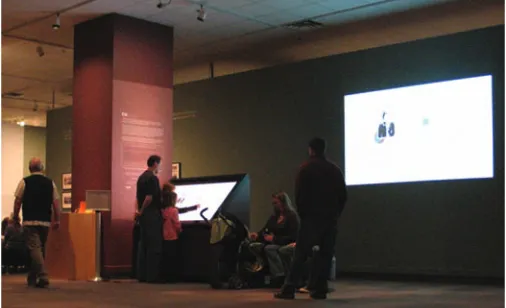
[image:2.612.307.560.424.578.2]EMDialog is an interactive information presentation that was commis-sioned by and installed at the Glenbow Museum to enhance an exhibi-tion about the Canadian artist Emily Carr (1871–1945). Organized by the Vancouver Art Gallery and the National Gallery of Canada, this traveling exhibition presented a selection of Carr’s paintings, craft work, and written publications by and about her. Located in a space be-tween the exhibition rooms, EMDialog invited visitors to interactively explore two visualizations of the previous and ongoing discourse about the artist (see Fig. 1). Before we describe the visualizations EMDialog embodies, we will explain our motivation and approach to its creation and provide technical details about the installation.
Fig. 1. EMDialog installation at the museum.
3.1 Motivation and Approach
Our approach to visualizing this discourse is an artistic one. This manifests itself in the choice and creation of the data set we visualize. Reflecting on the exhibition, EMDialog is an artistic response to the life and work of Emily Carr. Our goal was to provide visitors with additional information about Emily Carr but in a thought provoking manner rather than a didactic one. Engaging visitors to explore un-known information and initiating discussion were our incentives.
3.1.1 Technical Setup
EMDialog consists of a large high-resolution interactive display (65” diagonal, 1920 ×1024 pixel) designed by SMART Technologies Inc. [25] that is tilted by a 45° angle to resemble a digital drafting table. Equipped with infrared lights around the edges and infrared cameras in the corners, the display enables direct touch interaction us-ing fus-ingers [25]. Embedded speakers provide ambient sounds of birds twittering, water rushing, and wind passing through trees. With the ambient sound we tried to convey Emily Carr’s feeling of painting out in the woods. In addition, a large projection surface (101 × 56 inches) was arranged on the wall next to the interactive display. The projection contained the cloned content of the display making the visualizations and interaction with the display visible for a larger area (see Fig. 1).
3.1.2 Data Set
The interface of EMDialog consists of two visualizations that are based on a data set we created specifically for this installation. The data consists of statements from various authors about Emily Carr and comments from Carr’s own publications, journal entries [8], and auto-biography [7]. We also chose a subset of pictures of her paintings and craft work. The selection of data was driven by our intent to show a diversity of interpretations. In this regard, it is highly subjective and takes only a small subset of information about Carr into account. In total, our data set consists of 103 written statements and 71 pictures.
We then integrated the selected data into a contextual framework which evolved from our discussions about Carr. Based on the idea of mind mapping [6], the framework consists of six different node-link tree diagrams (henceforth trees) where each tree represents one perspective in which Carr’s work and life can be interpreted: iden-tity, modernism, feminism, Canadian ideniden-tity, First Nations, and na-ture (see Fig. 2 as an example). Filled with associative terms and ex-pressions, the tree diagrams form a contextual hierarchy wherein the collected statements and pictures are the children. In total, the tree structure contains approximately 1000 nodes. The content of this data set reflects the overall theme of the exhibition by representing differ-ent perspectives on Carr over time. Our personal artistic perspective is reflected through the conceptual framework represented by the tree. In a way, we are adding to the discourse on Emily Carr, by visualizing and reinterpreting it through EMDialog.
nature
west-coast
animals
spirituality
jungle
sky mountains
experience sea
unity
life divinity
friends birds
dogs
wilderness
trees colour
[image:3.612.316.570.450.632.2]sounds timber wisdom
Fig. 2. Partition of the nature tree diagram.
3.1.3 Visual Metaphor and Interaction Paradigm
Since EMDialog was installed within an exhibition that would mainly show Carr’s paintings, we decided to use a tree metaphor for our visu-alization, reflecting on the theme in most of her paintings. We visually interpret the tree metaphor in two different ways: the temporal dimen-sion of the data is represented by a cut tree section and the contextual
dimension by an upright standing tree with branches and leaves. Both visualizations can be explored independently of each other, but are in-terlinked through people’s interactions.
The visualizations are based on the “walk-up-and-use” interaction paradigm, that is, interactive elements react to simple, direct touch in-teraction. No instruction about how to interact with the visualizations is provided to visitors, which leaves the interaction techniques as well as the information visualizations open for exploration.
3.2 Visualizing Discourse
Based on the data set and visualization metaphor described above, EM-Dialog presents the discourse about Emily Carr along two dimensions: time and context. In this section, we will describe each of the visual-izations and how they relate to each other.
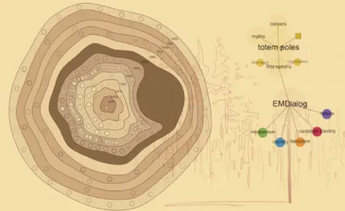
3.2.1 Cut Section Vis
The cut section visualization is a visual representation of the discourse on Carr’s life and workover time. The time line is presented in the form of a tree cut section (see Fig. 3 and 5 (left)) in which each tree ring represents a decade starting from 1890 to 2010. Statements from various authors about Carr’s life and work, passages from her own writing, and pictures of her paintings are represented by small circles and arranged within the tree rings of the cut section. While the state-ments on a tree ring are grouped by theme, their arrangement within a particular theme is not ordered. Touching the cut section within a tree ring causes the touched tree ring to visually open up through a lens ef-fect. If the finger touches one of the transparent circles within the tree ring the associated statement fully reveals itself (see Fig. 3). The state-ment remains open when the finger is released from the table surface to enable comfortable reading. The cut section allows for both point-and-touch and continuous point-and-touch interaction. Statements can be selected by simply touching them and releasing the finger from the display, similar to a point-and-click interaction on a desktop computer. However, it is also possible to run the finger across the cut section while continuously touching. This interaction enables smooth information browsing.
[image:3.612.60.297.537.642.2]The cut section offers a broad temporal overview of the discourse. People can focus on a certain time period to find out, e. g., what kind of paintings Carr created in the 1930s, or they can explore how the discourse about Carr has changed over time.
Fig. 3. Cut section in the EMDialog interface (statement by Carr [8]).
Each statement in the cut section has a reference stating the author, title, and year of the work. The statements are displayed in a sans-serif font (see Fig. 4(a)) with the exception of comments by Carr herself. Inspired by Carr’s use of an old typewriter to draft some of her publi-cations, her statements are presented in a typewriter font to give them a distinguishable look (see Fig. 4(b)).
(a) Statement by an author (Doris Shadbolt [23]) about Carr.
[image:4.612.48.299.46.242.2](b) Statement by Emily Carr [8].
Fig. 4. Statements by Carr are visualized in distinguishable way.
to which of the six different discourse perspectives the particular state-ment has been assigned. The coloring of the information visually in-terlinks the cut section with the tree visualization.
3.2.2 Tree Visualization
The time-based cut section visualization is supplemented by the
[image:4.612.364.503.48.350.2]context-basedtree visualization. When a statement or picture is se-lected in the cut section located on the left side of the interface, the contextually related tree reveals itself on the right side as soon as the selecting finger is released from the table surface (see Fig. 5). Similar to the cut section visualization, the node-link tree is based on a tree metaphor as it is shown in the form of an upright standing, abstracted tree with branches and leaves (see Fig. 6). Each tree node appearing as a circle represents a word or short expression. Statements or pictures appear as leaf nodes in the tree and are represented by small square icons. The spatial arrangement of tree nodes is based on a radial tree layout where leaf nodes are aligned in semi-circles around their parent while the length of the connecting line between leaf and parent is fixed for all nodes of one level [3].
Fig. 5. Selected statement [7] and the corresponding tree diagram.
The tree contextualizes statements and pictures by integrating them in a hierarchical graph consisting of supporting words and expres-sions. The selected statement in Fig. 5, e. g., is a comment by Emily Carr about Eric Brown, the then-director of the National Gallery of Canada. We embedded this comment into the “Canadian identity” tree as Brown played an important role in making Carr an iconic Canadian
Fig. 6. Tree providing contextual information (close-up from Fig. 5).
figure. In the related tree (see Fig. 6), the corresponding statement icon (the big squared document symbol) is connected to “Eric Brown,” “Na-tional Gallery,” “na“Na-tional acceptance,” “Canadian art movement,” and finally “Canadian identity.” Following the branches of the tree, people can gain contextual information about Carr’s comment about Brown.
Due to the size of our data set it can become difficult to spatially display the whole tree without experiencing major occlusion and over-lapping of branches. In order to avoid clutter, a tree is never expanded fully. Triggered by a statement selection (touch-and-release) from the cut section, only the corresponding node-link tree diagram is shown and it only expands the branches that are directly connected to the statement as shown in Fig. 6. The large translucent circles represent tree nodes that are fully expanded, the darker colored small circles rep-resent nodes that contain hidden children. These nodes can be interac-tively explored through simple touch-and-release interaction. Touch-ing a closed node will reveal its children on the next level and, if nec-essary, collapse other open nodes based on a degree of interest function and a threshold [10]. In this way, people have the possibility of explor-ing the tree of one specific perspective. Certain word nodes within the tree may trigger more interest and lead people in certain directions.
Touching a square icon on a leaf node enlarges it in the tree view and reveals the corresponding statement in the cut section. This shows how both the cut section and the tree visualization are interlinked with each other: selecting information in the cut section brings up the corre-sponding tree and selecting a statement or picture in the tree reveals its information fully extended in the cut section. Each visualization can be seen as an implicit navigation tool for the other visualization.
3.2.3 Relations and Perspective Crossing
[image:4.612.46.297.489.649.2]cir-cles in the cut section are highlighted in the associated color. As shown in Fig. 5, the selected statement is related to three other pieces of in-formation from the modernism (green), feminism (orange), and First Nations (yellow) perspective. In this way, people become aware of additional information that might be of interest to them.
[image:5.612.55.304.203.355.2]In addition to finding thematic relationships, it is possible to see all perspective trees at once. An overview tree is revealed when people make an “empty selection” in the cut section; when they touch areas on the tree rings where no information is located. If the finger is then released from the table surface, the tree that opens up consists of all possible perspectives (see Fig. 7). This overview tree can be explored by people just as the single-perspective trees. Again, the system does not allow this tree to be fully expanded, but certain branches are col-lapsed as people explore in order to avoid clutter.
Fig. 7. Empty selection in cut section brings up all-perspectives tree.
4 STUDYDESCRIPTION
EMDialog was installed at the Glenbow Museum from the end of Oc-tober 2007 until the end of January 2008. During this period of time approximately 29,700 people visited the Emily Carr exhibition, not including school or family programs. In the time period between De-cember 18, 2007 and January 27, 2008, we conducted a field study at the museum on the Emily Carr exhibition floor. Our goal was to gain insights into more open ended questions such as:
• how would people approach EMDialog,
• what would draw them toward the installation,
• how would they explore the information visualizations, and
• what would visitors generally think of this type of information pre-sentation in the museum context.
For this reason, we chose a qualitative ethnographically oriented study method [4]. We observed general museum visitors while they were exploring EMDialog as part of their museum visit. A sign informed people about the study being conducted. One of two observers would watch people interacting with the installation for 2–4 hours per obser-vation day. The observer would sit relatively far from the interactive display to interfere as little as possible with people’s behavior, making use of the large projection to see how exactly people were interact-ing. Observations took place for 15 days during a high attendance period between Christmas and New Years Eve and on the weekends in January. To avoid obtrusion as much as possible and due to ethical reasons we did not record video or audio data but focused our data collection on written field notes. To facilitate this process, we devised observational categories that were subsequently refined.
In addition to the open observation we had museum visitors fill out questionnaires in which we asked them about their experience with the installation and the visualizations. Questionnaires were available near the installation during the whole study period.
In a period of 15 days and 27 observation hours, we observed a total of 267 instances of interaction with EMDialog. In addition, 87
questionnaires were filled out by visitors. We analyzed the field notes and visitor opinions from the questionnaires based on the open cod-ing method [4] and counted occurrences of certain behaviors and inci-dences. The results of the analysis of questionnaires and the observa-tion based field notes are discussed below.
5 EMDIALOG INUSE
Our study results are organized as follows. First we describe how dif-ferent types of visitors approached and perceived the installation in general. After this, we discuss the various incentives that led people to explore EMDialog further. We then consider different styles of in-formation exploration we observed and discuss how groups explored the installation in contrast to individuals. Finally, we will explain the performance aspect of EMDialog revealed by the study, and provide an overview of visitors responses to the installation.
5.1 Types of Visitors
Our study confirmed our assumptions about the diverse audience at a museum and previous results from other museum studies [15, 22]. The age of people interacting with EMDialog ranged from toddlers to elderly people. Many families explored the installation. Our results indicated a close connection between the age of visitors and their mo-tivation to interact with EMDialog. Children were very keen on touch-ing the interactive display and would often drag adults accompanytouch-ing them toward the installation. We found adults to be more hesitant and careful in approaching the installation. They would often look at it from a distance before deciding to explore it further.
We also found that interest in EMDialog strongly varied between people. Many visitors stopped briefly to look at the table or the projec-tion and moved on without becoming further engaged. Others came closer and started to read the text panel near the interactive table or a statement that was selected in the cut section and moved on. Visitors that started interacting with the display were sometimes more inter-ested in the interaction and the visual effects than in the content of the visualizations. Especially children and younger adults were fascinated by the magnification effect caused by touching the cut section. These types of visitors would also watch the little blue dot that was displayed wherever the finger was touching the display following their fingers. On one hand, this shows that aesthetic interaction can be an instru-ment to keep people engaged with the information visualization even if they are not interested in the content. On the other hand, however, fancy interaction techniques can draw people’s attention away from the visualization’s content. For information visualization with an edu-cational purpose this could be problematic. The interaction time with EMDialog was less than two minutes if people were not interested in the content. That is, the novelty of interaction wore off fast. We found this short-term interaction in approximately 30% of our observations.
The average interaction time with the piece was approximately two to five minutes which was found to be an average amount of time for the exploration of exhibit pieces [22]. From a curator’s perspective this shows that EMDialog was a great success as an exhibit. Occasion-ally people became reOccasion-ally interested in reading statements or exploring themes in the tree and spent up to 15 minutes with the piece. These varying interaction times indicate that information visualizations in museums need to reward both short and long-term exploration.
5.2 Incentives to Approach EMDialog
From our observations and questionnaire analysis, we found that three major factors of EMDialog had an effect on motivating people to ap-proach the piece: the display technology, the visual appearance of the visualizations, and seeing other people interact with it.
rather attracted by the physicality of the display and by other people interacting with it. The projection, however, displayed the two infor-mation visualizations in a way that made it widely visible to people walking through the Emily Carr exhibition. This indicates that not only the display technology but also the visual appearance of the visu-alizations provided an incentive for people to come closer.
The other factor that led visitors to interact with EMDialog is the
honey pot effect[5], that is, the tendency of people to pay attention to an interactive system when they see other people interacting with it. While this phenomenon has been observed in different public display settings before [5, 17], our findings show that it transfers to large in-teractive information displays in museum spaces. Approximately 20% of people stated in the questionnaire that they started interacting with EMDialog for exactly this reason. During our observations we noticed the honey pot effect even in 33% of all observed cases of interaction. Watching other people interacting seems to help people understand what the information visualization is about and how it works. The wall projection of EMDialog facilitated the observation of people in-teracting with the system. All interaction techniques were simple and largely visible which made them easily understandable even from afar.
5.3 Data Exploration
We observed certain patterns of how people explored the two infor-mation visualizations and how the visual and interaction design influ-enced people’s exploration strategies.
5.3.1 Initial Interaction
Approximately 51% of visitors that interacted with EMDialog started to explore the cut section visualization first, while 30% turned to the tree. In the remaining 20% of cases it was unclear which visualization was approached first. Two factors seem to have influenced people’s initial preference: the appearance of the visualization and previous observations. The cut section visually dominates the interface. This could be a reason why it initially attracted more people. People who in-teracted with the tree first were presumably attracted by its more struc-tured look. Also, the tree’s interaction design is more traditional since its nodes resemble familiar buttons. People usually had no problem understanding that direct touch-and-release would expand branches.
However, we found that observing others interacting with EMDia-log influenced people strongly in their choice of visualization for first interaction. Visitors often tried to imitate interaction techniques they had observed. This became particularly apparent when people inter-acted with the cut section first. Many people tried to apply touch-and-release interaction on the cut section which worked but in a rather inac-curate and dissatisfying way. In most cases, people eventually learned to run their fingers continuously across the cut section for a smoother interaction. In contrast, people who observed other people applying the continuous interaction on the cut section immediately adopted it.
5.3.2 Exploring Linked Visualizations
The biggest motivation for people to explore EMDialog was to find statements and images within the visualizations. From our observa-tions and field note analysis, we found that people used the cut section and tree equally for this purpose. However, we noticed that both visu-alizations satisfy data exploration in different ways. In general, people seemed to browse through the cut section more at the beginning, while focusing on the tree later. We assume that the content of the tree with all its associative words and expressions becomes more interesting for people when they have a general understanding about the visualiza-tion’s content. For instance, we observed people going through the branches of the tree intentionally selecting statement icons from cer-tain themes after they had explored the cut section for a while. They seemed to understand the different thematic approaches of the two vi-sualizations and used the tree to find information on topics that were of personal interest to them.
In 30% of all observed cases, we noticed that people switched be-tween the two visualizations at least once. As we had anticipated, the visual links between the visualizations were often the reason for this attention shift. While exploring the cut section, people would notice
the corresponding tree and start to explore its branches. Vice versa, touching one of the squared symbols in the tree would reveal the cor-responding information in the cut section shifting people’s attention toward it. However, we found that another reason people switched be-tween the two visualizations was frustration about the lack of feedback. For instance, touch-and-release interaction in the cut section would of-ten lead to empty selections, in particular when people had not yet understood the encoding of the small circles within the tree rings. If an empty selection happened repeatedly, people usually moved over to the tree and tried to find something more meaningful there. Similarly, people would shift their focus to the cut section if the expansion of several tree branches did not reveal any pictures or statements. Peo-ple who did not find any meaningful information in any visualization usually left the installation altogether. We observed this incident quite a few times since an empty selection reveals the large all-perspective tree. The size of this tree makes it more difficult to find leaves that represent statements or pictures—information that was the most inter-esting to visitors. Long searches without any reward overly taxed mu-seum visitors’ attention span. Providing meaningful information, such as statements or pictures, early on is crucial to keep visitors motivated for further information exploration.
5.4 Individual vs. Group Interaction
Previous museum studies have found that visitors approach exhibits mostly in groups [22, 27]. Our observations revealed that this is also true for interactive information displays even if group interaction is not particularly supported. EMDialog was mostly approached by groups or individuals that were joined by acquaintances shortly after starting to interact. Groups of two were most commonly observed. Only 33% of the people we observed interacted as individuals with the informa-tion visualizainforma-tions. The technical setup of EMDialog does not opti-mally accommodate group interaction since we did not enable simul-taneous interaction by multiple people. This was particularly problem-atic when multiple children were interacting with the system. How-ever, this did not impair group interaction as much as we had expected. We observed that groups of two to three people were often exploring both visualizations in a highly collaborative way although they had to take turns. Often, one person would be the main interactor and control the visualization while the rest of the group would watch and more pas-sively take part in the interaction by pointing to certain visualization elements. Other groups took turns often and managed to collaborate quite smoothly. Some people, especially pairs, divided up the display workspace with one person interacting with the cut section and the other person with the tree. They would sometimes switch places dur-ing the exploration so that each person could interact with the other visualization. We noticed that group exploration of the visualizations was always accompanied by discussion.
From our experiences with other interactive installations we found that groups coped fairly well with the limited support of multi-touch interaction. We assume that this is because of the shared unfamiliarity of all group members which caused people to closely collaborate to-gether to find out how the interaction worked, what each visualization presented, and how they were interlinked. In this regard, the ability to collaboratively explore the visualization might have triggered further engagement with the visualizations.
5.5 Performance Aspect
The large display and projection surface made interaction with the vi-sualization quite visible which had advantages in regard to evoking cu-riosity and teaching people how to interact with the installation. How-ever, this technical setup also imposed a performance aspect to the information exploration that visitors perceived as intriguing and awk-ward at the same time. In 14% of all observed cases we found that people were clearly aware of themselves interacting in public, visible by everybody moving through the exhibition floor. Whenever a person was clearly looking at the projection screen while interacting with the display we took this as an indicator for such performance awareness. We assume that most people exploring the information visualization were aware that other people were observing them because of the large projection even if they did not look at it specifically. Some people com-mented about this in our questionnaire. In response to the question about what was particularly liked or disliked about the installation one person stated: I am“uncertain about the performance aspect—I’m kind of an introvert.” Particularly when the system looks new and not much instruction is provided, people often hesitate because they are afraid of doing something “wrong.” It appears that figuring out how to interact with the visualizations in public was an awkward ex-perience for many people. Some visitors also commented on feeling uncomfortable interacting with the display based on their interest be-cause of“not knowing whether or not someone was in the middle of reading the projected screen.” Along the same lines, another person stated: “I felt I was uncomfortable moving at my own pace because others were reading the projection.” Other people would not spend more time with the visualization because they felt they“couldn’t due to the line of other interested patrons.”Museum studies have revealed people’s awareness of other visitors’ presence and how this can influ-ence the way they explore an exhibition [11, 27]. Our observations not only show that these findings transfer to large interactive displays at museums but also that this awareness might lead to even shorter ex-ploration times that have nothing to do with personal interest in the visualization but with social pressure. Rewarding short-term interac-tion by making some informainterac-tion in the visualizainterac-tion easier accessible can be a solution to this issue.
From the perspective of the “observers,” one person stated that
“watching other people interact”was the most intriguing part of EM-Dialog. Indeed, we found when someone was interacting with EMDia-log, mostly other people, acquaintances or strangers, would pause and start to watch; either in the projection or, coming quite close, directly on the display. This shows that the performance aspect has two per-spectives: it might feel awkward to people who are interacting, but it makes the visualization more enjoyable for people watching from afar.
5.6 Visitor Response
EMDialog received mixed reactions from visitors. People stated quite explicitly what they liked or disliked about the installation. Many neg-ative comments directly refer back to the input technology we were using for touch interaction. For instance, people often thought the sys-tem“was not working”because they covered the LED lights on the display edges with their hands or jackets. Also, people complained that“when more than one person tried to interact with it, it would not respond.”These problems could be addressed by using different tech-nology that supports simultaneous multi-touch interaction. However, with linked visualizations such as ours where interaction with one visu-alization has an impact on other visuvisu-alizations integrating multi-touch interaction would need to be considered carefully.
Elderly people in particular complained about the absence of clear instructions. We sometimes observed visitors moving back and forth between the visualization and the text panel next to the display in search of instructions. With regard to the content and the actual vi-sualization, some people stated it was“too much reading”and“not enough pictures.” Many people clearly favor visual information over written text, even if it is presented in a more appealing way. Some peo-ple perceived the visualizations as“too complex”or“totally confus-ing.”A few people even personally talked to us stating that they would have liked a more traditional information presentation that would lead
them through the content in a more structured way. Three people stated that they found the overall information presentation“pointless,” indi-cating that they did not understand the purpose of it at all.
We also received positive and encouraging comments. People ap-preciated the visualizations for enhancing the museum experience by putting“Carr’s work into context.” Many visitors found the technol-ogy and the visual information presentation of EMDialog“awesome and cool”or“fun.”We also collected statements indicating that peo-ple really understood the visualizations and were able to glean some-thing from them. For instance, people appreciated
• the“linking of chronology & concept,”
• the fact that EMDialog enabled them to see“more of her work and [to get] a better understanding of the time line of her career,”
• that it allowed them“to focus on one aspect/period of her work,”
• that it gave a better“sense of time and place,”
• and they found that it“enhanced the museum experience because it presented tidbits of background info not available elsewhere in the exhibit.”
The aesthetics of the information visualization enhanced this impres-sion. In general people found the appearance of the visualization
“graphically appealing”and“interesting.”The tree metaphor and the connection to Emily Carr was largely understood. Although the in-teraction techniques can be improved on with regard to accuracy and smoothness, they were found adoptable and engaging. One person stated: “It took me a while to get the idea (and resist fatigue after spending two hours in the exhibit) but it quickly engaged me and was really neat and fun to use.” This statement might explain some of the negative comments we received for EMDialog. From the question-naires we learned that nearly 80% of visitors approached EMDialog either while they were on their way from one exhibit room to the next or at the end of their visit. Our observations confirm this. It is possible that some people already felt fatigued from all the impressions they had absorbed from the exhibition and were overwhelmed by EMDia-log’s unusual information presentation. More visual guidance through EMDialog’s interface could have made it easier for people to under-stand the visualizations. For instance, the interpretative character of the visualized information could have been reflected stronger. How-ever, the reaction and engagement of the majority of visitors show that people were able to interpret the walk-up-and-use information visual-izations provided by EMDialog without further instruction which can be called a success in itself.
6 LESSONSLEARNED
Our observations of EMDialog, an information visualization em-ployed as part of a museum exhibition where it reflected on the ex-hibition content, provides valuable insights for designing information visualizations for museum spaces. While large information displays have been studied in semi-public and public settings [5, 9, 17, 26], mu-seum visitors’ responds to and interaction with information visualiza-tions within the museum context had not been examined. This section summarizes the lessons we learned from our observations.
Rewarding short-term and long-term exploration.The differ-ing background and interest of museum visitors results in varydiffer-ing data exploration times. Some people spent little time with the visualization, while others examined the data in more detail. Both types of explo-ration should be rewarded by information visualizations for museum displays. This can be achieved through the visual data representation and the interaction design. A short data exploration could reveal a gen-eral overview or brief information snippets while longer exploration could provide deeper insights in the data relations and patterns.
collaborative data exploration. In contrast to collaborative information analysis applications that need to support both work in parallel, and close collaboration [16], our findings suggest that in a museum setting close collaborative information exploration preponderates. This needs to be analyzed further in future studies.
Making information exploration appealing. In EMDialog our choices around visual appeal focused on attracting peoples’ attention, evoking peoples’ curiosity, and keeping people engaged. Our findings suggest that using large interactive display technology to present infor-mation visualizations in museums gives the visualization a physical presence within an exhibition. This makes it possible for people to watch the visualization from afar and with low commitment required to decide whether to engage or not. Moreover, it makes data explo-ration widely visible. More than the visual appeal of the visualization alone, the observation of other people exploring the visualization cre-ates an incentive for people to try it themselves. It needs to be con-sidered, however, that being observed by strangers can create negative feelings for the person who interacts. This is a trade-off. Although interacting on a large public display always implicates some perfor-mance aspect, lightweight interaction techniques and clear visual feed-back might make people feel more comfortable and less vulnerable about making interaction “mistakes” in public.
Supporting various exploration styles. The interaction design within EMDialog mostly supports an exploratory style of data exami-nation. While the exploratory search was largely a positive and reward-ing experience, it was sometimes experienced as confusreward-ing and over-whelming. We therefore suggest supporting guided data exploration in combination with exploratory search for information displays at muse-ums. People that are unsure about the visualization’s content and how to interact with it can be guided toward meaningful information by providing visual feedback, e. g., through subtle animation sequences. Also, people with clear interests or special questions in mind should be able to explore the data based on their own criteria.
7 CONCLUSION
EMDialog is an interactive large display information presentation that was designed to engage museum visitors in the exploration of addi-tional information about a museum exhibition. It presents two in-terlinked information visualizations of the discourse about the artist Emily Carr along contextual and temporal dimensions. This paper contributes to the ongoing research around information visualization in public spaces by discussing the unique challenges of museums as an application area for information visualization, and presenting a design case study of an information visualization as a source of additional exhibition information. Our long-term field study conducted at the museum sheds light into how museum visitors responded to our infor-mation visualization. Our study results emphasize the importance of rewarding both short and long-term exploration of visualizations and supporting more than one interaction style to acknowledge the diverse audience at a museum. While the use of appealing information pre-sentations and interaction techniques can evoke curiosity and create an incentive to further information exploration, it is also important to make the actual content of the visualization accessible. Further, en-abling collaborative information exploration supports and recognizes of the social aspect of a museum visit. These insights contribute guide-lines for the design of information visualizations as part of museum exhibitions.
ACKNOWLEDGEMENTS
We would like to thank the Glenbow Museum and SMART Technolo-gies Inc. for making this project possible. Thanks to all members from the Interactions Lab of the University of Calgary for their insightful comments and suggestions and our funding agencies Alberta Ingenu-ity, iCORE, CFI, and NSERC.
REFERENCES
[1] ART+COM. floating.numbers. Website: http://artcom.de, 2004. Visited March 2008.
[2] L. Autogena and J. Portway. Black shoals stock market. Website: http://www.blackshoals.net/, 2001. Visited March 2008.
[3] G. D. Battista, P. Eades, R. Tamassia, and I. Tollis. Graph Drawing: Algorithms for the Visualization of Graphs. Prentice Hall, 1999. [4] J. Blomberg, J. Giacomi, A. Mosher, and P. Swenton-Wall.Participatory
Design—Principles and Practices, chapter Ethnographic Field Methods and Their Relation to Design, pages 123–155. Lawrence Erlbaum, 1993. [5] H. Brignull and Y. Rogers. Enticing people to interact with large public displays in public spaces. InProc. of the Int. Conf. on Human-Computer Interaction, pages 17–24, 2003.
[6] T. Buzan.The Mind Map Book. Penguin, 1991.
[7] E. Carr.Growing Pains: The Autobiography of Emily Carr. Douglas and McIntyre, 2005.
[8] E. Carr. Hundreds and Thousands: The Journal of an Artist. Douglas and McIntyre, 2006.
[9] E. F. Churchill, L. Nelson, L. Denoue, and A. Girgensohn. The plasma poster network: Posting multimedia content in public places. InProc. of the Int. Conf. on Human-Computer Interaction, pages 599–606, 2003. [10] G. W. Furnas. Readings in information visualization: using vision to
think, chapter The FISHEYE View: A new look at structured files, pages 312–330. Morgan Kaufmann Publishers Inc., 1999.
[11] R. E. Grinter, P. M. Aoki, A. Hurst, M. H. Szymanski, J. D. Thorton, and A. Woodruff. Revisiting the visit: Understanding how technology can shape the museum visit. InProc. of the conf. on computer supported collaborative work, pages 146–155, 2002.
[12] K. Grønbæk, A. Rohde, and S. Bech-Petersen. Infogallery: Informative art services for physical library spaces. InProc. of the Joint Conf. on Digital Libraries, pages 21–30, 2006.
[13] J. Harris and S. Kamvar. We feel fine. http://www.wefeelfine.org, August 2005. Visited March 17, 2008.
[14] L. E. Holmquist and T. Skog. Informative art: Information visualization in everyday environments. InProc. of GRAPHITE, pages 229–235, 2003. [15] E. Hornecker and M. Stifter. Learning from interactive museum instal-lations about interaction design for public settings. InProc. of the conf. of the computer-human interaction special interest group of Australia on Computer-human interaction, pages 135–142, 2006.
[16] P. Isenberg and S. Carpendale. Interactive tree comparison for co-located collaborative information visualization.IEEE Transactions on Visualiza-tion and Computer Graphics, 13(6):1232 – 1239, 2007.
[17] K. Karahalios and J. Donath. Telemurals: Linking remote spaces with social catalysts. InProc. of the conf. on Human factors in operating systems, pages 615 – 622, 2004.
[18] C. Malamud.A World’s Fair for the Global Village. MIT Press, 1997. [19] D. A. Norman.Emotional Design. Basic Books, 2004.
[20] M. G. Petersen, O. S. Inversen, P. G. Krogh, and M. Ludvigsen. Aesthetic interaction — a pragmatist’s aesthetics of interactive systems. InProc. of the conf. on Designing interactive systems, pages 269 – 276, 2004. [21] Z. Pousman, J. T. Stasko, and M. Mateas. Casual information
visualiza-tion: Depictions of data in everyday life.IEEE Transactions on Visualiza-tion and Computer Graphics, 13(6):1145—1152, 2007.
[22] C. G. Screven. Information Design in Informal Settings: Museums and other Public Spaces, chapter 7, pages 131–192. MIT Press, 2000. [23] D. Shadbolt.The Art of Emily Carr. Douglas and McIntyre, 1992. [24] T. Skog, S. Ljungblad, and E. Holmquist. Between aesthetics and utility:
Designing ambient information visualization. InProc. of the IEEE Symp. on Information Visualization, pages 30–37, 2003.
[25] Smart Technologies Inc. Digital vision touch technology. Website: http://smarttech.com/dvit, 2003. Visited March 2008.
[26] F. B. Vi´egas, E. Perry, E. Howe, and J. Donath. Artifacts of the presence era: Using information visualization to create an evocative souvenir. In
Proc. of the IEEE Symp. on Information Visualization, pages 105–111, 2004.
[27] D. vom Lehn, C. Heath, and J. Hindmarsh. Exhibiting interaction: Con-duct and collaboration in museums and galleries. Symbolic Interaction, 24(2):189–216, 2001.
[28] M. Wattenberg. Babynames, visualization, and social data analysis. In
![Fig. 3. Cut section in the EMDialog interface (statement by Carr [8]).](https://thumb-us.123doks.com/thumbv2/123dok_us/8680340.378202/3.612.60.297.537.642/fig-cut-section-emdialog-interface-statement-carr.webp)
![Fig. 5. Selected statement [7] and the corresponding tree diagram.](https://thumb-us.123doks.com/thumbv2/123dok_us/8680340.378202/4.612.364.503.48.350/fig-selected-statement-corresponding-tree-diagram.webp)