STREAMLINE VECTOR VISUALIZATION
by
Joshua Joseph Anghel
A thesis
submitted in partial fulfillment
of the requirements for the degree of
Master of Science in Computer Science
Boise State University
DEFENSE COMMITTEE AND FINAL READING APPROVALS
of the thesis submitted by
Joshua Joseph Anghel
Thesis Title: Interactive Focus+Context Glyph and Streamline Vector Visualization
Date of Final Oral Examination: 10 October 2013
The following individualsread and discussedthe thesis submitted by studentJoshua Joseph Anghel,and theyevaluatedhispresentationand responsetoquestionsduring the final oral examination. They found that the student passed the final oral examination.
Alark Joshi, Ph.D. Chair, Supervisory Committee
Kristin Potter, Ph.D. Member, Supervisory Committee
Amit Jain, Ph.D. Member, Supervisory Committee
chance tohelp you withthe summerworkshops atiSTEM.
ThankyouDr. KristiPotterforallyourfeedbackandassistanceonmywriting. Thank you Dr. Teresa Cole and all the studentswho participated inthe graphics researchgroupmeetingsforgivingmeaplacetopracticepresentingandgetfeedback,
and thanks to everyone who participatedin the user study.
Lastly I would like to thank the Computer Science department of Boise State
University and all the faculty for their support.
With data sets growing in size, more efficient methods of visualizing and analyzing
data are required. A user can become overwhelmed if too much data is displayed at
once and be distracted from identifying potentially important features. This thesis
presents methods for focus+context visualization of vector fields. Users can interact
with the data in real time to choose which regions should have more emphasis through
a mouse or touch interface. Streamlines and hedgehog based visualizations are used
to change the level-of-detail based on the importance value at each data point to
provide focus+context to vector visualizations. The presented visualization methods
are shown to be more computationally efficient and are shown to scale well to smaller
resource platforms (such as tablets), while user evaluations indicate user performance
for feature analysis and particle advection was similar to existing techniques.
LIST OF SYMBOLS . . . xviii
1 Introduction . . . 1
1.1 Context . . . 1
1.2 Prior Research . . . 4
1.2.1 Streamlines . . . 4
1.2.2 Hedgehogs . . . 8
1.2.3 Line Integral Convolution (LIC) . . . 11
1.2.4 Attention Driven Visualization . . . 14
1.3 Thesis Statement . . . 18
2 Overview . . . 20
3 Importance . . . 22
3.1 Focus Points . . . 22
3.1.1 What is a focus point? . . . 22
3.1.3 Interaction . . . 24
3.1.4 Generation from data . . . 26
3.2 Importance Field . . . 27
4 Glyphs . . . 29
4.1 Glyph Pool . . . 29
4.2 Random Glyphs . . . 30
4.3 Grid-Based Glyphs . . . 31
4.4 Mipmap Glyphs . . . 32
4.5 Shape and Size . . . 35
4.6 Temporal Coherence . . . 36
4.7 Performance . . . 36
5 Streamlines . . . 39
5.1 Seed Point Selection . . . 39
5.1.1 Image Guided . . . 39
5.1.2 Randomized Seed Pool . . . 39
5.2 Controlling Density . . . 40
5.2.1 Separation Distance . . . 40
5.2.2 Integration Method . . . 42
5.3 Visual Effect . . . 43
5.3.1 Splines . . . 43
5.3.2 Thickness . . . 43
5.3.3 Opacity . . . 44
5.3.4 Indicating Direction . . . 44
6.1.3 Data . . . 52
6.1.4 Participants . . . 52
6.2 Results . . . 53
6.2.1 Glyphs . . . 53
6.2.2 Streamlines . . . 57
6.2.3 Directed Streamlines . . . 57
7 Conclusions . . . 63
7.1 Results . . . 63
7.1.1 Glyphs . . . 63
7.1.2 Streamlines . . . 63
7.2 Discussion . . . 64
7.3 Future Work . . . 64
REFERENCES . . . 66
A Appendix . . . 69
A.1 User Evaluation Datasets . . . 70
4.1 Shows performance of glyph visualizations for uniform grid, jittered
grid, and random distributions. . . 37
5.1 Results for datasets shown in Figure 5.7. . . 48
1.3 Example of streamlines without orientation indications. [9] . . . 4
1.4 The left image shows streamlines placed on a grid. The right image
shows streamlines after the seed point positions have been optimized
based on the method presented by Turk et al. [15]. . . 5
1.5 The left image shows streamlines created using randomly chosen and
optimized streamlines, the image on the right uses the method
pre-sented in [9]. . . 6
1.6 Sample visualizations creating using Drawing with the Flow to
manu-ally place and alter streamlines [11]. . . 8
1.7 Oriented streamlines can be adapted to visualize direction along
stream-lines [10]. . . 9
1.8 Arrow glyph width is used to encode uncertainty while length encodes
magnitude to give a complete vector field visualization while conveying
the uncertainty of data [24]. . . 10
and jittered (right) grid [10] . . . 11
1.10 Shows two separate vector fields each rendered using a fixed number
of vectors to determine the level of detail to render the vector fields at
[13]. . . 12
1.11 The left image shows either a center, source, or sink critical point.
Due to the limitations of LIC, the orientation of the flow and whether
the rotation is actually converging on the point or not is difficult to
determine. The right image shows a turbulent flow visualized with LIC.
The image gives a good overview of the vector field, but the details are
masked by clutter [2]. . . 13
1.12 Shows the same center rendered using LIC (left) and FROLIC (right).
FROLIC clearly shows the clockwise rotation that LIC alone could not
show. [20] . . . 14
1.13 Shows how streamline visualizations can be created using a modified
LIC algorithms presented by Bordoloi et al. [1]. . . 15
1.14 The image on the left represents a fish eye zoom effect on a map
resulting in distortions in the surrounding roads. The image on the
right represents a sharp zoom lens that occludes some of the nearby
text. [3] . . . 16
direction. . . 20
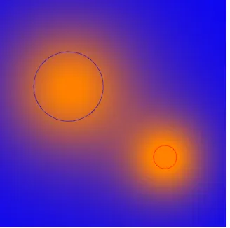
3.1 Visualization of wave functions for focus points and their effects on the
importance field. In all images, the importance field is represented as a
color map from blue (0) to orange (1). The circle represents the radius
and location of the focus point. . . 25
3.2 Shows the importance field resulting from multiple focus points. The
importance field varies from 0 (blue) to 1 (orange). Focus points are
visualized by the circles with width representing the radius of the focus.
In this figure both focus points use an inverse square wave function. . . . 28
4.1 Shows a vector field visualization using randomly placed glyphs. Note
how some glyphs overlap. Also note that there are small regions of
higher density that are far away from the focus point. . . 31
4.2 Shows the results of placing glyphs on a uniform and jittered grid
while choosing importance threshold randomly. Notice that occlusion
is suppressed, but pockets of uneven density still exist. . . 32
grid is shown below. Importance thresholds are shown with blue being
the highest, then orange, and green being the lowest. . . 34
4.4 Shows uniform and jittered grids using mipmap importance thresholds. 35
4.5 Shows uniform and jittered grids mipmap importance thresholds, but
without random variation within a level. Notice how the boundary
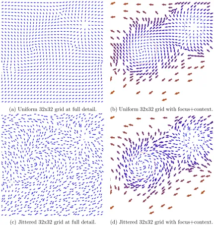
between level transitions is much more defined. . . 36
4.6 Shows both full detail and focus+context visualization using jittered
and uniform grid placement with mipmap importance thresholds. . . 37
5.1 Shows seed point pool used in streamline visualization. Seed points
that generate valid streamlines are shown in red, while ignored seed
points are shown in blue. . . 41
5.2 Shows streamline visualizations with varyingdtest. Notice how
stream-lines appear short and choppy with highdtest. For all imagesdmin=0.01
and dmax=0.08. . . 42
5.3 Demonstrates potential occlusions that occur near the ends of
stream-lines if no tapering occurs. The image on the left has no tapering
enabled, while the image on the right has tapering. . . 44
5.4 Demonstrates artifacts caused by tapering. The image on the left has
only tapering enabled. The image on the right has tapering and opacity
modulation enabled to smooth out the aliasing. . . 45
5.5 Shows streamlines with thickness and opacity modulated with a
saw-tooth function along the streamline to indicate direction. . . 46
using glyph based visualizations. The top graph shows the score
(pro-portion correct) the bottom shows the times. The 95% confidence
intervals are also shown. . . 54
6.2 User evaluation results for identifying the type of features using glyph
based visualizations. The top graph shows the score (proportion
cor-rect) and the bottom shows the times. The 95% confidence intervals
are also shown. . . 55
6.3 User evaluation results for advecting a particle using glyph based
visu-alizations. The bottom graph shows the average error (measured as the
distance from the selected point to the nearest point on the streamline)
and the top shows the times. The 95% confidence intervals are also
shown. . . 56
6.4 User evaluation results for counting the number of features using
stream-line visualizations. The top graph shows the score (proportion correct)
and the bottom shows the times. The 95% confidence intervals are also
shown. . . 58
rected streamline visualizations. The top graph shows the score
(pro-portion correct) and the bottom shows the times. The 95% confidence
intervals are also shown. . . 59
6.6 User evaluation results for identifying features using directed stream-line visualizations. The top graph shows the score (proportion correct) and the bottom graph shows the times. The 95% confidence intervals are also shown. . . 60
6.7 User evaluation results for advecting a point using directed streamline visualizations. The top graph shows the time and the bottom shows the error (as a distance from the selected point to the nearest point on the streamline). The 95% confidence intervals are also shown. . . 61
A.1 Full detail glyph visualization. . . 70
A.2 Focus+context glyph visualization with no initial focus points. . . 72
A.3 Full detail glyph visualization with focus point guesses shown. . . 73
A.4 Focus+context glyph visualization with initial focus points given. . . 74
A.5 Directed streamlines at full detail with no focus+context. . . 76
A.6 Directed streamlines with focus+context interaction enabled, but no focus points initially created. . . 77
A.7 Directed streamlines at full detail with initial focus points chosen. . . 78
A.8 Focus+Context directed streamlines with focus points initially created near possible features. . . 79
A.9 Full detail streamlines. . . 81
A.10 Focus+context streamlines with no initial focus points. . . 82
CPU – Central Processing Unit
GPU – Graphics Processing Unit
LOD – Level of Detail
LIC – Line Integral Convolution
OLIC – Oriented Line Integral Convolution
FROLIC– Fast Rendering Oriented Line Integral Convolution
Φ Focus point wave equation
ds Step size used in streamline integration
dmin Minimum streamline separation distance
dmax Maximum streamline separation distance
dtest Streamline separation distance test value
ts Maximum streamline thickness
CHAPTER 1
INTRODUCTION
1.1
Context
With the size of simulated and measured data sets growing, a more efficient method
of analyzing that data is needed. Data visualization is a way of filtering data and
displaying it in a way that allows more intuitive analysis. Data visualization is used
in many technical fields such as physics, math, chemistry, and engineering; however,
it is not limited to those fields. Figure 1.1 shows how data visualization can be used
to create a visual representation of recent wind trends across the United States.
A sub-domain of data visualization is vector field visualization. Vector fields map
a direction to every point in space and can be used to describe flow or movement of
a material (air or water for example) as well as represent vector potentials (such as
electric or magnetic fields). Many fields use numerical techniques to produce vector
data ranging from wind velocity in a hurricane to water currents around the world.
Vector visualization gives form to the data and allows more interactive and intuitive
analysis.
Vector fields are commonly described by their turbulence, a measure of how steady
or violent the flow of the field is, and by their critical points. Critical points are regions
where the value of the vector field becomes ambiguous. They include sources, sinks,
Figure 1.1: Shows recent wind patterns across the United States [16].
A source is a region where the field appears to originate and diverge from. A sink
is a region where the field appears to converge upon. Saddles occur along boundaries
in a vector field between regions of opposing direction. Centers are regions where the
vector field rotates about, but never converges or diverges from. Each critical point
type can be further classified based on rotation direction or other properties. Figure
1.2 shows a few examples of a saddle, a spiraling source (repelling focus), a spiraling
sink (attracting focus), a source which emits mainly in two directions (repelling node),
and a similar sink which absorbs mostly along two directions (attracting node).
Vector fields can be stored as functions or a map of positions to directions, but
are commonly stored in a structured grid format. Each point in the grid (either 2D
or 3D) stores a 2D or 3D value representing the direction at that point. Advances in
Figure 1.2: Example of feature types from left to right: simple saddle, a spiraling source (repelling focus), a spiraling sink (attracting focus), a source emitting only in two directions (repelling node), and a sink absorbing only in two directions (attracting node) [14].
grids resulting in vast amounts of vector data. For simplicity it is tempting to visualize
entire vector fields as a grid of values, but what if many of those values are null or
the user is uninterested in those regions? The result is a loss of computing time and
possibly cluttering a screen with information that will only distract the user.
With data set sizes growing it becomes more important to efficiently filter out
some of the data visualized. Many techniques for vector visualization currently exist
including streamlines, hedgehogs, and line integral convolution (LIC). All of these
techniques have been researched and improved over time, but the focus has been on
uniform density visualizations and not on the emphasis of specified regions of interest.
Doing so would allow interactive visualization of larger data sets more efficiently
as well as allowing the user to have a sense of context around a higher resolution
viewing region. This work proposes methods for adaptive importance-driven vector
Figure 1.3: Example of streamlines without orientation indications. [9]
1.2
Prior Research
1.2.1 Streamlines
Streamlines [9, 15, 23, 27] are smooth lines that follow the gradient of a vector
field. Streaklines are lines representing movement of particles (dye advection) at
any point. Pathlines or particle traces are lines representing the past history of a
single particle. These appear to be similar, but the gradient is not equivalent to a
particle trace or advection and thus produces slightly different results, but the lines
themselves are commonly visualized in a similar way. These methods of visualization
result in smooth visualizations, but present challenges with spatial and temporal
(for animation) coherence. Figure 1.3 shows an example of a simple streamline
visualization. Note that basic streamlines do not show which direction along the
streamline the vector field points.
stream-Figure 1.4: The left image shows streamlines placed on a grid. The right image shows streamlines after the seed point positions have been optimized based on the method presented by Turk et al. [15].
lines, so early work began with solving this problem. Turk et al. proposed a method
of image guided streamline placement [15]. Their method begins by placing a number
of seed points in the image space. Each seed point is integrated outwards to form a
streamline that terminates near another streamline, a critical point, or the edge of the
image. The seed points are shifted slightly in an attempt to maximize the distances
between streamlines. This results in an optimization problem that is iterated until
this distance metric is above a threshold set by the user or until the iteration limit
has been reached.
Figure 1.4 shows how streamline placement is a crucial factor in the visualization
method. Because the method is an optimization problem, it is often non-deterministic
and can result in different images if ran for a different number of iterations.
Further-more, Laidlaw et al. demonstrates this method to be less effective than LIC when
identifying locations of critical points [10].
Figure 1.5: The left image shows streamlines created using randomly chosen and optimized streamlines, the image on the right uses the method presented in [9].
results to Turk’s method, but is not modeled as an optimization problem and produces
deterministic results [9]. This method used a similar approach of attempting to find
optimal seed point placement, but it instead creates streamlines sequentially. A seed
point is chosen and a streamline is created from it. The next seed point is chosen
such that it is the fixed separation distance away from the current streamline and no
closer than the separation distance from any other streamline. This process continues
until there are no more candidate seed points. By “growing” streamlines outward, an
image can be generated in a single pass. Figure 1.5 demonstrates that this method
is not only faster, but produces longer, more consistent streamlines.
Heckel et al. later developed streamline hierarchy maps. They present an
algo-rithm for clustering streamlines in 2D and 3D into larger domains of similar flow
[8]. This method produces adaptive visualization with focus drawn to regions where
streamlines based on similar direction and the regions of higher density cannot be
specified by the user.
With the advancement of graphics hardware, GPUs and their application to vector
visualization has also been investigated. Weiskopf et al. present a method of creating
2D and 3D vector field visualizations by creating streaklines from particle advection
calculations computed using per pixel GPU operations [22]. Unfortunately due to
the nature of the advection operations, this method lacks the ability to control the
resulting distribution of streamlines like those from previous works [9, 15].
Work with variable vector field visualization using streamlines includes that of
Schroeder et al. [11]. They developed an interactive software tool that allows for
creating illustrative streamline visualizations using sketch-like gestures. This results
in varying LOD (level-of-detail) for regions of greater interest; however, this method
is not automated and does not actually visualize regions of interest directly. Rather,
the interface allows for more intuitive visualization through manual customization
by a user. Figure 1.6 displays some visualizations created using “Drawing with the
Flow.” These visualizations are a great example of importance-driven visualization
with emphasis placed on the turbulent region behind the obstacle, but were not
created by the software directly, but by a user manually placing and editing the
streamlines.
Streamline visualization produces smooth results that provide a greater continuity
than other methods, but suffers from the inability to demonstrate flow direction. This
problem can be overcome with the use of oriented streamlines. Oriented streamlines
use stylized line rendering to represent direction. Figure 1.7 shows how sawtooth
modulation of the widths of streamlines can provide indication as to which direction
Figure 1.6: Sample visualizations creating using Drawing with the Flow to manually place and alter streamlines [11].
(commonly arrows or triangles) based visualization. Oriented streamlines have been
shown to allow users to conduct particle advection tasks faster and more efficiently
that other LIC or glyph based techniques [10].
1.2.2 Hedgehogs
Hedgehogs [24] are a method which uses glyphs to represent the direction at various
points which can be chosen by any means, but are commonly chosen along a grid
of some kind. Hedgehogs produce a clear indication of the vector field direction at
various points. Because the glyphs are disjoint they lack the ability to give any strong
indication as to flow of the field, but do not suffer from spatial or temporal coherence
issues and do not require as much computation as streamlines or streaklines do.
Glyphs can also be used to visualize uncertainty as shown by Wittenbrink et al.
Figure 1.8 demonstrates how varying the lengths of the arrow glyph can be used to
indicate magnitude while varying the width of the arrow can be used to indicate error
Figure 1.7: Oriented streamlines can be adapted to visualize direction along stream-lines [10].
Glyph based visualizations can produce very different results depending on the
placement of the glyphs. A common and simple approach is to place glyphs at
regular intervals along a uniform grid. This produces consistent visualizations and
most accurately reflects the file data’s structure; however, user studies have shown
that jittering the location of the glyphs off a regular grid by some random amount
can improve the ability to locate critical points [10]. Figure 1.9 demonstrates the
difference between using a uniform or jittered grid to place glyphs along. As can be
seen, critical points are more clearly visible/pronounced in the right image.
Randomly jittering a grid can improve user performance, but is hardly a universal
solution. Some vector fields may have configurations that a random jittering still
does not compensate for (i.e. large number of critical points clustered together on
one side of the scene). Telea et al. investigated the use of a level-of-detail approach to
Figure 1.9: The same vector field visualized with hedgehogs on a uniform (left) and jittered (right) grid [10]
direction and magnitude), each level of the tree represents a level-of-detail for the
visualization. By choosing a fixed number of glyphs to display, a level of the tree
is chosen and rendered. Larger glyphs are used to represent clustered regions while
smaller glyphs represent less clustered and more unique regions. An example of two
vector fields rendered at different levels of detail is seen in Figure 1.10. Although
this approach provides excellent automated level-of-detail support based on features
within a vector field, it lacks any interactive component. The user cannot manually
specify a region of interest, but rather those are fixed based on the properties of the
vector field itself.
1.2.3 Line Integral Convolution (LIC)
Line integral convolution was first proposed by Cabral and Leedom [2]. This technique
Figure 1.10: Shows two separate vector fields each rendered using a fixed number of vectors to determine the level of detail to render the vector fields at [13].
noise texture based on the values of the vector field at that point. Figure 1.11 shows a
center and a turbulent vector field visualized with LIC. Due to its dependence on the
resolution of the texture and the number of computations required it is considered
more computationally expensive than other alternatives (glyphs and streamlines).
Also, LIC does not produce any indication as to vector field direction. User studies
show LIC to be one of the most inefficient visualization methods for finding the type
and location of critical points [10]. LIC also requires more interpolation between
data points and thus introduces more error. Because of the limitations of LIC it is
impossible to determine which direction the vortex is rotating in the left image of
Figure 1.11. The right image also suffers from an inability to determine direction,
but also appears very cluttered.
Oriented line integral convolution (OLIC) is an attempt to add directional
indi-cations to LIC visualizations [21]. FROLIC (fast oriented line integral convolution)
Figure 1.11: The left image shows either a center, source, or sink critical point. Due to the limitations of LIC, the orientation of the flow and whether the rotation is actually converging on the point or not is difficult to determine. The right image shows a turbulent flow visualized with LIC. The image gives a good overview of the vector field, but the details are masked by clutter [2].
on sparse textures populated with ink droplets. The variable opacity of the ink
streaklines produce context to direction, while the sparse textures provide a
perfor-mance boost. The results are not as cluttered as traditional LIC. Figure 1.12 shows a
traditional LIC rendering on the left compared to a FROLIC rendering on the right.
Notice that with LIC only there is no way of knowing the direction of rotation, while
FROLIC clearly shows a clockwise rotation is present.
Another method of incorporating direction into LIC visualization was present by
Shen et al. [12] which uses a principle similar to FROLIC. Colored “dye” is added to
the texture which is then integrated. The main difference between this method and
FROLIC is that the “dye” is not placed uniformly through the texture as droplets,
but only in a few regions in large quantities. This is done to show local movement of
Figure 1.12: Shows the same center rendered using LIC (left) and FROLIC (right). FROLIC clearly shows the clockwise rotation that LIC alone could not show. [20]
Bordoloi et al. provide a method for GPU acceleration of LIC. By creating
a clustered stream-patch quadtree and then rendering regions as blended texture
mapped objects, the results produce high quality images in a fraction of the time
[1]. Figure 1.13 also demonstrates how this method can be modified to produce
visualizations similar to streamlines by controlling the density of the patches as well
as the texture.
1.2.4 Attention Driven Visualization
The focus of attention driven rendering is to provide focus + context while avoiding
potentially distracting or unimportant visual clutter. If only the focus is displayed
without context, the data may be difficult to analyze or determine. If there is no
focus, analyzing data may be difficult due to either lack of detail or an overwhelming
clutter in the visualization. Cockburn et al. provides an overview of various focus +
Figure 1.13: Shows how streamline visualizations can be created using a modified LIC algorithms presented by Bordoloi et al. [1].
One method of providing focus + context to a region of interest is by a zoom
effect. Rather than rendering the information on the same scale (but higher detail)
the region of interest is rendered on a larger scale. The problem is then how to
transition between the regions of varying scale. One common method is with a fish
eye lens effect, while another is a zoom lens. Fish eye effects provide a smoother
transition and thus can maintain a higher level of context, but suffer from distortions
which result in artifacts such as roads appearing curved when they are not as seen
in Figure 1.14 (left). Zoom lenses produce harsh or broken transitions and may
sometimes cause data to be occluded, but have no distortions. Figure 1.14 (right)
shows how a clear closeup of some text is crisp and there are no distortions, but a
large portion of nearby text has become occluded.
Other methods of attention driven visualization focus less on zoom effects and
more on varying rendering styles to achieve focus + context. Cole et al. provide a
Figure 1.14: The image on the left represents a fish eye zoom effect on a map resulting in distortions in the surrounding roads. The image on the right represents a sharp zoom lens that occludes some of the nearby text. [3]
opacity, hue, blur, and other color based effects, as well as the line rendering style
[4]. The authors create an illustration like scene which mimics a sketch by using
item priorities and buffers. The item priority and buffers are used to diminish the
number of spacing of outlines used based on the proximity to the region of focus.
The authors also demonstrate the difference between focusing in the camera space, a
focus plane, and on a point in 3D space. Their method produces impressive results
for 3D scenes; however, the authors focus is on drawing a user’s attention to a region
rather than letting the user select that region in an interactive fashion. Also, their
technique for line spacing actually adds computational complexity and thus there
is no performance gain for rendering portions of the scene in a diminished detail.
Figure 1.15 shows some examples produced by their visualization method including
varying line texture, density, and width as well as varying color hue, transparency,
and saturation.
Importance-driven rendering has also been shown to work in 3D with volumes
1.3
Thesis Statement
As datasets become larger, the demand on data visualization also grows. Whether
that demand be on increasing the amount of data displayed, the size of the screen the
data is displayed on, or the level of detail it is displayed in; there exists a common
problem associated with this demand. That problem is the inefficiency of uniformly
up-scaling the amount of data visualized.
Simply showing more data on larger displays has been shown to actually decrease
productivity due to overwhelming the users with data [26]. Furthermore, due to the
limits of human vision, as the display size increases, less of the information around
our focal point is actually observable in full detail [5].
Focus+context visualization has been shown to be an efficient solution to this
problem when displaying 3D models or volumes [7, 4, 25]. Furthermore, adaptive
visualization driven by importance provides a way of directing the attention of the
user to particular regions of interest that have been either manually or automatically
determined to be significant [4, 17, 18, 19].
Current work on adaptive visualization of vector fields is limited by its ability
interactivity and inability to dynamically change the regions of focus [1, 8, 11].
This thesis presents methods for focus+context vector field visualizations using
glyphs and streamlines. These visualizations methods allow users to interact with
the data and visualization in real time and explore the data. These focus+context
visualizations provide less distractions to users since unimportant data is masked,
while greatly improving performance over full-detail visualizations in some cases. All
of this is done without sacrificing important data and while maintaining the context
(a) Glyphs (b) Streamlines (c) Directed Streamlines
Figure 2.1: Visualizations produced by the methods presented in this work. From left to right are glyphs, streamlines, and streamlines modified to show direction.
The goal of this work is to reduce visual clutter without sacrificing any information
the user considers important and allowing while still allowing interactivity with the
visualization. To accomplish this we create visualizations with a variable level of
information density. Streamlines and glyph visualizations have been chosen since
the information density of these methods can be altered by changing the separation
distance between streamlines or the number of glyphs used. LIC is not a focus of this
work since a LIC visualization with a sparse texture appear similar to a streamline
visualization (see Figure 1.13.) and unlike streamlines (which can be controlled
The user maintains control of which regions are considered important by setting
focus points. A focus point is represented by a location, radius, and magnitude and
represents a region the user considers important (see Section 3.1.1.). The user can
add, delete, move, and resize multiple focus points interactively and the visualization
will be updated in real-time.
The focus points are an interface presented to the user for controlling the
im-portance (a normalized scalar value representing the desired information density),
but are not used directly by the visualizations. The focus points are used to create
the importance field which is a scalar field superimposed onto the vector field (see
Section 3.2.). The importance field is used by the visualizations to sample the desired
information density at any point in the visualization. Glyph information density is
controlled by varying the number of glyphs shown (see Chapter 4.) while streamline
density is controlled by varying the separation distance between streamlines (see
Chapter 5.).
The simplicity of the interface for controlling focus points as well as the reduced
computational cost of the sparse visualizations seems to lend well to a touch tablet
platform. The visualizations of this work are implemented on both PC and Tablet
platforms and user evaluations are conducted using the tablet visualizations for
simpler tasks (such as critical point detection) and the PC visualizations for more
of the visualizations. An importance value of 1 at some point would cause that point
of the visualization to have the highest information density while a value of 0 would
cause it to have the lowest level of information density. The importance level is
controlled by the user through focus points and stored in the importance field for the
visualizations to use. The variable importance is what drives the number of glyphs or
density of streamlines in the visualization and controls how the visualizations reduce
visual clutter.
3.1
Focus Points
3.1.1 What is a focus point?
A focus point is a point in the visualization which has been given significance either
through data analysis or by the user. It represents a region of interest that should be
rendered in higher detail.
Focus points are composed of a point (p), weight(w), radius (rf), and wave
equation (Φ). Each of these values is used to evaluate the contribution a focus
Since focus points define a region of enhanced interest, they can be used to mimic
a lens; however, unlike a “zoom” or “fish-eye” lens, focus points do not cause any
distortion in the actual data. Instead they influence importance, which then influences
the visualization density.
3.1.2 Wave equation
Each focus point is defined by a wave equation which is used to calculate the
impor-tance contributed by that focus point to all regions in the visualization. The wave
equations are implemented as a 1D function with the variable being the distance (r)
from the point in question to the center of the focus point (p). The importance value
is highest at the center of the focus point and decays as the point moves further from
the center depending on the radius and wave equation. Different wave equations will
result in different decay profiles as well as slightly different performance. Figure 3.1.
shows the importance fields resulting from a focus point of each wave equation type.
The computational performance difference between the different wave equations was
found to be negligible on the PC and thus Gaussian is chosen as the default since it
produce a smooth transition of importance; however, the computational requirement
was noticeable enough on the tablet platform to encourage using the linear or inverse
function instead.
Linear: Φ(r) = min(w− r rf
,0) (3.1)
Inverse: Φ(r) =w 1 1 + rr
f
Gaussian: Φ(r) =we−( r rf) 2 (3.6) 3.1.3 Interaction
Focus points can be added by either the user or automatically by data analysis. They
can be deleted or have their point (p), radius (r−F), or wave equation (Φ) changed by the user interactively during the visualization. Manipulating the focus points is
how the user can interactively control the importance field during the visualization.
Depending on the platform (PC or tablet), the users interact with the focus points
differently.
On a PC a focus point can be created by clicking a region without a focus point.
If the user clicked on a region where a focus point already exists, that focus point
will be selected. Selected focus points can be deleted using the ‘d’ key, have their
radius increased with ‘+’ or decreased with ‘-’, or their wave equation changed with
the number keys ‘1’ - ‘6’. A focus point can be moved using a click-and-drag motion.
On a tablet a focus point can be created by touching and holding a region without
a focus point or deleted by touching and holding a region with a focus point. Simply
(a) Linear (b) Inverse
(c) Inverse square (d) Lorentzian
(e) Exponential (f) Gaussian
3.1.4 Generation from data
Focus points can be generated and placed automatically based on the data by
pre-computing possible critical points using a method presented by Effenberger et al. [6]
By analyzing each cell of the vector field, and determining in what way the sign of the
vector field in each component (x or y) changes along the edges of the cells, possible
critical points can be found. As long as the focus point’s radius is larger than the size
of the cell, simply determining if a cell can have one or more critical points is sufficient
and placing a focus point in the center of the cell will ensure that the critical points are
all contained within a focus point. No further computation to determine the number
or type of critical points is needed. These checks can be optimized by creating a key
for each possible configuration case and performing a lookup in a pre-computed table
with flags that state if a cell holds at least one critical point or not.
Figures A.3, A.7, A.11 all show full detail visualizations with features found by
this critical point detection method, while Figures A.4, A.8, A.12 all show how critical
point estimation can be used to generate an initial focus point set to present to the
3.2
Importance Field
Importance in a visualization is controlled by the importance field. The importance
field is a scalar field imposed over a vector field that is used by the visualization
methods to determine which regions of the visualization require more focus than
others. The importance field is normalized with a value of 0 being completely
unimportant and 1 being the highest importance.
The importance field is stored as a 2D texture. This texture is populated with
the superposition of all the focus points’ wave equations (see Section 3.1.1) sampled
at the center of each texture point. The importance field at any continuous point
is then acquired by sampling this texture using bi-linear interpolation. Figure 3.2.
shows the importance field resulting from two focus points.
A more accurate approach would be to sample each focus point’s wave equation
every time the importance field is sampled, but this would be slow since the field is
constantly re-sampled and some of the wave equations can be computationally costly.
This texture method is used as an optimization to improve performance by reducing
CHAPTER 4
GLYPHS
Glyphs are chosen because they offer the most control over information density. By
varying the number of glyphs placed in a particular region, the information density
can be either increased or decreased. Glyphs are also computationally inexpensive
compared to other visualization methods and often give a clearer indication of
direc-tion than streamline based methods.
4.1
Glyph Pool
The glyph pool is a high-density collection of potential glyphs created before the
visualization. Each glyph in the glyph pool has its position chosen and fixed before
the visualization. During visualization glyphs are chosen from the pool based on the
importance field and rendered. A higher importance results in more glyphs being
chosen from the pool and thus a higher density. A lower importance results in fewer
glyphs being chosen from the pool and thus a lower density.
A glyph pool is chosen for two reasons. The first is for efficiency (to avoid
unnecessary addition and deletion of glyphs during visualization). The second is
to maintain temporal coherence. By fixing the positions of all potential glyphs before
visualization, temporal disruption is limited to glyphs fading in and out rather than
cussed. Each attempting to address the shortcomings of the method before it.
• Random Glyphs • Grid-Based Glyphs • Mipmap Glyphs
4.2
Random Glyphs
The first method for glyphs involves randomly selecting the positions and importance
values. The desired result is to create a uniform distribution of glyphs throughout
the visualization. The problem with this method is that some glyphs may be placed
too close together and result in the glyphs occluding one another.
Attempts to resolve these occlusion problems included attempting to get a more
uniform distribution of glyphs by further jittering the glyph positions after generation,
but this did not appear to have a significant impact and made little difference visually.
Even with an ideal uniform distribution of glyphs and with occlusion avoided;
another problem with this method exists. The set of all glyphs may have a uniform
spatial distribution, but the subset of all visible glyphs can still have pockets of
Figure 4.1: Shows a vector field visualization using randomly placed glyphs. Note how some glyphs overlap. Also note that there are small regions of higher density that are far away from the focus point.
Figure 4.1. shows a visualization using random glyphs. Note how some glyphs
are occluding one another. This figure also shows small regions of high density even
in regions which should clearly be low density since they are far from the focus point.
4.3
Grid-Based Glyphs
The next method attempts to avoid occlusion by placing the glyphs on a uniform
(a) Uniform 32x32 grid (b) Jittered 32x32 grid
Figure 4.2: Shows the results of placing glyphs on a uniform and jittered grid while choosing importance threshold randomly. Notice that occlusion is suppressed, but pockets of uneven density still exist.
4.4
Mipmap Glyphs
The reason pockets of high density appear in low importance regions is because two
or more glyphs near each other are all assigned low importance thresholds. This
causes a small region of increased density. The reason pockets of low density appear
Randomly choosing the importance threshold may result in a uniform distribution of
importance threshold values, but it is also essential that these importance values be
uniformly distributed in space.
To avoid these pockets of high or low density and create a uniform spacial
distribu-tion of importance thresholds, the importance threshold is calculated using a mipmap
approach. For a grid of dimension 2n × 2n, n sub-grids of decreasing dimension are generated. For each value i from 1 to n a grid of size 2i × 2i is generated and each element is assigned a random value between i−n1 and ni. These sub-grids
represent multiple levels-of-detail with each sub-grid having importance threshold
values randomly chosen around a value proportional to the number of elements in
the sub-grid. For example a 23 ×23 sub-grid will have higher importance threshold values than a 22×22 sub-grid.
The final threshold value for each glyph is selected by sampling all valid sub-grids
and choosing the lowest threshold value among them. A sub-gridiis considered valid
for some index (u, v) if and only if u mod 2n−i = 0 and v mod 2n−i = 0. Figure
4.3 shows an example of a 8x8 grid and its sub-grids being used to chose importance
thresholds.
This mipmap approach ensures that no two neighbouring glyphs both have low
importance values and thus avoids pockets of high density. It also ensures that there
exists at least one glyph with a low importance threshold in each region thereby
avoiding pockets of low density.
Figure 4.4. shows uniform and jittered grid glyph placement using the mipmap
approach to assign importance thresholds. Notice there are no longer localized regions
of higher density and occlusion is mostly avoided.
(d) n= 3
(a) Uniform 32x32 grid. (b) Jittered 32x32 grid.
Figure 4.4: Shows uniform and jittered grids using mipmap importance thresholds.
some range is so the transition between LODs is smoother. If each sub-grid was
filled with a constant value proportional to its depth, then artifacts are visible when
transitioning between the LODs as seen in Figure 4.5.
4.5
Shape and Size
Glyphs are rendered as simple arrows pointing in the direction of the vector field at
the position of the glyph. In general glyph widths and lengths can be scaled according
to any attribute of the vector field. The method chosen is to render glyph length based
on the magnitude of the vector and also scale the glyph inversely with importance.
Glyphs will be smaller in high density regions to avoid overlapping glyphs and larger
in less dense regions to indicate that the glyph represents an approximation for a
larger region. Glyph color is also scaled with importance to visually confirm regions
(a) Uniform 32x32 grid. (b) Jittered 32x32 grid.
Figure 4.5: Shows uniform and jittered grids mipmap importance thresholds, but without random variation within a level. Notice how the boundary between level transitions is much more defined.
4.6
Temporal Coherence
As stated before, the glyph pool helps maintain temporal coherence by fixing glyph
positions and avoiding glyph movement during visualization. To further improve
tem-poral coherence when interacting with glyph based visualizations glyphs are gradually
faded in and out of the scene by modulating the opacity and width of the glyphs.
This provides a smooth transition and minimizes any popping artifacts caused when
glyphs quickly toggle visibility when changing the importance field.
4.7
Performance
Table 4.1. shows glyph visualization performance results for the data shown in Figure
(a) Uniform 32x32 grid at full detail. (b) Uniform 32x32 grid with focus+context.
(c) Jittered 32x32 grid at full detail. (d) Jittered 32x32 grid with focus+context.
Figure 4.6: Shows both full detail and focus+context visualization using jittered and uniform grid placement with mipmap importance thresholds.
Glyph Distribution Full Detail (fps) Focus+Context (fps)
Uniform 32x32 Grid 325 320
Jittered 32x32 Grid 313 311
CHAPTER 5
STREAMLINES
Unlike glyphs, streamlines excel at showing connected flow between regions in the
vector field. They require more computation but have been shown to be more useful
in advecting particles and locating critical points [10].
5.1
Seed Point Selection
5.1.1 Image Guided
Turk et al. and Jobard et al. both present specialized methods for placing streamlines
at a uniform density [9, 15], but these methods present temporal coherence issues
when changing the density. Jobard’s method of seed point generation lead to bad
temporal coherence because the next seed point is based on the previous streamline.
If one streamline changes, the positions of all the streamlines may change. Figure
5.6. shows overlapping visualizations with slightly different focus point positions. The
visualization using the method presented by Jobard et al. results in many changes
and thus has poor temporal coherence.
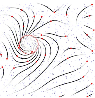
5.1.2 Randomized Seed Pool
We use a large randomized seed pool when choosing seed points. A large number
that distance cannot be achieved. Figure 5.1. shows an example where all seed points
in the pool are in blue and all valid seed points that have generated a streamline in
red.
5.2
Controlling Density
5.2.1 Separation Distance
Streamline density is controlled by maintaining a separation distance d between
streamlines. This separation distance is calculated by Equation 5.1. and used to
determine if a seed point is valid and when to terminate integration of a streamline.
d(x, y) =dmax−I(x, y)(dmax−dmin) (5.1)
Computing the actual distance between a streamline point and all other
stream-lines was performed by using a grid based method similar to that taken by Jobard et
al. [9]. The visualization space is divided into a uniform grid with each cell equal to
some value betweendmin anddmax. Each cell of this grid contains a list of points from
other streamlines that lie within that cell. A point query only needs to test against
Figure 5.2: Shows streamline visualizations with varyingdtest. Notice how streamlines appear short and choppy with high dtest. For all images dmin=0.01 and dmax=0.08.
all nearby cells within the search distance must be checked since the density is not
uniform over the entire image. Although the number of cells checked each time is
not a constant value; it is still bound by an upper limit since the maximum distance
between two streamlines is also bound.
5.2.2 Integration Method
Integration of streamlines is performed using the midpoint method for the tablet and
the 2nd order Runge-Kutta method for the desktop. The midpoint method is used
instead of Runge-Kutta on the tablet to reduce computational load on the weaker
system. Streamlines are integrated forward and then backwards from each seed point
using a step size of ds. Integration stops if the next point would be out of bounds of
the image, if the next point results in a self-intersecting streamline, or if the next point
is found to be within dtest of another streamline. This separation test threshold dtest
is used both to avoid creating short streamlines and to allow streamlines to converge
closer to each other after they are created. The effects of varyingdtest can be seen in
5.3
Visual Effect
Streamlines are rendered as triangles instead of lines to allow for tapering and width
variation along the streamline. Since the streamlines are oriented along one path, a
single triangle strip can be used to render the streamline by starting at one end and
alternating points between the left and right side of the streamline until reaching the
other end. By using a triangle strip instead of several triangles, sending duplicate
points to the GPU can be avoided.
This optimization can be taken a step further. If two “collapsed” triangles are
added such that the end points are equal to the end of one streamline and the
beginning of another, all the streamlines in the entire visualization can be rendered as
a single triangle strip (with the connecting triangles having 0 area and being invisible).
This optimization allows sending all the streamline data to the GPU at once rather
than in packets.
5.3.1 Splines
Before streamlines are rendered, the original streamline may be further interpolated
using a hermite spline. This spline interpolation is skipped on the tablet for
perfor-mance reasons. A lookup table is computed for the hermite spline coefficients and a
fast interpolation can be performed. The vector field is used to compute the tangents
of each point along the streamline during the spline computation.
5.3.2 Thickness
Maximum streamline thickness is controlled by the ts parameter. Streamlines can
Figure 5.3: Demonstrates potential occlusions that occur near the ends of streamlines if no tapering occurs. The image on the left has no tapering enabled, while the image on the right has tapering.
length of the streamline. This tapering effect gives the streamlines a brush-like effect
while also reducing streamline occlusion near the ends of streamlines where multiple
streamlines terminate. Figure 5.3. demonstrates this by showing a visualization with
and without tapering.
5.3.3 Opacity
Opacity can also be controlled and varied along the length of a streamline at the same
rate as thickness. Varying opacity helps avoid aliasing that occurs when rendering
very small triangles near the end of streamlines. Figure 5.4. demonstrates these
artifacts and how opacity modulation removes them.
5.3.4 Indicating Direction
Streamlines normally lack the ability to indicate direction. To create directed
Figure 5.4: Demonstrates artifacts caused by tapering. The image on the left has only tapering enabled. The image on the right has tapering and opacity modulation enabled to smooth out the aliasing.
This makes the streamline appear as a series of streaks similar to brush strokes that
allows the user to see the direction the streamline is traveling in. Figure 5.5. shows
streamlines with modulated opacity and used to indicate direction.
5.4
Temporal Coherence
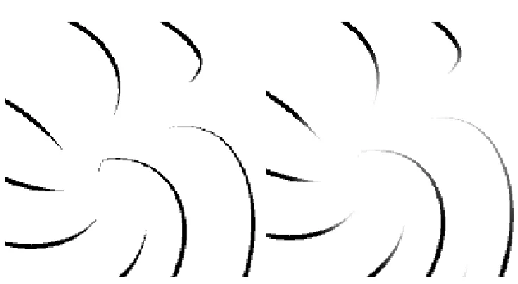
5.4.1 Choosing Seed Points
Image guided streamline placement works well for static images or visualizations with
uniform density, but leads to small changes in density propagating larger changes in
streamline positions. This can been seed in Figure 5.6. The figure shows an image
guided streamline method presented by Jobard et al [9] being used to choose seed
points compared to the random seed pool method. Each image is a composite of two
images with a focus point moved by some small amount. Notice how the image guide
(a) Full detail. (b) Focus+Context.
Figure 5.5: Shows streamlines with thickness and opacity modulated with a sawtooth function along the streamline to indicate direction.
method contains the changes to streamlines near the focus point.
5.4.2 Animation
To increase temporal coherence when a user is interacting and changing the
impor-tance field, streamlines visibility toggling is animated. Streamline maximum thickness
ts of a streamline will slowly grow from 0 to its default value when a streamline
becomes visible and shrink to 0 when a streamline is no longer visible. This help
avoid ”popping” artifacts when streamlines quickly toggle visibility.
5.5
Performance
Because no computational power is wasted integrating streamlines in regions of low
interest, computational performance is much higher for this focus+context method
(a) Image guided (b) Random seed pool
Table 5.1 shows the performance for each of these datasets and indicates as much
as a 4.4x improvement in fps for the focus+context methods discussed in this work.
Testing was performed on an Apple MacBook with a 2.3 GHz Intel i7, with 4 GB
(a) Hurricane at full detail. (b) Hurricane with focus + context.
(c) Three centers at full detail. (d) Three centers with focus + con-text.
(e) Random field at full detail. (f) Random field with focus + context.
point detection) and the PC platform for advanced tasks (particle advection). This
chapter details the tasks the users were requested to perform as well as their results.
6.1
Parameters
6.1.1 Tasks
Users were presented with a visualization and asked to perform one or more of the
following tasks.
Feature Counting
The user is asked to count the number of features in a visualization. This is the total
number of features, and not necessarily the number of unique features. The user is
presented with 5 multiple choice numbers and must select the correct one.
Identify Feature Type
The location of a particular feature is specified to the user through the testing program
Saddle, Center, Attracting Node, Repelling Node, Attracting Spiral, and Repelling
Spiral.
Point Advection
The user is presented with a point a in the visualization and must select a point b
such thatawill be at pointbafter some time has passed assuming thatais influenced
in direction by the vector field in the visualization. The users were allowed to change
their answer as many times as they needed before confirming their answer. Error is
measured by finding the distance from their answer to the nearest point on the path
integrated along the initial point. This error metric avoids inconsistencies arising
from different users advecting the particle further down the path.
6.1.2 Platform
For the feature counting and feature identification tasks users were given a tablet with
the visualizations and a java application which presented the questions on a desktop
or laptop. The reason that separate devices were used was because the tablet screen
was too small to fit both the questions and visualization on and because it was easier
to collect and retrieve the users data from the desktop than the tablet.
User demographics including age and tablet proficiency were collected before
testing.
Each participant was presented with 12 visualizations and asked to perform one
or both of the related tasks. The order of these visualizations was random, but
the order of the questions within each visualizations was constant. The test would
indicate which application to open and the user was required to open that application
6.1.3 Data
The vector fields used in each visualization were generated by simulating an electric
field generated by placing 2-5 randomly charged points at random positions on the
screen. These data-sets were generated before hand and stored for each test. Half of
the visualizations are full detail while the other half are focus+context visualizations.
Interaction was disabled for full detail since it would not affect the visualization
in any way, while the standard interaction methods discussed were enabled in the
focus+context based visualizations. Appendix A.1. details all the datasets used and
what tasks were performed for each.
6.1.4 Participants
Seventeen users participated with 2 female participants and 15 male participants and
ages ranging from 18 to 48 and over. All users considered themselves proficient in
6.2
Results
6.2.1 Glyphs
The following four visualizations were used during glyph evaluation:
• G1 - Full-detail glyphs • G2 - Focus+Context glyphs
• G3 - Full-detail glyphs with initial guess
• G4 - Focus+Context glyphs with initial focus points
Counting Features
Figure 6.1 shows the user evaluation results for counting features using glyph based
visualizations. Analysis shows a p-value of 0.76 for the times and 0.11 for the scores.
These results indicate that even though users are expected to interact with the
focus+context visualizations they took only slightly longer on average and were still
able to maintain a score higher than the default full detail visualization.
Identify Features
Figure 6.2 shows the user evaluation results for identifying features using glyph based
visualizations. The p-value for times is 0.82 and the p-value for scores is 0.65.
These results indicate the users were able to perform feature identification just as
effectively with the focus+context glyph visualizations as they were with full detail
Advection
Figure 6.3 shows the user evaluation results for advecting a particle using glyph based
visualizations. The p-value for the errors is 0.8 and the p-value of time was 0.1. Users
took longer for the focus+context visualizations as expected due to the time required
for interaction. The distribution of error for the default full detail glyph visualization
was much higher than any other glyph visualization. These results indicate that the
users were able to perform particle advection more effectively when a focus point was
initially chosen for them (G4).
6.2.2 Streamlines
The following four visualizations were used during streamline evaluation:
• S1 - Full-detail simple streamlines • S2 - Focus+Context simple streamlines
• S3 - Full-detail simple streamlines with initial guess
• S4 - Focus+Context simple streamlines with initial focus points
Counting Features
Figure 6.4 shows the user evaluations results for counting features using streamline
visualizations. The p-vale of times was 0.99 and the p-value for scores was 0.028.
Users took the same time to perform this task for all visualizations and were able
to achieve better results when initial focus points were selected for them.
6.2.3 Directed Streamlines
Figure 6.5: User evaluation results for counting the number of features using directed streamline visualizations. The top graph shows the score (proportion correct) and the bottom shows the times. The 95% confidence intervals are also shown.
• D1 - Full-detail directed streamlines • D2 - Focus+Context directed streamlines
• D3 - Full-detail directed streamlines with initial guess
• D4 - Focus+Context directed streamlines with initial focus points
Counting Features
Figure 6.5. shows the user evaluations results for counting features using directed
Figure 6.6: User evaluation results for identifying features using directed streamline visualizations. The top graph shows the score (proportion correct) and the bottom graph shows the times. The 95% confidence intervals are also shown.
scores is 0.32.
Users took slightly longer for focus+context visualizations, but scored higher with
the focus+context visualizations than the full detail counterparts.
Identify Features
Figure 6.6 shows the user evaluations results for identifying features using directed
streamline visualizations. The timings have a p-value of 0.35 and the scores have a
Figure 6.7: User evaluation results for advecting a point using directed streamline visualizations. The top graph shows the time and the bottom shows the error (as a distance from the selected point to the nearest point on the streamline). The 95% confidence intervals are also shown.
Users took longer to identify features in focus+context visualizations, but
per-formed better with both focus+context visualizations than the default full detail
visualization. Interestingly, all users correctly identified all features in D3. This is
the only visualization/task in which all users scored 100%.
Advection
Figure 6.7 shows the user evaluations results for advecting a point using directed
CHAPTER 7
CONCLUSIONS
As datasets become larger, uniformly up-scaling the visualization at full-detail
be-comes less efficient. Focus+context visualizations present the user with the detail
necessary to solve problems and analyze data without wasting resources on
less-important regions.
7.1
Results
7.1.1 Glyphs
A focus+context glyph visualization technique has been presented that runs at the
same framerate as a full detail glyph visualization (See Section 4.7.). User evaluations
show high p-values indicating there is little difference in performance between the
full detail and focus+context visualizations and thus the users are able to perform
common analysis tasks with the same proficiency in both cases (See Section 6.2.1.).
7.1.2 Streamlines
Focus+context streamline visualizations with and without direction indication were
also presented. These visualizations showed a large improvement in performance (See
Section 5.5.) over their full detail counterparts while maintaining the ability to be
flowing in a particular direction or that have a particular gradient. By using these
values to generate the importance field, focus+context visualizations emphasising the
values the user deems important are immediately apparent.
7.3
Future Work
These visualization techniques show great promise for use in displaying large datasets.
Not only does the streamline visualization technique show improvement in
perfor-mance, but also the ability to load lower resolution versions of a dataset into memory.
A data structure could be made to break a dataset into tiles containing multiple levels
of resolution for each section of a dataset. When the importance field is higher in a
particular region, a higher resolution tile will be loaded for that region, resulting in
faster processing and lower memory usage.
Another application is on large scale displays. The focus points could be
ex-tended to allow eye-tracking systems to control them to allow hands free interaction
with the data. These eye-tracking techniques could show promise in controlling the
visualizations on large scale displays such as display walls or projectors.
If eye-tracking is not available another option is to use a portable tablet with a
resolu-tion and larger scale focus+context visualizaresolu-tion with the focus points controlled by
![Figure 1.1: Shows recent wind patterns across the United States [16].](https://thumb-us.123doks.com/thumbv2/123dok_us/8922359.1842793/20.612.119.499.121.333/figure-shows-recent-wind-patterns-united-states.webp)
![Figure 1.3: Example of streamlines without orientation indications. [9]](https://thumb-us.123doks.com/thumbv2/123dok_us/8922359.1842793/22.612.220.430.100.318/figure-example-streamlines-orientation-indications.webp)
![Figure 1.5: The left image shows streamlines created using randomly chosen andoptimized streamlines, the image on the right uses the method presented in [9].](https://thumb-us.123doks.com/thumbv2/123dok_us/8922359.1842793/24.612.112.540.102.317/figure-streamlines-created-randomly-andoptimized-streamlines-method-presented.webp)
![Figure 1.7: Oriented streamlines can be adapted to visualize direction along stream-lines [10].](https://thumb-us.123doks.com/thumbv2/123dok_us/8922359.1842793/27.612.222.430.104.324/figure-oriented-streamlines-adapted-visualize-direction-stream-lines.webp)
![Figure 1.8: Arrow glyph width is used to encode uncertainty while length encodesmagnitude to give a complete vector field visualization while conveying the uncer-tainty of data [24].](https://thumb-us.123doks.com/thumbv2/123dok_us/8922359.1842793/28.612.130.518.177.567/figure-encode-uncertainty-length-encodesmagnitude-complete-visualization-conveying.webp)
![Figure 1.9: The same vector field visualized with hedgehogs on a uniform (left) andjittered (right) grid [10]](https://thumb-us.123doks.com/thumbv2/123dok_us/8922359.1842793/29.612.110.544.108.318/figure-vector-eld-visualized-hedgehogs-uniform-andjittered-right.webp)