Portland State University
PDXScholar
Dissertations and Theses Dissertations and Theses
Winter 3-14-2013
A Survey of Systems for Predicting Stock Market Movements,
Combining Market Indicators and Machine Learning Classifiers
Jeffrey Allan Caley Portland State University
Let us know how access to this document benefits you.
Follow this and additional works at:http://pdxscholar.library.pdx.edu/open_access_etds
Part of theComputational Engineering Commons, and theOther Electrical and Computer Engineering Commons
Recommended Citation
Caley, Jeffrey Allan, "A Survey of Systems for Predicting Stock Market Movements, Combining Market Indicators and Machine Learning Classifiers" (2013).Dissertations and Theses.Paper 2001.
A Survey of Systems for Predicting Stock Market Movements, Combining Market Indicators and Machine Learning Classifiers
by
Jeffrey Allan Caley
A thesis submitted in partial fulfillment of the requirements for the degree of
Master of Science in
Electrical and Computer Engineering
Thesis Committee: Richard Tymerski, Chair
Garrison Greenwood Marek Perkowski
Portland State University 2013
Abstract
In this work, we propose and investigate a series of methods to predict stock market movements. These methods use stock market technical and
macroeconomic indicators as inputs into different machine learning classifiers. The objective is to survey existing domain knowledge, and combine multiple techniques into one method to predict daily market movements for stocks. Approaches using nearest neighbor classification, support vector machine classification, K-means classification, principal component analysis and genetic algorithms for feature reduction and redefining the classification rule were explored. Ten stocks, 9 companies and 1 index, were used to evaluate each iteration of the trading method. The classification rate, modified Sharpe ratio and profit gained over the test period is used to evaluate each strategy. The findings showed nearest neighbor classification using genetic algorithm input feature reduction produced the best results, achieving higher profits than buy-and-hold for a majority of the companies.
Table of Contents
Abstract i List of Tables vi
List of Figures viii
Chapter 1: Introduction!1 1.1 Problem Statement!3 1.2 Objective!3
1.3 Thesis Format!4
Chapter 2: Background Information and Literature Overview!5 2.1 Technical Analysis!5
2.1.1 Moving Average [10]!6
2.1.2 Moving Average Convergence/Divergence (MACD) [11]!7 2.1.3 Relative Strength Index (RSI) [12]!7
2.1.4 Bollinger Bands [13]!8 2.1.5 Stochastics [14]!8
2.1.6 Momentum and Rate of Change [15]!9 2.1.7 Moving Variance [16]!9
2.1.8 Commodity Channel Index (CCI) [17]!10 2.1.9 Chaikin Oscillator [19]!10
2.1.10 Disparity Index [20]!11 2.1.11 Williams %R [21]!11 2.1.12 Volatility!11
2.2.1 United States (US) Federal Reserve Interest Rate!12 2.2.2 Canada - US Exchange Rate!12
The rate in which Canadian currency is exchanged for US currency.!12 2.2.3 Japan - US Exchange Rate!12
2.2.4 Swiss - US Exchange Rate!13 2.2.5 US - Euro Exchange Rate!13 2.2.6 US - Pound Exchange Rate!13 2.2.7 Three Month T-Bill Rate!13 2.2.8 Six Month T-Bill Rate!13
2.2.9 Trade Weighted US Dollar Index, Broad!13 2.2.10 Trade Weighted US Dollar Index, Major!14 2.3 Classifiers!14
2.3.1 K-nearest Neighbor (KNN)!14 2.3.2 K-Means Clustering!16
2.3.3 Support Vector Machine (SVM)!21 2.4 A Literature Overview!25
2.4.1 KNN trading system!25 2.4.2 SVM trading system!26 2.4.3 Evolving SVM’s!27
2.4.4 Using Economic and Technical Indicators!27 Chapter 3: Goals Hypothesis and Evaluation Method!29
3.1 Goals!29 3.2 Hypothesis!29
3.3.1 Classification Percentage!30 3.3.2 False Positive Percentage!30 3.3.3 Profit Versus Buy and Hold!31 3.3.4 Modified Sharpe Ratio [42]!31 Chapter 4: Design!32
4.1 Trading models!32 4.1.1 Data!32
4.1.2 Binary Classification!44 4.1.3 Trade Frequency!44 4.1.4 Walk Forward Testing!45 4.1.5 Data Normalization!46 4.2 Data Reduction!46
4.2.1 Principal component analysis!46 4.2.2 Genetic Algorithm selection!47 Chapter 5: Experiments and Results!49
5.1 KNN Classification!49 5.2 Other Classifiers!52
5.3 Redefining the Classification Rule!56 5.4 Adding Additional Technicals!61
5.5 Reduction of Problem Dimensionality!63 5.5.1 Principal Component Analysis (PCA)!64 5.5.2 Genetic Algorithm Dimensional Reduction!65 Chapter 6: Conclusions and Future Work!73
6.2 Future work!75 References!77
Appendix A: Code!80
Appendix B: Calculation of the Modified Sharpe Ratio!107 Appendix C: Data Filtering!108
Supplementary File: Code Used to Run Simulations
List of Tables
Table 2.1: Example training observations graphed in XY plane 15 Table 2.2: Example test observations graphed in XY plane 16 Table 2.3: Location of initial cluster centers 18
Table 2.4: Example training observations graphed in XY plane along with location of 3 cluster centers 18
Table 2.5: The location of the means after 1 iteration through the training set 19 Table 2.6: The assignment of each observation to a mean 20
Table 2.7: Example test observations and final cluster centers graphed in XY plane 20
Table 2.8: Example training observations 23
Table 2.9: Example observations graphed on the X plane 24
Table 2.10: Example observations mapped to a higher dimensional space. Then graphed in the XY plane to find a linear separation 25
Table 4.1: Full set of technical indicators and their formulas 34 Table 4.2: MacroEconomic indicators used 38
Table 5.1: Results for the KNN Classifier 49 Table 5.2: Results for the SVM Classifier 52 Table 5.3: Results for the K-Means Classifier 55
Table 5.4: Results for the KNN Classifier with a 0.5% Bias 57 Table 5.5: Results for the KNN Classifier with a 1.0% Bias 58 Table 5.6: Results for the KNN Classifier with a 1.5% Bias 59
Table 5.7: Results for the KNN Classifier Using 52 Technical Indicators as Inputs 61
Table 5.8: Results for the KNN Classifier Using 52 Technical Indicators and 10 Macroeconomic Indicators 62
Table 5.9: Results for the KNN using PCA to reduce the number of inputs 64 Table 5.10: Results for the KNN classifier using a reduced set inputs. The reduction was done using a GA optimizing a classification of Apple stock 67 Table 5.11: Results for the KNN classifier using a reduced set inputs. The reduction was done using a GA optimizing for each stock 69
Table 5.12: How many of each input was selected by the GA when optimizing the inputs for each stock 72
List of Figures
Figure 2.1: The location of the means after one iteration through the training data 19
Figure 2.2: A linear line separating the data types 22
Figure 2.3: A linear separation with the margin maximized 23
Figure 4.1: Daily movements of SPY over the training and testing period 39 Figure 4.2: Daily movements of AAPL over the training and testing period 39 Figure 4.3: Daily movements of F over the training and testing period 40 Figure 4.4: Daily movements of KO over the training and testing period 40 Figure 4.5: Daily movements of WMT over the training and testing period 41 Figure 4.6: Daily movements of BAC over the training and testing period 41 Figure 4.7: Daily movements of DIS over the training and testing period 42 Figure 4.8: Daily movements of MCD over the training and testing period 42 Figure 4.9: Daily movements of MRK over the training and testing period 43 Figure 4.10: Daily movements of DD over the training and testing period 43 Figure 4.11: Scheme of data set division for training and testing 45
Figure 5.1: Equity curve of trading strategy and buy-and-hold for stock SPY in the out-of-sample period 51
Figure 5.2: Equity curve of SVM and KNN trading strategies and buy-and-hold for stock BAC in the out-of-sample period 54
Figure 5.3: Equity curve of trading strategy and buy-and-hold for stock AAPL in the out-of-sample period 56
Figure 5.5: Volatility for stock MRK during test period 59 Figure 5.6: Volatility for stock BAC during test period 60
Figure 5.7: A graph of both the GA’s best and mean fitness per generation 66 Figure 5.8: Fords 800% gain using GA selected indicators 71
Chapter 1: Introduction
The Efficient Markets Hypothesis (EMH) [1] states that the price of a stock reflects all known information, therefore only new information can cause a
change in price. Since the arrival of new information is unpredictable, prediction of market prices is only possible when nonpublic information is known by the trader. This hypothesis also states that timing the market is not possible, which supports the well known investment strategy buy-and-hold, buying a stock and never selling it.
The EMH faces resistance from researchers and traders alike. Behavioral finance suggests that cognitive biases cause inefficiencies, letting rumor and speculation trump the importance of the known information [2] [3]. The
abundance of highly successful investors, such as Warren Buffet and George Soros, suggests the existence of inefficiencies that can be exploited for investment success.
Three approaches are commonly used to predict price movements for a given stock: fundamental analysis, technical analysis and quantitative analysis. Fundamental analysis involves analyzing the financial statements, management, competitive advantage, competitors and markets of a company to determine the fair market value of a business [4]. Fundamental economic indicators are metrics that give a view of the economic health of a nation or global economy in which the business participates [5]. Using these factors, an investor can determine a fair value for a business and make an educated prediction of the future stock price of a company.
Technical analysis uses past market data, mainly price and volume information, to make predictions of future market movements [6]. Price and volume is put through mathematical transformations to convert the data into easily graphed and understood indicators. These indicators are thought to show graphical patterns and trends that can help predict future price. Trading
decisions can then be made based on these trends.
Quantitative analysis uses numerical or quantitative techniques to derive an answer for most areas of finance. Trading strategy development, portfolio optimization, derivatives pricing and hedging, risk management and credit analysis [ [7] are some of the areas quantitative analysis is used. Using
techniques such as statistical arbitrage, automated trading and electronic market making, quantitative analysis removes the human element of trading and
replaces it with statistical market models [8].
The purpose of this work was to explore multiple techniques for daily stock market predictions using a combination of technical, fundamental and
quantitative analysis. Combining common technical and macroeconomic indicators with statistical techniques used in quantitative analysis, we looked to predict daily market movements using machine learning classifiers. Using these predictions as a guide, a trading strategy was developed to buy and sell stocks.
The results of this work show that using features comprised of technical indicators can be used as inputs into machine learning classifiers to create a trading strategy that outperforms the buy-and-hold strategy. Using a portfolio of
algorithm to select a subset of 52 features to be used as inputs into a K-nearest neighbors classifier. Performing this feature optimization on each stock in the evaluation set resulted in an average profit of 106.1%, 97.5% more than achieved using the buy-and-hold strategy.
1.1 Problem Statement
Where and how to invest one’s money is a problem that many individuals face. Despite the large amount of money and interest embedded into this problem, there is still no definitive answer on when and where money should be invested. Due to this, most people either keep their money in the bank or hand it off to someone else to manage. This work looks to develop an automated
trading system that can be used to make more money off trading securities than the traditional buy-and-hold strategy and to reduce the risk involved in making these investments.
1.2 Objective
The objective of this work is to develop a market trading model that can successfully trade market securities for a profit, beating buy-and-hold. This was accomplished through the construction of a market trading simulator and the exploration of many different trading models. The models will be evaluated by classification rate, profitability compared to buy-and-hold and the modified Sharpe ratio.
1.3 Thesis Format
The following includes a literature survey of background information and related techniques of market data classification (Chapter 2); a description of goals, hypothesis and evaluation methods (Chapter 3); an explanation of design (Chapter 4); and a thorough description of all experimental trading strategies with results (Chapter 5).
Chapter 2: Background Information and Literature Overview
There are many different techniques used to predict stock market movements. This chapter serves as an overview of stock market terminology, definitions of common macro and technical indicators, and previous research done in the field of stock market prediction using computational intelligence techniques.
2.1 Technical Analysis
In finance, technical analysis is the study of financial market movements. A technician is someone who performs technical analysis. They use past price and volume data displayed in graphical form to make decisions about where financial markets will move in the future [6]. Technicians believe that all information related to the stock is reflected in the price. Over the years,
technicians have found many different ways to represent price and volume data to help simplify decision points. These representations are referred to as
technical indicators.
This work uses many common technical indicators as inputs to classifiers. Technical indicators have been shown to be a valid representation of price and volume data that computational classification techniques can use to successfully classify stocks movements [9].
2.1.1 Moving Average [10]
There are two common types of moving averages; simple moving average and exponential moving average. A simple moving average (SMA) is calculated by computing the average price of a security over a specified number of periods. This process is repeated for each day, forming its own time series. The resulting formula is:
Where is the closing price of a given day and is the period in which the
moving average is being calculated. Exponential moving average (EMA) is calculated by taking a weighted average of past prices. As prices get farther into the past, they are weighted less and less. This means more recent values of the security effect the EMA result more than past values. EMA is calculated by:
Where,
is the period of the EMA and is the close price of the current day. To
2.1.2 Moving Average Convergence/Divergence (MACD) [11]
The MACD is a collection of three signals that are calculated using
exponential moving averages. First, the MACD, which is the difference between a 12 day and a 26 day exponential moving average. Second, the signal, which is the 9 day EMA of the MACD. Finally there is the histogram, which is the
difference between the MACD and the signal. It is also referred to as Price Oscillator when the MACD has different values for the moving averages. It is used to identify changes in the strength, direction and momentum of a security.
2.1.3 Relative Strength Index (RSI) [12]
The RSI is a momentum indicator which is between values of 0 and 100. RSI is used to measure the velocity and direction of price movements. It is calculated using the equations below.
Where,
Conversely, for a period that swings downward, use
2.1.4 Bollinger Bands [13]
Bollinger Bands are bands relating to volatility placed below and above a moving average. Stock price interaction with these bands is thought to reveal information about price movements in the future. Bollinger Bands consist of a simple moving average, an upper Bollinger Band and a lower Bollinger Band.
Where σ is the standard deviation of over the past n days and K is a selected
multiple. Commonly used values for K and n are 2 and 20, respectively.
2.1.5 Stochastics [14]
The Stochastic Oscillator is a momentum indicator that refers to the current price in relation to its price range over a period of time. It is composed of two lines, the %K and the %D. These lines represent predicted turning points for
Where is the close price of the current day and and are the low and high price over the past period n.
2.1.6 Momentum and Rate of Change [15]
The rate of change is a simple technical indicator calculated by taking the difference between today’s closing price and the price of the same security n days ago. This is then scaled by the older closing price. Without this scaling, it is called momentum.
2.1.7 Moving Variance [16]
Variance is a measure of the amount of variation from the mean in a time series. Moving variance is a moving average of variance values. To calculate variance, first calculate the mean of n number of points. Then find the difference between each point n and the mean, squaring the result. Finally, average these differences to find the variance.
2.1.8 Commodity Channel Index (CCI) [17]
Commodity Channel Index measures a security variation from its
statistical mean which is used to identify cyclical trends. It is calculated by taking the difference between the current price of a security and its SMA, divided by the mean absolute deviation of the price.
Where,
is the mean absolute deviation of .
2.1.9 Chaikin Oscillator [19]
The Chaikin Oscillator is a technical indicator that is used to relate price and volume data for a particular security. It is defined as the difference between the 3 day EMA of the Accumulation Distribution Line and the 10-day EMA of the Accumulation Distribution Line. Defined as the following:
2.1.10 Disparity Index [20]
The disparity index is a percentage of the latest closing price compared to a specific moving average.
2.1.11 Williams %R [21]
The Williams %R shows the current price of a security in relation to its high and low of the past n periods. It is used to see where the current price is in relation to its recent high or low. It is calculated by:
where n is the period in which to move backwards in time to find the specific high
or low price, denoted or .
2.1.12 Volatility
Volatility is a measure of variation of price over a period of time. It is
calculated by taking the standard deviation of n closing prices divided by a simple moving average of n days. In this study, 21 is used for n.
2.2 Macroeconomic Data
Macroeconomic indicators are statistics that are used to evaluate the current state of an economy. These statistics are used to track the health of the economy overall and can help guide economic policy decisions, such as
changing interest or tax rates [ [22]. The overall health of an economy can have significant impacts on specific securities prices, making macroeconomic data an invaluable big picture resource.
Macroeconomic indicators:
2.2.1 United States (US) Federal Reserve Interest Rate
The interest rate at which depository institutions trade with each other. This rate is set by members of the Federal Open Market Committee [22].
2.2.2 Canada - US Exchange Rate
The rate in which Canadian currency is exchanged for US currency.
2.2.3 Japan - US Exchange Rate
2.2.4 Swiss - US Exchange Rate
The rate in which Swiss currency is exchanged for US currency.
2.2.5 US - Euro Exchange Rate
The rate in which the Euro is exchanged for US currency.
2.2.6 US - Pound Exchange Rate
The rate in which the British Pound is exchanged for US currency.
2.2.7 Three Month T-Bill Rate
The interest rate associated with a three month debt obligation backed by the US government.
2.2.8 Six Month T-Bill Rate
The interest rate associated with a six month debt obligation backed by the US government.
2.2.9 Trade Weighted US Dollar Index, Broad
A weighted average of foreign exchange values of the US dollar against the currencies of a broad group of US trade partners [23].
2.2.10 Trade Weighted US Dollar Index, Major
A weighted average of foreign exchange rates; the US dollar and a subset of the countries included in the broad [24]. Currencies included are: Euro Area, Canada, Japan, United Kingdom, Switzerland, Australia and Sweden [24].
2.3 Classifiers
There are many well known machine learning algorithms that can be used to classify a problem given a set of features. This work looks to survey some of these algorithms to see if any are particularly useful in classifying stock market data into ‘up’ or ‘down’ periods given a set of inputs generated through
macroeconomic data and technical analysis. Classifiers investigated are:
2.3.1 K-nearest Neighbor (KNN)
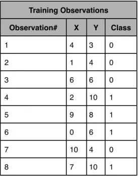
The K-nearest neighbor classifier is one of the simplest machine learning algorithms. An object is classified by looking to its nearest examples, measured using any distance metric, and using a majority vote [9] to decide what class to assign the object. K states how many neighbors will be used in this vote. K=1 simply states that an object will be assigned the same class as its nearest example. This work implements the KNN using the function ‘knnclassify’ supplied by the Bioinformatics Toolbox in Matlab.
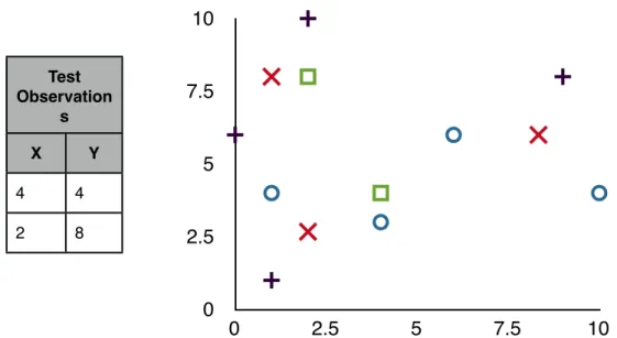
Given the training set seen in table 2.1, a two dimensional graph is constructed. The + represents class 1 while the O represents class 0 of the binary classification problem. When new points are looking to be
0 2.5 5 7.5 10 0 2.5 5 7.5 10 Training Observations Training Observations Training Observations X Y Class 4 3 0 1 4 0 6 6 0 2 10 1 9 8 1 0 6 1 10 4 0 1 1 1
Table 2.1: Example Training observations graphed in XY plane
classified, represented as a square in Table 2.2, their K nearest points are looked to for identification. In this example, Euclidian distance will be used with K = 3. For test observation (4,4), graphically it can be seen in Table 2.2 that two of its three nearest neighbors are points (4,3) and (6,6). The final nearest neighbor could either be point (1,1) or (1,4). Euclidian distance can be measured for both of these points to determine which is closest. For point (1,1), the distance is
calculated as distance. For point (1,4), the calculation is
distance. Point (1,4) is therefore the 3rd nearest neighbor. Because all 3 of the neighbors to point
0 2.5 5 7.5 10 0 2.5 5 7.5 10 Test Observation s Test Observation s X Y 4 4 2 8
Table 2.2: Example test observations graphed in XY plane
(4,4) are of class 0, point (4,4) will be assigned to class 0. For point (8,9), a similar technique can be used to find its nearest neighbors, which are (2,10), (0,6) and (1,4). Two out of the 3 points are in class 1, therefore point (2,8) will be assigned class 1.
2.3.2 K-Means Clustering
K-means Clustering is an unsupervised training method that looks to partition the data space into K clusters. Once the data space has been partitioned into K clusters, each cluster can be assigned a class based on the majority vote of the observations within the cluster. There are many clustering algorithms, but the one commonly associated with K-Means Clustering is an iterative refinement technique [26]. Starting with an initial randomly generated set of K means, each observation is associated to its nearest mean, forming K
clusters [25]. The observations of each cluster are then averaged to find a new cluster mean [25]. The observations are then reassigned to their nearest mean. This process is repeated until convergence is reached. Convergence is defined as an iteration where no means are moved. Once convergence is reached, each cluster is assigned its representative class based on a majority vote of all the observations associated with that cluster [25]. When a new observation is looking for a classification, it is measured against all the means to determine which cluster it belongs to and is assigned to the same class as the cluster.
In this work, K-means clustering is implemented using the function ‘kmeans’ provided in the Statistics Toolbox in Matlab. This function outputs the cluster center coordinates for each mean and the assigned mean for each data point in the training set. With this data, the associated class for each mean can be calculated, a ‘1’ or a ‘0’. The test data is then classified by comparing the distance of each point to the means to find its assigned class.
Simple Example:
Given the same training set as above, and a K=3, K-Means Clustering starts by randomly placing three means, represented by an X in table 2.4. Each observation is then assigned to the mean it is closest to, in this example, using Euclidian distance. The average of all points associated with each each mean is then calculated. Observations 1, 2 and 8 are associated to mean 1. So points
Initial Means Initial Means Initial Means mean# X Y 1 3 3 2 7 9 3 2 8
Table 2.3: Location of initial cluster centers
(4,3), (1,4) and (1,1) are averaged to find a new mean at (2,2.67). Observations 3, 5, and 7 are associated with mean 2, so the new mean 2 is (8.33,6).
Observations 4 and 6 are associated with mean 3 resulting in a new mean 3 at (1,8). Now the process repeats itself with the new means. All observations are
Training Observations Training Observations Training Observations Training Observations Observation# X Y Class 1 4 3 0 2 1 4 0 3 6 6 0 4 2 10 1 5 9 8 1 6 0 6 1 7 10 4 0 8 1 1 1 0 2.5 5 7.5 10 0 2.5 5 7.5 10
Initial Mean Placement
Table 2.4: Example training observations graphed in XY plane along with location of 3 cluster centers
reassigned to the new means. In this example, none of the observations are assigned to a different mean, meaning convergence has been reached. Now a majority vote is taken to assign a class to each cluster. Cluster 1 has two 0’s and
1st iteration Means 1st iteration Means 1st iteration Means mean# X Y 1 2 2.67 2 8.33 6 3 1 8
Table 2.5: The location of the Means after 1 iteration through the training set
one 1 associated with it, so it is assigned class 0. Cluster 2 also has two 0’s and one 1, so it also assigned to class 0. Cluster 3 has two 1’s associated with it, so it is assigned to class 1. The K-means classifier is now trained, and can be used to classify new observations. Using the same test observations as
0 2.5 5 7.5 10 0 2.5 5 7.5 10
1st iteration Mean Placement
1st iteration Observation assignment 1st iteration Observation assignment Observation# Mean Assigned 1 1 2 1 3 2 4 3 5 2 6 3 7 2 8 1
Table 2.6: The assignment of each observation to a mean.
before, points (4,4) and (2,8) are assigned to the closest mean. Point (4,4) is found to be nearest mean 1, while point (2,8) is nearest to mean 3. Mean 1
0 2.5 5 7.5 10 0 2.5 5 7.5 10
Testing Observations to Classify
Test Observation s Test Observation s X Y 4 4 2 8
is associated with class 0, so test observation (4,4) is assigned to class 0. Observation (2,8) is assigned to class 1.
2.3.3 Support Vector Machine (SVM)
Support Vector Machines are supervised learning models that can be used for classification machine learning problems. The basic SVM takes a set of input observations and associated binary outputs and constructs a model that can classify new observations into one class or the other. The model consists of a mapping of the training observations as points in space, linearly separating the observation sets [27]. The margin around this linear separation is calculated to be as large as possible. A partitioning in higher dimensional space by a linear hyperplane corresponds to a nonlinear partition in the output space [28]. This higher dimensional partitioning is known as the SVM kernel, and can be defined by any mathematical surface [28]. Some of the more common kernels are linear, quadratic, polynomial and Gaussian radial basis function [27].
This work uses the ‘svmtrain’ and ‘svmclassify’ functions provided in the Bioinformatics Toolbox by Matlab to perform SVM classification. A polynomial kernel function is used to map the data. Because the training data set is large, the ‘MaxIter’ option is set to its maximum to allow for the training and
Simple Example
Given a set of training observations, a support vector machine looks to linearly separate the data using a hyperplane. In this case, because we are only dealing in two dimensions, a simple line can be drawn to separate the data. In the figure 2.2, a possible solution has been shown. The line selected linearly separates the data. The blue area around the line shows its margin, defined as the distance between the line and the nearest observation. A support vector
0 2.5 5 7.5 10 0 2.5 5 7.5 10
Figure 2.2: A linear line separating the data types
machine looks to place this line as far away as possible from the nearest observations, thus maximizing its margin. To do this a continuous constrained optimization problem needs to be solved. Each observation becomes a
Training Observations Training Observations Training Observations Training Observations Observation# X Y Class 1 4 3 0 2 1 4 0 3 6 6 0 4 2 10 1 5 9 8 1 6 0 6 1 7 10 4 0 8 7 10 1
Table 2.8: Example training observations
end, the correct solution is found solving for a maximized margin in the continuously constrained optimization problem.
0 2.5 5 7.5 10 0 2.5 5 7.5 10
Figure 2.3: A linear separation with the margin maximized
If there is no hyperplane that can separate the example, then the soft margin method can be used [9]. The soft margin method allows for points to
appear on the incorrect side of the margin. These points have a penalty associated with them that increases the farther from the margin they appear. The hyperplane separation looks to minimize the penalty of incorrectly labeled points, while maximizing the distance between the remaining examples and the margin.
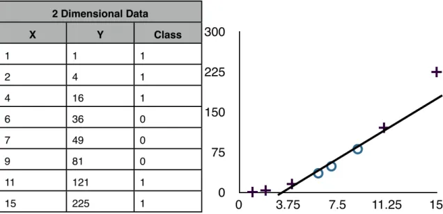
A second technique can be employed to separate data that isn’t linearly separable. The process is to map the data into a higher dimensional space using an SVM kernel. Using the set of 1 dimension data shown in table 2.9, separation of the data linearly is impossible. This changes if the data is mapped into two
dimensional space using the mapping . When this two dimensional
mapping is graphed, an obvious linearly separable line appears. The mapping
1 Dimensional Data X Class 1 1 2 1 4 1 6 0 7 0 9 0 11 1 15 1 0 4 8 12 16
2 Dimensional Data 2 Dimensional Data 2 Dimensional Data X Y Class 1 1 1 2 4 1 4 16 1 6 36 0 7 49 0 9 81 0 11 121 1 15 225 1 0 75 150 225 300 0 3.75 7.5 11.25 15
Table 2.10: Example observations mapped to a higher dimensional space. Then graphed in the XY plane to find a linear separation
used to increase the dimensionality of the problem is dependent on the data space being investigated.
2.4 A Literature Overview
This study performs a survey of existing techniques for stock market classification using technical analysis and machine learning classifiers. The following is an overview of the papers that served as guides to this work.
2.4.1 KNN trading system
In the paper “A Method of Automatic Stock Trading Combining Technical Analysis and Nearest Neighbor Classification,” the authors lay out a very straight forward implementation of market data classification [9]. Using four different
stock market technicals; moving averages, Relative Strength Index, Stochastic and Bollinger Bands, 22 input features are constructed. These 22 inputs are then used to classify daily stock market data. The data is broken up into training and test data sets. A nearest neighbor classifier is used. Using 10 years of data, 15 different stocks from the Sao Paulo stock exchange are run through a
simulated trading system. This system uses the KNN classifiers prediction of the next days stock price (buy, sell, keep) to execute a trade of 100 shares. The profit from these trades is compared to the buy and hold profit over the same period. The results show that this strategy outperformed the buy-and-hold strategy for 12 of the 15 test stocks.
2.4.2 SVM trading system
“Financial Time Series Forecasting Using Support Vector Machines” by Kyoung-jae Kim uses a similar approach to the KNN trading system method, replacing KNN with a support vector machine for classification [27]. Using the Korea composite stock price index, 12 technical indicators are generated to be used as input variables. Support vector machines (SVM) have parameters that can be tuned to optimize performance. Using a Gaussian radial basis function for the SVM’s kernel, Kim explores which parameters perform best for his stock data [27]. A comparison between the SVM classifier, a back propagation Neural Network (BPN) and a KNN is performed. The results show that SVM’s are sensitive to the value of its parameters and that SVM was able to outperform the
BPN and KNN classifiers in experimental tests when the correct parameters were selected [27].
2.4.3 Evolving SVM’s
In “Evolving Least Squares Support Vector Machines for Stock Market Trend Mining”, Lai, Wang and Chen use a similar approach to Kim [27] [28]. They use a SVM to classify data using indicators as inputs. These indicators are a combination of technicals and macroeconomic data, such as the interest rate on a one-month T-bill or the Consumer Price Index (CPI). The number of features to be used as inputs to the SVM is determined by a genetic algorithm (GA) [28]. The GA is setup to select a subset of possible inputs and uses them to train a SVM. The trained SVM is used to generate predicted stock movements for a test set. The classification rate is used to evaluate the success of the test. The fitness function for the GA is a combination of the classification success rate and the complexity of the inputs. Ultimately, the more inputs, the more complex the system. This technique was able to drive down the number of features used from 26 to 6 for certain data and improve classification performance. A second GA was also used to select parameters for the SVM [28].
2.4.4 Using Economic and Technical Indicators
“A Comparison of PNN and SVM for Stock Market Trend Prediction Using Economic and Technical Information” by Lahmiri, looks to use macroeconomic
data features along with technical indicators as inputs to a probabilistic neural network and an SVM classifier [37]. Granger causality is used to identify the causal relationships between inputs and output in an effort to reduce the feature space [37]. The paper finds that the SVM performs best when only
macroeconomic data is used, while the PNN performs best when only technical indicators are used [37]. The combination of both technical and macroeconomic data reduces the classification rate of the classifiers.
The paper also runs an experiment where it alters the trading strategy. Instead of training the classifier to identify days where the Standards and Poor’s index (S&P) moves up, it alters the training data to detect days where the S&P moves up by at least 0.5%. This alternative creates a significant increase in classification rate [37].
Chapter 3: Goals Hypothesis and Evaluation Method
3.1 Goals
The main goal of this work was to create an automated trading method that could outperform the buy-and-hold strategy and lower risk. This strategy should have been effective for any market security, given a reasonable amount of historical training data.
The second goal of this work was to learn about computational finance techniques. As the world becomes more connected due to globalization and the Internet, the ability to track and measure these connections increases. In today’s society more data is being recorded then ever, yet the information being gleaned from these records is in its infancy. Learning the techniques that can be used to parse and classify big data sets was the ultimate objective, due to the importance it will play in the future of the world.
3.2 Hypothesis
The hypothesis for this work was the following:
Historical stock market data contains information about what direction the market will move in the future. This information can be encoded into technical indicators and be classified into ‘up’ or ‘down’ days using known classification techniques such as KNN’s or SVM’s. These predictions can then be used to make market purchases that will be more profitable than a buy-and-hold strategy.
3.3 Evaluation method
To test this hypothesis, a simulated trading system will be constructed within Matlab. This system will allow a user to specify what technical indicators, classifier, frequency of trades, frequency of retraining, along with other options are used. The system will then simulate trading over a given time period and evaluate the performance using four performance criteria; classification
percentage, false positive percentage, profit versus buy and hold and a modified Sharpe ratio.
3.3.1 Classification Percentage
Classification percentage is an evaluation of the results in terms of the percentage of correctly classified instances compared to the total number of instances. In this work, classification percentage is measured on testing data by totaling the number of correctly predicted price movements and dividing it by the total number of days in the set.
3.3.2 False Positive Percentage
Money can only be lost in the stock market when stocks are bought. Minimizing the number of times a classifier falsely predicts a ‘up’ day, minimizes the number of losing trades. By tracking the percentage of losing trades to total
by totaling the number of stock purchases that lost money and dividing it by the total number of stock purchases.
3.3.3 Profit Versus Buy and Hold
With financial data being used, another possible performance criteria is profit made due to the specific trading strategy. Profit is calculated as a
percentage gain for each trade. The product of all trades profits gives a total profit percentage for the trading strategy. This can then be compared to the most common investment strategy, buy-and-hold, to see how it performs against a set baseline. Buy-and-hold is calculated the same way, with only one trade being made.
3.3.4 Modified Sharpe Ratio [42]
The Sharpe ratio measures the reward to risk ratio of a trading strategy. It is calculated by subtracting the risk free rate from the average return of the portfolio, divided by the standard deviation of the portfolio returns. The Sharpe ratio looks to show if a portfolio’s returns are worth the risk associated with them. By having one number that combines portfolio returns and risk, comparisons between portfolios can be made. The modified Sharpe ratio, used in this work, removes the risk free rate from the equation. The modified Sharpe ratio is calculated by taking the average return, measured in percentage, and dividing it by the standard deviation of the percent daily movements of the trading strategy. A description of the implementation can be found in Appendix B.
Chapter 4: Design
Matlab was selected as the tool to design the trading simulator because of its ease of use. Most features needed for this simulator were already available inside existing toolboxes or readily available off the Internet. The simulator was designed to be flexible, allowing the user to change what stock to simulate, the time period of the stock being tested, how to classify the days, what type of classifier to use, the frequency of trades, the rate of retesting and a selection of multiple data reduction techniques. Using this simulator, a trading model was created to explore how to maximize classification percentage and trading strategy profit.
4.1 Trading models
4.1.1 Data
All data used in this work was pulled from Yahoo! finance’s database of historical stock data [31]. Yahoo! provides the open, close, high, low, date, volume and adjusted close for each day of a security. To import this data into Matlab, the “Historical Stock Data downloader” was used [41]. Using the provided method ‘hist_stock_data’, any stock for any time period available on Yahoo! was imported into Matlab as a structure, broken down into the different categories. The time period investigated in this work was from January 1, 2001
through January 1, 2010. The first 70% of the data was used as training data while the last 30% was saved for testing.
In total, 52 technical indicators and 10 macroeconomic data indicators were constructed. Technical indicator construction was done using the TA-lib Library, an open source set of Matlab functions to calculate many common technicals [32]. For example, making the function call ‘TA_EMA(x,y)’, an
exponential moving average can be calculated on x with a look back period of y. The 10 macroeconomic data indicators were pulled from the Federal Reserve Economic Database (FRED) [33]. Because some of these indicators require a long look back period, data as far back as January 1, 2000 was used. The inputs are reported in Table 4.1.
Nine stocks and one index ETF were used to test any given simulated trading strategy. The companies selected; Apple (AAPL), Coke (KO), Dupont (DD), Merck (MRK), McDonalds (MCD), Ford (F), Walmart (WMT), Bank of America (BAC), Disney (DIS) are all high market cap companies, with 8 of the 9 belonging to the Dow Jones Industrial Average. Over the time period selected for testing, 5 of the stocks gained in value, while 4 stocks lost value. The 1 index, the S&P 500 exchange-traded fund (ETF)(SPY), lost value. These companies were selected because they all had a long history and are all large capitalization companies. These factors reduce susceptibility to large swings due to news and provide a large quantity of historical data to use. Each trading simulation run was evaluated on the success over these 10 stocks.
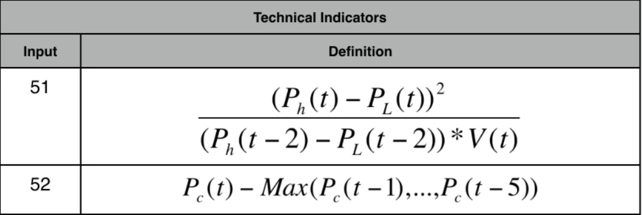
Technical Indicators Technical Indicators Input Definition 1 2 3 4 5 6 7 8 9 10 11
Technical Indicators Technical Indicators Input Definition 12 13 14 15 16 17 18 19 20
Technical Indicators Technical Indicators Input Definition 21 22 23 24 25 26 27 28 29 30 31 32 33
MACD
34CCI
Technical Indicators Technical Indicators Input Definition 36
Chaikin
Oscillator
37 38 39%R
40%D
41 42 43 44 45 46 47 48 49 50Technical Indicators Technical Indicators
Input Definition
51
52
Table 4.1: Full set of technical indicators and their formulas
MacroEconomic Data inputs MacroEconomic Data inputs
Input Definition
1 Federal Reserve Rate
2 Canada to US exchange rate
3 Japan to US exchange rate
4 Switzerland to US exchange rate
5 US to EURO exchange rate
6 US to Pound exchange rate
7 Three month T-Bill interest rate 8 Six month T-Bill interest rate 9 Trade Weighted U.S. Dollar Index:
Broad 10 Trade Weighted U.S. Dollar Index:
Major
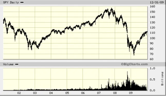
Figure 4.1: Daily movements of SPY over the training and testing period
Figure 4.3: Daily movements of F over the training and testing period
Figure 4.5: Daily movements of WMT over the training and testing period
Figure 4.7: Daily movements of DIS over the training and testing period
Figure 4.9: Daily movements of MRK over the training and testing period
4.1.2 Binary Classification
The price of a specific security on the stock market is simply a dollar value representation of the price to purchase one share. This work deals with time series data that is expressed in these dollar values. Binary classification was selected as a way to represent this data in a more simplified form. This
simplification improves the classification process. The binary classification was calculated using two different equations. First, a simple difference was taken; future data point minus current data point. For example, if the time series data is daily stock price, then the classification would state whether tomorrow's closing price is higher or lower than today's closing price. Higher was represented by a ‘1’, lower was represented by a ‘0’. Secondly, a set percent gain is required before classifying a point as ‘1’. For instance, if a 1% gain is required with daily data, only days where the close is up at least 1% from the previous day’s close will be classified as ‘1’, otherwise it is assigned ‘0’.
4.1.3 Trade Frequency
In this work, the trading frequency was daily trades at the closing price of the security. At the end of each day, the classifier outputs a predicted direction for tomorrow’s closing price. If this close price is ‘up’, then a purchase is made at the close price of the current day. If the close price is ‘down’, then no purchase of securities is made. In addition, any positions that are currently open, are closed. All technical indicators used as inputs to the classifier were calculated
4.1.4 Walk Forward Testing
When training and testing the classifiers, a walk-forward testing model was used. Walk forward testing uses the initial training data set to perform a test on a subset of the testing data. Once this subset has been evaluated, it is included in the next iteration of training data. The system is then retrained with the additional training data and tested over the next subset of testing data in the time series. This repeats until all test data has been tested. Walk forward
testing’s retraining of data can improve accuracy of test results due to the more recent data being included in the training set. Retraining in between each data point theoretically achieves the most realistic simulation of a daily trading model, but is not practical due to the time intensive nature of doing thousands of training cycles. Although a variable system was built which allows for any number of test window sizes, a period of 50 days between retraining was used for most tests.
Training Data Test
Data Training Data Training Data Training Data Training Data Test Data Test Data Test Data Test Data
4.1.5 Data Normalization
Most classifiers use distance measurements to compare examples. To do this effectively, each classifier input needs to have a similar scale. The indicators being constructed in this work have values that range anywhere from below 1 to millions. To scale these inputs, the vector of all examples for each input are normalized to a length of 1 [34]. This is done using the ‘normc’ function within Matlab, seen in Appendix A.
4.2 Data Reduction
In this work, classifiers with up to 62 inputs are used, 52 technical and 10 macroeconomic. As each feature adds another dimension to the search space, higher dimensional problems get exponentially harder to solve. By reducing the number of redundant features, we can simplify the job for the classifier. Two different ways of reducing the search space were pursued; principal component analysis and genetic algorithm selection.
4.2.1 Principal component analysis
Principal component analysis (PCA) is a useful statistical technique that implements an orthogonal transformation to convert correlated data sets of high dimensionality into a set of linearly uncorrelated data of equal or lower
dimensionality, called principal components [36]. This analysis is able to reduce the number of dimensions without much loss of information. The penalty
associated with the loss of information can be outweighed by the simplification of a lower dimensional search space [36].
In this work, PCA is performed by using the functions ‘compute_mapping’ and ‘intrinsic_dim’ out of the Matlab Toolbox for Dimensional Reduction [43]. The ‘intrinsic_dim’ function performs an intrinsic dimensionality estimation using Eigen values that returns an estimated number of features that PCA can reduce the feature set to. The ‘compute_mapping’ is used to perform PCA to reduce the dimensionality of the feature set to the estimated dimensionality found using ‘intrinsic_dim’.
4.2.2 Genetic Algorithm selection
Genetic algorithms (GA) are an optimization tool that mimics natural evolution. Starting with an initial population of randomly generated candidate solutions, the solutions are evaluated to determine the best solutions. The evaluation metric used to compare the candidate solutions is called the fitness function. The candidates with the best solutions are cross bred and mutated to produce offspring. The offspring are again evaluated and then the process is repeated until an acceptable solution is found. Through this process, the search space is explored and the optimal solution is found.
This work uses genetic algorithms to select a subset of the initial 52
technical indicators. A binary string of length 52 was created, randomly assigning 1’s or 0’s to each bit within the string. Each of these bits represented an input of the classifier. If the bit was a ‘1’, then that technical was used as an input, if it
was a ‘0’, it would not. Using this new subset of inputs, the classifier was trained and tested, with the classification rate being used as the fitness function. The intent is to maximize the classification rate. Because genetic algorithms are designed to minimize fitness, the classification rate is simply negated when fed into the GA. Once a candidate solution has had its fitness calculated, it enters the breeding and mutation step. Breeding was implemented using roulette wheel selection and two point crossover. The offspring of crossover are called children. Mutation occurs next, to all children of the crossover. Mutation is important to GA’s because it allows the search to avoid local minima within the search space. The mutation for these children was done with a simple random bit flip. The length of the binary string is traversed, applying a 2% chance of a bit flip to each bit. If a bit was selected for mutation, then the bit’s value is changed. If it was a ‘1’, it becomes a ‘0‘ and vis versa. Once a mutated child is created, it is tested for fitness and then compared to its unmutated parent. The candidate solution with the better fitness was moved to the next generation. This process was repeated for a set amount of generations. In the end, a candidate solution was evolved that selects a subset of the input feature set and performed an optimized classification.
This work uses the function ‘ga’ from the Global Optimization Toolbox to perform the genetic algorithm optimization. The fitness function ‘stockGA.m’, seen in Appendix A, was used to minimizing the negated classification rate for each instance of the classification. If not otherwise specified, the default Matlab
Chapter 5: Experiments and Results
5.1 KNN Classification
The first goal was to recreate the work done in “A Method for Automatic Stock Trading Combining Technical Analysis and Nearest Neighbor
Classification” [9]. Because this work is from Brazil and uses Brazilian stocks, a different set of US stocks were selected for testing. The same features seen in [9], the first 22 features shown in Table 4.1, were used as inputs to a KNN
classifier. Ten stocks were selected to test our trading method. No stop losses or data reduction was used and purchases were made when the classifier predicted the future closing price to be higher than the current closing price. Ten nearest neighbors were used for classification and an Euclidean distance metric was used. Daily trades were performed.
Stock Classifi cation % False Positive % profit % Buy And Hold % Sharpe Ratio BuyAndHold Sharpe Ratio # of Trades SPY 52.95 45.3 5.7 -20.8 0.013 -0.0076 119 AAPL 46.8 49.1 32.5 121 0.0301 0.0549 149 F 50.7 50.9 15.6 26.9 0.023 0.0309 136 KO 54.5 39.7 115.4 19.4 0.1178 0.0239 136 WMT 49.3 50.2 8.6 15.5 0.0166 0.021 131 BAC 49.2 53.7 -62.3 -66.8 -0.0136 0.0039 89 DIS 53.3 47.2 48.5 -3.9 0.0417 0.0102 117
Stock Classifi cation % False Positive % profit % Buy And Hold % Sharpe Ratio BuyAndHold Sharpe Ratio # of Trades MCD 52.7 44.2 60.1 40.4 0.0683 0.038 134 MRK 51.3 50.8 -0.8 -21.5 0.012 -0.0023 126 DD 51.4 47.1 62.5 -24 0.0465 -0.0024 124 Averag e 51.2 47.8 28.6 8.6 0.0355 0.0171 126.1
Table 5.1: Results for the KNN Classifier
The results for this test can be seen in Table 5.1. Average classification was 51.2%. This number isn’t comparable to [9] because it did not use a binary classification, rather a ternary classification. The definition of the three
classification values, ‘buy, ‘hold’ and ‘sell’ were not stated in the paper, thus it is not being used here. What can be compared is the profit via the KNN trading strategy vs the hold strategy. 7 of the 10 stocks outperformed buy-and-hold, with only 3 (AAPL, F and WMT) underperforming. The 3 underperforming stocks still saw gains during the test period, just not as large as those using hold. This is comparable to [9], where 12 of 15 stocks outperform buy-and-hold. The number of trades made during the test period was also comparable to [9], seeing around 40 trades per year. This simulation made around 126 trades, on average, for a period of 3 years. The Sharpe ratio shows a reduction of risk for 6 of the 10 stocks using the KNN trading strategy. WMT joined the 3 stocks that underperformed in profit as the 4 stocks that had a greater Sharpe ratio for
SPY during the test period, we see the trading strategy closely mirrors buy-and-hold, with occasional areas of outperformance. Around day 150 in the test set, the stock drops around 10%, with the KNN trading strategy avoiding most of that loss. This occurs again at around day 400, where the KNN strategy dropped with the market, but quickly recovers when the buy-and-hold strategy doesn’t. Just a few of these loss avoidances seems to make the difference between the 20% loss seen by the buy-and-hold strategy and the 5% gain seen by the KNN trading strategy.
Buy-And-Hold KNN Strategy
Figure 5.1: Equity curve of trading strategy and buy-and-hold for stock SPY in the out-of-sample period
5.2 Other Classifiers
Following the work, "A Comparison of PNN and SVM for Stock Market Trend Prediction using Economic and Technical Information", the next step in this exploration was to substitute the KNN classifier with other well known classifiers. A SVM classifier was chosen because it is a commonly used classifier for market classification, along with K-means [27] [28] [30] [37]. Tables 5.2 and 5.3 show the results for classification using an SVM and K-means, respectively. These tests used the same setup as the KNN classification. The SVM used a
polynomial kernel. This was chosen after experimental evidence showed that the linear and radial basis kernels were unable to separate the data effectively. Both kernels resulted in single digit trades, often just 1 or 2 that would last for long periods of time. Because the optimal trading system performs trades frequently, the linear and radial basis kernels were not used. The polynomial kernel was able to achieve a trading number on par with KNN, so it was used. The K-means classifier uses 10 clusters, also experimentally found to yield best classification percentage. Stock Classifi cation % False Positive % profit % Buy And Hold % Sharpe Ratio BuyAndHold Sharpe Ratio # of Trades SPY 55 43.6 51.7 -20.8 0.0582 -0.0076 101 AAPL 48.5 46.9 78.1 121 0.0579 0.0549 109 F 48 52.5 11.6 26.9 0.0243 0.0309 92 KO 53.8 45.1 61.2 19.4 0.0597 0.0239 100
Stock Classifi cation % False Positive % profit % Buy And Hold % Sharpe Ratio BuyAndHold Sharpe Ratio # of Trades WMT 51.7 47.3 36.9 15.5 0.0481 0.021 75 BAC 52.1 51.8 5.4 -66.8 0.0221 0.0039 40 DIS 49.6 51.8 -12.6 -3.9 -0.0012 0.0102 90 MCD 50.4 48.1 30.7 40.4 0.0367 0.038 71 MRK 50.5 52.3 5.4 -21.5 0.0127 -0.0023 77 DD 46.8 52 -54.9 -24 -0.0468 -0.0024 76 Average 50.6 49.1 21.4 8.6 0.02717 0.01705 83.1
Table 5.2: Results for the SVM Classifier
The SVM performed worse in every category when compared to the KNN classifier. Classification percentage dropped 0.6% and profit dropped from 28.6% to 21.4%. Five of the 10 stocks were able to outperform buy-and-hold, with F and AAPL being the two stocks that underperformed for both the KNN and SVM strategy. BAC saw the biggest change, moving from a -62.3% profit using the KNN strategy to a 5.4% profit using the SVM strategy. Figure 5.3 shows the equity curve of BAC for the SVM, KNN and buy-and-hold strategies. The SVM spends over 200 days without making a single trade, avoiding a significant down period, while KNN is able to make a profit over this same period. Around day 450 of the test period, the stock drops over 50% over a few week period.
Buy-And-Hold SVM Strategy KNN Strategy
Figure 5.2: Equity curve of SVM and KNN trading strategies and buy-and-hold for stock BAC in the out-of-sample period
This drop isn’t avoided by any strategy, but SVM makes a quick rebound, making it back into positive profits while KNN maintains a flat trajectory and buy-and-hold makes a 20% gain from its low.
Stock Classi ficatio n % False Positive % profit % Buy And Hold % Sharpe Ratio BuyAndHold Sharpe Ratio # of Trades SPY 49.9 47.9 -39 -20.8 -0.0482 -0.0076 57 AAPL 50.1 46.9 1.0 121 0.0128 0.0549 67
Stock Classi ficatio n % False Positive % profit % Buy And Hold % Sharpe Ratio BuyAndHold Sharpe Ratio # of Trades KO 53 42.1 26.5 19.4 0.0531 0.0239 86 WMT 51.8 47 55.4 15.5 0.0664 0.021 88 BAC 49.8 54.1 -15.3 -66.8 0.0127 0.0039 66 DIS 49.5 54 -23.1 -3.9 -0.035 0.0102 66 MCD 49.3 48.5 -4.7 40.4 0.00069 0.038 113 MRK 47.3 54.5 -42.6 -21.5 -0.0391 -0.0023 96 DD 47.6 52 -11.7 -24 -0.0082 -0.0024 66 Average 50.1 49.6 24.9 8.62 0.01144 0.01705 76.8
Table 5.3: Results for the K-Means Classifier
The K-means classifier performance also performed worse than the KNN in all of the performance metrics. Classification rate dropped down to 50.1, while profit dropped to 24.85%. One stock that performed significantly better was F. Using K-means, a 302% profit was achieved, compared to 26.9% for buy-and-hold and a 15.6% using KNN. Figure 5.4 shows the equity curve of F for the K-means and the buy-and-hold strategies. The K-Means classifier is able to do a good job of predicting the 200 day period in which F trends downward, and then is able to capitalize greatly on the period of growth following.
Buy-And-Hold K-Means Strategy
Figure 5.3: Equity curve of K-Means trading strategy and buy-and-hold for stock F using an SVM classifier in the out-of-sample period
5.3 Redefining the Classification Rule
Binary classification was defined as a day’s closing price being at least one cent greater than the previous day’s closing price for that day to be classified as an ‘up’ day. With this definition, the distinction between an ‘up’ and ‘down’ day can be very small for a great many data points. The next experiment explored changing the binary classification rule to require a certain threshold of
more precision. The results are shown in tables 5.4, 5.5 and 5.6 for differing threshold values. Stock Classi ficatio n % False Positive % profit % Buy And Hold % Sharpe Ratio BuyAndHold Sharpe Ratio # of Trades SPY 49 46.8 35 -20.8 0.0404 -0.0076 88 AAPL 47.9 47.4 70 121 0.0508 0.0549 125 F 50.1 53.1 7.7 26.9 0.0167 0.0309 112 KO 49.5 35.7 26 19.4 0.0622 0.0239 42 WMT 48.34 55 6 15.5 0.0175 0.021 68 BAC 50.8 53.7 -49.4 -66.8 -0.0046 0.0039 108 DIS 52.6 46.9 75.1 -3.9 0.06 0.0102 68 MCD 48.6 47.9 16.7 40.4 0.0349 0.038 75 MRK 54.2 45.8 54.6 -21.5 0.05 -0.0023 89 DD 52.75 41 84.2 -24 0.064 -0.0024 83 Average 50.4 47.3 32.6 8.6 0.0392 0.0171 85.8
Table 5.4: Results for the KNN Classifier with a 0.5% threshold values
With a threshold values of 0.5%, we see average classification go down slightly,
but profits advance from 28.6% to 32.6%. This can be explained through the reduction of the false positive percentage. The number of stock purchases has decreased for the test period but the rate in which these trades results in a
positive gain has increased slightly. The total number of trades also decreased by an average of 40 trades.
Stock Classi ficatio n % False Positive % profit % Buy And Hold % Sharpe Ratio BuyAndHold Sharpe Ratio # of Trades SPY 49.2 43.7 56.6 -20.8 0.0632 -0.0076 65 AAPL 47.7 43.6 7.5 121 0.0149 0.0549 61 F 50.1 55.7 25.2 26.9 0.0266 0.0309 64 KO 48.9 31.3 22.3 19.4 0.0666 0.0239 22 WMT 50.1 46.9 9.8 15.5 0.0464 0.021 24 BAC 52.1 53.1 -14.2 -66.8 0.0126 0.0039 99 DIS 52.7 44.8 28.1 -3.9 0.0337 0.0102 57 MCD 48.3 46 -2.3 40.4 -0.0106 0.038 29 MRK 52.6 48.6 -0.9 -21.5 0.0037 -0.0023 47 DD 51.3 40 75.5 -24 0.074 -0.0024 49 Average 50.3 45.4 20.8 8.6 0.0331 0.0171 51.7
Table 5.5: Results for the KNN Classifier with a 1.0% threshold values
With a threshold value of 1.0%, we saw a decrease of profits, down to 20.8%. The classification still hovered around 50%, but the false positive percentage continued to drop, down to 45.4%. This is expected as changing the
classification rule to look for more obvious positive stock movements would likely reduce the number of total trades made, but increase the number of successful trades. 4 stocks saw their profit gain compared to a 0.5% classification rule; SPY , F, WMT and BAC. When volatility is compared for the stocks that saw greater performance at a higher classification rule to those with worse
performance, we see the higher the volatility, the more success at a higher classification rule. As figures 5.5 and 5.6 show, F volatility ranged from 0.02 to
0.12 during the test period and saw great improvement when the classification rule 1.0% was used. MRKs volatility ranged from 0.01 to 0.06, a volatility half of F’s, and saw a decrease in profit using the increased classification rule.
Figure 5.4: Volatility for stock F during test period
Figure 5.5: Volatility for stock MRK during test period
Stock Classi ficatio n % False Positive % profit % Buy And Hold % Sharpe Ratio BuyAndHold Sharpe Ratio # of Trades SPY 47.4 49.3 18.9 -20.8 0.0296 -0.0076 44 AAPL 46.4 47.4 4 121 0.0217 0.0549 15 F 50.2 57.8 30.6 26.9 0.0377 0.0309 44 KO 48 25 3.9 19.4 0.0394 0.0239 10 WMT 50.4 37.5 6.9 15.5 0.0535 0.021 13 BAC 53.3 51.9 17.4 -66.8 0.0226 0.0039 81 DIS 52.4 44.3 27.9 -3.9 0.0388 0.0102 41 MCD 48 44.4 1.7 40.4 0.0183 0.038 8
Stock Classi ficatio n % False Positive % profit % Buy And Hold % Sharpe Ratio BuyAndHold Sharpe Ratio # of Trades MRK 52.1 60 1.4 -21.5 0.0127 -0.0023 5 DD 50.1 40 44.3 -24 0.0644 -0.0024 30 Average 49.83 45.76 15.7 8.62 0.03387 0.01705 29.1
Table 5.6: Results for the KNN Classifier with a 1.5% threshold values
A threshold values of 1.5% caused a significant decrease in the number of trades, averaging only 29 trades during the 679 day test period. MRK and MCD only saw 5 and 8 trades respectively, making most data gathered for this period very susceptible to large swings due to 1 or 2 bad trades. BAC was an outlier, having made 81 trades during the period, almost twice as many trades as the next closest stock. This can be attributed to it having the highest sustained volatilities of any stock during the test period. Due to this, it also saw the biggest increase in profits for all stocks.
Figure 5.6: Volatility for stock BAC during test period
Overall, redefining the classification rule was an effective technique to decrease false positive percentage and boost profits for stocks experiencing high volatility. Actively selecting what threshold value to use per stock based on
remained high for all threshold values tried, even as average profits fell. This showed that the thresholding decreased risk in the trading strategy.
5.4 Adding Additional Technicals
The next step was to increase the information being used by the
classifiers. This was done by increasing the number of technicals being used as inputs. From papers, “Evolving Least Squares Support Vector Machines for Stock Market Trend Mining” and “A Comparison of PNN and SVM for Stock Market Trend Prediction using Economic and Technical Information” an additional 30 technical features and 10 macro economic data features are found to help classify the data[28] [37]. With these 52 features being used as inputs for a KNN classifier, the results in Table 5.7 are gathered.
Stock Classi ficatio n % False Positive % profit % Buy And Hold % Sharpe Ratio BuyAndHold Sharpe Ratio # of Trades SPY 51.3 46.2 -5.3 -20.8 0.0023 -0.0076 156 AAPL 52.4 42.5 283.2 121 0.1118 0.0549 143 F 51.6 50.4 31.1 26.9 0.0285 0.0309 151 KO 50.2 46.3 39.4 19.4 0.0578 0.0239 165 WMT 49.5 50 -20.8 15.5 -0.0269 0.021 161 BAC 51.8 51.7 15.8 -66.8 0.0251 0.0039 131 DIS 52.9 48.1 64 -3.9 0.0512 0.0102 159 MCD 51.7 45.8 19.2 40.4 0.028 0.038 150 MRK 49.8 52.3 -35.1 -21.5 -0.0245 -0.0023 157 DD 51.1 47 85.5 -24 0.0590 -0.0024 151
Stock Classi ficatio n % False Positive % profit % Buy And Hold % Sharpe Ratio BuyAndHold Sharpe Ratio # of Trades Average 51.2 48.0 47.7 8.6 0.03123 0.0170 152.4
Table 5.7: Results for the KNN Classifier Using 52 Technical Indicators as Inputs
An increase in the number of technicals yielded no change in average classification percentage, but increased profits to 47.7% from 28.6%. The average Sharpe ratio saw a decrease to 0.03123. Before this, the Sharpe ratio had been tightly coupled with profit. When profit increased, so did the Sharpe ratio. This change states that while profits increased with 52 technicals, the risk associated with this strategy also increased.
In “Evolving Least Squares Support Vector Machines for Stock Market Trend Mining” [28], technical indicators, along with macro economic indicators taken from the Federal Reserve website, were used as inputs. Adding the same 10 macroeconomic indicators to our pool of features yield the results in table 5.8.
Stock Classi ficatio n % False Positive % profit % Buy And Hold % Sharpe Ratio BuyAndHold Sharpe Ratio # of Trades SPY 51.7 45.7 20.2 -20.8 0.0256 -0.0076 157 AAPL 49.5 45.9 128.6 121 0.0711 0.0549 157 F 53.6 47.9 130.8 26.9 0.0613 0.0309 149 KO 54.1 41.6 52.8 19.4 0.0725 0.0239 154 WMT 50.2 49.3 -7.4 15.5 -0.0052 0.021 160 BAC 52 51.6 58 -66.8 0.0369 0.0039 142