Dislocation and Materiality
Dislocation and Materiality
A report submitted in partial fulfilment of the requirements of the School of Arts and Digital Industries, University of East London for the degree of Professional Doctorate in
Fine Art
Mary Crenshaw
UEL 1426103
April 2018
Acknowledgements
Contents page
Abstract 2
Introduction 3
Personal and Creative Context 5
Creative Practice and Theory 14
Anselm Kiefer 15
Fabienne Verdier 23
Julie Mehretu 29
Dislocation 35
Experimentation with Painting Supports 36
Body Parts as Metaphor for Social Change 48
Figure and Landscape 58
Communicating with a Personal Visual Vocabulary 71
Materials and Meaning 79
Retaining Immediacy 85
Professional Practice 88
Summary 96 Bibliography 98
List of Figures 102 Appendices 106
Abstract
Dislocation, and Materiality is the culmination my three years of research into artists and theorists, whose work provided me with a clearer direction in my practice as a painter. My research has enabled me to become more aware of the reasons for my current approach to painting that includes: relying on my physical energy, the inherent properties in the material/paint, defining space, memory of place that suggests urban landscape and its inhabitants.
The theories of Georges Bataille on the mark, François Jullien on the Chinese concept of life- force, and Theodor Adorno on how dissonance is central to artistic and aesthetic process have fed the development of my creative practice. The key artists I researched –Anselm Kiefer, Julie Mehretu, Fabienne Verdier, Mark Bradford, and Phyllida Barlow – provided me with new concepts to introduce in my own work. Mehretu's paintings supplied me with the solution for incorporating political content by means of suggestive titles and expressive marking over imagery. Kiefer's rich assortment of media led me to understand how materials contribute to the meaning of a work. Verdier's gesture and physical energy encouraged me to let go of control and embrace expressionistic paint application. How Mark Bradford uses found brochures and posters from his neighbourhood, transforming them into material for his work gave me the insight that meaning can be in the actual materials. Phyllida Barlow's dynamic works made me consider how the different kinds of marks I create carry vitality and ideas communicated by the material properties of the paint.
Introduction
This report includes the work I have completed over the past three years during my Professional Doctorate research, the creative and professional development of my painting practice, and the artists I have investigated. My own experiences as an American living in Italy and studying in the UK fuelled the need to examine issues of exclusion and denied access. Aligned with this, through my daily encounters with displaced people, I started to question the migrant situation in Italy and now this has impacted on my practice.
Research into writer Petra Lange-Berndt, philosophers Theodor W. Adorno and François Jullien, and critics Rosalind Krauss and Linda Nochlin has changed the way I reflect upon my work. Theoretical reading has shaped my interests and made me more acutely aware of how the techniques I use to make my paintings can establish meaning.
I studied in-depth artists Mark Bradford, Robert Rauschenberg, Anselm Kiefer, Julie Mehretu, Fabienne Verdier, Lee Krasner, and Phyllida Barlow. Bradford's collaged advertisements, Rauschenberg's paint-drenched newspaper, and Kiefer's clay covered photographs are abstract works that powerfully evoke. Mehretu's method of tracing architectural imagery, then covering it with gestural marks influenced my use of layering paint over figures that I initially draw on the canvas. Verdier's large gestural paintings inspired me to simplify and work larger. Krasner's collaged canvases and drawings gave me input about how I can cut my paintings as a means of improving them compositionally. Barlow's pushing her work and having ungraceful results has helped me come to terms with accepting immediacy and not attempting to hide clumsiness that is the outcome of my process.
I began sketching from memory the migrants I saw on Milan street corners, their outstretched arms holding baseball caps while begging for spare change. The circular shape of the caps seemed to suggest emptiness and want and echoed the shape of begging bowls or bringing to mind sayings such as 'cap in hand' that denoted a plan for help due to hardship.
I tried to find various ways my paintings could be travel-size, as pragmatic and economic solutions to transporting them back and forth. After critiques with fellow students, supervisors, and seminar leaders, I realized that working small hindered my gestural way of painting, so I started to work larger and changed from paper support to unstretched canvas. Doing this has enabled me to travel with the work, and as a consequence of the large scale, my paintings have become less restrained. I choose to present the finished work without stretchers, which is emblematic of their transportability, and of my growing interest in investigations around dislocation and displacement.
In current work I rely on my physical energy to apply the marks, as well as the paint's natural ability to define space. These characteristics, together with suggestions of the figure and details of the urban landscape are features that unite my abstractions as a group. Since I am working larger now and because of the layering and necessity of allowing the paint to dry between layers, the increased scale of my work has forced me to become more contemplative.
Close to the end of my second year of the Professional Doctorate, after having failure after failure during weeks of painting, with only days left before my paintings needed to be dry enough to take to London for the 2017 Showcase exhibition, I made most of the five paintings I went on to exhibit there. The seminar leader insisted that the failed paintings had been necessary to lay the ground for the quicker, more successful work.
While researching Fabienne Verdier, I discovered that she routinely destroys her unsuccessful work. I have been doing this too, by cutting up my canvases, similarly to how Lee Krasner cut her drawings as a way of transforming them. When revisiting my largest paintings, I edit them through cutting as a way of saving areas that function compositionally and using them. This way of modifying my work has liberated me from over-thinking, imposing too much control over the paint and over-working. Through abstracting elements of the human form, architecture, and urban landscape I have discovered a way of questioning social and political inequality.
Personal and Creative Context
Growing up surrounded by my mother's colourful paintings from when she was a Ringling College of Art student, drew me to bold colours in my own painting when I began my BA at Virginia Commonwealth University. Because of this, professors encouraged me to look at work by Red Grooms and Jim Nutt, Chicago artists whose examples led me to paint a series of stage scenes adapted from photographs discovered in books about Hollywood and Vaudeville. As students, in addition to studio time, we were required to visit gallery and museum exhibitions in Richmond, Washington, DC, and Manhattan, where SOHO and East Village galleries had the cutting-edge work.
We were encouraged to read extensively about art, although there was no required essay or thesis. Calvin Tompkins’ The Bride and the Bachelors: Five Masters of the Avant-Guard was significant to me because he discussed Duchamp's influence on the following generation of younger artists. This gave me insight into how looking at artists from past generations could be incremental to the development of one's own work.
Visiting artists at VCU included: Laurie Anderson, Lucas Samaris, William Wegman, Nancy Rubins, and Pat Oleszko. Samaris' different approaches to his work, such as manipulating polaroid photographs, painting, and sewing intrigued me. Because of the graphic positioning of patterned fabric he incorporated in his paintings, I was inspired to explore Samaris' repetition of shapes and colours in my work, which led me directly to the Pattern and Decoration Movement.
"
Fig.1 Mary Crenshaw Ancestral Worship acrylic on canvas 150 x 150 cm. 1977
My painting Ancestral Worship was selected for exhibition at VCU's Anderson gallery and given a merit award by Walter Hopps, then head of 20th Century American Art at the Smithsonian American Art Museum. It made me feel like I had chosen the right path when Hopps mentioned my painting's bold colours and composition in his talk.
trans-woman –let me use a corner of the salon for painting after the Masonic Temple was sold to city developers and the artists were evicted. I began to collage hair in small works on paper and made large paintings on canvas of bouffant hairstyles based on drawings from hair-magazine photographs.
An artist who worked at the Virginia Museum told a curator about my work on paper with collaged snippets of hair. This body of work was included in a four-person exhibition at the now defunct Institute of Contemporary Art, a portion of the Virginia Museum of Fine Arts that was dedicated to contemporary art. By then, most of my friends from art school had transferred to New York, which is where I thought I would end up. However, I opted to move to Paris because I was told it was easy to find work there. I worked as an au pair in exchange for rent and I found work as American artist Jennifer Bartlett's studio assistant from 1984 to 1986.
Fig. 2.Mary Crenshaw Igneous Conglomerate oil, sand on canvas 150 x 180 cm. 2012
I enrolled at L'Alliance Française and it was there that I met my husband, Lucio. When his job changed and Jennifer asked me to come with her to New York to au pair her soon to be born daughter, we decided to move to Milan. For the last thirty years I have resided in Italy. I taught English as a second language and stayed at home to raise our two sons. Observing the uninhibited way they splashed paint on paper and the interesting results started to infiltrate my painting and inspired me to explore abstraction. I had also recently seen a retrospective at the Palazzo Reale in Milan of the American abstract expressionist William Congdon who lived in Italy, and was inspired by his paintings. Later, I developed friendships with artists and became affiliated with a commercial gallery so that I could explore making a living as a contemporary artist.
At Lesley the Critical Theory electives helped me to gain confidence in discussions about my work. In Critical Theory I, we learned how meaning is created through convention, and that visual and non-visual language is an arbitrary social construct. I could relate to this, having lived in between two different cultures and noting the contrasting contemporary art trends that took place mainly before Internet. In Italy the majority of artists were concerned more with design elements in their work, more than the content. The really exciting work was occurring elsewhere, where Italian artists played it safe. This is no longer entirely true because of improvement in communication.
Later, we read Claes Oldenberg's manifesto, I am for an Art, in which Oldenberg described a world full of images, sensations, and experiences (Stiles and Selz, p. 335). His belief that inspiration could be derived from one's immediate environment rang true. Oldenberg's declaration encouraged me to explore more meaningful approaches to my practice and to observe my surroundings for input.
In Critical Theory III we read Talking Back: Thinking Feminist, Thinking Black by Southern-born African American bell hooks, who described how standing up for her viewpoint strengthened and protected her from racial and female prejudice (1989). Also coming from a stifling, conservative, and Southern United States background, I related to hooks' need to voice her thoughts and opinions. For hooks, knowledge equals confidence, and for me developing a discourse around my work through knowledge was invaluable.
Through the first group critiques, I discovered the need to make more complex work by exploring different subject matter. By walking around Milan and taking photographs, I began observing the city and located a wealth of imagery I was drawn to and could use in my work. Also, painting Professor Anthony Apesos insisted that only five colours are needed for a complete palette: lamp black, flake white, Venetian red, yellow ochre, and ultramarine blue. I liked this idea, so I began using only those colours in my paintings.
permanent collection. The calligraphic brush strokes interested me because the range of expressive quality obtained in the paint's application and I decided mark making would be a main concern in my work. I began to explore work by Joan Mitchell, Ivon Hitchens, Cecily Brown, Frank Auerbach, Charline Von Heyl, Zao Wou KI, and Philip Guston. Joan Mitchell’s use of colour as composition was my first essay topic. I learned that colour and paint density can create compositional space the same way as forms and shapes. After that, I analyzed two Philip Guston paintings from 1961, Close Up III and Duo. These bold, primitive paintings felt subversive in their clumsiness. Painting wet into wet, Guston created three -dimensional illusion within his marks, a technique that I began to test in my work.
Ai Wei Wei’s Blog, and Hans Ulrich Obrist's Interviews Volume 2 were two engrossing required readings. I had just seen Ai Wei Wei's Sunflower Seeds at the Turbine Hall, so it was thought- provoking to read this socially engaged artist's blog posts. His blog was an open forum that described his artistic activities and those of other political-activist Chinese artists, until the government shut it. Obrist's Interviews Volume 2 introduced me to French Sinologist François Julien, who spoke of the importance of physical energy in Chinese culture (p. 564). Julien's explanation of why calligraphy is highly valued in China motivated me to learn more about this French philosopher who elucidates the division between Western notions of force versus Eastern notions of energy and flexibility. In the West value is given to strength and will, with youth being considered desirable. However, in Eastern cultures energy of the life force is immensely valued, which is why the elderly are highly respected.
[image:17.595.157.437.326.700.2]
The following semester I graduated and participated in the final joint exhibition. I presented two large oil on canvas paintings and three smaller ones, all five on stretchers. During the next summer in 2013, after spending two weeks in my husband's hometown, I created a body of paintings entitled Southern Stories. This work alludes to the precariousness of day to day living in Southern Italy, a region that incubates organized crime, crooked politicians, and poverty. In February 2014 Southern Stories was included in Thirst, a four-person joint exhibition curated by George Mogg at Brunel University. The University acquired four of my pieces from the exhibition for its permanent collection. I continued to work on Canson paper for oil, developing larger paintings on multiple sheets of paper. This good fortune gave me the self-confidence to apply to the UEL Professional Doctorate programme.
In December 2013, I attended my first residency at the Art Students League at Vyt in Sparkill, New York. Where, for the entire month, I painted daily, participated in critiques with visiting artists, and conversed with fellow resident artists. At first, I began making paintings of the verdant upstate New York landscape, until I had a critique with Swiss artist Hans Witschi, who noticed a small work where I had hurriedly smeared on grey and brown paint with a piece of cardboard. He said that was the real me. So, I returned to gesture and my usual subdued palette, creating the Blue Sky of New York series of oil on paper, where I abandoned the brush and layered the paint using painting knives.
In January 2015, I was a resident artist at the Vermont Studio Centre. This time I requested the print studio where I made numerous monotypes. Master printmaker Sarah Amos taught me how to make multi-plate collagraphs. Combining and turning the plates, I could always come up with a different print. Since I discovered in Vermont that monotype suits my quick, gestural way of working, I decided to take advantage of the excellent printmaking facilities at UEL.
Creative Practice and Theory
Anselm Kiefer, Fabienne Verdier, and Julie Mehretu are three artists whose work I chose to investigate because of their distinct visual vocabularies and the affinities of their work with my own concerns. Mehretu looks at world events and synthesizes them into marks that according to her (Tate, 2016) evoke "time, place, and space". Verdier uses bodily energy to guide a weighty calligraphy brush she designed that hangs vertically from her studio ceiling and this energy is transmitted onto her canvases. According to Lasser,' Her brushstroke speaks of the now and acts as a permanent testament to the fleeting and evanescent moment' (Verdier, 2017, p.33).Kiefer is constantly renewing and evolving his work through paint and materials such as lead, plaster, seeds and clay. 'By the introduction of natural materials and real objects in his work, for example, Kiefer was deliberately turning his back on illusionism of classical painting' (Arasse, 2014, p.307).
Anselm Kiefer
[Fig.6 Anselm Kiefer Untitled (Constellation Book) mixed media on lead, 100 x 30 cm, 2004] Is unavailable to be reproduced here due to copyright restrictions
Anselm Kiefer was born in post-war Germany in 1945. Foster et al (2004, p.597) states that when Keifer came to the forefront of the art world during the 1980s, many different stylistic trends were occurring simultaneously that broke with the previous generation of minimalist and conceptual artists. In 1980, Kiefer gained sudden notoriety when he represented Germany in the Venice Biennial. In a group of photographic self-portraits from a road trip staged in various European countries, the artist performed the Nazi salute and declared, "I occupied Switzerland, France, and Italy" (Arasse 2001, p. 69). Until that time in Germany, representation of the Second World War had been taboo and these images caused outrage and resentment and stirred up criticism (Arasse, 2001, p.22). Since then, Kiefer has looked to war-torn Germany as subject matter for his colossal paintings, sculptures, portraits, artist books and installations. His work has a universal and contemporary relevance in a time when war, violence, and catastrophe are ever-present realities.
Kiefer's incorporation of substances in his paintings like lead, cement, mud, oil, varnish, acrylic, seeds, and straw brings to mind Bataille's theory of the creative and destructive characteristics of mark-making. Smearing mud over photographs, scorching his canvases, and drenching them with molten lead are acts of defacement, evoking the formless, rotten, or scatological. Bataille’s notion of the mark as 'defacing'—both a spiritual and obscene gesture—links it to innate contradictions in human nature (Krauss, 1999, p.5). We make scientific and artistic discoveries, help other human beings, create cities and cure diseases, yet we also wage war, commit homicide and genocide, and all manner of atrocities. Creation and destruction are characteristics of our world and our selves as a species.
Bataille’s word for this logic of primitivism was alteration, by which he meant both decomposition (as in corpses) and the total otherness of the sacred (as in ghosts). That the word alteration could thus, like the Latin altus, have the internally contradictory double meaning of both “high” or sacred and “low” or rotten is evidence once more of formlessness doing its job. And the alteration that Bataille saw in the caves, even while the
painters promoted the detailed depiction of animal life, was a lowering or debasing of the representation of the specifically human form. But striking at the human body in an act of self-mutilation was what Bataille considered the primal fact of marking, not the creation of form but the defacement of it in a gesture that was simultaneously sacred and scatological (1999, p.8).
[Fig.7 Anselm Kiefer Lot's Wife, Acrylic, emulsion, and ashes on canvas with salt and lead, 1000 x1200 cm. Cleveland Museum of Art 1990]
Is unavailable to be reproduced here due to copyright restrictions
[Fig.8 Anselm Kiefer, The History of German Salvation, Oil, emulsion, shellac and sediment of electrolysis on canvas, 378 cm x 1099 cm. Pirelli Hangar Bicocca, Milan, 2012-2013].
In Milan's Hangar Bicocca exhibition space there is a permanent site-specific Kiefer installation, The Seven Heavenly Palaces. This immense work resembling a post-apocalyptic world is composed of massive sixty-foot ninety-ton concrete structures with details alluding to ancient Hebrew writings (Cane, 2015). Recently, five new paintings by Kiefer were added to the installation. One, The History of German Salvation reveals the artist's philosophical and theoretical concerns. An obvious tribute to Caspar David Friedrich, associated with Romanticism and the Sublime a man is depicted facing a body of water. Above him Kiefer painted a rainbow with a list of names of German philosophers, Immanuel Kant being the first name on the bottom left.
[Fig. 9 Anselm Kiefer The Seven Heavenly Palaces, partial view, Pirelli Hangar Bicocca, Milan 2004-2015].
Is unavailable to be reproduced here due to copyright restrictions
In his classic work Observations on the Feeling of the Beautiful and Sublime, Kant gives theoretical weight to ideas of the beautiful and the sublime. He begins this inquiry 'not as a philosopher', but as an onlooker, as a way of comprehending the reasons that certain characteristics of things and other people repel and attract us (Kant, 2011, p16). Beauty is perceived in daylight, youth, small stature, and small objects; the sublime is encountered in night, solitude, large buildings, tall and old people. Kant states,' the sublime touches, the beautiful charms'; the sublime evokes feelings of 'dread or melancholy', whereas beauty brings to mind cheerfulness (2011, p.16).
Kiefer's 2016 exhibition at the White Cube in London titled Walhalla, refers to 'the mythical place in Norse mythology, a paradise for those slain in battle, as well as to the Walhalla neo-classical monument, built by Ludwig I King of Bavaria in 1842 to honour heroic figures in German history' (Anselm Kiefer Bermondsey 2016/White Cube. http://www.whitecube.com, 2016). Impressive in its breadth and scale and its intriguing materials, the exhibition filled the gallery's huge central space and many rooms with enormous installations and paintings.
Handwriting on the lead bed sculptures, gouges in the oil paintings, splashed paint and molten lead call to mind war, death, and desolation. What most interested me were Kiefer's weighty, red clay artist books, with printed architectural imagery embedded and partially hidden in the clay. Making books from clay gives them a primitive, organic quality, suggesting an archaeological find, a more physical kind of book, or a future where books will no longer be of use. The books were displayed on table-like structures of welded steel. The parallel lines gouged into the steel are characteristic marks in Kiefer's paintings; in this work they seem like lines of unreadable written text.
!
[Fig. 10 Anselm Kiefer, Splitting I and II, (1986) Two-volume book of clay, photographs, synthetic polymer paint, glass, porcelain, and copper wire on board, bound with canvas, each
on a steel lectern designed by the artist .Volume I 70.4 cm x 50.2 cm x 12.2 cm, volume II 71 cm x 50.8 cm x 8.9 cm. lecterns, each 104 cm x 110.1 cm x 67.2 cm. Moma, New York].
Is unavailable to be reproduced here due to copyright restrictions
[Fig. 11 Robert Rauschenberg, untitled black painting on canvas, Rauschenberg Foundation, 1952].
Is unavailable to be reproduced here due to copyright restrictions
[Fig. 12 Robert Rauschenberg untitled black painting on paper, Enamel on newspaper, Rauschenberg Foundation, 1952].
Is unavailable to be reproduced here due to copyright restrictions
Fabienne Verdier
[Fig. 13 Fabienne Verdier, Fresque Torlonia, Opus I, Ink pigments and varnish on canvas, 407 cm x 763cm. 2010, Palazzo Torlonia, Rome].
Is unavailable to be reproduced here due to copyright restrictions
The French artist Fabienne Verdier makes gestural paintings, frequently creating large installations on multiple panels. In the early 1980s Verdier relocated to China where she lived for ten years and apprenticed with a Master Calligrapher. During her time in China, she absorbed and assimilated its culture, which explains why Eastern Philosophy permeates her work. Abadie describes how Verdier has fashioned an unusual calligraphy brush that is suspended from the studio ceiling. Made from thirty-five horsetails, the mammoth brush has a pair of bicycle handlebars attached midway up the handle (2014, p.8). Verdier defines space with gestural explosions of ink–sometimes only one continuous mark– applied by her huge mechanical brush to a canvas placed horizontally on the floor.
Philosopher and Sinologist François Jullien informs curator Hans Ulrich Obrist that in Chinese culture there is no concept of soul, but that of a vital, distinctive life-force (2010, p.564). Jullien describes how instead of the Western concept of suffering and endurance, Eastern convictions include aspiration of flexibility and awareness (2010, p. 574). Jullien's comparison of Eastern pliablity to Western rigidity sheds more light on Verdier's concerns. Daniel Abadie believes Verdier's gestural paintings relate to American Abstract Expressionism and in particular the paintings of Willem de Kooning (2014, p.8)
[Fig. 14 Willem de Kooning, Litho #2 (Waves #2), lithograph, 45 7/8 inches x 31 3/4 inches, 1960, The Museum of Modern Art, New York].
Is unavailable to be reproduced here due to copyright restrictions
the first on the American scene to open a really broad and major vein for himself inside Late Cubism' (1993, p.23). Verdier has opened up the discourse of contemporary abstract painting, synthesizing Asian calligraphy with abstract expressionism, thus developing a highly personal form of painting.
Doris von Drathen describes Fabienne Verdier's philosophy as including the belief that 'the human body is a tool bonding heaven and earth' (2012 p.9). Indeed, on Verdier's website (Verdier, 2016) there is a video of the artist in ink-stained, gloved hands clutching the handlebars of her giant calligraphy brush, guiding it across a precise grid of rectangular canvases placed on the floor. Obviously, she needs strength to push the ink-laden brush by the way her body is firmly planted, leaning, knees bent, and pushing with her legs. The video is reminiscent of the famous 1951 Hans Namuth film of Jackson Pollock painting.
Twenty years ago Amelia Jones proclaimed that, 'The Pollockian performative has re-emerged'...' to become a central impetus for practices returning to the politics and phenomenology of the body' (1998, p.99). Performance is yet another aspect of Verdier's art, her brush being an essential prop.
Another idea relevant to Verdier's work is 'indexicality'. Rosalind Krauss writes: ' By index I mean the type of sign which arises as the physical manifestation of a cause, of which traces, imprints, and clues are examples' (1986, p.211). The indexical sign produces a physical connection to meaning that is ambiguous. In The Walking Paintings, Verdier guiding her loaded brush while walking on top of the paper captures physical traces of her movement that evoke time, motion, and landscape. These works are simple and direct yet sophisticated and poetic in their use of indexical signs of the body and its actions.
[Fig. 15 Fabienne Verdier, From the Walking Paintings Series, Solo no°5, Ink on paper, 199 cm x 135 cm 2013]
In her artistic practice Fabienne Verdier extols the body's energy as a sacred tool. In 2014 being the first resident artist at the Julliard School of Music in New York, she experimented with the simultaneous creation of painting and music. Philip Lasser explains, 'Harmony in music and painting allows time and space to become one thing, not separate elements'. Where before Verdier was interested in line, her focus shifted because of this collaborative project (De Staël, A, Crichton-Miller, E., Lasser, P., 2016, p. 33, p.34). The paintings produced during her residency are complex, with denser marks and paint application. This is an interesting development since previously she claimed her body was a link between the earth and sky; now it is an antenna for the vibrations of sounds.
Verdier's latest rapport with music brings to mind another former Black Mountain College student: John Cage. Helen Molesworth writes how Cage addressed the body, music, and sound in one of his most famous works, Silent Piece. While closed in a soundproof room at Harvard University, Cage heard two tones. " When I described them to the engineer in charge, he informed me that the high one was my nervous system in operation, the low one my blood in circulation. Until I die there will be sounds" (Joseph, B.W., 2002, p.79). Ray Kass brings to light how Cage's fascination with painting and printmaking were ignited by his devotion to Eastern Philosophy, the desire to use chance, and an interest in 'eliminating personal expression in pursuit of a purely aesthetic experience' (2012, p.7).
[ Fig. 16 John Cage, Holding the biggest (84-inch wide) brush, 1990]. Is unavailable to be reproduced here due to copyright restrictions
[Fig. 17 Fabienne Verdier, Instability I, Acrylic and mixed media on canvas, 226 cm x 150 cm,Waddington Custot. 2016].
Similar to Cage's approach, Verdier's desire to use chance is seen in Instability I, where there is a flurry of vigorous, black brushstrokes together with small flicks and drips from the long bristles of the artist's calligraphy brush set against a tan background. While mesmerising lines of the wide, gestural motions draw the viewer in, the numerous vertical drips from the thick paint are resting places for the eye. A horizontal, black wood-strip joins the diptych in the middle. The neat black line evokes landscape and at the same time alters the perception of space. This horizontal line echoes the vertical drip-lines and disintegrates the organic, curvilinear space.
In Instability I dissonant drips and splashes veer off from Verdier's main horizontal brush strokes. As stated by Robert W. Witkin, Theodor Adorno elaborated ideas of dissonance in art and music: 'The world—and the experience of the subject in the world—is not reconciled but rooted in antagonistic relations' (1998, p. 52). Existence in our world is difficult, where exploitation and oppression contribute to these hostile interactions. The dissonance of Verdier's erratic marking results in an exciting and vital painting. I have found Adorno's concept of dissonance in art and music to be useful and exciting. Dissonance is central to aesthetic and artistic process, as well as being relevant to the social and political world. Social dissonance plays a more direct part in the work of Julie Mehretu.
Julie Mehretu
[Fig.18 Julie Mehretu, Transcending-The New International. 271 cm x 602 cm, Ink, acrylic on canvas 2003].
Is unavailable to be reproduced here due to copyright restrictions
Barry Schwabsky notes that some of her marks concern periods in history and emulate Russian Suprematist symbols (2002, p. 214). The founder of Russian Suprematism Kazimir Malevich believed that abstraction enabled authentic artistic development, while representation was only sheer imitation. Evgenja Petrova describes how Malevich believed that through artistic abstraction the physical world gave way to profound visionary ideas of existence (1990, p.106). Mehretu uses gesture and line as reference to past and present civilizations and through this has discovered a way of using architectural drawings and other forms of representational imagery as a basis for abstraction. Mehretu's Russian Suprematist symbol-traces are the artist's nod to Malevich and abstraction, and she layers marks over architectural imagery, repeating until a more abstract pattern appears. Through this painting technique, she can include and suggest "political and social thought" (Umish.edu, 2009).
In fact, Mehretu's architectural renderings in Transcending-The New International were adapted from pre-colonial, colonial, and post-colonial Africa. These images were layered with charts of Africa's financial and governmental investments (Umish.edu, 2009). Her underlying theme examines various kinds of social mutation and a flawed, idealistic yearning for a better and just society (Umish.edu, 2009). As a woman of African descent, Julie Mehretu plays with elements of personal identity through this historical and contemporary imagery. Mehretu's gestural, energetic, and visually absorbing paintings interest me because of the way she folds subject matter into her abstractions.
African American poet and feminist Audrey Lorde writes, 'Much of Western European history conditions us to see human differences in simplistic opposition to each other: dominant/subordinate, good/bad/up/down, superior/inferior'. Describing the oppressed individuals as being 'women, Blacks, the old, manual and industrial labourers, and refugees', Lorde discerns that society makes them feel like second-class citizens (2004, p.855).
In some of her paintings Mehretu uses removal as part of her process, believing that eradicating parts of a painting leads to creation of something new (Umich.edu, 2009). She builds up her surfaces, obliterating the images with marks. Figuration is abstracted through layering and by defacement of previous marks. Even though in her method Mehretu uses sophisticated projectors and digital renderings that she traces, in the end it is still the primitive act of marking that is the basis of her work.
Schwabsky compares Mehretu's multi-layered compositions to the work of Dutch artist Constant Nieuwenhuys– known as Constant –who along with Asgar Jorn and Guy Debord formed the European-based Situationist International (2002, p.214). Hal Foster reveals that the Situationist International wanted to revolutionize art and government, embracing the existentialist philosophy of Jean Paul Sartre (2004, p.391).
Tom McDonough reports that in a letter to the Situationist International Constant wrote, ' We ought to invent new techniques in all domains, visual, oral, and psychological, so as later to combine them in the complex activity that will produce unitary urbanism' ( 2002, p.75) . Through his art, Constant expressed the need for a cohesive society. In contrast, in her work Mehretu attempts to comprehend today's multi-faceted reality of social and political upheavals, rather than aspiring to a utopian concept of unity.
[Fig. 19 Constant, Radierungen Zu New Babylon- Sector 5.7 x 12.3 cm, Dry point, Collection Fondation Constant, 1970].
Is unavailable to be reproduced here due to copyright restrictions
Is unavailable to be reproduced here due to copyright restrictions
By referencing objects, places, and creating stories through mutating marks and spatial shifts, Julie Mehretu alludes to the disintegration of past and present civilizations. While Constant's panacea is an anti-consumerist utopia, Mehretu offers no solutions; her paintings present aspects of civilizations that have been damaged or destroyed, implying a dystopian aftermath of catastrophe. It is fascinating to see the similarities in the work of these two artists, separated by decades, different moments in history, and dissimilar points of view: Constant's post war hope in constructing a new society, and Mehretu's contemporary critique of society's breakdown.
As for Julie Mehretu's exhibition of new work at Marian Goodman, a change has taken place with expressionistic painting as the central focus. Robin Pogrebin highlights the work Conjured Part (eyes) Ferguson where the artist uses a flurry of gestural brush marks and handprints to suggest the Missouri shooting of African-American Michael Brown by a white policeman, Darren Wilson (2017, p.2).
[Fig. 21 Julie Mehretu, Conjured Part (eyes ) Ferguson, Ink and acrylic on canvas, 213.4 x 243.8 cm, Marian Goodman Gallery 2016].
Is unavailable to be reproduced here due to copyright restrictions
In Pogrebin's interview concerning Mehretu's recent paintings and etchings, the artist describes them as a break from her former process (2016, p.2). She has eliminated using assistants to trace imagery and relied on herself to create the marks. Additionally, this new work reflects her responses to world events with the tone of the exhibition being a foreboding one. Because of the directness and richness of gesture, this new development appeals to me more than Mehretu's projected paintings.
Is unavailable to be reproduced here due to copyright restrictions
One powerful work, Epitaph Damascus, with its rough, expressionistic black marks, again calls to mind Bataille's notion of the mark being simultaneously creative and destructive, as well as Adorno's thoughts on dissonance. This energetic, six-panel etching has the simplicity of Asian ink painting with brisk, inky marks that soften into black, cloud-like patches. The title nudges the meaning of this abstract work toward death and war.
Dislocation
International Migrant Manifesto Tania Bruguera (2011)
'We have been called many names. Illegals. Aliens. Guest Workers. Border crossers. Undesirables. Exiles. Criminals. Non-citizens. Terrorists. Thieves. Foreigners. Invaders. Undocumented' (The Restless Earth, p31).
According to Giorgio Agamben, ' The present circumstance of massive demographic shifts-owing to warfare and political repression as much as emancipatory desire-the refugee represents "the paradigm of a new historical consciousness", particularly with that figure we glance a future beyond nation-state and its destructive exclusion of noncitizen' (Demos, 2017, p. 19).
and seeing many of them on a daily basis in Milan planted the seed of my decision to try to bring contemporary social realities into the scope of my painting.
T. J. Demos specifies, 'Hannah Arendt wrote of "refugees driven from country to country" in the midst of the unprecedented genocide of the Holocaust not as mere victims; rather, for her, they "represent[ed] the vanguard of their peoples" (2017, p.19). Ignoring migration will not make it go away; Demos believes that looking at migrants as people first and foremost is the way to establish 'politics of equality' (2017, p.25). I address this topic in my work as a way of confronting and questioning my beliefs, those of the viewer, and possibly opening up discussions.
My current practice concerns my relationship to the refugee situation in Milan. I began thinking about migration after being fingerprinted in Milan's police headquarters for a document I needed in order to apply for Italian citizenship. I spent hours that day at the station, where many young Eritrean immigrants were also being fingerprinted. Because the FBI criminal records background check stipulated ink prints, I was having prints done the slow, old-fashioned way; the Eritreans were being electronically fingerprinted. Unfortunately, I was within earshot of the police technician shouting questions at them and I could see their terrified faces.
Together with this incident, I had become friends with a Nigerian man living in Milan. The harrowing story of his two-year voyage to reach Italy spurred me to attempt to address dislocation in my work. No longer is it possible to just come and go as one pleases. We must be identified, scanned, x-rayed, fingerprinted and photographed; without identification, we do not exist. Identity is an important issue for the thousands of people who have sought refuge for political freedom. These people have been welcomed to ports of entry all over Italy, a point in favour of Italian laws that promote tolerance and human rights.
Experimentation with Painting Supports
for this piece the artist painstakingly fashioned a mobile museum retrospective, replicating sixty-nine versions of it with meticulous printmaking techniques (2004, p.275). The word 'boîte' has frequently been erroneously translated into English as meaning box. Instead, boîte is slang for a place of work such as office, or workshop, or in the case of an artist, studio. With this in mind, I set out to make work that could be easily and economically shipped or carried in a suitcase from Milan to London and back.
[Fig. 23 Marcel Duchamp, Boîte -en -Valise, assemblage, dimensions variable. Leather valise containing miniature replicas, photographs, and color reproductions of works by Duchamp, and one "original" (Large Glass, collotype on celluloid), (69 items) overall 16 x 15 x 4" (40.6 x 38.1 x 10.2 cm). IX/XX from Deluxe Edition.The Museum of Modern Art, New York. James Thrall Soby Fund. © Succession Marcel Duchamp ARS New York/ADAGP Paris 1998. Photo: John Wronn, ©1999 The Museum of Modern Art, New York. 1935-1941].
Is unavailable to be reproduced here due to copyright restrictions
I began by cutting up a number of large-scale canvases painted during my MA years, and mounting selected rectangles of painted canvas to heavy pieces to paper. From those pieces evolved Travel Log, an accordion-style artist book. Metaphorically, the book refers to painting as an incomplete voyage and an unending, internal search.
Fig. 24 Mary Crenshaw, Mary Travel log, Oil on canvas mounted on paper, 300 cm x30 cm 2015.
[Fig. 25 Francisco Goya, Autorretrato/Self Portrait, 18 cm x 13 cm, Oil on canvas, Museo del Prado, Madrid, Spain, 1795].
Is unavailable to be reproduced here due to copyright restrictions
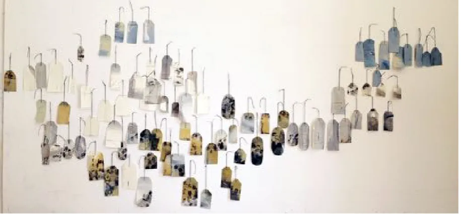
Fig. 26 Mary Crenshaw, Landscapes on 100 Luggage Tags, Oil, charcoal, enamel spray paint on paper luggage tags, dimensions variable, 2015.
For Landscapes on 100 Luggage Tags I coated the paper luggage tags with rabbit skin glue instead of gesso, to keep the brown paper visible. Then, I painted the tags with oil, drew into the paint with charcoal and sometimes collaged remnants of cut-paintings. With spray paint, I unintentionally added indexical impressions on the wall of my studio. The messy interventions gave the tags a feel of being consumed, as though they had a history.
As a way of suggesting landscape I used limited colours: lamp black, yellow ochre, and ultramarine blue, flake white, and charcoal for drawing. Since the strings were varying lengths the result was an imperfect grid when the tags hung, grouped together on the wall. Once installed in the Stanze exhibition, I decided to place the tags randomly in a few areas, as a way of adding movement and breaking up the grid pattern.
hand and fingerprints in Conjured Part (eyes) Ferguson –accentuated the fact that the indexical sign can be a powerful vehicle of meaning. Considering the way Mehretu's paintings evoke cultural upheaval, displacement, and violence was a step to understanding how to make my abstract work speak more clearly to me of the current European migrant crisis. Fabienne Verdier 's paintings influenced the making of this piece because of how she implies landscape through gesture, as did the palette, ambiguous political content, and varied materials of Kiefer's work.
Michael Corris describes how in Hand Grenades Susan Hiller features tags dangling from glass vials that contain ashes of paintings she deliberately destroyed (Gallagher, 2011, p.41). Unlike Hiller, I did not burn my paintings, but was radically changing them. My tags function as individual paintings that create a whole work, whereas Hiller's tags identify each burned painting separately. Hiller also displayed her tags in a group. My tags do not identify, but represent a deliberate departure from traditionally stretched canvas and allude to travel and identity. Hiller's tags identify her destroyed canvases, and thus her break from painting. Identity, destruction, and an attempt to transform her painting practice are undercurrents in Hiller's work that have inspired me in my practice.
[Fig. 27 Susan Hiller, Hand Grenades Ashes of paintings,12 glass jars, rubber stoppers,tags, in Pyrex bowl, 1969-1972].
Is unavailable to be reproduced here due to copyright restrictions
An artist friend unexpectedly dropped by my studio shortly after I had finished the tag piece. He commented on how different the piece was from my former work, and how he enjoyed the worn and dirty look, because of the charcoal smudged on the white strings. He noticed the unintentional indexical marks the spray paint had created on the wall. So, I decided to use the spray paint-indexes when I installed the work in Le Stanze.
place them randomly, as if they were migrating, and the result was less static. Also, I showed images of 100 Luggage Tags in my first UEL Work in Progress slide presentation. Feedback was that it worked well with my topic, but needed developing.
Fig. 28 Mary Crenshaw, 100 landscapes on Luggage Tags, installation, Milan, 2016.
After completing this piece, I attempted various ways of making my own luggage tags. I cut paintings on paper, I toyed with size, and assembled groups of various painted tags. This led to cutting and stitching larger paintings on paper. When I showed images of this body of work to one of my supervisors, she noted that it appeared decorative, and I agreed.
unsuccessful work, because I was folding and layering collage and paint led to the idea of layering in my painting.
Fig. 31 Mary Crenshaw, City wandering, Acrylic, collaged Italian law-book text, graphite, 70 cm x 50 cm, 2016.
" "
Fig. 32 Mary Crenshaw, Self -portrait, Photolithograph, soft ground etching, monotype on paper, 70 cm x 50 cm 2016."
Photolithography, soft ground etching and monotype were the processes I used to make this print. First, I began with an enlarged, photo shop-inverted scan of my fingerprints. Then, through the photolithographic process a plate was produced, which I inked and printed on a large sheet of Somerset printmaking paper. After that, I made a soft ground etching on a plate the same size as the photolithographic plate and printed that on top of the same sheet of paper. The etching ink I applied in the final monotype stage added space and a depth to the composition created by the marks and colour.
underneath would remain visible. I used the photolithographic process in order to increase the scale of the standard FBI fingerprint card and soft ground etching because it is a tactile method for marking. It contrasted the orderly, stark, clean arrangement of the fingerprints on the grid. My decision to have a third layer was to create spatial composition with the marks and to add a colour.
By random placement of lines and impressions on the second soft-ground etching plate, I infiltrated the bureaucratic finger print form. For the final layer, I applied etching ink with pieces of cardboard to the monotype matrix and printed that. The strategy of using layering with various printmaking processes enabled me to gradually build up marks until I felt I had succeeded in covering the first photographic fingerprint image sufficiently so it was partially visible and recognizable, yet obscured enough to be transformed.
According to Rosalind Krauss, '...the abstract artist adapts his work to the formal character of the indexical sign' (1986, p. 218). In this case my fingerprints are the indexical signs that attest to my identity and also form the compositional base of this etching. Visually, they were meant to work abstractly and define space, but, the index provides meaning; in this case body parts that denote me.
Besides the index, when developing this work I thought about Robert Witkin's writing on Adorno's theory on dissonance. Adorno declares,' Dissonance then becomes the truth about harmony, a true reflection of the human condition '. He also writes, 'The historical emancipation from harmony as an ideal has been an important aspect of the development of art's truth content' (1998, p.52-53). Reflecting on Adorno's concept of dissonance has opened up possibilities for me in my painting practice.
While the experience of being fingerprinted by someone else was awkward, making the information on the fingerprint document illegible was enjoyable. As a result, I broke away from a rigid business procedure by adding my own expressionistic marks as information. I wanted to employ process to develop something that I could not have imagined. This being the case, Self Portrait represents a step forward. Now that I use layering in my paintings, I realize that this work was a necessary stage in my present direction.
Body Parts as Metaphor for Social Change
During the middle of my second year, having tried different painting surfaces and struggled with developing ideas, I decided my main focus should return to painting. Still wanting the work to be portable, I began a series of oil paintings on paper. After having spent the summer painting on numerous found portrait and vacation snapshots, I decided to introduce the figure. In these paintings I still wanted to attempt to confront notions of migration. Each day on the ten-minute walk to my studio from the underground, I encountered migrants, sometimes in pairs, on every street corner, with outstretched arms, baseball caps or plastic cups in hand, panhandling for spare change. This attempt at survival by seeking charity, once migrants reach Italian cities, it is an all too familiar sight.
The migrants were already permanent fixtures to people walking to and from work and going about their daily routines and I read that many of the migrants never interact with a single Italian person. Consequently, I began making quick paintings of arms, hands, baseball caps, and cups, using gesture, marks, and imprints. Through tonal choices I amalgamated the figurative aspects into the urban landscape. Linda Nochlin's essay The Body in Pieces was helpful in my thinking about adding these figurative elements to my work.
body appears in the form of the index, where I applied paint with my hands and fingers, or traced my arm and hand: body parts as metaphor for social change.
Subdued colour, together with shapes mimicking tall buildings, construction machinery, and streets were elements that I incorporated to suggest Milan. I folded some of the larger sheets of paper twice as a way of making them fit in my carry-on luggage. With this body of work the primary concern was the abstract figure. In fact, I had just seen a Hokusai exhibition in Milan and was impressed at how easily the artist suggested figures with a few simple lines.
Again the work of Fabienne Verdier, and Anselm Kiefer were influential. I thought of Verdier's speed and her simple, direct paint application and the way Kiefer partially revealed his subject matter. The materials I used were Canson's Figueras paper for oil, oil paint, charcoal, and spray enamel. In this work, again Adorno's theory on dissonance in art and music came into play. ' Inside everything that can justly be called harmonious in art there are vestiges of despair and antagonism' (Witkin 1998, p.52).
One work fed another, with the drawing and colour palette being the same throughout the group. I decided to fold the larger pieces as a way of mistreating the work and having it fit in my suitcase in order to travel with me. I attached eyelets in the top two corners of each sheet of paper, so the paper could be nailed directly to the wall. Punching holes in the paper to insert the eyelets and nailing the paper directly to the wall affirmed that the work was not precious. It seemed to be an analogy to the violent, inhumane treatment of migrants. In the work that followed I decided to nail my canvases directly to the wall, instead of using stretchers. I installed the sheets of paper in a horizontal line to form a narrative sequence. The large folded works were hung on the opposite wall in the light well space.
In addition, seminar feedback helped get me on track. One astute comment was that the migrants' lives in Milan and my life are conflicting, and that the layering was a successful approach to convey this tension. Another remark was to trust my judgement and add visual complexity that seemed lacking in some of the pieces. The general agreement was that I should work on a larger scale and develop the process in future work. This critique made me aware of the need to work bigger so the strength of my gesture could evolve. I decided to create my next series of paintings on un-stretched canvas. Canvas could be larger than paper and would be easy to transport in that it could be rolled and tucked in a shipping tube.
Fig. 34 Mary Crenshaw, Detail light well installation, 30 x 40 cm, Oil, charcoal on paper, 2017
[image:48.595.99.497.110.436.2]
"
Spare some change? represents the beginning of a series of works. I continued with the same scale, and materials in the four paintings that followed. Because of the positive response from fellow students and seminar leaders, I am working on a large scale and use a limited palette. I began by under painting patches of colour using a wide brush. Then I drew a couple of figures with outstretched arms, holding baseball caps. I began layering paint, in order to cover up the figures. In the final layer I drew shapes reminiscent of baseball caps and body parts on the painted gestures. The paintings that came directly after this piece include gesture, line and layering of deconstructed figures, imprints, shapes and traces.
This painting was the first successful one that I completed after deciding to work large. Before this piece, I made other large paintings where I experimented inserting words and phrases, but I felt the text was a distraction from the actual painting. As mentioned above, not stretching the canvas was a pragmatic as well as an aesthetic decision, or rather a pragmatic necessity that became an aesthetic choice.
My core concern was to see if I could attempt to tackle political issues while continuing to work abstractly. Layering my drawing and marks was how I resolved this question. Initially, I drew figures with outstretched arms holding baseball caps, to which I added elements– concrete-slab shapes, girders, arches, and yellow patches– evocative of Milan and Italian architecture. These areas of detail were purposefully made to pull in the viewer. After numerous false starts, with this painting I was finally on track. The grey areas were casually applied over previous painted shapes as a way of adding gesture and letting go of control.
According to Homi K. Bhabha, 'When we talk of the ever expanding boundaries and territories of the global world, we must not fail to see how our own intimate, indigenous landscapes should be remapped to include those who are its new citizens' (1994, location 4% 297). How can these people merge into European society and will this 'remapping' ever happen?
considered Kiefer's sombre palette and how he reaches the viewer emotionally through his use of gesture and materials.
Before taking this painting to UEL to be displayed in the Showcase exhibition, I hung it at home on our living room wall so it would be completely dry before rolling it in a tube for shipping. Friends and family members who saw it reacted positively to the large scale and densely painted yellow areas, thinking that it looked like I had actually applied gold paint.
Comments from seminar leaders were: the painting was confident and demonstrated speed, the depth worked well, it was assured and exuberant, with a distinctive style. One leader remarked that it was a less 'polite' work than my previous year's work. Another observation was there is a bodily feel to the painting, by virtue of its scale and discernable figurative elements, yet the architectural devices unite the composition abstractly. Someone said that the paint application conveys excitement and a self-assured manual ability. It was also noted that there is an abstract- figurative debate in this work, with the shadows and traces resulting in an interesting ambiguity. Artists that came to mind were Joan Mitchell and Jean Michel Basquiat because of the dynamic, bold materiality. In addition, the seminar leader felt that the uniform size of the paintings and their irregular edges added consistency to the work as a whole.
Ciao mamma no.10 was completed a few days before I had to ship my work to London before the Showcase exhibition in June. Seminar leaders and fellow students singled it out as being the most successful work. Because for me it had come very easily, I did not at first agree. However, now I can see that the simple marks create space and movement.
There are figures underneath painted shapes and charcoal scribbles. The colours clash; the oval forms collide into one another, bouncing around the painted surface like a rockslide. This painting is upbeat; a seminar leader stated there is pleasure and joy, with musical moments of energy and pause, and that there is a brilliant use of texture and tone with a sense of process that is very alive. Clearly acting on the previous seminar feedback had helped to move my painting forward, even if I myself was slow to understand the value of what I had done.
Figure and Landscape
In Living in shadows, I wanted the imagery to be simple and direct, like the gestures of Verdier, yet with abstract outcomes obtained through layering by Mehretu, and with the expressive energy of Kiefer's dense paint application. I thought about different aspects of the Italian migration situation, where daily encounters with migrants sparked the title.
In this painting there is stark light and dark and contrasts of colour, with drawing that mimics open structures of a city combined with the round shape of the baseball caps migrants use for panhandling. These lines have a dual spatial reading. Other marks, like the white marks on the bottom left resemble a calligraphic figure. An accidental shape on the bottom left looks like the boot of Italy and patches of densely applied yellow ochre suggest Italy's rocky terrain. Black charcoal marks on the Italian-boot shape float on the surface, possibly evoking the migrants' travel over land and sea to arrive at their final destinations: hostile environments where they will always be outsiders.
[Fig. 40 Lee Krasner, "Were you seeing"? CR 565 Imperfect Indicative, Collage on canvas, 198 x 182 cm , 1976].
Is unavailable to be reproduced here due to copyright restrictions
Wagner writes that Krasner, living in the shadow of her famous husband Jackson Pollock, openly admitted her discomfort with the male chauvinism of the New York Abstract Expressionism art world. Though Krasner asserted that her work was autobiographical, Wagner suggests that there is an ambivalence and that cutting and reassembling was a tactic the artist used to avoid personal exposure. Her use of the genderless 'LK' as a signature suggests the desire to hide her identity as a woman (1996, p.180).
New to the city is another edited, torn painting. I cut the original painting in half, so the square scale is different from the vertical rectangular format. I think this size might be most suitable for my body, since I am not a tall person. However, it is probably a good idea to continue to work large, since I am not sure how many more years I will be able to do so. This consideration creates a sense of urgency within me to make work. While painting, I forget my age and I am fortunate to still have the agility to climb onto and hop off of my scaffolding. Eliminating stretchers that are heavy to lift, move, and transport has been a practical, as well as aesthetic decision. I no longer have the strength for heavy lifting, but apart from that, at sixty-three I can still work for long stretches on my feet, get up the next day, and do it again.
One aspect of my process is to preserve energy and speed that produces surprise. But as a mature artist I have learned the value of pausing to reflect and evaluate what I have made. The reason I rip is part of this reflection process, where I slow down to consider, edit, and rework. This is also a point where I try to title the paintings as a way of allowing the real world to come into my work. How Mehretu's titles add significance indicated the possibilities of nudging the viewer toward certain readings. I do not want to pin down the meanings, but add associations. I want my titles to hold the viewer's attention similarly to how the marks surprise.
After I cut this painting, I marked the canvas with oil bar, then smeared the marks with my fingers. A grey figure at the top is concealed with lines that resemble building structures. Small figures are drawn throughout with charcoal and mid-left a grey rectangle echoes the head shape. Next to that, a black daub creates ambiguous receding/advancing space, appearing like a hole, or a solid, because of two white specks located on top. Lines angle off to the bottom right, forming a foot shape. To the left of that, there is another foot. These are disconnected portions of the figure at the top. Marks under the foot shapes accentuate the lines. In previous layers that show through I applied paint with the rubber sole of my son's discarded trainer. The title came after hearing about another wave of migrants fleeing civil war and entering Italy.
[Fig. 42 Callum Innes, Exposed Painting Oriental Blue, Oil on linen, 120 x 118 cm. 2016] Is unavailable to be reproduced here due to copyright restrictions
.
The edges are the focal points in Innes' work, where he leaves previous layers of removed paint stating in the video (Callum Innes, In Two)," It gives history to the work. It gives history to the viewer"..."It gives it internal space". It is interesting how Innes' off-kilter lines of the rectangles and squares play off one another within his compositions. The edges of my trimmed canvases are also imprecise, and this is a feature that when they are hung grouped together creates energy between them, much in the same way as Innes' imperfect geometric shapes. This is an artist I intend to pursue for future research, as a way of thinking about possibilities regarding the imperfect edges in my work.
Fang Zhaolin's exhibition of large ink paintings was held last June in Milan at the Palazzo della Permanente. She fused landscape with calligraphy, combining simplicity and detail. After looking at this fascinating Chinese expressionist painter and the watercolours of Callum Innes, I have begun thinking about watercolour as a possible medium for future large-scale works on paper. Fang Zhaolin's densely painted areas resonate against the stark white space of her rice paper. This contrast is something to explore in my painting, as a way of giving breath to my compositions.
[Fig. 54 Fang Zhaolin, Signora del Celeste Impero, Ink, coloured pigments on rice paper, 120 x 80 cm, 1996].
Huma Bhabha's sculpture was on display in the foyer of the National Gallery when she was a finalist for the Fourth Plinth in January 2017. Humble materials– polystyrene, wood and cork– make up Bhabha's sculptures that fuse human form with architecture and address issues of race and identity. Seeing this particular piece sparked an idea as to how I might combine abstractions of the figure, landscape, and urban structures in my paintings.
[Fig. 43 Huma Bhabha, Castle of the Daughter, Cork, polystyrene, acrylic paint, oil stick, wood, 238.8 cm x 61 cm x 92.1 cm, 2016].
[image:61.595.112.484.337.653.2]Is unavailable to be reproduced here due to copyright restrictions
Fig. 45 Roccabascerana, Avellino, Italy
Fig.46 Self on scaffolding in new studio.
[image:62.595.168.439.393.597.2]
Fig. 47 Mary Crenshaw, There's no room here 1 and 2, Oil, oil bar, charcoal on canvas, 240 cm x 110 cm each, 2017.
The title There's no room here 1 and 2 are two separate paintings that I decided to hang together for my exhibition at Spazio Arte where there was only one large wall in the gallery. These two worked well together, so I left them there, leaving much needed surrounding space. The title came from hearing about the closure a migrant housing centre in Turin because of protests from local residents. This is work I began last summer in my newly-renovated studio in Southern Italy, where there is much more room to work than in the three by five metre Milan space I have used for the past twenty years. I was influenced by the light, colours, and terrain that is much different from Northern Italy. Milan is flat and the sky is notoriously overcast, due to smog because of its close proximity to the Alps. In There's no room here 1 (left) I built up the paint applying it in layers with rags. The rocky and irregular shapes in the top were applied with a painting knife.
could not seem to resolve the blue area, I decided to do something drastic. In a recent art supply order, I had received a complimentary thirty-millilitre tube of Gamblin's torrit grey, a colour the company makes once a year when the factory's air filters are cleaned. Torrit grey is luscious because it is a combination of every colour Gamblin produces. Because I had such a small amount, I decided to add the entire tube wet-into-wet to the previously applied white marks . The result was oppressive and heavy, a ball shape that weighed on the energetic marks underneath. I drew lines and rectangles on the bottom in an effort to further subdue their energy. Many of the painted marks in this area are in opposition to one another, trying to find refuge among the controlled debris.
Fig.48 Damaged wall after Ischia Earthquake, August 21, 2017
[image:65.595.165.431.493.696.2]