University of New Orleans University of New Orleans
ScholarWorks@UNO
ScholarWorks@UNO
University of New Orleans Theses and
Dissertations Dissertations and Theses
8-10-2005
Comparing Different Levels of Interactivity in the Visualization of
Comparing Different Levels of Interactivity in the Visualization of
Spatio-Temporal Data
Spatio-Temporal Data
Samara Ebinger
University of New Orleans
Follow this and additional works at: https://scholarworks.uno.edu/td
Recommended Citation Recommended Citation
Ebinger, Samara, "Comparing Different Levels of Interactivity in the Visualization of Spatio-Temporal Data" (2005). University of New Orleans Theses and Dissertations. 281.
https://scholarworks.uno.edu/td/281
This Thesis is protected by copyright and/or related rights. It has been brought to you by ScholarWorks@UNO with permission from the rights-holder(s). You are free to use this Thesis in any way that is permitted by the copyright and related rights legislation that applies to your use. For other uses you need to obtain permission from the rights-holder(s) directly, unless additional rights are indicated by a Creative Commons license in the record and/or on the work itself.
COMPARING DIFFERENT LEVELS OF INTERACTIVITY IN THE VISUALIZATION OF SPATIO-TEMPORAL DATA
A Thesis
Submitted to the Graduate Faculty of the University of New Orleans in partial fulfillment of the requirements for the degree of
Master of Arts in
The Department of Geography
by
Samara Ebinger
B.A. George Mason University, 1996
ACKNOWLEDGMENTS
This thesis would not have been possible without the people mentioned below and I am indebted
to them all. I would like to thank the members of my thesis committee for all of their help and
support: Dr. André Skupin, for serving as my major professor and graduate advisor, and for his
honest criticism and enthusiasm for the work comprising this thesis; Dr. Ron Hagelman for his
encouragement and guidance in my graduate studies, and for also giving me the opportunity to
work as his graduate assistant; and Dr. Jane Brooks for her vast insight into the urban landscape
of New Orleans and the French Quarter. I thank Walt and Ronda Rose for their friendship and
support I was lucky to find during my stay in New Orleans. Finally, many thanks to my parents
TABLE OF CONTENTS
LIST OF ILLUSTRATIONS... vii
LIST OF TABLES... viii
ABSTRACT... ix
CHAPTER 1 INTRODUCTION ...1
A new era of scientific visualization...2
Geovisualization ...4
Depicting spatio-temporal data: Static maps ...6
Depicting spatio-temporal data: Animation...7
Depicting spatio-temporal data: The use of higher levels of interactivity...10
Cognitive and usability issues: Geovisualization tools...11
Evaluating the effectiveness of animated cartography, static, and interactivity: Existing research ...12
Problem statement...14
Methods...15
CHAPTER 2 LITERATURE REVIEW ...18
Interactivity, geovisualization and static maps ...18
Definition of cartographic animation...22
Evaluating the effectiveness of geovisualization tools ...24
Geovisualization tools and usability ...30
CHAPTER 3 METHODS ...37
Data ...37
Creating the geovisualization tools...44
Testing the geovisualization tools...47
CHAPTER 4 ANALYSIS AND RESULTS...52
Quantitative analyses ...53
Qualitative results ...59
APPENDIX A
Static map sheet layouts...67
APPENDIX B
Animated map with VCR-type controls ...69
APPENDIX C
Toggle map ...70
APPENDIX D
Human subject testing approval and consent form ...71
APPENDIX E
Initial test questionnaire...75
APPENDIX F
Data-related test questions ...77
APPENDIX G
Open-ended evaluation questions ...78
APPENDIX H
Initial spreadsheet of quantitative data collected ...79
APPENDIX I
Chi-square test results ...80
APPENDIX J
Kruskal-Wallis test results (Accuracy) ...88
APPENDIX K
Kruskal-Wallis test results (Speed)...89
APPENDIX L
Copyright permission...94
REFERENCES ...96
LIST OF ILLUSTRATIONS
Figure
1. MacEachren's Cartography Cube...5
2. Study Area ...38
3. Soards' New Orleans City Directory entry ...40
4. Polk City Directory, New Orleans, Louisiana entry...40
5. Legend: Commercial and Public Land Use Types ...44
6. Temporal Legend for Computer-Based Animated Maps...46
LIST OF TABLES
Table
1. NAICS Sector Codes and Descriptions ...42
2. Reclassified Data Types...43
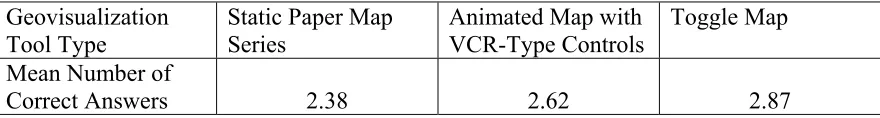
3. Mean Number of Questions Answered Correctly...57
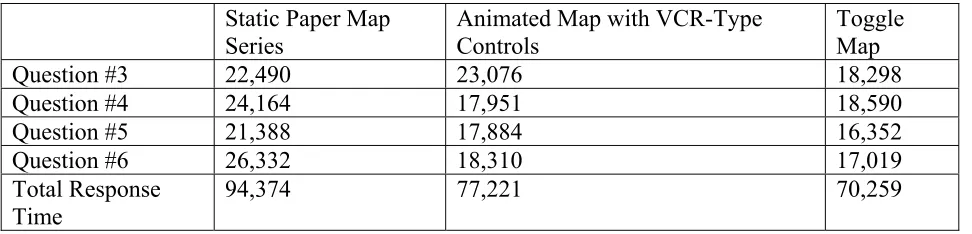
4. Mean Response Times (in milliseconds) ...58
ABSTRACT
The Internet and other advances in technology have dramatically affected cartography in recent
decades and yet these new capabilities have not been adequately evaluated for effectiveness. Are
dynamic maps more effective than traditional static paper maps in allowing users to visualize
spatio-temporal patterns? How important is a higher level of interactivity in visualizing data?
Which format is preferred? To examine these questions, human subject tests were conducted to
evaluate different levels of interactivity as represented by 1) a static paper map series; 2) an
animated map with 'VCR'-type controls; and 3) a toggle map featuring an interactive temporal
legend. Results indicate that while the level of interactivity did not affect accuracy of answers to
questions regarding spatio-temporal patterns, the total amount of time in which these questions
were answered lessened as the level of interactivity increased. Overall, test subjects were more
CHAPTER 1
INTRODUCTION
The world is complex, dynamic, multidimensional; the paper is static, flat. How are we to represent the rich visual world of experience and measurement on mere flatland? (Tufte 1990, 9)
Edward Tufte's question is one that cartographers have grappled with for hundreds of
years. However, the map makers of today are no longer forced to represent our world using just a
flat two-dimensional surface. Beginning in earnest in the 1960s, the means of production, the
distribution, and the look of maps have dramatically changed due to advances and innovations in
computer technology. What has also changed is how cartographers view the purpose of maps and
modern mapping tools. The rise of the geographic visualization paradigm (born out of the
broader notion of scientific visualization) in the late 1980s shifted this focus. Rather than merely
serving as an illustration to accompany 'real science', a map may now instead be seen as a way to
explore geographic data sets in order to discover previously unknown spatial and spatio-temporal
patterns or anomalies. The emergence of the World Wide Web in the mid-1990s has made the
computer an indispensable part of how most of us live our lives; it has made access to previously
unimaginable amounts of data much easier; it has also fundamentally changed how we produce,
distribute and ultimately interact with spatial data and maps.
Time makes a difference. Yet until quite recently, the depiction of space through time
was very much a challenge from a cartographic standpoint. Prior to the middle of the 20th
century, the two primary options were either the portrayal of time 'steps' on one map or the use of
multiple maps to represent different time periods. The introduction of animation in the late 1950s
spatio-temporal data. In the 1990s, interactive maps1 allowing for new ways to show data sets began to
appear with increasing frequency mainly due to the growth of computer technology and the
widespread use of the Internet.
In 1990, Monmonier argued that the use of computers would provide the means to
elevate the concept of time to "its proper place in graphic analysis" using two methods: 1)
through the use of interactivity, allowing users to freely manipulate the temporal component of
the data, and 2) through animation where "the map becomes a scale model in both space and
time" (1990, 40). Today, fifteen years later, both of these methods continue to hold such
promise, and yet many questions remain unanswered about their effectiveness and how they can
be best utilized in the mapping sciences. How do these new computer tools compare with static
paper maps in effectively depicting spatio-temporal data? How important a factor is interactivity
in using these tools? Before looking to answer these questions, it is first necessary to provide
some background information on several key topics.
A New Era of Scientific Visualization
MacEachren and Kraak (1997, 3) define scientific visualization as "the use of
sophisticated computing technology to create visual displays, the goal of which is to facilitate
thinking and problem solving." Proponents of the use of visualization as a scientific tool argue
that graphic representations of data (including maps) have previously been viewed simply as
communication devices for scientific results, rather than as valid methods for analysis. By
1 The term ‘interactive map’ typically refers to a computer-based map that allows a user to change the display by
utilizing the computer’s mouse or keyboard. The Oxford American Dictionary defines the word ‘interact’ as “to have an effect upon each other.” Using this definition, static paper maps may also be interacted with, in addition to computer-based maps. For the purposes of this thesis, this simple definition will be used. The concept of
relegating graphic elements to such a marginal role, scientists were missing out on powerful
research tools.
Today most scientists equate scientific visualization with sophisticated computing
technology. In fact, the fundamental ideas at the heart of scientific visualization have been
around for some time. Collins distinguishes two major eras in the visual representation of
scientific data. The first period of scientific visualization began in the middle of the 17th century
and continued into the beginning of the 20th century (Collins 1993). It was during this time that
innovative techniques for visual data representation such as the statistical graphic were created
and perfected by the leading scientists of Europe, including Descartes, Playfair, and Halley.
However, Collins considers the map (which preceded these other techniques by hundreds of
years) as one of the primary methods of scientific visualization prior to the computer age.
The second era of scientific visualization began in the 1960s, with the dawn of the
computer age. However, it was not until several decades later that this paradigm gained
widespread recognition within the scientific community. The early 1980s saw many
breakthroughs in the field of computer science. Improved technology allowed for increased
computing power and speed while reducing the size of computing devices, eventually leading to
the introduction of the desktop computer. In terms of scientific research, such innovations helped
to change how and for what purposes computer technology could be used.
In 1987, the National Science Foundation’s Panel on Graphics, Image Processing, and
Workstations issued a report titled "Visualization in Scientific Computing." This can be
identified as the beginningof the modern trend towards visualization that continues to affect
many disciplines today. The NSF report dubbed scientific visualization "the new interactive
principle: the ability of computers to provide an unprecedented level of user control, or
interactivity, to new forms of visualization.
Geovisualization
From the late 1980s onward, scientific visualization served as a new way of looking at
data exploration in many disciplines, including cartography and geography. However, these two
disciplines already possessed a rich history that espoused the fundamental concepts of
visualization. It was soon formally defined as geographic visualization, or geovisualization, as it
is now most commonly called.
MacEachren and Kraak (2001, 3) define geovisualization as a concept that "integrates
approaches from visualization in scientific computing, cartography, image analysis, information
visualization, exploratory data analysis, and geographic information systems to provide theory,
methods and tools for visual exploration, analysis, synthesis and presentation of geospatial data."
Dibiase et al. (1992, 201) assert that "visual representations of data and concepts are
indispensable materials in the construction of scientific knowledge."
MacEachren (1994) characterizes geovisualization in terms of map use, in contrast to the
theory of map communication, a paradigm that dominated cartography through the mid-1980s.
MacEachren conceptualizes map use within a three-dimensional space, with visualization and
communication at opposite ends of a continuum (Figure 1). Based on MacEachren’s cartography
Figure 1. MacEachren's Cartography Cube
Reprinted from Visualization in Modern Cartography by A. M. MacEachren and D. R. Fraser Taylor (Eds.), Oxford: Pergamon, 19942.
1. Map use is intended to reveal unknowns;
2. A map features a high level of interactivity;
3. A map is viewed privately at an individual work station in a research
environment.
Geovisualization is seen as a form of 'visual thinking' in which the goal is not to create
one ideal map to show a specific data set, but to provide a way to explore the data and to
generate ideas about them. MacEachren (1995, 460) once called geovisualization "the most
important development in cartography since the thematic mapping 'revolution' of the early 19th
century." It has dramatically shifted the focus of cartographic thought in the past decade.
Recent Research and Developments in Geovisualization
Since the emergence of geovisualization in the early 1990s, research has primarily
focused on the creation of tools that utilize rapidly advancing computer technologies to facilitate
spatial data exploration. However, relatively little research has been performed on how these
tools can best be utilized for this purpose. It is easy to forget that visualization is first and
foremost a mental process; visualization tools are simply aids to this process. Recent studies
have expressed a need to shift the focus of research from creating geovisualization tools to
studying how they work, how they may best be utilized for specific tasks, and how to make such
tools more user-friendly. This is especially important when it comes to the use of animated
mapping and interactivity; MacEachren and Kraak (2001, 5) note that when it comes to
geovisualization "today's cartographic environments are characterized by two keywords:
interaction and dynamics. While visual representation remains a fundamental issue, the focus of
both cartographic design and cartographic research now extends to problems in human-computer
interaction and in enabling dynamic map and map object behaviors."
It is the purpose of this thesis to evaluate three different geovisualization environments in
terms of varying level of interactivity to determine which format allows users to most effectively
visualize spatio-temporal patterns and which format users subjectively prefer. These three
different interactivity levels/mapping environments include: 1) a static paper map series; 2) an
animated map with VCR-type controls; and 3) an interactive toggle map. These three formats
will be discussed more in depth in a forthcoming section.
Depicting Spatio-Temporal Data: Static Maps
"Conceptualizing the dynamic nature of a phenomenon as it evolves and interacts through
representation of spatio-temporal processes in a graphical format is a relatively new phenomenon
within cartography. Prior to the computer age, the depiction of such data was restricted to several
static mapping solutions. One method included multiple time periods on a single composite map.
Another option utilized multiple maps to form a time series. Perhaps because of these limited
forms of portrayal, it was not until the middle of the 20th century that spatio-temporal change
came to be considered an important topic within cartography and geography (Vasiliev 1997).
Contributing to this change undoubtedly were the initial experiments in animated mapping and
advances in computer technology that took place at that time.
The Role of Static Paper Maps in Geovisualization
Static paper maps can be interacted with at a basic level and such activities may include
looking over the maps, comparing them to the real environment, and using them for navigation
(Crampton 2002). Because of this low level of interactivity, there is debate over whether static
paper map displays may even be considered forms of geovisualization by definition. In fact,
some definitions of interactivity have purposely excluded static maps, when defining that term in
reference to geovisualization (Crampton 2002). While it is arguable that a higher level of
interactivity may be appropriate for some mapping tasks, there is little evidence in the body of
literature that supports the conclusion that dynamic maps perform conclusively better than static
maps in depicting spatio-temporal data in a geovisualization environment.
Depicting Spatio-Temporal Data: Animation
Cartographic animation in its broadest sense may be defined as the creation of the illusion
of movement in relation to space (and in many cases through time)3. While the depiction of
3 A number of disparate definitions of what constitutes cartographic animation exist in the body of literature. This
spatio-temporal data is probably the most common type of cartographic animation produced,
non-temporal, attribute-based animations have increasingly become popular as well.
The ability of animation to portray change through time has long been recognized.
One of the first animated maps was created by the Disney studios in 1940 to illustrate the Nazi
invasion of Poland. However, it was not until almost two decades later that animation was finally
perceived as a viable tool within the cartographic research community. In 1959, Thrower
advocated the use of animation (at the time, traditional cel- based animation filmed utilizing a
movie camera, as used in cartoons) as a way of adding the temporal dimension to cartography.
In the years that followed, cartographers took initial steps to employ animation as a new
method for mapmaking. Computer-assisted cartographic animation was first attempted by
Cornwall and Robinson (1966), when they used a computer to create individual animation
frames. The actual animation was then transferred to film by literally photographing the frames
and placing them onto conventional film. Tobler (1970) used a similar approach in his depiction
of urban growth in the Detroit region. However, as Harrower (2004, 36) notes, Tobler's study is
important because he "used animation to generate new insights into a complex process, rather
than to communicate known facts about that process." The promise of animation as a data
exploration tool is seen even at this early point in its development and prior even to the formal
establishment of geovisualization as a concept.
Computer Technology, GIS, and Developments in Cartographic Animation
Beginning in the 1980s, revolutionary changes in the computing industry led to the
increased power and speed of computers and to the introduction of the desktop computer. Such
innovations signaled great changes ahead for cartography and geography (in addition to many
sciences has been the growth of geographic information systems (GIS), the computer-based
systems that allow for the management, analysis and display of geographic data sets. In the past
twenty years, GIS has changed the face of how geographic data is created, managed, and
manipulated, and how maps are created. It has also popularized the use of interactivity with
regard to maps and made the creation of maps via computer much easier. The growth of GIS,
plus the development of computer driven multimedia tools outside of the earth sciences, along
with interest generated from the new ideas of geovisualization, reinvigorated interest in
cartographic animation in the late 1980s and early 1990s, which, despite its promise, failed to
take off as a widespread cartographic tool in the preceding decades.
In 1990, Campbell and Egbert published a comprehensive work on the history and future
of cartographic animation, noting that "the relative lack of attention paid to animation is
remarkable" (1990, 42). Apparently cartographers took this admonition to heart, as the 1990s
saw a dramatic increase in the application of animation. Soon though, additional developments in
the computer industry would again dramatically affect cartography and its ever expanding
toolbox.
Cartographic Animation and the Internet
The emergence of the Internet in the mid-1990s fundamentally changed the way digital
data of all kinds were distributed. From the viewpoint of animated cartography, the Internet has
had several important effects that include:
1) Providing a method of distribution for geographic data and mapping products that
2) The underlying interactive nature of the Internet has opened up a wide range of
possibilities for how users interact with maps and in general has allowed people to
become familiar with interactivity as a concept;
3) Almost any person with a computer can view animated maps at faster speeds and with
smaller file sizes using web-ready formats such as Quicktime and Shockwave Flash
(Harrower 2004).
Research Needs in Animated Cartography
Echoing the sentiments of Campbell and Egbert in the early 1990s, MacEachren and
Kraak (2001) more recently lamented that the progress made involving cartographic animation
over the past ten to fifteen years has been sporadic at best, with many questions remaining
unanswered as to the appropriate use of animation in the context of geovisualization. Ogao and
Kraak (2002) similarly comment that "when critically assessed, the developments in animation
functionality are haphazard and uncoordinated in its efforts."
Depicting Spatio-Temporal Data: The Use of Higher Levels of Interactivity
In the 1980s, with the emergence of the desktop computer and faster and more powerful
computing tools, GIS quickly took off as the primary way to create modern maps. Interactivity is
clearly a fundamental component in GIS. The ability to turn on and off and manipulate different
data sets and their corresponding symbologies is central to what GIS is and can do. However,
such functionality is not typically available to a wide audience: just to users with the necessary
(often very expensive) software. While the GIS analyst may have access to a host of interactive
features, frequently the final product she is producing for larger distribution is a static paper or
It was not until the emergence of the Internet that interactivity became commonplace for
most computer users. The ability to choose what we see is what makes the Internet so powerful
and popular to users. However, even prior to the Internet, the importance of interactivity to
mapmaking was recognized. Campbell and Egbert (1990) identify its importance within the
context of cartographic animation, noting that a high level of interactivity is important in making
animation as functional as possible. This sentiment was echoed by other researchers in the early
1990s as well (Peterson 1993, Weber and Buttenfield 1993). With the emergence of the
geovisualization paradigm and the significance of interactivity within it, its importance only
continues to grow.
Interactivity and Geovisualization: Research Needs
As stated previously, interactivity is a key part of what defines geovisualization. Yet,
little research has been performed that deals with this concept within a geovisualization context.
Crampton (2002, 96) states that "interactivity has yet to be formally defined and conceptualized."
He continues, noting that there is not "yet a grasp of its limitations compared to static mapping
practices." Fairbairn et al. (2001, 16) emphasize the importance of studying user interaction with
dynamic representations, specifically how users respond to performing particular tasks and how
they understand the representations. The authors express a need to "move well beyond the
video-player metaphor for interacting with animations."
Cognitive and Usability Issues: Geovisualization Tools
In order to create effective geovisualization tools, two separate but related efforts are
necessary: 1) cognitive research driven by theory (i.e., understanding “how humans create and
employed in geovisualization in terms of usability (Slocum et al. 2001, 62). This thesis is
intended to be more relevant to issues of usability rather than to the specific mental processes
employed by the user. However, the results should prove helpful in developing relevant
cognitive theory in future analysis.
User testing for map effectiveness is nothing new to cartography. However, as
cartography has shifted to a primarily computerized format for map generation and viewing,
researchers have begun drawing from principles of usability engineering to test geovisualization
tools. Usability engineering may be defined as a multi-step process,
typically used in the evaluation of new computer software, to assess user-friendliness and to test
whether the software responds to tasks that users expect of it (Slocum et al. 2003).
Research Needs: Evaluating Geovisualization Tools
Slocum et al. (2001) express a need to determine how well dynamic representations
actually work within the confines of geovisualization. The authors state that "although the
notions of animation, exploration, and interactivity have enticed cartographers, we should ask
whether dynamic representations truly work. Do animations permit users to interpret
spatio-temporal patterns more effectively than static maps and do interactive displays enhance user
understanding of spatial patterns?" (Slocum et al. 2001, 64). MacEachren and Kraak (2001)
similarly comment on such a need for research in this area.
Evaluating the Effectiveness of Animated Cartography, Static Maps, and Interactivity: Existing Research
An investigation into the literature reveals a paucity of research dealing with the
effectiveness of geovisualization tools. To date, no research study has been performed that
collectively features three stepped levels of interactivity. However, research has been conducted
that involves different combinations of these elements. The results of these studies have been
somewhat inconclusive with contradictory findings in some cases. One likely reason is the very
diverse nature of the geographic data shown. Because there are so many different types of data
available and ways of visualizing them, it is difficult to standardize experiments in order that
they may apply to different types of data. To date, experiments involving geovisualization have
often included census-based data (Andrienko, Andrienko, and Gatalsky 2000; Dykes 1997;
Steiner, MacEachren, and Guo 2002) and also climate and weather-related data (Harrower 2002
[b]; Harrower, MacEachren, and Griffin 2000; Slocum et al. 2003; and Weber and Buttenfield
1993). This thesis instead focuses on the use of the different visualization tools to show
spatio-temporal change in land use data types. While urban land use data have previously been included
in interactive and animated mapping projects (Hamilton et al. 2001) and in a specifically
multi-temporal context (Société de développement de Montréal 2005), such data have not been used to
purposely evaluate the effectiveness of geovisualization tools.
Comparing Animation and Static Maps
From very early on in the development of cartographic animation, its capability as a tool
has been questioned (Bertin 1967). Surprisingly little evidence has been generated regarding its
effectiveness, and the results are mixed. For example, Patton and Cammack (1996) compared the
effectiveness of static and sequenced choropleth maps and concluded that sequenced maps held
an advantage in terms of speed and accuracy of response to questions about the data sets shown.
Koussoulakou and Kraak (1992) found that animated maps depicting spatio-temporal processes
held no advantage in terms of accurately answering data-related questions but that response
no significant difference in terms of accuracy when comparing static paper, static
computer-based and animated maps, but saw faster response times among those who used the animation. In
contrast, Slocum and Egbert (1993) compared sequenced and static choropleth maps and found
no significant difference in terms of accuracy or speed, but noted that response times were
slightly longer for users of the sequenced maps.
Interactivity
Regarding heightened levels of interactivity, Krygier et al. (1997) noted that participants
that utilized multimedia tools for geographic education enjoyed using interactive tools, once
exposed to the concept. Dibiase (1999) also found that in a study involving interactivity and
geographic education, students liked the interactive controls. Relatively little empirical evidence
has been produced that specifically tests the effectiveness of interactive geovisualization tools,
and again these studies show mixed results. Harrower, MacEachren and Griffin's 2000 study
dealing with interactive techniques for exploratory data analysis showed minimal positive results
for the enhanced interactive tools. On the other hand, MacEachren et al.'s 1998 experiment
evaluated similar tools and showed more dramatic positive effects.
Problem Statement
As stated above, the past several decades have brought great advances in computer
technology. These advances have reshaped cartography through the implementation of
innovative new ways to visualize spatial and spatio-temporal data. However, research studying
the effectiveness of these tools has not kept pace with these developments. Interactivity is
considered to be a fundamental aspect of geovisualization. However, very little research has been
The goal of this thesis is to examine how different levels of interactivity affect a user’s
ability to visualize spatio-temporal patterns. This study is intended to provide insight into the
following questions in relation to the above-stated goal: Are dynamic maps more effective in
allowing users to visualize spatio-temporal patterns than traditional static paper maps? How
important is a higher level of interactivity in effectively visualizing spatio-temporal data? The
purpose of this thesis is to examine these questions by conducting human subject experiments
that evaluate three different levels of interactivity. These three increasingly complex levels of
interactivity are represented by three different visualization tools.
Methods
The three geovisualization tools tested (in order from least interactive to most interactive)
include:
1) a traditional static paper map series;
2) a computer-based animated map with VCR-type controls; and
3) a computer-based interactive map series that allows the user to toggle between
different temporal views (or toggle map).
These three tools were evaluated using a methodology that combines elements of traditional
cartographic user testing and usability engineering principles.
Study Area
The data set featured in the three geovisualization tools is comprised of commercial and
public land use types in a portion of New Orleans' French Quarter over the past century.
Specifically the study area consists of four parallel city blocks along both Bourbon and Royal
environment where it is known that changes have occurred through time in terms of land use, but
the specific nature of the changes are not well known. Only two other known studies have
previously recorded detailed information about historical land use in the study area (Marcou,
O’Leary and Associates 1968 and University of New Orleans 1992).
Participants
Participants in this project included college students, specifically undergraduate and
graduate students enrolled in Geography and Urban Studies courses at the University of New
Orleans, in addition to mapping professionals employed by a private engineering firm in northern
Virginia. It was anticipated that recruiting such test subjects would be beneficial for the
following reasons:
1) They should already have fairly strong computer skills and a familiarity with the
Internet; and
2) The urban geographical subject of the maps might be interesting to the subjects
because of their area of study/profession and give them an incentive for learning to use
the tool.
Testing Procedure
Four testing sessions were conducted to evaluate the three tools. The first three sessions
were conducted on the campus of the University of New Orleans in New Orleans, Louisiana, and
featured 31 test subjects (approximately 10 at a time). The fourth testing session was conducted
at the headquarters of Dewberry LLC, a private engineering/mapping firm located in Fairfax,
Virginia, and included 10 additional test subjects. Subjects were tested on how well they were
qualitative questions about their individual likes and dislikes regarding the tools. By using both
quantitative and qualitative techniques, it was hoped that the most fitting qualities of usability
engineering principles and more standard cartographic user testing principles could be best
combined to assess the geovisualization tools displayed.
The questions I plan to answer using the results of these testing sessions are: Does the
level of interactivity affect a user's performance in detecting spatio-temporal patterns? Are
animated maps more effective in depicting spatio-temporal data than static maps in this regard?
Which format do users prefer? It is my hope that the results of this research will aid
cartographers in more effectively implementing similar types of geovisualization tools in the
CHAPTER 2
LITERATURE REVIEW
As discussed in the previous chapter, the goal of this thesis is to compare three different
methods of geovisualization that use three varying levels of interactivity to depict
spatio-temporal data. Buckley, Gahegan and Clarke (2000, 2) consider geovisualization as "not only the
development of theory, tools, and methods for the visualization of spatial data, it also involves
understanding how the tools and methods are used for hypothesis formulation, pattern
identification, knowledge construction, and the facilitation of decision making." From this angle,
it is the objective of this thesis to provide answers to the following questions:
• Does the level of interactivity a geovisualization tool provides affect the user's
performance in detecting spatio-temporal patterns?
• Are animated maps more effective in depicting spatio-temporal data than static maps
in this regard?
• Which format do users prefer?
This review discusses topics relevant to these research questions, and is divided into the
following sections: Interactivity, Geovisualization and Static Maps; Definition of Cartographic
Animation; Evaluating the Effectiveness of Geovisualization Tools; and Geovisualization Tools
and Usability.
Interactivity, Geovisualization and Static Maps
An argument can be made that geovisualization is simply the re-hashing of an old idea:
that idea being that a map can serve as a way to envision and explore data in new ways to
generate new ideas. MacEachren and Kraak (1997) dispute such claims, and argue that the new
different ways of visualizing data through high levels of interactivity, three-dimensional
modeling and interface design. Furthermore, the authors state that cartographers have not
implemented such tools to their full potential in relation to geographic phenomena.
In the eyes of many scientists, high levels of interactivity have come to define what
geovisualization actually is, thereby creating a distinction from the traditional static map. How
much of a distinction? According to Wood (1994), "the ability to prompt instantaneous changes
in maps results not only in a quantitative difference in the number of things a user can make
visible, but a qualitative difference in the way users think and in turn in the way maps function as
prompts to thinking and decision making." Clearly, to some, geovisualization is seen as
something truly revolutionary to the field of cartography. The increasingly important role of user
control and interactivity in cartography has been dubbed the "democratization of cartography"
(Morrison 1997). Important as these developments are, there remains little empirical evidence to
exclude traditional static maps from geovisualization based on performance alone.
In terms of feasibility, it is not practical to create a static map series of very large data
sets; in such cases it is only logical to employ computer-based geovisualization tools that may
rely on high levels of interactivity. At the same time, it is important to remember that
visualization is not a computer program or a paper map or any other method of representation,
but rather "an act of cognition, a human ability to develop mental representations that allow us to
identify patterns and create or impose order" (MacEachren et al. 1992).
Defining Interactivity in Relation to Geovisualization
Crampton's work on interactivity within the confines of geovisualization is the most
comprehensive piece of literature that specifically tackles the subject. He states that "interactivity
provide a readily applicable set of concepts that would allow the power of interactivity…to be
articulated, nor is there yet a grasp of its limitations compared to static mapping practices" (2002,
96). The goal of his work is to construct a typology of interactivity to aid in filling these gaps in
the research.
Crampton (2002, 86) states that "there is a surprising degree of variation in the literature
in the usage [of interactivity] and how it is employed." Calling interactivity a "nebulous" term,
he notes that authors concur that some forms of interactivity are more complex than others but
that what actually constitutes these forms is not agreed upon (2002, 88).
A key goal in Crampton's work is to discount the idea that geovisualization is nothing
new to cartography by defining interactivity as something "beyond the capability of the static
map environment" (2002, 86). He concedes that traditional static maps involve a basic level of
interaction, but advocates retaining a distinct meaning for the term as it relates to most
geovisualization environments because the types of interactivity involved are so different.
Ultimately, he defines interactivity within the confines of geovisualization as "a system that
changes its visual data display in response to user input" (2002, 88). This definition purposely
separates static maps from most computer-based geovisualization tools.
Crampton identifies a ranked set of interactive tasks that users engage in when
performing geovisualization. These tasks are ordered by the complexity and sophistication of the
1. Data examination;
2. Data comparison;
3. Re-ordering and/or re-sorting of data;
4. Extraction and/or suppression of data; and
5. Cause and effect analysis.
It is a safe bet to conclude that traditional static maps are not best suited to the three
higher level tasks: re-ordering/re-sorting data, extraction/suppression of data and cause and
effect analysis. However, clearly they are capable of the first two tasks, as Crampton himself
states in his article. He discusses the use of small multiples, as advocated by Tufte, as a valid
method of data comparison. Tufte (1990, 67) wrote that "at the heart of quantitative reasoning is
a single question: Compared to what?" It stands to reason that if static maps are capable of
answering this question so important to scientific investigation, should they not also be
considered as possible methods of geovisualization?
Based on the five tasks described above, Crampton constructs a preliminary typology of
interactivity that includes:
1. Interaction with data;
2. Interaction with the data representation;
3. Interaction with the temporal dimension; and
4. Contextualizing interaction.
Interaction with the temporal dimension (with which this thesis is primarily concerned) is
assigned a medium level of interactivity, because of the many different degrees of interactivity
variation in level of interactivity, is it really necessary to exclude traditional static maps from
such a typology?
Taking into account Crampton's work, it may be argued that for lower level
geovisualization tasks such as data examination and comparison in a spatio-temporal context, it
is appropriate to consider static maps as geovisualization tools in certain circumstances, given
that there is little empirical evidence to dispute this claim. In the literature, small multiples (as
coined by Tufte), or side by side comparisons of data in a map series, have been considered as
geovisualization tools, but oftentimes in a computer- based form rather than on paper. For
example, Slocum et al. created the MapTime computer program which features a variety of ways
of visualizing spatio-temporal data, including the use of small multiples on screen. The authors
comment that such a method is useful because of the ease in comparing the maps against one
another (2000). In addition, Aerts, Clarke and Keuper (2003) recently used static side by side
maps as a method to visualize uncertainty in urban growth data.
Clearly there is some debate over issues relating to the role of interactivity and static
maps in geovisualization. Conversely, most research scientists agree that animated maps have an
important role in geovisualization. The benefits of animation as a tool for data exploration have
long been extolled by proponents of scientific visualization. However, its effectiveness as a
visualization tool without satisfactory user controls has been questioned (Peterson 1993; Weber
and Buttenfield 1993). Also open to debate is what actually defines animation within the
boundaries of cartography and geography.
Definition of Cartographic Animation
Most people have their own idea of what constitutes animation: you know it when you
successive drawings or positions of puppets or models to create an illusion of movement when
the film is shown as a sequence.” However, a suitable definition for cartographic animation has
been hard to come by. In the early 1990s, Karl noted that a clear definition of cartographic
animation did not exist, and there was no consensus as to what it constituted (1992).
Unfortunately, today, there is still no standard definition of the term.
The lack of a comprehensive definition of cartographic animation is in part due to the
sporadic use of animation in geographic and cartographic research prior to the 1990s. Technical
difficulties and cost in production and distribution were major barriers to its implementation on a
large scale. In the early 1990s, Fairbairn and Deeley commented that "it is perhaps only by
attempting a project involving animated cartography that one begins to appreciate the ease of
construction, ease of use, efficiency, economy and portability of the traditional paper map"
(1991, 2). Advances in computer technology and the Internet (as discussed in Chapter 1) have
made cost and distribution issues much lesser factors, and have allowed research on animated
mapping to progress on a much wider scale.
In defining cartographic animation, Lobben (2003) makes a distinction between
cartographic animation and computer slide shows in terms of time scale. In an animation "the
viewer cannot detect the point at which one graphic in the series replaces the previous, while in
slide shows, the viewer can identify the point at which graphics change. In other words, each
individual slideshow graphic frame remains on the screen longer than does each animation
graphic frame” (Lobben 2003, 318).
Lobben's definition presents several problems. First, how are we to quantify what
constitutes a “longer” amount of time using such a definition? In addition, the ability to
the resolution and nature of the data. It seems unnecessary to define animation in such narrow
terms. If a simple presentation created using Microsoft Powerpoint conveys the idea of
geographic change through motion, why is it necessary to exclude it by definition? Weber and
Buttenfield (1993, 141) define cartographic animations as "cartographic displays having a
succession of maps pertaining to the same area whose content changes in relation to the
independent variable--time." While this definition seems more appropriate, it does exclude
non-temporal forms of animation.
Foley et al. (1990, 1057) define animation as covering "all changes that have a visual
effect" including changes in position, shape, color, structure, camera position, and lighting, in
addition to other factors. Dorling (1992) notes that a narrower definition than this may be
inappropriate based on the wide range of possibilities that animation offers.
Animated maps can come in many different forms. They can be created using different
computer software, using disparate types of geographic data, with different purposes in mind,
and may show either temporal or attribute change. These many differences and combinations are
what makes it so difficult to define and classify cartographic animation. It is also what makes it
such a potentially powerful tool. Perhaps more research in discovering actual strengths and
weaknesses of its applications is necessary before a consensus may be reached on how it may be
appropriately classified or further defined.
Evaluating the Effectiveness of Geovisualization Tools
Geovisualization tools can encompass a large array of types. Most of the existing
literature testing the effectiveness of such tools involves the evaluation of animation or the
comparison of animated maps with static maps. Dorling comments that "a single map to show
can solve this dilemma--but it can also compound it. Thus we must decide how and when its use
is appropriate. Such decisions can only be made with experience" (Dorling 1992, 216). While
studies have been performed evaluating the effectiveness of animation and other geovisualization
tools, the results have thus far been inconclusive. Following is a discussion of the existing
literature on this topic.
Animated Maps Involving No Interactivity
Koussoulakou and Kraak (1992) compared the performance of an animated map and a
static map series in demonstrating spatio-temporal processes. Test subjects were asked a series of
questions specifically relating to the data shown in the maps, with response times to the
questions recorded as well. No significant differences were found in the quality of answers (i.e.,
number of correct answers) between the two types of maps. However, response times for the
animated map test group were half those of the static map group. Despite the mixed results, the
authors argue that "static maps cannot display the evolution of spatio-temporal phenomena for a
long period and in high temporal resolution" (Koussoulakou and Kraak 1992, 106). The authors
suggest that interactivity, though not implemented in any way in the study, is essential to
improving map usage performance and user-friendliness in animated maps.
Slocum and Egbert (1993) compared static maps with sequenced choropleth maps
(animated maps that show one class of data at a time in a particular order) and how the teaching
of effective procedures affected knowledge acquisition. Results indicated that in terms of test
subjects answering data-related questions, there was no significant difference in accuracy or
speed of response between the two types of maps. However, the response times were slightly
static and sequenced choropleth maps, Patton and Cammack (1996) found that the sequenced
maps held an edge in terms of both speed of response and accuracy.
Johnson and Nelson (1998) evaluated the ability of users to recall spatio-temporal
patterns and information, comparing the effectiveness of a paper map series, static computer map
series, and an animated map. The authors used flow lines as symbology, arguing that areal
representations are not effective in animation because the user must constantly shift their focus
back and forth between the legend and the map. While this argument may have some merit, not
enough research has been performed to nullify the use of animation with areal symbols
(especially given the lack of interactivity as a factor in many studies evaluating effectiveness). In
evaluating the tools, tasks to be performed were divided into two categories: 1) the estimation of
quantity and 2) pattern recognition. Results indicated that there was no significant difference in
terms of accuracy or response time for the quantity evaluation tasks. However, for the pattern
recognition tasks, accuracy and response times were improved for the testing group that used
animation. In terms of tool preference, the testing group as a whole preferred the paper map
series to the other tools. The authors surmise that this was due to the lack of interactivity in the
other two tools, which resulted in the subjects having the most control over the paper maps.
Aerts, Clarke and Keuper (2003) compared the use of static maps and an animated map in
visualizing uncertainty in urban growth data. The results indicate that subjects using the static
maps answered data-related questions more accurately. In addition, the static maps were also
preferred in terms of technique over the animated map, which a number of the subjects found
annoying, possibly because they had no control over it. The test groups consisted of both novice
and expert users, with the experts preferring the animated method, possibly because they were
Clearly, the experiments discussed above demonstrate an incomplete picture in
comparing the effectiveness of both static and animated maps as geovisualization tools. A
recurring problem inherent in these experiments is that despite the knowledge that interactivity
could play an important role in the use of animations, it was in some cases deliberately excluded
from the testing sessions. Although it is impossible to know how much of a difference
interactivity would have made in those studies, the fact that it is mentioned repeatedly by the
authors (despite its exclusion from the user testing) indicates its potential importance and a need
for further investigation.
Animations Involving Interactivity
A common way to build interactivity into cartographic animations has been through the
use of interactive legends. Such tools can be used for both temporal and non-temporal
geographic data. Edsall et al. (1997) assessed different types of temporal legends used in
cartographic animation, in terms of ability to communicate information and to facilitate visual
thinking. The authors argue that in order for an animated mapping tool to be effective, users must
not only be able to perceive the actual spatial data presented, but they must also be able to locate
that data in real time and to understand the changes that occur through time to the data.
Legends serve several purposes in animated maps depicting spatio-temporal data. Like
traditional maps they must explain the meaning of symbols used in the map. However, they must
also provide information about the location in time of what is displayed. Furthermore, in
interactive programs, a temporal legend may also function as a tool to manipulate time in
different ways; for example, allowing the user to move to a specific point in time or even
specifying a particular temporal resolution or period within which to aggregate data (Edsall et al.
Edsall et al. define three categories of visually separate, temporal legends in animated
maps:
1. Text based legends with letters and numbers that continually change with the animation
(i.e., a digital clock);
2. Linear bars, that utilize some type of icon to 'fill up' the bar as time progresses;
3. Clock-like depictions that show the progress of time similar to a traditional, analog clock.
The authors' goal was to evaluate these legends in terms of their effectiveness in
depicting spatio-temporal data. All three maps/legends depicted the same data set: weather
patterns through time. The interactions between the test subjects and the linear bar legends and
clock legends were also recorded (the text based legend was not interactive) but the results were
not included in the study. The results indicated no significant difference between the three legend
types in terms of performance or speed.
MacEachren et al. (1998) developed a geovisualization tool for expert users, designed to
assist in the exploration of multivariate health statistics, with the goal of evaluating how such
tools may facilitate visual thinking, pattern detection and hypothesis generation. Using
qualitative analysis methods, the authors discovered that animation was favored by test
participants who also visualized patterns quicker over the second test group that featured the
more interactive method of "discrete time stepping" through different points in time in the data.
Peterson (1999, 376) examined the use and design of active legends in animated
mapping. An active legend "implements an interactive cartographic animation by making the
legend an active element of the display." He notes the problems associated with "passive"
viewing of animation, such as the difficulty in viewing the map and the legend simultaneously,
animation. He considers non-interactive cartographic animation similar to static maps, in that the
viewer is allowed only to view a predefined sequence of maps, as opposed to interactive
cartographic animation where the user has some form of control over any such sequence.
Peterson's study implemented a 'mouse-over' legend that allowed users to control the
animation and toggle between different variables and classification methods. The goal of the
study was to determine the level of functionality of the legend type and how it affected the
ability of users to identify patterns in the data. His results indicate that subjects were able to
comprehend use of the tools and the patterns in the data set adequately.
Antle (2000) evaluated the effectiveness of several different levels of interactivity in
terms of exploring data and data quality concurrently. In her work, she evaluates four tools
featuring varied levels of interactivity, including 1) side by side computer-based maps, 2) a
sequenced or toggle map, 3) an interactive merger bivariate map and 4) a hybrid of a merger map
and a hypermap. Based upon the author’s description of the tools, the first two types feature a
similar level of interactivity in that a scroll bar is utilized for the side by side (supposedly
‘static’) maps and the toggle map features just one button to toggle between two different maps.
The author also notes that the side by side maps were included in the experiment to serve as a
‘baseline,’ with the expectation that this tool would not match or exceed the level of
effectiveness of the other three tools.
Antle evaluated the tools using level of confidence, accuracy, and preference as variables
to signify effectiveness, arguing that response times and accuracy may be inversely related and
therefore may not be the best measure of effectiveness of such tools. However, one would think
that this conclusion could be discounted if either one of these factors remained constant. It is also
signify that the tool was effective. In fact, based on Antle’s results, the level of confidence
decreased as the complexity of a given task increased across all tool groups, indicating that
confidence did not play a significant role based on the level of interactivity. Overall, results
indicated that an increase in interactivity also resulted in increased accuracy. However, in terms
of preference, users did not specifically prefer the more interactive of the tools.
Unfortunately, there are few studies assessing geovisualization tools that adequately take
into account the concept of interactivity. The studies discussed above indicate mixed results in
assessing the role of interactivity in these tools. This is understandable given the paucity of
relevant literature. Clearly more research is necessary before any broad conclusions can be
derived from such results.
Geovisualization Tools and Usability
As mentioned in Chapter 1, there is a history of user testing within the discipline of
cartography in terms of evaluating mapping products. The studies discussed above adhere to a
standard method of evaluation that focuses on quantitative analysis of factors such as response
time and accuracy of response to data-related questions. With the advances in computer
technology and the shift in method of production of maps from paper to computer, plus the
introduction of new computer tools including animation, researchers have recently begun calling
on new ways to evaluate maps and mapping tools based on the principles of usability
engineering. Usability engineering consists of a typically qualitative multi-step process that is
primarily used to evaluate new types of software in the computer industry in terms of
user-friendliness and response to tasks expected of users (Slocum et al. 2003). Usability itself may be
Evaluation on the basis of usability engineering principles involves a number of distinct
steps. Slocum et al. recommend Gabbard's (1999) work as being particularly useful in terms of
geovisualization applications. Four major steps are called for in Gabbard's approach as
summarized by Slocum et al. (2003):
1) An analysis of potential user tasks prior to software development;
2) An evaluation of the software by usability experts;
3) Having actual users work with a broad range of software functions;
4) A comparative evaluation of selected user tasks.
Each of these steps is followed by either the development or refinement of the software,
resulting in an eight step process.
Even proponents of the application of usability engineering principles to evaluate
geovisualization tools acknowledge that it is not necessarily a perfect fit. Andrienko et al. (2002,
327) state that "not only do the standard principles and methods of usability engineering have
limited applicability to the design of geovisualization tools, but so do the existing guidelines for
conducting usability tests which require that 'the test tasks should specify precisely what result
the user is being asked to produce' (Nielsen and Landauer 1993, 185).” Because the goal of
geovisualization tools is to focus on the exploration of data sets, it is difficult to standardize the
desired end result. Furthermore, "while a software developer tests a specific program, a
geovisualization researcher often wishes to evaluate a certain technique in general, i.e., as a
concept, irrespective of a particular implementation" (Andrienko et al. 2002, 327).
Despite these issues, more and more studies are relying on usability engineering as an
effective method of evaluation for geovisualization tools. Several of these studies are discussed
Testing Geovisualization Tools Using Usability Principles
Kessler (2000) depended solely on focus groups to evaluate his data exploration system
on World War II U-boats. His project combined map animation, interactive database querying,
static maps, texts and other elements. The results of his focus group indicated that guidance on
how to use the tools was very important as was increasing the level of interactivity in the tools.
Kessler notes that "understanding the effect of animation on a viewer's ability to further
understand and explain spatial processes is a very important aspect of future research in
geovisualization. As yet, this research issue is largely untouched in the literature" (2000, 57).
While clearly the results of Kessler’s focus groups yielded important findings in people's
preferences in using the tools, it seems that a more quantitative approach would probably be
necessary to tackle the research issue he describes.
In 2000, Harrower, MacEachren and Griffin developed a geovisualization tool designed
to facilitate learning about global weather patterns through time. The Earth Systems Visualizer
(ESV) featured two interactive tools and was created with two goals in mind:
1) "to integrate exploratory data analysis methods (focusing and brushing) with
animation to produce a dynamic interactive representation that represents time as both
linear and cyclic;
2) to implement these tools in a geovisualization system that allows users to explore
complex spatial and temporal aspects of multivariate continuously changing
phenomena" (2000, 279).
The study was directed toward introductory level college students since, the authors note,
much of the research involving geovisualization tools has been focused on expert users already
project tools were comprehended adequately, used to effectively answer questions involving
spatio-temporal patterns, and to cultivate new approaches to problem solving and hypothesis
generation. The study was conducted in three parts. First, an initial prototype of the system was
created, followed by a focus group session to assess and later refine the prototype, and finally a
formal user testing session was performed using the final version of ESV.
For the formal user testing, subjects were divided into two groups that used two different
versions of the software: one with the focusing and brushing tools and one without those tools.
Multiple-choice questions were asked to determine whether subjects could identify basic facts
about the data. In addition, open-ended questions were used to determine how well the tool could
be used to generate hypotheses and solve problems. These responses were analyzed based on the
consistency, dimensionality and confidence of the answers. In addition, the actual system was
evaluated using subjective bi-polar word pairs (e.g., unattractive/attractive; clear/confusing) and
a seven point scale allowing test participants to rate their opinion of individual components of
the program accordingly.
The results of the study indicated that users of the enhanced version of ESV with the
interactive tools did not perform any better than the standard version. The authors attributed this
to the test subjects not fully understanding how to use these tools and what tasks they would best
be suited for, and as a result, suggest that better instruction screens are crucial in the design of
such tools. The authors also note that a major finding in their results was that positive feedback
in a focus group session does not necessarily translate to a formal user testing session. The ESV
tools were very well received in the focus group, but underutilized and misunderstood in the
Andrienko et al. tested several interactive geovisualization tools in terms of usability
(2002). This study also incorporated elements of usability engineering for the method of
evaluation, but on a wider scale than the other experiments discussed above. In keeping with
usability engineering guidelines, the authors first created a set of prototype tools which were then
evaluated by potential users and software usability experts. The authors refined the tools based
on received comments and then formally tested the tools. Five interactive techniques were tested
from three perspectives derived from usability engineering principles:
1) Learnability (i.e., the ability of users to understand the purposes of the tools and how
to use them);
2) Memorability (i.e., the ability to retain these skills for a period of time after not using
them);
3) Satisfaction (i.e., whether people develop a liking for the tools and are not afraid of
them).
The authors note that their research goal wasnot to test how the techniques facilitated
data exploration. Instead, the goal was to initially focus on making the tools usable from a
software engineering standpoint, and then later to focus on how well the techniques actually
facilitated geovisualization (Andrienko et al. 2002).
Slocum et al. (2003) tested the usability of an interactive tool designed to visualize
uncertainties in data pertaining to global water system issues. Focus groups were also used as the
primary method of evaluation for the MapTime geovisualization tool (Slocum et al. 2004) and
Blok’s prototype tool utilizing dynamic visual variables to explore spatial data sets (2005). As in
yielded results that were fundamentally tool-specific; no quantitative data were gathered from the
sessions.
In light of the recent trend to involve usability engineering principles in the evaluation of
geovisualization tools, it is important to note a few drawbacks to such methods. Undoubtedly, it
is important to ensure user-friendliness and optimum performance from the viewpoint of
software development for geovisualization tools. However, usability engineering can often result
in a very time consuming, laborious process: creating the prototype tool, testing with focus
groups, testing with usability and domain experts, and finally formal user testing (not to mention
adjusting the prototype tool based on the comments received after each of these steps). In
addition, all of this work is prior to any actual testing as to how the tool may facilitate data
exploration and geovisualization, the presumed primary goal of the tool in the first place.
As evidenced by Harrower et al.’s 2000 study that demonstrated a fundamental lack of
effectiveness of focus groups in determining what users ultimately prefer and how they perform
using geovisualization tools, usability engineering methods are clearly not proven to be fail-safe.
Is it really necessary to undergo such a laborious process to create a usable tool (from a software
development standpoint) when ultimately, that tool may be utterly useless in facilitating data
exploration and hypothesis generation? It is possible that an abbreviated process may still
provide the benefits of usability engineering, but without spending an excessive amount of time;
this would be especially helpful in evaluating less complex types of geovisualization tools.
For this thesis, a method of evaluation was utilized that was informed by usability
engineering principles as well as by the more standard approaches of traditional cartographic
user testing. The latter is reflected in the recording of test subjects’ answers and response times