by Richard Wagner and Richard Mansfield
Creating Web Pages
A L L - I N - O N E D E S K R E F E R E N C E
FOR
DUMmIES
‰Creating Web Pages
A L L - I N - O N E D E S K R E F E R E N C E
FOR
DUMmIES
‰by Richard Wagner and Richard Mansfield
Creating Web Pages
A L L - I N - O N E D E S K R E F E R E N C E
FOR
DUMmIES
‰About the Authors
Richard Wagneris an experienced Web designer, the inventor of the NetObjects ScriptBuilder Web tool, and the former vice president of prod-uct development for NetObjects. A versatile writer with a wide range of interests, he is also the author of XSLT For Dummies,C.S. Lewis & Narnia For Dummies (both published by Wiley), and many others. His online home is at Digitalwalk.net.
Dedication
Authors’ Acknowledgments
From Richard Wagner: I was thankful for working with a superior editorial team at Wiley during the production of this book. My sincere thanks to Nicole Sholly, for her flawless management of this project. Thanks also to Elizabeth Kuball, for her attention to detail and keen editing eye. Danilo Celic brought to the book a strong technical insight that ensured an overall con-sistency in quality and coverage. Many thanks also go to Steve Hayes, for his steady hand on the project, as well as my agent, Matt Wagner. Finally, a spe-cial thanks goes to my wife, Kimberly, and our three boys. I’ve got the best “home field advantage” of any author.
Contents at a Glance
Introduction ...1
Book I: Web & Page Design...7
Chapter 1: Getting Started with Your Web Site...9
Chapter 2: Best Practices in Web Design ...17
Chapter 3: Organizing and Navigating Your Web Site ...33
Book II: Online Services ...39
Chapter 1: Creating Your Own Space on MySpace...41
Chapter 2: Creating a Basic Web Site with Google Page Creator...55
Chapter 3: Blogging It: Creating Your Own Blog ...79
Chapter 4: Getting Started on eBay ...105
Book III: Microsoft Expression Web ...119
Chapter 1: Getting to Know Microsoft Expression Web ...121
Chapter 2: Express Yourself: Creating Your First Site with Expression Web ...133
Chapter 3: Working with Text, Graphics, and Links...143
Chapter 4: Laying Out Your Page with Expression Web ...157
Chapter 5: “Been There, Formatted That” with Dynamic Web Templates...167
Book IV: Dreamweaver ...175
Chapter 1: Getting to Know Dreamweaver...177
Chapter 2: Nuts and Bolts: Creating Your First Dreamweaver Web Site ...193
Chapter 3: Formatting and Layout Basics ...203
Chapter 4: Enhanced Page Elements: Flash Controls and Spry Widgets ...221
Chapter 5: Forms Follow Function ...237
Chapter 6: Working with CSS...251
Chapter 7: When DWT Calls: Using Templates for a Consistent Look...263
Chapter 8: Think Outside the Page: Managing Your Web Site ...273
Book V: Cascading Style Sheets ...289
Chapter 1: Styling Your Web Pages with CSS ...291
Chapter 2: Selectively Speaking: Working with Selectors ...301
Chapter 3: Formatting Text ...309
Chapter 4: The Gang of Four: Formatting Box Properties...321
Book VI: HTML/XHTML ...345
Chapter 1: Exploring HTML and XHTML Documents ...347
Chapter 2: Working with Text and Links...359
Chapter 3: Presenting Information with Lists and Tables ...375
Chapter 4: Adding Images ...389
Chapter 5: Divvying Up the Page with DIVs ...399
Chapter 6: Creating Forms ...415
Book VII: Graphics & Multimedia...425
Chapter 1: Understanding Web Graphics ...427
Chapter 2: Optimizing Your Graphics ...435
Chapter 3: Hotspots and Image Maps...443
Chapter 4: Image Rollovers ...449
Book VIII: Scripting ...461
Chapter 1: Understanding How Scripting Works...463
Chapter 2: Programming in JavaScript ...469
Chapter 3: Understanding the Document Object Model ...489
Chapter 4: Adding Event Handlers to Your Web Page ...509
Chapter 5: Useful Things to Know When Scripting ...515
Book IX: Flash...531
Chapter 1: Getting to Know Adobe Flash ...533
Chapter 2: Working with the Stage and Layers...545
Chapter 3: Working with Symbols ...553
Chapter 4: Making Movies ...565
Chapter 5: Publishing Your Movie...579
Table of Contents
Introduction...1
About This Book...1
Foolish Assumptions ...2
Conventions Used in This Book ...2
What You Don’t Have to Read ...3
How This Book Is Organized...3
Book I: Web and Page Design ...3
Book II: Online Services ...3
Book III: Microsoft Expression Web ...3
Book IV: Dreamweaver...3
Book V: Cascading Style Sheets...4
Book VI: HTML/XHTML...4
Book VII: Graphics and Multimedia ...4
Book VIII: Scripting...4
Book IX: Flash ...4
About the CD...5
Icons Used in This Book...5
Where to Go from Here...5
Book I: Web & Page Design ...7
Chapter 1: Getting Started with Your Web Site . . . .9
Knowing the Lingo and the Basics...9
Navigating the Web ...9
Creating and publishing a Web site...10
Surf and Study: Discovering What Works and What Doesn’t ...14
Chapter 2: Best Practices in Web Design . . . .17
Applying Three Proven Design Principles to Your Site ...17
Simplicity: Less is more ...17
Keeping things clean with white space ...20
Being consistent across the site...20
Understanding the Rule of Thirds...21
Tweaking your page design with the rule of thirds...22
Balancing the rule of thirds with the background ...26
Background image positioning ...26
Table of Contents
xv
Chapter 4: Getting Started on eBay . . . .105
Selling an Item at eBay...105
Presenting Your Goods ...114
Writing tips...114
Photo tips ...114
Opening a Store in eBay Stores ...116
Book III: Microsoft Expression Web ...119
Chapter 1: Getting to Know Microsoft Expression Web . . . .121
Exploring the Expression Web Workspace ...121
Exploring the Editing Window ...122
Discovering the Tag Selector ...125
Working with Task Panes ...126
Viewing Your Web Site ...130
Customizing Your Working Environment ...130
Customizing the task panes ...131
Customizing the Page Editor...131
Chapter 2: Express Yourself: Creating Your First Site
with Expression Web . . . .133
Creating a New Site ...133
Working with the Home Page...135
Previewing Your Page in a Browser ...137
Publishing Your Site...137
Importing a Site into Expression Web ...141
Chapter 3: Working with Text, Graphics, and Links . . . .143
Adding and Editing Text in Your Pages ...143
Adding text ...143
Formatting text ...144
Working with Pictures ...148
Adding a picture to your page ...148
Modifying a picture ...151
Working with Hyperlinks ...153
Creating a hyperlink...154
Removing a hyperlink ...155
Creating an image map and hotspots ...155
Chapter 4: Laying Out Your Page with Expression Web . . . .157
Working with div Elements ...158
Adding a div element ...158
Sizing and positioning a div element ...159
Creating Web Pages All-in-One Desk Reference For Dummies, 3rd Edition
xvi
Working with Layout Tables ...163
Inserting a layout table ...164
Editing layout cells ...166
Chapter 5: “Been There, Formatted That” with Dynamic
Web Templates . . . .167
Understanding Dynamic Web Templates ...167
Creating a Dynamic Web Template ...168
Using a Dynamic Web Template to Create a New Page ...171
Making Changes to Your Dynamic Web Template ...172
Attaching and Detaching a Dynamic Web Template...173
Book IV: Dreamweaver...175
Chapter 1: Getting to Know Dreamweaver . . . .177
Introducing the Dreamweaver Workspace...177
Exploring the Document Window ...180
Working with Toolbars ...182
The Insert bar ...182
Document toolbars ...184
Checking Out the Properties Inspector...185
Working with Panels ...186
Customizing Your Workspace...190
Showing and hiding a panel ...190
Undocking and docking a panel group ...191
Removing a panel from a group...191
Saving a workspace layout ...191
Chapter 2: Nuts and Bolts: Creating Your First Dreamweaver
Web Site . . . .193
Creating a New Site ...193
Creating a New Document...198
Adding Content to Your Page ...199
Saving a Page ...200
Previewing Your Page in a Browser ...200
Publishing Your Site...201
Chapter 3: Formatting and Layout Basics . . . .203
Working with Text ...203
Inserting text ...203
Creating Web Pages All-in-One Desk Reference For Dummies, 3rd Edition
xviii
Chapter 7: When DWT Calls: Using Templates for a
Consistent Look . . . .263
Understanding Dreamweaver Templates ...263
Creating a Template ...264
From scratch ...264
From an existing page ...267
Using a Template to Create a New Page ...268
The Ripple Effect: Making a Change to Your Template ...269
Attaching and Detaching a Template...270
Chapter 8: Think Outside the Page: Managing Your Web Site . . . . .273
Creating and Configuring a Site ...273
Editing Site Settings ...277
Working with the Files Panel...277
Managing local files...277
Managing remote files...278
Customizing Files Panel view...279
Working with the Assets Panel ...280
Managing Local and Remote Files...281
Transferring files ...281
Automatically uploading files to the server...282
Viewing the Site Map ...283
Displaying a vertical site map...284
Displaying a horizontal site map ...284
Working with the site map ...285
Customizing the site map ...286
Managing Links...287
Book V: Cascading Style Sheets...289
Chapter 1: Styling Your Web Pages with CSS . . . .291
Why Use CSS? ...292
Introducing CSS ...292
Make the rules — don’t break ’em ...293
Being (kinda sorta) insensitive about case...294
Applying CSS Styles to a Web Page ...294
Using embedded styles...295
Using an external style sheet ...296
Using inline styles ...296
Inheriting Properties...297
Creating Web Pages All-in-One Desk Reference For Dummies, 3rd Edition
xxii
Adding Form Elements ...417 Powering your form with buttons ...418 Working with form labels ...418 Adding a text box ...420 Adding a check box ...420 Adding a set of radio buttons ...421 Adding a multi-line text box ...422 Adding a drop-down list or multi-select list...422 Adding a hidden field ...423
Book VII: Graphics & Multimedia ...425
Chapter 1: Understanding Web Graphics . . . .427
It’s a Rasterized World: Exploring the Two Types of Graphics ...427 It’s All about Quality: Finding Good Graphics ...428 Avoiding Graphics That Lead to No Good ...429 Choosing a Graphics Editor ...430 Following Contemporary Design Trends ...431 “Off with their heads”: Cropping creatively ...431 Avoiding symmetry ...431 Remembering the rule of thirds ...432Chapter 2: Optimizing Your Graphics . . . .435
Determining Which Graphics File Type to Use ...435 JPEG: A great all-around format...436 GIF: Great for text and transparencies...437 PNG: The new kid on the block ...438 Avoiding Graphic Violence: Speed Up Your Web Graphics ...439 Reducing the file size ...439 Cropping and shrinking the image ...440 Making the image download “seem” faster...442 Ensuring accurate image dimensions ...442Chapter 3: Hotspots and Image Maps . . . .443
Understanding Graphical Links...443 Understanding Hotspots and Image Maps...444 Creating an Image Map by Using Expression Web ...445Creating Web Pages All-in-One Desk Reference For Dummies, 3rd Edition
xxiv
Using DOM arrays...492 Accessing an element by its id value ...492 Accessing an element by its tag name...493 Accessing and Modifying Properties ...494 Calling Object Methods ...494 Adding and Removing Nodes from the DOM...495 Adding new nodes ...495 Removing a DOM object ...496 Exploring the DOM...496 HTML elements...497 The document object...501 The window object...502 The form object ...504 The table object...505 Inspecting Your DOM...506
Chapter 4: Adding Event Handlers to Your Web Page . . . .509
Assigning Event Handlers ...509 Linking from an HTML element ...510 Connecting an event handler in code ...511 Surveying the Events ...511Chapter 5: Useful Things to Know When Scripting . . . .515
Storing Scripts in an External Script File...515 Creating a New Browser Window...516 Attaching a Script to a Link...517 Modifying a Web Page on the Fly ...518 Validating Forms...520 Beating the Spammers: Scrambling Your E-Mail Links...526 Testing for Features, Not for Browser Type...529Book IX: Flash ...531
Introduction
I
f you’re interested in creating a Web site, chances are that you’ve at least seen the terms HTML, XHTML, CSS, JavaScript,and Flashfloating around. Maybe your friends talk about their blogs or MySpace pages and you don’t know whether you should do the same or dive into using a more powerful tool, like Adobe Dreamweaver or Microsoft Expression Web.However, unless you’re a professional Web designer, you might be a bit unsure of — and maybe even a little intimidated by — figuring out where to start. You have to know which of these technologies is important to know about and which ones can be left to the techie-geek crowd. What’s more, you need to know the leastamount of information you need to have in order to create a decent Web site.
Along the way, you may occasionally need to dig into the code of your Web page and understand what’s going on behind the scenes. However, when possible, you’ll probably want to use Dreamweaver or Expression Web to handle most of that lower-level coding for you.
If these sorts of issues ring true for you, you have the right book in hand.
About This Book
In Creating Web Pages All-in-One Desk Reference For Dummies,3rd Edition, we take you on a tour around the World Wide Web. The ten minibooks packed inside these pages cover all the “required” technologies that you need to know about to create Web pages. Here are some tasks that we show you how to do in this reference book:
✦ Create attractive, professional-looking Web pages.
✦ Enjoy some of the most popular Web services, including MySpace, eBay, Blogger, and Google Pages.
✦ Use Adobe Dreamweaver or Microsoft Expression Web to create Web sites.
✦ Make sense of HTML code.
✦ Use Cascading Style Sheets (CSS) to style your Web site.
✦ Use graphics and multimedia effectively.
✦ Make your pages interactive, by adding JavaScript scripts.
Foolish Assumptions
2
Foolish Assumptions
In Creating Web Pages All-in-One Desk Reference For Dummies,3rd Edition, we don’t assume that you already know to create a Web page or that you’re familiar with the technologies we cover, such as HTML, Cascading Style Sheets, and JavaScript. However, we assume that you have surfed the Web and know what a Web site is. We also assume that you have a working knowl-edge of either a Windows or Mac computer and have used Microsoft Word or a similar word processing program.
Conventions Used in This Book
By conventions, we simply mean a set of rules we use in this book to present information to you consistently:
✦ Screen shots:Some of the browsers and Web site software that we cover in this book run on both the Microsoft Windows and Mac OS X plat-forms. The screen shots in this book feature both the Mac and Windows versions, but all the instructions are for both operating systems. ✦ Special formatting:When you see a term italicized,look for its
defini-tion, which is included so that you know what words mean in the con-text of Web site design and creation. Web site addresses and e-mail addresses appear in monofontso that they stand out from regular text. Code appears in its own font, set off from the rest of the text, like this:
<p class=”normalPara”>
It’s a <em>brave</em> new world. </p>
✦ HTML terminology:A Web page is created by using HTML, which is a markup programming languageused for organizing and displaying the information you present. HTML is composed of many elements,such as a p(paragraph) that looks like this:
<p>Here is a paragraph</p>
The <p>is the start tag,and the </p>is the end tag. The text between them is the content. The entire piece of code is referred to as the p element, or tag. The terms are synonymous.
How This Book Is Organized
3
What You Don’t Have to Read
We structured this book modularly: It’s designed so that you can easily find just the information you need and so that you don’t have to read anything that doesn’t pertain to your task at hand. We include sidebars here and there throughout the book that contain interesting information that isn’t necessar-ily integral to the discussion at hand; feel free to skip over them. You also don’t have to read the Technical Stuff icons, which parse out ubertechie tid-bits (which might or might not be your cup of tea).
How This Book Is Organized
Creating Web Pages All-in-One Desk Reference For Dummies,3rd Edition, is split into nine minibooks. You don’t have to read the book sequentially, you don’t have to look at every minibook, you certainly don’t have to read every chapter, and you don’t even have to read all the sections in any particular chapter. (Of course, you can if you want to; the book is a good read.) And, the table of contents and the index can help you quickly find whatever infor-mation you need. In this section, we briefly describe the topics that each minibook contains.
Book I: Web and Page Design
Start off right by exploring proven Web page design principles. Book I covers such topics as organizing an effective site, designing with white space, using the rule of thirds, and avoiding the nine most common Web site mistakes.
Book II: Online Services
Some of the hottest names on the Web are online services that you can use to create a presence on the Web. In this minibook, we show you how to create a MySpace page, a blog on Blogger, and a full Web site using Google Pages. Finally, we wrap up by showing you how to sell goods online through eBay.
Book III: Microsoft Expression Web
Expression Web is the flagship Web design tool from Microsoft. This inte-grated Web site design and authoring environment sports a visual page designer. In Book III, we walk you through the steps required to design, create, and publish a Web site by using Expression Web.
Book IV: Dreamweaver
How This Book Is Organized
4
key features of Dreamweaver and shows you how to quickly become produc-tive in using it.
Book V: Cascading Style Sheets
We don’t think it’s an overstatement to say that Cascading Style Sheets (or CSS, for short) is an essential technology to understand and work with as you begin to create Web sites. CSS helps revolutionize the way you structure a Web site by separating your page’s content from the formatting rules you create. That may not sound like a big deal, but it makes your job as a Web site creator mucheasier. In this minibook, you discover the power of this technology by exploring all its major features, including inheritance, selec-tors, and cascades.
Book VI: HTML/XHTML
Web pages are written in the special tag-based languages HTML (short for Hypertext Markup Language) or XHTML (Extensible HTML). Dreamweaver and Expression Web generally do a good job of hiding the complex HTML code from you in their visual environments. However, in some cases, you can’t avoid peeking “under the hood.” Book VI comes in handy to help you know what’s going on in the midst of the source code.
Book VII: Graphics and Multimedia
Graphics can make or break your Web site design. Book VII shows you how best to obtain images, optimize them, and explore other important graphics techniques, such as hotspots, image maps, and rollovers.
Book VIII: Scripting
In this minibook, you discover the world of JavaScript. Using JavaScript, you can write scripts for your Web pages to make them interactive and respond to user events (button clicks, for example). We introduce you to the key con-cepts you need to know to be productive with scripting and then show you how to seamlessly add scripts into your Web page and make them work.
Book IX: Flash
Where to Go from Here
5
About the CD
The CD included with this book comes packed with several useful Windows and Mac applications and Web links to many more applications for instant downloading. You can use these software tools to help you in creating your Web pages.
Icons Used in This Book
Dummies books are known for using helpful icons that point you in the direc-tion of useful informadirec-tion. This secdirec-tion briefly describes the icons used in this book.
The Tip icon points out helpful information or key techniques that can save you time and effort.
The Remember icon is used to point out something particularly important in the text to help you in your understanding of the technology.
The Warning icon is synonymous with saying “Hey, you — be careful!” When you see this icon, pay attention and proceed with caution.
This icon denotes nearby techie information. If you’re not feeling very tech-nical, you can skip this info.
Where to Go from Here
You can begin by starting out with Book I. Or, if you want to dive into a spe-cific topic right away, consider any of these jumping-off points:
✦ To create an immediate Web presence, check out Book II.
✦ To create cool, well-designed pages, check out Book I, Chapter 2.
✦ To master style sheets, take a look at Book V.
✦ To find out the basics of creating an HTML document, check out Book VI, Chapter 1.
✦ To gain a working knowledge of the HTML source code, check out Books V, VI, and VIII.
Book I
Contents at a Glance
Chapter 1: Getting Started
with Your Web Site
In This Chapter
Getting to know the lingo for creating Web sites
Understanding how a Web site is published
Discovering Web sites that work and ones that don’t
P
erhaps you created a simple Web site in the past and are now ready for the next step.Or, maybe you always wanted to build your first site but don’t know the first place to start.
Either way, in this chapter, we outfit you with the basics you need to get you on the road to achieving the goals, purposes, hopes, dreams, imaginings, and hankerings that you have for your Web site. (The “hankerings” part may be difficult to pull off, but we’ll do our best.)
In this chapter, we introduce you to all of the important terms, technologies, and tools that you use along the way.
Knowing the Lingo and the Basics
Anytime you start doing something new, one challenge is picking up the lingo. The Web has so many new terms floating about every day that you can easily pick up some terms, but you might find that other, more techie concepts or technologies go right over your head. So, here’s a crash course to make sure that we’re all on the same page.
Navigating the Web
Knowing the Lingo and the Basics
10
A variety of sites are on the Web, including
✦ Corporate sites
✦ Personal home pages
✦ Blogs
✦ MySpace profiles ✦ Special-interest sites
Every Web site has a unique address, known as a URL(Uniform Resource Locator). A URL looks like
http://www.cnn.com
http://www.myspace.com/everestdude http://www.digitalwalk.net/index.html
The main part of the URL (cnn.com, digitalwalk.net) is known as a domain name.
A user enters the URL in a browser, such as Microsoft Internet Explorer. The browser sends the request across the Internet, and through the magic of Disney Imagineering, it winds up at the doorsteps of the Web server. (Okay, although the underlying technology is magical, Mickey Mouse has nothing to do with it.) The Web server then responds by sending the requested page back to the browser.
The Web server is often hosted by an Internet service provider (ISP) or Web hosting provider. Some providers are free, but generally most of the more reliable ones charge a fee for their services. Fortunately, intense competition has driven down the monthly fees to generally be the equivalent of three or four grande cappuccinos (our preferred form of currency).
If you have the right Internet connection (such as a T1 line), you can host a Web site on your own computer. Most cable and DSL customers, however, are prohibited from doing this.
Creating and publishing a Web site
Book I Chapter 1
Getting Started with
Y
our W
eb Site
Knowing the Lingo and the Basics
11
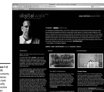
These pages, which have a .htmlor .htmextension, look different depend-ing on the software you use to view them. When you view an HTML docu-ment in a text editor like Notepad, you see a bunch of weird-looking code, as shown in Figure 1-1. However, a browser knows what all these instructions mean and can then render(a fancy word for processing and displaying) the document in all its visual glory, as shown in Figure 1-2.
Creating Web pages: The alternatives
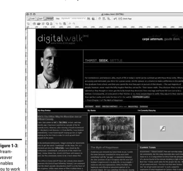
When you create a presence on the Web, you can either put on a geek hat and write the HTML code for your Web site or let a piece of software (such as Dreamweaver) or an online service (such as MySpace) do this work for you. Most of these solutions allow you to work inside a visual environment to design your pages. Figure 1-3 shows you the visual editor inside
Dreamweaver.
Because everyone’s needs are different and can evolve over time, we show you all these alternatives in this book. Book II walks you through the online alternatives, such as MySpace and Blogger. Books III and IV show you how to work with the two major Web site builders that you can install on your com-puter. And, Book VI gives you the lowdown on how to successfully work with HTML code without getting a migraine.
Knowing the Lingo and the Basics
12
Adding graphics and other media files
If you’re used to working with Microsoft Word or other word processors, you’ve probably added a graphical image to a document. When you perform this action in Word, it embeds a copy of the graphic from its original file into the document. Therefore, if you were to e-mail the file to a friend, the image would be displayed on your friend’s computer when the document is opened.
In contrast, although HTML documents display graphics, video, and other media as content, this media is never stored inside the HTML file itself. Instead, the HTML document links to external image files or Flash media. Therefore, the Web site includes not only HTML documents but also any other media file that you add to your page layout.
The other common types of files you work with include Figure 1-2:
Book I Chapter 1
Getting Started with
Y
our W
eb Site
Knowing the Lingo and the Basics
13
✦ Cascading Style Sheets (.css); see Book V
✦ Graphics (.jpg, .gif, and .png); see Book VII
✦ JavaScript files (.js); see Book VIII ✦ Flash movies (.swf); see Book IX
Publishing your site
When you’re done creating your Web site, you publishyour files to your Web site hosting server. If you’re creating the pages on your own computer, pub-lishing involves uploading all the HTML, graphic, and other media files. When the files have been successfully added to the Web server, the Web site is considered live,or open for all the world to see.
Book I Chapter 1
Getting Started with
Y
our W
eb Site
Surf and Study: Discovering What Works and What Doesn’t
15
✦ Look for the overall messaging of the site. What’s being communicated through the design, graphics, and text of the home page? Is there a single theme? Are you getting mixed messages? Is it successful? For your Web site, develop a consistent, coherent theme or message and then create the site around it.
✦ Check out the site’s navigation. Can you easily find the information you’re looking for? Can you get lost in the site? You should develop a site that’s easy to navigate. (See Chapter 3 of this minibook for more on site organization.)
✦ Identify the technologies being used. When you come across an effect or interactive feature that you really like, dive under the hood and iden-tify the technology that the site is using to pull off the effect.
To do so, right-click the page and choose View Source from the pop-up menu, a feature that’s available in most browsers. Inside the HTML source, you can find all the nitty-gritty details of the technology behind the scenes. Be sure to read Book VI first, to help you navigate your way through the source.
When you come across a site you really like, don’t blatantly copy its design or actual files. Instead, use other sites as inspirations to spawn your own creative ideas.
If you get into a rut trying to find interesting Web sites to explore, we
recommend checking out www.coolhomepages.comand www.cssbeauty.
com/gallery. Both sites feature a gallery of well-designed sites that can inspire you.
Chapter 2: Best Practices
in Web Design
In This Chapter
Keeping your design simple
Maintaining consistency
Applying the rule of thirds to your site design
Avoiding the nine most common site design problems
B
ecause the Web is a visual medium, the design of your Web site can be as important as the content you offer on your site. If your design is tacky, amateurish, and annoying, visitors might not treat you seriously or might hit the Back button before you can cry out “But I tried!”Therefore, even before we get into the specifics of how to create a Web site, we spend some time talking about how to design it. In this chapter, we explore several proven design principles that you should understand. In addition, we also talk about what not to do — those errors that you should avoid from the start.
Applying Three Proven Design Principles to Your Site
Back in the mid-1990s, the Web was filled with sites that were dense with information. They were functional, but they often looked liked they had been designed by a trash compactor — smashing as much content inside the page as possible. However, sometime over the past decade, the world of design caught up with the Web.In Chapter 1 of this minibook, we recommend that you begin by spending some time analyzing other well-designed sites. If you find several candidates, we’re willing to bet that, in spite of their visual differences, they employ many of the same proven design principles. Here are several to consider.
Simplicity: Less is more
Applying Three Proven Design Principles to Your Site
18
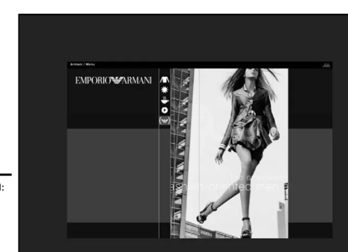
You would expect contemporary design in a Web page devoted to one of today’s most respected fashion houses. Armani (www.armani.com) deliv-ers, as you can see in Figure 2-1.
This figure show how minimal content can create a highly effective Web page: one photo, one menu, five icons, and some nearly transparent text scrolling across the photo. Note the use of few words here. Most of the page is, in fact, white space (discussed in the next section).
A second example of minimalist design is Google (www.google.com). The popular search engine’s home page is famous for its refusal to include any-thing considered unnecessary.
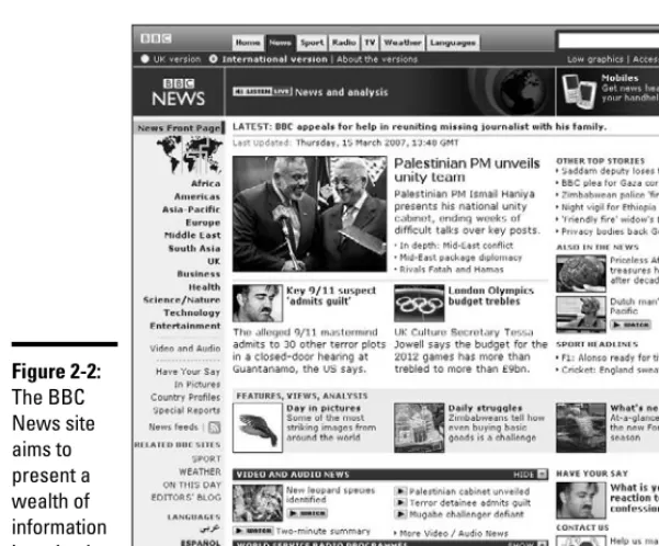
Consider the opposite extreme — the Web site of a major news outlet, such as the BBC (news.bbc.co.uk), as shown in Figure 2-2. An Armani-like site wouldn’t make any sense, but the site aims to keep the overall design as simple as possible, in spite of the complexity of information it’s presenting. This site generally displays three columns plus a side panel of links; dozens of stories, many photos, and headline links are all displayed at once.
The reality is, however, that most of us aren’t Armani, Google, or the BBC. We can’t get by with just placing a couple words here or there on the page Figure 2-1:
Book I Chapter 2
Best Practices in
W
eb Design
Applying Three Proven Design Principles to Your Site
19
and living with a minimalist design. But we don’t need to deal with the constant flood of content of a news service. Our aim, therefore, should be to strike a balance by following the age-old advice to keep it simple.
Here are some ideas to consider:
✦ Have a center point of focus, particularly for your home page. Your primary focus — the thing that catches a visitor’s eye first — should have considerable punch. Make it big, sharp, and forceful. By contrast, other elements of the page can tend toward the paler, softer-focused, and smaller. In other words, the majority of your page should be visually gentle, with one main exception.
✦ Include lots of white space, and also try to simplify the organization of the page. We discuss using white space in the next section.
✦ Go easy on the overall number of links. ✦ Use two or three columns.
✦ Give the visitor a simple, obvious pathway down through your page. Don’t make them flit around because your page is confusing and complex. ✦ Consider putting your main symbol (whether an image or a headline)
in a vibrant color. Figure 2-2:
Applying Three Proven Design Principles to Your Site
20
Keeping things clean with white space
White space,also called negative space,is a design term that refers to regions that are empty of text or graphics. It doesn’t necessarily mean that the space is colored white. Empty areas can be any color or even a gradient (a visual transition between colors). For example, the white space shown in Figure 2-1 is colored black. White space serves several purposes:
✦ Increase readability:Text on computer screens can be more difficult to read than paper. Give your viewers plenty of white space, to make the content more readable.
✦ Keep things clean:Viewers aren’t overwhelmed with the feeling that they must buckle down and work to get through all the information you’re cramming into their view.
✦ Emphasize your content:When your page is less crowded, each image and paragraph has greater value and doesn’t compete with the others. ✦ Free you for an effective design:By using more white space, you have
greater freedom to move items around, which helps build an effective design.
Consider, for example, Deepblue.com, the site for a Web design firm (see Figure 2-3). As you can see, its home page is very clean, containing a minimal amount of information surrounded by lots of white space.
Being consistent across the site
Although the home page of a site often has a page layout that’s different from the rest of the pages, the overall site design should be consistent in terms of colors, fonts, font sizes, margins, and other elements.
Avoiding background noise
One of the most important parts of a page to follow the keep it simple rule is your back-ground. It should be a single color (often white, gray, or black) or a gradual gradient (a gradual blend from one color or shade to another) that
Book I Chapter 2
Best Practices in
W
eb Design
Understanding the Rule of Thirds
21
Several technologies are available that can help you simplify this task. First, the Cascading Style Sheets (CSS) technology allows you to set styles and for-matting rules for your site in one location and attach every page of your site to those rules. We cover CSS fully in Book V.
Understanding the Rule of Thirds
Growing up, we had a “rule of thirds” that we always followed around the dinner table. After we quickly scarfed down two helpings of the meal, our rule was that the first person to ask for thirds could eat the remainder of the food portions. However, that rule of thirds became unfashionable after our pants no longer fit around out waistlines.
Understanding the Rule of Thirds
22
Several years ago, we discovered a design principle of the same name. Although it may not help your waistline, this rule helps you create a well-designed Web site.
The rule of thirdsis one of the most persistent and pervasive tenets of Western art: This rule has been employed successfully by everyone from brilliant Greek sculptors to contemporary greeting card designers, with good reason. When an image or a page is divided into thirds vertically and hori-zontally and objects are positioned on those lines, the image is simply more pleasing to the eye. (For an example, check out Figure 2-6, coming up in the “Tweaking your page design with the rule of thirds” section.)
When you apply the rule of thirds to your Web site, the main subject is rarely in the center of your page or image. Too much symmetry makes for a bad overall composition. In addition, you avoid centering the horizon line — that is, equal amounts of sky and land — which would divide the visual in the middle horizontally.
Therefore, as you design a page, we recommend experimenting. Move elements around. Tweak your original ideas and see what happens. When you feel pretty good about a page, pull back to take a dispassionate look at it with the rule of thirds in mind. More likely than not, you’ll find that adjusting your page design with the rule of thirds in mind improves the look of your Web page.
You don’t need to employ the rule of thirds in every last photograph you take or Web page you design. If you regularly follow this rule of composition, though, your designs will benefit.
Tweaking your page design with the rule of thirds
Consider how a page design can be modified by following the rule of thirds. To start, you need a focal point. Like any good painting or photograph, your Web pages benefit from having an object that’s the main topic or the most prominent visual element — whatever the viewer is supposed to notice first.
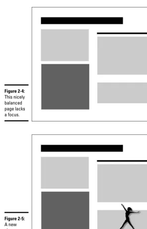
Figure 2-4 illustrates a Web page displayed in an abstract way to highlight its primary zones: some text (gray blocks), some bold text (the dark block), and headlines (black bars). Overall, this isn’t a bad design because it has variety and is also balanced. Note that it’s not symmetrical: It’s balanced. That’s an important difference.
Book I Chapter 2
Best Practices in
W
eb Design
Understanding the Rule of Thirds
23
Understanding the Rule of Thirds
24
Figure 2-5 looks like an improvement over Figure 2-4, but invoking the rule of thirds can strengthen the composition even more. To apply the rule, draw imaginary lines dividing your Web page into thirds vertically and horizon-tally, as shown in Figure 2-6.
Place straight lines (walls and horizons, for example) along any of these lines.
The points in which these lines intersect are the best places to put your focus: the subject of the picture. The four spots where the lines intersect are hotspots. Figure 2-7 is a further improvement to the design with the dancer now moved to a hotspot.
Next, we move the focal point to one of the other hotspots. You see that it looks good in those locations as well. Remember that you have four hotspots to experiment with. In Figure 2-8, the dancer is positioned in the upper left hotspot. Also notice that the dancer has been reversed from her position in Figure 2-7; now, she dances into the page shown in Figure 2-8.
When you have motionin your composition (an arrow, a dancer, or anything that points or “moves”), good design emphasizes ensuring that the motion moves into — not out of — your page. The focal point is the first thing the viewer sees, and it should lead the eye into the page.
Book I Chapter 2
Best Practices in
W
eb Design
Understanding the Rule of Thirds
25
Understanding the Rule of Thirds
26
Balancing the rule of thirds with the background
When tinkering with object focus placement according to the rule of thirds, pay attention to the background you use. You can see that the design shown in Figure 2-9 isn’t nearly as successful as the one in Figure 2-8 even though the dancer is positioned on a hotspot. With this design, the focal point is swallowed by the dark background.
Another rule of good composition is that you should violate white space: That is, move a focal point so that it isn’t framed or sunk into its background but instead pokes into the surrounding white space. In Figures 2-7 and 2-8, the dancer leaps out of the background into the white space. That’s the better choice.
Of all these page designs, Figure 2-7 is arguably the best. It’s the most bal-anced because the dancer counteracts the weight of the large headline at the top of the page. The final choice is, of course, up to you.
Background image positioning
You should also employ rule of thirds hotspots with your background images. You might be tempted to center the background image shown in Figure 2-10, thinking that the page is balanced if the background image is in the middle. Although that’s true, also remember that balance should be com-bined with interest, and unity comcom-bined with variety.
Book I Chapter 2
Best Practices in
W
eb Design
Understanding the Rule of Thirds
27
When you move your background over to a rule of thirds hotspot, you main-tain balance while adding interest to your composition.
With that in mind, we try moving around the background image from Figure 2-10. Notice the overall improvement in Figure 2-11. The background now radiates from the hotspot, not from the center.
Avoiding Eight Common Web Design Problems
28
Finessing graphics
Using the rule of thirds applies to more than the overall design on your page. For added visual appeal, remember to apply it with the graphics that you add to the page. See Book VII, Chapter 1 for applying the rule of thirds to your graphics.
Avoiding Eight Common Web Design Problems
As you consider the good design principles we discuss in this chapter, we also want to tell you about the “bad stuff,” the common mistakes that Web designers often make. Sometimes these problems occur from the start, and sometimes they creep in slowly as you update and modify your site over time.
Clutter eats your site alive
Clutter makes visitors uncomfortable and gives them the impression that your site is disorganized. Avoid it. You want your site easy for visitors to get the information that they’re looking for, not feel like they’re lost in a Dharma experiment.
Unless you’re adding a blog or personal home page that you’re using as your digital dumping grounds, ditch useless content that doesn’t add anything to your goals for your site.
If you have a tendency to create a cluttered design, take the reins and throw out everything possible. Then throw out even more, or move items to pages deeper within the site.
Overwhelming your visitors at the start
This error sometimes results from being so enthusiastic about what’s on your site that you overwhelm your visitors by throwing everything at them on the home page. Determine what’s most essential and highlight it, but be disciplined enough to place other content on other pages. As long as you have a good navigation scheme (see Chapter 3 of this minibook), you’ll be fine.
Photoshop plug-ins
While Adobe Photoshop has no built-in fea-ture to help you employ the rule of thirds,
powerretouche.comoffers some helpful
Book I Chapter 2
Best Practices in
W
eb Design
Avoiding Eight Common Web Design Problems
29
Confusion comes with complexity
Visitors make instant decisions the moment they arrive on your site. If they’re confused or annoyed, they click the Back button and never return. If you can’t simplify by eliminating clutter (see the “Clutter eats your site alive” section), you have to employ your design skills to clarify by design.
Divide your page into logical areas, to make clear what goes with what. Traditionally, horizontal and vertical lines were used to fence off various areas on a Web page, just like newspapers continue to do now. However, con-temporary Web design often eliminates lines in favor of bars of color zones in the background, multimedia areas (audio and animation using Flash, for example), navigation bars, and other visually distinct areas. Figure 2-12 illus-trates how a variety of textures, colors, and multimedia zones can separate content into recognizable categories.
Avoiding Eight Common Web Design Problems
30
Mixing and matching design ideas never works
Avoid creating a Web design that mixes and matches various styles, no matter how strong they are by themselves. Instead, use a visual theme that’s coherent and organized and helps give you a unique identity. Whether it’s theNew York Timesfamous gothic typeface, Martha Stewart’s beloved pale aquamarine, or the NBC peacock, visual themes are indispensable in identi-fying a person or organization.
By carefully selecting graphics, font typefaces, and colors that work together and match your tone and messaging, you can create a design that holds together visually and gives your site personality.
For deciding which colors work well together, we recommend checking out www.colorschemer.com/schemesand www.colourlovers.com.
For comparing and contrasting font typefaces, check out typetester. maratz.com.
Extreme symmetry is a yawner
As we mention in the rule-of-thirds discussion earlier in the chapter, a major graphical design rule — for magazine ads, interior decorating, photography, Web pages, and many other fields — is to avoid using extreme symmetry. Simply, don’t position the focus(the main item) of your page or photo smack dab in the center. If a lit Christmas tree is the focus of a snapshot, don’t have the tree right in the middle of the picture. If you’re photographing the sea, don’t have the horizon line where water meets sky in the middle of your shot.
The problem with symmetry is that it removes quite a bit of the life, the subtle conflict, that is necessary for successful contemporary design. It’s the visual equivalent of the newspaper story “People Strolled through the Park Yesterday.”
From the Dept. of Redundancy Dept.:
Self-linking pages
Avoid linking to the same page in your Web site. If, for example, you display a common naviga-tion bar at the top of each page, make sure to highlight the link for the current page through special formatting. This effect helps visitors
Chapter 3: Organizing and
Navigating Your Web Site
In This Chapter
Deciding between random or sequential access
Combining structures
Navigating via bars
W
e’ve always thought that a well-organized Web site is much like a GPS for your automobile. A road map or atlas throws all the possible routes and destinations at you, leaving you all alone to figure out where you are and how to best get there. A GPS, on the other hand, gives you just the facts you need at your exact location to successfully navigate to your intended destination.In much the same way, your Web site needs to be GPS-enabled, so to speak. Visitors should feel like they’re navigating your Web site with a GPS in hand rather than simply being tossed a road atlas. They need to be able to intu-itively locate the content that they’re looking for without bombarding them with every possible option.
In this chapter, you explore the important concepts to consider as you organize your site.
Creating a Site Hierarchy
Web sites usually have a logical, tree-like hierarchy to them. A home page branches out into four to six section pages, some of which might have sub-pages or even subsections under them. Larger sites might have several of these subsections, whereas smaller sites might have little beyond the origi-nal section pages.
Creating a Site Hierarchy
34
As you organize your site, make sure that you put on a visitor’s hat and look at the overall structure like a newcomer would. As the creator of the site, you have the “inside scoop” and understand the various interrelationships that exist among the content. However, be aware of how this content logi-cally fits together to the uninformed.
To organize your site structure, follow these steps:
1.
Make a flat list of all the pages you want to add to your Web site. If you have an existing site, don’t automatically reuse the same hierar-chy. Start from scratch this time around and see where you end up.2.
Put the pages into broad topical groups.Organize the pages into various groups that naturally fit together. For example, a small consulting firm that sells goods and services might have 30 pages that the owners want to include on their site. The pages might naturally fall under just five distinctive topics, such as News, About Us, Services, Portfolio, and Products.
Avoid using too many groups because they turn into the main sections of your site. You should be able to organize your site into five to eight clearly defined and distinct topical categories.
3.
Label the group with a prosaic name that clearly and effectively describes it.These group names will be the names of your Level 2 pages (just under the home page) that you will want to include on the navigation menu of the site. (See the next section for more about navigation menus.) Avoid being too clever, abstract, vague, or generic in your labeling. You simply want a term that can people can intuitively understand without having to think much about it. For example, if you’re selling cars, label it Cars, not Automatic Transport Vehicles or Your New Transportation Device.
4.
Identify subgroups within each broad group.Check to see whether your topics can be further subdivided. If so, group them together and name the subgroup according to the conventions described in Step 3.
Book I Chapter 3
Organizing
and Navigating
Y
our W
eb Site
Navigating Your Site with a Navigation Menu
35
5.
Go through each page on your site and identify pages that must be linked directly from the home page, even if the link doesn’t neatly fit within the hierarchy you established.Web sites normally function best when you have a well-defined site organization, but never be so rigid that you hurt the site’s usefulness.
Analyze each of the pages you identified and determine their overall importance. If they’re veryimportant, you might want to move them to a separate first-level category. Or, if not, there are various places on the home page that you can highlight these special pages, even if they don’t work being on the main navigation menu.
6.
Create each of the pages in the software package you’re using. If you’re using Expression Web, flip over to Book III. Or, if you’re using Dreamweaver, you can find what you’re looking for in Book IV.When you finish organizing your Web site hierarchy, we recommend getting a friend or person off the street to look it over and provide feedback. (We find that the cappuccino bribe is particularly effective.)
Navigating Your Site with a Navigation Menu
Web site design goes beyond the page layout, colors and fonts, and other visual elements. Your design should also encompass the organization of your site.
Sites almost always display a navigation menu(or menu bar), which is a set of graphical or textual links to the major sections of your site. Although the home page might have its own navigation scheme, the rest of the Web site usually has a common navigation bar found at one of two locations on each page:
✦ A horizontal menu bar is located at the top of the page, usually under a banner or logo.
✦ A vertical menu bar is placed along the left side.
Navigating Your Site with a Navigation Menu
36
Figure 3-1 illustrates a travel site where the home page is essentially just one large navigation bar. The user has no trouble understanding how to use this site or how to navigate it.
When you move to any of the other pages of the site, these same links are placed on a menu bar, as shown in Figure 3-2.
Notice that the page shown in Figure 3-2 uses a horizontal menu for top-level navigation and a vertical menu for navigation within that section.
You can create a navigation menu manually. Even better, Dreamweaver and Expression Web offer features that create navigation menus for you.
Book I Chapter 3
Organizing
and Navigating
Y
our W
eb Site
Navigating Your Site with a Navigation Menu
37
Book II
Contents at a Glance
Chapter 1: Creating Your
Own Space on MySpace
In This Chapter
Introducing the MySpace experience
Creating your MySpace profile
Personalizing your MySpace profile
“W
hat’s your MySpace name?”Given the explosive popularity of MySpace.com, chances are high that someone has asked you that question. Perhaps you don’t know what
MySpace is. Perhaps you visited the site but weren’t sure how to create your own profile. Regardless of your reasons, this chapter will help get you into the most popular social networking site on the planet.
In this chapter, we begin by telling you about the social networking phenom-enon. After that, we guide you through the process of setting up a profile that’s tailored for your personality.
Going Social with MySpace
MySpaceis a social networking Web site that provides a personal Web site (a profile), an interactive network of friends, blogs, photos, videos, and music. Think of MySpace as the Internet equivalent of the local neighborhood hang-out spot. People chat, associate with a group of buddies, play their music, and share their snapshots.
Book II Chapter 1
Creating Y
our Own
Space on MySpace
Setting Up a MySpace Profile
43
1.
Go to www.myspace.com.You see the MySpace home page, shown in Figure 1-1.
2.
Click the Sign Up! button to get started.The form displayed in Figure 1-2 asks for basic information about who you are.
3.
Fill in the form labeled Join MySpace Here, and be sure to read and then agree to the terms of service and the privacy policy.Click the Sign Up button to continue. After you do, the Upload Some Photos! page is displayed (see Figure 1-3).
4.
Click the Choose File button and locate an image of yourself that you want to use in your profile. Then click the Upload button.Or, if you prefer not to upload a photo now, click the Skip for Now link.
Click here to create a profile.
Setting Up a MySpace Profile
44
Book II Chapter 1
Creating Y
our Own
Space on MySpace
Setting Up a MySpace Profile
45
The Invite Friends to Your Space! page is displayed. (See Figure 1-4.)
5.
In the space provided, enter the e-mail addresses of friends and other people you want to socialize with on MySpace.You can use the boxes to customize the e-mail message they receive. Click Invite to continue.
If you don’t want to invite anyone now, click the Skip for Now link.
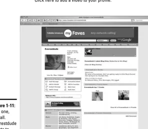
After you do this, your basic profile is created for you, as shown in Figure 1-5.
6.
Click the Verify Your Email Address! link.MySpace needs to confirm your e-mail address, so follow the instruc-tions to do that.
7.
Click the Pick Your MySpace Name/URL! link. Figure 1-6 shows you the page that’s displayed.Setting Up a MySpace Profile
46
Book II Chapter 1
Creating Y
our Own
Space on MySpace
Setting Up a MySpace Profile
47
Each MySpace user picks a unique name to have associated with her profile. Your name can be the same as your Display Name, but it doesn’t need to be. The name you choose is the way to access your profile on MySpace: www.myspace.com/YourMySpaceName.
As the text on the site indicates, choose your name carefully. After you pick a name, you cannot change it.
8.
Enter the MySpace Name you want and click the Submit button. If you select a name that has already been chosen, you’re asked to select again.After you finish this process, MySpace gives you a chance to enter your real name. This information isn’t made visible as part of your profile, but is used only when someone is looking specifically for you.
Enter your name and click Submit or click the Skip link.
Be sure to read the sidebar “Making sure that your kids are safe at MySpace,” earlier in this chapter, as you consider adding your personal data.
A summary page appears (see Figure 1-7) after you complete this task.
Now that your basic profile is up and running, it’s time to spice it up and give it some personality.
Setting Up a MySpace Profile
48
9.
Return to your profile by going to your MySpace URL (www.myspace.com/YourMySpaceName).10.
Click the Edit Profile link that’s in the main information box, beside the photo area.A No Photo box shows up when you don’t have a photo selected for the profile.
The Profile Edit module is displayed, as shown in Figure 1-8. This area has a series of pages that enable you to describe your interests and background. Use the links at the top of the page to work your way through the forms, providing just the information you’re willing to share with your friends or anyone else.
The Name link takes you to the place for changing your display name.
11.
If you want to add a song or a video to your profile, click the Song & Video on Profile link. Otherwise, move on to Step 12.The Profile Songs page opens. Figure 1-9 shows a snapshot of it.
Book II Chapter 1
Creating Y
our Own
Space on MySpace
Setting Up a MySpace Profile
49
When you add a song or video to your page, a MySpace player is embed-ded on your page, to allow friends or visitors to check out your favorite media.
Adding songs and videos is easy. Simply go to the band of your choice and click the Add link beside a song or the Add to My Profile link next to a video (see Figure 1-10). After you reply to a confirmation message, MySpace instantly adds it to your profile.
Before leaving the Profile Songs page, decide whether you want to dis-play a video slider, which is a control that allows you to easily disdis-play multiple videos on your page.
Specify the height in the Width and Height boxes, along with color selec-tions. Click Save before leaving the page.
After your profile changes have been saved, your profile page is updated to express more of your personality. Figure 1-11 shows the exciting life of Everestdude.
Setting Up a MySpace Profile
50
Figure 1-11: Run one, run all. Everestdude wants to be your MySpace friend.
Click here to add a video to your profile. Figure 1-10:
Book II Chapter 1
Creating Y
our Own
Space on MySpace
Setting Up a MySpace Profile
51
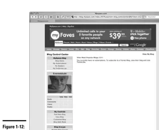
12.
MySpace features a blog as part of your profile. If you want to post a message on your blog, click the Blog link on the top navbar.The Blog Control Center is displayed (see Figure 1-12).
13.
Click the Post New Blog link.The Post a New Blog Entry page is shown.
14.
Enter your blog entry in the editor.Use the toolbar buttons to format your message.
Figure 1-13 shows Everestdude’s first message.
15.
Click the Preview & Post button. A Confirm Blog Posting page is displayed.16.
If you’re satisfied with your post, click the Post New Blog link. Figure 1-14 displays the post on your blog.Setting Up a MySpace Profile
52
Book II Chapter 1
Creating Y
our Own
Space on MySpace
Customizing the Look of Your MySpace Profile
53
Customizing the Look of Your MySpace Profile
Many designers look at the default MySpace profile design and groan, claim-ing that MySpace sets Web design back about a decade or so. If you feel the same way, you might want to give your profile a customized look.
Many Web sites provide free MySpace templates for you to use. Some look attractive, and others look garish and migraine inducing. Our best advice is to use your favorite search engine to search for free MySpace templatesand browse through the site listings. Most sites allow you to copy the template (consisting of HTML and Cascading Style Sheets [CSS] code) to your Clipboard for pasting into MySpace later.
After you settle on a template design, follow these steps:
1.
Go to your profile page and click the Edit Profile link.2.
In the About Me section, paste the template code into the box, above any text you might have there. See Figure 1-15.3.
Click the Save All Changes button.Your profile (see Figure 1-16, for example) is updated to reflect the changes.
Customizing the Look of Your MySpace Profile
54
If you find that you don’t like the new look, simply delete the HTML and CSS code you added in the About Me box and save your changes.
Chapter 2: Creating a Basic Web
Site with Google Page Creator
In This Chapter
Understanding what Google Page Creator can do
Signing up for Google Page Creator
Creating a basic Web site
Changing the look and layout of a page
Working with images and text
Linking your pages
Publishing your site
O
nline Web site creators are everywhere. You can find plenty of free ones across the Web. Your Internet service provider (ISP) probably has one. Most of the big names of the Web have one, too. A few of these browser-based tools try hard to do almost everything that Adobe Dreamweaver or Microsoft Expression does on your desktop. (Trust us — they can’t.) Other online builders are so limited that you can’t do much of anything. However, arguably the most common attribute of these builders, other than that they work inside your browser, is that they tend to produce bland, unremarkable, or even downright ugly sites.Google recently made public its own online Web site builder, known as Google Page Creator. Although this free tool from Google won’t make the developers at Adobe or Microsoft nervous, it stands out from the crowded pack of online builders. It offers a painfree way to get a rather attractive Web site up and running in a jiffy.
In this chapter, we introduce you to Google Page Creator and walk you through the steps to build a basic Web site. Perhaps the initial site you create is a stepping stone for you — a temporary site as you begin working with Dreamweaver (see Book IV) or Expression (see Book III). Or, you may find Google Page Creator to be just the site builder you’re looking for.
Understanding How Google Page Creator Works
56
Understanding How Google Page Creator Works
Here are two general principles to keep in mind as you begin to work with Google Page Creator:
✦ You work with one page at a time. The edits and changes you make are generally limited to the current page you’re working on. Other pages in your site that you created are unaffected. A couple of examples explain the significance of this fact:
• If you change the look of your site, you need to individually update every page on your site.
• Your pages aren’t interconnected by default. You need to manually add links before your home page will link to any other page you create.
✦ You can edit some but not all parts of a page. A pageis a template with regions that you can edit, such as title, subtitle, content, and footer. Depending on the layout you select, the content region can include one, two, or three columns. You’re free to add content within these regions, but you can’t insert it outside of them.
Signing Up for Google Page Creator
To sign up for Google Page Creator, you must first have a Gmail account. If you have Gmail, you’re all set and ready to sign up for Google Page Creator. However, if you don’t have Gmail, take a quick detour and go to
gmail.google.comfirst to register for an account.
After you have a Gmail account, point your Web browser to http://pages. google.com. As Figure 2-1 shows, you sign in using your Gmail e-mail address and password.
After you sign in, you see an introductory page, as shown in Figure 2-2. Read the Terms and Conditions section in the lower left corner of the page. Then select the check box confirming that you have read the “fine print” and click the I’m Ready to Create My Pages button.
Book II Chapter 2
Creating a Basic
W
eb Site with
Google Page Creator
Signing Up for Google Page Creator
57
Creating a Basic Web Site
58
Creating a Basic Web Site
Google Page Creator’s name helps set expectations. It isn’t a “Web site builder” with tons of Web site management capabilities — it’s primarily a creator of individualWeb pages. The program allows you to create and edit a set of pages that you can group together to form a Web site.
The following steps show you how to create a basic Web site. For the site in our example, we’re creating a Web site for the adventure sports company Everest Leaders. Follow these steps:
1.
Sign in to Google Page Creator.Follow the steps in the section “Signing Up for Google Page Creator,” ear-lier in this chapter.
After you sign in and agree to the terms and conditions, you see a blank home page with a default design (see Figure 2-3). Don’t worry about whether you want to keep the design. You can change it later.