ELECTION DATA VISUALIZATION
Elena Long, Vladimir Lovitskii , Michael Thrasher
Abstract: Data visualization has direct link to data interface, data capture, data analysis, and data presentation. At the present time there is still a huge gap between our ability to extract answers and our ability to present the information in meaningful ways. There is consensus that future breakthroughs will come from integrated solutions that allow end users to explore data using graphical metaphors - the goal is to unify data mining algorithms and visual human interfaces. The main purpose of our paper is to discuss one approach to that “breakthrough”. The paper uses data from recent UK parliamentary elections to illustrate the approach.
Keywords: natural interface, data visualization, graphical interface
ACM Classification Keywords: I.2 Artificial intelligence: I.2.7 Natural Language Processing: Text analysis.
Introduction
This paper represents results of our further research in the natural language and graphical interface to database (DB) [V.A.Lovitskii and K.Wittamore, 1997; Guy Francis et al., 2007; Elena Long et al., 2009; Elena Long et al., 2010]. The data source addressed here is a DB containing the results of the 2005 and 2010 UK General Elections. The result shows the current vision of our “natural interface” that has been implemented
as a Web application. This is termed “NITED” (Natural
Interface To Election Data) where a user can see and interact with UK General Election data online. The aim of design is that the application must offer simple, intuitive and responsive user interfaces that allow users to achieve their objectives regarding information retrieval with minimum effort and time.
S. K. Card, J. Mackinlay, and B. Shneiderman [1999] define information visualization (infovis) broadly: infovis is the use of computers to interactively amplify cognition, using visual representations. Therefore if we take this as our starting definition, systems must be computer-based, interactive, provide visual representations, and most importantly, amplify cognition. Our aim is that NITED meets these requirements.
Information visualization emerged and developed at the confluence of computer graphics, human-computer interaction, and databases [C. Ware, 2000; S. Card, 2003]. Continuing research in information visualization has produced a wide variety of techniques for displaying large multidimensional datasets on a computer screen and allowing users to identify complex patterns in multidimensional data. Here, we will take into account some distinctive features of election data and their potential for visualization.
People are increasingly relying on the Internet mass media as their primary source of visualizing election results. It is thus crucial for the media to develop the ability to provide accurate, informative, and user-friendly visualizations. However, this is not a straightforward task because of the complexity of the data. Because
elections visualization is such an important yet challenging task, it is useful to take into account its effectiveness. The effectiveness of the visualization not only of election results but also the visualization on Input User Interface is therefore very important, since it is the one visualization that people pay strong attention to. On the one hand, rather than have users struggle through tables of data, an effective visualization of the election results could potentially provide users with a more powerful understanding of the situation. On the other hand, a poorly-designed visualization may bring confusion rather than clarity. Worse still, such a poor visualization environment could persuade users to turn to competitor websites for their information requirements. From the user’s standpoint some visualization may potentially lead them to draw incorrect conclusions about the data.
The principal purpose of our paper is to offer an Input and Output user interface which makes it easy, efficient, and enjoyable to operate NITED in a way which produces the desired result. This generally means that a user is required to provide minimal input to achieve the desired output. Essentially election data visualization is a graphical representation of data, and can be implemented in a variety of ways - from charts and graphs to more complex mapping of data that has the potential to optimise the flow of information to the end user. In this paper the process of output election data visualization will be discussed in details.
Reading this paper will tell you the following: • User interface.
• Election interactive map. • Drill down map.
• Drill down map creation. • Drill down maps examples.. User Interface
The user interface (UI) for applications should be simple and intuitive for the end user - most users want to achieve the desired result whilst expending minimum effort. The end user should have a positive experience when using the application. This generally means that the user needs to provide minimal input to achieve the desired output, and crucially, that the application minimizes undesired outputs to the user. NITED’s UI has to be election domain specific i.e. contents and features of Election Application Domain (EAD) should define the strictures of Input and Output user’s interfaces. It should describes how well an application can be used for its intended purpose by its target users with efficiency, effectiveness, and satisfaction Some general requirements of UI are discussed in our earlier paper [Elena Long et al., 2010]. The “golden rule” to UI creation is that the UI should be made as simple as possible, but not simpler. The proper balance between simplicity and sophistication at the input side is the main requirement to NITED UI.
UI provides a means of:
Input UI, allowing the user to manipulate an application, and
NITED uses three different kind of Input UI:
Command-Line User Interface (CLUI) which accepts two pairs of text commands: “GE2005” – “GE2010” to activate the corresponding Data Base (DB) and “START” to activate slides show regarding the General Election 2010 and “STOP” to quit it. Only text field, keyboard and mouse are required for CLUI. This interface is hidden as a less frequently used.
The next two Input UI are GUIs. The great convenience of the GUI made it as the standard in human-computer interaction. The GUI generally provides users with immediate, visual feedback about the effect of each action. There are several general requirements to GUI:
• Provide meaningful contrast between screen elements. • Create groupings.
• Align screen elements and groups. • Provide three dimensional representation • Use colors and graphics effectively and simply.
Let us consider two Input GUIs.
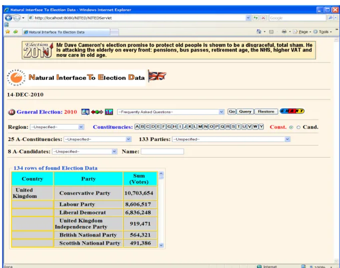
Graphical Query Input User Interface (GQIUI) is an interface to General Election DB. GUI is a user interface based on graphics (checkboxes, clickable images and list boxes of Regions, Constituencies, Parties and Candidates) instead of text; it uses a mouse as well as a keyboard as an input device. GQUI provides three different types of user’s request:
• Frequently Asked Question (FAQ).
• Natural Language Enquiry Template (NLET) combines FAQ and a slot represented by variable in the square brackets, the value of which should be selected by the user from the corresponding list of values. For example, “In which constituency did [party] achieve its highest vote?”
• Natural Descriptors Enquiry (NDE). Such enquiries permit users to communicate with a DB in a natural way rather than through the medium of formal query languages.
These three types of user’s requests are described in greater detail in our paper [Elena Long et al., 2010]. Graphical Charts Input User Interface (GCIUI) provides the direct way to accomplish chart creation as a response to user’s request represented only by FAQ which are classified into 3 parties (Conservative, Labour and Liberal Democrat) groups to see how they are oriented in the UK map of regional spaces, for example, party performances in the South West of England, in Scotland or in Wales. These three parties were selected initially because the election results among them and other parties are not compatible because of differential patterns of party competition (see Figure 1). GCUI is a very useful method for the analysis of election data. For example, NITED displays the results using interactive maps. Initially the user is shown the UK map with selectable regional areas. When a region is selected, the NITED will direct the user to an analysis of its election results. Let us distinguish two parts of GCIUI: fixed and dynamic. Fixed GCIUI is based on a list box of FAQ, radio buttons group, map of Regions and clickable images of buttons. Dynamic GCIUI will be described below.
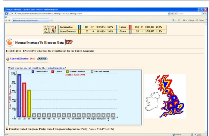
Figure 1. Chart result of the GE 2010 in the United Kingdom
NITED distinguishes two different types of Output UI:
Table Output (TOUI) is the general and natural way to represent the result to user’s request.
Chart Output (COUI) allows the user to see the election data. COUI should satisfy some basic criteria in order to be useful for users:
• Charts should be designed to encourage the user to make comparisons between discrete elements of data, for example, difference in vote share across constituencies/regions.
• COUI should provide views of the data at many levels of detail. This principle relates to the "Drill down"
and "Level-Of-Detail" capabilities of visualizations. With these capabilities, NITED can allow a broad overview of the data to be given and, at the same time, allow the user to have access to the detailed data that underlies the overview.
• Maps are a potential "natural" representation for entities that can be analyzed geographically. For example, if a user would like to see how some region is performing in comparison to other regions in terms of party votes, the user could look at a map-based chart type of visualization. A map-based representation can become a true multivariate representation.
Input and Output UIs interactions is shown in Figure 2. GQIUI always first of all produces the TOUI. But NITED, as an intelligent system, analyses the result to discover whether it is logically appropriate to represent the output as a chart as well using COUI. If answer is YES TOUI displays button “Chart” (see Figure 3). As a result of clicking this button NITED substitutes TOUI for COUI (see Figure 1). COUI represents the dynamic part of GCIUI
and a user can click any histogram to see the result for the selected party. Charts should be preferred to Tables whenever it is important for users to quickly and easily recognize characteristics of and patterns in data.
Figure 2. Input and Output UI Interaction
Election Interactive Map
The expansion of Web technology over the past decade has created fresh opportunities for presenting data online. One of the most rapidly improving tools for interactive presentation is the map. Interactive maps on the Internet present data most effectively when they invite action from the user. Showing relationships between data is easier when the user has the power to change the visuals. Drilling down is fundamental to the interactive map. These actions enable the user to focus their browser on the amount of information that they are comfortable with.
More recent developments have included interactive data visualization which can quickly respond to new data or collect data about the user to better refine the visualization which take advantage of the power to quickly recalculate and display to find unexpected patterns, and proximity mapping that use the relationships between people, concepts, or words to determine proximity.
When a parliamentary election was over, the country’s voting patterns were mapped and broken down by region. The election result was directly tied to a particular area. The interactive map enables the user to focus NITED on the amount of information that they are comfortable with. Each change in the behaviour of the NITED should be accompanied by a corresponding change in the appearance of the interface.
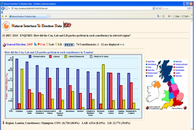
For user convenience, a Regions’ legends are added at the top (see Figure 4) allowing the user to choose which region’s data should be represented. The user can then view the results for a single constituency or the total votes and vote shares across each region.
Drill Down Map (DD-Map)
When the user has to move through various levels of specificity of data, a drill down style of navigation is commonly offered. The drill-down clearly groups information of magnitudes ranging anywhere from the “big picture” down to an individual case.
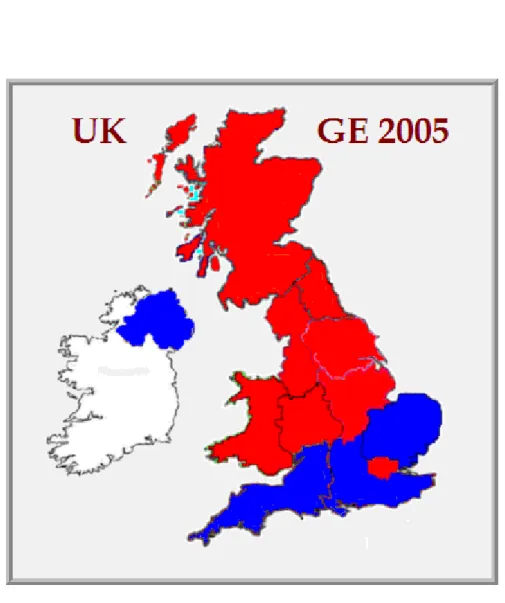
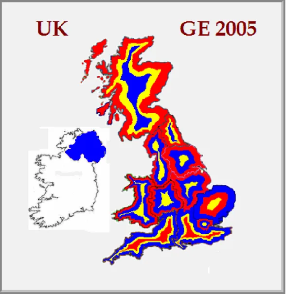
Figure 5. Regions results of the GE 2005
One Chart diagram (see Figure 5) shows that Conservatives “won” in three English regions and also in Northern Ireland (purely an artifact of party competition given that only the Conservatives of the three main parties contested seats in Northern Ireland at the 2010 general election) and that is why in the Regions’ Map (see Figure 6) those regions are coloured blue (the standard colour of the Conservative party). Charts are preferred to Tables: a single chart conveys important features of the data more vividly and memorably than columns of data.
Figure 6. Results of the GE 2005 by Regions
The main purpose of using the map is to show thematically relevant information in an easily interpreted manner. But, what is the value of such a map? At one level of understanding the map shown in Figure 6 does not work. The regions are unequal in area giving the user a false impression of the mapped data distribution. People, not familiar with the UK voting system and the way in which votes are translated into seats, might assume that Labour won a clear majority of UK votes. However, the race was much closer. Labour won 35.2%, Conservatives - 32.3%, and Liberal Democrats won 22.0% of votes. Displaying simply the colour of a regional winner does not show the real distribution of votes between Labour, Conservative and Liberal Democrat in each region. For example,
East Midlands: LAB: 785,943 (39.0%) CON: 747,438 (37.1%) LD: 372,041 (18.5%) North West: LAB: 1,327,668 (45.1%) CON: 846,195 (28.7%) LD: 629,250 (21.4%) Scotland: LAB: 922,397 (39.5%) CON: 369,388 (15.8%) LD: 528,076 (22.6%)
The attempt to produce a map depicting the results by voting percentage (i.e. each region's colour is a mix of red, blue and yellow colours in proportion to the results for that region) was not a total success [Stephen L. Sperry, 2006]. We decided instead to change colour of region in proportion of votes change square size of region in proportion to the result i.e. the initial size e.g. of the East Midlands region from map in Figure 6 equal 100%, or 785,943 votes. The size of the East Midlands region for Coservative party should be less and occupied 95.1% = 747438 / 785943 * 100 of initial Labour map, and size of Liberal Democrat map should be significantly less and occupied just 47.34% of initial Labour map. When the sizes are changed and region maps are coloured accordingly they are placed one above another in descending order. Such map we called Drill Down Map (DD-Map). The subsequent DD-Map displaying the result of the 2005 election by regions is shown in Figure 7.
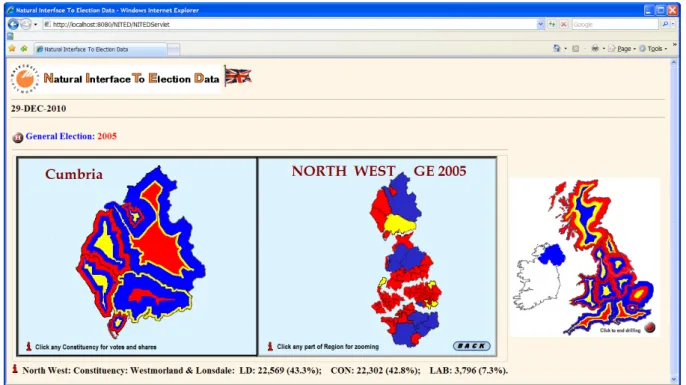
Figure 8. DD-Map of the GE 2005 for the North West region
As a result of clicking, for instance, the North West region DD-Maps of different levels will be displayed (see Figure 8). The North West region is sub-dividing into five Counties and then each County will be disaggregating to the different Constituencies. Clicking on any DD-Map of region (Figure 8) the next level of DD-Map will be displayed (see Figure 9). Finally, after clicking any specific constituency the result of election for that constituency will be shown.
Drill Down Map Creation
The well established Geographic Information computer-based System (GIS) for mapping cannot be used to produce a DD-Map. The explanation for this is very simple. Buffering feature usually creates two areas: one area that is within a specified distance to selected real world features and the other area that is beyond. The area that is within the specified distance is called the buffer zone. A buffer distance always has to be defined as a whole number
1. The GIS produce the buffer zone around the given centre point (i.e. building, town, river etc.).
(integer) or a decimal number (floating point value). This value is defined in map units (meters, feet, decimal degrees) according to the Coordinate Reference System (CRS) of the vector layer.
There are three main reasons why GIS cannot be used to create DD-Map: 2. A buffer distance has to be defined precisely for buffer zone producing.
3. The direction of DD-Map creation is from Region (or Constituency) border to centre and distance cannot be calculated explicitly.
Let’s describe the operation of our algorithm for creating a DD-Map using real data:
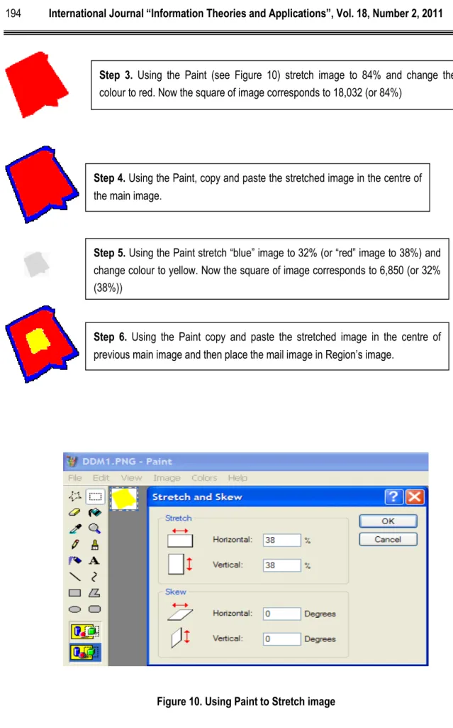
GE 2010: Region: London, Constituency: Harrow East
Results: CON: 21,435 LAB: 18,032 LD: 6,850
Step 2. Extract constituency from the Region London map using the Paint tool. Each Windows based computer has this tool along with Notepad, Word, Access etc. The square of image corresponds to 21,435 (or 100%). Let’s call it main image and fill it with blue colour.
Step 1.Calculate the percentage of votes with regard to maximum vote: CON: 21,435 – 100%
LAB: 18,032 – 84% = 18032 / 21435 * 100
Figure 10. Using Paint to Stretch image
Step 3. Using the Paint (see Figure 10) stretch image to 84% and change the colour to red. Now the square of image corresponds to 18,032 (or 84%)
Step 4. Using the Paint, copy and paste the stretched image in the centre of the main image.
Step 5. Using the Paint stretch “blue” image to 32% (or “red” image to 38%) and change colour to yellow. Now the square of image corresponds to 6,850 (or 32% (38%))
Step 6. Using the Paint copy and paste the stretched image in the centre of previous main image and then place the mail image in Region’s image.
Drill Down Maps Examples
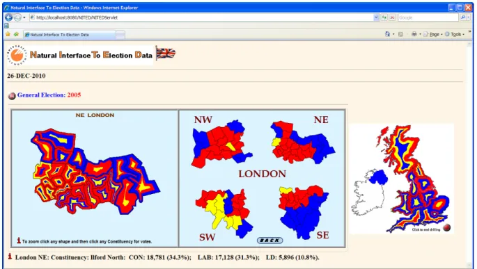
The next set of Figures are used to illustrate how the various mapping approaches can affect how we visualize the election results and what information the user can thereby perceive. This is especially true if you have no prior knowledge of the area being mapped; context is very important for visualization. Let us consider a drilling down of the London region for the 2005 parliamentary election.
Figure 11. Constituencies Map of winner in London region
0-Level of London DD-Map (LDD-Map0) is shown in Figure 6 and indicates that Labour received the maximum votes. LDD-Map1 from Figure 7 shows that Labour did not win the absolute number of votes:
London: LAB: 1,135,687 (38.9%) CON: 931,966 (31.9%) LD: 638,533 (21.9%)
LDD-Map2 from Figure 11 shows the winner in each Constituency. For further drilling down the London region is sub-divided into four parts: North West (NW), North East (NE), South West (SW), and South East (SE). LDD-Map3 for each of this part is shown in Figures 12-15. To see LDD-LDD-Map3 for any particular part of the London region it is sufficient simply to click this part. Mouse click on any constituency of LDD-Map3 immediately display the votes in that constituency.
Figure 12. DD-Map of the GE 2005 for the NW part of London
Figure 14. DD-Map of the GE 2005 for the SW part of London
Conclusion
We believe that Internet-based visualization of election results is and will continue to be very important because it facilitates user-interaction and engagement with the democratic process. NITED is designed through the Internet to make UK parliamentary election results available to any user, not simply those that possess relatively sophisticated knowledge about voting systems and their operation. Many users like to examine tables, charts, maps and DD-Maps to analyze election results. It is therefore very crucial that the Internet mass media provide visualizations that are accurate, user-friendly, and clear. We believe that NITED has the potential to encourage more people to engage with the political process.
Data, that is increasingly freely-available to end-users, lies at the heart of the modern world. Despite living in the information age, there is only so much information one person can handle at a given time. We are therefore fortunate that this is the digital information age, allowing computers to assist in translating vast quantities of data into a more usable form – away from tabular data and towards visualized data. Nevertheless, tables that come from querying databases are precisely what is used to create these visualizations. Furthermore, we have also designed some simple alternative visualization (DD-Maps) that are able to convey the same information much more clearly.
In future research we are planning to use visualization of election data for comparative analysis, thereby permitting users to visualize the dynamics of electoral change (see Fig.16).
Bibliography
C. Ware, 2000. Information Visualization: Perception for Design. Morgan Kaufman, San Francisco, CA
Guy Francis, Mark Lishman, Vladimir Lovitskii, Michael Thrasher, David Traynor, 2007. “Instantaneous Database Access”, International Journal“Information Theories & Applications”,Vol 14(2), 161-168.
Elena Long, Vladimir Lovitskii, Michael Thrasher, David Traynor, 2009. “Mobile Election”, International Book Series "Information Science and Computing", Book 9, Intelligent Processing, 19-28.
Elena Long, Vladimir Lovitskii, Michael Thrasher, 2010. “Natural Interface to Election Data, International Book "New Trends in Classification and Data Mining", ITHEA, Sofia, Bulgaria, 2010, 138-146.
S. K. Card, J. Mackinlay, and B. Shneiderman, 1999. Readings in Information Visualization, Using Visualization to Think, chapter 1, pages 1–34. Morgan Kaufmann.
S. Card, 2003. Information visualization. In J. A. Jacko and A. Sears, editors, The Human-Computer Interaction Handbook: Fundamentals, Evolving Technologies and Emerging Applications, chapter 28, pages 544–582. Lawrence Erlbaum Associates, Mahwah, NJ.
Stephen L. Sperry, 2006,
V.A.Lovitskii and K.Wittamore, 1997. "DANIL: Databases Access using a Natural Interface Language", Proc. of the International Joint Conference on Knowledge-Dialogue-Solution: KDS-97, Yalta (Ukraine), 282-288.
Authors information
Elena Long – University of Plymouth, Plymouth, Devon, PL4 6DX, UK,
e-mail:
Major Fields of Scientific Research: Data visualization in Political science
Vladimir Lovitskii – University of Plymouth, Plymouth, Devon, PL4 6DX, UK,
e-mail:
Major Fields of Scientific Research: Artificial Intelligence
Michael Thrasher– University of Plymouth, Plymouth, Devon, PL4 6DX, UK,
e-mail: