VR-Viz
Visualization System for
Data Visualization in VR
Mustafa Saifee
Master’s thesis submitted for the degree of Master of Arts Aalto University
School of Arts, Design and Architecture Department of Media
Visual Communication Design 2018
Thesis Supervisor Prof. Rupesh Vyas Submitted by Mustafa Saifee
[email protected] For the degree of
Master of Arts at
Aalto University School of Arts, Design and Architecture Department of Media
Program of Visual Communication Design Major in Information Design
Printed by Picaset Oy Helsinki 2018 Finland Font Used IBM Plex Sans
Recent years have seen fast growth in big data. The datasets are not only exponentially larger, but also more complex (multi-dimensional). Because of the scale and complexity of these datasets, their visualization poses significant challenges. As a solution, this thesis explores how virtual reality (VR) and 3D visualization can be used to visualize complex and large datasets, and proposes a visualization system for designing visualizations in VR.
Abstract
Author: Mustafa SaifeeLanguage: English Pages: 92 + 20
Year: 2018
Title of Thesis: VR-Viz: Visualization Sytem for Data Visualization in VR
Degree Programme: Visual Communication Design Department: Department of Media
iv
First, this thesis examines concepts of information visualization, VR, and 3D information visualization. Next, it explores
visualization systems for 3D visualization and three examples of information visualization in VR and discusses their successes and short comings. Finally, in order to make VR information visualization accessible to a wider audience, a tool is introduced to simplify the process of designing information visualization in VR for beginners. The tool can also be used as a quick prototyping tool by more advanced users.
Keywords
information visualization; data visualization; 3D visualization; virtual reality; VR
Acknowledgement
I would like to express my sincere gratitude to my supervisor, Professor Rupesh Vyas, for his continuous motivation, support, and guidance throughout this project. I would also like to thank the Visual Communication Design department for giving me the freedom to plan my studies and design my curriculum.
I would take this opportunity to extend my special thanks to Futurice for their support and guidance while I was working on my thesis. I would also like to thank the data visualization open source community for their feedback and comments.
Last but not the least, I would like to thank my family for their support and encouragement.
Abbreviation
2D 3D AR DOM EU FOV HMD PTSD UI UK USA VR Two Dimension Three Dimension Augmented Reality Document Object Model European UnionField of View
Head Mounted Display
Post Traumatic Stress Disorder User Interface
United Kingdom
United States of America Virtual Reality
Abstract Acknowledgement Abbreviation 1 Introduction 1.1 Motivation 1.2 Research Question 1.3 Thesis Structure 2 Background 2.1 Virtual Reality (VR) 2.2 Information Visualization
2.3 Visualization Systems for 3D and VR Visualizations 2.4 Examples of 3D Information Visualizations in VR 2.5 Summary 3 VR-Viz 3.1 System Framework iii v vii 11 12 12 13 15 15 21 31 32 38 41 41
Content
x
3.2 Getting Started With VR-Viz 3.3 Scene Specification
3.4 Graph Specification 3.5 Choosing the Right Chart 3.6 Interactivity 3.7 Future Developments 3.8 Summary 4 Example Applications 4.1 3D Mesh Plot 4.2 3D Rectangle Chart 4.3 3D Time Series 4.4 Prism Map
4.5 3D Map with Time Bars 4.6 Summary 5 Conclusion 5.1 Contribution 5.2 Future Research References Image Sources Appendix A Appendix B Appendix C 45 47 50 60 62 65 66 67 68 69 70 71 72 73 75 75 76 79 91 93 95 109
With the rapid development of technology, there has been a rapid explosion in data and it is only going to grow faster. According to one prediction; by the year 2020, about 1.7 megabytes of new information will be created every second for every human being on the planet[1]. This will lead to a substantial increase in data available to us. Because of this reason, information visualization is becoming increasingly relevant. As the amount and dimensionality of data increases, the traditional ways of visualizing data may not be sufficient anymore and we may have to explore new and innovative methods and technologies to visualize data.
Virtual reality (VR) and augmented reality (AR) may be one of the solutions to this problem. Immersing the user in a virtual environment increases the bandwidth of data available to the user’s brain[2]. It not only makes the visualization more immersive but also lets us visualize multi-dimensional and large datasets. This thesis analyzes how existing visualization
1
12 Research Question
methods can be extrapolated from 2D screen medium to 3D VR medium, and explores the advantages and limitations of using 3D visualization in VR.
1.1
MOTIVATION
Statistical graphics and information visualizations have been around for a really long time. The graphical and visual representations of information have a very long history from the use of the earliest maps, and later to thematic cartography and statistical graphics. Along the way, there have been many developments in technologies; mathematics and statistics which have transformed how we visualize data and information today.
VR could be one such technology which can cause the field of information visualization to transform once again. This thesis researches how this shift may happen and how 2D visualization techniques, which are commonly used today, can be transformed into the 3D environment.
1.2
RESEARCH QUESTION
The aim of this thesis is to explore and understand existing 3D visualization techniques and explore new visualization techniques that can help in improving data visualization in VR. The research question can be formulated as:
• How can VR help us visualize complex data?
• What existing or new information visualization techniques can be used to visualize complex data and concepts in VR? • How can the current 2D information visualization
techniques be modified, so that they can be used in VR? This thesis uses different techniques to answer these questions. First question is answered by researching and analyzing a few examples of existing information visualization in VR. Second and third questions are answered by cataloging and analyzing several 3D visualization techniques or 2D visualization techniques which can also be used in 3D. Observations about the readability and usability of different visualizations are based on my personal assessments informed by literature review and my experience in using information visualizations in VR, and not on user studies.
This is a production-based thesis. The main contribution of this thesis is the reusable open source library which can be used to design and develop information visualization in VR.
1.3
THESIS STRUCTURE
Chapter 2 introduces the concept of VR and information visualization, analyzes examples of existing visualization system for 3D and VR visualization, and examines a few existing information visualization in VR. Chapter 3 documents
14 Thesis Structure
the reusable Javascript library that can be used to design and develop information visualization for VR and also explores and catalogs several 3D visualizations techniques. Chapter 4 documents some examples and concept prototypes that are built using the Javascript library. Chapter 5 concludes the thesis by summarizing the advantages and limitations of VR information visualization techniques and future work.
2
Background
The purpose of this chapter is to familiarize readers with the background information related to the research topic. The first section of this chapter presents relevant details about VR, its limitation, and current applications. The second section explains what information visualization is, why it is important, and also dicusses 3D visualizations in VR. The third section discusses different visualization systems for 3D and VR visualizations. The final section of this chapter analyzes a few successful examples of 3D information visualization in VR.
2.1
VIRTUAL REALITY (VR)
VR as a concept has been around for a long time but gained popularity recently when Facebook bought Oculus Rift (a startup that makes VR headsets) in 2014 for two billion dollars[3]. Examples of VR applications are also becoming more and more common mainly in the field of entertainment (predominantly gaming), medicine, 3D modeling or product
16 Virtual Reality (VR)
design, and simulation training. VR has quickly become a hot topic in the tech industry with almost all major tech companies like Facebook, Google, Microsoft, Samsung, and HTC investing in developing the technology[4]. To understand this rise in interest in VR, we first need to understand what is VR and what are its advantages, limitations, and applications.
What is VR?
VR is a new kind of computing interface that has the capability to change the way we use computers or any digital media. Mihelj et al.[5 p. 1] define VR to be “composed of an interactive computer simulation, which senses the user’s state and operation and replaces or augments sensory feedback information to one or more senses in a way that the user gets a sense of being immersed in the simulation (virtual environment)”.
Mihelj et al.[5] also state that VR can be identified by the presence of four basic elements
• Virtual environment - A computer simulation environment which consists of different elements and their relationships. • Virtual presence - The feeling of being present in the
virtual environment. This feeling is the reason why VR is immersive.
• Sensory feedback - Feedback to users according to his/her location in the virtual environment.
• Interactivity - Ability of the user to affect the virtual environment with his/her actions.
VR Devices
Most of the VR devices in the market have three main elements: • Head-mounted display (HMD)
• Mechanism for head tracking • Hand-held controllers
HMD uses a stereographic display to immerse the user in the virtual environment. Head tracking is used to track the movement of the user in the virtual environment, which is then used to re-render the environment updating the user position. As a result of this, user feels that he/she is present in the virtual environment. The hand-held controller can also be used for tracking the user but the main objective of the hand-held controller is to help the user interact with the environment. The hand-held controller can be seen to do the same task that mouse and keyboard do for the computer.
Some of the leading VR devices are PlayStation VR (by Sony), Oculus Rift (by Facebook), HTC Vive (by HTC), Gear VR (by Samsung), and Daydream (by Google). All these devices use different technologies for the three above mentioned elements. For example, PlayStation VR, Oculus Rift, and HTC Vive have display screen in the headset whereas Gear VR and Daydream use smartphones in the headsets as the display medium. The design of the hand-held controller is also different for different devices and can provide different functionalities.
18 Virtual Reality (VR)
Limitations of VR
Although there has been an increase in developments in the VR technology; there are still a few challenges which this technology faces.
One of the major challenges is mobility with immersion. The current VR devices either focus on mobility or immersion. Smartphones powered VR headsets give better mobility but are not fully immersive. In other VR devices like HTC Vive or Oculus rift which provide fully immersive experience, the HMD is connected to a computer and the head tracking mechanism does not allow the user to move freely in an open space. Another concern with VR is simulation sickness (also referred to VR sickness). The symptoms of simulation sickness are similar to motion sickness but without any motion. There has been research which proves that simulation sickness is a real and serious issue[6]. While improvements in display quality will eliminate some negative effects, VR may have an inherent problem affecting a significant percentage of the population. Therefore while designing VR experience, designers need to take special care so that the design and interactions are not the reason for simulation sickness.
The third concern is that since this is a relatively new technology for the masses, the user might not be very familiar with the devices and how to use them and the interactions that are
possible. For example, the user might not know how to navigate in the environment using the hand-held controllers.
With most of the technology giants investing money in this technology, we can expect to see considerable improvements in the technology[4].
Current Application of VR
Although VR is still in its nascent stage, it is already used in many applications. Some of the industries/applications where VR technology has been most commonly used are as follows: Gaming
This is probably the most common and one of the first
applications of VR technology where the player is immersed in the game by being present in the game environment[7].
Aviation
VR technology has been used in aviation industry to allow users practice or try a given task in a safe and controlled environment. One of the most common applications is simulators that allow airlines to train their crew in an emergency situation. Flight simulators are also used to train pilots[8].
Retail
Retail industry uses VR to enhance the shopping experience and drive sales[9]. It allows customers to be immersed in
20 Virtual Reality (VR)
custom-created worlds to increase consumer engagements in retail and online shopping[10].
Real Estate & Architecture
VR technology has been used in many applications in real estate and architecture ranging from architecture rendering to virtual tours of properties. Another application is user can walk into an apartment or house that is not built yet, change the decor to experience how the property would look once it is built[11]. Health & Medicine
In healthcare and medicine, VR technology has plenty of applications. VR simulations are used by surgeons and physicians to train in variety of scenarios[12]. VR technology is also used for visualizing 3D scans of brain and heart and 3D models of X-rays[13]. VR is also used in immersion therapy to treat patients for psychological problems from PTSD to phobias of spiders[14].
Travel and Tourism
VR technology allows users to travel anywhere in the world and stand in the middle of the action. This is used by the tourism industry to attract tourist by making the viewer experience the destination without being there[15].
Design & Visualization
objects ranging from furniture to rocket parts [16]. Communication & Collaboration
VR has been used as a tool that allows organizations to bring people from different parts of the world to the same virtual environment so they can collaborate and share ideas in the same space[17].
These are just a few industries where VR is used and there are plenty of domains still to be explored. This thesis explores the use of VR for information visualization.
2.2
INFORMATION VISUALIZATION
According to Mazza[18 p.7], visualization can be defined as “cognitive activity, facilitated by external visual representations from which people build an internal mental representation of the world”. Therefore, we can define information visualization as the use of graphical or visual element to represent abstract or non-physical data such as text, hierarchies, or statistical data like life expectancy and GDP.
Why is Information Visualization Important?
According to Cairo[19],the purpose of data visualization is “to enlighten people—not to entertain them, not to sell them products, services, or ideas, but to inform them. It’s as simple— and as complicated—as that”. The ultimate goal of information
22 Information Visualization
visualization is to provide insights into the data which is being visualized[20 p. 6].
We use visualizations because they help us solve problems faster, or let us learn something new. Information visualization is a powerful tool for communicating existing ideas effectively, and for exploring and analyzing data.
One of the major uses of information visualization (mainly in statistical studies) is to ease the analysis of big and complex data which helps in faster and better decision-making. Information visualization is used to find patterns, clusters, outliers, trends, or correlations in a statistical data as it is easier to identify these things in a graphical representation than in a data-table[20 p. 15-20]. It is because of these reasons that information visualization is now a common part of data analysis workflow[21].
Information Visualization Reference Model
Information visualizations can be analyzed systematically and Card et al.[20] proposes a simple visualization reference model (fig. 2.1) for mapping data to visual form. This framework can successfully model a wide array of visualization systems like Tableau, Vega or Vega-lite.
The reference model can be divided in two parts: data and visual form. First step is transformation of raw data into data
tables. Next step is mapping of data tables to visual structures (structures that combine various visual and spatial properties), then visual structures are further transformed to form a view that can be perceived by users. Probably, the most important mapping in the model is mapping of data table to visual
structures which defines the grammar of visualization. Different data structures use different visual mappings for visualizations. Data Structure
Each data represents a single piece of information. Data can be best visualized according to its type. We can categorize data in the following categories:
• Quantitative: Information that can be measured numerically and is continuous. Some examples of quantitative data are financial data, height data, and temperature data.
• Ordinal: Information that is categorical and have natural order. Distances between the categories is not known. A well-known example of ordinal data is the Likert scale.
Raw Data Data
Data
transformation Visual mappings Visual transformation
Tasks
Visual Form
Data Tables Views
User Visual
Structure
24 Information Visualization
• Norminal: Information that is categorical and qualitative with two or more categories without having any kind of natural order. Some examples of norminal data are occupations, gender, and color.
Visual Mapping
Visual mapping can also be refered to visual encoding. Visual encoding is the process of mapping approriate visual properties to various dimensions of data. Bertin et al.[22] defines 7 visual variables that can be used to map data dimensions. Visual variables can be defined as the different ways that a mark can be varied.
Position
changes in x, y, and z location
Size
changes in length, area or volume
Shape
infinite number of shape
Value
changes from light to dark
Color
changes in hue
Orientation
changes in alignment
Texture
variation in ‘grain’ and texture
Mackinlay[23] expanded Bertin’s variables and proposes effectiveness of encodings by data type.
Criteria for Good Information Visualization
In literature, we find many proposals that can help design a good information visualization.
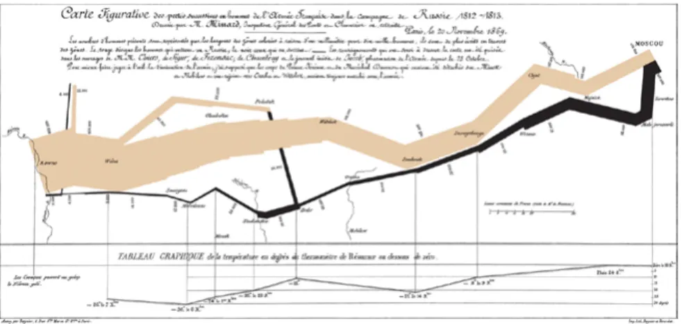
A good visualization conveys vast amounts of information in a single image. “the greatest statistical graphic ever”, according to Tufte[24 p. 40], is Charles Minard’s map of Napoleon’s March Quantitative Position Length Angle Slope Area (size) Volume Density (value) Color Sat. Color Hue Texture Connection Containment Shape Most Least Position Density (value) Color Sat. Color Hue Texture Connection Containment Length Angle Slope Area (size) Volume Shape Position Color Hue Texture Connection Containment Density (value) Color Sat. Shape Length Angle Slope Area (size) Volume Ordinal Norminal
Fig. 2.3 Effective ranking of visual variable (redrawn from Mackinlay[23])
Ef fe ct iv enes s
26 Information Visualization
(fig. 2.4) which tells the story of Napoleon’s disastrous Russian campaign of 1812. As a statistical graphic, the map combines six different datasets in a single chart.
1. The underlying layer is a map.
2. The path on the map follows the route that the army took while going to Russia and coming back.
3. The different colours of the path show the path the army took while going to Russia and while coming back.
4. The width of the path shows the number of soldiers in the army at that given time and location.
5. The line chart at the bottom shows the temperature that the army faced at that given time and location.
6. The time is indicated at the bottom.
In this single image, Minard was able to communicate the whole
story of Napoleon’s Russian campaign of 1812. Graphical Excellence [24 p. 13-52]
Graphical excellence is all about well-designed visualization of an interesting dataset. Graphical excellence aims at visualizing complex ideas clearly, precisely, and efficiently. According to Tufte[24], visualization must aim to provide the viewer with “the greatest number of ideas, in the shortest time, using the least amount of ink, in the smallest space”. Good design, good use of statistics, and interesting dataset are all required for graphical excellence.
Graphical Integrity[24 p. 53-79]
Visualization must not distort data or try to create a wrong impression by the use of misleading graphics. The graphical element must be mapped proportionally to the data it represents. The number of different visual dimensions of the graphical element must not exceed the dimensionality of the data. For example, if the colour is not used to visualize a dimension of the data then all the elements should be of the same colour, adding colour for sake of aesthetics can confuse the viewer.
Aesthetics
Good visuals are very important to attract the viewer to the graphics. A visually appealing visualization with attention to detail is more inviting and attracts the viewer to explore
28 Information Visualization
the visualization. That being said, graphical excellence and graphical integrity must not be compromised for aesthetics. 3D Information Visualization in VR
3D information visualization has frequently been a topic of debate in the field, even though 3D visualizations are very common in scientific visualization[25, 26]. Although 3D provides an additional dimension; it is very hard to visualize 3D space on a 2D screen. This compromises graphical integrity of the visualization because of fake depth perception. However with the new VR technology and headsets, the above mention problem is not a concern as in VR the viewer sees a 3D environment in 3D space and not 3D on a 2D screen. Benefits of 3D Information Visualization in VR Although there have already been a great number of applications in 3D visualization in medicine, scientific
visualization, and architecture; there are not many successful 3D information visualizations. 3D space offers some intrinsic benefits that can be leveraged. The most prominent being an additional dimension which can be used to visualize an additional dimension of the data. Although, additional visual dimension would not be of much help for visualizing ultra-high dimensional data as it only adds one additional dimension. Since we humans live in a 3D world, it is easier for us to create a mental model of 3D visualization.
3D information visualization in VR, when done right, gives an immersive experience. In a 2D visualization, the viewer is an external agency, whereas in 3D visualization in VR the viewer is immersed in the visualization and is a part of the environment. The viewer can move around in the scene and interact with the environment in a more intuitive way. This lead to an immersive experience for the viewer which when combined with story-telling techniques can lead to very intriguing examples (some of them are discussed later). Also, navigation is more intuitive in 3D information visualization in VR since it is similar to viewer walking in the environment rather than viewer using his/her mouse or keyboard to navigate.
3D information visualization in VR can be used as a very effective collaborative tool[27]. Immersive collaboration is a dynamic and innovative way of working which allows the user to interact with each other as if they are present in the same room, change the parameters of the visualization and see the results of the changes in real time.
2D graphs generally use graphical elements like bars in bar charts to convey information about volume or numbers (in case of bar charts the numbers are mapped proportionally to the height of the bars). Whereas in VR, visualizations can use 3D models of the real objects to overcome that ambiguity.
30 Information Visualization
Limitation of 3D Information Visualization in VR
Beyond the intrinsic advantages, there is one main issue of occlusion which the designer needs to keep in mind while designing 3D information visualization for VR. Occlusion can be defined as the hiding of an object from the view because of the positioning of other objects in the user’s line of sight[28]. Occlusion occurs when there is an overlapping of data points or if one data point hides another data point because of the way they are placed or positioned. Although occlusion also occurs in 2D information visualization with overlapping data points, it is somewhat more prominent in 3D visualization and can also cause problems in interactions, for example it is hard to interact with an occluded object.
Another limitation is the presence of simulation sickness as an inherent problem of VR (for a set of the population)[6]. Although the causes of simulation sickness are not fully known; the most broadly accepted theory is that simulation sickness is caused because of the inconsistent sensory information about body orientation and motion[6]. Simulation sickness can occur if the eyes viewing a computer screen sense the world is moving while the body senses things are not moving. Therefore, special care must be taken while creating animating visualizations.
A minor limitation of 3D visualization in VR is that text in the 3D environment are hard to read[26]. This may be because of the low resolution of the VR displays, as we have no problems
reading text in the real world. Therefore, we can expect that with further improvements in technology, the readability of the text will improve. Till then we would have to place the text in the environment in such a way that it is readable.
2.3
VISUALIZATION SYSTEMS FOR 3D AND VR
VISUALIZATIONS
Visualization systems are tools developed explicitly to design and develop data visualization. Visualization systems generally support data management, layout algorithms, interaction, and animation[29].
Visualization Systems for 3D Visualizations
By far the most common use of 3D data visualization is in scientific and technical visualization. Most widely used tools for designing 3D visualization are those integrated in software frameworks, often numerical analysis softwares, like MATLAB and Wolfram Mathematica. The main drawback of such softwares is that these softwares are rarely open-sourced. Therefore, if a desired feature or visualization type is not available, there is no way for the user to use these softwares to achieve the desired result.
A number of visualization systems are also available as libraries for existing languages like C++, Python or Java. The Visualization Toolkit[25] and Paraview[30] are the most popular
32 Examples of 3D Information Visualizations in VR
examples of such systems. The main drawback of such a system is barrier to entry for designers or web developers as they might not be very comfortable with the above mentioned high level computer programming languages.
Although languages and libraries like Processing[31] and three.js[32,33] have been used to build 3D visualization, they are not visualization systems, as the main purpose of these libraries is not to build data visualization but to make 3D or 2D graphics. Visualization Systems for VR Information Visualization Although there are not many visualization systems for designing VR visualization, there are a few startup like Dali-VR[34],
Virtualitics[35], Datavized[36] and 3Data[37] working on the same. Tools from all these startup are not commercially available as of June 2018.
EXAMPLES OF 3D INFORMATION
VISUALIZATIONS IN VR
Although there have not been many examples of 3D information visualization in VR, there are a few examples by companies like Google, Wall Street Journal which have explored the possibility of 3D information visualization.
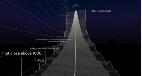
Is the NASDAQ in Another Bubble? By Roger Kenny and Ana Asnes Becker for The Wall Street Journal[38]
In 2015, The Wall Street Journal released 3D VR tour of the NASDAQ, USA’s second-largest stock exchange. It is a standard time series visualization visualizing the time series of the NASDAQ index.
The Wall Street Journal’s team wanted to illustrate 21 years of market fluctuations traced by the NASDAQ index and decided on a three-dimensional exploration of the market’s oscillations in roller coaster form would be a fun way for readers to engage with data. “You’re high up on this mountainous curve looking down and standing on something that’s extremely narrow and fragile.
34 Examples of 3D Information Visualizations in VR Can we make that real? Can we make you feel that it is such a precarious scenario that you’re in?”[39] says Roger Kenny, an interactive designer of this visualization.
What makes this visualization interesting and successful is its implementation. This might be the first use of 3D information visualization in VR in journalism; which makes it more immersive and lets the viewer immerse in the data and engage with it. Google cardboard with the smartphone is used as HMD. Because of this reason, the team had to design interaction which did not involve hands as the hands are busy holding the HMD. To solve this problem, the team created a new way to interact in this space, looking on a button for a while act as a mouse click or tap, allowing readers to bypass more complicated clicking interfaces[40].
Design decisions which help make this visualization more usable were
• Information density was kept low in the visualization because the text is harder to read in VR.
• Monthly data was used to avoid nausea and motion sickness (as the camera bounces less)[40].
• Instead of an exploratory approach, the team decided to take a guided tour approach to limit the viewer options so that he/she can focus on the story[40].
visualization that went viral on social media and was successful in engaging users with the data and telling the story in more immersive and engaging way.
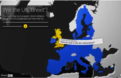
Will the UK Brexit? By Google News Lab[41]
In 2016 Google New Lab in collaboration with Pitch Interactive and Micheal Chang created a VR experience which simply visualized the top question search on Google by the people in countries in EU related to the United Kingdom’s EU referendum.
The 360-degree visualization uses Google cardboard with the smartphone as HMD. It requires users to look at the map of
36 Examples of 3D Information Visualizations in VR
Europe and move their head to discover the countries and when the user sees a particular country, he/she can view the top question searched by the people in that country.
There are two versions of the visualization: one for the computer/ mobile and another, a VR experience. The data shown in the VR experience is significantly less than that in the non-VR version. This is to avoid using a large chunk of text in a complicated environment. This is due to the fact “the more text you have, the more likely it is that you will make your viewers sick”[42].
There is no need to click to navigate in the visualization as the user only need to look at the country he/she is interested in. This makes for a seamless interaction with no need for any external input devices. This also feels more intuitive than using the mouse to click or finger to tap on a smartphone. Another observation by the creators of the visualization while working on the visualization is that looking down is more comfortable than looking up[42].
Since VR is a fairly new medium and everyone is not familiar with the medium, instructions of how to view and use the visualization become very important. It guides the user in the visualization and is a good starting point.
Overall, this was a quick prototype of 360 visualization; which demonstrated the potential of 3D VR data visualization and immersion in visualizations.
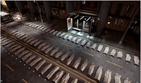
DeathTolls Experience By Ali Eslami[43]
Ali Eslami explains DeathTolls Experience as “a virtual journey from the refugee crisis in Europe to the bloodbath in Syria, placing the dry ‘data reality’ of the news in an emotional perspective”[44].
DeathTolls Experience visualizes the casualties of terrorism, refugee crisis and Syrian civil war, in an impactful, and
emotional VR visualization. The main objective is to visualize the exact number of deaths in a particular event so that the viewer can comprehend and understand the concept of mass death. One of the complaints with information visualization has typically been that numbers can easily breed apathy towards the human
38 Summary
lives behind reported death tolls from various events. This visualization is very successful in changing that and in generating empathy with the victims and causing an emotional response to a ‘bunch of numbers’ by using 3D models of body bags to represent these numbers instead of some geometric shape. DeathTolls Experience also uses sound design to great effect to generate emotional response and immerse the user in the data.
DeathTolls Experience is a chilling visualization of the enormity of human loss created through various events throughout the world, and is very successful in quantifying this loss by presenting the viewer with an overview of all the dead in body bags. It is an immersive and emotional presentation of data which causes users to think about the casualties in more human terms than just obscure numbers.
SUMMARY
VR enabled 3D information visualization has a few intrinsic benefits over 2D medium like immersive experience,
collaboration, less cognitive load, and intuitive navigation; there are also a few limitations. Some of the limitations are because of the limitations of the technology like lack of mobility with immersion and text readability while others because of the nature of the medium like occlusion and simulation sickness. Although VR enabled 3D information visualization already exists
and some of the examples are really successful, there is still great amount of work to be done. It is still quite a new field with scope of improvements and advancements. The next chapter introduces VR-Viz, visualization system for data visualizations in VR and also discusses about different 3D data visualization methods and techniques.
Although, there are quite a few visualization system in 3D that can also be used to implement visualization in VR (for example three.js), there is a huge gap in the visualization system for webVR. To the best to my knowledge, there is no available visualization system for webVR which is open source yet. In response, this thesis contributes VR-Viz[A1], high-level react components to generate 3D visualization in webVR. VR-Viz combines A-Frame with React (for DOM manipulation) and D3 (for data visualizations) to generate visualization in VR. VR-Viz is open sourced, therefore, the code is accessible to everyone and anyone can contribute to the library.
3.1
SYSTEM FRAMEWORK FOR VR-VIZ
The first step in developing the library is to explore different development frameworks and technology stacks and choosing the one which would be ideal for building an open source resource. The technology stack we are using comprises of
3
42 System Framework for Vr-Viz
• A-Frame (Framework for building a VR scene) • React (DOM manipulation library)
• D3 (Data visualization library) A-Frame[45]
A-frame is a web framework built upon webVR for building VR experience. A-Frame is an independent open source project originally built by Mozilla. A-Frame is based on top of HTML, thus making it easier for the developer to start. Using A-Frame requires no installations. VR experiences build in A-Frame are web-based and run in the browser. Another advantage of A-Frame being HTML based is that it is compatible with most Javascript libraries and web frameworks like React.js, Vue.js, D3.js. A-Frame also has a built-in visual inspector which is very handy while debugging.[46]
A-Frame Supported VR Headset
Since A-Frame is HTML based and runs on a browser it is device independent. The only software requirement to run a VR experience built in A-Frame is a web browser that supports webVR. Platforms that support A-Frame are:
• Desktop with a VR headset (supported headsets: HTC Vive with controllers and trackers, Oculus Rift with touch controllers)
• Mobile with a VR headset (supported headsets: Google Daydream with controllers, Samsung GearVR with controllers, Google Cardboard)
• Desktop without headset • Mobile without headset
• AR headsets (supported headsets: HoloLens, Windows Mixed Reality)
Why A-Frame?
The reasons for choosing A-Frame over other frameworks are: • Platform independence: The main reason of using
A-Frame is that it is platform independent i.e. the same VR experience can be viewed on different devices.
• Accessibility: Since A-frame is browser-based, users can access the VR experience on a computer or mobile. • HTML based: This makes A-frame compatible with most
Javascript libraries and web frameworks.
• Easy to learn: Since its HTML based, any library or framework built using A-Frame would be easy to use or learn by other developer and data visualizers as they might have prior experience with web development.
• Debugging: The built-in visual inspector tool in A-frame make is very easy to debug the code.
• Community support: There is a very strong community which provides support to new developers.
React.js[47]
React.js is a Javascript library for building UIs developed by Facebook and released in 2013. It is primarily a DOM manipulation library aims to provide speed, simplicity, and scalability.
44 System Framework for Vr-Viz
One key feature of React that make it scalable is that it is component based. Each component acts as a lego piece which can be reconfigured to give a completely different design. Because of this feature of React, we can create components for commonly used elements like the axes which can then be used in different visualizations. Another advantage of React being component based is that the codebase is easier to maintain. React is also easy to learn because of its simple structure. Anyone with basic knowledge of programming can understand code written in React. React has also gained considerable popularity since it was launched. It has also become an industry standard for designing UIs. Therefore, most of the front-end developers already know React. Because of these reasons, libraries written in React are more accessible to a larger audience.
Prototyping and testing in React are also very quick and easy. One can create prototypes in React very quickly and its very easy to test these prototype while editing them at the same time. Why A-Frame and not React-360 for VR experience? React-360 is a framework for building VR experience using React. If using React for developing the UI and component, React-360 would be the obvious choice for building VR experience; but the I decided to use A-Frame instead of React-360 because React-360 is still in its infancy and A-frame has much better community support and documentation.
D3.js[48]
D3.js (or data-driven document) is an open source Javascript library for designing and developing dynamic and interactive information visualization in the browser. The library is written by Mie Bostock based on his Ph.D. studies at Stanford Visualization Group. D3.js can also be seen as a DOM manipulation library which allows developing information visualization.
VR-Viz mainly uses D3.js for data manipulation and creating visualizations using the data.
3.2
GETTING STARTED WITH VR-VIZ
VR-Viz combines React, D3, and A-Frame to provide a high-level react components to generate 3D data visualization. The aim of VR-Viz is to make 3D data visualization more accessible to web and interaction designers. The design of VR-Viz is heavily based on Vega-Lite[49]. The formal definitions for the visualization are expressed in a JSON syntax. Open source code can be found on Github[A1] and full documentation can be found here[C1].
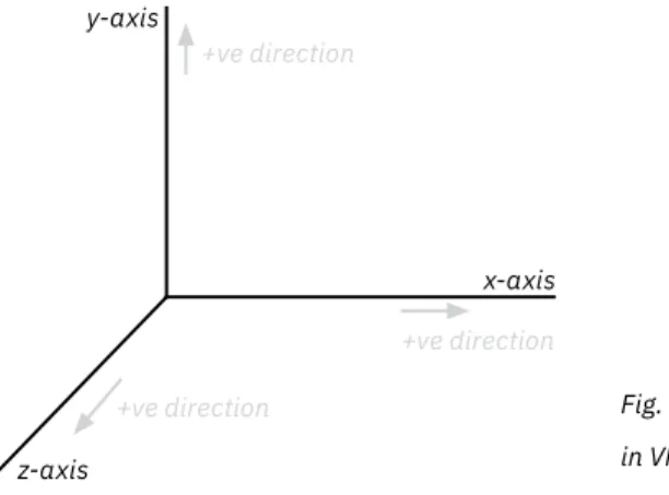
Coordinate System
Coordinate system is a system which uses one or more numbers, to uniquely determine the position of a point in a space. VR-Viz uses Cartesian coordinate system with x, y, and z-axis perpendicular to each other. VR-Viz uses a right-handed coordinate system.
46 Getting Started With VR-Viz
Distance unit is measured in meters, therefore when designing visualizations for VR, it is important to consider the real world scale. For example box with height as 10 that may look normal on computer screens appears very big in VR.
Rotational unit in VR-Viz is in degrees. The positive direction of rotation can be found using the right-hand rule, by pointing the thumb of the right hand down the direction of a positive axis, and the direction which the fingers curl around is the positive direction of rotation.
Fig. 3.1 Coordinate system in VR-Viz +ve direction z-axis x-axis y-axis +ve direction +ve direction
Fig. 3.2 Right hand rule for finding positive direction of rotation
After understanding the coordinate system of VR-Viz, we can focus on visualization design. VR-Viz components used to generate visualizations is divided in 2 main parts:
1. Scene specification: This defines the properties of the 3D scene in which the visualization will be placed.
2. Graph specification: This defines the graph/chart types and its properties in the visualization.
3.3
SCENE SPECIFICATION
Scene specification defines the properties of the 3D scene in which the visualization will be placed. Setting up a proper environment can make or break a visualization. It creates a sense of space and perception in VR. Design of the environment is very important for the viewer to feel a part of the virtual world and immerse in the environment. An environment which is not designed properly can cause the following problems to the user: • Loss of orientation
• Loss of depth perception • Simulation sickness
The environment in VR is composed of five main elements: • Skybox or sky
• Floor or ground
• Camera and camera position • Lights
48 Scene Specification
immersive but we will not discuss sound in this thesis as it is not an essential element)
Skybox or Sky
Imagine standing on a height and looking up in the sky without any obstruction. This can be said to be a real-world skybox[50]. It can be seen as a backdrop for the viewer. As a design element, the skybox is really just a graphical element which surrounds the viewer, it can be a photograph, texture, 3D artworks, solid color, or gradient. Skybox extends to infinity and gives an illusion of depth. Design of skybox can set the tone of the scene. For an information visualization scene, the skybox is generally a flat color or gradient. It is equivalent to the background in the 2D information visualization on a screen.
Floor or Ground
Floor or ground, as the name suggests, is the element on which the user stands. When the viewer cannot visualize the floor, he/ she can feel disoriented. It is not suggested to have a simple flat colour as the floor as using flat colour as floor can make the user feel that he/she is floating the space, especially if the colour of the skybox and floor are the same. It is good to have texture or some pattern like a grid on the floor to help the viewer orient him/her self.
Camera and Camera Position
acts as the eyes of the user. It defines from which perspective the viewer views the scene. Placing the camera in the right position is very important as it can affect the feeling of immersion and scaling of the scene. A camera should usually be positioned at the average height of human eye level. When moving or rotating the camera relative to the scene, it is suggested to use a camera rig.
Lights
Lights are a key part of a 3D scene. Perception of the colour of an object in the 3D environment depends on its relationship and interactionwith the lights. It also depends on the location of lights, the colour of lights, the intensity of lights and the type of lights used. Lights are also used to cast shadows in the environment which add depth and realism to the scene. Some of the types of lights that can be used are
• Ambient light: Ambient light can be seen as the most basic form of light that is included within a virtual environment. This light is omnidirectional and illuminates all the objects in the scene equally. This light has no direction, therefore, it cannot cast any shadows. Some form of ambient light is used so as to mimic indirect light.[51]
• Directional light: Directional light acts as a light that gets emitted in a specific direction. The light behaves as if the source is infinitely far away but shining from a specific direction, like the sun. It illuminates all objects in the scene equally like the ambient light but from a given direction.
50 Graph Specification
This light is used to create real-time shadows and this light is used to simulate daylight.[52]
• Point light: Point light originates from a single point source, and is omnidirectional. The point light is most commonly used to simulate a light bulb. The closer the object is to the point light the more lit it is.[53]
• Spot light: Spot light is emitted from a single point source and is uni-directional. Spot light spreads outward in a cone shape that increases in size with distance from the light source. The light also gets dimmer the further from light source it is.[54]
Although there are other kinds of lights like hemisphere light, area light; these are not as commonly used as the types of lights described earlier. Generally, in a 3D scene, multiple light sources are used to give a more realistic feel. While setting a 3D scene using appropriate light sources and placing them at appropriate positions not only makes the scene more immersive and realistic, it also helps in the visual perception of graphical elements.
3.4
GRAPH SPECIFICATION
Graph specification defines the visualization that is used in the scene. VR-Viz currently provides 24 different graph/chart types. The available graph/chart types include a mix of standard graphs (for example 3D bar charts, 3D scatter plot), established
academic techniques (for example 3D treemaps), and a few experimental techniques (for example 3D timeseries, 3D map time bars). All the available visualization in VR-Viz can broadly be divided in following three groups.
1. Chart or Graph
3D Spiral Chart
3D Bar Chart 3D Stacked Bar Chart Waterfall Plot
3D Scatter Plot 3D Bubble Chart 3D Mesh Plot
3D Force Directed Graph 3D Point Cloud 3D Treemap
52 Graph Specification
2. Function Plot
3. Visualization for GeoSpatial Data
3D Surface Plot 3D Contour Plot 3D Parametric Contour Plot
3D Parametric Surface Plot
Prism Map 3D Map Bar Graph 3D Map Stacked Bar Graph
3D Contour Map 3D Isoline Map 3D Flow Map
Chart or Graph 3D Bar Graph[C2]
3D bar graph shows the relationship between a numeric and two categoric variables. The height of the bar represents its numeric value and its position represents the categoric variables.
3D bar graphs can be used to identify trends when the two categoric variables are related, for example age group and gender or day of the week and time of the day. Sorting bars, which is often useful in 2D bar graph, can be hard in 3D as it is difficult to decide which category should be used for sorting. Therefore, it is helpful if the categories are ordered.
3D bar graphs work well when there is a clear pattern to discover or if there are certain outliers. 3D bar graphs can be seen as an alternative to 2D stacked bar graph (although 3D bar graphs do not highlight part to whole relationship)
3D Stacked Bar Graph[C3]
3D stacked bar graph is a variation of 3D bar graph and shows the relationship between a numeric and two categoric variables showing part to whole relationships. 3D stacked bar graph can be very difficult to read because of the occlusion from all the angles. Therefore this visualization must have only a few categoric variables and components and the bar must have sufficient spacing between them.
54 Graph Specification Waterfall Plot[C4]
Waterfall plot shows the distribution of a numerical value for several groups. Distributions are all aligned to the same horizontal scale and the groups are distributed along z-axis. This plot is effective for large number of groups and in identifying patterns in distribution in the groups. This plot is most
commonly used in digital signal analysis and spectral analysis. 3D Scatter Plot[C5]
In 3D scatter plot, the relationship between three numeric variables is plotted for the data. Projections on the different planes can enhance the learning from the visualization as it combines 2D scatter plot with 3D plot. Droplines on the floor can help in improving the readablity of the plot. Like 2D scatter plot, overplotting (overlapping data points) is a common issue in 3D scatter plot as well.
3D Bubble Chart[C6]
3D bubble chart is a variation of 3D scatter plot where an additional numerical variable is represented as the size of the point in the chart. Overplotting gets enhanced in bubble chart as an additional variable is represented by size of the point. 3D Mesh Plot[C7]
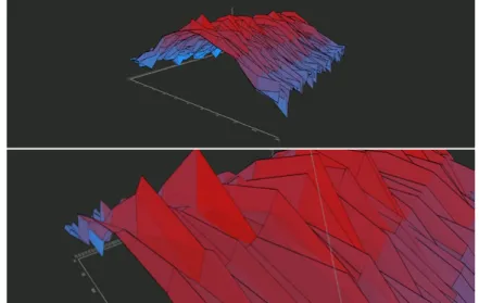
3D mesh plot can be seen as a 3D extension of 2D line graph. It is used to display the evolution of one variable for several ordered group. The measurement points are ordered (typically along
x-axis) for different groups (typically along z-axis) and joined with planes. This can also be used as a variation of waterfall plot. 3D mesh plots are very effective in identifying trends.
3D Force Directed Graph[C8]
3D force directed graph is a network diagram (using force directed layout[55 p. 383-409]) that shows relationships and connections between different entities. Each entity is called a node and
connections between them are referred as links. 3D force directed graphs help in untangling the hairball in 2D graphs as there is an additional dimmension for the algorithm to position the nodes. 3D Point Cloud[C9]
3D point cloud is a set of points in space. Point cloud is generally produced by 3D scanning an object and is used to recreate a 3D model of the object. 3D point cloud can be used for visualizing certain properties of points of the 3D object using color. 3D Treemap[C10]
3D treemap is a 3D variation of 2D treemap[56]. 3D treemap displays hierarchical data as a set of nested cubes with the base area of box being propotional to one numeric variable and height being propotional to another numeric variable. Colors are used to distinguish between groups and subgroups. Treemaps are used to effectively visualize heirarchical relationship and part to whole relationship. 3D treemaps can be very difficult to read because of occlusion and confusing layout.
56 Graph Specification 3D Rectangle Chart[C11]
3D rectangle chart shows the relationship between two numeric and a categoric variable. Each category is visualized by separate bars, the height of the bar represents one numeric value and the depth another. 3D rectangle chart can be used to identify relationship or correlation between the two numeric values, like in a 2D scatter plot, without the issue of overplotting.
3D Connected Scatter Plot[C12]
3D connected scatter plot is a 3D variation of 2D connected scatter plot[57]. 3D connected scatter plot visualizes the relationship between three numeric variables as points
connected by a curve in temporal order. Connected scatter plot can only be drawn if the data is sampled at the same rate. 3D connected scatter plot can create complex shapes that can be hard to interpret and gain insights from.
3D Time Series[C13]
3D time series displays the evolution of two numeric variables over time. Typically, one of the numeric variable is plotted along y-axis, another along z-axis, and time along x-axis. Adding points along the plot enhances readability of the chart.
3D Spiral Chart[C14]
3D Spiral chart is 3D variation of 2D radar chart (also known as polar plot). 3D spiral chart visualizes multi-variate numerical or ordinal data for different groups. Each variable has its own
axis, all axes are joint in the center of the figure. Each group is shown as a different layer (typically along y-axis) with some spacing between them. The chart is most effective if the groups are ordinal and the layers can be ordered. This chart is not very readable but can be used to see trends for multiple variables in the same plot. 3D spiral chart is most effective if the scales for different variables are the same.
Function Plots
This set of visualizations is used to visualize shape of mathematic functions in 3D space.
3D Contour Plot[C15]
3D contour plot is a line graph in 3D space used to plot x (typically along x-axis) and z (typically along z-axis) as
functions of y (typically along y-axis). Therefore, x and z are the dependent variable and y is the independent variable.
x = f(y) z = g(y) 3D Parametric Contour Plot[C16]
3D parametric contour plot is also a line graph in 3D space used to plot x (typically along x-axis), y (typically along y-axis) and z (typically along z-axis) as functions of an independent variable t.
x = f(t) y = g(t) z = k(t)
58 Graph Specification 3D Surface Plot[C17]
3D surface plot is a plot used to visualize y (typically along y-axis), as a function of x (typically along x-axis) and z (typically along z-axis).
y = f(x,z) 3D Parametric Surface Plot[C18]
3D parametric surface plot is a plot used to visualize y (typically along y-axis), x (typically along x-axis) and z (typically along z-axis) as functions of independent variables u and v.
x = f(u,v) y = g(u,v) z = k(u,v) Map Visualizations for Geospatial Data Prism Map[C19]
Prism map is a 3D map visualization that involves changing height of regions of the map based on numeric data. A problem with prism map is that different regions overlap and hide the regions behind them. Therefore, top view of prism map makes the visualization more readable in VR. Prism maps can be used to determine relationship between area of the region and numeric data.
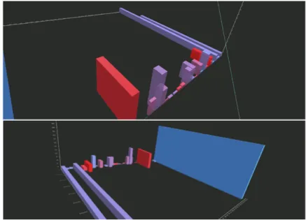
3D Map Bar Graph[C20]
3D map bar graph, as the name suggests, is a combination of 3D bar graph and map. This visualization geographically
represents one numeric variable. The bars are positioned on the geographical coordinates it is associated with and the height of the bar represents the numeric variable. This visualization shows the relationship between the geographical position and numerical variable of the data.
3D Map Stacked Bar Graph[C21]
3D map stacked bar graph, a variation of 3D map bar graph, combines 3D stacked bar graph and map. This visualization geographically represents one numeric variable for multiple groups. Bars are positioned on the geographical coordinates it is associated with and height of the bar represents the numeric variable and different colors represent different categories. 3D Contour Map[C22]
3D contour map is 3D extension of a contour map (sometime also called topographic map). It is used to represent natural features on the ground (i.e. the topology of the ground). In 3D, elevation can be used to represent the scaled model of the actual features. This can be considered slightly different from other map visualizations as it does not represent latitudinal or longitudinal data.
3D Isoline Map[C23]
3D isoline map represents lines of constant value for a property on a map. Properties which the lines represent can be barometric pressure (the map is called isobar map), temperature (map is
60 Choosing The Right Chart
called isotherm map), precipitation (map is called isohyet map) or elevation (like the contour map). In 3D isoline map, elevation and color of the line represent the constant values.
3D Flow Map[C24]
3D flow map represents the connection between several positions on a map. The link between two places can be drawn as an arc or can represent the path that the connection follows. The height of the arc can be used to represent a numeric variable for the connection.
3D Map With Time Bars[C25]
3D map with time bars visualizes spatially-referenced time dependent numeric data. This is a relatively new visualization and was first proposed by Thakur et al.[58] in 2010. Numeric data is represented by disks stacked over one another. The order of the disks is temporal, i.e. oldest data is represented by the bottom most disk and newest by the top most. The diameter of the disk represents the numeric data. The stack of disks are positioned on the geographical coordinates it is associated.
3.5
CHOOSING THE RIGHT CHART
Choosing the right visualization technique can be tricky. The choice of the right chart depends on the following criteria[59]: • Structure of the data set to be visualized
Structure of the Data Set
Data have many attributes like type, size, dimensionality, range, structure, and distribution[60 p. 382-383]. This thesis mainly focuses on two of these attributes: dimensionality and type of variables. Dimensionality refers to how many attributes does the data have. The type of variables in data is key in choosing the right chart. Broadly, variables can be of two types:
• Continuous variable: Variables that can assume any value in a range.
• Discrete variable: Variables that can only take certain values. Discrete variable may or may not be numeric. User Tasks
Another criteria while choosing the right chart is the task or specific action the user wishes to perform or the intended message of the chart. Following are the tasks which the users may perform with visualization[60 p. 380, 61] (not an exhaustive list): • Correlate — to find relationship between three or more
variables.
• Rank — place an object or groups of object in an order. • Compare — to examine values of several objects and
identify and compare them.
• Identify shape — recognize shape of an object or function. • Identify distribution — identify how often a value appear in
dataset.
• Identify change over time
62 Interactivity
spatial location.
• Identify flow — recognize flow and relationship between two or more entities.
• Identify part of whole — recognize the relationship of single entity with its components.
A poster to help designers and data visualizers to select the optimal 3D visualisation technique is provided (can be seen in the fold out on the next page). This resource is inspired by Financial Times’ Visual Vocabulary[61].
3.6
INTERACTIVITY
Visualization systems have two main components:
representation and interaction[62].Previous section focussed on the representation component, main focus of this section will be interaction. The interaction component involves relationship between the user and the visualization. Interaction component defines how the system reacts when user interacts and explores the data to uncover insights. Although the main focus this thesis is the representation component, we will briefly discuss the interaction component of VR-Viz in this section. Out of the seven proposed categories of interaction techniques by Yi et al.[62], this section focuses on explore and select/focus.
Explore
CORRELATE
COMPARE
SHAPE
DISTRIBUTION
CHANGE OVER TIME
SPATIAL
FLOW & RELATIONSHIP
PART OF WHOLE
MAGNITUDE
Shows the magnitude of multiple variables
3D Radar Plot
Shows the movement on a map
3D Flow Map
Shows spatially-referenced time dependent numeric data
3D Map with Time Bars
Shows the landscape or terrains
3D Contour Map
Shows the magnitude of 2 numeric variables across a categorical variable
3D Rectangle Chart
Shows line of constant value for a property on a map
3D Isoline Map
Shows the relationship of functions x=f(u,v), y=g(u,v), and z=k(u,v) based on variables u and v
3D Parametric Surface Plot Waterfall Plot
Shows the change over time for a continuous variable for multiple groups
3D Bubble Plot
Shows relationship between 4 continuous numeric variables Compares the magnitude of 2
numeric variables across a categorical variable
3D Rectangle Chart 3D Stacked Bar Chart
Shows the movement on a map
3D Flow Map 3D Map Bar Graph
Shows the magnitude of a variable spatially
3D Parametric Contour Plot
Shows the relationship of functions x=f(t), y=g(t), and z=k(t) based on a variable t
Waterfall Plot
Shows the distribution across different groups along a continuous variable
3D Mesh Plot
Shows change over time for a continuous variable for multiple groups
3D Treemap
Shows hierarchical part-to-whole relationships; also shows the magnitude of a variable using height
Shows relationship between 3 continuous numeric variables and its trend over time
3D Connected Scatter Plot
Shows relationship between 3 continuous numeric variables and its trend over time
3D Connected Scatter Plot 3D Mesh Plot
Shows the magnitude across 2 categorical or continuous variables
3D Map Stacked Bar Graph
Shows the magnitude across 2 categorical or continuous variables
3D Surface Plot
Shows the shape of the function y=f(x,z)
HOW TO CHOOSE THE
RIGHT CHART*
Based on the user tasks defined on the top, look at the chart type and data type they represent to form an initial idea on which chart to use. This is not an exauhstive list but a starting point in using 3D visualization.
Readability
Readability of the graph is decided on the basis of Cleveland et al.[63]
study of graphical perception, occlusion of graphical elements, and novelty of layout. Readability of the visualization is also affected by the task that needs to performed, the design (i.e. the colors and layout) of the visualization, and the dataset to be visualized.
Force Directed Graph
Shows the strength and inter-connect-edness of relationships. Can be used to show flow using animation.
3D Stacked Bar Chart
Shows the magnitude across 2 categorical variables
3D Bar Chart
Shows the magnitude across 2 categorical variables
Shows the magnitude across 2 categorical variables
3D Bar Chart
Compares magnitude across 2 categorical variables
3D Scatter Plot
Shows relationship between 3 continuous numeric variables
3D Contour Plot
Shows the relationship of functions x=f(y) and z=g(y)
3D Bar Chart
Shows the distribution across 2 categorical variables (in the form of a 3D histogram)
Prism Map
Shows the magnitude of a variable spatially
3D Time Series
Shows change over time for 2 continuous variables
64 Interactivity
subset of the data or examine the data from a different point of view[64]. Since VR is an immerssive medium, user can the walk towards or away from the visualization and also move around the visualization, thus allowing the users to explore and focus on point of interest. This can be seen as a literal implementation of the direct-walk technique which is explained by Card et al.[64] as “a task in which a user navigates from a starting point to a goal point in an information structure by a series of mouse points or other direct manipulation methods”.
The ability to rotate the camera using the HMD allows the user to see the visualization from different point of views, for example top view or side views. This not only allows the user to focus on subset of data but also helps the user gain insights about the data by showing the data from different point of view. Select/Focus
Select interaction techniques provide users with the ability to select or focus on a data item of interest and find details about that item. VR-Viz uses mouse over effect as key select interaction technique. This interaction is straight forward but there are some issues when designing mouse over effect for VR. In VR there are multiple ways to place and visualize the UI elements:
• Spatial UI: UI is placed within the 3D scene. This method is not adviced to be used for placing information on mouse
over as the UI might be placed in a position which is not in the FOV of the user.
• UI attached to the body: There are two option for this method: UI attached to head (HMD) and UI attached to hand (controllers). VR-Viz uses UI attached to hand for mouse over effect as UI attached to head can cause occlusion and hide the visualization in front.
In VR-Viz the information that appear on mouse over is attached to one of the controllers so that the effect can be view easily all the time no matter the position or viewing angle of the user in the scene. The information must not be placed very close to the camera as it can cause strain to the user.
3.7
FUTURE DEVELOPMENT
Development of VR-Viz is a continuous process. In the present state, VR-Viz contains 24 visualization techniques and basic interactivity features.
In future, more visualization techniques will be added: like 3D lollipop chart, 3D bump chart, exploded view drawing and map visualizations on a spherical earth.
Currently, the interactivity feature is very basic, and need further developement. Interactivity features that will be added in future releases are the ability of user to rotate and scale
![Fig. 2.1 Reference model for visualization (redrawn from Card et al. [20] )](https://thumb-us.123doks.com/thumbv2/123dok_us/11061710.2992860/23.648.88.561.102.245/fig-reference-model-visualization-redrawn-card-et-al.webp)
![Fig. 2.2 Original visual variable (redrawn from Bertin et al. [22] )](https://thumb-us.123doks.com/thumbv2/123dok_us/11061710.2992860/24.648.75.562.414.704/fig-original-visual-variable-redrawn-bertin-et-al.webp)
![Fig. 2.3 Effective ranking of visual variable (redrawn from Mackinlay [23] )](https://thumb-us.123doks.com/thumbv2/123dok_us/11061710.2992860/25.648.88.547.184.517/fig-effective-ranking-visual-variable-redrawn-mackinlay.webp)