A VISUAL ANALYTICS APPROACH TO FEATURE DISCOVERY AND SUBSPACE EXPLORATION IN PROTEIN FLEXIBILITY MATRICES
by
Scott Anthony Barlowe
A dissertation submitted to the faculty of The University of North Carolina at Charlotte
in partial fulfillment of the requirements for the degree of Doctor of Philosophy in Computing and Information Systems
Charlotte 2011 Approved by: Dr. Jing Yang Dr. Dennis R. Livesay Dr. Donald J. Jacobs
Dr. Heather Richter Lipford
c 2011
Scott Anthony Barlowe ALL RIGHTS RESERVED
iii ABSTRACT
SCOTT ANTHONY BARLOWE. A visual analytics approach to feature discovery and subspace exploration in protein flexibility matrices. (Under the direction of DR.
JING YANG)
The vast amount of information generated by domain scientists makes the transi-tion from data to knowledge difficult and often impedes important discoveries. For example, the knowledge gained from protein flexibility data sets can speed advances in genetic therapies and drug discovery. However, these models generate so much data that large scale analysis by traditional methods is almost impossible. This hin-ders biomedical advances. Visual analytics is a new field that can help alleviate this problem. Visual analytics attempts to seamlessly integrate human abilities in pattern recognition, domain knowledge, and synthesis with automatic analysis techniques. I propose a novel, visual analytics pipeline and prototype which eases discovery, com-parison, and exploration in the outputs of complex computational biology datasets. The approach utilizes automatic feature extraction by image segmentation to locate regions of interest in the data, visually presents the features to users in an intuitive way, and provides rich interactions for multi-resolution visual exploration. Functional-ity is also provided for subspace exploration based on automatic similarFunctional-ity calculation and comparative visualizations. The effectiveness of feature discovery and subspace exploration is shown through a user study and user scenarios. Feedback from analysts confirms the suitability of the proposed solution to domain tasks.
ACKNOWLEDGMENTS
I would like to thank my advisor, Jing Yang, for allowing me to have great free-dom to experiment with new approaches, for providing me with valuable feedback througout this process, and for never hesitating to work me into her schedule. I would also like to thank Dennis Livesay and Don Jacobs for their incredible patience when sharing their knowledge in the simplest terms, for taking the time to listen to my ideas, and for becoming active participants in this work. Without all of these faculty members, this collaborative effort would not have been possible.
This work also benefited from the effort of several others. I would like to thank Yujie Liu for help with the user study, Deeptak Verma for being a valuable source of feedback, and James Mottenon for supplying data.
Most of all, I would like to thank my wife. Becky, thank you for your patience all those many nights that I was either at school, traveling to and from school, or staying up until the next morning working on projects. Without your encouragement and your help, I would have fallen well short of my goal.
v TABLE OF CONTENTS
LIST OF FIGURES viii
CHAPTER 1: INTRODUCTION 1
CHAPTER 2: LITERATURE REVIEW 4
2.1 Current Systems for Protein Analysis 4
2.2 Matrix Visualization 8
2.3 Feature Extraction 9
2.3.1 Extraction Techniques 9
2.3.2 Feature and Change Visualization 14
CHAPTER 3: MODELS, DATA, AND TASKS 18
3.1 Protein Construction 18
3.2 A Computational Model 20
3.3 Data Formulation and Tasks 22
3.3.1 Model Outputs 23
3.3.2 High-level Tasks 27
CHAPTER 4: WAVEMAP – INTERACTIVE FEATURE DISCOVERY 35
4.1 System Components 38 4.1.1 Feature Extraction 38 4.1.2 Overview 42 4.1.3 Feature Exploration 46 4.1.4 Detailed Analysis 48 4.2 Scenario 49
4.3 Evaluation 52 4.3.1 User Study 52 4.3.2 Expert Evaluation 59 4.4 Discussion 62 4.4.1 Extensions 62 4.4.2 Limitations 66
CHAPTER 5: EXTENSIONS FOR SUBSPACE EXPLORATION 68
5.1 Task Refinement 68
5.2 Background in Subspace Exploration 69
5.2.1 Protein Subspaces 69 5.2.2 Subspaces in Visualization 71 5.3 Plot Carving 78 5.3.1 Grid Sections 78 5.3.2 Histogram Sorting 78 5.3.3 Interactions 83 5.4 Subpsace Clusters 85 5.5 Sliding Subspaces 86 5.5.1 Context Scans 86 5.5.2 Interactions 89 5.5.3 Outlier Detection 90
vii
5.6 Evaluation 93
5.6.1 Example Use 93
5.6.2 Expert Evaluation 98
CHAPTER 6: CONCLUSION AND FUTURE WORK 101
LIST OF FIGURES
FIGURE 1: VisAlign [41] 5
FIGURE 2: iVici [85] 6
FIGURE 3: Java Protein Dossier [72] and a lattice-based visualization 7
FIGURE 4: Wavelet families 11 FIGURE 5: Wavelet applications in information visualization 12
FIGURE 6: Wavelet lifting steps 13
FIGURE 7: Wavelet effect on a 1D signal 13
FIGURE 8: Protein contact map 15 15
FIGURE 9: Component plane array 16 FIGURE 10: Protein structure levels 19
FIGURE 11: Phi-psi angles for protein motion 20
FIGURE 12: Steps in the Distance Constraint Model 21
FIGURE 13: DCM outputs 23
FIGURE 14: Allosteric response plot 24
FIGURE 15: Cooperativity correlation matrix 26
FIGURE 16: Alignment example 28
FIGURE 17: Difficulty in flexibility analysis 29 FIGURE 18: Multiple correlation metrics 30
FIGURE 19: Early prototypes 31
ix
FIGURE 21: System setup 35
FIGURE 22: Main interface with allosteric response 36
FIGURE 23: System framework 37
FIGURE 24: Wavelet iteration and outputs 40 FIGURE 25: Wavelet application to cooperativity correlation plots 41
FIGURE 26: Overview with MDS layout 43
FIGURE 27: Overview with jigsaw layout 43
FIGURE 28: Parameter labels 44
FIGURE 29: Pencil tool 46
FIGURE 30: Feature view 47
FIGURE 31: Detailed analysis 49
FIGURE 32: Scenario (part 1) 50
FIGURE 33: Scenario (part 2) 51
FIGURE 34: Scenario (part 3) 52
FIGURE 35: User study tasks 54
FIGURE 36: User study questionnaire 55
FIGURE 37: User study results 57
FIGURE 38: User study example 58
FIGURE 39: Other biological applications 63
FIGURE 40: Microarrays 65
FIGURE 41: Subspace and feature selection 73
FIGURE 43: Web-based outlier subspace 76
FIGURE 44: Histogram view 79
FIGURE 45: MVE [4] 80
FIGURE 46: Shifted histograms 82
FIGURE 47: Trim tool 83
FIGURE 48: Effect of trim tool on subspaces 84
FIGURE 49: Subspace context dots 85
FIGURE 50: Bubble view 87
FIGURE 51: Bubble details 90
FIGURE 52: Free-hand tool 90
FIGURE 53: Outlier detection 91
FIGURE 54: Two distance types 92
FIGURE 55: Example Use (Part 1) 94
FIGURE 56: Example Use (Part 2) 95
FIGURE 57: Example Use (Part 3) 96
CHAPTER 1: INTRODUCTION
Models describing physical or naturally occurring behavior can generate many pos-sible outputs when different parameter settings are used. As models become more complex and more sensitive to parameter changes, the data produced becomes more difficult to analyze. This difficulty arises from both the amount and variation of produced data which must be considered quickly in parallel so that a model and the consequences of its outputs can be understood efficiently and accurately. Models are used in many applications but have become central in the prediction of protein be-havior. One of the most fundamental predictors of protein behavior is flexibility, or a protein’s ability to change shape under given circumstances. Accurate descriptions of protein flexibility are crucial for understanding the physiochemical mechanisms that underlie protein function [49] and could eventually be used to speed the drug discovery process. Making the prediction of protein behavior complex is that some portions of a protein are highly dynamic (flexible), whereas other regions are quite static (rigid). Compounding the problem is choosing the most appropriate set of parameters that accurately describe or predict protein flexibility.
These problems become evident when attempting to holistically analyze various types of flexibility and correlation plots. These plots are colored matrices representing either a flexibility index or residue to residue coupling behavior for varied proteins
and parameter settings. Small-scale examination impedes comparison among residues within plots possibly having several hundred variables. Scientists must not only identify abrupt differences, but subtle changes which easily escape manual inspection. This becomes more difficult as the similarities or differences among proteins becomes less dramatic, but no less important. In fact, the identification and comparison of small differences may prove to be crucial for learning how to alter a given behavior or explaining why two similar proteins behave differently. This difficulty increases as any insights gained must be placed in context across multiple proteins, environmental conditions, and correlation types.
The main contribution of this work is the design and development of a visual analytics prototype for model-based protein analysis. Two benefits emerged during the development of the prototype presented here. The first benefit is the formalization of data types and high-level tasks encountered in the course of using a particular protein flexibility model. Unfortunately, even public providers of biological data publish data sets with inconsistent formatting standards and require a great deal of preprocessing before software systems can be used in exploring them. Stein [81] discusses the challenges and current attempts for creating standardized data sets. However, attempts at standardization mostly address public repositories and often ignore the complexities introduced by scientists employing individualized workflows. Only when individualized workflows, including data types and high-level tasks, are exposed can common processes be identified and the level of standardization needed for fast discovery take place. Years of collaboration, sifting through much data, and several failed attempts at prototyping have resulted in the description of the data sets
3 for this particular model. This will not only aid in the development of newprocessing tools for this model but also for other domains encountering similar data structures both within and outside protein analysis. Furthermore, this work defines the high-level tasks learned from observing domain analysis which will help in the development of new analysis tools tools so that insights can be made more efficiently.
The second benefit is the construction of a pipeline and prototype that can serve as a model for future visual analytics tools. The prototype, called WaveMap [3] combines automatic analysis and human perceptual abilities to provide a more com-plete view of data. WaveMap utilizes automatic feature extraction through image segmentation to guide users to points of interest in the colored plots at varying levels of granularity. Items that exhibit coarse-grain patterns of interest can be selected so that features representing a given fine-grain behavior can be explored. Simulta-neously, the data is reduced through both automatic techniques and user interaction allowing scientists to focus on fewer items of interest. Extracted features can be effi-ciently compared to the original data values so that the results of automatic analysis can be mapped back to their original values. WaveMap also includes techniques for interactive selection and comparison of subspaces that help in distinguishing local behavior from global behavior. The effectiveness of the system is confirmed by a user study, user scenarios, and feedback from domain scientists.
The solution presented in this work employs many techniques from a wide range of fields. In the following sections, current visualization systems used in the ex-ploration of two-dimensional protein data are surveyed and their shortcomings are exposed. Techniques in matrix visualization are then examined. Finally, possible feature extraction methods for emphasizing areas of interest and ways of visualizing those features are discussed.
2.1 Current Systems for Protein Analysis
While limited, there have been multiple attempts for applying visual analytics to protein structure and function. Because of the complexities associated with han-dling biologically based data, most attempts have either originated in or been heavily influenced by the bioinformatics community. Several systems are presented now.
Keim et al [41] state the importance of combining automatic and exploratory tech-niques during protein analysis. The authors present VisAlign (Figure 1) which helps users view and explore the alignment sequence of proteins and the correlation to a selected basis column. The system is comprised of the Alignment Viewer, Parameter Window, Mapping Window, Properties Window, and a 3D viewer. The Alignment Viewer shows each alignment as a column where each amino acid is color coded. All cells not correlated to the basis column are gray. The user can input maximum and
5
Figure 1: VisAlign [41].
minimum threshold values which are immediately available in the visualization. The Mapping Window allows the grouping of similar amino acids where similarity is based on an amino acid property or hypothesis of interest. The Properties Window controls visual properties such as zooming, fading, and cell size variation. The 3D Viewer shows a three-dimensional protein structure which is linked to the Alignment Viewer. iVici [85] is a system for viewing protein-protein interactions encoded into sym-metric, two-dimensional matrices (Figure 2). There are three modes. The general mode represents hierarchical clusters generated by an outside source. The compara-tive mode dissects symmetrical matrices into halves along the diagonal resulting in a triangular section. Matrices are compared by placing the triangular section from one matrix onto the top of a new matrix and the triangular section from the other matrix onto the bottom of the new matrix. The superimposed mode places one matrix onto
Figure 2: iVici [85].
another and the resulting color of each cell represents the intersection of values. Java Protein Dossier [65] is shown in Figure 3(a). This system attempts to be a parameter and visualization warehouse for protein analysis. Java Protein Dossier ac-counts for many parameters that may need to be considered and employs elementary pixel displays for summary statistics. The authors claim that their molecular model-ing capabilities include more than sixty parameters and can be deployed over the web. Windows showing protein sequences, structures, and parameters are coordinated.
One of the most complete tools specifically targeting protein structure and func-tion explorafunc-tion is based on lattice construcfunc-tion [72]. This system (Figure 3(b))
in-7
Figure 3: (a) Java Protein Dossier [65] and (b) lattice-based protein visualization [72].
cludes many of the techniques necessary for complete visual analysis. Focus+context, overview+detail, and multiple views are integrated into this platform. Energy land-scapes can be examined through interactive line plots. Additionally, the work is connected to simulation models, provides a three dimensional lattice viewer, and includes contact matrix visualizations.
Although these representative systems attempt to utilize visualization of two-dimensional protein data, there are shortcomings. For example, most of these systems make little use of automatic analysis techniques which can ease the exploratory bur-den of users when searching for important data characteristics. In the cases where automatic techniques are present, highly-interactive tools are not available to guide the user to the places in the data which may be of greatest interest. Additionally, these and similar systems often only show summary information which can hide
im-portant relationships and subtle features. Such information is often crucial in spatial or temporal understanding. Finally, these systems (with the exception of [41]) only consider one or few proteins at a time and ignore the need for large scale analysis.
2.2 Matrix Visualization
Currently, scientists lack effective tools to conduct the above tasks for large flexi-bility data sets. Existing methods heavily depend on manual inspection of enlarged flexibility plots using Heatmaps [59], [58]. Subtle but important relationships and patterns may remain hidden even with zooming and distortion interactions. The large number of plots and the subtle differences both within each plot and among parameter sets are almost impossible to distinguish. These obstacles greatly hinder knowledge discovery.
Heatmaps are widely used in bioinformatics besides protein flexibility data visu-alization. Specifically, they are the most common representation for gene expression data [23]. Many of them can guide users to patterns such as clusters and out-liers within the data. For example, HCE [78] and Java Treeview [76] enable users to identify clusters in microarray experiment data sets using hierarchical clustering algorithms and interactive visual exploration. Visualization methods developed for matrix data [84], [79] also allow users to find patterns through interactive visual exploration. However, the above techniques would not work for protein flexibility data visualization because of their heavy reliance on the grouping of similar rows and columns. Not only does each flexibility matrix value i,j have a color-coded flexibil-ity measure but also carries spatial significance reflecting residue ordering along the
9 three-dimensional protein structure. Any reordering or rearranging of rows, columns, or individual measures would disrupt the spatial context in which any flexibility mea-sure occurs. Moreover, a large number of plots need to be examined simultaneously in our application while most of the above techniques only consider one matrix or array at a time.
2.3 Feature Extraction 2.3.1 Extraction Techniques
Feature extraction is an automatic analysis technique in signal and image processing used to draw out defining characteristics in a data set. Forlines and Balakrishnan [22] have shown that feature extraction through image segmentation can be helpful in visual search as target subimages become small and rare. This is a necessary aid since they note that search time is linearly correlated with the number of distractor objects. The authors perform user studies which differ in the presentation of targeted objects. Presentation differences include increasing target prevalence, re-layout, and space/time tradeoff. The authors found that all three of the image segmentation techniques improved search performance by reducing the false-negative error rates.
Many image analysis techniques for extracting features can be applied to flexibility plots so that difficult to detect patterns can be identified. For example, Principal Component Analysis (PCA) [38], [17] can be used to summarize features by finding the linear combinations of variables and then ordering the resulting components by variance [93]. It has been used in many image processing applications such as face recognition [69] and edge detection [73] but can be computationally taxing [88],
[18]. Additionally, the results can be difficult to interpret [96]. Fourier analysis [24] is another popular image analysis technique applied to many areas including feature extraction and dimension reduction [35]. Fourier frequencies can be linked to pixel value changes where low frequencies are associated with slowly varying pixel changes and high frequencies are associated with abrupt pixel changes [24]. A major drawback to this type of analysis is that frequency and spatial information cannot be conveyed at the same time.
Wavelet analysis is based on small signals (waves) of limited duration and varying frequency [24]. This type of transform allows the same frequency-based processing of pixel values as Fourier analysis. However, wavelets provide simultaneous frequency and spatial information with a multi-resolution approach that allows normally hidden features to be revealed. The wavelet transform (Equation (1)) results in a set of coefficients WΨ(s, τ) which represent the similarity between a function f(x) and a given wavelet transform Ψs,t. Similarity is measured as s, a scaling factor, and τ, a
translation factor, are varied resulting in a multiresolution view of f(x).
WΨ(s, τ) = Z ∞
−∞
f(x)Ψs,t(x)dx (1)
Different wavelets transforms, many of which can be grouped with others exhibiting similar characteristics to form wavelet families, can be substituted to extract desired characteristics. Examples of different wavelets are shown in Figure 4. Wavelets have been integrated into visualization tools for brushing applications [90] (Figure 5(a)), text analysis [55] (Figure 5(b)), and many scientific applications [19], [8].
11
Figure 4: A sample of different wavelet families provided by a toolkit in MATLAB [53]
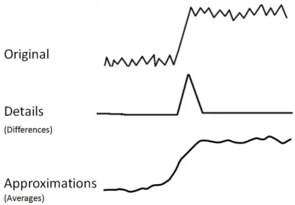
Wavelet lifting [82], [37] is an improvement to traditional wavelet analysis. Lifting is accomplished through repeated execution of a set of distinct steps. Steps for a one-dimensional signal include split, predict, and update. The first step, split, sorts the data into even and odd indices. Predict assumes that the correlation between a sample and its neighbors is high. In this step, the difference between the predicted value and the actual value is recorded in the odd entries. The update step uses the difference in the predict step to update the even entries. The even entries represent an approximation of the signal and the odd entries represent the details. Repeating these steps using the output as the input to the next sequence of split, predict, and update results in an increasingly coarse (if the approximations are used) or detailed
Figure 5: (a) Wavelet brushing shows the approximations (outside the brush) and details (inside the brush) [90]. (b) Wavelet energies superimposed on topics (left) wavelet energies on a line graph (right) [55].
(if the differences are used) view of the signal. The steps in lifting are shown in Figure 6 and the general effects of applying a wavelet to a one dimensional signal is shown in Figure 7.
The wavelet used can be changed by altering the predict and update stages. As with other wavelet implementations, different filter banks can be constructed by varying
13
Figure 6: Steps in wavelet lifting are split, predict, and update. The result is a set of approximations, S and a set of details, d.
Figure 7: The general effect of applying a wavelet filter on an one-dimensional signal. Outputs include a set of approximations representing a coarse view of the original signal and a set of details representing a fine-grained view. Different variations of wavelts can be used to alter specific behavior.
what (either the signal approximation or detail) is taken as the input to the next step. A discrete, iterative process which uses no more memory than required for the original data matrix improves computational efficiency. Additionally, the results of lifting can be reversed by simply reversing the discrete steps used in transformation. This property enables the original data to be directly and quickly accessed from any level of decomposition.
There have been many cases of the application of feature extraction to data sets found in protein analysis [61], [12], [56]. The mining of protein contact maps is an excellent example where automatic feature extraction has been applied to protein image data. Protein contact maps are color images representing the chemical inter-actions for all amino acids in a protein and, because each map is unique, is a picture of protein structure [39]. Contact maps have also been used to inform scientists regarding a protein’s secondary structure in addition to non-local features influencing the definition of its tertiary structure [32]. Characteristics which are color coded by Fernandes et al [39] include hydrophobic interactions, electrostatic interactions, and hydrogen bonds. Similar to the protein model described earlier (section 3.3.2), contact maps relate three-dimensional structure to a two-dimensional color image. Because the final output of the protein analysis is an image, the authors use content-based image retrieval (CBIR) as an automatic approach for similarity based searching. The authors report a successful grouping of similar structures based on their methods. Other activities in which scientists have been interested include pruning mined pat-terns and then clustering the results [32]. An example of a contact map is shown in Figure 8.
2.3.2 Feature and Change Visualization
Although most of the attempts for developing a complete system for modeling protein behavior have come from the bioinformatics domain, the visualization com-munity has many techniques that can be applied to model-driven protein analysis. The most important contribution of the visualization community for the inspiration
15
Figure 8: Contact map [86] color coding hydrophophic interactions, electrostatic interactions, and hydrogen bonds.
of this work is in feature visualization. Because the proposed system seeks to detect unexpected changes in residue behavior, works in anomaly visualization and visual change detection are included below.
Schreck et al [77] recognize the importance of visualization when analyzing fea-tures. The authors present an approach utilizing a self-organizing map (SOM) and visualization to help find high quality feature vectors. Feature vectors are descriptors of data characteristics and are important in clustering, classification, and similarity search. Although crucial in many data mining tasks, feature vectors which exhibit high discriminatory ability are often found only after much experimentation, bench-marking, and expert intervention. The authors cluster the feature vectors in the SOM which results in an unsupervised, compact feature space representation. Component planes are constructed by color-coding reference vectors at each SOM position. The
Figure 9: Component plane array for feature vector distribution from a self-organizing map [77].
distribution of the vectors is then visualized. Image processing techniques such as differencing and entropy functions are used to mine the component planes. An array of component planes is shown in Figure 9.
Oelke et al [68] present feature-based text visualization and illustrate how ex-tracted features can provide patterns for desired text characteristics to which other documents can be compared. Characteristics include the importance of passages and the classification of opinions. Visual examination relies on the work in [40] where pixel displays representing documents relate feature importance through a color scale. Visualizing features produced through image segmentation is one of the main func-tions of the Semantic Image Browser [91]. The Semantic Image Browser utilizes automatic image analysis to explore image datasets. Users can view the original
17 image or extracted image features which result from semantic image classification. Layout options include multidimensional scaling and ordering. Viewable low-level features include but are not limited to color histograms, extracted textures, and color variances. Interactions such as zooming, panning, and distortion aid exploration.
The detection of interesting regions or items allows more efficient comparison by al-lowing experts to isolate where trends or individual values deviate from expectations. Visualization has been shown to be beneficial in finding specific points of interest. The visualization of text passage importance has already been mentioned [68]. Layout generation has been used to reflect importance of numeric summaries and variance through display size and location [29]. Two-dimensional colormaps [95] and the inte-gration of visualization with advanced interfaces [54] have been successfully used for detecting unexpected behavior in financial time series data. Maciejewski et al [51] use visual analytics to identify unexpected behavior change, or hotspots. Hotspots can occur in spatiotemporal data including health reports and terrorism and are available to aid analysts prevent disease spread or criminal attacks.
The work here differs from those mentioned above by providing feature extraction within a highly interactive visual analytics framework for guided discovery in model guided protein examination. Specifically, this approach utilizes image segmentation to detect regions of interest based on the degree of change in flexibility and correlation plots. This work goes even further by providing options for choosing which image characteristics in the protein data should be explored. Finally, this work provides links from the extracted features to the original data so that the features can be understood in context of the entire data set.
3.1 Protein Construction
The National Center for Biotechnology Information (NCBI) [62] defines bioinfor-matics as the ”science in which biology, computer science, and information technology merge to form a single discipline.” The NCBI goes on to state that bioinformatics has two goals. The first is a practical goal of enabling the discovery of new biological insights. The second goal, the progress toward which is much more difficult to mea-sure, is to create ”a global perspective from which unifying principles in biology can be discerned.” One area of bioinformatics that can greatly benefit from approaches that combine the above components is the study of protein behavior. Complexities associated with protein insight include the simultaneous consideration of multiple pro-tein families, the presence of multiple propro-teins within families, single propro-teins having many residues per protein, and a host of environmental conditions.
Proteins are composed of unbranched chains of amino acids connected by chemical bonds [72]. These chains can consist of 20 different possible amino acids and vary greatly in length and sequence across different proteins. The spatial arrangement of these chains determines the biological function of the protein. As Figure 10 illustrates, amino acids make up the primary protein structure and influence the more complex, upper level (secondary, tertiary, and quaternary) shapes. After polymerization, each
19
Figure 10: The four protein structures [63]. The primary structure consists of amino acids and influences the upper level structures.
amino acid building block in the protein chain is referred to as aresidue. The overall 3D shape of the protein chain is defined by internal rotation angles within bonds that form the repeating unit along the protein backbone. Present in each residue, the rotatable angles phi and psi (shown in Figure 11) provide the degrees of freedom
Figure 11: Phi-psi rotation angles that allow movement between chemical bonds in an amino acid [7].
that allow the structure to change. A proper understanding of this process is critical because protein function is defined by its structure, and fluctuations therein. Unfor-tunately, to date, there have only been a small number of connections that correlated specific structural changes to function [42].
One of the main obstacles in understanding how structural changes in proteins affect function is the vast number of possible spatial configurations allowed by var-ious bond rotations occurring under changed environmental conditions. This set of possible configurations is referred to as a protein’s conformation space [66]. Most pre-diction methods search this space for the structure having the lowest energy, making energy one of the primary variables to be examined. Although important in protein changes, the energy function is often difficult to explore. Exploration is complicated by multiple local minima and an energy function’s dependence on many interrelated variables. Furthermore, differences in the underlying chemical structures may require examination of individual proteins.
3.2 A Computational Model
Because of the complexities associated with exploring a protein’s conformation space researchers rely on models to understand and to predict changes in protein
21
Figure 12: The Distance Constraint Model [34], [48] consists of numerous steps including third-party information such as protein repository files, 3d structure dia-grams, several programs developed by domain scientists, manipulation of structures, and model parameters. (From James Mottonen, 2008).
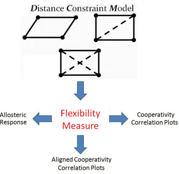
structure. A variety of models exist which are suited to magnify the effect of important characteristics desired for study [57], [36], [28]. The Distance Constraint Model [34], [48] is an example of a model that has proved successful in predicting protein behavior and is the model used throughout this work. The Distance Constraint Model (DCM) is based on free energy decomposition and mechanical constraints. The premise of the DCM is to relate free energy and mechanical constraints with a graph topology which can be calculated in linear time. The strength and location of constraints represented by graph edges in the resulting topology help scientists determine the flexibility/rigidity of a protein. The details of workflow for the DCM are shown in Figure 12. The generalized steps [50] include the following:
1. Each vertex in the graph is assigned degrees of freedom.
2. Molecular interactions are represented by an edge in the graph and assigned enthalpy (depth of the energy curve) and entropy (width of the energy curve). 3. Constraints are added recursively from lowest to highest entropy.
4. When accessible degrees of freedom are present, the added constraint consumes 1 degree of freedom.
5. Enthalpic components are linearly consumed, entropic components are only summed over independent degrees of freedom.
6. The partition function is calculated and thermodynamic properties are deter-mined.
7. Using the probabilities calculated from the thermodynamic data, mechanical properties are appropriately averaged.
Like any model that retains relevance, the DCM [34], [48] is constantly evolving and the need to quickly examine changes in parameters is crucial for efficient model development. Parameters considered by this model include but may not be limited to heat capacities, energy curves, pH measures, temperature, and torsion constraints.
3.3 Data Formulation and Tasks
The process of data formulation and the defining of high-level tasks for the model in this work occurred over a period of several years with the help of domain scien-tists. Data formulation and the definition of tasks were not discrete events but often
23
Figure 13: Model outputs can be used to form flexibility measures, psi-phi correlation measures, and aligned correlation measures.
occurred in small segments before, during, and after collaborative activities. The model outputs are described here first so that the high-level tasks, and the process for defining them, can be more clearly explained.
3.3.1 Model Outputs
Outputs from the DCM [34], [48] can take several forms depending on the needs of the scientist. They include, but are not limited to, raw flexibility values, correlation measures, and aligned correlation measures (Figure 13). They are now described.
Figure 14: The allosteric response plot for one parameter set applied to the CheY protein [58] where a color index at i, j is the response of residue j occurring due to a perturbation at residue i. Columns represent the response for all residues when a single residue is perturbed. Rows represent all of the allosteric responses for a single residue as every residue in the protein is perturbed.
Raw flexibility measures. Raw flexibilty measures are determined by model parameters or other internal modifications and serve as a standard method for com-paring residue flexibility. An example use of raw flexibility measures is the study of allosteric response. Allosteric response tracks how a protein change in one residue, referred to as a perturbation, affects the flexibility of other residues. Analyzing al-losteric responses for many residue parameters and types will allow scientists to better understand how to achieve specific biomedical results. Allosteric responses can be rep-resented by ann x n asymmetric color plot wheren represents the number of residues for a given protein. Figure 14(a) shows the set-up for allosteric response plots and (b) shows the allosteric response of one parameter set when applied to the CheY protein
25 [58]. In each plot, the residues are ordered according to the three-dimensional protein structure so that local and regional characteristics have biological meaning. In the examples used here, a color index ati, j is the flexibility change of residuej occurring with a perturbation at residue i. Color values are used such that darker shades of blue indicate increased residue rigidity and darker shades of red indicate increased flexibility. White areas correspond to neutral residues.
Correlation measures. Scientists may be just as interested in how flexibility changes are coordinated as parameter sets vary just as much as a global flexibil-ity measure. For example, Quantitative Stabilflexibil-ity/Flexibilflexibil-ity Relationships (QSFR) describe a high dimensional range of model properties where regions of correlated flexibility and rigidity are of great interest [49], [59]. Domain scientists currently visualize correlated flexibility and rigidity through cooperativity correlation matrices (Figure 15) where each axis is also ordered by the sequence of amino acids (residues) that define a protein. Individual indices are correlations for one of two different types of rotation angles found on the residue structure such that for two residues A and B
• i, j is the correlation between Aphi and Bphi
• i + 1, j is the correlation forAphi and Bpsi
• i, j + 1 is the correlation betweenApsi and Bphi
• i + 1, j + 1 is the correlation betweenApsi and Bpsi
Correlations between pairs of residues provide insight into the nature of the dy-namics of a protein. Patterns that emerge in these plots over families of proteins give
Figure 15: The length of each axis is twice the number of the residues in the protein. Each index in the matrix is one of the pair-wise correlation measures for a residue’s psi-phi angles. In this cooperativity correlation matrix, blue indicates residue pairs that are co-rigid, red indicates coflexible, and white indicates no mechanical coupling. The three dimensional protein structures are colored according to a single strip of the matrix, meaning each highlights all pairwise coupling to a given reference residue. Some residues share similar correlations resulting in large, consistent regions. Other residue regions that differ from neighbors are much more difficult to detect. Three dimensional structures were visualized with PyMol [15].
insight into the mechanisms important for biological function. These include the size and location of similar or dissimilar regions, and any outliers where a given residue may unexpectedly differ from its neighbors, or from a consensus over the family. Descriptors, or metrics, include (but are not limited to) the probability of residues to rotate (PROB), the probability of residues to be in correlated motion (COR), a flexibility index (FLX), indicators of structure fluctuation (SUS), and measures of mechanical freedom (DOF). Taken together, these plots simultaneously provide both local and global descriptions of protein dynamics. Scientists can plot the correlation between any two metrics but this work only considers the correlation among
mea-27 sures of the same metric type (e.g. PROB-PROB, COR-COR, SUS-SUS, FLX-FLX, and DOF-DOF). The volume of plots produced and the number of residues present within a plot makes large-scale comparisons and exploration cumbersome and inef-fective. Although some descriptions for a single protein are expected to show some common characteristics, any unexpected differences within a protein’s set of metrics or across proteins for a single metric would be of great interest to domain experts.
Aligned correlation measures. Not all correlation measures being studied have the same number of residues because the underlying proteins are different lengths. This often occurs for individual proteins within the same family and makes compar-ison among those proteins more difficult. To better compare proteins of different lengths, alignment algorithms [64], [80] are applied. The sequence alignment is rep-resented by a string of alpha characters (each character corresponding to a residue) and, in simple cases, alignment algorithms will shift the residues left or right. During the process of shifting, spaces or gaps may be inserted so that the optimal alignment is reached (Figure 16). (What constitutes ”optimal” and how that condition is reached is an active area of research [70], [16] beyond the scope of this work.) Accounting for aligned residues when applying both automatic analysis and visual techniques is necessary for accurate comparison.
3.3.2 High-level Tasks
This work addresses the problem of identifying and exploring points of interest in allosteric response or QSFR [49], [59] correlation data resulting from the DCM [34], [48]. The process of gathering user requirements for solving those problems
Figure 16: Alignment for two proteins. Dashes represent where the residues have been shifted to produce the best alignment. Column A shows the length of the protein and column B shows the adjusted length used during comparison.
included heavy involvement by domain scientists beginning in the summer of 2008 and is most adequately described as participatory design [60]. Domain experts had no choice but to be full partners in the design process because I knew very little about the correlation and flexibility data that was driving the collaboration. I began attending group research meetings with bioinformatics faculty members, graduate students, and a research scientist where the group would examine a single plot or, at best, a few plots at a time. I was a silent observer in the beginning and was, frankly, overwhelmed by the complexity and diversity of the workflow to produce even a single flexibility plot. The domain terminology describing the workflow and the resulting data were just as complex and diverse. I began experimenting with ideas, maintained
29
Figure 17: Residue comparison becomes difficult as the number of parameter sets increases. Each parameter set produces a set of flexibility which, in turn, can be used to calculate several types of correlation measures among many residues.
frequent communication (at least once every two weeks) with both bioinformatics and visualization experts, and regularly presented results. Discussion was primarily at meetings during summer sessions (of which there were well over 30), through email, and less frequent meetings during the academic year.
I quickly learned plots displaying raw flexibility measures for a single protein or pa-rameter set can contain local and regional characteristics for perhaps several hundred residues that are difficult to identify and even more difficult to compare. Eventually, flexibility plots can be used to construct cooperativity correlation matrices. Acquir-ing insights from these matrices becomes more difficult as the number of parameters, correlation types, or residues increases. Figure 17 illustrates the multi-tiered
prob-Figure 18: Multiple correlation metrics for the 2TRX protein family. In this display created by WaveMap [3] each row consists of a single correlation metric for all proteins in the family. From top to bottom the metrics are FLX-FLX, COR-COR, PROB-PROB, DOF-DOF, and SUS-SUS. Black lines represent gaps inserted into the sequence by an alignment algorithm.
lems challenging users of the DCM and QSFR data. Domain scientists have few tools available for examining plots and then pruning the possible choices to only those of interest. The lack of tools hinders biological insight.
There were several failed attempts before the solution presented here emerged. Those first attempts primarily targeted a small, but much studied data set comprised of QSFR [49], [59] correlation plots for nine related proteins (Figure 18). The first attempt consisted of multiple glyphs similar to a picture frame. The correlation type of interest was in the center of the frame and the remaining four measures for the protein made up the surrounding frame segments. This proved ineffective when
31
Figure 19: Residue comparison becomes difficult as the number of parameter sets increases. Each parameter set produces a set of flexibility which, in turn, can be used to calculate several types of correlation measures among many residues.
multiple proteins were viewed because the domain analysts found the color mapping and glyph representation confusing. The second attempt plotted the cooperativity correlation plots on the bottom of the screen and line graphs for parameters relevant to QSFR such as energy curves and heat capacities on the top. A prototype is shown in Figure 19(a). The third attempt (Figure 19(b)) utilized animation to selectively gray items that fell below a correlation threshold for a single protein across the QSFR correlation types listed above. The aim in this case was to quickly identify regions that had high positive or negative correlation to a metric of interest chosen by the user. Different colors were eventually used to signify predefined bins of correlation. Both attempts proved ineffective for large-scale analysis since the number of plots were limited to five (one for each metric) so that neither the back-end parameters nor the shaded areas could be easily compared.
Most of the difficulties in the previous attempts were unsuccessful because they were not scalable to large data sets with many dimensions. Additionally, the mixing
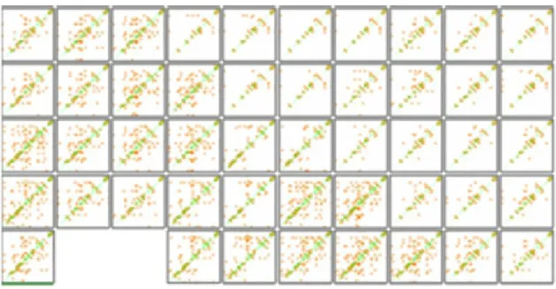
Figure 20: The CheY data set [58] consists of 75 plots representing one protein’s behavior for varying combinations of three parameters. Many of the differences among the plots are subtle and difficult to detect.
of correlation types often confused development and analysis efforts. Further compli-cating development was the fact that this data set contained several different proteins having residue sequences needing functions to adequately handle alignment results. The CheY data set [58] that had been developed by BMPG for studying allosteric response was much more suitable (Figure 20). It was significantly larger, all plots could be considered at once without confusion, and there was no significant sequence preprocessing required. Even though the data set was changed to ease development, the same high-tasks described below are the same for almost all flexibility data sets
33 used by BMPG.
Analyzing spatial relationships and numeric trends of flexibility mea-sures within proteins. Protein dynamics can be altered by either a local group of residues, larger regional groups, or the concerted effort of multiple areas of varying sizes. Locating and identifying those regions of interest which contribute to change is necessary before the roles of individual subunits can be identified.
Studying parameter influence and grouping parameter sets. Parameter refinement within a model is a reflection of evolving expert knowledge for a specific protein and environmental condition. For a fixed parameter set, a comparative analy-sis between different proteins and/or environmental conditions can help discover new spatial relationships and numerical trends. Grouping model outputs by parameter sets will allow scientists to understand what combination of parameter settings result in the greatest or most unexpected change for a single or group of residues. From this knowledge, domain experts can refine the model or investigate ways to take advantage of these differences.
Pruning parameter sets and residues. Clearly defining relationships among residues and parameters of interest is best accomplished if redundant or uninteresting data items are excluded from consideration. This can take the form of excluding entire parameter sets, entire proteins, or individual residues based on domain knowledge or thresholding. Additionally, scientists need to be able to start with a well-studied individual residue, group of residues, or overall structure that is accurately reflected by model outputs and then eliminate parameter sets based on similarity (or dissimilarity) from the established item.
BMPG members confirm that these tasks are frequently encountered. Previous to this work, the lack of a tool in meeting them was a significant obstacle in securing biomedical advances. Because of the complexities associated with protein insight, approaches that address the above goals must combine the best of automatic tech-niques to guide users to interesting places in the data, the natural ability of humans to discern patterns, and the unique knowledge of domain scientitists.
CHAPTER 4: WAVEMAP - INTERACTIVE FEATURE DISCOVERY
WaveMap [3] is a visual analytics prototype that integrates wavelet lifting [82], [37] with visualization to address the problems associated with protein analysis. Specifi-cally, WaveMap was designed to help scientists find global, regional, and individual residue characteristics that may be of interest. The prototype is now presented.
The system is comprised of inputs, preprocessing, and the interface (Figure 21). Inputs include a file containing the sequence alignment for all proteins to be studied, one file for each raw flexibility/correlation data matrix, and a file for the parameter settings. Parameter settings include which part of the wavelet output is sent to the input of the next iteration, the number of proteins, the number of necessary wavelet
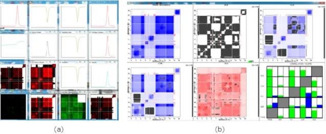
decompositions, and several other parameters used in system functions. Preprocess-ing includes extractPreprocess-ing features (described below) and distance calculations. The interface consists of a control panel, an overview to display the entire data set, a fea-ture window to examine selected plots, a detailed analysis window to perform closer examination, and a clipboard to carry plots of interest throughout analysis (Figure 22). The interface with allosteric response data is shown in Figure 22(a)-(d).
Co-Figure 22: (a) MDS, Sorting, and Jigsaw layout space. (b) Clipboard. (c) Detail window. (d) Control panel. (e) Single cooperativity correlation measure. (f) Multi-ple correlation metrics after alignment. Black lines represent ”gaps” inserted by an alignment algorithm. When multiple metrics are included, users can filter the display by metric type.
37 operativity correlation measures are shown in Figure 22(e) and aligned cooperativity correlation measures with multiple metrics are shown in Figure 22(f). In the case of aligned measures and multiple metrics, users can view the entire data set with all metrics available or filter the data set to one metric through a drop-box selection.
WaveMap [3] allows scientists to begin with the entire data set and continuously refine their analysis to individual residues. The workflow is shown in Figure 23. The first step in this process is to extract features by wavelet analysis. Extracted features are visually presented to users to help them locate global trends or local areas where trends are interrupted. Subtle trends that are hard to discover in the original data become visible in the feature space. To study parameter influence, a set of plots in the original data or extracted features can be viewed in a clustering or sorting layout from which global trends across parameter sets, as well as clusters and outliers of
plots can be observed. Users can interactively retrieve groups of interesting plots so that further examination and comparison can reveal the relationships among residues and parameters. Features can be filtered based on their type and magnitude and are intuitively mapped to the original data. The feature window allows examination of interesting regions for a subset of interesting plots. The detail window facilitates co-ordinated, residue-level analysis among multiple plots. In every view, specific regions for given parameter sets can be exported for insight management and exchange. The framework is now discussed.
4.1 System Components 4.1.1 Feature Extraction
Wavelet lifting [82], [37] is first applied to extract varying plot features at many resolutions. During each application to a discrete, two dimensional signal (or decom-position), the data is separated into the high and low frequency components. The result is a series of four data matrices each of which is one-quarter the size of the original data matrix. The results include the high frequency components in both directions (HH), low frequency components in both directions (LL), low frequency along rows and high frequency along columns (LH), and high frequency along the rows and low frequency along columns (HL). One of the components is chosen to be fed to the input of the next stage and the process repeats.
Wavelets come in varying families and can be designed to extract desired features [83]. A lifting implementation of the widely-applied Debauchies 4 wavelet [37] is the starting point chosen here but other wavelets can be used. Because the data is
39 halved along the rows and columns during each application, the original data set is linearly interpolated so that each row and column is a power of two. (It should be noted that the suggestion given by domain analysts for handling sequences with gaps was followed. Their suggestion was to remove any row or column across the data set if one protein or parameter set had a gap inserted.) The interpolated data is only used in application of the wavelet algorithm and is never visible to the user. After each decomposition during wavelet analysis, any given feature represents a larger neighborhood in the original data. Feature magnitude can be mapped to color so that the degree of change between adjacent locations can be visually represented. The components, or subbands, and the characteristics emphasized in the data that are important for our work are illustrated in Figure 24 and include
• LL: Averages along rows and columns
• LH: Averages along rows and differences along columns • HL: Differences along rows and averages along columns • HH: Differences along rows and columns
It may seem that the total amount of data has been significantly increased because each original data plot is now represented by four different subbands. However, each decomposition results in each subband being only one-quarter of the input data size. Additionally, the subbands and multiple levels of resolution produced are different perspectives of the original data. This allows experts to choose the appropriate prism through which domain knowledge can be applied.
Figure 24: During a wavelet iteration four data matrices are produced, each one-fourth the size of the input matrix. Each resulting matrix contains features representing different data characteristics.
Figure 25 illustrates how features for each subband emphasize various character-istics present in cooperativity correlation flexibility plots for a TRX protein [59]. Each index is the correlation between two flexibility measures for two rotation an-gles. The top row is the original data and the bottom row is the transformed data after wavelet analysis and filtering. Original plot values (top row) are displayed with the red-white-blue scheme currently in use by domain scientists. The features for all subbands except for the averaging features (LL), use a different color scheme because features capture the change occurring between plot regions and not the original plot values. We chose a feature color scheme ranging from green (negative changes) to white (no change or below a threshold) to orange (positive changes). The red-white-blue scheme was kept for the averaging features because they visually relate original data information at varying resolutions (25(c)). In Figure 25(a) coarse-grain behav-ior along rows is preserved and differences along each column are detected so that general residue behavior is preserved along the rows but changes in residue behavior between adjacent column are detected. Figure 25(b) shows the detection of changes
41
Figure 25: Three cooperativity correlation plots [49], [59] depicting the correlation of flexibility changes. Original correlation values are shown on the top row. Blue indicates co-rigid regions and red indicates co-flexible regions. The data after wavelet transformation (3 decompositions) are on the bottom row and corresponding regions are bounded in red. Orange highlights positive correlation changes and green high-lights negative correlation changes in all except the last pair. (a) Row patterns are preserved while indicating changes along columns. Because this data set is symmet-ric, the LH and HL subbands are redundant. Only the LH subband is shown here. (b) Areas of change along both rows and columns are detected. (c) Coarse-grain characteristics are preserved for the entire data set.
along both rows and columns revealing where residue behavior changes from adjacent residues in both the row and column direction. Figure 25(c) preserves coarse-grain behavior in both directions. Although the features highlighted in the top row are easily detected and represent symmetric data, such features can be much harder to detect in other datasets without the help of the transformed data. An application to the asymmetric and much more subtle allosteric response data is discussed later.
4.1.2 Overview
After feature extraction, either the original values or the features can be displayed in the overview. Original data plots and extracted feature plots can be browsed with a MDS layout (Figure 26), a jigsaw layout (Figure 27), or according to similarity based sorting. MDS allows viewers to interpret data similarity as visual distances [9], [14]. Plot size can be interactively reduced to minimize overlap. The jigsaw layout [89], [92] allows users to examine plot clusters and outliers without overlap. It is a grid layout where similar plots are placed close to each other and boundaries among clusters of similar plots can be detected. Sorting enables users to examine similarity in relation to a selected plot. MDS, jigsaw, and sorting configurations depend on whether the original or feature plots are chosen. If features are explored, the MDS, jigsaw, and sorting layouts can futhermore depend on the subband and level of decomposition chosen. Providing access to all subbands and decomposition levels allows users to view the plot arrangement or the features which detect desired characteristics and simultaneously reducing the number of points being considered. Users have much flexibility when setting display properties. The data can be displayed according to features but display the original plot values. Likewise, the data can be viewed according to the original values but display features.
When parameter set labels are turned on, analysts can see if a relationship ex-ists between any parameter sets and if any parameter combinations result in out-liers. WaveMap [3] has the ability to read a set of filenames with the format ParameterTypeA-ParameterTypeB-ParameterTypeC (format of the allostery data
43
Figure 26: Clustering features for a section of the MDS layout. The HH subband after 2 decompositions identifies places of change along both rows and columns while simultaneously reducing the number of data points. the data is separated into areas with plots having many points of change (left side of each layout) and plots with fewer points of change (right side of each layout).
Figure 27: Clustering features for a section of the jigsaw layout also showing the HH subband after 2 decompositions.
file names)and then dynamically count the number of variants per type, up to 16 variants per type. The user can then choose through the interface which parameter type to apply border highlights. Figure 28 illustrates this functionality. Figure 28(a)
Figure 28: Parameter variants in (a) and (b) are evenly distributed and mixed. Pa-rameter variants in (c) generally cluster by type. Clusters are identified in (d) and show varying degrees of consistency.
shows that variants of the first parameter type are evenly mixed. The variants of the second parameter type in 28(b) are mixed but seem to exhibit more consistency than 28(a). Variants of third parameter type shown in Figure 28(c) show even more consistency. In the third parameter type, each color represents a variant of an entropy parameter referred to as d-nat. The three possible values are 0.4 (red), 0.8 (blue), and 1.2 (green). Figure 28(d) indicates that some of the 0.4 items cluster in a small homogeneous cluster (far right), a less homogeneous cluster with mostly one other color (center), and a very heterogeneous cluster (far left). Domain analysts reported that the configuration confirmed their suspicions that the data set would at least
45 roughly cluster by this variable.
Many interactions exist for the overview display. They include filtering, decompo-sition level and subband change, searching, selection, and drawing.
Filtering. Features within plots can be filtered according to a user-defined threshold changed by buttons that trigger incremental increases or decreases or by direct entry into a textbox. Thresholding allows only the most important features to be shown by eliminating plot items that have an absolute value less than the user-defined value. Entire plots can also be filtered by metric type through a drop-down box.
Decomposition Change. The decomposition level is changed through a slider giving smooth transition between various levels of resolution. Decomposition values are propagated to feature exploration to aid in view continuity.
Subband Change. The feature type displayed can be changed through a drop-down box.
Searching. Individual plots can be located by entering the protein-metric combination. Found plots are highlighted in bright green.
Selection. Any plot left-clicked in the main display will be shown with greater detail in the context window. A middle-mouse click on a plot will add the plot to the clipboard. The clipboard is used to maintain an evolving list of interesting plots to be investigated further.
Figure 29: Drawing a line on the plot in the detail window reveals the residues at the line location along with the plot coordinates and residue name abbreviations.
Drawing. Detailed residue information is always available. Drawing a hori-zontal line on the plot in the context window displays corresponding residue flexibility/correlation colors and residue name abbreviations (Figure 29).
4.1.3 Feature Exploration
After viewing and selection, features can be examined in detail. Users can either view all proteins for a single metric or a mixture of protein-metric combinations that have been placed on the clipboard. A coordinated lens Figure 30(a) allows users to view the averages (LL) at the current decomposition level as the user sweeps over the features. The LL subband was chosen to be the center of the lens so that as sweeps are performed, users can associate features with the original values at the given level of decomposition.
Reconstruction (Figure 30(b)) further extends the effective and efficient association of extracted features with the original values. In this system, users are allowed to
47
Figure 30: (a) A coordinated lens allows simultaneous examination of multiple plots while relating features to the original data. (b) Reconstruction further bridges the feature and original data. Coordinates are marked in the large plot showing the original data and in the context window. A bounding box marks where the features occur in the data before transformation. Coordinates are propagated to the detail view.
select a plot and then manually inspect features. Navigation is through directional buttons and users can choose to visit each feature or snap to features with values above the threshold. Once a feature is accessed, the original data values responsible for that feature value are bounded in the context window and in a resizable plot in the main display. Bounding box size increases along with the number of decompositions reflecting a decrease in the number of features present but an increase in neighborhood size. Boundary conditions can be problematic in wavelet analysis and developing techniques to appropriately deal with this case is an active area of research beyond the scope of this work [11], [27]. However, an initial step towards informing the user of boundary effects has been incorporated into this system by filling the reconstructed
bounding box that falls outside of the plot with gray.
Once a feature is visited, plot coordinates of the bounding box are displayed in the main display and in the context window. Main display coordinates represent absolute coordinates for that particular plot before any gaps are inserted during alignment. Coordinates in the context window reflect the bounding box origin relative to gaps inserted by alignment algorithms. Gaps are included in the context window bounding box so that plot coordinates for the entire data set can be normalized. The normalized coordinates are propagated to the next view for detailed analysis across multiple proteins.
4.1.4 Detailed Analysis
Once a subset of protein plots are placed on the clipboard, the chosen plots are available for detailed analysis (Figure 31). In this view, a column segment is shown for each protein. For raw flexibility values, each column is one rectangle wide. For correlation measures, each segment is composed of two horizontally adjacent color rectangles that represent the correlation values of the two rotation angle pairs for each residue in the column. Any inserted gaps appear black. The current column and row numbers are shown to the left of the series of correlation cells. Exploration in this view can begin at the plot origin or from the context coordinates propagated from the previous view. After a suitable beginning point is found, residue columns are navigated by directional buttons or by entering known coordinates into text fields so that a detailed sweep across selected plots can be performed. Clicking in each column sends the entire plot to the context window and a vertical green bar indicates current
49
Figure 31: Detailed analysis occurs for a column section across multiple plots. Left, right, up, and down buttons facilitate navigation during reconstruction and detailed analysis.
plot location. Removing an item from the clipboard removes it from the display and allocates the extra space to the remaining column segments. Normalization in this view only includes clipboard plots and is recalculated as plots are added and removed. Users can also toggle residue name abbreviations to further connect alignment information with correlation values.
4.2 Scenario
We now present an example scenario that illustrates how WaveMap [3] can be utilized for better understanding of flexibility data. It specifically highlights the utility of our approach in detecting a small but significant area among a set of similar allostery response plots. A good reason for performing such analysis is to find model parameter sets which result in similar overall response but exhibit a small difference
Figure 32: (a) A section of the Jigsaw layout is identified for further analysis based on similar global features (2 decompositions). A known plot is highlighted in green. (b) Closer examination of features reveals noticeable differences. Circled regions indicate a point of difference in one parameter set (lower right).
which could explain subtle variations in behavior. The data set used in the example represents flexibility response measures from the CheY [58] protein.
A protein scientist pre-selects a set of parameters (ie a plot) which exhibit a desired global behavior. The analyst suspects that other parameter sets globally similar to the selected plot have differences which may explain subtle variations in behavior. However, the values and residue region resulting in this behavior are unknown. The analyst searches for the known plot in the overview by entering the identifier into a search box and it is highlighted in green. Places of flexibility trend changes within this parameter set indicating possible differences are difficult to locate in the con-text of other similar plots. The analyst moves the slider which changes the level of decomposition and examines the resulting features (Figure 32(a)).When the wavelet features are displayed after two levels of decomposition and after the elimination of features having a small magnitude, the analyst sees a pattern of interest within the known plot indicating the changes in flexibility. He/she uses the Jigsaw layout [89],
51
Figure 33: (a) The coordinated lens reveals the pattern that the features emphasize. (b) A larger view of the lens shown for clarity.
[92] and identifies several adjacent plots with similar features to the known plot to ensure global similarity (Figure 32(b)). The group of plots are placed on the clipboard for further examination.
After pruning the parameter sets, the analyst proceeds to the feature exploration window. In this window, the analyst easily compares corresponding regions of the selected plots with the help of the coordinated lens (Figure 33). It is confirmed that the feature plots are similar but have noticeable differences. Of particular interest is the feature present in all but the bottom, far-right plot in Figure 32(b). The coordinated lens (33(a) and 33(b)) reveals that the area of interest highlights a sharp change in flexibility (a small blue section in the middle of red) except for the one parameter set.
To more accurately define the region of difference, the location is visited (Figure 34(a)) and the residue numbers marking the area of change are revealed. The coordi-nates are propagated to the detail analysis window (Figure 34(b)) and the differences in response can be mapped to the specific residue numbers. The analyst can now
![Figure 4: A sample of different wavelet families provided by a toolkit in MATLAB [53]](https://thumb-us.123doks.com/thumbv2/123dok_us/11060082.2992752/21.892.160.803.103.566/figure-sample-different-wavelet-families-provided-toolkit-matlab.webp)
![Figure 8: Contact map [86] color coding hydrophophic interactions, electrostatic interactions, and hydrogen bonds.](https://thumb-us.123doks.com/thumbv2/123dok_us/11060082.2992752/25.892.296.675.103.468/figure-contact-coding-hydrophophic-interactions-electrostatic-interactions-hydrogen.webp)
![Figure 9: Component plane array for feature vector distribution from a self-organizing map [77].](https://thumb-us.123doks.com/thumbv2/123dok_us/11060082.2992752/26.892.228.746.111.521/figure-component-plane-array-feature-vector-distribution-organizing.webp)
![Figure 10: The four protein structures [63]. The primary structure consists of amino acids and influences the upper level structures.](https://thumb-us.123doks.com/thumbv2/123dok_us/11060082.2992752/29.892.172.793.111.834/figure-protein-structures-primary-structure-consists-influences-structures.webp)

![Figure 25: Three cooperativity correlation plots [49], [59] depicting the correlation of flexibility changes](https://thumb-us.123doks.com/thumbv2/123dok_us/11060082.2992752/51.892.162.805.105.561/figure-cooperativity-correlation-plots-depicting-correlation-flexibility-changes.webp)