C
O
L
U
R
O
C
COLOUR CODED
Edited by Carinna Parraman
at The Centre for Fine Print Research University of the West of England Bristol, BS3 2JT
www.uwe.ac.uk/research/cfpr
Published by the Society of Dyers and Colourists, PO Box 244, Perkin House, 82 Grattan Road, Bradford, West Yorkshire, BD1 2JB, England. www.sdc.org.uk
ISBN 978-0-901956-93-4
Printed by The Ark Design & Print Pudsey Business Park
47 Kent Road Leeds, LS28 9BB
www.thearkdesign.co.uk
A catalogue record for this book is available from the British Library
Colour Coded key:
(The subjects contained in each paper are illustrated using the following key) measurement / image quality
architecture / landscape
culture / communication / history
new materials /chemistry /nanotechnology
conservation / heritage
illumination / lighting
print /reproduction /subtractive colour mixing
HDR /multispectral /additive colour mixing /display art / design / painting
education
Introduction
Carinna Parraman and Alessandro Rizzi, CREATE: building a multi-disciplinary project in
Europe
Colour History
Arne Valberg, From Colour perception to neuroscience. A historic perspective on colour vision
Claudio Oleari, A concise history of the chromaticity diagram, from Isaac Newton to the CIE
observer
Daniele Torcellini, The history of the colour reproduction of artwork
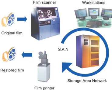
Colour and Film
Kieron Webb, Colour and the restoration of motion picture fi lm Orsola Silvestrini, Dead ends of colour in Italian cinema
Chaker Larabi, Cinema; moving towards all digital
Majed Chambah and Alessandro Rizzi, Perception based digital motion picture restoration and quality evaluation
Colour Measurement and Appearance
János Schanda, A colour space based on advanced colour matching functions
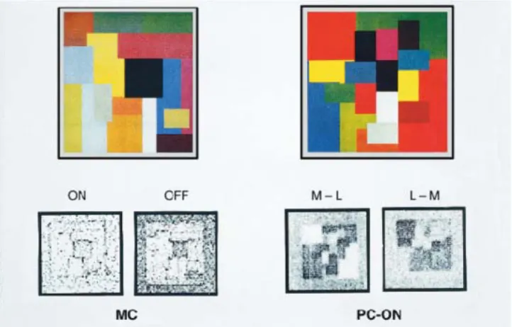
John J. McCann, Vassilios Vonikakis, Alessandro Rizzi, Carinna Parraman, Report on the 3-D colour Mondrian project: refl ectance, illumination, appearance and reproduction Cecilia Sik-Lányi, Lights and colour in virtual reality
Vien Cheung and Stephen Westland, Evaluation of colour-correcting lenses
Serge Berthier, Nanophotonics in nature and art: a brief overview.
Colour and Restoration
Diane Kunzelman, Pictorial restoration: techniques of integration of paint losses and their evolution to the present day
Susanna Bracci and Marcello Picollo, UV-Vis-NIR spectroscopic characterisation of glass
Colour in Print
Mary McCann, Interrogating the surface
Ondrej Panak, Printing techniques - what is beneath
Steve Wilkinson, How secondary process can enhance print
Colour Communication
Robert Hirschler, Colour communication in industry from design to product - with special emphasis on textiles
Tien-Rein Lee, Colour association in Chinese culture – colour-selection based on the fi ve-element
Wuxing system
Nathan Moroney, The many mispellings of fuchsia
Conclusion
Reiner Eschbach, Enjoy your misfortunes
Picture Credits
Anna Bamford, Julie Caves, Alison Davis, Rahela Kulcar, Ondrej Panak, John Hammersley, Kristine Grav Hardeberg, Paul Laidler, Melissa Olen, Carinna Parraman, Alessandro Rizzi, Vassilios Vonikakis, Eli Zafran
page 232 page 242 page 256
page 263
page 275
page 290
CREATE: building a multi-disciplinary project in Europe
Carinna Parraman, Alessandro Rizzi
Centre for Fine Print Research, University of the West of England, Bristol, UK
Dept. di Informatica per la Comunicazione, Università degli Studi di Milano, Italy
Introduction
The aim for the coordinators of the CREATE project over the last four years has been simple, yet the objective and the journey have been challenging: how to communicate and exchange theories and ideas on colour? Colour is a vast and complex subject that impacts many sectors in so many different ways. Yet, the majority of research into colour is usually undertaken in single subject areas, in for example, art, psychology, colour science, physics, chemistry, design, architecture and engineering. The challenge of CREATE was to address the increasingly complex questions through interdisciplinary dialogue and practice. The long-term objective of the project was to address a broad range of themes in colour and to develop with artists, designers, technologists and scientists a cross disciplinary approach to improving colour communication, education and to provide a forum for dialogue between different fi elds.
Now at the end of the funding programme, a range of experts have contributed to this dialogue by writing about their subject for this publication. The title Colour-Coded, and the colour coding on the chapter pages, aims to demonstrate the crossovers between disciplines and how colour can be considered from a multi-dimensional perspective, that benefi ts both the arts and sciences.
The development of a cross-disciplinary European network
In 2006, through funding from the European Union, CREATE, (Colour Research for European Advanced Technology Employment), was established . The group came together to promote and exchange research and knowledge through a series of conferences and training courses to an emerging generation of young researchers in colour.
The organising group was composed of: the University of the West of England, Bristol (UK); the
and image quality, young researchers had access to experts of the highest calibre. The aim was to foster potential mobility opportunities for research thus expanding and enhancing the knowledge-base and skill-sets of European researchers, industrialists, academics and SMEs.
The motivation for the EU Marie Curie Actions is to encourage young people to become researchers, for researchers to become research active and to build successful research careers. A further objective is to assist in their mobility to travel, meet and to share knowledge with other groups. Based on the MC Actions, the aims of the group CREATE was:
• to develop a pan-European network of training projects and to bring together European colour groups; • to exchange and disseminate knowledge through specialist conferences;
• to enable researchers, especially those at an early stage in their career, to benefi t from the knowledge of experts in the fi eld of digital colour and its applications through a programme of 7 events;
• to enable the researcher to develop not only links outside their own research centre but to create a cross disciplinary dialogue with peers and experts across Europe;
• to provide a forum for dialogue between different fi elds, to create new insights to an idea or problem; • to facilitate the dissemination of cutting-edge research to the commercial and industrial sector and improve economic growth through new collaboration and knowledge transfer;
• to foster a robust research network beyond just the time-frame of the funding programme; • to assist and develop networks and contacts in order to help build future research portfolios particularly for early career researchers.
Programme content
The CREATE project assisted in the development of research ideas between speakers and
researchers, including European colour groups working in the arts and the sciences, and a subsequent exchange and dissemination of knowledge. As new researchers applied for the training events, a new injection and diversifi cation of ideas evolved. The priority therefore was to maintain a balance between delivering knowledge and providing time and space for new ideas and research opportunities to occur.
The programme of events began and ended with a large conference, showcasing the range of subjects and expertise of the participants. The fi rst conference, entitled ‘Collaborate - Innovate – Create’, was held at the School of Creative Arts, UWE Bristol, September 2007, and the last was held at Gjøvik University College, Norway, June 2010. In between have occurred a series of carefully themed skills-based workshops, lectures, and poster sessions. These were hosted by different universities: Training Course 1: ‘Putting the Human Back into Colour’, Charleville-Mézières, Ardennes, France, February 2008
‘On Paper...’, University of the West of England, Bristol, England ‘On Fabric...’, University of Ulster, Belfast, Northern Ireland
Training Course 4: ‘Communicating Colour’, University of Pannonia, Hungary, May 2009
Training Course 5: ‘Colour Heritage and Conservation’, Università Degli Studi Di Milano, Italy, October 2009
Conference 1, Bristol, 17th -21st September 2007
The fi rst conference was held in Bristol 2007. The objective for this event was to bring together a research community that included young researchers, more mature researchers and experts to share, discuss, teach, and build on the particular expertise. The objective for the conference was for participants to gain an introduction to new areas of research, to establish a network and facilitate dialogue. Moreover, the intention was also to set a programme framework that provided coherence for all the subsequent training events. The focus of the programme was to facilitate dialogue between the researchers, and therefore, as well as formal lectures, a range of sessions were included to bring the group together to encourage participants to talk and exchange ideas. It was certainly agreed the range of speakers covered a wide area of expertise, from arts, commerce, science and technology and achieved the
multi-disciplinary perspective that was expected. The key-note speakers Reiner Eschbach - ‘Image Reproduction - An Oxymoron!’, and John McCann - ‘The Interaction of Art, Technology and Consumers in Picture Making’ demonstrated a balanced and stimulating perspective on the arts and sciences. They also provided a context to the project, which underpinned the strategies for the future training courses, which were the multidisciplinary approaches to colour, and to expand the fi eld that could lead to advances in technology. A brief description of the training events are provided here:
Training Course 1, Charleville Mézières, France, 21st-24th February 2008
The theme of the event was an investigation of the human side of colour, which included anthropology, entomology, psychology, linguistics and emotional responses to colour. A range of speakers considered how the human processed colour, how the brain responded to natural images, perception of colour and texture. Speakers also presented their ideas on the relationship between colour and creativity, the phenomenology of colour in art, an analysis of colour in paintings, in textiles and fashion and gastronomy.
Training Courses 2 and 3, Bristol and Ulster, 14th-22nd October 2008
analysis, print quality and image quality; inkjet technologies and requirements for the user: industrial, commercial, museum sector, fi ne art textiles; chemistry of inks, dyes, pigments, print-head and printer development, paper and media.
Training Course 4, Hungary, 19th-23rd May 2009
This event presented research on colour standards, colour theories and methods of communicating colour, the use of colour in architecture, display colour and more unusual aspects such as fl uorescent paints used in the theatre. The event included workshops and discussion sessions, which addressed problems relating to the conceptual aspects of colour, colour naming, teaching, profi ling, communication, marketing, advertising, arts, and pedagogic research.
Training Course 5, Italy, 19th -24th October 2009
The event highlighted the vital need for the continuation of our cultural heritage. Speakers discussed how digital techniques, digital colour management and processing were becoming increasingly important. Research was presented on recent digital techniques used for the data acquisition, collection, restoration, presentation and preservation of coloured artefacts: paintings, sculpture, glass, textiles, works on paper and fi lm. Subjects included, methods for non-invasive capture of paintings and ancient artefacts;
preservation of colour, inkjet, paintings, fi lm digitalisation techniques and standards and digital movie and picture restoration.
Conference 2, Norway. 8th -11th June 2010
The fi nal conference was held at Gjøvik University College, Norway. The event was open to researchers in all fi elds related to colour in the arts and sciences. As part of the submission procedure, all
participants were requested to submit a full presentation of between 2500-3000 words. A range of submissions were encouraged and accepted: scientifi c, theoretical, or a submission that contained images of the artwork. The objective for the event was to showcase the range of work that had evolved during the four-year programme and to refl ect on the quality of research that was being undertaken by researchers.
Research training environment
The methodology developed and utilised during the programme involved a range of teaching and training methods with the objective to gradually increase participant involvement. Each event comprised lectures, demonstrations, led discussion sessions, workshops, mentoring, poster sessions and many
(2010), the participants’ involvement by far exceeded that of the invited lecturers. For the majority, the notion of presenting to an audience was a daunting task, and a variety of methods were employed to increase participation and improve confi dence. The following section provides an outline of the methods used to deliver training and improve networking and collaboration.
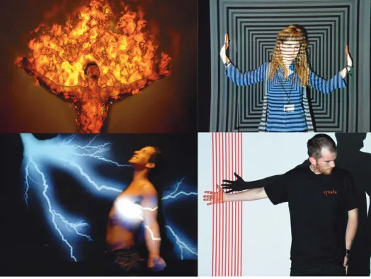
Fig. 1 Participants attending lectures and workshops (left) demonstration by Lindsay MacDonald on mixing coloured light, TC4, Pannon University, Hungary, ‘Communicating Colour’, (middle)TC2 ‘On Paper...’, University of the West of
England, Bristol and (right) TC3 ‘On Fabric...’, University of Ulster, Belfast
Demonstrations
Throughout the events we benefi ted from a wide range of experts who delivered high quality lectures on colour; a full list of speakers can be found in the archives http://www.create.uwe.ac.uk/archives.htm. The demonstrations and experiments were the preferred methods of training by participants. Furthermore, the opportunity to gain experience through experimentation and to be able to refl ect and discuss their experiences was also crucial to the learning environment. For example, Lindsay MacDonald in Hungary demonstrated theories using a range of lighting equipment and fi lters to show different colour
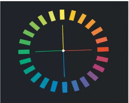
phenomena (TC4, 2009). Robert Hirschler led a demonstration and practical workshop on the
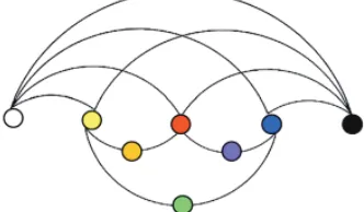
understanding of the different colour terms. The NCS tutorials were used. The objective was to improve participants’ skills in estimating the hues of colours by arranging colours samples in a colour circle (fi gure 1).
a microscopic examination of prints to gain a better understanding of the characteristics of different printing processes, ink and paper. Participants with different backgrounds worked in pairs at the microscopes to develop their understanding of the materials. At Ulster, lectures, interlinked
demonstrations and workshops expanded on the potentials of working with a range of stitch and print technology. The workshops involved creating digitally engineered print designs for textile and wearable products, and experimenting with colour manipulation of the designs (fi gure 1).
Exhibitions
An exhibition was launched to coincide with the training events in October 2008 (TC 2 and 3). All participants were invited to take part in a photography exhibition entitled, ‘Colour and Landscape’ (fi gure 2). The online exhibition showed all the works from this exhibition and also showcased 2D and 3D works on paper, fabric and on other materials from staff and colleagues from the Centre for Fine Print Research, (UWE, Bristol), and INTERFACE, at the Centre for Research in Art, Technologies and Design, (Ulster). The exhibition is available to view online.
The opportunity for discussion was also considered by participants as fundamental to gaining an understanding of the research of their peers and how research methods, terms and ideas could be transferred across disciplines. Although discussion sessions were included at all events, these sessions began to take on more importance and prominence as the events progressed. This will be discussed in more detail later in this paper.
Researcher poster sessions
At all events, the researchers were required to present a poster on their research projects, to discuss their ideas and to participate in workshops and discussion groups. All poster sessions were mandatory throughout the conferences and training courses. The posters served to provide a visually stimulating presence and a physical impact at the venue. Posters were usually displayed throughout the event and breaks were served in the same area. A signifi cant period of time was dedicated to discussing the posters and research ideas. Poster sessions provided an informal setting for mentoring, knowledge exchange and networking. As the programmes continued, different hosts experimented with different approaches. We began by allocating half the group red dots and the other half green dots; one group presented to
the other group and then exchanged. At the Ulster event, participants were given fi ve minutes to each present their poster. A similar approach was employed in Italy. During the poster sessions in Italy each researcher delivered a fi ve-minute presentation to a small group, so that by the end of the week, all had presented their poster. These smaller group presentations proved to be more successful as the audience were more likely to ask questions. In Norway, as well as the larger more informal poster session, we adopted a one-minute spotlight presentation. This was a very useful exercise for researchers to present their ideas with clarity and brevity.
Researcher presentations
artworks and the developments in technology that have changed our perception of colour reproductions. Giorgio Trumpy co-ordinated a workshop on the ‘2-dimensional digital imaging of artworks: general aspects and the issue of colour accuracy’, during which the other participants were required to evaluate the colour accuracy of their digital cameras.
In Norway, the number of researcher’s presentations equalled the number of invited experts.
Furthermore a 400 page conference proceedings containing all the research participants was published. The proceedings can be accessed as individual papers, which are listed alphabetically by author:
http://www.create.uwe.ac.uk/submit_nor.htm, or as a complete publication: http://www.create.uwe.ac.uk/create_gjovik_proceedings.pdf.
Discussion sessions
Discussion sessions have been an important factor of the programme. At the fi rst conference in Bristol, discussion sessions were held in groups and led by lecturers and members of the management
committee. As the discussion sessions progressed, participants were increasingly motivated to contribute, to critically refl ect on the progress of the programme, to debate on colour issues, and to highlight gaps
in the fi eld of colour research. In the discussion sessions at the Bristol event (TC2, 2008), participants Brigit Connolly (Royal College of Art - Ceramics & Glass), and Markus Reisinger (University of Technology Delft, & Philips Research Europe) were asked to present and lead discussion groups.
During the Italian event (TC5), informal discussion sessions were initiated during the evenings to develop collaborative ideas. Also during the Italian event, with the benefi t of being surrounded by potential collaborators, researchers were asked to form small groups in order to generate new or develop existing research ideas. It was suggested that these new collaborative ideas might also be useful to begin applying for trans-national funding applications. During the week, the groups were divided onto their self-assigned research groups and more lengthy discussion sessions were undertaken so that aims and objectives could be formed. The results were presented during larger group discussions. The overall objective for these sessions was to make the project sustainable; making applications for further funding would be crucial to maintaining a robust network.
Collaborative art projects
Fig. 3 Collaborative art project, Norway, June 2010
conceptual motivation was to refl ect on the identity of the CREATE group and to observe how
Continuing the colour discussion
The objective for continuing the CREATE group through a website was to maintain the momentum and enthusiasm generated at each of the training events. This has been primarily through the CREATE website, www.create.uwe.ac.uk, which delivers programme information, abstracts and biographies prior to an event and post event as an archive. The archive contains presentations, lecture notes and photos of discussion and poster sessions, social events and workshops. Many of these photos are taken by
CREATE members. The website also contains news of other events and useful links. The CREATE website, hosted by UWE, Bristol is the primary source of information for all delegates. It has proven to be widely accessed, including visits from non-EU countries, ranging from Japan to west coast USA.
Postscript event
A small training event was held in Bristol (25th - 30th October 2010). The format of the week was very different to previous CREATE events. The week comprised extended workshops of 2 - 5 hours and a critical refl ection, a discussion on the event and the previous events. The workshops included colour mixing with pigments, mixing colours from memory, photography and image quality, print, illumination and appearance, lighting installation, and colour naming. The majority of these sessions were led by research-ers in the group. There was also plenty of time allocated to discuss their own research projects, research directions, ideas and motivations, and was repeated over the week.
Conclusion
This chapter has presented a snapshot of the 4-year CREATE project. Young researchers had
opportunities to listen to and work with some of the most signifi cant experts in the fi eld of colour, to meet and network with other researchers, to present their research through formal presentations and poster sessions, and, participate in exhibitions, workshops, experiments and discussion groups. By the time the fi nal conference ended in June 2010 in Norway, CREATE had trained about 400 researchers with the assistance of about 100 experts. Many have gained PhDs, started new jobs, or developed their research careers. The CREATE network has enabled them to develop links with peers and experts across Europe and has provided a forum for dialogue between different fi elds. This project could be considered as unusual as it has been a dedicated forum for the dissemination of postgraduate research.
Student participation, interaction and their motivation for the future will continue to be a vital element to the success of future CREATE projects. Based on Marie Curie Actions, the aim is to fund the mobility and training of a new group of researchers, and to assist in their future choices, development and
confi dence to develop new research ideas through collaboration and professional practice. It is expected that from the establishment of new cross-disciplinary groups, novel ideas will be formed to develop innovative research projects for the future.
Acknowledgements
My sincere thanks goes to the CREATE administrator Alison Davis.
Management committee 2006-2010: Carinna Parraman, Alessandro Rizzi, Stephen Westland, János Schanda, Cecília Sikné Lányi, Karen Fleming, Maria Vanrell, Majed Chambah, Ivar Farup, Jon Yngve Hardeberg, Ming Ronnier Luo.
CREATE collaborative art project: Julie Caves, Vasileios Kantas, Janet Best, Carinna Parraman, Melissa Olen, Ian Gibb.
October 2010 Re-CREATE group: Sophie Adams-Foster, Janet Best, Clotilde Boust, Julie Caves, Daria Confortin, Mojca Friskovec, Jussi Kinnunen, Rahela Kulcar, Albrecht Lindner, Lisa Mittone, Naila Murray, Dimitris Mylonas, Markus Reisinger, Birgit Schulz, Aditya Sole, Elza Tantcheva, Jean-Baptiste Thomas, Giorgio Trumpy, Vassilios Vonikakis.
Special thanks go to John and Mary McCann and Reiner Eschbach for your continued support.
Figure captions to training events on page 13. Clockwise from top left:
From colour perception to neuroscience
Arne Valberg, Norwegian University of Science and Technology, Norway
Abstract
Throughout history there have been different approaches to pursuing a better understanding of colour and colour vision, depending on the phenomena one wanted to explain. Isaac Newton analysed the spectrum and performed extensive studies of colour phenomena as expressions of physical-optical processes. The three-colour theory of Young-Helmholtz and the opponent-colours theory of Ewald Hering illuminated different aspects of colour perception. With the assistance of James C. Maxwell, who investigated the tri-variance of colour matches, the three-colour theory eventually became reduced to a three-receptor theory. While the original three-colour theory, based on the primary colours red, green, and violet, was a blind alley, the three-receptor theory became most successful. It provided the theoretical foundation for the CIE XYZ-system and an advanced colour technology. Hering postulated opponent physiological processes as basis for the two pairs of the elementary colours yellow-blue and red-green. These processes later became associated with the activity of cone-opponent cells in the retina and the lateral geniculate nucleus of primates. However, today there is a general agreement that colour neither resides in the receptors, nor in the cone-opponent cells. In view of the insuffi cient correlates between the activity of cone-opponent cells and the perception of the elementary hues, one may ask if colour perception is distributed over several brain areas or if there is a specifi c and still undisclosed colour centre.
Introduction
For about 100 years, up to the end of the 20th century, the trichromatic- and the opponent-colour theories of colour vision challenged each others validity. Both were based upon observations and experiments, although of different kinds. Here we shall see how they developed and how they may be reconciled. Modern neuroscience has a good understanding of the three-receptor theory that developed from the trichromatic theory, but the opponent theory still lacks the fi nal neural correlates.
Newton and the spectrum
physical stimulus for seeing colour. Newton arranged the appearance of the spectrum into seven regions of different hues, or in seven sectors on a colour circle.
Fig. 1 Hue circle
The three-colour theory and the three-receptor theory
he continues: “... (The essence of Young’s hypothesis) is that the sensations (Empfi ndung) of colour are imagined as composed of three mutually and completely independent processes in the neural substrate”. This quotation makes it clear that the Young-Helmholtz theory was originally a three-colour theory, dealing with qualitative perception. As such, this theory encountered strong opposition from Ewald Hering and his adherents, who preferred the opponent - or four-colour theory.
Fig. 2 (left). Distribution of cone receptors.(no rods and no S-cones in the central fovea) (Valberg 2005). Fig. 3 (right). Colour measurement as relative receptor excitations L, M, and S
It is not clear to what extent Maxwell agreed with Helmholtz on this. His extensive experience with colour matches had led him to the insight that every set of three independent primaries could serve as primaries in colour matches. He wrote “...The theory [...] assumes the existence of three elementary sensations by combination of which all the actual sensations of colour are produced. I will show that it is not necessary to specify any given colours as typical for these primary sensations. Young has called them red, green and violet; but any of the three colours might have been chosen, provided that white resulted from their combination in proper proportions” (Maxwell, 1970/1856). Helmholtz, however, seems to have accepted Young’s choice of red, green, and violet, even if he commented that Young’s choice of primary colours was somewhat arbitrary (Helmholtz, 1910/1860). Tri-variance was a fact, but its explanation in the three-colour theory was too simple. A confi rmation of tri-variance was not a suffi cient support of Young-Helmholtz three-colour theory, and the confusion was great (Le Grand, 1968).
appearance. Thus we limit ourselves to infer that equal excitations of the same three receptor types (in the same retinal location) imply equal colour impressions. This principle is the very foundation of the XYZ-colour space of the CIE- system for colour measurement. Cones play a necessary, but incomplete role in the perception of colour qualities. What was earlier a three-colour theory has thus become a three-receptor theory. Recent unexpected evidence in support of a restricted role of cones in colour perception comes from a study of Hofer et al. (2009) where different colours could be evoked by stimulating single cones with the same photo pigment. The important factors here seem to be the composition (number and spacing) of cone types surrounding the one that is stimulated, as well as its connection to the ganglion cell receptive fi elds. The same cone may contribute to the receptive fi elds of more than one ganglion cell.
Around 1960 Edwin H. Land (1959) presented some spectacular demonstrations of approximate colour constancy, and the scientifi c discussion of colour vision theories took a new course. The three-colour theory of Young-Helmholtz was attacked by Land, although this time from a different angle. His two-colour projections had shown that a surprising rich gamut of colours could be produced in the projections by using only two colours. Deane B. Judd (1960) set things straight by pointing out that Land’s demonstrations were vivid illustrations of well known facts about simultaneous colour contrast, where the appearance of a coloured surface depends on the colour of its surround. This phenomenon cannot be explained on the receptor level. The similarity of Land’s later Retinex theory (Land, 1983) with the von Kries cone adaptation hypothesis confi rmed that a three-receptor theory was restricted to explaining colour matches. Neither it, nor its predecessor, the three-colour theory, could, as Helmholtz had believed, account for perceptual qualities of colours. It looks like Land, in his criticism of Helmholtz, got caught in the same trap.
The opponent-colours theory
the distinction between excitation and sensation, the controversy between Hering and Helmholtz would seem unnecessary, provided that Helmholtz had also accepted it. In his late “more tangible” reformulation of Young’s idea, where he compared nerve fi bres with telegraph wires, Helmholtz (1896, pp. 349-350) went a long way to do just that. However, the personal animosity between the two giants of colour science made a reconciliation impossible (Howard, 1999).
In the 1950s, the American psychologists Dorothea Jameson and Leo M. Hurvich revived Hering’s ideas through extensive hue cancellation experiments (see Hurvich, 1981). In their view, unique yellow, for instance, can be used as an expression for the brain being in an equilibrium state between a ‘red’ process and a ‘green’ process. This idea strikes one as being fundamentally different from the notion that yellow is the result of an additive mixture of red and green lights. The same reasoning would apply to white.
Zone theories
Before neuroscience had developed tools to directly measure the activity of single cells in the retina and the visual pathway, or the spectral sensitivity of cones themselves, there were many attempts to establish theories based on psychophysical data. In 1925 Erwin Schrödinger showed that simple, linear forms of the three- and four-colours theories could, in principle, be compatible as different properties of the same three-dimensional vector space, and, as such, applicable to different levels of the visual system (Schrödinger, 1925). In the 1950s this, and similar zone theories that combined trichromacy and opponency (see below), proved useful in explaining the outcome of the original quantitative psychophysical experiments carried out by Jameson and Hurvich (Hurvich and Jameson, 1955).
Deane B. Judd (1951) provided a summary of such zone-theories in Steven’s Handbook of Experimental Psychology. Of the many theories that tried to account for both receptor level processing and later, opponent processing, the theory of Müller (1930) stands out as the most ambitious. Like many of the other theories, Müller’s had an initial three-receptor stage and a fi nal neural chromatic-opponent and white-black stage (Hering). However, unlike the other zone theories Müller’s introduced a second retinal chromatic and achromatic stage. He also distinguished between Hering’s unique colour opponency and other opponent processes that were at play in adaptation and chromatic induction.
Neuroscience and correlates
Further quantitative data were gathered at the end of the millennium, in Otto Creutzfeldt and Barry B. Lee’s laboratories at the Max Planck Institute for biophysical Chemistry in Göttingen, Germany. Our recordings from opponent cells in the retina and lateral geniculate nucleus (LGN) of the macaque monkey (macaca fascicularis) led to a physiological model of colour vision that could account for several colour phenomena and psychophysical data (Valberg et al., 1986a; Lee et al. 1987) For instance, psychophysical thresholds often corresponded with the threshold sensitivity of the most sensitive cells. Moreover, colour differences, the Bezold-Brücke effect, and colour scaling correlated with relative fi ring rates. Both threshold and supra-threshold scaling data were nicely reproduced by a neural network model combining six different types of opponent cells (Valberg, 2001). In this computational model, the magnitude of the combined responses (fi ring rates) of the opponent cells is regarded as vector-lengths in an opponent colour diagram and constant colour strength (chroma) would be equivalent to a
constant vector length from the white point. When colour purity changes, a constant ratio of fi ring rates (responses) between cells with different opponencies, corresponds closely to a perception of constant hue. Deviation from this ratio accounts for the Abney effect. As the luminance of a chromatic stimulus increases, the magnitude and ratio of fi ring rates of orthogonal opponent cells change as expected for the Bezold-Brücke phenomenon when hue and chroma are combined (Valberg et al, 1986a; 1991). These are examples of how one can use computational neuroscience to analyse an abundance of psychophysical and neurophysiological data on colour perception in order to establish quantitative correlates.
New experimental techniques
The rapid development of computational neuroscience, together with new experimental techniques, have shed new light on retinal as well as cortical processes. For instance, studies using adaptive optic techniques have given new insights into the causes of red-green colour vision defi ciency. By correcting for the optic aberrations of the eye, this technique makes it possible to visualise the individual cones with a much greater spatial resolution than before. In combination with selective chromatic adaptation, it is possible to recognise the identity of each of the three cone types in the retinal mosaic (Hofer et al., 2005). Such studies have revealed that a genetically conditioned red-green colour vision defi ciency can be caused either by a missing pigment being replaced by another one (e.g the L-pigment is replaced by the M-pigment with no reduction in the number of cone receptors), or that a pigment type (let us say M) is replaced by a non-functional pigment. In the latter case, the retina will have blind spots where the functional pigment is absent (Carroll et al., 2004).
treatment, the monkey could distinguish colours that had been invisible before treatment. We are likely to hear more about this revolutionary fi nding in the future.
About 30 years ago one found that visual cells with opponency between L- and M-cones belonged to a separate, parvocellular (PC) pathway from the retina to the brain. Less than 15 years ago one found that opponency between S-cones and a combination of L- and M-cones, belonged to another, koniocellular (KC) pathway (Martin et al., 1997). Both these pathways contribute to colour vision, whereas another magnocellular (MC) pathway with cells that add inputs from L- and M-cones does not. MC-cells respond very fast and have a high contrast sensitivity, and they are thought to determine the luminous effi ciency function, V( ), of the human eye (Lee et al., 1987). Light stimuli with a luminance above the threshold for detection of MC-cells, but below the threshold of PC- and KC-cells, have a colourless, achromatic appearance. It has therefore been speculated that MC-cells can contribute to the perception of white (Hofer et al., 2005).
After the discovery that S-cones have their own pathway from the retina, via LGN to the cortex, much time has been devoted to studies of cells with S-cone inputs. Until recently, there were only a few fi ndings of cells with S-cone inhibition, and one had started to doubt that they could play a signifi cant role in colour vision. However, this doubt seems now to have been removed (Valberg et al., 1986b; Dacey and Parker, 2003; Tailby et al., 2008). Cells with inhibitory S-cone inputs discriminate well between stimuli along a white-yellow dimension, something the PC-cells with L- and M-cone opponency cannot do. Cells with excitatory S-cone input discriminate well between colours along a white-blue dimension.
The majority of cells in the primary visual cortex (area V1) show responses to contours and achromatic contrasts. They are relatively insensitive to changes in chromatic colours, but there appears to be a high concentration of colour sensitive cells in the so-called blobs in area V1. Colour sensitive cells in the V1 blobs show other colour preferences than cells in LGN (Wachtler et al., 2003; Solomon and Lennie, 2007; Conway, 2009) which is strange since they get their inputs from the LGN. Cells in the blobs project to the thin stripes in area V2 (Livingstone and Hubel, 1984; Sincich et al., 2007).
Challenges
Fig. 4 (Left) MC-cells respond to contours. (Right) PC-cells respond to wavelength distributions
This would consist of correlating the qualitative nature (qualia) of colours with neural responses, for instance their arrangement in a perceptual colour space like the Natural Colour System (NCS). A few such studies have already demonstrated correspondence between, for instance, the ordering of hues on a colour circle and a sequence of what might be colour-specifi c cells in the thin stripes in area V2 (Xiao et al., 2003).
Zemir Zecki has suggested that area V4 is specialised for colour vision, whereas more recent
[image:26.539.83.444.32.263.2]However, the relevance of these cells for colour vision needs to be better demonstrated. For instance, it remains to prove that the responses of “colour cells” change in parallel with the changes that occur in colour perception under simultaneous- and successive colour contrast. When, for example, the same physical stimulus changes its colour from red to green during simultaneous contrast or chromatic adaptation, a true “red-coding cell” must stop fi ring and another “green-coding cell” take over. Such cells must in addition respond with colour constancy when the colour of the illumination changes whereas the colour of the illuminated surface remains the same (as in Edwin Land’s demonstrations of colour constancy). We do not know how to reconcile such colour contrast effects with cone-opponency, neither at a low- nor at a higher level in the brain. Is it possible that colour qualia are brought to life by an interplay between units at several levels of the visual pathway?
Conclusion
The different paths from perception to neuroscience that I have sketched here can be described as following one of three main routes:
We have considered colour matching and the laws of additive colour mixture that result from the three-receptor hypothesis. This route deals further with thresholds, colour discrimination, and colour adaptation (Brindley’s class A experiments). Ideally, such experiments concern only the identity or non-identity of two perceptive properties and the physical and physiological conditions that lead to the same perception (Brindley, 1960).
The second route deals with colour perception, including the order and scaling of colours in colour systems (Hering’s approach). Attributes like hue, saturation, and lightness/brightness, chromatic content, white and black, are the properties of colours that are in focus here (such as scaling of attributes in the colour systems of Ostwald, NCS, Munsell, etc.; Brindley’s class B experiments).
A third route, which is more demanding and may prove impossible to travel, is investigating the relationship between neural activity and the uniqueness of qualia, such as the immediately experienced qualities of colour (e.g. the perception of redness), unique hues, and other qualitative perceptual
phenomena that can be appreciated by top-down models. Communication and science require a language where perceptual qualities and processes are substituted for symbols and logic. Therefore, it is important to realise which limitations the scientifi c method imposes on the treatment of qualia (Brindley’s class A experiments) and to admit that the origin of qualitative colour features is still an enigma. Here lies a challenge for the future.
Acknowledgements
References
BRINDLEY, G.S. (1960). Physiology of the Retina and the Visual Pathway. London: Edward Arnold. CARROLL, J., NEITZ, M., HOFER, H., NEITZ J. & WILLIAMS, D.R. (2004). Functional photoreceptor loss revealed with adaptive optics: An alternate cause of color blindness. Proceedings National Academy of Sciences of the USA, 101, 8461-8466.
CONWAY, B.R. (2009). Color vision, cones, and color-coding in the cortex. The Neuroscientist 15, 274-290.
DACEY, M. D. & LEE, B.B. (1994). The blue-ON opponent pathway in primate retina originates from a distinct bistratifi ed ganglion cell type. Nature, 367, 731-735.
DACEY, M. D. & PACKER, O.S. (2003). Color coding in the primate retina: diverse cell types and cone-specifi c circuitry. Current Opinion in Neurobiology, 13, 421-427.
DA VINCI, L. (1906). A Treatise on Painting. English translation by Rigaud, J. F. & Bell, G. London: New edition by Hetzfeldt, M., 1925.
DE VALOIS, R. (1965). Analysis and coding of color vision in the primate visual system Cold Spring Harbour Symposia on Quantitative Biology, 30, 567-579.
GEGENFURTNER, K.R & KIPER, D.C. (2003). Color vision. Annual Review of Neuroscience, 26, 181-206. GRASSMANN, H. (1853). Zur Theorie der Farbmischung. Poggendorffs Annalen Physik, 89, 69-84. HELMHOLTZ, H. VON (1911). Handbuch der Physiologischen Optik, Vol. 2, 3rd edition. Hamburg: Voss. This edition of Vol.2 is based on the original edition from 1860.
HELMHOLTZ, H. VON (1896). Handbuch der Physiologischen Optik. 2nd revised edition. Hamburg and Leipzig: Voss.
HERING, E. (1920). Grundzüge der Lehre vom Lichtsinn. Berlin: Springer.
HERING, E. (1964/1920). Outlines of a Theory of the Light Sense. Translated by L. M. Hurvich and D. Jameson. Cambridge, Mass.: Harvard University Press.
HOFER, H., SINGER, B. & WILLIAMS, D.R. (2005). Different sensations from cones with the same photopigment. Journal of Vision, 5, 444-454.
HOWARD, I.P. (1999). The Helmholtz-Hering debate in retrospect. Perception 28, 1-8.
HURVICH, L.M. & JAMESON, D. (1955). Some quantitative aspects of opponent-colors theory. II. Brightness, saturation and hue in normal and dichromatic vision. Journal of the Optical Society of America, 45, 602-616.
HURVICH, L. M. (1981). Color Vision. Sunderland, MA: Sinauer.
JUDD, D. B. (1960). Appraisal of Land’s work on two-primary color perceptions. Journal of the Optical Society of America, 50, 254-268.
KAISER, P. K. & BOYNTON, R. M. (1996). Human Color Vision. 2nd edition. Optical Society of America: Washington D.C.
KOMATSU, H. (1997). Neural representation of color in the inferior temporal corex of the macaque monkey. In The Associative Cortex – Structure and Function (Ed. H. Sakata, A. Mikami, J. Fuster). Amsterdam: Harwood Acad.
LAND, E.H. (1959). Color vision and the natural image. Del I and II. Proceedings of the National Academy of Sciences of the USA, 45, 115-129 and 636-644.
LAND, E.H. (1983). Recent advances in retinex theory and some implications for cortical computations: color vision and the natural image. Proceedings of the National Academy of Sciences of the USA, 80, 5163-5169.
LEE, B.B., VALBERG, A., TIGWELL D. A. & TRYTI, J. (1987). An account of responses of spectrally opponent neurones in macaque lateral geniculate nucleus to successive contrast. Proceedings of the Royal Society of London, Series B, 230, 293-314.
LEE, B.B., MARTIN, P.R. & VALBERG, A. (1988). The physiological basis of heterochromatic fl icker
photometry demonstrated in the ganglion cells of the macaque retina. Journal of Physiology, 404, 323-347. LEE, B.B. (1991). Die Universität Göttingen und die Entstehung der Farbenlehre. MPG Spiegel 3(91), 11-15.
LE GRAND, Y. (1968). Light, Colour and Vision. London: Chapman and Hall, p.430.
LIVINGSTONE, M.S. & HUBEL, D.H. (1984). Anatomy and physiology of a color system in the primate visual cortex. Journal of Neuroscience, 4, 309-356.
MANUSCO, K., HAUSWIRTH, W.W., LI, Q., CONNOR, T.B., KUCHENBECKER, J. A., MAUCK, M.C., NEITZ, J. & NEITZ, M. (2009). Gene therapy for red-green colour blindness in adult primates. Nature, 461, 784-288.
MARTIN, P.R., WHITE, A.J.R., GOODCHILD, A.K., WILDER, H.D. & SEFTON, A.E. (1997). Evidence that the blue-on cells are part of the third geniculocortical pathway in primates. European Journal of Neuroscience, 9, 1536-1541.
MAXWELL, J.C. (1970/1856). Theory of the perception of colours. Transactions of the Royal Scottish Society of Arts, 4, 394-400, 1872. Printed in D. L. MacAdam (Ed.) Sources of Colour Science, pp. 63-64. Cambridge, MA: MIT Press.
MAXWELL J.C. (1970/1872). Theory of the perception of colours. Transactions of the Royal
Scottish Society of Arts, 4, 394-400, 1872. Printed in D. L. MacAdam (Ed.) Sources of Colour Science, pp. 75-83. Cambridge, MA: MIT Press.
MIESCHER, K., HOFMAN, K.-D., WEISENHORN, P. & FRÜH, M. (1961). Ueber das natürliche Farbsystem, Die Farbe, 10, 115-144.
of Colours and Vision. London: Drapers Hall.
MÜLLER, G.E. (1930). Ueber die Farbempfi ndungen. Psychophysische Untersuchungen. Leipzig: Barth. NEWTON, I (1979/1704). Optics. New York: Dover. (First published in 1704).
SCHRÖDINGER, E. (1925). Ueber das Verhältnis der Vierfarben- zur Dreifarbentheorie. Sitzungsberichte der Akademie der Wissenschaften, Wien IIa (134), 471-490.
SINCHICH L. C., JOCSON, C.M. & HORTON, J.C. (2007). Neurons in V1 patch columns project to V2 thin stripes. Cerebral Cortex, 17, 935-941.
SOLOMON, S.G. & LENNIE, P. (2007). The machinery of colour vision. National Review in Neuroscience, 8, 276-286.
STOCKMAN, A & SHARPE, L.T. (2000). The spectral sensitivities of the middle- and long-wavelength sensitive cones derived from measurements in observers of known genotype. Vision Research 40, 1711-1737.
TAILBY, C., SOLOMON, S.G. & LENNIE, P. (2008). Functional asymmetries in visual pathways carrying S-cone signals in macaque. Journal of Neuroscience, 28, 4078-4087.
TRENDELENBURG, W. (1943). Der Gesichtssinn. Berlin: Springer.
VALBERG, A., SEIM, T,.LEE, B.B. & TRYTI, J. (1986a). Reconstruction of equidistant color space from responses of visual neurons of macaques. Journal of the Optical Society of America, A3, 1726-1734. VALBERG, A., LEE, B.B. & TIGWELL, D. A. (1986b). Neurones with strong inhibitory S-cone inputs in the macaque lateral geniculate nucleus. Vision Research, 26, 1061-1064.
VALBERG, A., LANGE-MALECKI, B. & SEIM, T. (1991). Colour changes as a function of luminance contrast. Perception 20, 655-668.
VALBERG, A. (2001). Unique hues: An old problem for a new generation. Vision Research, 41, 1645-1657. VALBERG, A. (2005). Light Vision Color. Chichester: Wiley & Sons.
VALBERG, A. & Seim, T. (2008). Neural mechanisms of chromatic and achromatic vision. Color Research & Application, 33, 433-443.
VON KRIES, J. (1905). Die Gesichtsempfi ndungen. Handbuch der Physiologie des Menschen. (W. Nagel red.; pp. 109-282). Braunschweig: F. Vieweg und Sohn.
WACHTLER, T., SEJNOWSKI, T.J. & ALBRIGHT, T.D. (2003). Representation of color stimuli in awake macaque primary visual cortex. Neuron, 37, 681-691.
XIAO, Y., WANG, Y. I. & FELLMAN, D. J. (2003). A spatially organized representation of colour in macaque cortical area V2. Nature, 42, 535-539.
WIESEL, T.N. & HUBEL, D.H. (1966). Spatial and chromatic interactions in the lateral geniculate body of the rhesus monkey. Journal of Neuroscience, 29, 1115-1156.
A concise history of the chromaticity diagram,
from Newton to the CIE observer
Claudio Oleari, University of Parma, Italy
Abstract
Colour reproduction can be undertaken in two ways: fi rstly by a visual matching based on recipes; secondly by a numerical matching based on colour measurements. The fi rst way dates back to the beginning of time. The second approach begins with Sir Isaac Newton (1704), who made the fi rst chromaticity diagram, based on a law, named the centre of gravity rule. This diagram is circular, and is useful for the reproduction of colours by the mixing of coloured lights. The same technique is used today, although with contemporary mathematics and measuring instruments. For over 150 years, Newton’s original theories were diffi cult to understand. New mathematics and knowledge of the physiology of vision were necessary to fully comprehend and apply his ideas. Throughout the eighteenth century very few people understood Newton, many were in opposition, but, in spite of this fact, the ideas at the basis of colour reproductions in prints were empirically defi ned in this century by Jakob Christoffel Le Blon, and applied practically by Jacques Fabian Gautier d’Agoty, who created fascinating and informative prints of the dissected human body. A proper understanding of Le Blon’s technique was achieved in 1924 by M. E. Demichel and further developed by Hans E. J. Neugebauer in 1937, who used Newton’s centre of gravity rule on the updated CIE 1931 chromaticity diagram. The physiological understanding of the colour vision process was an intuition of George Palmer (1777) and developed by Thomas Young (1802) who postulated three kinds of “fi bres” as transducers of the visible lights in colour sensations.
In 1852-1853 Hermann Günther Grassmann mathematically formalised Newton’s rule on mixing of coloured lights by means of geometrical representation (the mathematical tools used by Grassmann were developed by him in 1844 and are the ideas of modern linear vector spaces).
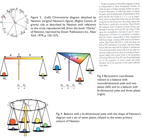
Fig. 1 Newton’s experimental apparatus for studying of the compounds colours of spectral lights (from the original fi gure of Newton).
Working from the ideas of Young, Grassmann and Helmholtz, James Clerk Maxwell (1857) fi rst assigned numbers to the chromaticity diagram, after which it was possible to measure colour, and to precisely specify the mixing of coloured lights. The chromaticity diagram was referred to as three laboratory primary spectral lights, placed in the corners of an equilateral triangle.
The chromaticity diagram we use today, defi ned on the experimental data of W. David Wright and John Guild, was standardised by the “Commission Internationale de l’Éclairage” (CIE) in 1931 under the guidance of Dean B. Judd. Following a fascinating idea of Ervin Schrödinger (1920), the reference frame is imaginary (i.e. it is not related to physical lights or to photoreceptor activations) and the colour luminance enters as a reference axis. After more than two centuries, Newton’s centre of gravity rule can be understood and applied with simple equations. (Mollon, 2003; Wright,1944)
Newton and the gravity rule
Since Isaac Newton’s “New Theory About Light and Colour” (1671), to the “Colorimetric Standard Observer” (1931) by the “Commission Internationale de l’Éclairage” (CIE), 260 years have elapsed. A great length of time has been dedicated to the understanding Newton’s intuition on colour. Moreover, it was necessary to invent new mathematics to defi ne a linear vector space, and to realise a deeper understanding of the physiology of the human visual system. This long history is covered here in a very concise way, with the intent to stress the high computational value of the Newtonian novelty.
particular colour. Colours are not Qualifi cations of Light, ..., but original and connate properties, which in divers Rays are divers.”. (Newton, 1672/72)
Once the novel theory of the Experimentum Crucis was generally accepted, Newton presented an empirical basis for his geometrical representation of compound colours (Newton, 1730). Let us fi rst describe the optical apparatus used to study the coloured light compounds (fi gure 1). The light source is a beam of sunlight, which enters a room through a hole in the window. This beam of white light is fi rst dispersed by a prism into seven Primary Colours (Red, Orange, Yellow, Green, Blue, Indigo, Violet) and then, by using a lens and a second prism, recombined into a beam of white light. The amounts of primary lights from the initial beam can be modulated by introducing a comb with teeth of different lengths on a plane close to the lens and orthogonal to its optical axis, where the spectral dispersion of the light has his maximum. The teeth subtract light to coloured beams, which, crossing the lens MN and the prism DEG, exit into a recombined and coloured beam with changed spectral modulation. The dispersion by a third prism is required to check the preservation of the spectral modulation, after its recombination. “In a mixture of Primary Colours, the Quantity and Quality of each beam given, to know the colour of the Compound” is defi ned by a very original geometrical construction, termed the “Centre of Gravity rule”. The rule, fi rst presented by Newton, was diffi cult to fully understand and put in to practice for more than 150 years. This rule is graphically described through the use of a circle and its original description is in fi gure 2.
In order to fully understand Newton’s novel concept for producing compound coloured lights, which is represented by the centre of gravity rule, let us use an example of mixing two coloured lights of red and yellow as demonstrated in fi gure 3 (overleaf). Here the bar shows all the colours obtainable by mixing two coloured lights in variable ratios. At point Z of the bar there corresponds a ratio Wa/Wb, where
Wa and Wb are the amounts of the two lights to create the colour mix. The arrangement of the colours
on the bar can be such that any colour subdivides the bar into two segments with lengths a and b, that we fi x proportional to Wa and Wb, respectively. The bar can be considered as the yoke of a balance, on whose plates are placed two weights equal to the amounts Wa and Wb. Of course, by defi nition,
Figure 2. (Left) Chromaticity diagram sketched by Newton (original Newton’s fi gure). (Right) Centre of gravity rule as described by Newton with reference to the circle reproduced left (from the book “Oticks” of Newton, reprinted by Dover Publications Inc., New York 1979, p. 155-157).
Fig. 3 Barycentric coordinates related to a balance with monodimensional yoke and two plates (left) and to a balance with bi-dimesional yoke and three plates (right).
[image:35.539.34.508.22.486.2]Four independent lights do not exist, therefore the colour of any light is matched by a mixture of three independent lights. Hence the name trichromacy. Newton’s Centre of Gravity rule represents this property. The circular graphic arrangement of colours as shown in Newton’s fi gure 2 can be considered as the bi-dimensional yoke of a balance (fi g. 4), on whose plates is placed a weight equal to the amount of spectral light entering the mixture. In this case, a colour, represented by the equilibrium point Z, is obtained in a simplifi ed way by mixing seven non indpendent spectral colours, that Newton calls “primary”, but we should consider a continuous set of spectral lights positioned on the border of the circle.
The centre of gravity rule is graphically represented by Newton as a colour circle. This circle is not only a colour wheel, but is an early interpretation of the 19th century chromaticity diagram as produced by Helmholtz (fi g. 9), Maxwell (fi g.11) and in 1931 standardized by CIE (fi g.14). The content of this rule is extraordinary, because:
a) the same equilibrium point Z (as shown in fi gure 2 and 4) can be obtained by different mixtures of spectral colours (today, this phenomenon is called metamerism)
b) equal amounts of spectral lights at the ends of any circle diameter produce white light. Today, these pairs of spectral lights are called complementary lights. The existence of pairs of complementary spectral lights was not experimentally established until the middle of the 19th century by Helmholtz (Helmholtz,1924):
i) Christian Huygens (1673) said that “two colours alone (yellow and blue) might be suffi cient to yield white.”
ii) Newton wrote, (1671/72) “There is no one sort of Rays which alone can exhibit” whiteness. White “is ever compounded, and to its composition are requisite all the aforesaid primary colours.” (1704) “if only two of the primary colours which in the circle (fi g. 2) are opposite to one another be mixed in an equal proportion, the point Z shall fall upon the centre O and yet the colour compounded of these two shall not be perfectly white, but some faint anonymous colour. For I could never yet by mixing only two primary colours produce a perfect white. Whether it may be compounded of a mixture of three taken at equal distance in the circumference.”
a) The angular positions of the spectral lights (primary colours) on the colour circle were erroneously placed in relation to the musical notes and not to the exact colour complementarities, which were not yet verifi ed.
b) Only spectral lights are placed on the external border of the wheel, therefore all the magenta hues, obtainable by variable mixings of red and violet primaries, are not considered.
c) A circular shape is only an ideal approximation, because any radiometric measurement was impossible for Newton.
Solutions were found to these open problems after the middle of the 19th century. The centre of gravity rule holds true for light compounds, not for pigment mixtures. Although Newton was very clear, this has been misunderstood by many people. Let us return to Newton’s description of the circle in fi gure 2: “…it is such an orange as may be made by mixing an homogeneal orange with a white in the proportion of the Line OZ to the Line ZY, this Proportion being not of the quantities of mixed orange and white Powders, but the quantities of the Lights refl ected from them.”
Material colours and impalpable colours in the eighteenth century
[image:37.539.187.353.314.411.2]Before Newton, the colour mixing rule was related to material colours, as produced by pigments and dyes. Its origin lies in the medieval ages and was synthetically represented by François d’Aguilon (1613) in his sketch as shown in fi gure 5. (Aguilon, 1613). He considered that white and black (i.e. light and dark) were “primaries”, and yellow, red and blue were the basic or “noble” hues, from which all other colours were derived.
Fig. 5 François d‘Aguilon’s material colour-mixing theory (1613)
defi ned by Jakob Christoffel Le Blon, who has to be remembered for his outstanding book entitled “Coloritto: or the Harmony of Coloring in Painting Reduced to Mechanical Practice” (Le Blon, 1725). Le Blon’s work clearly stressed the distinction between “material colours” and “impalpable colours”, as illustrated in the fi rst page of his Coloritto (fi gure 6). Le Blon also understood the important role of a black ink plate in addition to his existing red, blue and yellow colour plates, and could be considered as demonstrating an early four-colour printing. In all probability, the best and most fascinating prints of that century based on this process were made by Jacques Fabian Gautier d’Agoty. These prints are of didactical sections of the human body (fi g. 6). A proper understanding of this technique started only two centuries later, in 1924, with M. E. Demichel to conclude in 1937 with Hans E. J. Neugebauer, who used the updated Newton chromaticity diagram.
Physiological intuitions to the complete understanding of the centre of gravity rule
The physiological understanding of colour vision was suggested by George Palmer (1777), who thought there existed in the retina of the eye “three kinds of particles” (fi g. 7), “and each of these particles is Fig. 6 (left) From “Coloritto: or the Harmony of Coloring in Painting Reduced to
Mechanical Practice” written by Jakob Christoffel Le Blon. (right) Jacques Fabian Gautier d’Agoty, Anatomie generale des viscères en situation, de grandeur et couleur naturelle, avec l’angeologie, et la nevrologie de chaque partie du corps
humain, Paris (1752) http://www.nlm.nih.gov/exhibition/historicalanatomies/ gautier_home.html
moved by his own ray”. This deep intuition of Palmer was discussed by Thomas Young (1802), who postulated the existence of three kinds of “fi bres” as transducers of visible lights in colour sensations. “The human eye is capable of three distinct primitive sensations of colour, which by their composition in various proportions, produce the sensations of actual colours in all their varieties.” This intuition was confi rmed physiologically in 1950 by Gunnar Svaetichin. Only around fi fty years later was it possible to combine this physiological intuition with the Newton chromaticity diagram. This model with three kinds of transducers confi rmed the Trichromacy and assumed the same name.
Hermann Günther Grassmann in 1852-1853 mathematically formalised Newton’s theory by
geometrically representing the mixture of the light colours. The mathematical tools as developed and presented by Grassmann in 1844 are the foundation of the modern linear vector spaces.
Around 1852, Hermann Ludwig Ferdinand von Helmholtz undertook his studies on colour vision: in particular the subject of complementary colours. He was able to confi rm the existence of continuous sets of complementary spectral lights according to Newton’s centre of gravity rule, particularly: “It was found that the colours from the red to green-yellow were complementary to colours ranging from green-blue to violet, and that the colours between green-yellow and green-blue have no homogeneous complementaries, but must be neutralized by mixtures of red and violet” (fi g. 8 left). This phenomena induced Helmholtz to transform Newton’s circle into a half-moon like shape (fi g. 8 right), where the red light is connected to the violet light by a straight line, whose points represent purple or magenta colours (Helmholtz, 1924).
The next step was undertaken to combine the chromaticity diagram with Young’s hypothesis of three transducers. This step was made by two scientists in different ways.
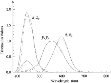
Helmholtz produced a sketch of a diagram in the reference frame that, after Arthur König (1886), is called fundamental. Helmholtz supposed that any spectral light excites together and in different amounts the three kinds of fi bres postulated by Young. These excitation curves with the corresponding chromaticity diagram, obtained by applying the centre of gravity rule, are reproduced in fi gure 9 (1866). The three barycentric coordinates related to the equilateral triangle containing the chromaticity diagram represent the activations of the three kind of “fi bres”. Now, these activations may be considered as components of vectors in a three-dimensional space. A perspective view of this space (fi gure 9 right) shows that the Chromaticity Diagram is a fi gure obtained by the intersection of the vectors, representing “fi bre” activations, and a conventional plane.
Fig. 9 Colour-Matching Functions (left), corresponding Chromatic Diagram (centre) as sketched by Helmholtz (original fi gures) and a perspective view of the tristimulus space with the plane of the chromaticity diagram (right).
James Clerk Maxwell (1855) made extensive experiments on the additive mixture of colours by
Fig 10. Fig. 11
Fig. 10 Maxwell’s original fi gure of the spinning disks. A radial cut in the coloured disks allows to put the disks on the same centre and a rotation of one disk with respect the other defi nes the size of the circular sectors, and hence the
amount of colours to be mixed.
Fig. 11 Colour-Matching Functions (left) and corresponding Chromatic Diagram as measured by Maxwell (original fi gures).
Fig. 12 Tristimulus space with “fundamental” reference frame according to Helmholtz (left) and with “laboratory”-reference frame according to Maxwell (rights). A linear transformation exists between these two “laboratory”-reference frames. In the two spaces, the coloured axes, that represent the three “standard” lights of Maxwell, and the thick black line
the amounts of lights in any matching. The combination of these two equations at any wavelength gives the spectral sensitivities of the Young fi bres in the laboratory-reference frame. Figure 11 reproduces the spectral functions and the chromaticity diagram obtained by measurement with Maxwell’s wife, Katherine, as observer. All three functions have a zero crossing and where two functions are positive the third is negative. This is not a problem, as Maxwell says, because “by transposing the negative term to the other side” of the colour matching equation “it becomes positive, and then the equation may be verifi ed”. After Maxwell the centre of gravity rule was a true mathematical instrument for the colour specifi cation based on measurements of spectral lights refl ected or transmitted by coloured bodies or emitted by light sources. Any other step was a refi nement. The passage from the “fundamental” reference frame of Helmholtz to the “laboratory”-reference frame of Maxwell is represented in fi gure 12 (the words “fundamental” and “laboratory” are the words used today.)
The standard observer CIE 1931
In 1931 the Commission Internationale de l’Éclairage (CIE), under the guidance of Dean B. Judd (1933), defi ned the colourimetric standard observer, that we use today. The experimental data were of W. David Wright and John Guild. The reference frame of the chromaticity diagram CIE 1931 is not the “fundamental” and is not referred to as a “laboratory” (fi g. 12), but is referred to as a set of three imaginary primaries, whose understanding needs the introduction of luminance in colourimetry. The suggestion came from Ervin Schrödinger (1920). The colour specifi cation was completely understood and made by a vector in a space termed tristimulus space. The vector is termed tristimulus vector and its components tristimulus values. The chromaticity diagram is the fi gure obtained from the intersection of the tristimulus vectors with a chosen plane in the tristimulus space (fi g. 13). Schrödinger synthesised into the equation of a plane the relation between tristimulus values and luminance, and the luminance was written as a scalar product between the tristimulus vector and a particular direction in the tristimulus space defi ned by Exner’s weights. The intersection line between the zero-luminance plane and the chromaticity-diagram plane, that Schrödinger named Alychne (fi g. 13 and 14), was chosen by Judd as the abscissa line in the CIE 1931 Chromaticity diagram. As a last step, practical reasons induced Judd to make a suitable projection, that transforms the classical equilateral triangle into a right-angled triangle with Cartesian coordinates. The CIE 1931 Chromaticity diagram that we use today was fi nally obtained For practical reasons let us conclude by applying the centre of gravity rule as appears in the (x, y) CIE chromaticity diagram. Consider two colour stimuli and the corresponding chromaticities
Q1 = (X1, Y1, Z1) and Q2 = (X2, Y2, Z2),
Fig. 13 Perspective view of the Tristimulus space and Chromaticity-Diagram plane in the fundamental reference frame (left) and normal view of the corresponding Chromaticity Diagram (right), where the spectrum locus is specifi ed by the wavelengths of the spectral radiations and the Alychne line is drawn (Schrödinger’s original fi gures). Since the luminance is the projection of the tristimulus vector on the direction defi ned by the Exner weights, the stimuli with equal luminance belong to a plane orthogonal to such a direction, and particularly a plane of unreal colour stimuli with zero projection and zero luminance exists. “Alychne” line (right), fi rst given by Schrödinger, is the intersection line between the plane of the chromaticity diagram and the zero-luminance plane and was chosen as abscissa line in the CIE 1931 (x, y) chromaticity diagram (fi g. 14 left).
Fig. 14 CIE 1931 (x,y) Chromaticity Diagram with the mixture of two light-colours stimuli, whose chromaticities are q1 and q2, (left) and chromaticity diagram used as bidimensional balance (right). The mixture of the two stimuli with
and with W2 = (X2 + Y2 + Z2).
The sum of these two stimuli is
Q = Q1 + Q2 = (X = X1 + X2, Y = Y1 + Y2,Z = Z1 + Z2)
with chromaticity q= (x, y) with and
i.e. the chromaticity coordinates of the stimulus Q are a weighted sum of the chromaticity coordinates of the addend stimuli, where the weights are W1 and W2. All this is according to Newton’s centre of gravity rule:
• point q is internal in the segment q1q2;
• the lengths of the segments |qq1| and |qq2| satisfy the relation
|qq1| W1=|qq2| W2 , i.e. |x - x1| W1 = |x - x2| W2 , |y - y1| W1 = |y - y2| W2 , |z - z1| W1 = |z - z2| W2
The analogy with the balance is complete: point q is the equilibrium point on the balance yoke q1q2, and
W1 and W2 are the weights on