Art and Design Theses Ernest G. Welch School of Art and Design
Spring 5-10-2014
Ambiguous Space: the Research of Transparency and Shallow
Ambiguous Space: the Research of Transparency and Shallow
Space in Architecture
Space in Architecture
Yue Zhao
Follow this and additional works at: https://scholarworks.gsu.edu/art_design_theses
Recommended Citation Recommended Citation
Zhao, Yue, "Ambiguous Space: the Research of Transparency and Shallow Space in Architecture." Thesis, Georgia State University, 2014.
https://scholarworks.gsu.edu/art_design_theses/160
AMBIGUOUS SPACE
THE RESEARCH OF TRANSPARENCY AND SHALLOW SPACE IN ARCHITECTURE
by
YUE ZHAO
Under the Direction of Tim Nichols
ABSTRACT
Concepts in transparency have evolved, given the improvements in constructive
technologies, new theories in architecture, and social behavior. In this thesis, I will try to
articulate the transition in the concepts of transparency, initiating with literal and phenomenal
transparency that Colin Rowe and Slutzky discussed in their essay, Transparency, Literal and
Phenomenal and propose ambiguous space, a new understanding of transparency through current
case studies in architecture.
AMBIGUOUS SPACE
THE RESEARCH OF TRANSPARENCY AND SHALLOW SPACE IN ARCHITECTURE
by
YUE ZHAO
A Thesis Submitted in Partial Fulfillment of the Requirements for the Degree of
Master of Fine Art
in the College of Arts and Sciences
Georgia State University
Copyright by Yue Zhao
AMBIGUOUS SPACE
THE RESEARCH OF TRANSPARENCY AND SHALLOW SPACE IN ARCHITECTURE
by
YUE ZHAO
Committee Chair: Tim Nichols
Committee: Stephanie Haynie
Tim Nichols
Michael White
Electronic Version Approved:
Office of Graduate Studies
College of Arts and Sciences
Georgia State University
DEDICATION
I would like to thank all the people who helped and supported me to complete this thesis.
Thank Lixun Zhao and Jing Liu, my parents, for giving birth to me at the first place and
supporting, encouraging and believing in me throughout my degree.
Thank my friends, Chunlan Zhao, Da Chen, Lie Luo, Yingdan Zhang, for your concern,
patience, support, and experience we have had in the last three years. I am very fortunate and
ACKNOWLEDGEMENTS
A major research thesis like this is never the work of anyone alone. The contributions of
many different people, in their different ways, have made this possible. I would like to express
my sincere gratitude especially to the following.
Professor Tim Nichols, for making this thesis possible. His supports, guidance, advice
throughout this year, as well as in those two years before, are appreciated. Indeed, without his
help, I would not be able to complete the three-year program in Georgia State University.
Professor Michael White, for encouragement, insightful comments and patience. His
guidance helped me in all the time of research and writing of this thesis. Moreover, thank you for
the comment to my gallery show. I am very glad that you think it is successful.
Professor Stephanie Dawn Haynie, for her patience, motivation, and immense knowledge.
Your wisdom, knowledge and commitments inspired me to find the correct direction of the thesis.
Professor Cheryl Goldsleger, for constant concern and support, both academic and
individual. Although you are not the member of the committee, I am very honored you would
TABLE OF CONTENTS
DEDICATION ... iv
ACKNOWLEDGEMENTS ... v
TABLE OF FIGURES ... vii
INTRODUCTION ... 1
1.1. Background ... 1
1.2. Purpose of Thesis ... 2
1.3. Transparency is cubist paintings ... 2
1.4. Transparency in architecture ... 7
ARGUMENT TO TRANSPARENCY, LITERAL AND PHENOMENAL ... 13
2.1. Different Origins ... 14
2.2. Simplicity of Definition ... 16
AMBIGUOUS SPACE ... 18
CASE STUDY ... 21
4.1. Case Study 1: KAIT Workshop ... 21
4.2. Case Study 2: Musashino Art University Museum and Library ... 29
4.3. Case Study 3: Ambiguity, Gallery Exhibition ... 37
CONCLUSION ... 45
TABLE OF FIGURES
Figure 1.1 Colin Rowe and Robert Slutzky, Transparency, Literal and Phenomenal ... 1
Figure 1.2 Paul Cezanne, Mont Sainte-Civtoire ... 3
Figure 1.3 Comparison between The Clarinet Player by Picasso and Portuguese by Braque ... 6
Figure 1.4 Bauhaus, corner of workshop wing ... 8
Figure 1.5 Villa in Garches, garden facade ... 9
Figure 1.6 Villa at Garches, second floor plan ... 10
Figure 1.7 League of Nations, axonometric view ... 12
Figure 1.8 League of Nations, plan ... 13
Figure 2.1 Tatlin's tower, model, 1919. ... 15
Figure 2.2 S. R. Crown Hall, façade ... 17
Figure 2.3 S. R. Crown Hall, floor plan ... 18
Figure 4.1 KAIT workshop plan ... 22
Figure 4.2 KAIT workshop, facade ... 23
Figure 4.3 KAIT workshop interior ... 25
Figure 4.4 WAIT workshop, interior ... 25
Figure 4.5 WAIT workshop, ceiling ... 27
Figure 4.6 WAIT workshop, bird’s view ... 28
Figure 4.7 Musashino Art University Museum and Library, interior ... 30
Figure 4.8 Musashino Art University Museum and Library, first floor plan ... 31
Figure 4.10 Musashino Art University Museum and Library, concept ... 32
Figure 4.11 Musashino Art University Museum and Library, section ... 32
Figure 4.12 Musashino Art University Museum and Library, bookshelves ... 34
Figure 4.13 Musashino Art University Museum and Library, interior ... 35
Figure 4.15 Ambiguity, View from Entrance ... 38
Figure 4.16 Ambiguity, View from Back Wall ... 38
Figure 4.27 Ambiguity, Interior View ... 39
Figure 4.28 Ambiguity, Floor Plan ... 40
Figure 4.20 ambiguity, Fabrics with Different Orientations ... 40
Figure 4.21 Ambiguity, Interior View ... 41
Figure 4.22 Ambiguity, Fabrics with Different Orientations ... 43
Figure 4.23 Ambiguity, Appearance with Illuminations ... 43
INTRODUCTION
Background
In the spring of 1955, Colin Rowe and Robert Slutzky started to write an essay about the
concept of transparency in architecture. In the fall of the same year, they published the first
section of this thesis; in winter, the second section hadbeen completed, which can be seen as the
development of the first one. In the spring of 1956, Rowe and Slutzky completed the last section
of this thesis. Due to manyreasons, this essay was not published in the same year. For example,
Architectural Review agreed to publish this thesis only if the authors could delete their critique of
Gropius. However, Rowe and Slutzky refused the request. This thesis finally was published in
Perspecta, Vol. 8, the journal of architecture at Yale University in 1963. The title of this thesis
was, Transparency: Literal and Phenomenal.
[image:11.612.226.387.409.638.2]
Purpose of Thesis
Concepts in transparency have evolved, given the improvements in constructive
technologies, new theories in architecture, and social behavior. In this thesis, I will try to
articulate the transition in the concepts of transparency, beginning with literal and phenomenal
transparency and propose a new understanding of transparency through current case studies in
architecture. From these case studies, this thesis represents multiple possibilities of transparency
in current architectural projects. Further, I will introduce and discuss my installation, ambiguity,
as the conclusion of my understanding of transparency in architecture.
Transparency is cubist paintings
The history and theory of transparency take us back to the essay Rowe and Slutzky wrote
in 1956. This essay represents two different concepts of transparency in architecture, literal and
phenomenal. For explaining the different characteristics of the two concepts, the authors chose
three architectural projects designed by Gropius and Le Corbusier. In the beginning of this essay,
Rowe and Slutzky introduce both the physical and perceivable characteristics of transparency.
According to the definition in dictionary, transparency is a material condition that of being
reflected to light and air. Either transparency can be the basic physical characteristic of material,
as in curtain wall, or it can be an organization of space.1On the other hand, transparency
represents a perception that two spaces “are able to interpenetrate without an optical destruction
of each other.”2 The authors believed that transparency in architecture, however, implied more
than an optical characteristic, it implied a spatial order that connected spaces together. For
explaining these two concepts, Rowe and Slutzky researched the origins of two concepts.
1 Colin Rowe and Robert Slutzky, Transparency, literal and phenomenal, (Cambridge, MIT Press, 1963), 46.
According to their thesis, literal transparency could be tracked back to cubist paintings and
aesthetics of mechanism. However, “Our senses to phenomenal transparency probably are from
the observations to cubist paintings alone.” 3
Transparency describes not only an optical existence, but also a broader order of space.4
Because literal transparency is a definition that can be directly perceived through the senses, the
authors paid more attention to phenomenal transparency. Meanwhile, it also was the least
understood or explored idea. Robert Slutzky, as a painter and a member in charge of the painting
and color classes at the University of Texas in Austin, was familiar with art movements in the
contemporary world. He explained phenomenal transparency in cubist paintings. According to
Slutzky, The Mont Sainte-Victoire painting by Paul Cezanne is an example that highly illustrates
the characteristics of analytical cubism, frontality (parallel perspective), compression of depth,
oblique and rectilinear grids, and propensities of perspective from main figure toward
environment and minor elements. Furthermore, oblique and curved lines created a deep depth of
[image:13.612.172.442.429.642.2]
Figure 1.2 Paul Cezanne, Mont Sainte-Civtoire
field at the direction of diagonal, which combines with the parallel perspective framed by
horizontal and vertical lines. These two opposite perspectives simultaneously express the implied
order between objects, as well as produce ambiguous relations.5
It is impossible to distinguish all the related elements in the painting. However, a large
number of fragments onthe canvas implyfor observers to be conscious of the order of space.
They may see some transparent areas connecting foreground and middle ground, as well as some
translucent or even opaque areas in middle ground and background that restrain the transmission
of light. Observers are required tomovethrough the conflict between shallow and deep spaces
back and forth. After sustaining observations, observers may achieve the situation that discovers
that theplanes show“interpenetration without optical destruction”.6
From Cezanne’s painting the authors further use three groups of cubist paintings to
explain the differences between two concepts of transparency, Picasso versus Braque, Robert
Delaunay versus Juan Gris, Moholy-Nagy versus Fernand Leger. Each group contains one
painting that typically represents characteristics of phenomenal transparency. The other one
contains fewer features. The authors believe that literal transparency isa method that allows
observers to communicate with the main figure in paintings directly. While,phenomenal
transparency emphasizesthe implication of space in paintings. Through clues, for example grids
on canvas, observers use their own imagination to detect the figure concealedbehind
complicated fragments. The authorshave a standard to evaluate phenomenal transparency in
cubist paintings. This standard includes two aspects. First, what method does the painter choose
to represent the figures? In the paintings with fewer characteristics of phenomenal transparency,
the figure is represented ina relatively direct way. Alternatively, phenomenal transparency
implies the main figure with clues, with which observers use their judgment to discover the truth
behind thesurface. Anotheraspect is the number of possible waysof reading the painting. If the
painting can be read byone method alone, it can be considered as havingless phenomenal
transparency. If the painting can be read with multiple methods, we can say that the painting has
characteristics of phenomenal transparency. It also emphasizes the order and organization of the
frame, by which the grids and objects are dissociated with each other and read separately.7
Normally, we start from chaos on canvas, but end at a clear division between figure and
background. When we try to read the painting at the beginning, the grids help us to determine the
depth of field. Gradually, we start to read the content with the guidanceofthegrids. In the end,
the figure appears.
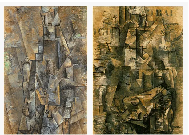
One of the three groups is the comparison between Picasso and Braque. The authors
simulated the order of observations between The Clarinet Player by Picasso and The Portuguese
by Braque. In The Clarinet Player, Picasso definesthe major figure with a strong contour.
Because of the distinct contour, observers may have the sense ofa transparent figure standing in
front of abackground. Through long observation, the views of people, gradually, areblurred by
the interspace between foreground and background. Furthermore, they may realize that there is
no depth of field in this painting. At the end, the entire image merges into an ambiguous chaos.
In summary, the order of reading The Clarinet Player is from clarity to chaos. However, Braque
uses more complicated and implicit skills with which the reading of his painting goes the
opposite way. Observers simply fallinto the ambivalence of canvas. The highly developed grids
on vertical, horizontal, and oblique directions create an ambiguous depth of field.
Figure 1.3 Comparison between The Clarinet Player by Picasso and Portuguese by Braque
Possibly, there was no depth of field at all. The figure appears only if observers observethe
image for a long time. Comparing these two paintings, Rowe and Slutzky also state that The
Clarinet Player provides one reading method alone, but ThePortuguese not only contains more
possibilities for observers, but also, “Braque provided an opportunity to read space and grid
independently”.8
The other two pairs of artists cited by Rowe and Slutzky are concerned with the
characteristics of phenomenal transparency as well, which are used to help readers to create a
general concept of phenomenal transparency. From these two examples finished in the periods
after Picasso and Braque, we are able to see that the features of phenomenal transparency run
through the whole history of cubism. Hereto, Rowe and Slutzky have stated their opinions on the
concepts of transparency, not only in paintings, but they switch to discuss their theory of
transparency in architecture.
Transparency in architecture
Architecture is different from painting, which is a form of art that exists on a
two-dimensional canvas. The third dimension in painting is implied, but spatial existence is one of
the essential characteristics of architecture.9 Therefore, architects and critics generally associate
transparency in architecture with the physical appearance of materials.10 The visual
communication between two layers in space has to be represented through glass or some other
transparent materials. However, Rowe and Slutzky are trying to prove the existence of
phenomenal transparency in architecture. By using two Le Corbusier’s projects, Villa at Garches,
and the League of Nations, these two authors explain the existence of phenomenal transparency
in architecture, as well as the features of literal transparency in the Bauhaus. The first typical
example for explaining phenomenal transparency is the Villa at Garches. Another example, the
comparison between the League of Nation and the Bauhaus campus shows the development of
phenomenal transparency in building complex and urban design.
First of all, the authors use the workshop wing of the Bauhaus to explain literal
transparency in architecture. They believe that the glass wall in this building significantly reflects
the physical characteristic of material. Unfortunately, this transparent glass wall denies all the
transitions in the space. Due to the lack of information on the surface, a simplified transparency
of overlapping planes is easily found. Although all kinds of constructional components, grids,
and furniture confuse our eyes, we are able to catch all the information precisely either on the
surface or in the interior space when we stand in front of the glass wall. We gain a similar
experience from observing traditional paintings or frescos. It is difficult to read a traditional
Figure 1.4 Bauhaus, corner of workshop wing
painting in a fresh way because we are familiar with almost everything in it. For the same reason
the development of phenomenal transparency in this building is restricted. The entire building
seems to be far away with the limitless possibilities of alternative readings.11 As a result, Rowe
and Slutzky have to look elsewhere.
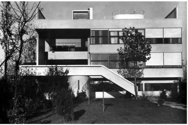
Alternatively, one of the most important functions of the horizontal windows in Villa at
Garches is to represent the planar extension of surface. As we see both the exterior and edge of
the overhanging terrace emphasize the horizontal extension of the surface. The windows,
moreover, seems to increase the perception that the façade is going to extend to an unlimited
distance. At the edge of the sidewall, the facile frames of these windows substantially reduce the
restrictions that are produced by cumbersome walls.
Figure 1.5 Villa in Garches, garden facade
Rowe and Slutzky also state the implications of these horizontal windows on the facade
of Villa at Garches. This implication guides observers to imagine the space behind the surface,
and gives them a surprise in the end. For example, through the extension of the glazing
horizontally, it implies that there is a parallel space behind the façade and it extends from one
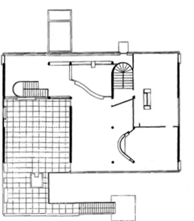
side to the other. Observers move to the second floor with the implication in mind. They
suddenly realize that the interior totally contradicts. The whole floor is divided into several
spaces in deep direction. Moreover, the architect intentionally set a curved wall to eliminate any
incorrect anticipation that users bring from the exterior. Therefore, the building forces users to
regulate their anticipations to accommodate the contradiction, back and forth; and by the
continuous corrections, the space becomes full of possibilities of alternative readings.
Alternatively, the Bauhaus seems to deny all imagination and to represent a distinct reading
method for people. Even at the edge of glass wall, we are unable to find any possibility of spatial
Figure 1.6 Villa at Garches, second floor plan
In their essay, Rowe and Slutzky explain the different selections of perspectives between
literal and phenomenal transparency. From the photos of the Bauhaus and Villa at Garches, we
can find that the perspectives have been separated into two distinct groups. In the Bauhaus,
photographers tend to choose perspectives of off-axis views, which emphasize the stability of
rhythm and unity of space. In terms of the interior space, the glass wall provides precise
information for observers. Through the transparent material, observers are able to directly realize
how deep the interior space is. On the other hand, the Villa at Garches has a totally different
condition. Photographers like to shoot this building with a parallel perspective. As we mentioned,
Bauhaus is a typical example of literal transparency that provides a distinct reading method of
the building. Photographers precisely perceive this characteristic and record it by their photos.
Villa at Garches, otherwise, brings different perceptions to photographers, who adopt parallel
perspective by coincidence. Parallel perspective represents a compressed space, in front of which
transparency is represented by the connection of a lot of compressed layers, the order of space is
definite. Despite the repeated horizontal walls, the façade on the garden side contains a large
number of clues for implying the order of space. For example, the ends of the sidewalls on the
roof and the exterior wall on the first floor stop at the same spatial layer, which keeps the same
distance to the main exterior wall on the second and third floors. This distinct order of space is
hidden in the ambiguous details, which increase the possibilities of alternative readings of this
building. In terms of the interior space, Villa at Garches adopts more abstract suggestions than
direct descriptions. Rowe and Slutzky repeatedly emphasize the importance of the horizontal
windows on the façade, not only because these windows extend the façade in a horizontal
direction, but also they have the ability to implicate the form of the interior. The continuous
windows seem to imply that there is a continuous parallel space behind the wall. However, the
implication guides observers to the wrong assumption. When they step on the second floor, the
order of the interior space will surprise them. They will find that the entire space is divided into a
couple of parallel spaces on the deep side. Finally, observers have to correct their understanding
of this building, and try to read it from an alternative angle.
Literal and phenomenal transparency also exists in an architectural complex and in urban
design. The authors used the League of Nations and the Bauhaus campus to explain the
possibilities. These two concepts mainly reflect on the order of spatial systems. Both of these
two projects contain multiple directions of extension on shapes. The difference is that there is not
a preference for a specific direction in the Bauhaus, but the League of Nations has an explicit
order of spatial layers both horizontally and deeply. Every view in the Bauhaus campus
represents the same sensation of penetration, but it is difficult to be aware of the difference
read the building. They will eventually admit that the order of space is simplified and clarified.
[image:22.612.173.442.124.323.2]However, the League of Nations represents a different possibility.
Figure 1.7 League of Nations, axonometric view
This project emphasizes the diversification of layers. For example, Le Corbusier set a
wall with repeated glazing beside the presidential box, the major space of this building. The
views of observers lead to the Secretariat and library building by the side. A newly appeared lack
of focus moves one’s vision away from the major building.12 Moreover, we easily can find that
the major axis is interrupted constantly by a series of parallel objects, such as stairs, trees, and
transverse roads. These elements neutralize the traditional impression of a public building, which
contains a spatial protagonist in the visual center, the presidential box in this case, and a deep
space. Meanwhile, these interruptions compress the depth of space, and produce a neat order of
observation. When people follow the path that Le Corbusier designed to walk through the forest,
the expectation of a grandiose main building has been counteracted by the parallel layers of the
horizontal direction. Rowe and Slutzky use a vivid metaphor to explain the difference between
the Bauhaus campus and the League of Nations. Le Corbusier’s space is a piece of crystal, while
the surface glazing in the Bauhaus gives the building a “crystalline translucence”. 13
Figure 1.8 League of Nations, plan
At the end of the essay, Rowe and Slutzky state that neither literal nor phenomenal
transparency is an inevitable component of architecture. It is also not necessarily a dogma for
analysis of any project. The purpose of their statement is to provide qualifications of space in
which phenomenal transparency is able to be possible.
ARGUMENT TO TRANSPARENCY, LITERAL AND PHENOMENAL
In summary, it has been more than 50 years since Transparency, Literal and Phenomenal
was published, and although architecture has been described by new theories, the substance of
transparency as defined by Rowe and Slutzky still maintains its importance. However, many
questions have been raised. Is the theory of transparency that Rowe and Slutzky stated absolutely
accurate? Are there any possibilities that these two authors did not mention in the essay? In this
chapter, I will state my arguments to some viewpoints existing in their theory of transparency.
First of all, we have to acknowledge that the theory of either literal or phenomenal
transparency is inclined to a method of architectural critique, instead of a methodology in design.
Although the authors chose two of Le Corbusier’s projects as the examples for explaining
phenomenal transparency, we doubt that Le Corbusier, himself, designed these two projects with
the exact same theory. It is also possible that literal transparency is the initial idea that Gropius
pursued. When we try to read architecture with the theory of either literal or phenomenal
transparency, there is a statement we need to understand. All of our conclusions derive from our
subjective determination, rather than objective existence. Furthermore, as we have mentioned
many times above, phenomenal transparency provides multiple possibilities for alternative
readings of architecture. If we are able to read architecture using multiple methods, we have to
acknowledge that Rowe and Slutzky’s theory is not the only standard for analyzing architecture.
Different Origins
Historically, we are able to find a large number of architectural projects in the same
period with Villa at Garches and the Bauhaus that contain more or fewer characteristics of literal
or phenomenal transparency. Rowe and Slutzky conclude the expanding of cubism in Europe
caused the phenomenon. However, we know that various other art styles existed in the same
period, and have the potential to be an origin of architectural theory. We can go back to the
Bauhaus campus and look at the buildings. I agree that these buildings lack features of
phenomenal transparency, but we easily can find the marks of constructivism and Neoplasticism
(also known as De Stijil). Meanwhile, Bauhaus influenced the development of Minimalism in
1960s. In my opinion, the glass wall in the Bauhaus seems to be a media, which allows the
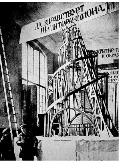
Figure 2.1 Tatlin's tower, model, 1919.
similarity with an example of Russian constructivist architecture. As one of the most significant
constructivist architectural projects, Tatlin’s tower is a typical constructivist architectural design
by Vladimir Tatlin in 1919, the first year the Bauhaus operated. Tatlin’s tower was to be built
with similar materials used by the Bauhaus: iron, steel, and glass. This tower can be seen as an
experiment in new architecture. Despite new technology in construction, observers do not expect
to see the new shape that differs from traditional architecture. Tatlin’s tower and the Bauhaus
have multiple similarities. Among these features, the most important one is that both of them
represent their pursuits of a modern world. Meanwhile, we can perceive some degree of a desire
for utopia from these kinds of pursuits. Moreover, it is possible to connect the Bauhaus with De
Stijl. Objectively, both the Bauhaus and De Stijl are influenced by Russian constructivism.
Different origins evolve into different preferences. Literal transparency (Constructivism)
by which the tension of building is represented. Through the use of new material and technology,
Constructivism, as well as Deconstructivism and High Tech architecture later on, represents
explorations to a new world beyond reality. On the other hand, phenomenal transparency
(cubism) represents a different understanding. First, phenomenal transparency seems to lack an
interest in the specialty of materials. When we look at Le Corbusier’s projects it is obvious to
find that he was always trying to use the new materials and constructive technology of his period,
such as steel and the use of the overhanging terrace. However, both new materials and
technologies are only the tools to represent the metaphor motif of the project. Each component
cooperates with other elements, but the specialty of material is slighted. Second, cubist artists
prefer to provide more possibilities of subjective determinations rather than direct descriptions.
Simplicity of Definition
In their essay, Rowe and Slutzky use two examples to explain the characteristics of
phenomenal transparency, and choose a different example, the Bauhaus complex, to represent
literal transparency. It seems like Rowe and Slutzky believe that literal and phenomenal
transparencies are two different concepts, and they cannot be combined in a single project. In my
opinion, directly ascribing architecture to either literal or phenomenal is too simplified. Villa at
Garches is a typical example of phenomenal transparency, as is the Bauhaus complex. We find
that strict compliance with a particular style may tend to show the effect of experimental
characteristics of art. However, we are able to see a mix of literal and phenomenal transparency
in some cases. These buildings can achieve the same functionality and artistic requirements as
well.
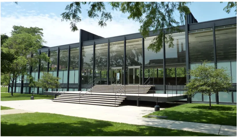
We can give a glance at S. R. Crown Hall, the home of the College of Architecture at
Figure 2.2 S. R. Crown Hall, façade
the upper section is transparent. In my opinion, the curtains prevent excessive exposure of
interior space and the upper section implies a continuous shallow space behind the surface.
However, the image that observers make at first glance is subverted by the division of three
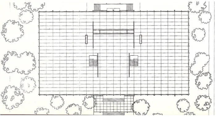
parallel sections on deep direction. Further, S. R. Crown Hall provides a distinct order of space.
Because the two areas on both sides are obstructed by curtains, the deep space in the middle area
is emphasized. Meanwhile, the two beams on the roof, which remind us of the two sidewalls on
the roof of Villa at Garches, keep the same width as the clear room in the middle, and stop at the
same points with the platform of steps. Controlling the dimensions in this way represents the
metaphoric order of space. On the other hand, S. R. Crown Hall represents literal transparency as
well. The exposed components of construction and glass wall represent the importance of
material and technology. A lack of attention to the specialty of materials cannot be seen in this
Figure 2.3 S. R. Crown Hall, floor plan
In summary, neither literal nor phenomenal transparency is the only option for architects.
As we see in S. R. Crown Hall, a project with compound features is able to achieve the
requirements of both functions and art as well. In my opinion, the discussion of transparency in
architecture eventually is settled on the experience of space. Rowe and Slutzky emphasized the
advantages of phenomenal transparency time after time because it provides more possibilities for
observers to evoke subjective readings through implications. Subjective readings induce various
interactions between users and architecture, which constantly renew the experience of space. As
a result, users complete the transition between acceptors and creators.
AMBIGUOUS SPACE
Due to the appearances of new theories and techniques, architecture has developed
further from the period of Gropius and Le Corbusier. Meanwhile, the concept of transparency
has been transformed. Now seems to be an appropriate opportunity to discuss transparency
within the background of the present. Because the discussion of transparency is based on the
and transparency? Is there a new understanding of transparency in the present? What kind of new
experience can people gain from the new transparency?
To answer the first question, I hope to look at the difference in social behaviors at present.
Because traditional architecture usually has cumbersome exterior walls and sealed interior spaces,
transparency becomes one of the most important characteristics of modern architecture.
Simultaneously, transparency is a tool for the public to represent their attitudes to modern life.
Mies van der Rohe designed Farnsworth House between 1945. In the same year, the Case Study
House program in southern California started. Both of these two projects represent the luxurious
life in the age of consumerism. The public started to realize that privacy is seldom an issue.
People can make compromises for their modern lives. And then, the compromises become
normal behaviors. Since social communications are getting developed, such as the wide use of
social networking services, we find that the boundary between private and public is getting
blurred. Transparency is a sign of modernity and progress that was not only technical, but also
ethical.14 Everyday, we can see all kinds of photos and comments that people post on social
networking websites. Besides concerns about public issues, the public is accustomed to sharing
their private lives with each other. Meanwhile, the public gradually gets used to participating in
the lives of others.
When we return to and discuss new understandings of transparency in architecture, we
find a possibility, ambiguous space. The essential purpose of ambiguous space is to blur
boundaries between layers. Compared with phenomenal transparency, ambiguous space contains
an indistinct order of space. Observers easily get lost in the dissolved order of space at first
glance, and then, they need to find the paths of the labyrinth by themselves. The reason I call an
14 Nigel Whiteley, Intensity of Scrutiny and a Good Eyeful: Architecture and Transparency,
ambiguous space a labyrinth is that it brings a confusion of emotion to observers.. In ambiguous
space, we can see both shallow and deep depth of field at the same time. As I mention in the first
chapter, literal transparency is able to produce deep space with vision, but phenomenal
transparency creates shallow space on emotion. Ambiguous space contains both of these features
in some degree, so that it is able to create more possibilities for observers to read the building.
Ambiguous space has similarities with phenomenal transparency as well. For example,
foreground and background in the space appear simultaneously, and they merge with each other;
grids in ambiguous space provide implications, although they usually guide the view of
observers to an incorrect reading deliberately. Ambiguous space contains some characteristics of
literal transparency. Similar to literal transparency, ambiguous space represents an inherent
quality of substance. For example, ambiguous space sometimes has glazing on a facade, which
shows the planar extension in a two-dimensional way. However, this glazing usually serves the
function of reflection of light, rather than denying the obstruction of views.
The reason that I believe ambiguous space is a new understanding is that it represents a
dissolved space with a blurred boundary. Due to the requirements of social behaviors, the
functions of architecture are getting more complicated. Ambiguous space provides a possibility
that the transitions between different functions are unconstrained. Meanwhile, one of the
purposes of ambiguous space is to blur the boundary between interior and exterior. Glazing is a
bridge connecting exterior and interior space, and lets users communicate with the environment
around the building. Ambiguous space uses large size glazing to emphasize this kind of
communications, with which the distance between users and the environment gets closer. When
we discuss multiple possibilities of readings that are created by phenomenal transparency, we
alternative readings through the movements of people as well. Because there is no distinct
direction in ambiguous space, the movements of users are not restricted.
CASE STUDY
In this chapter, I will discuss the characteristics of ambiguous space through two current
projects in architecture, KAIT Workshop by Junya Ishigami, and Musashino Art University
Museum and Library by Sou Fujimoto. Both of these two projects are completed within the last
ten years and can be seen as typical examples of ambiguous space. Through dissolving the solid
boundaries of space, users are able to control their movement permissively. Meanwhile, I will
introduce my personal exhibition, Ambiguity, which represents my understandings to this new
possibility of transparency. With the setting of fabric curtains and light sources, I hope to create a
constantly changing space without restrictions of movements.
Case Study 1: KAIT Workshop
The first project is KAIT (Kanagawa Institute of Technology) workshop by Junya
Ishigami. As one of the representatives in the younger generation of Japanese architects,
Ishigami was influenced by Mies Van der Rohe and Kazuyo Sejima, the founder of SANAA
architecture firm and the laureate of the Pritzker Prize in 2010. Beyond his processor, Ishigami
moves his step further to the “disappearance of space. His designs imply the unlimited
possibilities of how to read architecture.
KAIT is a facility for students to work on their creative projects, and its purpose is to
represent freedom of creation in this location. The shape of this project is a non-paralleled
quadrangle covered with curtain walls. The architect abandons the) solid wall completely in
Figure 4.1 KAIT workshop plan
between the building and environment. At the first glance, people may confuse the location of
the entrances because the entire surface of the building is occupied by a continuous curtain wall.
Because of the unified material, the façades become four flat canvases. Meanwhile, we can see
both interior space and reflection of environment appear on the canvas simultaneously. As a
result of the confusion, users need to recognize the authenticity of the building. However, the
facades constantly refuse any exclusive result. Compared with painting, the building can be seen
as the main figure and the environment should be the background. In this example, we realize
that the building conceals itself into the background, and the reflection seems to emphasize the
importance of environment. The complications of light and reflection can be seen in this building
as well. On a sunny day, the surface is reflective and thus shows the trees. However on a cloudy
day, reflection and transparency exist at the same time, which represents the confusion of space.
Figure 4.2 KAIT workshop, facade
different times, multiple readings of this building become possible. Meanwhile, the building
changes the traditional concept of a solid subject in a site and emerges as an unstable status.
When facing the façade of this building, the sensational absence of materiality effects our
determinations. Although we can see the distinct cornices and floors at the top and bottom of the
surface, it is still difficult to determine the boundaries of the façade on both sides. In the corner,
we can see that the curtain wall, roof and floor turn at the exact same point, which eliminates all
the possibilities of determining layers. Although the solid lines of the roof and floor lead the
vision in a distinct direction, the view is not stopped in the corner. Because the complications of
reflection and transparency, the surface seems to be extended. Also the edge of the curtain wall is
blurred at each corner. Standing outside of the building, people are able to find the perceptive
edge of the building, rather than a clarified physical edge.
The interior space of this building also creates an exciting experience for users and it
that three hundred and five columns are irregularly located in a single-storied, one-room, space.15
Either standing on outside or inside of this building, the complicated matrix is easily detected.
Ishigami mentions that he wants to create a space that brings natural elements into interior. We
can imagine that the columns explicitly imply the sensation of a forest. Meanwhile, the matrix
interrupts the regular organization of structure of building. Usually, a neat grid of columns is a
typical standard to recognize the direction and size of space. However, when columns are
arranged with an irregular layout, the routine method for detecting the function of space is
lacking. As we have seen in Villa of Garches, observers have to use subjective guesses to restore
the reality. During the process, multiple possibilities for alternative readings of the building
appear. Lack of visual obstructions is another feature of this project. In general, solid wall is one
of the most elementary components that divide space into public and private. In this project,
public and private spaces seem to merge together. Private space seems to be ignored. When he
mentions the divisions of space, Ishigami says that his intention is not “to plan individual spaces
in different locations of this building one by one”.16 In this building, the whole and parts have the
equal value and status. Further, the delimitation of space is not static. Because most of
semi-private spaces are bounded by furniture, every movement of the furniture is able to produce the
change of space. “There is a plan, but no defined bounder. This is the space in my mind,”17
Ishigami describes his understanding of this building. Meanwhile, personal activities affect the
readings of this space. When someone is working in a specific spot, others will automatically
realize that the space is occupied, due to the transparent glass. Numerous spots force a person to
draw a map in ones mind, which includes the possible path and divisions of public and private.
15 Junya Ishigami, Junya Ishigami: Small Images, (Tokyo, INAX Publishing. 2008), 29. 16 Junya Ishigami, Junya Ishigami, 29.
With involvement in different activities, this map is revised all the time, which means a new
possibility of space is created. Along with the subtle movements of users and plants, the
boundaries of the spaces become ambiguous as well. In brief, the building is a specific space
containing “an entrance-like space, a work area-like space, and a passage-like space”.18
[image:35.612.145.467.185.402.2]
Figure 4.3 KAIT workshop interior
Figure 4.4 WAIT workshop, interior
[image:35.612.152.456.436.643.2]
Meanwhile, the columns bring a sense of instability of the space as well. They are excessively
tenuous, with which the roof seems to be a balloon bolted down by countless slight lines. Maybe
at sometime the roof will ascend into sky. In this space, every movement of every person will
change the whole experience of the building.
Some characteristics of phenomenal transparency are represented in this building. First,
off-axis perspectives are avoided as much as possible and frontality is emphasized. The shape of
this project is a quadrangle with an oblique angle, which the perspective in each direction
inclined. We have the common knowledge that near is large and far is smaller. The grids on
ceiling lead to views of the far ends, the distance may be much further than how it appears to the
viewer visually. In this building, the sensation of deep space is replaced by a series of parallel
layers from foreground to background. The columns challenge users’ sense of depth of space all
the time, but they still leave some clues for users to discover the essence of the space.19 Second,
foreground and background appear with equal importance simultaneously. Every column in this
project is tenuous, but sizes are different. It is hard to realize their presence due to the tenuous
thinness of each column. Meanwhile, all the columns are set as rectangles rather than squares, so
that a column appears slightly thicker or thinner depending on the location from where you look
at it.20 Varied appearances reduce the solidness of columns. At least they are not prominent parts
in whole space. However, when there are more than three hundred columns in a single-room
space, the tensions of these vertical sticks cannot be ignored. Observers need to not only
recognize the distances between each two columns, but also to detect the connections between
them. When facing countless columns, a flat, two-dimensional image emerges in front of ones
19 Junya Ishigami, Another Scale of Architecture, (Kyoto, Seigensha Art Publishing. 2010),
273.
eyes. Looking at this space is exactly the same as reading a cubist painting. The depth of the
image depends on the association of ideas in the mind. Actually, the phenomenon of confusion
between shallow space and deep space appears in cubist paintings again and again. Due to the
denseness and irregularity of columns, we are not able to spot the accurate location of every
column. As a result, the contradiction between two-dimensions and three-dimensions constantly
exists.
The ceiling represents the conflict of dimensions as well. Because the connection
between floor and ceiling is repeatedly emphasized by the columns, the observers’ eyes
unavoidably move to the ceiling, which is created by alternating linear patterns. We easily can
detect that the widths of bright ribbons are not uniform but that the rhythms of brightness and
darkness are varied. However, the grids are not the only things we can see when we look up. We
also can see many columns pointing to one vanishing point meeting at a far distance in the sky.
When we attempt to search for the perceived vanishing point in the air, the ceiling stops us. It
interrupts the extension of columns, so that we hardly regard them as an implication of deep
[image:37.612.136.479.461.696.2]
space. Meanwhile, the parallel ribbons on the ceiling represent two-dimensional space, and lead
viewers to the horizontal ends on the sidewalls. In summary, interior space is filled with
contradictions of two-dimensions and three-dimensions. However, these kinds of contradictions
force users to change their anticipations of this space, and thus the readings of the space become
multiple.
From entirety to details, Ishigami emphasizes his understanding of how to “dissolve
space” in this building. The entire building merges into the environment, and the boundary of
this building is blurred. The interior space also represents the same essential idea. Numerous
columns create a complicated matrix, which compresses the building into a shallow space. The
minds of users have to move from two-dimensions to three-dimensions back and forth. Although
the order of space is not as distinct as Villa at Garches, ambiguous space is able to produce
multiple possible readings of architecture. Furthermore, we can see that an ambiguous space is
not stable constantly. Rather, the space is transforming in people’s minds all the time.
[image:38.612.140.472.463.683.2]
Case Study 2: Musashino Art University Museum and Library
The second example of ambiguous space is Musashino Art University Museum and
Library by Sou Fujimoto. Fujimoto is another representative of the new generation of architects
in Japan. According to his statement, his purpose is “to make weak architecture”, which is “not
making architecture from the relationship between each parts, rather than from a overall order”.21
He also mentions that the result of weak architecture is “a new order is made that cooperates
uncertainty and disorder”.22 The specific details of the new order will be explained later in this
paper. In Fujimoto’s projects, the focus of a view is usually dispersed. Users seem to walk into
an infinite space, in which nobody is able to point at any definite volume. Users have to
reorganize their thoughts and thus create new possibilities of space in their minds. The
masterpieces of Sou Fujimoto are Musashino Art University Museum and Library, House NA,
and Serpentine Gallery Pavilion in 2013.
Musashino Art University Museum and Library represents the concept of ambiguous
space sufficiently. The concept of this project comes from the impression of a traditional library
in which every corner is occupied by constant bookshelves. Fujimoto improves this concept and
pursues the modern form with the essence of a traditional library. In this space, we can see
bookshelves everywhere, from floor to ceiling. However, this space is not simplified bestrewn
with an infinite number of bookshelves. Instead, this is a canyon of books that extends to
multiple dimensions. The infinite bookshelves and neat grids increase the unification of the space,
which produces a strong contradiction with a complicated path. In order to increase the impact of
sight, the height of the library is set at 29.5 feet (9 meters). In this space, the feeling of being
engulfed by environment is produced.
Figure 4.7 Musashino Art University Museum and Library, interior
Several questions of concern come to mind about the library. What kind of form can
represent an infinite space? Why should this space be a complicated labyrinth? There is an
irreconcilable conflict between a labyrinthine space and a library with the function of fast and
convenient research. As I mentioned above, a new order that includes uncertainty and chaos is
established. Fojimoto decides to use a spiral form to organize the library, which contains both
functions of search and stroll. He calls this spiral form a Guru-guru, which “externalizes all
interiority and internalizes all exteriority”.23 Meanwhile, it contains both infinite depth toward
the interior and infinite extension toward the exterior. Meanwhile, a spiral space neutralizes the
trend of extension in a straight direction, and then guides the movement and view to the parallel
ways. A Spiral space contains another advantage in representing ambiguous space. First of all, a
spiral path has a non-linear extension, which compresses the space into a tight volume. Also, the
movements of users are defined as rotations. Second, spiral space provides infinite possibilities
for users to discover the space. As we know, people enjoy the process of looking for the exit of a
labyrinth, and a varied path provides more possibilities for strolling. The process of discovery
increases more possible alternative readings of the space. Meanwhile, the space produces both
attraction and confusion in the same degree. On one hand, users are attracted by the mystery of
Figure 4.8 Musashino Art University Museum and Library, first floor plan
[image:41.612.199.415.150.400.2]
Figure 4.10 Musashino Art University Museum and Library, concept
Figure 4.11 Musashino Art University Museum and Library, section
spiral, and thus want to detect the information in the center of the spiral. On the other hand, the
confusion comes from the multiple dimensions. Although the main path in the spiral is obvious,
[image:42.612.81.536.391.586.2]another, either by behavior or vision. Then, users have to make a choice. They can follow the
path into the center of spiral, or choose to move between layers without limitation.
Fujimoto denies a sealed space because he believes bookshelves may erase the
appearances of the users, and then make them fear the books and the space. Simultaneously,
there is a lack of interesting experience if users follow a path of an established spiral. To reduce
spatial restriction, Fujimoto breaks some of the walls with holes and interspaces and flyovers are
inserted. These flyovers connect different layers of the spiral with various directions, from inside
to outside. Meanwhile, they also disorder the order of the space. As I previously mentioned about
Fujimoto‘s purpose, a new order is created. When people are walking on the regular path of the
spiral, they are constantly interacting with the holes on the walls. The deep spaces behind the
holes seem to indicate other possibilities about the dimensions of the space. No matter which
way the users choose, they will with certainty miss the opportunity to discover another path.
Therefore, users have to use the clues they find to create a floor plan in their minds, which may
help them to understand the entire space. However, this imagined floor plan is not always correct.
We can conclude then that there are benefits that the holes and flyovers bring to the space.
First, this method changes the monotonousness of the walls. Because the wall is created by more
than 20,000 unified units, visual fatigue is quickly produced. However, the holes break the
continuity of duplications. For the same reason, flyovers prevent the singular sense produced by
a unified story. Second, we can find that the ability to stroll is the essential purpose that Fujimoto
hopes to emphasize in this space. The ability to search, on the other hand, is the response that he
has to the function of a library. Because of the holes and flyovers, an explicit path in this library
is created. People do not have to follow the established path moving in or out of the spiral. Both
existence of the spiral. The spiral indeed provides the basic order of this space. However, this
order has been concealed. Because of these holes and flyovers, users are able to move from the
most interior circle to the most exterior circle with a relatively straight path, as well as with their
vision. Users may have the sense that they are engulfed by countless bookshelves, but their
views and movements are totally free.
As the most important element of this building, the spiral wall represents several features
of ambiguous space. First, it reduces depth of field. “The independence and interdependence of
certain area mutually compatible; expansion and stability coexist; something far is actually
alongside.”24 Comparing it with a straight way, the spiral path compresses the space. Further,
the distance that the views can achieve is significantly reduced. Second, the entire space is
broken into numerous fragments. This characteristic can be connected with the same one in
cubist paintings. Similar to cubist paintings, fragments distract the attention of users. Therefore,
users have to organize the fragments in their own minds, so that an integrated space can be
[image:44.612.135.475.426.659.2]
Figure 4.12 Musashino Art University Museum and Library, bookshelves
created. Further, this kind of characteristic produces multiple reading methods of the architecture.
Except for a couple of inevitable rooms, such as restrooms and machine rooms, the entire
building is designed as a single space without solid obstructions. People are able to use multiple
ways to move between two points. Every time, when people choose a different path to the same
locations, their views and experiences of the space are different. As a result, the impressions of
this library become varied. Meanwhile, the interest of the building is increased.
Surface is an inevitable element in this building. For accomplishing the initial idea,
Fujimoto abandons the common method. Instead, the bookshelves become the walls. These
bookshelves are unified, duplicated, and saturated. They are the combination of flatness and
depth. Depending on the standpoints, they can be seen as flat as a solid wall. However, when we
move toward an oblique angle, the bookshelves show the depth of the wall. We can see the
transformation of perspectives, which is increased when the wall extends to a different direction.
Meanwhile, unified bookshelves restore the perceivable continuity of surface that the holes
create. Even when the wall misses the position of holes, it is still not difficult to imagine the
[image:45.612.156.454.456.680.2]
continuity of the wall. Further, the perception of the entire wall will extend to the far ends. At the
same time, the spiral form, the elemental order of the space is not broken. In terms of the huge
volume of the spiral, the form cannot be ignored completely. Similar to Mont Sainte-Victoire,
diagonal perspective is preserved while parallel perspective is emphasized. Although the integral
spiral is interrupted constantly, users are able to perceive the implication it brings.
We can presume what the experience is when a reader goes into this library. The reader
feels the conflict and chaos of this space at the entrance. Suddenly he or she finds the implied
order of the space, a spiral path. However, the sense of intense chaos fills his or her mind. There
are too many branches of the path he or she needs to deal with at the same time. Every hole
between bookshelves may lead the person to a new place. Meanwhile, the overwhelming spiral
wall implicates that he or she is still in the middle of the spiral. The contradiction of distance and
the confusion of location create the new order of the library. When he discusses distance in
architecture, Fujimoto says that it is not a physical distance; it is a psychological distance arising
from the distortion and modulation of space.25 This distance is ambiguous, which only can be felt
by emotion. Due to the different emotions of different people, the results are various. Finally, we
need to know that the reading of a spiral space is simplified, but the readings of the ambiguous
space are various, only if the boundaries are blurred.
Musashino Art University Museum and Library reflects Fujimoto’s understanding of
transparency. In this building, the established order of space is replaced by an emotional order, a
combination of deep space and spiral form. Users are forced to accept multiple dimensions of the
space. Due to the constant implications, the process of development of this space becomes
interesting. Through the use of parallel perspective and duplicated units, the interior space of this
architecture is compressed. Ambiguous space, in this case, represents the combination between
chaos and order, between established order and new order.
Case Study 3: Ambiguity, Gallery Exhibition
In this section, I want to introduce one of my experiments, Ambiguity, which was finished
in the gallery of Ernest G. Welch School of Art and Design at Georgia State University in April
2014. In the gallery (19feet by 34 feet), of this exhibition, I hope to change the original
appearance of the room and thus to create an ambiguous space. I decide to hang multiple layers
of curtains with different sizes and locations, in order to compress the depth of field and to create
an ambiguous space with blurred boundaries. Although the installation creates an abstract space
in the gallery, I hope it may become one of the suggestions for designing ambiguous space in
practice. In this section, I would introduce three main elements of my installation, material,
layout of fabrics, and illumination. These three elements support the concept of ambiguous space,
and create a new experience of space for observers.
I choose white fabric as only material because of two reasons. First, white fabric provides
more possibilities of transparency. This kind of material contains 80% visibility, which keep the
perfect balance between the opacity and transparency. It confuses the original understanding of
the space and brings perception of a flat and compressed space for observers. In practice, the
distances between layers are confirmed, but the order of this space becomes unstable. Further, I
hope white fabrics are able to cooperate with white walls and ceiling, and expand the tension of
this space. Over here, I guess white is the only choice for me to achieve the purpose of creating
an ambiguous space. With the same tone, the continuity between fabric and wall is produced;
therefore, the boundary between two different materials will be blurred. If I chose any other
Figure 4.14 Ambiguity, View from Entrance
Figure 4.15 Ambiguity, View from Back Wall
division between fabric and wall in this room if a strong contrast is created. However, I hope
people find an integral perception of ambiguity alone in this space. The contrast of different
colors may prompt some other focus for observers, with which the purpose of the installation
may not be simplified any more.
There is another reason that I eventually choose this material. As I mentioned above, this
[image:48.612.158.457.70.275.2] [image:48.612.140.474.301.525.2]the exhibition is opened, I try to pay attention to the variations of transparency that produced by
the movements of other observers. Because the blurred boundaries of layers, it is difficult to
determine the accurate order of space. Therefore, I need the helps of others to sense the distance
between one specific fabric and myself. When a person stands in front of a layer, he or she would
be the clue to measure the distance. If I determine the distance by the fabric alone, the other
layers would confuse me and lead me to a disordered integer. However, the distinct perception of
distance appears only within a few seconds and disappears again. In some area, people can be
seen with 80% visibilities or a little lower in terms of the quantity of layers. However, people
only can be seen with 20% visibilities. As a result, I find that people in this room always exist
between appearance and disappearance.
Figure 4.16 Ambiguity, Interior View
I want to discuss the layout of the exhibition as well. First of all, the space is divided on
horizontal and deep directions alone. As an experiment of ambiguous space, oblique lines may
lead the views of observers to the corners of the room, thus the three-dimensional perspective
would be emphasized. However, a parallel perspective is more appropriate for the purpose of
[image:49.612.157.458.345.548.2]deep direction, there are only five pieces of fabrics, which all hang on the ceiling with
transparent strings with the same height (8 feet). Cooperating with the grids on ceiling, the
tendency on deep direction is easily defined. However, one of the purposes of this exhibition is
Figure 4.17 Ambiguity, Floor Plan
[image:50.612.194.417.159.440.2] [image:50.612.150.462.466.680.2]
to break the original tendency of orientation, and then to represent a shallow space. I constantly
use horizontal fabrics to obstruct the inertia of views, which can be relieved from deep side.
Further, these parallel layers provide more opportunities for observers to extend their views to
sidewalls.
The sizes of fabrics on horizontal way are much smaller than ones on deep side, which
increase the diversifications on both horizon and height. In contrast, the perspective on depth is
reduced tremendously. The heights of fabrics also reflect the order of space. From the entrance to
the back wall, the heights of fabrics gradually elevate. The organization of height has specific
purpose. I try to simulate the order of observation when designing the space. First, the front of
this gallery is a curtain wall, through which people are able to give a glance at the space. When
they look at the space at the first time, I hope the order of space can be transferred to their mind.
The ascend layers can be seen as the clue to realize the order. The view of observers would
[image:51.612.156.458.402.691.2]