Worcester Polytechnic Institute
Digital WPI
Interactive Qualifying Projects (All Years) Interactive Qualifying Projects
February 2017
An Exploration in Predicting the Price of a Stock
Matthew Beader
Worcester Polytechnic Institute Sahawat Amonlikitsin Worcester Polytechnic Institute Stephanie A. Martin Worcester Polytechnic Institute
Follow this and additional works at:https://digitalcommons.wpi.edu/iqp-all
This Unrestricted is brought to you for free and open access by the Interactive Qualifying Projects at Digital WPI. It has been accepted for inclusion in Interactive Qualifying Projects (All Years) by an authorized administrator of Digital WPI. For more information, please [email protected]. Repository Citation
Beader, M., Amonlikitsin, S., & Martin, S. A. (2017).An Exploration in Predicting the Price of a Stock. Retrieved from
An Exploration in Predicting the Price of a
Stock
An Interactive Qualifying Project Report submitted to the Faculty of
WORCESTER POLYTECHNIC INSTITUTE In partial fulfillment of the requirements for the
Degree of Bachelor of Science By: Sahawat Amonlikitsin Matthew Beader Stephanie Martin Submitted to: Mayer Humi, PhD March 3, 2017
ii
Abstract
Mastering the art of the stock market is a goal of many, but none have a perfect model to fit its chaotic nature. In this project, we explored different methods of modeling the stock market to predict future stock prices and examined how to measure stock volatility to gain more accurate predictions. In addition, our stock portfolios made between an 8% and 39% profit. We believe our model can help investors choose profitable stocks like we did in our portfolios.
iii
Executive Summary
Investing in the stock market is a dance with risk. Prices can rise or fall significantly in a matter of a day. In some cases the cause of a sharp change in price is a concrete event, such as the release of a new product, company scandals, or product recalls. In other cases, the cause is a mixed bag of economic deterioration or prosperity, consumer confidence, and other unknown factors. The key to being successful in the stock market is to avoid the declines and profit from the inclines. It is nearly impossible to successfully avoid every drop in price, but knowing which stocks have a high chance of remaining stable and increasing with time lowers the risk of
encountering more substantial price drops.
This Interactive Qualifying Project (IQP) focused on optimizing a stock market model developed in previous IQP projects as well as finding a way to measure a stock’s volatility. The goal was to increase the accuracy of future stock price predictions and to determine which stocks the model would predict best. Successfully doing so would allow investors of all levels to
minimize the risk of investing in the market by detecting which stocks are the least likely to cause significant losses of profit. This would be especially helpful for people new to investing and for those who cannot afford to have large deficits in their portfolios.
At the start of the project, each team member chose five stocks within a sector of the stock market to follow and test the model with throughout A-term. The model transformed over the course of the term through additions and optimizations. The base model used a Fourier Series and least-squares linear regression to analyze stock prices over the past year and predict prices 30 days into the future. If a stock was relatively volatile, or had many dips and peaks in its
iv prices, the model struggled to produce and accurate prediction. To combat this issue, the team added moving averages to the equation, which smoothed a stock’s price data before processing it through the rest of the model. The final addition to the model was exchange indices. The index changed depending on the stock, but if the two had a strong correlation in terms of price movement, it generally improved the prediction of the stock’s prices.
At the end of the term, the model was far from perfect, so the team adjusted various parameters within the model to see if they could be optimized. Those parameters included
window size for moving averages, length of historical price data, and autocorrelation values. The overall findings resulted in the conclusion that each stock had its own optimal values, but those values fall within a certain range depending on the parameter.
The second term marked a change in the direction of the project. The team researched the concept of using Lyapunov exponents to determine a stock’s overall volatility. The advisor of the project, Professor Humi, suggested a program called TISEAN to find the largest Lyapunov exponent of each stock, where a larger exponent indicated greater volatility. The goal was to see if a stock was too much of a risk to invest in and if it would work better with the model. Stocks with higher volatility tended to have poorer predictions.
In addition to exploring volatility, each member of the team chose 5 to 10 new stocks to “invest” in with $100,000 of virtual money with the hopes of making a profit. Each stock’s profitability was monitored into the final term of the project, with profit margins moving with the market, which at the time was on the rise. These stocks also became the new test subjects of the model, with many of them achieving better predictions than the industry stocks. The majority of the project’s final data comes from testing done with the new stocks.
v
Table of Contents
Abstract ... ii
Executive Summary ... iii
Table of Contents ... v
List of Figures ... vii
List of Tables ... x
Introduction ... 1
Background ... 2
Time Series and the Stock Market ... 2
Autocorrelation ... 3
Least-Squares Linear Regression ... 4
Fourier Series ... 5 Moving Averages ... 6 Exchange Index ... 8 Volatility ... 8 Lyapunov Exponents ... 8 Methodology ... 10 Choice of Stocks ... 10
Linear Regression and Fourier Series Analysis ... 12
Moving Averages ... 15
Exchange Index ... 16
TISEAN ... 17
Results ... 19
Linear Regression and Fourier Series ... 19
vi
Parameter Adjustments ... 29
Exchange Index ... 35
Choices for Implementation: Mutual Information or Correlation ... 39
TISEAN ... 42
Stock Portfolios ... 46
Model Predictions of Portfolio Stocks ... 51
Conclusion ... 67
Recommendations: ... 67
References ... 70
vii
List of Figures
Figure 1. Graph of autocorrelation for SAFT. ... 13
Figure 2. Trend line for SAFT ... 13
Figure 3. Fourier fit for SAFT ... 14
Figure 4. Noise graph for SAFT ... 15
Figure 5. Moving averages curve fit for BHI ... 16
Figure 6. Scaled prices for NYSE and SAFT ... 17
Figure 7. Noise graph for BRK-B ... 19
Figure 8. Fourier prediction for BRK-B ... 20
Figure 9. Fourier prediction for FAF ... 20
Figure 10. Fourier prediction for MU ... 21
Figure 11. First Fourier prediction for MSFT ... 22
Figure 12. Second Fourier prediction for MSFT ... 22
Figure 13. Moving averages prediction for BRK-B ... 23
Figure 14. Moving averages prediction for SAFT ... 24
Figure 15. Moving averages prediction for FAF ... 24
Figure 16. Moving averages prediction for FAF with window size 25 ... 25
Figure 17. Moving averages prediction for TRV with window size 25 ... 26
Figure 18. Moving averages prediction for TRV with window size 30 ... 26
Figure 19. FCAU smoothed predictions for window sizes 1-50 ... 27
Figure 20. NVDA smoothed predictions for window sizes 1-50... 28
Figure 21. TXN smoothed predictions for window size 1-50 ... 29
Figure 22. TXN Fourier series with residuals ... 29
Figure 23. Prediction for Google with default value ... 30
Figure 24. Prediction for Google with offset adjustment ... 31
Figure 25. Comparison of standard derivation values ... 32
Figure 26. Comparison of absolute mean values ... 32
Figure 27. First-zero autocorrelations of Google ... 33
Figure 28. Fourier prediction for BHI ... 36
Figure 29. BHI prediction with NYSE ... 37
viii
Figure 31. MSFT prediction with NASDAQ ... 38
Figure 32. Comparison of models with mean - GOOG ... 40
Figure 33. Comparison of models with standard deviation - GOOG ... 41
Figure 34. Prediction errors over sets of 5 days after 11/15/2016 ... 44
Figure 35. Lyapunov exponents at varying dimensions (11/15/16 as day before future)... 45
Figure 36. Lyapunov exponent vs. error for seven stocks at both 3 and 4 dimensions ... 45
Figure 37. NASDAQ from 10/01/2016 to 2/01/2017 ... 51
Figure 38. NYSE from 10/01/2016 to 2/01/2017 ... 51
Figure 39. Fourier prediction for AMZN ... 52
Figure 40. Fourier prediction with NASDAQ for APC ... 52
Figure 41. Fourier prediction for CNQ ... 53
Figure 42. Fourier prediction with NASDAQ for COG ... 53
Figure 43. Fourier prediction for COP ... 54
Figure 44. Fourier prediction for GOOG ... 54
Figure 45. Fourier prediction with index for TSLA ... 55
Figure 46. Fourier prediction for YHOO ... 55
Figure 47. Fourier prediction for ABEO ... 56
Figure 48. Fourier prediction for AKAM ... 56
Figure 49. Fourier prediction for AKAM with NASDAQ ... 57
Figure 50. Fourier prediction for BHI ... 57
Figure 51. Fourier prediction for BHI with NYSE ... 58
Figure 52. Fourier prediction for EXPE ... 58
Figure 53. Fourier prediction for EXPE with NASDAQ ... 59
Figure 54. Fourier prediction for LNTH ... 59
Figure 55. Fourier prediction for LNTH with NASDAQ ... 60
Figure 56. Fourier prediction for MSFT ... 60
Figure 57. Fourier prediction for MSFT with NASDAQ ... 61
Figure 58. Fourier prediction for MTL ... 61
Figure 59. Fourier prediction for MTL with NYSE ... 62
Figure 60. Fourier prediction for VNTV ... 62
ix
Figure 62. Fourier prediction for FCAU ... 63
Figure 63. Fourier prediction for HMC ... 64
Figure 64. Fourier prediction for AMAT ... 64
Figure 65. Fourier prediction for AMD ... 65
Figure 66. Fourier prediction for MU ... 65
Figure 67. Fourier prediction for NVDA ... 66
x
List of Tables
Table 1. Lengths of historical data for AMZN ... 34
Table 2. Lengths of historical data for GOOG ... 34
Table 3. Lengths of historical data for EBAY ... 34
Table 4. Lengths of historical data for FCAU ... 34
Table 5. Lengths of historical data for TXN ... 34
Table 6. Lengths of historical data for AMD ... 35
Table 7. Lengths of historical data for NVDA ... 35
Table 8. Lengths of historical data for MSFT... 35
Table 9. Lengths of historical data for COP ... 35
Table 10. Mean and standard deviations - GOOG ... 41
Table 11. Mean and standard deviations - MSFT ... 41
Table 12. Mean and standard deviations - TSLA ... 41
Table 13. Mean and standard deviations - AMC ... 41
Table 14. Mean and standard deviations - AMZN ... 42
Table 15. Lyapunov exponents at varying dimensions 11/1/16 ... 43
Table 16. Lyapunov exponents at varying dimensions 11/15/16 ... 44
Table 17. Stock Portfolio A ... 47
Table 18. Stock Portfolio B - February 1st ... 48
Table 19. Stock Portfolio B - November 28th ... 49
1
Introduction
In an ocean full of sharks, it is difficult to survive as a small fish. The stock market is full of professional investors, the sharks, who have numerous tools and insider information at the tips of their fingers, giving them lucrative intel on which stocks will make the most profit.
Meanwhile, amateurs and casual investors alike, the small fish, swim on the outside with little more than the recommendations of experts and their own intuition to help them invest in the market with confidence. The goal of this Interactive Qualifying Project was to develop a tool for less experienced investors to predict the profitability of stocks.
The project focused on two areas of weakness for the amateur investor: predicting a stock’s future price and determining if a stock is risky. To predict a stock’s price, the team further developed and optimized a model created by a previous IQP team. Different aspects of the model were tested in order to find the best suited parameters, and new methods were added to improve the prediction accuracy. In theory, all stocks are risky investments, but some are more volatile than others. The team used TISEAN software to determine the volatility, and thus the riskiness, of stocks.
With small investors in mind, the team sought to combine the two tools to provide guidance in choosing potentially profitable stocks. Ideally one would first see if a stock is volatile and then use the model to predict the stock’s future prices. The predictions have a general window of error but still show the overall trend of the stock, which can be positive, negative, or stagnant. For the safer investors who are just poking their heads into the stock market, this project would help them identify stable stocks with positive trends, which in turn would provide a profit.
2
Background
Time Series and the Stock Market
A stock’s price data is recorded at some specific time (end of the day). According to
Brockwell, the stock market is a discrete-time series, a discrete set of recorded observations Xt at specific time t.
To analyze a time series, we use the classical decomposition process, a modeling process which separates a time series Xt into 3 components as shown below:
𝑋𝑡 = 𝑚𝑡+ 𝑠𝑡+ 𝑌𝑡 – (Brockwell, 22)
Where those variables -- 𝑚𝑡, 𝑠𝑡 , 𝑎𝑛𝑑 𝑌𝑡 -- can be described as the following: a) Long-term Trend ( mt)
A long-term trend is the direction in which all of the observed data is heading towards, either increasing or decreasing. The relationship of the variables in the observed data that have a long term trend does not have to be linear, only that the data has to be fluctuating in the same direction.
b) Seasonal Component (st)
A seasonal component is a pattern in the observed data and exists throughout the data. The cause of a seasonal component comes from many factors such as season changes, quarter of the year, etc.
c) Irregular Component or random noise component (Yt)
After subtracting the long-term trend and seasonal component from the data, the leftover term is defined as an irregular component. The irregular component is random and can cause sudden changes in the observed data. The expected value of the irregular
3 Autocorrelation
An autocorrelation function of a time series Xt is a function which indicates correlation or similarity between Xt and its own lagged version Xt-L. The value of autocorrelation ranges between -1 and 1. A value of 1 means those two points or set in the time series fluctuates perfectly in the same direction, while a value of -1 represents the opposite. To find the autocorrelation we use the process described below:
1) Suppose there exists a time series data set Xt which consists of K observations. We create a lagged version of the time series, Xt-L, by choosing data (L-1)th to Kth of Xt. Xt-L is preferred as the time series Xt with lag L.
2) The autocorrelation of Xt with lag L can be calculated using the formula below:
𝐴𝐶𝐹 = 𝐶𝑂𝑉(𝑋𝑡 ,𝑋𝑡−𝐿 )
𝐶𝑂𝑉(𝑋𝑡 ,𝑋𝑡) - (S. Bisgard and M.Kuanchi, 51-52)
Where ACF is the autocorrelation function COV is the covariance function Xt is the total observations Xt – L is the observations with lag L
According to Bisgard, the amount of data Xt considered good should be more than 50 and the value of lag we are using should not be more than one fourth of the total amount of data we have.
In our model, ACF is used for choosing a period of data in which a long-term trend exists. Such a period of data is expected to have only positive ACF due to some degree of similarity which exists throughout the data set.
4 Least-Squares Linear Regression
Least-squares linear regression is a common and versatile modeling method. It’s used to find the trend component (mt) to determine the line of best fit for a set of data. Linear regression uses an independent variable to predict the path of a dependent variable. For our model, we assume that the trend component depends on time (t):
𝑚𝑡 = 𝛽1∗ 𝑡 + 𝛽0 - (G. James et al. 61) Where mt is the trend component
t is the time variable
𝛽0 , 𝛽1 are constants
Both constant 𝛽0 𝑎𝑛𝑑 𝛽1 can be estimated using a method of ordinary least square (OLS). Least-squares calculates the distance between a regression line and a data point, then Least-squares that value. The Residual Sum of Squares (RSS) is the sum of the squared residuals (ei):
𝑅𝑆𝑆 = ∑𝑛𝑖=1𝑒𝑖2 – (G. James et al. 62)
OLS states that the values of 𝛽0 𝑎𝑛𝑑 𝛽1 for the best fitting trend line should provide the least
RSS. According to (G. James et al. 62), those value of 𝛽0 𝑎𝑛𝑑 𝛽1 can be calculated using
equation as shown below:
𝛽1 =∑ (𝑡𝑖− 𝐸(𝑡𝑖))(𝑥𝑖− 𝐸(𝑥𝑖)) 𝑛 𝑖=1 ∑𝑛 (𝑥𝑖− 𝐸(𝑥𝑖))2 𝑖=1 𝛽0 = 𝐸(𝑥𝑖) − 𝛽1∗ 𝐸(𝑡𝑖)
Where xi is the ith observed value of time series Xt ti is the time at which xi appears
5 E(xi), E(ti) are the means of xi and ti respectively
For further details on how to find 𝛽0 𝑎𝑛𝑑 𝛽1, we recommend viewing chapter 3 of “An
Introduction to Statistical Learning: with Applications in R” by G. James et al.
The line created by the least-squares linear regression contains the minimized sum of the squared values, producing a line that represents the overall trend of the data being modeled. It is the base for the model in this project, as it provides a sense of the direction of the stocks’ prices over a period of time.
Fourier Series
The Fourier series is a series of the periodic functions sine and cosine, which can be used to represent any function f(x) on a specific interval. A Fourier series of a function f(x) on the interval [-L,L] can be represented as
𝑓(𝑥) = 𝑎0+ ∑ 𝑎𝑖cos (𝑛𝜋 𝐿 𝑥) + 𝑏𝑖sin ( 𝑛𝜋 𝐿 𝑥) ∞ 𝑛=1 - (E.Kreyszig 483) Where 𝑎0 = 1 2𝐿∫ 𝑓(𝑥)𝑑𝑥 𝐿 −𝐿 𝑎𝑛 = 1 𝐿∫ 𝑓(𝑥)cos ( 𝑛𝜋 𝐿 𝑥)𝑑𝑥 𝐿 −𝐿 𝑏𝑛 = 1 𝐿∫ 𝑓(𝑥)sin ( 𝑛𝜋 𝐿 𝑥)𝑑𝑥 𝐿 −𝐿
A Fourier series is usually used to approximate a periodic function. We call the approximation method a harmonic regression which, for some reference, is referred to as “Fourier fitting” or “Trigonometric fitting.”
The seasonal component (st), which shows patterns over time, can be approximated using harmonic regression. With Fourier approximation, the seasonal component is as shown below:
6 𝑠𝑡 = 𝑎0+ ∑ 𝑎𝑖cos (𝑛𝜋 𝐿 𝑥) + 𝑏𝑖sin ( 𝑛𝜋 𝐿 𝑥) 𝑁 𝑛=1
Note that parameter L is half of the period of the seasonal component and the constant 𝑎𝑖 𝑎𝑛𝑑 𝑏𝑖
can be approximated by using a least-squares method.
The stock market tends to cycle in a periodic fashion, making Fourier series a viable option to model stock price data. In this project, second and third order Fourier series were used, which correlates to two sine and two cosine terms or three sine and three cosine terms,
respectively. The equation for a second order Fourier series in Matlab is:
Y = a0+a1*cos(x*p)+b1*sin(x*p)+a2*cos(2*x*p)+b2*sin(2*x*p)
Where p = 2*/(max(xdata)-min(xdata)). The Fourier series uses the equations above comprised of sines and cosines to model a set of data with a curve.
Moving Averages
According (Abraham 174), moving average is a seasonal adjustment, a method for removing a seasonal (st) and irregular (Yt) component out of a time series. The method works as described below:
Suppose that we have a time series Xt and its equation is shown below:
𝑋𝑡= 𝑚𝑡+ 𝑠𝑡+ 𝑌𝑡
And the time series Wt is linear-filtered Xt . Wt can be described as
𝑊𝑡 = 1
2𝑞 + 1 ∑ 𝑋𝑡+𝑖
𝑞
7 = 1 2𝑞 + 1[ ∑ 𝑚𝑡+ 𝑞 𝑖= −𝑞 ∑ 𝑠𝑡+ 𝑞 𝑖= −𝑞 ∑ 𝑌𝑡 𝑞 𝑖= −𝑞 ]
Since st is a periodic function and the expected value of the irregular component is zero, the mean value of st and Yt is expected to be close to zero. Moreover, as a linear function,
𝑚𝑡 = 1 2𝑞 + 1 ∑ 𝑚𝑡+𝑖 𝑞 𝑖= −𝑞 Therefore, 𝑊𝑡 ≈ 𝑚𝑡
With the ability to subtract linear independent variables from a function, MA is called a Linear Filter. There are two types of commonly used MA:
a) Simple moving average b) exponential moving average
Although, MA is a very effective tool for subtracting trend components out of a time series, we still have to be cautious while choosing a window size of (2q+1), as the trend line component may be a linear function.
The method of calculating a moving average can be explained in simpler terms. Choosing a window size of 10, the first new data point calculated would be the average of the first 10 data points, the second an average of data points 2-11, and so on. The resulting line comprises of each data point created by calculating the moving averages. The goal of using moving averages in the project is to smooth stock data to cut down on noise produced by frequent price fluctuations.
8 Exchange Index
A stock market index is some measurement of the value of some portion of the market. By weighting the individual prices of stocks, the performance of the market can be quantified and tracked. The resulting index is usually a good representation of the overall trend of the market indexed. Since stocks are not traded in their own universe, they all provide their own influence on the market and are in turn influenced by the market. A technology stock that follows the overall trend of the market, for example, may be highly correlated with the NASDAQ Composite. The peculiarities and noise of the stock’s price changes would be smoothed by the overall market trend, producing a prediction more resistant to oddities. The movement of the index and its own prediction could be used to improve the prediction of the stock alone.
Volatility
Volatility is the amount of variation over time of a time series. For stocks, volatility is a measure of risk and typically calculated by taking the standard deviation of the logarithmic returns. A highly volatile stock is often subject to frequent and significant price changes. These types of stocks are more difficult to predict, as the changes are more often influenced by outside factors and specific events, such as investors’ opinions and press releases, and less by market trends and company performance. The price of a more nonvolatile stock would be more accurately predicted than that of a highly volatile stock.
Lyapunov Exponents
In the project, to determine how predictable a stock price system is, Lyapunov exponents were utilized. These exponents characterize the chaos of a system through infinitesimal
9 perturbations. As a result of being computed with a specified embedding dimension, there is a spectrum of Lyapunov exponents representative of the number of dimensions. These other exponents may be spurious, as the embedding space does not necessarily represent the actual space, thus the largest exponent, the Maximal Lyapunov Exponent (MLE), can be considered as the only relevant exponent. When the MLE is negative, points converge and there is minimal chaos. Conversely, when the MLE is positive, points diverge. For a prediction, exponents closer to a negative value would mean that system is more easily predicted, while more positive exponents are less easily predicted.
10
Methodology
Choice of Stocks
At the beginning of the project, each member chose a sector of the stock market to research: oil, automobiles, and finance, specifically insurance companies. Each member then chose five stocks in their respective sector. These stocks became the first sources of test data in the early stages of the model. They were chosen based both on interest and potential profitability.
The finance sector is traditionally stable, but can vary by company and overall market stability. The 2007 stock market collapse known as the Great Recession exemplifies a time where certain industries in the finance sector, such as banks, did not fare well in the market, while others were able to remain in the black or suffered small losses in comparison. The automobile sector was on the rise recently as newer technology in self-driving cars and
automated driver assistance boomed, and plummeting oil prices fueled a resurgence in consumer interest. While the oil industry was in a lull, stock prices were at their lowest, meaning they were cheap to buy and would eventually go up again. However, the industry was not profitable at the time of the project, which prompted changes in industry choice a few weeks into A-term.
At the end of A-term, each member chose seven or eight new stocks for both testing and to build a stock portfolio. Each member was given $100,000 of “virtual” money to purchase shares of the stocks and to track the progress of their investments for the rest of the project. The goal was to choose stocks that would make a profit over time. Each member of the team chose their stocks in a different manner. Creating a stock portfolio helped realize potential risks in the stock market and furthered the team’s understanding of how the market operates.
For Portfolio A, some of the oil stocks from A-term stayed while new stocks were also added to diversify the portfolio. The oil stocks from A-term were tested with the model, and the
11 ones with the best predictions, Canadian Natural Resources Limited (CNQ), Cabot Oil & Gas Corporation (COG), Anadarko Petroleum Corporation (APC), and ConocoPhillips (COP), stayed in the portfolio. In addition, four other stocks were added: Google (GOOG), Tesla (TSLA), Amazon (AMZN), and Yahoo (YHOO). Historically stable stocks, these were chosen based on comfort and familiarity with the companies, rather than their potential profits. However, with the exception of financial woes and product blunders, these companies tend to rise as the market rises, and thus still could make a profit in a bullish market.
To determine the best stocks to invest in for Portfolio B, websites such as The Street, Motley Fool, and Investopedia were used to view a stock's price history, gain advice on which stocks were good buys, and see projections of how certain market sectors would behave in the future. For example, Motley Fool provides advice from veterans of the market about which stocks, based on consumer confidence, market movement, and company success and product releases, have the most potential for profit in the near future. With this in mind, some of the stocks chosen were little known companies with low stock prices, such as Abeona Therapeutics Inc. (ABEO), Lantheus Holdings, Inc. (LNTH), and Mechel PAO (MTL). These stocks offered wiggle room in terms of profit losses and gains - a large price jump would lead to a significant profit, while a drop would lead to minimal losses since the price could only drop so far. A weekly article post from the Motley Fool about the top ten stocks to buy in October included Vantiv, Inc. (VNTV), Akamai Technologies, Inc. (AKAM), and Baker Hughes Incorporated (BHI) in the rankings. Meanwhile, Expedia, Inc. (EXPE) and Microsoft Corporation (MSFT) were slated to have upticks in the prices of their stocks based on consumer confidence and product releases.
12 For Portfolio C, the automotive manufacturers were replaced by computer hardware manufacturers. However, the two auto stocks that best fit the model, Honda (HMC) and Fiat-Chrysler (FCAU), were kept. To determine what stocks looked like decent investments, a list was first compiled of well-known brands. This list was further narrowed down to only public companies traded on either the NYSE or the NASDAQ, then expanded to include other companies found on these exchanges, and finally were compared against each other. Of these, both NVIDIA Corporation (NVDA) and Advanced Micro Devices, Inc. (AMD) had been performing well and had numerous positive news. The two competitors both had been widely projected to continue increasing. Texas Instruments Incorporated (TXN) was chosen after having recently released a strong earnings report. Micron Technology, Inc. (MU) and Intel Corporation (INTC) on the other hand, did not seem to have much going for either stock. The model was applied to both stocks over the time period of A Term, resulting in a near perfect prediction for MU. INTC’s recent performance also weighed against it and as a result was not chosen. While attempting to determine why the prediction for MU was so good, Applied Materials, Inc. (AMAT), another high volume stock, was added.
Linear Regression and Fourier Series Analysis
The initial model involved auto-correlating exactly one year of historical stock closing prices to determine the period where these prices were considered relevant to the current price. The autocorrelation for the stock Safety Insurance Group, Inc. (SAFT) was 78 days, the point at which the red line crosses zero, as shown in Figure 1.
13
Figure 1. Graph of autocorrelation for SAFT.
A least-squares linear regression was performed on the resulting set of data, represented by the green line in Figure 2.
14 The residuals from this regression were then fit to either a two or three term Fourier series. A Fourier three fit was used for SAFT in Figure 3.
Figure 3. Fourier fit for SAFT
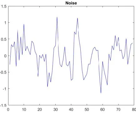
The prediction curve was then generated by taking the sum of the regression line and the Fourier curve. To provide a reasonable range around the prediction curve allowing any potential noise to be accounted for, the mean of the absolute value of the difference between the residuals and the Fourier series was taken. The graph of the noise for SAFT is presented in Figure 4.
15
Figure 4. Noise graph for SAFT
This model served as a basis for every other model used.
Moving Averages
The first modification of the model was the employment of moving average smoothing. Prior to calculating the regression line, the raw relevant closing prices were smoothed by averaging a chosen number of previous data points, typically around 25, also known as the window size. There was not a set value for the window size, so the team chose one that was popularly used by others doing similar research. This new set of smooth data, free of any sharp spikes, was then used in the calculation of the regression line and only in this calculation, the rest of the model was performed as before. Using moving averages produced a lag in the data
proportional to the window size, so a larger window size did not necessarily mean higher accuracy. An example of the lag produced can be seen in Figure 5:
16
Figure 5. Moving averages curve fit for BHI
The shape of the curve created by the moving averages lags behind the shape of the raw data. In an attempt to compensate for the loss of data points in the first 25 days, a for loop was written to calculate a moving average with one less day in the window size, so for day 24 the window size would be 24, etc. The goal of using moving averages was to provide data with less noise so the Fourier fit would be less erratic.
Exchange Index
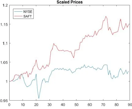
The model was further modified by implementing a stock market index. For this model, prediction curves were calculated as before for both the stock's and the index's closing prices. Autocorrelation, however, was not performed for the index. Instead the autocorrelation period of the stock was used, as the stock is our chief interest and the time periods used must match. In order to combine these prediction curves, both curves must be on the same scale, thus the curves were normalized by their respective price on the day before the future, as seen in Figure 6.
17
Figure 6. Scaled prices for NYSE and SAFT
The resultant prediction was the weighted sum of the individual prediction curves. To determine how to weight each curve, the correlation between the stock closing prices and the index closing prices over the relevant period was taken. The index was weighted by the
correlation value, while the stock was weighted by one minus the correlation. This way, the final prediction is not significantly larger or smaller than the original curves, as the weights sum to one, and the index only contributes as much as it associates with the stock. Finally, the summed prediction was rescaled back by the same amount the stock was originally normalized by to get the final combined prediction curve.
TISEAN
Using the delay and lyap_spec programs found in the TISEAN package, historical prices were divided into columns determined by the autocorrelation, then used to calculate leading exponents at various dimensions, such that each dimension would use that many autocorrelations
18 of data, e.g. an autocorrelation of 40 would use 80 points for a dimension of two. This was done by executing the following:
./delay <data file> -d <autocorrelation period> -m <dimension> -o ./lyap_spec <delay output file> -m <dimension>,<dimension> -o
where the dimensions in the lyap_spec options are always equal. An ideal dimension would not include so many days of data that prices would not at all be relevant, as well as not have any extreme leading exponent, whether positive or negative. Typically, at most two years of
historical data would be considered, restricting the use of dimensions above five for anything but small autocorrelation periods. To determine whether Lyapunov exponents could be used to indicate whether a stock was a good fit for the model, the exponents were compared against the absolute error between the predicted price and the actual price. If lower exponents correlated with lower error, Lyapunov exponents could indicate that the stock could ultimately be more accurately predicted.
19
Results
Linear Regression and Fourier Series
The combination of linear regression and Fourier series was the simplest model and led to a variety of results. Some stocks had accurate predictions, while others were only successful for one or two days. As was a common trend throughout the project, the model tended to work best with stocks that were more stable and had less noise. One of the stocks chosen in A-term, Berkshire Hathaway Inc. (BRK-B), before the team knew how stock volatility affected the accuracy of the model, had noise represented by Figure 7, which is quite significant compared to more stable stocks, which generally have a noise below 1.0.
Figure 7. Noise graph for BRK-B
The prediction for BRK-B was more accurate the further into the future it went, as shown in Figure 8.
20
Figure 8. Fourier prediction for BRK-B
For most stocks this was not the case. For example, First American Financial Corporation (FAF) had the opposite happen, as shown in Figure 9.
21 After discovering the issue with volatility near the end of A-term, the team chose new stocks, not only ones that would make a profit but also ones which were more stable. Since the stock market fluctuated due to the presidential election, even some notoriously stable stocks had sharp price changes. The model, however, fared better overall with the new stocks, even going as far as a near perfect prediction over 25 days (Figure 10).
Figure 10. Fourier prediction for MU
One stock, Microsoft (MSFT), still fell victim to volatility, causing the model to only be accurate until the stock’s price spiked quickly, as shown in Figure 11.
22
Figure 11. First Fourier prediction for MSFT
A prediction of MSFT calculated a few weeks later was more successful with less error (Figure 12).
23 These results exemplify why the stock market cannot be predicted with 100% accuracy, as entire sectors or the market as a whole can rise or fall sharply with little to no warning. The linear regression and Fourier series model had room for improvement, which led the team to further expand the model.
Moving Averages
Success with using moving averages to smooth data was a mixed bag. For some stocks, the prediction improved, while for others there was little change or it was worse. The window size was a parameter of guess, as each stock had one that worked best. For example, the moving averages prediction for Berkshire Hathaway Inc. (BRK-B) in Figure 13 and Safety Insurance Group, Inc. (SAFT) in Figure 14 use the group standard window size of 25, while the prediction for First American Financial Corporation (FAF) in Figure 15 uses a window size of 38.
24
Figure 14. Moving averages prediction for SAFT
25 With the standard window size of 25, the prediction for FAF was much worse, as seen in Figure 16 below.
Figure 16. Moving averages prediction for FAF with window size 25
For The Travelers Companies, Inc. (TRV), the moving averages prediction with window size 25 missed the mark completely, as shown in Figure 17. With an adjustment to the window size to 30, however, the prediction improved (Figure 18).
26
Figure 17. Moving averages prediction for TRV with window size 25
Figure 18. Moving averages prediction for TRV with window size 30
These results exemplify why the optimal window size for moving averages varies between stocks. In response to these findings, the team attempted to discover an optimal window size or range for predicting a stock’s price. We discovered that each stock had an optimal window size
27 between 10 and 50. Any higher or lower and the results were worse, rather than better. For example, in Figure 19 and Figure 20, all prediction curves with a smoothing window from 1 to 50 were graphed together, where a pure red (RGB #FF0000) line indicates a window of 1, pure green (RGB #00FF00) a window a 25, and pure blue (RGB #0000FF) a window of 49. A window closer to 25 was clearly better than one closer to either extreme.
28
Figure 20. NVDA smoothed predictions for window sizes 1-50
Moving averages have the power to completely change the prediction curve with a singular step increase in window size. Following the same format as the previous graphs, Figure 21 shows such a change. For all window sizes of 21 and below, the prediction curves were exactly the same, diverging from both the rest of the curves and the actual stock price. The single step from 21 to 23 caused the fitted Fourier series to have a complete change in behavior, from two critical points to four. In the case that this does occur, one of the two Fourier series forms will always cause a prediction curve to unrealistically approach +/- infinity. If this occurs when smoothing is not used, moving averages will likely improve the model.
29
Figure 21. TXN smoothed predictions for window size 1-50
Figure 22. TXN Fourier series with residuals
Parameter Adjustments
Zeroth Date Price Offset Adjustment:
The graph of the model prediction with the default value is shown in Figure 23. The zeroth-date prediction is not the same as the actual stock price.
30
Figure 23. Prediction for Google with default value
The prediction should start at the same point as the actual price. If the model starts with an error, it is likely that the second half of the model will have more error than necessary. Therefore, we adjusted our prediction by subtracting the offset of the prediction so the zeroth-date prediction would be the same as the actual price. The result after the adjustment is shown in Figure 19. Please note the value of the offset.
31
Figure 24. Prediction for Google with offset adjustment
In comparing Figures 23 and 24, the result of the model with the offset adjustment performed is better than the one with no offset adjustment: the model with the offset adjustment had the actual price closer to the prediction than the others.
For more solid evidence, we created 2 sets of prediction models, offset and non-offset adjustments, to predict the actual price for 10 days. The start date ranged from October 01, 2016 to Nov 01, 2016. We found the standard deviation of the residuals and absolute value of the mean of the residuals for each of the models from each of the sets. The results are shown below:
32
Figure 25. Comparison of standard derivation values
Figure 26. Comparison of absolute mean values
From Figures 25 and 26, the standard derivative of both sets of predictions have the same standard derivative, but have different graphs for the absolute value of their means. Therefore, adjusting the offset of the prediction by equalizing the prediction and actual price at the zeroth
33 date can lead to a prediction with a better direction, but the overall error will still the be same as both of the prediction sets have the same standard derivative but the offset-adjusted predictions have lower absolute mean value.
Autocorrelation and total amount of data used to analysis:
Figure 27. First-zero autocorrelations of Google
Figure 27 shows that the different lengths of historical data used in the model provide different results. This is because different lengths of data have different autocorrelations. Moreover, for almost every lag, there exists a length historical data corresponding to such a lag (this case can only be applied to a small amount of the historical data). This implies that we can use any lag number to create the best prediction model, which is false since using a different first-zero autocorrelation provides a different model with different performance. Therefore, it is necessary to choose a length of historical data in order to have the first autocorrelation that provides the best prediction.
34 To consider the proper length of historical data for our model, we created a set of 10-day prediction models for 9 stocks on November 1, 2016 and a set of prediction models for each stock with varying lengths of data. To test the performance of each prediction, we found the standard derivation and mean of error for each prediction. The resulting means and standard derivations are shown below:
AMZN Amount of The Historical Data Used
100 300 500 700 900 1100
Standard Derivation 53.7376 29.1489 19.7317 18.2121 20.6674 20.9298 Mean -76.6463 36.7305 -12.1744 -9.0863 21.3682 21.9294
Table 1. Lengths of historical data for AMZN
GOOG Amount of The Historical Data Used
100 300 500 700 900 1100
Standard Derivation 17.7396 20.7924 14.6934 14.77 22.7987 22.9309 Mean 25.907 26.9657 7.4313 7.6817 29.4946 29.7686
Table 2. Lengths of historical data for GOOG
EBAY Amount of The Historical Data Used
100 300 500 700 900 1100
Standard Derivation 0.3189 0.7358 0.979 0.2208 0.2231 0.2274 Mean -0.2029 1.3021 -1.157 0.0614 0.0639 0.0473
Table 3. Lengths of historical data for EBAY
FCAU Amount of The Historical Data Used
100 300 500 700 900 1100
Standard Derivation 0.3295 0.2581 0.6322 0.2137 0.2508 0.3792 Mean -0.0874 -0.0848 -0.524 0.1465 0.0657 -0.1947
Table 4. Lengths of historical data for FCAU
TXN Amount of The Historical Data Used
100 300 500 700 900 1100
Standard Derivation 0.6888 0.7854 0.7582 0.6967 1.4382 0.7826 Mean 0.6308 0.8531 1.5267 0.6413 -0.799 0.6414
35 AMD Amount of The Historical Data Used
100 300 500 700 900 1100
Standard Derivation 0.3607 0.2973 0.2682 0.2798 0.2728 0.2682 Mean 0.5743 0.6032 0.4484 0.4796 0.4624 0.4491
Table 6. Lengths of historical data for AMD
NVDA Amount of The Historical Data Used
100 300 500 700 900 1100
Standard Derivation 10.306 7.0216 6.796 6.9485 7.3275 7.9403 Mean -11.0053 -2.874 -2.3298 -2.6961 -3.3754 -4.5713
Table 7. Lengths of historical data for NVDA
MSFT Amount of The Historical Data Used
100 300 500 700 900 1100
Standard Derivation 0.9722 23.0696 1.9108 0.8131 0.7847 0.824 Mean 1.4492 -23.324 2.5145 0.6641 0.3185 0.6337
Table 8. Lengths of historical data for MSFT
COP Amount of The Historical Data Used
100 300 500 700 900 1100
Standard Derivation 1.2517 1.4913 1.0482 0.7494 0.6615 0.6618 Mean 1.1573 -0.6667 -1.0002 0.7643 0.282 0.3519
Table 9. Lengths of historical data for COP
From the tables above, the length of the historical data to be used, ranging from 500 – 900, usually at 700, can provide predictions with the best performance (low magnitude in both standard derivation and mean). Therefore, we chose to use 700 days for the length of the data.
Exchange Index
Some stocks follow the price patterns of the exchange index they are traded in, providing an opportunity to improve the accuracy of the model for stocks falling under that category. As all the stocks chosen for the project fell under either the NASDAQ or the NYSE, it was obvious some stocks were better fit for this type of model, as not all the NASDAQ or NYSE stocks had
36 the same price patterns as their counterparts. Another influence in the accuracy of the exchange index model was if the index’s stock had a good prediction, since the model predicts both the stock and the index and then adds weighted versions of the two together. If the index’s prediction was poor, the combined prediction would then be inaccurate because of the index rather than the stock.
For some stocks, the addition of the exchange index improved the prediction accuracy. For others it remained similar to using just the linear regression and Fourier series model. (BHI) had the accuracy of its prediction go from 9 days to 16 days after incorporating its exchange index, the NYSE. Figure 28 and 29 compare the two models:
37
Figure 29. BHI prediction with NYSE
While the index model was less accurate in predicting the first few days, it was more accurate further into the future. When investing in stocks for longer than a few days, knowing the future price 16 days in advance is more useful than five days.
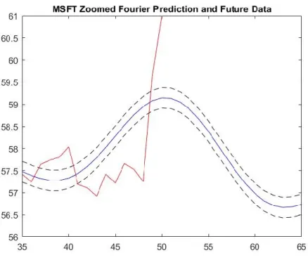
Meanwhile, Microsoft (MSFT) was an example of how the exchange index (NASDAQ) model was relatively the same in accuracy as the linear regression and Fourier series model, but the further the predictions went into the future, the more the two differed (Figures 30 and 31).
38
Figure 30. Fourier prediction for MSFT
Figure 31. MSFT prediction with NASDAQ
The correlation between MSFT and NASDAQ was close to .5, meaning the two had some similarities in their price patterns. When weighting the two prediction curves in the model, they
39 received almost equal weight since the correlation was close to half of one. The combined
prediction curve would then depend on the accuracy of the NASDAQ prediction. The NASDAQ prediction worked well with the autocorrelation of MSFT, so there was a relatively accurate combined prediction curve.
In general, the stocks that either had close to a correlation of 0.5 with their exchange indices or a negative correlation fared the worst with this model. There were some exceptions, such as MSFT, which had accurate predictions on both ends. However, usually a negative correlation would lead to weight being put on the exchange index even though the two price patterns had little similarities. The stocks with a correlation close to 0.5 had a prediction curve skewed towards the index more than needed, resulting in an over or under estimate of the stock’s price, depending on where the index’s prediction curve fell.
Choices for Implementation: Mutual Information or Correlation
As previously shown, index implementation can result in improved stock predictions. Another way to implement the index to the model uses Mutual Information. The concept of correlation is similar to that of mutual information. While correlation is referred as the linear relationship between two sets of variables, mutual information between x and y is a “reduction in uncertainty of x by virtue of being told by y” (Bishop (2013), Page 57). In other words, mutual information shows how close the two sets of data are to each other.
To implement mutual information into our model, we use the same method as when we implement correlation to the model:
1) We find mutual information between a stock and its index. In this model, we use the approach of vanilla kde by A. Tsanas.
2) Create a new prediction by using the mutual information value as a ratio to combine the stock and index together
40 To test the new approach for implementing the index into the model, we find the mean and root mean square for a year (October 16, 2015 – October 16, 2016) for various stocks using three different approaches:
a) Non-index implementation
b) Index implementation using correlation
c) Index Implementation using mutual information
Graphs of the results from one of the stocks, Alphabet Inc. or GOOG, are shown below:
41
Figure 33. Comparison of models with standard deviation - GOOG
For a better analysis, we find the mean of both the mean and root mean square of the error. The results are shown in the tables below:
GOOG Non Corr Mutual Mean -2.0083 -2.2821 -1.9047 STD 13.7834 14.13 13.3134
Table 10. Mean and standard deviations - GOOG
MSFT Non Corr Mutual Mean -0.2006 -0.0554 -0.1555 STD 1.0651 0.9831 1.0181
Table 11. Mean and standard deviations - MSFT
TSLA Non Corr Mutual Mean 0.7573 0.1582 0.3796 STD 10.4983 8.4532 9.3816
Table 12. Mean and standard deviations - TSLA
AMC Non Corr Mutual Mean -0.1929 -0.2412 -0.2121 STD 0.9763 0.9072 0.9397
42 AMZN Non Corr Mutual
Mean 1.0039 -2.8218 -1.3362 STD 16.8398 15.7457 16.2134
Table 14. Mean and standard deviations - AMZN
From the tables above, except for GOOG, the performance of the implementation of the index using correlation provides better performance (lower mean of mean and root mean square) than the other two, followed by implementation using mutual information and
non-implementation.
Therefore, we would recommend the user to use correlation to implement mutual
information as using the correlation will more likely get a better prediction, but keep in mind that there are some stocks in which mutual information alone would produce a better prediction. TISEAN
Finding Lyapunov exponents involved the dual task of determining a reasonable embedding dimension and matching the values of the exponent to the amounts of prediction error. As mentioned before, such a dimension would not include so many days that some would be irrelevant to how the stock currently performs or be an extreme value of either sign. To avoid the issue of determining a proper market index for every stock, the market indices were left out of the model for the implementation of Lyapunov exponents.
For two auto manufacturer and five computer hardware company stocks, taking
November 1st as the last day before the future, the majority of Lyapunov exponents of dimension 2 were negative, while all became positive for dimensions 3 and 4, as shown in Table 15.
Comparing these exponents with the normalized absolute errors of both all 20 days and the first 5 days showed very little relationship between the exponents and the error for any dimension with either day range. This time period, however, was a very turbulent time for the stock market, as many stocks saw sharp price changes over a short period of time, particularly NVIDIA. Across
43 the board, the prediction curves were only reasonably accurate for around eight days. There may also have been effect from the 2016 Presidential Election.
Table 1. Lyapunov exponents at varying dimensions (11/1/2016 as the day before the future)
Stock 2 3 4 HMC -0.023 0.085 0.282 FCAU -0.196 0.242 0.044 NVDA -0.089 0.174 0.176 TXN -0.113 0.047 0.209 MU -0.145 0.101 0.062 AMD 0.118 0.121 0.191 AMAT 0.007 0.215 0.209
Table 15. Lyapunov exponents at varying dimensions 11/1/16
As a result, November 15th was chosen as the new last day before the future. This change resulted in slight changes to the length of the autocorrelation period, ranging from 0-8 days difference. Over the now 15 trading days, no prediction curve was stellar. Both Honda and Fiat-Chrysler, however, both were reasonable. The prediction for AMD had a very large amount of error and may be an outlier. This can be seen in Figure 34.
44
Figure 34. Prediction errors over sets of 5 days after 11/15/2016
As shown in Table 16 and depicted in Figure 35, the exponents again were mostly
negative for a dimension of 2 and began increasing significantly starting with dimension 5. Also, as shown in Figure 36, both dimensions 3 and 4 displayed a relationship between the Lyapunov exponent and the error. For example, in both cases, the stock with the least error, Honda, had the lowest exponent and as either error or exponent increased, the other tended to increase likewise.
Table 2. Lyapunov exponents at varying dimensions (11/15/2016 as the day before the future)
Stock 2 3 4 5 6 7 8 HMC -0.04 -0.02 0.04 1.37 2.98 3.02 4.71 FCAU -0.24 -0.01 0.09 1.29 2.86 4.01 3.98 NVDA -0.05 0.13 0.15 0.60 TXN 0.02 0.10 0.13 0.37 2.35 MU -0.24 0.15 0.06 0.32 2.60 3.99 AMD -0.05 0.14 0.37 0.31 2.41 AMAT 0.06 0.26 0.25 0.29
45
Figure 35. Lyapunov exponents at varying dimensions (11/15/16 as day before future)
46 Stock Portfolios
Each team member compiled a stock market portfolio at the beginning of B-term. The portfolios exemplified how the stock market fluctuates over several months. All three team members made a profit with their portfolios, but the margins varied. In the time between October 2016 and February 2017, the stock market took multiple hits due to the presidential election and typical January fluctuations as companies’ year-end profit data was released. As a result, some stocks saw a decline in prices, while others saw increases, especially at the end of January.
Portfolio A, shown in Table 17, bought stocks on November 1st, 2016. As of February 1st, 2017, the portfolio obtained an 8.45% profit totaling $8,445.70. Only one stock, Canadian Natural Resources Limited (CNQ), resulted in a negative profit. Google (GOOG) and Cabot Oil & Gas Corporation (COG) made small profits, while Tesla (TSLA) made the largest with $3,507. The other stocks, Anadarko Petroleum Corporation (APC), ConocoPhillips (COP), Amazon (AMZN), and Yahoo (YHOO) had modest gains. Half of the stocks in the portfolio were in the oil industry, which was still on a slow climb from when oil prices plummeted earlier in 2016. Thus, the profits from those companies varied significantly based on their ability to recover.
47
Company Start Price End Price Shares Cost Profit
CNQ 31.65 30.13 300 9495 -456 COG 20.54 20.77 300 6162 69 TSLA 190.79 249.24 60 11447.4 3507 APC 59.95 68.36 200 11990 1682 COP 43.54 48.5 300 13062 1488 GOOG 783.61 795.7 20 15672.2 241.8 AMZN 785.41 832.35 20 15708.2 938.8 YHOO 41.33 43.78 398 16449.34 975.1 Total 1598 99986.14 8445.7
Table 17. Stock Portfolio A
Portfolio B, shown in Table 18, bought stocks on October 1st, 2016. As of February 1st, 2017, the portfolio obtained a 17.2% profit totaling $17,114.70. Again, only one stock, Abeona Therapeutics Inc. (ABEO), resulted in a negative profit. Lantheus Holdings, Inc. (LNTH) and Expedia, Inc. (EXPE) made small profits, while Mechel PAO (MTL) made the largest with $9,420, a 109% profit. The other stocks, Microsoft Corporation (MSFT), Vantiv, Inc. (VNTV), Akamai Technologies, Inc. (AKAM), and Baker Hughes Incorporated (BHI), had modest to large gains, ranging from $1,196 to $3875.20. The stocks were from a variety of sectors in the stock market in order to minimize the effects of sector-specific crashes.
48
Company Start Price End Price Shares Cost Profit
LNTH 8.28 8.55 2000 16560 540 MTL 2.86 6 3000 8580 9420 MSFT 57.6 63.58 200 11520 1196 VNTV 56.27 62.25 200 11254 1196 ABEO 6 4.65 2000 12000 -2700 AKAM 52.99 68.7 200 10598 3142 BHI 50.47 62.58 320 16150.4 3875.2 EXPE 116.72 120.77 110 12839.2 445.5 Total 8030 99501.6 17114.7
Table 18. Stock Portfolio B - February 1st
One of the portfolio’s best performances, presented in Table 19 was selling the stocks on November 28th, 2016, with a 22.7% profit totaling $22,608. On that date, all eight stocks had made positive gains.
49
Company Start Price End Price Shares Cost Profit
LNTH 8.28 9.6 2000 16560 2640 MTL 2.86 6.22 3000 8580 10080 MSFT 57.6 60.61 200 11520 602 VNTV 56.27 58.18 200 11254 382 ABEO 6 6.9 2000 12000 1800 AKAM 52.99 66.17 200 10598 2636 BHI 50.47 61.27 320 16150.4 3456 EXPE 116.72 125.92 110 12839.2 1012 Total 8030 99501.6 22608
Table 19. Stock Portfolio B - November 28th
Portfolio C, shown in Table 20, bought stocks on November 1st, 2016. As of February 1st, 2017, the portfolio obtained a 39.6% profit totaling $39,609.46. All seven stocks had positive gains. Honda Motor Co., Ltd. (HMC) had a small profit, while NVIDIA Corporation (NVDA) had the largest at $13,021. Micron Technology, Inc. (MU) and Advanced Micro Devices, Inc. (AMD) also had large gains at $9090.90 and $8786.96 respectively. The other stocks, Fiat Chrysler Automobiles N.V. (FCAU), Texas Instruments Incorporated (TXN), and Applied Materials, Inc. (AMAT) made modest profits. Five of the stocks fell under the
50
Company Start Price End Price Shares Cost Profit
HMC 29.03 29.96 260 7547.8 241.8 FCAU 7.24 10.98 1030 7457.2 3852.2 NVDA 69.05 113.95 290 20024.5 13021 TXN 69.44 76.27 290 20137.6 1980.7 MU 16.98 24.75 1170 19866.6 9090.9 AMD 7.09 12.06 1768 12535.12 8786.96 AMAT 28.9 35.03 430 12427 2635.9 Total 5238 99995.82 39609.46
Table 20. Stock Portfolio C
The profit margins for these portfolios were significant in comparison to the general market’s performance. From October 1st to February 1st, the NASDAQ Composite (^IXIC, Figure 37) increased by 5.8% and the NYSE Composite (^NYA, Figure 38) by 4.3%, while Portfolio B made a 17.2% profit in the same time frame. From November 1st to February 1st, the NASDAQ Composite increased by 8.7% and the NYSE Composite by 7.1%, while Portfolio A made an 8.45% profit and Portfolio C made a 39.6% profit. This concludes that while the market increased overall during the time span of the portfolios, stocks in Portfolios B and C saw greater gains the market average.
51
Figure 37. NASDAQ from 10/01/2016 to 2/01/2017
Figure 38. NYSE from 10/01/2016 to 2/01/2017
Model Predictions of Portfolio Stocks
The following are prediction graphs produced by the model for the stocks in the team’s three portfolios.
52
Figure 39. Fourier prediction for AMZN
53
Figure 41. Fourier prediction for CNQ
54
Figure 43. Fourier prediction for COP
55
Figure 45. Fourier prediction with index for TSLA
56 Portfolio B
Figure 47. Fourier prediction for ABEO
57
Figure 49. Fourier prediction for AKAM with NASDAQ
58
Figure 51. Fourier prediction for BHI with NYSE
59
Figure 53. Fourier prediction for EXPE with NASDAQ
60
Figure 55. Fourier prediction for LNTH with NASDAQ
61
Figure 57. Fourier prediction for MSFT with NASDAQ
62
Figure 59. Fourier prediction for MTL with NYSE
63
Figure 61. Fourier prediction for VNTV with NYSE
Portfolio C
64
Figure 63. Fourier prediction for HMC
65
Figure 65. Fourier prediction for AMD
66
Figure 67. Fourier prediction for NVDA
67
Conclusion
Through research of the stock market and time signal analysis, the team modified and improved a tool for investors to choose potentially profitable stocks. The tool used input of historical price data for stocks and exchange indexes to predict a stock’s future price. The accuracy of the model varied based on the volatility of the stock, which led to the addition of Lyapunov exponents to determine a stock’s volatility before testing it with the model. Overall, stocks with lower volatility had the best predictions. However, only a small amount of testing was done with Lyapunov exponents, so the data is not yet strong enough to say they are a reliable way to measure volatility.
The team tested the model with their stocks from A-term and kept the stocks with the best predictions for their B-term investment portfolios. Out of the six stocks kept, four from the oil industry and two from the auto industry, all but one increased in price from November 1st, 2016 to February 1st, 2017. This showed the model’s ability to predict a stock’s overall price trend with moderate accuracy. In a bullish market, the team had great success with their investment portfolios as a whole, with profit margins ranging from 8.45% to 39.6%. While the model did not predict such success for every stock, the knowledge of being in a bull market paired with the model predictions fared well overall.
Recommendations:
Three academic terms is a limited amount of time when taking on a project as significant as trying to predict stock prices. There are a few topics the team wanted to delve deeper into but time restrictions did not allot for it. Below are some recommendations for future research on modeling the stock market:
68 We recommend looking into the effects of volatility on a stock’s performance and also on the model’s ability to predict a stock’s price. There are several ways of measuring volatility, and some methods may be more successful than the Lyapunov exponents used in this project. Another possible research topic is figuring out why the model works with some stocks better than others. Our conclusions found volatility as part of the solution, but other factors are likely to play a role in the inconsistency of the model across a variety of stocks.
2. Extensively Test Lyapunov Exponents
Using Lyapunov exponents to determine the volatility of a stock has a lot of potential, and this project only grazes upon its surface. We recommend researching a way to measure the accuracy of how well the Lyapunov exponents determine a stock’s
volatility. Accomplishing this requires a lot of data and analysis, which is why it would work well for a future project. With such results, a comparison could be made between the model’s performance and a stock’s Lyapunov exponents.
3. Explore Other Market Areas
There are many more components of the stock market that affect a stock’s price than what is explored in this project. We recommend examining other possible
contributors to market performance. This could include both global and local factors, i.e. those that affect the market on a global scale and those that affect stocks individually. Some possible topics of research include:
A stock’s sector’s performance, volatility, and model prediction in addition to its exchange index
69
Economic trends in foreign markets
70
References
1.1 - What is Simple Linear Regression? (n.d.). Retrieved February 15, 2017, from https://onlinecourses.science.psu.edu/stat501/node/251
Abraham, B., & Ledolter, J. (1983). Statistical methods for forecasting. New York: Wiley. Bisgaard, S., & Kulahci, M. (2011). Time series analysis and forecasting by example. Hoboken, NJ: Wiley.
Bishop, C. M. (2013). Pattern recognition and machine learning. New Delhi: Springer. Bloomberg.com. (n.d.). Retrieved Fall, 2016, from https://www.bloomberg.com/
Boeing, G. (2016). Visual Analysis of Nonlinear Dynamical Systems: Chaos, Fractals, Self-Similarity and the Limits of Prediction. Systems, 4(4),
Brockwell, P. J., & Davis, R. A. (2002). Introduction to time series and forecasting. New York: Springer.
E. (n.d.). Moving average. Retrieved February 15, 2017, from https://ec.europa.eu/eurostat/sa- elearning/tags/moving-average
Fuller, W. A. (1996). Introduction to statistical time series. New York: John Wiley & Sons. Hegger, R., Kantz, H., & Schreiber, T. (1999). Practical implementation of nonlinear time series methods: The TISEAN package. CHAOS, 9, 413.
Investopedia - Sharper Insight. Smarter Investing. (n.d.). Retrieved Fall, 2016, from http://www.investopedia.com/
James, G., Witten, D., Hastie, T., & Tibshirani, R. (2013). An introduction to statistical learning: with applications in R (6th ed.). New York: Springer.
Kreyszig, E., & Kreyszig, H. (2011). Advanced engineering mathematics: tenth edition. Hoboken, NJ: Wiley.
The Motley Fool. (n.d.). Retrieved Fall, 2016, from https://www.fool.com/
Stein, R. A., Harmonic Regression. Personal Collection of Stein, R. A., University of Pennsylvania, Philadelphia, PA
Stein, R. A. Regression Method. Personal Collection of Stein, R. A., University of Pennsylvania, Philadelphia, PA