M E T H O D O L O G Y
Open Access
Visualising associations between paired
‘omics’ data sets
Ignacio González
1*, Kim-Anh Lê Cao
2*, Melissa J Davis
2and Sébastien Déjean
1*Correspondence:
[email protected]; [email protected]
1Institut de Mathématiques -Université de Toulouse III et CNRS, UMR 5219, F-31062 Toulouse, France
2Queensland Facility for Advanced Bioinformatics and the Institute for Molecular Bioscience, The University of Queensland, 4072 St Lucia, QLD, Australia
Abstract
Background: Each omics platform is now able to generate a large amount of data. Genomics, proteomics, metabolomics, interactomics are compiled at an ever increasing pace and now form a core part of the fundamental systems biology framework. Recently, several integrative approaches have been proposed to extract meaningful information. However, these approaches lack of visualisation outputs to fully unravel the complex associations between different biological entities. Results: The multivariate statistical approaches ‘regularized Canonical Correlation Analysis’ and ‘sparse Partial Least Squares regression’ were recently developed to integrate two types of highly dimensional ‘omics’ data and to select relevant information. Using the results of these methods, we propose to revisit few graphical outputs to better understand the relationships between two ‘omics’ data and to better visualise the correlation structure between the different biological entities. These graphical outputs include Correlation Circle plots, Relevance Networks and Clustered Image Maps. We demonstrate the usefulness of such graphical outputs on several biological data sets and further assess their biological relevance using gene ontology analysis.
Conclusions: Such graphical outputs are undoubtedly useful to aid the interpretation of these promising integrative analysis tools and will certainly help in addressing fundamental biological questions and understanding systems as a whole.
Availability: The graphical tools described in this paper are implemented in the freely availableRpackagemixOmicsand in its associated web application.
Introduction
‘Omics’ data now form a core part of systems biology by enabling researchers to under-stand the integrated functions of a living organism. However, the available abundance of such data (genomics, proteomics, metabolomics, interactomics ...) is not a guarantee of obtaining useful information in the investigated system if the data are not properly processed and analyzed to highlight this useful information. A major challenge with the integration of omics data is therefore the extraction of discernable biological meaning from multiple omics data.
Recently, several authors have further improved statistical methodologies to inte-grate two highly dimensional data sets. Such methodologies include regularized and sparse variants of Canonical Correlation Analysis (CCA) [1-5] and Partial Least Squares
(PLS) regression [6,7] - also referred as projection-based methods. These multivariate approaches aim at unravelling the correlation structure between two sets of data mea-sured on the same samples. In addition, they achieve dimension reduction by sum-marizing the data into a small number of components or variates, which are linear combinations of the original variables. These exploratory approaches aim at exploit-ing coexpression between disparate types of biological measures instead of differential expression. The assumption relies on the fact that similar expression patterns across a set of samples are hypothesized to have a functional relationship [8]. In order to better understand the link between the different biological entities from highly dimen-sional data sets, several clustering techniques have been proposed in the literature. One category of approaches include simple criteria matching, which order the vari-ables according to fold-change or univariate statistical tests for a given threshold. These variables are considered to be ‘clustered’ [9]. Other methods, such as self-organizing maps, use Euclidian distances. However, they are known to encounter difficulties in finding variables “negatively” (oppositely) associated with each other [10]. Another way is to comprehensively compare all variables against each other using a similar-ity measure, such as Pearson correlation coefficient [10,11], or mutual information [9]. Once these associations are graphically represented, the aim is to obtain fresh insights into the different biological functional levels, which then act as a foundation for new hypotheses.
So far, most the statistical integrative projection-based approaches cited above have been limited to numerical results, and little attention has been paid to either the interpre-tation of the results or the graphical outputs. In this article, we propose to revisit some graphical outputs mostly dedicated to exploratory approaches to highlight associations between two different types of biological entities. We have improved Correlation Circles plots, Relevance Networks and Clustered Image Maps (CIM) to be specifically adapted to the results of our previously published CCA or PLS methods [1,4,7]. These graphical
out-puts are implemented in theRpackagemixOmicsa that is dedicated to the integrative
analysis of ‘omics’ data [12]. For users not familiar with theRprogramming language, a
web application is also available at http://mixomics.qfab.org.
In the following ‘Background’ Section, we first describe the three graphical outputs used inmixOmics to visualise pair-wise associations between two types of biological vari-ables. In the ‘Results and discussion’ Section, we assess the relevance of the proposed CIM and Relevance Networks on a simulation study. On two real data sets, we provide a thorough biological interpretation of the results obtained and compare the inferred statis-tical networks to known biological networks using data knowledge driven analyses. The ‘Methods’ Section describes how to compute the pair-wise similarity matrix to construct the graphical representations proposed.
Background
We first briefly introduce PLS and CCA methodologies and their associated variants recently developed for the highly dimensional case. More details about the approaches are given in the ‘Methods’ Section. We review the three main graphical outputs proposed in
Integrative approaches
The two-block data matrices to be integrated are denotedX(n×p)andY(n×q), where
pandqare the total number of variables measured on the samensubjects. For example
X is a gene expression matrix and Y contains metabolites concentrations, both
tran-scripts and metabolites being measured on the same patients. CCA and PLS search for the largest correlation and covariance respectively between orthogonal components, also
calledvariates, which are linear combinations of theXandY variables. The number of
chosen dimensions or components in CCA or PLS isd, withd≤min(p,q)for CCA and
d≤pfor PLS.
In classical CCA and PLS regression, all variables from both data sets are included in the fitted linear combinations or variates. However, in the context of high throughput bio-logical data, the number of variables often exceeds tens of thousands. In this case, linear combinations of the entire set of features make biological interpretability difficult as they contain too many variables to perform further tests or to generate biological hypothe-ses. Most importantly, the high dimensionality and the insufficient sample size lead to computational problems as CCA requires the computation of the inverse of the
covari-ance matrices ofX and Y. To circumvent this problem, regularized CCA (rCCA) has
been recently proposed by [1] when dealing with ill-conditioned covariance matrices by adding a regularization term on their diagonal. Sparse PLS (sPLS) has been recently pro-posed to perform simultaneous variable selection in the two data sets [4,7]. sPLS includes Lasso penalization terms on the loading vectors (the vectors which weight are used in the determination of the PLS variates) to shrink some of the coefficients towards zero.
rCCA and sPLS are both implemented in the R package mixOmics [12]. These
methodologies require to choose or tune the number of dimensionsd, the regularization
parameters for rCCA and the number of variables to select in both data sets for sPLS. Guidelines to choose these parameters are discussed in [1,7]. The biological relevancy of rCCA and sPLS has been recently demonstrated in several biological studies [13-18].
Correlation Circle plots
Correlation Circle plots were primarily used for PCA outputs to visualise the relation-ship between variates and variables of the same type, where one single omics data set is analysed [19-23]. The use of such a graphical tool was then generalised to represent variables of two different types using statistical integrative approaches such as Canonical Correlation Analysis and Partial Least Squares regression [24].
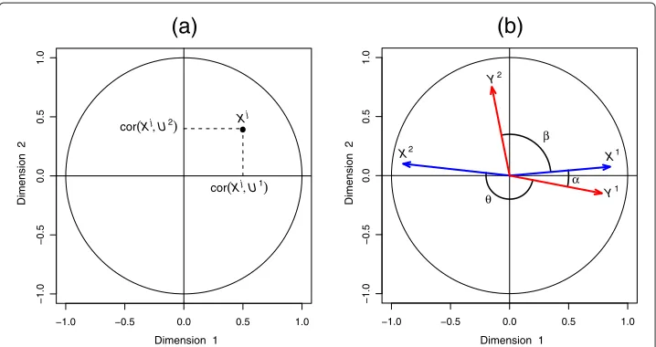
Although not very well known, this plot is an enlightening tool for data interpreta-tion, as it enables a graphical examination of the relationships between variables and variates. In this plot, the coordinates of the variables are obtained by calculating the cor-relation between each original variable and their associated component (see Figure 1(a)). Because variables are usually centered and standardized, the correlation between each variable and a component is simply the projection of the variable on the axis defined by the component.
−1.0 −0.5 0.0 0.5 1.0
−1.0
−0.5
0.0
0.5
1.0
Dimension 1
Dimension 2
Xj
cor(Xj, U1)
cor(Xj, U2)
(a)
−1.0 −0.5 0.0 0.5 1.0
−1.0
−0.5
0.0
0.5
1.0
Dimension 1
Dimension 2
X1
Y1
X2
Y2
α β
θ
(b)
Figure 1 Correlation Circle plot.a)Coordinates of theX-variables on the plane defined by the first two variatesU1andU2.b)The correlation between two variables is positive if the angle is sharp cos(α) >0, negative if the angle is obtuse cos(θ ) <0, and null if the vectors are perpendicular cos(β)≈0.
angle is sharp, the correlation is positive, if the angle is obtuse the correlation is negative and if the angle is right the correlation is null.
The centered and standardized variables are projected onto the space spanned by the two chosen components, inside a circle of radius 1. Thus, from the inner product definition, the longer the distance to the origin, the stronger the relationship between the variables. The variables closely located to the circumference of radius 1 can be directly interpreted, since the closeness on the plane corresponds to the closeness in the
d-dimensional variables space.
For variables closely located to the origin, it means that some information can be carried on other axes and, it might be necessary to visualise the Correlation Circles plots in the subsequent dimensions (see example in Figure 2).
For the sake of interpretability, variables are not represented as vectors but as the end
points of the vectors inmixOmics. Two circles are usually represented, of radii 0.5 and
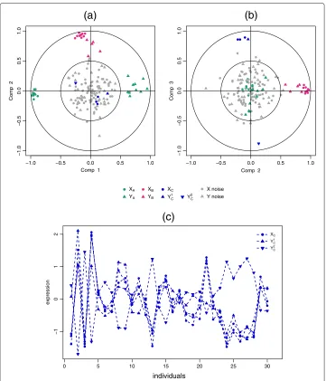
1, to better visualise the ‘important’ variables. Figure 2 gives an example of the different scenarios that can be encountered when visualising the correlation structure between two data sets. The data come from the simulation study of the following ‘Results and discussion’ Section.
The variables or groups of variables strongly positively correlated are projected closely
to each other on the Correlation Circle. This is the case, for instance, withXBandYBon
the dimension 2 (Figure 2(a-b)) andXC andYC1on the dimension 3 (Figure 2(b)). When
the correlation is strongly negative, the groups of variables are projected at diametrically
opposite places on the Correlation Circle. This occurs, for instance, withXAandYAon the
dimension 1 (Figure 2(a)) andXCandYC2on the dimension 3 (Figure 2(b)). The variables
or groups of variables that are not correlated are situated 90° one from the other in the
circle (for instance,XAandYB(Figure 2(a)) andXCandYB(Figure 2(b))).
−1.0 −0.5 0.0 0.5 1.0
−1.0
−0.5
0.0
0.5
1.0
Comp 1
Comp 2
−1.0 −0.5 0.0 0.5 1.0
−1.0
−0.5
0.0
0.5
1.0
Comp 2
Comp 3
XA
YA
XB
YB
XC
YC 1
YC 2
X noise Y noise
0 5 10 15 20 25 30
−1
0
1
2
expression
XC
YC 1
YC 2
(a)
(c)
(b)
individuals
Figure 2 Correlation Circle plots for the simulation study.Correlation Circle plots for dimensions 1 and 2 (a), and 2 and 3(b). TheXandYvariables are represented by thick points and triangles respectively. The subsets of correlated variables are colored according to the legend. Expression profiles of some positively and negatively correlated variables across samples(c).
variables from two data sets can be difficult, and a threshold can be chosen to remove some weaker associations.
Relevance networks
0.6), an edge is drawn between these two variables, otherwise, no edge is drawn and these two variables are considered not associated for this threshold, and the variables/nodes with no link are not represented in the graph.
The construction of biological networks (gene-gene, protein-protein, etc.) with direct connections within a variable set is of considerable interest amongst biologists, and has been extensively used in the literature. Therefore, we will not consider this case and focus rather on the representation between variables of two different types. We will thus display Relevance Networks through the use of bipartite graph (or bigraph), where
variables/nodes fromXcan only be connected to variables/nodes fromY.
Instead of computing the Pearson correlation coefficients between each pair of vari-ables as was proposed by [10], bipartite networks are inferred using a pair-wise similarity matrix directly obtained from the outputs of the integrative approaches (regularized) CCA and (sparse) PLS. The values in the similarity matrix are computed as the corre-lation between the two types of projected variables onto the space spanned by the first components retained in the analysis. The values in the similarity matrix can be seen as a robust approximation of the Pearson correlation (see Section ‘Methods’).
The advantage of relevance networks is their ability to simultaneously represent posi-tive and negaposi-tive correlations, which are missed by methods using Euclidian distances or mutual information. Another advantage is their ability to represent genes in several path-ways, and, most importantly for our purpose, to represent correlations across disparate biological measures. One of the main limitation of relevance networks is that it requires extensive computing ressources as mentioned by [26] to compute the comprehensive pair-wise associations when the underlying network is fully connected, i.e. when there is an
edge between any pair of two typesXandY variables (see also [27] who recently
pro-posed an R package for fast computation of the correlations). In the case of the sparse PLS, extensive computing is not required since the pair-wise association are only com-puted for the variables selected by the approach. A threshold is also proposed to remove some weaker associations.
Since the relevance networks are visual representations of the correlations between variables, one looks for clusters or sub-networks of subsets of variables, where the edge colors indicate the nature of the correlation (positive, negative, strong or weak). Each of these clusters often highlight a specific correlation structure between the features. More details about the relevance networks interpretation can be found in the Section ‘Results and discussion’.
Clustered Image Maps
(positive, negative, strong or weak), while the dendrogram indicate the proximity between correlated variables. In practice, one looks for well defined large rectangles or squares of the same color corresponding to long branches of the dendrograms. More details about the CIM interpretation can be found in the the Section ‘Results and discussion’.
The similarity matrix represented by the CIM is the same as in the relevance networks described above. CIM is a visualisation tool that complements well the Correlation Cir-cles plots and the Relevance Networks as clusters of subsets of variables of the same type correlated with subsets of variables of the other type can be observed. This complemen-tarity of three graphical outputs is illustrated in the Section ‘Results and discussion’ on the Nutrimouse case study.
Implementation inmixOmics
Correlation Circles plots, Relevance Networks and Clustered Image Maps are
imple-mented in the R package mixOmics [12] to be applied to a variety of integrative
approaches implemented in the package, such as rCCA and sPLS methodologies. Full tutorials on how to analyse data sets with different methodologies and how to obtain spe-cific graphical outputs with desired legends and colors are available on the website http://
www.math.univ-toulouse.fr/~biostat/mixOmics. For users not familiar with theR
pro-gramming language, an associated web application is available at http://mixomics.qfab. org and provides a Cytoscape plugin to display the Relevance Networks in an attractive manner.
Results and discussion
We investigate the relevance of Correlation Circle plot, Relevance Networks and CIM representations, firstly on a simulated data set to assess if the proposed graphical outputs are able to highlight pair-wise association structure between two data sets, and secondly on two biological data sets to assess the biological relevance of such graphical tools.
Simulated data
Data sets
We generated two data setsXandYwith an equal number of 30 observations in each data
set. A subset of relevant variables inXwere associated with a subset of relevant variables
inYaccording to the model described below, and the remaining variables were simulated
as noise. This simulation study enables to assess if the proposed graphical representations allow differentiate the associated groups of relevant variables from the noisy variables.
• The relevantX and Y variables were generated according to a normal distribution with zero mean and covariance matrixdefined by :
=
XX XY
XY YY
, with XY =
⎡ ⎢ ⎢ ⎣
AXY 0 0
0 BXY 0
0 0 CXY
⎤ ⎥ ⎥
⎦.
Details about the covariance matrices can be found in Additional file 1.
• X contains three independent sets of respectively 10, 10 and 3 cross-correlated variables:XA=
X1A,. . .,XA10,XB=
X1B,. . .,XB10andXC =
contains three independent sets of respectively 10, 5 and 2 cross-correlated variables:
YA=YA1,. . .,YA10,YB=YB1,. . .,YB5andYC =YC1,YC2. These groups of variables are associated with each other according to the cross-correlation matrixXY.
• The relevant variables inXAandYAwere generated with a negatively
cross-correlation varying between−0.93and−0.51. The variables inXBandYBwere generated with a positive cross-correlation varying between 0.5 and 0.85; and the variables inXCandYCwere generated with an absolute cross-correlation varying between 0.81 and 0.93,XCis positively correlated withYC1and is negatively correlated withYC2.
• The irrelevant (noisy) variables were simulated with a normal distribution with zero mean and covariance identity matrices and were added to the sets such that final data set contained 100 variables forX and 50 variables for Y. These variables are
independent within the setsX and Y and with each other.
Analysis process
PLS canonical mode (PLS-can) was applied to these data sets and the graphical
rep-resentations Correlation Circle plots, CIM and Relevance Networks resulting from the statistical approach were plotted. The first three dimensions were chosen for these graphical displays (correlation values between latent variables equal to 0.97, 0.94 and 0.95 respectively on each dimension, before decreasing for the following dimensions, Section ‘Methods’ gives the original references to the parameters tuning for the different
approaches inmixOmics).
Graphical outputs
Figure 2 displays the corresponding correlation circle plots. Figure 2(a) highlights the
strong negative correlation between clustersXAandYAon dimension 1 and the strong
positive correlation between clustersXBandYBon dimension 2. Figure 2(b) underlines a
strong positive correlation betweenXCandYC1and a strong negative correlation between
the latter andYC2on dimension 3. For that last case, Figure 2(c) represents the
expres-sion profiles of the variables across the 30 individuals and illustrates in a more intuitive manner the nature of the correlation between the variables.
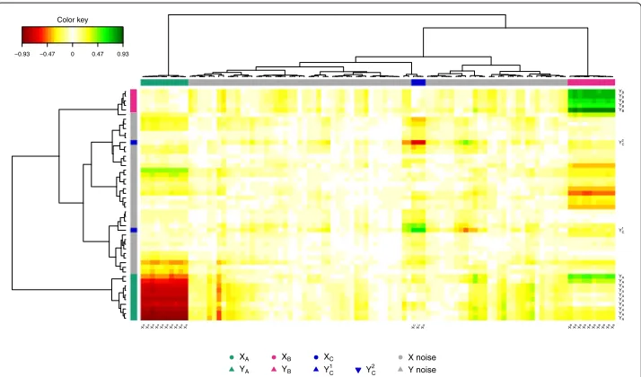
The pair-wise similarity matrix was then computed using our proposed method (see Section ‘Methods’) for the first three PLS dimensions in order to display the CIM (Figure 3). The Euclidian distance and the Ward method were used for the hierarchical clustering. In the CIM display, each coloured block represents an association between
subsets of theX-variables and theY-variables. The green colour indicates that theXand
Y clusters are positively correlated (clusterXBandYB, and clusterXC andYC1), and the
red colour indicates a negative correlation in theX-Ycluster (clusterXAandYA, and
clus-terXCandYC2), whereas yellow indicate weaker correlation values. The dendrograms on
the top and the left hand side of the map indicate how the clusters join, the longer the distance, the sharper the boundary between the coloured blocks.
The variables with blank names indicate variables with weak correlations (irrelevant variables). The CIM details in a more comprehensive manner than the correlation circle plots the correlations between all variables.
−0.93 −0.47 0 0.47 0.93
Color key
XAXAXAXAXAXAXAXAXAXA XCXCXC XBXBXBXBXBXBXBXBXBXB
YA
YA
YA
YA
YA
YA
YA
YA
YA
YA
YC1
YC
2
YB
YB
YB
YB
YB
XA
YA
XB
YB
XC
YC
1 Y
C 2
X noise Y noise
Figure 3 CIM for the simulation study.CIM on the simulated data with the PLS-can method. The green and red colours indicate positive and negative correlations respectively, whereas yellow indicate small correlation values. The clusters of variables are colored on the top and left side of the CIM as in Figure 2. The variables with blank names indicate variables with weak correlations (irrelevant variables).
dimensions (see Section ‘Methods’). Three relevant components were obtained setting a
threshold to 0.5, linking the corresponding correlated subsets:XAwithYA,XBwithYB
andXC with YC. Note that none of the irrelevant variables were displayed in the
net-work, demonstrating the good ability of the PLS approach to estimate the real simulated correlations.
Comparison with rCCA
The rCCA approach was also applied to these data sets with regularization parameters
λ1 = 0.889 andλ2 = 0.889 for the first three dimensions (canonical values obtained
were of 0.959, 0.925, and 0.881 on each dimension respectively, followed by much lower values). As expected, the graphical outputs were very similar to those with PLS-can.
In this simulation setting, accuracy of inferred networks from rCCA and PLS-can were similar, while networks inferred with Pearson correlation gave a much higher error rate, especially for a small number of samples (see Additional file 2).
This simulation study shows that Correlation Circle plots, Relevance Networks and CIM are able to highlight the relevant variables amongst the noisy ones and pinpoint the pair-wise association structure between the two data sets. In the following, we illustrate the use of such graphical outputs on real data sets and discuss the biological relevancy of the obtained results.
Biological data
Data sets
These data sets are publicly available in themixOmicspackage [12] and provide good
illustrative examples for this Section. However, much larger biological data sets could be
−0.95 −0.45 0.95 Color key
XA1
XA2
XA3
XA4
XA5
XA6 XA7
XA8
XA9 XA10
XB1 XB2
XB3
XB4
XB5 XB6
XB7
XB8
XB9
XB10
XC1 XC2
XC3
YA1 YA2 YA3
YA4
YA5
YA6 YA7
YA8 YA9
YA10 YB1
YB2 YB3
YB4
YB5
YC1
YC2
Figure 4 Relevance Networks for the simulation study.Relevance Networks obtained with sPLS-can on the simulated data using thenetworkfunction in themixOmicspackage. Green and red edges indicates positive and negative correlation respectively.XandYvariables are represented respectively as circles and rectangles.
specifically developed to handle large data sets (several thousands of variables in both data sets).
Nutrimouse data. The data come from a nutrigenomic study [31] in which 40 mice from
two genotypes (wild-type and PPARα -/- deficient) were fed with five diets with
con-trasted fatty acid compositions. Oils used for experimental diets preparation were corn and colza oils (50/50) for a reference diet (REF), hydrogenated coconut oil for a saturated fatty acid diet (COC), sunflower oil for an Omega6 fatty acid rich diet (SUN), linseed oil for an Omega3 rich diet (LIN) and corn/colza/enriched fish oils (43/43/14) for the FISH diet. Expression of 120 genes in liver cells were acquired through microarray experiment and concentrations of 21 hepatic fatty acids were measured by gas chromatography. The
study therefore includes two data matrices of size (40×120) for the gene expression and
(40×21) for the fatty acids measurements.
Liver toxicity data. The data come from a liver toxicity study [32] in which 64 male rats of the inbred strain Fisher F344/N were exposed to low (50 mg/kg or 150 mg/kg) or to high (1500 mg/kg or 2000 mg/kg) doses of acetaminophen (paracetamol) in a controlled experiment. Necropsies were performed at 6, 18, 24 and 48 hours after exposure and the mRNA from the liver was extracted. Ten clinical chemistry measurements of variables containing markers for liver injury are available for each subject and the serum enzymes levels are numerically measured. The study therefore includes two data matrices of size
Analysis process
Several methodologies are implemented in mixOmics to integrate data from two
different types, to model the relationships between the two types of features in an appro-priate manner (see Section ‘Methods’ for a brief description of the models). In the Nutrimouse data, we applied the methodology sPLS-can as the aim is to highlight highly correlated subsets of genes and hepatic fatty acids in the two data sets. This study was previously analysed with another approach (rCCA [1]). In this paper, the aim is to illus-trate the usefulness of combining the three graphical outputs to interpret such results, and assessing the biological relevance of the Relevance Networks obtained.
In the Liver Toxicity data, we applied the methodology sPLS-reg as the aim is to high-light a subset of correlated genes which expression can predict the clinical chemistry measurements [33]. This analysis was performed in a previous paper to demonstrate the numerical good results of the sPLS-reg approach but no focus was made on the biological relevance of the results or on the use of variable graphical outputs. In this paper, we focus instead on the biological relevancy of the resulting Relevance Networks. In both studies, using these integrative methodologies and associated graphical outputs, the biological questions we ask are: which subsets of variables from both types are strongly positively or negatively correlated with each other? Do these selected features bring any relevant insight in relation to system under study?
Two parameters need to be tune in sPLS: the number of dimensions and the number of variables to select on each dimension. For both data sets, three dimensions were chosen (see numerical results presented in [1,7]). To illustrate the use of the proposed graphical outputs, we arbitrarily chose to select 50 transcripts or genes on each dimension. This rather large selection size (150 transcript or genes) is justified by the Gene Ontology (GO) analysis which require a sufficient number of variables to assess their biological relevance. The similarity matrices were computed from the sPLS method on the basis of the selected variables.
To highlight the strongest variable associations only, variables with an association score greater than 0.6 in absolute value were chosen to infer the Relevance Networks. This threshold was arbitrarily chosen in order to obtain biologically interpretable networks that were neither too sparse nor too dense. The obtained networks were then used as an input to Cytoscape [34] for visualization and GeneGo [35] and topGO [36,37] were used to assess the biological relevancy of the inferred associations between the different
types of variables (see Additional file 3 for theRscript used and how to export the
net-work to a Cytoscape file format). This analysis is similar to the one performed by [38] who assessed the results of rCCA in a metabolic syndrome study. We then compared the obtained inferred networks to known biological networks through data driven and knowledge driven biological analyses.
Application to Nutrimouse data
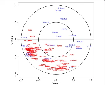
Preliminary analysis comparing the different graphical outputs. In order to illustrate the usefulness of the variable graphical outputs in a real case study, we first discuss the outputs obtained on the first two components, where 50 genes were selected on each dimension. The Correlation Circle plot (Figure 5) displays all fatty acids and the genes selected on each component (a 100 in total in this plot). It highlights subsets of
−1.0 −0.5 0.0 0.5 1.0 −1.0 −0.5 0.0 0.5 1.0
Comp 1
Comp 2
ACAT1 ACAT2 ACBP ACC1 ACC2 ACOTH ADSS1 ALDH3 AM2R AOX BACT BIEN BSEP C16SR CACP CAR1 CBS CIDEA COX1 COX2 CPT2 CYP24 CYP27a1 CYP27b1 CYP2b10 CYP2b13 CYP2c29 CYP3A11 CYP4A10 CYP4A14 FAS FAT FDFT G6PDH G6Pase GK GS GSTa GSTmu GSTpi2 HMGCoAred HPNCL IL.2 L.FABP LDLr LPK LPL LXRa Lpin Lpin1 Lpin2 Lpin3 MCAD MDR1 MDR2 MRP6 MS MTHFR NURR1 Ntcp OCTN2 PDK4 PECI PLTP PMDCI PON PPARd PPARgPXR Pex11a RARa RARb2 RXRa RXRb2 RXRg1 S14 SHP1 SIAT4c SPI1.1 SR.BI THB THIOL TRa TRb Tpalpha Tpbeta UCP2UCP3 VDR VLDLr Waf1 apoA.I apoC3 apoE c.fos cHMGCoAS cMOAT eif2g i.BABP i.BAT i.FABP i.NOS mABC1 mHMGCoAS C14:0 C16:0 C18:0 C16:1ω9
C16:1ω7 C18:1ω9
C18:1ω7
C20:1ω9
C20:3ω9
C18:2ω6
C18:3ω6 C20:2ω6
C20:3ω6 C20:4ω6 C22:4ω6
C22:5ω6 C18:3ω3
C20:3ω3
C20:5ω3 C22:5ω3
C22:6ω3
Figure 5 Correlation Circle plots for the Nutrimouse study.Correlation Circle plots for the first two sPLS dimensions (100 genes selected in total).
C16:0 are the fatty acids which variation mainly participate to the definition of the sPLS
component 2 (top and bottom of they-axis). Similarly, genes such as CAR1, ACOTH,
SIAT4C, SR.BI, Ntop are positively correlated to each other, and to the fatty acid C16:1ω9
and their variation participate to the definition of the sPLS component 1 (left-hand side
of thex-axis).
While the CIM better highlights different clusters of variables and their degree of cor-relation (indicated by the colour code) than the Corcor-relation Circle plots (Figure 6), the visualisation of the correlation within variables sets is more difficult to observe. For
example, the Correlation Circle plot highlights a negative correlation between [C18:2ω6,
C20:2ω6] and C16:0, which is less obvious in the CIM.
−0.83 −0.42 0 0.42 0.83 Color key GSTpi2SPI1.1 CYP3A11 PMDCIG6Pase FAS
CYP4A14GSTmuCYP4A10
CBS
THIOLACBPL.FABPCACP GKAOXGSTa
HPNCLALDH3
mHMGCoAS
PECIACAT2THB CYP2c29Pex11aPPARd
FDFTIL.2LpinLpin1 cMOATMRP6PLTPCOX1S14i.BABPmABC1BACTC16SRAM2RLDLr
cHMGCoAS
CYP27a1
TpbetaMDR2apoE
HMGCoAred
LPK
apoA.IBSEPLpin2BIEN TpalphaCPT2CAR1ACOTHSIAT4cSR.BINtcpRXRaMCADWaf1TRa
SHP1VDRFAT
RXRg1
MSeif2gUCP2CYP24Lpin3UCP3PDK4 CYP27b1RARb2CYP2b13
VLDLrPONCOX2i.BATACAT1apoC3MTHFR LXRai.FABPACC2ACC1
G6PDH
PXR
RXRb2OCTN2
GS
CIDEAADSS1RARac.fos NURR1i.NOSCYP2b10
LPLTRb MDR1PPARg C18.2n.6 C20.2n.6 C22.4n.6 C20.3n.6 C22.6n.3 C18.0 C22.5n.6 C20.4n.6 C20.5n.3 C22.5n.3 C20.1n.9 C18.3n.3 C20.3n.3 C18.3n.6 C16.0 C20.3n.9 C16.1n.9 C18.1n.9 C14.0 C16.1n.7 C18.1n.7
Figure 6 CIM for the Nutrimouse study.CIM for the first two sPLS dimensions (100 genes selected in total). Green (red) indicate high positive (negative) correlation.
easier visualisation, the cytoscape software was used to represent the networks, but the
similarity matrix was estimated withmixOmics.
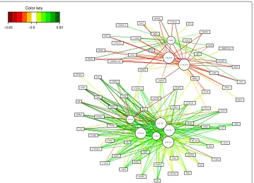
GeneGO analysis. The Relevance Network generated for the Nutrimouse data at a threshold 0.6 highlighted two subsets of fatty acids, and three subsets of genes (Figure 8). Considering first the fatty acids, the yellow group on the left-hand side contained all the
ω6 fatty acids from the data set (C18:2ω6, C20:2ω6, C20:4ω6, C20:3ω6, C22:5ω6, and
−0.83 −0.6 0.83 Color key ACBP ACC1 ACC2 ACOTH ADSS1 ALDH3 AOX BACT BIEN BSEP CACP CAR1 CBS CIDEA CPT2 CYP24 CYP27a1 CYP27b1 CYP2b10 CYP2b13 CYP3A11 CYP4A10 FAS FAT G6PDH GK GS GSTa GSTpi2 HPNCL L.FABP LPL LXRa Lpin2 Lpin3 MCAD MDR1 MDR2 MRP6 MS NURR1 Ntcp OCTN2 PDK4 PECI PLTP PMDCI PPARg PXR RARa RARb2 RXRa RXRb2 RXRg1 SHP1 SIAT4c SR.BI THIOL TRa TRb Tpalpha Tpbeta UCP2 UCP3 VDR VLDLr Waf1 c.fos cHMGCoAS cMOAT eif2g i.FABP i.NOS mHMGCoAS C14.0 C16.0 C18.0 C16.1n.9 C16.1n.7 C18.1n.9 C18.1n.7 C18.2n.6 C20.2n.6
Figure 8 Relevance Networks for the Nutrimouse study.Relevance Networks generated with Cytoscape based on the proposed estimation of the pair-wise associations between seleted genes and fatty acids. Green and red edges indicate positive and negative correlation respectively.
C22:4ω6). The second group of fatty acids consisted of those in theω9,ω7, and saturated
fatty acid groups, along with the twoω3 fatty acids included in the data set. These groups
made sense in the context of lipid biosynthetic pathways – one biosynthetic pathway leads
to the production ofω6 lipids, while theω9,ω7 and saturated lipids are the product of an
alternative lipid biosynthetic pathway (orange nodes). Theω3 group was the exception in
our analysis – it was generated by a pathway related to theω6 pathway (yellow nodes),
but based on the connectivity in our network, these fatty acids partitionned with theω7,
ω9 and saturated fatty acid group [39].
The three gene sets defined by network topology were: (1) a set of genes that were
negatively correlated with only theω6 lipid group; (2) a set of genes that were negatively
correlated with theω6 group, but largely positively correlated with the other lipid group;
and (3) a gene set that was only associated with the second lipid group, with positive
correlations to theω3,ω7,ω9, and saturated fatty acids C14:0 and C16:0, but negatively
correlated with the C18:0.
Theω6 group showed only negative correlations with genes selected by sPLS-can. This
was consistent with the observations made by [31] that feeding mice a diet rich inω6 fatty
acids lead to the down regulation of several genes on the array.
The second group of genes contained many targets of PPARα, a nuclear receptor
tran-scription factor associated with the high-level regulation lipid metabolism (dark blue
nodes). PPARα targets are expected to be associated with long-chain polyunsaturated
fatty acids from theω3 family, while the final subset of genes involved in lipid
biosynthe-sis is expected to be closely associated with the saturated and monosaturated fatty acids
of theω7 andω9 families. Both of these associations were apparent in the network. An
in-depth analysis of the Nutrimouse data is behind the scope of this article. The reader can refer to [31,39] for more details about the underlying biological interpretation.
Application to Liver Toxicity data
A
B
C 1
2
3
4
Figure 9 Relevance Networks for the Liver Toxicity study.Relevance Networks generated with Cytoscape based on the proposed estimation of the pair-wise associations between selected genes and clinical variables. Green and red edges indicate positive and negative correlation respectively. The network contained three groups of clinical chemistry measurements (white nodes): A [ALB], B [CHOLE] and C [ALT, AST, BUN, TBA] and four groups of genes (colored nodes) denoted 1, 2, 3 and 4.
(negative) correlation. This network contained three groups of clinical chemistry mea-surements (white nodes) denoted A, B and C and four groups of genes (colored nodes) denoted 1, 2, 3 and 4. Considering first the chemistry measurements, groups A and B only consisted of albumin [ALB] and cholesterol [CHOLE] levels respectively. Group C contained indicators of liver injury (Alanine Aminotransferase [ALT] and Aspar-tate aminotransferase [AST]), indication of renal injury (urea nitrogen [BUN]), and assessment of cholestasis – bile flow interruption (total bile acids [TBA]).
The four gene subsets defined by network topology (Figure 9) were: group 1: a set of genes that were positively correlated with the cholesterol levels B but negatively correlated with C; group 2, a set of genes that were negatively correlated with ALB levels only (group A); group 3, a set of genes positively correlated with group C and negatively correlated with group B; and group 4 a gene set with only positive correlations with group C.
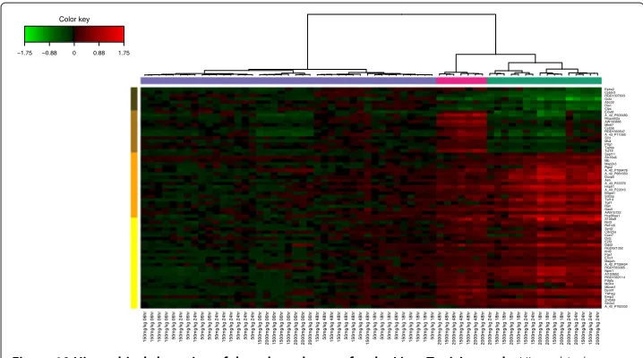
Biological relevance of the extracted genes. Hierarchical clustering (heatmap) of the biological samples on the extracted genes is displayed in Figure 10. This clustering high-lights the groups of rats which were treated with different doses of acetaminophen (also found in [32]). Clusters labelled (coloured at the top of the heatmap) with either no (vio-let), moderate (cyan) or severe (magenta) necrosis of the centrilobular region of the rat liver were obtained by using the expression values of the genes extracted from the net-work. Levels of the clinical chemistry measurements on each group of samples are given in Additional file 4. Figure 10 also highlights the differences in gene expression profiles between each gene cluster (coloured in dark brown, brown, orange and yellow at the left side of the heatmap). Gene expression differences are clearly observed between the clusters.
−1.75 −0.88 0 0.88 1.75
Color key
150mg/kg 06hr 150mg/kg 06hr 150mg/kg 06hr 150mg/kg 06hr 50mg/kg 06hr 150mg/kg 24hr 50mg/kg 06hr 150mg/kg 24hr 50mg/kg 06hr 50mg/kg 06hr 50mg/kg 24hr 150mg/kg 24hr 150mg/kg 24hr 50mg/kg 24hr 50mg/kg 24hr 50mg/kg 24hr
1500mg/kg 06hr 2000mg/kg 06hr 1500mg/kg 06hr 1500mg/kg 06hr 1500mg/kg 06hr 2000mg/kg 06hr 2000mg/kg 06hr 2000mg/kg 06hr 150mg/kg 48hr 50mg/kg 48hr 150mg/kg 48hr 150mg/kg 48hr 50mg/kg 48hr 150mg/kg 48hr 50mg/kg 48hr
1500mg/kg 48hr 50mg/kg 18hr 50mg/kg 18hr 50mg/kg 18hr 50mg/kg 48hr 150mg/kg 18hr 150mg/kg 18hr 150mg/kg 18hr 150mg/kg 18hr 50mg/kg 18hr
2000mg/kg 48hr 1500mg/kg 48hr 2000mg/kg 48hr 1500mg/kg 48hr 1500mg/kg 48hr 2000mg/kg 48hr 2000mg/kg 48hr 2000mg/kg 24hr 1500mg/kg 18hr 1500mg/kg 18hr 2000mg/kg 18hr 1500mg/kg 18hr 1500mg/kg 24hr 1500mg/kg 24hr 2000mg/kg 18hr 2000mg/kg 18hr 1500mg/kg 18hr 2000mg/kg 18hr 2000mg/kg 24hr 2000mg/kg 24hr 1500mg/kg 24hr 1500mg/kg 24hr 2000mg/kg 24hr
A_42_P762202 Slc2a1 Znf593 Emp3 Ywhag Dynll1 Mboat1 Mcm4 Pdgfa RGD1562114 AI103652 Npm1 RGD1563365 A_42_P758454 Magoh Ercc1 Pgs1 Ifrd2 RGD621352 Ddit3 E2f3 Dnlz Cxcr7 Cdc25a Synj2 Rnf145 Nol3 S100a9 Hsp90aa1 AW915722 Gas5 Ran Tgif1 Taf1d Sdcbp B3gnt1 A_43_P22616 Hsph1 A_43_P23376 Aen Dusp5 A_42_P681650 A_42_P769476 Rgs2 Map2k3 Mb Slc16a6 Sept11 Tcf19 Tapbp Pttg1 Mvd Scd A_43_P11285 RGD1563547 Cyb5b Mki67 AW143886 Rnaseh2a A_42_P505480 Elovl6 Clpx Dio1 Abcd3 Gckr RGD1307603 Cyb5r3 Ephx2
Figure 10 Hierarchical clustering of the selected genes for the Liver Toxicity study.Hierarchical clustering of the biological samples using the extracted genes from sPLS-reg network. Agglomerative hierarchical clustering was derived using the Euclidean distance as the similarity measure and Ward methodology. The resulting heatmap contains the genes in rows and samples in columns with red indicating up regulation, green down regulation and black no change. On the top of the heatmap, clusters of the biological samples are colored in violet, cyan and magenta for no, moderate or severe necrosis respectively. On the left hand side of the heatmap, gene clusters are shown (dark brown, brown, yellow and orange).
The extracted genes were uploaded into topGO [36,37]. A Gene Ontology (GO) enrichment analysis from the gene list was then performed. GO terms significantly enriched include biological processes related to nitric oxide metabolism and cellular stress responses, including responses to unfolded proteins. The top GO molecular functions enriched in the gene set relate to protein binding, nucleotide binding, and enzyme activity (eg. hydrolase, phosphatase, decarboxylase). Cellular component GO terms enriched in the set mostly relate to very general locations, however both an endopeptidase complex and the peroxisome are also present in the list, reinforcing the association of the selected gene products with proteolysis and the response to stress and unfolded proteins.
The individual gene clusters in the sPLS-reg network (Figure 9) may also be examined for GO enrichment, as we have done for the larger cluster 4. For example, while examining the biological process terms associated this cluster, we saw an enrichment for processes involving xenobiotic transport, and interesting functional enrichments such as positive regulation of mesenchymal cell proliferation, a process that was previously observed to occur in other tissues in response to epithelial damage signalling to the underlying mes-enchyme to initiate proliferation and tissue remodelling [40], and negative regulation of CREB transcription factor activity, interesting due to the previous association of CREB transcription factor with responses to cytotoxic stress [41,42], particularly in renal tubular cells [43].
stress and presentation of endogenous antigens. A summary of these networks can be found in Additional file 5.
Conclusions
Since several methodologies have been recently proposed to jointly analyse two data sets, the development or the improvement of graphical tools is now crucial to better visualise and understand complex associations between biological entities. In the omics era in par-ticular, the deluge of data can make the interpretation of the results extremely difficult.
In ourRpackagemixOmics, we have proposed such graphical tools to ease the
inter-pretation of the implemented integrative methodologies dedicated to the analysis of large biological data sets.
In this paper, we revisited and further developed three types of graphical displays to better understand and interpret the results obtained with CCA and PLS related meth-ods. We thoroughly described how to interpret Correlation Circles plots, which are very insightful graphical outputs to represent the associations between two types of variables. To complement the Correlation Circle plots, we proposed two types of graphical displays: both CIM and Relevance Networks are graphical representations of a pair-wise similarity matrix directly estimated from the results of the integrative methodologies implemented inmixOmics. The results obtained on simulated and real data sets illustrated very well the usefulness of these graphical tools to further explore the relationships between two omics data sets. The thorough biological interpretation of the obtained inferred networks using geneGO analysis demonstrated the relevancy of the approach.
Full tutorials are available on http://www.math.univ-toulouse.fr/~biostat/mixOmics
to use all the methodologies and graphical outputs implemented in mixOmics. An
associated web application is also available at http://mixomics.qfab.org and provides a Cytoscape plugin to display the Relevance Networks in an attractive manner.
Methods
We revisit and further develop graphical outputs to visualise correlation structures between two data sets. Correlation Circle plots, CIM and Relevance Networks all use as
input by-products of the integrative approaches implemented in themixOmicspackage.
Both CIM and the Relevance Networks require the estimation of large scale
associa-tion or pair-wise similarity matrixMas an input. Previously, several similarity measures
have been proposed, including Pearson correlation coefficient [10,29,44,45], entropy and mutual information [9]. We propose instead a novel approach to estimate a pair-wise similarity matrix using the results of either PLS or CCA approaches.
We briefly describe the PLS and CCA methodologies and associated variants recently developed for the highly dimensional case, more details about these approaches can be found in [1,7]. We then describe how to estimate the pair-wise similarity matrix to construct Relevance Networks and CIM.
CCA and PLS based methods
Notations
We focus on two-block data matrices denotedX(n×p)andY(n×q)where thep
observationsn, forj = 1,. . .,pandk = 1,. . .,q. We adopt the following notation:Mjk
represents the element of thekth row andjth column of the matrixM.
CCA
CCA [46] looks for the largest correlation between a linear combination of the variables
in the first setXand a linear combination of the variables in the second setY. The first
pair maximizes the correlationρ1 =cor(Xa1,Yb1)subject to var(Xa1)= var(Yb1) =1.
The subsequent pairs(Xal,Ybl),(l=2,. . ., min(p,q))maximize the residual correlation
with the additional requirements that each pair is to be uncorrelated with the previous
pairs. In the following, we will refer toal andblas thecanonical loadings(or weights).
The resulting variablesUl = Xal andVl = Ybl are called thecanonical variatesandρl
are known as thecanonical correlations.
PLS
PLS [47] searches for the largest covariance between linear combinations of theXand the
Y variable. The first pair maximises cov(Xa1,Yb1)subject to||a1|| = ||b1|| = 1. Similar
to CCA, the subsequent pairs(Xal,Ybl),(l=2,. . .,q)maximize the residual covariance
with the additional requirements that each pair is to be uncorrelated with the previous pairs. The algorithm of PLS differ from CCA as it is solved in an iterative manner by
sequentially decomposing the data matrices. Thealandblare referred toloading vectors
(or weights) and the linear combinationsUl =Xal andVl = Yblas thelatent variables
(or variates). Several PLS algorithms have been proposed in the literature, for different shapes of data (SIMPLS [48], PLS1 and PLS2 [47], PLS-SVD [49]), as well as for different modelling aims (predictive like PLS2, or modelling like PLS-mode A, see [2,23,50]). In
the present paper, we will refer to a PLS approach with two different aims.PLS-reg(for
PLS-regression mode) is used to model an ‘asymmetric’ or uni-directional relationship
between the two data sets, i.e. we want to predict the matrixY with the dataX. In that
case, the model isY = AXwhereAis the matrix of the regression coefficients.PLS-can
(for PLS-canonical mode) is used to model an ‘symmetric’ way and therefore models a
bi-directional relationship. In that case, we would like to modelAY =BXwhereAandBare
the matrices of the regression coefficients. PLS-can and CCA have very similar purposes.
Regularized and sparse based methods
rCCA. The high dimensionality and the insufficient sample size lead to computational
problems as CCA requires the computation of the inverse of matricesXXandYY. To
circumvent this problem, [1] developed a regularized (or ridge) extension of CCA (rCCA). rCCA solves the instability of the loadings due to multicollinearity by adding a regular-ization term on the diagonal of the ill-conditionned matrices, i.e. the covariance matrices. Thus, highly correlated variables get similar loadings, resulting in a grouping effect. The
regularization termsλ1andλ2associated to each data set are chosen by cross-validation
in order to maximize the first canonical correlation.
sPLS. Several sparse PLS have been proposed in the literature to select variables [6,7].
These approaches introducel1(Lasso) penalization terms on the loading vectors to shrink
selecting variables from both sets and therefore providing sparse sets of associated vari-ables. In the article, we consider the sparse PLS proposed by [7] since both regression (sPLS-reg) and canonical mode (sPLS-can, [4]) are available. For practical purposes, the two penalization parameters associated to each data set were replaced by the number of variable to select on each data set and on each sPLS dimension.
Parameters tuning. Both rCCA and sPLS are implemented in mixOmics. These
approaches require to choose the number of dimensions d and the
regulariza-tion/penalization parameters associated to X and Y. For rCCA, the choice of these
parameters is based on cross-validation (see [1] for more details). For sPLS, depending on the modes, several criteria are available to choose these parameters. They are based
on theQ2criterion for the regression mode, or on the maximisation of the correlation for
the canonical mode (as was also proposed by [2,5], see the original article [7] for more details).
Pair-wise variable associations for CCA
The similarity measure that we propose to use is analogous to a correlation coefficient.
Firstly, similar to a Correlation Circle output, theXjandYk variables are projected onto
a low dimensional space. Letd≤min(p,q)the chosen dimensions to adequately account
for the data association, and letZl=Ul+Vlthe equiangular vector between the
canon-ical variatesUl andVl (l = 1,. . .,d). The coordinates of the variable Xj and Yk are
obtained by projecting them on the axes defined byZl. The projection on the Z axes
seems the most natural asXandYare symmetrically analysed in CCA. Furthermore, [22]
showed that theZvariables have the property to be the closest toXandY, i.e. the sum of
their squared multiple correlation coefficients withXand withYis maximal.
Letxj = (xj1,. . .,xjd)andyk = (yk1,. . .,ydk)the coordinates of the variableXjandYk
respectively on the axes defined byZ1,. . .,Zd. These coordinates are obtained by
com-puting the scalar inner productxjl = Xj,Zlandyk
l =
Yk,Zl(l = 1,. . .,d). As the
variablesXjandYkare assumed to be of unit variance, the inner product is equal to the
correlation between the variablesX(orY) andZ:xjl=cor(Xj,Zl)andykl =cor(Yk,Zl).
Then, for any two variablesXjandYk, a similarity score can be computed as follows:
Mkj = xj,yk =(xj)yk (1)
where 0≤ |Mkj| ≤1. The matrixMcan be factorized asM=xywithxandymatrices of
order(p×d)and(q×d)respectively. Whend=2,Mis represented in the Correlation
Circle by plotting the rows ofxand the rows ofyas vectors in a 2-dimensional
Carte-sian coordinate system. Therefore, the inner product of theXjandYk coordinates is an
approximation of their association score.
Pair-wise variable associations for PLS
For PLS-reg, the association scoreMjkbetween the variablesXjandYk can be obtained
from an approximation of their correlation coefficient. Letrthe rank of the matrixX,
according to [51], PLS-reg allows for the decomposition ofXandYby:
Y =U1(ϕ1)+U2(ϕ2)+ · · · +Ur(ϕr)+E(r) (3)
where φl andϕl, are the regression coefficients on the variatesU1,. . .,Ur, andE(r) is
the residual matrix (l = 1,. . .,r). By denotingulthe standard deviation ofUl, using the
orthogonal properties of the variates and the decompositions in (2) and (3), we obtainxjl=
cor(Xj,Ul) = ulφjlandykl = cor(Yk,Ul) = ulϕkl. Letd < rthe number of components
selected to adequately account for the variable association, then for any two variablesXj
andYk, the similarity score is defined by:
Mjk= xj,yk =
d
l=1 xjlykl =
d
l=1
u2lφjlϕlk≈cor(Xj,Yk), (4)
wherexj=(xj1,. . .,xjd)andyk =(yk1,. . .,ykd)are the coordinates of the variableXjand
Yk respectively on the axes defined by U1,. . .,Ud. Whend = 2, a Correlation Circle
representation is obtained by plottingxj andxk as points in a 2-dimensional Cartesian
coordinate system.
For PLS-can, the association scoreMjkis calculated by substitutingykl =cor(Yk,Vl)in
(4) forl=1,. . .,d, as in this case the decomposition ofYis given by:
Y =V1(ϕ1)+V2(ϕ2)+ · · · +Vr(ϕr)+E(r)
whereϕl(l=1,. . .,r), are the regression coefficients on the variatesV1,. . .,Vr. Then,
Mjk= xj,yk =
d
l=1
u2lσl2φljϕkl ≈cor(Xj,Yk),
whereσl2is the variance ofVl.
Constructing Relevance Networks
Bipartite networks are inferred using the pair-wise similarity matrix Mdefined in (1)
and (4) for (r)CCA and (s)PLS results respectively. EntryMjk in the matrixMrepresents
the association score betweenXjandYkvariables. Then, by setting a user-defined score
threshold, the pairs of variablesXjandYkwith a|Mkj|value greater than the threshold will
be aggregated in the Relevance Network. By changing this threshold, the user can choose to include or exclude relationships in the Relevance Network. This option is proposed in
an interactive manner in themixOmicspackage [12].
Relevance Networks for (r)CCA assume that the underlying network is fully connected,
i.e. that there is an edge between any pair ofXandY variables. For reg and
sPLS-can, Relevance Networks are solely represented for the variables selected in the model. In
this case,Mkj pair-wise associations are calculated based on the selected variables.
Displaying CIM
CIM or heatmaps were introduced in [11,29] to represent data resulting from gene expression profiles. This type of representation is based on a hierarchical clustering
simul-taneously operating on the rows and columns of a real-valued similarity matrixM. The
(r)CCA, (s)PLS-can and (s)PLS-reg, we chose to display CIM based on the pair-wise
similarity matrixMdefined in (1) and in (4).
Endnotes
ahttp://www.math.univ-toulouse.fr/~biostat/mixOmics
Additional files
Additional file 1: Covariance matrices for the simulated data.
Additional file 2: Comparative study of the inferred networks from Pearson correlation, rCCA and PLS-can.
Additional file 3:Rscript to generate the Relevance Networks for the Nutrimouse and Liver Toxicity data.
Additional file 4: Levels of the clinical chemistry measurements for each group of samples from the hierarchical clustering.
Additional file 5: Summary of the 14 networks identified with GeneGo from Liver Toxicity.
Competing interests
The authors declare that they have no competing interests.
Authors contributions
IG performed the statistical analysis, the network analysis, wrote the R functions and drafted the manuscript. KALC performed the statistical analysis and drafted the manuscript. MD performed the some of the network analysis. SD participated in the design of the manuscript and helped to draft the manuscript. All authors read and approved the final manuscript.
Acknowledgements
We would like to thank Dr. Pierre Bushel (National Institute of Environmental Health Sciences) for his assistance on the Liver Toxicity study and Dr. Pascal Martin (Institut National de la Recherche Agronomique) for his feedback on the Nutrimouse study. This work was supported, in part, by the Wound Management Innovation CRC to KALC (established and supported under the Australian Government’s Cooperative Research Centres Program).
Received: 10 February 2012 Accepted: 15 October 2012 Published: 13 November 2012
References
1. González I, Déjean S, Martin P, Gonçalves O, Besse P, Baccini A:Highlighting relationships between heteregeneous biological data through graphical displays based on regularized Canonical Correlation
Analysis.J Biol Syst2009,17(2):173–199.
2. Waaijenborg S, Verselewel de Witt Hamer PC, Zwinderman A:Quantifying the association between gene
expressions and dna-markers by penalized canonical correlation analysis.Stat App Genet Mol Biol2008,
7:Article 3.
3. Parkhomenko E, Tritchler D, Beyene J:Sparse canonical correlation analysis with application to genomic data
integration.Stat App Genet Mol Biol2009,8:1–34.
4. Lê Cao KA, Martin P, Robert-Granié C, Besse P:Sparse canonical methods for biological data integration:
application to a cross-platform study.BMC Bioinformatics2009,10:34.
5. Witten DM, Tibshirani R, Hastie T:A penalized matrix decomposition, with applications to sparse principal
components and canonical correlation analysis.Biostatistics2009,10(3):515–534.
6. Chun H, Keles S:Sparse Partial Least Squares Regression with an Application to Genome Scale Transcription
Factor Analysis.Technical report, Department of Statistics, University of Wisconsin, Madison, USA2007.
7. Lê Cao KA, Rossouw D, Robert-Granié C, Besse P:A sparse PLS for variable selection when integrating omics
data.Stat App Genet Mol Biol2008,7(1):35.
8. Lee H, Hsu A, Sajdak J, Qin J, Pavlidis P:Coexpression analysis of human genes across many microarray data
sets.Genome res2004,14(6):1085–1094.
9. Butte AJ, Kohane IS:Mutual Information Relevance Networks: Functional Genomic Clustering Using Pairwise
Entropy Measurement.InGenome research, Volume 5; 2000:415–426.
10. Butte AJ, Tamayo P, Slonim D, Golub TR, Kohane IS:Discovering functional relationships between RNA
expression and chemotherapeutic susceptibility using relevance networks.Proc Nat Acad Sci USA2000,
97:12182–12186.
11. Eisen MB, Spellman PT, Brown PO, Botstein D:Cluster analysis and display of genome–wide expression
patterns.Proc Nat Acad Sci USA1998,95:14863–14868.
12. Lê Cao KA, González ISD:integrOmics: an R package to unravel relationships between two omics data sets.
Bioinformatics2009,25(21):2855–2856.
13. Bertini I, Calabro A, De Carli V, Luchinat C, Nepi S, Porfirio B, Renzi D, Saccenti E, Tenori L:The metabonomic
signature of celiac disease.J proteome res2009,8:170–177.
14. Jozefczuk S, Klie S, Catchpole G, Szymanski J, Cuadros-Inostroza A, Steinhauser D, Selbig J, Willmitzer L:
15. Koenig J, Spor A, Scalfone N, Fricker A, Stombaugh J, Knight R, Angenent L, Ley R, Succession of microbial consortia in the developing infant gut microbiome.Proc Nat Acad Sci2011,108(Supplement 1):4578.
16. Morine M, McMonagle J, Toomey S, Reynolds C, Moloney A, Gormley I, Gaora P, Roche H:Bi-directional gene set enrichment and canonical correlation analysis identify key diet-sensitive pathways and biomarkers of
metabolic syndrome.BMC bioinformatics2010,11:499.
17. Rose M, Rose T, Pariasca-Tanaka J, Wissuwa M,et al:Revisiting the role of organic acids in the bicarbonate
tolerance of zinc-efficient rice genotypes.Funct Plant Biol2011,38(6):493–504.
18. Hamid J, Meaney C, Crowcroft N, Granerod J, Beyene J:Potential risk factors associated with human
encephalitis: application of canonical correlation analysis.BMC Med Res Methodology2011,11:120.
19. Caillez F, Pages JP:Introduction à l’analyse des données. Paris, SMASH: Mathématiques et sciences humaines; 1976. 20. van der Burg E, de Leeuw J:Non–linear canonical correlation.Br J Math Stat Psychology1983,36:54–80. 21. van der Geer JP:Introduction to linear multivariate data analysis, Vol. 1. Leiden, The Netherlands: DSWO Press; 1986. 22. Saporta G:Probabilités analyse des données et statistique. Paris: Ed. Technip; 2006.
23. Tenenhaus M:La régression PLS: théorie et pratique. Paris: Ed. Technip; 1998.
24. Mevik BH, Wehrens R:The pls Package: Principal Component and Partial Least Squares Regression in R.J Stat Software2007,18(2):1–24. [http://www.jstatsoft.org/v18/i02]
25. Buehler D, Versteegh M, Matson K, Tieleman B:One Problem, Many Solutions: Simple Statistical Approaches
Help Unravel the Complexity of the Immune System in an Ecological Context.PloS one2011,6(4):e18592.
26. Moriyama M, Hoshida Y, Otsuka M, Nishimura S, Kato N, Goto T, Taniguchi H, Shiratori Y, Seki N, Omata M:Relevance
Network between Chemosensitivity and Transcriptome in Human Hepatoma Cells1.Mol Cancer Ther2003,
2(2):199.
27. Langfelder P, Horvath S:Fast R Functions for Robust Correlations and Hierarchical Clustering.J Stat Software 2012,46(11):i11.
28. Weinstein J, Myers T, Buolamwini J, Raghavan K, Van Osdol W, Licht J, Viswanadhan V, Kohn K, Rubinstein L, Koutsoukos A,et al:Predictive statistics and artificial intelligence in the US National Cancer Institute’s drug
discovery program for cancer and AIDS.Stem Cells1994,12:13–22.
29. Weinstein JN, Myers TG, O’Connor PM, Friend SH, Fornace Jr AJ, Kohn KW, Fojo T, Bates SE, Rubinstein LV, Anderson NL, Buolamwini JK, van Osdol WW, Monks AP, Scudiero DA, Sausville EA, Zaharevitz DW, Bunow B, Viswanadhan VN, Johnson GS, Wittes RE, Paull KD:An information–intensive approach to the molecular pharmacology of
cancer.Science1997,275:343–349.
30. Scherf U, Ross D, Waltham M, Smith L, Lee J, Tanabe L, Kohn K, Reinhold W, Myers T, Andrews D,et al:A gene
expression database for the molecular pharmacology of cancer.Nat Genet2000,24(3):236–244.
31. Martin P, Guillou H, Lasserre F, Déjean S, Lan A, Pascussi JM, San Cristobal M, Legrand P, Besse P, Pineau T:Novel aspects of PPARalpha-mediated regulation of lipid and xenobiotic metabolism revealed through a
nutrigenomic study.Hepatology2007,54:767–777.
32. Bushel P, Wolfinger RD, Gibson G:Simultaneous clustering of gene expression data with clinical chemistry and
pathological evaluations reveals phenotypic prototypes.BMC Syst Biol2007,1:15.
33. Gidskehaug:A framework for significance analysis of gene expression data using dimension reduction
methods.BMC Bioinformatics2007,8:346.
34. Shannon P, Markiel A, Ozier O, Baliga NS, Wang JT, Ramage D, Amin N, Schwikowski B, Ideker T:Cytoscape: A
Software Environment for Integrated Models of Biomolecular Interaction Networks.Genome Res2003,
13:2498–2504.
35. Ashburner M, Ball C, Blake J, Botstein D, Butler H, Cherry J, Davis A, Dolinski K, Dwight S, Eppig J,et al:Gene
Ontology: tool for the unification of biology.Nat Genet2000,25:25–29.
36. Alexa A, Rahnenfuhrer J, Lengauer T:Improved scoring of functional groups from gene expression data by
decorrelating GO graph structure.Bioinformatics2006,22:1600–1607.
37. Alexa A, Rahnenfuhrer J:topGO: Enrichment analysis for Gene Ontology; 2010. [R package version 2.2.0].
38. Morine M, McMonagle J, Toomey S, Reynolds C, Moloney A, Gormley I, Gaora P, Roche H:Bi-directional gene set enrichment and canonical correlation analysis identify key diet-sensitive pathways and biomarkers of
metabolic syndrome.BMC Bioinformatics2010,11:499.
39. Guillou H, Zadravec D, Martin PGP, Jacobsson A:The key roles of elongases and desaturases in mammalian
fatty acid metabolism: Insights from transgenic mice.Prog Lipid Res2010,49:186–199.
40. Holgate S, Holloway J, Wilson S, Bucchieri F, Puddicombe S, Davies D:Epithelial-mesenchymal communication in
the pathogenesis of chronic asthma.Proc Am Thoraic Soc2004,1(2):93.
41. Holownia A, Mroz R, Wielgat P, Skiepko A, Sitko E, Jakubow P, Kolodziejczyk A, Braszko J:Propofol protects rat astroglial cells against tert-butyl hydroperoxide-induced cytotoxicity; the effect on histone and
cAMP-response-element-binding protein (CREB) signalling.J Physiol Pharmacol2009,60(4):63–69.
42. Lee B, Cao R, Choi Y, Cho H, Rhee A, Hah C, Hoyt K, Obrietan K:The CREB/CRE transcriptional pathway:
protection against oxidative stress-mediated neuronal cell death.J Neurochem2009,108(5):
1251–1265.
43. Arany I, Herbert J, Herbert Z, Safirstein R:Restoration of CREB function ameliorates cisplatin cytotoxicity in
renal tubular cells.Am J Physiol- Renal Physiol2008,294(3):F577.
44. Scherf U, Ross DT, Waltham M, Smith LH, Lee JK, Tanabe L, Kohn KW, Reinhold WC, Myers TG, Andrews DT, Scudiero DA, Eisen MB, Sausville EA, Pommier Y, Botstein D, Brown PO, Weinstein JN:A Gene Expression Database for the
Molecular Pharmacology of Cancer.Nat Genet2000,24:236–244.
45. Moriyama M, Hoshida Y, Otsuka M, Nishimura S, Kato N, Goto T, Taniguchi H, Shiratori Y, Seki N, Omata M:Relevance
Network between Chemosensitivity and Transcriptome in Human Hepatoma Cells.Mol Cancer Ther2003,
2:199–205.
47. Wold H:Estimation of principal components and related models by iterative least squares.InMultivariate Anal, Volume 2. 2nd edition. Edited by Krishnaiah P. New York: Wiley; 1966:391–420.
48. de Jong:Simpls: An alternative approach to partial least squares regression.Chemom Intell Lab Syst1993, 18:251–263.
49. Lorber A, Wangen L, Kowalski B:A theoretical foundation for the PLS algorithm.Chemometrics1987,1:19–31. 50. Wegelin J:A survey of Partial Least Squares (PLS) methods, with emphasis on the two-block case.Technical
Report 371, Department of Statistics, University of Washington, Seattle. 2000.
51. Tenenhaus M, Gauchi JP, Ménardo C:Régression PLS et applications.Revue de Statistique Appliquée1995,43:7–63.
doi:10.1186/1756-0381-5-19
Cite this article as:Gonzálezet al.:Visualising associations between paired ‘omics’ data sets.BioData Mining20125:19.
Submit your next manuscript to BioMed Central and take full advantage of:
• Convenient online submission
• Thorough peer review
• No space constraints or color figure charges • Immediate publication on acceptance
• Inclusion in PubMed, CAS, Scopus and Google Scholar • Research which is freely available for redistribution