Rootograms
Christian Kleiber Universit¨at Basel Achim Zeileis Universit¨at Innsbruck AbstractThe rootogram is a graphical tool associated with the work of J. W. Tukey that was originally used for assessing goodness of fit of univariate distributions. Here we extend the rootogram to regression models and show that this is particularly useful for diagnosing and treating issues such as overdispersion and/or excess zeros in count data models. We also introduce a weighted version of the rootogram that can be applied out of sample or to (weighted) subsets of the data, e.g., in finite mixture models. An empirical illustration revisiting a well-known data set from ethology is included, for which a negative binomial hurdle model is employed. Supplementary materials providing two further illustrations are available online: the first, using data from public health, employs a two-component finite mixture of negative binomial models, the second, using data from finance, involves underdispersion. AnRimplementation of our tools is available in theRpackagecountreg. It also contains the data and replication code.
Keywords: rootogram, visualization, goodness of fit, count data, Poisson regression, negative
binomial regression, hurdle model, finite mixture.
1. Introduction
The area of count data regression has experienced rapid growth over the last two decades. More often than not, the standard Poisson model from the generalized linear model (GLM) toolbox does not suffice in empirical work. Specifically, many data sets are plagued by some form of overdispersion, often resulting from unobserved heterogeneity that can potentially be handled by, e.g., models with additional shape parameters such as the negative binomial distribution or from an excess of zeros for which hurdle and zero-inflation models are available (Mullahy 1986;Lambert 1992). While various diagnostic tests of dispersion are also available – see, e.g.,Cameron and Trivedi (1990) or Dean(1992) for some popular tests andCameron and Trivedi(2013) for an overview – they typically only identify general issues with model fit and rarely provide clear indications regarding the source of the problems. Suitable graphical tools can guide the search for more appropriate specifications, thereby supplementing and enhancing more formal approaches.
If count data regressions are visualized at all, this is currently mainly done in the form of barplots of observed and expected frequencies; see, e.g., Figures 3.1 and 6.4 inCameron and Trivedi (2013) for examples and also Figure 3 below. In the present paper, we explore the use of rootograms for assessing the fit. Rootograms are associated with the work of John W. Tukey on exploratory data analysis (EDA) and statistical graphics, culminating inTukey
(1977). However, rootograms do not figure prominently there. Instead, early applications, all confined to continuous data, appear in selected contributions to collected volumes and conference proceedings (Tukey 1965, 1972), which were often not easily available prior to the publication of Tukey’s collected works in the 1980s. Nonetheless, the ideas pertaining to rootograms were known in some circles at an early stage (Healy 1968), and an early paper popularizing the concept isWainer(1974). For further information on the history of statistical graphics we refer to Friendly and Denis(2001).
The following section introduces a generalized version of the rootogram for regression models (as opposed to univariate distributions) and allowing for weights that can be applied to new data or (weighted) subsamples of a data set. This is useful for assessing in-sample fits as well as out-of-sample predictions and also for situations with survey weights or model-based weights. Several styles of the rootogram, namely standing, hanging, and suspended versions, are briefly described. We also provide some guidelines for interpretation using simulated data. Section3
provides an empirical example, presenting a case where a hurdle model adjusts for excess zeros and also for overdispersion, while the final section 4discusses how rootograms could be included in routine applications of count data regressions. In supplementary materials, we present two further examples, one involving a finite mixture model requiring the rootogram version with model-based weights mentioned above, the other involving underdispersed data. All analyses are run in R(RCore Team 2016), and we briefly describe an implementation of our tools in the Rpackage countreg in an appendix.
2. Rootograms
Given observationsyi (i= 1, . . . , n) we want to assess the goodness of fit of some parametric
model F(·;αi), with corresponding density or probability mass function f(·;αi). For classic
rootograms (see e.g.,Friendly 2000, Chapter 2) the parameter vectorαi is the same for all
ob-servationsi= 1, . . . , n. Here, we allow it to be observation-specific, e.g., through dependence on some covariates xi – a leading case being the GLM withαi=g(x>i β) for some monotonic
functiong(·). In practice, these parameters are typically unknown and have to be estimated from data. Hence, in the following we assume that we have fitted parameters ˆαi where
esti-mation may have been carried out on the same observationsi= 1, . . . , n (i.e., corresponding to an in-sample assessment) or on a different data set (i.e., out-of-sample evaluation). The estimation procedure itself may be fully parametric or semiparametric etc. as long as it yields fitted parameters ˆαi for all observations of interest.
To judge the goodness of fit of a model with estimated parameters ˆαi to observationsyi (i=
1, . . . , n), a natural idea is to assess whether observed frequencies match expected frequencies
from the model. In the case of discrete observations frequencies for the observations themselves could be considered while somewhat more generally frequencies for intervals of observations may be used. Tukey’s original work often considered goodness of fit to the normal distribution on the basis of binned observations, see, e.g., his example involving the heights of 218 volcanos (Tukey 1972). In this paper, we focus on discrete distributions.
For assessing the goodness of fit in regression models, practitioners routinely check some type of residuals, i.e., (weighted) deviations of the observationsyifrom the corresponding predicted
means. However, this focuses on the first moment of the fitted distribution only while for count data, which are non-negative and typically skewed, further aspects of the distribution
are also of interest. Relevant aspects include the amount of (over-)dispersion, skewness (or further aspects of shape), and whether there are excess zeros. Hence, it is natural to consider observed and expected values for a range of counts 0,1,2, . . . in order to assess the entire fitted distribution.
Specifically, in the case of count data with possible outcomes j= 0,1,2, . . ., the observed and expected frequencies for each integer j are given by
obsj = n X i=1 I(yi=j), expj = n X i=1 f(j; ˆαi),
whereI(·) is an indicator variable. More generally, one can use a set of breaksb0, b1, b2, . . . that span (a suitable subset of) the support of y. Here, we additionally also allow for observation-specific weights wi (i= 1, . . . , n), the observed and expected frequencies are then given by
obsj = n X i=1 wiI(yi∈(bj, bj+1]), expj = n X i=1 wi{F(bj+1; ˆαi)−F(bj; ˆαi)}.
The weights are needed for survey data and also for situations with model-based weights. For example, the latter may represent class membership in mixture models, a case that is relevant in one of our supplementary examples.
2.1. Styles of Rootograms
The rootogram compares observed and expected values graphically by plotting histogram-like rectangles or bars for the observed frequencies and a curve for the fitted frequencies, all on a square-root scale. The square roots rather than the untransformed observations are employed to approximately adjust for scale differences across the j values or intervals. Otherwise, deviations would only be visible for j’s with large observed/expected frequencies.
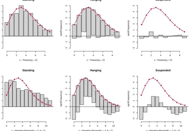
Different styles of rootograms have been suggested, see Figure 1:
• Standing: The standing rootogram simply shows rectangles/bars forp
obsj and a curve
for√expj. To assess deviations across thej’s, the expected curve needs to be followed as the deviations are not aligned.
• Hanging: To align all deviations along the horizontal axis, the rectangles/bars are drawn
from √expj to√expj−p
obsj so that they are “hanging” from the curve representing
expected frequencies, √expj.
• Suspended: To emphasize mainly the deviations (rather than the observed frequencies),
a third alternative is to draw rectangles/bars for the differences between expected and observed frequencies, √expj−p
obsj (some authors use
p
Standing x ~ Poisson(µ =3) sqr t(Frequency) 0 2 4 6 8 −2 −1 0 1 2 3 4 5 Hanging x ~ Poisson(µ =3) sqr t(Frequency) 0 2 4 6 8 −2 −1 0 1 2 3 4 5 Suspended x ~ Poisson(µ =3) sqr t(Frequency) 0 2 4 6 8 −2 −1 0 1 2 3 4 5 Standing y ~ NegativeBinomial(µ =3, θ =2) sqr t(Frequency) 0 2 4 6 8 10 −2 −1 0 1 2 3 4 5 Hanging y ~ NegativeBinomial(µ =3, θ =2) sqr t(Frequency) 0 2 4 6 8 10 −2 −1 0 1 2 3 4 5 Suspended y ~ NegativeBinomial(µ =3, θ =2) sqr t(Frequency) 0 2 4 6 8 10 −2 −1 0 1 2 3 4 5
Figure 1: Styles of rootograms for two Poisson models fitted to 100 artificial observations from a Poisson (top row) and negative binomial (bottom row) distribution. Top row: The Poisson model fit (ˆµ= 3.34) captures the true mean (µ= 3) as well as the distributional form with small deviations only. Bottom row: The Poisson model fit (ˆµ= 3.32) does not capture the underlying distribution well (µ= 3,θ= 2), leading to clear deviations in the rootogram.
The basic version, the standing rootogram, is perhaps the least useful among the three: it sim-ply plots rectangles/bars and a curve representing the model, but the fit is not easily assessed. The other versions both make use of a horizontal reference line, a detail often emphasized by Tukey (e.g., Tukey 1972). Here, it highlights the discrepancies between observed and ex-pected frequencies. In a sense, hanging rootograms emphasize the fitted values and suspended rootograms the corresponding residuals. We recommend the hanging version as the default as long as residuals are not of main concern, and hence employ hanging rootograms below. We also note that the suspended rootogram exists in several versions; inTukey(1972) it was turned upside down, i.e., with a curve resembling expected values below the bars resembling residuals. Here we follow Friendly (2000).
2.2. Interpreting Rootograms
In analyses employing rootograms, one is often interested in detecting patterns such as runs of positive or negative deviations, which highlight aspects of the model fit that might require further attention. For example, Figure 1 presents rootograms for a Poisson model fitted to two simulated data sets from a Poisson (top row) and negative binomial (bottom row)
distribution. Both underlying distributions have mean µ = 3, the negative binomial has a shape parameter θ= 2 (while the Poisson is formally a negative binomial with θ=∞). When fitting a Poisson model to the Poisson data, all three versions of the rootogram in the top row exhibit only small deviations: The standing version shows that the curve representing expected frequencies closely tracks the histogram representing observed frequencies, there are also no clear patterns in the hanging and suspended versions. All this indicates that the model fits well.
In contrast, when fitting a Poisson model to the negative binomial data in the bottom row there are substantial departures of the model from the data: in the standing version, the curve representing expected frequencies does not track the observed frequencies, there are also discernible patterns in both the hanging and suspended variants. Specifically, for the latter the rootogram bars form a ‘wave-like’ pattern around the horizontal reference line: the data exhibit too many small counts, notably zeros, as well as too many large counts for a Poisson model to provide an adequate fit. In summary, the patterns encountered in the bottom row of Figure 1reflect a substantial amount of overdispersion that is not captured by the fitted Poisson distribution.
The patterns seen in the bottom panel of Figure 1 are theoretically supported by results presented by Mullahy (1997), who shows that Poisson mixtures exhibit a larger number of zeros (compared with a Poisson null model) as well as more mass in the upper tails and less mass in the center of the distribution. Mullahy’s results rely on earlier work ofShaked(1980), who shows that mixing will generally spread out a distribution (from the exponential family) towards its tails. The negative binomial distribution is a gamma mixture of the Poisson distribution, hence these arguments are directly relevant in the case at hand.
While excess zeros are strictly implied by overdispersion (compare Mullahy 1997, Prop. 1), there also exist situations in practice where the number of zeros is so large that merely correcting for overdispersion via, e.g., a negative binomial model does not solve the problem. These tend to exhibit a spike at zero in graphical displays and are often best treated by fitting a two-part model. We shall encounter an example below.
3. An Example from Ethology
In this section we present an empirical illustration revisiting a well-known data set from ethology, for which excess zeros and, more generally, overdispersion require treatment. We select models using information criteria, notably the BIC, and use rootograms for highlighting deficiencies of fitted models.
Brockmann(1996) investigates horseshoe crab mating. The crabs arrive on the beach in pairs to spawn. Furthermore, unattached males also come to the beach, crowd around the nesting couples and compete with attached males for fertilizations. These so-called satellite males form large groups around some couples while ignoring others. Brockmann(1996) shows that the groupings are not driven by environmental factors but by properties of the nesting female crabs. Larger females that are in better condition attract more satellites.
Agresti (2013, Chapter 4.3) reanalyzes these data, modeling the number of satellites using count data regression techniques. The main explanatory variable is the female crab’s carapace width, but its color and spine condition are also considered in some analyses – with the ordered factors for color and spine condition often treated as numeric variables. In his analysis,Agresti
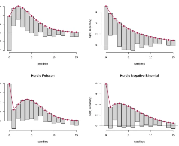
Poisson satellites sqr t(Frequency) 0 5 10 15 −4 −2 0 2 4 6 Negative Binomial satellites sqr t(Frequency) 0 5 10 15 0 2 4 6 Hurdle Poisson satellites sqr t(Frequency) 0 5 10 15 0 2 4 6 8
Hurdle Negative Binomial
satellites sqr t(Frequency) 0 5 10 15 0 2 4 6 8
Figure 2: Hanging rootograms for crab satellite models (counts 0, . . . ,15).
(2013) starts out from a Poisson model with the standard log link and then goes on to consider both Poisson and negative binomial models with both log and identity links. He finds that among these the negative binomial model fits best but also notes that further refinements might be possible, e.g., by allowing for zero inflation.
To illustrate how rootograms can help in judging the goodness of fit of various count regression models for this data, we extend the analysis of Agresti (2013) in the following way: we consider both Poisson and negative binomial regressions (with log link) and hurdle versions of these (with a logit-type binary part) to allow for excess zeros. The carapace width and a numeric coding of the color variable are used as regressors in all (sub-)models. To compare the relative performances of the four models, we employ the Bayesian information criterion (BIC), yielding: Poisson (BIC = 931.0, df = 3), negative binomial (BIC = 769.5, df = 4), hurdle Poisson (BIC = 755.1, df = 6), and hurdle negative binomial (BIC = 736.8, df = 7). These results already suggest that the hurdle negative binomial model fits best. However, a look at the corresponding hanging rootograms (for counts 0, . . . ,15) in Figure 2 provides much more insight into the pros and cons of the various models:
counts 1, . . . , 4 are overfitted while 0 and most counts from 6 onwards are underfitted. This indicates a substantial amount of overdispersion in the data, the clear lack of fit for 0 could be an additional indication of excess zeros.
• Negative binomial: The rootogram does no longer exhibit the wave-like pattern of the
Poisson model, showing that the overdispersion is accounted for much better in this model. However, the underfitting of the count 0 and clear overfitting for counts 1 and 2 is typical for data with excess zeros. Note also that the fitted negative binomial model implies a decreasing probability mass function (withθ= 0.93), which is not in line with the data structure.
• Hurdle Poisson: The rootogram now shows a perfect fit for the count 0 (by design of the
hurdle model). However, there is still overdispersion in the remaining positive counts that is again reflected by a wave-like pattern, note also the clear underfitting of the count 1.
• Hurdle negative binomial: The rootogram shows that this model fits the data quite well.
There are no clear patterns of departure anymore and the deviations between observed and predicted frequences are very small for most of the counts.
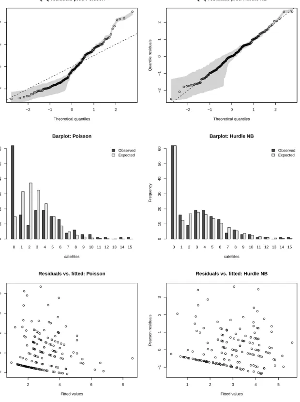
To highlight that the conclusions above are drawn more easily based on the proposed rootograms than from more traditional visualizations, Figure 3provides different types of displays for the poorly fitting Poisson model (left column) and the well-fitting hurdle negative binomial (NB) model (right column). More traditional analyses include visualizations of some sort of resid-uals, for example using quantile-quantile (or Q-Q) plots or plots of residuals vs. fitted values, and also of observed vs. expected frequencies. All three versions are used in sources such as
Cameron and Trivedi (2013). The rows of Figure 3 show:
1. Quantile-quantile (or Q-Q) plots of randomized quantile residuals (Dunn and Smyth 1996) vs. the corresponding theoretical standard normal quantiles – along with a gray shaded area corresponding to the range from the 5% up to the 95% quantile of the randomized distribution. The curvature of the Poisson model clearly indicates overdis-persion but the excess zeros are not directly visible. The hurdle NB model, on the other hand, appears to fit rather well.
2. Barplots of observed and expected frequencies. The excess zeros in the Poisson model are rather obvious while the overdispersion is somewhat obscured due to the tiny frequencies of the larger counts. Also, the deviations are not aligned and hence are more difficult to track than in the hanging rootogram.
3. Scatterplots of Pearson residuals vs. fitted values (means). Such displays are generally more difficult to interpret than in linear regression models due to the discrete and asymmetric response distribution. While it can be seen that the fit for the Poisson is not as good as for the hurdle NB model, the overall quality is harder to judge than in the previous displays. For the same reason, a scatter plot of observations vs. fitted means (not shown) would not be straightforward to interpret.
Overall, rootograms clearly bring out several aspects that are not as easily seen in tradi-tional displays. The barplots of observed and expected frequencies are closest in spirit to
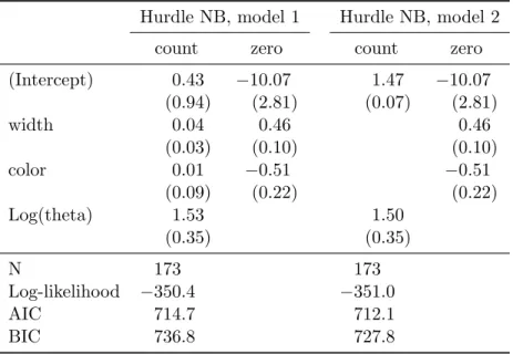
Table 1: Negative binomial hurdle models for crab satellites. Coefficient estimates (and standard errors in parentheses).
Hurdle NB, model 1 Hurdle NB, model 2
count zero count zero
(Intercept) 0.43 −10.07 1.47 −10.07 (0.94) (2.81) (0.07) (2.81) width 0.04 0.46 0.46 (0.03) (0.10) (0.10) color 0.01 −0.51 −0.51 (0.09) (0.22) (0.22) Log(theta) 1.53 1.50 (0.35) (0.35) N 173 173 Log-likelihood −350.4 −351.0 AIC 714.7 712.1 BIC 736.8 727.8
the rootogram, but suffer from an overemphasis of the tails (addressed by the square-root transformation in the rootogram) and the curved shape of the mass functions (addressed by the special alignment of observed vs. expected values and the horizontal reference line in the rootogram).
To further explore, the well-fitting hurdle NB model, its parameter estimates (and standard errors) are reported in the first two columns of Table 1. Interestingly, this reveals that the female crab’s carapace width and color both clearly affect the probability of having any satellites (binary zero hurdle part). Specifically, larger crabs are much more likely to have satellites. However, given that there is at least one satellite neither carapace width nor color are individually significant (zero-truncated count part). Omitting both variables improves the fit in terms of both AIC and BIC (hurdle NB, model 2, Table 1). The rootogram of the simplified model (see Figure5) is very similar to that of the full hurdle model.
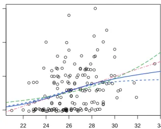
Additionally, identity (rather than log) links or a zero-inflation (rather than hurdle) specifi-cation could be employed but are omitted here for compactness. Both lead to qualitatively identical insights and similar patterns in the rootograms while neither leads to improvements over the negative binomial hurdle model. We conclude with a comparison of predicted ef-fects for the mean function from several models. (Figure4), evaluated for increasing carapace width at the mean color (= 2.5 in the center of the scale 1, . . . , 4). This shows that, compared to the identity link model preferred byAgresti(2013), the hurdle model leads to very similar predictions at average widths while avoiding negative predictions for small widths and at the same time increasing even more slowly for large widths. This complements the findings from the rootograms and underlines that the hurdle model fits the data rather well.
−2 −1 0 1 2
−2
0
2
4
Q−Q residuals plot: Poisson
Theoretical quantiles Quantile residuals −2 −1 0 1 2 −2 −1 0 1 2
Q−Q residuals plot: Hurdle NB
Theoretical quantiles Quantile residuals 0 1 2 3 4 5 6 7 8 9 10 11 12 13 14 15 Observed Expected Barplot: Poisson satellites Frequency 0 10 20 30 40 50 60 0 1 2 3 4 5 6 7 8 9 10 11 12 13 14 15 Observed Expected Barplot: Hurdle NB satellites Frequency 0 10 20 30 40 50 60 2 4 6 8 −2 0 2 4 6
Residuals vs. fitted: Poisson
Fitted values P earson residuals 1 2 3 4 5 −1 0 1 2 3
Residuals vs. fitted: Hurdle NB
Fitted values
P
earson residuals
Figure 3: Alternative graphical model checks for the crab satellites data. Rows: Q-Q plot based on randomized quantile residuals, barplot of observed and fitted frequencies, and scatterplot of Pearson residuals vs. fitted values (means). Columns: Poisson model and negative binomial hurdle model.
22 24 26 28 30 32 34 0 5 10 15 Carapace width (cm)
Number of satellites (jittered)
Poisson (id) Poisson (log)
Hurde NB, model 1 Hurde NB, model 2
Figure 4: Predicted effect for the mean number of satellite at increasing carapace width and mean color.
4. Discussion and Concluding Remarks
Several flavors of rootograms have been discussed as graphical diagnostic tools for visualiz-ing complex regression models for count data. They combine exploratory data analysis with model-based inference by bringing out discrepancies between observed and fitted distribu-tions. Unlike other model-based graphics that often focus on effects on the mean of the fitted distribution (e.g., effect displays), rootograms capture deviations across the support of the entire distribution and hence can help to diagnose misfit regarding scatter and/or shape. This is particularly relevant for count data models, which are often affected by problems such as overdispersion and/or excess zeros.
To incorporate rootograms into the model-building workflow for count data regression models, their graphical information can be used to complement standard techniques such as informa-tion criteria (AIC, BIC, . . . ). Using a range of basic models – as done in Figure 2for the crab satellites data – rootograms can guide the practitioner in deciding whether overdispersion (e.g., Poisson vs. negative binomial models) and/or extra zeros (e.g., hurdle or zero-inflation vs. ‘one-part’ models) are relevant issues in the data at hand. The models upon which the rootograms are based should use a reasonable first selection of regressors (e.g., a standard specification from the literature or a model involving all potentially relevant variables). Some users may want to include a built-in calibration of uncertainty. To this end, Figure 5
provides the rootogram of the simplified model from Table1along with (pointwise) 95% con-fidence intervals obtained via a parametric bootstrap based on 10,000 replications from the estimated model. Note that the resulting intervals are not substantially different from the “warning limits” ofTukey(1972, p. 61), set at±1, hence the latter would seem to be a useful
practical device at a minimum cost.
Two further examples are available via supplements: the first uses a large data set from health economics, available from theRpackageAERsupplementingKleiber and Zeileis(2008) under the name NMES1988and exhibiting a different type of unobserved heterogeneity, the second
Hurdle NB, model 2 satellites sqr t(Frequency) 0 2 4 6 8 10 12 14 0 2 4 6 8 Confidence intervals Rule of thumb Bootstrap
Figure 5: Hanging rootogram for the second hurdle NB model. Pointwise confidence intervals are added based on a rule of thumb (±1, blue dashed) or the 2.5% and 97.5% quantiles from a parametric bootstrap (10,000 replications from the estimated model, blue solid).
involves the less frequent case of underdispersion and is available from theRpackagecountreg
(Zeileis and Kleiber 2016) under the name TakeoverBids. See the appendix below for more information on the latter package.
Computational Details
Our results were obtained usingR3.3.1 (RCore Team 2016) with the packagescountreg0.1-5 (Zeileis and Kleiber 2016;Zeileis, Kleiber, and Jackman 2008), MASS 7.3-45 (Venables and Ripley 2002), andflexmix2.3-13 (Leisch 2004;Gr¨un and Leisch 2008), and were identical on various platforms including PCs running Debian GNU/Linux (with a 3.2.0-1-amd64 kernel) and Mac OS X, version 10.10.5.
Acknowledgments
The authors thank the editor, the associate editor, and several anonymous reviewers for many valuable suggestions on earlier versions of this paper.
References
Agresti A (2013). Categorical Data Analysis. 3rd edition. John Wiley & Sons, Hoboken. Brockmann HJ (1996). “Satellite Male Groups in Horseshoe Crabs, Limulus polyphemus.”
Ethology,102(1), 1–21. doi:10.1111/j.1439-0310.1996.tb01099.x.
Cameron AC, Trivedi PK (1990). “Regression-Based Tests for Overdispersion in the Poisson Model.”Journal of Econometrics,46, 347–364. doi:10.1016/0304-4076(90)90014-k.
Cameron AC, Trivedi PK (2013). Regression Analysis of Count Data. 2nd edition. Cambridge University Press, Cambridge.
Dean CB (1992). “Testing for Overdispersion in Poisson and Binomial Regression Models.”
Journal of the American Statistical Association,87(418), 451–457. doi:10.2307/2290276.
Deb P, Trivedi PK (1997). “Demand for Medical Care by the Elderly: A Finite Mix-ture Approach.” Journal of Applied Econometrics, 12(3), 313–336. doi:10.1002/(sici)
1099-1255(199705)12:3<313::aid-jae440>3.0.co;2-g.
Dunn PK, Smyth GK (1996). “Randomized Quantile Residuals.” Journal of Computational
and Graphical Statistics,5(3), 236–244. doi:10.2307/1390802.
Friendly M (2000). Visualizing Categorical Data. SAS Insitute, Cary. URL http://www.
datavis.ca/books/vcd/.
Friendly M, Denis DJ (2001). “Milestones in the History of Thematic Cartography, Statistical Graphics, and Data Visualization.” URLhttp://www.datavis.ca/milestones/.
Gr¨un B, Leisch F (2008). “FlexMix Version 2: Finite Mixtures with Concomitant Variables and Varying and Constant Parameters.”Journal of Statistical Software,28(4), 1–35. doi:
10.18637/jss.v028.i04.
Healy MJR (1968). “The Disciplining of Medical Data.” British Medical Bulletin, 24(3), 210–214.
Jaggia S, Thosar S (1993). “Multiple Bids as a Consequence of Target Management Resistance: A Count Data Approach.”Review of Quantitative Finance and Accounting,3(4), 447–457.
doi:10.1007/bf02409622.
Kleiber C, Zeileis A (2008). Applied Econometrics with R. Springer-Verlag, New York. doi:
10.1007/978-0-387-77318-6.
Lambert D (1992). “Zero-Inflated Poisson Regression, with an Application to Defects in Manufacturing.”Technometrics,34(1), 1–14. doi:10.2307/1269547.
Leisch F (2004). “FlexMix: A General Framework for Finite Mixture Models and Latent Class Regression in R.” Journal of Statistical Software, 11(8), 1–18. doi:10.18637/jss.
v011.i08.
Mullahy J (1986). “Specification and Testing of Some Modified Count Data Models.”Journal
of Econometrics,33(3), 341–365. doi:10.1016/0304-4076(86)90002-3.
Mullahy J (1997). “Heterogeneity, Excess Zeros, and the Structure of Count Data Models.” Journal of Applied Econometrics, 12(3), 337–350. doi:10.1002/(sici)
1099-1255(199705)12:3<337::aid-jae438>3.0.co;2-g.
RCore Team (2016). R: A Language and Environment for Statistical Computing. R Founda-tion for Statistical Computing, Vienna, Austria. URLhttp://www.R-project.org/. Rigby RA, Stasinopoulos DM (2005). “Generalized Additive Models for Location, Scale
and Shape.” Journal of the Royal Statistical Society C, 54(3), 507–554. doi:10.1111/
Shaked M (1980). “On Mixtures from Exponential Families.”Journal of the Royal Statistical
Society B,42(2), 192–198.
Stasinopoulos DM, Rigby RA (2007). “Generalized Additive Models for Location, Scale and Shape (GAMLSS) inR.”Journal of Statistical Software,23(7), 1–46. doi:10.18637/jss.
v023.i07.
Tukey JW (1965). “The Future of Processes of Data Analysis.” In Proceedings of the 10th
Conference on the Design of Experiments in Army Research, Development and Testing,
pp. 691–729. Army Research Office, Durham, NC. Reprinted in Lyle V. Jones (ed.) The Collected Works of John W. Tukey, Volume IV. Philosophy and Principles of Data Analysis:
1965–1986, Wadsworth & Brooks/Cole, Monterey, CA, 1986.
Tukey JW (1972). “Some Graphic and Semigraphic Displays.” In TA Bancroft (ed.),Statistical
Papers in Honor of George W. Snedecor, pp. 293–316. Iowa State University Press, Ames,
IA. Reprinted in William S. Cleveland (ed.): The Collected Works of John W. Tukey,
Volume V. Graphics: 1965–1985, Wadsworth & Brooks/Cole, Pacific Grove, CA, 1988.
Tukey JW (1977). Exploratory Data Analysis. Addison-Wesley, Reading, MA. ISBN 0-201-07616-0.
Venables WN, Ripley BD (2002). Modern Applied Statistics with S. 4th edition. Springer-Verlag, New York.
Wainer H (1974). “The Suspended Rootogram and Other Visual Displays: An Empirical Validation.” The American Statistician, 28(4), 143–145. doi:10.1080/00031305.1974.
10479098.
Wickham H (2009). ggplot2: Elegant Graphics for Data Analysis. Springer-Verlag, New York.
Wood SN (2006). Generalized Additive Models: An Introduction with R. Chapman & Hall/CRC.
Zeileis A, Kleiber C (2016).countreg: Count Data Regression. Rpackage version 0.1-5/r106,
URLhttp://R-Forge.R-project.org/projects/countreg/.
Zeileis A, Kleiber C, Jackman S (2008). “Regression Models for Count Data in R.” Journal
A.
R
Implementation
For an overview of count data regression models in Rwe refer to Zeileiset al.(2008), where
R implementations of hurdle and zero-inflation models are described in some detail. The corresponding fitting functions have now been moved to the countregpackage, a new package that is currently under development by the authors of the present paper. First versions are already available from http://R-Forge.R-project.org/projects/countreg/.
The current implementation of rootograms in countreg provides a generic function rootogram(object, ...) along with several methods for different types of models/data. The methods all proceed in the same way: They first compute the observed and expected frequencies, obsj and expj respectively (see Section2), and then call the default method that
computes all required coordinates for drawing the rootograms. The latter has the following arguments:
rootogram(object, fitted, breaks = NULL,
style = c("hanging", "standing", "suspended"), scale = c("sqrt", "raw"), plot = TRUE,
width = NULL, xlab = NULL, ylab = NULL, main = NULL, ...)
The argumentsobject andfitted need to provide the tables/vectors of observed and fitted frequencies. (The first argument is calledobject rather thanobservedfor consistency with the generic function that only takes one requiredobjectargument and....) Thebreaksneed to be specified if a continuous distribution is employed while for a discrete distribution one may want to set thewidthof the bars to leave small gaps between the bars (as in our examples). Additionally, one of three styles can be specified: "hanging" (default), "standing", or "suspended". The object returned is then a ‘data.frame’ with all the coordinates needed for plotting, and this is also drawn directly by default (plot = TRUE) along with the specified graphical arguments (xlab,ylab,main,...). By default, the base graphics plot() method is used for drawing rootograms. In addition, there is also anautoplot()method for drawing rootograms using the ggplot2 package (Wickham 2009).
Above we used methods for objects of classes ‘glm’ and ‘hurdle’. There are further meth-ods available, currently for univariate distributions fitted viafitdistr()(to objects of class ‘numeric’,Venables and Ripley 2002), zero-inflated models (objects of class ‘zeroinfl’,Zeileis
et al.2008), zero-truncated models (objects of class ‘zerotrunc’, as fitted by thezerotrunc() function incountreg), generalized additive models (objects of class ‘gam’, Wood 2006), and for selected count distributions falling within the framework of generalized additive mod-els for location, scale and shape (objects of class ‘gamlss’, Rigby and Stasinopoulos 2005;
Stasinopoulos and Rigby 2007).
B. Supplementary Material: Demand for Medical Care
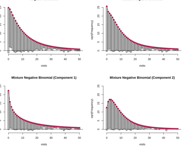
Here we provide an additional example, taken from health economics. Its purpose is to present a larger data set with a much greater range of values for the response and further to show how fitted models resulting from modern tools such as finite mixture models can also be assessed via rootograms.
The data are cross-sectional data originating from the US National Medical Expenditure Survey (NMES) conducted in 1987 and 1988. The NMES is based upon a representative,
Negative Binomial visits sqr t(Frequency) 0 10 20 30 40 50 0 5 10 15 20 25
Mixture Negative Binomial
visits sqr t(Frequency) 0 10 20 30 40 50 0 5 10 15 20 25
Mixture Negative Binomial (Component 1)
visits sqr t(Frequency) 0 10 20 30 40 50 0 5 10 15 20 25
Mixture Negative Binomial (Component 2)
visits sqr t(Frequency) 0 10 20 30 40 50 0 5 10 15 20 25
Figure 6: Hanging rootograms for NMES 1988 models.
national probability sample of the civilian non-institutionalized population and of individuals admitted to long-term care facilities during 1987. The subsample used here comprises only individuals aged 66 and over, all of whom are covered by Medicare (a public insurance pro-gram providing substantial protection against health-care costs). ForRusers, these data are conveniently available from theAERpackage supplementingKleiber and Zeileis(2008) under the name NMES1988. They have been explored originally by Deb and Trivedi (1997) using finite mixtures of count data regressions. Zeileis et al. (2008) employ the data for illustra-tion of hurdle and zero-inflaillustra-tion models whileCameron and Trivedi(2013) reinvestigate finite mixtures. Here, we follow the latter approach but employ a slightly reduced set of regressors to facilitate interpretation while still obtaining reasonably good fits.
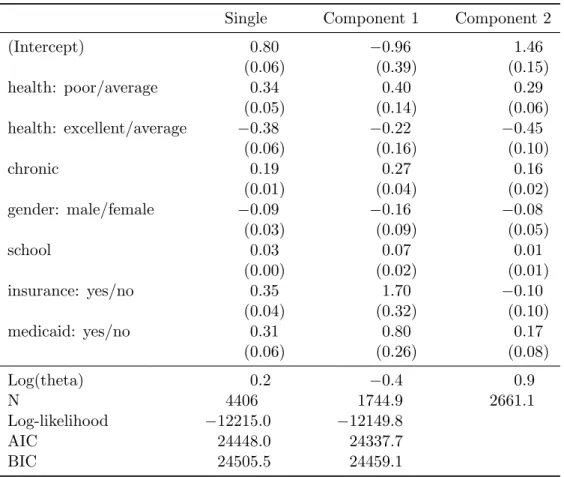
Figure 6 displays the rootograms for a single negative binomial regression as well as for a finite mixture of two negative binomial regressions. For the latter, the mixture model (upper panel, right) as well as both components (lower panel) are given. The corresponding parameter estimates (standard errors in parentheses) as well as the sums of the posterior weights (denotedN) are reported in Table2.
The single NB regression clearly misfits, especially for the low counts 0,1,2, while the mix-ture NB provides an improved fit. It is possible to study the mixmix-ture model in more detail by decomposing observed and expected frequencies into the individual components and
visu-Table 2: Negative binomial regression models (single and 2-component finite mixture) for NMES 1988 physician office visits. Coefficient estimates (and standard errors in parentheses).
Single Component 1 Component 2
(Intercept) 0.80 −0.96 1.46 (0.06) (0.39) (0.15) health: poor/average 0.34 0.40 0.29 (0.05) (0.14) (0.06) health: excellent/average −0.38 −0.22 −0.45 (0.06) (0.16) (0.10) chronic 0.19 0.27 0.16 (0.01) (0.04) (0.02) gender: male/female −0.09 −0.16 −0.08 (0.03) (0.09) (0.05) school 0.03 0.07 0.01 (0.00) (0.02) (0.01) insurance: yes/no 0.35 1.70 −0.10 (0.04) (0.32) (0.10) medicaid: yes/no 0.31 0.80 0.17 (0.06) (0.26) (0.08) Log(theta) 0.2 −0.4 0.9 N 4406 1744.9 2661.1 Log-likelihood −12215.0 −12149.8 AIC 24448.0 24337.7 BIC 24505.5 24459.1
alizing them separately. To this end, the observed and expected frequencies are computed as weighted sums using the posterior probabilities for each component. Figure6(bottom panels) highlights nicely that both components fit rather well. It also brings out the different means and variances in the two components. Specifically, the first component contains a fraction of 0.4 = 1744.9/4406 of all observations and is characterized by a zero-modal rootogram. On average, the corresponding individuals have fewer physician office visits but at the same time a rather high variance. The parameter estimates are mostly larger (in absolute values) than in the second component, especially for the insurance and medicaid parameters. In contrast, the second component is characterized by a unimodal rootogram with comparatively lighter tails. On average, the corresponding individuals have more physician office visits but at the same time a smaller variance. The first group may, therefore, be seen as the group of occasional users, for which the number of visits likely depends on the severity of the issues, while the second group may be seen as the group of regular users, for which the number of visits often results from the presence of chronic conditions. Indeed, when splitting the patients into two clusters (with hard assignment to the clusters according to the highest posterior probability), it can be seen that the second cluster has a lower proportion of persons with excellent health status (10.1% vs. 7.1%), or without chronic diseases (34.4% vs. 19.8%), and a higher propor-tion of insured persons (64.7% vs. 81.7%). Moreover, further unobserved factors such as the type of diseases and medication might be captured by the two latent components.
C. Supplementary Material: Takeover Bids
Our final example uses data from finance. Its purpose is to present an application with underdispersion and fewer zeros than in the Poisson model.
The data comprise a set of firms that were targets of takeover bids during the period 1978– 1985. They were initially analyzed by Jaggia and Thosar (1993) using a standard Poisson regression and are reanalyzed in Cameron and Trivedi (2013, Chapter 5). The response variable is the number of takeover bids (after the initial bid received by the target firm) and a number of regressor variables capturing the defensive actions of the target management and firm-specific characteristics as well as potential interventions by federal regulators are employed. A more detailed description of the variables is provided in Cameron and Trivedi
(2013, Table 5.2). Coefficient estimates (and standard errors) of the Poisson regression model are reported in the first column of Table3.
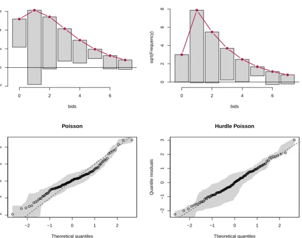
The number of bids ranges from 0, . . . ,10 so that a Poisson model might capture the data well. However, only 7.1% of the observations are zeros which is fewer than expected under
Table 3: Poisson and hurdle Poisson for takeover bids data. Coefficient estimates (and standard errors in parentheses).
Poisson Hurdle Poisson: count zero
(Intercept) 0.99 1.14 2.15 (0.53) (0.76) (3.47) legalrest: yes/no 0.26 0.44 0.97 (0.15) (0.21) (0.98) realrest: yes/no −0.20 −0.00 −2.72 (0.19) (0.25) (1.00) finrest: yes/no 0.07 0.27 −1.47 (0.22) (0.27) (1.17) whiteknight: yes/no 0.48 0.88 1.19 (0.16) (0.28) (0.87) bidpremium −0.68 −1.35 0.82 (0.38) (0.53) (2.48) insthold −0.36 −0.66 −1.84 (0.42) (0.61) (2.41) regulation: yes/no −0.03 −0.06 −1.14 (0.16) (0.22) (0.98) size 0.18 0.24 0.35 (0.06) (0.07) (1.02) size2 −0.01 −0.01 0.01 (0.00) (0.00) (0.18) N 126 126 Log-likelihood −184.9 −159.5 AIC 389.9 359.0 BIC 418.3 415.7
Poisson bids sqr t(Frequency) 0 2 4 6 −2 0 2 4 6 Hurdle Poisson bids sqr t(Frequency) 0 2 4 6 0 2 4 6 8 −2 −1 0 1 2 −2 −1 0 1 2 Poisson Theoretical quantiles Quantile residuals −2 −1 0 1 2 −2 −1 0 1 2 3 Hurdle Poisson Theoretical quantiles Quantile residuals
Figure 7: Hanging rootograms (top) and Q-Q residuals plots (bottom) for the Poisson (left) and hurdle Poisson (right) models for the takeover bids data.
a Poisson model, leading to underdispersion in the model. This is also brought out clearly by the corresponding hanging rootogram in the top left panel of Figure 7. One strategy to improve the model is to employ a hurdle Poisson regression model, see the second and third column of Table3. This appropriately captures the fewer zeros and leads to a satisfactory fit in the rootogram (top right panel of Figure7).
In comparison, the corresponding Q-Q residuals plots (based on randomized quantile resid-uals) also bring out the underdispersion in the Poisson model – by way of the curvature – and the satisfactory fit of the hurdle Poisson model. However, it is less obvious that the underdispersion is mainly due to the fewer zeros in the data.
Affiliation: Christian Kleiber
Universit¨at Basel Peter Merian-Weg 6 4002 Basel, Switzerland E-mail: [email protected] URL:http://wwz.unibas.ch/kleiber/ Achim Zeileis Department of Statistics
Faculty of Economics and Statistics Universit¨at Innsbruck
Universit¨atsstr. 15 6020 Innsbruck, Austria
E-mail: [email protected]