저작자표시-비영리-변경금지 2.0 대한민국 이용자는 아래의 조건을 따르는 경우에 한하여 자유롭게 l 이 저작물을 복제, 배포, 전송, 전시, 공연 및 방송할 수 있습니다. 다음과 같은 조건을 따라야 합니다: l 귀하는, 이 저작물의 재이용이나 배포의 경우, 이 저작물에 적용된 이용허락조건 을 명확하게 나타내어야 합니다. l 저작권자로부터 별도의 허가를 받으면 이러한 조건들은 적용되지 않습니다. 저작권법에 따른 이용자의 권리는 위의 내용에 의하여 영향을 받지 않습니다. 이것은 이용허락규약(Legal Code)을 이해하기 쉽게 요약한 것입니다. Disclaimer 저작자표시. 귀하는 원저작자를 표시하여야 합니다. 비영리. 귀하는 이 저작물을 영리 목적으로 이용할 수 없습니다. 변경금지. 귀하는 이 저작물을 개작, 변형 또는 가공할 수 없습니다.
Master's Thesis
Machine Learning Toolbox and PCA Visualization
for Data-Driven PHM
Sunhee Woo
Department of System Design and Control Engineering
Graduate School of UNIST
2017
Machine Learning Toolbox and PCA
Visualization for Data-Driven PHM
Sunhee Woo
Department of System Design and Control Engineering
Machine Learning Toolbox and PCA
Visualization for Data-Driven PHM
A thesis
submitted to the Graduate School of UNIST
in partial fulfillment of the
requirements for the degree of
Master of Science
Sunhee Woo
1. 5. 2017
Approved by
_________________________
Advisor
Seungchul Lee
Machine Learning Toolbox and PCA
Visualization for Data-Driven PHM
Sunhee Woo
This certifies that the thesis of Sunhee Woo is approved.
1/5/2017
signature
___________________________ Advisor: Seungchul Lee
signature ___________________________ Nam-Hun Kim signature ___________________________ Hwa-Jung Hong
Abstract
Increased awareness of big data has led to active development of machine learning algorithms for big data analytics. The advent of rapidly emerging data analytics technologies has also brought about considerable changes to the diagnostics and prognostics for smart manufacturing industries. As the importance of managing massive factory data also has grown, many engineers are putting in efforts to implement machine learning algorithms for a PHM (Prognostics and Health Management) purpose in accordance with the type of machinery of interest.
In this thesis, research on assisting the quick deployment of supervised and unsupervised learning classification algorithms with data visualization is conducted by building up the GUI software with an emphasis on PHM. It can plot raw data, select hand-crafted features based on an expert knowledge, followed by a dimension reduction step if necessary. The various machine learning algorithms will provide the classification decision boundaries to enable us to diagnose current machine health conditions. Therefore, it can suggest to engineers a guideline to determine suitable features and date-driven PHM algorithms.
Principal Component Analysis (PCA) is a widely used dimension reduction algorithm without losing too much information for high-dimensional data analysis. It transforms the high-dimensional data into a meaningful representation of reduced dimensional data. In a machine health monitoring system, a result of dimension reduction via PCA is often utilized. Although eigenvectors and eigenvalues of PCA are important information, it is too difficult for users to interpret where the principal components are coming from. In order to assist the user in better understanding and interpreting PCA, data visualization can be used. We have developed a system that visualizes the eigenvectors and eigenvalues of PCA using JavaScript library, D3 and demonstrated that how the key information and insights of PCA results can be intuitively visualized.
I Contents
1 Introduction ... 1
1.1 Motivation ... 1
1.2 Research Objectives ... 1
1.3 Outline of the Thesis ... 2
2 Literature Survey ... 3
2.1 Machine Diagnostics... 3
2.2 Data Visualization ... 5
3 Machine Learning Toolbox ... 9
3.1 Problem Statement ... 9
3.2 General Process of Machine Learning for PHM ... 9
3.3 Machine Learning Algorithms ... 11
3.3.1 Feature Selection ... 11
3.3.2 Dimension Reduction ... 14
3.3.3 Classification ... 17
3.3.4 Clustering ... 23
3.4 Development of Machine Learning Toolbox ... 28
3.5 Case Study with a Rotor Testbed ... 43
4 PCA Visualization ... 48
4.1 Problem Statement ... 48
4.2 PCA (Principal Component Analysis) ... 48
4.3 Previous Studies ... 52
4.4 Layout of the Proposed PCA Visualization Method ... 54
4.4.1 Correlation of Two Coordinate Systems ... 56
4.4.2 Weight of Principal Component and Feature Vector ... 57
4.4.3 Information for Dimension Reduction ... 57
4.4.4 Interactive Visualization ... 58
4.5 Case Study ... 59
II List of Figures
Figure 1: Stock price visualization ... 6
Figure 2: Visualization of the characters in ‘Les Miserables’ (before clustering) ... 7
Figure 3: Visualization of the characters in ‘Les Miserables’ (after clustering) ... 8
Figure 4. Process of machine learning based diagnostics ... 10
Figure 5: Features in time domain ... 12
Figure 6: Features in frequency domain... 12
Figure 7: FFT example ... 13
Figure 8: Fisher discriminant analysis... 16
Figure 9: Perceptron algorithm ... 18
Figure 10: Classification method of perceptron ... 19
Figure 11: The number of misclassification in perceptron ... 19
Figure 12: Basic structure of neural network ... 20
Figure 13: Multilayer structure of neural network ... 20
Figure 14: Classification using SVM ... 22
Figure 15: Cost of k-means algorithm ... 24
Figure 16: Clustering result of k-means ... 25
Figure 17: Basic structure of SOM ... 26
Figure 18: The corresponding weighting functions ... 26
Figure 19: Clustering result of SOM ... 27
Figure 20: Process of machine learning for PHM ... 28
Figure 21: GUI software ... 29
Figure 22: Datatype selection buttons in GUI ... 30
Figure 23: Results when the ‘supervised’ button is pressed ... 30
Figure 24: Results when the ‘unsupervised’ button is pressed ... 31
Figure 25: Result of feature extraction (dimension < 4) ... 32
Figure 26: Result of feature extraction (dimension > 3) ... 33
Figure 27: Correlation Matrix ... 34
Figure 28: Result of dimension reduction (fisher discriminant analysis) ... 35
III
Figure 30: Result of principal component analysis ... 37
Figure 31: Result of clustering (K-means) ... 38
Figure 32: Result of clustering (SOM) ... 39
Figure 33: Result of classification (Support Vector Machine) ... 40
Figure 34: Result of classification (Neural Network) ... 41
Figure 35: Result of classification (perceptron) ... 42
Figure 36: Signallink rotor testbed ... 43
Figure 37: Raw data from rotor testbed ... 44
Figure 38: Result of variance feature extraction ... 45
Figure 39: Result of dimension reduction with PCA ... 46
Figure 40: Result of the classification model with SVM ... 47
Figure 42: Eigenvectors of covariance matrix ... 51
Figure 43: Eigenvalues of covariance matrix ... 52
Figure 44: iPCA program... 54
Figure 45: Result of proposed PCA visualization ... 55
Figure 46: Coordinate system in PCA visualization ... 56
Figure 47: Height setting of principal component node... 57
Figure 48: Result of interactive visualization when a curser is on the left node ... 58
Figure 49: Result of interactive visualization when a curser is on the right node ... 59
Figure 50: Signallink rotor testbed ... 59
Figure 51: Result of PCA visualization ... 63
Figure 52: Result of PCA visualization when the node is selected (a: PC1, b: PC2) ... 63
Figure 53: Result of dimension reduction with PCA ... 64
IV List of Tables
Table 1: Selected features……… 45
Table 2: Extracted features………...60
Table 3: PCA result (eigenvectors)……….. 61
1 1 INTRODUCTION
1.1 Motivation
Active development of machine learning algorithms for data analytics has been conducted as the
significance of big data has greatly increased. Additional changes to the diagnostics and prognostics
for smart manufacturing industries have been also taken into consideration due to the development
of rapidly emerging data analytics technologies. The increase in complexity in massive factories
has led to increase in importance of data management, and thus more and more engineers are
putting in efforts to implement a verity of machine learning algorithms for the Prognostics and
Health Management (PHM) purposes depending on the type of machinery of interest.
However, because there are too many different features and machine learning algorithms, it is
difficult for the engineer to find the right one that represents the data well. In addition, since most
engineers are not experts in PHM algorithms, it is not easy for them to understand all the algorithms
and analyze the results. To solve these practical problems in manufacturing domains, an interactive
tool to visualize the complicate result of algorithms and help engineers make better decisions is
needed.
1.2 Research Objectives
- To develop the machine learning toolbox to assist the quick deployment of supervised and unsupervised learning classification algorithms for PHM
- To develop the PCA visualization methodology that visualizes the key information (eigenvalues and eigenvectors) and insights of PCA results intuitively.
2 1.3 Outline of the Thesis
In this thesis, there are five chapters. In the first chapter, the motivation and the objectives of the
thesis are described. The second chapter conducts literature survey. Machine diagnostics and data
visualization are introduced in this chapter. Based on machine learning algorithms, the GUI
software and the PCA visualization for suggesting to engineers a guideline to determine suitable
features and data-driven PHM algorithms are developed in chapter 3 and 4. Finally in chapter 5,
3
2 LITERATURE SURVEY
2.1 Machine Diagnostics
Diagnosis refers to the development of algorithms and methods that decide whether the behavior
of a system or machine is correct or not. Most of these techniques are based on observations which
provide information about the current machine state. The diagnostic method can be classified into
two types. The first is a model-based diagnosis and the second is a data-based diagnosis method.
Since each method has own advantages and disadvantages, it is common to use the pertinent
method for the situation or to use a mixture of both methods.
Model-Based Diagnostics
Model-based diagnosis is mainly conducted by comparing the predicted values through the
dynamic model equation with the sensing values or observations. If the dynamics of the system are
well known and the mathematical modeling is accurate, it is a very effective diagnostics
methodology because the state of the equipment can be accurately predicted from the model.
However, in a general case, designing a model can be very complex and the result of diagnostics
from model-based method can be inaccurate since the dynamics of system is so complicated.
Data-Driven Diagnostics
Data-driven methodologies refer to finding a meaningful result from the data by applying statistics
and probability-based methods to accumulated observation data. It also refers to the machine
learning methodology, which are algorithms that let the computer learn through the data and
determine the state of the equipment itself. Various machine learning algorithms have been used to
4
making categories (or classes) of the patterns from raw observation data and build auto-cognitive
systems for some tasks which the user defined [1].
The expert system is based on the causes of fault and symptoms which come from an empirical
knowledge by experience of operations. Generally, the expert system expresses the causality
between the malfunction and causes in the form of IF (symptom) and THEN (cause) because
symptoms of the machine are due to certain causes. The Bayesian approach, which is capable of
calculating the probability of a fault appearing based on condition probability, is mainly used
because the observed data and symptoms are usually known information or cases. The Bayesian
rule can compute the probability of the causes that are derived from known symptoms in machine
[2].
Support Vector Machine (SVM) is a supervised learning model which will offer an optimal
decision boundary in a classification model. SVM can classify data into discrete categories using a
feature-based input vector which builds a feature space. To implement diagnostics in a machine,
proper elements which can well express the state of machine or are related to dynamics of machine
are often selected as features. Then SVM uses hinge loss to optimize the decision boundary by
considering relationship between input feature vector patterns and fault types [3].
Artificial Neural Network (ANN) is a method which uses a mathematical or computational
model for information processing. The ANN structure is trained based on the information that flows
through the network and generates appropriate weight values for classification boundaries during
iterative training processes [4]. After the training process is completed, the ANN model is used to
diagnose the state of the machine [5]. However, conventional neural network models have been
limited in their performance to classify patterns in real problems. However, deep learning is
5
the development of neural networks models. Deep learning models are composed of multiple
processing layers that perform non-linear input-output mappings to learn representations of data
with multiple levels of abstraction. It can also find complex hidden patterns in big data sets by using
various optimization methods to calculate its internal parameters to compute the representation of
data [6].
2.2 Data Visualization
The amount of generated data has greatly increased throughout the years of development in
information and communication technology. In fact, the growth rate of data generation is so fast
that 90% of the world’s data has been generated over the last 2 years. However, such massive data alone does not provide much of an insight for the users. As a result, it has become more important
than ever to be able to effectively utilize the massive amounts of data considering the fact that
handling such data offers solutions to many problems, and thus data visualization is becoming
increasingly valuable [7].
Data visualization refers to the representation of data through intuitive and illustrative graphics,
assisting people to understand the significance of the provided data. In contrast with the
conventional methods for data visualization such as standard charts and graphs, where it is difficult
to draw much significance with the visualization itself, more sophisticated techniques have been
developed in the modern field of data visualization to help people discover unnoticed insights or
patterns. These data visualizations also enable data to be represented within a limited space more
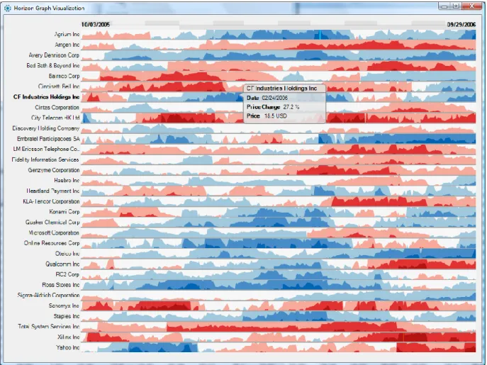
efficiently. As seen below in Figure1, the stock prices are represented in graphs. Quantitative data such as numbers or prices usually correspond with the height values of graphs. However, color and
6
considering the limited vertical space that each row of data can represent. With blue representing
the negative values and red representing the positive values, and the saturation representing the
extent of positivity or negativity, an effective visualization of the stock data is shown [8].
Figure 1: Stock price visualization
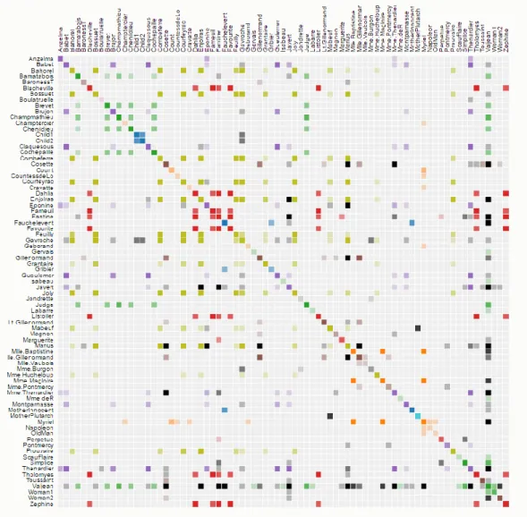
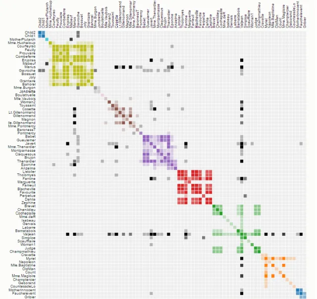
Well organized data visualizations tend to enable the viewer to grasp the information that is hidden
within the data [9], because the human brain handles visual information much more easily than
massive amounts of complex data containing numbers and letters. In addition, it is easier to spot
exceptions and outliers leading to quicker and more effective trend analyses of the data. Figures 2
7
character according to the alphabetical order of their names, Figure 3 clusters characters with each
other depending on their appearances throughout the novel. As a result of the clustering process, it
is much easier to identify the general relationship between the characters [10]. Through adjustment
of the parameters for data visualization, the data can be visualized differently such as the frequency,
which is likely to show the importance of each character.
8
Figure 3: Visualization of the characters in ‘Les Miserables’ (after clustering)
All things considered, for rapidly changing environments such as manufacturing factories,
organizational leaders must be able to interpret and deal with the given data in real-time to obtain
a competitive differentiation over other organizations. Data visualization can be one of the most
9
3 MACHINE LEARNING TOOLBOX
3.1 Problem Statement
When any problems are found by machine operators during productions in job floors, the problem
will be reported to the engineer. In order to prevent damage from machine failure in the production
line, a systematic way to diagnose machine failure should be applied by the engineer as soon as
possible. However, conventional methods are usually time consuming in finding the features and
determining the fault diagnosis algorithms for the broken machine. Implementing the diagnosis
system and applying it to the actual facilities also add up to the time consuming process since much
time is required to figure out the best features and algorithms. As a result, a system that is capable
of supporting an engineer's decision making so that features and algorithms could be selected faster,
is needed. In data-driven PHM, there are many common features and machine learning algorithms.
We demonstrated a practical solution for this problem through the development of a GUI software
that allows engineers to quickly see how the results would look like when common features and
algorithms are applied to the data.
3.2 General Process of Machine Learning for PHM
The main difference between the data-driven diagnostics and the model-based one is that the
system state is judged by the data rather than the dynamic model of the system. By connecting the
statistics to the fault diagnosis technology, the monitoring system can be able to grasp the health
condition of the facility by itself without analyzing the physics of mechanical systems. The general
procedure of a machine learning approach for the machine fault diagnostics can be described with
10
Figure 4. Process of machine learning based diagnostics
1. After selecting important assets on the production line, sensors are attached to selected components and the data is acquired. In this process, it is important how to select important
assets, and where and how many sensors should be placed.
2. The feature vector is extracted from the acquired data through Discrete Signal Processing (DSP). The process of selecting the feature vector is a very important procedure in machine
learning based methods. If the characteristic signal reflecting the dynamic characteristics
of the system is selected, the size of data can be efficiently reduced without too much loss
of information and it can be effectively used to determine the machine state through the
11
3. The procedure of applying algorithms to diagnose the state of machine: Depending on the existence of the data labels, it is divided into supervised learning and the unsupervised
learning. The kind of algorithms that can be applied at this time are different: classification
for discriminating the failure mode of the equipment, and regression for tracking and
predicting the malfunction state of the machine.
4. Prediction of the state of the machine using the stochastic method and prediction of the Remaining Useful Life (RUL): Based on the current state of the equipment, we can predict
how the future state of the equipment will change in a stochastic manner.
3.3 Machine Learning Algorithms 3.3.1 Feature Selection
To diagnose the health state of a machine, signals should be acquired through many channels.
However, it is not plausible to directly analyze the acquired signals due to the high dimensionality
of each signal. Hence, the underlying features of the signals should be extracted beforehand.
There are two categories of features.
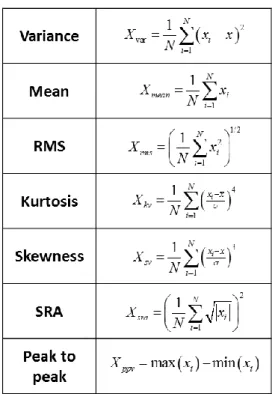
1. The first category consists of features computed based on a time domain signal in Figure 5. There are features representing shapes of a signal such as kurtosis, skewness and
peak-to-peak and representing energy of a signal such as RMS and SRA [11]. Besides, there are
12
Figure 5: Features in time domain
2. The second category consists of features based on a frequency domain signal. In this category, the first and second multiples of a rotating rpm is utilized mainly especially for
rotating machinery. Amplitude and phase of n-th multiple of a rotating rpm is called nX
amplitude and nX phase [12]. Furthermore, there are statistical features of a frequency
domain signal as shown in Figure 6 [11].
13 FFT (Fast Fourier Transform)
In particular, the frequency domain category requires conversion of a time signal to the frequency
domain. It can commonly be implemented by FFT [13]. For example, the frequency component of
the time data is obtained as shown in Figure 7. Since the amplitude of the sine function is 2 and the
frequency is 4, the result of the FFT is displayed 2 only at 4 Hz and others are zero.
Figure 7: FFT example
Correlation
Correlation analysis is a method of analyzing the linear relationship between two random variables
in probability theory and statistics. The two variables can be correlated with each other, and the
strength of the linear relationship between the two variables is referred to as a correlation. Note that
correlation indicates the degree of association between the two variables, but does not explain the
14 1 2 2 1 1
correlation
n i i i n n i i i ix
x
y
y
x
x
y
y
(1)The correlation coefficient between x and y is calculated by a mathematical expression as shown
in Equation (1). Correlation coefficient can have a value from -1 to 1. When the correlation value
is a positive value greater than 0 and less than or equal to 1, it is called positive correlation. This
means that both variables tend to increase together. The higher the value, the more similar it
increases. Value 0 in correlation coefficient means that there is no relation between x and y variables
at all. Correlation values greater than or equal to -1 and less than 0 indicate negative correlation,
meaning that one variable decreases when one variable increases [14].
3.3.2 Dimension Reduction
Although many features are extracted, data analysis for high dimensional feature sets is still
required. This is because statistical independence among the extracted features is not guaranteed.
In other words, many extracted features are not fully decoupled. In addition, it is difficult to
visualize the high dimensional data, which makes it hard for the user to interpret the analysis results.
Therefore, it is necessary to reduce the number of features via the appropriate coordinate
transformation without losing too much information.
PCA (Principal Component Analysis)
Since the direction that produces large variation of data implies that many phenomena are occurring
15
can be formulated as an optimization problem of finding a direction that maximizes the variance
of the data projected on that axis as shown in Equation (3). The variance of projections are obtained
by Equation (2). It turns out that this optimization problem finds the eigenvector of the data
covariance matrix as a solution [1], [15], [16].
2 2 ( ) ( ) 1 1 ( ) ( ) 1 ( ) ( ) 1 ( ) ( ) 1 1 1 variance of projections 1 1 1
(S: sample covariance matrix)
T T T T T m m T i i i i m T i i i m T i i i m T i i i T u x x u m m x u x u m u x x u m u x x u m u Su (2) maximize subject to 1 T u T u Su u u (3)
Fisher Discriminant Analysis
The PCA generally shrinks the data in a direction along which the variation of the data is large in
an unsupervised learning environment. However, if the data distributions between two clusters are
different not only in the variance but also in the mean value, another way of dimension reduction
is to project data into a space where distance between projected means is large and projected
16
space [17]. The basic idea of Fisher discriminant analysis is conceptually illustrated in Figure 8
[16].
Figure 8: Fisher discriminant analysis
Since Fisher discriminant analysis maximizes the distance between the averages of clusters and
minimizes the variance between the clusters, it can be re-expressed as an optimization problem in
Equation (4) 2 0 1 0 0 1 1 max T T T T n S n S (4)
Since the distance between the means of two clusters need to be maximized, they are placed at a
denominator in Equation (4). On the other hands, the variance terms of clusters are located in a
denominator of Equation (4) to be minimized in an optimization process. The number of data is
multiplied to each variance because each variance should be weighted as the data size is larger. We
17 2 2 0 1 0 0 1 1 0 1 0 0 1 1 1 2 2 1 2 T T T T T T T T T T T T T T T T m J n S n S m n S n S R R u R R u R m u m R u u J u R m u R R u u (5)
Then, Equation (6) is the solution to this optimization problem [1].
2 0 1 1 1 1 1 0 1 0 1 0 1 1 0 0 1 1 0 1 is maximum when T T T T T T T u J u R m u aR m u u aR m aR R u aR R a R R a a n S n S (6)
As a result, we can implement the Fisher discriminant analysis if we only know the average and
variance of the two clusters.
3.3.3 Classification
Data analysis is largely based on two data types. When a class exists in the data and the labeled
data is analyzed, it is called supervised learning. Conversely, when there is no label, the data is
18
The purpose of supervised learning is to set boundaries based on given training data to determine
which classes belong to new data when they are acquired. The classification algorithm implements
the following three methods in this work.
- Perceptron - Neural Networks
- SVM (Support Vector Machine)
The perceptron algorithm is the simplest algorithm, which is the basis of neural networks. The
perceptron algorithm cannot be directly used for classification because its structure is too simple.
Therefore, we use a neural network algorithm that stacks these perceptron in multiple layers. As
the structure of a neural network becomes complicated, it is possible to analyze data having a
complex distribution. However, a drawback of a neural network algorithm lies in expensive
computational cost.
Perceptron
The perceptron algorithm has the structure of Figure 9.
19
is set and is updated with respect to the sign of the inner product value. If the sign of the inner
product is the same as the label, the update value is 0. If the sign of the inner product value and
label are different, the update value is not 0, so the correction is made only to the incorrect
classification as shown in Figure 10. If we modify the boundary line several times over iterations,
classification of the data becomes possible. Figure 11 shows that misclassification is reduced when
multiple updates are made.
Figure 10: Classification method of perceptron
20
However, since the structure is simple, it is not easy to classify data having a complicated
distribution with a sign of an inner product value. Therefore, it is possible to increase the
classification complexity by connecting these structures in multiple layers.
Neural Network
Figure 12 shows one perceptron structure.
Figure 12: Basic structure of neural network
Neural networks connect these structures in multiple layers as shown in Figure 13.
21
In perceptron, the boundary line is expressed as a vector, but as the structure becomes complicated,
the neural network expresses a boundary with a matrix in each layer. These matrices are updated
using the backpropagation algorithm. Backpropagation is done as follows.
The classification is done by using the finally updated matrices and the forward propagation. The
22 SVM (Support Vector Machine)
SVM is easy to analyze some complex data and computation is not as large as a neural network.
The SVM sets the boundary to the direction that maximizes the distance between the cluster as
shown in Figure 14.
Figure 14: Classification using SVM
This is an optimization problem because it tries to maximize the distance from the boundary line.
23 2 0 0 minimize 1 1 subject to 1 1 0 0 T T T T u v X u Y v u v (7)
The reason for setting the slack variables u and v vectors is that there is no guarantee that the two
clusters are linearly separable. Therefore, we also optimize u and v to minimize the number of
misclassification.
3.3.4 Clustering
The purpose of unsupervised learning is to distinguish among unlabeled data. This is called
clustering because it assigns a cluster to the data.
K-means
K-means is the principle of finding the center of mass of data. We must enter the number of clusters
we want to find as input. Initially, the center of mass is set randomly and then repeatedly optimized.
24
The iterative process moves the center of mass to the average of the nearest data points. The
clustering problem can also be expressed as an optimization problem. The above iterative process
converges to the solution of Equation (8).
( ) 2 (1) ( ) (i) (1) 1 1 , , c , , , i m m K c i J c x m (8)
Therefore, the K-means algorithm finds clusters in a direction that minimizes the distance between
the center of mass and the center of mass of the cluster to which the data belongs. Setting the
number of clusters can be a problem, which can be determined by examining the cost function with
respect to the number of clusters set. For example, it is a good idea to set the number of clusters to
three if the cost is shown in Figure 15.
25
The result of clustering using k-means is shown as Figure 16. X marks in Figure 16 are the center
of mass of each cluster. Applying the K-means algorithm saves the center of mass of the cluster.
When new data comes in, we can determine the cluster to which this new data belongs by
calculating the distance between this data and each center of mass.
Figure 16: Clustering result of k-means
SOM (Self Organizing Map)
A visualization of the clustering results helps interpretability of the model. SOM, as a visualization
26
Figure 17: Basic structure of SOM
A random allocation of high-dimensional vectors in the grid is as shown in Figure 17. When new
data comes, the vector having the closest distance is located and updated. This vector is called the
winner vector. At the same time, the surrounding nodes are updated relatively weakly. Since the
SOM must update all nodes with various strengths, we use Equation (9) to set it. As we get farther
away from the winner vector, we assign a weaker intensity as shown in Figure 18(a).
2 2 ( ) exp 2 ( ) ik ik d h n n (9)
27
In addition, for the stability of convergence, the update strength is reduced gradually as shown in
Figure 18. The whole process and the corresponding weighting functions are as follows.
Figure 19 is a visualization result of the clustering of 4-D data.
28 3.4 Development of Machine Learning Toolbox
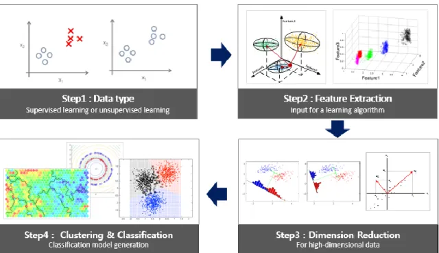
The machine learning process of the developed GUI software in our work consists of four stages.
Figure 20 shows four steps of GUI software. First, choose the data type depending on whether the
label of the data exists or not. Features are selected based on an expert knowledge. After the feature
extraction, dimension reduction algorithm is applied if necessary. PCA (Principal Component
Analysis) and Fisher discriminant analysis are here implemented for reducing the dimensionality.
Finally, we can check the result of applying the classification algorithm.
Figure 20: Process of machine learning for PHM
The Framework of GUI Software
In this thesis, the GUI software is developed for PHM as shown in Figure 21. The user creates a
new project folder for saving the model and training options in step 0. Before the user loads
29
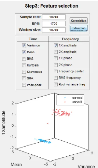
differently in step 2. After the data loading step, the user can plot the raw data by clicking the 'Time
Plot' button. In the feature extraction step, hand-crafted features are selected based on expert
knowledge. Information about the load data is typed such as sampling rate, rpm and sample size in
this step. If the data is too high-dimensional, engineers can reduce the dimensionality of data as
much as they want in step 4 via PCA or Fisher discriminant analysis. In step 5, the classification
model is trained by classification algorithms. If the learning form is unsupervised learning, a
clustering algorithm is applied before the classification algorithm. After the entire steps are
conducted, the generated model is saved for the real-time classification later.
Figure 21: GUI software
Data Type Selection
Machine learning algorithms will be applied differently depending on the data type. It can be
30
there are the 'supervised' and 'unsupervised' buttons for selecting data types as you can see in Figure
22. The user can change the learning form depending on the data type which the user has.
Figure 22: Datatype selection buttons in GUI
In supervised learning, a category label for each pattern is provided in a training set, making a
training model use this category label. In unsupervised learning, there is no category label. First,
the system forms clusters or groups of the input data and trains the model [1]. Therefore, as shown
in Figure 23, when the ‘supervised’ button is pressed, the button of the clustering part is disabled.
On the other hand, when the ‘unsupervised’ button is pressed, the classification part is deactivated,
as shown in Figure 24.
31
Figure 24: Results when the ‘unsupervised’ button is pressed
Feature Extraction
Feature extraction is to transform raw data into features that can be used as an input for a machine
learning algorithm. In most mechanical systems, the features consist of time domain features and
frequency domain features. The sampling rate is required to extract the frequency feature. In the
case of rotating machinery, the RPM should also be entered. The data is extracted by a sample size
and feature are calculated according to the selected feature algorithm. One or more original features
can be selected by users. When signals through multiple channels are received, feature extraction
algorithm is applied to each channel. After selecting the desired features and pressing the
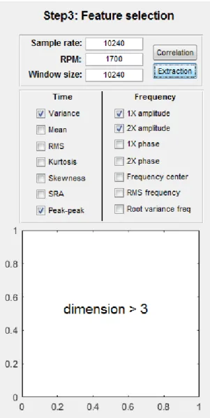
‘Extraction’ button, the extracted feature values are displayed on the graph (Figure 25). If the dimension of a selected feature vector is within three dimensions, it will be displayed. However, if
32
33
Figure 26: Result of feature extraction (dimension > 3)
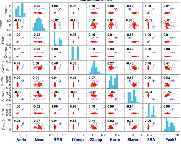
When the ‘correlation’ button is pressed, users can see the correlation matrix plot among the
selected features. Then they can check the correlation between the features as shown in Figure 27.
34
Figure 27: Correlation Matrix
Dimension Reduction
If the dimension of the extracted features are high and cannot be represented graphically, or if the
statistical correlation between the features is large, the dimension of the features can be reduced
without losing too much information. If you select a reduction algorithm after entering the
dimension to be reduced, the reduction result is displayed as a graph in Figures 28 and 29. The
developed GUI software provides two algorithms for dimension reduction: the principal
35
36
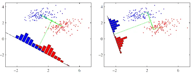
Figure 29: Result of dimension reduction (principal component analysis)
In addition, when the dimension is reduced through the PCA, the importance of the newly defined coordinates and the coefficient of each feature can be examined (Figure 30).
37
Figure 30: Result of principal component analysis
Clustering and Classification
In the case of a classification, the process depends on the data type. If the learning form is
unsupervised learning, it must go through a clustering step before choosing a classification
algorithm. When a clustering algorithm is applied, it automatically divides a group of data and
graphs the result according to its learned label. After a group of data is divided, a classification
model can be generated by selecting an appropriate classification algorithm. On the other hand,
since the data group is already sub-grouped in the case of the supervised learning, the classification
model is generated by the classification algorithm without clustering process.
Unsupervised learning data without labels is shown in black as shown in Figures 31 and 32.
Applying the k-means algorithm to each unlabeled data yields the result shown in Figure 31. Data
38
Figure 31: Result of clustering (K-means)
In the case of SOM, the result is as shown in Figure 32. The purple hexagon is the location of the
data, and the distance between the two hexagons is represented by a diamond-shaped hexagon,
from yellow to black. The closer to yellow, the similar the data is. The closer you are to black, the
more likely it is that the two data are different. You can see the data that surrounds yellow as a
39
Figure 32: Result of clustering (SOM)
In the case of supervised learning type, or after clustering, classification is applied. Figures 33, 34,
and 35 show the result of model generation by applying the SVM, neural network, and perceptron
algorithms to the same data, respectively. For a perceptron, a decision boundary is represented by
a single line. In the case of SVM and neural network, the decision boundary can be identified by
40
For the SVM, the number of support vectors of the trained model is also texted in the GUI as shown
in Figure 33. A large value of the support vector number indicates that there is a lot of data in the
margin near the decision boundary, which means that it is not a good classification model.
Conversely, if the number of support vectors is small, it can be regarded as a good classification
model. Therefore, the number of support vectors can be treated as an indicator of whether
classification is performed well. You can use this indicator to see how the performance of the
classification model changes as you use other features or other dimension reduction algorithms.
41
42
43 3.5 Case Study with a Rotor Testbed
The aforementioned GUI software is applied to vibration data sets which are collected from the
rotor testbed in Figure 36. The testbed consists of a shaft with length of 470 mm coupled with a
flexible coupling to reduce the effect of the high frequency vibration, two discs and three bearing
housings. One accelerometer is mounted at bearing housing along x and y directions.
Figure 36: Signallink rotor testbed
All the experiments are conducted at 1,700 rpm and 10,240 Hz sample rate. In each state, 10,240
data is sampled for 1 second, and a total of 614,400 data points is extracted for 6 seconds. The
malfunction of rotating machinery causes a variety of faults such as unbalance, shaft misalignment
and oil whirl in a rotor shaft. In our rotor testbed, unbalance and shaft misalignment states can be
implemented. Therefore, we obtained normal, unbalance and misalignment data from the rotor
testbed as shown in Figure 37. The unbalanced state is divided into ‘unbalance1’ and ‘unbalance2’
44
Figure 37: Raw data from rotor testbed
Since we know the state of each data, we have applied the supervised learning method in this case
study. We selected the eleven features listed in Table 1. The selected features were applied to all
data for each channel. For example, the variance feature can be extracted from the raw data as
45
Table 1: Selected features
Name of feature Variance Mean RMS Kurtosis Skewness SRA Peak to peak 1X amplitude 2X amplitude 1X phase 2X phase
46
Because we could not visualize all 22-feature data on the graph and the features are not fully
independent, we reduced dimension of the feature data in 2D with PCA as shown in Figure 39. The
classification model was generated by applying SVM to the data. The result is shown in Figure 40,
while Figure 41 shows the classification model which was trained by the neural network.
47
Figure 40: Result of the classification model with SVM
48 4 PCA VISUALIZATION
4.1 Problem Statement
The Principal Component Analysis (PCA) is a widely used algorithm for high dimension data
analysis. In a machine health monitoring system, a result of dimension reduction through PCA is
often used. However, other important information for data analysis is not visualized. In addition,
the PCA results are mainly represented in a form of tables, making it difficult for non-experts to
understand and interpret the data. Therefore, we propose to develop a visualization tool that
visualizes the results of PCA, assisting the user to better understand and interpret the PCA results.
4.2 PCA (Principal Component Analysis)
Principal component analysis (PCA) is used for dimension reduction without losing too much
information and finding a low-dimensional, yet useful representation of the data [19]. To achieve
this goal, the PCA computes new variables, principal components through linear combination of
existing variables. The first principal component has the largest variance. Having the greatest
variance means the largest part of data is explained in a direction of the first principal component.
The second component is orthogonal to the first component and has the second largest variance.
The following is the calculating process of principal components. First, data preprocessing is
performed on the given data in a form of Equation (10).
(1) ( ) 1 (2) ( ) ( ) (m) , T i T i i n T x x x x X x x (10)
49
To compute principal components, the zero mean is made first by shifting the given data in
Equation (11). ( ) 1 ( ) ( ) 1 (zero mean) m i i i i x m x x (11)
In Equation (12), the unit variance is obtained by rescaling.
2 2 ( ) 1 ( ) ( ) 1 1 i j j i i j i j j m x m x x (12)
The sample covariance matrix S of the converted data X is calculated in Equation (13).
1
TS
X X
m
(13)Then, the principal component can be calculated by maximizing the variance of the projected data
onto that direction. If the unit vector u is the axis with the maximum variance, then the projected
variance is T
50 maximize subject to 1 T T u Su u u (14)
The solution of the optimization problem is the same with the eigenvector of the covariance matrix
S. The result of eigen-analysis is in Equation (15).
2 2 1 1 2 2 2 2 T T T T u u u S u u u u (15) where: Eigen analysis: Su u u: eigenvector : eigenvalue T ( ) ( ) 1 1 m T T i i i u Su u x x u m
If the largest eigenvalue 1 of covariance matrix S is selected and u u1 is the 1's corresponding eigenvector, u1 is the first principal component (which means the direction of highest variance in
the data). The principal component can be made in this way, and using i can indicate how
51 Eigenvector
In the data analysis for machine healthcare, the original coordinate system of data represents
features. The eigenvector refers to the principal component axis that is the new coordinate system.
Figure 42: Eigenvectors of covariance matrix
Figure 42 shows eigenvectors (uˆ1, uˆ2) of the covariance matrix in PCA calculation. They
constitute a new coordinate system after applying PCA. xˆ1 and xˆ2 are the original coordinate system. As you can see in Figure 42, uˆ1and uˆ2 can be presented as a linear combination of xˆ1 and
2
ˆ
x . Therefore, c, the coefficient of the eigenvector, is equal to the weight of each feature vector
for the principal component. For example, value c1 means the weight of the first feature (xˆ1) in the first principal component (uˆ1).
1 3 1 2 1 2 2 4 ˆ ˆ ˆ ˆ c c u u x x c c (16)
52 Eigenvalue
Figure 43: Eigenvalues of covariance matrix
As you can see in Figure 43, each eigenvector has an eigenvalue (1, 2) which means the variance of the data. In PCA, the eigenvalue is equal to the weight of the principal component axis and
represents how much the principal component axis has the information of the original data.
Therefore, when dimension reduction is performed, eigenvectors having a large eigenvalue are
sequentially selected as the new axis in order. For example, if the cumulative value up to the n-th
principal component satisfies 90% or more of all, the principal component axis from 1 to n is
selected for dimension reduction. It means that more than 90% of all data can be explained by these
principal component axes.
4.3 Previous Studies
In visualization, PCA has been mostly used for dimension reduction. Hibbs conducted a study on
visual analysis of microarray data via PCA [20]. Wall studied the visualization and analysis of gene
53
algorithm, little research has been done to make it easier to understand the results of PCA. Programs
such as MATLAB [22] and SAS/INSIGHT [23] can be used to apply the PCA algorithm to the
data and graph the results. GGobi is an open-source software that can interactively analyze data via
the PCA and work on additional statistical analyzes in conjunction with the R program [24]. Muller
and Alexa have developed a system that allows the user to visually check the PCA results to create
a data cluster directly [25]. He has further improved the existing information visualization using
PCA and has proven that this combination can improve data analysis one step further [26]. These
PCA-based tools are powerful and use various visualization techniques. However, they have
developed tools on the premise that the user is an expert in projecting data from the existing
coordinate system into the PCA space. Therefore, in this thesis, the goal is to create a visualization
tool that will help the user to interpret intuitively the relationships between the existing coordinate
system and the principal component coordinate system, even for beginners. It helps to analyze the
data by showing the eigen analysis results of PCA which could not be visualized.
Jeong has developed a system that helps multivariate data analysis with PCA results [27]. The
system uses various coordinated views and interactions to visualize the PCA results. Figure 44
shows the program developed by Jeong. The system consists of 4 parts: the projection view (Figure
44A), the eigenvector view (Figure 44B), the data view (Figure 44C), and the correlation view
(Figure 44D). In the projection view, projected data is shown onto the most dominant two principal
components coordinate system in 2D. The data view shows a parallel coordinates visualization of
all data points in the original data dimensions. The eigenvector view shows the data points in the
eigen space (i.e., principal component basis). The calculated eigenvectors and their eigenvalues are
54
the correlation view, a matrix of scatter plots and values are shown to avoid symmetric, repetition
dimensions.
Figure 44: iPCA program
However, in this system the correlation between the principal component coordinate system and
the original coordinate system is not well expressed.
4.4 Layout of the Proposed PCA Visualization Method
In a PCA visualization, it is important to understand how much each feature contributes in both an
55
a bar type and a circular type are usually used [28]. Generally, the bar type has better cognitive
accuracy than the circular type [29]. In addition, a PCA result is similarly illustrated with OD
(Origin-Destination) data, because it has two coordinate systems (original and new principal
component coordinates). Therefore, we used a visual structure of parallel sets to visualize the PCA
algorithm and its results.
Figure 45: Result of proposed PCA visualization
Figure 45 is the result of the proposed PCA algorithm visualization method. The PCA visualization
56 4.4.1 Correlation of Two Coordinate Systems
Figure 46: Coordinate system in PCA visualization
In a parallel set, it is divided by two part as you can see in Figure 46. The first part consists of
original feature vectors. It refers to the original coordinate system located on the left side of the
visualization. The second part is the principal component coordinate system and is located on the
right. Each bar, called a Node, is a feature or principal component. The line width of the connection
line between the two nodes is set proportional to the coefficient of the eigenvector. It shows the
57
4.4.2 Weight of Principal Component and Feature Vector
Figure 47: Height setting of principal component node
The height (or length) of a principal component node in Figure 47 is proportional to the eigenvalue.
The user can intuitively figure out the weight of each principal component based on the height of
node. In other words, it tells how much that principal component contributes in a new transformed
feature space (i.e., new basis). Therefore, it intuitively represents the importance of each feature so
that it can help the user to decide the number of principal components to select and estimate how
much information can be lost during the PCA dimension reduction process.
4.4.3 Information for Dimension Reduction
In the previous PCA analysis, the cumulative value of the eigenvalues was represented through a
table or a bar graph. Based on these cumulative values, the principal components that constitute a
58
nodes of the principal components which are not included within 90% of the cumulative value of
the eigenvalue are indicated in black so that the new coordinate system can be perceived intuitively
by users.
4.4.4 Interactive Visualization
Interactive visualizations can offer users to explore or search the data for themselves. When a curser
is on top of the node, all connected lines of the node are highlighted as changing to darker color, as
shown in Figures 48 and 49. When the curser is on the connection line, the feature information of
the connected node is displayed in a small popped window (Figure 48).
59
Figure 49: Result of interactive visualization when a curser is on the right node
4.5 Case Study
We applied the proposed PCA visualization method to the vibration data collected from the rotor
kit, shown in Figure 50.
60
The testbed consists of a shaft with length of 470 mm coupled with a flexible coupling to reduce
the effect of the high frequency vibration, two discs and three bearing housings. Two
accelerometers are mounted at bearing housing along x and y directions. Channel 1 and channel 2
data were obtained from accelerometers in the y and x directions, respectively. All the experiments
are conducted at 1,700 rpm.
As shown in Table 2, 11 features, including commonly used time domain features and
frequency domain features in rotor machines, were extracted for each channel. After extracting the
features, the PCA algorithm was applied to the feature data and we obtain the results shown in
Tables 3 and 4.
Table 2: Extracted features
CH1 (Y direction) CH2 (X direction) Feature Variance Variance Mean Mean RMS RMS Kurtosis Kurtosis Skewness Skewness SRA SRA
Peak to peak Peak to peak 1X amplitude 1X amplitude 2X amplitude 2X amplitude
1X phase 1X phase
61
Table 3: PCA result (eigenvectors)
PC1PC2PC3PC4PC5PC6PC7PC8PC9 PC 10 PC 11 PC 12 PC 13 PC 14 PC 15 PC 16 PC 17 PC 18 PC 19 PC 20 PC 21 PC 22 CH1-variance -0.101 0.462 -0.030 -0.019 0.008 -0.348 0.336 0.290 0.137 -0.152 -0.135 0.476 0.032 0.023 0.079 0.369 0.128 -0.055 -0.004 -0.072 0.019 -0.012 CH2-variance -0.147 -0.085 0.004 -0.004 -0.004 0.021 -0.004 -0.054 0.272 0.021 0.330 0.030 -0.353 0.594 -0.069 0.241 0.023 0.340 -0.064 0.350 -0.012 0.007 CH1-mean -0.006 -0.004 -0.002 -0.005 -0.005 0.002 -0.005 0.003 0.013 -0.007 0.011 -0.026 0.020 0.012 -0.138 0.197 -0.537 -0.404 -0.676 0.124 0.125 -0.040 CH2-mean 0.012 0.007 0.002 0.001 -0.001 -0.005 0.005 -0.006 -0.012 0.017 -0.031 0.014 -0.003 -0.036 0.105 -0.055 -0.028 0.639 -0.511 -0.554 -0.067 -0.039 CH1-RMS -0.062 0.215 -0.013 -0.009 0.003 -0.100 0.100 0.032 0.067 -0.191 0.088 0.114 -0.008 0.063 -0.334 -0.600 -0.124 0.124 0.013 0.039 0.554 0.228 CH2-RMS -0.101 -0.058 0.003 -0.003 -0.003 0.003 0.010 -0.004 0.178 0.012 0.210 0.039 -0.137 0.297 0.032 -0.191 0.027 -0.372 0.105 -0.508 0.094 -0.589 CH1-1X amplitude 0.022 0.364 -0.022 -0.006 0.007 -0.056 0.045 -0.094 -0.077 -0.594 0.093 -0.617 -0.223 -0.030 0.169 0.129 -0.046 -0.006 0.054 -0.062 0.006 -0.012 CH2-1X amplitude -0.020 -0.013 0.002 0.001 0.002 -0.056 0.059 0.106 0.043 0.098 -0.078 0.035 0.069 0.169 0.815 -0.246 -0.402 0.049 0.096 0.150 0.087 0.039 CH1-2X amplitude -0.039 -0.018 -0.001 -0.005 -0.006 0.012 -0.010 -0.019 0.087 -0.019 0.211 0.109 0.065 -0.191 -0.231 0.239 -0.679 0.216 0.469 -0.203 -0.116 -0.012 CH2-2X amplitude -0.120 -0.077 -0.001 -0.004 -0.005 0.038 -0.014 -0.047 0.254 -0.086 0.641 0.170 -0.044 -0.573 0.250 -0.031 0.177 -0.043 -0.145 0.113 0.055 0.007 CH1-Kurtosis 0.153 0.110 -0.001 0.011 0.007 0.077 -0.091 -0.332 -0.228 0.023 -0.196 0.378 -0.747 -0.166 0.070 -0.058 -0.097 -0.046 0.022 0.000 -0.007 -0.009 CH2-Kurtosis -0.076 -0.066 -0.004 0.000 -0.004 -0.253 0.233 0.525 0.022 0.438 -0.003 -0.372 -0.442 -0.231 -0.099 -0.062 -0.036 0.013 0.019 0.004 0.004 0.001 CH1-Skewness -0.269 -0.469 0.019 -0.001 -0.008 0.162 -0.178 0.501 -0.110 -0.547 -0.186 0.173 -0.148 -0.026 -0.003 -0.015 -0.017 0.014 -0.003 0.006 -0.019 -0.005 Ch2-Skewness 0.005 -0.023 -0.009 0.009 0.006 -0.166 0.108 0.099 -0.823 0.035 0.471 0.111 0.071 0.173 0.020 0.019 0.005 -0.012 -0.010 -0.016 -0.017 0.011 CH1-SRA -0.035 0.193 -0.012 -0.007 0.003 -0.098 0.096 0.036 0.049 -0.134 0.031 0.071 0.034 -0.001 -0.144 -0.467 -0.106 0.021 -0.112 0.254 -0.732 -0.222 CH2-SRA -0.069 -0.040 0.002 -0.002 -0.003 0.005 0.005 -0.007 0.139 0.008 0.135 0.017 -0.109 0.199 0.039 -0.079 0.006 -0.320 -0.012 -0.381 -0.320 0.739 CH1-Peak to peak-0.711 0.443 -0.007 -0.008 -0.007 0.318 -0.338 0.044 -0.142 0.237 -0.038 -0.041 0.021 -0.031 0.016 0.007 0.004 -0.001 0.000 -0.001 0.000 0.000 CH2-Peak to peak-0.569 -0.342 0.013 -0.005 0.000 -0.350 0.385 -0.488 -0.062 -0.049 -0.184 -0.064 0.018 -0.077 -0.003 0.001 -0.005 0.002 0.005 0.006 0.003 0.000 CH1-1X phase -0.016 0.009 0.172 0.684 0.706 -0.047 -0.043 0.008 0.018 -0.004 0.005 0.000 0.004 -0.001 -0.005 0.003 -0.005 -0.002 -0.003 -0.001 0.000 0.000 CH2-1X phase 0.002 -0.029 -0.306 -0.644 0.700 0.020 -0.007 -0.002 -0.003 0.011 -0.001 -0.003 -0.003 -0.001 0.001 0.000 0.000 0.001 0.000 -0.002 -0.001 0.000 CH1-2X phase -0.010 -0.039 -0.676 0.206 -0.098 -0.490 -0.497 -0.025 0.038 0.002 -0.006 0.000 0.006 0.001 0.003 -0.002 0.003 0.001 0.000 0.000 0.001 0.000 CH2 -2X phase 0.002 0.010 0.646 -0.272 0.042 -0.511 -0.494 -0.018 0.028 -0.002 0.004 -0.002 0.003 -0.003 0.002 -0.002 0.003 -0.001 0.001 0.001 0.000 0.000
We applied the proposed PCA visualization technique to this PCA result data, which is difficult to
analyze in a table form. However, Figures 51 and 52 show the result of the proposed visualization.
Table 4 shows that the sum of the proportion of eigenvalues from PC1 to PC4 is over 90% at 90.9.
In the visualization result in Figure 51, it can be seen that more than 90% of the data can be
explained from PC1 to PC4. In this case, the corresponding principal component nodes on the right
62
largest height in the original feature node on the left, it can be considered that the ‘peak-to-peak’ is the most dominant feature in the original data.
Table 4: PCA result (eigenvalues)
Eigenvalue Proportion (%) PC1 4.6687 44.1 PC2 2.5659 24.2 PC3 1.4624 13.8 PC4 0.9347 8.8 PC5 0.6395 6.0 PC6 0.1363 1.3 PC7 0.1060 1.0 PC8 0.0344 0.3 PC9 0.0197 0.2 PC10 0.0089 0.1 PC11 0.0058 0.1 PC12 0.0039 0.0 PC13 0.0022 0.0 PC14 0.0016 0.0 PC15 0.0003 0.0 PC16 0.0001 0.0 PC17 0.0001 0.0 PC18 0.0001 0.0 PC19 0.0000 0.0 PC20 0.0000 0.0 PC21 0.0000 0.0 PC22 0.0000 0.0
63
Figure 51: Result of PCA visualization
(a) (b)
64
Based on the results of the visual analysis, we compared the results of dimension reduction of the
data along the direction of PC1 and PC2 (Figure 53), which have the largest proportions, and the
results of feature extraction with ‘peak-to-peak’ (Figure 54), which is considered to be the best
feature. As shown in Figures 53 and 54, we can figure out that the data clusters of each group are
grouped similarly. In other words, peak-to-peak in the original features contributes most to the
reduced feature space.
65
66
5 CONCLUSIONS AND FUTURE RESEARCH
In this thesis, the machine learning toolbox and the PCA visualization were proposed. The machine
learning toolbox is capable of plotting raw data, selecting hand-crafted features based on an expert
knowledge, followed by a dimension reduction step if necessary. In addition, the various machine
learning algorithms are provided for the classification to diagnose current machine health
conditions. Therefore, it can quickly provide engineers a guideline to determine suitable features
and data-driven PHM algorithms. In the developed GUI software, the engineer can select the
desired features and algorithms, and visually check and compare the results so that the final
decision is made based on the experience or opinion of the engineer. In future research, we need to
develop a system that automatically selects features and algorithms by generating a indicator that
can determine the degree of classification.
PCA visualization so far has not yet been well done despite the fact that the eigenvector and
eigenvalue of PCA are important information. It was used only to reduce the dimension of
high-dimensional data, or the user had to view and interpret the result table. However, new PCA
visualization methods have made it easier for users to understand and analyze PCA results more
easily and intuitively. Users can interactively search for information they want. In addition, the
development of visualization using Web-based JavaScript has the potential to be applied to
web-based real-time monitoring platforms. The interest in machine learning algorithms such as PCA,
which was discussed in this thesis, is increasing, but it is difficult to understand the analysis results
without the help of an expert. Therefore, further works are needed to apply visualization techniques
67 REFERENCES
[1] Duda, R.O., P.E. Hart, and D.G. Stork, Pattern Classification, 2000, Wiley-Interscience.
[2] Yang, B.-S., D.-S. Lim, and A.C.C. Tan, VIBEX: an expert system for vibration fault diagnosis
of rotating machinery using decision tree and decision table, Expert Systems with Applications,
2005, 28(4), pp. 735-742.
[3] Widodo, A. and B.-S. Yang, Support vector machine in machine condition monitoring and fault
diagnosis, Mechanical Systems and Signal Processing, 2007, 21(6), pp. 2560-2574. [4] Zurada, J.M., Introduction to artificial neural systems, 1992, Pws Pub Co.
[5] Kankar, P.K., S.C. Sharma, and S.P. Harsha, Fault diagnosis of ball bearings using machine
learning methods, Expert Systems with Applications, 2011, 38(3), pp. 1876-1886.
[6] LeCun, Y., Y. Bengio, and G. Hinton, Deep learning, Nature, 2015, 521(7553), pp. 436-444.
[7] Sayma, P., Analysis and Visualization of Network Data using JUNG, International Journal of
Engineering Research and Applications, 2014, 4(8), pp. 118-120.
[8] Pandre, A., Motion Map Chart with Tableau, 2014, Available from:
https://tableau7.wordpress.com/.
[9] Thudt, A., U. Hinrichs, and S. Carpendale, The Bohemian Bookshelf: Supporting Serendipitous
Book Discoveries through Information Visualization, in CHI '12 Proceedings of the SIGCHI
Conference on Human Factors in Computing Systems, 2012.
[10] Bostock, M., Les Misérables Co-occurrence, 2012, Available from:
https://bost.ocks.org/mike/miserables/.
[11] Xia, Z., S. Xia, L. Wan, and S. Cai, Spectral Regression Based Fault Feature Extraction for
Bearing Accelerometer Sensor Signals, Sensors (Basel, Switzerland), 2012, 12(10), pp. 13694-13719.