Unit 22: Sampling
Distributions
Summary of Video
If we know an entire population, then we can compute population parameters such as the population mean or standard deviation. However, we generally don’t have access to data from the entire population and must base our information about a population on a sample. From samples, we compute statistics such as sample means or sample standard deviations. However, if we resample, chances are good that we won’t get the same results.
This video begins with a population of heights from students in a third grade class at Monica Ros School. A graphic display of the population distribution of heights shows a roughly normal shape with a mean µ = 53.4 inches and standard deviation σ =1.8 inches (See Figure 22.1.).
Figure 22.1. Population distribution of heights from third-grade class.
Next, we draw random samples of size four from the class and record the heights. Figure 22.2 shows the results from five samples along with their sample means, which can be found in Table 22.1. Notice that the sample means vary from sample to sample, except for Samples 3 and 4 where the sample means match even though the data values differ.
57 56 55 54 53 52 51 50 1 2 3 4 5 Height Sa mp le
Figure 22.2. Random samples of size four.
We can keep sampling until we’ve selected all samples of size four from this population of 20 students. If we plot the sample means of all possible samples of size four, we get what is called the sampling distribution of the sample mean (See bottom graph in Figure 22.3.).
Figure 22.3. Sampling distribution of the sample mean.
Now, compare the sampling distribution of x to the population distribution. Notice that both distributions are approximately normal with mean 53.4 inches. However, the sampling distribution of x is not as spread out as the population distribution.
We can calculate the standard deviation of x as follows:
Sample Mean, x 1 53.00 2 52.25 3 52.75 4 52.75 5 53.25 Table 22.1. Sample means.
σx = σ n
σx =1.8 inches
4 ≈0.9 inch
Next, we put what we have learned about the sampling distribution of the sample mean to use in the context of manufacturing circuit boards. Although the scene depicted in the video is one that you don’t see much anymore in the United States, we can still explore how statistics can be used to help control quality in manufacturing. A key part of the manufacturing process of circuit boards is when the components on the board are connected together by passing it through a bath of molten solder. After boards have passed through the soldering bath, an inspector randomly selects boards for a quality check. A score of 100 is the standard, but there is variation in the scores. The goal of the quality control process is to detect if this variation starts drifting out of the acceptable range, which would suggest that there is a problem with the soldering bath.
Based on historical data collected when the soldering process was in control, the quality scores have a normal distribution with mean 100 and standard deviation 4. The inspector’s random sampling of boards consists of samples of size five. Hence, the sampling distribution of x is normal with a mean of 100 and standard deviation of 4 / 5≈1.79. The inspector uses this information to make an x control chart, a plot of the values of x against time. A normal curve showing the sampling distribution of x has been added to the side of the control chart. Recall from the 68-95-99.7% rule, that we expect 99.7% of the scores to be within three standard deviations of the mean. So, we have added control limits that are three standard deviations (3 × 1.79 or 5.37 units) on either side of the mean (See Figure 22.4.). A point outside either of the control limits is evidence that the process has become more variable, or that its mean has shifted – in other words, that it’s gone out of control. As soon as an inspector sees a point such as the one outside the upper control limit in Figure 22.4, it’s a signal to ask, what’s gone wrong? (For more information on control charts, see Unit 23, Control Charts.)
Figure 22.4. Control chart with control limits.
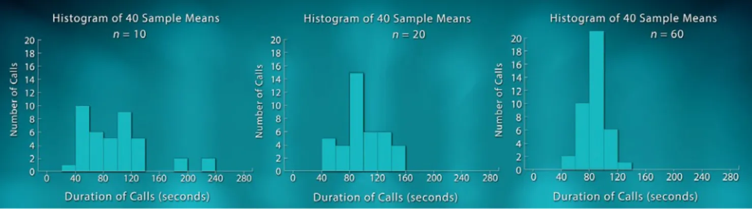
So far we’ve been looking at population distributions that follow a roughly normal curve. Next, we look at a distribution of lengths of calls coming into the Mayor’s 24 Hour Hotline call center in Boston, Massachusetts. Most calls are relatively brief but a few last a very long time. The shape of the call-length distribution is skewed to the right as shown in Figure 22.5.
Figure 22.5. Duration of calls to a call center.
To gain insight into the sampling distribution of the sample mean, x, for samples of size 10, we randomly selected 40 samples of size 10 and made a histogram of the sample means. We repeated this process for samples of size 20 and then again for samples of size 60. The histograms of the sample means appear in Figure 22.6.
Figure 22.6. Histograms of sample means from samples of size 10, 20, and 60.
Now let’s compare our sampling distributions (Figure 22.6) with the population distribution (Figure 22.5). Notice that the spread of all the sampling distributions is smaller than the spread of the population distribution. Furthermore, as the sample size n increases, the spread of the sampling distributions decreases and their shape becomes more symmetric. By the time n = 60, the sampling distribution appears approximately normally distributed. What we have uncovered here is one of the most powerful tools statisticians possess, called the Central Limit Theorem. This states that, regardless of the shape of the population, the sampling distribution of the sample mean will be approximately normal if the sample size is sufficiently large. It is because of the Central Limit Theorem that statisticians can generalize from sample data to the larger population. We will be seeing applications of the Central Limit Theorem in later units on confidence intervals and significance tests.
Student Learning Objectives
A. Recognize that there is variability due to sampling. Repeated random samples from the same population will give variable results.
B. Understand the concept of a sampling distribution of a statistic such as a sample mean, sample median, or sample proportion.
C. Know that the sampling distributions of some common statistics are approximately normally distributed; in particular, the sample mean x of a simple random sample drawn from a normal population has a normal distribution.
D. Know that the standard deviation of the sampling distribution of x depends on both the standard deviation of the population from which the sample was drawn and the sample size n. E. Grasp a key concept of statistical process control: Monitor the process rather than examine all of the products; all processes have variation; we want to distinguish the natural variation of the process from the added variation that shows that the process has been disturbed.
F. Make an x control chart. Use the 68-95-99.7% rule and the sampling distribution of x to help identify if a process is out of control.
G. Be familiar with the Central Limit Theorem: the sample mean x of a large number of observations has an approximately normal distribution even when the distribution of individual observations is not normal.
Content Overview
The idea of a sampling distribution, in general, and specifically about the sampling distribution of the sample mean x, underlies much of introductory statistical inference. The application to x charts is important in practice and the discussion of x charts, along with other types of control charts, continues in Unit 23, Control Charts.
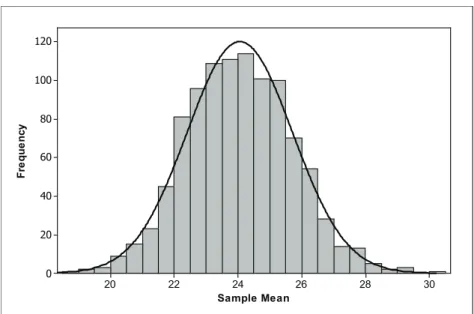
If repeated random samples are chosen from the same population, the values of sample statistics such as x will vary from sample to sample. This variation follows a regular pattern in the long run; the sampling distribution is the distribution of values of the statistic in a very large number of samples. For example, suppose we start with data from the population distribution shown in Figure 22.7. This population is skewed to the right, and clearly not normally distributed. 25 20 15 10 5 0 X x
Figure 22.7. Population distribution.
Now, we draw a random sample of size 50 from this population and compute two statistics, the mean and the median, and get 20.7 and 19.8, respectively. Next we take another sample of size 50 and compute the mean and median for that sample. We keep resampling until we have a total of 1000 samples. Histograms of the 1000 means and 1000 medians from those samples appear in Figures 22.8 and 22.9, respectively. In both cases, the sampling distribution of the statistic appears approximately normally distributed. The sampling distribution of the sample mean, x, is centered around 24 and the sampling distribution of the sample median at around 22.
30 28 26 24 22 20 120 100 80 60 40 20 0 Sample Mean Fr eq ue nc y
Figure 22.8. Distribution of the sample mean from 1000 samples of size 50.
30 28 26 24 22 20 18 16 100 80 60 40 20 0 Sample Median Fr eq ue nc y
Figure 22.9. Distribution of the sample median from 1000 samples of size 50.
Although basic statistics such as the sample mean, sample median and sample standard deviation all have sampling distributions, the remainder of this unit will focus on the sampling distribution of the sample mean, x. If x is the mean of a simple random sample of size n from a population with mean µ and standard deviation σ, then the mean and standard deviation of the sampling distribution of x are:
µx =µ σx = σ
If a population has the normal distribution with mean µ and standard deviation σ, then the sample mean x of n independent observations has a normal distribution with mean µ and standard deviation σ n . In our example above, the population distribution was not normal (see Figure 22.7). In such cases, the Central Limit Theorem comes to the rescue – if the sample size is large (say n > 30), the sampling distribution of x is approximately normal for any population with finite standard deviation.
Control charts for the sample mean x provide an immediate application for the sampling distribution of x. In the 1920’s Walter Shewhart of Bell Laboratories noticed that production workers were readjusting their machines in response to every variation in the product. If the diameter of a shaft, for example, was a bit small, the machine was adjusted to cut a larger diameter. When the next shaft was a bit large, the machine was adjusted to cut smaller. Any process has some variation, so this constant adjustment did nothing except increase variation. Shewhart wanted to give workers a way to distinguish between the natural variation in the process and the extraordinary variation that shows that the process has been disturbed and hence, actually requires adjustment.
The result was the Shewhart x control chart. The basic idea is that the distribution of sample mean x is close to normal if either the sample size is large or individual measurements are normally distributed. So, almost all the x-values lie within ±3 standard deviations of the mean. The correct standard deviation here is the standard deviation of x, which is σ n (where σ is the standard deviation of individual measurements). So, the control limits µ ±3σ n contain the range in which sample means can be expected to vary if the process remains stable. The control limits distinguish natural variation from excessive variation.
Key Terms
If repeated random samples are chosen from the same population, the values of sample statistics such as x will vary from sample to sample. This variation follows a regular pattern in the long run; the sampling distribution is the distribution of values of the statistic in a very large number of samples.
If x is the mean of a simple random sample (SRS) of size n from a population having mean µ and standard deviation σ, then the mean and standard deviation of are:
µx =µ σx = σ
n
If a population has a normal distribution with mean µ and standard deviation σ, then the
sampling distribution of the sample mean, x, of n independent observations has a normal distribution with mean µ and standard deviation σ n .
If the population is not normal but n is large (say n > 30), then the Central Limit Theorem tells us that the sampling distribution of the sample mean, x, of n independent observations has an approximate normal distribution with mean µ and standard deviation σ n .
The Video
Take out a piece of paper and be ready to write down answers to these questions as you watch the video.
1. What is the difference between parameters and statistics?
2. Does statistical process control inspect all the items produced after they are finished?
3. The inspector samples five circuit boards at regular intervals and finds the mean solder quality score x for these five boards. Do we expect x to be exactly 100 if the soldering process is functioning properly?
4. If the quality of individual boards varies according to a normal distribution with mean µ = 100 and standard deviation σ =4, what will be the distribution of the sample averages, x?
(Recall the sample size is n = 5.)
5. In general, is the mean of several observations more or less variable than single observations from a population? Explain.
6. The distribution of call lengths to a call center is strongly skewed. What does the
Central Limit Theorem say about the distribution of the mean call length x from large samples of calls?
Unit Activity:
Sampling Distributions of the Sample Mean
Write each of On this these numbers many slips
50 10 49, 51 9 48, 52 9 47, 53 8 46, 54 6 45, 55 5 44, 56 3 43, 57 2 42, 58 1 41, 59 1 40, 60 1
Table 22.2. Numbered slips for the population distribution.
1. Your instructor has a container filled with numbered strips as shown in Table 22.2. Make a histogram of this distribution. Describe its shape.
2. You will need 100 samples of size 9. Your instructor will provide instructions for gathering these samples. After the data have been collected, you will need a copy of the table of results before you can answer parts (a) and (b).
a. Find the sample mean for each of the samples. Record the sample means in the results table. (Save your results table. You will need this table again for the activity in Unit 24, Confidence Intervals.)
b. To get an idea of the characteristics of the sampling distribution for the sample mean, make a histogram of the sample means. (Use the same scaling on the horizontal axis that you used in question 1.) Compare the shape, center and spread of the sampling distribution to that of the original distribution (question 1).
Extension
3. A population has a uniform distribution with density curve as shown in Figure 22.10.
1.0 0.8 0.6 0.4 0.2 0.0 1.0 0.8 0.6 0.4 0.2 0.0 x Pr opor tion
Figure 22.10. Density curve for uniform distribution.
a. Your instructor will give you directions for using technology to generate 100 samples of size 9 from this distribution.
b. Once you have your 100 samples, find the sample means.
c. Make a histogram of the 100 sample means. Describe the shape of your histogram. Compare the center of this sampling distribution with the center of the population distribution from Figure 22.10.
Exercises
1. The law requires coal mine operators to test the amount of dust in the atmosphere of the mine. A laboratory carries out the test by weighing filters that have been exposed to the air in the mine. The test has a standard deviation of σ =0.08 milligram in repeated weighings of the same filter. The laboratory weighs each filter three times and reports the mean result.
a. What is the standard deviation of the reported result?
b. Why do you think the laboratory reported a result based on the mean of three weighings?
2. The scores of students on the ACT college entrance examination in a recent year had the normal distribution with mean µ = 18.6 and standard deviation σ =5.9.
a. What fraction of all individual students who take the test have scores 21 or higher?
b. Suppose we choose 55 students at random from all who took the test nationally. What is the distribution of average scores, x, in a sample of size 55? In what fraction of such samples will the average score be 21 or higher?
3. The number of accidents per week at a hazardous intersection varies with mean 2.2 and standard deviation 1.4. This number, x, takes only whole-number values, and so is certainly not normally distributed.
a. Let x be the mean number of accidents per week at the intersection during a year (52 weeks). What is the approximate distribution of x according to the Central Limit Theorem? b. What is the approximate probability that, on average, there are fewer than two accidents per week over a year?
c. What is the approximate probability that there are fewer than 100 accidents at the intersection in a year? (Hint: Restate this event in terms of x.)
4. A company produces a liquid that can vary in its pH levels unless the production process is carefully controlled. Quality control technicians routinely monitor the pH of the liquid. When the process is in control, the pH of the liquid varies according to a normal distribution with mean
a. The quality control plan calls for collecting samples of size three from batches produced each hour. Using n = 3, calculate the lower control limit (LCL) and upper control limit (UCL). b. Samples collected over a 24-hour time period appear in Table 22.3.
Sample pH level Sample mean
1 5.8 6.2 6.0 2 6.4 6.9 5.3 3 5.8 5.2 5.5 4 5.7 6.4 5.0 5 6.5 5.7 6.7 6 5.2 5.2 5.8 7 5.1 5.2 5.6 8 5.8 6.0 6.2 9 4.9 5.7 5.6 10 6.4 6.3 4.4 11 6.9 5.2 6.2 12 7.2 6.2 6.7 13 6.9 7.4 6.1 14 5.3 6.8 6.2 15 6.5 6.6 4.9 16 6.4 6.1 7.0 17 6.5 6.7 5.4 18 6.9 6.8 6.7 19 6.2 7.1 4.7 20 5.5 6.7 6.7 21 6.6 5.2 6.8 22 6.4 6.0 5.9 23 6.4 4.6 6.7 24 7.0 6.3 7.4 Table 22.3. pH of samples.
c. Make an x chart by plotting the sample means versus the sample number. Draw horizontal reference lines at the mean and lower and upper control limits.
d. Do any of the sample means fall below the lower control limit or above the upper control limit? This is one indication that a process is “out of control.”
e. Apart from sample means falling outside the lower and upper control limits, is there any other reason why you might be suspicious that this process is either out of control or going out of control? Explain.
Review Questions
1. Suppose a chemical manufacturer produces a product that is marketed in plastic bottles. The material is toxic, so the bottles must be tightly sealed. The manufacturer of the bottles must produce the bottles and caps within very tight specification limits. Suppose the caps will be acceptable to the chemical manufacturer only if their diameters are between 0.497 and 0.503 inch. When the manufacturing process for the caps is in control, cap diameter can be described by a normal distribution with µ =0.500 inch and σ =0.0015 inch.
a. If the process is in control, what percentage of the bottle caps would have diameters outside the chemical manufacturer’s specification limits?
b. The manufacturer of the bottle caps has instituted a quality control program to prevent the production of defective caps. As part of its quality control program, the manufacturer measures the diameters of a random sample of n = 9 bottle caps each hour and calculates the sample mean diameter. If the process is in control, what is the distribution of the sample mean x? Be sure to specify both the mean and standard deviation of x’s distribution.
c. The cap manufacturer has a rule that the process will be stopped and inspected any time the sample mean falls below 0.499 inch or above 0.501 inch. If the process is in control, find the proportion of times it will be stopped for inspection.
2. A study of rush-hour traffic in San Francisco records the number of people in each car entering a freeway at a suburban interchange. Suppose that this number, x, has mean 1.5 and standard deviation 0.75 in the population of all cars that enter at this interchange during rush hours.
a. Could the exact distribution of x be normal? Why or why not?
b. Traffic engineers estimate that the capacity of the interchange is 700 cars per hour. According to the Central Limit Theorem, what is the approximate distribution of the mean number of persons, x, per car in 700 randomly selected cars at this interchange?
c. What is the probability that 700 cars will carry more than 1075 people? (Hint: Restate the problem in terms of the average number of people per car.)
3. Recall that the distribution of the lengths of calls coming into a Boston, Massachusetts, call center each month is strongly skewed to the right. The mean call length is µ = 90 seconds and the standard deviation is σ= 120 seconds.
a. Let x be the sample mean from 10 randomly selected calls. What is the mean and
standard deviation of x? What, if anything, can you say about the shape of the distribution of x? Explain.
b. Let x be the sample mean from 100 randomly selected calls. What is the mean and
standard deviation of x? What, if anything, can you say about the shape of the distribution of x? Explain.
c. In a random sample of 100 calls from the call center, what is the probability that the average length of these calls will be over 2 minutes?
Unit 23: Control Charts
Summary of Video
Statistical inference is a powerful tool. Using relatively small amounts of sample data we can figure out something about the larger population as a whole. Many businesses rely on this principle to improve their products and services. Management theorist and statistician W. Edwards Deming was among the first to champion the idea of statistical process management. Initially, Deming found the most receptive audience to his management theories in Japan. After World War II, Japanese industry was shattered. Rebuilding was a daunting challenge, one that Japanese business leaders took on with great determination. In the decades after the war, they transformed the phrase “Made in Japan” from a sign of inferior, cheaply-made goods to a sign of quality respected the world over. Deming’s emphasis on long-term thinking and continuous process improvement was vital in bringing about the so-called “Japanese Miracle.” At first, Deming’s ideas were not as well received in America. Deming criticized American managers for their lack of understanding of statistics. But as time went on – and competition from Japan grew – companies in the U.S. began to embrace Deming’s ideas on statistical process control. Now his principles of total quality management are an integral part of American business, helping workers uncover problems and produce higher quality goods and services.
In statistics, a process is a chain of steps that turns inputs into outputs. A process could be anything from the way a factory turns raw iron into a finished bolt to the way you turn raw ingredients into a hot dinner. Statisticians say a process that is running smoothly, with its variables staying within an expected range, is in control. Deming was adamant that statistics could help in understanding a manufacturing process and identifying its problems, or when things were out of control or about to go out of control. He advocated the use of control charts as a way to monitor whether a process is in or out of control. This technique is widely used to this day as we’ll see in the video in a visit to Quest Diagnostics’ lab.
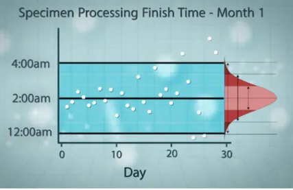
Quest performs medical tests for healthcare providers. So, for example, at Quest a patient’s blood sample is the input of the process and the test result is the output. A courier picks up specimens and transports them to the processing lab, where they are sorted by time of arrival and urgency of test. Technicians verify each specimen and confirm the doctor’s orders.
processing lab aimed to get all specimens logged in and ready by 2 a.m. so the sample could move on to the technical department for analysis. However, until a few years ago, they were rarely meeting that 2 a.m. goal. Their lateness was leading to poor customer and
employee satisfaction and moreover, it was wasting corporate resources. Enter statistical process control!
Quest needed to know where the process stood at present: How close were they to hitting the 2 a.m. target and how much did finish times vary? Keep in mind that all processes have variation. Common cause variation is due to the day-to-day factors that influence the process. In Quest’s case, it could be things like a printer running out of paper and needing to be refilled, or a worker calling in sick. It is the normal variation in a system.
Processes are also susceptible to special cause variation – that’s when sudden, unpredictable events throw a wrench into the process. Examples of special cause variation would be
blackouts that shut down the lab’s power, or a major crash on the highway that would keep the samples from being delivered to the lab. Quest needed to figure out how their process was running on a day-to-day basis when they were only up against common cause variation. Quest used six months of finish-time data to set up control limits and then created a control chart, which is a graphic way to keep track of variation in finish times. Figure 23.1 shows a control chart for month 1. The center line is the target finish time. The control limits at 12:00 a.m. and 4:00 a.m. are set three standard deviations above and below the center line. The data points are the finish times that Quest tracked over a one-month period.
Figure 23.1. Control chart for month 1.
Quest assumed that their nightly finish times are normally distributed. In Figure 23.2, we add a graph of the normal distribution to the control chart. Remember, in a normal distribution 68% of your data is within one standard deviation of the mean, 95% is within two standard deviations,
Figure 23.2. Adding an assumption of normality.
Using the control chart Quest was able to figure out when their process had been disturbed and gone out of control, or was heading that way. One dead giveaway that the finish times are out of control is if a point falls outside the control limits. That should only happen 0.3% of the time if everything is running smoothly. Take a look at Figure 23.3, which highlights what happened toward the end of the one-month cycle.
Figure 23.3. Highlighting finishing times beyond the control limits.
There are other indicators that something suspicious might be going on besides points falling outside the control limits. For example, if too many points are on one side of the center line or if a strong pattern emerges (hence, the variability is not random) – then it’s time to investigate. Mapping finish times on the control chart helps monitor the process, and alerts techs right away that something has been disturbed. Then they can track down and address the cause immediately.
restructured the entire department. It set up pods within the department and changed staffing. These sorts of changes brought the mean finish time much closer to the 2 a.m. target, and the remaining variation clustered more tightly around the center line. The days of wildly erratic finish times were gone thanks to statistical process control.
Student Learning Objectives
A. Understand why statistical process control is used.B. Be able to distinguish between common cause and special cause variation.
C. Know how to construct a run chart and describe patterns/trends in data over time.
D. Know how to construct an x chart and describe the changes in sample means over time. E. Make decisions based on observed patterns in 7 run charts and x charts.
F. Be able to apply decision rules to determine if a process is out of control.
Content Overview
Figure 23.4: Silicon ingots and polished wafers.
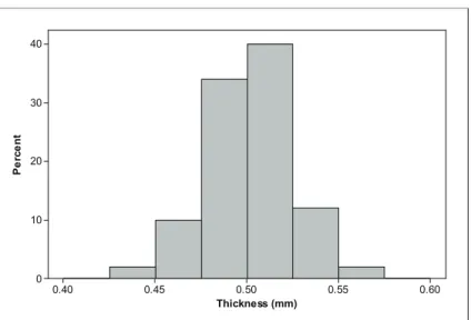
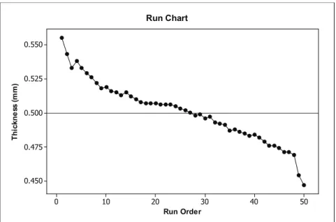
Consider the problem of quality control in the manufacturing process of turning ingots of silicon into polished wafers used to make microchips. (See Figure 23.4.) Assume that the manufacturer wants the polished wafers to have consistent thickness with a target thickness of 0.5 millimeters. A sample of 50 polished wafers is selected as a batch is being produced. Table 23.1 contains these data.
0.555 0.543 0.533 0.538 0.533 0.529 0.526 0.522 0.518 0.519 0.516 0.515 0.513 0.515 0.512 0.510 0.508 0.507 0.507 0.507 0.506 0.506 0.506 0.505 0.503 0.502 0.500 0.498 0.499 0.496 0.497 0.493 0.492 0.491 0.487 0.488 0.486 0.485 0.483 0.484 0.482 0.479 0.476 0.476 0.474 0.471 0.471 0.469 0.454 0.447 Table 23.1. Wafer thickness from sample of 50 polished wafers.
0.60 0.55 0.50 0.45 0.40 40 30 20 10 0 Thickness (mm) Pe rc en t
Figure 23.5. Histogram of wafer thickness.
The histogram indicates that distribution of wafer thickness is approximately normal. The sample mean is 0.50064, which is pretty close to the target value. Furthermore, the standard deviation is 0.02227, which is relatively small compared to the mean. The analysis thus far supports the conclusion that the process is in control.
The sample mean and standard deviation together with the histogram provide information on the overall pattern of the sample data. However, there is more to quality control than simply studying the overall pattern. Manufacturers also keep track of the run order, the order in which the data are collected. For the data in Table 23.1, the run order may relate to which part of the ingot – top, middle, or bottom – the wafers came from, or it may relate to the order in which wafers were fed through the grinding and polishing machines. If a process is stable or in control, the order in which data are collected, or the time in which they are processed, should not affect the thickness of polished wafers. One way to check that the production processes of polished wafers are in control is by creating a run chart.
A run chart is a scatterplot of the data versus the run order. To help visualize patterns over time, the dots in the scatterplot are usually connected. Table 23.1 lists the data values in the order they were collected, starting with the first row 0.555, 0.543, . . . , 0.519, followed by the second row, third row, fourth row and ending with 0.447, the last entry in the fifth row. So, the run order for 0.555 is 1, for 0.543 is 2, and so forth until you get to the run order for 0.447, which is 50. Figure 23.6 shows the run chart for the wafer thickness data. A center line has been drawn on the chart at the target thickness of 0.05 millimeters.
50 40 30 20 10 0 0.550 0.525 0.500 0.475 0.450 Run Order Th ic kn es s (m m) Run Chart
Figure 23.6. Run chart for wafer thickness data from Table 23.1.
Even though the overall pattern of the data gave no indication that there were any problems with the grinding and polishing processes, it is clear from the run chart in Figure 23.6 that the thickness of polished wafers is decreasing over time. Processes need to be stopped so that adjustments can be made to the grinding and polishing processes.
The run chart involved plotting individual data values over time (run order). Another approach is to select samples from batches produced over regular time intervals. For example, a quality control plan for the polished wafers might call for routine collection of a sample of n polished wafers from batches produced each hour. The thickness of each wafer in the sample is
recorded and the mean thickness, x, is calculated. The information on mean thickness can be used to determine if the process is out of control at a particular time and to track changes in the process over time.
Suppose when the grinding and polishing processes are in control, the distribution of the individual wafers can be described by a normal distribution with mean µ = 0.5 millimeters and standard deviation σ =0.02 millimeters (similar to the data pattern in Figure 23.5). From Unit 22, Sampling Distributions, we know that under this condition the distribution of the hourly sample means, x, based on samples of size n are normally distributed with the following mean and standard deviation:
µx =µ =0.05 millimeters
σx = σ n =
0.02
Assume that the quality control plan calls for taking samples of four polished wafers each hour. In this case, our standard deviation for x is:
σx =0.02 4 =0.01 millimeter
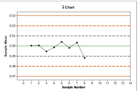
Each hour a technician collects samples of four polished wafers, measures their thickness, records the values, and then calculates the sample mean. Suppose that the data in Table 23.2 come from samples collected over an eight-hour period.
Sample Sample Sample
Number Thickness (mm) Mean (mm)
1 0.509 0.502 0.521 0.469 0.5003 2 0.504 0.505 0.525 0.468 0.5005 3 0.489 0.506 0.486 0.497 0.4945 4 0.513 0.516 0.482 0.483 0.4985 5 0.552 0.516 0.476 0.472 0.5040 6 0.480 0.484 0.518 0.510 0.4980 7 0.516 0.489 0.513 0.495 0.5032 8 0.508 0.499 0.466 0.480 0.4882 Table 23.2. Data from samples collected each hour.
According to the 68-95-99.7% Rule, if the process is in control, we would expect:
68% of the x values to be within the interval 0.5 mm ± 0.1 mm or between 0.49 mm and 0.51 mm.
95% of the x values to be within the interval 0.5 mm ± 2(0.1) mm or between 0.48 mm and 0.52 mm.
99.7% of the x values to be within the interval 0.5 mm ± 3(0.1) mm or between 0.47 mm and 0.53 mm.
Next, we make an x chart, which is a scatterplot of the sample means versus the sample order. We draw a reference line at μ = 0.5 called the center line. We use the values from the 68-95-99.7% Rule to provide additional reference lines in our x chart. The lower and upper endpoints on the 99.7% interval are called the lower control limit (LCL) and upper control limit (UCL), respectively. Figure 23.7 shows the completed x chart.
14 13 12 11 10 9 8 7 6 5 4 3 2 1 0 0.53 0.52 0.51 0.50 0.49 0.48 0.47 Sample Number Sa mp le Me an x Chart 14 13 12 11 10 9 8 7 6 5 4 3 2 1 0 0.53 0.52 0.51 0.50 0.49 0.48 0.47 Sample Number Sa mp le Me an x Chart
Figure 23.7. x chart for wafer thickness over time.
The x chart in Figure 23.7 does not appear to indicate any problems that warrant stopping the grinding or polishing processes to make adjustments. All of the points except one fall within one σ n of the mean, in other words, fall between the reference lines corresponding to 0.49 and 0.51. However, as we add additional points, we will need some guidelines – a set of decision rules – that tell us when the process is going out of control. The decision rules below are based on a set of rules developed by the Western Electric Company. Although they are widely used, they are not the only set of decision rules.
Decision Rules:
The following rules identify a process that is becoming unstable or is out of control. If any of the rules apply, then the process should be stopped and adjusted (or the problem fixed) before resuming production.
Rule 1: Any single data point falls below the LCL or above the UCL.
Rule 2: Two of three consecutive points fall beyond the 2σ / n limit, on the same side of the center line.
Rule 3: Four out of five consecutive points fall beyond the σ n limit, on the same side of the center line.
Rule 4: A run of 9 consecutive points (in other words, nine consecutive points on the same side of the center line).
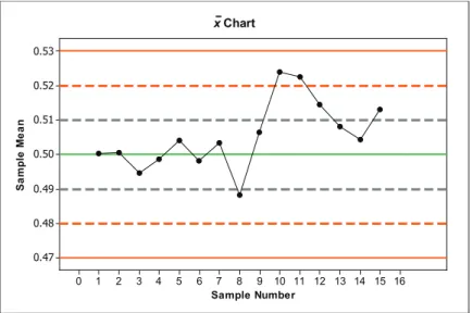
None of the decision rules apply to the control chart in Figure 23.7. Hence, the processes are allowed to continue. Table 23.3 contains data on the next seven hourly samples.
Sample Sample Sample
Number Thickness (mm) Mean (mm)
9 0.505 0.489 0.499 0.532 0.5063 10 0.534 0.521 0.530 0.511 0.5240 11 0.526 0.514 0.520 0.530 0.5225 12 0.517 0.518 0.511 0.512 0.5145 13 0.506 0.504 0.511 0.511 0.5080 14 0.507 0.499 0.501 0.510 0.5043 15 0.511 0.509 0.512 0.520 0.5130
Table 23.3. Samples from an additional seven hours.
Figure 23.8 shows the updated x chart that includes the means from the seven additional samples. 16 15 14 13 12 11 10 9 8 7 6 5 4 3 2 1 0 0.53 0.52 0.51 0.50 0.49 0.48 0.47 Sample Number Sa mp le Me an x Chart
Figure 23.8. Updated x chart.
Now, we apply the decision rules. This time, we find that Rule 2 applies. Data points
associated with Samples 10 and 11 fall above 0.52 (which, in this case, is above the 2σ / n limit). According to Rule 2 the process should be stopped after observing Sample 11’s
x-value.
The x chart monitors one statistic, the sample mean, over time. The x chart is only one type of control chart. As mentioned earlier, the manufacturer is also interested in producing a consistent product. So, instead of tracking the sample mean, the quality control plan could also track the sample standard deviations, or the sample ranges over time. More generally, control charts are scatterplots of sample statistics (or individual data values) versus sample order and
Before control charts were popular, there was a tendency to adjust processes whenever a slight change was noted. This led to over-adjustment, which often caused more problems than it solved. In addition, it meant that the process was stopped for adjustment more frequently than was necessary, which was a waste of money. Control charts and decision rules give manufacturers concrete guidelines for deciding when processes need attention.
Key Terms
A process is a chain of steps that turns inputs into outputs. Every process has variation. Common cause variation is the variation due to day-to-day factors that influence the process. Special cause variation is the variation due to sudden, unexpected events that affect the process.
When a process is running smoothly, with its variables staying within an acceptable range, the process is in control. When the process becomes unstable or its variables are no longer within an acceptable range, the process is out of control.
A run chart is a scatterplot of the data values versus the order in which these values are collected. The chart displays process performance over time. Patterns and trends can be spotted and then investigated.
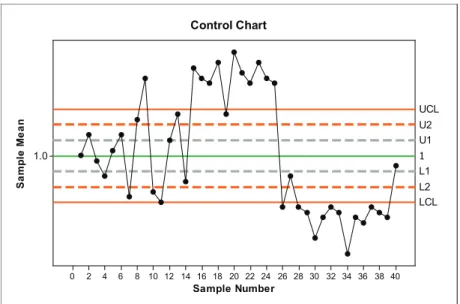
Control charts are used to monitor the output of a process. The charts are designed to signal when the process has been disturbed so that it is out of control. Control charts rely on samples taken over regular intervals. Sample statistics (for example, mean, standard deviation, range) are calculated for each sample. A control chart is a scatterplot of a sample statistic (the quality characteristic) versus the sample number. Figure 23.9 shows a generic control chart.
16 14 12 10 8 6 4 2 0 Sample Number Qu al ity Ch ar ac te rist ic UCL Center Line LCL Control Chart
Figure 23.9. Generic control chart.
The center line on a control chart is generally the target value or the mean of the quality characteristic when the process is in control. The upper control limit (UCL) and lower control limit (LCL) on a control chart are generally set ±3 σ n from the center line.
An x chart is one example of a control chart. It is a scatterplot of the sample means versus the sample number. Scatterplots of sample standard deviations or sample ranges over time are two other types of control charts.
Decision rules consist of a set of rules used to identify when a process is becoming unstable or going out of control. Decision rules help quality control managers decide when to stop the process in order to fix problems or make adjustments.
The Video
Take out a piece of paper and be ready to write down answers to these questions as you watch the video.
1. What was W. Edwards Deming known for?
2. What is a process, statistically speaking? Give an example.
3. What does it mean for a process to be in control?
4. Why did Quest Diagnostics’ lab need a statistical-quality-control intervention?
5. In Quest’s control chart, how did they determine where to set the upper and lower control limits?
6. How did Quest respond to what it learned from its control charts? What were the results of these changes?
Unit Activity:
You’re In Control!
For this activity, you will play the role of a semiconductor quality control manager in charge of monitoring the thickness of polished wafers. Open the Control Chart tool from the Interactive Tools menu. You will be working with x charts. The activity questions follow the list of steps below.
Step 1: Select a set of values for the mean µ and standard deviation σ. You have three possible choices for each of these parameters.
For now, you will work through the construction of at least two control charts with your
selection. In the real world, these values would be determined from past data collected when the process was known to be in control.
Step 2: Since you are in charge of the quality control plan, decide on the sample size n you would like to use for monitoring the process. You have three choices: 5, 10, or 20. Keep in mind the following: The more wafers you sample, the more time it will take, and the more it will cost. On the other hand, with larger samples, results are more precise.
Step 3: Select the Step-By-Step mode.
In this mode, you will get feedback immediately after each decision that you make. If you make a mistake, you will be told to start over and will need to click the “Start Over” button. Once you feel confident about your decisions, you can change to Continuous mode.
Step 4: Calculate the lower control limit to four decimals and enter its value in the box for LCL. Calculate the upper control limit to four decimals and enter its value in the box for UCL. Click the “Change Control Limits” button.
If your calculations are correct, control lines will appear in the x chart. In Step-By-Step mode, you will get feedback (see bottom of screen) if you have made a mistake. The feedback will say: Recalculate control limit values. To correct the error, enter new values for LCL and UCL and then click the “Change Control Limits” button.
Step 5: Click on the “Collect Sample Data” button. The data will appear in a column under the heading Thickness (mm) near the top of your screen. To calculate x, click the “Calculate Mean” button. The mean will appear underneath the column.
Step 6: Click the “Plot Point” button to plot the ordered pair (sample number, mean) on the x chart.
Step 7: Make a decision. Your possible decisions are: (1) Continue Process, which means that you have decided the process is in control; or (2) Stop Process, which means that you have decided to shut down the process for adjustments or inspection.
Step 8: Repeat steps 5 – 7 until one of the following three things happens:
(1) You decide to continue and get the following feedback: Process is not in control. It should be stopped immediately. In this case, click the “Start Over” button at the top of the screen. (2) You decide to continue and get the following feedback: Good decision. In this case, continue constructing the control chart.
(3) After 25 samples, it will be time for routine maintenance even if the process is still in
control. At this time you, you can proceed to the next question. Click the “Start Over” button to do so.
1. Work through Steps 1 – 8 using the Control Chart tool. Complete one control chart successfully. Make a sketch of your chart (or do a screen capture and paste the screen
capture into a Word document). If the process was stopped before 25 samples were selected, state which of the decision rules applies.
2. Use the same settings as you did for question 1. Rework question 1.
After you have successfully completed two control charts in Step-by-Step mode, you are ready to move on to question 3.
3. Change the settings for µ, σ, and n. Choose Continuous mode. Allow the process to continue until you think it needs to be stopped. After clicking the “Stop Process” button, you will receive feedback.
a. What settings did you choose? What were the values of the upper and lower control limits? b. Make a sketch of your control chart or save a screen capture of your control chart into a Word document.
c. What feedback did you receive?
d. If your feedback indicated that you made a correct choice to stop the process, state the rule that made you decide it was time to stop the process. If your feedback indicated that you should have stopped the process sooner, state the sample number for when you should have stopped the process and the rule that applies.
4. Select new settings for µ and σ (it is up to you if you also want to change n). Repeat question 3 and make another control chart.
Exercises
1. A manufacturer of electrical resistors makes 100-ohm resistors that have specifications of 100 ± 3 ohms. A quality control inspector collected a sample of 15 electrical resistors and tested their resistance. The results are recorded below:
99 98 101 98 99 101 99 100 100 98 99 102 99 101 100
Assume that these data are recorded in the order they were collected beginning with the first row 99, . . . 100, followed by the second row 100, . . . 100.
a. Make a run chart for these data. Leave room on the horizontal axis to expand the run orders out to 30. (You will be adding 15 more data points in part (c).) Draw a reference line for the target resistance (100 ohms) and for the tolerance interval (these can serve as control limits). b. Based on your run chart in (a), is there any evidence that the process is out of control? Support your answer.
c. The quality control inspector continued collecting data on the resistors. Results from an additional 15 data values, in the order values were collected, are recorded below:
100 99 102 99 101 102 101 100 101 102 100 103 101 102 103
Use these data to complete the run chart in (a) for run orders from 1 – 30.
d. Based on the completed run chart in (c) is there any evidence that the manufacturing process is out of control? Support your answer.
2. Suppose a chemical manufacturer produces a product that is marketed in plastic bottles. The material is toxic, so the bottles must be tightly sealed. The manufacturer of the bottles must produce the bottles and caps within very tight specification limits. Suppose the caps will be acceptable to the chemical manufacturer only if their diameters are between 0.497 and 0.503 inch. When the manufacturing process for the caps is in control, cap diameter can be described by a normal distribution with µ =0.5 inch and σ =0.0015 inch .
a. If the process is in control, what percentage of the bottle caps would have diameters outside the chemical manufacturer’s specification limits?
b. The manufacturer of the bottle caps has instituted a quality control program to prevent the production of defective caps. As part of its quality control program, the manufacturer measures the diameters of a random sample of n = 9 bottle caps each hour and then calculates the sample mean diameter. If the process is in control, what is the distribution of the sample mean
x? Be sure to specify both the mean and standard deviation of x’s distribution.
c. The cap manufacturer has a rule that the process will be stopped and inspected any time the sample mean falls below 0.499 inch or above 0.501 inch. If the process is in control, find the proportion of times it will be stopped during inspection periods.
3. For each of the x charts in Figures 23.10 – 23.12, decide whether or not the process is in control. If the process is out of control, state which decision rule applies. Justify your answer. (Note that reference lines at one, two, and three σ n on either side of the mean have been drawn on the control charts.)
a. 16 14 12 10 8 6 4 2 0 35 30 25 20 15 10 5 Sample Number Sa mp le Me an 5 10 15 20 25 30 35 Control Chart
b. 16 14 12 10 8 6 4 2 0 70 60 50 40 30 20 10 Sample Number Sa mp le Me an 10 20 30 40 60 70 50 Control Chart
Figure 23.11. Control chart for exercise 3(b). c. 40 35 30 25 20 15 10 5 0 70 60 50 40 30 20 10 Sample Number Sa mp le Me an 10 20 30 40 50 60 70 Control Chart
Figure 23.12. Control chart for exercise 3(c).
4. A company produces a liquid which can vary in its pH levels unless the production process is carefully controlled. Quality control technicians routinely monitor the pH of the liquid. When the process is in control, the pH of the liquid varies according to a normal distribution with mean µ = 6.0 and standard deviation σ =0.9 .
a. The quality control plan calls for collecting samples of size three from batches produced each hour. Using n = 3, calculate the lower control limit (LCL) and upper control limit (UCL). b. Samples collected over a 24-hour time period appear in Table 23.4. Compute the sample
Sample pH level Sample Mean 1 5.8 6.2 6.0 2 6.4 6.9 5.3 3 5.8 5.2 5.5 4 5.7 6.4 5.0 5 6.5 5.7 6.7 6 5.2 5.2 5.8 7 5.1 5.2 5.6 8 5.8 6.0 6.2 9 4.9 5.7 5.6 10 6.4 6.3 4.4 11 6.9 5.2 6.2 12 7.2 6.2 6.7 13 6.9 7.4 6.1 14 5.3 6.8 6.2 15 6.5 6.6 4.9 16 6.4 6.1 7.0 17 6.5 6.7 5.4 18 6.9 6.8 6.7 19 6.2 7.1 4.7 20 5.5 6.7 6.7 21 6.6 5.2 6.8 22 6.4 6.0 5.9 23 6.4 4.6 6.7 24 7.0 6.3 7.4
Table 23.4. pH samples collected hourly.
c. Make an x chart. Add reference lines including lines for the lower and upper control limits. d. Based on the control chart you drew for (c), decide whether or not the process is in control. If not, state which of the decision rules applies.
Review Questions
1. A manager keeps track of duplicate e-mail messages he receives, which he views as a waste of his time. His log of the number of duplicate e-mails over 20 consecutive workdays appears in Table 23.5.
Day Number 1 2 3 4 5 6 7 8 9 10
Number of Duplicates 2 1 0 2 12 14 17 15 25 20
Day Number 11 12 13 14 15 16 17 18 19 20
Number of Duplicates 24 27 22 24 26 20 22 5 2 0
Table 23.5. Duplicate e-mail messages per day.
a. Calculate the mean number of duplicate e-mails per day.
b. Draw a run chart of the duplicate e-mail data. Add the mean number of duplicates as a reference centerline.
c. Nine or more consecutive data points on the same side of a center line can signal a special cause variation. Does the run chart from (b) signal a special cause variation?
2. A quality control inspector at a company that manufactures valve linings monitors the mass of the linings. When the process is in control, the mean mass is µ =240.0 grams and standard deviation σ =0.4 gram. The inspector randomly selects a valve liner from batches produced each hour and records its mass. The mass (in grams) of 25 valve liners are displayed in Table 23.6 on the next page.
Hour Mass Hour Mass 1 240.0 14 240.2 2 239.9 15 239.8 3 239.6 16 240.7 4 240.2 17 239.4 5 239.6 18 240.5 6 239.8 19 239.7 7 239.8 20 239.3 8 240.1 21 240.5 9 239.8 22 239.7 10 240.1 23 239.5 11 240.1 24 240.7 12 239.8 25 239.4 13 240.2
Table 23.6. Mass of valve liners.
a. Make a histogram for mass of valve liners from Table 23.6. For the first class interval, use 239.0 grams to 239.2 grams. Based on the histogram is there any evidence that the manufacturing process is not in control? Explain.
b. Make a run chart for the mass of valve liners. Add a reference center line at µ. Add lower and upper control limits at µ ±3σ .
c. Does the run chart show any changes in the distribution of valve-liner mass over time? Explain.
3. One process in the production of integrated circuits involves chemical etching of a layer of silicon dioxide until the metal beneath is reached. The company closely monitors the thickness of the silicon dioxide layers because thicker layers require longer etching times. The target thickness is 1 micrometer (µm) and has a standard deviation of 0.06 micrometers (based on past data when the process was in control). The company uses samples of four wafers. An x chart based on 40 consecutive samples appears in Figure 23.13 on the next page.
Figure 23.13. Control chart for thickness of silicon dioxide layers.
a. Calculate the appropriate control limits (the values of the reference lines drawn in Figure 23.13). Round the values to two decimals.
b. Decide whether or not the process is in control. If not, explain which decision rule applies and identify the sample number after which the process should be shut down for adjustments.
4. The company referred to in exercise 4 has two plant lines that produce the liquid. Data from the second line appears in Table 23.7. When the process is in control, the pH of the liquid varies according to a normal distribution with mean µ =6.0 and standard deviation σ =0.9. The quality control plan calls for collecting samples of size three from batches produced each hour.
Sample pH level 1 7.2 7.4 7.4 2 6.9 6.6 6.5 3 6.2 6.3 6.3 4 6.8 6.4 6.5 5 6.5 6.6 6.7 6 6.8 6.8 6.8 7 6.2 6.3 6.4 8 5.6 5.7 5.9 9 4.9 5.8 5.6 10 6.4 6.0 4.4 11 6.9 5.3 6.2 40 38 36 34 32 30 28 26 24 22 20 18 16 14 12 10 8 6 4 2 0 1.0 Sample Number Sa mp le Me an 1 L2 L1 U1 U2 UCL LCL Control Chart
12 5.5 5.9 5.9 13 5.3 5.1 5.2 14 6.2 6.7 6.5 15 4.9 4.7 4.8 16 6.4 6.1 7.0 17 6.3 5.8 6.0 18 4.9 5.0 5.1 19 5.5 5.7 5.3 20 5.3 5.2 5.4 21 5.8 5.8 5.6 22 5.8 5.6 5.7 23 4.8 4.7 4.6 24 4.8 4.9 4.8 Table 23.7. pH of samples.
a. Calculate the sample means for each of the 24 samples.
b. Construct an x chart for the pH samples from the second plant line. Include reference lines marking the center line and one, two, and three σ n on either side of the center line.
c. Based on the control chart from (b), does the process appear to be in control? If not, which decision rule applies and what appears to be the problem?
Unit 24: Confidence
Intervals
Summary of Video
This video is an introduction to inference, which means we use information from a sample to infer something about a population. For example, we might use a sample statistic to estimate a population parameter. Suppose we wanted to know a man’s mean blood pressure. A sample of blood pressure readings is shown in Table 24.1.
Table 24.1. Systolic blood pressure readings.
We could estimate his mean blood pressure using the sample mean from these readings, x = 130. But how trustworthy is our conclusion given that different samples could lead to different results, some higher and others lower? Statisticians address this issue by calculating confidence intervals. Rather than a single number like 130, we can compute a range of values along with a confidence level for that range.
Next, the context switches from blood pressure to the length of life of batteries. Because companies promise specific battery lifetimes and improved performance over a competitor, they need proof before ads promoting their product go on the air. At Kodak’s Ultra
Technologies, technicians use rigorous testing and calculate confidence intervals to back up their marketing claims. Here’s how the data are collected. Random samples of batteries are pulled from the warehouse. The batteries are drained under controlled conditions and the time it takes for them to run out of juice is recorded. From these data, Kodak has determined that its population of AA batteries when used in a toy will last 7½ hours ± 20 minutes and that their confidence in that range is 95%.
Now, we retrace Kodak’s steps to figure out how they came up with this interval. Before getting started, we need to check that a few underlying assumptions are satisfied:
Su M T W Th F Sa
130 120 140 125 130 130 140 A.M.
125 130 145 140 125 135 110 P.M.
1. Observations are independent.
2. Data are from a normal population or the sample size n is large. 3. The population standard deviation is known.
Selecting a random sample of batteries for the test takes care of the assumption of
independent observations. The second assumption is satisfied since the sample size of n = 40 is considered large. The last assumption is not reasonable in the real world, but for now, we’ll assume that from past data we do know the population standard deviation, σ =63.5 minutes. The task is to calculate a confidence interval for μ, the mean life of Kodak’s AA batteries. Our sample statistic x is a point estimate for the parameter μ. If we include a margin of error around our point estimate, we get an interval estimate of the form:
point estimate ± margin of error
From Unit 22, Sampling Distributions, we know that the sampling distribution of x is normal, with mean µx =µ and standard deviation σx =σ n. In this case, we are given σ =63.5 minutes and we can compute σx =63.5 40 minutes or about 10 minutes. Think back to the 68-95-99.7% Rule. In any normal distribution, 95% of the observations lie within two standard deviations of the mean. So, 95% of all possible samples result in battery-life data for which µ is within plus or minus 20 minutes of that sample’s mean, x. In our example, x =450 minutes. So, we can say with 95% confidence that μ lies within 20 minutes of x, giving us a confidence interval from 430 minutes to 470 minutes. To say that we are 95% confident in our calculated range of values means that we got the numbers using a method that gives correct results 95% of the time over many, many examples.
What if Kodak were willing to settle for only 90% confidence? Or what if they insisted on 99% confidence? We can get any confidence level that we want by turning to the standard normal distribution and finding the z* critical value. Then just substitute the appropriate values into the following formula: x±z* σ n ⎛ ⎝⎜ ⎞ ⎠⎟
Notice that the margin of error gets larger if we insist on higher confidence because z* will be larger. On the other hand, the margin of error gets smaller if we take more observations so that n is larger.
Student Learning Objectives
A. Understand that a common reason for taking a sample is to estimate some property of the underlying population.
B. Recognize that a useful estimate requires a measure of how accurate the estimate is. C. Know that a confidence interval has two parts: an interval that gives the estimate and the margin of error, and a confidence level that gives the likelihood that the method will produce correct results in the long range.
D. Be able to assess whether the underlying assumptions for confidence intervals are
reasonably satisfied. Provided the underlying assumptions are satisfied, be able to calculate a confidence interval for μ given the sample mean, sample size, and population standard deviation.
E. Understand the tradeoff between confidence and margin of error in intervals based on the same data.
F. Given a specific confidence level, recognize that increasing the size of the sample can give a margin of error as small as desired.
Content Overview
The purpose of a confidence interval is to estimate an unknown parameter with an indication of (1) how precise the estimate is and (2) how confident we are that the result is correct. Any confidence interval has two parts: an interval computed from the data and a confidence level. The interval often has the form
point estimate ± margin of error.
The confidence level states the probability that the method will give a correct result. That is, if you use 95% confidence intervals often, in the long run 95% of your intervals will contain the true parameter value.
Suppose that a simple random sample of size n is drawn from a normally distributed
population having an unknown mean µ and known standard deviation σ. A level C (expressed as a decimal) confidence interval for µ is
x±z* σ n ⎛ ⎝⎜ ⎞ ⎠⎟ ,
where z* is a cutoff point for the standard normal curve with area (1 – C)/2 to its right.
For example, if C = 0.95 (for a 95% confidence interval) then (1 – C)/2 = (1 – 0.95)/2 = 0.025. In this case, z* turns out to be 1.96 as shown in Figure 24.1.
0.4 0.3 0.2 0.1 0.0 Z De ns ity -1.960 1.960 0.025 0 0.025 Distribution Plot Normal, Mean=0, StDev=1
Figure 24.1. Standard normal density curve illustrating z* = 1.96.
If the sample size n is relatively small, we first need to check that the underlying assumption of normality is reasonably satisfied before computing a confidence interval. One way to check the assumption of normality is to make a normal quantile plot of the sample data. Alternatively,
we could look at a boxplot. If the sample size n is large (n at least 30), the confidence interval formula is approximately correct even when the population does not have a normal distribution. This result is due to the Central Limit Theorem (Unit 22, Sampling Distributions).
The size of the margin of error controls the precision (width) of the confidence interval estimate. Precision is increased as the margin of error shrinks. The margin of error of a confidence interval decreases if any of the following occur:
• the confidence level C is reduced • the sample size n increases
• the population standard deviation σ decreases
In practice, the population standard deviation σ is not known and must be estimated from the sample. If the sample size n is fairly large (say at least 30), then the value of the sample standard deviation s should be close to σ. In that case, you can replace σ by s in the confidence interval formula. (See Unit 26, Small Sample Inference for One Mean, for a continued discussion of confidence intervals for µ when σ is unknown.)
Key Terms
A point estimate of an unknown population parameter is a single number based on sample data (a statistic) that represents a plausible value for that parameter.
A confidence interval for a population parameter is an interval of plausible values for that parameter. It is constructed so that the value of the parameter will be captured between the endpoints of the interval with a chosen level of confidence. The confidence level is the success rate of the method used to construct the confidence interval.
Many confidence intervals have the following form: point estimate ± margin of error. The margin of error is the range of values above and below the point estimate.
A formula used to compute a confidence interval for µ when σ is known and either the sample size n is large or the population distribution is normal is given by:
x±z* σ n ⎛ ⎝⎜ ⎞ ⎠⎟ ,
The Video
Take out a piece of paper and be ready to write down answers to these questions as you watch the video.
1. Why is a single blood pressure reading not sufficient if we want to estimate a person’s average blood pressure?
2. What are the two parts of any confidence interval?
3. What assumptions need to be checked before computing a confidence interval?
Unit Activity:
Confidence Interval Simulation
In this activity, you will need the simulation data collected for question 2 in Unit 22’s activity. Recall that samples of size 9 were drawn from an approximately normal distribution with
µ =50 and standard deviationσ =4. Assume for the moment that µ is unknown. You will be using sample data to find confidence interval estimates for µ.
1. a. What is the standard deviation of x for samples of size 9?
b. What is the margin of error for a 95% confidence interval for µ? (Round your answer to two decimals.)
2. Your instructor has a container filled with numbered strips. Draw a sample of size 9. a. Record the outcomes of your sample and calculate the sample mean, x.
b. Based on your sample, determine a 95% confidence interval for µ.
c. In this case, the true value of µ is 50. Does your confidence interval contain the true value of µ?
3. Your instructor should distribute a table of the results from 100 samples of size 9 generated for Unit 22’s activity.
a. For each sample, calculate a 95% confidence interval estimate for μ and record the endpoints of the interval.
b. Of the 100 samples collected, how many of the 95% confidence intervals contain the true value of μ, which is 50? How many did you expect to contain 50? Is there a discrepancy between the number you found and the number you expected to find? Explain how this discrepancy could occur.
Exercises
1. Students who take SATs in most high schools are not representative of all students in the school. Generally, only students who plan to apply for college admission take the test. The statistics class at Lincoln High decides to get better data. They select a random sample of 20 members of the junior class and arrange for all 20 to take the Math SAT.
The scores are given below.
410 400 460 440 390 400 450 460 520 380 480 480 490 450 480 330 390 460 600 610 Assume that the standard deviation of scores for all juniors is σ =100.
a. Find the value of σx, the standard deviation of the sample mean in size-20 samples.
b. Check to see whether these data could be considered to come from a normally distributed population. (The data need only be roughly normal – in other words, the data should have no severe departures from normality.)
c. Let μ be the mean score that would be observed if every junior at Lincoln High took the exam. Give a 95% confidence interval for μ. Show your calculations. How could you get a smaller margin of error with the same confidence?
d. Give a 99% confidence interval for μ. Explain in plain language, to someone who knows no statistics, why this interval is wider than your result in (c).
2. The Massachusetts Comprehensive Assessment System (MCAS) includes a 10th grade math test which is scaled from 200 to 280. Assume that the standard deviation of math test scores is σ =17. (This assumption is reasonable based on past results.)
a. A random sample of 30 test results is given below. Use these results to determine a 95% confidence interval for the mean MCAS math score, μ.
252 266 264 244 262 268 236 254 264 276 266 220 218 260 258 232 268 218 262 242 238 262 250 264 276 234 232 266 276 248
b. A second random sample of 30 test results was taken. The results are given below. Combine the data from the two samples, the one below and the one in (a), and use the combined data to compute a 95% confidence interval for μ.
258 252 268 264 264 264 222 258 220 254 254 274 266 264 268 248 238 248 258 254 254 258 208 268 268 272 274 254 272 270
c. Compare the margin of errors for the confidence intervals in (a) and (b). Why would you expect the margin of error based on 60 observations to be less than the margin of error based on 30 observations?
d. Keeping the confidence level at 95%, how many observations would you need in order to reduce the margin of error to under 3.0?
3. A city planner randomly selects 100 apartments in Boston, Massachusetts, to estimate the mean living area per apartment. The sample yielded x =875 square feet with a standard deviation s = 255 square feet.
a. Calculate a 95% confidence interval for μ, the mean living area per apartment. (Keep in mind that since the sample size is large, s should be close to σ.)
b. Having found the interval in (a), can you say there is a 95% chance that the mean living area is within the interval? Explain why or why not.
4. A random sample of 50 full-time, hourly wage workers between the ages of 20 and 40 was selected from participants in the 2012 March Supplement, which is part of the Current Population Survey (a joint venture of the U.S. Bureau of Labor Statistics and Census Bureau). The hourly rate (in dollars) of these workers is given below.
7.25 30.09 12.00 25.00 8.00 27.53 14.20 31.00 20.00 18.00 12.00 28.12 16.50 8.00 9.00 15.00 15.10 18.00 17.43 14.00 15.25 34.50 8.00 14.80 7.80 11.00 33.07 10.55 19.00 19.50 12.25 18.00 24.00 27.50 15.00 6.75 30.00 10.30 27.00 14.50 8.00 14.00 10.00 11.75 15.00 28.00 7.50 28.50 16.25 11.75
a. Calculate the sample mean and standard deviation.
b. Calculate a 95% confidence interval for μ, the mean hourly wage of full-time, hourly wage workers between the ages 20 and 40. Because the sample size is large, use s, the sample standard deviation, in place of σ, the unknown population standard deviation.
c. A politician speaking around the time that the data for the 2012 March Supplement were collected claimed that salaries were rising. He stated that the average hourly rate for fulltime workers between the ages of 20 and 40 was $20.00. Does your confidence interval from (b) affirm or refute the politician’s claim. Explain.
d. After being confronted, the politician complained that we should have used a 99%
confidence interval to estimate the mean hourly wage. Compute a 99% confidence interval for